© 2019 Keenan Sultanik
Written and designed by Keenan Sultanik Book set in Korolev and Minion Pro For more information, visit www.sultanik.net
Professor Monique Maloney, Chair
Professor Jennifer Pride, First Reader
Professor David Meyer, Second Reader
the greatest honors I could ever hold.
I also want to thank Dr. Paul Chappell, Dr. John Goetsch, and Dr. Mark Rasmussen for their influence and personal investment in my life, the opportunity to impact lives through teaching, and their lifelong work in ministry and education.
It is also my wish to thank Mark Jellema for his mentorship and teaching in photography during my teen years, first introducing me to the world of lenses, exposure, and visual storytelling.
Finally, I want to thank Tim and Janis Eastwood for giving me my first position in professional graphic design, for being more friends and mentors than bosses, and especially for teaching me how to kern.
inspired and cultivated my creativity and opened to me the world of art and design, all the while challenging me to make a difference for Christ.
RESEARCH � � � � � � � � � � � � � � � � � � � � � � � � � � � � � � � � � � � � � � � � � � � � � � � � � � � � � 14
PROCESS � � � � � � � � � � � � � � � � � � � � � � � � � � � � � � � � � � � � � � � � � � � � � � � � � � � � � 54
SOLUTION � � � � � � � � � � � � � � � � � � � � � � � � � � � � � � � � � � � � � � � � � � � � � � � � � � � � � �78
CONCLUSION � � � � � � � � � � � � � � � � � � � � � � � � � � � � � � � � � � � � � � � � � � � � � � � � � � �90
APPENDIX � � � � � � � � � � � � � � � � � � � � � � � � � � � � � � � � � � � � � � � � � � � � � � � � � � � � � �94
in nearly every other area of society making each more productive and more capable. This study identifies key aspects of a comprehensive and universal visual learning system that incorporates a more holistic approach to design and interactivity in educational environments. The desired effect of this is elevating classroom learning to higher levels as defined by Bloom’s Taxonomy. In this thesis, I have collected and explored empirical and observational data to examine the relationship between effective learning environments and the use of visual aids and interactive experiences. Research in the forms of case studies and personae will present how effective educators are utilizing technology and visuals in and out of the classroom and how individuals associate information through relationships of color, shape, form, hierarchy and other visuals. This research has been applied to a brand identity system designed to facilitate
powerful storytelling, the establishment of an emotional connection between speaker and audience, a rigorous and thorough preparation, and content mastery on the part of the presenter. Online learning-based video content should take advantage of bilateral cognitive processing of both visuals and audio, should be limited in length to capitalize on the ideal attention span of the viewer, and should be bundled with interactive, actionable content or questions for the best long-term retention rates.
The aim of the research was to establish a set of guidelines for the evolution of education in the adoption of modern visual and interactive design systems to better engage a new generation of learners. The research has been applied to create a flexible, comprehensive, and universal design system that can be packaged for implementation in the classroom environment in nearly any teaching field.
B
ecause education has changed very little since the mid-nineteenth century, research in visually enhanced learning and interactive design systems will inform the creation of a set of standards to aid the adoption and utilization of visual design and interactive experiences in educational environments to modernize education at large and to promote higher levels of student learning with specific application being made to its use in the Visual Arts program of West Coast Baptist College in Lancaster, California.A spark is a charged particle thrown off by an energy source that can serve to ignite a fuel source elsewhere. This project seeks to empower educators to throw off academic “sparks” of learning through the use of visual design in educational environments to light a fire in the hearts of their students for continued, deeper, and more meaningful learning. To “spark learning” is the goal and essence of this system.
The traditional classroom of higher education has changed very little over the last several centuries, while technology throughout the rest
of society has advanced rapidly, making each facet of life more productive and more capable. This study and the resulting visual learning system that will be presented alongside will incorporate a more holistic approach to design and interactivity in educational environments to elevate classroom learning to higher levels as defined by Bloom’s Taxonomy. Research data will be explored to define the relationship between effective learning environments and the use of visual aids and interactive experiences. Research will be presented to establish how effective educators are utilizing technology and visuals in and out of the classroom and how individuals associate information through relationships of color, shape, form, hierarchy and other visuals. The study will determine a set of best practices, particularly for engaging visual and kinesthetic learners, to promote and facilitate an evolution of education in the adoption of modern visual and interactive design systems to better engage a
new generation of student learners. This research and accompanying visual learning system will seek to provide educators at West Coast Baptist College with a visual standard and the means to implement it in an educational environment as well as to provide students with tools to better understand and utilize their own personal learning styles and the significance of the visual system’s components.
The primary audience for this project would be divided into two broad groups. The first group would include educators and
administrative personnel in higher education, particularly those at West Coast Baptist College, in whose classrooms the following study and communicative principles seek to find use and relevancy. For this system to become widely adopted, it has to solve intrinsic problems for faculty in such a way as to justify the time
and effort required in its implementation. It has to produce positive and obvious results in addition to being easy to implement in the course design. Without both aspects being present, the implementation of the system and principles will be limited in scope.
The second target audience is the students who will benefit from the design system’s implementation in their learning environments. While the students could not be classified as decision-making stakeholders, they are
nevertheless the primary benefactors of the system and the quality of their learning environment is the primary concern of the project, making them a crucial audience for this project. The website will contain resources which will aid students in better understanding their own individual learning styles and the best ways to capitalize on its strengths and limit its weaknesses.
In the domain of educational visual aids at West Coast Baptist College, there are no competing products or services available either for faculty to utilize in the preparation of their visuals or for
For this system to become
widely adopted, it has to solve
intrinsic problems.”
students to determine and assist their individual learning styles. This project seeks to fill this necessary void at this institution.
The goal of this study will be to create a visual learning system that incorporates a more holistic approach to design and interactivity in educational environments to elevate classroom learning to higher levels as defined by Bloom’s Taxonomy. Visual design is a key component in the presentation of visual information. The communicative value and visual syntax of each component will be considered and carefully applied to the final visual design system to maximize the effectiveness of its utilization in the classroom to promote higher levels of learning. The following list will be used as a checklist for the proposed deliverables for the visual design solution:
Subject-matter or learning-based logos or symbolism. To provide students with a visual system that distinguishes educational departments and courses, symbolism and color will be used to create a identification system so they can better identify course material and areas of study. This type of
identification system will help with providing a context of familiarity and recognition.
Slide templates. Slide graphics form the foundation of visual learning in the classroom, and as nearly all classrooms are equipped with screens or projectors, a standardized set of slide
templates will be designed for use by educators for visual presentation in the classroom.
Notes/handouts template. Notes and printed handouts are notorious for poor design and organization and need to be clear and concise to reinforce the visual and auditory content received in class.
Syllabus template. The syllabus is the heart of the course content, as it provides a context and a framework upon which all of the requirements and motivations for the course sit. Uniformity is crucial as students collect and organize content from syllabi from multiple courses at the beginning of each semester. The syllabus will form the key academic component.
LMS title graphics template. West Coast Baptist College uses Canvas as its web-based learning management system, and as students flip from one course’s section to another’s, they need a visual anchor to provide clarity as to which course and subject they are currently viewing and for continuity. A standardized template for a header
graphic which ties into the visual identity system mentioned above could be used at the top of the course’s home page could provide the needed visual anchor for students moving from class to class in the online system.
Color and symbolism (such as through the use of icons to rapidly communicate basic visual information in a consistent method) will both take a crucial role in the design and development of the visual design system. Symbolism will be a key deliverable in the visual design system, with a standardized set of symbols and icons to quickly communicate various concepts. The scope and number of symbols that will be developed will be determined once the design system begins to mature from a visual standpoint.
The templates must be easy for less technically astute faculty to be able to deploy in their
classrooms. The development of a training program will be considered to help aid the faculty adoption rate of the visual system. The technologies currently used must be considered.
E
utilizing multiple teaching styles andtechniques to reach different types of students with learning hooks that prompt them to dive deeper into a topic with the hope that they will ultimately impact the world in their field. Imagine an
educational environment where teacher and student alike are on-point and learning is fostered through the visual design that permeates the classroom. Visual design can be effectively used to create bridges and build connections in the mind for more effective learning. A universal visual design system, presented through an interactive presentation, will help equip educators to utilize this important tool in their own educational environment.
Research, consisting of case studies, the creation of user personas, and practical observations has been performed to inform the concept and design phases of this project, which will culminate in a set of best practices derived from each study. These best practices are codified, listed at the end of each study results, and
implemented in the visual portion of the thesis and in a set of instructions for faculty utilization
This document seeks to present the need for a visual design system which would assist educators with promoting higher levels of learning in educational environments. Because education has changed very little since the mid-nineteenth century, research in visually enhanced learning and interactive design systems will inform the creation of a set of standards to aid the adoption and utilization of visual design and interactive experiences in educational environments to modernize education at large and promote higher levels of student learning.
Traditional higher education classrooms have changed very little in the last century, while the world for which educators are preparing students has changed quite dramatically along with the characteristics of society at large. The goal of this study is to create a visual learning system that promotes higher levels of learning as defined by Bloom’s Taxonomy through easier understanding and sythesis of learning materials by applying principles of branding design to the learning resources. Observations
and research data will be presented and explored to examine the relationship between effective learning environments and the use of visual aids and interactive experiences. Research will be presented to establish how effective educators and education platforms are utilizing technology and visuals in and out of the classroom and how individuals associate information through relationships of color, shape, form, hierarchy and other visuals. The aim of the research is to establish a set of guidelines for the evolution of education in the adoption of modern visual and interactive design systems to better engage a new generation of learners.
Through a series of peer-reviewed research and articles on a wide range of subjects related to the thesis topic including education, technology, design, visual communication, visual literacy, color, and new media, the following insight into the topic of the utilization of visual design systems in educational environments has been developed. The static approach to learning fails to leverage interactive design to engage with the younger
generations the way they learn best. For better or worse, social media and interactive experiences have changed the way younger generations think and respond to stimuli, and therefore, learning experiences must change to meet the new demands of educating them. One author writing for the International Journal of Emerging Technologies in Learning writes the following:
“The modern child is a product of this new context. Now children develop in a visually rich environment and perceive the world through visual communications from birth. It is hard for a child to become accustomed to the traditional educational process, which often ignores
particularities of perception and learning. Many studies show that the modern child, and people in general, have changed recently. According to research, children’s creativity has decreased; their emotional discomfort has increased; the need for screen stimulation of cognitive processes has appeared; and the so-called ‘file’ memory is developing” (Yarkova 7).
Curricula generally rely on rote learning
techniques which were essential when access to particular information was limited to certain libraries or the archives of universities. In the modern world, information is merely a voice search away—a reality that much of the current educational systems fail to consider. Young people then perceive that education is outdated and useless. While this is far from true and there is much to be gained through formal education, the methods may need to be revised to adequately prepare students for the future.
The gap between the way information was accessed in the past and the way it is today is accentuated by the gap in thinking between generational groups. One author writes,
“Today digital-device-outfitted Millennials comprise the majority of university students. Concern over these digital natives’ tendency to perform lower than expected as a group in college after completing a commendable high school experience, has some eyeing character traits as a possible culprit. Conversely, university faculties are comprised primarily of Baby Boomers and
older members who grew up in lower-tech, lesser-interactive-media environments” (Arnold 281).
He goes on to state, “The most avid users of technology, Millennials ‘are ‘digital natives’—the only generation for which these new technologies are not something they’ve had to adapt to’ (Pew Research Center, 2014). Our students have changed radically, they are no longer the people our educational system was designed to teach (Prensky, 2001)” (Arnold 281).
Another problem to address if the proposed system is to elevate learning to higher levels is to define said levels of learning. Much attention and study has gone into Bloom’s Taxonomy and has established it as a definitive way to measure distinct levels of learning based on measurable learning outcomes and assessments. In addition to defining the higher levels of learning, the benefits of visual facilitation in the classroom must be presented, defended, and integrated into the final project. Effective teaching methodology will also be incorporated through a focus on student learning and interaction. Howard Hendricks,
a notable educator, stated, “You see, effective teaching comes only through a changed person. The more you change, the more you become an instrument of change in the lives of others. If you want to become a change agent, you also must change” (Hendricks 21).
Visual design is a key component in the presentation of visual information. The communicative value and visual syntax of each component will be considered and carefully applied to the final visual design system to maximize the effectiveness of its utilization in the classroom to promote higher levels of learning. Lih-Juan ChanLin, the author of A Theoretical Analysis of Learning with Graphics, states, “The use of graphics in communication has had a long history. Through art and technology, human beings have been engaged in reconstructing their perceptual world for thousands of years (Bolter, 1991). Ever since human beings learned to communicate, symbols have been created and used to communicate” (ChanLin 3).
use of icons to rapidly communicate basic visual information in a consistent method) will both take a crucial role in the design and development of the visual design system. An author for the journal Memory and Cognition states, “If color is part of the stored memory representation of an object, it will provide an additional attribute to assist in matching the retrieval cue to the internal representation at retrieval. Thus, when color information is preserved at study and test, one would expect accuracy for colored objects to be better than accuracy for black-and-white objects. Research results confirm this: Recognition is more accurate for colored than for black-and-white stimuli (Tanaka & Bunosky, 1993; Wurm, Legge, Isenberg, & Luebker, 1993)” (Hanna 322-323). A set of standards and a quick reference guide for educators who seek to integrate these standards in their educational environments will be created and presented in parallel with the system itself. In the specific context of higher education, one author states, “Visual learning is an approach to helping learners communicate with imagery. In
the graphic design environment, learners deal with vast quantities of visual information and have developed ways of being able to process this information effectively. The visual learning style is useful for learners who prefer the visual modality of learning in order to better recall what has been observed or read” (Chmela-Jones 630).
In order to create a baseline of student comprehension of the visual design system, some elements of visual literacy should be canonized and integrated into the curricula to ensure a consistency in interpreting the visual communication on the part of the student. “One of the most important considerations in the process of developing an assessment instrument is the correct identification of the characteristics to be measured. Visual literacy is a multi-layered concept. Since it contains many skills, the definition should be formed correctly” (Arslan 61).
Much of interactive and graphic design is based on a medium of technology upon which to display it. Educational technology is a rapidly growing sector because of the decreasing prices
of large displays, portable computing devices such as iPads and Chromebooks, and the growing need for utilizing and teaching technological literacy as part of common core standards. Online learning is also a burgeoning field, and young people increasingly expect learning opportunities to be as portable and flexible as their other forms of media—accessible on demand from anywhere. Media in online education is more than a nicety to supplement the classroom environment, media is the educational environment. As such, standards must be developed for its effective usage in this context just as there are standards of presentation and teaching in the traditional classroom learning environment that must be used if effective
learning is to occur in the lives of the students.
Bloom’s Taxonomy and Levels of Learning
Published in 1956, Benjamin S. Bloom’s Taxonomy of Educational Objectives has long been the established standard for evaluating the level of student learning in educational environments. This standard, often visualized as a pyramid, introduces
the most basic levels of learning at the bottom with the highest forms at the pinnacle. Bloom’s original taxonomy focused on educational objectives and featured nouns for the levels of learning. This original system was revised in 2001 by a team of instructional researchers and curriculum designers to focus on the dynamics of the holistic learning experience and thus used action words in place of the original nouns. Patricia Armstrong, the former Assistant Director of Vanderbilt University’s Center for Teaching summarizes the scale by stating, “While each category contained subcategories, all lying along a continuum from simple to complex and concrete to abstract, the taxonomy is popularly remembered according to the six main categories” (Armstrong). Those six categories in the revised system are as follows: remember, understand, apply, analyze, evaluate, and create.
The first category of “remember” includes recognizing simple information, like terms or names, and recalling such information. Educators sometimes term this level as “rote learning,” which relies primarily on recall of
basic information without the necessity of understanding or interpreting said information.
The second category is “understand” and includes the concepts of interpreting, explaining, comparing, and classifying information. This is more complex because an understanding of the interrelationships of various pieces of information is required to be able to construct a mental pattern of the information as the student classifies or summarizes the information.
The third category is “apply” and forms the basis for action taken as a result of the learning that has taken place. This includes the concepts of implementing the information or executing actions taken as a direct result of the information.
Fourthly, the category of “analyze” requires that the student understand enough of the subject to know the scope of the information set in order to attribute, differentiate, and organize the information, possibly producing original classification taxonomies in order to do so.
Next is the category of “evaluate.” This takes information and applies critical thinking through
the determination of whether the information is good or bad. This concept includes critiquing and checking information with the intent to analyze the information.
The final category is the apex of learning in the new system and is called “create.” This category includes generating new works in the field through planning and producing original work that expands the information set or genre.
These categories will form the basis for classification and evaluation of levels of student learning throughout this study and its resulting visual identification system to aid visual learning. Creation of original works is the pinnacle of learning and directly related to effectiveness in the visual arts fields specifically.
Visual Literacy
Visual literacy is difficult to define, primarily because one must frame the study of something visual into the context of a written description. Some definitions are so vague that they could encompass nearly anything non-textual. Visual
literacy was perhaps defined best in the following statement by Braden and Hortin (1982): “Visual literacy is the ability to understand and use images, including the ability to think, learn and express oneself in terms of images” (Braden 38).
This ability to take visual input without the concrete guidance and context of textual communication and to correctly interpret them into ideas, emotions, and meaningful communication is vital to visual literacy and in living and relating to others in this culture.
The importance of visual literacy has increased as the speed of society has increased. There is a factor of cultural relevancy in visual literacy. Technology allows people today to move and do more and faster than ever. Mobile devices and the ubiquity of the Internet enables people to connect and communicate with nearly anyone anywhere and anytime. Business moves faster, images are shared around the world at the moment of capture, and visuals are able to be created with equally increasing speed. All of these moving components of society require a
form of communication that can keep pace. Robyn Seglem, in a journal article on teaching visual literacy in the classroom, stated, “No longer are the abilities to read and write in a linear, left-to-right fashion the sole indicators of successful communications. Rather, the world is made up of visual symbols that require more complex thinking skills than traditional literacy requires” (Seglem 216). These visual symbols permeate culture and society. A mere trip to a department store or airport can reveal this.
“Instantaneously, students can receive imagery and information from television shows and movies, cartoons, websites, and advertisements. Helping students to understand the diversity of print and nonprint texts as well as the visual connections that can be made between them is a practical way to connect the concrete and abstract thinking of students who struggle to make meaning from text” (Seglem 217). Visual communication of necessity has an abstract component to it that must be correctly interpreted (visual literacy) for the viewer to receive the
communication in the way that it was meant. With the great importance of visual literacy in culture and society, it follows that educators should be preparing their students to live and work in a world in which visual literacy is key to effective communication. When you compare the number of jobs that require memorizing raw facts versus the number of jobs that require a specific level of competency with visuals or technology, the general emphasis of most educational systems is seen to be dated when compared to the skills students will need to live in a world five to ten years from now. Seglem states, “If educators want students to perform well in both the world and on new assessments, students need a critical understanding of print and nonprint texts in relationship
to themselves as readers and viewers within different social, cultural, and historical contexts. Incorporating visual literacy into the curriculum is vital for student success” (Seglem 216-217).
The patterns of recognition that education in visual literacy create allows young adults to process and understand more of what they see and
experience around them. This education can also allow them to connect abstract concepts together and form new links between subjects and between patterns to synthesize the information they learn and apply it in new ways. “If the culture teens are immersed in revolves around the visual and the media, their minds recognize the patterns created by these images, creating a persuasive argument for incorporating these patterns within the classroom” (Seglem 222). By using pathways that young adults already have active, teachers can leverage these stronger mental connectors to connect with students at a deeper level and promote deeper learning and cultivate more engaged students.
Learning Theory and the Use of Visuals
There is a physiological superiority of visuals to words as a purer form of communication. Science indicates that the brain can process visual cues faster and more reliably than textual information (Kouyoumdjian 1). Dr. Haig Kouyoumdjian, a published author in the field of psychology and
visual learning states, “The research outcomes on visual learning make complete sense when you consider that our brain (link is external) is mainly an image processor (much of our sensory cortex is devoted to vision), not a word processor. In fact, the part of the brain used to process words is quite small in comparison to the part that processes visual images” (Kouyoumdjian 1). He goes on to describe the benefits of visual learning over auditory repetition, “Students who tried to remember the words by repeating them over and over again did poorly on recall. In comparison, students who made the effort to make visual associations with the three words, such as imagining a dog riding a bike down the street, had significantly better recall” (Kouyoumdjian 1).
This research is at the heart of this project— connecting abstract concepts through the implementation of a visual system to promote learning in college students. The brain’s role of visual processing takes prominence over its other roles, allowing connections between information related to visuals to be formed faster and more
reliably than those connecting information merely presented verbally or textually.
There are distinct benefits to education when visuals are introduced into the learning environment. People are unique and learn in different ways, but there is a natural affinity for visual learning over the other forms in many people. Juliana Stancampiano, CEO of a Seattle-based company specializing in corporate training and adult learning theory, discusses the benefits and best practices of incorporating visuals into education through adult learning theory by the following: “Visual learning often rates higher than audio or kinesthetic learning for many people. We have found that when setting up the corporate classroom, using drawings truly does help people learn” (Stancampiano 1).
This project seeks to make visual connections between the divergent subjects under the wide umbrella of visual arts in the program at WCBC. By integrating the colors and symbolism of this design system, student learning and synthesis of information should increase.
The Application of Color
in Learning Theory
Color will form an important aspect of this project, because color communicates faster than visual symbols and each proficiency will features its own predominant color. Color has importance in society, conveys emotion, contains inherent meaning, and helps to make connections between information.
In any comprehensive visual system, color is a particularly important component for a variety of reasons. One such reason stems from color’s important place in society. The referencing of job types by the color of the worker’s collar would be one illustration of this; another would be the use of color to bring order to society though colored traffic lights with uniform meaning.
Color could also be considered the visual language of emotion. Each hue has distinct
emotional connotations that are difficult to backup with reasoning. Passion is often communicated through red, calmness and serenity through blue, and life and energy through green. Perhaps the emotional qualities of color are best felt rather than
explained. Color is important to the visual design system for the Visual Arts disciplines’ icons, and explanation for the colors chosen will be displayed on the informative poster.
There is a certain amount of inherent meaning conveyed through color as well. This concept is illustrated by a recent trip to a Mexican restaurant. When examining the hot sauce
packets, there were three choices which were color coded—black, red, and orange. One would likely assume that orange was the mild, that red was medium, and that black was the hottest. Surprisingly this is not the case; orange is hottest, while black is medium, and red is actually the mild. Although the color-based visual system that the restaurant created for its hot sauce branding is consistent across all of its stores and online presence, this system contradicted some inherent meaning that they carried for the user—a paradigm that was brought into the store that had its origin in some external influence.
Color allows people to make connections between information sets faster than could
be done through patterns or otherwise, one way is through color coding. Color coding is everywhere—from the pages of how-to manuals to weather maps to election night results. By distinguishing information by use of color, the viewer can visually separate and associate information more quickly and accurately. In a study done to determine whether color coding could help children with Down Syndrome to find specific symbols and connect related information, the researcher states, “Color is an important dimension both in clinical practice and in scientific research on human visual processing. Clinically, colorful symbols are standard features of commercially available symbol set ‘dictionaries’” (Wilkinson 2). If color is such an important factor in people’s visual processing, it stands that when used in education it may allow the student to connect abstract concepts faster, more accurately, and it a more structured fashion. This research on how color cues promote learning in the learning disabled has informed the process of selecting and applying color palettes into the
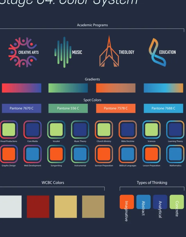
course icon design systems. Each department of the college will get its own unique color and gradient. Specific colors will also be defined for each discipline within each department.
Again Wilkinson states, “Structural characteristics of the stimulus array influence speed and, in some cases, accuracy for finding a target symbol, in children with and without [Down Syndrome]. These findings support the argument that understanding human visual processing may be critically important to constructing effective displays for aided communication” (Wilkinson 20). If color coding dramatically helped children with this learning disability connect related information together using abstract symbolism, using color coding to enhance adult learning seems that it would also be an effective way to connect abstract concepts.
The Application of Typography and Type
Classification Systems in Learning
Particularly in Creative Arts Education
of typography on design through history and its application in collegiate typographic education. The emotional communication of typography will be presented in an effort to ultimately reach past the head of the learner and impact the heart. Emotions are powerful vehicles for memories and meaningful learning and are often incorporated into effective teaching methodology.
Classification systems are a continual subject for debate by designers, with seemingly infinite combinations of categorization and evaluation. The Vox-ATypI system has been long regarded as standard, but with its last revision preceding the computer age, many have determined that it needs to be replaced or updated. Some systems are too complex to be approachable to undergraduate students studying typography for the first time, while others overlook entire groups of difficult-to-categorize typefaces completely. A new categorization system will be presented that is approachable to students while including the necessary groups and remaining true to the historical progression from Old Style Serif
typefaces to Geometric Sans-serif typefaces. In this system, the focus is placed education and therefore retains the major divisions based on serif and sans-serif, with the incorporation of scripts and display styles.
The historical context of the typefaces will also be examined and featured as a component of the organizational system to provide students with a cultural and social context for the development and even abandonment of particular styles and typefaces. The historical element is important in the educational environment and provides insight into emotional factors based on historical events and cultural factors unique to the time period in which the typeface was created.
A communicative profile for each of the seven typefaces being evaluated and represented is included below to help further define each of the classifications in the system to help students in selection and usage. Metaphor and inherent emotional connotation remain important factors in this study and in typographic usage in educational contexts.
Old Style Transitional Modern Slab Humanist Realist Geometric Formal Handwriting Blackletter Display Serif Sans-serif Script
Typeface
Classification
System
Keenan SultanikA model for classifying type families which maintains
visual classification and a historical progression
The Vox-ATypI system is well known and widely used by designers and typography educators, but its age and lack of revision since the beginning of the computer age has caused even the ATypI organization to form a special interest group to research its replacement: “ATypI members have started a Type Classification special interest group (SIG) to explore type classification” (atypi.org). With this, the classification system proposed by Robert Bringhurst in 2000 would have been the most suitable choice for the project. His system focuses on serif styles from the beginning of typography through the present. But, while this system shows a historical progression of typography, to convey the range of emotional characteristics properly, a system should be chosen or created that separates slab serifs and sans-serifs to unique categories for more precise emotional representation.
Thus, a new classification system was created which is based on the work of Ellen Lupton, a visual arts professor at the Maryland Institute College of Art, Baltimore. The divisions in this new system are as follows:
1. Serif: Old Style (Garamond) 2. Serif: Transitional (Baskerville) 3. Serif: Modern (Bodoni)
4. Serif: Slab (Clarendon)
5. Sans-serif: Humanist (Gill Sans) 6. Sans-serif: Realist (Helvetica) 7. Sans-serif: Geometric (Futura) 8. Script: Formal
9. Script: Handwriting 10. Script: Blackletter 11. Display
This hybrid system is based on the serif/sans/ script/display divisions with several subdivisions, with eleven categories in total. This would be helpful when introducing type classifications to students and demonstrating variance in emotional connotation, while also remaining true to the historical progression. For each serif and sans-serif sub-category, the representative and historically significant typeface has been provided in parentheses. The complete categorization is displayed below in the form of a pie chart consistent with the information display system
from the Parsons Journal for Information Mapping (Childers).
Typographic history represents the framework and context in which the typeface was designed. Much of the character and emotion of the era is tied with this context and likewise in the design of the typeface. While seemingly a detour from the instruction of the execution of proper typesetting, this historical context allows the typography student insight into the meaning and mindset of the typeface, which can be used to craft refined and coordinating meaning into the design as a whole.
Technology contributed much to the evolution of typography and often provided the necessity and the means for change to the industry as a whole. The creation of the printing press with standardized interchangeable type birthed the craft, which would later be refined and reborn by the monotype and linotype systems of typesetting.
The photographic typesetting process again changed the industry and introduced improved workflows for layout artists and printers while reducing the precision of the craft through the
need for only one design of a letter, rather than multiple designs at different sizes.
The personal computer enabled great
advances in typography by granting the ability for anyone to practice page layout and typesetting, while also empowering those with little skill or knowledge to propagate the poor use of the same.
Technology often dictated to typeface designers how to design or cut their specimens so that they may be compatible with the latest equipment. This resulted in typeface design drift away from the original letterforms as the typeface is redesigned for newer equipment time and time again. Continual reinterpretation of classical typefaces, the ease with which a digital font can be produced, and the lack of typographic copyright laws in the United States have
encouraged the introduction of hundreds of copies of traditional typefaces ranging from faithful interpretations to nearly satirical renderings in the marketplace, weakening the original designs.
A modern resurgence of interest in the “original” designs of classical typefaces has
been a healthy aspect of the twentieth century, encouraged by foundries like Adobe and others.
The histories of typefaces provide cultural and social insight into the inspiration and design of these typefaces and their designers. Current events, social optimism or depression, technology, the advancement of the arts, and philosophical ideologies all contribute to the development of typography and the letterform through its inherent tie with language and learning.
These brief summaries will be incorporated into the curriculum design of related courses to provide the typography student with a historical context for the development of the typeface and cultural insight into the emotions of the era and to provide the student with distinctive features of the typeface’s construction.
Old Style Serif: Garamond. Claude Garamond (ca. 1480–1561) lived in Paris, France, and worked for scholar and printer Robert Estienne during the sixteenth century. His work inspired Jean Jannon (1580-1635) to produce specimens similar to Garamond’s work, which later experienced a
revival in the early 1900’s. French Renaissance style is pronounced in Garamond, which is known for its readability and gracefulness.
Transitional Serif: Baskerville. Determined to improve that venerable Caslon typeface, designer John Baskerville (1706–1775) created Baskerville, which built on the readability of its predecessor and bridged the old style faces with the modern. Higher contrast strokes and geometric letterforms were characteristics of his typefaces which were not shared by Caslon, a humanist old style typeface.
Modern Serif: Bodoni. Vertical stress and narrow unbracketed serifs are representative of the Modern style of serif typefaces, of which Bodoni is an exemplary member. This typeface was created by Italian type designer Giambattista Bodoni (1740–1813), who borrowed the high
Technology contributed
much to the evolution
of typography and often
provided the necessity and
the means for change.”
contrast of John Baskerville’s work and the flat serifs of the Romains du Roi, a typographical remnant of the Age of Enlightenment.
Slab Serif: Clarendon. Robert Besley (1794– 1876) designed Clarendon, named after the Clarendon Press at Oxford and the first registered typeface, for Thorowgood and Co. in 1845. This Egyptian, or slab serif, typeface gained quick popularity and has been used by governments and companies since, including the German Empire during World War I, AAA auto club, Sony, and the US National Parks Service.
Humanist Sans-serif: Gill Sans. Eric Gill (1882–1940) worked as an engraver, calligrapher, and sculptor in the United Kingdom. He designed Gill Sans in 1928, drawing inspiration from signage of the London Underground Railway. Originally, this typeface only included uppercase glyphs, with the lowercase letters not added until the following year.
Transitional Sans-serif: Helvetica. Swiss designer Max Miedinger (1910–1980) created Helvetica in 1957 as an alternative to
Akzidenz-Grotesk. Clarity of the letterform and ambiguity of intrinsic meaning were strong goals for the project, which resulted in Helvetica being created in the Haas type foundry of Münchenstein, Switzerland. Its high legibility and nondescript features have encouraged its use in way-finding signs, in modern graphics, and in corporate branding.
Geometric Sans-serif: Futura. German
Designer Paul Renner (1878–1956) created Futura, a geometric sans-serif typeface, in 1927 with three weights. Additional weights were added to the family over the next few years. The design of Futura, based on simple geometry and inspired by Bauhaus designers, features limited contrast and even widths to produce a modern interpretation of the alphabet.
Connotations, formed by taking concepts from one “domain” and mixing them with concepts from another. This provides “meaning potential” and affects (along with contextual usage) ultimate meaning. The structures and design of typefaces definitely produce an emotional response that may be defined and evaluated. One researcher states,
“Because people reported similar emotion response to the design features, this study suggests that design’s underlying features represent a common visual language” (Koch 1). Designers have intuitively known this since the beginning of textural
illustration and graphic design. One may say that a typeface is suitable or unsuitable for a particular usage. The ‘suitability’ of a typeface suggests that its design inherently communicates something that either matches or contradicts the visual communicative qualities of the rest of the design.
The concept of metaphor is very important in understanding the emotional significance of typography. “Not all typefaces can be understood on the basis of connotation, because it is not always possible to ‘place’ typefaces, to understand them on the basis of ‘where we have seen them before,’ ‘where they come from.’ In that case another semiotic principle can nevertheless provide meaning, the principle of metaphor, or, more precisely, of the metaphoric potential of specific features of letterforms” (Van Leeuwen 140). In Koch’s study on the emotional response
to typography, she states that “culture, visual trends and even age” (Koch 4) play a part in the emotional conveyance and were factors evaluated in her study. These metaphors provided a context for visual communication in education.
The educational importance of such concepts are growing ever more significant as the students’ exposure to powerful layout and text tools become increasingly more common. When the personal computer brought desktop publishing to non-professionals, society’s need for increased typographic literacy increased exponentially. As professional layout tools and font creation software have become more accessible, the need to educate in typography must become more prominent. “As the means for typographic expression have now become accessible to everyone who uses a word processor, teaching typographic literacy should also become an integral part of teaching writing, at all levels, and this inevitably requires the development of concepts and methods” (Van Leeuwen 142).
Iconographic Design Principles and
Specific Application
The scope of this project is larger than the icons themselves. By incorporating meaning through basic shapes, colors, and visual styles, this project requires development of a more comprehensive design system. Sean Hodge of Envato puts it this way: “Icons fit within graphic systems. Whether they are designed for desktop applications or Web sites, an icon is one of many graphic elements that need to work together harmoniously” (Hodge 1). The design system created for this project should be varied enough to make visual distinctions between the three different disciplines of the Visual Arts program while at the same time making the entire program feel unified and connected.
The intended audience should always be taken into account when working on a visual design project. The target audience for this project is very specific—college students enrolled in the Visual Arts program at West Coast Baptist College. Symbols are interpreted differently depending on the audience. “When creating icons, cultural
considerations are important. Symbols may differ for common elements you may use for your designs” (Hodge 2). Symbols carry different meaning based on experience and culture. One application of this principle in the project would be to choose varying shapes that can be easily distinguished from a distance and not associated with other well known symbols.
Proportion in icon design is also important. Icons can vary in complexity and detail based on the size at which they will be viewed. The intended visual style for this project has always included a high level of detail from the beginning, which in turn necessitates display at larger
proportions. The logos will appear large on screen graphics and in print to show off the detail of the designs. They are to never be used as bulletin points or reproduced smaller than one inch in print. “If you go vector and make your icon in Illustrator, there is an inherent temptation to scale the design, and try to use it at any size… The approach taken for small icons and large icon design is immensely different” (Hodge 3).
When designing iconic symbols, there has to be a balance between visual complexity and the speed at which the symbols can be recognized. Simplicity is key, but detail is also necessary to maintain a connection with reality rather than letting the symbol slip into total abstraction. Recognition speed is a more important factor in situations where the viewer has limited time to observe and understand the symbol, such as in wayfinding icons. The author at Envato says, “There are times when the aesthetic interest of the icon may be worth losing some of its iconic impact. it’s always a judgment call, and needs will vary with each design…It requires a judgment, though, as to whether the loss of some of the quick recognition of the symbol is worth the added design around the symbol” (Hodge 4). Because the context of this project is a controlled classroom environment (speed of recognition is less of a factor) and the repetitive nature of the viewing (students are viewing the design elements over the course of an entire semester), the designs for this visual system may be more complex.
Because of the realism in the intended visual style of the icons (multi-colored with gradients rather than primarily one-color), consistent use of shadows, highlights, and shading is required to maintain a level of detail. “It’s important that the realism you add to your designs all function coherently. If you use a light source coming from one direction then stick with it or you risk losing the integrated design of your icons” (Hodge 5). Because of this, the icons in the set will have consistent use of gradients and shadowing, while one-color varients will provide the set with the flexibility needed in a range of contexts.
While this may seem obvious, the angle and perspective of the icons must be consistent to provide uniformity to the presentation. A limited perspective must be maintained. “If you place one at a specific angle, then make sure all the icons function that way. Imagine a camera being placed from a specific vantage point and looking at all the objects from the same perspective. This helps to maintain consistency in your icon designs” (Hodge 6). For this project, the designs of the icons will
be rendered straight-on to provide consistency with the surfaces on which the icon will be viewed (flat slides and flat pieces of paper) making the application of this principle straightforward.
The visual style must be carefully maintained through the entire set to make them appear to function in unity. Hodge states, “Lighting and Perspective certainly contribute to the style of an icon, though there are many other factors that can contribute to the style as well” (Hodge 6). One of the important elements of visual style in this project is the use of gradients to add visual interest along with simple outer shapes which provide clarity when viewed at smaller sizes or from great distances. This will help create depth and uniformity though the icons are colored differently. The colors and base shapes will be unique to each department and discipline.
The Application of Visual Theory in the
WCBC Visual Arts Identity System
Integrating and leveraging visual literacy into the Visual Arts program and corresponding identity
system is important, if for no other reason than to educate students to become visually literate. By introducing them to a comprehensive design system, they will begin to understand how design systems work and be able to apply the theory to their own school projects and professional work after graduation. By teaching students the meaning of the design system for the Visual Arts program, they will begin to interpret other design systems and hopefully be able to create their own.
By using the visual identity system created through this project throughout the Visual Arts program at West Coast Baptist College, students should begin to associate abstract concepts together to synthesize knowledge in a more comprehensive way that before, connecting what they learned about a topic in one class with something from another class along similar lines. Consistent use of colors, shapes, and other branding elements should help to improve the learning environment and aid their brains in the creation of new neural pathways.
design systems, there are certain design principles that must be adhered to for best practices. The first consideration examined above is that of the audience. As college students are used to a stimulating level of complexity, the designs may be more complex (both in visual style and in meaning) than that which would be ideal for the general public. The next consideration is that of the icons’ proportion and scale. Because they will be viewed larger than most icons based on the context of screen graphics and printed documents, they may also exhibit an increased level of visual and meaningful complexity. The heart of the identity system is communication. If the designs fail to communicate the programs and courses they are intended to communicate, their use is irrelevant. The shapes chosen as frames for the icons are different enough so as to be easily distinguishable at a distance. The color schemes were also selected to be easily discerned among the others. Value, color, and accompanying text placement must all be consistent to maintain the visual style and be believable when placed directly
next to each other. A limited perspective (straight-on in most situati(straight-ons) also helps with this.
Utilizing visual literacy within the Visual Arts program and corresponding identity system is important to assist students in becoming visually literate and will also serve as a model for the other departments’ brand identities to form a more universal system. By introducing students to a comprehensive design system, they will begin to understand how design systems work and be able to design similar systems for their own school projects and professional work after they graduate. By using the visual identity system created through this project throughout the Visual Arts program at West Coast Baptist College, students should begin to associate abstract concepts together to synthesize knowledge in a more comprehensive way that before, connecting what they learned about a topic in one class with something from another class along similar lines. Consistent use of colors, shapes, and other branding elements should help to improve the learning environment and aid their
brains in the creation of new neural pathways. The colors for each discipline of the Visual Arts program (green for Visual Productions, blue for Web Development, orange for Graphic Design, and purple for Foundational Media) were chosen to be easily distinguished from each other, along with some other factors. The following describes the qualities that each color possess or communicates. Purple is vibrant and thoughtfully reflective in nature. It is said that purple is associate with creativity and creative individuals. This color was chosen for the Foundational Media courses where students are first exploring the idea of creativity and learning the tools necessary to express their own creativity. Green conveys a sense of life and growth and motion. The idea of life leads to the idea of a story. This color of growth and story was selected for the Visual Productions track, which focuses on video production, photography, and audio. Blue is the color for the Web
Development track and exhibits a sense of calm and logical, rational existence—appropriate for the most technical track in the program. Orange
communicates passion, energy, and boldness. This color was chosen to represent the Graphic Design track. All of these concepts help to inform the design process. These specific applications of visual theory make the accompanying designs more effective as tools of the educational process and integrate visual literacy and theory into WCBC’s Visual Arts program. In addition to teaching more effectively, students will be more visually literate.
Visual design systems can indeed promote learning by tapping into the visual processing ability of the human mind and allow students in the college classroom to more accurately synthesize knowledge and abstract concepts presented through slides, handouts, and other materials that are part of the learning process. Visual literacy is an important component, because students must first know that something is significant before they can understand the meaning and purpose behind it. Learning theory strongly indicates that the use of visuals is not only helpful but essential to the more permanent conveyance of information in an educational
setting. The icons themselves can serve as these visuals in this design system and allow students to attribute what they are learning as a piece of the whole just as the icon of their current class is a piece of the entire design system.
Color is key to connecting concepts and will be used heavily to separate concepts and tracks of the program. Icons must be designed and there are design principles to govern and guide the creation process. While the designs accompanying this research are more visually complex than most icons, the proportion at which they will be viewed and their intended audience allow for this as is explained above. In addition to providing a system to students in which learning can be more effective, the intent of this visual design system is that through its promotion, students will learn how to create their own comprehensive design systems and to think of design more holistically than is considered with a single isolated project.
The primary benefactors of this project would be divided into two distinct groups. The first group would include teaching faculty, particularly
those at West Coast Baptist College. For this project to achieve long-term success, it has to be adopted by faculty and it has to produce positive and obvious results in addition to being easy to implement in the course design.
Students will also be impacted by the results of this visual learning system as they will benefit from the design system’s implementation in their classroom and digital learning environments.
Research Implications
This project has great potential to launch higher education into the 21st century with the integration of visual design systems and the use of technology to enhance the student learning experience and promote higher levels of student learning. The administration of the institution at West Coast Baptist College is interested in using the results of this project as a set of codified visual design standards for the college’s faculty that could aid course design, preparation, and instructional design. In addition, the institution plans to adopt the visual designs produced in this project as a set of
templates to bring the visual communication of all of the faculty up to a unified standard.
Because education has changed so little over time, research in visually enhanced learning and interactive design systems will inform the creation of a set of standards to aid the adoption and utilization of visual design and interactive experiences in educational environments to modernize education at large and promote higher levels of student learning.
Research data has been collected and explored to define the connection between the use of graphic and interactive design and the level and effectiveness of student learning. The following research methods explore and illustrate how effective educators are utilizing technology and visuals within and without the classroom and how students associate information through relationships of color, shape, form, hierarchy and other visuals. The primary goal of the research is to establish a set of guidelines for the evolution of education in the adoption of modern visual and interactive design systems to better engage a new
generation of learners and specifically apply these standards through a brand identity system for the Visual Arts program of WCBC.
Another aim of the research for this project was to discover the weaknesses/absence of current visual communication in the classroom from both groups of stakeholders and define what types of design would be most effective to bring learning in educational environments to the next level. Also, a set of standards would have to be codified into a list of guidelines (serving as a reference and implementation guide) for faculty to follow in the adoption of visual design into their courses.
Research Method 1: User Personas for
Thesis Website and Distribution of the
Final Deliverable
Written personas were used to answer the following research question: “What are existing pain points in online and in-classroom visual communicative methods and how could students be educated on their own personal learning styles and the use of the visual system used by their instructors?” The
personas below are fictional characters who will provide empathetic insight into the motivations, behavior, and needs of the typical user. Some fictional background is provided to give context and understanding into the background of the target audience. Along with a written persona representing the faculty and the students, a chart has been included for each containing a flowchart visualizing the website usage and discovery process of a faculty member seeking to improve visual aids in the classroom and one visualizing a student seeking to understand the visual learning system used in the classroom. These personas will guide the design and usability of the website.
The personas below are fictional characters who will provide empathetic insight into the motivations, behavior, and needs of the typical user. Some fictional background is provided to give context and understanding into the background of the target audience.
The first persona will be for Dr. Philip Stevens, a college faculty member, age 55, with 10+ years of teaching experience. Dr. Stevens,
carrying several advanced degrees, is an expert in his field and tries to connect with students in the classroom but is often met with students’ lack of attention, lack of knowledge retention, and lack of motivation to learn the material despite Dr. Sevens’ efforts. He is looking for new methods of presentation to use in his classroom to better connect with a generation that is often defined by visual stimuli. Dr. Stevens is not very comfortable using a computer for more than composing email, writing documents, and preparing slide presentations and may need additional instruction and help in implementing the visual design system he seeks. He will be motivated to visit the project’s website to discover resources that could improve his teaching potential, which he sees as his life’s work, thus elevating the importance of improvement in this area.
The second persona is Hannah Martins, a 20-year-old sophomore in college with a desire to learn but who is often distracted by social media when trying to pay attention in class, while studying for exams, and while working on related
research projects. She wants to improve her GPA but fails to connect with the teaching style of the learning environment and sometimes considers dropping out of college thinking that higher education is simply not for her. Martins would be motivated to visit the project website with the desire to understand the visual design system that the professor is using in class and her own personal learning style (and how to capitalize on it) to a greater degree. She might be connecting with the class more now that the visual design system is being employed and wants to more fully understand the system and perhaps how to utilize it herself in her own teaching/presentation opportunities. As a “digital native,” someone who was raised with the Internet and prolific digital devices, she is familiar with digital interfaces and websites, but the educational concepts and motivations behind the visual design system would need to be explained for her to understand that different people learn in different ways and how the use of technology can help cater to a wide variety of learning styles effectively. Knowing
what her learning style is would also help her study more effectively by taking advantage of the resources available to her specific style.
Both of these personas forced the designer to think in the perspective of a member of both groups of stakeholders. These perspectives brought to light certain key shortcomings of the website that were previously unconsidered and will positively inform the final design of the thesis website with the goal of making it functional and beneficial to both groups simultaneously.
Research Method 2: Case Studies
into Visual Design Systems in
Educational Environments
This research method answers the second research question, “How are effective communicators
utilizing visual and interactive design in educational environments?” In this component of the research, information was collected on (and then analyzed) case studies of effective presenters who used design as a key component of education, college faculty in other institutions who are using visual design
as instructional instruments to promote higher forms of learning. Observations will be made as to the components that made cases successful or unsuccessful. Conclusions will be drawn from the case studies and application will be made in the form of itemized lists of best practices included at the end of each as drawn from the study.
Study 1: A Case Study on Steve Jobs
and Presentation Technique
Steve Jobs was the epitome of success within the technology industry, but unlike most technology entrepreneurs, his every word was studied by the masses. His presentations launched products that created and redefined entire industries and were sought after by millions. Why was Jobs such a brilliant presenter? Could his techniques and presentation style be adapted for use in education to better connect with students and effect higher levels of learning through visuals and interactive media? The following case study will explore this.
Steve Jobs is the subject of this case study because of his captivating presentation style and
his ability to connect deeply with his audience, effecting change in perspective and action in the lives of those present. His technique and presentation principles will be explained, analyzed, and interpreted to show how they can be applied to education for a better rate of comprehension and higher levels of learning with a longer-lasting impact on students.
When considering the best presenters, one must think of Steve Jobs. His presentations have captivated audiences and shifted entire industries. When the iPad was first introduced, industry analysts said that it would not catch on because it served too niche of a purpose. Steve Jobs presented it as a computer for everyday tasks and consuming media and information with power and persuasion. Today, all one must do to see the effect of his presentation is to walk through an airport and count the number of people using iPads. This long-lasting, meaningful, and change-effecting impact is the goal of any passionate educator, and yet, so many teachers fail to connect with a portion of their students.
Jeff Black, founder of Black Sheep, a company specializing in leadership development, told CNBC that Steve Jobs’ presentation success stemmed from three points: powerful storytelling, an emotional connection, and obsessive preparation. He also said, “What Steve Jobs did brilliantly is he just put pictures or a word, and it was just enough to ignite what he wanted to say” (Mejia).
These three points will be examined and a set of guidelines will be presented to show how Jobs’ powerful techniques can be applied to an educational environment through the establishment of best practices based on this study.
Powerful storytelling was always a cornerstone of Jobs’ presentations and product releases. He would tell the story of its development and then directly insert the new product into the lives of the audience by telling stories of how it might open new possibilities and solve problems that they did not even knew existed. When educators teach, it should be with the thought that what is being presented could and will change the lives of the students present rather than simply “conveying knowledge”