Visualisation Support for Biological Bayesian Network
Inference
A thesis
submitted in partial fulfilment
of the requirements of
Edinburgh Napier University,
for the award of
Doctor of Philosophy
by
Athanasios Vogogias
Edinburgh Napier University
August 2019
Abstract
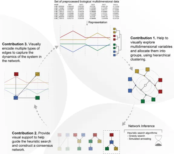
Extracting valuable information from the visualisation of biological data and turning it into a net-work model is the main challenge addressed in this thesis. Biological netnet-works are mathematical models that describe biological entities as nodes and their relationships as edges. Because they describe patterns of relationships, networks can show how a biological system works as a whole. However, network inference is a challenging optimisation problem impossible to resolve compu-tationally in polynomial time. Therefore, the computational biologists (i.e. modellers) combine clustering and heuristic search algorithms with their tacit knowledge to infer networks. Visual-isation can play an important role in supporting them in their network inference workflow. The main research question is: “How can visualisation support modellers in their workflow to infer networks from biological data?”To answer this question, it was required to collaborate with com-putational biologists to understand the challenges in their workflow and form research questions. Following the nested model methodology helped to characterise the domain problem, abstract data and tasks, design effective visualisation components and implement efficient algorithms. Those steps correspond to the four levels of the nested model for collaborating with domain experts to design effective visualisations. We found that visualisation can support modellers in three steps of their workflow. (a) To select variables, (b) to infer a consensus network and (c) to incorporate information about its dynamics.
To select variables (a), modellers first apply a hierarchical clustering algorithm which produces a dendrogram (i.e.a tree structure). Then they select a similarity threshold (height) to cut the tree so that branches correspond to clusters. However, applying a single-height similarity threshold is not effective for clustering heterogeneous multidimensional data because clusters may exist at different heights. The research question is: Q1“How to provide visual support for the effective hierarchical clustering of many multidimensional variables?”To answer this question, MLCut, a novel visualisation tool was developed to enable the application of multiple similarity thresholds. Users can interact with a representation of the dendrogram, which is coordinated with a view of the original multidimensional data, select branches of the tree at different heights and explore dif-ferent clustering scenarios. Using MLCut in two case studies has shown that this method provides transparency in the clustering process and enables the effective allocation of variables into clusters.
Selected variables and clusters constitute nodes in the inferred network. In the second step (b), modellers apply heuristic search algorithms which sample a solution space consisting of all
possible networks. The result of each execution of the algorithm is a collection of high-scoring Bayesian networks. The task is to guide the heuristic search and help construct a consensus net-work. However, this is challenging because many network results contain different scores pro-duced by different executions of the algorithm. The research question is:Q2“How to support the visual analysis of heuristic search results, to infer representative models for biological systems?” BayesPiles, a novel interactive visual analytics tool, was developed and evaluated in three case studies to support modellers explore, combine and compare results, to understand the structure of the solution space and to construct a consensus network.
As part of the third step (c), when the biological data contain measurements over time, heuris-tics can also infer information about the dynamics of the interactions encoded as different types of edges in the inferred networks. However, representing such multivariate networks is a challenging visualisation problem. The research question is: Q3 “How to effectively represent information related to the dynamics of biological systems, encoded in the edges of inferred networks?” To help modellers explore their results and to answer Q3, a human-centred crowdsourcing experi-ment took place to evaluate the effectiveness of four visual encodings for multiple edge types in matrices. The design of the tested encodings combines three visual variables: position, orienta-tion, and colour. The study showed that orientation outperforms position and that colour is helpful in most tasks. The results informed an extension to the design of BayePiles, which modellers evaluated exploring dynamic Bayesian networks. The feedback of most participants confirmed the results of the crowdsourcing experiment.
This thesis focuses on the investigation, design, and application of visualisation approaches for gaining insights from biological data to infer network models. It shows how visualisation can help modellers in their workflow to select variables, to construct representative network models and to explore their different types of interactions, contributing in gaining a better understanding of how biological processes within living organisms work.
Table of Contents
Acknowledgments v List of Figures 1 List of Tables 9 1: Introduction 10 1.1 Biological Networks . . . 111.2 Network Inference Workflow . . . 12
1.3 Biological Analysis Challenges . . . 13
1.4 Research Questions . . . 14 1.5 Contribution to Knowledge . . . 15 2: Background 18 2.1 Domain Scientists . . . 18 2.2 The Data . . . 19 2.3 Visualisation . . . 22 2.3.1 Biological Visualisation . . . 23 2.3.2 Visual Analytics . . . 24
2.4 Visualisation Design Methodology . . . 25
3: Related Work 31
3.1 Hierarchical Clustering Analysis . . . 31
3.1.1 Visualising Dendrograms . . . 32
3.1.2 Cutting the Dendrogram . . . 33
3.1.3 Representing Multivariate Data . . . 36
3.2 Network Inference . . . 39
3.2.1 Bayesian Networks . . . 40
3.2.2 Exploring and Comparing Networks . . . 42
3.3 Multivariate Network Analysis . . . 46
3.3.1 Dynamic Bayesian Networks . . . 46
3.3.2 Visualising Multivariate Networks . . . 48
3.4 Summary . . . 51
4: Exploring Multi-Level Cuts in Dendrograms with MLCut 53 4.1 Domain Problem Characterisation . . . 54
4.2 Requirements . . . 55
4.3 Design and Implementation . . . 57
4.3.1 Design Process . . . 57 4.3.2 Dendrogram Design . . . 58 4.3.3 Dynamic Sliders . . . 60 4.3.4 Coordinated Views . . . 62 4.3.5 Releases . . . 64 4.4 Evaluation . . . 64 4.4.1 Clustering SNPs to Chromosomes . . . 65
4.4.2 Clustering Time-series Gene Expression Data . . . 66
4.5 Summary of Contribution . . . 67
5: Bayesian Network Inference with BayesPiles 68 5.1 Domain Problem Characterisation . . . 69
5.2 Tasks . . . 70
5.3.1 Exploring Hundreds of Scored Directed Networks to Support T1 . . . 75
5.3.2 Importing and Ordering Multiple Network Collections to Support T2 . . 76
5.3.3 Group and Compare Networks to Support T3 . . . 78
5.3.4 Graph Filtering of Nodes and Edges to Support T4 . . . 80
5.3.5 Viewing Outgoing Edges of Nodes in Multiple Networks to Support T5 . 81 5.3.6 Manual Consensus Network Construction to Support T6 . . . 81
5.4 Evaluation . . . 82
5.4.1 Brain Regions on Songbird . . . 82
5.4.2 Genes and Brain Regions on Rats . . . 83
5.4.3 Gene Clusters on Ovarian Cancer Cells . . . 86
5.4.4 Subjective Feedback . . . 88
5.5 Summary of Contribution . . . 89
6: Visual Encodings for Edges in Matrices 92 6.1 Domain Problem Characterisation . . . 93
6.2 Tasks . . . 94
6.3 Encoding Multiple Edges in Matrices . . . 95
6.3.1 Matrix Cell Designs . . . 96
6.4 User Study . . . 99 6.4.1 Data . . . 99 6.4.2 Questions to Participants . . . 100 6.4.3 Hypotheses . . . 102 6.4.4 Experimental Procedure . . . 104 6.5 Results . . . 106
6.5.1 Task 1 - Cell with Most Marks . . . 109
6.5.2 Task 2 - Most Frequent Mark . . . 110
6.5.3 Task 3 - Most Frequent Mark Pair . . . 111
6.5.4 Task 4 - Matrix with Most Cells of a Mark Type . . . 112
6.6 Integration into BayesPiles and User-Centred Evaluation . . . 114
6.6.2 Evaluation . . . 116
6.6.3 Results . . . 118
6.6.4 Qualitative Feedback . . . 119
6.7 Summary of Contribution . . . 120
7: Conclusions and Future Work 121 7.1 Contribution 1: Hierarchical Clustering with MLCut . . . 122
7.2 Contribution 2: Inferring Networks with BayesPiles . . . 124
7.3 Contribution 3: Matrix Representations for Networks with Multiple Edge Types . 128 7.4 Contribution Summary . . . 133
References 134
Appendix A: GitHub Repositories 154
Acknowledgments
I would like to thank Edinburgh Napier University for funding my research. Also, I would like to thank the School of Computing for providing technical support, office space to work as well as space for collaboration and exchange of ideas with colleagues. I would like to express my sincere gratitude and deep appreciation to my supervisors Prof. Jessie Kennedy and Dr Daniel Archambault for their guidance and insightful mentoring, for motivating me and for helping me to grow as a researcher. Without their invaluable support, I would not be able to overcome difficulties and achieve my research goals. Also, I would like to thank all my collaborators, and especially Dr Anne Smith, for believing in the value of my research and for their continuous engagement and enthusiastic interest in applying my visualisation methods to their biological data. Without their feedback, my research would be meaningless. I would like to thank Dr Benjamin Bach for the inspiration, his comments and his generous assistance during our collaboration in the second half of my PhD. Finally, I would also like to thank my fellow PhD students for their companionship in this long and often lonely journey of scientific inquiry and my family and friends that always stand by me tolerating my ignorance. Their patience and love overwhelm me with satisfaction and joy.
List of Figures
1.1 The workflow that describes the process of network inference with the three anal-ysis challenges highlighted. Step (a): reduce the number of variables, Step (b): guide the heuristic search and construct a consensus network and Step (c): incor-porate the dynamics about the system in the network model. . . 13
1.2 The visual analysis circle that describes the contributions of this thesis for inferring biological networks from multivariate data. . . 16
2.1 The flow of data in the three steps of modellers’ workflow: (a) variable selection through hierarchical clustering (HC), (b) network inference and (c) incorporating the dynamics of interactions. . . 21
2.2 (a) The visual analysis loop. (b) The visual data-exploration loop [102]. . . 24
2.3 The sense-making loop for Visual Analytics [102]. . . 25
2.4 Sense-making model for exploring molecular level influences on disease-related processes [130]. . . 26
2.5 The four levels of the nested model. In the first level, the domain problem is characterised and understood. In the second level, data and tasks are abstracted and clarified. In the third level, the visual encoding and the interaction technique are designed. In the fourth level, an efficient algorithm for manipulating the data is designed. [132]. . . 28
2.6 Threats and validation in the nested model [132]. . . 29
2.7 The task clarity and information location axes as a way to analyse the suitability of design study methodology. Green and yellow areas mark regions where design studies may be the wrong methodological choice [159]. . . 30
3.1 The flow of constructing the dendrogram. Pairwise dissimilarities between data records are calculated and used by the hierarchical clustering algorithm to con-struct a dendrogram. The branches A and B correspond to clusters. . . 32
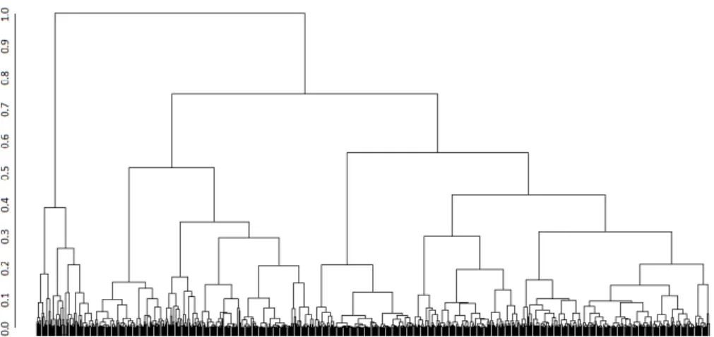
3.2 A traditional top-down representation of a dendrogram generated using R. The axis on the left shows the dissimilarity levels ranging between 0 (leaves) and 1 (root). . . 33
3.3 Different tree layouts as presented by McGuffinet al. [124]. (a) node-link, (b) a variation on (a) to support long labels, (c) icicle, (d) radial, (e) concentric circles, (f) nested circles, (g) treemap and (h) indented outline. . . 34
3.4 Multi-level cuts in a heterogeneous dendrogram. The red icons indicate four lo-cally applied similarity thresholds which cut the tree in four branches that form the same number of non-overlapping clusters. This clustering scenario could not be achieved using any single-height similarity threshold. . . 35
3.5 Applying brushing technique in Timesearcher software to specify time pattern [89]. 37
3.6 Time-series represented in 3D with TIALA [94]. . . 37
3.7 Using animated scatterplots to identify patterns in temporal data using MaTSE [50]. 38
3.8 Visualisation of ranking changes in large time-series data with RankExplorer [164]. 38
3.9 Screen-shot of MAVisto analysing a transcriptional regulatory network of Saccha-romyces cerevisiae with different perspectives to explore motifs. On the left-hand side, the network is shown with the motif-preserving layout of highlighted matches of the feed-forward loop motif. On the right-hand side, all discovered motifs can be further analysed. Detailed information is presented in the motif table (top), the structure of the currently active motif is displayed in the motif view (middle) and the motif frequency spectrum is shown in the motif fingerprint (bottom) (as found in Schreiberet al.[158]). . . 43
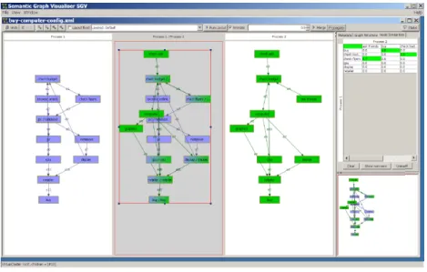
3.10 The Semantic Graph Visualizer (SGV) comparing two process graphs representing workflows involved in buying a computer. (as found in Andrewset al.[10]). . . 44
3.11 (a) CompNet canvas displaying the union of eight protein-protein interaction net-works. The names of nodes belonging to different communities are marked with different colours. (b) The ‘pie-nodes’ representation enables to identify the pres-ence/absence of individual nodes across the compared networks. (c) The cumula-tive community distribution plot (d) Bubble chart representing similarity between networks (e) Hierarchical tree built using network similarity (as found in Kuntal et al.[108]). . . 44
3.12 Small multipiles (i.e. MultiPiles) create lists (piles) of similar dense graphs in a time line, visualised using the technique of adjacency matrix. Larger piles indicate longer occurrences of the graph in the time line [18]. . . 45
3.13 The traditional representation of a DBN with edges connecting nodes in different time-slices. Edges that show self-correlation have been removed to create a more clear diagram. Self-correlation edges create a feedback loop that starts and finishes in the same node. . . 47
3.14 A PivotGraph visualisation of a large graph rolled up onto two categorical dimen-sions [189]. . . 48
3.15 Multivariate network exploration using selections of interest, detail view (left) and high-level infographic-style overview (right) [177]. . . 49
3.16 Alternative superimposed (a) matrix and (b) node-link visualisations supporting weighted graph comparisons [9]. . . 50
3.17 Exploration of the InfoVis 2004 Contest co-authorship data set using GraphDice. On the left is the main visualisation window of GraphDice including (a) an overview plot matrix, (b) a selection history tool, (c) a selection query window, (d) the main plot, and (e) a toolbar [31]. . . 51
4.1 A picture showing two of the handwritten cards after a card sorting session with one of the participants. . . 55
4.2 Pictures from the second card sorting session. New requirements and requirements found in the first session were grouped based on their relevance. . . 56
4.3 Dendrogram displayed in an earlier version of MLCut using a version of the top-down node-link tree layout. This dendrogram layout is suitable for identifying clusters and outliers based on the length of the branches. . . 59
4.4 A summary of the visual encodings used for representing the dendrogram in MLCut. 59
4.5 Texture added to data records that have been double-clicked. Those records will remain highlighted (“locked”) in the interface and not affected by any cluster se-lection. . . 60
4.6 Dynamic query sliders in use. The top slider in II sets the similarity threshold and the bottom slider in III sets the distinctiveness threshold. . . 61
4.7 Three sub-clusters of genes (A, B and C) that exhibit distinctive time patterns. Each sub-cluster belongs to a larger main cluster, visually encoded using colour. . 63
4.8 A screenshot from TetraploidSNPMap showing MLCut as an integrated clustering component [82]. . . 65
5.1 (a) A “rainbow” consensus network of 10 networks superimposed, shown in Graphviz [65]. This is the most dense network analysts can currently handle. (b) A denser consensus network which is almost impossible to read. . . 72
5.2 Some of the sketches drawn and discussed during our meetings with the compu-tational biologists. The first six sketches show unrefined encoding ideas of the solution space and the last three sketches are concerned with encoding directed networks in matrices. . . 73
5.3 A screenshot of MultiPiles [18] showing four piles of networks represented as adjacency matrices. The interface was extended in BayesPiles to provide visuali-sation support for tasks related to Bayesian network inference. . . 74
5.4 The two linked views of BayesPiles. (a) Overview of 99 networks produced in five runs and shown as summary columns. Different colours indicate different runs. (b) A histogram with the distribution of scores. By hovering over each bar, details such as the computed score value, the run ID and the iteration appear as a tooltip. (c) Initially, the consensus pile is empty. Piles 1-5 contain networks from the five different runs and shown using the top-down mode. Opacity encodes the weight of each edge (cell) in piles of superimposed networks. Opacity is also used to summarise the out-degrees which except the overview also appear at the top edge of each pile. . . 75
5.5 Directed versus undirected node-link and matrix representations. (a) Node-link representation of a directed network. (b) The same directed network as encoded in top-down mode. Rows encode incoming edges and columns outgoing edges resulting in an adjacency matrix that is not symmetric. (c) The out-degree of each node as encoded using opacity in a summary column. (d) Node-link representation of an undirected network. (e) The undirected network shown in skeleton-mode resulting in a symmetric adjacency matrix (MultiPiles visualisation method). (f) The degree of each node as encoded using opacity in a summary column. . . 76
5.6 Node reordering improves network comparison and pattern recognition in matri-ces. (a) Five piles in skeleton mode before applying node reordering. (b) The same five piles after node reordering. (c) It is easier to spot differences such as an edge which is only missing in the second pile from the left (in last row and third column). . . 77
5.7 The evolution of the design for comparing edges of opposite directions. Interme-diate design options created ambiguities and visual artefacts because of adjacent neighbouring edges. In the final design (diamond mode), only the (top and bot-tom) triangles that encode the opposite directions (in and out respectively) appear adjacent. . . 79
5.8 Interactively comparing piles. (a) Top-down mode highlights differences in addi-tion and removal of edges. (b) Diamond mode highlights change in direcaddi-tion of edges between piles. In both modes, it becomes evident that the hovered consensus pile is more similar to piles 1, 2 and 4 and less similar to piles 3 and 5. . . 80
5.9 Comparing representations that show the outgoing edges from a selected node across a collection of networks. (a) Showing outgoing edges from node 3 in 4 networks using a node-link diagram in which networks are superimposed and en-coded using different colours. The resulting visualisation is already hard to read. (b) For the same task, a matrix-based representation, similar to a heatmap, is much more scalable. Opaque rectangles indicate the existence of an edge in a network and blank rectangles indicate its absence. (c) Users can hover over the label of a node (here var16) and all outgoing edges will appear in the column summaries across all networks of multiple runs (here there are 99 networks in total). Interest-ing patterns may appear. For instance, the analyst can observe that the edge from var16 to var6 does not appear in any of the networks found by runs 3 (blue) and 5 (pink). . . 81
5.10 The hill-climbing pattern consistently appearing in five repetitions of the search. (a) Summary of networks when ordered by score. Networks of the same score are piled. (b) Piles shown in the top-down mode. Fully opaque edges show that all five runs produced identical results. (c) The outgoing edges for var2 look the same across all runs when networks are ordered based on their run ID. A smooth asymp-totic curve appears in the histogram of their scores, indicating a hill-climbing pattern. 83
5.11 (a) The even length of score bars together with the solid opacity of column sum-maries in skeleton mode suggest that networks 12-45 belong to the same equiv-alence class. (b) However, using the diamond mode reveals that there is a lot of variation in the directionality of edges within and across piles. . . 84
5.12 Flexible edge filtering. By moving a slider, users can interactively filter out edges from the consensus network and all other piles. Filtering out edges that appear in fewer networks contributes to the construction of a more reliable and reproducible consensus network. In other words, users are enabled to identify and control which edges to include based on how consistently they appear in high-scoring networks. 85
5.13 Comparison between the final BN model found by BANJO without BayesPiles with the one constructed after using BayesPiles. (a) The top-scoring network found by BANJO. (b) The same network as shown in skeleton mode. (c) The consensus network constructed manually by the analyst using BayesPiles. Users not only can gain control over the process of consensus network construction but also, they can visualise uncertainties about edges (shown in lower opacity). . . . 86
5.14 Results from five search attempts finding Bayesian networks in gene clusters of ovarian cancer cells. (a) User interface controls. (b) A summary of outgoing edges for var41 in five collections of thirty networks each. (c) Networks grouped in five piles and juxtaposed. The column that corresponds to var41 in each pile (manually labelled) appears darker indicating a high out-degree for var41. (d) Differences between the first and the other four runs are shown in the blue and red cells which correspond to edge additions and removals. . . 87
5.15 An overview of the workflow. BayesPiles visualises the results of heuristic search algorithms, informs their parameter settings and enables the construction of a con-sensus network structure. . . 90
5.16 A snapshot of BayesPiles taken during the interactive construction of an average consensus network. . . 91
6.1 (a) A DBN visualised as a multivariate node-link diagram and in (b) as a multi-variate matrix. . . 95
6.2 Examples of visual designs considered for encoding multiple types of edges in matrices. The top row shows an example of a single matrix and the bottom row shows the encoding for each ML type. The encodings use one or more visual variables to represent multiple edges: a) uses a coloured pie chart, b) uses opacity in a pie chart, c) uses a segmented and coloured pie chart d) uses orientation, e) combines position and colour, f) uses size and g) combines size and colour to create a glyph. . . 97
6.3 Proposed visual encodings for the different types of edges (MLs) tested in the user study: a) orientation without colour (ORI), b) orientation with colour (ORI+COL), c) position without colour (POS) and d) position with colour (POS+COL). Columns (i), (ii), (iii) and (iv) show the encoding of edge types ML0, ML1, ML2 and ML3 accordingly. Columns (v), (vii) and (vii) show how the combination of two, three and four edge types look in the different encodings. . . 98
6.4 An example of the final encodings showing the same multivariate network: a) orientation without colour (ORI), b) orientation with colour (ORI+COL), c) position without colour (POS) and d) position with colour (POS+COL). . . 99
6.5 a) An example of the interface used in the first task. This trial uses the encod-ing orientation without colour (ORI). b) An example of the interface used for the second task which uses orientation and colour (ORI+COL). c) An example of the interface used for the third task which uses position without colour (POS). . . 102
6.6 An example of the interface used for the fourth task which uses position with colour (POS+COL). . . 102
6.7 Instructions were shown before every block of trials. This is an example of how instructions were shown before the block that was testing orientation in the first task (T1). . . 104
6.8 An example of a gold standard question for task T2. . . 105
6.9 This image appeared between trials to help participants concentrate. . . 106
6.10 Distributions of response times (left) and error rates (right) for the first experiment. 107
6.11 Distributions of response times (left) and error rates (right) for the second experi-ment. . . 107
6.12 Distributions of response times (left) and error rates (right) for the third experiment. 108
6.13 Distributions of response times (left) and error rates (right) for the fourth experiment.108
6.14 Average response times (top) and error rates (bottom) for experiment 1. The mar-gin of error for 95% confidence intervals is shown in each box while the black lines between boxes indicate significance between visual encodings. Mean and median values are indicated below each bar. . . 110
6.15 Bar charts of average response times (top) and error rates (bottom) for experiment 2. The margin of error for 95% confidence intervals is shown in each box while the black lines between boxes indicate significance between visual encodings. Mean and median values are indicated below each bar. . . 111
6.16 Bar charts of average response times (top) and error rates (bottom) for experiment 3. The margin of error for 95% confidence intervals is shown in each box while the black lines between boxes indicate significance between visual encodings. Mean and median values are indicated below each bar. . . 112
6.17 Bar charts of average response times (top) and error rates (bottom) for experiment 4. The margin of error for 95% confidence intervals is shown in each box while the black lines between boxes indicate significance between visual encodings. Mean and median values are indicated below each bar. . . 114
6.18 A collection of 17 dynamic Bayesian networks shown in BayesPiles. . . 114
6.19 A collection of 30 dynamic Bayesian networks shown in BayesPiles. . . 117
6.20 Three piles of 30 networks in total shown using orientation and colour. To increas-ing the salience of the representation, we used red instead of yellow for encodincreas-ing ML0. . . 118
7.1 Semantic zooming in a large dendrogram for low-level exploration of individual variables and small clusters, using MLCut. . . 123
7.2 Exploring a data set of reordered matrices from five runs. At the top, an overview of all outgoing edges for node var6. At the bottom, the difference between the consensus and five piles of networks in diamond mode. . . 126
7.3 Two patterns that appear after combining Bayesian networks in BayesPiles: (a) thecyclepattern and (b) thecombopattern. . . 127
7.4 Orientation and colour used to encode multiple edge types in four dynamic Bayesian networks. . . 129
List of Tables
2.1 The first 15 variables of a time-series gene expression data set with 5 time points. Each numerical value corresponds to the mean log2 fold change. . . 20
2.2 The format BANJO uses to represent Bayesian networks as text. . . 22
2.3 The format in which a dynamic Bayesian network with three types of edges is printed in the output of BANJO. . . 23
6.1 Parameter settings as percentages of marks in each matrix used for generating networks of the same density but of different difficulty levels. . . 101
1 Introduction
Networks are a mathematical model composed of nodes and edges useful for studying complex systems, including biological systems. Nodes in network models represent entities and edges between nodes represent interactions between entities. Instead of looking at single interactions, networks can describe multiple interactions between entities (i.e. patterns) in a clear and easy to interpret way, summarising how a system works as a whole [86]. Patterns of interactions between biological entities can be inferred from the data using heuristic search algorithms and depicted as a network [167]. However, scientists struggle to cope with the volume, the complexity and the dynamics of biological data [59], and the discipline of biological visualisation, which is a branch of bioinformatics, has emerged to help represent complex data and networks effectively [72]. This thesis argues that data visualisation can help scientists to gain insights about the state of the biological system and help infer networks that describe the interactions between its entities. Also, this thesis presents visualisation tools that support scientists in their workflow to infer networks from biological data.
The domain scientists or experts who analyse data to infer networks are calledmodellers. In the domain of biology, the modellers are computational biologists (i.e. bioinformaticians), so throughout this thesis, these terms are used interchangeably. For this thesis, we collaborated with a group of 5 computational biologists who wanted to use visualisation to support their network inference workflow. These collaborators were also the end-users of the presented visualisation tools. One of them was a senior lecturer specialised in probabilistic methods for inferring com-plex biological networks. The other 4 were research students that worked on individual projects supervised by the senior lecturer. Also, during the first period of this research, a senior statistician specialised in computational methods for analysing genetic data provided useful feedback. Our collaborators not only helped to identify requirements when the features of the visualisation tools were designed but also helped with their evaluation.
Using visualisation along with data mining techniques to extract valuable information from biological data, and to infer networks, is the main focus of this thesis. In Section 2.4, we de-scribe the four levels of the nested model methodology [132], which helped to make this research successful. In particular, the nested model was used to help understand the characteristics of the domain problem, to abstract data and tasks, to design effective encodings and to implement effi-cient algorithms. The contributions of this thesis are presented as three separate design studies,
each following the nested model methodology. In particular, we found that visualisation can help our modellers in three steps of their network inference workflow: (a) to organise variables into groups, (b) to infer representative networks and (c) to explore the different types of interactions which reveal information about the dynamics of the underlying biological system. The challenges involved in each of these workflow steps have led to the formation of the three research questions discussed in Section 1.4.
The different workflow steps require the visualisation of different types of data. For the first step (a), the data sets consist of potentially thousands of variables measured over time or in differ-ent experimdiffer-ental conditions, resulting in a multidimensional data set. Although such data sets can be gathered by the modellers as part of their experimental process, in this thesis, we used data sets stored in publicly accessible repositories. For the second step of the workflow (b), the data sets consist of collections of potentially thousands of networks. The networks were generated by our collaborators using BANJO [167], a package that contains different heuristic search algorithms for network inference. For the third step (c), the data generation process is similar to the second step, but the networks are more complex as they contain multiple edge types. More details about the data are explained in Section 2.2.
1.1 Biological Networks
Biological systems are composed of individual parts or entities which are interlinked. One of the challenges that scientists face when they analyse biological data is to understand the interactions between these entities. Networks are used to describe complex interactions simply and clearly, providing an abstract view of a biological system [86]. For instance, networks can describe inter-actions between chemical molecules within single cells by integrating genetic and environmental factors which both affect cell functions and the phenotype of a living organism [71]. The depic-tion of interacdepic-tions between biological entities as a network is one of the first steps towards making sense of the data [138]. Thus, the study of networks has become intrinsic to modern biological research, finding its way into many applications in medicine, neuroscience, genetics, ecology etc.
In general, biological networks take their name from the different types of variables or inter-actions they model. For instance, the circuitry inside a living cell is commonly described by three types of molecular network: a) gene regulatory networks (GRNs), b) protein-protein interaction networks (PPIs) and c) metabolic pathways [138]. However, biological networks often include variables and interactions of different types, which are interlinked and influence each other [4]. For instance, biological networks often describe probabilistic relationships between aggregates of variables, experimental conditions, or other biological entities, providing a more high-level view of the system [54, 166]. This level of abstraction is particularly important when there is a lot of uncertainty about the underlying biological mechanisms that govern the behaviour of the system, and a more qualitative understanding is required. Biological networks are most useful when they are simple and can describe biological processes in a minimal and easy to interpret way.
1.2 Network Inference Workflow
The concept ofnetwork inference refers to the process followed by modellers for deriving net-works from biological data [54]. Given a biological data set, the goal of the modeller is to find the network that optimally represents the interactions between biological entities found in the underly-ing data. Durunderly-ing network inference, the modeller plays an active role in combinunderly-ing computational and mathematical heuristic methods with their tacit knowledge to identify interactions between biological entities that define the structure of the presented final network [54]. The final network is also known as theconsensus networkbecause it is often derived from the exploration, combina-tion and comparison of multiple networks. The possible network solucombina-tions that modellers consider when they construct a consensus network are calledcandidatenetworks. In other words, during network inference, it is the modellers who decide on a method that determines the structure of the consensus network, combining edges from different candidate networks.
Inferring networks that describe the real interactions between biological entities is a challeng-ing optimisation problem because many variables can affect the status of the biological system at any given moment [54]. A model that incorporates the effect of all these variables is difficult to find because the search space that includes all possible network solutions increases super-exponentially every time a new variable is considered [91]. Also, collecting biological measurements is finan-cially expensive and technically complicated [91, 41]. This results in measurements which might be noisy, sparse, and can contain missing values. These factors add to the uncertainty about the state of the complex natural system (i.e.the biological network) which hence becomes inherently stochastic. Network inference cannot be resolved in polynomial time and finding an exact solution to the underlying computational problem is known to be NP-hard [48, 44]. Therefore, modellers use clustering and approximate heuristic search methods to find candidate networks.
Instead of considering all possible variables, modellers constrain the search space of solutions to the problem by filtering or aggregating variables so that only those that affect the status of the biological system are included in the model. Also, modellers use heuristic search algorithms that sample the search space of all possible network solutions. Each of these networks is assigned with a score that indicates how well it fits the underlying data. As part of their network infer-ence workflow, modellers supervise the variable selection step, guide the heuristic search and then decide on a method that determines the structure of the consensus network. To construct a consen-sus network modellers often explore, combine and compare multiple candidate network solutions generated and assessed by the algorithm.
There are different steps involved in the process of inferring network models but as shown in Figure 1.1, the workflow usually starts with (1) forming hypotheses about the biological system based on previous evidence followed by the (2) design and execution of experiments for collecting relevant biological data measurements. Those measurements often contain variables with multiple dimensions or time points. Raw data (3) get pre-processed, cleaned and normalised to enable comparisons. Then modellers (4) reduce the number of variables selecting only those that become nodes in the network. Usually, this is done by removing redundant variables, or by aggregating
similar variables after organising them into groups using clustering algorithms. The next step (5) involves the execution of heuristic search algorithms to infer the structure of the network. During this step, the modeller guides the heuristic search and decides on a method for constructing a consensus network. When the data set involves measurements over time (6), information about the dynamics of the system can be incorporated into the different types of edges in the network. Finally, the modeller shares the network with other scientists (7) who interpret this new knowledge, motivating future research and forming new hypotheses.
Figure 1.1: The workflow that describes the process of network inference with the three analysis challenges highlighted. Step (a): reduce the number of variables, Step (b): guide the heuristic search and construct a consensus network and Step (c): incorporate the dynamics about the system in the network model.
1.3 Biological Analysis Challenges
The workflow that computational biologists (i.e.modellers) often follow to infer network models involves the following three steps that appear highlighted in Figure 1.1 (a), (b) and (c). Those steps constitute the main biological analysis challenges targeted in this thesis.
• Step (a):Narrowing the search space by reducing the number of variables is an essential step for improving the performance of the computationally expensive heuristic search algorithms that follow. The challenge is to find the most important variables in large and complex data sets with multiple dimensions or time points. A hierarchical clustering algorithm is used to reduce the number of variables included in the model. The algorithm produces a tree structure which is called thedendrogram. Modellers have to inspect the dendrogram and the multidimensional data to decide which branches correspond to clusters. Selected variables, or clusters of variables, become nodes in the network model.
• Step (b): Heuristic search algorithms sample the search space of all possible networks generating collections of candidate networks. Also, multiple executions of the algorithm take place using different parameter settings and a network score that represents the fitness
to the data. Modellers guide the heuristic search and decide on a method that determines the consensus network after consulting the candidate networks generated by the algorithm. However, it is difficult for modellers to explore, combine and compare large collections of candidate networks to infer a consensus network. To overcome this challenge, modellers first need to acquire an understanding of the shape of the solution space, consisting of the many high-scoring candidate networks produced by different heuristic search runs.
• Step (c): Modellers also attempt to infer the dynamics of the biological systems. Spe-cialised heuristic search algorithms can analyse time-series data to infer information about the dynamics of the underlying biological system and incorporate this information into the network results. These algorithms produce collections of multivariate networks with mul-tiple edge types which are hard to represent and explore. Therefore, supporting modellers in studying the characteristics of different edge types in the search results is important for understanding how biological processes evolve.
1.4 Research Questions
In the aforementioned three steps of modellers’ workflow (Section 1.3), visualisation can play an important role in overcoming biological analysis challenges. This thesis focuses on the investiga-tion, design, and application of visualisation approaches for supporting computational biologists in their workflow of inferring network models. The main research question that initiated the re-search for this thesis is the following:“How can visualisation help modellers in their workflow to infer networks from biological data”which immediately leads to the following questions:
• Q1“How to provide visual support for the effective hierarchical clustering of many mul-tidimensional variables?” The first visual analysis challenge is to help modellers explore multidimensional data sets of multiple variables and allocate those variables into groups, using the method of hierarchical clustering. Selected variables, or clusters of variables, become nodes in the inferred network model.
• Q2“How to support the visual analysis of heuristic search results, to infer representa-tive models for biological systems?” The second challenge is to help modellers guide the heuristic search and decide on a method that determines the final consensus network. Mod-ellers are required to understand the shape of the solution space after sampling this space using a heuristic search algorithm, executed multiple times. The visual analysis challenge is to explore, combine and compare potentially hundreds of candidate networks for inferring the structure of a representative final consensus network.
• Q3“How to effectively represent information related to the dynamics of biological sys-tems, encoded in the edges of inferred networks?” The third challenge is to help modellers
understand the dynamics of the underlying biological system through the understanding of heuristic search results, which consist of networks with multiple types of edges. The vi-sual analysis challenge is to identify effective vivi-sual encodings for multivariate networks in which the multivariate data is associated with the edges.
Supporting modellers in their workflow to overcome those challenges, constitutes the three main contributions presented in this thesis. In the following chapters, we provide answers to those three research questions. In Chapter 2, we cover some of the background regarding the domain scientists, the data and the methodology followed for answering the research questions. In Chapter 3, we discuss the research questions in detail and we present a literature review. Chapter 4 addresses the challenge of variable selection, which concerns the first research question (Q1). In Chapter 5, we address the second research question (Q2) which corresponds to the challenge of inferring a network structure from biological data sets. In Chapter 6, we address the challenge of representing information about the dynamics of the biological system, encoded in the different types of edges (Q3). The thesis concludes with Chapter 7, which presents an outline of each contribution in relation to the whole visual approach and also discusses future work.
1.5 Contribution to Knowledge
This thesis presents a novel visual analysis approach to the process of biological Bayesian network inference. Figure 1.2 summarises the three main contributions to knowledge which correspond to the three research questions (Section 1.4) derived from steps of the network inference workflow.
• Contribution 1: Answering the first research question (Q1), we developed a novel visual-isation tool, called MLCut, which enables the hierarchical clustering of multidimensional data by cutting dendrograms at multiple levels. The interface of the tool incorporates two coordinated views, one for representing multidimensional data sets as parallel coordinates and a second for representing the dendrogram using a scalable design. The visual encod-ing can represent potentially large multidimensional data sets and dendrograms. Moreover, an interactive mechanism for cutting dendrograms at multiple heights was implemented. More details about this contribution are presented in Chapter 4. The paper for MLCut was published in theComputer Graphics and Visual Computing (CGVC)conference [180].
• Contribution 2:As part of a contribution that concerns the second research question (Q2), we developed a novel visualisation tool, called BayesPiles, for providing visualisation sup-port for Bayesian network structure learning. The tool enables the exploration, combination and comparison of potentially large collections of scored, directed networks. The tool can visualise directed networks as matrices and supports an overview of multiple networks, ca-pabilities for sorting networks, node reordering and node/edge filtering. Most importantly, the modeller can inspect the shape of the solution space, interactively select networks from
Figure 1.2: The visual analysis circle that describes the contributions of this thesis for inferring biological networks from multivariate data.
the collection and construct a consensus network manually. More details about this con-tribution are presented in Chapter 5. The paper for BayesPiles was published in theACM Transactions on Intelligent Systems and Technology (TIST)journal [181].
• Contribution 3:As part of the contribution that concerns the third research question (Q3), we explored a large design space of possible visual encodings based on a literature review, feedback from modellers and perceptual principles related to primary visual variables. The main contribution is a quantitative evaluation of a selected subset of the most promising encodings in matrices. The results of this study informed the design of BayesPiles to also support dynamic Bayesian networks. Except biology, the identification of effective encod-ings has application to several other domains that utilise multidimensional networks, such as neuroscience, social networks and software engineering. More details about this con-tribution are presented in Chapter 6. The paper for the evaluation study was accepted for
presentation in theVIS 2019 Workshop on the Visualization of Multilayer Networks[182].
In the following Chapter 2, we describe in more detail the domain scientists and the data involved in this thesis. Also, we cover the background knowledge related to the domain of vi-sualisation as well as details about the design methodology followed for answering the research questions.
2 Background
In this thesis, we describe how visualisation can support computational biologists (i.e. domain scientists) in their workflow to infer networks from biological data. We present visualisation tools that can help reduce the number of variables (Figure 1.1 (a)), infer the structure of a final network model (Figure 1.1 (b)) and understand information about the dynamics of the interactions (Figure 1.1 (c)). This chapter, covers some of the background knowledge required for understanding the context of these contributions. Section 2.1, introduces the domain scientists who collect and visually analyse biological data to infer networks. Section 2.2 provides a description of the data visualised in this thesis. The chapter continues with an overview of concepts and definitions related to the fields of information and biological visualisation (Section 2.3). Section 2.4, presents the methodology followed for identifying biological and visualisation analysis challenges addressed in this thesis.
2.1 Domain Scientists
The visualisation tools presented in this thesis were designed for scientists who are interested in inferring networks that model biological systems. In other words, the end-users of the contributed tools are scientists who use visualisation to gain insights from biological data and combine mathe-matical and computational methods with their tacit knowledge to infer networks. These scientists can be statisticians, mathematical modellers, bioinformaticians (i.e. computational biologists) or any other scientists interested in inferring biological networks. Because they can come from dif-ferent backgrounds, throughout this thesis the termsend-users, specialists, modellers, analysts, computational biologists, bioinformaticians, domain scientistsanddomain expertsare used inter-changeably. Most commonly, we refer to the end-users of our tools with the generic term: “mod-ellers”. Moreover, because we collaborated with a specific group of five computational biologists, we often refer to them as“our collaborators”or“our biologists”.
Our collaborators included a senior lecturer in the field of biology, who is an expert in the field of complex biological network inference, and four research students, who were supervised by the senior lecturer. Each of the research students worked independently on individual projects, focusing on different aspects of the biological network inference workflow (Figure 1.1). Our
collaboration with the research students lasted for as long as they were working on each of their projects. The duration of that period ranged from six weeks up to six months, depending on the project. Our collaboration with one of the research students lasted for approximately six months, and it was related to the first two steps of the network inference workflow (Figure 1.1(a) and (b)). A second student, who was a neuroscientist, only collaborated during a short period of six weeks for a research project that focused on the second challenge (Figure 1.1 (b)). The projects of the other two students were mostly focusing on challenges related to the third step of the workflow (Figure 1.1 (c)). Our collaboration with one of them lasted for three months, while the second student (who was a PhD candidate) collaborated during six months on an occasional basis (3-4 meetings in total). The senior lecturer collaborated in all steps of the workflow for the three years of this thesis. Our collaboration for some periods was very close (meeting weekly), while for other periods it was occasional (meeting monthly). During six months and while we were addressing the first step of the workflow (Figure 1.1 (a)), we also received feedback from a senior statistician specialised in computational methods for analysing genetic data.
For the step of variable selection in the analysis workflow (Figure 1.1 (a)), our collaborators used the implementation of the agglomerative hierarchical clustering algorithm (average-linkage) found in the R package TSclust [131]. They executed the algorithm through the command line, and they inspected the results in the form of the static dendrogram visualisation the package pro-vides. For the steps of network inference (Figure 1.1 (b)) and the integration of the dynamics of interactions (Figure 1.1 (c)), our collaborators used a particular software package for Bayesian net-work structure learning, called BANJO [167]. BANJO provides a command-line interface through which common heuristic search algorithms such as greedy search and simulated annealing become easily accessible. Users of BANJO can easily set parameters editing a configuration file. Such pa-rameters include discretisation policies for transforming continuous data into discrete, setting-up the heuristic search algorithms, the maximum number of parents per node permitted, edges be-tween pairs of nodes which are already known, the range of latency types (i.e. Markov lag) for dynamic Bayesian networks etc. The output of BANJO is a text file that reports on the networks that the execution of the heuristic search algorithm has found. The networks are encoded in a textual format and sorted based on score, with the top-scoring network appearing first. Our col-laborators combined many of these textual reports to identify edges that appeared in high-scoring networks and were missing from the lower-scoring ones. Also, in their effort to construct a con-sensus network, they used Graphviz [65] to visualise more than one networks.
2.2 The Data
As part of the second step of the network inference workflow (Figure 1.1), scientists perform experiments collecting biological data to test their hypotheses. Typically, the purpose of these experiments is to record the state of a biological system by collecting quantitative measurements of variables in different conditions or time points [115]. There are many ways that data can be collected and the experimental design may involve both manual and automated steps. Modern
automated methods, such as next-generation sequencing technologies [125, 149], enabled scien-tists to massively collect genetic data from organisms, resulting in large data tables that contain potentially thousands of variables measured in different experimental conditions or time points. However, because collecting biological data is financially expensive and technically complicated [91], in real data sets, the number of experimental conditions or time points usually ranges from 2 to 20, with each corresponding to a different column in the data table. In this thesis, we present case studies that involve data sets that fall within this range. Also, we do not use the same data set throughout the whole analysis workflow (Figure 1.1) because each of our collaborators was focus-ing on analysfocus-ing data in specific steps of the pipeline. However, the tools presented in this thesis can be used sequentially for the same data set throughout the whole network inference workflow.
In a typical data table, recordings are summarised in data tables in which rows correspond to variables, while columns correspond to the different experimental conditions or time points (Table 2.1). Thus, each variable can be described as a vector of multiple attributes, each of which corresponds to a different condition or time point, resulting in a high-dimensional data set. The numerical values of real data sets are usually continuous measurements of different ranges. Their range depends on the experimental design and the technology used for each data set in the sampling (i.e. measuring) process. However, these continuous measurements always get normalised in a pre-processing step to enable comparisons.
NAME DAY1 DAY2 DAY4 DAY7 DAY14
ILMN 2053546 -0.64824 0.02733 -0.03789 -0.84012 -0.17355 ILMN 1742981 0.59644 0.28945 -0.16766 0.17026 -0.0533 ILMN 3224758 0.515 0.07212 -0.04839 0.06311 -0.10306 ILMN 1755115 -0.43211 0.0443 -0.08666 -0.54099 -0.23722 ILMN 1789702 0.00909 0.12338 0.21579 -1.27578 0.02609 ILMN 2053546 -0.64824 0.02733 -0.03789 -0.84012 -0.17355 ILMN 1784217 -0.17191 -0.37519 -0.25647 -0.97748 0.07347 ILMN 1652082 -0.07852 -0.01369 -0.12612 -0.67727 0.15559 ILMN 2053178 -0.43855 0.0289 0.08289 -0.57347 -0.02958 ILMN 1656625 -0.35504 -0.00547 -0.19932 -0.45741 -0.12073 ILMN 1665909 -0.43526 0.072852 -0.18364 -0.58188 -0.08157 ILMN 3246292 -0.39645 0.04943 -0.12847 -0.53187 -0.10791 ILMN 1803429 0.12951 0.13822 0.20856 0.80324 0.22108 ILMN 1670881 0.17555 -0.06011 0.0919 0.92469 0.1284 ILMN 2051519 -0.36165 0.07544 0.06387 -0.51779 0.00425
Table 2.1: The first 15 variables of a time-series gene expression data set with 5 time points. Each numerical value corresponds to the mean log2 fold change.
After the data-collection step and before any representation or analysis of the data, there is a data pre-processing step (the third step in Figure 1.1) which ensures that the data can be used for comparisons and further processing. As part of this step, scientists perform a variety of methods to clean, filter and format the data, remove noise and normalise the measurements across the set, making them comparable [147]. By the end of this step, a ready to use and share data set gets created. The raw data used in this thesis were normalised using thez-score, and the entries in the
resulting data table were the means of thelog2fold change for each variable in every condition or time point tested, as shown in Table 2.1. Examples of such data sets can be found online in publicly accessible repositories such as the Gene Expression Omnibus (GEO) [64].
After the variable selection step of the biological workflow (Figure 2.1 (a)), the number of variables is reduced by either removing or aggregating rows in the data table. The data table is reduced from containing hundreds or even thousands of rows, to contain just a few dozen (30 to 50 rows). The resulting data table of this smaller set of variables is used as input in the network in-ference step (Figure 2.1 (b)). However, an additional discretisation step is first required. Although real data sets contain continuous variable types, most network inference methods, such as BANJO [167], require that the measurements in the data table are discrete values [56]. In those cases, a discretisation policy is applied to the data before networks can be inferred. BANJO offers several policies for discretising continuous data sets at different granularities.
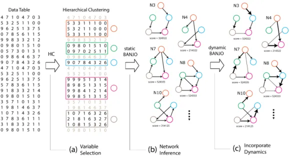
Figure 2.1: The flow of data in the three steps of modellers’ work-flow: (a) variable selection through hierarchical clustering (HC), (b) network inference and (c) incorporating the dynamics of inter-actions.
The output of network inference algorithms is a collection of potentially hundreds of candi-date networks (Figure 2.1 (b)). A scoring metric assesses the merit of each network based on its statistical fit to the data [69]. BANJO generates plain text reports as an output which contain the candidate networks found by the heuristic search algorithm printed in a tabular format as lists of edges between pairs of nodes (Table 2.2). The networks are ordered based on their score, cal-culated using the BDe metric [87], with the top-scoring network appearing first. In this format, the first line indicates the rank of the network, its score and the iteration it was first encountered by the algorithm. The second line indicates the number of nodes in the network. In each of the
Network #1, score: -1168.0524, first found at iteration 11642630 12 0 1 10 1 4 0 2 4 10 2 3 0 6 10 3 3 5 7 10 4 3 3 6 10 5 0 6 3 0 3 7 7 3 0 5 10 8 3 4 9 11 9 3 7 10 11 10 0 11 4 0 3 4 5
Table 2.2: The format BANJO uses to represent Bayesian networks as text.
remaining rows, the first column indicates theidof the node of reference. The second column indicates the number of the incoming edges to that node (i.e.parents) and the rest of the columns indicate the ids of the incoming edges. For example 0 1 10 means that node with id=0 has 1 parent which is the node with id=10. Each execution of the algorithm can generate hundreds of candidate networks, and modellers often compare networks across different runs to construct a consensus network. Therefore, the data sets that modellers handle, contain results from multiple runs, and up to a thousand networks in total.
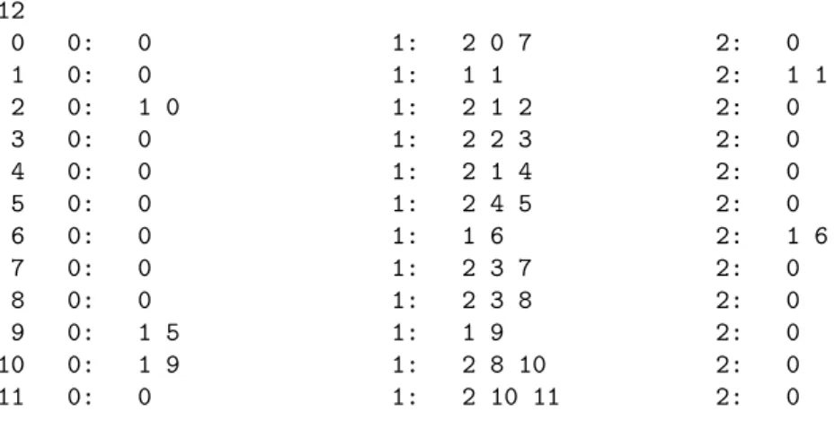
When the data contains measurements over time, it is also possible to infer networks which incorporate information about the dynamics of the interactions (i.e.dynamic Bayesian networks), as shown in Figure 2.1 (c). Such networks involve multiple types of edges, and an example of a network generated by BANJO is shown in Table 2.3. In this thesis, we visualise data sets that contain networks with up to four types of edges. To be able to visualise such networks, first, we had to parse those text files and transform them into a more flexible JSON format. For this purpose, we wrote custom text-formatting scripts that convert BANJO report files into JSON. In the next section, we present an overview of basic concepts and definitions about visualisation and its role in helping scientists make sense of their data.
2.3 Visualisation
Visualisation can be defined as the scientific discipline which aims at helping humans to gain a better understanding of data, through the sense of sight, using visual means. In other words, visualisation is about creating visual representations and interactive interfaces that can augment our perception and help us explore and understand reality based on evidence found in collected data. Practically, when visualisation is applied to real situations, gaining insight is mainly achieved by exploring, explaining or confirming information and knowledge found in the data. Therefore,
Network #1, score: -15756.4344, first found at iteration 25555 12 0 0: 0 1: 2 0 7 2: 0 1 0: 0 1: 1 1 2: 1 1 2 0: 1 0 1: 2 1 2 2: 0 3 0: 0 1: 2 2 3 2: 0 4 0: 0 1: 2 1 4 2: 0 5 0: 0 1: 2 4 5 2: 0 6 0: 0 1: 1 6 2: 1 6 7 0: 0 1: 2 3 7 2: 0 8 0: 0 1: 2 3 8 2: 0 9 0: 1 5 1: 1 9 2: 0 10 0: 1 9 1: 2 8 10 2: 0 11 0: 0 1: 2 10 11 2: 0
Table 2.3: The format in which a dynamic Bayesian network with three types of edges is printed in the output of BANJO.
visualisation can beexploratory,explanatory, orconfirmatory. In the first case, the aim is to help users form new hypotheses about reality, based on information they find after interacting with the data [176]. In the second case, the aim is to present information in a clear way to the users and promote a better understanding of what was already found in the data [175]. In the third case, the aim is to provide an evidence-based verification and confirmation of previous knowledge found in new data [176]. In any case, a successful visualisation can help to deal with practical problems in a more efficient and effective way. In this thesis, we mostly focus on problems related to the exploration and representation of biological data. However, the visualisation tools presented in this thesis can be also used for the visual explanation and confirmation of results.
2.3.1 Biological Visualisation
In the field of biological visualisation, the discipline of biology provides challenging problems that originate and motivate hypotheses and research questions, while the discipline of visualisation pro-vides a suitable vehicle for approaching these biological challenges. The aim is to gain a better understanding of biological processes, using visualisation techniques for exploring biological data and for representing findings more effectively [59]. Visualisation aims at developing useful tools for conducting scientific research more efficiently and effectively. Inherently, biological visual-isation aims at assisting researchers in finding better solutions to biological challenges, such as representing biological networks and data effectively [72]. Biological visualisation overlaps with many research disciplines, but because it relies heavily on the use of computer systems, it is often considered to be part of the wider interdisciplinary field of bioinformatics.
2.3.2 Visual Analytics
The exploration of the data typically follows the Visual Analytics loop, which starts with the ex-ecution of an algorithm followed by a representation of the results, as shown in Figure 2.2 (a). A visual interface enables the user to interact with the results, select data and refine parameters informing the next execution of the algorithm [102]. This process creates a loop which is repeated several times in an iterative fashion, as shown in Figure 2.2 (b) and leads to the gradual improve-ment of the results (i.e.the model). Depending on the speed of the algorithm, the user can interact either sequentially or in real time with its execution. Usually, in both cases, the user can receive visual feedback through the representation of the data in real time.
Figure 2.2: (a) The visual analysis loop. (b) The visual
data-exploration loop [102].
When applied to biological data, Visual Analytics produces interactive visualisation software tools, algorithms, classifications, techniques and/or methodologies, which can be used for com-pleting different biological analysis goals [102]. For example, as mentioned in Chapter 1, systems biologists try to model biological processes by observing changes within a living cell at a molecu-lar level. Usually, biologists collect observations under multiple experimental conditions and then try to integrate findings in a model, which is often represented as a network. In the case of proba-bilistic methods, such as Bayesian networks, there is a need for visualisation tools which can help modellers to make sense of their data and improve their network inference workflow. The sense-making loop for Visual Analytics, shown in Figure 2.3, places visualisation between the user and the data. The users try to make sense out of data by combining their knowledge with what they perceive visually. Thus, the process of sense-making is repetitive and involves elements from both exploratory and confirmatory data analysis methods since it combines new with old knowledge [176].
When the sense-making loop for Visual Analytics is applied to systems modelling, it takes the form of the visual data-exploration loop (Figure 2.2 (b)). The user interacts with a visual
Data Knowledge Hypotheses Visualisation Perception Exploration & Analysis Initial Analysis New Insight Analyse Further Image Specification
Data Visualisation User
Figure 2.3: The sense-making loop for Visual Analytics [102].
representation of the data to tune parameters of the suggested model in an iterative way. This process is repeated in a loop until the model is further refined in a way that more knowledge about the real system is acquired from the data.
In the context of exploring data from biological experiments for the purpose of unravelling functional relationships between molecules, biological visualisation provides users with interac-tive data visualisations that give insights through a process of sense-making. For instance, Figure 2.4 presents a model which describes the sense making loop for exploring interactions in disease-related processes in a molecular level [130].
This thesis focuses on the application of visualisation methods for gaining insights from bi-ological data to create better network models. Visualisation plays an important role because it provides opportunities for developing tools for data exploration, complexity reduction and pat-tern detection, which can help modellers gain insights about the biological system [80]. However, given a biological problem, there are many ways that information can be visualised and it is dif-ficult to identify which design would be the most effective [133]. In the following section, we describe the methodology followed for creating the visualisations presented in this thesis.
2.4 Visualisation Design Methodology
The outcome of effective visualisation design can augment human judgement by combining the ability of humans’ visual system in detecting patterns quickly, with the power of modern comput-ers in storing, processing and displaying information. Thus, visualisation designcomput-ers must take into account limitations related to the visual perception of humans, to create successful visual encoding and interaction techniques [188]. Usually, a successful visualisation design is achieved by devel-oping effective graphical representations which reduce the cognitive overload and visual clutter of naive representations [29].
Figure 2.4: Sense-making model for exploring molecular level in-fluences on disease-related processes [130].
Due to advances in computer science, it became possible for the user to interact with the display and get visual feedback in real time. This development created new opportunities and challenges for developing powerful visualisation systems based on computers. Computer-based visualisations of data can help people carry out tasks, that cannot be automated [133]. However, there are many possible ways that data can be represented visually and the design space is huge. To deal with all these possibilities, visualisation designers must take into account limitations in computers, displays and humans [133].
Computer systems are considered an invaluable resource for the discipline of visualisation because they can process and represent data sets that would be infeasible to draw manually. In ad-dition, computers provide capabilities for manipulating visual representations interactively. How-ever, real-world data sets may be composed of hundreds of Gigabytes and current computer sys-tems cannot always handle them efficiently. Therefore, there are limitations in computational resources available to deal with the increased demands that those data sets impose. Therefore, the path of visually gaining insights from large, complex and dynamic data, partly coincides with the one already followed by the disciplines of high-performance computing, data mining and optimi-sation [157, 95]. For example, scientific discovery often uses visualioptimi-sation in conjunction with computational methods as part of a larger workflow.
Regarding display limitations: it is true that during the last decades screens became larger and of a higher resolution. However, their capabilities are still limited compared to the size of the data available for analysis. There are visualisation approaches for utilising larger and higher resolution displays [15] and also approaches that utilise the hardware architecture of the most advanced graphics processing units (GPUs) [30]. Such technological solutions are important for advances in the discipline of visualisation but they are outside the scope of this thesis, in which we are mostly concerned with creating visualisations for users with a standard set of computational resources (an average PC).
In visualisation approaches, except for technological limitations, there are also limitations in-herent to human visual perception. For example, the human brain has certain limitations in matters of memory and attention. In order to comply with those limitations, appropriate visual encoding has to be selected for creating effective external representations. Such representations help us to surpass our cognitive limitations and augment our capacity to take decisions and solve prob-lems. Following design principles is important so that information will become more sensible, will be communicated more effectively, with increased precision and within reasonable time con-straints [103, 188, 133]. This is how the discipline of visualisation has been shaped; by considering the limitations in human perception and cognition, in conjunction with the technological limita-tions.
2.4.1 The Nested Model
The methodology followed for determining the visualisation designs presented in this thesis was driven by thenested model, proposed by T. Munzner [132]. This model was selected to be the core methodological approach during this thesis, mainly because of its generality and its widespread adoption by the visualisation community. Contrary to other frameworks [78, 178, 160, 151], the nested model has been applied successfully to all kinds of visualisation approaches and appli-cation domains, including case studies for multi-attribute rankings [79], social media data [38], climate change data [144] and even poetry [1]. Most importantly, the nested model has been used extensively in design studies for biological visualisation [76, 169, 67, 163].
There are many possible ways to visually encode information to pictures (the design space is huge) and the danger of creating ineffective visualisations is very high [133]. The nested model can help designers avoid threats that often lead to bad design decisions, identify and clarify interesting problems in the application domain and create effective visualisations. In this section, we overview the basic concepts of this model and in the next chapters, we describe how we used it to create visualisations presented in this thesis.
According to this model, there are four nested levels, summarised in Figure 2.5, which should be addressed and evaluated separately: (1) target users to identify domain analysis objectives, (2) select appropriate data structures and operations, (3) justify visual encoding and interactions and (4) develop efficient algorithmic implementations.
![Figure 2.4: Sense-making model for exploring molecular level in- in-fluences on disease-related processes [130].](https://thumb-us.123doks.com/thumbv2/123dok_us/11087406.2995762/34.892.198.720.173.577/figure-sense-exploring-molecular-fluences-disease-related-processes.webp)
![Figure 3.3: Different tree layouts as presented by McGuffin et al. [124]. (a) node-link, (b) a variation on (a) to support long labels, (c) icicle, (d) radial, (e) concentric circles, (f) nested circles, (g) treemap and (h) indented outline.](https://thumb-us.123doks.com/thumbv2/123dok_us/11087406.2995762/42.892.281.630.174.542/figure-different-layouts-presented-mcguffin-variation-concentric-indented.webp)
![Figure 3.5: Applying brushing technique in Timesearcher software to specify time pattern [89].](https://thumb-us.123doks.com/thumbv2/123dok_us/11087406.2995762/45.892.255.664.177.484/figure-applying-brushing-technique-timesearcher-software-specify-pattern.webp)
![Figure 3.8: Visualisation of ranking changes in large time-series data with RankExplorer [164].](https://thumb-us.123doks.com/thumbv2/123dok_us/11087406.2995762/46.892.231.690.722.960/figure-visualisation-ranking-changes-large-time-series-rankexplorer.webp)