Abstract—The development of mobile phone is swift and abundant. This research aims at converting a cycling website to a mobile phone interface and exploring the simplification design principles, which are examined by LUI (Logical User Interface), PUI (Physical User Interface), and GUI (Graphic User Interface) three facets. The research sample is recruited from bike club and design school and assigned to web-surfing groups, and cycling groups. Data show research participants are congruent in high satisfaction to the converted APP web design over the conventional one, including the direction and connection, the navigation on panorama picture, and jump buttons. However, design students also suggest the color layout of the web can be improved, and the graphic design can be more attractive.
Index Terms—Interactivity, mobile web design, simplicity, user interface.
I. INTRODUCTION
Since the intelligent mobile phones such as HTC, iPhone, and Samsung promote the wireless web-surfing, the majority of social communication and E-commerce has been transferring to more portable. Easier handling and humanized interface promote hefty interactive attraction [1]. The mobile phone experiences a transformation from simple call to personal digital assistant; from broadcast receiving to walking video/audio playing; from basic digital photographing to high resolution video recording; and from real-time dialog to on-line chatting. Nowadays, the mobile phone has become the most indispensable personal communication and interaction device [2]. However, the formidable function of the modern mobile phone requests easier and more logical operational interface in turn. The web structure and the user behavior in the small portable devise have the discernible dissimilarities to table-top computer. How to maintain the simplification but keep adequate information and intriguing interaction at the same time in an intelligent mobile is a vital task.
The full screen touch-panel of the mobile phone also prompts more computerization to accommodate fast web surfing [2]. The navigation of mobile phone becomes straightforward, shifting from linear structure of text menu to horizontal connection of graphic and image icon. The Nano-technology is pushing hardware and devices more compact ever. However, in the mobile phone interface, there are many constrains to swing from normal web design,
Manuscript received November 5, 2012; revised January 25, 2013. S. H. Chin is with the Department of Media Design, Tatung University, Taiwan (e-mail: shchin@ ttu.edu.tw).
namely small dimension for less functional keys, small display screen for less information and navigation space, small capacity for less micro-processing and memory volume [3]. Besides, the web software language in mobile phone and in html is differed. Two major mobile phone languages, Google Android and Apple I-Phone are not friendly to Flash animation, which is the key element of visual attractiveness and interaction. Researchers suggested focusing on LUI (Logical User Interface), PUI (Physical User Interface), GUI (Graphic User Interface) to examine the mobile web design principles [4], [5]. Thus, this research aims at examining the transformed mobile web of 19k Wind cycling web, our primary project, in LUI, PUI, and GUI to test the simplification and interaction design principles.
Recently people tend to willing to spend more time on body exercise. Cycling becomes fashionable for its recreation, training, and environment friendly purposes. The local government also advocates cycling by building many bike routes for civilian’s own health good and local tourist prosperity. Excessive forming of bike teams and sub-organizations are the evidence of celebrating the heyday of cycling in Taiwan. The request for communication or information exchange within the cycling community grows. The easy accessing cycling website is designed not only to meet the purpose by presenting pleasure of navigation and communication, but importantly, to connect people [6]. The redesign from conventional bike web to a mobile one can help community members to get information and communicate immediately. Thus, a well-designed mobile website can ease utilization and navigation, and promote people to communicate and connect. The purpose of the research is to figure out the mobile web design principle by analyzing the LUI, PUI, and GUI. Also, the research compares the differences between conventional web design and the mobile web in funniness, operation, connection, and communication.
II. RELATED WORKS
A. Web-Based Cycling Community
Three reasons shape the cycling community, race and exercise, personal and interpersonal need, and relax and enjoy the scenery [7]. People bunch up in the cycling community because of actively involvement, experience sharing, and care of each other [6]. The location and type of bike trails may impact the willingness to part in the community activity. People may consider the condition of the trail, how much time will take in the ride, and the type of the activity [8]. In spite of diverse purpose, people can always
Examining the User Satisfaction on Web APP in LUI, PUI,
and GUI
find the position in the bike community, and community can accommodate personal need [9].
B. Mobile User Interface
Researchers examined the mobile phone hardware design by 5 functions: phone call, message, image, audio and video, button design and ergo design [5]. However their discussion of button design is vague from the reality, since modern intelligent mobile phone is exclusively using full screen touch panel to expand the capacity of information and communication. The full screen encourages multiple functions for a clear overview, such as online game [10], online banking and shopping [11], GPS system, mobile web and real-time audio/video transferring [3], and digital photography and HD video record [12]. In fact, the intelligent mobile phone is not only a phone, but by combining PDA function becomes the most indispensable devise in daily life [2].
Nevertheless, in such small volume to push huge amount of information or functions, not only the hardware cannot handle well, but the massive information leads the access become difficult and complicated [6]. In the reality, the technology does not full support the mobile phone to web surfing anywhere and anytime. The small capacity cannot run quickly as a conventional computer. The mobile phone program language has its limitation, such as not support to Flash animation, which diminishes the web interaction and attractiveness [13]. The main mobile web software such as iPhone, Android, and Window Mobile cannot be adapted or translated by each other. This increases inconvenience for web designer [13]. Thus, In order to show the richness and clarity of information in a small mobile devise, a well-designed interface needs to be brought out [14]. Additionally, to keep the information relevant and necessary, web connecting structure need to get rid of hierarchical and scrolling down; simplicity is the key principle for information design, navigation design, and visual design in the mobile web design[15] and [16].The simplicity and interaction design principle of web App can be examined in LUI, PUI, GUI [4].
C. LUI
The user experience in web surfing including visual experience, operation experience, and emotion experience can impact the user satisfactory toward a website [17]. LUI refers to web structure design, in which the information and functions set in a logical way for fast navigation; and can be seen as key element to form user experience [14]. Herzberg et al. (2009) divided the web structure into (1) Scope, content of the website; (2) Structure, effective and efficient structure; (3) Skeleton, interface and navigation design; and (4) Surface, the visual design [18]. The web structure has the impact to the navigation efficiency; the clear and flat structure can increase the intimacy toward navigation [15].
Because of the small capacity and small screen, many enterprises redesign their mobile web by using simplification principles [19]. The direct and flat web structure is adopted instead of the hierarch structure to ease and accelerate the web surfing [20].
D. PUI
The user experience reflects user satisfaction based on the
physical user interface design, such as the shape, color, ergonomic and operation of a mobile phone [21]. Jin and Ji (2010) held the PUI of a mobile phone encompassed three levels, key level, function level, and grip level. In order to expand the screen volume, intelligent mobile phone has turned the real keys into virtual such as dial button, icon button, and type-in button; or put the real keys such as send, close, return, and the on and off to the top or button of the screen [4]. The full screen not only can imitate keyboard for texting, but simulate real function key such as play key, send key, shutter button, or GPS key. In other word, the display of screen can be various and flexible [22].
The virtual key or button on the touch panel encourages new use gestures including single touch and multiple touch, and multiple touch refers to the type in technique by using more than one finger to the icon button or the image [23]. Saffer (2008) tried to summarize the touch gestures in the touch panel as approach [24], touch, press, deep press, move, two fingers separate and close. Shue (2009) pointed that the single touch mobile phone denotes the use of thumb to receive the message, and the two hand keying mobile phone is to deal with complicate message [25]. Some researchers discovered the idea touch area between 0.58cm-0.7cm, and divided the touch screen into 5 areas horizontally, and 8 vertically [26]. Park and Han (2009) indicated the most frequent used area lies in the mitten, and the left for those right hand users; and the 4 corners are the less used area [19]. However, the gesture of touch screen keying can be varied based upon the pattern of the phone manufacture. The standardization of the touch screen gesture is advocated to prevent the user repeat learning the new gestures by shifting in different mobile phones [27]. In short, the effective interactive gesture should be easy to use, reliable, reactive, appropriate, meaningful, flexible, and pleasant [24].
E. GUI
The GUI in mobile phone refers not only to the graphical and visual layout, but also the design of graphical and image icon, which can be dragged, clicked, and pressed to functioning [28]. The keying elements in touch screen can be divided in Windows, Icons, and Menus. Shaw went on to state that the developing of effective image icon should follow the principle of recognition, popularity, consistence, feature, and communication.
Pappachan and Ziefle (2008) indicated that frequent used virtue function keys in touch screen were icon button, image button, and text icon [16]. To convey adequate information within the small screen of a mobile phone, the graphical interface is more efficient than the text interface. Furthermore, the concrete and simplified icons are easy to recognize and learn, and free from culture influence such as my favorite and play keys [16]. Hence, the image icon is practical and effective, because image is explicit to recognize, such as my friend picture or pet picture. On the other hand, text icon is easy to learn, easy to understand [29]. Times New Roman and Arial are most used text fond in English and its fond size is 8-12 [29].
whole website. Teo, Oh, Liu, and Wei (2003) viewed the visual attractiveness is one of keys to keep the user satisfying [30]. Cui et al. (2010) advocated that the visual design of a mobile web should keep vivid and explicit for easy briefing and visual attraction [20].
F. Attractive Interaction
All the LUI, PUI, and GUI share the same goal to build a web APP to be easy to read, easy to use, and easy to have fun [31]. Interactive is the key to make LUI, PUI, and GUI to reach the goal [32]. High involved interaction can create high satisfactory in web surfing, and the intriguing interaction may forge high involvement to the website [33]. The playfulness can attract long term user and build up positive and satisfactory attitude toward the website [33]. The purpose of interaction is to make access simple and convenience; human factor is the core and should be brought out in the whole design process.
Thus, the satisfied user interface in web APP can be defined as the relevance of information, easy to use, and visual attractiveness [20]. The simplicity and interactivity are the basic design principles in Mobile web APP.
III. METHODOLOGY
Using the simplicity and interactivity design principles to turn the cycling website, 19K Wind into a mobile web, this research examines the user satisfaction toward LUI, PUI, and GUI of the designed cycling mobile website. Research participants are asked to finish some tasks within a certain time to test the web use satisfaction. Research sample is also asked to compare the use experience between the original web version and the mobile one by the factors of attractiveness, operation, navigation, and communication.
A. Research Sampling
The research participants are n=54, and recruited form two sample pools, an amateur cycling community (by n=24) and a design school in Taipei (n= 30). The research sample is divided into two groups, biking experience, in which 2 hours per week is grouped into high biking experience, n=24, and less than 2 hours into low bike experience, n=30; and webbing frequency, in which over 4 hours per day is to the high frequent group, n=41, and less than 4 hours to the low frequent group, n=13. The research aims at using the angle of biking and the webbing experience to examine the LUI, PUI, and GUI of the 19k Wind web APP, and compare the original web and the mobile version.
B. Navigation Task
The first navigation task for the research sample is to open the 4 sub-page and find out 3 locations; using the location panorama screen to connect the historical and biological information, and switch to other location. The second task is to repeat the procedure in original website to be able to compare both web versions.
C. Design Prototype
The design principles used for creating the web APP as followed:
1) LUI: flat structure, simplifying the information.
2) PUI: icon button to click and image or menu to move. 3) GUI: keep the visual identification but one trail one
color.
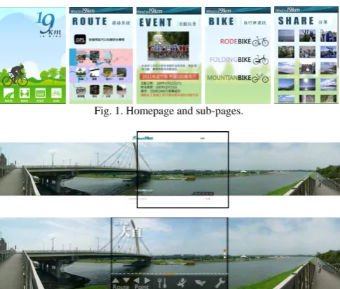
Fig. 1. Homepage and sub-pages.
Fig. 2. Interface comparison in location panorama.
Fig. 3. QR code of the 19K wind web APP.
IV. RESULTS
Two research sample pools were recruited, a well-known cycling club and a well-known design school. Each of 30 was recruited, but 6 of cycling club were failed to complete the experiment. The cycling club, n=24, and design school n=30. The sample was divided into high biking experience, n= 24, and low biking experience, n=30; high webbing group, n=41, and low webbing group, n=13. Further categorizations are age, gender, and educational background.
There are 35% answers in 3, not decided, but the agree answers in LUI hold 42.4%, PUI 49.7%, and GUI 43.3%. The disagree answers are 10% in LUI, 14.8% in PUI, and 10% in GUI. The high contrast of 4:1 from agree to disagree indicates research sample is satisfied with the UI design in the mobile web APP, in which PUI ranked the highest, and followed by GUI and LUI.
0 20 40 60 80 100 120 140 160
1 2 3 4 5
數列1 數列2
0 20 40 60 80 100 120 140
1 2 3 4 5
數列1 數列2
0 20 40 60 80 100 120 140 160
1 2 3 4 5
數列1 數列2
LUI PUI GUI Fig. 4. Scoring of LUI, PUI, GUI.
main comparisons of the research were the biking experience and webbing frequency. The webbing frequency comparison showed no significance in all three UI, but it did show the significance between biking experiences. The higher biking experience group had higher satisfaction rate than the low biking experience group at LUI, p=.043< .05, and PUI, p=.010<.05. Higher satisfaction in LUI and PUI also indicated that the cycling club members had the specific need in practical trail information and easy to use. Other variables such as age, gender, and social background only the age in PUI showed significant different view (p=.008<.05).
TABLEI:SIGNIFICANCE ANALYSIS OF SAMPLE GROUPS
Group Gender Age Back Webbing. Biking
LUI .296 .205 .518 .164 .939 .043*
PUI .044* .237 .008* .927 .792 .010*
GUI .386 .202 .200 .577 .684 .202
* p<05
In the comparison between original website and the mobile version, the factor connection gained the highest score of 58%, operation the second of 54.3%, attractiveness the third of 48.8%, and the communication the last of 36.5%. The communication factor gained the least score in agree answer but the highest in disagree of 13.7%, indicating the small capacity and small screen of mobile phone did show the limitation of information richness. The higher rate in other 3 factors indicated the mobile web version is competitive to the conventional web. Research participants were satisfied with the panorama image pages where the direct button not only can freely jump into next location or next trail, but can navigate the local information as well. Research participants also expressed satisfaction with the Web APP over the conventional web version.
0 20 40 60 80 100 120 140
1 2 3 4 5
數列1 數列2
0 20 40 60 80 100 120 140
1 2 3 4 5
數列1 數列2
0 20 40 60 80 100 120 140 160
1 2 3 4 5
數列1 數列2
0 20 40 60 80 100 120 140 160 180
1 2 3 4 5
數列1 數列2
Attractive Operation Connection Information
Fig. 4. Scoring of the 4 factors in web comparison.
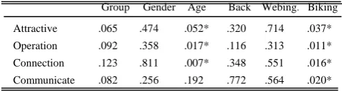
In the group comparisons, the cycling club showed higher satisfaction than the design school by p=.065. The groups between gender, background, and web surfing frequency did not show significance. However, the high biking experience group held higher satisfaction in all 4 factors by attractiveness p= .037<.05, operation p= .011<.05, connection p= .016<.05, and communication p= 020<.05. Again, the higher biking experience group seems to rely on real-time portable online device and easy to use website.
TABLE II: SIGNIFICANCE ANALYSES OF COMPARISON FACTORS
Group Gender Age Back Webing. Biking
Attractive .065 .474 .052* .320 .714 .037*
Operation .092 .358 .017* .116 .313 .011*
Connection .123 .811 .007* .348 .551 .016* Communicate .082 .256 .192 .772 .564 .020*
* p<05
The research also asked research sample to opine the
navigation experience of the web APP. The open-end data were ranked into (1) the panorama image of trail location is interesting, (2) the direct button of sub-page is easy to use, (3) information is inadequate, (4) graphic design is ordinary, (5) the navigation structure is logical, (6) the color theme are not attractive, and (7) the overall design is OK. Actually, the panorama image for navigation is a unique design; the direct connection provides ease and fun to navigating. Research participants held positive view toward trail connection and the direct button in the location panorama image. The opinion about the weakness of graphic design and color matching is valuable for further improvement.
V. CONCLUSION
The design on mobile web APP has its inherent limitation; the small capacity in hardware and screen entails the inadequate information, not easy to type in, and difficult to read. The implant from conventional web version to mobile version becomes too tough. The independent mobile APP design is an inevitable tendency. The prevalence of the intelligent mobile phone also prompts the independent design of the mobile APP. Thus, the simplicity and interactivity of the mobile APP design principles deserves pay more attention.
This research tried to erect the simplified and interactive design principles for the web APP by examining the cycling trail website as followed, (1) In LUI, the structure be flat, connection be horizontal, and information be simplified but relevant; (2) in PUI, icon connection superior to menu, function prioritized and simplified, multiple connection routes to the same goal; and (3) in GUI, building the main visual system, keeping variant in sub-pages, but simplifying the screen layout. As the result, the research tried out putting the connection function in the panorama picture as the transportation harbor to make navigation easier. The research also worked out with 3 connections to reach the same location, such as GPS in home page, the trail sub-page, and the panorama page. Some of these ideas may help to the local authority web design to promote the tourism.
Data showed the cycling club members and the cyclist held the positive perspective toward the trail web APP. Specifically, the panorama image effect and connection function can ease the use and provide the funniness in navigation. It is intriguing that different sample has diverse interests in the web interface. The cyclist tends to have the interest in practical need of trail information and easy to use, while the design student tends to put the foci on the web structure and the visual attraction. The weakness of graphical design and the color display in the research web APP can be improved as for further research to make the website more attractive and aesthetical.
ACKNOWLEDGMENT
This work was supported in part by Tatung University under Grant No. B100-V02-062.
REFERENCES
[1] M. Newman and J. Landay, “Sitemaps, storyboards, and specification: A sketch of 4 web site design practice,” DIS, New York: ACM Press, 2000, pp. 263-274.
[2] R. P. Morris and J. J. Tomlinson, “A mobile device user interfaces with a simple, classic design,” IEEE Transactions on Consumer Electronics,
vol. 54, pp. 1252-1258, 2008.
[3] P. Ornella and B. Stéphanie, “Universal design for mobile phones: A case study CHI EA '06 CHI '06,” Human factors in computing systems ACM, New York, 2006.
[4] H. Kiljander, “Evaluation and usability of mobile phone interaction styles,” Unpublished Ph.D. Thesis at Helsinki University of Technology, 2004.
[5] B. Jin and Y. Ji, “Usability risk level evaluation for physical user interface of mobile phone,” Computer in Industry, vol. 61, pp. 350-363, 2010.
[6] L. Lan. (2009). The gentle rider. Website of Taiwan Bike Day. [Online]. Available: http://www.cycling-lifestyle.org.tw/ bikeday/2009/essay/content.php?id=10
[7] S. Ho. (2009). BIKEID put Web2.0 concept. [Online]. Available: http://www.mag.chinayes.com/MagazineBase/cxfxz/2174/200904291 23432315.shtml
[8] B. C. Don, “Research of relationship between involvement of biker and location Intimation: Using Koushung Rever Park as example,” Unpublished Master Thesis of Asia University in Taiwan, 2007. [9] Y. C. Lue, “Research of impact factors of web-based learning
community,” Unpublished Master Thesis of Tamkang University in Taiwan, 1999.
[10] M. Dunlop and S. Brewster, “The challenge of mobile devices for human computer interaction,” Personal and Ubiquitous Computing,
vol. 6, pp. 235-236, 2002.
[11] S. Shen. (2003). Development of framework for trust in mobile
commerce. [Online]. Available:
http://www.sigs.aisnet.org/SIGHCI/Research/ICIS2003/ CI03_14.pdf [12] S. Kim et al., “Mobile web 2.0 with multi-display buttons,”
Communications of the ACM, vol. 53, no. 1, pp. 136-141, 2010.
[13] G. K. Gu, “The key element in small TFT-LCD screen – Using I-Phone as example,” Unpublished Master Thesis of Fong-Gia University Taiwan, 2010.
[14] Shui, “Exploring the user interface of mobile multi-media devise,” Unpublished Master Thesis of Taiwan University of Science and Technology, 2006.
[15] C. F. Ye and W. F. Chang, “The application of design principles in human-computer interface,” in Proc. 7th CID Annual Design Conference, 2002.
[16] P. Pappachan and M. Ziefle, “Cultural influence on the comprehensibility of icons in mobile-computer interaction,” Bahaviour
and Information Technology, vol. 27, pp. 331-337, 2008.
[17] H. Desmet and S. Hekkert, “Framework of product experience,” Int. J. Design 1, pp. 57-66. 2007.
[18] D. Herzberg, N. Marsden, P. Kubler, C. Leonhardt, S. Thomanek, H. Jung, and A. Becker, “Specifying computer-based counseling systems in health care: A new approach to user-interface and interaction design,” Journal of Biomedical Informatics, pp. 347–355, 2009. [19] Y. S. Park and S. H. Han, “Touch key design fone-handed thumb
interaction with a mobile phone: Effects of touch key size and touch key location,” International Journal of Industrial Ergonomics, vol. 40, pp. 68-75. 2009.
[20] Y. Cui, M. Honkala, K. Pihkala, K. Kinnunen, and G. Grassel, “Linked internet UI: A mobile user interface optimized for social networking,”
Mobile HCI, vol. 7, pp. 45-54, 2010.
[21] V. Postrel, The substance of style: How the rise of aesthetic value is
remarking commerce, culture, and consciousness, New York: Harper
Collins, 2003.
[22] Y. K. Cheung, Z. Li, and W. Chen, “Integration of cognition-based content zooming and progressive visualization for mobile-based navigation,” The Cartographic Journal, vol. 46, pp. 268-272, 2009. [23] Y. L. Muller. (2008). Multi-Touch Displays: Design, Applications and
Performance. 3M MicroTouchTM DST Touch System. [Online]
Available: :
http://solutions.3m.com/wps/portal/3M/en_US/3MTouchSystems/TS/ Solutions/to uchScreens/DispersiveSignal/
[24] D. Saffer, Designing gestural interfaces: Touch screens and interactive
devices, CA: O’Reilly, 2008.
[25] S. Y. Shue, “The operation of thumb a finger in portable device by using mobile phone interface as example,” Unpublished Master Thesis of Ching-Hwa University in Taiwan, 2009.
[26] B. Shildbach and E. Rukzio, “Investigating selection and reading performance on a mobile phone while waiking,” MobileHCI, vol. 7, pp. 93-102, 2010.
[27] H. Celentano, S. Orsini, and B. Pittarello, “Design and evaluation of a mobile art guide on iPod Touch,” Interaction Design and Architecture
Journal, IxD and A. N. 5-6, pp. 77-80, 2009.
[28] Z. T. Shaw, “Research of user interface in digital camera for elders,” Unpublished Master Thesis of Tatung University Taiwan, 2009. [29] C. H. Chien and C. Chen, “Exploring text represntation in small screen
reading,” Journal of Design, vol. 10, pp. 123-135, 2005.
[30] H. Teo, L. Oh, C. Liu, and K. Wei, “An empirical study of the effects of interactivity on web user attitude,” International Journal of
Human-Computer Studies,vol. 58, no. 3, pp. 281-305, 2003.
[31] P. Dourish, “What we talk about when we talk about context,”
Personal and Ubiquitous Computing, vol. 8, pp. 19-30, 2004.
[32] L. Ha and E. James, Interactivity reexamined: A base line analysis of early business web sites, 1998.
[33] H. Chen and D. Yen, “Improving the quality of online presence through interactivity,” Information and Management, vol. 42, pp. 217-226, 2004.