Department of Computer Science and Software Engineering University of Canterbury
May 2017
Calibration using Supervised Learning for
Low-Cost Air Quality Sensors
A thesis submitted in partial fulfilment of the requirements
for the Degree of Master Science in Computer Science
in the University of Canterbury by
Boney Bun
Abstract
Low-cost environmental sensors encounter challenges of reliability and accuracy. This thesis aims at increasing the readings accuracy of low-cost air quality sensors, particularly using three Air Quality Egg (AQE) version 2 to measure the CO and NO2 concentrations in the
air, in a supervised manner, by proposing the outlier and adjustment modules. The outlier module detects and eliminates noise in the sensor readings, while the adjustment module aims to increase the sensors’ reading accuracy. Four proposed detection schemes and three mathematical algorithms were trained and tested in the outlier module and adjustment module, respectively.
The temperature, humidity, and CO sensors on the AQEs had good readings agreement based on the index of agreement (d-value), except for the NO2. Thus, the selection
of the schemes for the outlier module can be based on the sensors’ characteristic. The scheme that verifies the adjacent nodes before marking an outlier has better ability to classify the outlier than a scheme that does not. Artificial neural network (ANN) outperformed the other two mathematical techniques in the adjustment module because the accuracy performance is influenced by the sensors readings agreement and the performance of the outlier module.
The CO, temperature, and humidity sensors on the three AQEs can fit the CO reference from Environment Canterbury’s data by at least 80% with or without the existence of the outlier module. On the other hand, the NO2, temperature and humidity sensors can fit the
NO2 reference by 40% and at least 80%, respectively, without and with the filter from the
Acknowledgements
Although seems to be old fashion way, but only God makes this thesis (and my study) possible. HE would definitely be the first on the thankful list.
Special thanks to NZ Scholarship and UC’s Student Care Advisors for allowing me having a life time experience.
My wife and son who has supported me through all the distances and exhaustive time.
I would like to express thanks to my supervisor, Andreas Willig, for his time, critical thinking, and valuable feedback during the thesis. I would also express thanks to Malcolm Campbell, for the feedback and encouragement.
Table of Contents
ABSTRACT ... II
ACKNOWLEDGEMENTS ... III
TABLE OF CONTENTS ... IV
LIST OF FIGURES ... VII
LIST OF EQUATIONS ... X
CHAPTER 1: INTRODUCTION ... 1
CHAPTER 2: RELATED WORK ... 7
2.1 MONITORING EQUIPMENT ... 7
2.1.1 Authority Monitoring ... 8
2.1.2 Citizen Monitoring ... 9
2.2 LOW COST SENSORS ... 10
2.3 ARTIFICIAL NEURAL NETWORK ... 13
2.4 ANOMALY DETECTION ... 15
CHAPTER 3: EXPERIMENT ... 17
3.1 AIR QUALITY EGGS ... 17
3.1.1 Data Gathering ... 18
3.1.2 Technical Specification ... 19
3.2 APPARATUS ... 20
3.3 DEPLOYMENT ... 20
3.4 DATA SOURCES AND TREATMENT ... 21
CHAPTER 4: OUTLIER MODULE ... 25
4.2 EVALUATION METHODS ... 30
4.3 ARIMAMODELS ... 30
4.3.1 Time Series Model with Seasonal ARIMA ... 31
4.3.2 Box-Jenkins Approach ... 34
4.4 TRAINING PHASE ... 36
4.4.1 Temperature ... 36
4.4.2 Carbon Monoxide (CO) ... 41
4.4.3 Nitrogen Dioxide ... 45
4.4.4 Humidity ... 49
4.5 DIFFERENCE AMONG AQESENSORS ... 53
4.5.1 Carbon Monoxide ... 60
4.5.2 Nitrogen Dioxide ... 63
4.5.3 Temperature ... 64
4.5.4 Humidity ... 66
4.6 TESTING PHASE ... 68
4.7 SUMMARY ... 78
CHAPTER 5: ADJUSTMENT MODULE ... 80
5.1 PROPOSED METHODS ... 80
5.1.1 Linear Regression and Multi-Linear Regression ... 80
5.1.2 Artificial Neural Network (ANN) ... 82
5.2 EVALUATION METHODS ... 84
5.2.1 Coefficient of Determination (R-Square) ... 85
5.2.2 Root Mean Square Error (RMSE) ... 86
5.2.3 Index of Agreement (d) ... 86
5.3 TRAINING PHASE ... 86
5.3.2 Artificial Neural Network (ANN) ... 87
5.4 TESTING PHASE ... 92
5.4.1 Without Outlier Module ... 92
5.4.2 With Outlier Module ... 100
5.5 SUMMARY ... 105
CHAPTER 6: CONCLUSION ... 107
6.1 SUMMARY OF FINDINGS ... 107
6.2 FUTURE WORK ... 111
REFERENCE ... 112
APPENDIX A TESTING SCENARIO FOR OUTLIER MODULE ... 120
List of Figures
FIGURE 1.1INFORMATION FLOW OF THE PROPOSED SYSTEM ARCHITECTURE ... 5
FIGURE 3.1THE PLACEMENT OF THREE AIR QUALITY EGGS ON TOP OF A ROOF AT THE RICCARTON ROAD SITE. ... 20
FIGURE 4.1PROPOSED DECISION SCHEMES IN THE OUTLIER MODULE ... 29
FIGURE 4.2.2014 AND 2015 TEMPERATURE PLOT ... 37
FIGURE 4.3.ACF AND PACF OF TWO YEARS TEMPERATURE (2014 AND 2015) ... 38
FIGURE 4.4.ACF AND PACF OF TWO YEARS’ TEMPERATURE (2014 AND 2015) AFTER ONE-TIME DIFFERENCING ... 39
FIGURE 4.52014-2015 READINGS OF HOURLY CO CONCENTRATION. ... 42
FIGURE 4.6ACF AND PACF FOR CO ... 43
FIGURE 4.7ACF AND PACF FOR FIRST ORDER OF CO ... 44
FIGURE 4.8THE PLOTTING OF NITROGEN DIOXIDE BETWEEN 2014 AND 2015 ... 46
FIGURE 4.9ACF AND PACF OF NO2 ... 47
FIGURE 4.10ONE ORDER OF DIFFERENCING OF ACF AND PACF FOR NO2 ... 48
FIGURE 4.11THE HOURLY HUMIDITY ON THE RICCARTON ROAD SITE TAKEN DURING THE PERIOD OF 2014 AND 2015. ... 50
FIGURE 4.12ACF AND PACF FOR HUMIDITY ... 51
FIGURE 4.13ACF AND PACF FOR FIRST ORDER OF HUMIDITY ... 52
FIGURE 4.145-SECOND READING OF THREE AIR QUALITY EGGS IN RICCARTON ROAD DURING A PERIOD OF THREE MONTHS FROM THE SENSORS ... 55
FIGURE 4.15HOURLY READING OF THREE AQES AND ECAN IN RICCARTON ROAD DURING A PERIOD OF 3 MONTHS FROM THE SENSORS ... 58
FIGURE 4.165-SECOND CO READING FROM THREE AQES. ... 61
FIGURE 4.175-SECOND NO2 READINGS FROM THREE AQES. ... 63
FIGURE 4.185-SECOND TEMPERATURE READING FROM THREE AQES. ... 66
FIGURE 4.195-SECOND HUMIDITY READING FROM THREE AQES. ... 67
FIGURE 4.20THE ACCURACY RESULTS FROM VARIOUS MONTHLY DETECTION SCHEMES. ... 74
FIGURE 4.21THE ACCURACYRESULTS FROM VARIOUS WEEKLY DETECTION SCHEMES. ... 77
FIGURE 5.2A MULTI-LAYER PERCEPTRON TOPOLOGY ... 84
List of Tables
TABLE 4.1DIAGNOSTIC CHECKING FOR TEMPERATURE MODELS USING AIC. ... 41
TABLE 4.2DIAGNOSTIC CHECKING FOR CO MODELS USING AIC. ... 45
TABLE 4.3DIAGNOSTIC CHECKING FOR NO2 MODELS USING AIC ... 49
TABLE 4.4DIAGNOSTIC CHECKING FOR HUMIDITY MODELS USING AIC ... 53
TABLE 4.5INDEX OF AGREEMENT BETWEEN SENSORS ON AQES ... 56
TABLE 4.6ANALYSIS OF VARIANCE: COMPARING READINGS DIFFERENCE BETWEEN INDIVIDUAL AQES AND ECAN ... 57
TABLE 4.7ANOVA RESULT FOR CO ON AQES ... 61
TABLE 4.8TUKEY POST HOC TEST ON THE 5-SECOND READING OF CO ON AQES ... 62
TABLE 4.9ANOVA RESULT FOR NO2 ON AQES ... 64
TABLE 4.10TUKEY POST HOC TEST ON THE 5-SECOND READING OF NO2 ON AQES ... 64
TABLE 4.11ANOVA RESULT FOR TEMPERATURE ON AQES ... 66
TABLE 4.12TUKEY POST HOC TEST ON THE 5-SECOND READING OF TEMPERATURE ON AQES ... 66
TABLE 4.13ANOVA RESULT FOR HUMIDITY ON AQES ... 68
TABLE 4.14TUKEY POST HOC TEST ON THE 5-SECOND READING OF HUMIDITY ON AQES ... 68
TABLE 5.1RESULT OF LINEAR REGRESSION AND MULTI LINEAR REGRESSION ... 93
TABLE 5.2SELECTED RESULT OF SINGLE HIDDEN LAYER NETWORK ... 96
TABLE 5.3SELECTED RESULT OF GRADIENT BOOSTING ... 97
TABLE 5.4SELECTED RESULT OF MULTI-LAYER PERCEPTRON ... 97
TABLE 5.5SELECTED RESULT OF SINGLE HIDDEN LAYER WITH SEASONAL ARIMA ESTIMATOR ... 101
TABLE 5.6SELECTED RESULT OF MULTI-LAYER PERCEPTRON WITH SEASONAL ARIMA ESTIMATOR ... 102
TABLE 5.7SELECTED RESULT OF GRADIENT BOOSTING WITH SEASONAL ARIMA ESTIMATOR ... 102
TABLE 5.8SELECTED RESULT OF SINGLE HIDDEN LAYER WITH NON-SEASONAL ARIMA ESTIMATOR ... 104
List of Equations
EQUATION 4.1 ... 26
EQUATION 4.2 ... 26
EQUATION 4.3 ... 30
EQUATION 4.4 ... 33
EQUATION 4.5 ... 36
EQUATION 5.1 ... 81
EQUATION 5.2 ... 81
EQUATION 5.3 ... 81
EQUATION 5.4 ... 81
EQUATION 5.5 ... 81
EQUATION 5.6 ... 81
EQUATION 5.7 ... 82
EQUATION 5.8 ... 82
EQUATION 5.9 ... 85
EQUATION 5.10 ... 86
EQUATION 5.11 ... 86
EQUATION 5.12 ... 88
Chapter 1:
Introduction
Scientific evidence has shown that air pollution contributes to respiratory diseases, as reported by the World Health Organization (WHO) [1]. According to this report, children and the elderly are more sensitive to air pollution. Therefore, real-time ambient air quality information could be an important way to protect sensitive citizens, if it were made accessible online by the relevant authorities, using instruments to monitor air quality. Currently, monitoring instruments provide some air quality information, but usually only covering broad areas of a city. Yet, the concentration of air pollutants is likely to vary locally and be location-dependent, such as in industrial areas, busy roads, around houses burning firewood, near forest fires [2], and so on. Current instruments do not give such detailed information on small specific areas in ways that could potentially be valuable to residents in those areas.
There is a foreseeable trend of spatial temporal monitoring in the future – the ‘Internet of Things’. The trend is for a growing number of commercial sensing devices, as advanced low-cost environmental sensors become more available and affordable. There is a further trend towards increased awareness regarding healthy lifestyle, as people become eager to assess their surroundings for health factors such as air pollution. These two factors may encourage the public in using low cost sensor products as part of their daily activities. As a result, there may be a plethora of spatial-temporal data in the future. Furthermore, these trends may lead to the use of opportunistic sensing concepts [3] and the development of smart cities using these concepts.
project received initial funding from a crowd-funding website and is an open source product. AQE has a growing number of users around the world [4]. In comparison to conventional air monitoring equipment, typically costing more than US$ 5,425 (€5,000) [2], an AQE is relatively cheap and affordable for most people, at a cost of about US $240. Consumers can easily connect an AQE to their wireless networks in their homes. Then, ambient air quality information is accessible through the AQE’s website or the users can look directly at the device’s LCD display. Apart from giving an hourly average on the website, the AQE data receives no other treatment or analysis. Adding a data treatment or an analysis layer to the system can potentially deliver added value to the consumers. Most of the Open Source Systems (OSSs) deliver very robust and reliable projects within an affordable budget even for start-up companies. So, it is likely that OSS tend to attract more people, ranging from amateur to professional users. The AQE is an open source system (OSS) which both amateurs and professionals may use for obtaining ambient air quality information; more advanced users, such in the Air Quality Sense Box project [5], may customize it to suit their specific needs. AQE hardware and software information are available online. Following a successful campaign on Kickstarter to raise initial funding for the AQE project [6], the company now sells version two of AQE on their own site.
There is much literature on the use of various mathematical algorithms in the data analysis stage. For example, two studies of Spinelle et al [8, 9] showcased the use of linear regression, multilinear regression, and artificial neural networks. Vito et al [10, 11] use a multivariate correlation technique to calibrate the electronic node in their two studies. Therefore, applying mathematical algorithms in the data analysis has a good possibility of fixing the accuracy of the low-cost sensors.
The second challenge might occur from the location or placement of low-cost sensors, particularly outdoors, where the performance of the sensors can be influenced by the ambient environment, such as the temperature, relative humidity, and wind speed. A solution to this might include having redundant sensors on a site, where one AQE can potentially detect anomalies of other AQEs. Therefore, in this project we also explore using redundant low-cost sensors in a site. We use mathematical algorithms as an approach to both problems.
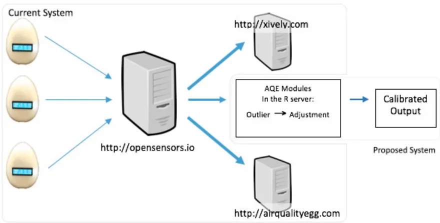
module for data processing, called the AQE module, will be located in the server. The AQE module is divided into two:
• Outlier module
Air quality data may contain a sudden change and a seasonal pattern [15]. Thus, distinguishing whether a reading in the data is a normal reading or an outlier can be a big challenge, a sudden change in the reading can result from a change in the environment, not the sensors’ fault. The outlier module aims to classify and filter whether an hourly sensor reading at a certain time is an outlier or not. All the hourly AQE readings will be filtered by the outlier module first before going to the adjustment module. If an outlier is found in the reading, the reading will not proceed to the adjustment module as it may affect the calibration process.
• Adjustment module
Figure 1.1 Information flow of the proposed system architecture 1
We apply supervised learning to train the classification algorithm in the outlier module and the calibration algorithm in the adjustment module [16, 17]. Past data is useful to train the classification algorithm in the outlier module. Whereas, a portion of AQE data is reserved as the training data for the calibration algorithm in the adjustment module. The final output of AQE module is calibrated output.
The impact of the outlier module to the adjustment module is assessed by comparing the calibration performance of the adjustment module with or without the presence of the outlier module. Each module is also evaluated. The outlier module is assessed using classification accuracy by counting the number of True Positive (TP), True Negative (TN), False Positive (FP), and False Negative (FN) of the module. TP and TN mean the module has
correctly identified the sensor readings as normal and outlier, respectively. FP and FN indicate the module has mistakenly identified the normal and outlier readings, respectively. The classification accuracy percentage of the outlier module is then calculated based on the number of TP, TN, FP, and FN. Meanwhile, the adjustment module is assessed by using statistical methods which are: coefficient of determination (r-square), root mean square error (RMSE), and d value. 100% accuracy for the outlier module and a value of 1 of R-square or d value for the adjustment module are the ideal result for the two modules.
Chapter 2:
Related Work
This chapter presents the literatures regarding low-cost environmental sensors. Section 2.1 describes the current monitoring system used by the New Zealand government and the reasons people with health concerns monitor their ambient air quality. On-going alternative developments to the conventional monitoring system are presented in Section 2.2. Section 2.3 and Section 2.4 explain artificial neural networks and anomaly detection techniques found in the literature.
2.1 Monitoring Equipment
Scientific evidence suggests that harmful pollutants have a significant impact on human health [18]. Different standards have been laid down to minimize the impact of these harmful pollutants to people; of particular interest to us is an emission performance standard. Most countries have institutions that set these standards; Environment Canada (Canada), the Environmental Protection Agency (the USA), the European Union (Europe), Environment Canterbury (Canterbury, New Zealand), and China’s State Environmental Protection Administration (SEPA) are examples. These standards require constant monitoring systems in order to be effective and ensure compliance by all stakeholders. Such monitoring equipment is the subject of review next.
they can also be useful to environmental policy makers in order to take action regarding environmental issues. Furthermore, the monitoring of data can be used as an evaluation tool to measure the effectiveness of a policy.
Due to its accuracy, operating a sophisticated monitoring system requires a lot of resources. The system demands skilful operators, with a high maintenance cost, huge space, and large budget [19]. Johnson [20] described the authority’s annual budget spent on a water monitoring system through the implementation of the 1972 Clean Water Act (CWA). Less than half of the $982 million from government expenses went to water-pollution monitoring in 2001 according to Johnson’s report. Lovet et al [21] gave a good reason to keep using this expensive system, they argued that although the monitoring programs need extensive resources, the cost of monitoring programs is cheaper than the cost of policy implementation. They noted that the cost of monitoring and implementation might not have been measurable in the past due to the lack of data.
2.1.1 Authority Monitoring
The Institute of Environmental Science and Research (ESR), and the National Institute for Water and Atmosphere (NIWA) are among New Zealand’s institutions monitoring air pollution levels. The Resource Management Act 1991 has given rights to the Regional Council to control air pollution in New Zealand. Any activities releasing air pollutants require a consent from New Zealand’s regional offices and local authorities.
benzene, hydrogen sulphide, and fluorides. A secondary pollutant is any substance derived from two or more chemicals, for example, the sulfuric acid of acid rain, which is a mix of sulphur dioxide, water, and air.
The methods for detecting air pollution have been used for more than 30 years. There are two types of monitoring methods; manual, and instrumental methods [22]. Some examples of manual methods are; passive samplers, paper tape samplers, bubbler systems, and dust deposition. Examples of instrumental methods are; non-dispersive infra-red (NDIR), chemiluminescence, flame photometric analysers, fluorescence monitors, and suspended particulate monitoring methods. Manual detection methods demand intensive labour and provide little information, so have progressively been replaced by instrumental methods [22].
2.1.2 Citizen Monitoring
Apart from the government, ordinary people are apparently eager to monitor their environment. Entrikin [23] proposed that a sense of attachment to a place can be a driving factor. Korten [24] has a similar suggestion, recommending that a sustainable population requires the establishment of attachment to its community and environment. Furthermore, Kruger and Shannon [25] proposed that civic social assessment could help people in the community to understand themselves and their environment.
volunteers were recorded and involved in more than 338 various environmental monitoring activity programs in the USA from 1988 to 1992. Conrad and Daoust [27] conducted surveys and interviewed all Community Based Monitoring (CBMs) groups in the Province of Nova Scotia, Canada in order to understand the advantage of CBM. The Waterkeeper Alliance was an example of global cooperation among CBMs, working to protect ecosystem and water quality in 15 countries, including the USA, Australia, India, Canada, and the Russian Federation [28].
The motives of the citizen science movement may be driven by environmental concerns from the above examples. Uncertainty and lack of funding in government monitoring are potential explanatory factors for citizen monitoring; an example can be found in the study of Savan et al [29]. The Canadian Citizens’ Environment Watch was founded by three university professors in 1996 as a response to a substantial decrease in funding provided by the Ministry of Environment and Energy between 1995 and 1998. The organisation had independently monitored, and provided education and supervision to the local environment.
2.2 Low Cost Sensors
smoke, and NO2 concentrations. However, the effect of carbon monoxide to human health
may not be directly clear, as pinpointed by Alan et al in 2002 [32], whose study suggests that more data is required to gather stronger evidence regarding the relationship between carbon monoxide and human health. Epidemiological studies may find ways to use spatial-temporal monitoring for gathering long-term data in an effort to understand patterns, causes, and effects of health conditions and disease in certain populations. These studies may need various types of sensors covering a specific area in order to enable fine-grained analysis.
It is possible that the need of spatial-temporal monitoring may trigger the use of low-cost sensors in the future. The reliability of spatial-temporal monitoring becomes possible with advancing technology in the fabrication of sensors, particularly MEMS. The advance of MEMS technology has driven many sensor developments and subsequent industrial applications [33]. Types of MEMS sensors, such as pressure sensors, microphones, and accelerometers, are known to be reliable and widely used in many industries. Meanwhile, the development of gas sensors is still underway to achieve the same level of reliability as other type of sensor because MEMS technology cannot be fully implemented into gas sensors [33].
Because MEMS technology has not been fully usable in gas sensors, the performance of materials for gaseous low-cost sensors has been a subject of research. Instead of using silicon in the production of metal-oxide semiconductor (MOX) sensors, Vasiliev et al [34] added ceramic MEMS technology.
interest. Castell et al [2] point out there may be other criteria these sensors can meet in the future.
A way to overcome the lack of accuracy problem is to conduct on-field calibration, for example, in detecting benzene [10], CO and NOx [11]. Another calibration approach is to use artificial mixed gas to help low-cost sensors distinguish targeted gas from other gases [36, 37]. Two MiCS-5521 sensors for detecting CO and volatile organic compounds (VOC) were tested and calibrated against an air quality monitoring station in Brazil [38]. The study found that the two sensors added another option into the existing conventional air quality equipment. But, cross-sensitivity problems due to the presence of other gases could occur with these sensors. The authors suggested a multi-sensor system to deal with the cross-sensitivity problem. In another part of the world, four MiCS-5525 sensors were evaluated. Two mathematical models were derived as a result of running two calibrations [39]. The first calibration was conducted in a controlled environment, the second one run in a field test against reference instruments for 19 days, in April 2013. The first calibration had unsuccessfully fitted the output of the reference instruments, while the second one was better in generating optimal model parameter values. Using a non-linear model fitting algorithm, the second calibration incorporated well if heater drift was known. Heater drift is the difference between ambient temperature and surface temperature.
Some research explores the application of low-cost sensor networks based on the mobility of the sensors in the network. High-density sensor networks were explored within stationary-based networks. The idea was to be able to adjust the output and detect an anomaly in the nodes. Tsujita et al [40] showcased work on this type of network. The NO2
Meanwhile, a smartphone was used as a power source through a USB port with a MiCS-OZ-47 sensor in a non-stationary system, which sensed ozone concentration in the atmosphere [41]. A handheld unit with a few sensors was also proposed to measure air quality in the Common Sense project [42]. The handheld is expected to connect to a smartphone via Bluetooth. The project aims to embed environmental sensors onto a smartphone [43]. Another example of this is the N-SMARTS project [44] which uses commercial off-the-shelf (COTS) sensors deployed easily to any smartphone. Jiang et al [45] developed Mobile Air Quality Sensing (MAQS) system and focused their study on indoor air quality by building a sensor prototype working closely with a smartphone.
2.3 Artificial Neural Network
An artificial neural network (ANN) has been applied to forecast where data is made available by many researchers [46]. Speech recognition, image recognition, chemical research, ecological, and environmental sciences are among the numerous applications of ANN mentioned by Lek and Guegan [47]. Gardner and Dorling [48] explained the use of the algorithm in the atmospheric sciences. The growing number of ANN applications has encouraged us to include the algorithm in this thesis.
the architecture, the ANN algorithm can be categorized by either feed-forward or recurrent (feedback) networks [49]. Single-layer perceptron, multilayer perceptron, and radial basis function nets are examples of feed-forward architecture. Meanwhile, competitive networks, Kohonen’s SOM, the Hopfield network, and ART models are examples of recurrent nets. Feed-forward networks have no loops, while recurrent nets do have loops (feedback mechanisms). The ANN network is not as complex as the human brain, but works by inferring a general model from the data. The algorithm has a number of inputs (or features) and its associated constants (also known as weights) to be fitted into one or more outputs within the training and testing phases. The challenge of ANN is to find an appropriate network layout by determining appropriate weights with optimal fitting performance. This process runs in the training phase. When a right network configuration has been determined, the model would then be used to predict the output based on a number of inputs in the testing phase. The ANN works best with a high number of data and features.
ANN algorithms have been used and deployed widely to many fields for more than a decade. In terms of environmental air quality, for example, Gardner and Dorling [50] used an ANN to predict NOx and NO2 concentrations on London’s busy roads using monitoring sites in
Central London. Nagendra and Khare [51] predicted NO distribution from vehicles in Delhi. The algorithm has also been used in generating a model to calibrate low-cost sensors economically. The trained ANN models were used to adjust the output of tin dioxide (SnO2)
2.4 Anomaly Detection
The quantification of gaseous concentration by low-cost sensors can possibly be enhanced by using redundant sensors. A dense deployment of low-cost sensor nodes creates the potential for every node to be an auditor for their adjacent nodes, and give detailed coverage of the condition of whole areas easily. As environmental awareness is increasing, low-cost environmental sensors will soon be found everywhere.
The data collection process for wireless sensor networks may well include abnormal observation in the sets of data. Abnormal observations may result from noise and errors (i.e. mechanical faults, instrument error), actual events (i.e. changes in system behaviour), human error, or malicious attacks. Atypical observations can potentially affect the data set and the analysis process. Therefore, it is important to set apart these outliers from the population. Although there are different definitions of an outlier, two classic definitions seem to be widely accepted [56]. In statistics, an outlier in an observation can be defined as data inconsistent from the rest of population [57]. Another definition of outlier based on Hawkin’s paper [58] is any output with a different mechanism, from many observations. Neyman and Scott [59] argued that certain data distributions might generate outliers. Starting from Neyman and Scott’s study, Green [60] further developed six models of statistical distributions based on outlier properties found on the right tail of the distributions. The models classified the distributions to being either outlier-prone or outlier-resistant.
characteristics of outlier detection methods based on the use of: pre-labelled data, parameters of data distribution, and type of data set. Evaluation methods can be used as outlier detection method according to the two authors. Given “normal” and “abnormal” as a pre-defined label to the data, outlier detection methods can be distinguished as unsupervised, supervised, and semi-supervised. Statistically, outlier detection can be further divided based on the use of parameters of data distribution: parametric, non-parametric, and semi-parametric methods [61]. On the other hand, multi-layer perceptron, self-organising maps, radial basis function networks, support vector machines, Hopfield networks, and oscillatory networks are among the neural network methods implemented as outlier detection techniques [62].
Chapter 3:
Experiment
There are three questions to be answered from this experiment:
Q1. How much do readings vary between different AQE sensor products? Q2. By adding redundant sensors, can the outlier module identify outliers?
Q3. Could we find a mathematical model for AQE in the adjustment module that can fit a reference device?
The experiment was run in three stages: data gathering, data analysis, and data testing. The data gathering phase monitored the environment for a period using the AQE. This data was then analysed, evaluated, and compared to that obtained with the instruments owned by Environment Canterbury, Christchurch, New Zealand. The process of data analysis involves the learning of our proposed methods from the outlier and adjustment modules. The trained methods are then evaluated in the testing phase.
This chapter starts with the description of AQEs, followed by how we design the experiment, obtain and treat data.
3.1 Air Quality Eggs
3.1.1 Data Gathering
An AQE publishes the measurements of its surroundings to an MQTT broker on http://mqtt.opensensors.io using a publish/subscribe approach [65]. To publish and subscribe
AQE data to OpenSensors, an AQE device requires four properties to be set, which are: an API-key (determined by OpenSensors), a device client-id, a device password (determined by OpenSensors), and a unique topic id which has the pattern of:
/users/<Username>/<Topic_Name>.
There are two options available for data publishing and subscribing: the mosquitto client or the HTTP protocol. AQE installs a program call mosquitto client on its Arduino board. The mosquitto client sends mosquitto_pub and mosquitto_sub commands to publish and subscribe to the MQTT broker on the following URL: https://mqtt.opensensors.io/ws. Both commands require passing the same number of parameters. The syntax to publish data, or subscribe data differ only in the command, using the mosquitto client in the following:
Mosquitto_pub –h mqtt.opensensors.io –i <DeviceID> -t /users/<UserName>/<TopicName> -m <Message> -u <UserName> -P <Device Password>
Where:
• -h specifies the OpenSensors broker. In this example: mqtt.opensensors.io • -i specifies device id
• -t specifies topic name. A conventional pattern is /users/<UserName>/<topic> • -u specifies user name
• -P specifies device’s password • -m specifies your published message
3.1.2 Technical Specification
An AQE has three sensors, namely the MICS 2710 (NO2 detector), MICS-5525 (CO
detector), and AM2303 (sensing temperature and humidity) [66]. The MICS series sensors are semiconductor sensors [67], while the DHT22 is a capacitive-type sensor [68].
The MICS sensors have a sensing layer that works by combining the thermal, chemical and electrical effects. To begin a sensing operation, the sensing layer has to be heated first, known as the warm-up phase. The gas will affect the electrical resistance in the sensors’ sensing layer, which can then be compared with the stored reference value. Due to their characteristics, several problems are present in the application of MICS sensors. First, the minimal resistance level may differ between each sensor. Second, other gases are likely to interfere with the targeted gas. Third, frequent use of the sensor may affect its sensing layer. Fourth, an appropriate temperature is required for the sensor to measure the gas accurately. The last problem is that the ambient temperature and humidity may affect the baseline, the sensitivity, and reactivity of the sensors. Therefore, the use of these sensors requires extensive calibration.
sensitivity of the sensor. A change of temperature, particularly as a result from other parts in the device, may affect the measurement. Lastly, strong light and ultraviolet may degrade the performance of the sensor.
The sensors specifications are available online. Wicked Device claims they calibrate the sensors before sending the products to end users.
3.2 Apparatus
The three AQEs used to monitor air quality in this study are brand new. Figure 3.1 shows the installation of AQEs on site during the experiment from 12 September 2016 09:39 AM until 4 December 2016 11:59 PM
Figure 3.1 The placement of three Air Quality Eggs on top of a roof at the Riccarton Road site.
3.3 Deployment
seeping in. The AQEs ran without any supervision or maintenance during the experiment. Vodafone’s 3G modem acted as an access point because the AQEs require a Wi-Fi connection for publishing the measurement values. The download and upload speeds of the modem on the site were 7.86 Mbps and 1.86 Mbps, respectively. The power box leaned on the wall to maintain its position against strong winds, despite its heavy mass. The shade of a 2-level building next to the site shielded the AQEs from direct sunlight during daytime.
The AQEs were placed on the same site as the sophisticated instrument analysis operated by Environment Canterbury (ECan) at the Riccarton Road site in Christchurch, New Zealand. The CO reference meter is a Gas Filter Correlation CO Analyzer Model 300E, and the NO2 reference meter is Chemiluminescence NOX Analyzer Model 200E. Both analysers were
calibrated with the corresponding gas every month. The AQEs record the air every 5 seconds, while the Reference Meter does so every hour. The AQE results are averaged into hourly readings in order to be compared with the result of the Reference Meter.
Both ECan and AQE data obtained from the data collection phase were trained and tested on two different computers, using R, specifically using RStudio. Both machines have the following specification: 64-bit 8GB RAM and i7 processor. The two machines’ operating system and R software are: MacOS 10.11.6 running RStudio version 0.99.903 and Linux Mint Cinnamon 2.8.8 running RStudio version 0.99.491.
3.4 Data Sources and Treatment
into two parts for data training and data testing purposes. The first part of the dataset was utilised to generate models in the data training phase. The generated models were then evaluated in the data testing stage using the second part data.
The ECan data was used as the main reference. Two different ECan datasets were used to be analysed and evaluated: past and current ECan. The past ECan data contains hourly measurements from the sophisticated instrument analysis on the same site, between 2014 and 2015. The data is used to train the outlier module for generating ARIMA models. The current ECan data is used to evaluate the outlier in the testing phase, and the adjustment modules in both the training and testing phases. The current ECan data was obtained from the same period of the AQEs and was averaged hourly.
Both past and current ECan data are accessible through the Environment Canterbury website [70]. The past ECan data is limited to only the last two years (2014-2015). The ECan data has 5 columns: DateTime, StationName, Temperature, CO (mg/m3), and Relative humidity (%). Past ECan data must first be converted into a suitable format accepted by R. There were three treatments to the ECan data. Firstly, the DateTime field is not in an R standard time format since ECan data uses the a.m./p.m. format. The accepted format in R is AM/PM. Secondly, the StationName only indicates Riccarton Road. Thus, this column was eliminated. Finally, the date field was not in a sort order. Hence, the data was sorted by date.
WickedDevice, the producer of AQE, restricted the data to downloads every 7 days. Downloaded files contained weekly periods and divided to the following weekly and monthly batches:
• The third week: 26 September 2016 00:00 to 2 October 2016 23:59 • The fourth week: 3 October 2016 00:00 to 9 October 2016 23:59 • The fifth week: 10 October 2016 00:00 to 16 October 2016 23:59 • The sixth week: 17 October 2016 00:00 to 23 October 2016 23:59 • The seventh week: 24 October 2016 00:00 to 30 October 2016 23:59 • The eighth week: 31 October 2016 00:00 to 6 November 2016 23:59 • The ninth week: 7 November 2016 00:00 to 13 November 2016 23:59 • The tenth week: 14 November 2016 00:00 to 20 November 2016 23:59 • The eleventh week: 21 November 2016 00:00 to 26 November 2016 23:59 • the twelfth week: 26 November 2016 00:00 to 4 December 2016 23:59 AM. • The first month: 12 September 2016 00:00 AM to 10 October 2016 00:00 AM • The second month: 10 October 2016 00:00 AM to 7 November 2016 00:00 AM • The third month: 7 November 2016 00:00 to 5 December 2016 00:00 AM
Due to an intermittent internet connection on the site, AQE data is missing from the following periods:
• 25 September 2016 23:00
• 11 October 2016 01:00 until 14:00
• 26 November 2016 16:00 until 29 November 2016 14:00 • 30 November 2016 03:00 until 1 December 2016 15:00
Of all weekly downloaded AQE data files, a change was imposed in a name of a column, particularly to the last column titled “altitude[m]”. It seems that there was a change in naming the column on the third month of the experiment. The new column was “altitude[deg]”. Although the column was unused, the renaming affects the code in R. Therefore, the old column name was used to refer to the last column in the AQE data.
The AQE dataset has 10 columns, of which half are relevant: timestamp (in mm/dd/yyy hh:mm:ss format), temperature (in degrees Celsius), humidity (in percentage), NO2 (in ppb),
and CO (in ppm). The other five columns: NO2 (in volt), CO (in volt), latitude (in degree),
Chapter 4:
Outlier Module
We are interested in exploring statistical models in the outlier module based on Hodge and Austin’s classification [16]. The ARIMA method is used and the calculation of the ARIMA is then compared to the neighbour sensors’ data to classify whether a value is an outlier or not. Supervised learning is used to generate the appropriate ARIMA model to be employed by the four proposed decision schemes in the outlier module. This chapter starts with introducing the four proposed decision schemes for detecting an outlier and the evaluation methods in Section 4.1. Then, the process to generate ARIMA models using the Box-Jenkins approach are discussed in Section 4.2. The training of the ARIMA models uses the 2014 and 2015 data from ECan, and the difference between sensors are also discussed in Section 4.3 to Section 4.5. Finally, the research findings and the evaluations of the decision schemes using AQE readings and ECan data are discussed on testing phase in Section 4.6.
4.1 Proposed Decision Schemes
Four decision schemes are proposed and examined in the outlier module. They basically can be distinguished based on whether they check the neighbour sensor or not. The input to each scheme is the AQE dataset, which is divided into weekly or monthly batches, described in Section 3.4. A scheme predicts the values of the next batches based on an ARIMA estimator, which should be on the prediction range of the scheme. The prediction range is a range of the expected value plus or minus one standard deviation.
1. Static Detection scheme.
The first batch of AQE data is the input to an ARIMA model and the outcome is the forecast for the next two batches (?@). Algorithm 4.1 illustrates the algorithm, while the standard deviation and the mean are calculated based on Equation 4.1 and Equation 4.2. The predicted value is then compared to the second and the third batch of AQE data as a reference. When the prediction (?@) and AQE (?@) are compared to each other, the scheme marks an outlier if a reference is not within a range of prediction and its standard deviation. The algorithm for marking the outlier is explained below. Figure 4.1(a) illustrates the Static Detection scheme. Dotted blue lines show the comparison between predicted ARIMA model and AQE data. It also represents the evaluation of the scheme. The evaluation method is explained in section 4.2.
#using AQE’s first batch predicts the output of two batches ahead
#compare predicted value (?@) and AQE data (?@) of two batches ahead Algorithm 4.1.
For each ith row:
Within range: if (?@− C) < ?@ < (?@+ C) Mark as outlier: if ?@ > (?@+ C) OR ?@ < (?@− C)
Standard deviation (C) is calculated as:
C = GHFF G@KF ?@− I J Equation 4.1
where:
I = F
G ?@
G
@KF Equation 4.2
2. Dynamic Detection Scheme.
calculated between the two consecutive batches. The previous batch is used to predict the later one. The calculation goes on until the last batch of the data (the twelfth week in the case of weekly input and the third month for monthly). Contrary to the Static Detection scheme with only one model for comparison to other data batches, the Dynamic Detection scheme is calculated dynamically between two consecutive batches (either monthly or weekly).
Take the first and second monthly batches as an example. The input of an ARIMA model is the first month of AQE data and the output is the prediction for the second month of AQE data (?@). Similar to the Static Detection scheme, both prediction and reference are compared to detect outliers in the Dynamic Detection scheme. The same Algorithm 4.1, Equation 4.1, and Equation 4.2 are used. The predicted value (?@) is then compared to the second batch of AQE data as a reference (?@). When the prediction (?@) and AQE (?@) are
compared to each other, the scheme marks an outlier if a reference is not within a range of prediction and its standard deviation. The scheme proceeds to calculate, predict, and evaluate the next batch until the last batch.
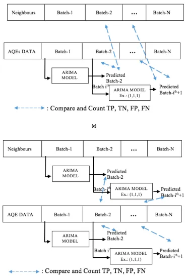
3. Dynamic with Comparison to Neighbour Scheme
This scheme is similar to the Dynamic Detection scheme. However, when the scheme detects AQE data (yi) outside the prediction range (?N) and its standard deviation, the scheme
checks a suspected outlier against its adjacent nodes (zin) and their standard deviation. The scheme marks a value as an outlier when the value (yi) is still out of the range on all adjacent node values (zin) and their standard deviations.
Algorithm 4.2 and Figure 4.1c illustrate the proposed method.
#using AQE’s first sequence predicts the output of one batch ahead
For each ith row:
Within range: if (?@− C) < ?@ < (?@+ C)
Possibility of an outlier: if ?@ > (?@+ C) OR ?@ < (?@− C)
#Checks values (P@) of n neighbours (P@Q) and their standard deviation (CQ) For each nth neighbour:
Possibility of an outlier: if ?@ > (P@+ CQ) OR ?@ < (P@− CQ) Marks as an outlier if ?@ is out of the range for all neighbours
4. Dynamic with Comparison to Neighbour’s ARIMA model Scheme
This scheme is similar to the Dynamic with Comparison to Neighbour scheme, but it differs in evaluating their neighbours. The scheme calculates their ARIMA model and compares the predicted values against suspected outliers when evaluating the neighbours. The scheme marks the outlier only if the suspected outliers are out of the range on all predicted neighbours’ ARIMA model. Figure 4.1d illustrates the scheme.
(c)
[image:39.595.112.481.68.613.2](d)
Figure 4.1 Proposed decision schemes in the outlier module (a) static detection. (b) dynamic detection. (c) dynamic detection with comparison to neighbours. (d) dynamic detection with
4.2 Evaluation Methods
Classifying whether a reading is an outlier or not is a challenging task, particularly because a sudden change in the air quality dataset can be correlated to a sudden change in environment, instead of the sensor’s fault. We apply the Type 3 approach to the problem of outlier detection [16]. Type 3 assumes only normal data with few outliers exist in the dataset. Outliers are then assessed statistically using the proposed detection schemes in order to find them in the data, particularly when a value is outside the boundary. The proposed detection schemes identify values outside their prediction range as outliers.
Classification accuracy is used in assessing the performance of each decision scheme. Classification accuracy is assessed by counting the number of True Positive (TP), True Negative (TN), False Positive (FP), and False Negative (FN). The evaluation method requires a reference to identify whether the schemes have correctly classified the values. TP indicates that a scheme has correctly identified a value as normal data, compared to the reference. TN indicates the scheme has correctly identified a value as an outlier, FP means the scheme has incorrectly identified the value as normal data, while FN indicates the value has incorrectly identified as an outlier. The assessment of a scheme is calculated as:
Classification Accuracy = YZ[\Z[YG[\GYZ[YG Equation 4.3
4.3 ARIMA Models
time series. Regarding the time series analysis, Shumway and Stoffer [72] discuss three possible approaches: linear regression, Box-Jenkins, and additive models. They also mention other methods: frequency domain, and a combination of time series and frequency domain approaches. The use of time series can be found in many applications, such as engineering, agriculture, meteorology, and quality control.
A univariate outlier detection model is implemented by employing the Box-Jenkins approach. The method is also known as the ARIMA (Auto Regressive Integrated Moving Average) model and is discussed in detail below.
4.3.1 Time Series Model with Seasonal ARIMA
Stochastic models can be used to calculate the probability of a future value in the range of two specified limits [73]. One class of stochastic models is stationary models. Stationary models require fixed probabilistic processes, meaning that the distribution function of the stationary series does not change over time. Stationary models can be distinguished based on the mean and variance. A model can be categorized as a strictly stationary process when its mean is zero. But, strictly stationary processes never exist in the real world. A model with a fixed constant mean and constant variance is categorized as a weakly stationary process. Nonstationary models, as opposed to stationary models, tend to fluctuate in amplitude, so they may not have a constant mean level over time. Nonstationary models are the most common models found in many time series problems.
predicts future values by calculating its forecast errors and averaging out noise. ARIMA models can only be applied to stationary processes. When the series is a non-stationary process, it requires to be transformed first into a stationary process by applying the difference to the series. This process is said to be “Integrated” in the ARIMA model.
Ideally, the model of autoregressive (AR) and moving average (MA) representations contains an infinite number of available observations. However, this notion is not applicable in the real world due to data limitation. The model for the time series has a finite number of parameters. An autoregressive process of order p means that the AR model is limited to a number of p observations in the past, while a moving average process of order q can be interpreted as q number of lag forecast errors from the past observations. d notation represents the number of differencing steps.
Seasonal ARIMA is introduced when the given series shows a repeated or seasonal pattern. Suppose that five-year precipitation data shows heavy rain every Spring, drizzle in Summer, or a dry Autumn. This phenomenon can be explained using a seasonal ARIMA model. Capital letters are used to denote the order of the seasonal model. P means the number of past values for seasonal AR, Q is the number of the lag forecast error, and D indicates a number of differencing steps imposed to the seasonal time series. Describing the seasonal ARIMA model, the notation of the model can be written as (p,d,q) x (P,D,Q).
Equation 4.4 is a seasonal ARIMA model with four types of constants (θ,^,Θ,Φ) where
^_(`) and θq (B) are the regular autoregressive and moving average factors and ΦP (Bs) and
ΘQ (Bs) are the seasonal autoregressive and moving average factors, respectively [71]. (1-B)
cZ `d ^_ ` 1 − ` e 1 − `d fgh = ij ` kl `d mh Equation 4.4
where:
gh = ggh− I, Nn o = p = 0 h, rsℎuvwNxu
mh = nrvuymxs uvvrvx nvrz sℎu {mxs r|xuv}msNr~x ms sNzu s ϕ_ ` = mÄsrvuÅvuxxN}u nmysrvx = 1 − ϕF` − ϕJ`J− ϕ
_`_
θj ` = zr}N~Å m}uvmÅu nmysrvx = 1 − θF` − θJ`J− θ j`j
ΦZ `d = xumxr~mÑ mÄsrvuÅvuxxN}u nmysrvx = 1 − ΦF`d− ΦJ`Jd − ΦZ`Zd Θl `d = xumxr~mÑ zr}N~Å m}uvmÅu nmysrvx = 1 − Θ
F`d− ΘJ`Jd− Θl`ld
B is a backshift operator Bjxt = xt-j. It is used to shorten the equation. Equation 4.4 has
been shortened because of the B operator. Suppose that we use the temperature model of (2, 2, 2) x (1, 1, 1)12 or (2, 2, 2) x (12, 12, 12). Each element from Equation 4.4 for the given
ARIMA model can be written as:
^J ` gh = 1 − ^FghHF− ^JghHJ
iJ ` mh = 1 − iFmhHF− iJmhHJ
cJ `FJ g
h = 1 − cFghHFJ
kJ `FJ mh = 1 − kFmhHFJ
(1 − `)Jg
h = gh− ghHF− ghHJ
(1 − `FJ)Fg
h = gh− ghHFJ
From the seasonal ARIMA model above, Ztis current temperature at time t, Zt-1 is the
4.3.2 Box-Jenkins Approach
Time series analysis is a tool to capture the nature of past processes in order to predict future values by the use of mathematical model and data analysis. To generate a model, a theoretical and data analysis is usually combined to perfect the model. The Box-Jenkins approach is used as a starting point. Several ARIMA models may need to be evaluated and explored to choose the best fitted model, identified in three steps: model identification, parameter estimation, and diagnostic checking.
A. Model Identification
Four stages are involved for model identification [71]. The first step is plotting the time series data in order to determine whether the series is a stationary or non-stationary process. Data differencing is applied when it is a non-stationary process. The next three steps are: calculate the auto correlation function (ACF), calculate partial auto correlation function (PACF), and test the deterministic trend term θ when d > 0.
B. Parameter Estimation
It is common that some models may have a similar result in the parameter estimation stage [71]. Therefore, some criteria are available to select a model in generating a time series model, including the Method of Moments, Maximum Likelihood Method, Non Linear Estimation, and Ordinary Least Squares Estimation [71]. Dent and Min [76], and Ansley and Newbold[75, 76] have conducted simulation studies to assess the performance of the Conditional Least Squares, Unconditional Least Squares, and Maximum Likelihood techniques for estimating parameters in ARMA models. If an estimator has to apply only one technique, Dent and Min propose Maximum Likelihood over the others. However, the two studies suggest that both Least Squares methods suit larger sample sizes, while Maximum Likelihood works better with small or moderate sample sizes. The result of two simulation studies is strengthened by the study of Hillmer and Tiao [7[77, 78], and Osborn [77, 78]. Later, we discuss the experiment challenge in the testing phase with regards to selecting an appropriate method for parameter estimation in Section 4.6.
R has a built-in function (stats::arima) to build the ARIMA model. The Maximum Likelihood (ML) method is chosen to examine the parameters in the training phase. The Exact Likelihood function is used among the other two ML functions: (i) Conditional Maximum Likelihood Estimation, and (ii) Unconditional Maximum Likelihood Estimation and Backcasting Method [71]. The algorithm of Gardner et al [79, 80] and the study of Dublin and Koopman [79, 80] are applied to the Exact Likelihood function.
C. Diagnostic Checking
Criteria (BIC), Schwartz’s Bayesian Criterion (SBC), Parzen’s Criterion for Autoregressive Transfer (CAT). Akaike Information Criterion is a common method for diagnosing a model and has been employed in many time series programs [71]. We employ AIC in determining the best ARIMA model.
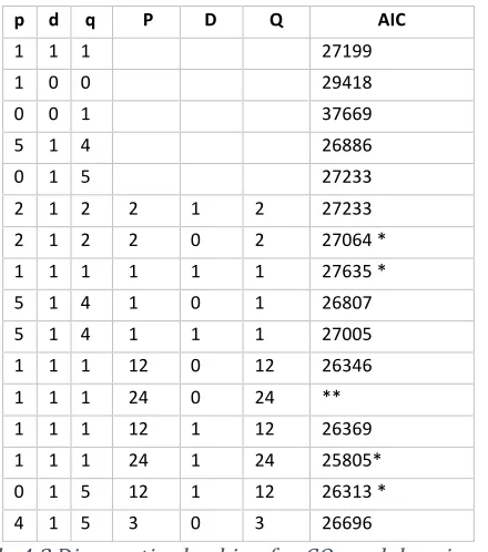
The AIC determines the goodness of a model based on the mean expected log likelihood. It provides a balance between the virtue of fitting the model and the complexity of the model. Sakamoto et al [81] implied that a model with the lowest AIC can be chosen. When there are several models with almost the same values, they suggest choosing the model with the smallest number of parameters. The method estimates the information lost in generating the data for a given model. Sakamoto et al argued that the differences of AIC values generated from the models under investigation are more important than the actual AIC values themselves. AIC cannot measure the model in the real application and it cannot tell if the models fit poorly. AIC is defined as follows [81]:
AIC = -2 x (maximum log likelihood of the model) +
2 x (number of free parameters of the model) Equation 4.5
4.4 Training Phase
Past ECan data is assessed statistically in obtaining appropriate ARIMA models to be used in the detection schemes. The data is separated based on the types of sensors. The following four subsections discuss the finding of the past ECan data for the training phase.
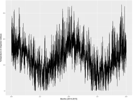
4.4.1 Temperature
degrees Celsius, where the minimum values are 0 degrees Celsius and the maximum value is 33.26 degrees Celsius. Looking at each year alone, the mean temperature of 2014 is 12.49 degrees Celsius where the minimum value is 0 degrees Celsius and the maximum value is 32.46 degrees Celsius. Meanwhile, the 2015 mean temperature is 12.63 degrees Celsius with 0 degrees Celsius and 33.26 degrees Celsius as the minimum and maximum temperature, respectively. Note that there are 107 hours of missing data of which 36 hours occurred in 2014.
Figure 4.2. 2014 and 2015 temperature plot
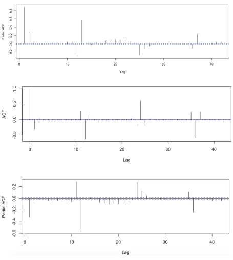
(September to November) and Summer (December to February) than in the Autumn (March to May) and Winter (June to August) seasons [82]. We would expect annual temperature series to be symmetrical over long periods. ACF and PACF are computed at the first stage to determine possible models. Figure 4.3 depicts the result of the computation of ACF and PACF where it shows a sustained large ACF with slow decay values, and a large PACF value in the first lag. Although the two-year measurement of temperature indicates a weakly stationary process, Figure 4.3 suggests the temperature needs to be differenced. Data differencing is needed if ACF decays very slowly and PACF cuts off after lag 1 [71]. Therefore, data differencing is applied to the dataset and its result is described in Figure 4.4.
Figure 4.4. ACF and PACF of two years’ temperature (2014 and 2015) after one-time differencing
12-hour, 24-12-hour, or 36-hour pattern in the series. This seasonal trend is confirmed in the PACF plot. Lag 12th, 24th, and 36th correlate to current time with the respective factor of -0.57, 0.27,
and -0.24. From the plotting of ACF and PACF in Figure 4.4, zero or first order of AR, first order of MA, and either 12, 24, or 36 order of seasonal ARIMA model will all be candidates for being the model.
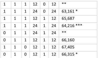
Although we already have a good starting point in deciding which ARIMA model is the best, estimating a model can still be a challenge. We might need to examine all possible configurations of the model. The Box-Jenkins approach emphasizes ACF and PACF are useful in model identification, but there may be an occasion where we need to assess all possible orders of autoregressive and moving average. Obtaining earlier indications of p, d, and q values, we examine all possible models and obtain the AIC values. Table 4.1 shows the result of the calculation.Note: A single asterisk means the parameters are near the edge of the stationarity region. The Maximum Likelihood method in the parameter estimation requires that the ARIMA model must be in a stationary process and the single asterisk indicates that the calculation has a potential to be out of the region. A double asterisk indicates that the estimation cannot be continued as the calculation leads to infinity. A triple asterisk depicts that the estimation takes exhaustive time for calculation.
p d q P D Q AIC
1 1 1 79,079
1 1 4 78,191
1 1 4 12 1 12 65,611
1 0 0 81,007
5 1 4 75,780
5 1 5 74,750
2 1 2 2 1 2 78,217 *
2 1 2 2 0 2 79,091 *
1 1 1 1 1 1 80,827 *
5 1 4 1 0 1 75,478
1 1 1 12 0 12 ** 1 1 1 24 0 24 63,161 * 1 1 1 12 1 12 65,687 1 1 1 24 1 24 64,216 ***
0 1 1 24 1 24 **
[image:51.595.201.394.70.185.2]0 1 1 12 1 12 66,160 1 1 0 12 1 12 67,405 0 1 0 12 1 12 66,315 *
Table 4.1Diagnostic checking for temperature models using AIC.
The AIC method is used to decide which p, d, q values are best to use as a model. We conclude that ARIMA (1,1,1) x (12,1,12), (1,1,1) x (24,0,24), and (0,1,1) x (12,1,12) have the smallest AIC value. The performance of the three models would be decided later based on the evaluation of the model on the outlier module.
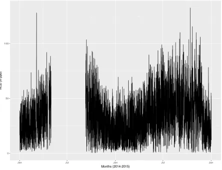
4.4.2 Carbon Monoxide (CO)
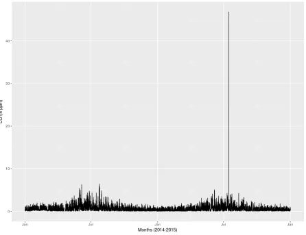
understand the event, we may need to look at the possibility if there was an accident, or heavy traffic on the site.
Figure 4.5 2014-2015 readings of hourly CO concentration.
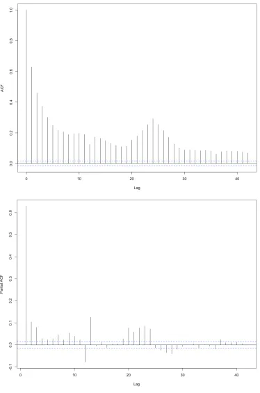
Figure 4.7ACF and PACF for first order of CO
ACF plotting in Figure 4.7 suggests a first or second order of MA process, whereas PACF indicates many possibilities of order for AR process ranging from 1st to 10th order. For
negative contribution by the respective factors of: 0.27, 0.2, 0.13, 0.11, 0.10, 0.11, 0.79, 0.1, 0.83, and 0.62. Table 4.2 shows the result of various configurations.
p d q P D Q AIC
1 1 1 27199
1 0 0 29418
0 0 1 37669
5 1 4 26886
0 1 5 27233
2 1 2 2 1 2 27233
2 1 2 2 0 2 27064 *
1 1 1 1 1 1 27635 *
5 1 4 1 0 1 26807
5 1 4 1 1 1 27005
1 1 1 12 0 12 26346
1 1 1 24 0 24 **
1 1 1 12 1 12 26369
1 1 1 24 1 24 25805*
0 1 5 12 1 12 26313 *
[image:55.595.190.410.136.385.2]4 1 5 3 0 3 26696
Table 4.2Diagnostic checking for CO models using AIC.
Based on Table 4.2, the models for CO are: (0,1,5) x (12,1,12), (1,1,1) x (12,1,12), (1,1,1) x (12,0,12), and (1,1,1) x (24,1,24).
4.4.3 Nitrogen Dioxide
Two-years of measurement of nitrogen dioxide (NO2) is shown in Figure 4.8. The NO2
readings on the site are incomplete. There are 3,334 missing hours in the data, where 51 missing hours occurred in 2015. Another 3283 hours were missed in 2014. The missing data is noticeable in Figure 4.8. The missing periods are:
• 18th April 2014 9:00 AM to 22nd April 2014 at 12:00 PM, • 1st May 2014 1:00 AM until 9th September 2014 at 12:00 PM • 13th, 19th, and 30th September 2014.
The two-year NO2 concentration average is 34.44 ppb with 0.189 ppb and 132.4 ppb
[image:56.595.77.522.170.511.2]as the minimum and maximum values, respectively. The standard deviation is 28.56 ppb and variance is 344.39 ppb.
Figure 4.8The plotting of nitrogen dioxide between 2014 and 2015
Figure 4.10One order of differencing of ACF and PACF for NO2
lag has an impact to the series in the ACF plot. The seasonal ARIMA model might also be considered in the model, particularly at lag 12 and 24.
Following initial assessment of the ACF and PACF plots, AIC values are calculated for various configurations of lags, results given in Table 4.3.
p d q P D Q AIC
1 1 1 109,918
1 0 0 111,699
0 0 1 131,324
5 1 4 108,418
0 1 5 109,689
[image:59.595.218.389.202.434.2]2 1 2 2 1 2 109,669 * 2 1 2 2 0 2 109,735 1 1 1 1 1 1 110,715 5 1 4 1 0 1 108,051 5 1 4 1 1 1 108,425 1 1 1 12 0 12 104,665 1 1 1 24 0 24 104,665 1 1 1 12 1 12 104,552 1 1 1 24 1 24 102,373 0 1 5 12 1 12 104,506 *
Table 4.3Diagnostic checking for NO2 models using AIC
From Table 4.3 the three lowest AIC values are (1,1,1) x (24,1,24), (1,1,1) x (12,1,12), and (0,1,5) x (12,1,12).
4.4.4 Humidity
Figure 4.11The hourly humidity on the Riccarton road site taken during the period of 2014 and 2015.
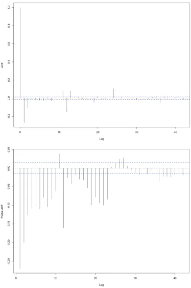
Figure 4.13 ACF and PACF for first order of humidity
the process, with respective factors of -0.324 and -0.299. Looking at the possibility to consider building a seasonal model, lag 12 and 24 have significant impact on the process with factors of -0.62 and 0.531, respectively. Also, it is interesting to consider lag 36 because its factor is -0.511 which shows an impact on the process as well. From Figure 4.13, the different value of orders is examined. The result is given in Table 4.4.
p d q P D Q AIC
1 1 1 132,534
1 0 0 134,570
0 0 1 178,511
5 1 4 130,443
0 1 5 132,309
2 1 3 131,472
2 1 3 12 1 12 122,025 * 2 1 2 2 1 2 131,501 2 1 2 2 0 2 131,482 * 1 1 1 1 1 1 133,951 * 5 1 4 1 0 1 130,445 5 1 4 1 1 1 130,457 1 1 1 12 0 12 130,457 1 1 1 24 0 24 ** 1 1 1 12 1 12 122,025 1 1 1 24 1 24 ** 0 1 1 12 1 12 122,228
Table 4.4Diagnostic checking for humidity models using AIC
Looking at the AIC values in Table 4.4, two models are chosen: (0,1,1) x (12,1,12), (1,1,1) x (12,1,12), and (2,1,3) x (12,1,12).
4.5 Difference Among AQE Sensors
(a)
(c)
[image:65.595.109.474.85.647.2](d)
Figure 4.14 5-second reading of three Air Quality Eggs in Riccarton road during a period of three months from the sensors:(a) carbon monoxide (CO). (b) nitrogen dioxide (NO2). (c)
temperature. (d) humidity.
is specifically used for graphical comparison and has a function to perform index of agreement. The index of agreement of ‘0’ indicates no agreement between the sensors, while ‘1’ indicates a perfect agreement. Further detail of the index of agreement is explained in Section 5.3.2. Table 4.5 shows the d-value of each sensor type. The table indicates temperature, humidity and CO sensors have the same agreement on the reading (more than 0.8), while NO2 sensors have a poor level of agreement.
Type of Sensors Index of Agreement Among Sensors
Temperature 0.98
Humidity 0.98
CO 0.80
NO2 0.40
Table 4.5 Index of agreement between sensors on AQEs
Sum of Squares AQE1
Sum of Squares AQE2
Sum of Squares
AQE3 Residuals Sensor Types
21.00 ppm 16.33 ppm 2.31 ppm 96.31 ppm CO
21,769.3 ppb 4,654.2 ppb 1,727.0 ppb 466,703.8 ppb NO2
8,344.02 0C 1,045.72 0C 1,025.11 0C 18,865.01 0C Temperature
226,381.5 % 2,786.8 % 3,009.5 % 343,102.3 % Humidity
Table 4.6 Analysis of variance: comparing readings difference between individual AQEs and ECan
Apart from the early measurement when the AQEs were turned on for the first time, the CO reading from all AQEs and ECan during the experiment period never reached 2.5 ppm, as illustrated by Figure 4.15a. The AQEs’ CO sensors underestimate the ECan value. Similar readings occurred in the NO2 readings (Figure 4.15b) and humidity (Figure 4.15d) where the
AQEs readings were lower than ECan. Meanwhile, the temperature readings overestimate the ECan readings on the site in Figure 4.15c.
(b)
(c)
[image:68.595.87.521.80.682.2](d)
We have now established a null hypothesis: there is no mean difference between all the corresponding sensors on AQEs, while the alternative hypothesis is the opposite of the null hypothesis. The null hypothesis (H0) and the alternative hypothesis (H1) can be written
mathematically as:
óò: IF = IJ = Iô
óF: IF ≠ IJ ≠ Iô
Take a null hypothesis for CO sensors as an example, the null hypothesis equation above suggests that the mean of AQE1 (µ1), AQE2 (µ2), and AQE3 (µ3) are all equal. The
one-way analysis of variance (ANOVA) and the Tukey test are chosen to test the null hypothesis [85]. ANOVA is a null hypothesis test to determine group means by partitioning variance. Only one independent variable is considered in the ANOVA test, hence it calls as one-way. The F-test using ANOVA determines the relationship between multiple predictors in predicting the response so it can validate whether accepting or rejecting a null hypothesis. A null hypothesis can be rejected if the F ratio is statistically significant, depicting that at least one of the group means is different from the others, but we cannot determine which group it is. A test between any pair of groups can be carried out to further determine the difference among them. This is called post hoc or posteriori testing.
and-whisker plots were used to summarize the 5-second AQEs readings. A Box-and-whisker plot presents the whole data as illustrated in Figure 4.16a, Figure 4.17a, Figure 4.18a, and Figure 4.19a below. On these four figures, a box indicates the inter-quartile range, starting from the 25th to the 75th percentile. A horizontal line inside the box indicates the