Impression Formation Through Adding
"Weight and Structure" to Arguments
Corinna Gerst
University of Twente
Abstract Years of research have shown the importance of unconscious information processing in
impression formation. Especially in the context of consumer psychology, the stimulation of visual, olfactory,
and auditory senses has been demonstrated to be an effective mean for regulating consumer's behaviour on
an unconscious level. However, the role of touch (tactile sense) with its fundamental dimensions weight and
texture has been studied rarely. In this paper it is argued, that tactile manipulation is a powerful mean to
influence consumer's impressions. This idea was tested by comparing the effects of different paper versions
within visual communication material. In a first experiment, a 2x2 between-subjects-design was used to
compare the effects of Weight (light versus heavy) and Texture (glossy versus rough) within an image
brochure about a supermarket. Subjects in the heavy-paper condition and the rough-paper condition reported
higher scores on brochure quality than subjects within the light-paper or glossy-paper condition. Texture also
affected perceptions of brochure attractiveness, brand credibility & trust, and behavioural intention to go to
the advertised supermarket. In a second study, it was focused on the effects of Weight within a product
brochure. Contrary to the effects found in the image brochure, Weight even affected brand evaluation.
Furthermore, additional variables were included, whereby Weight positively affected material evaluation,
authenticity perceptions, and the preference for the brand and product advertised. Additionally, it was
focused on congruence effects created by cross-pairing paper material (light versus heavy) with content
(Light chips versus Classical chips). It was assumed that information congruent with each other is processed
more fluently and accordingly, evaluated more positively. However, no such effects could be found. Findings
suggest that tactile information can function as a subsequent cue for impression formation. Thereby, these
effects may differ between image and product related material, which should be the focus of future research.
The lack of congruence effects indicates that visual communication design could incorporate Weight
regardless the product's attributes, since even the Light chips brochure benefited from heavy paper material.
KEY WORDS: Impression Formation, Tactile Sense, Weight, Texture, Congruence
Impressieformatie Door Toevoeging van
"Gewicht en Structuur" Aan Argumenten
Corinna Gerst
Universiteit Twente
Abstract Jaren onderzoek heeft het belang van onbewuste informatieverwerking bij impressie
formatie aangetoond. Vooral in de context van de consumenten psychologie werd gedemonstreerd dat het
stimuleren van visuele, olfactorische en auditieve zintuigen een effectief middel is, om gedrag van
consumenten op een onbewust niveau te reguleren. Daarentegen werd de rol van het tactiel zintuig met zijn
fundamentele dimensies Gewicht en Textuur zelden onderzocht. In dit paper wordt betoogd dat de tactiele
manipulatie een krachtig middel is, om impressies van consument te beïnvloeden. Dit idee werd getest door
de effecten van verschillende papierversies voor visueel communicatiemateriaal te vergelijken. In een eerste
experiment werd een 2x2 tussen-proefpersonen-opzet gebruikt, om de effecten van Gewicht (licht versus
zwaar) en Textuur (glanzend versus ruw) door middel van een imagobrochure over een supermarkt te
vergelijken. Proefpersonen in de zware- en ruwe-papier conditie rapporteerden hogere scores op brochure
kwaliteit dan proefpersonen in de lichte- of glanzende-papier conditie. Textuur had bovendien invloed op de
percepties van brochure-aantrekkelijkheid, merk-geloofwaardigheid & vertrouwen, en gedragsintentie om
naar de geadverteerde supermarkt te gaan. Een tweede experiment werd gericht op de effecten van Gewicht
in een productbrochure. In tegenstelling tot de effecten in de imagobrochure, heeft Gewicht zelfs de
merkevaluatie beïnvloed. Bovendien werden extra variabelen opgenomen, waarbij Gewicht positieve invloed
had op materiaalevaluatie, authenticiteit percepties, en de voorkeur voor het merk en het geadverteerde
product. Daarnaast werden congruentie-effecten onderzocht, die door cross-pairing van materiaal (licht
versus zwaar) en inhoud (Light chips versus Classical chips) gecreëerd werden. Er werd aangenomen dat
congruente informatie vloeiender verwerkt en daardoor positiever geëvalueerd wordt. Er werden echter geen
dergelijke effecten gevonden. De resultaten suggereren dat tactiele informatie als een additionele cue voor
impressieformatie kan werken. Daarbij kunnen deze effecten verschillen tussen imago- en productgerelateerd
materiaal, wat ook de focus van toekomstig onderzoek zou moeten zijn. Het gebrek aan congruentie-effecten
geeft aan dat Gewicht, ongeacht de attributen van het product, in communicatiemateriaal opgenomen zou
kunnen worden, omdat zelfs de Light chips brochure van het zwaar papier profiteerde.
TABLE OF CONTENT
1. INTRODUCTION 5
1.1 System 1 and System 2 5
1.2 The Power of Unconscious Information Processing 5
1.3 The Human Sense of Touch 6
1.4 Tactile Influences Within the Context of Visual Communication 9
1.5 Congruence Improves Processing Fluency 11
2. GENERAL METHOD 12
2.1 Conscious and Unconscious Information Processing 13
2.2 Pretest 13
3. STUDY 1 14
3.1 Stimulus Material 15
3.2 Method 15
3.2.1 Participants and Procedure 15
3.2.2 Measures 16
3.3 Results 17
3.4 Conclusion 19
4. STUDY 2 19
4.1 Stimulus Material 21
4.2 Method 21
4.2.1 Participants and Procedure 21
4.2.2 Measures 22
4.3 Results 25
4.4 Conclusion 28
5. GENERAL DISCUSSION 29
5.1 Tactile Influences 29
5.3 Conclusions 30
5.4 Limitations 32
5.5 Future Research 32
REFERENCES 34
1. INTRODUCTION
Getting insight in the nature of the human being, especially in the mechanisms of decision making, is an
extensive field of interest. For many years, rational choice was assumed to explain behaviour (Simon, 1955;
Downs, 1957), which is a conscious process (Kahneman, 2011). However, there are findings which cannot
be explained by using this concept. Examples are the 'mere-exposure effect' (Zajonc, 1986), improved
attitudes towards an object by repeated exposure, the 'embodying emotion', (cartoon) evaluations are more
positive when smiling (Strack, Martin, & Stepper, 1988), and the 'ideomotor-effect', exposing participants by
a particular idea - concept of 'elderly' - influences their subsequent behaviour - walking more slowly (Bargh,
Chen, & Burrows, 1996). Reviewing those investigations, it can be argued that people's evaluations are not
solely based on rational argumentation, there has to be an alternative explanation: unconscious information
processing.
1.1 System 1 and System 2
Stanovich and West (2000) combined both unconscious and conscious information processing by introducing
the terms system 1 and system 2 and therefore, accepting their co-existence. Within this dual-process
approach, system 1 can be characterised as an autonomous, instinctive and uncontrolled mode of thinking,
which takes place rapidly, parallel and automatically. In contrast, system 2 operates slowly and sequentially
with the aim of hypothetical thinking, abstract reasoning, and self-mastery. However, last mentioned
processes are constrained by working memory capacity and require high effort (Evans, 2003). Focusing
research on the processes and results of system 1, it has been found that those operations can create complex
and skilled judgments, independent of system 2 (Morrewedge & Kahneman, 2010). Going a step further,
Dijksterhuis (2004) claims that "conscious thought is [...] maladaptive when making complex decisions" (p.
586). Therefore, the concept of the unconsciousness was subject of many investigations and targeting almost
all of our five senses.
1.2 The Power of Unconscious Information Processing
For a long time, vision dominated scientific research related to consumption (Jannson-Boyd, 2011). Studies
in consumer psychology showed that the unconscious exposure of words can affect consumer behaviour,
known as subliminal priming. For example, the subliminal presentation of the words drinking, glass and
pursuing its impact on shoppers' search, purchase, and consumption behaviours. For example, it was found
that "brighter lighting influenced shoppers to examine and handle more merchandise" (Areni & Kim, 1994,
p. 117). However, in the past 15 years there has been gradual shift to the interest in how other senses can
impact aspects related to consumer decision making and product evaluation (Jannson-Boyd, 2011).
Accordingly, the auditory dimension was subject of study as well. In a supermarket, “French [in-store] music
led to higher sales of French than German wine, and German [in-store] music led to higher sales of German
than French wine” (North, Hargreaves, & McKendrick, 1999, p. 274). Also, results of the exposure to
classical versus top-forty background music indicated that customers selected more expensive merchandise
when classical music was played (Areni & Kim,1993). Thirdly, investigations of the olfactory dimension
demonstrated that the presence/ absence of an odour affects consumer behaviour. Guéguen and Petr (2006)
showed that consumers in a restaurant stayed longer when exposed to a scent of lavender, associated with
relaxation, than in the non-aroma condition. Hirsch (1995) investigated the context of gambling, where
ambient aromas were found to influence the gamblers' behaviour; the amount of money gambled was greater
than in odour-free control condition.
This is only a selection of many studies targeting these three senses (for an extensive overview see
Dijksterhuis, 2007). However, the tactile dimension has not been considered that extensively. Even though
the first experiment known investigating unconscious processes was targeting the human sense of touch,
touch as a consumer communication tool has been rarely used (Jannson-Boyd, 2011). In the year 1884,
Pierce and Jastrow could reveal that a human subject is able to discriminate between weights, even though
the absolute difference is minimal so that it could not be detected consciously. For this aim, they set up a
weight-discrimination-experiment, which the researchers performed themselves. The task was to identify the
heavier object and to indicate how sure they were about this judgment on a rating scale, resulting in a
difference limen (knowing versus guessing). Conducting the analysis, Pierce and Jastrow (1884) noticed that
the majority of guessed weight-judgments was correct. Their success rate deviated significantly from chance.
Consequently, the authors inferred that unconscious perception has to be responsible for this finding.
1.3 The Human Sense of Touch
The importance of tactile input for human information processing can already be found in our youngest
childhood, since touch is the first sense to develop in infants (Miodownik, 2005). From the moment we are
development for environmental manipulation, which are the two primary functions of our hands (Ackerman,
Nocera, & Bargh, 2010). Tactile information subconsciously influences impressions, judgments, decisions
and actions (Williams, Huang, & Bargh, 2009), since conceptual knowledge based on early sensimotor
experiences is acquired. The underlying concept is the formation of a 'haptic mindset' originating from
diverse associative linkages that are triggered when touching objects (Ackerman, Nocera, & Bargh, 2010).
Moreover, evidence from everyday consumption behaviour emphasises the importance of tactile
input, such as within the clothes shopping context. Next to the visual information gained when considering a
specific item for possible purchase, the tactile information serves as a peripheral cue (Peck & Wiggins
Johnson, 2011). For example, if the impression obtained by both senses is not satisfactory to the possible
customer, (s)he decides to shop elsewhere (Gladwell, 1996). In addition, according to McCabe and Nowlis
(2003), consumers prefer to purchase products from stores where they are allowed to touch them. To the
contrary, if they are prevented from touching the product of interest, judgment decisions are affected
negatively (Peck & Childers, 2003). Besides, Spence, Nicholls and Driver (2001) demonstrated that
consumers are less likely to shift their attention to a competing product or brand, once they focused on the
tactile input, which also underlines the importance of touch. Finally, it is found that tactile information is
linked to affect (Jannson-Boyd, 2011). Specifically, when consumers experience a haptically pleasant
product it triggers an emotional response (Schifferstein & Hekkert, 2011). Summarising, within the last years
a clearer understanding emerged with regard to the important role the human sense of touch plays in
consumer evaluations. Even more specific, "the capability of increasing the likelihood of sales [...] is the key
to why touch should be acknowledged as an important tool" (Jannson-Boyd, 2011, p. 542).
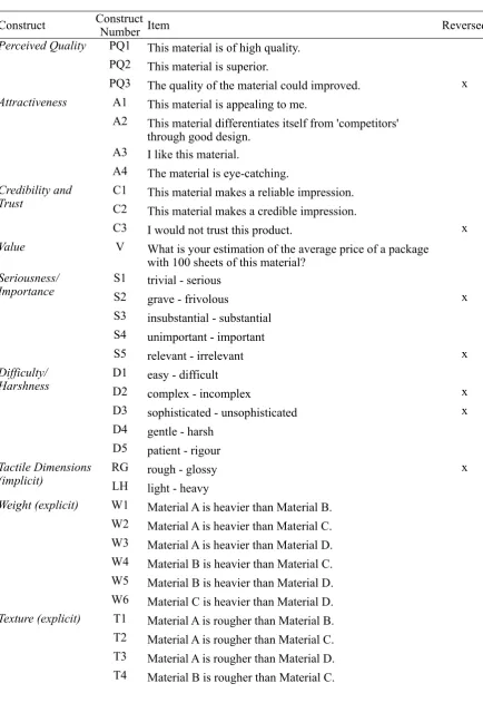
The fundamental dimensions of touch are texture, hardness, and weight (Ackerman, Nocera, &
Bargh, 2010; Hollins, Faldowski, Rao, and Young, 1993; Picard, Dacremont, Valentin, and Giboreau, 2003),
whereby each dimension evokes certain metaphorical associations based on the haptic mindset as described
above. Firstly, texture and specifically roughness is associated with the concepts of difficulty and harshness,
as expressed in the metaphors "having a rough day" and "coarse language" (cf. Ackerman, Nocera, & Bargh,
2010, p. 3). Secondly, hardness, as opposed to softness, is associated with the concepts of stability, rigidity,
and strictness, as expressed in the idioms "(s)he is my rock" and "hard-hearted" (cf. Ackerman, Nocera, &
Bargh, 2010, p. 4). Thirdly, heaviness is associated with seriousness and importance, as expressed in the
Bargh, 2010, p. 2). Those metaphors and associations are not only applicable to the English language, but to
many more, such as Dutch, German, Spanish, and even Chinese (Jostmann, Lakens, & Schubert, 2009).
Moreover, with respect to last mentioned dimension "people 'weigh' the value of different options
before making a decision, they 'add weight' to place emphasis on important ideas, and their opinion 'carries
weight' if they fill an influential position" (Jostmann, Lakens, & Schubert, 2009, p. 1169). Accordingly, it is
argued that the "abstract concept of importance is grounded in bodily experiences of weight" (Jostmann,
Lakens, & Schubert, 2009, p. 1169), which is known as embodiment. Theories on 'embodied cognition' posit
that perceptual representations of abstract concepts are developed through schematisation of experienced
bodily states. Within the present context the embodiment of importance emerged from the fact that heavier
objects have a greater impact on people with respect to physical as well as mental effort. Consequently, the
experience of weight influences the judgments regarding the extent of importance that is allocated. The
authors demonstrated within four different studies that the dimension of weight has a powerful effect on
subsequent judgments (Jostmann, Lakens, & Schubert, 2009). For this aim, they used a heavy versus a light
clipboard, which participants were holding when answering different questions. Participants within the heavy
clipboard condition (1) judged the value of foreign currencies to be higher, (2) found it more important to
have a voice in decision-making procedures, (3) displayed a greater consistency in judgments, and (4)
demonstrated more polarisation when evaluating strong versus weak arguments, compared to participants
holding the light clipboard. Concluding, weight led to a greater effort participants put into thinking and
greater cognitive elaboration as well as greater confidence in one's opinion (Jostmann, Lakens, & Schubert,
2009).
The associations arising when holding a relatively heavy object, such as the clipboard, and the
transfer process taking place could also be supported by findings of Ackerman, Nocera, and Bargh (2011).
The theoretical evaluation of a potential job applicant was more positive and social issues were experienced
as more important. Besides, this process is also taking place in a somewhat more practical situation.
Participants were asked to evaluate the same yoghurt, while divided into three groups. Each group was eating
from a bowl differing in weight. This manipulation affected sensory and hedonic perception of the yoghurt,
since effects could be found for density as well as price-expectation ratings, with the highest scores within
1.4 Tactile Influences Within the Context of Visual Communication
It has not been clearly figured out for what type of product categories tactile stimulation will influence the
consumer perception (Jannson-Boyd, 2011). As described above, also within a more abstract setting the
associations made on basis of weight have an impact on the evaluation of for example value, social issues,
and judgment consistency. Accordingly, the object of evaluation by itself is not required to contain the tactile
manipulation in order to be evaluated more favourably. To the contrary, the experience of weight in general
at the moment of evaluation is sufficient to achieve the desired effect. Consequently, it can be argued that the
product of evaluation even does not have to be present at all. The effect of weight manipulation may also be
valid for visual communications, such as advertisements, flyers, letters of application, or the annual report of
a company. Much research focused on making visual material more appealing to the consumer with respect
to colour usage, typeface, logo design, and more (Zhang, Feick, & Price, 2006; Van Rompay, Hekkert,
Saakes, & Russo, 2005; Childers & Jass, 2002). For instance, statements presented in a colour which is easy
to read are judged more credible (Reber & Schwarz, 1999; Unkelbach, 2007). The relative neglect of the
sensory dimension touch within this research domain builds up the motivation to study weight differences
within this context in more detail. Additionally, findings could contribute to an expansion of theories of the
unconsciousness as well as an increased effectiveness of visual communications, such as product campaigns.
It is assumed that two processes of association formation are taking place when evaluating visual
material. Firstly, a message is printed on a medium, specifically paper, which evokes different associations
based on different tactile dimensions (i.e. texture, hardness, weight) and their respective distinctiveness. For
example, the dimension weight could influence the perceived quality of the paper, whereby heavier paper is
assumed to be associated with better quality. This is the first transfer process taking place as illustrated in
Figure 1. Secondly, the message itself contains specific information that needs to be evaluated. Assuming
that this evaluation would be based on the rational model it can be argued that paper-evaluation and
Figure 1. Independent evaluation of paper and written text.
However, thought processes are known to be interdependent, even though people are not aware of it.
For instance, Harrar and colleagues (2011) as well as Piqueras-Fiszman and her colleagues (2012) recently
demonstrated that tableware and the environment have effect on the perception of food and drink. Next to the
transfer of low-level attributes taking place to the consumables (e.g. colour of a plate influences flavour
perception), likewise, "high-level attributes of the tableware, such as their perceived quality and expense,
might be transferred to the consumables" (Spence, Harrar and Piqueras-Fiszman, 2012, p. 10). Accordingly,
it can be argued that consumers can be influenced unconsciously. Therefore, it is assumed that evaluating a
product is not solely based on rational arguments. To the contrary, processing other information
simultaneously would have an influence on the final judgment, even though people are not aware of this
relation.
Figure 2. Transfer of paper-associations on text evaluation
In line with this reasoning it can be argued that paper-evaluation and text-evaluation are taking place
concurrently, resulting in interdependent unconscious information processing. It can be assumed that the
tactile processing is taking place much faster than reading the whole text. Therefore, the consumer already
[image:10.595.76.440.497.630.2]adopts the associations made on basis of the quality of the paper directly to the associations (s)he thought
have made on basis of the written information. This link between associations is reasonable, since those
associations could be similar. As stated above a paper can be categorised as qualitatively good, likewise the
text printed on the paper can be evaluated as good quality arguments. This example of identical evoked
associations can be supplemented with associations of credibility, trust, attractiveness, and many more.
Accordingly, a second transfer process is taking place: Paper-association influence the text-associations
which leads to the assumption that subtle changes in paper quality affect information processing of rational
arguments (Figure 2). For the purpose of identifying the underlying processes, the following research
question was formulated.
What is the influence of varying tactile paper dimensions on the evaluation of
visual communication material?
1.5 Congruence Improves Processing Fluency
Products as well as visual communications involve multiple visual elements, such as colour, typeface, or
logo design, whereby each of those 'channels' communicates specific symbolic meaning (Van Rompay,
Pruyn, & Tieke, 2009). A consumer faces the challenge to integrate these meanings into an overall
impression. Arguably, this integrating process is facilitated if the different elements are carrying the same
message, opposed to the situation if they are disagreeing with each other. This is in line with the 'consistency
principle', which states that different expressions originating from the same source should be consistent
(Rotenberg, Simourd, & Moore, 1989). The general need for unity, and more specifically, the benefit of
congruence among visual features for a fictive product evaluation, is demonstrated by Van Rompay and
Pruyn (2011). For this aim they used two shape variants and two typeface variants of a fictitious brand of
bottled water connoting either luxury or casualness within their first study and either masculinity or
femininity within their second investigation. "Cross-pairing the two shapes with the two typefaces resulted in
[respectively] four product variants, either congruent or incongruent in terms of the symbolic meanings
connoted" (p. 599). Results indicated that participants were more attracted to the product representing
congruence.
This effect can be explained based on the fact that stimuli which can be easily processed are
Reber and colleagues (2004) that fluent processing is experienced as overall positive. Based on these
processing fluency accounts, for example, the mere-exposure effect identified by Zajonc in 1986 could be
explained afterwards. Simply based on the repeated perception of the same object or person, this stimulus
could be processed with increasing fluency, leading to an enhanced appeal.
In addition to the aforementioned multiple visual channels, consumer products and visual
communications are often embedded within a context encompassing non-visual elements as well. Those
elements may be addressing remaining senses, such as the tactile dimension. In analogy with the benefit of
congruence among multiple elements within one dimension, congruence should also be established across
different dimensions, such as the material (touch) and the communicated appearance of a product for
example (vision). Accordingly, it is assumed when meaning connoted across the different elements are
incompatible, it is more difficult for the consumer to develop an overall image of the specific product or
brand, which in turn may negatively affect attitude formation (Van Rompay, Pruyn, & Tieke, 2009). This
process needs to be subject of investigation as well.
2. GENERAL METHOD
To answer the research question, this study focused on the effects of varying paper versions on the evaluation
of visual communications (i.e. study 1: image brochure of a supermarket and study 2: product brochure of
Lay's chips). As shown by Ackerman, Nocera, and Bargh (2010) the fundamental tactile dimensions are
texture, hardness, and weight. Firstly, it was chosen to study the dimension of Weight in more detail in the
context of visual communications on paper. This choice is originated from the finding of Jostmann, Lakens,
and Schubert (2009), who demonstrated that evaluation of different dependent variables could be influenced
by answering questions on heavy clipboard versus a light clipboard. The dimension hardness was not
included, since it is implicitly embedded in the dimension Weight, because relatively heavy paper is
necessarily perceived as harder than relatively light paper. Secondly, Texture was added to the current
research design of the first study, since it seems a crucial dimension of paper. In the second study, it was
especially focused on the (in)congruence effects of content and tactile information (i.e. Weight) on product
2.1 Conscious and Unconscious Information Processing
It is argued that the conscious information processing of the content of a visual communication is
supplemented by unconscious information processing, which is evoked by different (implicit) associations
made on basis of the paper version. Thereby, it is predicted that relatively heavy and rough paper types have
a positive effect on the evaluation of the visual communication. This is based on the findings of Ackerman,
Nocera, and Bargh (2010), who argued that heaviness is associated with seriousness and importance and
roughness is associated with difficulty and harshness. To measure the effect of the varying tactile dimensions
five dependent variables were analysed with a survey (i.e. attractiveness, perceived quality, credibility and
trust, brand evaluation, behavioural intention) during study 1. The second study focused on studying the
dimension of Weight in combination with congruence effects of content. However, the first step was to check
for the effectiveness of the paper manipulations in order to be able to draw valid conclusions during study 1
and 2.
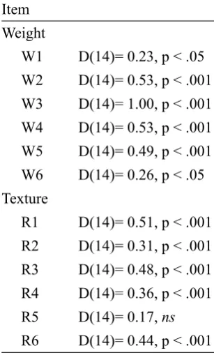
2.2 Pretest
To ensure the effectiveness of both manipulations, 14 participants took part in a pretest. Based on the
combination of the two dimensions Weight (light [90g/m²] versus heavy [300g/m²]) and Texture (glossy
versus rough), participants were presented with four types of paper stimulus material (Material A: light and
glossy; Material B: light and rough; Material C: heavy and glossy; Material D: heavy and rough). Items used
for the pretest can be found in Appendix A.1 and A.2. In order to reduce possible sequence effects, the
different paper types were administered in a random order to the participants. Most important findings of the
pretest of the potential stimulus material are described in the following. For a more detailed description of
applied analyses see Appendix A.3 and A.4.
Participants were asked to compare the different stimuli directly with respect to the two dimensions
Weight and Texture. Since most data were distributed non-normally, a Wilcoxon-Signed Rank Test was
conducted respectively with the test value 4 (meaning no difference between paper materials). For one
exception the data was normally distributed and therefore, an One-Sample t-test was performed with the
same test value. Results indicated that both 'heavy' materials C and D were indeed perceived as heavier than
the 'light' materials A (z= -3.64, p < .001 and z= -3.74, p < .001) and B (z= -3.64, p < .001 and z= - 3.50, p
< .001). Additionally, no difference was found between the two heavy variants (C and D, z= -1.47, ns) as
materials B and D were indeed perceived as rougher than the 'glossy' materials A (z= -3.56, p < .001 and z=
-3.50, p < .001) and C (z= -2.04, p < .05 and z= - 2.98, p < .05). Additionally, no difference was found
between the two rough variants (B and D, t= 0.43, ns) as well as between the two glossy variants (A and C,
z= -0.85, ns).
To conclude, the explicit comparison of stimulus material indicated that desired manipulations were
effective with respect to the dimensions of Weight and Texture, and therefore appropriate to be utilised during
the following studies.
3. STUDY 1
Based on described insights, the first study aimed to demonstrate the effect of different paper versions on the
evaluation of the communicated message. Therefore, this study tested the prediction that a visual
communication printed on relatively (1) heavy and (2) rough paper will benefit with respect to several
dependent variables in opposition to the same visual communication printed on relatively (1) light and (2)
glossy paper. Specifically, the dependent variables predicted to be affected by the paper material are
Brochure Attractiveness, Brochure Quality, Brand Evaluation, Brand Credibility and Trust, and Behavioural
Intention to Go to the Supermarket. In order to be able to evaluate potential effects afterwards the following
hypotheses were formulated:
H1: The visual communication printed on heavy stimulus material will be evaluated more positively with
respect to the dependent variables than the light stimulus material version [main effect].
H2: The visual communication printed on rough stimulus material will be evaluated more positively with
respect to the dependent variables than the glossy stimulus material version [main effect].
H3: The visual communication printed on the combination heavy and rough stimulus material will be
evaluated most positively with respect to the dependent variables[interaction effect].
Finally, it was expected that all effects on the dependent variables are distinct irrespective the fact the
potential consumer knows the brand communicated or not. To test these predictions, paper quality of a
Figure 3. Research model study 1
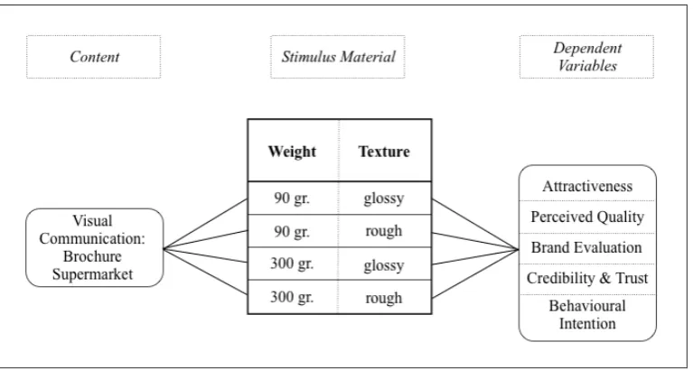
3.1 Stimulus Material
An image brochure of the German supermarket EDEKA was created based on selected content of the annual
report 2011 (Geschäftsbericht 2011: EDEKA Nord - Leidenschaft für Lebensmittel). The same visual
communication was printed on four different paper versions. These were established by manipulating two
tactile dimensions of the paper quality: Weight (light [90g/m²] versus heavy [300g/m²]) and Texture (glossy
versus rough). Accordingly, the two extremes of the mentioned dimensions were paired, resulting in a 2 x 2
between-subject design. Except for the variations discussed, the brochures were identical (Appendix B).
Therefore, there was no influence that could bias potential differences between conditions.
3.2 Method
3.2.1 Participants and Procedure
Based on a power analysis 168 participants (42 per group) were randomly selected to take part in the
study (55 male and 113 female; mean age 26.91 years; familiarity with supermarket: 73 yes, 25 not really,
and 70 no; a frequency distribution can be found in Appendix C.2). Participants received a brochure,
whereby they were randomly assigned to the conditions, and a questionnaire (pretested in advance, see
Appendix A.5). The purpose of the study was introduced at the beginning of the questionnaire: "Companies
spend a lot of time and effort in creating adverts that convey the right brand image to customers. To make
sure the 'right' image comes across; a supermarket is interested in your perception of this brand." Participants
were asked to globally evaluate the brochure within one minute, instead of studying each detail. Next,
prevent participants from just filling in their answers at one extreme of the likert-scale, some items were
reversed. After completion of the questionnaire, participants were thanked for their cooperation.
3.2.2 Measures
Brochure Attractiveness. Participants' brochure attitude was measured with four items reflecting the
extent to which participants liked the brochure and perceived the brochure as attractive, appealing, and
differentiating from competitors. Participants indicated on a 7-point likert scale the extent to which they
considered these items descriptive of the brochure. A general attitude was formed by summing and averaging
the scores on these items (α = .81).
Brochure Quality. The perceived quality of the brochure was measured with four items reflecting the
extent to which participants perceived the brochure as superior, premium, of high quality, and belonging to
high-class. Participants indicated on a 7-point likert scale the extent to which they considered these items
descriptive of the brochure. A general attitude was formed by summing and averaging the scores on these
items (α = .92).
Brand Evaluation. Brand evaluation was measured with four items indicative for participants'
attitude towards the brand ("This supermarket appeals to me", "This is an unattractive supermarket", "I feel
positive about this supermarket", and "I have the impression this is a poor supermarket"). Participants
indicated on a 7-point likert scale the extent to which they considered these items descriptive of the brand. A
general attitude was formed by summing and averaging the scores on these items (α = .79).
Brand Credibility and Trust. Brand credibility was measured with four items reflecting the extent to
which participants perceived the supermarket as reliable, authentic, and trustworthy. Participants indicated
on a 7-point likert scale the extent to which they considered these items descriptive of the brand. A general
attitude was formed by summing and averaging the scores on these items (α = .70).
Behavioural Intention. Participants' potential future behaviour was measured with four items
reflecting the extent to which participants had the intention to get involved with this supermarket EDEKA
within the next month ("I will stop by this supermarket when I am nearby", "I would rather go to this
supermarket than somewhere else when I am nearby", "I want to go to this supermarket when I am nearby",
extent to which they considered these items descriptive for their intention. A general behavioural intention
was formed by summing and averaging the scores on these items (α = .88).
3.3 Results
A multivariate analysis of covariance (MANCOVA) with Weight (light versus heavy) and Texture (glossy
versus rough) as independent variables, Brochure Attractiveness, BrochureQuality, Brand Evaluation, Brand
Credibility and Trust, and Behavioural Intention as dependent variable, and Gender and Familiarity With
Supermarket as covariates was conducted. Beforehand, items appropriate for further analysis were identified
by means of a reliability analysis (Appendix C.3) and constructs were computed. Afterwards an outlier
analysis was conducted. Thereby, identified scores were adjusted following the procedure suggested by Field
(2009), which entails to replace those scores by the mean plus/minus two standard deviation (Appendix
C.4). Finally, the assumptions of a MANCOVA were investigated (i.e. homogeneity of variance, normal
distribution, independence of covariate and treatment effect, homogeneity of regression slopes). For details
see Appendix C.5.
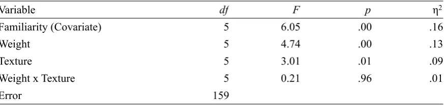
Results of the MANCOVA revealed a non-significant effect of Gender, F(5, 158)= 1.62, ns, and a
significant relationship of the covariate Familiarity with the outcome variables, F(5, 158)= 4.78, p < .001, η2
= .13. Both independent variables revealed an effect on the dependent variables across the experimental
[image:17.595.59.497.513.617.2]conditions, whereas the interaction between Weight and Texture was non-significant (Table 1).
Table 1. MANCOVA Results for Study 1 (Multivariate Tests)
Variable df F p η2
Familiarity (Covariate) 5 6.05 .00 .16
Weight 5 4.74 .00 .13
Texture 5 3.01 .01 .09
Weight x Texture 5 0.21 .96 .01
Error 159
In order to study these findings in more detail, the univariate test results served as a follow-up (for a
detailed overview see Appendix C.6, Table C6.1). Based on the findings above, only Familiarity was
included as a covariate within this analysis. Since the multivariate analysis revealed no significant effect of
an interaction on the dependent variables, the interaction was neglected on the univariate level as well.
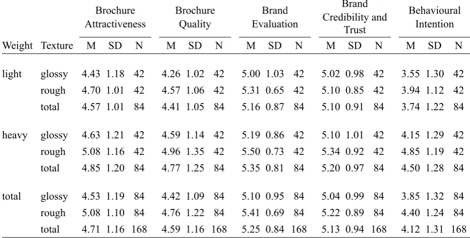
Table 2. Average Rating and Standard Deviations of Dependent Variables as a Function of Weight and
Texture (Study 1)
Brochure Attractiveness Brochure Attractiveness Brochure Attractiveness Brochure Quality Brochure Quality Brochure Quality Brand Evaluation Brand Evaluation Brand Evaluation Brand Credibility and Trust Brand Credibility and Trust Brand Credibility and Trust Behavioural Intention Behavioural Intention Behavioural Intention
Weight Texture M SD N M SD N M SD N M SD N M SD N
light glossy 4.43 1.18 42 4.26 1.02 42 5.00 1.03 42 5.02 0.98 42 3.55 1.30 42 rough 4.70 1.01 42 4.57 1.06 42 5.31 0.65 42 5.10 0.85 42 3.94 1.12 42 total 4.57 1.01 84 4.41 1.05 84 5.16 0.87 84 5.10 0.91 84 3.74 1.22 84
heavy glossy 4.63 1.21 42 4.59 1.14 42 5.19 0.86 42 5.10 1.01 42 4.15 1.29 42 rough 5.08 1.16 42 4.96 1.35 42 5.50 0.73 42 5.34 0.92 42 4.85 1.19 42 total 4.85 1.20 84 4.77 1.25 84 5.35 0.81 84 5.20 0.97 84 4.50 1.28 84
total glossy 4.53 1.19 84 4.42 1.09 84 5.10 0.95 84 5.04 0.99 84 3.85 1.32 84 rough 5.08 1.10 84 4.76 1.22 84 5.41 0.69 84 5.22 0.89 84 4.40 1.24 84 total 4.71 1.16 168 4.59 1.16 168 5.25 0.84 168 5.13 0.94 168 4.12 1.31 168
Brochure Attractiveness. Analysis of covariance revealed a significant effect of the covariate
Familiarity. The main effect of Weight was non-significant, while there was a significant main effect of
Texture on Brochure Attractiveness. Thereby, participants within the rough-paper condition (M= 5.08; SD=
1.10) scored higher on Brochure Attractiveness than participants within the glossy-paper condition (M= 4.53;
SD= 1.19).
Brochure Quality. Analysis of covariance revealed a significant effect of the covariate Familiarity.
The main effect of Weight was found to be significant. Thereby, participants within the heavy-paper
condition (M= 4.77; SD= 1.25) scored higher on Brochure Quality than participants within the light-paper
condition (M= 4.41; SD= 1.05). Similarly, the main effect of Texture was significant as well. Thereby,
participants within the rough-paper condition (M= 4.76; SD= 1.09) scored higher on Brochure Quality than
participants within the glossy-paper condition (M= 4.42; SD= 1.22).
Brand Credibility and Trust. Analysis of covariance revealed a non-significant effect of the covariate
Familiarity. The main effect of Weight was non-significant, while there was a significant main effect of
Texture on Brand Credibility and Trust. Thereby, participants within the rough-paper condition (M= 5.22;
SD= 0.89) scored higher on Brand Credibility and Trust than participants within the glossy-paper condition
[image:18.595.55.538.110.355.2]Behavioural Intention. Analysis of covariance revealed a significant effect of the covariate
Familiarity. The main effect of Weight was non-significant, while there was a significant main effect of
Texture on Behavioural Intention. Thereby, participants within the rough-paper condition (M= 4.40; SD=
1.24) scored higher on Behavioural Intention than participants within the glossy-paper condition (M= 3.85;
SD= 1.32).
3.4 Conclusion
The results show that participants who received the visual communication printed on heavy paper, scored
partly higher on the measured variables than participants who received the visual communication printed on
light paper. This confirms, in part, hypothesis 1. Likewise, participants who received the visual
communication printed on rough paper, scored partly higher on the measured variables than participants who
received the visual communication printed on glossy paper. This confirms, in part, hypothesis 2. Contrary to
the expectation that cross-pairing the heavy with the rough paper stimulus material resulted in the most
favourable evaluation of the dependent variables, no interaction effect could be revealed. Therefore,
hypothesis 3 was rejected.
4. STUDY 2
Based on the insights of the first study - no interaction effect between tactile dimensions could be revealed -
this second study focussed in more detail on the tactile dimension Weight. Thereby, it was aimed at
demonstrating that the magnitude of effect for paper's weight on certain variables is depending on the content
of the visual communication. Specifically, congruence plays a role here. It was assumed that information
congruent with each other is processed more fluently (Van Rompay & Pruyn, 2011). According to recent
insights (e.g. Lee & Labroo, 2004; Reber, Schwarz, & Winkielman, 2004) "stimuli that can be easily
processed are generally evaluated in positive terms and inspire favourable attitudes" (Van Rompay & Pruyn,
2011, p. 600). Within the current context, the congruence of stimulus material (i.e. paper) and an advertised
content (i.e. Lay's chips) was under investigation. Thereby, it was proceeded from the assumption that the
dimension Weight is represented in the stimulus material (i.e. light [90g/m²] versus heavy [300g/m²]) as well
as in the content of the Lay's brochure (i.e. LAY'S® Classic Potato Chips / LAY'S® Light Original Potato
Chips). Accordingly, weight is presented explicitly and physically in the stimulus material, whereas weight is
Assuming that congruence is also beneficial within the proposed context, this study tested the
prediction that a visual communication would be evaluated more favourably when printed on a paper version
connoting the same associations as the content (i.e. Light [few calories] Lay's chips advertisement printed on
light paper and Classical [many calories] Lay's chips advertisement printed on heavy paper). Subsequently,
study 2 tested predictions with respect to brand, product, brochure, and stimulus material perception.
Specifically, the dependent variables predicted to be affected by the (in)congruence effects of paper material
and content are Brand Evaluation, Brand Credibility and Trust, Behavioural Intention, Perception of Brand's
Seriousness and Importance, Preference Brand, Preference Kind, Brochure Attractiveness, Brochure Quality,
Stimulus Material Evaluation, and Authenticity. Furthermore, it was expected that the relationship between
content and paper material is dependent on the extent of Processing Fluency. In order to be able to evaluate
potential effects afterwards the following hypotheses were formulated:
H4: The visual communication printed on heavy stimulus material will be evaluated more positively with
respect to the dependent variables than the light stimulus material version [main effect].
H5: The visual communications connoting congruence among stimulus material and content (i.e.
Classical chips advertised on heavy paper version; Light chips advertised on light paper version)
will be evaluated more positively with respect to the dependent variables than the visual
communications connoting incongruence among stimulus material and content (i.e. Classical chips
advertised on light paper version; Light chips advertised on heavy paper version) [interaction
effect].
H6: The expected interaction effect of stimulus material and content with respect to the dependent
variables is mediated by Processing Fluency [moderated mediation].
Finally, it was expected that all effects on the dependent variables are distinct irrespective the fact the
potential consumer knows the brand communicated or not. To test these predictions, paper weight as well as
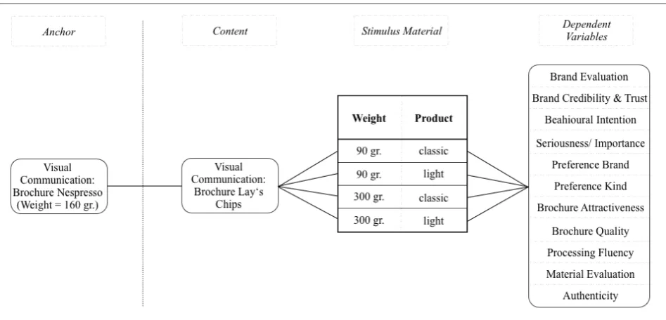
Figure 4. Research model study 2
4.1 Stimulus Material
A basic product brochure of the brand Lay's was created based on selected content of the corporate website
(Frito-Lay, 2013). Thereby, this basic brochure was adjusted with two different kinds of Lay's chips
(LAY'S® Classic Potato Chips / LAY'S® Light Original Potato Chips). These two versions were printed
respectively on two different paper versions (light [90g/m²] versus heavy [300g/m²]). Accordingly,
cross-pairing these factors resulted in a 2 x 2 between-subject design. Except for the variations discussed, the
brochures were identical (Appendix D.1 and D.2). Therefore, there was no influence that could bias potential
differences between conditions.
In order to ensure participants will unconsciously attend to the quality of the stimulus material, a
second brochure served as an anchor. For this aim, an information brochure of the brand Nespresso, which is
a neutral stimulus (neither associated with lightness nor with heaviness), was created (Appendix D.3) and
printed on stimulus material with a weight (160g/m²) approximately intermediate between the stimulus
material used for the Lay's brochure (Appendix G).
4.2 Method
4.2.1 Participants and Procedure
Based on a power analysis 140 participants (35 per group) were randomly selected to take part in the
study (48 male and 92 female; mean age 23.15 years; a frequency distribution can be found in Appendix
to assure they are prepared well for the real study. For this aim they received the Nespresso brochure as
described above and shortly afterwards a questionnaire (Appendix E.1).
After completing the first brochure evaluation, the 'real' study followed. Participants received a
brochure of the brand Lay's and a questionnaire (piloted and pretested in advance, Appendix A.6 and A.7),
whereby the purpose of the study was introduced at the beginning of the questionnaire: "Companies spend a
lot of time and effort in creating advertising material that convey the right brand image to customers. The
company Frito-Lay intents to place new information material about the brand Lay's on the market. Thereby,
they are aiming at developing a brochure, which is appealing to potential customers and induces future
purchases of Lay's chips. To make sure the 'right' image comes across, Frito-Lay is interested in your
perception of this brand". Participants were asked to evaluate the advertisement. Next, participants filled in
the questionnaire (Appendix E.2) comprising the dependent measures as well as filler items used to reduce
hypothesis guessing. In order to prohibit participants from just filling in their answers at one extreme of the
likert-scale, some items were reversed. After completion of the questionnaire, participants were thanked for
their cooperation.
4.2.2 Measures
Brand Evaluation. Based on the fact that congruence effects were shown to be influential on the
perceived value of the brand under investigation (Van Rompay & Pruyn, 2011), brand evaluation in a more
general sense was included as a first measure within the current study. Participants' perception of the brand
was measured with three items reflecting the extent to which participants felt positive about the brand,
perceived the brand as fine, and as poor. Participants indicated on a 7-point likert scale the extent to which
they considered these items descriptive of the brand. General brand evaluation was formed by summing and
averaging the scores on these items (α = .81).
Brand Credibility and Trust. According to the consistency principle a source should be
communicating consistently across different dimensions (Rotenberg, Simourd, & Moore, 1989), which is
supposed to create a more credible message. The positive effect of congruence on credibility evaluations has
been demonstrated by Van Rompay and Pruyn (2011). Accordingly, the construct Brand Credibility and Trust
was measured with three items reflecting the extent to which participants perceived the brand as reliable and
descriptive of the brand. A general attitude was formed by summing and averaging the scores on these items
(α = .81).
Behavioural Intention. Participants' future behaviour was measured with three items reflecting the
extent to which participants had the intention to get involved with the product of the particular brand within
the next month with respect to tasting and buying ("I want to taste Lay's chips", "I will go tho a supermarket
to buy Lay's chips", and "I would love to buy Lay's chips"). Participants indicated on a 7-point likert scale
the extent to which they considered these items descriptive for their intention. A general behavioural
intention was formed by summing and averaging the scores on these items (α = .91).
Seriousness/ Importance. Based on the assumption that heaviness (of the paper) implies seriousness
and importance (Ackerman, Nocera, & Bargh, 2010), it was supposed that those associations were
transferred to the evaluation of the brand under investigation. Following this, participants were asked to
indicate which adjectives of a semantic differential (six-point) they considered as more descriptive of the
brand. Those pairs were trivial - serious, insubstantial - substantial, and unimportant - important. General
perceived seriousness/ importance was formed by summing and averaging the scores on these items (α = .
89).
Brochure Attractiveness. Based on the finding that the underlying concept processing fluency of
congruence effect positively affects aesthetic judgments, the construct brochure attractiveness was included
as a dependent measure. Participants' perception of the brochure's attractiveness was measured with three
items reflecting the extent to which participants liked the brochure and perceived the brochure as appealing,
and eye-catching. Participants indicated on a 7-point likert scale the extent to which they considered these
items descriptive of the brochure. A general attitude was formed by summing and averaging the scores on
these items (α = .94).
Brochure Quality. The construct brochure quality was included in order to check for the effectiveness
of the proposed manipulation (i.e. Weight of stimulus material). The perceived quality of the brochure was
measured with three items reflecting the extent to which participants perceived the brochure as premium, of
high quality, and belonging to high-class. Participants indicated on a 7-point likert scale the extent to which
they considered these items descriptive of the brochure. A general attitude towards Brochure Quality was
Material Evaluation. In order to prevent participants from anticipating the purpose of the study, three
filler items (i.e. design, print quality, colours) were added to four items measuring the construct Material
Evaluation. Participants were asked to indicate to what extent the items liking material, thinking of material
as low quality, preferring heavier material, and comparing it to material used for the Nespresso brochure
were indicative for their perception (on a 7-point likert scale). A general perception was formed by summing
and averaging the scores on these items (α = .88).
Authenticity. In order to ensure participants perceived the visual communication as potential real
advertising material of the company Frito Lay, the construct authenticity was included as a manipulation
check. Authenticity of the brochure was measured by three items covering the scope of brochure
authenticity, the estimation to which extent they believed the brochure was real advertising material and an
effective means for informing customers. A general perception of authenticity was formed by summing and
averaging the scores on these items (α = .68).
Preference Brand. In order to check that participants attitudes are not biased by their existing
preference for a brand of chips, this construct was included as well. The participants' preference for the brand
was measured with three items reflecting the extent to which participants would choose Lay's rather than
Pringles and over other brands. Participants indicated on a 7-point likert scale the extent to which they
considered these items descriptive of the brochure. A general attitude was formed by summing and averaging
the scores on these items (α = .84).
Preference Kind. In order to check that participants attitudes are not biased by their existing
preference for a particular flavour of chips, this construct was included as well. The participants' preference
for the specific kind of Lay's chips was measured with three items reflecting the extent to which preferred
the specific flavour and were about buying this flavour rather than another. Participants indicated on a
7-point likert scale the extent to which they considered these items descriptive of the brochure. A general
attitude was formed by summing and averaging the scores on these items (α = .96).
Processing Fluency. Based on the findings that processing fluency is the underlying concept of
congruence effects (e.g. De Vries & Van Rompay, 2009), the construct was included in the study as well. For
this purpose, processing fluency was operationalised as the extent to which the existing impression of the
with two items reflecting the extent to which participants felt that their first impression as well as the design
of the brochure matches with their existing image of the company Frito-Lay. Participants indicated on a
7-point likert scale the extent to which they considered these items descriptive of the brochure. General
processing fluency was formed by summing and averaging the scores on these items (α = .97).
4.3 Results
A multivariate analysis of covariance (MANCOVA) with Weight (light versus heavy) and Flavour (Classic
versus Light) as independent variables, Brand Evaluation, Brand Credibility and Trust, Behavioural
Intention, Seriousness/ Importance, Preference Brand, Preference Kind, Brochure Attractiveness, Brochure
Quality, Material Evaluation, and Authenticity as dependent variables, and Gender as covariate was
conducted. Beforehand, items appropriate for further analysis were identified by means of a reliability
analysis (Appendix E.4) and constructs were computed. Afterwards an outlier analysis was conducted.
Thereby, identified scores were adjusted following the procedure suggested by Field (2009), which entails to
replace those scores by the mean plus/minus two standard deviation (Appendix E.5). Finally, the
assumptions of a MANCOVA were investigated (i.e. homogeneity of variance, normal distribution,
independence of covariate and treatment effect, homogeneity of regression slopes). For details see Appendix
E.6.
Results of the MANCOVA revealed a non-significant relationship of Gender with the outcome
variables F(10, 125)= 1.77, ns. Therefore, there was no need to control for the effect of a covariate on the
outcome. Both independent variables revealed an effect on the dependent variables across the experimental
conditions, whereas the interaction between Weight and Flavour was non-significant (Table 3).
Table 3. MANOVA Results for Study 2 (Multivariate Tests)
Variable df F p η2
Weight 11 4.32 .00 .28
Flavour 11 2.36 .01 .17
Weight x Flavour 11 0.92 .52 .08
Error 125
In order to study these findings in more detail, the univariate test results served as a follow-up (for a
detailed overview see Appendix E.7, Table E7.1). Since the multivariate analysis of variance revealed no
level as well. Accordingly, only the two main effects were studied in more detail. Mean ratings (M) and
standard deviations (SD) as a function of the independent variables can be found in Table 4.
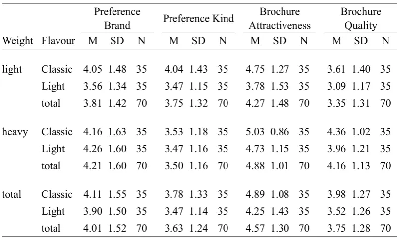
Table 4a. Average Rating and Standard Deviations of Dependent Variables as a Function of Weight and
Flavour (Study 2)
Brand Evaluation Brand Evaluation Brand Evaluation Brand Credibility and Trust Brand Credibility and Trust Brand Credibility and Trust Behavioural Intention Behavioural Intention Behavioural Intention Seriousness/ Importance Seriousness/ Importance Seriousness/ Importance
Weight Flavour M SD N M SD N M SD N M SD N
light Classic 5.43 0.82 35 5.09 0.88 35 4.45 1.50 35 3.64 1.05 35 Light 4.54 1.22 35 4.60 1.17 35 3.80 1.52 35 3.49 0.94 35 total 4.99 1.12 70 4.85 1.06 70 4.12 1.54 70 3.56 0.99 70
heavy Classic 5.39 0.66 35 5.09 0.91 35 4.52 1.66 35 3.71 0.96 35 Light 5.19 0.89 35 4.97 1.00 35 3.96 1.37 35 3.81 0.74 35 total 5.29 0.78 70 5.03 0.95 70 4.25 1.54 70 3.76 0.86 70
total Classic 5.41 0.74 35 5.09 0.89 35 4.49 1.57 35 3.68 1.00 35 Light 4.86 1.11 35 4.78 1.10 35 3.88 1.44 35 3.65 0.86 35 total 5.14 0.98 70 4.94 1.01 70 4.18 1.53 70 3.66 0.93 70
Table 4b. Average Rating and Standard Deviations of Dependent Variables as a Function of Weight and
Flavour (Study 2)
Preference Brand Preference
Brand Preference
Brand Preference KindPreference KindPreference Kind
Brochure Attractiveness Brochure Attractiveness Brochure Attractiveness Brochure Quality Brochure Quality Brochure Quality
Weight Flavour M SD N M SD N M SD N M SD N
light Classic 4.05 1.48 35 4.04 1.43 35 4.75 1.27 35 3.61 1.40 35 Light 3.56 1.34 35 3.47 1.15 35 3.78 1.53 35 3.09 1.17 35 total 3.81 1.42 70 3.75 1.32 70 4.27 1.48 70 3.35 1.31 70
heavy Classic 4.16 1.63 35 3.53 1.18 35 5.03 0.86 35 4.36 1.02 35 Light 4.26 1.60 35 3.47 1.16 35 4.73 1.15 35 3.96 1.21 35 total 4.21 1.60 70 3.50 1.16 70 4.88 1.01 70 4.16 1.13 70
[image:26.595.56.456.166.414.2] [image:26.595.55.456.490.731.2]Table 4c. Average Rating and Standard Deviations of Dependent Variables as a Function of Weight and
Flavour (Study 2)
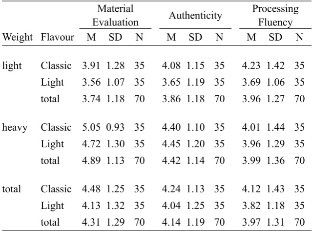
Material Evaluation
Material Evaluation
Material
Evaluation AuthenticityAuthenticityAuthenticity
Processing Fluency Processing
Fluency Processing
Fluency
Weight Flavour M SD N M SD N M SD N
light Classic 3.91 1.28 35 4.08 1.15 35 4.23 1.42 35 Light 3.56 1.07 35 3.65 1.19 35 3.69 1.06 35 total 3.74 1.18 70 3.86 1.18 70 3.96 1.27 70
heavy Classic 5.05 0.93 35 4.40 1.10 35 4.01 1.44 35 Light 4.72 1.30 35 4.45 1.20 35 3.96 1.29 35 total 4.89 1.13 70 4.42 1.14 70 3.99 1.36 70
total Classic 4.48 1.25 35 4.24 1.13 35 4.12 1.43 35 Light 4.13 1.32 35 4.04 1.25 35 3.82 1.18 35 total 4.31 1.29 70 4.14 1.19 70 3.97 1.31 70
Brand Evaluation. The main effect of Weight was found to be significant. Thereby, participants
within the heavy-paper condition (M= 5.29; SD= 0.78) scored higher on Brand Evaluation than participants
within the light-paper condition (M= 4.99; SD= 1.12). Similarly, the main effect of Flavour was significant
as well. Thereby, participants within the Classic-Lay's condition (M= 5.41; SD= 0.74) scored higher on
Brand Evaluation than participants within the Light-Lay's condition (M= 4.86; SD= 1.11).
Behavioural Intention. The main effect of Weight was non-significant, while there was a significant
main effect of Flavour on Behavioural Intention. Thereby, participants within the Classic-Lay's condition
(M= 4.49; SD= 1.57) scored higher on Behavioural Intention than participants within the Light-Lay's
condition (M= 3.88; SD= 1.44).
Brochure Attractiveness. The main effect of Weight was found to be significant. Thereby,
participants within the heavy-paper condition (M= 4.88; SD= 1.01) scored higher on Brochure Attractiveness
than participants within the light-paper condition (M= 4.27; SD= 1.48). Similarly, the main effect of Flavour
was significant as well. Thereby, participants within the Classic-Lay's condition (M= 4.89; SD= 1.08) scored
[image:27.595.55.375.105.341.2]Brochure Quality. The main effect of Weight was significant. Thereby, participants within the
heavy-paper condition (M= 4.16; SD= 1.23) scored higher on Brochure Quality than participants within the
light-paper condition (M= 3.35; SD= 1.31). Similarly, the main effect of Flavour was significant as well. Thereby,
participants within the Classic-Lay's condition (M= 3.98; SD= 1.27) scored higher on Brochure Quality than
participants within the Light-Lay's condition (M= 3.52; SD= 1.26).
Material Evaluation. The main effect of Weight was significant. Thereby, participants within the
heavy-paper condition (M= 4.89; SD= 1.13) scored higher on Material Evaluation than participants within
the light-paper condition (M= 3.74; SD= 1.18). The main effect of Flavour revealed to be non-significant.
Authenticity. The main effect of Weight was significant. Thereby, participants within the heavy-paper
condition (M= 4.42; SD= 1.14) scored higher on Authenticity than participants within the light-paper
condition (M= 3.86; SD= 1.18). The main effect of Flavour revealed to be non-significant.
Even though interaction effects among Weight and Flavour could not be revealed with respect to the
vast majority of dependent variables, a moderated mediation analysis was conducted. Despite those
non-significant findings this choice is still reasonable, since potential interaction effects could be masked by a
third variable. Specifically, this analysis aims to investigate whether the non-observed interaction effects of
Weight and Flavour on the dependent variables are mediated by Processing Fluency. For this purpose, the
procedure suggested by Muller, Judd, and Yzerbyt (2005) was followed, which entails four conditions to be
met in order to confirm moderated mediation. However, since the second condition (the interaction effect of
the independent variables (i.e. Weight x Flavour) on the mediator (i.e. Processing Fluency) should be
significant) already has been shown to be violated, there was no need to further investigate the remaining
conditions. Accordingly, the variable Processing Fluency was dropped as a potential mediator.
4.4 Conclusion
The results show that participants who received the visual communication printed on heavy paper, scored
partly higher on the measured variables than participants who received the visual communication printed on
light paper. This confirms, in part, hypothesis 4. Contrary to the expectation that the evaluation of the
measured variables would benefit from a congruent version of the visual communication in terms of paper
Finally, it was shown that the potential effect of the relationship between paper stimulus material and content
on the measured variables is not depending on Processing Fluency. Therefore, hypothesis 6 was rejected.
5. GENERAL DISCUSSION
5.1 Tactile Influences
The findings reported in study 1 largely confirm the importance of incorporating the tactile dimension in the
design of a visual communication. Although the proposed main effects of the dimensions Weight and Texture
varied in strength across the dependent variables, the overall results partly support the prediction that brand
and brochure perceptions benefit from (1) heavy and (2) rough paper versions. Specifically, it could be
revealed that the visual communication printed on heavy material as opposed to light material benefits in
terms of Brochure Quality evaluations. Furthermore, results show that the visual communication printed on
rough as opposed to glossy material positively affects perceptions of Brochure Attractiveness, Brochure
Quality, Brand Credibility and Trust, and Behavioural Intention. However, contrary to expectations
cross-pairing the two dimension did not result in an interactive intensification with respect to the dependent
variables.
The research design of the second study included the dimension Weight again in order to investigate
this concept in more detail with respect to additional dependent variables and in its pure condition. Thereby,
it could be revealed that weight effects not only influence perceptions of the visual communications itself,
which was the case during study 1 (i.e. Brochure Quality), but those effects were extended to product
perceptions and even reaching brand evaluation in a more general sense. Specifically, study 2 testifies to the
central role of paper quality (i.e. Weight) in demonstrating the positive influence of printing the visual
communication on heavy as opposed to light material with respect to Material Evaluation, Authenticity,
Preference Kind, Preference Brand, and Brand Evaluation. A summary of described results can be found in
Appendix F, Table F.1.
5.2 Congruence Effects
The research design of study 2 incorporated next to the tactile dimension Weight the focus on congruence
effects by including content (i.e. Flavour), which was supposed to be either in line with the paper material
used or not. Opposed to the prediction that a visual communication would be evaluated more favourably