The Linked Data Visualization Model
Josep Maria Brunetti1, Sören Auer2, Roberto García1 1GRIHO, Universitat de Lleida
Jaume II, 69. 25001 Lleida, Spain
{josepmbrunetti,rgarcia}@diei.udl.cat,http://griho.udl.cat/ 2
AKSW, Computer Science University of Leipzig, Germany
[email protected],http://aksw.org/
Abstract. In the last years, the amount of semantic data available in the Web has increased dramatically. The potential of this vast amount of data is enormous but in most cases it is very difficult for users to explore and use this data, especially for those without experience with Seman-tic Web technologies. Applying information visualization techniques to the Semantic Web helps users to easily explore large amounts of data and interact with them. In this article we devise a formal Linked Data Visualization model (LDVM), which allows todynamicallyconnect data with visualizations. In order to achieve such flexibility and a high degree of automation the LDVM is based on a visualization workflow incor-porating analytical extraction and visual abstraction steps. We report about our comprehensive implementation of the Linked Data Visualiza-tion model comprising a library of generic visualizaVisualiza-tions that enable to get an overview on, visualize and explore the Data Web.
1
Introduction
In the last years, the amount of semantic data available on the Web has increased dramatically, especially thanks to initiatives like Linked Open Data (LOD). The potential of this vast amount of data is enormous but in most cases it is very dif-ficultandcumbersome for users to visualize, explore and use this data, especially for lay-users [1] without experience with Semantic Web technologies.
Visualizing and interacting with Linked Data is an issue that has been rec-ognized from the beginning of the Semantic Web (cf. e.g. [2]). Applying informa-tion visualizainforma-tion techniques to the Semantic Web helps users to explore large amounts of data and interact with them. The main objectives of information visualization are to transform and present data into a visual representation, in such a way that users can obtain a better understanding of the data [3]. Visu-alizations are useful for obtaining an overview of the datasets, their main types, properties and the relationships between them.
Compared to prior information visualization strategies, we have a unique opportunity on the Data Web. The unified RDF data model being prevalent on the Data Web enables us to bind data to visualizations in an unforeseen
structures to be present. When we can derive and generate these data structures automatically from reused vocabularies or semantic representations, we are able to realize a largely automatic visualization workflow. Ultimately, we aim to re-alize an ecosystem of data extractions and visualizations, which can be bound together in a dynamic and unforeseen way. This will enable users to explore datasets even if the publisher of the data does not provide any exploration or visualization means.
Most existing work related with visualizing RDF is focused on concrete do-mains and concrete datatypes. However, finding the right visualization for a given dataset is not an easy task [4]: ‘One must determine which questions to ask, identify the appropriate data, and select effective visual encodings to map data values to graphical features such as position, size, shape, and color. The challenge is that for any given data set the number of visual encodings – and thus the space of possible visualization designs – is extremely large.’
The Linked Data Visualization Model (LDVM) we propose in this paper
allows to connect different datasets with different visualizations in a dynamic way. In order to achieve such flexibility and a high degree of automation the LDVM is based on a visualization workflow incorporating analytical extraction and visual abstraction steps. Each of the visualization workflow steps comprises a number of transformation operators, which can be defined in a declarative way. As a result, the LDVM balances between flexibility of visualization options and efficiency of implementation or configuration. Ultimately we aim to contribute with the LDVM to the creation of an ecosystem of data publication and data visualization approaches, which can co-exist and evolve independently.
Our main contributions are in particular:
1. The adoption of the Data State Reference Model [5] for the RDF data model through the creation of a formal Linked Data Visualization model, which allows todynamically connect data with visualizations.
2. A comprehensive, scalable implementation of the Linked Data Visualization model comprising a library of generic data extractions and visualizations that allow to obtain an overview on, visualize and explore the Data Web in real-time.
The remainder of this paper is organized as follows: Section 2 discusses re-lated work. Section 3 introduces the Linked Data Visualization Model. Section 4 describes an implementation of the model and Section 5 presents its evaluation with different datasets and visualizations. Finally, Section 6 contains conclusions and future work.
2
Related Work
Related work can be roughly classified into tools supporting Linked Data visu-alization and exploration, data visuvisu-alization in general as well as approaches for visualizing and interacting with particularly large datasets.
2.1 Linked Data Visualization and Exploration
Exploring and visualizing Linked Data is a problem that has been addressed by several projects. Dadzie et al. [1] analyzed some of those projects concluding that most of them are designed only for tech-users and do not provide overviews on the data.
Linked Data browsers such as Disco [6], Tabulator [7] or Explorator [8]
al-low users to navigate the graph structures and usually display property-value pairs in tables. They provide a view of a subject, or a set of subjects and their properties, but not any additional support getting a broader view of the dataset being explored.Rhizomer [9] provides an overview of the datasets and allows to interact with data through Information Architecture components such as navi-gation menus, breadcrumbs and facets. However, it needs to precompute some aggregated values and does not include visualizations.
Graph-based toolssuch asFenfire[10],RDF-Gravity1,IsaViz2provide
node-link visualizations of the datasets and the relationships between them. Although this approach can help obtaining a better understanding of the data structure, in some cases graph visualization does not scale well to large datasets [11]. Some-times the result is a complex graph difficult to manage and understand [12].
There are also JavaScript-based tools to visualize RDF. Sgvizler3 renders the results of SPARQL queries into HTML visualizations such as charts, maps, treemaps, etc. However, it requires SPARQL knowledge in order to create RDF visualizations.LODWheel [13] also provides RDF visualizations for different data categories but it is focused on visualizing vocabularies used in DBpedia.
Other tools are restricted to visualizing and browsing concrete domains, e.g.
LinkedGeoData browser [14] or map4rdf4 for spatial data, FoaF Explorer5 to
visualize RDF documents adhering to the FOAF vocabulary.
To summarize, most of the existing tools make it difficult for non-technical users to explore linked data or they are restricted to concrete domains. None of them provide generic visualizations for RDF data. Consequently, it is still difficult for end users to obtain an overview of datasets, comprehend what kind of structures and resources are available and what properties resources typically have and how they are mostly related with each other.
2.2 Data Visualization
Regarding data visualization, most of the existing work is focused on categorizing visualization techniques and systems [15]. For example, [16] and [17] propose different taxonomies of visualization techniques. However, most visualization techniques are only compatible with concrete domains or data types [3].
1 http://semweb.salzburgresearch.at/apps/rdf-gravity 2 http://www.w3.org/2001/11/IsaViz 3 http://code.google.com/p/sgvizler/ 4 http://oegdev.dia.fi.upm.es/map4rdf/ 5 http://xml.mfd-consult.dk/foaf/explorer/
Chi’s Data State Reference Model [5] defines the visualization process in a generic way. It describes a process for transforming raw data into a concrete vi-sualization by defining four data stages as well as a set of data transformations and operators. This framework provides a conceptual model that allows to iden-tify all the components in the visualization process. In Section 3 we describe how this model serves as a starting point for our Linked Data Visualization Model.
2.3 Visualizing and interacting with large-scale datasets
For data analysis and information visualization, Shneiderman proposed a set of tasks based on the visual information seeking mantra: “overview first, zoom
and filter, then details on demand” [18]. Gaining overview is one of the most
important user tasks when browsing a dataset, since it helps end users to un-derstand the overall data structure. It can also be used as starting point for navigation. However, overviews become difficult to achieve with large heteroge-neous datasets, which is typical for Linked Data. A common approach to obtain an overview and support the exploration of large datasets is to structure them hierarchically [19]. Hierarchies allow users to visualize different abstractions of the underlying data at different levels of detail. Visual representations of hier-archies allow to create simplified versions of the data while still maintaining the general overview.
There are several techniques for visualizing hierarchical structures. One ap-proach to provide high level overviews areTreemaps [20]. Treemaps use a rect-angle to show the tree root and its children. Each child has a size proportional to the cumulative size of its descendants. They are a good method to display the size of each node in a hierarchy. In CropCircles [21] each node in the tree is represented by a circle. Every child circle is nested inside its parent circle. The diameter of the circles are proportional to the size of their descendants.
Space-Trees [22] combines the conventional layout of trees with zooming interaction.
Branches of the tree are dynamically rescaled to fit the available space.
For datasets containing spatial data, another approach for obtaining an overview is to point resources on a map. Clustering [23] and organizing resources into hierarchies [24] are the most commonly used approaches for exploring large datasets on maps.
By applying these techniques it is possible to build interactive hierarchical visualizations that support the visual information seeking mantra proposed by Shneiderman.
3
Linked Data Visualization Model
In this section we present the Linked Data Visualization Model by first giving an overview, then formalizing key elements of the model and finally showcasing the model in action with a concrete example.
3.1 Overview
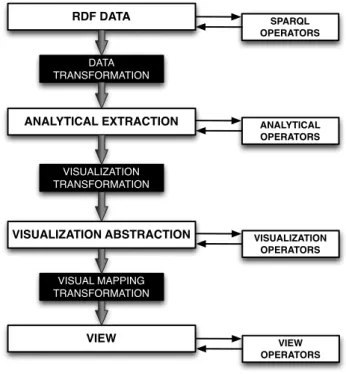
We use the Data State Reference Model (DSRM) proposed by Chi [5] as con-ceptual framework for ourLinked Data Visualization Model (LDVM). While the DSRM describes the visualization process in a generic way, we instantiate and adopt this model with LDVM for the visualization of RDF and Linked Data. The names of the stages, transformations and operators have been adapted to the context of Linked Data and RDF. Figure 1 shows an overview of LDVM. It that can be seen as a pipeline, which originates in one end with raw data and results in the other end with the visualization.
RDF DATA ANALYTICAL EXTRACTION VISUALIZATION ABSTRACTION VIEW DATA TRANSFORMATION VISUALIZATION TRANSFORMATION VISUAL MAPPING TRANSFORMATION SPARQL OPERATORS ANALYTICAL OPERATORS VISUALIZATION OPERATORS VIEW OPERATORS
Fig. 1.High level overview of the Linked Data Visualization Model.
The LDVM pipeline is organized in four stages that data needs to pass through:
1. RDF Data:the raw data, which can be all kinds of information adhering to
the RDF data model, e.g. instance data, taxonomies, vocabularies, ontolo-gies, etc.
2. Analytical extraction: data extractions obtained from raw data, e.g.
calcu-lating aggregated values.
3. Visual abstraction: information that is visualizable on the screen using a
4. View:the result of the process presented to the user, e.g. plot, treemap, map, timeline, etc.
Data is propagated through the pipeline from one stage to another by apply-ing three types of transformation operators:
1. Data transformation:transforms raw data values into analytical extractions
declaratively (using SPARQL query templates).
2. Visualization transformation: takes analytical extractions and transforms
them into a visualization abstraction. The goal of this transformation is to condense the data into a displayable size and create a suitable data structure for particular visualizations.
3. Visual mapping transformation: processes the visualization abstractions in
order to obtain a visual representation.
There are also operators within each stage that do not change the underlying data but allow to extract data from each stage or add new information. These are:
1. SPARQL Operators: SPARQL functions, e.g. SELECT, FILTER, COUNT,
GROUP BY, etc.
2. Analytical Operators:functions applied to the data extractions, e.g. select a
subset of data.
3. Visualization Operators:visual variables, e.g. visualization technique, sizes,
colors, etc.
4. View Operators:actions applied to the view, e.g. rotate, scale, zoom, etc.
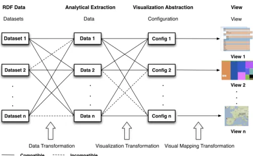
As illustrated in Figure 2, our model allows to connect different RDF datasets and different data extractions with different visualization techniques. Not all datasets are compatible with all data extractions and each data extraction is only compatible with some visual configurations.
Each dataset offers different data structures to be extracted, e.g. class hi-erarchy, property hihi-erarchy, geospatial data, etc. Each data extraction can be visualized with different configurations, which contain information such as the visualization technique to use, colors, etc. Then, a concrete visualization is gen-erated depending on the data extraction and the visual configuration.
In summary, the model is divided in two main areas: data space and visual space. The RDF data stage, analytical extraction stage and data transformation belong to the data space, while visual abstraction stage, view stage and visual mapping transformation belong to the visual space. These two main blocks are connected by a visualization transformation.
3.2 Formalization
The RDF data model enables us to bind data to visualizations in a dynamic way while the LDVM allows to connect datasets with data extractions and visu-alizations. However, the compatibility between data and concrete visualizations needs to be determined.
Dataset 1 Dataset 2 Dataset n Data 1 Data 2 Data n Config 1 Config 2 Config n . . . View 1 View 2 View n . . . . . . . . .
Datasets Data Configuration View
Incompatible Compatible
RDF Data Analytical Extraction Visualization Abstraction View
Data Transformation Visualization Transformation Visual Mapping Transformation
Fig. 2.Linked Data Visualization Model ecosystem, which allows to dynamically connect datasets with visualizations.
In this section we formalize the extraction and generation of visualization data structures (in the analytical extraction stage) as well as the visualization configuration (in the visualization abstraction stage). Our visual data extraction structure is capturing the information required to (a) determine whether a cer-tain dataset is compatible with a cercer-tain analytical extraction and (b) process a compatible dataset and extract a relevant subset (or aggregation) of the data as required by compatible visualization configurations. Our visual configuration structure determines whether a certain analytical extraction is compatible with a certain visualization technique.
Definition 1 (Visualization Data Extraction). The visualization data ex-traction defines how data is accessed for the purpose of visualizations. Our visu-alization data extraction structure comprises the following elements:
– a compatibility check function (usually a SPARQL query), which determines
whether a certain dataset contains relevant information for this data extrac-tion,
– a possibly empty setD of data extraction parameters,
– a set tuples(q, σq), withqbeing a SPARQL query template containing
place-holders mapped to the data extractions parameters D and σq being the
sig-nature of the SPARQL query result, i.e. the number of columns returned by
queries generated fromq and their types.
Visual data extractions define how data can be extracted declaratively using SPARQL query templates for visualization. Visual configurations are the
corre-sponding structures on the visualization space side, that can receive extracted data:
Definition 2 (Visualization Configuration). The visualization configura-tion is a data structure, which accommodates all configuraconfigura-tion informaconfigura-tion re-quired for a particular type of visualization. This includes:
– the visualization technique, e.g. Treemap, CropCircles, etc,
– visualization parameters, e.g. colors, aggregation,
– an aggregated data assembly structure, consisting of a set of relationsr, each
one equipped with a signatureσr
The declarative definition of the data extraction and visualization configu-ration enables flexible combination of extractions and configuconfigu-rations. However, we have to ensure, that the structure of extracted data is compatible with the structure of data required for a visualization. For that purpose, we define the compatibility between visualization data extraction and visualization configura-tion based on matching signatures:
Definition 3 (Compatibility). A visualization data extraction vdeis said to
be compatible with a visualization configuration vc iff for eachσr in vc there is
a corresponding σq invde, such that the types and their positions in σq and σr
match.
Note, that a visualization data extraction might provide more information than required for a certain visualization configuration.
3.3 Example application of the model
In this section we present a concrete application of the Linked Data Visualiza-tion Model. It describes the process to create a Treemap visualizaVisualiza-tion of the DBpedia [25] class hierarchy with its data stages, transformations and operators used in each data stage.
Data Stages
– RDF Data: the DBpedia dataset containing RDF triples and its ontology.
– Analytical Extraction: tuples containing the class URI, its number of
in-stances and its children.
– Visual Abstraction: data structure containing the class hierarchy.
– View:a treemap representation of the class hierarchy.
Transformations
– Data Transformation:SPARQL queries to obtain the analytical extraction.
The concrete SPARQL queries are provided in the Example 1.
– Visual Transformation: a function that creates the class hierarchy from the
tuples obtained in the analytical extraction stage.
– Visual Mapping Transformation: a function that transforms the class
Stage Operators
– SPARQL Operators:DISTINCT, COUNT, GROUP BY, AS, FILTER,
OP-TIONAL.
– Analytical Extraction Operators: functions to parse the SPARQL queries
results and convert them to a concrete format and structure.
– Visual Abstraction Operators: size of the treemap, colors.
– View:zoom in, zoom out.
Example 1 (Visualization Data Extraction). This example illustrates the
ele-ments of the Linked Data Visualization Model required for visualizing the DB-pedia class hierarchy using a treemap.
Compatibility check function: The following SPARQL query is executed in
order to check if this data extraction is compatible with the dataset. If the query returns a result the required information is present in the dataset and the data extraction is compatible.
1 ASK W H E R E {
2 ? c rdf : t y p e ? c l a s s .
3 F I L T E R (? c l a s s = owl : C l a s s || ? c l a s s = r d f s : C l a s s )
4 } L I M I T 1
SPARQL Query to obtain root elements: The following SPARQL query
ob-tains the root elements of the class hierarchy and their labels if they exist. 1 S E L E C T D I S T I N C T ? r o o t ? l a b e l W H E R E {
2 ? r o o t rdf : t y p e ? c l a s s .
3 F I L T E R (? c l a s s = owl : C l a s s || ? c l a s s = r d f s : C l a s s ) 4 O P T I O N A L {
5 ? r o o t r d f s : s u b C l a s s O f ? s u p e r .
6 F I L T E R (? r o o t !=? s u p e r && ? s u p e r != owl : T h i n g && ? s u p e r != r d f s : R e s o u r c e && ! i s B l a n k (? s u p e r ) )
7 } O P T I O N A L {
8 ? r o o t r d f s : l a b e l ? l a b e l .
9 F I L T E R ( L A N G (? l a b e l ) = ’ en ’ || L A N G (? l a b e l ) = ’ ’ )
10 } F I L T E R (! b o u n d (? s u p e r ) && i s U R I (? r o o t ) && ! i s B l a n k (? r o o t ) && ? r o o t != owl : T h i n g )
11 }
SPARQL Query to obtain children per element:The following SPARQL query
is used to obtain the parent of each class in the hierarchy and their labels if they exist. 1 S E L E C T D I S T I N C T ? sub ? l a b e l ? p a r e n t W H E R E { 2 ? sub rdf : t y p e ? c l a s s . 3 F I L T E R (? c l a s s = owl : C l a s s || ? c l a s s = r d f s : C l a s s ) 4 ? sub r d f s : s u b C l a s s O f ? p a r e n t . 5 F I L T E R (! i s B l a n k (? p a r e n t ) && ? p a r e n t != owl : T h i n g ) 6 O P T I O N A L { 7 ? sub r d f s : s u b C l a s s O f ? s u b 2 . 8 ? s u b 2 r d f s : s u b C l a s s O f ? p a r e n t . 9 O P T I O N A L { 10 ? p a r e n t owl : e q u i v a l e n t C l a s s ? s u b 3 . 11 ? s u b 3 r d f s : s u b C l a s s O f ? s u b 2 .
12 } F I L T E R (? sub !=? s u b 2 && ? s u b 2 !=? p a r e n t && ! i s B l a n k (? s u b 2 ) && ! b o u n d (? s u b 3 ) ) 13 } O P T I O N A L { 14 ? sub r d f s : l a b e l ? l a b e l . 15 F I L T E R ( L A N G (? l a b e l ) = ’ en ’ ) 16 } F I L T E R (! i s B l a n k (? sub ) && ! b o u n d (? s u b 2 ) ) 17 }
SPARQL Query to obtain number of resources per element: The following SPARQL query retrieves the number of resources of each class in the hierarchy. 1 S E L E C T ? c ( C O U N T (? x ) AS ? n ) W H E R E {
2 ? x rdf : t y p e ? c . 3 ? c rdf : t y p e ? c l a s s .
4 F I L T E R (? c l a s s = owl : C l a s s || ? c l a s s = r d f s : C l a s s )
5 } G R O U P BY ? c
SPARQL Query to retrieve a list of resources per element: The following
SPARQL query retrieves a list of resources that belong to a concrete class (in placeholder %s) 1 S E L E C T D I S T I N C T ? x ? l a b e l W H E R E { 2 ? x rdf : t y p e % s . 3 O P T I O N A L { 4 ? x r d f s : l a b e l ? l a b e l . 5 F I L T E R ( L A N G (? l a b e l ) = ’ en ’ || L A N G (? l a b e l ) = ’ ’ ) 6 } 7 } L I M I T 10
Example 2 (Visualization Configuration).The visualization Configuration
struc-ture contains:
– Visualization Technique: Treemap,
– Visualization parameters:
• Colors: random,
• Aggregation6 : yes.
4
Implementation
Based on the Linked Data Visualization Model proposed, we have implemented a comprehensive prototype called LODVisualization7. It allows to explore and
interact with the Data Web through different visualizations. The visualizations implemented support the Overview task proposed by Shneiderman [18] in his visual information seeking mantra. This way, our prototype serves not only as a proof-of-concept of our LDVM but also provides useful visualizations of RDF. These visualizations allow users to obtain an overview of RDF datasets and realize what the data is about: their main types, properties, etc.
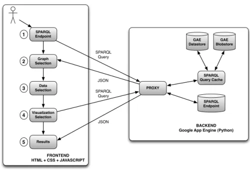
LODVisualization is developed using Google App Engine8 (GAE). Google App Engine is a cloud computing platform for developing and hosting web ap-plications on Google’s infrastructure. Figure 3 shows the architecture of LOD-Visualization.
Steps 1 and 2 correspond to the LDVM data stage, in which users can enter an SPARQL endpoint and select the graphs to visualize. Step 3 corresponds to the data extraction stage, in which users can choose a data extraction available for the selected graphs. Step 4 corresponds to the visualization abstraction stage,
6
group those classes that have an area too small to show in the Treemap 7 http://lodvisualization.appspot.com/
8
SPARQL Endpoint PROXY SPARQL Query Cache SPARQL Endpoint SPARQL Query SPARQL Query JSON JSON BACKEND Google App Engine (Python)
FRONTEND HTML + CSS + JAVASCRIPT GAE Datastore GAE Blobstore 1 2 3 4 5 Graph Selection Data Selection Visualization Selection Results
Fig. 3.High-level LODVisualiation architecture.
in which users can select a visualization technique compatible with the data extraction and some visualization parameters such as colors, size, etc. Finally, step 5 corresponds to the view stage and presents a concrete visualization to the users.
The frontend is developed using HTML, CSS and Javascript, while the back-end is developed in Python. Most visualizations are created using theJavaScript
Infovis Toolkit9andD3.js [26]. We have chosen them because they allow to
cre-ate rich and interactive JavaScript visualizations and they include also a free license. We also use Google Maps and OpenStreetMaps to create geospatial vi-sualizations. Data is transferred between SPARQL endpoints, the server and the client using JSON, which is the data format used by those libraries. Most SPARQL endpoints support JSON and can convert RDF to JSON, thus facili-tating the integration with Javascript.
Instead of querying SPARQL endpoints directly using AJAX, queries are generated on the client side but sent to the server. The server acts as a proxy in order to avoid AJAX cross-domain requests. At the same time, the server provides a cache infrastructure implemented using GAE Datastore and GAE Blobstore. For each SPARQL query we generate an MD5 hash and store the hash along with the query results. The GAE Blobstore is used to save those results whose size exceeds 1MB since the Datastore has this limitation. When the server receives a query, the results are obtained from cache if available and not stale.
9
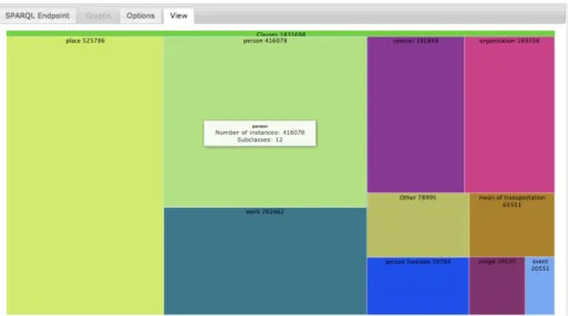
Fig. 4. LDVM implementation LODVisualization showing the DBpedia class hierarchy as a Treemap.
Otherwise, the query is sent to the SPARQL endpoint using the GAE URL Fetch API. Then, the hash of the query and its results are stored in the cache. The cache substantially increases performance, scalability and reliability of Linked Data visualizations by preventing to execute the same queries when users aim to visualize the same data extraction with different visualization techniques.
Our implementation includes so far 4 different data extraction types and 7 different visualization techniques. The available data extractions are: class hierarchy, property hierarchy, SKOS concepts hierarchy and geospatial data. The visualization techniques implemented are: Treemap, Spacetree, CropCircles, Indented Tree, Google Maps and OpenStreetMap. Figure 4 shows a concrete visualization example with the following parameters:
– Dataset: DBpedia.
– Data Extraction: class hierarchy.
– Visualization Configuration: Treemap, aggregation, random colors.
LODVisualization is compatible with most of SPARQL endpoints as long as JSON and SPARQL 1.110are supported. Most of the data extraction queries use
aggregate functions such asCOUNTorGROUP BY, which are implemented starting from this version. Our implementation has a limitation: the response of each SPARQL query must be available in less than 60 seconds. This is the maximum timeout for requests using the GAE URL Fetch API. Nevertheless, longer re-quests could be performed using the GAE Task Queue API or an alternative infrastructure.
10
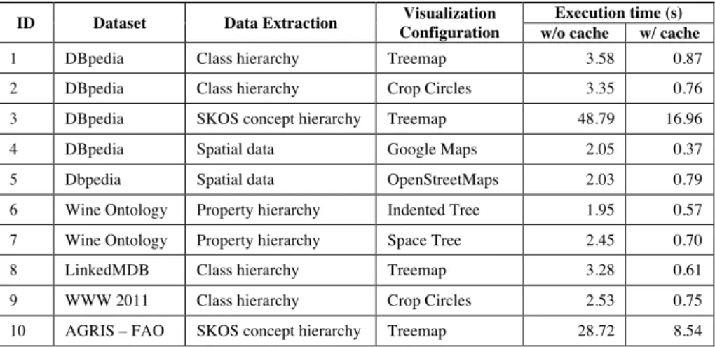
ID Dataset Data Extraction Visualization Configuration
Execution time (s) w/o cache w/ cache
1 DBpedia Class hierarchy Treemap 3.58 0.87
2 DBpedia Class hierarchy Crop Circles 3.35 0.76
3 DBpedia SKOS concept hierarchy Treemap 48.79 16.96
4 DBpedia Spatial data Google Maps 2.05 0.37
5 Dbpedia Spatial data OpenStreetMaps 2.03 0.79
6 Wine Ontology Property hierarchy Indented Tree 1.95 0.57
7 Wine Ontology Property hierarchy Space Tree 2.45 0.70
8 LinkedMDB Class hierarchy Treemap 3.28 0.61
9 WWW 2011 Class hierarchy Crop Circles 2.53 0.75
10 AGRIS – FAO SKOS concept hierarchy Treemap 28.72 8.54
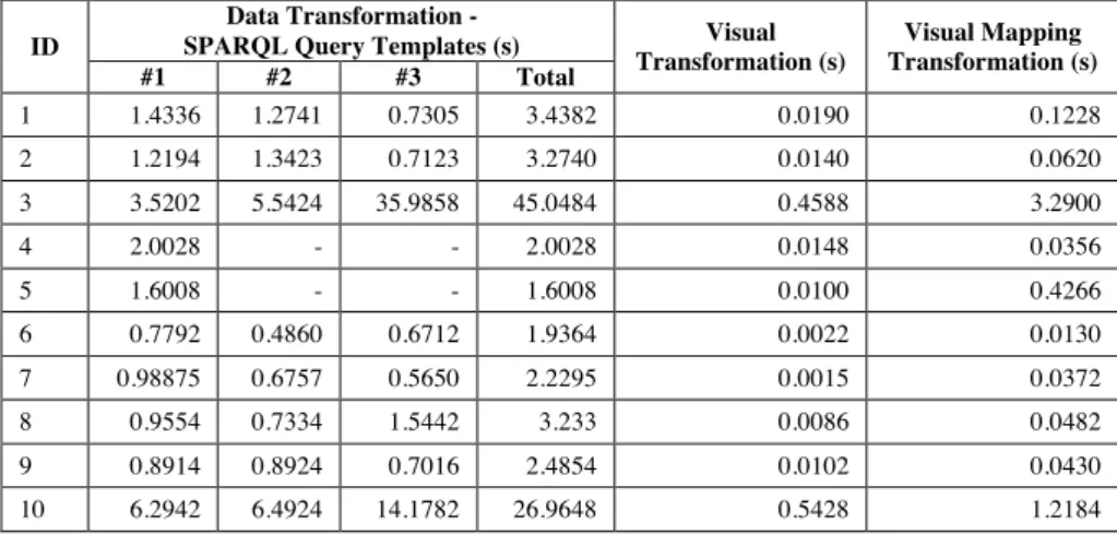
ID
Data Transformation -
SPARQL Query Templates (s) Visual Transformation (s) Visual Mapping Transformation (s) #1 #2 #3 Total 1 1.4336 1.2741 0.7305 3.4382 0.0190 0.1228 2 1.2194 1.3423 0.7123 3.2740 0.0140 0.0620 3 3.5202 5.5424 35.9858 45.0484 0.4588 3.2900 4 2.0028 - - 2.0028 0.0148 0.0356 5 1.6008 - - 1.6008 0.0100 0.4266 6 0.7792 0.4860 0.6712 1.9364 0.0022 0.0130 7 0.98875 0.6757 0.5650 2.2295 0.0015 0.0372 8 0.9554 0.7334 1.5442 3.233 0.0086 0.0482 9 0.8914 0.8924 0.7016 2.4854 0.0102 0.0430 10 6.2942 6.4924 14.1782 26.9648 0.5428 1.2184
Table 1. Evaluation results summary: execution time for 10 combinations of datasets, data extractions and visualization configurations.
5
Evaluation
We have evaluated our implementation of the Linked Data Visualization Model with different datasets, data extractions and visualizations. The evaluation was performed with Google Chrome version 19.0.1084.46. Table 1 shows a summary of the evaluation results.
Timings for each concrete visualization were averaged from 10 execution cycles without cache and 10 execution cycles with cache. Despite using some of the largest datasets available on the Data Web, most of the visualizations can be generated in real-time (<5s rendering time) and the use of the cache further reduces the execution time substantially (<1s rendering time). However, in experiments #3 and #10 (SKOS concept hierarchies) the results had to be stored in the GAE Blobstore instead of the GAE Datastore due to their size. Accessing the Blobstore to retrieve those results is much slower than accessing the Datastore, but further optimizations are possible to increase performance in such cases.
Table 2 shows the timings for each visualization divided into the three trans-formations proposed in the LDVM: data transformation, visual transformation and visual mapping transformation.
Creating different visualizations for the same data extraction takes a similar time. This is due to the fact that most of the execution time can be attributed to the data transformation. The visual transformation timing depends on the size of the results to process. In the same way, the visual mapping transformation depends on the number of items to visualize. This number is particularly high in experiments #3 and #10, with a huge hierarchy of SKOS concepts.
However, it is important to highlight that the execution times are not re-ally relevant for this evaluation. They depend mainly on the complexity of the
ID Dataset Data Extraction Visualization Configuration
Execution time (s) w/o cache w/ cache
1 DBpedia Class hierarchy Treemap 3.58 0.87
2 DBpedia Class hierarchy Crop Circles 3.35 0.76
3 DBpedia SKOS concept hierarchy Treemap 48.79 16.96
4 DBpedia Spatial data Google Maps 2.05 0.37
5 Dbpedia Spatial data OpenStreetMaps 2.03 0.79
6 Wine Ontology Property hierarchy Indented Tree 1.95 0.57
7 Wine Ontology Property hierarchy Space Tree 2.45 0.70
8 LinkedMDB Class hierarchy Treemap 3.28 0.61
9 WWW 2011 Class hierarchy Crop Circles 2.53 0.75
10 AGRIS – FAO SKOS concept hierarchy Treemap 28.72 8.54
ID
Data Transformation -
SPARQL Query Templates (s) Visual Transformation (s) Visual Mapping Transformation (s) #1 #2 #3 Total 1 1.4336 1.2741 0.7305 3.4382 0.0190 0.1228 2 1.2194 1.3423 0.7123 3.2740 0.0140 0.0620 3 3.5202 5.5424 35.9858 45.0484 0.4588 3.2900 4 2.0028 - - 2.0028 0.0148 0.0356 5 1.6008 - - 1.6008 0.0100 0.4266 6 0.7792 0.4860 0.6712 1.9364 0.0022 0.0130 7 0.98875 0.6757 0.5650 2.2295 0.0015 0.0372 8 0.9554 0.7334 1.5442 3.233 0.0086 0.0482 9 0.8914 0.8924 0.7016 2.4854 0.0102 0.0430 10 6.2942 6.4924 14.1782 26.9648 0.5428 1.2184
Table 2.Timing for each transformation: data transformation, visual transfor-mation and visual mapping transfortransfor-mation.
SPARQL queries required for the data extraction as well as on the availability of SPARQL endpoints or Google App Engine servers. The goal of our evaluation was to prove that the LDVM can be applied to different datasets providing dif-ferent data visualizations. All these visualization examples are available on the website and it easy to create new ones.
6
Conclusions and Future Work
We presented the Linked Data Visualization Model (LDVM) that can be ap-plied to rapidly create visualizations of RDF data. It allows to connect different datasets, different data extractions and different visualizations in a dynamic way. Applying this model, developers and designers can obtain a better understand-ing of the visualization process with data stages, transformations and operators. The LDVM offers user guidance on how to create visualizations for RDF data.
We have implemented the model as an application where it is possible to create generic visualizations for RDF. In our implementation we provide visual-izations that support the overview task proposed by Shneiderman in his visual seeking mantra. These visualizations are useful for obtaining a broad view of the datasets, their main types, properties and the relationships between them.
Our future work will focus on complementing the Linked Data Visualization Model with an ontology. A visualization ontology can help during the matching process between data and visualizations, capture the intermediate data struc-tures that can be generated and choose the visualizations more suitable for each data structure.
Regarding our implementation of the model, we plan to extend the library of data extractions and visualizations, e.g. charts or timelines. Having more data
extractions and visualizations will facilitate the creation of an ecosystem of data publication and data visualization approaches, which can co-exist and evolve independently.
Finally, based on the LDVM we aim to develop a dashboard for visualiz-ing and interactvisualiz-ing with linked data through different visualizations and other components. However, other Information Architecture components [27] such as facets or breadcrumbs are necessary to support other data analysis tasks and exploration.
Acknowledgments
We would like to thank our colleagues from AKSW research group for their helpful comments and inspiring discussions during the development of LDVM. This work was partially supported by a grant from the European Union’s 7th Framework Programme provided for the project LOD2 (GA no. 257943).
References
1. Aba-Sah Dadzie and Matthew Rowe. Approaches to visualising linked data: A survey. Semantic Web, 2(2):89–124, 2011.
2. Vladimir Geroimenko and Chaomei Chen, editors. Visualizing the Semantic Web. Springer, 2002.
3. Stuart K. Card, J. D. Mackinlay, and Ben Shneiderman. Readings in Information Visualization: Using Vision to Think. Academic Press, London, 1999.
4. Jeffrey Heer, Michael Bostock, and Vadim Ogievetsky. A tour through the visual-ization zoo. Queue, 8(5):20:20–20:30.
5. Ed H. Chi. A taxonomy of visualization techniques using the data state reference model. InProceedings of the IEEE Symposium on Information Vizualization 2000, INFOVIS ’00, pages 69–, Washington, DC, USA, 2000. IEEE Computer Society. 6. Uldis Bojars, Alexandre Passant, Frederick Giasson, and John Breslin. An
ar-chitecture to discover and query decentralized RDF data. volume 248 ofCEUR Workshop Proceedings ISSN 1613-0073, June 2007.
7. Tim Berners-lee, Yuhsin Chen, Lydia Chilton, Dan Connolly, Ruth Dhanaraj, James Hollenbach, Adam Lerer, and David Sheets. Tabulator: Exploring and ana-lyzing linked data on the semantic web. InIn Proceedings of the 3rd International Semantic Web User Interaction Workshop, 2006.
8. Experimenting with explorator: a direct manipulation generic rdf browser and querying tool. In Workshop on Visual Interfaces to the Social and the Seman-tic Web (VISSW2009), February 2009.
9. J.M. Brunetti, R. Gil, and R. Garcia. Facets and pivoting for flexible and usable linked data exploration. Crete, Greece, May 2012.
10. Tuukka Hastrup, Richard Cyganiak, and Uldis Bojars. Browsing linked data with fenfire, 2008.
11. Adapting Graph Visualization, Flavius Frasincar, Ru Telea, and Geert jan Houben. Adapting graph visualization techniques for the visualization of rdf data. Inof RDF data, Visualizing the Semantic Web, 2006, pages 154–171, 2005.
12. David Karger and MC Schraefel. The pathetic fallacy of RDF. Position Paper for SWUI06, 2006.
13. Magnus Stuhr, Roman Dumitru, and David Norheim. LODWheel - JavaScript-based Visualization of RDF Data -, pages 1–12. 2011.
14. Claus Stadler, Jens Lehmann, Konrad Höffner, and Sören Auer. Linkedgeodata: A core for a web of spatial open data. Semantic Web Journal, 2011.
15. Maria Cristina Ferreira de Oliveira and Haim Levkowitz. From visual data explo-ration to visual data mining: A survey. IEEE Transactions on Visualization and Computer Graphics, 9:378–394, 2003.
16. S. K. Card and J. Mackinlay. The structure of the information visualization design space. In Proceedings of the 1997 IEEE Symposium on Information Visualiza-tion (InfoVis ’97), INFOVIS ’97, pages 92–, Washington, DC, USA, 1997. IEEE Computer Society.
17. E. H. H. Chi, P. Barry, J. Riedl, and J. Konstan. A spreadsheet approach to infor-mation visualization. InProceedings of the 1997 IEEE Symposium on Information Visualization (InfoVis ’97), INFOVIS ’97, pages 17–, Washington, DC, USA, 1997. IEEE Computer Society.
18. Ben Shneiderman. The eyes have it: A task by data type taxonomy for information visualizations. InIEEE Visual Languages, number UMCP-CSD CS-TR-3665, pages 336–343, College Park, Maryland 20742, U.S.A., 1996.
19. Niklas Elmqvist and Jean-Daniel Fekete. Hierarchical aggregation for informa-tion visualizainforma-tion: Overview, techniques, and design guidelines. IEEE Trans. Vis. Comput. Graph., 16(3):439–454, 2010.
20. Ben Shneiderman. Tree visualization with tree-maps: 2-d space-filling approach. ACM Trans. Graph., 11(1):92–99, January 1992.
21. Taowei David Wang and Bijan Parsia. Cropcircles: Topology sensitive visualization of owl class hierarchies. InIn Proc. of the 5th International Conference on Semantic Web, pages 695–708, 2006.
22. Catherine Plaisant, Jesse Grosjean, and Benjamin B. Bederson. Spacetree: Sup-porting exploration in large node link tree, design evolution and empirical evalua-tion. InProceedings of the IEEE Symposium on Information Visualization (Info-Vis’02), INFOVIS ’02, pages 57–, Washington, DC, USA, 2002. IEEE Computer Society.
23. Natalia Andrienko. Interactive visual clustering of large collections of trajectories. InWorking Notes of the LWA 2011 - Learning, Knowledge, Adaptation, 2011. 24. Heidrun Schumann and Christian Tominski. Analytical, visual and interactive
concepts for geo-visual analytics. J. Vis. Lang. Comput., 22(4):257–267, August 2011.
25. Sören Auer, Christian Bizer, Georgi Kobilarov, Jens Lehmann, and Zachary Ives. Dbpedia: A nucleus for a web of open data. InIn 6th Int?l Semantic Web Confer-ence, Busan, Korea, pages 11–15. Springer, 2007.
26. Michael Bostock, Vadim Ogievetsky, and Jeffrey Heer. D3: Data-driven documents. IEEE Trans. Visualization & Comp. Graphics (Proc. InfoVis), 2011.
27. Josep Maria Brunetti and Roberto García. Information architecture automatiza-tion for the semantic web. In Proceedings of the 13th IFIP TC 13 international conference on Human-computer interaction - Volume Part IV, INTERACT’11, pages 410–413, Berlin, Heidelberg, 2011. Springer-Verlag.