University of New Hampshire
University of New Hampshire Scholars' Repository
Honors Theses and Capstones Student Scholarship
Spring 2015
Current Practices for Product Usability Testing in
Web and Mobile Applications
Spencer W. Black
University of New Hampshire - Main Campus, [email protected]
Follow this and additional works at:https://scholars.unh.edu/honors
Part of theOther Computer Sciences Commons, and theSoftware Engineering Commons
This Senior Honors Thesis is brought to you for free and open access by the Student Scholarship at University of New Hampshire Scholars' Repository. It has been accepted for inclusion in Honors Theses and Capstones by an authorized administrator of University of New Hampshire Scholars' Repository. For more information, please [email protected].
Recommended Citation
Black, Spencer W., "Current Practices for Product Usability Testing in Web and Mobile Applications" (2015).Honors Theses and Capstones. 226.
Current Practices for Product Usability Testing in Web and Mobile Applications
Spencer Black
Senior Honors Thesis Advisor: Karen Jin
Department of Computer Science University of New Hampshire Spring 2015
Abstract
Software usability testing is a key methodology that ensures applications are intuitive and easy to use for the target audience. Usability testing has direct benefits for companies as usability
improvements often are fundamental to the success of a product. A standard usability test study includes the following five steps: obtain suitable participants, design test scripts, conduct usability sessions, interpret test outcomes, and produce recommendations. Due to the increasing importance for more usable applications, effective techniques to develop usable products, as well as technologies to improve usability testing, have been widely utilized. However, as companies are developing more cross-platform web and mobile apps, traditional single-platform usability testing has shortcomings with respect to ensuring a uniform user experience. In this report, a new strategy is proposed to promote a consistent user experience across all application versions and platforms. This method integrates the testing of different application versions, e.g., the website, mobile app, mobile website. Participants are recruited with a better-defined criterion according to their preferred devices. The usability session is conducted iteratively on several different devices, and the test results of individual application versions are compared on a per-device basis to improve the test outcomes. This strategy is expected to extend on current practices for usability testing by incorporating cross-platform consistency of software versions on most devices.
Table of Contents
1 Introduction ... 1
2 Generic Usability Sessions ... 6
2.1 Test Preparation... 6
2.1.1 Obtaining Suitable Participants... 6
2.1.2 Test Script Preparation ... 10
2.2 Conducting Tests and Interpreting Results ... 12
2.3 Techniques on Improving Usability ... 15
3 Web Usability Sessions ... 19
3.1 Individual Usability Testing of Websites ... 19
3.2 Technology Associated with Web Usability ... 22
4 Mobile Usability Sessions ... 26
4.1 Understanding Limitations and Abilities of Mobile Devices... 26
4.2 Individual Usability Testing of Mobile Apps ... 28
4.3 Technology Associated with Mobile Usability ... 29
5 Usability Testing of Both Web & Mobile Applications ... 31
5.1 The Need for Consistency ... 31
5.2 Consistency among Websites, “Mobilized” Websites, and Apps ... 33
5.3 A Proposed Methodology of Testing Web, Mobile, and “Mobilized” Web Apps ... 37
6 Usability Testing Benefits ... 41
6.1 Benefits of Successful Usability Tests ... 41
6.2 Benefits of Our Approach to Web & Mobile Usability Tests ... 43
7 Conclusion ... 45
Acknowledgements ... 49
1
Introduction
Software usability is a component of software development that ensures that applications are usable with the target audience of the product. Ideally an application should “just work,” with minimal thought from the users, regardless of the platform that they are using. Navigation of the application should be fluid; menu items should make sense, and there should be no room for ambiguity when the users are exercising the workflow of common tasks. During development, software engineers should ideally visualize their software from the eyes of the user, e.g., the ones who purchase, download, and use the software to complete their work. If software is not
intuitive, consumers will ultimately struggle with it and gravitate to other applications that are easier to use.
A primary method to aid in making products more usable is formal usability testing. Usability testing is a methodology that is aimed at ensuring that an application can be used effectively to accomplish one or more defined tasks. In other words, it refers to evaluating the ease with which users can learn to use a product [1]. Testing for software usability allows for software companies to obtain data on their own product usability. This associated procedure of usability testing is not formally included in a unit or system test plan, even though it is arguably just as important as manual and automated testing of basic functionality. In fact, it is not enough that software performs a set of functionality. There is no guarantee that the interaction with the software is intuitive or easy to use just because there is a way to complete functional tasks.
Usability testing differs from focus group testing in several aspects. Focus group testing revolves around a small pool of people who assemble together and convey their feedback regarding proposed designs and ideas. The purpose of focus group testing is to gather quick data
concerning feelings and opinions of a small sample of users; it also helps to find if a planned component of a website makes sense. These details should be discovered early on, before the website or application has even begun development [10]. On the other hand, with usability testing, one user at a time is shown something (whether it is a website, a prototype of a site, or some sketches of individual pages) and asked to either (a) figure out what it is, or (b) try and use it to do a typical task [10]. Usability testing is much more individualized and personal. The focus is around the software user and their personal unique experience with the software. Focus group testing and usability testing each have respective complementary purposes. The differences should be clear for human factors designers as well as software engineers during the
development process, when testing needs to be conducted with the product [10].
A basic flow diagram of the five-step generic usability testing process is outlined in Figure 1. A standard usability test study includes five steps: obtain suitable participants, design test scripts, conduct usability sessions, interpret test outcomes, and produce recommendations.
Figure 1: The basic five-step procedure of a usability test.
Fundamental to effective usability testing is candidate selection. Finding the right
candidates to participate in a usability study varies from product to product. The participants who perform the testing should also be customized based on the situation and the type of usability test. For example, if a tablet application is designed for young children to play games while learning basic arithmetic skills, children should represent the demographic of usability testing sessions as opposed to college-aged people.
Obtain Suitable Participants Compose Test Scripts Conduct Usability Study Interpret Test Outcomes Recommendations
In addition to ensuring the correct application demographic, companies who recruit participants utilize different criteria for selecting ideal application testers. The criteria will differ substantially based on the product being tested. Cell phone technology testing must account for a very wide spectrum of users whereas account software typically is a much smaller niche of participants.
Comparative software websites/applications should also have a similar user experience (e.g., Lowe’s and Home Depot/MS Office and Open Office). Familiarity helps users
tremendously and greatly reduces the learning curve to effectively use similar applications. It is less than ideal to have the same testers for the same or a similar application. This is because the newness to the application may be compromised hence invalidating the test data as they would already have experience with the obvious similar workflows.
Often the human factors designer utilizes written scenarios, called scripts, to ask the participants to perform tasks. Scripts consist of a set of order tasks a user must do. Tasks could outline a participant to perform a basic login/logoff of a web application, or complete a purchase order. Scripts test the user’s ability to quickly find menus, drop-downs, button icons, tool tips and scrolling to perform a task. During the usability session the test administrators record data that can later be analyzed through various measures to give the application a usability index. This index measures the degree of easiness for an unfamiliar user to use the application effectively. It is up to the discretion of human factors designers on what aspect(s) of the product to test. For example, they may decide to observe the user’s ability to perform an end-to-end workflow in testing some applications.
Interpreting the test outcomes from a usability session varies from test to test, though there are a few fundamentals components of a successful usability test. A successful usability case study should begin with constructing clear, quantitative, objectivegoals along with some design decision action items, which also act as milestones for accomplishing a goal [3]. These objectives must be fulfilled as specified by either the human factors designer and/or the developing team. With goals in place, there will be additional light shed on finding where the line is drawn for usability testing, or how much usability testing is enough.
One sample goal of a usability session designated by the human factors designer, for a photo-taking mobile application, might be that users will be able to take a picture with their camera in less than five seconds at first use. This could entail a user navigating to the application and accessing the device’s camera. Some design decisions could include placing a camera icon on the bottom of the application and placing “Take a picture” text below it. This would clearly make the photo-taking application intuitive. Setting quantitative usability target goals ahead of software design enables software engineers to focus on satisfying these goals during the development process of the application [3].
Usability testing encompasses all supported application platforms. Typically applications run within a web browser as part of a website; in addition mobile device support is also often provided as an application or a mobile website. Older applications are installed directly on a user’s computer and run without network connectivity. Often applications will need to have slightly altered screen layouts and flows depending on the screen real estate available. For example, a webpage often must be condensed and reformatted to run on a tablet or smartphone, given the significantly reduced screen space available.
Testing should ensure that a user should ideally have a similar experience while navigating through the same application or webpages regardless of the device that the user is using, that is, a laptop, a tablet or a smartphone. Often users use the same application on their laptop while at work, on their smartphone while in transit, and then on their tablet when at home. Similarity and consistency of an application regardless of where it is run ultimately improves the user's application experience. For example, a user should not have to sift through countless webpages on their phone when they could instead find the page immediately visible on a laptop. Regardless of the platform or the application, usability testing is valuable for companies in many aspects.
Direct examples can be deduced from usability testing to show the impacts. For example, the Ford Motor Company embraced usability testing for their accounting system in some of their dealerships. Findings from the usability study included problems: Car dealers needed to make an average of three calls to the help-line to be able to start using the system and the commands used to enter credits and debits were designed by the engineers without first consulting users to learn the commonly used abbreviations [1]. As a result, Ford made significant alterations to the
accounting system and the calls to the help-line dropped to zero. Along with this, the new system saved Ford around $100,000. With the cost of usability testing being $70,000, the cost-benefit ratio stood at 1:1.4 [1].
Usability testing is a completely separate testing entity than automated and manual testing. The content presented in this thesis is valuable to readers interested in usability, or those who are unaware of how usability sessions are conducted. It requires a lot of careful thinking and effort to present a product that is completely intuitive to the user. Employers of the software industry need to be aware of developing products which yield a positive user experience.
Usability testing aids in producing better applications and companies can directly impact their own products by embracing in its potential.
2
Generic Usability Sessions
There are five steps to conduct a successful usability session, as shown in Figure 1. This section details the entire life cycle of administering a successful usability session. A standard usability test study includes the following steps: obtain suitable participants, design test scripts, conduct usability sessions, interpret test outcomes, and produce recommendations. Each step is vital for producing effective usable results to make products better.
2.1
Test Preparation
2.1.1 Obtaining Suitable Participants
To begin the selection process of suitable participants, a human factors designer should first gain some background knowledge about the application developed from the entire cross-functional development team and what features of the product they want tested for usability. The development team should include personnel from engineering, test engineering, product
management and documentation to prevent getting a bias view from a single group, e.g., the engineers who built the application. The aspects of the application collected should include the supported environments (e.g., web application, website and/or handheld device), the common workflows that they anticipate users will follow and an order prioritized list of the most important tasks a user will accomplish with the application.
In addition to understanding how the software is expected to be used, the typical user of the product should be identified. For example, an application that displays academic resources
would be ideally tested by a high school or college-aged individual whereas a recipe finder application would be best tested by a homemaker. A question that should be asked is how much experience participants should have. In other words, how can we differentiate between an
overqualified and under-qualified participant? Ideally participants should fall in the middle of the qualification spectrum to ensure that the tests do not result in excessive false positives or false negatives. False positives indicate that users are too experienced and do not encounter as many problems as typical users because they are more familiar with the product. They may be more accustomed to error messaging and know how to respond to them. False negatives often come from inexperienced people who lack the basic qualifications to conduct the test. In other words they do not have the basic fundamental understanding of the subject matter to successfully use the product and hence they are not the desired target user [10].
Once the application's demographics have been determined, participants can be found and selected. One way to locate participants is to look within places of business pertaining to the product being tested. For example, a banking application would likely be used by tellers and accountants, so recruiters could target banks with obtaining participants for the usability study. Internal applications should be strictly utilized by central employees because they are the target users who actually utilize the product.
Another methodology to find suitable people to participate in a usability study is to advertise in public places through posters, on-line forums, and newspapers. This approach, however, can result in testing delays. Additionally, increased filtering measures of the applicant pool might be needed as well due to the wider demographic of people being shown the
opportunity. Another technique that can be used is word of mouth amongst friends using social media. This approach can be problematic due to reluctance to convey problems out of fear of
showing the company negative criticism and hence compromising friendships. In other words, biasness could result from this procedure [10].
Alternatively, companies wishing to conduct usability sessions can pay other agencies that will perform the recruiting and screening process on their behalf. These agencies likely collect a royalty associated with the cost of a participant’s time such as 33%. TecEd, a company focused on user experience along with research and design, outlines their approach of reaching potential participants by outlining characteristics of a target participant and placing ads in newspapers and online groups. They also recruit from customer lists in their own database of over seven-thousand usability test participants [13].
One technique that recruiters utilize is screening. A screening process is conducted by a recruiter after potential people who meet the criteria are found. TecEd uses a two-step process which requires candidates to identify themselves through an on-line questionnaire as well as use a script to phone-screen the candidates to confirm previous responses, collect additional
information and check articulateness [13]. A similar approach could be utilized by human factors designers who wish to screen participants themselves, without outside agency assistance. They can email, send letters, or even call prospective usability test users.
The goal of the screening process procedure is to determine if a person is suitable as a participant of a study or not. One example of a question that a screener could ask would be what popular applications a prospective participant uses on their mobile device. A list of choices would be presented as well. In the case that the company is looking for users to test a recipe application, a question that a screener could ask would be when the prospective participant last read out of a recipe book. The questions should be configured in a way to determine if a user
would be a good fit for the product based on their past experiences and interests; the questions that are addressed should be specific so as to reduce error [10].
A technique called intercept recruiting is utilized by some recruiting companies. This method uses software popups to provide an invitation to prospective usability participants for a study. If users express interest, they can complete an on-screen questionnaire while the recruiter remotely oversees the results. The recruiter looks over the user’s responses to confirm that they match the target profile. This approach is often more effective than previously discussed methods depending on the site traffic [13]. The popup is presented and the user has to specify yes or no that they are interested in participating in a usability session. They do not have to rely on
memory from seeing an advertisement to remember to call that they are interested. Also, there is a sense of comfort when behind one’s own computer as opposed to talking to recruiters in person or on the telephone.
Participants require incentives to participate in a study, which is one of the reasons why usability testing stands as an investment. Whether they are Good Samaritans wanting to feel like they are helping the greater good, or seeking money for their time, participants should be
compensated for their participation. Some usability testers are fine with gift cards or even samples of other products. The level of experience that a participant has can raise or lower the amount of participant's compensation. A typical half-day pay rate for being part of a usability session can range from $50 - $200 [10]. According to Nielsen Normal Group, one of the leading voices in user experience, the average per-user cost is $171. Other costs that are associated with usability testing are external agencies raking around $107 per participant. The average amount of pay for external users is between $32 - $118 per hour, depending on how high-level of a
professional the participant is, as well as the location. For example, Silicon Valley comprises of many high-level professionals [11].
It also should be noted that one participant does not, and never will, represent all users. Multiple participants should be used in any usability study. There is not a “one-size-fits-all” guideline as to how many participants should be included in a usability study, although having five participants is generally accepted. Having five participants almost always gets close to the user testing's maximum benefit-cost ratio for testing websites, intranets, PC applications, or mobile apps [12]. Certain variables that affect the number of participants are the amount of resources available and the overall width of the audience demographic. I.e., a small niche of anticipated users from a varied spectrum of the population may result in suitable test results.
2.1.2 Test Script Preparation
With participants and a list of prospective aspects of a product to test for usability, the human factors designer should design a test script which contains written instruction outlining the scenarios to follow. The test script should be designed with some influence from the goals of the developer(s) and others in the cross-functional product team. The script should also describe steps that a participant must carry out during the testing cycle. These tasks, interpreted from goals of the product team, could be thought of as the various scenarios that a user experiences while using the product. A long-term goal which will help drive the script's composition may include reducing the need to call product support by 50% for each business week during the initial installation of the product. Another long-term goal could be reducing the amount of call support needed to assist the customers in their first time using the product. As a general rule of thumb, an hour long usability session yields approximately ten scenarios for desktop and laptop scenarios, and eight scenarios for mobile devices. Fewer scenarios are able to be completed for
mobile devices because of the reduced screen size [14]. They should also be written as short statements and easy to understand in order to reduce ambiguity for a user.
A recent usability study had focused on elder adults using social networking sites like LinkedIn and Twitter [2]. The majority of the tasks on the script revolved around navigating Facebook. The social media “activities” conducted by the participants were specified as follows:
• Task 1: Logging into your account,
• Task 2: Understanding the homepage
• Task 3: Understanding your profile
• Task 4: Navigating through the site
• Task 5: Understanding information on a profile
• Task 6: Commenting on profiles
Additionally, subtasks can be defined to further break down the main tasks even more to encourage more coverage. They can indicate consistency among different scenarios that a user experiences. The human factors designer can also observe how the user navigates through the application to complete the described subtasks for each task. Subtasks in the above study include:
• 4.1 Click where you would enter your username
• 4.2 Click on the timeline area of your profile
• 4.3 Click on the latest post in your newsfeed
• 4.4 Click on an advertisement on the homepage
• 4.5 Click the appropriate link to view Ellie’s notifications on the homepage
• 4.6 Read out loud where John went to high school
These subtasks can also include figures and diagrams to indicate what the user is expected to see; the tasks also validate to the human factors designer, who is recording data, whether the user is on the right track or not. The object is for the user to complete these tasks without any assistance. The human factors designer should not provide hints or answers to tasks performed by the participants as these hints may invalidate the test. The time to complete a task would be reduced, as the user would not need to figure out the task on their own. Assistance, hints and tips can completely nullify the results of a usability test.
2.2
Conducting Tests and Interpreting Results
After observing the participant and recording data, the human factors designer needs to review performance metrics and benchmarks to of the usability session. These metrics go beyond noting whether a user completed a task successfully or not; they include severe and less-severe user-encountered error(s), the percentage of participants who come across certain errors, the time it takes for a user to complete a task, subjective measures, and even final feelings are all types of performance metrics and results contributing to the usability study. The entire cross-functional team can make their products more intuitive based on these test outcomes.
One example of an important performance metric is how fluid a participant’s navigation is through a webpage or application. For example, if a user has a task of taking a photograph and consistently goes through many more steps than they feel is necessary; the human factors
designer should record this and inform the software engineers. Also, the human factors designer should take note of frustrated users who make several repeated navigational errors, causing an increase in the time to complete a task. If a participant keeps entering a wrong value in a text field based on pure intuition, then this error should be noted accordingly so that the developer
can modify the error message and/or tooltip. If a user repeatedly gets errors this may be
indicative that the user is unclear about the goal of a task. Less severe errors include fulfilling a task in a less-efficient way than expected. For example, a page could be navigated to another page through three intermediate pages instead of five, through a series of user interactions with GUI controls. This is a burden for a user and yields time wasted while using the product [14].
Other findings that can be recorded as performance metrics include the percentage of participants who encountered severe problems vs. less severe problems on a per-scenario basis. These percentages can indicate what features related to tasks are the most problematic and need to be addressed. In addition, the frequency in which no errors are found should be recorded; this indicates that participants did not have any difficulties with completing tasks and hence the feature is intuitive enough for the common user [14].
The time it takes for a user to complete a task is very useful quantitative information to document. Tasks that take too long for a user attribute to frustration with a product which yields a negative user experience. There should be an approximate time range as to how long a task should take before the test has commenced. One example could be locating a search text field on a social media website or a retail on-line store, entering in text and clicking on a button to execute the search should take a few seconds. If a user struggles finding a field, navigating to a page, or understanding the purpose of a product attribute, the human factors designer should record these difficulties with the product [14].
Subjective measures can also be noted based on the discretion by the human factors designer. They can provide their own evaluations for a participant to describe their experience on a numbered (1 [horrible experience] - 10 [excellent experience]) scale. For example, during a
usability session for a social media application, a tester may rate an aspect that was easy to use such as navigating from the main menu to a people search menu on a scale from 1 to 10. These statements complement the human factors designer’s own comments during the participant observation [14].
Participants can provide final feelings of the usability of the application to the human factors designer. The difference between the user's opinion on usability and a human factors designer’s subjective measures is that the user's views are completely ad hoc, unscripted, and unplanned. Participants can offer suggestions from their standpoint in order to make the product more usable. For example, if the wording of a menu item was confusing to the user, then the human factors designer can record the constructive criticism. They can also provide positive feedback which shows what aspects of the application worked well in the product. The ultimate goal of the session is to make the product continuously better through the aid of the multiple participants of a usability session [14].
All of the data collected as part of the study should be compiled into a well-organized analytical report. Quantitative data such as the success rates, task time, error rates, as well as the 1 – 10 user-response ratings should be recorded in a spreadsheet. In addition, qualitative data such as the participant’s spoken or written feelings, the problems encountered by the participant, comments/suggestions, and answers to non-numerical questions should be recorded in a series of statements that are easy to understand for the readers of the document such as the program managers and the software engineering teams [15].
The reports should be reviewed with the entire cross-functional development team
data collected from the usability session, to make the product better. At this point upon
completion of develop, the human factors designer can decide if the goals are fulfilled and ready to ship the product or if testing based on application revisions is warranted. Fluid,
results-oriented communication is crucial between the human factors designer and the development team [14]. The human factors designer should be considered to be an integral part of the product team. Furthermore, a usability test is successful only if it helps to improve the product that was tested and the process by which it was developed [3]. Usability testing should therefore be viewed by development as a way of ensuring that the software will be successful in the
marketplace. It should not be viewed as a waste of time or effort during the development cycle.
2.3
Techniques on Improving Usability
There are several approaches to make websites and applications more intuitive to users and thus provide a positive user experience. A developer should always consistently utilize icons that are obvious to users of the product. These can be icons that are ubiquitous amongst other product’s icons such as a magnifying glass symbolizing search or find in Facebook and Amazon. Other universal icons that should be utilized, if necessary is the left arrow (←) indicating
backwards and the right arrow (→) indicating forwards for navigating between pages that have already been accessed. It is a common practice to have these icons readily accessible in case a user experiences difficulty and wants to return to a previously visited page. In addition, icons should not rely exclusively on color for those who are colorblind. They should a combination of color, shape, and/or text to address colorblindness.
Companies should be cognizant of the positioning of fundamental components on their products. The layout of an application’s screens is extremely important. Being consistent with common application layout practices is extremely important. For example, “OK” and “Cancel”
buttons should be together and always at the far right bottom of a dialog. Search fields that are repeatedly used for websites specializing in shopping, or even finding someone in social media should almost always remain at the top in plain view, consistent with other application. The placement of navigation is extremely important as it can result in how fast a user successfully completes a desired task; poor, inconsistent navigation will result in user frustration and may even result in the inability to successfully complete a task.
Websites designers and application developers should also be mindful of the platforms that people will use. It is often the case that users will use all variants (local application, web application, handheld application) of the same application so they all should be consistent. Having a handheld application that is completely different from its laptop counterpart will be very frustrating for users.
Platform limitations must also be taken into account. For example, Apple users utilize devices that do not support Adobe Flash. Large-sized images can also slow down the
application’s loading time which is also unwanted. All major browsers such as Internet Explorer, Mozilla Firefox, Google Chrome, and Safari should be tested during the development process. As a rule of thumb, one should always design products that fit as large as possible demographic of users in order to maximize revenue and overall application satisfaction.
While keeping the user experience in mind, developers should make appropriate adjustments to titles and menu items that appear on websites. They should be condensed for mobile devices to convey the same information without being too obtrusive on the eye. Titles that are too long should be abbreviated on mobile devices or they will most likely cause the user to lose interest due to excessive, unwanted scrolling. Large amounts of text inputs can be
frustrating for users as well on mobile devices because of the small fields that need to be pressed. Unless necessary, use other fields that are easier to select such as dropdowns, radio buttons and checkboxes [6].
Having a well-conceived product design also applies for having an overall simple layout and design for a website or application. Having products that are too busy can frustrate a user who expects websites and applications to just work without much of a learning curve. Users prefer to have a smooth, simple, minimal step workflow during their application navigation. Well-labeled text links should be used in an organized grid-like fashion from menus and lists in order to improve the user's experience. It is important not to lose information in the
simplification process to ensure the quality and completeness of the page [6].
In addition to having a mobile version of website designed for handheld devices, the option to view the full website, as a fall back, should be presented in case there are any issues with the mobile version. For example, some websites on mobile devices suffer significant usability issues such that the user is unable to scroll horizontally to view a whole graphical figure; this indicates that an insufficient amount of mobile usability testing was conducted by the company. Other times, users simply want the same exact experience as using a website on their laptop and do not have the desire or time to navigate through the mobile version. The option to view the full website should be present as there is practically a standard for widely-used websites such as Facebook and Amazon [6].
Showing elements of focus also complements a positive user experience by drawing the user to important aspects of the application. Use of color, text bolding, graphics, or even
first on an area of the application presented. Users do not want to scroll through an application searching for fields to complete tasks, regardless of the platform. Neither do they want to accidentally click an element without realizing it and end up in a brand new page, essentially getting lost in the application. Providing useful focus items should not bind the user to selecting these items but instead enable a user to use the application in an efficient, no-need-to-backtrack way. Focused elements should only be used where they make sense. However, there should not be too many focus points as doing so defeats the purpose of providing the user with focus to begin with [6].
Excessive amounts of popups should also not be used. Closing them can become a burden for users regardless of their device. For mobile users in particular, oftentimes their devices will not load popups due to their small-sized screen. Popups become frustrating due to the amount of refreshing that continues to occur and can even make the user feel nauseous or seasick. The additional time and frustration required to close them is also problematic for user experience [6].
When in doubt, a software designer should just try and imagine how a user would interact with the application or website. Questions one might ask are: Is having field X really necessary, and for what purpose does it serve? Are there a significantly different amount of links it takes to navigate to a page between mobile and non-mobile devices? Is the page too busy for a user, with too much content? Asking these questions allows developers to envision the product as a user which can make way for a positive user experience [6].
3
Web Usability Sessions
3.1
Individual Usability Testing of Websites
Websites can be individually tested using the framework of the usability testing process, without the need to also test mobile applications or the mobile versions of websites. When testing websites for usability, the operating system, browser, and screen size should be taken into account. For example, the current version of Safari (8.0.4 as of March 17, 2015) cannot be downloaded for Windows, as it is specifically for OS X Yosemite. Users should only test on browsers that they are comfortable with, so that they are familiar with the interface. Screen size is an important test consideration because the size of a screen dictates the landscape that an application can reside in. The larger the screen size, the more of a website can be presented at any time, giving opportunity for more design flexibility and detail.
Ideally, users should have a similar experience during the usability test, regardless of any of the considerations presented above. They should feel comfortable and familiar with the desktop/laptop device, operating system, and associated browser used during the usability session. By having operating system environment familiarity, focus is placed on the tests to ensure more valid outcomes. For example, a MacBook user doing an editor test on Windows may need to copy a picture using the familiar Windows command, “CTRL + C” to cut and “CTRL + V” to paste. If the user is not aware of these commands, they may struggle with the test and skew the test outcomes.
Data obtained from each user should be analyzed and corrections should be applied between usability sessions in order to iteratively improve a product. A human factors designer can present the report to the engineers who will directly address the problems. Afterwards,
another usability session can be conducted with a brand new version of the website to test the results of the improvements and allow for further refinements. For example, the 10,000 Steps homepage was designed to display the 10,000 Steps Program, which has a goal of increasing participation in physical activity across a wide range of adult populations. Figure 2 outlines the homepage of the 10,000 Steps website, before any usability sessions were conducted [7]. Figure 3 displays the final homepage of the 10,000 Steps website after usability sessions were
conducted.
Figure 2: The 10,000 Steps website before any usability Figure 3: The result of the second version of the
test sessions were conducted [7]. 10,000 Steps website, after one round of usability
testing was performed and analyzed [7].
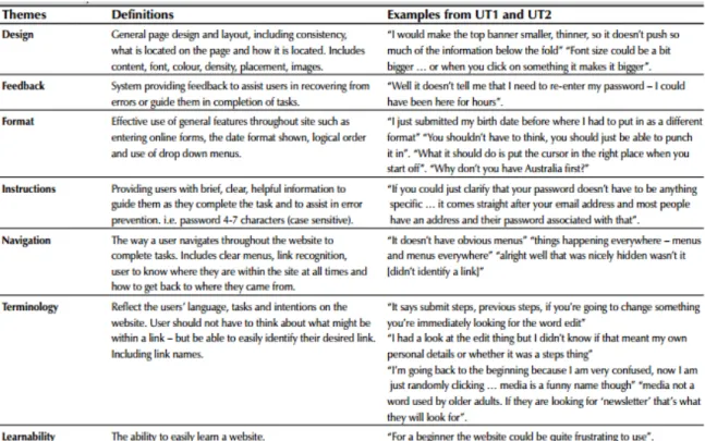
After the usability test was conducted, the human factors designer outlined the data in a table, shown in Figure 4. It can be observed that this particular test had the following seven attributes to be observed: Design, Feedback, Format, Instructions, Navigation, Terminology, and Learnability.
Figure 4: The seven factors in a table that the human factors designers were interested in during the usability test. They obtained data from participant statements [7].
Next, the results were taken into consideration by the software development teams who owned the websites. They made changes to the website, attempting to make it better, as the improved result shown in Figure 3.
After the revision, a new sample of the usability testers can be brought into the testing studio for usability. The same seven theme-metrics can be observed. The number of problems can be observed and compared from the first and second round of usability sessions, as shown in Figure 5.
At this point, it can be verified that the usability test was successful as there were considerably fewer problems in the website the second time around (138 vs. 30). Given the significant reduction of issues, common aspects of usability can be further analyzed to improve the website. Additional iterations with six new participants for the usability test can be
performed. These refinement cycles will continue to make the website converge toward
perfection, though the cycles can be costly. A human factors designer can decide if a benchmark is needed, such as the total amount of problems allowed, in order to terminate additional
usability testing.
3.2
Technology Associated with Web Usability
Other technologies are also utilized during usability sessions. EyeWorks, is a company that specializes in developing eye tracking software designed for researchers. One component of the software is its ability to produce a testing script designed for participants. It can present scenarios and tasks to participants, stream video, and even display photos. The greatest aspect related to usability is its ability to launch websites and collect user interaction data. The product is capable of displaying data as to what a user focuses on when looking at a webpage. It can also monitor other user interactions by observing where a user clicks the mouse, what keys they press, and where they scroll. Figure 6 illustrates what a user is currently fixated on while on the Amazon homepage [4]. It also has a feature to monitor a user’s eye motion in real time while viewing a webpage in case the researcher wants to see the movement of how the eye travels.
Figure 6: The homepage with enhanced EyeWorks™ capabilities which illustrate movement of the eye, where a user focuses on [4].
This product clearly aids in developing more usable software for users as it allows
researchers access to observe of the eye of the user. Before the user makes the decision on where to click, press, or what to type in, they must first see the field, by visually navigating to it. A convoluted product may cause the user to repeatedly circle around a page trying to locate a certain item and in turn waste time and cause frustration. Figure 7 shows how eye tracking devices work, through a series of heat mappings.
Figure 7: The heat mapping of points on a webpage that are gazed at different time periods [5].
Points that are focused on for long periods of time indicate a redder hue on the color scale. Figure 8 outlines the “saccade pathways” which indicate the movement of the eye and are also utilized for data collection [5]. In this example, the user observed the top middle of the page and navigated through the page in a series of zigzag movements. The red circles outline areas of focus on the user [5].
Figure 8: The movement of the eye in a series of “saccade pathways” [5].
Eye tracking of the product user is especially useful as the data collected consists of what the user is reading/scanning and account for what specific content on the page that they are looking at. The data also can indicate the user’s confusion, noting the repeated eye motions over the same areas of the application. Zigzag movements over repeated areas of the application are often a sign of confusion. Eye tracking can also be used to see what features of an application are missed completely. One limitation of eye tracking technologies is that it cannot explain the psychology as to why a user is looking at certain aspects of a website as opposed to others.
However, there are also caveats and disadvantages with employing eye tracking devices. The underlying aspects of eye tracking are unique to each user and cannot be scientifically explained. Also, eye wear such as contacts and glasses may negatively affect the results. The equipment is also expensive to purchase, which may be a burden for small companies.
Subsequently, the data gathered from eye tracking devices should only be used as supplemental information to add to the usability study [5].
4
Mobile Usability Sessions
4.1
Understanding Limitations and Abilities of Mobile Devices
Testing on mobile devices requires different strategies than their platform counterparts. Special considerations should be made when conducting testing on mobile devices to make sure that the user experience is as fluid as using a laptop or desktop. Mobile devices have unique features such as working with a single window screen. Users on non-mobile devices can have multiple screen displays and have multiple applications on at the same time such as an Internet browser, a calculator, and a document capable of capturing arithmetic. While multitasking may be possible on mobile device, it is much harder to balance between open applications from when they are readily accessible on non-mobile devices.
Ideally a mobile application should not have to rely on any other applications as it can inhibit the user experience, although there are always exceptions. Facebook received negative feedback for forcing mobile users to download the Facebook Messenger application along with the separate Facebook app. Mark Zuckerberg, CEO of Facebook, acknowledged that it was a “big ask” for the Facebook community and even defended the choice by stating, “We wanted to do this because we believe that this is a better experience. Messaging is becoming increasingly important. On mobile, each app can only focus on doing one thing well, we think” [16]. In fact, reliance on other software can be frustrating for users and should be avoided or an alternate path should be provided.
An important difference between a mobile and desktop application is how a user navigates: through a touchscreen and typing directly on the device instead of using an external mouse and keyboard. Developers need to be cognizant with how the mobile keyboard affects the landscape of the application due to additional space occupied. Mouse and touchscreen are also quite different for the user experience. For instance, with the mouse the user can observe the motion of the mouse through an icon, as they physically move it with their hand. This same phenomenon will not occur for the mobile counterpart. With touchscreen, users are unable to see where they are moving unless some aspect of the application changes. Some examples of these changes include a keyboard or additional menu displaying, or even the feed scrolling vertically.
Shortcuts and menus that would normally appear on an Internet browser will likely be needed in order to add more fluidity among mobile devices. This commonality will make the multiple forms of a product be nearly interchangeable in terms of doing the same tasks.
Developing the application to contain a simple design is perfectly acceptable, but if it stems too far from the desktop/laptop version, then there will result in inconsistencies which can cause user frustration from the continuous need to mentally map the differences. If common aspects of an application are not carried out across all platforms, customers may gravitate towards only using the web version on their laptop or desktop. The worst case scenario would be that they
completely stop using the product altogether due to lack of cross platform consistency.
For mobile devices that have a laptop or desktop version, human factors designers have a choice of constructing usability scripts which have a user test the mobile device against the desktop/laptop version. Ideally the experience should be the same (or at least very similar) between the two, but regardless, the observations from the participant should be recorded and discussed. Consumers should not have to go much more out of the way from fulfilling their work
tasks in the mobile version than from the desktop/laptop version. One important goal of usability is to provide consistency among devices. If a user has to completely relearn software between devices, then the application will enviably fall short with respect to usability as reported by consumers. Regardless of the version of the application, functionality should just simply work consistently.
To accommodate the differences between mobile and non-mobile devices, developers should utilize strategies such as simplifying product design. Complexity is taboo when it comes to usability, so simple and clean designs should be the focus for software engineers; simplicity is especially important when developing mobile-friendly applications with their limited screen real estate. Consumers love utilizing mobile applications that have cross-compatibly with tablets and desktops/laptops; companies that provide this consistency have a distinct advantage. Having a product that works just as well on mobile devices compared to desktop/laptop versions will ultimately make a company more successful.
4.2
Individual Usability Testing of Mobile Apps
Standalone mobile device applications can have usability testing conducted similarly to desktop or laptop testing. The human factors designer should have an idea of what devices should be tested such as Apple, Windows, Android tablets and smartphones. This should be a factor when choosing participants based on the device that they are comfortable with. The reason for this is an iPhone user testing an Android device may have a difficult time with navigating with the device’s controls, which could induce false negatives on a product. All major devices should be tested to reflect a universal user experience across the board. It is also useful to have the user utilize their own device so issues such as being unfamiliar with the operating system will be irrelevant in the test.
The human factors designer should have a list of tasks for the user to complete on the mobile device such as dragging and dropping a cell into a grid and expecting a push notification to arise. The results are recorded and compiled into a report for the software engineers to fix. Afterwards, the revised mobile application can be tested by a new group of usability testers. A similar analysis of the results is performed during web usability sessions using themes: Design, Feedback, Format, Instructions, Navigation, Terminology, and Learnability. The difference is purely the platform that is used.
A positive aspect of standalone mobile applications is that the website counterpart does not need to be reviewed for consistency or fluid navigation. The testers simply use the mobile application as if there was no website available which means that the screen size does not have to be compared from the website’s vast landscape. However, with that being said, a range of
devices (including tablets) need to be tested with slightly different screen sizes and
functionalities. At bare minimum, three Apple, Windows, Android tablets and three mobile devices should be tested for usability. To fulfill this requirement, at least three tablets and three mobile devices should be tested as long as the product is supported.
4.3
Technology Associated with Mobile Usability
Mobile usability test sessions often leverage special camera technology. There exists technology that will aid in mobile usability sessions. During a usability session, special cameras may be harnessed to observe a user’s motions. Then these recordings can be replayed to see how closely the user reacts to expected behavior by the human factors designer. The human factors designer has the choice of recording the user’s actions during a usability session, although it is not necessary as the live feed can be observed. However, the user must be notified prior and give consent to such measures. Figure 9 illustrates the ZiggiHD camera in action. It can be inferred
that the camera is in a fixed position, so the user should be cognizant of their physical movement of the device that they are testing. Figure 10 shows a better view of how the human factors designer can observe the participant’s actions on their personal device.
Figure 9: The ZiggiHD camera utilized by a potential candidate in a usability session, while connected to a laptop for the human factors designer to witness [9].
Figure 10: The IPEVO Presenter application on an Apple device, capable of displaying the participant’s workflow throughout a usability session [9].
The ZiggiHD camera device, along with all other related cameras involved in mobile usability testing, allows for a better view to observe the user’s attempts to complete tasks in a usability session. The human factors designer can use this tool and document important data while separated from the user. As shown by Figure 10, the device is not obtrusive to the user’s mobile experience as the camera does not interfere with what is seen on the screen; it is set up so the user experience is as “normal” as possible. Factors which contribute to a positive experience are use of dry cloths to clean their device and also to have appropriate lighting to reduce glaring effects on the device from the camera’s reflection. The nice aspect of the camera is that it will work for both tablets and phones. The camera allows the human factors designer to see what fingers the participants use to navigate, what menus they go to (and in what order), and what they type in on text fields, along with other navigation scenarios [9].
5
Usability Testing of Both Web & Mobile Applications
5.1
The Need for Consistency
For the growing amount of companies who have websites, mobile versions of websites, and mobile apps, and a universal experience needs to be obtained. Usability testing should go beyond testing individual platforms at a time; it needs to extend to covering mobile and desktop/laptop versions, to promote a general consistency across all devices. The experience should be uniform and seamless along the same application. In other words, consistency is not just an individual device’s experience.
Consistency, in the context of usability testing, means that the three types of applications behave similarly. Given users often utilize many devices concurrently, it is vital that users can seamlessly perform a workflow, regardless of the application version, or platform. There should
not be a “black-and-white experience” between the website and the mobile website. In other words, website and mobile websites are expected to behave the same way and not with major differences to yield a detriment to the user experience. A user should be inclined to choose whichever version of the application as they want and expect to have the same results. If a user is dissatisfied with a company’s version of a mobile application, they may make the conscious decision to terminate their business with the company, even if the desktop/laptop version of the application is satisfactory. Having three consistent versions of an application shows a user that the company cares about their customers enough to promote a positive user experience.
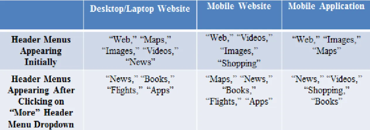
An example of a webpage that exemplifies consistency is Google. All of the content is appropriately condensed in the mobile app and mobile webpage versions from the desktop/laptop counterpart, regardless of what page the user is on. An example of this condensing done is the webpage that is displayed after searching. There are header menus that appear initially and additional header menus that appear after clicking on the “More” dropdown. These differences are shown in Figure 11:
While the header menus that appear initially as well as after the “More” header menu dropdown is clicked may be slightly different across platforms, this does not necessarily harm usability. Mobile versions have far less landscape to work with then the desktop/laptop versions, forcing slightly different design choices. The key is to consistently use these design concessions throughout the mobile version. Consistent design choices between mobile website application and the mobile website versions results in users inferring that the differences are a deliberate design choice made by the product owner of that page. This page is still considered easy-to-use and consistent because all supported menu items appear; unsupported items such as “Flights” can simply be omitted from the mobile application where they are not supported.
All versions also have a similar navigation flow, e.g., going on the main homepage of https://www.google.com (or loading up the application), brings up a very simple, familiar page with a search bar. Entering values into the search bar and pressing the enter-key result in pages displayed by the search engine. This two-step process for searching is the same across all versions. A further analysis of this cross-consistency, using Amazon as an example, will be presented in the next section.
5.2
Consistency among Websites, “Mobilized” Websites, and Apps
Testing mobile usability sessions often is slightly different from testing the
desktop/laptop large “landscape” version of the applications. For popular websites in particular, like ESPN, Google, and Facebook, the website needs to present information effectively on a mobile device’s smaller screens size. The goal is to not hinder the user’s experience if they are using a mobile version compared to a desktop/laptop version which concurrently demonstrating a commonality between both presentations.
As mentioned, many users go from desktop/laptop to handheld versions on the same application throughout the day and the handheld version should not seem complete different or foreign to the user. Navigation within a mobile application typically uses icons to display menus to aid in navigation. Use of icons prevents a congested application littered with page links. Excessive scrolling on a handheld device is never an answer in an effort to reduce clutter. Scrolling becomes very frustrating and often results in loss of memory context of what one was trying to accomplish. Designers must therefore develop applications which work differently but consistently regardless of whether they are run on a laptop, a tablet or a smartphone.
Amazon, for example, has three separate entities associated with displaying their page content: through the website on a laptop, the website on a mobile device, and the mobile application. Figures 12, 13 and 14 display the differences in the same order listed above.
Figure 13: The homepage of Figure 14: The homepage of the http://www.amazon.com on a mobile device Amazon application on a mobile device
(iPhone 5S) in the Safari web browser. (iPhone 5S).
The differences between the three versions of Amazon reveal several design choices. First of all, the website (both desktop/laptop and mobile devices) along with the application all use the universal shopping cart icon to provide consistency in user experience. The homepage banner revealing Valentine’s Day deals is also displayed and compressed appropriately to fit all screen sizes appropriately.
It is observed that the content appears slightly abridged with mobile devices compared to desktop/laptop platforms. This indicates to the user that scrolling downward is required to see more of the homepage of the application or even select links to advance to other menus. This technique is commonly used amongst websites formatted for mobile devices and is fine as long
as other links to navigate to are supplied. It is undesirable for a mobile user to scroll down on the homepage for ten seconds or more in order to find a desired link. Design choices must be made with user intuition in mind. While it is easier to develop a website that consists of one long page on mobile devices, doing so will result in a negative user experience.
Amazon’s mobile application looks much cleaner and less busy than the mobile website, with every pixel detailing purpose, compared to the mobile website version containing the URL and other mandatory browser controls. Developers need to be cognizant of how much space is displayed for each mobile platform, and to utilize it effectively. Tablet devices download the same app from the respective mobile application store.
Three separate designs are utilized for complementing the main search text-box. The website is the most descriptive with containing a “GO” button symbolize navigation to another page. It also contains a drop-down to narrow and broaden searches accordingly by the choice of the user. Alternatively, “Shop by Department” is displayed as a link in the mobile versions; clicking the link brings up another page that displays “All Departments.” Adding in links for navigation is a smart choice because it reduces congestion on the main page.
It should be noted however that too much navigation can be obstructive to the user experience. The main mantra to follow when condensing a website into a mobile form is to be mindful of the most common pages a user visits; these should always be easily accessible for the consumer of a product. Amazon is an on-line shopping store, so having the final “check out” shopping cart neatly displayed on the top makes the purchasing very easy for a buyer. Using intuitive icons for the target user often results in a positive user experience.
5.3
A Proposed Methodology of Testing Web, Mobile, and
“Mobilized” Web Apps
Our proposed approach modifies the generic usability testing strategy by having participants test an application on multiple devices in order to promote consistency across devices. Standard web applications in today’s industry are typically complemented with mobile websites and mobile applications. To test all three components of an application, a human factors designer identifies a target user with noted skills in mobile device and desktop/laptop device. Then, they will run a series of tasks, designed by the human factors designer, that outline a workflow for the user to perform. The user will run the run the same tasks three times on the website, mobile application, and the mobile website. It should be noted that the order in which they carry out the three tests will be random between participants, so that the user will not necessarily “learn” from the website how to navigate through the mobile counterparts.
Next, the human factors designer keeps data on all three tests of the tasks by the user and notes any discrepancies amongst the applications. The developers should ideally fix all versions of the application that fail the benchmark as deemed appropriate by the human factors designer. A priority system could become enacted, which would serve as the notion of fixing the worst-usable applications in order. After the version(s) of the application have become fixed, a new group of usability testers will test the same tasks of the mobile/non-mobile devices. Afterwards, the number of problems the user encountered for each version of the application can be analyzed. At this point, the human factors designer can keep conducting usability testing until the
benchmark for all three versions of the applications is reached.
Carrying out this proposed methodology requires all five steps of the generic usability test to be modified. First of all, adjustments to evaluation criteria will need to be established.
Prior to running the test, the human factors designer should thoroughly interview the individual performing the tests to understand what he/she commonly uses for devices (e.g., Dell
desktop/laptop with Windows, Apple iPhone) on which to run applications. This interview will help eliminate extraneous errors such as basic navigation through a smartphone. For example, an iPhone user should not be testing an Android device because it is not their primary device and they may not be familiar with even basic navigation. However, “cross-devices” do not
necessarily have to be related. For example, a candidate who uses an Android device and a MacBook should not be disqualified from being a usability test participant. Figure 15, outlines the various modifications from the generic usability session.
Figure 15: A modified five-step process of a generic usability test.
Figure 16 displays a scenario in which four potential participants were interviewed for taking part of a usability study which regarded an app that was on Windows, iOS, and Linux operating systems on desktops/laptops. The app was also supported with Windows, Apple, and Android smartphone devices. The first participant had Windows 7 on a desktop/laptop and had 5.0 Lollipop on an Android smartphone. The second participant had OS X 10.10 Yosemite on a MacBook and had 4.4.2 KitKat on an Android smartphone. The third participant had OS X 10.6 Snow Leopard and an iPhone running iOS 8.3. Lastly, the fourth participant had Linux Mint 17.1 on a desktop/laptop and a smartphone running Windows 8.1. The operating system is useful information for knowing what the app supports.
Obtain Suitable Participants with Better-Defined Criteria (Based on Their Platform Devices) Compose Test Scripts Catered to Multiple Versions of the App Conduct Usability Study for Multiple Application Versions (Based on Participant’s Devices) Interpret Test Outcomes by Comparing Respective Devices Together Recommendations by Improving the Weaker App Versions to Promote Cross-Platform Consistency
Figure 16: An example table of obtaining the desktop/laptop OS version, as well as the type of phone for the user. To read the chart, the number to the left on the cell differentiates the potential participants. The second item represents the operating system of their desktop/laptop. The third item is the operating system of their mobile device.
Adequate coverage is vital for a usability test to be successful. For generic usability testing, five is generically accepted as the sample size for a minimum amount of participants to serve as statistical significance. For our proposed methodology, there must be a balance between the number of participants obtained and the budget. Obviously, having a large number of
participants results in more data, but it is also costly. For the purpose of this procedure, the human factors designer should make sure that for each operating system that the application can run on, at leastthree participants should be testing it. This means if there are three operating systems for the desktop/laptop platforms, and three operating systems for the mobile platforms, then there need to be at minimum nine participants for reasonable, full coverage of this
proposition. To make the minimum number of participants of this strategy more formulaic, multiply the amount of operating systems for the desktop/laptop platforms by the number of operating systems for the mobile platforms. It should also be noted that one does not need to cover all versions of a certain OS unless the app calls for it. For example, a KitKat and Lollipop user of the Android platform could be grouped in the same Android OS level as long as they do not have to individually be tested for usability.
After the participants have been recruited and selected, the human factors designer will have a list of their respective devices and operating systems. The human factors designer will also have a script which will cover both of the participant’s devices and randomly select the order of the versions of the app that the user tests first. This will remove the notion that learning one version of the application will help with another version. The user in turn tests multiple versions of the app, to reduce the amount of users needed per version of the application. Also, having more than three users is fine, especially if there are users whose devices contain vastly different operating environments such as Microsoft's Windows and Apple's iOS.
The human factors designer will record and interpret data on each of the devices that the user tests. There is no difference in the data recorded from the usability study between our proposed methodology and the individual testing of desktop/laptop and mobile devices. The data will not be compared until the very end when the report is written with all of the user data. Part of the report will entail a page detailing all of the comparisons of the mobile devices and a page outlining all of the comparisons of the non-mobile devices are displayed. This will allow for easy-to-read evaluations of devices and the ability to see which perform better than others.
Afterwards, the developers can observe which devices are the most usable and can improve the other versions of the apps to be on the same level. For example, suppose a series of usability tests were administered and the human factors designer’s performance metrics
determined that the Apple iPhone mobile application was designated to be the most usable for the mobile application. However, the tests also indicated that the Windows computer provided the best user experience for a desktop/laptop website. This exemplifies that the iOS version of the mobile app should be served as a basis for fixing usability issues in the other supported

![Figure 2: The 10,000 Steps website before any usability Figure 3: The result of the second version of the test sessions were conducted [7]](https://thumb-us.123doks.com/thumbv2/123dok_us/1385855.2685644/24.918.471.812.416.713/figure-steps-website-usability-figure-version-sessions-conducted.webp)
![Figure 6: The homepage with enhanced EyeWorks™ capabilities which illustrate movement of the eye, where a user focuses on [4]](https://thumb-us.123doks.com/thumbv2/123dok_us/1385855.2685644/27.918.110.730.115.618/figure-homepage-enhanced-eyeworks-capabilities-illustrate-movement-focuses.webp)
![Figure 7: The heat mapping of points on a webpage that are gazed at different time periods [5]](https://thumb-us.123doks.com/thumbv2/123dok_us/1385855.2685644/28.918.111.785.105.629/figure-heat-mapping-points-webpage-gazed-different-periods.webp)
![Figure 8: The movement of the eye in a series of “saccade pathways” [5].](https://thumb-us.123doks.com/thumbv2/123dok_us/1385855.2685644/29.918.117.680.122.552/figure-movement-eye-series-saccade-pathways.webp)
![Figure 10: The IPEVO Presenter application on an Apple device, capable of displaying the participant’s workflow throughout a usability session [9]](https://thumb-us.123doks.com/thumbv2/123dok_us/1385855.2685644/34.918.109.636.650.979/figure-presenter-application-capable-displaying-participant-workflow-usability.webp)