DigitalCommons@USU
DigitalCommons@USU
All Graduate Theses and Dissertations Graduate Studies
12-2012
Visual Data Mining Techniques for Functional Actigraphy Data: An
Visual Data Mining Techniques for Functional Actigraphy Data: An
Object-Oriented Approach in R
Object-Oriented Approach in R
Abbass SharifUtah State University
Follow this and additional works at: https://digitalcommons.usu.edu/etd
Part of the Statistics and Probability Commons
Recommended Citation Recommended Citation
Sharif, Abbass, "Visual Data Mining Techniques for Functional Actigraphy Data: An Object-Oriented Approach in R" (2012). All Graduate Theses and Dissertations. 1394.
https://digitalcommons.usu.edu/etd/1394 This Dissertation is brought to you for free and open access by the Graduate Studies at
DigitalCommons@USU. It has been accepted for inclusion in All Graduate Theses and Dissertations by an authorized administrator of DigitalCommons@USU. For more information, please contact
DATA: AN OBJECT-ORIENTED APPROACH IN R
by
Abbass Sharif
A dissertation submitted in partial fulfillment of the requirements for the degree
of
DOCTOR OF PHILOSOPHY in
Mathematical Sciences
Approved:
Dr. J¨urgen Symanzik Dr. Piotr S. Kokoszka
Major Professor Committee Member
Dr. Daniel C. Coster Dr. Christopher D. Corcoran
Committee Member Committee Member
Dr. Yanghee Kim Dr. Mark R. McLellan
Committee Member Vice President for Research and
Dean of the School of Graduate Studies
UTAH STATE UNIVERSITY Logan, Utah
Copyright c Abbass Sharif 2012 All Rights Reserved
ABSTRACT
Visual Data Mining Techniques for Functional Actigraphy Data: An Object-Oriented Approach in R
by
Abbass Sharif, Doctor of Philosophy Utah State University, 2012
Major Professor: Dr. J¨urgen Symanzik
Department: Mathematics and Statistics
Actigraphy, a technology for measuring a subject’s overall activity level almost continuously over time, has gained a lot of momentum over the last few years. An actigraph, a watch-like device that can be attached to the wrist or ankle of a sub-ject, uses an accelerometer to measure human movement every minute or even every 15 seconds. Actigraphy data is often treated as functional data. In this disserta-tion, we discuss what has been done regarding the visualization of actigraphy data, and then we explain the three main goals we achieved: (i) develop new multivariate visualization techniques for actigraphy data; (ii) integrate the new and current visu-alization tools into an R package using object-oriented model design; and (iii) develop an adaptive user-friendly web interface for actigraphy software.
PUBLIC ABSTRACT
Actigraphy, a technology for measuring a subject’s overall activity level almost continuously over time, has gained a lot of momentum over the last few years. An actigraph, a watch-like device that can be attached to the wrist or ankle of a sub-ject, uses an accelerometer to measure human movement every minute or even every 15 seconds. Actigraphy data is often treated as functional data. In this disserta-tion, we discuss what has been done regarding the visualization of actigraphy data, and then we explain the three main goals we achieved: (i) develop new multivariate visualization techniques for actigraphy data; (ii) integrate the new and current visu-alization tools into an R package using object-oriented model design; and (iii) develop an adaptive user-friendly web interface for actigraphy software.
ACKNOWLEDGMENTS
My top thanks go to my mother, Donia; my dad, Ismail; my brother, Ali; and my sister, Alia. They are my earlier heaven on this earth.
Millions of thanks to my major professor, Dr. J¨urgen Symanzik, for his sincere
support during my doctoral years at USU. Your continuous support helped me build an attitude of excitement and devotion for my research.
Many thanks go to the Mathematics and Statistics Department at Utah State University, to all professors, students, and staff members (especially Ms. Cindy Moul-ton).
My sincere appreciation to my committee members, Dr. Daniel C. Coster, Dr. Piotr S. Kokoszka, Dr. Christopher D. Corcoran, and Dr. Yanghee Kim, for their agreement to work with me and sit on my committee.
To the department of Mathematics and Computer Science at the Lebanese Amer-ican University in Beirut: thank you for the solid foundation I obtained while pursuing my undergraduate and master’s degrees. Dr. May Abboud, Dr. Ramzi Haraty, and Dr. Samer Habre, thank you for your comprehensive support and encouragement.
I would also like to thank my friends for the moral support, positive vibes, and encouragement. A person who seeks a Ph.D., he/she should make sure to have friends of your calibre!
United States friends: Ani Aghababyan, Ani Mirzakhanyan, Armen Armaghanyan,
Allyn Bernkof, Dr. Bobbe Allen, Brian Abel, Carlos Calbimonte, Chris Lewis, Dr. Daniel Useche, Danilo Lemos, Jean Carlos Guzman, Dr. James Odei, Janitha Nan-dalochana, Jonathan Koch, Jordan Glissmeyer, Karli Salisbury, Kayla Harris, Lau-ren Ayne, Lia Inoa, Dr. Magathi Jayaram, Manal El Arab, Marco Antonio Leite
Ribeiro Bodini, Mohamed El Hamoui, Mercedes Roman, Nadishan Pitigala, Nare Hayrapetyan, Nayda Gonzalez, Dr. Nicoleta Fuca, Randa Yassine, Dr. Robertas Gabrys, Rob Gentillon, Rouchelle Brockman, Dr. Roula Bachour, Dr. Ryan Hill, Satenik Sargsyan, Stella Henry, Tony Kusbach, Vance Almquist, and Wonhee Hong.
Lebanon friends: Batoul Bitar, Dr. Fadel Jaber, Kamal Kaawach, Karim Baalbaki,
Khaled Mneimneh, Hassan Mansour, Haytham El Zein, Loulou Hilal, Majd Eid, Ryan Sabbah, Roaida Hilal, Sarah Hilal, Samih El Khatib, and Zeina Youssef.
CONTENTS Page ABSTRACT . . . iii PUBLIC ABSTRACT . . . iv ACKNOWLEDGMENTS . . . vi LIST OF TABLES . . . xi
LIST OF FIGURES . . . xii
1 INTRODUCTION . . . 1
1.1 Introduction . . . 1
1.2 Current Visualizations of Actigraphy Data: Literature Review . . . . 2
1.3 Goals of this Dissertation . . . 8
1.3.1 Goal 1: Development of New Multivariate Visualization Tech-niques for Actigraphy Data . . . 8
1.3.2 Goal 2: Integration of New and Current Visualization Tools into an R Package Using Object-oriented Model Design . . . . 9
1.3.3 Goal 3: Development of a User-friendly Web Interface for Actig-raphy Software . . . 9
2 MULIVARIATE VISUAL DATA MINING TECHNIQUES FOR ACTIG-RAPHY DATA . . . 10
2.1 Introduction . . . 10
2.2 Techniques for Visualizing Functional Data . . . 13
2.2.1 Density-based Plots . . . 14
2.2.2 Data Enveloping . . . 15
2.2.3 Data Summing . . . 16
2.2.4 Multivariate Time Series Plots . . . 16
2.3 Simulated Data . . . 17
2.4 Techniques Applied to Simulated Data . . . 18
2.4.1 Density-based Plots . . . 18
2.4.2 Data Enveloping . . . 19
2.4.3 Data Summing . . . 20
2.4.4 Multivariate Time Series Plots . . . 23
2.5 Actigraphy Data . . . 28
2.6 Techniques Applied to Actigraphy Data . . . 30
2.6.2 Data Enveloping . . . 31
2.6.3 Data Summing . . . 34
2.6.4 Multivariate Time Series Plots . . . 36
2.7 Discussion . . . 38
3 ACTIVIS: AN R PACKAGE FOR VISUALIZING ACTIGRAPHY DATA . . . 42
3.1 Introduction . . . 42
3.2 Why to use R? . . . 43
3.3 Object-Oriented Programming . . . 44
3.3.1 Object-Oriented Programming in R . . . 45
3.3.2 Object-Oriented Design for ActiVis R Package . . . 47
3.4 Data . . . 52
3.4.1 Actigraphy Data . . . 52
3.4.2 Clinical Data . . . 53
3.5 Case Study: Using the ActiVis R Package . . . 53
3.5.1 Single Patient Actigraphy Visualization . . . 53
3.5.2 Multiple Patient Actigraphy Visualization . . . 56
3.6 Discussion . . . 58
4 A WEB-BASED STATISTICAL FRAMEWORK FOR THE VISU-ALIZATION OF ACTIGRAPHY DATA USING R . . . 65
4.1 Introduction . . . 65
4.2 Graphical Interfaces to R . . . 66
4.2.1 Windows Interface to R . . . 66
4.2.2 Web Interface To R . . . 66
4.3 Existing Statistical Web Applications Using R . . . 71
4.4 Technologies Used . . . 72 4.4.1 Brew . . . 72 4.4.2 Javascript . . . 72 4.4.3 CSS . . . 73 4.4.4 AJAX . . . 73 4.4.5 rjson . . . 73 4.4.6 jQuery . . . 74
4.5 Web Application Setup . . . 75
4.5.1 Client-Server Architecture . . . 76
4.5.2 High Level Actigraphy Web Application Design Model . . . . 76
4.5.3 Low Level Actigraphy Web Application Design Model . . . 77
4.6 The ActiVis Graphical User Interface . . . 79
4.7 Discussion . . . 84
5 SUMMARY AND CONCLUSIONS . . . 86
APPENDICES . . . 93
APPENDIX A PROCEDURAL PARADIGM (R CODE) . . . 95
A.1 Read AWC Data Format File . . . 95
A.2 Aggregate 15-seconds Data to 1-minute Data . . . 98
A.3 Aggregate Sum of Minutely Data . . . 100
A.4 Raw Data Plot . . . 102
A.5 Smoothed Data Plot . . . 104
A.6 Velocity Plot . . . 106
A.7 Acceleration Plot . . . 108
A.8 Cumulative Sums Plot . . . 110
A.9 Sorted Cumulative Sums Plot . . . 112
A.10 Density Plot . . . 114
A.11 Envelope Data . . . 119
A.12 Plot Envelope Data . . . 125
A.13 Mvts Plot . . . 129
APPENDIX B OBJECT ORIENTED PARADIGM (R CODE) 135 B.1 ActData . . . 135 B.2 Graph . . . 137 B.3 RawDataPlot . . . 138 B.4 SmoothedDataPlot . . . 140 B.5 VelocityPlot . . . 142 B.6 AccelerationPlot . . . 145 B.7 CumSumsPlot . . . 148 B.8 SortedCumSumsPlot . . . 150 B.9 DensityPlot . . . 152
APPENDIX C WEB APPLICATION (HTML CODE) . . . 155
C.1 Main Page . . . 155
C.2 Single Patient Page . . . 161
C.3 Multiple Patient Page . . . 165
APPENDIX D WEB APPLICATION (JAVASCRIPT CODE) 169 D.1 Javascript Controller . . . 169
LIST OF TABLES
Table Page
3.1 Description of the attributes and methods for theActData class. The
AWC data format is described in Section 3.4 . . . 50
3.2 Description of the attributes and methods for the Graph class. . . 51
3.3 Description of the attributes and methods for theRawDataPlot,
Smoothed-DataPlot, VelocityPlot, AccelerationPlot, CumSumsPlot, and Sorted-CumSumsPlot classes. . . 52
3.4 Description of the attributes and methods for the DensityPlot class. . 60
3.5 Description of the attributes and methods for the EnvelopePlot class. 61
3.6 Description of the attributes and methods for the MvtsPlot class. . . 62
3.7 The format of the AWC data files that are produced by the actigraphy
devices (Mini Mitter Company Incorporated., 2005) . . . 63
3.8 The format of the CSV clinical data files that are collected by the
PHQ-9 questionnaire. . . 64
4.1 List of other approaches for bridging R to web interfaces . . . 71
LIST OF FIGURES
Figure Page
1.1 An actigram as produced by the Actical software from Mini Mitter
Company Incorporated. (2005). The horizontal axis represents the
time from noon (far left) to noon 24 hours later (far right). Vertically, 14 days are shown. Data have been collected on twelve of those days.
The solid black area represents the activity levels of the subject . . . 3
1.2 Histograms and numerical summaries of actigraphy data of four
differ-ent patidiffer-ents (Symanzik and Shannon, 2008). The x-axis indicates the level of activity (higher represents more active) and the y-axis shows
the percentage of time the patient exhibits that level of activity. . . . 5
1.3 Recent visualization techniques for actigraphy data (Sharif et al., 2010).
(a) raw data plot, (b) smoothed data plot, (c) velocity plot, (d) acceler-ation plot, (e) cumulative sums plot, (f) sorted cumulative sums plot. Shown are data for a single subject, called Patient X, for four con-secutive days. The horizontal axis represents a 24-hour period from midnight to midnight. The thick red curves represent the averages (Avg.) which are calculated from the raw data in plots (a), (e), and (f), and from the smoothed data in plots (b), (c), and (d). Some curves
are partially hidden due to overplotting . . . 6
2.1 An actigram as produced by the Actical software from Mini Mitter
Company Incorporated. (2005). The horizontal axis represents the
time from noon (far left) to noon 24 hours later (far right). Vertically, 14 days are shown. Data have been collected on twelve of those days.
The solid black area represents the activity levels of the subject . . . 11
2.2 Density-based Plots: Simulated data with different noise levels (k =
1,50,100,200) . . . 19
2.3 Data Envelopes: M in−maxenvelopes for simulated data with different
noise levels . . . 21
2.4 Data Envelopes: Q1 −Q3 envelopes for simulated data with different
2.5 Data Summing with Enveloping (Zero noise): raw data (1 minute) vs.
data sums of 10, 20, 30, and 60 minutes . . . 24
2.6 Data Summing with Enveloping (Low noise): raw data (1 minute) vs.
data sums of 10, 20, 30, and 60 minutes . . . 25
2.7 Data Summing with Enveloping (Medium noise): raw data (1 minute)
vs. data sums of 10, 20, 30, and 60 minutes . . . 26
2.8 Data Summing with Enveloping (High noise): raw data (1 minute) vs.
data sums of 10, 20, 30, and 60 minutes . . . 27
2.9 Multivariate Time Series Plot: Simulated data with different levels.
The right hand side shows a box plot, and the bottom side shows a plot for the median activity level across all the times series for each
time point. . . 28
2.10 Multivariate Time Series Plot: Simulated data with different levels. The right hand side plot shows a box plot, and the bottom side shows
a plot for the 25th−75th percentile envelopes. . . . 29
2.11 Density-based Plots: Actigraphy data grouped by patients’ depression
levels . . . 31
2.12 Density-based Plots: Actigraphy data grouped by patients’ gender . . 32
2.13 Density-based Plots: Cumulative sum plots for actigraphy data grouped
by patients’ depression levels . . . 33
2.14 Density-based Plots: Cumulative sum plots for actigraphy data grouped
by patients’ gender . . . 34
2.15 Data Envelopes: 25th−75th percentile vs. 40th −60th percentile
en-velopes for actigraphy data grouped by patients’ depression levels . . 34
2.16 Data Envelopes: 25th−75th percentile vs. 40th −60th percentile
en-velopes for actigraphy data grouped by patients’ gender . . . 35
2.17 Data Envelopes: 25th−75th percentile vs. 40th −60th percentile
en-velopes for cumulative sums of actigraphy data grouped by patients’
depression levels . . . 35
2.18 Data Envelopes: 25th−75th percentile vs. 40th −60th percentile
en-velopes for cumulative sums of actigraphy data grouped by patients’
2.19 Data Sums with Envelopes: 25th−75th percentile vs. 40th−60th
per-centile envelopes for actigraphy data grouped by patients’ depression
levels . . . 37
2.20 Data Sums with Envelopes: 25th−75th percentile vs. 40th−60th
per-centile envelopes for actigraphy data grouped by patients’ gender . . 37
2.21 Multivariate Time Series Plot: Actigraphy data with different levels of depression -low(level 1) up to high (level 5). The right hand side plot shows a box plot, and the bottom side shows a plot for the median
activity level across all the times series for each time point. . . 39
2.22 Multivariate Time Series Plot: Actigraphy data with different levels of depression -low(level 1) up to high (level 5). The right hand side plot
shows a box plot, and the bottom side shows a plot for the 25th−75th
percentile envelopes. . . 40
3.1 Class diagram for the ActVis R package. Shown are eleven different
classes and the interactions among them. The dashed arrow represents a dependency relation, while the non-dashed arrows represent inheri-tance relations. Inheriinheri-tance indicates that one of the two related classes is considered to be a specialized form of the other, while a dependency relationship indicates that one class depends on another because it uses
it at some point of time . . . 48
3.2 Actual content of Karli’s AWC file (Karli.AWC). Shown are the first
48 lines. . . 54
3.3 Raw data plot for of Karli’s actigraphy data (days 2 and 3) , with the
average of these two days (solid green line). . . 56
3.4 MVTS plot for 6 patients (5 females, and 1 male). . . 59
4.1 Actigraphy plugin in Microsoft Excel . . . 67
4.2 A control panel window based on the Rcmdr package showing the raw
data plot for a certain subject for three different days . . . 67
4.3 A control panel window based on the Rcmdr package showing the
4.4 A web interface showing four different types of plots (raw data, lowess fit, first derivative, and second derivative plot, introduced in Section 1.2), based on user selections via “check boxes” menu items. Faint orange symbols and lines represent five days at the baseline; faint pur-ple symbols and lines represent five days after treatment. Solid or-ange/purple lines represent averages at the baseline/after treatment
for this subject . . . 69
4.5 Basic Client-Server Model. . . 76
4.6 ActiVis Client-Server Model (Ooms, 2010a). . . 77
4.7 Low Level Architecture for the ActiVis Client-Server Model . . . 78
4.8 ActiVis Web Application . . . 80
4.9 ActiVis Web Application: Browsing for Data Files . . . 81
4.10 ActiVis Web Application: Uploading Data Files . . . 81
4.11 ActiVis Web Application: Selecting a Graph Type . . . 82
4.12 ActiVis Web Application: Inputting Graph Paramters . . . 82
4.13 ActiVis Web Application: Rendering the Visualization . . . 83
INTRODUCTION
1.1 Introduction
Actigraphy is an emerging technology for measuring human activity/rest levels over time. Actigraphy data are collected by an actigraph unit which is a non-invasive watch-like device that consists of an accelerometer. Actigraphy is useful to evaluate sleeping patterns, fatigue, circadian rhythms, and general activity over a period of several weeks.
Actigraphy observations are recorded almost continuously over time. Today’s actigraphs can measure human activity at different accumulation rates ranging from low (one or more minute intervals) over high (15 seconds intervals) to very high (one second interval). These data could be treated as functional data. Ramsay and Silver-man (2006, p. 38), characterize functional data as follows: “The basic philosophy of functional data analysis is to think of observed data functions as single entities, rather than merely as a sequence of individual observations.” In order to explore and inter-act with functional inter-actigraphy data, we need some new and easy-to-use visualization techniques and interfaces. So far, a few visualization techniques have been provided by the manufacturers of actigraphs. These techniques have very limited features that might not allow the users of the software to view activity levels of one or more sub-jects from different perspectives. In addition, a user/programmer is not allowed to customize the software provided by the manufacturer to meet his/her needs. In this dissertation, we developed new visualization methods that utilize the object-oriented (OO) programming approach (Lafore, 2002), and then bundled this functionality as
an open source software to be published as a part of The Comprehensive R Archive Network-CRAN, http://cran.r-project.org. The main purpose behind using the OO paradigm is to make it easier for other programmers to reuse our suggested visualiza-tion techniques. For example, this would allow other programmers to create different user interfaces and customize these interfaces for the needs of their users.
1.2 Current Visualizations of Actigraphy Data: Literature Review
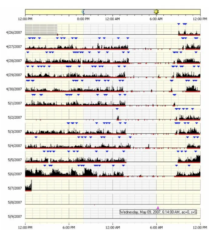
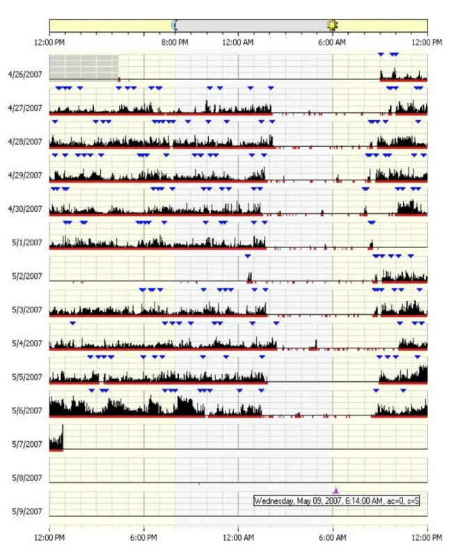
Figure 2.1 shows an actigram (sometimes also called actogram), a visual display of the daily activity/rest patterns, of a certain subject. This is a commonly used visualization technique for actigraphy data and can be found in numerous actigraphy related publications, e.g., Figures 1 & 2 in Slaven et al. (2009), and Figure 2 in Labyak and Bourguignon (2002). Figure 2.1 was produced using the software developed by the manufacturer of the Actical actigraphy device, Mini Mitter Company Incorporated. (2005). The monitoring of this subject started on 4/26/2007 and ended on 5/7/2007. Each row of the actigram represents the flow of activity during one day. The black spikes represent the level of activity, the red dots/segments at the horizontal axis tell whether there is activity or not at a specific time of the day, and the blue upside-down triangles indicate time points marked by the subject when a major new activity has started or ended, such as waking up or going to bed.
From a display such as in Figure 2.1, a viewer should be able to detect if there is major minute-to-minute variability during a certain day or significant day-to-day variability among the days. Here, for example, on 5/4/2007 the subject’s overall activity is very low compared to his/her overall activity on 5/6/2007. Although this graph allows us to explore the data visually, it only offers limited insight. It is not a very powerful tool for studying the variability within a subject and among multiple subjects. For example, if a medical doctor wants to check if a certain treatment
Fig. 1.1: An actigram as produced by the Actical software from Mini Mitter Company Incorporated. (2005). The horizontal axis represents the time from noon (far left) to
noon 24 hours later (far right). Vertically, 14 days are shown. Data have been
collected on twelve of those days. The solid black area represents the activity levels of the subject
or disease is affecting a patient’s activity, then the doctor needs to compare data from before and after the treatment. The actigram won’t allow us to do detailed comparisons. Furthermore, it does not allow us to do group comparisons such as control vs. experimental groups.
Histograms and numerical summary statistics have been also used to explore actigraphy data. These are not very useful and need to be extended. For instance, Figure 1.2, taken from Symanzik and Shannon (2008), shows the histogram display for four patients. The horizontal axis represent the activity levels for each patient (from low to high activity level), and the vertical axis represents the percentage of time a particular patient exhibits a certain level of activity. Patients A and B (the bottom two histograms) have similar levels of activity that range from 0 (probably during sleep) to 400, while patients C and D (the top two histograms) have very low levels of activity. This is shown by the high bars on the left side of the histogram and no bars on the right side. This interpretation is confirmed by summary statistics of mean activity levels of 5.4, 20.4, 206.5, and 209.7 for patients C, D, B, and A, respectively. These histograms and summary statistics describe how the patients differ in activity levels, but fail to capture when the patients exhibit different levels of activity levels and patterns.
A variety of new or improved visualization methods for actigraphy data have been suggested in Symanzik and Shannon (2008), such as the raw data plot, smoothed data plot, velocity plot, acceleration plot, cumulative sums plot, and sorted cumu-lative sums plot. Some of these plots have been previously introduced, such as the cumulative sums plot that resembles the cumulative actigram in Figures 2(B) & 3 in Labyak and Bourguignon (2002). These visualization techniques for actigraphy data are useful when doing comparisons for a single subject over time (e.g., baseline, during treatment, and after treatment).
Fig. 1.2: Histograms and numerical summaries of actigraphy data of four different patients (Symanzik and Shannon, 2008). The x-axis indicates the level of activity (higher represents more active) and the y-axis shows the percentage of time the patient exhibits that level of activity.
Figure 1.3 shows six of these recently introduced visualization techniques (Sharif et al., 2010), produced in R (R Core Team., 2012). Each of these graphs provides a different insight for the actigraphy level of a certain subject, from Day 3 through Day 6 of monitoring. The x-axis shows the time of the day, except for the sorted cumulative sums plot in (f). The y-axis shows the activity level or a derived measure for the subject.
In the raw data plot (Figure 1.3(a)), a viewer may speculate that there is a pat-tern in the activity levels of this subject, but this patpat-tern is not clearly visible because of the extensive overplotting of the points. The smoothed data plot (Figure 1.3(b)) would be a better approach, especially when taking into account that actigraphy data can be considered as functional data. In this plot, each day is represented as a func-tion by showing (locally weighted scatterplot smoothing) lowess (Cleveland, 1979,
(a)− Patient X Raw Data Plot Time ● ● ●●●●●●●●●●●●●●●●●●●●●●●●●●●●●●●●●●●●●●●●●●●●●●●●●●●●●●●●●●●●●●● ● ● ●●●●●●●●●●●●●●●●●● ● ● ●●●●●●●●●●●●●●●●●●●●●●●●●●●●●●●●●●●●●●●●●●●●●●●●●●●●●●●●●●●●●●●●●●● ● ● ● ● ● ●●●●●●●●●●●●●●●●●●●●●●●●●●●●●●●●●●●●●●●●●●●●●●●●●●●●●●●●●●●●●●●●●●●●●●●●●●●●●●●●●●●●●●●●●●●●●●●●●●●●●●●●●●●●●●● ● ● ● ● ● ● ● ●●●●●●●●●●●●●●●●●●●●●●●●●●●●●●●●●●●●●●●●●●●●●●●●●●● ● ●●●●● ● ● ● ● ● ● ● ● ● ● ● ● ● ● ● ●● ● ● ● ● ● ● ● ● ● ● ● ● ● ● ● ● ● ● ● ● ● ● ● ● ●● ● ● ● ● ●● ● ● ● ● ● ●●●●●●●●●●●●●●●●●●●●●●●●●●●●●●●● ● ●● ● ● ● ● ● ● ● ● ● ● ● ●● ● ● ● ● ●●●● ● ● ● ●●● ● ● ● ●●●● ● ● ● ●● ● ● ● ● ● ● ● ● ● ● ● ●● ● ● ● ● ●●●●●●●●●● ● ● ● ● ●● ● ● ● ● ●● ● ● ● ● ● ● ● ● ● ● ● ● ● ● ● ● ● ● ●●● ● ● ● ● ● ● ● ● ● ● ●● ● ● ● ● ●●● ● ● ● ● ●●●●●● ● ● ● ● ● ● ● ●● ● ● ● ● ● ●●●●●●●●●●●●●●●●●● ● ● ● ● ● ● ● ● ●●● ● ● ● ● ● ● ● ● ● ● ● ● ● ● ● ● ●●●●● ● ● ● ● ● ● ● ● ● ● ● ● ● ● ● ● ● ● ● ● ● ● ● ● ● ● ● ● ●● ● ● ● ● ● ● ● ● ● ● ● ●●● ● ● ● ● ●●●●●●●● ● ● ● ● ● ●●●●●●● ● ● ● ● ● ● ● ● ● ● ● ● ●●●●●●●●●● ● ● ● ● ● ● ● ● ● ● ●●●● ● ● ● ●● ● ● ● ● ● ● ● ● ● ● ● ●●● ● ● ● ●●●● ● ● ● ● ● ● ● ● ● ●●●● ● ● ● ● ● ● ● ● ● ●● ● ● ● ● ● ●● ● ● ● ● ●●●●●●●●●●●●● ● ● ● ● ● ● ● ●●●● ● ● ● ●● ● ● ● ● ● ● ● ● ● ● ● ●● ● ● ● ● ●● ● ● ● ● ● ●●●●● ● ●●●● ● ● ● ● ● ● ● ● ● ● ● ● ● ● ● ● ●●● ● ● ● ● ● ● ● ● ● ● ● ● ● ● ● ● ● ●● ● ● ● ● ● ● ● ● ● ● ● ●●●●●●●● ● ● ● ● ● ●●●● ● ● ●● ● ● ● ● ● ● ● ● ● ● ● ● ● ● ● ● ● ● ●● ● ● ● ● ● ●●●●●●●●●●●●●●●●●● ● ●●●●●●●●●●●●●●● ● ● ● ● ● ●●● ● ● ● ●● ● ● ● ● ● ● ● ● ● ● ● ●●●●● ● ● ●●●● ● ● ● ● ● ● ● ● ● ● ● ● ● ● ● ● ●●● ● ● ● ●●●●●●●●●●●● ● ● ● ● ● ● ● ● ●●●●●● ●●●●●●●● ● ● ● ● ● ●●●●●●●●●●● ● ● ● ● ● ● ● ● ● ●● ● ● ● ● ● ●● ● ● ● ● ●●●● ● ● ● ● ● ● ● ● ● ● ● ● ● ● ● ● ●●● ● ● ● ●● ● ● ● ● ● ●●● ● ● ● ●●● ● ● ● ● ● ● ● ● ● ● ● ● ● ● ● ● ● ● ● ● ● ● ● ● ●●●●●●●● ● ● ● ● ● ● ● ● ● ● ● ●●●●●●●● ● ● ● ● ● ●●●●●●●●●●●●●●●● ● ● ● ● ●●●●●●●●●●●●●●●●● ● ● ● ●●●●●●● ● ● ● ● ● ● ●● ● ● ● ● ●● ● ● ● ● ● ●●●● ● ● ●●● ● ● ● ● ●● ● ● ● ● ● ● ● ● ● ● ● ●●●● ● ● ● ● ● ● ● ● ● ●●●●●●● ● ● ● ● ● ● ● ● ● ● ● ● ● ● ● ● ● ● ● ● ● ● ● ● ● ● ●●● ● ● ● ● ● ● ● ● ● ● ●●●●●●●●●●●●●●●●●●●●●●●●●●●●●●●●●●●●●●●●●●●●●●●●●●●●●●●●●●●●●●●●●●●●●●●●●●●●●●●●●●●●●●●●●● 12:00 AM 6:00 AM 12:00 PM 6:00 PM 12:00 AM 0 500 1000 1500 2000 2500 3000 3500 Activity Le vel ● Day 3 Day 4 Day 5 Day 6 Avg.
(b)− Patient X Smoothed Data Plot
Time 12:00 AM 6:00 AM 12:00 PM 6:00 PM 12:00 AM 0 100 200 300 400 Activity Le vel Day 3 Day 4 Day 5 Day 6 Avg.
(c)− Patient X Velocity (First Derivative) of Smoothed Daily Data
Time 12:00 AM 6:00 AM 12:00 PM 6:00 PM 12:00 AM −6 −4 −2 0 2 4 6 V elocity of Actigr aph y Day 3Day 4 Day 5 Day 6 Avg.
(d)− Patient X Acceleration (Second Derivative) of Smoothed Daily Data
Time 12:00 AM 6:00 AM 12:00 PM 6:00 PM 12:00 AM −0.3 −0.2 −0.1 0.0 0.1 0.2 0.3 Acceler ation of Actigr aph y Day 3 Day 4 Day 5 Day 6 Avg.
(e)− Patient X Cumulative Sums Plot
Time 12:00 AM 6:00 AM 12:00 PM 6:00 PM 12:00 AM 0 100 200 300 400 Activity Le
vel (in thousands)
Day 3 Day 4 Day 5 Day 6 Avg.
(f)− Patient X Sorted Cumulative Sums Plot
Order 0 360 720 1080 1440 0 100 200 300 400 Activity Le
vel (in thousands)
Day 3 Day 4 Day 5 Day 6 Avg.
Fig. 1.3: Recent visualization techniques for actigraphy data (Sharif et al., 2010).
(a) raw data plot, (b) smoothed data plot, (c) velocity plot, (d) acceleration plot, (e) cumulative sums plot, (f) sorted cumulative sums plot. Shown are data for a single subject, called Patient X, for four consecutive days. The horizontal axis represents a 24-hour period from midnight to midnight. The thick red curves represent the averages (Avg.) which are calculated from the raw data in plots (a), (e), and (f), and from the smoothed data in plots (b), (c), and (d). Some curves are partially hidden due to overplotting
typical activity levels for this subject; active during the day and resting during the night for all days except for Day 6 where the subject is inactive most of the day. The velocity plot (Figure 1.3(c)), i.e., the first derivative of the smoothed daily activity data, tells us how the activity level is changing over time. In other words, it tells us when the subject is becoming more active (positive), less active(negative), or staying at the same activity level (zero). If a viewer looks at the average velocity (thick red curve), he/she can see that the activity level starts increasing at 6 am, and then it stays almost at the same level between 9 am and 5 pm, and then decreases to become constant again when the subject goes to sleep. The acceleration plot (Figure 1.3(d)), i.e., the second derivative of the smoothed daily activity data, tells us how quickly the changes in velocity are occurring. If the acceleration is positive, then the rate of the change in activity levels over time is increasing; if the acceleration is negative, then the rate of change in activity levels over time is decreasing; and if the acceleration is zero, then the rate of change is constant.
If we focus on Day 6 in the smoothed data plot (Figure 1.3(b)), a viewer can see that this particular subject has low activity throughout this day compared to the three other days. To check whether this day is an outlier, we can use the cumulative sums plot (Figure 1.3(e)). This plot shows accumulated activity obtained by adding up the activity counts as one moves across the horizontal time axis from midnight (far left) to midnight 24 hours later (far right). This plot is useful to show total activity of a subject up to a particular time of the day. Indeed, the subject had accumulated very little activity this day compared to the other three plotted days. We can also use the sorted accumulated activity plot (Figure 1.3(f)) obtained by adding up the activity counts from smallest to largest. It should be noted that the horizontal axis no
longer represents time, but order, i.e., minutes from 1 to 1440 (24 hours×60 minutes
tox(1440) to create this plot. This sorted cumulative sums plot might also be helpful
to check if the overall activity of a particular subject for a certain day is similar to the overall activity for the remaining days. Perhaps, a subject might have shifted his/her main activity during a certain day from morning to afternoon.
A detailed description of these plots with variation assessment tools could be found in Ding et al. (2011).
1.3 Goals of this Dissertation
The work in this dissertation is developed in order to produce reusable statistical tools for visualizing actigraphy data with a user-friendly interface. The American Academy of Sleep Medicine recommends the use of actigraphy as a useful measure for detecting sleep in healthy individuals through assessing specific aspects in insomnia and restless leg syndrome (Ancoli-Israel et al., 2003; Morgenthaler et al., 2007). They also recommend actigraphy as a tool for objectively measuring fatigue. In order to increase actigraphy as a tool for objectively measuring fatigue, and overcome the limitations of current visualization tools and software, we propose the following three specific goals:
1.3.1 Goal 1: Development of New Multivariate Visualization Techniques
for Actigraphy Data
We enhanced the visualization techniques that were suggested in Symanzik and Shannon (2008) and presented a first implementation in Sharif et al. (2010). Those enhanced visualization techniques allow the clinician to view a single patient’s actig-raphy data to identify aberrant patterns of activity. In other words, these techniques explore the variability within individual patients, but not between multiple patients. To overcome this limitation, we introduced four multivariate visualization techniques
(Chapter 2).
1.3.2 Goal 2: Integration of New and Current Visualization Tools into
an R Package Using Object-oriented Model Design
We published our preliminary object-oriented model in Sharif et al. (2010). In this dissertation, we enhanced this model to fit all of our visualization techniques from Goal 1. All of the programming was done in an object-oriented approach using R (Chapter 3). R is a free software environment for statistical computing and graphics,
http://www.r-project.org. We bundled all of the code into an R package, which is
a set of utility methods for managing, storing, visualizing, and exporting data and
results. This package will be submitted to The Comprehensive R Archive
Network-CRAN, http://cran.r-project.org. In addition, a set of help and tutorial documents
will be written and made available following the R program developer’s guideline and specifications.
1.3.3 Goal 3: Development of a User-friendly Web Interface for
Actigra-phy Software
Many end users of the R package described in Goal 1 and Goal 2 can be ex-pected to have a background in the medical field, sports, or they might be individuals
interested in their daily activity levels.1 Those users are unlikely to know how to
deal with computer code written in R. Furthermore, R does not have a user-friendly Graphical User Interface (GUI) with menus and buttons. These users want to focus on the results and graphics, and not on running computer code. Thus, we developed an easy-to-use web GUI for the underlying R functionality (Chapter 4).
1There is website for people interested in self-tracking devices to gather information and share
CHAPTER 2
MULIVARIATE VISUAL DATA MINING TECHNIQUES FOR ACTIGRAPHY DATA
2.1 Introduction
Actigraphy is an emerging clinical technology for measuring human sleep, day-time activity, and circadian activity rhythms over day-time via a device called an acti-graph. An actigraph is a non-invasive watch-like device usually attached to the wrist or the leg to measure the movements, via a sensor, in the form of activity counts recorded almost continuously over time. Due to its continuous nature, this type of data could be treated as functional time series data (Ramsay and Silverman, 2006). So far, a few visualization techniques have been provided by the manufacturers of actigraphs. These techniques have very limited features that might not allow the users of the software to view activity levels of one or more subjects from different perspectives. For example, Figure 2.1 shows an actigram (sometimes also called ac-togram), a visual display of the daily activity/rest patterns, of a certain subject. This is a commonly used visualization technique for actigraphy data and can be found in numerous actigraphy related publications, e.g., Figure 1 and Figure 2 in Slaven et al. (2009), and Figure 2 in Labyak and Bourguignon (2002). This visualization allows to study the variability of a subject’s activity during a certain day or many days, but it can’t be used as a tool to compare many subjects or study the activity of different groups (e.g. males vs. females, young vs. old, etc.). In addition, the following three issues rise while visualizing such type of data, especially when we deal with a large number of subjects and/or many days of data per subject.
• Information Loss: researchers use data smoothing algorithms to fit curves on actigraphy data (Ogbagaber et al., 2012; Wang et al., 2011; Ding et al., 2011;
Fig. 2.1: An actigram as produced by the Actical software from Mini Mitter Company Incorporated. (2005). The horizontal axis represents the time from noon (far left) to
noon 24 hours later (far right). Vertically, 14 days are shown. Data have been
collected on twelve of those days. The solid black area represents the activity levels of the subject
Sharif et al., 2010; Symanzik and Shannon, 2008). Data smoothing is a tool used to reduce the noise and irregularities in order to capture and reveal interesting patterns present in large datasets. However; one of the main drawbacks for data smoothing is losing some insight for the variation in the data. Another critical issue in some of smoothing algorithms is that they are not robust against outliers, and therefore the smoothed curve is pulled towards those outliers (Rice, 2004). This problem is present in almost every smoothing technique except for the LOWESS (Locally Weighted Scatterplot Smoothing) algorithm (Cleveland, 1979, 1981).
• Measurement Bias: using actigraphs to measure activity levels of humans might produce substantial measurement error. The actigraphy devices might be bi-ased for many different reasons. In Sherick’s study (Sherick et al., 2010) on the accuracy of the Actical actigraphy devices that are manufactured by the Mini Mitter Company Incorporated (Mini Mitter Company Incorporated., 2005), it was suggested that one of the four sampled Actical devices which were used for measuring activity levels of patients in Sharif et al. (2010) were biased. Another study (Esliger and Tremblay, 2006) on Acticals suggests that even though those devices have small inter- and intra-instrument coefficient of variations, calibra-tion and reliability of devices should not be assumed.
• Curve Cluttering: in exploratory data analysis, sometimes the researchers might want to compare different sets of groups (males vs. females, different age groups, different races, etc.). Laying the smoothed data curves of all groups on the same plot might not produce the desired “clear-cut” grouping of objects with close characteristics.
In order to overcome the above mentioned issues we have adopted and enhanced some techniques to help visualize functional datasets, and in particular actigraphy
datasets. Four main techniques are introduced: (i) density-based plots such as
re-peated density strips, (ii) data enveloping methods (min−max, 25th−75thpercentile,
and 40th−60th percentile) to summarize common features, (iii) data summing over
time (10, 20, 30 and 60 minutes), and (iv) multivariate time series plots such as data images. These techniques are applied to raw data, i.e., unprocessed actigraphy data. No filtering, smoothing, or any other statistical techniques are required at this stage. Therefore, the visual data mining approach could be seen as an exploratory data analysis (EDA) phase for functional actigraphy data.
The EDA concept was first introduced by Tukey (1977) to encourage statisticians to visually explore their datasets in order to find structure, outliers, trends, patterns, and/or unexpected behavior, etc. in them. This chapter introduces EDA techniques for functional actigraphy data, and is inspired by Wegman’s article on visual data mining (Wegman, 2003), where he presents three tools for visualizing large datasets: parallel coordinates, the d-dimensional grand tour, and saturation brushing. Accord-ing to him, visual data minAccord-ing is the process of discoverAccord-ing the unknown structure of the dataset through graphical methods and techniques that help in depicting statis-tical patterns, trends and information which is hidden in data.
In Section 2.2, we present four tools for the visual data mining of functional data. Section 2.3 describes simulated actigraphy-like data. In Section 2.4, we demonstrate how to apply the four techniques on the simulated data. Section 2.5 presents real actigraphy data, and Section 2.6 describes the use of the four suggested techniques on these data. Finally, Section 2.7 concludes the chapter with a discussion.
2.2 Techniques for Visualizing Functional Data
Consider the scenario in time series data where we have to graph observations recorded every minute over multiple days. This means that we end up having 1440
observations per day (24 hours × 60 minutes). This data usually have lots of spikes
try to visualize the pattern that is present in the data by plotting all observations on one figure where the x-axis (horizontal axis) represents time (in minutes) and the y-axis (vertical axis) represents the measurement of a particular quantity under investigation. If the scientist wants to compare how those measurements vary among different days, then the traditional way would be to overlay all days on the same plot. This action might produce messy plots with lots of interweaving spikes and lots of data overplotting. Thus, there is no immediate way to distinguish between different days’ patterns even if the scientist uses color to differentiate between days. A solution would be to smooth the curves, which has the disadvantage of losing information. In this section, we will present four visual data mining techniques to explore functional time series data that could be used either alone or combined with some of the other techniques depending on how messy or noisy the data are.
2.2.1 Density-based Plots
The idea of density-based plots is based on Jackson’s density strip plots (Jack-son, 2008) which display uncertainty with shading. A density strip plot is usually a horizontal rectangle with color shading that ranges from dark to white. It is shaded with darkness proportional to the probability density of the measured quantity at a point, darkest at points of highest probability density, and white at points of zero den-sity. This kind of plots is usually very helpful when comparing distributions arising from parameter estimation.
Density strip plots could be utilized to visualize variability and trends for func-tional data over time. The main purpose is to make the trends look clearer on the plot without using smoother functions that might lead to loss of information. The proposed density-based plots are simply stacked vertical density strips with equal widths, where each strip shows data for a given period of time (e.g., 1 minute, 10 minutes, 1 hour, etc.). In order to have a proportional shading scheme for all of the strips, the shading level for for each strip is multiplied by its density divided by the
maximum density over all strips. This technique is similar to Miller and Wegman (1991), where the author proposed to have a “line density plot” instead of drawing individual lines using a binning technique where the plot is divided into zones, and the number of lines passing through each zone is counted. These zones are then color shaded based on the obtained counts.
These density-based plots could be used with either raw data or cumulative sums data. Cumulative sums plots show accumulated activity obtained by adding up activity counts as one moves across the horizontal time axis from midnight (far left) to midnight 24 hours later (far right) (Sharif et al., 2010). They are helpful to show the total activity of a group up to a particular time of the day.
2.2.2 Data Enveloping
Data enveloping is the process of subsetting the dataset into different classes, drawing bands around each class of data observations, and then filling each with a different color. The idea of enveloping data was first introduced by Inselberg et al. (1987) as a tool to reduce noise in Parallel Coordinate Plots (PCPs), and then it was enhanced by Moustafa et al. (2011).
This technique is very helpful to clearly see trends followed by each class or visually validate cluster analysis results. These bands often range from the minimum
observation to the maximum observation for every minute (min−max envelopes),
but sometimes these extreme observations might be outliers, and thus cause heavy overlapping between the classes. In order to overcome this problem, two things could be done: (1) the bands could be drawn with a narrower range; for example, from the
first quartile Q1 to the third quartile Q3 of a given class of data, or from the 40th
percentile to the 60th percentile, etc., and (2) use alpha blending techniques (Porter
and Duff, 1984) for the colors to create transparency effects in order to be able to see the hidden parts of class bands.
2.2.3 Data Summing
Data summing is the process of combining a collection of data observations into one single observation. In time series data analysis, we can sum up many observations into 10, 20, 30, or even 60 minute intervals instead of looking at minutely data. This process will help in data reduction, and automatically reduce the number of spikes and make the graph looks smoother . For example, if we decided to sum up each 10 observations into one observation, we will reduce the daily dataset by 90% (from 1440 to 144). In order to get a better view of data clusters, this technique could be used in combination with data enveloping.
2.2.4 Multivariate Time Series Plots
Multivariate time series plots become handy when we need to compare more than five or six time series data. In the traditional way, the comparison was done by stacking all time series plots in a fashion where it sometimes become difficult to fit all plots on one page or a computer screen. Peng (2008) visualized environmental data that are collected over time and multiple locations. Instead of producing the traditional time series stacked plots, he came up with a new visualization technique for plotting multivariate time series. This plot is based on the “data images” concept, which was first introduced by Wegman (1990) as colored histograms which are now called “data images” (Minnotte and West, 1998; Morphet and Symanzik, 2010). The idea is simple and similar to density based plots: each time series is split into different categories that are assigned to a color intensity range from low (few observations) to high (many observations). The number of categories vary depending on the nature of data. If the data are smooth, then we can have many categories, while if the data are noisy and spiky, then few categories are needed to give a smoother look for the plot. This kind of categorization or discretization allows the user to visualize variation in the data.
In addition to the basic data image, multivariate time series plots could be aug-mented with some summary information at the right and bottom sides of the plot. For example, a box plot could be drawn for each time series at the right hand side of the plot. Also, at the bottom of the plot, we can have some graphs using the pre-viously mentioned techniques which would give summary information about values across all the time series for each specified time point.
2.3 Simulated Data
The techniques introduced in the previous section that will be applied to our real actigraphy data (Section 2.5) will first be demonstrated on simulated data set. One of the clinical questions that medical doctors investigate in actigraphy is whether activity patterns differ for people with different levels of depression? For that purpose, we simulated actigraphy-like data with five different classes representing five groups of people with different activity levels that are clearly separated from each other, based on the following Sine model:
Yijkl = max(0, j ×siniπN +k×Zijkl),
whereYijkl represents an observation at timei∈ {1,2,3, ..., N}, that belongs to class
levelj ∈ {200,400,600,800,1000}, with an induced random noisek ∈ {1,50,100,200}
for N = 1440 (24 hours×60 minutes) and with l = 10 functional data observations.
Here, Zijkl is a standard normal random variable.
Thus, the simulated data represent some noisy actigraphy-like data with little
to no actigraphy for small and large values of i (representing early mornings and
late evenings), and peak actigraphy towardsi≈ N
2 (representing times around noon).
Different magnitudes (represented byj) and noise levels (represented by k) have been
modeled. Simulated data smaller than zero were replaced with zero.
The motivation behind simulating actigraphy-like data is to see how the tech-niques that were introduced in Section 2.2 work with data classes that are clearly
separated from each other. In particular, these simulated datasets were created to answer the following questions:
• Does data enveloping help in detecting patterns in the data curves?
• Does summing of data over time help detecting patterns in the data curves?
• Does density-based plots and multivariate time series plots detect clusters and
patterns in data?
2.4 Techniques Applied to Simulated Data
In this section, we demonstrate how the four techniques discussed in Section 2.2 can be applied to the simulated data that are described in Section 2.3. We use the same dataset to illustrate all of the techniques, with 10 functional data observations
for each class level (j).
2.4.1 Density-based Plots
Figure 2.2 shows the density-based plots for the simulated data with four different
noise levels ranging from zero noise (k = 1) to high noise (k = 200). Although it
would be hard to detect a clear separation between the five classes of simulated levels, this kind of plot helps us to see the trend that the data are following. The activity levels are close to zero at midnight, and then they start growing up until they reach a peak at the middle of the day, and then they start falling down again. Density-based plots help in giving a smoother look at the data by blending the spikes together via its color shading technique. Notice that at midnight, the activity levels are concentrated near the zero level. Therefore, the color shading is the darkest in that region, and then it goes lighter towards grey at the middle of the day where the simulated activity levels vary most.
Noise Density-based Plots Level Zero (k = 1)
Midnight 6 AM Noon 6 PM Midnight
Time 0 500 1000 1500 2000 Activity Le vel Lo w (k = 50)
Midnight 6 AM Noon 6 PM Midnight
Time 0 500 1000 1500 2000 Activity Le vel Medium (k = 100)
Midnight 6 AM Noon 6 PM Midnight
Time 0 500 1000 1500 2000 Activity Le vel High (k = 200)
Midnight 6 AM Noon 6 PM Midnight
Time 0 500 1000 1500 2000 Activity Le vel
Fig. 2.2: Density-based Plots: Simulated data with different noise levels (k =
1,50,100,200)
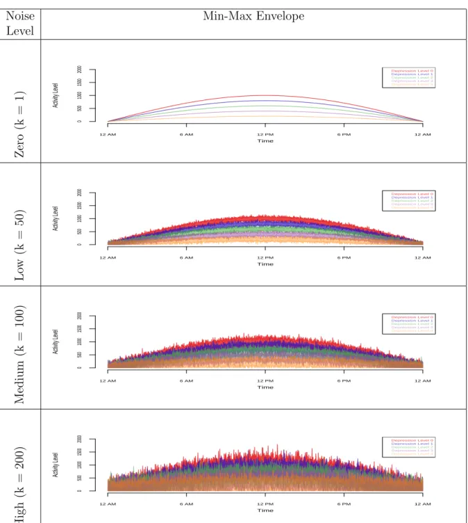
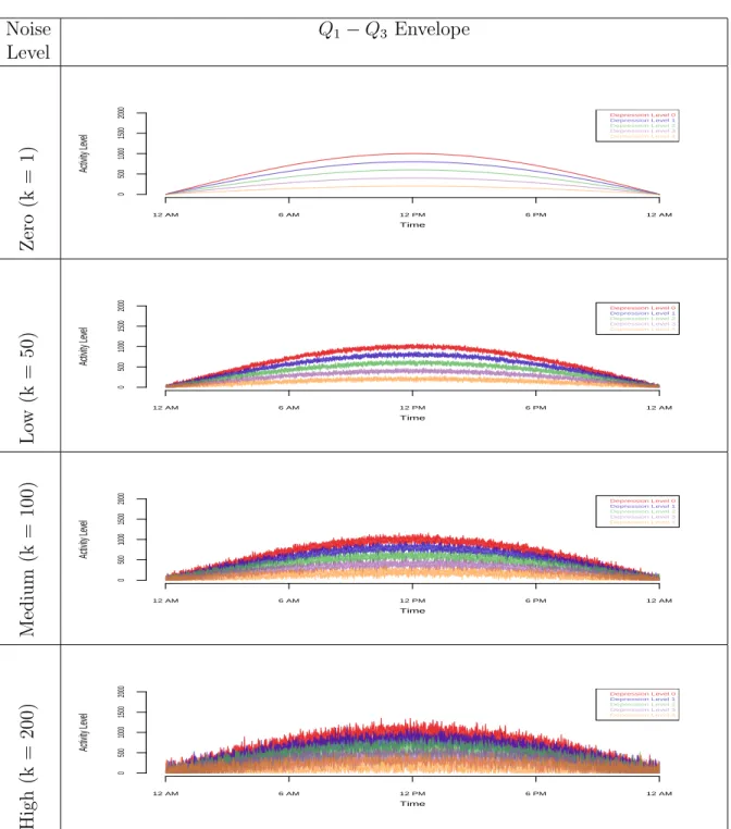
2.4.2 Data Enveloping
data. In each set of envelopes, there are four graphs (zero noise to high noise). Trying
to get information from themin−maxenvelopes does not help much, unless there is
not much overlapping between the classes (zero and low noise). Narrowing the bands
of the envelope to range fromQ1 toQ3 in each class helps the viewer to better detect
patterns at the medium noise level. The Q1−Q3 envelope does not work well at the
high noise level. Hence, we need a narrower envelope such as the 40th−60th percentile
envelope.
Even though data envelopes help in revealing data clusters, this technique does not help in reducing the spikes in the plots, in particular sharp spikes that are present at the medium to high noise levels.
This technique would be very useful if implemented in an interactive software environment where the envelope bands range as a parameter that could be changed
by the user. In our simulated data, when the noise level was low, aQ1−Q3 envelope
was sufficient to depict a clear separation between the five classes. That is not the case when the noise level was medium or high. We need to have narrower envelopes
such as the 30th−70th percentile or maybe the 40th−60th percentile to be able to
distinguish the patterns of the five classes.
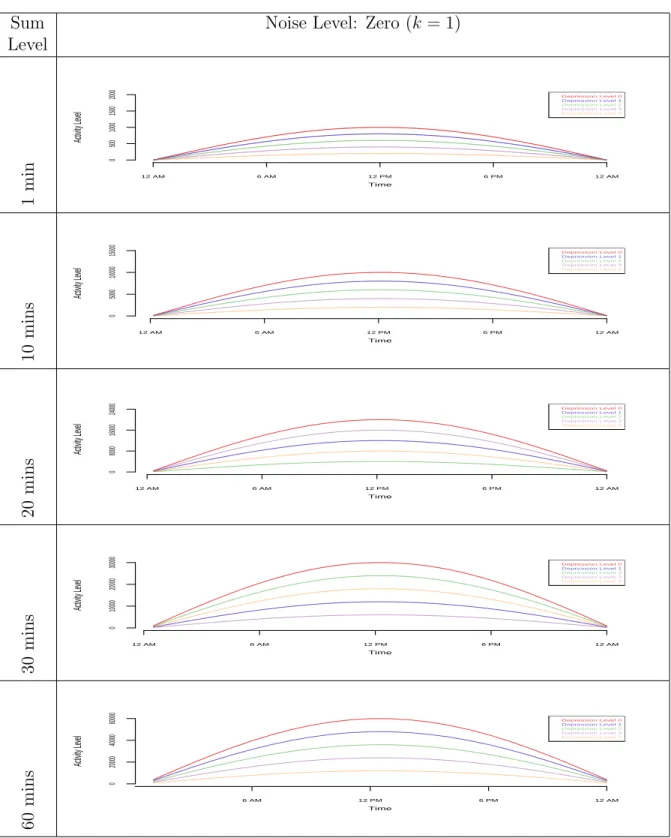
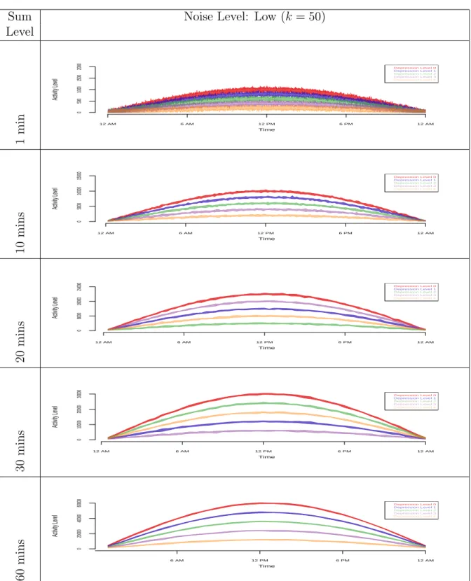
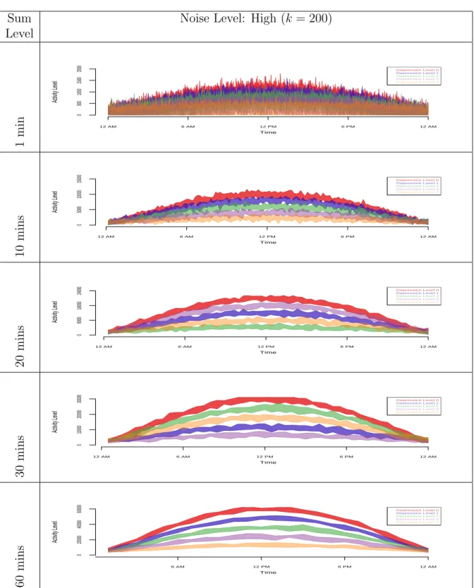
2.4.3 Data Summing
Data enveloping helps in showing the separation between different group clusters in the simulated data, but it fails to smooth the spikes. In order to reduce the spikes from the envelope plots in Figures 2.3 and 2.4, we aggregate the data and do four levels of summing over time (10, 20, 30, and 60 minutes summing). Figures 2.5, 2.6, 2.7, and 2.8 show the graphs of the raw simulated data with different noise levels
before and after aggregation (10, 20, 30 and 60 minutes summing) with min−max
envelopes. For the zero noise level, it is obvious that there is no need for data summing (Figure 2.5). For the low level noise (Figure 2.6) and the medium level noise (Figure 2.7), we can see spikes being smoothed out with just 10 minutes of aggregation. This
Noise Min-Max Envelope Level Zero (k = 1) 12 AM 6 AM 12 PM 6 PM 12 AM 0 500 1000 1500 2000 Time Activity Le vel Depression Level 0 Depression Level 1 Depression Level 2 Depression Level 3 Depression Level 4 Lo w (k = 50) 12 AM 6 AM 12 PM 6 PM 12 AM 0 500 1000 1500 2000 Time Activity Le vel Depression Level 0 Depression Level 1 Depression Level 2 Depression Level 3 Depression Level 4 Medium (k = 100) 12 AM 6 AM 12 PM 6 PM 12 AM 0 500 1000 1500 2000 Time Activity Le vel Depression Level 0 Depression Level 1 Depression Level 2 Depression Level 3 Depression Level 4 High (k = 200) 12 AM 6 AM 12 PM 6 PM 12 AM 0 500 1000 1500 2000 Time Activity Le vel Depression Level 0 Depression Level 1 Depression Level 2 Depression Level 3 Depression Level 4
Fig. 2.3: Data Envelopes: M in−max envelopes for simulated data with different
noise levels
turned out to be enough for smoothing low and medium level noise data because there is no further improvement done with 20, 30, and 60 minutes of aggregation. Figure
Noise Q1−Q3 Envelope Level Zero (k = 1) 12 AM 6 AM 12 PM 6 PM 12 AM 0 500 1000 1500 2000 Time Activity Le vel Depression Level 0 Depression Level 1 Depression Level 2 Depression Level 3 Depression Level 4 Lo w (k = 50) 12 AM 6 AM 12 PM 6 PM 12 AM 0 500 1000 1500 2000 Time Activity Le vel Depression Level 0 Depression Level 1 Depression Level 2 Depression Level 3 Depression Level 4 Medium (k = 100) 12 AM 6 AM 12 PM 6 PM 12 AM 0 500 1000 1500 2000 Time Activity Le vel Depression Level 0 Depression Level 1 Depression Level 2 Depression Level 3 Depression Level 4 High (k = 200) 12 AM 6 AM 12 PM 6 PM 12 AM 0 500 1000 1500 2000 Time Activity Le vel Depression Level 0 Depression Level 1 Depression Level 2 Depression Level 3 Depression Level 4
Fig. 2.4: Data Envelopes: Q1−Q3 envelopes for simulated data with different noise
levels
2.8 shows that for data with the high noise level 10 minutes of aggregation do not result in a clear separation of clusters and spikes are still present. Things get better
with 20 minutes of aggregation, but for this particular case, 30 minutes of aggregation is the best.
2.4.4 Multivariate Time Series Plots
In Figure 2.9, we plot the simulated actigraphy-like data with medium noise level (k=100). The top left part of the graph is an image plot with 50 horizontal strips, each represents a time series for one subject’s average activity level over a ten-days
period (l = 10). In this plot, each time series is discretized into three categories
using a diverging palette of colors which assigns purple to low activity values, grey to medium activity, and green to high activity. The discretization of the data is done using quantiles of the time series values. Therefore, using three levels implies dividing the data into tertiles with roughly an equal number of points in each (Peng, 2008).
This kind of plot, clearly categorizes subjects into five classes separated by a horizontal black line. According to our simulated data, a subject with low class level (Level 0), has very low activity at mid night (purple), and then its activity grows gradually (grey) until it reaches its maximum in the middle of the day (green). Notice that the green areas shrink the higher the class level is. A subject with very high class level (Level 4) is barely active, and this is clear because most of the Level 5 block is purple.
The right hand side display of the graph is a set of box plots which shows the distribution of average activity levels for each subject. We can see that subjects with very high class level (Level 5) have very low variation in their activity, while subjects with very low class level (Level 0) have more activity variation. The plot at the bottom is a display for the median activity level across all the time series for each time point. This bottom area could be replaced with any of the previously discussed visualizations in this chapter such as in Figure 2.10.
Sum Noise Level: Zero (k = 1) Level 1 min 12 AM 6 AM 12 PM 6 PM 12 AM 0 500 1000 1500 2000 Time Activity Le vel Depression Level 0 Depression Level 1 Depression Level 2 Depression Level 3 Depression Level 4 10 mins 12 AM 6 AM 12 PM 6 PM 12 AM Time Activity Le vel 0 5000 10000 15000 Depression Level 0 Depression Level 1 Depression Level 2 Depression Level 3 Depression Level 4 20 mins 12 AM 6 AM 12 PM 6 PM 12 AM Time Activity Le vel 0 8000 16000 24000 Depression Level 0 Depression Level 1 Depression Level 2 Depression Level 3 Depression Level 4 30 mins 12 AM 6 AM 12 PM 6 PM 12 AM Time Activity Le vel 0 10000 20000 30000 Depression Level 0 Depression Level 1 Depression Level 2 Depression Level 3 Depression Level 4 60 mins 6 AM 12 PM 6 PM 12 AM Time Activity Le vel 0 20000 40000 60000 Depression Level 0 Depression Level 1 Depression Level 2 Depression Level 3 Depression Level 4
Fig. 2.5: Data Summing with Enveloping (Zero noise): raw data (1 minute) vs. data sums of 10, 20, 30, and 60 minutes
Sum Noise Level: Low (k = 50) Level 1 min 12 AM 6 AM 12 PM 6 PM 12 AM 0 500 1000 1500 2000 Time Activity Le vel Depression Level 0 Depression Level 1 Depression Level 2 Depression Level 3 Depression Level 4 10 mins 12 AM 6 AM 12 PM 6 PM 12 AM Time Activity Le vel 0 5000 10000 15000 Depression Level 0 Depression Level 1 Depression Level 2 Depression Level 3 Depression Level 4 20 mins 12 AM 6 AM 12 PM 6 PM 12 AM Time Activity Le vel 0 8000 16000 24000 Depression Level 0 Depression Level 1 Depression Level 2 Depression Level 3 Depression Level 4 30 mins 12 AM 6 AM 12 PM 6 PM 12 AM Time Activity Le vel 0 10000 20000 30000 Depression Level 0 Depression Level 1 Depression Level 2 Depression Level 3 Depression Level 4 60 mins 6 AM 12 PM 6 PM 12 AM Time Activity Le vel 0 20000 40000 60000 Depression Level 0 Depression Level 1 Depression Level 2 Depression Level 3 Depression Level 4
Fig. 2.6: Data Summing with Enveloping (Low noise): raw data (1 minute) vs. data sums of 10, 20, 30, and 60 minutes
Sum Noise Level: Medium (k = 100) Level 1 min 12 AM 6 AM 12 PM 6 PM 12 AM 0 500 1000 1500 2000 Time Activity Le vel Depression Level 0 Depression Level 1 Depression Level 2 Depression Level 3 Depression Level 4 10 mins 12 AM 6 AM 12 PM 6 PM 12 AM Time Activity Le vel 0 5000 10000 15000 Depression Level 0 Depression Level 1 Depression Level 2 Depression Level 3 Depression Level 4 20 mins 12 AM 6 AM 12 PM 6 PM 12 AM Time Activity Le vel 0 8000 16000 24000 Depression Level 0 Depression Level 1 Depression Level 2 Depression Level 3 Depression Level 4 30 mins 12 AM 6 AM 12 PM 6 PM 12 AM Time Activity Le vel 0 10000 20000 30000 Depression Level 0 Depression Level 1 Depression Level 2 Depression Level 3 Depression Level 4 60 mins 6 AM 12 PM 6 PM 12 AM Time Activity Le vel 0 20000 40000 60000 Depression Level 0 Depression Level 1 Depression Level 2 Depression Level 3 Depression Level 4
Fig. 2.7: Data Summing with Enveloping (Medium noise): raw data (1 minute) vs. data sums of 10, 20, 30, and 60 minutes
Sum Noise Level: High (k = 200) Level 1 min 12 AM 6 AM 12 PM 6 PM 12 AM 0 500 1000 1500 2000 Time Activity Le vel Depression Level 0 Depression Level 1 Depression Level 2 Depression Level 3 Depression Level 4 10 mins 12 AM 6 AM 12 PM 6 PM 12 AM Time Activity Le vel 0 5000 10000 15000 Depression Level 0 Depression Level 1 Depression Level 2 Depression Level 3 Depression Level 4 20 mins 12 AM 6 AM 12 PM 6 PM 12 AM Time Activity Le vel 0 8000 16000 24000 Depression Level 0 Depression Level 1 Depression Level 2 Depression Level 3 Depression Level 4 30 mins 12 AM 6 AM 12 PM 6 PM 12 AM Time Activity Le vel 0 10000 20000 30000 Depression Level 0 Depression Level 1 Depression Level 2 Depression Level 3 Depression Level 4 60 mins 6 AM 12 PM 6 PM 12 AM Time Activity Le vel 0 20000 40000 60000 Depression Level 0 Depression Level 1 Depression Level 2 Depression Level 3 Depression Level 4
Fig. 2.8: Data Summing with Enveloping (High noise): raw data (1 minute) vs. data sums of 10, 20, 30, and 60 minutes
Level 5 Level 4 Level 3 Level 2 Level 1 100 200 300 400 500 600 Activity Le v el 0 200 400 600 800 1000 1200 1400 0 200 600 1000 ● ● ● ● ● ● ● ● ● ● ● ● ● ● ● ● ● ● ● ● ● ● ● ● ● ● ● ● ● ● ● ● ● ● ● ● ● ● ● ● ● ● ● ● ● ● ● ● ● ●
Fig. 2.9: Multivariate Time Series Plot: Simulated data with different levels. The right hand side shows a box plot, and the bottom side shows a plot for the median activity level across all the times series for each time point.
2.5 Actigraphy Data
The real data used in this chapter is based on a small sample of 55 patients with insomnia, sleep apnea, or restless leg syndrome, collected at the Washington University Sleep Medicine Center. Two types of data were collected for each patient: actigraphy level data and depression level data. (For more information about this data, please refer to Ding et al. (2011).) The actigraphy level data were collected via an actigraph device manufactured by the Mini Mitter Company Incorporated Mini
Level 5 Level 4 Level 3 Level 2 Level 1 Activity Le v el 12 AM 6 AM 12 PM 6 PM 12 AM 0 3000 6000 9000 12000 Depression Level 0 Depression Level 1 Depression Level 2 Depression Level 3 Depression Level 4 0 200 600 1000 ● ● ● ● ● ● ● ● ● ● ● ● ● ● ● ● ● ● ● ● ● ● ● ● ● ● ● ● ● ● ● ● ● ● ● ● ● ● ● ● ● ● ● ● ● ● ● ● ● ●
Fig. 2.10: Multivariate Time Series Plot: Simulated data with different levels. The right hand side plot shows a box plot, and the bottom side shows a plot for the
25th−75th percentile envelopes.
Mitter Company Incorporated. (2005) that the patient wore on his/her wrist for a period of seven days. Some of the actigraphs collected data every 15 seconds, and others collected data every minute, but for the purpose of this study, we aggregated the 15 seconds level data into one minute level data. The depression level data were collected to investigate patterns in activity levels in different patient subgroups. Each patient filled out the Patient Health Questionnaire (PHQ-9) (Kroenke and Spitzer, 2002), one of several existing ways to evaluate the level of depression. On the PHQ-9
scale, the higher the depression score, the more depressed the patient is. The following are some descriptive statistics for the collected data in terms of demographics and depression levels:
• Gender: 17 males, 38 females
• Depression level: 15 patients with no depression (Level 0), 13 with mild
de-pression levels (Level 1), 15 have moderate dede-pression levels (Level 2), 8 have moderately severe depression levels (Level 3), and 4 are severely depressed (Level 4).
2.6 Techniques Applied to Actigraphy Data
2.6.1 Density-based Plots
Figures 2.11 and 2.12 show the density-based plots for the actigraphy data we described in Section 2.5 for groups of patients with different depression levels (Fig-ure 2.11) and gender (Fig(Fig-ure 2.12), respectively. These plots look very rugged. It is difficult to compare the activity patterns for these groups of patients. The “dis-advantage” of such plots is that we have to separate the groups into different plots. We can see that patients with very high depression levels (Level 4) are active during the night and have low activity levels early during the morning while the other four groups (Levels 0, 1, 2, and 3) have normal activity pattern- active during the day and are passive during the night. This kind of plot does not show us clearly if there is a difference in activity levels of some groups.Thus, to obtain a clearer picture for all of the groups, we can look at the cumulative sums plots for the actigraphy data. These plots show accumulated activity obtained by adding up activity counts as one moves across the horizontal time axis from midnight (far left) to midnight 24 hours later (far right) (Sharif et al., 2010). They are helpful to show the total activity of a group up to a particular time of the day. Figures 2.13 and 2.14 show the density-based plots for the cumulative sums for actigraphy data density-based on depression levels
(Figure 2.13) and gender (Figure 2.14), respectively. People with higher depression levels accumulate higher activity counts during the night and early morning (Figure 2.13). Also, females accumulate higher activity counts than males (Figure 2.14).
Depression Density-based Plots
Level Lev el 0 Time Activity Le vel
Midnight 6 AM Noon 6 PM Midnight
0 750 1500 2250 3000 Lev el 1 Time Activity Le vel
Midnight 6 AM Noon 6 PM Midnight
0 750 1500 2250 3000 Lev el 2 Time Activity Le vel
Midnight 6 AM Noon 6 PM Midnight
0 750 1500 2250 3000 Lev el 3 Time Activity Le vel
Midnight 6 AM Noon 6 PM Midnight
0 750 1500 2250 3000 Lev el 4 Time Activity Le vel
Midnight 6 AM Noon 6 PM Midnight
0
750
1500
2250
3000
Fig. 2.11: Density-based Plots: Actigraphy data grouped by patients’ depression levels
2.6.2 Data Enveloping
Figures 2.15 and 2.16 show the actigraphy data of the 55 patients clustered ac-cording to the patients’ depression level (Figure 2.15) and gender (2.16), respectively.
Gender Density-based Plots
Males Time
Activity Le
vel
Midnight 6 AM Noon 6 PM Midnight
0 750 1500 2250 3000 F emales Time Activity Le vel
Midnight 6 AM Noon 6 PM Midnight
0
750
1500
2250
3000
Fig. 2.12: Density-based Plots: Actigraphy data grouped by patients’ gender
Figures 2.15 (top) and 2.16 (top) show a 25th−75th percentile envelope for the raw
actigraphy data, while Figures 2.15 (bottom) and 2.16 (bottom) show a narrower
40th−60th percentile envelope. Figure 2.15 shows that patients with high depression
levels are most active during the night compared to the other groups of patients, and this group is least active during the day. It is not easy to compare the other groups of patients even when we at look a narrower envelope (see Figure 2.15 (bottom)). As for gender, (Figure 2.16), men and women in general have the same activity pattern - active during the day, and rest during the night (from 12 am until 6 am).
Figures 2.17 and 2.18 show the cumulative sums plots for the accumulated sums of actigraphy clustered according to depression levels (Figure 2.17) and gender (Figure
2.18), respectively. Figure 2.17 (top) uses a 25th−75thpercentile envelope which shows
some distinction between the five groups of patients with different depression levels. As anticipated, patients at Level 0 depression have the highest accumulated activity during the whole day, followed by patients at Level 1, then Level 2, then Level 4. It seems that there is a high variability for the Level 3 depression patients. To see a
clearer picture, we plotted the 40th−60th percentile envelope (Figure 2.17 (bottom)).
This plot shows that there might be an outlier in the group with depression Level 3 that was affecting the variability of this group. Opposite to what we anticipated,