and Measures – Dashboard Selection Model
Miroslaw Staron1, Kent Niesel2, and Wilhelm Meding31
Computer Science and Engineering, University of Gothenburg, Sweden
2
Volvo Car Group, Sweden
3 Ericsson AB, Sweden [email protected]
Abstract. Background:Contemporary software development organi-zations utilize multiple channels to disseminate information about their indicators, measures, trends and predictions. Selecting these channels is usually done based on the availability of the visualization technology and a set of requirements elicited from stakeholders at the company. Eliciting these kind of requirements can be labor-intensive and time-consuming. Goal:The objective of this research is to develop a method for selecting which dashboard should be used. As the set of dissemination patterns of measures in modern organizations is limited, this method should be able to identify the needs of visualizations at the company and match them to the dissemination patterns and their supporting technology.Method: The research method applied is action research conducted at Volvo Car Group. The action research is conducted as part of a project redesigning a large project status reporting tool and has been designed to quantify the requirements elicited from the stakeholders of the system.Results:The results is the dashboard selection model which consists of seven dimen-sions – type of reporting, data acquisition method, type of stakeholders, method of delivery, frequency of updates, aim of the information, and length of data processing (flow). Conclusions: The conclusions show that using this model leads to a rapid identification of the best visualiza-tion method for measurement data, which has a cost-saving impact on measurement programs and effect-maximizing impact on the companies.
1 Introduction
Contemporary medium-to-large software development organizations often rely on quantitative information in monitoring their products and processes [Sta12]. These kind of companies use measures and indicators to both monitor the status and to plan long-term evolution of their business [Par10]. In order to effectively trigger decisions, support evolutions and prevent problems, the ways in which the measures are visualized and communicated have to vary.
In this paper we recognize the need for variability of information visualiza-tion types in modern software companies based on how informavisualiza-tion should be
disseminated and how it is supposed to be used. Normally, this variability is designed when developing measurement systems or dashboards and is constant over time. Therefore it is a prerequisite of success that the elicitation of the requirements for these dashboards is correct and efficient. However, there ex-ists only a limited set of technologies for storing, processing and visualizing the results of measurement processes.
Therefore in this paper we address the following research question – How to efficiently map stakeholders’ requirements to indicator dissemination patterns including the supporting visualization?
The result of addressing this question is the dashboard selection model – a method for quantifying the requirements for dashboards and matching them to dissemination patterns. The model has been developed as part of an action research project at Volvo Car Group. The goal of the project was to support the company’s transformation of project status reporting by studying and evolving project reporting practices and eliciting future requirements for the reporting processes.
The remaining of the paper is structure as follows. Section 2 presents the most relevant related work in literature regarding the experiences of selecting dashboards. Section 3 describes the design of the action research project where the model was developed.
2 Related Work
We review work in three areas – standardization in the area of measurement in software engineering (which is an important input to the creating measures and KPIs), measurement theory (in general and its applications in software engineering) and visualization of metrics in software engineering.
2.1 Dashboards and visualization
In our previous work we identified the need for building dashboards at different levels of the organization by studying team decision meetings at RUAG Space [FSHL13]. The results from the evaluation showed that one should combine different views and information in one dashboard, but the visualization of the data is the most crucial aspect for the success dashboard’s adoption.
In our later studies we expanded the evaluation of dashboards to more com-panies – SAAB Electronic Defense Systems, Ericsson and Volvo Cars [SMH+13]. During the study one of the observations was that the standard visualizations of data available from measurement instruments (aka metric tools) focus on the data rather than the information need, which requires a more thorough design. Telea [Tel14] described a set of modern data visualization principles which we used when developing examples of how a dashboard should visually be designed. Staron and Meding [SM09a] designed a set of principles of for assessing the reliability of information, which was the base for constructing one of the di-mensions of the dashboard selection model – delivery method. This method was
proven to be useful when designing industrial measurement systems, e.g. for monitoring bottlenecks [SM11].
In our previous work we also studied how information visualization in form of models helps decision making in large companies – [MS10]. The results showed that the alignment of the type of model and the decision is one of the prerequi-sites for efficient software development and prevents waste.
2.2 Standardization
Measurement theory has been used as a basis for the main international stan-dard in measurement on common vocabulary in metrology – VIM [oWM93]. The standard defines such concepts as measurement uncertainty, measurand and quantification. These definitions capture the meaning of the concepts from the measurement theory in engineering. These concepts are important when setting up the measurement program and its visualization – in particular when consider-ing the assessment of how the data should support the decisions at the company (e.g. whether the product is ready to be releases w.r.t. its quality, [SMP12]).
VIM standardizes the most important concepts which influence measurement processes, for example:
– Measuring instrument: device used for making measurements, alone or in con-junction with supplementary device(s)
– Measuring system: set of one or more measuring instruments and often other devices, including any reagent and supply, assembled and adapted to give measured quantity values within specified intervals for quantities of specified kinds
The standard specifies the concepts, but does not prescribe any specific means for visualization of use of these concepts in practice. In this paper we set off to address the need for such a linkage.
2.3 Measurement theory
Kitchenhamn [KPF95] presented a framework for software measurement valida-tion which focused on the need for linking the empirical properties of metrics to their corresponding empirical entities. This kind of link is important when se-lecting measures and their visualizations, which impacts the data-flow dimension of the dashboard selection model.
Briand et al. [BEEM96] presented the concepts from the measurement theory in the context of software engineering. In addition to the theoretical illustration of units, scales, admissible transformations and other related concepts, the au-thors illustrated the implications of applying them in software engineering – e.g. by discussing the property of additivity for complexity measures. This paper has also influenced the design of the data-flow dimension in the dashboard selection model.
3 Research design – Action Research
In this study we applied the principle of action research as advocated by Susman and Evered [SE78] and used in our previous studies with the same company [RSB+13, RSM+13, RSB+14]. The action research set-up provided us with a
unique opportunity to be part of a project at Volvo Car Group (VCC) which aimed at a redesign of a large program status reporting tool. The tool was used to monitor the progress of car development projects and was divided into three parts – Key Performance Indicators, Milestone reporting and Risk monitoring. In our work we focused only on the Key Performance Indicators part as it was aligned with the researcher’s competence and the company’s interest.
The research was organized in action research cycles, which is shown in table 1.
Table 1.Action research cycles
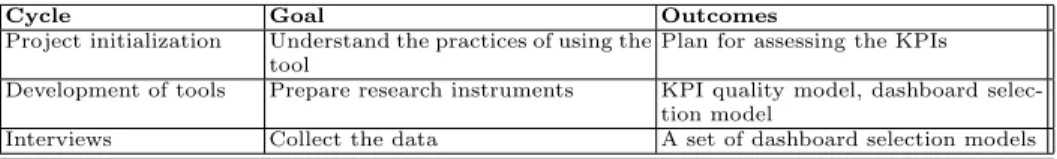
Cycle Goal Outcomes
Project initialization Understand the practices of using the tool
Plan for assessing the KPIs Development of tools Prepare research instruments KPI quality model, dashboard
selec-tion model
Interviews Collect the data A set of dashboard selection models
In the first cycle we focused on refining the initial problem formulation – how to effectively elicit requirements for a new dashboard.
In the second cycle we prepared research instruments for defining the dash-board selection model – preparing the dissemination patterns based on literature studies and discussions with focus group at the company. The result of this cycle was the dashboard selection model presented in this paper.
In the third cycle we focused on applying the dashboard selection model and on understanding its advantages and shortcomings.
4 Dashboard selection model
4.1 Dissemination patterns in modern companies
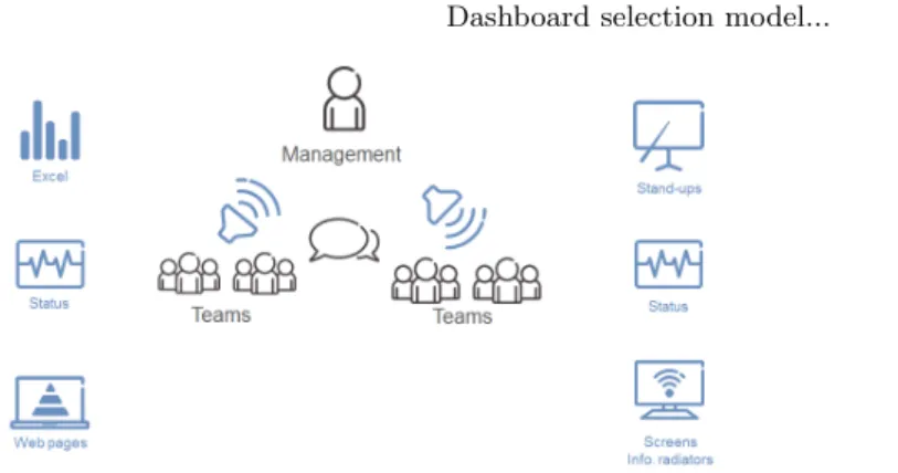
During the first cycle of our action research project we observed the dissemina-tion patterns of metrics in large software development companies. These patterns are presented in fig. 1.
The classical dissemination pattern is the top-down communication from managers to employees and the bottom-up reporting of status from employees to management. This communication is based on pre-defined templates created by management or process methodologists which intend to unify the ways of working across the company.
The new pattern is the communication from teams to management. The teams define themselves which kind of information they want to communicate
Fig. 1.Metrics dissemination patterns in large software development companies
and which information is important for the team, the product and at that par-ticular time.
Finally, there is also the new pattern of facilitated knowledge-sharing be-tween the teams. There are usually no indicators or measures defined when this type of knowledge-sharing takes place, but the teams organize knowledge-sharing sessions in order to spread good practices and warnings about pitfalls.
Given these dissemination patterns, in the first action research cycle we iden-tified a set of characteristics of measurement systems and dashboards. These characteristics form a model which is presented in fig. 2.
Ericsson Internal | 2013-09-24 | Page 2
Reports Individual Group Dashboards Manual Automated Raw data Indicators
Fig. 2.Initial model for diversity of measurement systems
The characteristics shown in fig. 2 capture the way in which dashboards and measurement systems are used (report vs. dashboard), who the stakeholders are or how the dashboards are distributed to their stakeholders. These characteristics evolved during the next action research cycle into the dashboard selection model.
4.2 Dashboard selection model
Dashboard selection model is a graphical way of choosing properties of a dash-board, based on the information needs of stakeholders. It is divided into seven dimensions with each dimension defined by two alternatives – from full focus on one alternative, through equal focus on both, to the full focus on the other alternative.
The seven dimensions of the dashboard selection model are:
– Type of dashboard – defining what kind of visualization is needed. Many dashboards are used as reports where the stakeholders input the data and require the flexibility of the format – the alternative is namedreport whereas some require a strictly pre-defined visualization with the same structure for every update – the alternative designated asdashboard. There is naturally a number of possibilities of combining the flexibility and the strict format, which is denoted by the scale between fully flexible and fully strict.
– Data acquisition – defining how the data is input into the tool. In general the stakeholders/employees can enter the data into the tool – e.g. making an assessment – the alternative is named manual or they can have the data being imported from other systems – this alternative is namedautomated. The previous selection of a dashboard for visualization quite often correlates to the selection of the automated data provisioning.
– Stakeholders – defining the type of the stakeholder for the dashboard. The dashboards which are used as so-called information radiators often have an entire group as a stakeholder, for example a project team. However, many dashboards which are designed to support decisions often have anindividual
stakeholder who can represent a group.
– Delivery– defining how the data is provided to the stakeholders. On the one hand the information can be delivered to a stakeholder in such forms as e-mails or MS Sidebar gadgets – the alternative isdelivered to the stakeholders and fetched, which requires the stakeholder to actively seek the information in form of opening a dedicated link and searching for the information. – Update– defining how often the data is updated. One alternative is to update
the dataperiodically, for example every night with the advantage of the data being synchronized but with the disadvantage that it is not up-to-date. The other alternative is thecontinuous update which has the opposite effects on the timeliness and synchronization.
– Aim – defining what kind of aim the dashboard should fulfill. One of the alternatives is to use the dashboard as an information radiator – to spread the
information to a broad audience. The other option is to design the dashboard for a specific type ofdecisionin mind, for example release readiness [SMP12]. – Data flow – defining how much processing of the data is done in the dash-board. One of the alternatives is to visualize theraw data which means that no additional interpretation is done and the other is to add the interpretations by applying analysis models and thus to visualizeindicators.
The graphical representation of the dashboard selection model is presented in fig. 3. Each line represents one dimension and each dot can be moved to one of the positions – e.g. fully towards report for the type of dashboard.
Interviews
Dashboard selection model
SSF MOBILTY PROJECT - WWW.STARON.NU
Manual Automated Data acquisition: Individuals Group Stakeholders: Fetched Delivered Delivery: Periodically Continously Update:
Information Decision support Aim:
Report Dashboard
Type:
Raw data Indicators
Data flow:
Fully Equally Fully
Mostly Mostly
Fig. 3. Dashboard selection model – visualization
Each selection of one of the dimensions is captured by a short, natural lan-guage, sentence describing why and how the stakeholder reasons about his need.
4.3 Examples
The dashboard selection model can be applied to a set of existing tools and classify them based on the dashboard model which they represent. For example, MS Excel can be used to visualize the data, but it primarily is dedicated to other purposes. If MS Excel is used to visualize measurement systems and contains a dedicated visualization of indicators, its classification could be done as presented in fig. 4. This example comes from our previous work on the frameworks for developing measurement systems [SMN08].
Recommendations – example (MS Excel with indicators)
• MS Excel file with no template
– Can be used to store raw data, manual processing (e.g. by using formulas), accessed on demand (open file)
Manual Automated
Individuals Group
Fetched Delivered
Periodically Continously
Information Decision support
Report Dashboard
Raw data Indicators
Fig. 4.Dashboard selection model – classification of MS Excel with indicators
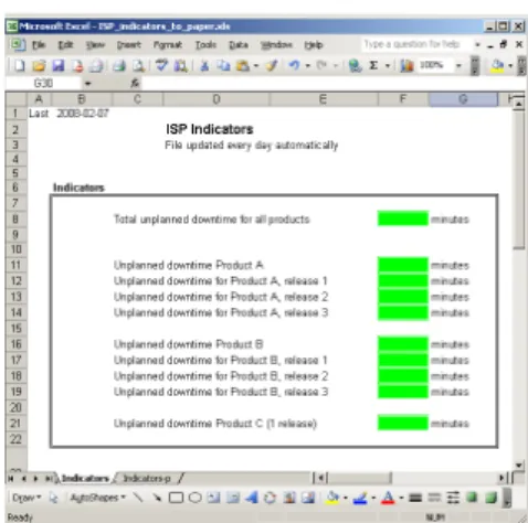
An example of such a measurement system is shown in fig. 5. The colored cells present the indicators and the measures, trends and raw data are available in other worksheets in the same workbook.
Fig. 5. Example of a visualization using MS Excel.
The evaluation of the MS Sidebar gadgets as a means of visualization of measures and indicators is classified as shown in 6. An example gadget from our previous works is also shown in 7
Recommendations – example (gadgets)
• MS Sidebar gadget
– Data is pre-processed in form of indicators, fetched from core PD systems, wide spread, used both for radiation and for decision support
Manual Automated
Individuals Group
Fetched Delivered
Periodically Continously Information Decision support
Report Dashboard
Raw data Indicators
Fig. 6. Dashboard selection model – classification of gadget
Fig. 7. Example of a gadget
In such a gadget, the data is pre-processed in form of indicators, fetched from core product development systems, wide spread, used both for radiation and for decision support [SMN08], [SMP12], [SMH+13], [SM09b].
Another example of a tool used for similar purposes is Tableu, which has been evaluated in our previous studies [PSSM10] and is presented in fig. 8. The tool provides a number of pre-defined visualizations and analysis recipes, but is interactive and therefore not fully suited as an information radiator [?]. However it is important that the presentation can be understandable [KS02, SKT05].
Tableu: characteristics Manual Automated Data acquisition: Individuals Group Stakeholders: Fetched Delivered Delivery: Periodically Continously Update:
Information Decision support Aim:
Report Dashboard
Type:
Raw data Indicators
Data flow:
Fully Equally Fully
Mostly Mostly
Fig. 8.Dashboard selection model – classification of Tableu
Yet another example is a class of tools referred to as information radiators, i.e. dashboards dedicated to spread the information to a broad audience. Their classification is presented in fig. 9. These tools are designed with one purpose in mind and are meant to be non-interactive. Their primary use is in landscapes and during decision meetings.
Recommendations – example (radiators)
• Information radiators, e.g. screens in corridors
– Everything is automated, no particular stakeholder, for general audience, updated often
Manual Automated
Individuals Group
Fetched Delivered
Periodically Continously
Information Decision support
Report Dashboard
Raw data Indicators
Fig. 9.Dashboard selection model – classification of information radiators
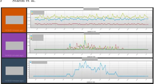
An example of an information radiation from Ericsson is presented in fig. 10. It shows the usage of a network in a laboratory environment and is dedicated for the project team to observe the status of their test network. For the con-fidentiality reasons the names of the tested products are covered with greyed boxes.
The last example is a typical Business Intelligence tool (not a specific product, but a class of products) with the possibility to create reports and to work with the data, but at the same time with the possibility to create dashboards as presented in 11.
Fig. 10.An example of information radiator
Recommendations – example (business intelligence)
• Business intelligence tool, e.g. Rational Insight, Oracle BI – Data is fetched automatically, reports and dashboards can be generated
automatically or created by demand
Manual Automated
Individuals Group
Fetched Delivered
Periodically Continously
Information Decision support
Report Dashboard
Raw data Indicators
Fig. 11. Dashboard selection model – classification of Business Intelligence tools
5 Evaluation
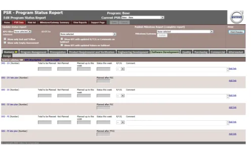
In the last action research cycle we used the dashboard selection model when eliciting a possible next generation of the project reporting tool at the company. Using the dashboard selection model for the elicitation of requirements for a future tool was a good candidate for the evaluation. Since we had the oppor-tunity to work with users of the project reporting tool, we could verify that the requirements captured by the dashboard selection model were consistent with their envisioned new version of the tool. The current version of the tool is presented in fig. 12 and shows one of the forms for reporting the KPIs (Key Performance Indicators) for one of the areas.
In this cycle we interviewed nine stakeholders from different parts of VCC – from software development (and electrical systems development), through me-chanical engineering, manufacturing engineering to purchasing organization. All of the interviewees had a role in the project leadership – from the main project manager, through sub-project managers to sub-sub-project managers. We in-cluded also the project quality managers (two persons) who were in charge of monitoring the KPIs in the tool and controlling the quality of the projects. The
Dashboard selection model... 11
7
Fig. 12. Project status reporting tool – a screenshot
project quality managers had a more holistic view on the product while the project management had more focus on the project progress and quality. All stakeholders had a significant number of years of experience with projects at VCC and worked with previous version of the project status reporting tools.
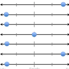
The result from the evaluation is presented in fig. 13. Each dot represents one stakeholder.
Results
Dashboard selection model
•How would you like the PSR to look like in the future?
SSF MOBILTY PROJECT - WWW.STARON.NU
Manual Automated Data acquisition: Individuals Group Stakeholders: Fetched Delivered Delivery: Periodically Continously Update:
Information Decision support Aim:
Report Dashboard
Type:
Raw data Indicators
Data flow:
Fully Equally Fully
Mostly Mostly
Fig. 13. Result from using the dashboard selection model for designing the future project reporting tool
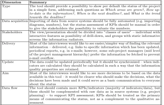
The dots representing the answers of each interviewee in fig. 13 are spread over the entire model, which is a result of different views on the needs for such a tool. Since the tool is used at a large organization, this is quite a normal situation and the dashboard selection model helped to compactly visualize this diversity. We analyzed each of the characteristics separately to elicit the potential next evolution step. We summarize them in table 2 per dimension of the dashboard selection model.
Table 2.Summary of qualitative data for each dimension Dimension Summary
Type The tool should provide a possibility to show per default the status of the project in a simple form, addressing such questions asWhich areas are green?,How
up-to-date is the information?,When is the next deadline?, andWhat is the trend
towards the deadline?
Data acquisition Importing of data from source systems should be fully automated (e.g. importing diagrams, numbers), but the status assessment of KPIs should be manual in order to give the stakeholders the possibility to valuate the numbers.
Stakeholders The view/presentation should be divided into ”classes of users” – individual with interactive features as possibility of drill-down, and groups with static informative screens like information radiators.
Delivery Most of the interviewees would like to see easier/simpler way of finding the relevant information – delivered, e.g. links to specific information which has been updated, periodical reports, e.g. in e-mails; however, some sub-project managers (mid level of the project management hierarchy) prefer the information be fetched to prevent e-mail overflow.
Update The data could be updated periodically but it should be synchronized – when indi-cators are calculated they should be calculated in such a way that the information quality properties are retained.
Aim Most of the interviewees would like to see more decisions to be based on the data available in this tool – it would be clearer who should make the decisions, what the decisions have been made and it could serve as a basic communication to everyone about the status
Data flow The tool should contain more KPIs/indicators (majority of indicators/data), but these should be complemented with raw data as in source systems (e.g. project planning) – to support KPI assessment; KPIs should be treated as the primary means of communicating the status, not as a complement to the qualitative as-sessment.
One of the conclusions based on the interviews was to evolve the project reporting tool’s presentation possibilities to support wider spread of the status – i.e. to introduce a dashboard to the entire project team. By using this model a more particular set of requirements was collected and stakeholders’ relation between different elements (e.g. what should be manual and what should be automatic) were elicited.
Another significant finding was that by using this model we could link the set of answers which differed from the rest (e.g. the yellow dot in the type dimension) to a specific type of functionality envisioned by the interviewee. Without this model there was a risk that this answer would be considered as insignificant.
6 Conclusions
Developing dashboards for monitoring of product quality, project progress or customer satisfaction are popular in modern software development companies. The dashboards present quantitative data in a visually appealing manner and help to spread the information to broad population and to support designated stakeholders in making decisions. Depending on the purpose of the dashboard, its elements can vary in terms of applied technology, visualization or interactivity with users.
In this paper we address the problem of choosing the right dashboard for the right purpose by presenting a dashboard selection model and evaluating it at Volvo Car Group in an action research project.
The dashboard selection model is based on the patterns of dissemination of information in modern software development companies and allows to choose between dashboards for visualizing project status in large office landscapes and stakeholder specific MS Sidebar gadgets dedicated to provide pre-selected infor-mation for stakeholders in order to make decisions. The use of the dashboard selection model allows to quantify requirements for metrics information visu-alization from a number of stakeholders. It can be applied both as a tool for requirement elicitation and as a tool for market survey at the company.
Using the dashboard selection models allow metrics teams to focus on their core business – designing metrics and supporting measurement processes – and therefore in the future we intend to expand it to support automated selection of the right visualization based on the stakeholders’ needs (e.g. by linking the model to pre-defined set of visualizations).
Acknowledgment
This work has been partially supported by the Swedish Strategic Research Foun-dation under the grant number SM13-0007.
References
[BEEM96] Lionel Briand, Khaled El Emam, and Sandro Morasca. On the applica-tion of measurement theory in software engineering. Empirical Software Engineering, 1(1):61–88, 1996.
[FSHL13] Robert Feldt, Miroslaw Staron, Erika Hult, and Thomas Liljegren. Support-ing software decision meetSupport-ings: Heatmaps for visualisSupport-ing test and code mea-surements. In Software Engineering and Advanced Applications (SEAA), 2013 39th EUROMICRO Conference on, pages 62–69. IEEE, 2013. [KPF95] Barbara Kitchenham, Shari Lawrence Pfleeger, and Norman Fenton.
To-wards a framework for software measurement validation. Software Engi-neering, IEEE Transactions on, 21(12):929–944, 1995.
[KS02] Ludwik Kuzniarz and Miroslaw Staron. On practical usage of stereotypes in uml-based software development. InForum on Design and Specification Languages, 2002.
[MS10] Niklas Melleg˚ard and Miroslaw Staron. Characterizing model usage in em-bedded software engineering: a case study. In Proceedings of the Fourth European Conference on Software Architecture: Companion Volume, pages 245–252. ACM, 2010.
[oWM93] International Bureau of Weights and Measures. International vocabulary of basic and general terms in metrology. International Organization for Standardization, Genve, Switzerland, 2nd edition, 1993.
[Par10] David Parmenter. Key performance indicators (KPI): developing, imple-menting, and using winning KPIs. John Wiley & Sons, 2010.
[PSSM10] Kosta Pandazo, Arisa Shollo, Miroslaw Staron, and Wilhelm Meding. Pre-senting software metrics indicators: a case study. In Proceedings of the 20th International Conference on Software Product and Process Measure-ment (MENSURA), volume 20, 2010.
[RSB+13] Rakesh Rana, Miroslaw Staron, Christian Berger, J¨orgen Hansson,
Mar-tin Nilsson, and Fredrik Torner. EvaluaMar-ting long-term predictive power of standard reliability growth models on automotive systems. InSoftware Reli-ability Engineering (ISSRE), 2013 IEEE 24th International Symposium on, pages 228–237. IEEE, 2013.
[RSB+14] Rakesh Rana, Miroslaw Staron, Christian Berger, J¨orgen Hansson, Martin Nilsson, Fredrik T¨orner, Wilhelm Meding, and Christoffer H¨oglund. Se-lecting software reliability growth models and improving their predictive accuracy using historical projects data. Journal of Systems and Software, 98:59–78, 2014.
[RSM+13] Rakesh Rana, Miroslaw Staron, Niklas Melleg˚ard, Christian Berger, J¨orgen Hansson, Martin Nilsson, and Fredrik T¨orner. Evaluation of standard re-liability growth models in the context of automotive software systems. In
Product-Focused Software Process Improvement, pages 324–329. Springer, 2013.
[SE78] Gerald I Susman and Roger D Evered. An assessment of the scientific merits of action research. Administrative science quarterly, pages 582–603, 1978. [SKT05] Miroslaw Staron, Ludwik Kuzniarz, and Christian Thurn. An empirical
assessment of using stereotypes to improve reading techniques in software inspections. In ACM SIGSOFT Software Engineering Notes, volume 30, pages 1–7. ACM, 2005.
[SM09a] Miroslaw Staron and Wilhelm Meding. Ensuring reliability of information provided by measurement systems. 5891:1–16, 2009.
[SM09b] Miroslaw Staron and Wilhelm Meding. Using models to develop measure-ment systems: A method and its industrial use. 5891:212–226, 2009. [SM11] Miroslaw Staron and Wilhelm Meding. Monitoring bottlenecks in agile
and lean software development projects–a method and its industrial use.
Product-Focused Software Process Improvement, pages 3–16, 2011.
[SMH+13] Miroslaw Staron, Wilhelm Meding, J¨orgen Hansson, Christoffer H¨oglund, Kent Niesel, and Vilhelm Bergmann. Dashboards for continuous monitoring of quality for software product under development. System Qualities and Software Architecture (SQSA), 2013.
[SMN08] Miroslaw Staron, Wilhelm Meding, and Christer Nilsson. A framework for developing measurement systems and its industrial evaluation. Information and Software Technology, 51(4):721–737, 2008.
[SMP12] Miroslaw Staron, Wilhelm Meding, and Klas Palm. Release readiness in-dicator for mature agile and lean software development projects. In Agile Processes in Software Engineering and Extreme Programming, pages 93–107. Springer, 2012.
[Sta12] Miroslaw Staron. Critical role of measures in decision processes: Manage-rial and technical measures in the context of large software development organizations. Information and Software Technology, 54(8):887–899, 2012. [Tel14] Alexandru C Telea. Data visualization: principles and practice. CRC Press,