c
SMERU Working Paper
Andy Sumner
Peter Edward
From Low Income, High Poverty to
High Income, No Poverty?
An Optimistic View of the Long-Run Evolution of Poverty
SMERU WORKING PAPER
From Low Income, High Poverty to High Income, No Poverty?
An Optimistic View of the Long-Run Evolution of Poverty in
Indonesia by International Poverty Lines, 1984
–
2030
Andy Sumner
Peter Edward
Editor
Jamie Evans
Australian Volunteers International
The SMERU Research Institute
December 2015
Cover photo: M. Fajar Rakhmadi
The SMERU Research Institute Cataloging-in-Publication Data Sumner, Andy.
From low income, high poverty to high income, no poverty? : an optimistic view of the long-run evolution of poverty in Indonesia by International Poverty Lines, 1984-2030.
/ written by Andy Sumner, Peter Edward.; edited by Jamie Evans. vi, 55 p. ; 30 cm.
Includes index. ISBN 978-602-7901-29-2 1. Poverty. I. Title 362.5--ddc22
The findings, views, and interpretations published in this report are those of the authors and should not be attributed to any of the agencies providing financial support to The SMERU Research Institute.
For further information on SMERU’s publications, please contact us on 62-21-31936336 (phone), 62-21-31930850 (fax), or [email protected] (e-mail); or visit www.smeru.or.id.
ACKNOWLEDGEMENTS
Many thanks for important comments to Arief Anshory Yusuf, Asep Suryahadi, Dharendra Wardhana and Lukas Schlögl and seminar participants at the SMERU Research Institute, Jakarta, on 2 May 2013 and the Centre for Economic and Development Studies, Department of Economics, Padjadjaran University, Bandung, on 3 May 2013.
ABSTRACT
From Low Income, High Poverty to High Income, No Poverty?
An Optimistic View of the Long-Run Evolution of Poverty in Indonesia
by International Poverty Lines, 1984
–
2030
Andy Sumner and Peter Edward
Indonesia has achieved well-documented and drastic improvements in average incomes and in the reduction of poverty. Much research has discussed this progress. This paper adds to the literature with a new perspective. We discuss poverty in Indonesia using the international poverty lines ($1.25, $2 and we add $10 per day). We generate historic estimates of poverty and to make projections based on various growth and inequality trends. We find that Indonesia has the potential to attain high-income country status in a decade or so and at the same time the potential to end $1.25 per day and $2 per day poverty, but this would require favorable changes in distribution. Looking ahead, the end of poverty in Indonesia may be accompanied by a large proportion of the population vulnerable to poverty for some considerable time to come, suggesting public policy priorities may need to balance insurance and risk management
mechanisms with more “traditional” poverty policy. We also find, in contrast to national poverty
line analysis, that poverty by the various international poverty lines, is considerably more urbanized, with more than half the poor residing in urban areas currently and the urban proportion of total poverty likely to rise further in the years ahead.
TABLE OF CONTENTS
ACKNOWLEDGEMENTS i
ABSTRACT ii
TABLE OF CONTENTS iii
LIST OF TABLES iv
LIST OF FIGURES iv
LIST OF APPENDICES v
LIST OF ABBREVIATIONS vi
I. INTRODUCTION 1
II. INDONESIAN DEVELOPMENT SINCE 1984 1
2.1 Economic Development 1
2.2 Empirical Studies of the Evolution of Income Poverty (and Distribution) in Indonesia 5
III. INDONESIA AND INTERNATIONAL POVERTY LINES: METHODOLOGY 7
IV. HISTORICAL PATTERNS AND PROJECTIONS, 1984–2030 16
4.1 Income per capita trends, 1984–2030 16
4.2 Historical Patterns of Growth, 1984–2011 18
4.3 Trends in Poverty Reduction Overall, 1984–2030 20
V. CONCLUSION 25
LIST OF REFERENCES 27
LIST OF TABLES
Table 1. Indonesia: Economic Indicators Relative to Cambodia and Vietnam 4
Table 2. Indonesia: Economic Indicators Relative to Country Groupings, Population Weighted 5
Table 3. Percentage Share of Consumption, 2015–2030, Extrapolated Inequality on Current
Trends 10
Table 4. Indonesia, poverty headcount (millions), 2010, survey and NA means 13
Table 5. National Poverty Line Versus $1.25 PPP Poverty Line, 2007–2012 14
Table 6. Comparison of Ginis from GrIP, BPS and Povcal 15
LIST OF FIGURES
Figure 1. Indonesia: Income per capita, 1984–2011 2
Figure 2. Indonesia, ODA indicators, 1984–2011 3
Figure 3. Indonesia, sectoral proportion of GDP, 1984–2011 3
Figure 4. Indonesia, sectoral proportion of labor force, 1984–2011 4
Figure 5. Indonesia’s historical GDP per capita growth rates, 1960–2011 9
Figure 6. Theil, 1984—2011 11
Figure 7. Gini, 1984–2011 12
Figure 8. Share of GNI to poorest 40%, middle 50% and top 10%, 1984–2011 12
Figure 9. GNI per capita, 1984–2030 (optimistic growth from 2011), Indonesia, China, Brazil,
India and Nigeria 17
Figure 10. GDP (PPP) per capita, 1984–2030 (optimistic growth from 2011), Indonesia, China,
Brazil, India and Nigeria 17
Figure 11. Density curve, 1984–2011 18
Figure 12. Indonesia, fractile chart, 1984–, 1990–, 2000–2011 19
Figure 13. Fractile chart, 1990–2011: Indonesia, China, India, Brazil, and Nigeria 19
Figure 14. Poverty, total, millions, 1984–2011 21
Figure 15. Poverty headcount, total, millions, 1984–2030 (optimistic growth, three
distribution scenarios) 21
Figure 16. Total Poverty Gap (TPG), US$bn (PPP), 1984–2030 (optimistic growth, three
distribution scenarios) 22
Figure 17. Rural and urban poverty, millions, 1984–2011 22
Figure 18. Income poverty, rural, millions, 1984–2030 (optimistic growth, three distribution
Figure 19. Income poverty, urban, millions, 1984–2030 (optimistic growth, three distribution
scenarios) 23
Figure 20. Rural poverty as a % of total 24
Figure 21. Poverty by $2 per day in Thailand, 1988–2011 (historical actual) versus poverty
by $2 in Indonesia 2011–2030 based on moderate growth scenario and static
inequality 25
LIST OF APPENDICES
Appendix 1 Table A1. Gini and Theil, 1984–2011 34
Appendix 2 Table A2. Share of GNI by Decile Groups, 1984–2011 35
Appendix 3 Table A3. Headcount (millions) and Total Poverty Gap (US$bn 2005 PPP),
1984–2011 36
Appendix 4 Table A4. Headcount (millions) and Total Poverty Gap (US$bn 2005 PPP), static
inequality, 2015–2030 37
Appendix 5 Table A5. Headcount (millions) and Total Poverty Gap (US$bn 2005 PPP),
Extrapolated Current Trends on Inequality, 2015–2030 38
Appendix 6 Table A6. Headcount (millions) and Total Poverty Gap (US$bn 2005 PPP),
Extrapolated Current Trends on Inequality, 2015–2030 40
Appendix 7 Table A7. Povcal Urban and Rural Estimates 42
Appendix 8 Figure A1. Fractile chart by $ PPP per capita per annum, 1984–2011 45
Appendix 9 Figure A2. Fractile chart by $ PPP per capita per annum, 1987–2011 46
Appendix 10 Figure A3. Fractile chart by $ PPP per capita per annum, 1990–2010 47
Appendix 11 Figure A4. Density curve, 1984–2011, Indonesia urban 48
Appendix 12 Figure A5. Density curve, 1984–2011, Indonesia rural 49
Appendix 13 Figure A6. Total poverty gap (TPG), $1.25 US$bn (PPP) 50
Appendix 14 Figure A7. Total poverty gap (TPG), $2 US$bn (PPP) 51
Appendix 15 Figure A8. Total poverty gap (TPG), $10 US$bn (PPP) 52
Appendix 16 Figure A9. Rural poverty as a % total, $1.25 53
Appendix 17 Figure A10. Rural poverty as a % total, $2 54
LIST OF ABBREVIATIONS
BPS : Statistics Indonesia
CGE : computable general equilibrium model
GDP : gross domestic product
GNI : gross national income
GrIP : Growth, Inequality, and Poverty model
HFC : household final consumption
HIC : high-income country
IFLS : Indonesian Family Life Survey
IMF : International Monetary Fund
LIC : low-income country
LMIC : lower middle-income country
NA : national accounts
ODA : official development assistance
pc : per capita
PPP : purchasing power parity
RPJM : National Medium-Term Development Plan
SME : small- and medium-sized enterprise
TPG : total poverty gap
UMIC : upper middle-income country
UNU : United Nations University
WDI : World Development Indicators
WEO : World Economic Outlook
I. INTRODUCTION
Indonesia has achieved well-documented and drastic improvements in average incomes and in the reduction of poverty. Much research has discussed this progress. However, in recent years the context for poverty reduction in Indonesia has increasingly become a discussion of slowing rates of poverty reduction (see Suryahadi, Hadiwidjaja, and Sumarto, 2012) and how to maintain rates of reduction to meet the National Medium-Term Development Plan (RPJM) national poverty (LHS)
target of 8–10% by 2014.1 Further, vulnerability to poverty remains an issue with almost 40% of
the population living in the range of 1.5 times the national poverty line (World Bank, 2012c). This paper adds to the literature with an alternative and complementary perspective, discussing trends and patterns of poverty reduction by using international poverty lines ($1.25, $2 and we add $10 per day). We use a model of growth, inequality, and poverty for historic estimates and project forward poverty reduction patterns by various growth and inequality trends in order to ascertain the possible future levels for poverty based on different assumptions.
We are, of course, not the first to consider the long-run evolution of poverty in Indonesia. Indeed, a number of studies we review have considered the evolution of poverty by the national poverty
line (see discussion below). However, to the authors’ knowledge, no paper has yet considered the
evolution of poverty by the international poverty lines, for headcount and gap measures for total, urban, and rural components, nor made poverty projections on various scenarios. We also discuss trends in inequality and the distribution pattern of growth.
The paper is structured as follows: Section 2 provides an overview of Indonesian development since 1984 and reviews the literature relating to the long-run evolution of poverty (and inequality) in Indonesia. Section 3 outlines our methodology and section 4 our findings. Section 5 concludes.
II. INDONESIAN DEVELOPMENT SINCE 1984
2.1 Economic Development
Gross national income (GNI) per capita (using the Atlas method—exchange rate conversion
applied to categorize countries’ income status) in Indonesia grew from US$540 in 1984 to US$2,940 per capita in 2011 (see figure 1). Gross domestic product (GDP) per capita based on purchasing power party (PPP) (2005 constant $) grew from US$1,500 to almost US$4,100 per
capita (see Figure 1) during the same period.2 In short, GNI per capita (using the Atlas method)
increased almost six-fold and average incomes by PPP are just a few years away from tripling. Average PPP income stood at about US$11 per day per capita in 2011. Few countries have achieved such a drastic change. In fact, the Commission on Growth and Development (2008: 20)
identified just 13–15 countries which had achieved average growth rates of 7% a year or more for
25 years or longer at which the speed of the economy doubles in size every ten years. The group
1
As of March 2012, the national poverty line headcount was 12% (World Bank, 2012c).
2
includes four countries in Southeast Asia—Indonesia, Thailand, Malaysia and Vietnam.3 That said,
there was a noticeable dip following the 1997–1998 financial crisis and the long-run poverty
impact of the crisis has been contentious.
Not surprisingly, official development assistance (ODA), indicators of development, as both a proportion of GNI and gross capital formation has been on a downward trajectory from what was
a relatively low point by the early 1990s (albeit with a rise around the 1997–1998 crisis) (see
Figure 2). Moreover, indicators of structural change in terms of economic development also show major shifts since the 1980s (and the process of transformation can be traced to before) (see figures 3 and 4). These shifts included the increasing importance of non-agricultural sectors to
GDP and the labor force (although noticeable reverse trends emerged around the 1997–1998
crisis).
Services have increased as a share of employment but fallen as a share of GDP value added. In contrast, employment growth in industry is flat whilst industry’s share of GDP value added has risen. Several studies (see section 2.2) have argued that this economic growth in the services sector is more beneficial to the poor than economic growth in the agriculture sector.
However, in spite of major structural changes, export dependency on primary commodities remains significant and has even risen over the period to around 10% of merchandise exports. In short, despite its economic development, Indonesia retains some characteristics of poorer
nations—notably primary export dependency and high $2 poverty levels.
Figure 1. Indonesia: Income per capita, 1984–2011
Source: WDI (2013).
3
Booth (1999) argued that initial conditions were crucial in differentiating this more recent Southeast Asian miracle
from the older East Asian ‘miracle’.
0 500 1000 1500 2000 2500 3000 3500 4000 4500
GNI per capita, Atlas method (current US$)
GDP per capita, PPP (constant 2005 international $)
Figure 2. Indonesia, ODA indicators, 1984–2011 Source: WDI (2013).
Figure 3. Indonesia, sectoral proportion of GDP, 1984–2011
Source: WDI (2013). 0 10 20 30 40 50 60 Agriculture, value added (% of GDP) Industry, value added (% of GDP) Services, etc., value added (% of GDP)
0
2
4
6
8
10
12
14
16
1984 1986 1988 1990 1992 1994 1996 1998 2000 2002 2004 2006 2008 2010Net ODA received (% of GNI)
Net ODA received (% of central government expenditure)
Net ODA received (% of gross capital formation)
Figure 4. Indonesia, sectoral proportion of labor force, 1984–2011 Source: WDI (2013).
Indonesia, though, fares reasonably well in relative assessments to other countries. Although
Indonesia’s $2 poverty rate is surprisingly higher than poorer Southeast Asian neighbors such as
Vietnam (Table 1), when Indonesia is compared to the averages of each income group (see Table 2 and Suryahadi, Hadiwidjaja, and Sumarto, 2012; Sumner, 2012d), Indonesia is certainly much closer to the upper middle-income group average in terms of ODA indicators. However, Indonesia is closer to the lower middle-income group weighted mean in terms of the proportional increase in GDP PPP per capita since 1990, the contribution of agriculture to GDP, and closer to the low-income group weighted mean in terms of primary export dependency.
If one compares income per capita in Indonesia and the country groups as a percentage of OECD high-income countries (HICs), in PPP terms, income per capita in Indonesia in 1990 was 18% of
OECD high-income countries’ weighted average and only slightly rose to 19% in 2008 (above the
low-income countries’ weighted mean and some distance from the upper middle-income country
average).
Table 1. Indonesia: Economic Indicators Relative to Cambodia and Vietnam
Country Poverty rate (% poor at $2 PPP a day) GDP per capita, PPP (constant 2005 $) GDP in non-agricultural sectors (% of GDP) Exports of primary commodities (% of GDP) 1995-2000 2005-2010 1995-2000 2005-2010 1995-2000 2005-2010 1995-2000 2005-2010 Indonesia 66.97 54.36 2,710.42 3,480.90 82.85 85.88 13.16 14.68 Cambodia 70.79 53.24 898.65 1,783.78 55.15 66.30 7.66 3.37 Vietnam 68.71 43.33 1,424.50 2,527.13 73.95 79.10 18.60 28.58 0 10 20 30 40 50 60 1984 1986 1988 1990 1992 1994 1996 1998 2000 2002 2004 2006 2008 2010 Employment in agriculture (% of total employment) Employment in industry (% of total employment) Employment in services (% of total employment)
Table 2. Indonesia: Economic Indicators Relative to Country Groupings, Population Weighted
Economic Indicators, 2010 (or nearest year) Indonesia LICs LMICs UMICs
Net ODA received (% of GNI) 0.2 12.6 1.0 0.1
Net ODA received (% of gross capital formation) 0.6 53.1 3.5 0.4
GDP of agriculture (%) 15.3 30.8 17.3 8.8
Agriculture as a % of total employment 38.3 n.a. 11.8 17.9
Urban population (% of total) 49.9 27.9 39.2 56.8
Agricultural raw materials (% of merchandise exports) 6.6 9.7 1.9 1.1
Ores and metals exports (% of merchandise exports) 9.9 7.4 5.9 4.3
Convergence with High-Income OECD
GDP pc (PPP 2005 $) as a % HIC OECD, 1990 18 7 16 37
GDP pc (PPP 2005 $) as a % HIC OECD, 2008 19 6 16 43
GDP pc (PPP 2005 $) (1990 = 100) 178 138 188 355
Source: Sumner (2012d) based on data processed from World Bank (2012b).
2.2 Empirical Studies of the Evolution of Income Poverty (and
Distribution) in Indonesia
There have been a large number of studies on poverty in Indonesia published since the Asian financial crisis that make use of data from the 1980s, 1990s, and onwards. Our review of the literature using Thomson Reuter’s (ISI) Web of Knowledge online database and working papers of
research institutes found almost 60 articles.4
Not surprisingly, many of the included studies are based on time series analyses of the national socioeconomic survey (Susenas) by Statistics Indonesia (BPS) which are available for every three years from 1984 to 2002, and every year from 2002 onwards. There are also a few studies that
draw on data from the National Labor Force Survey (Sakernas), which has annual data from 1986
onwards, and the Indonesian Family Life Survey (IFLS—produced by the RAND Corporation and
partners) that can be used to estimate expenditure poverty and have been particularly used to study chronic and transient poverty.
The studies identified can be grouped into three themes relevant to the current discussion of this paper on the evolution of poverty over time: first, there are studies focused on long-run trends in expenditure poverty. Second, studies focused on the long-run relationship between expenditure poverty and economic growth. Third, studies which are focused on long-run inequality trends. Studies focused on long-run trends in expenditure poverty typically use Susenas survey data over a long period of time, and use either BPS’s national monetary poverty lines or a variation of the poverty lines calculated by Pradhan (2001). The consensus from these studies is as follows: consistent with the data provided in Section 2.1, absolute poverty declined in Indonesia during the Suharto years (Asra 2000; Booth 2000; Friedman 2005). However, poverty was still significant
4
See Sumner (2012c). The selected studies were found in the Thomson Reuter’s (ISI) Web of Knowledge online database
using the keywords: “Indonesia AND (poverty OR inequality)”. There is, of course, a bias that only studies published in English are included. That said, a large number of these studies identified are written by Indonesian scholars.
before the 1997–1998 financial crisis, and may have been underestimated due to national poverty lines being set too low (Asra 2000). Further, welfare improvements slowed in the period after the
1997–1998 crisis (Friedman 2005; Friedman and Levinsohn 2002; Lanjouw et al. 2001; Skoufias et
al. 2000; Suryahadi et al., 2012). Much of this was due to an increase in chronic long-run poverty (Suryahadi and Sumarto 2001, 2003a, 2003b). Furthermore, vulnerability to poverty has also increased, resulting in a large number of households experiencing transient or short-term poverty (Suryahadi and Sumarto, 2001, 2003a, 2003b; Pritchett et al., 2000; Widyanti, Sumarto, Suryahadi, 2001). For example, using IFLS data, Dartanto and Nurkholis (2013) argue that,
between 2005–2007, 28% of the poor in Indonesia were chronically poor and 7% of the nonpoor
were vulnerable to poverty.5
There is some disagreement in the literature over how quickly Indonesia recovered from the financial crisis in terms of poverty levels. Those arguing that it recovered quickly or that the social consequences were less severe than anticipated include Suryahadi and Sumarto (2003a, 2003b). In contrast, those arguing that the consequences were more significant and/or long term include Dhanani and Islam (2002) and Ravallion and Lokshin (2007). To a certain extent, use of different poverty indicators plays a part in the different findings. However, research suggests Indonesia
coped with the more recent global financial crisis of 2008–2009 relatively well in terms of poverty
due to its moderate economic impact on the country (McCulloch and Grover, 2010).
Indeed, Suryahadi, Hadiwidjaja, and Sumarto (2012) note poverty has only risen twice in
Indonesia: during the 1996–1999 economic crisis due to job losses and hyperinflation and again in
2005–2006 due to inflation caused by domestic fuel price rises and the rises in the cost of rice
(which were caused by the 2004 ban on rice imports—see McCulloch, 2008).
Susenas data, and either the national BPS monetary poverty lines or a variation of the poverty
lines calculated by Pradhan et al. (2001) are typically used in studies focused on the long-run
relationship between expenditure poverty and economic growth. These studies share the following consensus: overall, economic growth in Indonesia has benefited the poor, with a high
and stable growth elasticity of poverty even after the 1997–1998 crisis (Baliscan, Pernia, Asra,
2003; Friedman, 2005; Suryahadi, Hadiwidjaja, and Sumarto, 2012; Timmer, 2004). However, economic growth in different sectors is associated with quite different impacts on poverty, notably economic growth in the services sector, as noted above, is found to be more beneficial to the incomes of the poor than economic growth in agriculture (Fane and Warr, 2002; Suryahadi et al., 2006 and Suryahadi, Hadiwidjaja, and Sumarto, 2012). This is significant as rural poverty dominates the poverty count in Indonesia when the national poverty line is used (see later discussion). Suryahadi, Hadiwidjaja, and Sumarto (2012: 216) estimate rural poverty as two-thirds of total poverty in 2010 as do Dartanto and Nurkholis (2013).
Studies focused on long-run inequality again typically use the Susenas and compute the Gini
coefficient or the Theil index. The findings are as follows: before the 1997–1998 crisis, there is
general agreement that inequality was relatively low or declining (Akita, Kurniawan, and Miyata, 2011), and inequality had not increased drastically as a result of economic growth (van der Eng, 2009), and was offset by gains from this growth (Cameron, 2000). However, there are some detractors from this, arguing that inequality was high or increasing pre-crisis (Frankema and Marks, 2009; Leigh and van der Eng, 2010; van Leeuwen and Foldvari, 2012) and overall, growth has been largely distributionally neutral, although areas such as Java have grown slightly faster
than the national average (Hill, 2008; Hill et al., 2008) and inequality has increased post-crisis—
5
They link poverty to educational attainment, number of household members, physical assets, employment status, health shocks, the microcredit programs, access to electricity, and changes in employment sector, and employment status.
mainly intra-group and urban-rural inequality (Akita, 2002; Akita and Miyata, 2008; Skoufias, 2001; Sumarto, Vothknecht, and Wijaya, 2014; Suryadarma et al., 2005, 2006; Yusuf and Rum, 2013).
The causes of recent changes in inequality are complex. Five possible inter-related reasons are: (i) although high-income groups are missing in the data (see Leigh and van der Eng, 2010: 173), BPS recently sought to make efforts to address this (Cornwell and Anas, 2013: 27), meaning that recorded inequality may have risen as a result; (ii) there are large differences in provincial-level Ginis (and the highest Ginis are in the more developed provinces) (Sumarto et al., 2014); (iii) Indonesia is experiencing a commodity boom in coal and palm oil in particular (Burke and Resosudarmo, 2012) and this is impacting on inequality; (iv) relatedly, Suryahadi, Hadiwidjaja, and Sumarto, (2012) note changing sectoral contributions to growth are associated with slowing poverty reduction, and thus potentially with changes in inequality; and (v) Yusuf et al., (2013) propose one more hypothesis on labor market rigidity in the formal labor market including
inter-related changes in labor market regulation—an increase in the severance payment rate, the
strengthening of labor unions, rising minimum wages, reduced demand for unskilled labor, and an increase in informality in lower wage employment.
III. INDONESIA AND INTERNATIONAL
POVERTY LINES: METHODOLOGY
The Growth, Inequality and Poverty (GrIP) model is a global model developed to compare trends in poverty and inequality over time across countries and across different input assumptions, and make projections. The GrIP model was developed from an earlier model described in Edward (2006) and is described in-depth in Edward and Sumner (2013a; 2013b ). The main objective of the GrIP model is to construct a truly global model of consumption distribution that allows ready comparison of different assumptions (such as the use of survey means or national account [NA] means). Survey distributions (quintile and upper and lower decile data) are taken (in the following
order of preference) from the World Bank’s online analysis poverty tool PovcalNet, World
Development Indicators (WDI), or the United Nations University’s (UNU) World Income Inequality Database (WIID) Version 2.0c database (May 2008). Survey means are taken from PovcalNet and NA means are taken from WDI (all analysis and results are in 2005 PPP $). This approach enables
the model to cover more countries than just those in PovcalNet.6
In terms of Indonesia, the data extracted from the GrIP model is as follows:
Decile values and survey means are taken from PovcalNet which provides data at
three-yearly intervals from 1984–2005 and annually thereafter up to 2011 (values for
intermediate years are determined by interpolation).
Household final consumption (HFC) data are taken from WDI which provides annual data
throughout the 1984–2011 period; and
6
This feature, which is predominantly introduced so that the model can be used to look at the entire global consumption (or income) distribution and not just at the lowest income regions, is particularly useful when investigating issues such as the emergence of a global middle-class and identifying winners and losers in the globalization process.
We take population data for the urban and rural from Povcalnet for all the survey years except 2011 which is not presented. For 2011 we estimate from the trends for the urban-rural shares from earlier years. The urban-urban-rural split in the forecast populations (see
appendix) is based on a linear extrapolation of the change in the shares from 1990–2010
which is then applied to the UN total population forecast.
We treat pre-1990 data with some caution and supply figures in the appendix based on different
base years.7 In order to produce future projections of income and poverty we use somewhat
similar assumptions to those in Karver, Kenny, and Sumner (2012) but derive the forecast rates from more recent International Monetary Fund (IMF) World Economic Outlook (WEO) figures.
This means the estimates are based on the average growth rate from 2010–2017. We therefore
use the following three scenarios for GDP PPP growth estimates as the forecast growth rate for
2010–2030:8
“Optimistic economic growth scenario”: a scenario that assumes the average national
growth rate in the WEO is sustained to any point in the future (this produces an average of 6.7% per annum for Indonesia);
“Moderate economic growth scenario”: a scenario that is the same as “optimistic growth”
but minus 1% (based on the historic error of IMF projections—see Aldenhoff, 2007) (this
produces an average of 5.7% per annum for Indonesia); and
“Pessimistic economic growth scenario”: a scenario that is 50% of “optimistic growth” (this produces an average of 3.4% per annum for Indonesia).
It is worth noting that the actual growth rates in comparison to these scenarios (see Figure 5) as
such comparison would suggest the growth rates of the 1987–1997 period would be required.
Growth rates for the more recent period of 2000–2011 are closer to 3–5% per annum, which is
closer to the pessimistic scenario. That said growth rates over the last five years have typically been about 5% per annum, which may suggest the moderate growth scenario is more plausible (and presumably the basis of the IMF’s projections to some considerable extent).
7
There are some questions about the use of Susenas data pre-1990. The expansion of Susenas to 200,000 households took place in 1993.
8
When selecting these scenarios we also considered similar scenarios used by others: (a) assume the IMF’s furthest out WEO forecast rate (2016–2017 in our case) is the best estimate of medium-term growth rate and apply this to all years post-2017; (b) use WEO forecasts up to 2017 but beyond those cut long-term growth rates in half (i.e. to 50% of the 2016–2017 rate); (c) subtract 1% from the growth forecast for all years from current year; (d) use historical averages from the last 15 years (1995–2010) as the growth forecast for the next 15 years. We do not use these on the following basis: (a) and (b) both rely on forecasts for single years being sustained subsequently over the next two decades. Where those forecasts yield growth rates higher than our optimistic model then we would be concerned that they could not be sustained over such a long period. Where the forecasts show lower growth rates then our optimistic model would
over-estimate growth and hence provide an ‘upper-bound’ estimate—which is what we consider an optimistic model should be aiming to provide. With reference to (d), while historical averages may be interesting we are inclined to presume
that these have already been taken into account in forming the IMF’s WEO forecasts. We do not therefore think that
there is any reason to suppose that forecasts based on the historical averages are any more justifiable than those derived, as ours are, from the WEO forecasts.
Figure 5. Indonesia’s historical GDP per capita growth rates, 1960–2011 Source: World Bank (2012b).
We explore the impact that a dynamic inequality estimate might have on future poverty. We use three inequality scenarios to illustrate the impact of different inequality assumptions as follows:
“Static inequality”: a scenario with static inequality from 2011 onwards;
“Dynamic inequality”: a scenario with dynamic changes in distribution. Future changes are estimated by linear extrapolation of the trends calculated from 1990 to 2010 (see Table 3); and
“Best-ever distribution”: a scenario representing a return to the lowest-inequality
historical distribution in the PovcalNet dataset for Indonesia (which is 1999 for rural Indonesia and 1987 for urban Indonesia).
The main purpose of this dynamic inequality analysis is illustrative and to investigate whether the
assumption of static distribution introduces a significant difference in the calculations. Because the dynamic inequality assumption introduces even more uncertainty into the forecasts, we prefer only to extend those forecasts out to 2030. Recognizing that within-country inequality can decrease, we explore the significance of the impact of this by providing forecasts calculated using a “best” (i.e. most equal) historical distribution for Indonesia. The “best distribution” is the survey distribution that had the lowest ratio of the highest quintile to the lowest quintile (Q5/Q1).
-20 -15 -10 -5 0 5 10 15 1960 1962 1964 1966 1968 1970 1972 1974 1976 1978 1980 1982 1984 1986 1988 1990 1992 1994 1996 1998 2000 2002 2004 2006 2008 2010
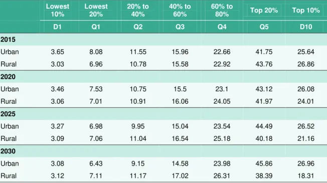
Table 3. Percentage Share of Consumption, 2015–2030, Extrapolated Inequality on Current Trends
Lowest 10% Lowest 20% 20% to 40% 40% to 60% 60% to 80% Top 20% Top 10% D1 Q1 Q2 Q3 Q4 Q5 D10 2015 Urban 3.65 8.08 11.55 15.96 22.66 41.75 25.64 Rural 3.03 6.96 10.78 15.58 22.92 43.76 26.86 2020 Urban 3.46 7.53 10.75 15.5 23.1 43.12 26.08 Rural 3.06 7.01 10.91 16.06 24.05 41.97 24.01 2025 Urban 3.27 6.98 9.95 15.04 23.54 44.49 26.52 Rural 3.09 7.06 11.04 16.54 25.18 40.18 21.16 2030 Urban 3.08 6.43 9.15 14.58 23.98 45.86 26.96 Rural 3.12 7.11 11.17 17.02 26.31 38.39 18.31
Source: Author’s estimates.
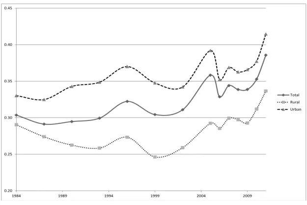
Again, if we compare the historical record, we would be more likely to err towards caution on likely changes in inequality, noting the causes of inequality in Indonesia are complex and relate to spatial inequality in particular (see earlier discussion). Figures 6 to 8 show the Gini and Theil
measures and decile groupings for 1984–2011 based on the GrIP data. The graphs show rising
inequality over the period in Indonesia in several waves with a clear spike in inequality in 2005 that fell back before rising quickly again. The graphs are consistent with the story of the density curves and fractile graphs below, in that although poverty fell and growth was broad-based at the lower end of the distribution, there were more significant gains in the middle and at the top end of the distribution and thus inequality rose.
Of concern to policy makers is that rising inequality will slow the rate of poverty reduction but also it may slow growth too or the length of the growth episode. Cornia, Addison, and Kiiski (2004), who use a dataset of 73 countries to identify critical threshold levels of inequality. They conclude that rising inequality can assist growth but only up to a Gini value of 0.30 and above 0.45 inequality impedes GDP growth (Indonesia’s Gini is moving close to this level). In short, they find a distinct nonlinear relationship between initial income inequality and economic growth. They argue that a low level of inequality is bad for growth (free-riding, high supervision costs), but also that too high levels of inequality can have serious negative consequences.
The conclusion above is consistent with the global literature. There is substantial empirical evidence that high or rising inequality has a negative effect on the rate of growth or the length of growth spells (e.g. Berg and Ostry, 2011; Easterly, 2005). There is some evidence that this
depends on level of economic development (GDP per capita) and “openness” (Agénor, 2002;
Barro, 2000; Milanovic, 2002) and assets rather than income (Deininger and Olinto, 2000) with an emphasis on human capital in particular. Further, that a higher level of inequality leads to less poverty reduction at a given level of growth (Deininger and Squire, 1998; Hanmer and Naschold, 2001; Kraay, 2004; Ravallion, 1995; 1997; 2001; 2004; 2005; Son and Kakwani, 2003; Stewart, 2000). This is, though, not given as there is a high level of heterogeneity of country experience (see Fosu, 2011; Kalwij and Verschoor, 2007; Ravallion, 2001) which points towards the role of
policy in influencing the sectoral and geographical pattern of economic growth, as well as the composition of public expenditure, especially social spending and labor market policies (Fields, 2001; Kraay, 2004; Ravallion, 1995).
There is further a question of whether to use survey or national accounts means. In this paper we use survey means because this most closely replicates the method used by the World Bank. Elsewhere we have used the GrIP model to compare poverty estimates by both survey and NA means (see Edward and Sumner, 2013a and 2013b). When NA means are used lower poverty estimates are generated compared to survey means (see Table 4). We would therefore anticipate that estimates of global poverty that use NA means would understate Indonesian poverty when compared to estimates from Povcal (in fact, many of those estimates would understate Indonesian poverty by more than Table 4 because in general they use HFC means without the global adjusting that GrIP includes to allow for the fact that HFC means are generally higher than survey means). Table 4 shows the differences between poverty counts (millions of people) for each poverty line by survey and NA means.
Figure 6. Theil, 1984—2011
Source: Author’s estimates. 0.00 0.05 0.10 0.15 0.20 0.25 0.30 0.35 1984 1989 1994 1999 2004 2009 Total Rural Urban
Figure 7. Gini, 1984–2011 Source: Author’s estimates.
Figure 8. Share of GNI to poorest 40%, middle 50%, and top 10%, 1984–2011
Source: Author’s estimates.
0.20 0.25 0.30 0.35 0.40 0.45 1984 1989 1994 1999 2004 2009 Total Rural Urban 0.0 10.0 20.0 30.0 40.0 50.0 60.0 70.0 80.0 90.0 100.0 1984 1990 1996 2002 2006 20082010 1987 1993 1999 2005 2007 2009 2011 1984 1990 1996 2002 2006 2008 2010 Percentage share of distribution
D1 to D4 D5 to D9 D10
Total Rural Urban
Table 4. Indonesia, Poverty Headcount (millions), 2010, Survey and NA Means $1.25 $2 $10 Survey mean NA mean Survey mean NA mean Survey mean NA mean Total 43.2 2.4 108.7 49.7 236.8 225.2 Urban 23.5 2.2 55.1 26.6 125.7 117.0 Rural 19.7 0.2 53.7 23.0 111.1 108.1
Source: Author’s estimates.
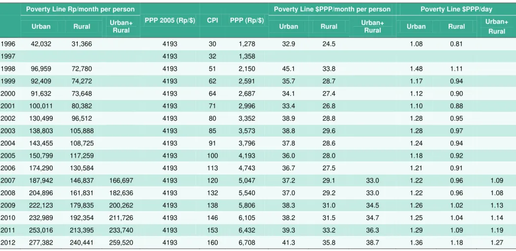
Finally, we make use of international poverty lines of $1.25, $2 and add a $10 poverty line. The logic for this is as follows. First, the $1.25 line is, as Yusuf et al. (2013) notes, approximately equivalent to the current PPP $ value of the national poverty line (see Table 5). In fact, the national poverty line has been close to the $1.25 international poverty line over the last five
years.9
We include the $2 poverty line because it is well established as the World Bank moderate international poverty line, which is close to the median poverty line across all developing countries ($2.36 per capita [pc] in 2008) as well as the regional mean poverty line in sub-Saharan Africa, South Asia, and China collectively, where many of the world’s poor live (Ravallion, 2012: 25). The global mean for developing country poverty lines is $4.64 pc which is significantly higher
than the median because poverty lines can be around $11–$12 pc. The mean in Latin America, the
Caribbean, and Eastern Europe is close to $4, which also is the mean in East Asia and Pacific (Ravallion, 2012: 25). In short, $2 pc seems reasonable because, from an international perspective, it is close both to the global median and to the mean poverty line in the countries
where most of the world’s poor live (Sub-Saharan Africa, South Asia, and China).
We also use a $10 per day per capita poverty line on the basis that this threshold broadly
separates those living “rich-world” lifestyles from those living “developing world” lifestyles.10
Given that there is an inevitable degree of arbitrariness in the precise location of these thresholds the $10 level seems a reasonable point of separation, and $10 has been identified as an approximate “security” from the poverty line: an interesting study in Chile, Mexico and Brazil suggests that the risk of falling into poverty was as low as approximately 10% at an initial income of $10 per day per capita in all three countries. The authors refer to this as a ‘vulnerability
approach to identifying the middle classes’ (López-Calva and Ortiz-Juarez, 2011). Further, Birdsall,
Lustig, and Meyer (2013) noted that $10 is the mean per capita income of those who have completed secondary school across Latin America suggesting such completion of schooling can be
associated with some kind of greater security.11 We have proposed that those living above $2 per
day but below the $10 per day level might be referred to as the “global insecure”, while those above it would be the “global secure” (see discussion in Edward and Sumner, 2013b).
9
The national poverty line was revised in 1998. The national poverty line is based on the cost of 2,100 calories and essential non-food items (see for discussion, Sumner, 2002).
10
This is discussed in-depth in Edward and Sumner (2013b). From GrIP, 87% of the HIC population lives above $10 pc a day. 98% of LIC and LMIC populations are below this level. If we wished to exactly balance out the LIC/HIC separation we would need a threshold of $7, which would position 94% of the HIC population above the threshold and 94% of the LIC and LMIC population below it.
11
Table 5. National Poverty Line Versus $1.25 PPP Poverty Line, 2007–2012
Poverty Line Rp/month per person
PPP 2005 (Rp/$) CPI PPP (Rp/$)
Poverty Line $PPP/month per person Poverty Line $PPP/day
Urban Rural Urban+ Rural Urban Rural Urban+ Rural Urban Rural Urban+
Rural 1996 42,032 31,366 4193 30 1,278 32.9 24.5 1.08 0.81 1997 4193 32 1,358 1998 96,959 72,780 4193 51 2,150 45.1 33.8 1.48 1.11 1999 92,409 74,272 4193 62 2,591 35.7 28.7 1.17 0.94 2000 91,632 73,648 4193 64 2,687 34.1 27.4 1.12 0.90 2001 100,011 80,382 4193 71 2,996 33.4 26.8 1.10 0.88 2002 130,499 96,512 4193 80 3,352 38.9 28.8 1.28 0.95 2003 138,803 105,888 4193 85 3,573 38.8 29.6 1.28 0.97 2004 143,455 108,725 4193 91 3,796 37.8 28.6 1.24 0.94 2005 150,799 117,259 4193 100 4,193 36.0 28.0 1.18 0.92 2006 174,290 130,584 4193 113 4,743 36.7 27.5 1.21 0.91 2007 187,942 146,837 166,697 4193 120 5,047 37.2 29.1 33.0 1.22 0.96 1.09 2008 204,896 161,831 182,636 4193 132 5,540 37.0 29.2 33.0 1.22 0.96 1.08 2009 222,123 179,835 200,262 4193 138 5,806 38.3 31.0 34.5 1.26 1.02 1.13 2010 232,989 192,354 211,726 4193 146 6,105 38.2 31.5 34.7 1.25 1.04 1.14 2011 253,016 213,395 233,740 4193 153 6,432 39.3 33.2 36.3 1.29 1.09 1.19 2012 277,382 240,441 259,520 4193 160 6,708 41.3 35.8 38.7 1.36 1.18 1.27
Table 6. Comparison of Ginis from GrIP, BPS, and Povcal
Year 1984 1987 1990 1993 1996 1999 2002 2005 2006 2007 2008 2009 2010 2011
BPS 0.33 0.32 0.32 0.34 0.36 0.31 0.33 0.36 0.33 0.36 0.35 0.37 0.38 0.41
Povcal 0.305 0.293 0.292 0.293 0.313 0.290 0.297 0.340 0.341 0.356
In terms of validating our data, we take the Gini ratio from GrIP and compare with those of BPS (and Povcal). We find a reasonably close correlation (see Table 6). The GrIP model tends to underestimate Ginis in individual countries due to the way that the model extrapolates and interpolates across the distribution. GrIP uses a method for estimating fractile shares of income from ventiles and deciles. It is extremely difficult to estimate from this data the detail distribution across (particularly) the top 5% of the distribution. The method in GrIP is designed to be inherently conservative in this region (see Edward, 2006: 1692) so that GrIP tends to slightly underestimate Gini coefficients for individual countries. With access to the full survey data we expected the Indonesian Government numbers would be slightly higher, which they are. Interestingly, Povcal also underestimates the national Gini while GrIP’s estimate seems to be very close to Povcal. Maybe, if anything, Povcal is slightly better in that it is often closer to the government figures.
As is well known, expenditure survey data (namely data from Indonesia’s Susenas and thus Povcal too) understates income inequality since it ignores savings (for example), whilst top incomes largely escape surveys (see for details: Leigh and van der Eng, 2010). Those are inherent shortcomings of all such surveys, not just Indonesia’s. Therefore, in general, the decile data in Povcal on which GrIP is based is widely recognized as likely to underestimate inequality and the
incomes of the rich—so it is unsurprising that the GrIP results reflect these shortcomings in the
underlying data. One very interesting recent study by Nugraha and Lewis (2013) argues that when using Susenas data the different forms of non-market income should be taken into account. We find (see below) that in the GrIP data that the $10 poverty line calls into question the capture of information on higher incomes.
A slight difference between GrIP and Povcal arises because Povcal uses a kernel distribution method and GrIP uses a linear distribution method to estimate the distribution detail from the decile or quintile data. This leads to slightly different estimates of the Lorenz curve and hence of the Gini.
IV. HISTORICAL PATTERNS AND
PROJECTIONS, 1984
–
2030
In figures 9–21 presented below we can consider growth, distribution and poverty from 1984–
2011 and make projections to 2030 where appropriate. The graphs are grouped by: (a) income per capita trends; (b) historical patterns of growth; and (c) trends in poverty overall.
4.1 Income per Capita Trends, 1984
–
2030
The first set of graphs show income per capita. Figures 9 and 10 respectively show GNI per capita by the Atlas method and GDP per capita by PPP. Indonesia is compared to a set of populous and fast growing economies, namely, China, Brazil, India and Nigeria. The graphs show that Indonesia
may cross the threshold in the next 1–2 years into the upper middle-income country (UMIC)
classification and could attain high-income country (HIC) status around 2025. These estimates are based on the ‘optimistic’ economic growth scenario (meaning the IMF WEO forecast extrapolated out to 2030 at 6.7% a year which is clearly an optimistic scenario).
Figure 9. GNI per capita, 1984–2030 (optimistic growth from 2011), Indonesia, China, Brazil, India and Nigeria
Source: Author’s estimates.
Figure 10. GDP (PPP) per capita, 1984–2030 (optimistic growth from 2011),
Indonesia, China, Brazil, India and Nigeria Source: Author’s estimates.
0 5000 10000 15000 20000 25000 1985 1990 1995 2000 2005 2010 2015 2020 2025 2030 G NI per c ap it a (c ons tan t 20 10 $, A tla s me thod )
Indonesia China Brazil India Nigeria LIC-LMIC LMIC-UMIC UMIC-HIC
0 5000 10000 15000 20000 25000 30000 35000 40000 1985 1990 1995 2000 2005 2010 2015 2020 2025 2030 G DP PP P p er c ap it a (c ons tan t 20 05 $)
4.2 Historical Patterns of Growth, 1984
–
2011
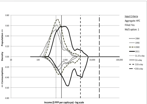
A second set of graphs show growth distribution trends over the 1984–2011 period. Figures 11
and 12 show the pattern of that growth in a density curve and a fractile chart. Additional charts are included in the appendix with different base years and urban and rural density curves. These graphs show the gradual shift of the poverty peak (and decline in size of the peak) between 1984
and 2011 and thus the emergence of those in the $2–$10 per day group (arguably, between
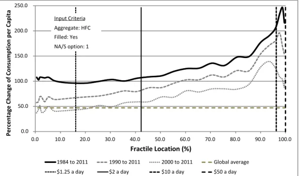
day-to-day poverty and security from poverty). The rise in consumption is particularly visible in the middle and at the top end of the distribution (the bottom half of the graph). The change between 2000 and 2011 is quite striking.
The growth incidence graph explains further (Figure 12) and shows both the broad base to economic growth over the period at the lower end of the distribution and the benefits accruing
to the top 15–25% of the population over the period (various other graphs by different time
periods are in the appendix for reference). Further, comparison to Brazil, China, India , and Nigeria is largely favorable to Indonesia as the pattern of growth is somewhat similar to China’s (see Figure 13).
Figure 11. Density curve, 1984–2011
Source: Author’s estimates. -0.80 -0.60 -0.40 -0.20 0.00 0.20 0.40 0.60 0.80 10 100 1,000 10,000 100,000 < = C o n su mp ti o n D en si ty P o p u la ti o n = >
Income ($ PPP per capita pa) - log scale
1984 1990 2000 2011 $1.25 a day $2 a day $10 a day $50 a day Aggregate: HFC Filled: Yes NA/S option: 1 Input Criteria
Figure 12. Indonesia, fractile chart, 1984–, 1990–, 2000–2011 Source: Author’s estimates.
Figure 13. Fractile chart, 1990–2011: Indonesia, China, India, Brazil, and Nigeria
Source: Author’s estimates.
-100.0 0.0 100.0 200.0 300.0 400.0 500.0 600.0 0.0 10.0 20.0 30.0 40.0 50.0 60.0 70.0 80.0 90.0 100.0 Fractile Location (%)
Indonesia China India Brazil Nigeria
Aggregate: HFC Filled: Yes NA/S option: 1 Input Criteria Pe rcent age Cha n ge of Con su m p tion p e r C apita 0.0 50.0 100.0 150.0 200.0 250.0 0.0 10.0 20.0 30.0 40.0 50.0 60.0 70.0 80.0 90.0 100.0 Fractile Location (%) 1984 to 2011 1990 to 2011 2000 to 2011 Global average $1.25 a day $2 a day $10 a day $50 a day Aggregate: HFC Filled: Yes NA/S option: 1 Input Criteria Pe rcentage Cha n ge of Con su m p tion p e r C apita
4.3 Trends in Poverty Reduction Overall, 1984
–
2030
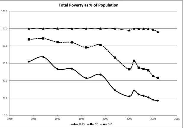
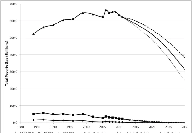
Finally, poverty trends are presented. Figures 14 to 20 show total, rural and urban poverty
headcounts in millions of people from 1984–2030 and the total poverty gap in US$bn (2005 PPP$)
and estimates of urban and rural proportions of poverty by $1.25, $2 and $10 poverty lines. In considering the historical trends on poverty in Indonesia it is evident that there is a rather fluctuating curve for poverty reduction in that the curve is not very smooth. The two spikes in poverty are clearly visible Suryahadi, Hadiwidjaja, and Sumarto (2012).
The data suggests the end of $1.25 and $2 poverty is plausible in the 2015–2025 period if growth
meets the “optimistic” forecast and distribution returned to “best ever”. Surprisingly perhaps, $10 poverty will only start to fall in 2025. One should note this “end of $1.25 or $2 poverty” scenario is unequivocally an optimistic scenario and simply illustrates what is possible (see discussion
below). And if one accepts the basis of a $10 per capita, “security from poverty” poverty line, the
end of extreme and moderate poverty could be accompanied by a large potentially insecure group (possibly 200 million in 2030) of those between $2 and $10 for some time to come with the urban proportion rising notably over time (note the $10 urban line on Figure 17). On the other hand one might argue that the fact that high incomes are not well captured in the data gravitates against the use of this higher poverty line. Although here in the text, “optimistic economic
growth” is used, all the data for all other scenarios is presented in the appendix. The emergence
of a substantial group of the population in between $2–$10 for some time to come raises
questions for evolving public policy priorities and the balance between insurance and risk management mechanisms versus “traditional” poverty policy. One interesting policy taxonomy is
the Dartono and Nurkholis (2013: 62) grouping of chronic and transient poverty programs.12
A further issue of note is that the rural component of total poverty by each poverty line is falling drastically and poverty by international poverty lines is far more urbanized than by the national poverty line. In fact, rather than two-thirds of the poor being rural, it is less than half of the poor in Indonesia who are rural when one uses international poverty lines. It is commonly thought
international poverty lines underestimate urban poverty for methodological reasons (see Mitlin
and Satterthwaite, 2003; Satterthwaite, 2004). Figure 20 shows the urban-rural proportions of total poverty. The precise reasons for such differences in the urban-proportion of poverty by national and international poverty lines may be due to clustering near the international poverty lines.
12
Chronic poverty programs include School Operational Assistance (BOS), scholarships, conditional cash transfers, the National Program for Community Empowerment (PNPM), credits to SMEs (microfinance) and the Kecamatan
(Subdistrict) Development Program (PPK). Transient poverty policies, in contrast, include social safety nets—subsidized rice (Raskin), Direct Cash Transfers (BLT) and health insurance for the poor (Askeskin). There are others taxonomies of course too (see detailed policy review of Suryahadi et al., 2010).
Figure 14. Poverty, total, millions, 1984–2011 Source: Author’s estimates.
Figure 15. Poverty headcount, total, millions, 1984–2030 (optimistic growth, three
distribution scenarios) Source: Author’s estimates.
0.0 50.0 100.0 150.0 200.0 250.0 1980 1985 1990 1995 2000 2005 2010 2015 2020 2025 2030
Poverty headcount (millions)
$1.25 Headcount $2 Headcount $10 Headcount
Static, Optimistic Extrapolated, Optimistic Best, Optimistic 0.0 20.0 40.0 60.0 80.0 100.0 120.0 1980 1985 1990 1995 2000 2005 2010 2015
Total Poverty as % of Population
$1.25 $2 $10 Po ve rty H e adco u n t (m illions)
Figure 16. Total Poverty Gap (TPG), US$bn (PPP), 1984–2030 (optimistic growth, three distribution scenarios)
Source: Author’s estimates.
Figure 17. Rural and urban poverty, millions, 1984–2011
Source: Author’s estimates. 0.0 100.0 200.0 300.0 400.0 500.0 600.0 700.0 1980 1985 1990 1995 2000 2005 2010 2015 2020 2025 2030 Tot al P ov er ty G ap ( $bill ion s)
$1.25 TPG $2 TPG $10 TPG Static, Optimistic Extrapolated, Optimistic Best, Optimistic
0.0 20.0 40.0 60.0 80.0 100.0 120.0 140.0 1980 1985 1990 1995 2000 2005 2010 2015
Rural, $1.25 Headcount Rural, $2 Headcount Rural, $10 Headcount Urban, $1.25 Headcount Urban, $2 Headcount Urban, $10 Headcount
Figure 18. Income poverty, rural, millions, 1984–2030 (optimistic growth, three distribution scenarios)
Source: Author’s estimates.
Figure 19. Income poverty, urban, millions, 1984–2030 (optimistic growth, three
distribution scenarios) Source: Author’s estimates.
0.0 20.0 40.0 60.0 80.0 100.0 120.0 140.0 160.0 180.0 1980 1985 1990 1995 2000 2005 2010 2015 2020 2025 2030
Poverty headcount (millions)
Urban, $1.25 Headcount Urban, $2 Headcount Urban, $10 Headcount Static, Optimistic Extrapolated, Optimistic Best, Optimistic
Po ve rty H e adco u n t (m illions) 0.0 20.0 40.0 60.0 80.0 100.0 120.0 140.0 1980 1985 1990 1995 2000 2005 2010 2015 2020 2025 2030 Poverty headcount (millions)
Rural, $1.25 Headcount Rural, $2 Headcount Rural, $10 Headcount Static, Optimistic Extrapolated, Optimistic Best, Optimistic
Po ve rty H e adco u n t (m illions)
Figure 20. Rural poverty as a % total Source: Author’s estimates.
An important question to ask is what are the historical comparisons for Indonesia? In short, is there any country that had, at some point in the past, the same level of $1.25 per day or $2 per day poverty incidence as Indonesia today, and managed to reduce it to near zero in such a short time frame? We have noted earlier that the economic growth rates and distribution trends would suggest some considerable caution is needed in relation to this data. However, one can make
comparisons to Thailand’s growth, inequality and poverty trends.13
Thailand, in 1988, had similar levels of $2 poverty as Indonesia today: Thailand in 1988, had a $2 per day poverty headcount of 41.0% of the population, which fell to just 4.1% of population in
2010. Even including the 1997–1998 Asian financial crash (and severe contraction accompanying
this), Thailand’s GDP per capita growth rate for 1988–2011 was 3.8% and inequality was largely
static between 1988–2006, before it fell in 2006–2011 (the Gini fell from 43.8 in 1988 to 42.4 in
2006 to 39.4 in 2010).
Thus to make the comparison more robust we can take the higher poverty line of $2 per day (rather than the $1.25 per day) and the moderate growth scenario (5.7% pc per annum) and static inequality (rather than falling inequality which would all speed up the end of poverty).
Making such assumptions we can compare Indonesia, 2010–2030 and Thailand, 1990–2010 (see
Figure 21). In short, the historical comparison to Thailand is of interest because two decades of growth at 3.8% per capita per annum and largely static inequality, Thailand reduced $2 poverty
to under 4% of the population. A somewhat similar pattern of such ‘moderate’ growth and
static inequality could mean the end of poverty in Indonesia in 2030, especially so if the 1997–
13
We are indebted to Arief Yusuf for his comments as discussant at the Padjadjaran seminar for the proposal to compare Thailand and Indonesia in this way.
0.0 10.0 20.0 30.0 40.0 50.0 60.0 70.0 80.0 90.0 1980 1985 1990 1995 2000 2005 2010 2015
Rural Poverty as % of Total Poverty
1999 crisis period is removed from Thailand’s curve. It is worth noting though that the poverty curve slowed drastically in Thailand when the $2 poverty headcount reached less than 5% (see Figure 21).
Figure 21. Poverty by $2 per day in Thailand, 1988–2011 (historical actual) versus
poverty by $2 in Indonesia 2011–2030 based on moderate growth scenario and
static inequality
V. CONCLUSION
Indonesia certainly experienced rapid economic development and poverty reduction between
1984 and 2011. What does historical and forecast analysis of Indonesia’s growth, inequality, and
poverty using international PPP poverty lines tell us? First, it is plausible that Indonesia may attain high-income country status in a decade or so. However, historical growth rates indicate a more
cautious forecast could be necessary—with 15 years perhaps being a more likely time frame.
Second, it is also mathematically plausible that Indonesia could end $1.25 per day and $2 per day poverty in the same time frame if growth meets IMF WEO forecasts and there is a favorable movement in distribution. Again, current and historic trends suggest this is highly optimistic. An alternative way of looking at this is that the opportunity cost of current inequality trends indicate
poverty in Indonesia could end within a period of 10–20 years. In terms of comparison, the
historical “moderate” growth and static inequality achieved by Thailand may be of interest to policy makers in Indonesia.
1988 1993 1998 2003 2008 2013 0 5 10 15 20 25 30 35 40 45 50 2010 2015 2020 2025 2030 2035 Thailand year
$2 a day headcount as percentage of total population Indonesia year
Indonesia (2011-2030) Thailand (1988-2010) $2 a Day H eadc ou n t as Perce ntage o f Total P o pu lat ion
Third, however, we note that a large proportion of the population may find themselves between day-to-day poverty and security from poverty (defined here as the $10 per day line). Fourth, we also note that poverty by international poverty lines seems to be far more urban and on a steep trend to a greater urban proportion of poverty.
How different are our findings when using the international poverty lines compared to the national poverty line? There were three areas reviewed in this paper: first, studies focused on long-run trends in expenditure poverty. Second, studies focused on the long-run relationship between expenditure poverty and economic growth. Third, studies focused on long-run inequality.
In the first, we noted research using national poverty lines—meaning non-$PPP lines—has
concluded that absolute poverty declined during the Suharto years. However, poverty was still
significant before the 1997–1998 financial crisis, and may have been underestimated. Further,
welfare improvements slowed in the period after the 1997–1998 crisis. Using consistent
international poverty lines at $1.25 and $2 (recalling the former of which is close now to the
national poverty line), we find over the 1984–2011 period that $1.25 per day poverty significantly
declined during the Suharto era. However, the substantial decline of $2 poverty per day seems to largely date to the post-Suharto era and the $10 per day poverty count appears to have changed
surprisingly little in 25 years, according to the data. It is true that even before the 1997–1998
crisis poverty was still at high levels (more than 40% of population by the $1.25 per day poverty line and 80% of population by the $2 per day poverty line). We find the rate of poverty reduction
by $1.25 per day and $2 per day was particularly fast in the period of 2000–2005, indeed faster
than in the pre-crisis time and possibly reflects the range of social programs introduced or extended in the post-crisis period. However, that rate of poverty reduction is slower since the
2005–2006 rice price induced poverty spike, notably for the $1.25 poverty count and somewhat
for the $2 poverty count.
In the second area, studies focused on the long-run relationship between expenditure poverty and economic growth, we noted that research based on national poverty line(s) found that
overall, economic growth in Indonesia has benefited the poor. We find over the 1984–2011
period that the benefits of growth to those under $2 have been substantial. Indeed, economic growth certainly appears to have benefited the poor substantially using the $1.25 or $2 poverty lines. Overall growth has been broad-based with regard to the lower end of the distribution and Indonesia compares well to other populous countries.
Finally, with regard to long-run trends in inequality, research findings to date have been
somewhat conflicting. Some have found that before the 1997–1998 crisis, inequality was
relatively low or declining and that inequality did not increase drastically as a result of economic growth, whilst others have found inequality was high or increasing pre-crisis. Further, many have noted that inequality has increased post-crisis. We find that total inequality (measured by the Gini coefficient and Theil index) fell in the early 1990s (although this masked rising urban inequality as
it was rural inequality that fell substantially). However, after the 1997–1998 crisis inequality has
risen in two waves in particular: one wave visible in the data for 1999–2005 and a more recent
wave 2009–2011. This is alarming in the sense that Indonesia’s rising inequality could slow further
LIST OF REFERENCES
Agénor, Pierre-Richard (2002) ‘Does Globalisation Hurt the Poor?’ World Bank Policy Research
Working Paper 2922. Washington, DC: World Bank.
Akita, Takahiro (2002) ‘Regional Income Inequality in Indonesia and the Initial Impact of the
Economic Crisis.’ Bulletin of Indonesian Economic Studies 38 (2): 201–222.
———. (2003) ‘Decomposing Regional Income Inequality in China and Indonesia using two-stage
nested Theil Decomposition Method.’ The Annals of Regional Science 37 (1): 55–77.
Akita, Takahiro and Sachiko Miyata (2008) ‘Urbanization, Educational Expansion, and Expenditure
Inequality in Indonesia in 1996, 1999, and 2002.’ Journal of the Asia Pacific Economy 13
(2): 147–167.
Akita, Takahiro, Puji Agus Kurniawan, Sachiko Miyata (2011) ‘Structural Changes and Regional
Income Inequality in Indonesia: A Bidimensional Decomposition Analysis.’ Asian Economic
Journal 25 (1): 55–77.
Aldenhoff, Frank-Oliver (2007) ‘Are Economic Forecasts of the International Monetary Fund
Politically Biased? A Public Choice Analysis.’ Review of International Organizations 2 (3):
239–260.
Asra, Abuzar (2000) ‘Poverty and Inequality in Indonesia: Estimates, Decomposition and Key
Issues.’ Journal of the Asia Pacific Economy 5 (1–2): 91–111.
Baliscan, Aresnio M., Ernesto M. Pernia, and Abuzar Asra (2003) ‘Revisiting Growth and Poverty
Reduction in Indonesia: What Do Subnational Data Show?’ Bulletin of Indonesian
Economic Studies 39 (3): 329–351.
Barro, Robert J. (2000) ‘Inequality and Growth in a Panel of Countries.’ Journal of Economic
Growth 5 (1): 5–32.
Berg, Andrew G. and Jonathan D. Ostry (2011) ‘Inequality and Unsustainable Growth: Two Sides of
the Same Coin?’ IMF Staff Discussion Note. Washington, DC: IMF.
Birdsall, Nancy, Nora Lustig, and Christian J. Meyer (2013) ‘The Strugglers: The New Poor in Latin
America.’ CGD Working Paper 337. Washington, DC: Center for Global Development.
Booth, A. (1999) ‘Initial Conditions and Miraculous Growth: Why is Southeast Asia Different from
Taiwan and South Korea?’ World Development 27 (2), 301–21.
Booth, Anne (2000) ‘Poverty and Inequality in The Soeharto Era: An Assessment.’ Bulletin of
Indonesian Economic Studies 36 (1): 73–104.
Burke, P. J., and B.P. Resosudarmo (2012) ‘Survey of Recent Developments.’Bulletin of Indonesian
Cameron, Lisa A. (2000) ‘The Impact of the Indonesian Financial Crisis on Children: An Analysis
Using the 100 Villages Data.’ UNICEF Innocenti Research Centre Working Paper 81.
Florence: UNICEF.
Chen, Shaohua and Martin Ravallion (2012) ‘More Relatively-Poor People in a Less
Absolutely-Poor World.’ World Bank Policy Research Working Paper 6114, Washington, DC: World
Bank.
Commission on Growth and Development (2008) The Growth Report: Strategies For Sustained
Growth and Inclusive Development [online] <http://siteresources.worldbank.org/ EXTPREMNET/Resources/489960-1338997241035/Growth_Commission_Final_Report. pdf.>.
Cornwell, Katy and Titik Anas (2013) ‘Survey of Recent Developments.’ Bulletin of Indonesian
Economic Studies 49 (1): 7–33.
Cornia, Giovanni Andrea, Tony Addison, and Sampsa Kiiski (2004) ‘Income Distribution Changes
and their Impact in the Post Second World War Period.’ In Giovanni Andrea Cornia (Ed.)
(2004) Inequality, Growth, and Poverty in an Era of Liberalization and Globalization.
Oxford: Oxford University Press: 22–54.
Dartanto, Teguh and Nurkholis (2013) ‘The Determinants of Poverty Dynamics in Indonesia:
Evidence from Panel Data.’ Bulletin of Indonesian Economic Studies 49 (1): 61–84.
Deininger, Klaus and Lyn Squire (1998) ‘New Ways of Looking at Old Issues: Inequality and
Growth.’ Journal of Development Economics, 57 (2): 259–287.
Deininger, Klaus and Pedro Olinto (2000) ‘Asset Distribution, Inequality, and Growth.’ Policy
Research Working Paper 2375, Washington D.C.: World Bank.
Dhanani, Shafiq and Iyanatul Islam (2002) ‘Poverty, Vulnerability and Social Prote