Is my Grocery Store Safe: A Model for Individual
Infection Probability during an Epidemic and
Estimations for COVID-19
Ram Ramanathan∗Westford, MA, USA
ramontravel AT gmail.com
ABSTRACT
We present an approximate model to estimate the average infection probability of an individual living in an epidemic-affected area around a given date as a function of the mean number of contacts, infection transfer (transmission) probability, and the number of days between infection and isolation. The model also estimates the maximum number of contacts for a given risk tolerance. A key part of the model is the development of an ensemble of methods to estimate the number of active cases. We apply the generic model to the current COVID-19 pandemic for several U.S states and for a few representative roles (e.g. grocery store shopper, cashier, prison inmate, subway rider, etc.) to compare their risk profiles, and present a few studies using plots. A sample of our observations (full list in section4) include: (1) the variation in infection risk and contacts budget across regions is huge (53x and 97x respectively between DC and Oregon), much more than may be inferred from reported infection densities (11x); (2) the risk of a grocery store cashier is predicted to be≈16x more than that of a shopper, yet the amount of protection and care taken/given to each is nowhere in proportion; (3) Isolation within 5 days of infection for all infected individuals in a region is equivalent to cutting the transfer probability or number of contacts for a non-infected individual by at least 10x on average.
NOTE: This paper is work in progress and NOT PEER REVIEWED. The author is not liable for any actions taken as a result of interpretations of this paper.
1 Introduction
The rapid spread of the COVID-19 pandemic has had a profound impact across the globe, and has spurred a huge volume of research. Most of the epidemiological research has focused on models for predicting the spread of disease. While this obviously addresses a very important need, it does not answer questions from anindividual perspective, questions such as: what is the risk of going to the grocery store; what is the risk of being a cashier at one; how risky is warehouse work, or to ride on the subway on the way to one, and so on. While it is obvious that "less contact the better", there are situations, especially for essential workers, where contacts are unavoidable.
We present an approximate model to estimate the average infection probability of an individual living in an epidemic-affected area around a given date as a function of the number of contacts, infection transfer (transmission) probability, and days-to-quarantine. The model uses epidemiological parameters including the Infection-Fatality Ratio (IFR), serial interval, reproductive factor and infection-to-death lag, and
publicly published region- and time-specific reported death and infection data for the epidemic in question, and derives an expression for infection probability for the given region and day. As a corollary, the model also provides an expression for the maximum number of contacts ("contacts budget") given a risk tolerance ("comfort probability").
A key part of the model is the estimation of the actual number of infections in a given region. We have presented three methods (A, B, C), all of which use current death data and the IFR to estimate time-lagged actual infections, but differ in the data elements needed to estimate the growth of those infections. Method A uses no additional reported data, and relies on estimated effective reproductive factor; method B uses reported cases on the considered day andλ days prior, whereλ is the lag between infection and death;
method C uses reported death dataλ days prior. Depending on what data is reliably available, one may
use an ensemble of an appropriate subset of methods to estimate actual infections on a particular date. Our model is generic in that it can be applied to any epidemic as long as the few required epidemio-logical parameters and publicly reported data elements are available (see section2.1.4for the list). We apply our model to the current COVID-19 pandemic and study the infection probability for a few example U.S. states for varying levels of contact transfer probability and number of contacts. We use the Covid Tracking Project1for historical state-wise data and the rt.live website2for the reproductive factor used by Method A. We also estimate the average infection probability for a few representative roles (e.g. grocery store shopper, cashier, prison inmate, warehouse worker, etc.) to compare their risk profiles. Finally, we present a few studies using plots that capture the inter-relationships between the various parameters for four selected states.
Our key findings, which are elaborated upon in section4are as follows: (1) The variation in infection risk and contacts budget across regions is huge, much more than may be inferred from reported infection densities; (2) Using best-guess values (see section3.2) the risk of a grocery store cashier is predicted to be 16x than a shopper, yet the amount of protection an care taken/given to each is nowhere in proportion; (3) If one wants to be more mobile and risk more contacts for whatever reason, the payoff in affordable contacts is only worth it if the transfer probability is low (e.g. if using effective masks); (4) There can be considerable variety and variance in infection probabilities over time even among similarly affected states (e.g. ≈15% variation for NJ vs≈50% for MA); (5) For most situations in an epidemic, and for most COVID-19 regions, the infection probability depends nearly linearly on theproductof number of contacts and transfer probability, which may lead to the concept of aquantaof exposure.
The guidance from public health agencies is to "limit contact as much as you can". However, in many cases this is unfortunately more of a trade-off than a binary decision. Our work is a preliminary step to quantifying this trade-off, and hopefully can help individuals make decisions according to their comfort level. With the world lifting lockdowns, informing such decisions will become even more crucial, both for individuals to make the right tradeoff, and for administrations to selectively tighter or loosen restrictions.
2 Model Development
Consider an uninfected individual who hasmindependent infectable contacts on a given day2i. Since the probability of infection on each contact is pi, the probability of being infected at the end of dayiis given
by
pi(m) =1−(1−pi)m (1)
Symbol Meaning
pi Probability of infection with a single encounter on dayi
pi(m) Average probability of infection aftermencounters around dayi
pt Transfer (transmission) probability of infection from one person to another, if infected
pc Comfort probability, i.e, acceptable odds of infection
M Maximum number of contacts an individual can make on average such that pi(M)≤pc
A Smallest geographical region for which infection density can be inferred1
P Population ofA, assumed constant over the period of analysis
φi Number of newly infected individuals on dayi
φ0i Number ofreportednewly infected individuals on dayi
Φj,i Cumulative number of infected individuals from day jup to dayi Φi Cumulative number of infected individuals up to dayi, i.e, j=0 above δi Number of new deaths on dayi
δ0i Number ofreportednew deaths on dayi
I Infection Fatality Ratio, i.e, deaths/infections
λ Average lag between infection and death in number of days
s Serial interval, i.e, days to transfer infection between successive people
Rt Effective reproductive factor
c Considered day, i.e, day around which the infection/comfort probability is sought
T Period of analysis, the only data window that is used, typically (c−λ,c)
G Average per-day growth in actual infections for the period of analysis
Table 1. Notation used in this paper
The probability piof an individual being infected by a single contact is the combined probability of the other (encountered) individual being infected, and the infection transfer probability pt. Assuming
that encountered individual is drawn uniformly from the population, the probability of the encountered individual being infected equals the density ofavailable carriersin an area. Available carriers are those that can potentially be outside of their home in a grocery store, school, or other public place and present an infection danger. We assume that everyone who has been infected, not died or quarantined (including hospitalized, since that is a form of quarantine) is an available carrier. We recognize that small children and the elderly have a reduced chance of being in a public place, but leave consideration of this to a future version of the paper.
Let Ci (A) denote the number of carriers available to infect a given individual. Assuming that the
person encountered by the individual is drawn uniformly from the set of available carriers, the average probability of the encountered person being infected on dayiis
qi= Ci(A)
P(A) (2)
For now,Ci(A) is an unknown; we will derive expressions forCi(A) in section2.1.
The areaAcan be taken at various geographical aggregations, e.g. town, county, state, country etc. The model does not make an assumption in this regard, but it makes sense to use the smallest area for which credible data is available.
the reference is implicit. Thus, the average probability piof infection on dayiis
pi=qipt= Ci
P ·pt (3)
From eqs. 3and1
pi(m) =1−
1− Ci
P ·pt
m
(4)
Let pc be thecomfort probability, that is, the maximum probability that an individual is willing to accept of being infected. Then, we can "reverse" equation 4 to derive the maximum contacts M the individual can afford to make such that pi(M)≤pc. We therefore have
M≤ ln(1−pc)
ln(1−Ci
P·pt)
(5)
We note that both pi(m) and M are averages over all individuals in the considered area on the considered date. The value for a particular individual may vary considerably, especially for areas with uneven density.
We now derive a model to estimate the number of carriersCion a given dayi. Indeed, this part of the
model turns out to be a significant portion of this paper, and may represent a contribution in and of itself to the methodology of estimating actual infections.
2.1 Estimating Available Carriers
In an area with full and up-to-date testing, and accurate data for positive cases, deaths, recovered cases and quarantined cases,Ciis simply the number of positive cases minus the sum of the deaths, recovered and
quarantined cases. Unfortunately, due to almost universal under-testing by at least an order of magnitude in most regions, we cannot use such an approach.
Our approach consists of three main steps. Given a dayifor which infection probability is sought, we (1) use death information along with the Infection Fatality Ratio (IFR) to estimate time-lagged number of infections; (2) compute the cumulative number of infections on dayifor a given growth parameterG; (3) use three different methods to estimateG, each differing in the kind of reported data used.
The methods use an idealized model of infection as follows. An individual infected on a particular day is in the "system" for exactlyλ days thereafter, after which they are removed (recovered or deceased) from
the system. Hereλ is the estimated time between infection and death, usually available for a disease from
various sources3–7for COVID-19. On dayb,φbnew individuals are infected. They stay in the population
and give rise to new infections, the sum total of who are infectious until dayi=b+λ. On dayithey are
removed either due to death or recovery. Thus, all of the deaths on dayiis attributed to the new cases on dayi−λ. Further, theexistingcases on dayi−λ (new cases on dayi−λ−1 and prior) do not contribute
to the infectious carriers on dayias they are removed by dayλ−1. Finally, we assume that there are no
imported cases into this system from outside. The new infectious cases grow at an average rate ofGper day.
We recognize that the infection-to-death period is distributed around the mean λ and so mapping
deaths on dayientirely to cases on dayi−λ is not correct. We believe these factors are within the margin
The model can capture the fact that infected individuals are quarantined (including hospitalized) after a certain number of daystq. The incubation period plus a certain margin can be used as an estimate oftq. We assume that 0≤tq≤λ. By default, we assume thattq=λ, that is, no quarantining happens.
We now proceed with the computation of available carriers. We begin with step (1) above to compute the time-lagged infections using theinfection fatality ratio (IFR)8, which is the expected ratio of number of deaths to number of actual infections. We assume that the IFR for a disease stays constant for the period of analysisT.
Thus, for a given dayi, by definition of IFR, and the model assumption which implies that all deaths on dayiresult from new infections on dayi−λ, we have
φi−λ =
δi
I (6)
The new cases grow at a rate ofGper day, and are all infectious on dayi. Note that none of the cases resulting from theexistingcases oni−λ contribute to the infections on day ibecause per assumption,
they were "born" more thanλ days earlier and are removed by dayi−1.
The total number of infections on dayiis the sum of new infections from dayi−λ throughi, since all
of these are potentially active and carriers on dayi. The cumulative infections is given by
Φ(i−λ,i)=
λ
∑
k=1
φi−λGk (7)
Using equation6and the formula for binomial series, we have
Φ(i−λ,i)=
δi
I ·
(Gλ−1)
(G−1) (8)
Since infections arising beforetqdays prior toiought to have been quarantined, the total number of the cumulative infections above that are quarantined and thereforenotavailable carriers is
Φ(i−λ,λ−tq)= λ−tq
∑
k=1
φi−λGk= δi
I ·
(Gλ−tq−1)
(G−1) (9)
The number of available carriers is given by the difference of the cumulative infected and the cumulative quarantined. From equations8and9,
Ci=Φ(i−λ,i)−Φ(i−λ,λ−tq)
= δi
I ·
(Gλ −Gλ−tq)
(G−1)
(10)
We observe that equation10also captures a "no quarantine" model, that is, when the quarantine period is equal to the lag period and so none of the infected individuals are removed. Settingtq=λ in equation
10yields equation8.
2.1.1 Method A: Using Effective Reproduction Rate R
This method estimatesGusing the effective reproductive factorRt and the mean period from the infector being infected to the infectee being infected, which we term theinfection interval.
We observe that if the incubation period is of two individuals is the mean incubation period, then the infection interval is same as the well-knownserial interval9, commonly defined as the time from symptom onset in an infector to symptom onset in an infectee10. To see this, supposes1,s2denote times of symptom onset of two individuals, and f1, f2their infection times. Then, since the incubation period is assumed to
be the same,s1−f1=s2−f2, implying f2−f1=s2−s1, which is the serial interval. We note that this is true whether or not the disease spread is asymptomatic (f2<s1) – observe that no assumption was made in this regard above. Accordingly, we shall use the serial interval as a proxy for infection interval going forward.
Ifsis the infection/serial interval in number of days, then the increase in infections insdays is captured by bothRt and(G)s. Therefore, they are related as:
G=Rt1/s (11)
Using equation 10and equation11, and assuming reported deathsδ0iequal actual deathsδi(while
these certainly differ, the discrepancy is likely far less than with reported vs actual infections), we have
CA i =
δ0i
I ·
(Rλt/s−Rt(λ−tq)/s) (R1t/s−1)
(12)
The advantage of method A is that it relies on only one test data item, namely the reported deaths on dayi. The disadvantage is that it needs a reliable and up to date estimate ofRt ands, which have a wide range across different studies11,12. Since such studies require time for data gathering, analysis, publication and dissemination their estimates typically lag the actual by a few weeks at a minimum.
2.1.2 Method B: Using reported infection growth data
This method uses the growth in thereported infections as a proxy for the growth in actualinfections, implicitly making the assumption that both grow at approximately the same rate.
Letφ0jdenote the number of new reported cases on day j. SinceGis the per-day growth, we have
φ0i−λGλ =φ0i (13)
Therefore
G=
φ0i
φ0i−λ
1/λ
(14)
Substituting equation14in equation10, and using reported deaths for actual deaths
CB i =
δ0i
I ·
( φ0i φ0i−λ
)−( φ0i φ0i−λ
)(λ−tq)/λ
( φ0i φ0i−λ)
The advantage of this method is that it does not rely on study-basedRt and serial interval, which may
not be transferable across areas and could change over time. Instead, it only needs two data items – daily reported infections on considered day, and daily reported infectsλ days earlier. The disadvantage is that it
assumes reported infection growth can be a sufficient proxy for actual infection growth, and relies on the uniformity of testing over the period of analysis.
2.1.3 Method C: Using growth in death data
This is very similar to Method B, except that it uses the reported daily death data instead of the reported infection case data. The rationale is that reported death data is closer to actual deaths than reported infections to actual infections, and sometimes only death data may be available (for example, when testing technology is not present). However, since deaths lag infections byλ, we end up estimating the growth in
infections over aλ-day window prior to the period of analysis. Therefore, this method requires that the
IFR and growth in infections over a 2λ-day period do not change significantly. With this assumption, we
have
δ0i
φ0i−λ =I =
δ0i−λ
φ0i−λ−λ (16)
and
φ0i
φ0i−λ = φ0i−λ
φ0i−2λ (17)
From equations16and17and assumptions
φ0i
φ0i−λ
= δ
0 i
δ0i−λ
(18)
Combining equations18and15
CC i =
δi
I ·
( δ0i δ0i−λ
)−( δ0i δ0i−λ
)(λ−tq)/λ
( δ0i δ0i−λ
)1/λ−1 (19)
Method C inherits the advantages and disadvantages of method B over method A. Its advantage over method B is that it uses the growth data of reporteddeaths, which is not affected by under-testing etc. It major disadvantage is that the IFR and infection growth do not vary significantly over a 2λ period, which
may be unreasonable whenλ for a disease is more than a few days. The differences in attribution of deaths
to disease over time and across areas may also be a source of inaccuracy. However, for an outbreak of a disease with a smallλ (e.g Ebola) in an area where testing is not available andRt has not yet been studied,
method C may be the most appropriate, and in fact the only method possible.
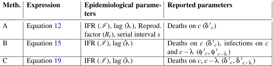
2.1.4 Aggregating the Methods
The three methods A, B and C provide different ways of estimating the actual number of carriers using different assumptions and balance of data vs studies. The expressions for number of carriersCiA,CiBand
CC
Meth. Expression Epidemiological parame-ters
Reported parameters
A Equation12 IFR (I), lag (λ), Reprod.
factor (Rt), serial intervals
Deaths onc(δ0c)
B Equation15 IFR (I), lag (λ) Deaths on c (δ0c), infections on c
andc−λ (φ0c,φ0c−λ)
C Equation19 IFR (I), lag (λ) Deaths onc,c−λ (δ0c,δ0c−λ)
Table 2. Summary of parameters required by each method
requirements for the three methods for considered dayc. In addition, all of these methods can optionally use the time to quarantinetq, if available.
In the absence of any reason to prefer one method over another, a straightforward way of aggregating these models is to take the mean of theCi values estimated by each method. However, there are a few
situations that may warrant a different approach:
• Historical data is unavailable/unreliable. In this case, Methods B and C cannot be used, and Method A should be chosen. However, if historical data for reported cases is available then Method B can be used and if historical data for reported deaths is available then Method C can be used.
• Estimates of reproductive factor Rt and serial interval s are not recent enough or are unreliable.
In this case, Method A cannot be used. In particular,Rtis quite sensitive to social distancing, and changes rapidly during the course of an epidemic. By the time estimates of Rt are obtained in studies, it is likely already reduced.
• The lag between infection and death is not small, or it is very early in the Epidemic.In this case, Method C cannot be used. When it is very early, the daily deaths are few and sometimes even zero.
When applying the model to a specific epidemic for a given area and time, we recommend evaluating which methods are likely to be valid, and only average the estimates for methods that are valid per guidance above in that area at that time according to the heuristic above.
3 Instantiating the Model for SARS-COV-2 (COVID-19)
We use our model to analyze the average infection probability and contacts budget for COVID-19 for a subset of US states – those that received a data quality grade A or higher by the Covid Tracking Project1. The model instantiates equation4and equation5. The value ofCiused in these equations will be taken
from a combination of12,15or19, guided by the discussion in section2.1.4and based on preliminary results below.
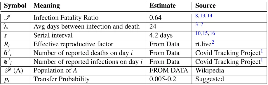
We assign some of the model parameters for Covid-19 based on results from previous studies, as follows.
Symbol Meaning Estimate Source
I Infection Fatality Ratio 0.64 8,13,14
λ Avg days between infection and death 24 3–7
s Serial interval 4.2 days 10,15,16
Rt Effective reproductive factor From Data rt.live2
δ0i Number of reported deaths on dayi From Data Covid Tracking Project1 φ0i Number of reported infections on dayi From Data Covid Tracking Project1
P (A) Population ofA FROM DATA Wikipedia
pt Transfer Probability 0.005-0.2 Suggested Table 3. Estimates for COVID-19 used, and their source
• Time from illness onset to death,λ. We estimate this by adding two periods: time from incubation
to illness onset, and time from illness onset to death. The mean incubation period for COVID-19 has been estimated as 5.1 days3and 5 days4. The mean time from illness onset to death in Wuhan, China has been estimated as 20 days5and 21 days6. Yang et al7estimate the time from illness onset to ICU admission as 11 days and from ICU to death as 7 days, for a mean of 18 days. Linton et al estimate it as 13 days, but 17 days if right-truncated4. Based on these estimates, we assign 5 days for the mean incubation period, and 19 days for time from illness onset to death. Adding these,we use lag between actual infection and deathλ = 24 daysfor our analysis.
• Reproductive factor Rt. Tindale et al estimate the reproductive factor as 1.97 (Singapore) and 1.87 (Tianjin)15. Shim et al17estimates it as 1.5 (South Korea) and Wu et al5as 1.8 (Wuhan). The meta study in11 estimates it as high as 3.28 for China. We note that these were early studies, andRt is
subject to a fair bit of variation based on social distancing and facial protection measures in place. Recently, the website rt.live2 has been tracking the effective reproductive factor on a daily basis for US states using up-to-date information. We shall use the numbers from rt.live for our analysis, taking the mid-point day between the considered day and the lagged day(i.e., consideredday -lag/2) to index theRt number.
• Serial interval. Studies on the serial interval for Covid-19 transmission vary from a mean of 3.96 days (China)10, a mean of 4.56 days (Singapore) and 4.22 days (Tianjin)15, and a median of 4 days with data sampled from across the world16. The estimates seem to have little variability. We take the mean of those numbers anduse serial interval s = 4.2 daysfor our analysis.
• Transfer probability, pt. This is hard to estimate because it depends on the duration and type of contact, and the Personal Protective Equipment (PPE) worn. We did not find any studies on estimating transmission probability for Covid-19. We have seen a value of 0.2 being used18, but this was without any scientific basis. We assume a range between 0.2 (sustained contact) and 0.005 (passing contact), and guesstimate this number for a given situation. The authors would appreciate any pointers to better estimations of pt.
Unless otherwise specified, we shall use the following defaults: Considered date: May 3, 2020;
Transfer probability: 0.1 (10%);Number of contacts: 100;Contact tracing/isolation: No;When isolated, time from infection to isolation: 5 days
To generate the results below, we have implemented the model in Python, which inputs downloaded data from the Covid Tracking Project and rt.live. We intend to make the code publicly available in due course.
3.1 Per-state Infection Probability and Contacts Budget
Table4shows the infection probability calculated by each of the three methods, and their average. The last column shows the contacts budget for a given comfort probability (averaged over the methods), i.e, how many contacts a person can afford to make if they want their infection probability to be below 5%. We have chosen to study only the 15 states with a data quality grade of A or A+ in the Covid Tracking Project website1.
State Method A Method B Method C Avg. Inf. Prob. (100 contacts)
Avg. Contacts Budg. (pc= 5%)
AZ 4.40% 7.07% 6.12% 5.87% 84 DC 57.61% 63.71% 83.44% 70.55% 4 GA 4.24% 6.92% 6.90% 6.03% 82 IL 15.25% 23.75% 17.88% 19.04% 24 IN 14.37% 17.47% 13.14% 15.01% 31 KS 2.66% 4.49% 1.45% 2.88% 175 KY 2.98% 2.85% 2.43% 2.75% 183 MD 19.11% 24.17% 29.86% 24.51% 18 MA 34.88% 46.29% 52.14% 44.88% 8 MI 12.22% 15.09% 14.43% 13.92% 34 MN 14.38% 28.06% 18.42% 20.50% 22 NJ 32.90% 35.76% 32.51% 33.74% 12 OK 2.21% 2.37% 1.62% 2.07% 245 OR 1.21% 1.67% 1.04% 1.31% 389 RI 38.37% 51.89% 76.71% 58.94% 5 VA 11.91% 20.32% 18.32% 16.93% 27 WI 2.84% 3.78% 1.78% 2.80% 180
Table 4. State-wise comparison of methods, averaged infection probabilities and contact budgets
There is a wide variation in infection probabilities across states: from 1.31% for Oregon to as much as 70.55% for DC – a factor of 53x. The difference in contacts budget is even higher between Oregon and DC – a factor of 97x. This shows thatindividual risk variation across regions is huge, much more than may be inferred from reported infection densities(the ratio of infection densities on the considered day between DC and OR is only 11x). Finally, among the states analyzed, small east coast states such as DC, Massachusetts, Rhode Island, and New Jersey are the top four riskiest states to live in as of the considered date. Thereforefor deeper studies and plots with selected states, we shall use these four states.
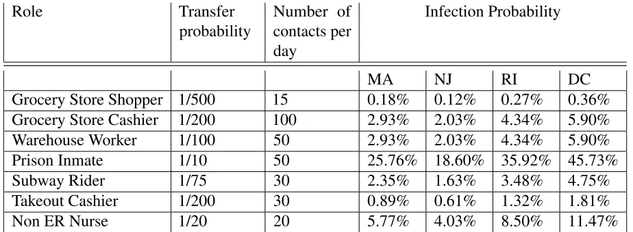
3.2 Infection Probabilities by Role
In Table5we take some example roles, and guesstimate values for per-contact infection transfer probability
pt and number of contactsm per dayfor those roles, and compute the infection probability.
Role Transfer probability
Number of contacts per day
Infection Probability
MA NJ RI DC Grocery Store Shopper 1/500 15 0.18% 0.12% 0.27% 0.36% Grocery Store Cashier 1/200 100 2.93% 2.03% 4.34% 5.90% Warehouse Worker 1/100 50 2.93% 2.03% 4.34% 5.90% Prison Inmate 1/10 50 25.76% 18.60% 35.92% 45.73% Subway Rider 1/75 30 2.35% 1.63% 3.48% 4.75% Takeout Cashier 1/200 30 0.89% 0.61% 1.32% 1.81% Non ER Nurse 1/20 20 5.77% 4.03% 8.50% 11.47%
Table 5. Per-day infection Probabilities by role and example estimates of transfer probability and number of contacts. The transfer probabilities are notional numbers guesstimated by the author based on how close and sustained a typical contact is, and admittedly very subjective.
We note that the pt andmare purely examples/guesstimates. We have no data to back up the numbers, and indeed it would be very difficult to do so. However, it is instructive to know what the infection probabilities would be given those numbers.
We observe that there is a large variation in risk across roles, more than might be expected. For instance,the risk of a grocery store cashier is predicted to be 16x more than that of a shopper, yet the amount of protection and care taken/given to each is nowhere in proportion- we routinely see grocery store cashiers with long shifts wearing a thin mask if at all, while shoppers come in with expensive masks and gloves and spend barely 15 minutes in the store. We also observe that the infection risk varies much more across professions than across states, although studies across a wider variety of states is needed to confirm this.
As will be discussed in more detail in section 3.4, the infection probability can be expressed as a function of the product of transfer probability and number of contacts. This explains why the Grocery store cashier and Warehouse worker have the same probabilities.
3.3 Studies
or for all states; therefore we shall focus our studies on the four riskiest states, namely DC, MA, NJ and RI, and when only one state can be picked, use MA, the author’s home state.
3.4 Comparing Methods
Figure1shows the infection probability as a function of number of contacts (left) and a function of transfer probability (right), for each of the methods for Massachusetts. The curves are concave (down) with a near-linear dependence at the lower ends of infection probabilities. Method C predicts the worst infection probability, which is not surprising since it uses death data alone. Death data has a 24-day lag, and MA as of the considered date was past its peak.
(a) (b)
Figure 1. Study of infection probability a function of number of contacts (a) and infection transfer probability (b)
It is interesting that the two sets of curves are almost identical. To see why, consider equation 4, restated below for convenience.
pi(m) =1−
1− Ci
P ·pt
m
(20)
For themand pt used, and all of the states considered, Ci
P·pt·m1, since the infection density is
very low. Therefore, the expression can be rewritten by virtue of thebinomial approximation19 as3
pi(m)≈1−
1− Ci
P ·pt·m
= Ci
P ·pt·m (21)
Thus,for low values of pt and m pi(m)depends nearly linearly on the product of m and pt. For two different sets of mand pt, ifm·pt is the same, the infection probability is nearly the same. Given the range of values on the x-axis, and the default values for pt andm(top of the chart), the product goes from
0 to 20 in each plot, yielding the same y-values.
3This may not be valid if applied to small towns with high infection density, or if we do the analysis for highp
Given this equivalence, we will only plot infection probability with respect to the number of contacts for the rest of the studies below with the understanding that replacing the x-axis with transfer probability should yield a very similar shape.
For all but the last set of plots below, we shall use the average of the three methods to compute the infection probability or contact budget. For the last set on historical evolution, we shall use only method A as it is the least dependent on data.
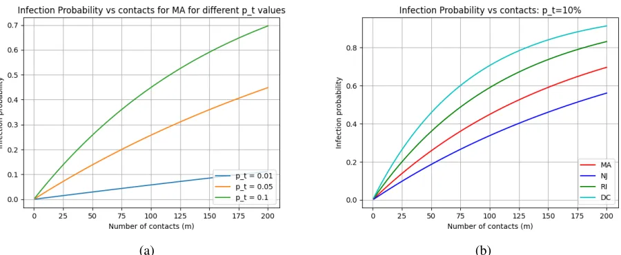
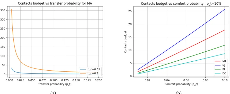
3.5 Dependence on Contacts and Transfer Probability
Figure2(a) shows that reducing transfer probability (via masks or other precautions) can have a significant impact. At low transfer probabilities, the dependence is almost linear, which again is a result of the observation in section3.4.
(a) (b)
Figure 2. Study of infection probability vs contacts and transfer probability
Figure2(b) shows the infection probability in terms of changes in transfer probability and across the top 4 riskiest states. The states maintain their infection probability risk rank (DC> RI> MA> NJ) across the range of contacts, which is not surprising. Further,the riskier a region is, the more non-linear is the growth in risk: for DC, doubling the contacts from 25 to 50 increases the risk about 1.9x whereas doubling the contacts from 100 to 200 increases it only 1.2x; this is not the case with NJ.
3.6 Effect of Contact Tracing and Isolation
All of the plots thus far assumed that there was no removal of symptomatic or known infections. Now we study the effect of isolating (quarantining) individuals 5 days after infection. This could be through, for example, symptom recognition or testing positive based on contacts.
Figure3(a) compares the infection probability for MA with and without quarantining 5 days after infection. We see a significant drop in infection probability. By inspecting figures3(a) and 2(a), we observe that for a transfer probability of 10%,isolation after 5 days is equivalent to cutting the transfer probability by an order of magnitude (10x).
Clearly, it is not realistic to expect 100% isolation and quarantining. Thus, the "real" number with contact tracing and isolation would be somewhere in between the two curves in Figure3(a).
(a) (b)
Figure 3. Study of infection probability as a function of days-to-quarantining after infection.
Thus, it appears that the riskier the state is (above a threshold), the more the "bang for the buck" for quarantining.
3.7 Contacts Budget for a given Comfort Probability
Thus far, we have focused on infection probability given the number of contacts (and other parameters). Now we look at the "reverse" question: suppose an individual is willing to take a certain amount of risk in terms of infection probability (comfort probability). Then, what is the maximum number of contacts that the individual can afford to make (contacts budget). The expression for contacts budget was derived in equation5.
(a) (b)
Figure 4. Study of contacts budget vs comfort probability
for whatever reason, the payoff in affordable contacts is only worth it if the transfer probability is low (e.g. if using effective masks).
In Figure4(b), the effect of increasing the individual risk tolerance is shown. We note that the order of the states is reversed in the plot, with NJ having the highest contact budget, which makes sense.It is sobering to observe that for a 2% comfort probability, which is likely at the high end of an individual’s risk tolerance, as few as 2-5 contacts can be made at a 10% transfer probability. However, a transfer probability of 10% likely not very common, especially with social distancing.
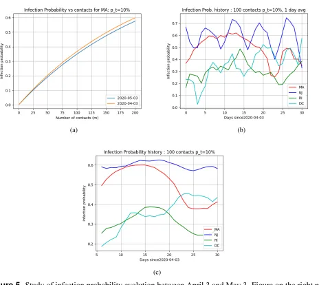
3.8 Evolution of Infection Probability
Figure5tracks how the infection probability evolved over the period of a month. For this, we simply ran the analysis by changing the "considered date" from April 3 to May 3, in increments of one day. We used only Method A as the other methods would "look back" 24 days for infection or death data, and data in early March was very sparse and unreliable.
(a) (b)
(c)
Figure 5. Study of infection probability evolution between April 3 and May 3. Figure on the right plots the 7-day moving average
a month. This is a bit misleading: COVID-19 was uptrending after April 3 for a while and starting coming down end of April and what we are seeing is two ends of a bell curve in a period where there was a lot of change. This can be seen in the MA curve in5(b) which shows the infection probability as a function of the number of days since April 3, 2020. Interestingly, while NJ appeared to be the least risky state on the considered date May 3, 2020 in the plots in the previous sections, it only achieves this position on the very last day4.
Figure5(c) shows the 7-day moving average of the infection probability plotted for each day starting from April 3. We use the 7-day moving average to smooth out cases where multiple days are combined together for reporting, or reporting on weekends may not capture all data. Interestingly, each state shows a different pattern. While NJ is about the same over the interval, MA and RI clearly show a peak, and that they are past it, while DC still appears to be uptrending. It appears thatthere can be considerable variety and variance in infection probabilities over time even among similarly affected states (e.g. ˜15% variation for NJ vs 50% for MA).
4 Conclusions
The model is based on a number of parameters whose values have been based on previous studies, and on reported data. Given the uncertainty in both of these, it goes without saying that the absolute numbers given in the paper have a wide uncertainty range. Further, the use of "mean-based" analysis (as opposed to using distributions) prevent us from characterizing the uncertainty.
Nonetheless, while theabsolutenumbers may not be very useful practically, we believe that quantifying therelativenumbers between two situations or regions, and broad relationships between parameters and the "shape" of curves are more resilient to the inherent uncertainty. Understanding these aspects may be useful and help inform individual or public health decisions, for example, in the allocation of resources. We summarize some of our insights below.
• The variation in infection risk and contacts budget across regions is huge, much more than may be inferred from reported infection densities. For example, on May 3 the ratio of reported infection densities between DC and Oregon (from the COVID tracking project) is only 11x. However, the infection probabilities differ by 53x and the contact budget by 97x.
• Using best-guess values (see section3.2) the risk of a grocery store cashier is predicted to be 16x than a shopper, yet the amount of protection an care taken/given to each is nowhere in proportion.
• Isolation within 5 days of infection for all infected individuals in a region is equivalent to cutting the transfer probability or number of contacts for a non-infected individual by at least 10x on average. This reinforces the generally accepted notion that contact tracing and isolation allows dramatically more mobility, enabling more sectors to "open up".
• If one wants to be more mobile and risk more contacts for whatever reason, the payoff in affordable contacts is only worth it if the transfer probability is low (e.g. if using effective masks).
• The riskier a region is, the more non-linear is the growth in risk: as an example, for DC, doubling the contacts from 25 to 50 increases the risk about 1.9x whereas doubling the contacts from 100 to 200 increases it only 1.2x; this is not the case with the less risky (as of May 3) NJ
• The riskier a region is (above a threshold), the more the "bang for the buck" for quarantining (e.g. after symptoms appearance or contact tracing) after 5 days.
• It is sobering to observe that for a 2% comfort probability, which is likely at the high end of an individual’s risk tolerance, as few as 2-5 contacts can be made in the riskiest states studied (at a 10% transfer probability).
• There can be considerable variety and variance in infection probabilities over time even among similarly affected states (e.g. ≈15% variation for NJ vs≈50% for MA)
• The infection probability is generally a concave function of number of contacts for a given transfer probability, with essentially linear increase at the low end. This also holds as a function of transfer probability for a given number of contacts.
• For most situations in an epidemic, and for most COVID-19 regions, the infection probability depends nearly linearly on theproductof number of contacts and transfer probability, which may lead to the concept of aquantaof exposure.
Acknowledgements
The author thanks Sudha Kapali for numerous discussions, and for suggesting the initial ideas behind Method C.
References
1. et al, K. C. The covid tracking project (2020). [Online; accessed 13-April-2020].
2. Kreiger, M. Effective reproductive factor (2020). [Online; accessed 30-April-2020].
3. Lauer, S. A.et al. The Incubation Period of Coronavirus Disease 2019 (COVID-19) From Publicly Reported Confirmed Cases: Estimation and Application. Annals Intern. MedicineDOI:10.7326/ M20-0504(2020). https://annals.org/acp/content_public/journal/aim/0/aime202005050-m200504.pdf.
4. Linton, N. M. et al. Incubation period and other epidemiological characteristics of 2019 novel coronavirus infections with right truncation: A statistical analysis of publicly available case data. J. Clin. Medicine9, DOI:10.3390/jcm9020538(2020).
5. Wu, J. T.et al. Estimating clinical severity of covid-19 from the transmission dynamics in wuhan, china. Nat. Medicine1–5 (2020).
6. Zhou, F.et al. Clinical course and risk factors for mortality of adult inpatients with covid-19 in wuhan, china: a retrospective cohort study. The Lancet395, 1054 – 1062, DOI:https://doi.org/10. 1016/S0140-6736(20)30566-3(2020).
7. Yang, X.et al. Clinical course and outcomes of critically ill patients with sars-cov-2 pneumonia in wuhan, china: a single-centered, retrospective, observational study. The Lancet Respir. Medicine
(2020).
9. Wikipedia contributors. Serial interval — Wikipedia, the free encyclopedia (2020). [Online; accessed 10-April-2020].
10. et al, D. Serial interval of covid-19 among publicly reported confirmed cases. Emerg Infect Dis
(2020).
11. Liu, Y., Gayle, A. A., Wilder-Smith, A. & Rocklöv, J. The reproductive number of COVID-19 is higher compared to SARS coronavirus. J. Travel. Medicine27, DOI:10.1093/jtm/taaa021(2020). Taaa021,https://academic.oup.com/jtm/article-pdf/27/2/taaa021/32902430/taaa021.pdf.
12. Bar-On, Y. M., Flamholz, A., Phillips, R. & Milo, R. Sars-cov-2 (covid-19) by the numbers. eLife9, e57309, DOI:10.7554/eLife.57309(2020).
13. et al, V. Estimates of the severity of covid-19 disease. medRxivDOI:10.1101/2020.03.09.20033357
(2020). https://www.medrxiv.org/content/early/2020/03/13/2020.03.09.20033357.full.pdf.
14. Roques, L., Klein, E., Papaix, J., Sar, A. & Soubeyrand, S. Using early data to estimate the actual infection fatality ratio from covid-19 in france. medRxiv(2020).
15. Tindale, L. et al. Transmission interval estimates suggest pre-symptomatic spread of covid-19.
medRxivDOI:10.1101/2020.03.03.20029983(2020). https://www.medrxiv.org/content/early/2020/ 03/06/2020.03.03.20029983.full.pdf.
16. Nishiura, H., Linton, N. M. & Akhmetzhanov, A. R. Serial interval of novel coronavirus (covid-19) infections. Int. J. Infect. Dis.93, 284 – 286, DOI:https://doi.org/10.1016/j.ijid.2020.02.060(2020).
17. Shim, E., Tariq, A., Choi, W., Lee, Y. & Chowell, G. Transmission potential and severity of covid-19 in south korea. Int. J. Infect. Dis. 93, 339 – 344, DOI: https://doi.org/10.1016/j.ijid.2020.03.031
(2020).
18. 3blue1brown Youtube Video. Simulating an epidemic (2020). [Online; accessed 13-April-2020].