Statistical graphing in spreadsheets
Zhong Guan
Department of Mathematical Sciences
Indiana University South Bend PO Box 7111
South Bend IN 46634 USA
Spreadsheet program such as Microsoft Excel™ is one of the most useful software
packages for doing simple statistical analysis. However some commonly used statistical techniques are not implemented in it. In particular some useful visualisation methods are not included in the chart wizard. In this article, the procedures to create box and whisker plot, q-q plot and the graphs of step functions using spreadsheets is described.
Introduction
Technology plays very important role in teaching statistics. Visualisation methods are sometimes more than necessary for displaying data and results of statistical analysis. In introductory courses of statistics, instructor may choose some commercial statistical packages like Minitab, SAS, Splus, and SPSS or free software like R. Although these are very powerful packages, in order to use them in teaching, the instructors have to spend some time teaching their students how to use them. For some students who have no experience in programming, this might be very frustrating. Moreover, due to the access restriction to these software and necessity of learning specialised statistics packages for some group of students, one would use Microsoft Excel™ which is one of the most versatile and
easy-to-learn software applications. Using Excel, students with no programming experience can create professional statistical graphs.
There are many sources either online or offline which give useful guidelines for using Excel to teach and to do statistics. Among many others, Warner and Meehan (2001) reported how they successfully integrated Excel into introductory statistics courses and that they have developed a tutorial manual to guide students through various statistical procedures in Excel. The Department of Physics and Astronomy at Clemson University hosts an online tutorial for using Excel
[http://phoenix.phys.clemson.edu/tutorials/excel/index.html].
There are numerous chart types available in Excel. For example, the bar chart can be used to plot a histogram; scatter plot can be used to graph data, the regression line, and residual plot in simple regression analysis. However the most popular statistical graph, so called ‘box and whisker plot’ which was invented by Tukey (1977), is not implemented in Excel. Hunt (1996) published a procedure for creating simplified box plot in the absence of outlier in Excel. Some people have improved its appearance so that it looks similar to the ones created by the specialised statistics packages. But it seems that no one has developed a method to construct the box and whisker plot in the presence of outliers in Excel. Another drawback of Excel is the lack of chart type for graphing step functions. In the application of statistics, sometimes one needs to show the graph of an empirical distribution which is a step function and one of the most import nonparametric estimates of the population distribution. Comparison between the empirical and the hypothesised distribution is a visualisation of Kolmogorov-Smirnov (K-S) goodness of fit test. Instead of doing goodness of fit tests such as Kolmogorov-Smirnov test based on empirical distribution, people would like to use a q-q plot to visualise how well the data are fitted by a theoretical model. There is no Excel
built-in chart type which can create the q-q plot directly.
In this note, a procedure for creating a box and whisker plot in the presence of outliers in Excel will be described. Some guidelines for graphing step functions using empirical distribution and the confidence ban as examples and the q-q plots will also be given.
Box and Whisker Plot in the presence of outliers
Let q0, q1, q2, q3, and q4 be the five number summary of a sample X1, X2, …, Xn.
That is q0 = min(Xi), q4 = max(Xi), q2 = median(Xi) and q1 and q3 are the second
interquartile range IQR = q3 - q1; the lower inner fence =
q1 - 1.5·IQR; the upper inner fence = q3 + 1.5·IQR; the
lower outer fence = q1 - 3·IQR; and the upper outer fence
= q3 + 3·IQR. Define
q
0* as the minimum observation within the inner fence andq
4* as the maximum observation within the inner fence. The suspected outlier or mild outlier is the observation which is within inner fences and is either less thanq
0* or greater thanq
*4. The outlier or extreme outlier is the observation which is either less than lower outer fence or greater than upper outer fence.The dataset shown in Table 1 contains three samples labeled by A, B, and C. The interquartile ranges and fences are calculated easily using formulae. Then the suspected outliers and outliers for each group of observations can be found.
Next one can create the following Table 2 which contains data needed for constructing the box and whisker plots with outliers. In this table “s.out.” represents suspected outlier and “out.” represents outlier.
Table 1. Dataset containing three samples and inner and outer fences for the three samples
A: 42 61 75 81 87 88 90 91 92 93 94 109 112 122
B: 51 62 70 71 72 73 74 75 77 80 87 107 113
C: 42 72 73 75 79 80 82 84 87 88 93 103 125 133
Interquartile Inner Fence Outer Fence
Range lower upper lower upper
A: 11.25 64.1 109.9 47.3 126.8
B: 9.00 57.3 91.25 43.8 104.8
C: 15.75 51.4 111.6 27.8 135.3
Table 2. Data for box and whisker plot with outliers
Statistic Group A Group B Group C
q1 82.5 71 76
q0* 75 62 72
q2 90.5 74 83
q4* 109 87 103
q3 93.75 80 91.75
s.out.1 61 51 42
s.out.2 112 125
s.out.3 122 133
out.1 42 107
out.2 113
Step 1
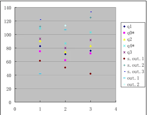
Highlight Table 2 in your spreadsheet and click on “Chart Wizard” and choose “XY(Scatter)” Chart Type from “Standard Types”. Then check “Series in: Rows” and click “Finish”. This results in the graph shown in Figure 1.
0 20 40 60 80 100 120 140
0 1 2 3 4
q1 q0* q2 q4* q3 s.out.1 s.out.2 s.out.3 out.1 out.2
Step 2
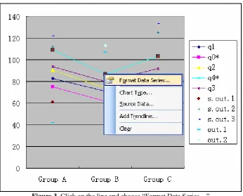
Then change Chart Types of q1, q0*, q2, q4* and q3 to the default sub-type of "Line" type by right click on one of the points and choosing “Chart Type”. The resulting graph is shown in Figure 2.
0 20 40 60 80 100 120 140
Group A Group B Group C
q1 q0* q2 q4* q3 s.out.1 s.out.2 s.out.3 out.1 out.2
Figure 2. Change “Chart types” or q1, q0*, q2, q4* and q3 to “Line”
Step 3
Right click on one of the lines and choose “Format Data Series…” as follows as shown in Figure 3.
Figure 3. Click on the line and choose “Format Data Series…”
Step 4
0 20 40 60 80 100 120 140
Group A Group B Group C
q1 q0* q2 q4* q3 s.out.1 s.out.2 s.out.3 out.1 out.2
Figure 4. Adding “High-low lines” and “Up/down bars” and increasing the “Gap Width” in “Options”
Step 5
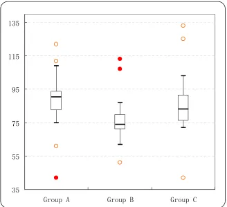
Right click on the lines again and go to “Patterns”. Check “None” for “Line”. In “Marker” area, check “None” for q1 and q3, check “Custom” and choose “style” “—“ for q0*, q2 and q4*. One can also change “Foreground” and “Background” colours for the marker. Increase the size of the marker for q2 to 14. Similarly one can change marker styles of outliers and suspected outliers. “Clear” the legend, change the style of gridlines, modify the scale of vertical axis and so on. Finally the following box and whisker plot is obtained which looks like the one created by a specialised statistical package.
35 55 75 95 115 135
Group A Group B Group C
Empirical Distribution and K-S Goodness of Fit
tests
Consider the test of the null hypothesis that the underline population distribution function F(x) equals a continuous distribution function F0(x). That is to test H0: F(x) = F0(x)
against H1: F(x)
≠
F0(x). Given a sample x1 , x2 ,…, xnfromF(x) the empirical distribution is
Fn(x) = # ( i : xi
≤
x )/ n, -∞
< x <∞
.The Kolmogorov-Smirnov test statistic is
Dn = max{ | Fn(x) - F0(x) | : -
∞
< x <∞
}= max{ | i/n - F0(yi) |, | (i -1)/n - F0(yi) |, 1
≤
i≤
n}where y1, y2 ,…, ynare the order statistics of x1 , x2 ,…, xn .
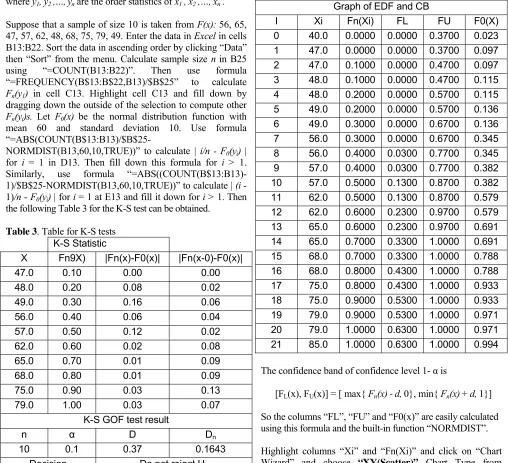
Suppose that a sample of size 10 is taken from F(x): 56, 65, 47, 57, 62, 48, 68, 75, 79, 49. Enter the data in Excel in cells B13:B22. Sort the data in ascending order by clicking “Data” then “Sort” from the menu. Calculate sample size n in B25 using “=COUNT(B13:B22)”. Then use formula “=FREQUENCY(B$13:B$22,B13)/$B$25” to calculate
Fn(y1) in cell C13. Highlight cell C13 and fill down by
dragging down the outside of the selection to compute other
Fn(yi)s. Let F0(x) be the normal distribution function with
mean 60 and standard deviation 10. Use formula
“=ABS(COUNT(B$13:B13)/$B$25-NORMDIST(B13,60,10,TRUE))” to calculate | i/n - F0(yi) |
for i = 1 in D13. Then fill down this formula for i > 1. Similarly, use formula “=ABS((COUNT(B$13:B13)-1)/$B$25-NORMDIST(B13,60,10,TRUE))” to calculate | (i -1)/n - F0(yi) | for i = 1 at E13 and fill it down for i > 1. Then
the following Table 3 for the K-S test can be obtained.
Table 3. Table for K-S tests
K-S Statistic
X Fn9X) |Fn(x)-F0(x)| |Fn(x-0)-F0(x)|
47.0 0.10 0.00 0.00
48.0 0.20 0.08 0.02
49.0 0.30 0.16 0.06
56.0 0.40 0.06 0.04
57.0 0.50 0.12 0.02
62.0 0.60 0.02 0.08
65.0 0.70 0.01 0.09
68.0 0.80 0.01 0.09
75.0 0.90 0.03 0.13
79.0 1.00 0.03 0.07
K-S GOF test result
n α D Dn
10 0.1 0.37 0.1643
Decision Do not reject H0
In Table 3, α is the significance level, d is the critical value for K-S statistic which can be found from tables in many textbooks of statistics (see for example, Table VIII on Page 694 of Hogg and Tanis, 2006), and Dn is the K-S statistic
calculated by “=MAX(D13:D22,E13:E22)”. One failed to reject the null hypothesis H0: F(x) = F0(x) because Dn < d.
In order to graph the empirical distribution function and confidence band, it might be needed to create several columns. First, create column “I” containing numbers 0 ~ (2n+1). Second, create column “Xi”, fill the top cell with a number which is a little smaller than the smallest value y1and
fill the bottom cell with a number which is a little greater than the largest value yn. Third, create column “Fn(Xi)” with
the top two cells are filled with 0 and the other cell H15, for example, is filled by formula “=INDEX(C$13:C$22, FLOOR((1+F14)/2, 1),1)” (see the Table 4). Then one gets the following Table 4.
Table 4. Data needed to plot empirical distribution function and confidence band
Graph of EDF and CB
I Xi Fn(Xi) FL FU F0(X)
0 40.0 0.0000 0.0000 0.3700 0.023
1 47.0 0.0000 0.0000 0.3700 0.097
2 47.0 0.1000 0.0000 0.4700 0.097
3 48.0 0.1000 0.0000 0.4700 0.115
4 48.0 0.2000 0.0000 0.5700 0.115
5 49.0 0.2000 0.0000 0.5700 0.136
6 49.0 0.3000 0.0000 0.6700 0.136
7 56.0 0.3000 0.0000 0.6700 0.345
8 56.0 0.4000 0.0300 0.7700 0.345
9 57.0 0.4000 0.0300 0.7700 0.382
10 57.0 0.5000 0.1300 0.8700 0.382
11 62.0 0.5000 0.1300 0.8700 0.579
12 62.0 0.6000 0.2300 0.9700 0.579
13 65.0 0.6000 0.2300 0.9700 0.691
14 65.0 0.7000 0.3300 1.0000 0.691
15 68.0 0.7000 0.3300 1.0000 0.788
16 68.0 0.8000 0.4300 1.0000 0.788
17 75.0 0.8000 0.4300 1.0000 0.933
18 75.0 0.9000 0.5300 1.0000 0.933
19 79.0 0.9000 0.5300 1.0000 0.971
20 79.0 1.0000 0.6300 1.0000 0.971
21 85.0 1.0000 0.6300 1.0000 0.994
The confidence band of confidence level 1- α is
[FL(x), FU(x)] = [ max{ Fn(x) - d, 0}, min{ Fn(x) + d, 1}]
So the columns “FL”, “FU” and “F0(x)” are easily calculated using this formula and the built-in function “NORMDIST”.
Highlight columns “Xi” and “Fn(Xi)” and click on “Chart Wizard” and choose “XY(Scatter)” Chart Type from “Standard Types”. Then select the “Chart Sub-type: Scatter with data points connected with lines (with or without markers)”. Then the graph of empirical distribution function can be created by clicking on “Finish”. After adding “Series” by right clicking the line and choosing “Source Data …”, the graphs of FL(x), FU(x), and F0(x) can be added. The “X
Empirical Distribution and Confidence Band
-0.2 0.0 0.2 0.4 0.6 0.8 1.0 1.2
35.0 45.0 55.0 65.0 75.0 85.0
x
Fn
(x
)
Fn(x) FL FU F0(x)
Figure 6. Graphs of empirical cdf and confidence band
The q-q plot
Using the above data, one can easily construct the q-q plot which is usually used to visualise the goodness of fit of a theoretical model F0(x) to a sample data. For r = 1, 2, …, n,
let πrbe the r/(n + 1) quantile of the theoretical distribution
F0(x). That is, πr satisfies F0(πr) = r/(n + 1) . The so called q-q
plot is a scatter plot of πr versus yr(Hogg and Tanis 2006,
chapter 3). If F0(x) is the true population distribution function,
then the points in the q-q plot should scattered closely to the diagonal line. That is πr
≅
yrfor all r. Suppose that the sorteddata values are put in cells A7:A16 and the sample size n is stored in B5. Then the cell, say B7, in column “πr”can be
filled by formula
“=NORMINV(RANK($A$7:$A$16,$A$7:$A$16,1)/($B$5+ 1), 60, 10)”. One should get the Table 5 below.
Table 4. Data for q-q plot
Theoretical Distribution F0(x):N(60,100) N=10
yr πr
47.0 46.6 48.0 50.9 49.0 54.0 56.0 56.5 57.0 58.9 62.0 61.1 65.0 63.5 68.0 66.0 75.0 69.1 79.0 73.4
Using “XY(Scatter)” Chart Type, one can create the following q-q plot in which the diagonal line is drawn by adding “Series” with “X Values” and “Y Values” being the same, the “yr” column.
The q-q plot
40 45 50 55 60 65 70 75 80 85 90
40.0 50.0 60.0 70.0 80.0 90.0
Sample Quantile
T
h
e
o
re
ti
cal
Qu
an
ti
le
q-q plot Diagonal Line
Sample Excel worksheet files are available from the author upon request by providing an email address.
References
Hogg, R.V. and Tanis, E.A. (2006) Probability and Statistical Inference, 7th edition, Pearson Prentice Hall: Upper Saddle
River, NJ.
Hunt, N. (1996) Boxplots in Excel, The Spreadsheet User, 3(2).
Shuquin, Y. (2005) Applications of Excel in teaching Statistics,
CAL-laborate, 14, UniServe Science.
Tukey, J.W. (1977) Exploratory Data Analysis, Addisson-Wesley.Warner, C.B. and Meehan, A.M. (2001) Microsoft
Excel™ as a Tool for Teaching Basic Statistics, Teaching