Abstract
CHU, TZU-MING. STATISTICAL NONPARAMETRIC AND LINEAR MIXED
MODEL ANALYSES OF OLIGONUCLEOTIDE DNA CHIPS DATA. (Under the directions of Professors Bruce Weir and Russ Wolfinger)
Scientists investigate the dynamic relationships among genes and the associated phenotypes through gene expression array (microarray) studies. An essential step in the tasks is to identify the genes that actually interact with the
phenotypic outcomes. This dissertation focuses on the selection of informative genes with statistical approaches.
In chapter one, a nonparametric approach that combines the Bootstrap resampling method and the Kruskal-Wallis test (the BKW test) for gene selection is discussed. Principal component and clustering analyses are performed for
disease multi-type classification. In chapter two, steps are outlined and described for a statistically rigorous approach to analyzing probe-level
different ways or ignored altogether. In chapter three, an empirical comparison of the linear mixed model and the Li-Wong's multiplicative model is presented
for a real data set, and it is found that the models perform quite similarly across most genes, but with some interesting and important distinctions. Results are
also presented from a simulation study designed to assess inferential properties of the models, and a modified test statistic is presented for the Li-Wong model that provides an improvement in Type I error control.
The analysis approaches discussed here are applied to the data from oligonucleotide DNA chips. However, the concepts are also applicable to the
STATISTICAL NONPARAMETRIC AND LINEAR MIXED MODEL ANALYSES OF OLIGONUCLEOTIDE DNA CHIPS DATA
by
TZU-MING CHU
A dissertation submitted to the Graduate Faculty of NORTH CAROLINA STATE UNIVERSITY
in partial fulfillment of the requirements for the Degree of
Doctor of Philosophy
STATISTICS
RALEIGH 2002
APPROVED BY:
Bruce S. Weir
Co-chair of Advisory Committee
Russell D. Wolfinger Co-chair of Advisory Committee
Biography
Tzu-Ming Chu was born in Taipei, Taiwan, to parents Peng-Cheng Chu and
Su-Mei Tsao on May 31, 1968. He received a B.S. in Mathematics from National Tsing Hua University, Taiwan, in 1990 and a Master in Statistics from Michigan
State University in 1996. Since August 1996, he has studied for the doctoral degree in the Department of Statistics with concentration in Bioinformatics at North Carolina State University, under the supervision of Drs. Bruce Weir and
Acknowledgements
My gratitude goes to my co-advisors, Drs. Bruce Weir and Russell
Wolfinger, for their guidance, support, and mentoring in the beginning of my research journey. Dr. Weir's enthusiasm in Bioinformatics inspired me to enter
the field of genomic research. Dr. Wolfinger's thorough insights in our discussions not only provided direction for my dissertation work but also broadened my knowledge in both of the fields of Statistics and Bioinformatics. It
is truly my honor and pleasure to work with them. I would also like to express my appreciation to my dissertation committee, Drs. Roger Berger, Jeffery Throne,
and Anastasios Tsiatis, for their helpful suggestions.
There are many people who have helped me during my dissertation work. Dr. John Brocklebank, the former director of the Data Mining group at SAS
Institute Inc., gave me an internship and encouraged me to work on microarray data analysis in 2000. Wendy Czika, my colleague in Genomics department in
addition, the irradiation GeneChipTM data from Stanford University applied in this dissertation were provided by Virginia Tusher, Gilbert Chu, and Robert
Tibshirani. I thank them for allowing me to use their data.
I am grateful to the former and current faculty, students and staff in the
Statistics department and Bioinformatics Research Center for their valuable discussions and help. Special recognition goes to Drs. Ying-Hsuen Sun and Pei-Yun Chen, former students in the Forestry and Statistics departments,
respectively. Dr. Sun is one of my good friends and was the first person who set up a microarray lab at NCSU. He provided me with my first experience with
microarrays. Dr. Chen and I have known each other since we were research assistants in Academia Sinica in Taiwan in 1997. Dr. Chen is often the first audience for my thoughts and ideas and always listens with patience and interest.
Finally, I greatly appreciate my parents and my wife with all my heart. My parents, Peng-Cheng and Su-Mei, always support me unconditionally. My wife,
Contents
List of Tables ix
List of Figures x
1 A Filtering Method of Gene Expression Data for Multi-Type
Disease Classification 1
1.1 Introduction .……….…. 1
1.2 Filtering Method ………..… 3
1.3 Simulation Study – Parametric vs. Nonparametric Tests ...….. 8
1.3.1 Candidate Gene Selection …..………... 9
1.3.2 Simulation by the Normal, Lognormal, and Gamma
Distribution without Outliers ….……….. 9 1.3.2.1 Scenario 1 – Same Sample Size as Training
Data Set ………. 11
1.3.2.2 Scenario 2 – Small Sample Size ...……….… 11
1.3.3 Simulation with an Outlier Involved ... ….…………... 12
1.4 Clustering Analyses ……….. 12
1.4.2 Clustering Analysis on Array Samples ………. 14
1.4.2.1 Example of Highly Unbalanced Number of Genes among Gene Clusters ……….. 15
1.5 Discussion ………. 16
2 A Systematic Statistical Linear Modeling Approach to Oligonucleotide Array Experiments 30 2.1 Introduction ……… 30
2.2 Analysis Steps ……… 32
2.2.1 Identify the Experimental Design ……….. 32
2.2.2 Extract Numerical Data from the Image ……… 33
2.2.3 Formulate and Fit a Statistical Model ……… 33
2.2.4 Check Assumptions, Remove Outliers, Reformulate and Refit the Model if Necessary ……….. 37
2.2.5 Perform Basic Statistical Inference and Filter Out Insignificant Genes ……… 38
2.2.6 Perform Additional Analyses of Statistically Filtered Data ………. 38
2.3 Ionizing Radiation Example ……….. 39
2.3.1 Identify the Experimental Design ……….. 39
2.3.2 Extract Numerical Data from the Image ……… 40
2.3.4 Check Assumptions, Remove Outliers, Reformulate and Refit the Model if Necessary ……… 41 2.3.5 Perform Basic Statistical Inference and Filter Out
Insignificant Genes ……… 43
2.3.6 Perform Additional Analyses of Statistically
Filtered Data ……….. 47
2.4 Discussion ………. 47
3 Comparisons of Li-Wong and Loglinear Mixed Models for the
Statistical Analysis of Oligonucleotide Arrays 58
3.1 Introduction ……… 58
3.2 The Ionizing Radiation Data and Associated Li-Wong and
Mixed Models ……… 60
3.3 Results from Ionizing Radiation Data …..………. 62
3.3.1 Goodness-of-fit ……….……… 62
3.3.2 Normality Diagnosis and Outlier Detection ………. 64
3.4 A Simulation Study ………..………. 65
3.4.1 Scenario 1 – [LW] is the True Model ……… 66
3.4.2 Scenario 2 – [MM] is the True Model ….………….. 67
3.4.3 Simulation Results ……….………… 68
3.5 Discussion ………. 69
References 77
List of Tables
1.1 Number of array samples for various disease types ……….. 18
1.2 Parameter estimates for three distributions ……… 18
1.3 Simulation results of scenario 1 ………. 19
1.4 Simulation results of scenario 2 ………. 20
1.5 Type I error with one outlier ……….…. 21
1.6 Classification results of Golub et al. (1999) and the BKW method . 21 2.1 Design layout (within a gene) ……… 48
2.2 Most significantly induced genes ……….. 49
2.3 Most significantly repressed genes ……… 50
3.1 Experimental design for the ionizing radiation data ……….. 71
3.2 Testing results assuming [LW] as true model ………... 71
List of Figures
1.1 Histogram of sample means of all genes in ALL groups ………….. 22 1.2 Histogram of sample standard errors of all genes in ALL groups …. 22 1.3 Histogram of candidate gene with fitted Normal, Lognormal, and
Gamma distribution curves ……… 23
1.4 Power curves of t- and Kruskal-Wallis tests under Normal,
Lognormal, and Gamma distributions ………... 24 1.5 Simulated Type I error curves with one outlier in data ………. 25 1.6 Line plot of average standardized expression levels for clusters of
genes in two-type disease classification ……… 26 1.7 Line plot of average standardized expression levels for clusters of
genes in three-type disease classification ……….. 27 1.8 Grid plot of expression levels for significant genes in two-type
disease classification ……….. 28
1.9 Grid plot of expression levels for significant genes in three-type
2.1 Scatter plots of 4 experimental effects between 2 replicate arrays
before (top 4) and after (bottom 4) standardization ………... 51 2.2 A. Standardized residual plots for gene 1000, 2000, 3000, 4000,
5000 and 6000 from Model I ………... B. "Submarine plots" of standardized residuals of all genes from
Model I ..……….. C. "Submarine plots" of standardized residuals of all genes from
Model II ………..
D. "Submarine plots" of standardized residuals of all genes from Model III ……….
52
52
52
52
2.3 Histogram of R2 values from Model I for all genes excluding 160
genes that have 1/5 data missing ……….. 53
2.4 A. "Volcano" plots of cell line, treatment, and cell line-treatment
interaction effect among Models I (top row), II (middle row), and III (bottom row) for all genes ………
B. Significance plots of the probe and its interaction effects
applying Model I for all genes ………. C. Significance plots of the covariate effect applying Model I …....
54
54 54
2.5 A. Significant cell line-probe interaction in gene 7104 (X3068) …. B. Significant treatment-probe interaction in gene 2789 (U14518)
55 55
B. Probe profiles of gene 3270 (U47621 ………. 56
2.7 A. Scatter plots for comparing the negative log p-values (top row) and estimates (bottom row) of treatment effect among Model I, II, and III ………
B. Probe profile of gene 1610 (L42176) ………. 57
57 3.1 A. Scatter and regression plot of prediction from [LW] and [MM]
B. Scatter plot of R2 comparison ………. 72
72 3.2 A. Expression profiles from gene 3096 (U35451) ………
B. Profiles from gene 1860 ( M25753) ……… 73 73
3.3 A. Pooled standardized residual plots of [LW] ……… B. Pooled standardized residual plots of [MM] ………
C. Standardized residual plots of 8 genes ……… 74 74
74 3.4 A. Histogram of the logarithm transformed estimates of the
random components from [MM] and [LW] ……….
B. Expression profile from gene 2863 (U18300) ………. 75
Chapter 1
Nonparametric Filtering of Gene Expression Data for
Multi-Type Disease Classification
1.1
Introduction
The technology of gene expression arrays, also known as microarrays, was a
breakthrough developed at the end of last century that allows researchers to
perform a single experiment on thousands of genes simultaneously (Schena et al.,
1995; Lockhart et al., 1996). Major applications of expression array technology
include monitoring transcriptional activity throughout the cell cycle and finding
the signature genes characterizing different cell types. The results of studies using
expression array technology enable us to explore the functionalities and
interactions of genes on a genome scale. A tremendous amount of data,
containing information from thousands of genes, is generated from the expression
array studies. To convert the data into statistically significant evidence and then
Identifying signature genes plays an important role in disease type
classification, which in turn is crucial for diagnosis and effective treatment for
complex diseases. In general, the first problem encountered is how to extract
sufficient information from all the genes in the experiments. In microarray
studies, the proportion of genes relevant for the biological event of interest is
often low. This leads to issues about setting a good filtering rule in order to select
informative genes. Some methods (Golub et al., 1999; Dudoit et al., 2000a) have
been discussed for the selection of informative genes. However, discussions
about the number of informative genes to be selected have been somewhat
arbitrary. Here, we propose a filtering method that combines bootstrap
resampling and the Kruskal-Wallis test (the BKW test) to select informative genes
without restricting the total number of genes to be selected. The next steps are to
group informative genes into clusters, and to classify array samples into different
disease types. Clustering analysis is one of the most general approaches for
classification. We perform k-means clustering analyses on both the disease
samples and the selected genes. Results of clustering analyses by using the
informative genes selected from the BKW test as inputs show correct
classification rates of at least 92% for the data sets used in this study.
Two data sets, which were collected using Affymetrix Hu6800 GeneChips
(Lipshutz et al., 1999; Lockhart et al.,1996; McGall et al., 1996), from Golub et
al. (1999) are studied here for classifying different subtypes of acute leukemia.
proliferate in an excessive amount and lose their normal functionality within a
short period of time. Acute leukemia can generally be divided into two
categories: acute lymphoblastic leukemia (ALL) and acute myeloid leukemia
(AML). Moreover, ALL is divisible into two subtypes, B-lineage ALL and
T-lineage ALL (McConkey, 1993). The initial steps for successful and effective
treatment for acute leukemia are to differentiate ALL from AML and to recognize
the relevant subtypes (Cripe, 1997). Patients with different subtypes of acute
leukemia need different therapies (Bishop, 1997; Wrzesien-Kus, 1997).
Therefore, accurate classification of leukemia subtypes, or other diseases, using
expression array data would be a substantial achievement in biomedical studies.
In our study, the data set with 38 array samples is used as the training data
set, and the other set with 34 array samples is used as the test data set. Each of
the array samples corresponds to one leukemia patient. Table 1.1 displays the
number of each subtype for both data sets. Simulations were conducted to
compare Kruskal-Wallis test and its normal-theory competitor, the t-test,
considering two subtypes in data. The Type I error and power of the two tests
will be discussed. Data with or without outlier are considered in simulations.
1.2
Filtering Method
Obtaining a good filtering rule is the first and crucial step prior to further data
analyses, such as clustering analysis, for disease type distinction and disease
number of genes to be investigated and to increase the accuracy of disease type
distinction. For this task, researchers wish to select genes with expression profiles
correlated to the disease types as highly as possible. However, they tend to
increase the number of selected genes in order to reduce the risk of losing
information from potential disease genes. Golub et al. (1999) suggested a
t-test-like neighborhood analysis for two-type disease classification. In their study,
1,100 genes were highly correlated with ALL-AML class distinction, and the 50
most closely correlated genes were selected for further classification. Several
questions arise regarding the number of genes used for classification analysis, the
selection criterion of genes, and whether the selection method is applicable to
multi-type disease classification. Will we lose some information by using the 50
most correlated genes for ALL-AML class distinction instead of using all 1,100
significant genes? How many genes should be included for succeeding
classification? In addition, is the 50-gene selection rule applicable to other
classification for other diseases? Furthermore, the micro-level sensitivity of the
GeneChip platform often results in data containing outlying observations due to
such factors as dust and tiny scratches. It is also not obvious that the data follow
standard parametric assumptions used, for example, with a t-test.
To address these issues, we consider the well-known Kruskal-Wallis test
Here, KWi is the Kruskal-Wallis statistic for the ith gene, L is the number of
disease subtypes, Ri(l) is the average rank for the ith gene in the lth subtype, and nl
is the sample size for subtype l. The standard, asymptotically valid, p-value for
this test is computed as
)
Pr( 2
1 i
L
i KW
p = χ − > ,
where 2 1
− L
χ is a chi-square random variable with L-1 degrees of freedom.
To take a more modern approach and adjust for potential small-sample
biases, we compute p-values based on the bootstrap. Specifically, suppose that
ú ú ú ú ú û ù ê ê ê ê ê ë é pN p p N N Y Y Y Y Y Y Y Y Y ... . . ... ... . . . . ... ... 2 1 2 22 21 1 12 11
is the original data set in which Yij is the expression measurement of the ith gene in
the jth array, N is the number of arrays, and p is the number of genes. From these
data, we generate K bootstrap resamples, and denote the kth resampled data set as
ú ú ú ú ú ú û ù ê ê ê ê ê ê ë é ) ( ) ( 2 ) ( 1 ) ( 2 ) ( 22 ) ( 21 ) ( 1 ) ( 12 ) ( 11 ... . . ... ... . . . . ... ... k pN k p k p k N k k k N k k Y Y Y Y Y Y Y Y Y ,
where (k)
ij
Y has been sampled with replacement from {Yi1, Yi2, …, YiN}. For each
ú ú ú ú ú ú û ù ê ê ê ê ê ê ë é ) ( ) ( 2 ) ( 1 ) ( 2 ) ( 22 ) ( 21 ) ( 1 ) ( 12 ) ( 11 ... . . ... ... . . . . ... ... k pN k p k p k N k k k N k k R R R R R R R R R ,
where {Ri(1k),Ri(2k),...,RiN(k)}are the ranks of { , ( ),..., ( )}
2 ) ( 1 k iN k i k
i Y Y
Y for the ith gene. We
then calculate the Kruskal-Wallis statistic for each gene in each resampled data
set according to its associated rank data set:
2 1 ) ( ) ( ) ( ) 2 1 ( ) 1 ( 12
å
= − + + = L l k l i l k i N R n N N KWHere KWi(k) is the Kruskal-Wallis statistic for the ith gene in the kth resampled set,
L is the number of disease subtypes, ( ) ) (kl i
R is the average rank for the ith gene in
the lth subtype in the kth resample, and nl is the sample size for subtype l.
We can thus simulate from the bootstrap sampling distribution of the
Kruskal-Wallis statistic for each gene, and can compare KWi to this distribution
to assess its significance. In particular, the fraction of KWi(k) greater than KWi is
an approximate p-value.
To select a filtered set of genes for clustering, one is faced with the
classical multiple testing problem. Many methods for dealing with this are
addressed in the literature, ranging from simple Bonferroni adjustments to
complicated ones based on bootstrap or permutation resampling; Dudoit et al
the Bonferroni adjustment is sufficient, and so we use it here. Applied to the
leukemia data with a familywise Type 1 error rate of 0.05, the bootstrap
Kruskal-Wallis test with Bonferroni adjustment selects 291 out of 7129 genes.
Before using this set of genes for clustering analyses, we consider two
additional issues. The first is the idea of using some characteristic of the
bootstrap distribution itself to assess significance, rather than just using it as a
reference distribution for the observed statistic in the original sample.
Specifically, consider the collection of the standard Kruskal-Wallis p-values for
the ktk resampled set, calculated as follows:
)
Pr( 2 ( )
1 )
( k
i L
k
i KW
p = χ − > ,
whereχL2−1 is a chi-square random variable with L-1 degrees of freedom. Under the null hypothesis of no differences among the subtypes, we would expect the
) (k i
p to follow a uniform distribution. Thus, departures from a uniform could be
construed as evidence against the null. For example, a test could be constructed
by comparing the 95th percentile of the (k)
i
p to some cutoff much less than 0.95.
We are currently investigating such a testing procedure and preliminary empirical
results are very similar to those we present later from the standard method. We
do not include any additional details here.
The second issue we address before considering clustering is how the
nonparametric Kruskal-Wallis test compares with the parametric t-test in our
1.3
Simulation Study - Parametric vs. Nonparametric Tests
The intensity measurements of gene expression naturally have a right-skewed
distribution of positive measurements with a small proportion in the right tail.
Intuitively, the lognormal and gamma distributions are appropriate. In most
microarray articles, the expression intensities are log-transformed (base 2) prior to
the analysis, and the transformed values are assumed to be normally distributed.
An early statistical analysis by Chen et al. (1997) for microarray data proposed
that, despite the expression variability from gene to gene across microarrays, the
expression measurements of genes have equal coefficients of variation. This
motivated Newton et al. (2001) to consider gamma distributions that have a
constant shape parameter to govern measurements from different groups of tissue
samples. In this section, we select a candidate gene from the leukemia data and
fit its expression data by normal, lognormal, and gamma distributions in order to
obtain the necessary parameter estimates to conduct the simulations. The
comparable parametric test to the Kruskal-Wallis test is the F-test in an ANOVA
setting. For simplicity of comparison, the data are simulated under two groups,
with or without mean differences, and the equivalent tests for comparison are the
Wilcoxon rank sum test and the t-test. The Wilcoxon rank sum test is a version of
Kruskal-Walllis test, so the latter term is retained. We are interested in comparing
the Type I error and the power between the t-test and the Kruskal-Wallis test
under different scenarios as will be explained in more detail in the following
1.3.1 Candidate Genes Selection
To obtain better estimates, data from the 47 GeneChips from ALL patients in the
training and test data sets are pooled together. The first two moments, sample
means and variances, of all genes are calculated, and a gene with sample mean
and variance not far from the median among all genes is selected. In order to fit
lognormal and gamma distributions with positive support, those genes with any
negative measurements will not be selected. A Gaba (Gamma-Aminobutyric
Acid) gene, marked HG3255-HT3432 in Affy's Hu6800 GeneChipTM, is chosen
for simulation studies. The Gaba gene has a sample mean of 375.09 (the 70th
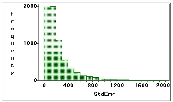
percentile) and standard deviation of 149.73 (the 44th percentile). Figures 1.1 and
1.2 show the histograms of sample means and standard deviations. In these
figures, there are many genes having negative means due to the algorithm
Affymetrix used to measure gene expression. Therefore, it is not possible to
directly transform data by taking the logarithm as the standard process for cDNA
microarray. (The new Affymetrix algorithm, MAS5.0, avoids this issue of
negative expression measurement. (www.affymetrix.com/products/)) We have
further and detailed discussion about this problem in Chapter 2.
1.3.2 Simulation by the Normal, Lognormal, and Gamma Distributions without Outliers
We fit the 47 observations of the candidate gene to normal, lognormal, and
the histogram with three fitted distribution curves. The parameter estimates of the
three distributions are listed in the figure legend and summarized in Table 1.2.
"Theta" is the threshold parameter for both lognormal and gamma distributions.
"Theta = 0" implies positive support for these two distributions. With the
parameter estimates, the simulated data are created by the following formulas:
, * δ ) 1 , αˆ ( * βˆ ) , , ( , * δ )} 1 , 0 ( * γˆ ηˆ exp{ ) , , ( , * δ ) 1 , 0 ( * σˆ µˆ ) , , ( } 2 { } 2 { } 2 { = = = + = + + = + + = i t i g i t i l i t i n I Gamma t j i Y I Normal t j i Y I Normal t j i Y
where i=1,2; j=1,2,…Ji; and t=1,2,…T. Y is the simulated expression intensity of
the jith chip for the ith subtype disease in the tth time of simulation and the
subscript of Y indicates the distribution applied. Normalt(0,1) and Gammat(αˆ ,1)
represent the random values drawn from normal and gamma distributions in the tth
simulation, respectively. µˆ, σˆ, ηˆ, γˆ , αˆ, and βˆ are parameter estimates listed in
Table 1.3. δ represents the artificial mean expression difference between two subtype disease groups. I{i=2} is an indicator function. Two scenarios regarding
the sample size are considered. We generate the data with the same sample size
as in the original training data (J1=27, J2=11) and with a small size (J1=5, J2=5) in
the first and the second scenarios, respectively. The mean differences between
1.3.2.1Scenario 1 - Same Sample Size as Training Data Set
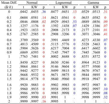
We consider J1 = 27 and J2 = 11 in the first scenario. Table 1.3 lists the rejection
rates (power) of the t- and the Kruskal-Wallis test with nominal 0.05 significance
level. The McNemar test is used to assess the testing agreement of the t- and the
Kruskal-Wallis tests in the simulation. When the true mean difference is zero, the
rejection rates indicate the Type I error. In this scenario, the McNemar's p-values
indicate the Type I errors are similar for the two tests. This implies the powers of
both tests are comparable. As might be expected, the Kruskal-Wallis test has
lower power under the normal distribution but higher power under the lognormal
and gamma distributions. Figure 1.4 shows power curves of all six
test-distribution combinations.
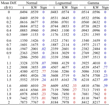
1.3.2.2Scenario 2 - Small Sample Size
Microarray studies are often based on a small number (less than 10) of arrays
because of cost concerns. In the second scenario, we repeat the first scenario
except for having only five simulated samples for the two disease subtypes. Table
1.4 lists the rejection rates of the t- and Kruskal-Wallis tests. Examining the
rejection rates when no mean difference exists, the t-test controls the nominal .05
Type I error under all three distributions, and the Kruskal-Wallis test has slightly
liberal error rate for the three distributions. The powers in this scenario are not
exactly comparable since the tests are not based on the same significance level.
(1.9σˆ and 2σˆ). This implies that, compared to the Kruskal-Wallis test with a
small sample size, the t-test is more powerful for more significant mean
differences.
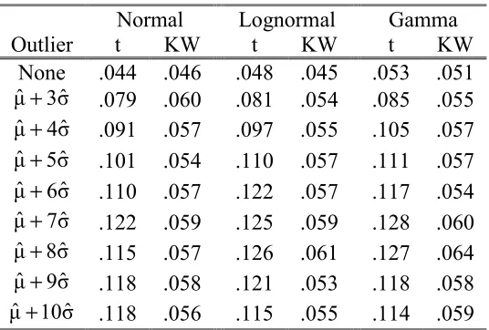
1.3.3 Simulations with an Outlier Involved
The presence of non-biologically-relevant outliers in raw data is a common issue
in microarray experiments (Schadt et al., 2000 and Li and Wong, 2001a). Figure
2.1 in Chapter 2 also shows an example. Here, we arbitrarily make one
observation an outlier in the second group with the same sample sizes (J1=27 and
J2=11) as the first scenario in the previous simulation to investigate the control of
Type I error. The outlier is fixed at µˆ+kσˆ and the parameter k is varied from 3
to 10. Table 1.5 and Figure 1.5 displays the simulation results and the simulated
Type I error curves, respectively. The simulated Type I errors for the
Kruskal-Wallis test are slightly larger than 0.05, the nominal significance. These results
are expected since the group sums of rankings are affected very little by the
magnitude of the outlier. However, the simulated Type I errors for the t-test are
all significantly higher than 0.05. Therefore, the Kruskal-Wallis test is much more
robust than the t-test in the presence of outliers.
1.4
Clustering Analyses
Once the significant genes are identified, more questions will arise. Is there any
differentiated based on the expression level of the significant genes? Typically,
clustering analysis plays a key role in answering these questions. For the data set
containing information about significant genes, we can either consider genes as
observations and samples (arrays) as variables or conversely. In the first case, we
perform a clustering analysis to classify the significant genes into groups
according to their expression profiles across the samples. In the second case, we
perform a clustering analysis to group the array samples based on the expression
profiles across the significant genes.
1.4.1 Clustering Analysis on Genes
First, we standardize the measurements of expression level for each significant
gene across all arrays by subtracting the average from the measurements and then
dividing the difference by the standard deviation. A k-means clustering analysis
(Johnson and Wichern, 1992) is implemented with an automatic search for the
best number of clusters determined by the cubic clustering criterion (CCC) (Sarle,
1983). For two-type disease classification, the 291 significant genes selected by
the BKW test are automatically divided into two clusters, of 163 and 128 genes.
For three-type disease classification, the 402 significant genes are automatically
grouped into three clusters, of 171, 93, and 138 genes. Figures 1.6 and 1.7 show
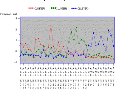
the average standardized expression profiles for each cluster.
For two-type disease classification, the genes classified into Cluster1 show
AML group, the average levels of Cluster1 are higher in the ALL disease group
(except the ALL-B12), but fluctuate over a wider range. The genes in Cluster2
behave in the opposite manner.
For three-type disease classification, the higher expression levels of genes
in Cluster2 and Cluster3 are observed in the T-lineage and AML samples,
respectively. For B-lineage samples, apart from ALL-B12 and ALL-B17, the
expression levels of genes in Cluster1 are comparatively higher than those in
other clusters.
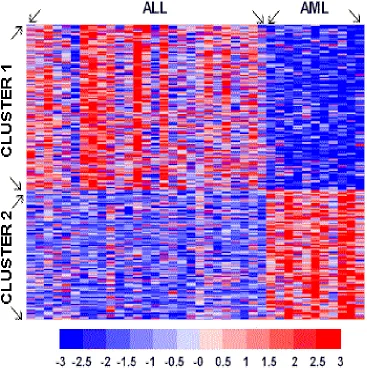
Figures 1.8 and 1.9 display grid plots of the expression levels for all
significant genes. The order of array samples in Figures 1.8 and 1.9 are the same
as those in Figures 1.6 and 1.7.
1.4.2 Clustering Analysis on Array Samples
We also classify the array samples into different groups based on the similarity
among the expression levels of those significant genes. Array samples grouped in
the same cluster tend to have the same disease type. In general, all the selected
informative genes can be used as inputs directly for clustering analysis. However,
when the number of the genes that are actually dominant in disease type
classification is relatively small in the data, the contribution of these genes to the
computed distances (or similarities) between clusters might be small. Therefore,
disease types are not easily differentiated. This situation usually occurs when the
example is given in section 1.4.2.1. To improve the clustering results in the
situation above, we suggest a principal component analysis on the informative
genes and performing clustering analysis on array samples based on the major
principal components. In our study, we choose the smallest number of principal
components (17 for two-type disease classification and 20 for three-type disease
classification) with the cumulative proportion of variation at least 0.95. A
succeeding clustering analysis is applied and the generated classification rule is
applied to the test data set. In two-type disease classification, the correct
classification rates are 95% (with samples ALL-B12 and ALL-B25 missed) for
training data and 94% (with sample numbers 66, 67 missed) for test data. In
three-type disease classification, they are 92% (with samples ALL-B12, ALL-B17
and ALL-B25 missed) for the training data and 94% (with sample numbers 66, 67
missed) for the test data. The classification results, along with the results of
Golub et al. (1999), are summarized in Table 1.6.
1.4.2.1Example of Highly Unbalanced Numbers of Genes among Gene Clusters
The situation of unbalanced numbers of genes among gene clusters may occur
when stimulating or starving experiments are applied. Large numbers of genes
can be induced or depressed in such experiments. Although the unbalanced
situation does not appear in leukemia data used here, for demonstration purposes
genes from the third gene cluster (Cluster3). Therefore, the gene clusters have
152, 104, and 10 genes, respectively. Based on the new set of informative genes,
the k-means clustering analysis without a principal component analysis shows that
42.1% (8/19) of the ALL-B samples are grouped together with the AML samples.
When a principal component analysis is applied, only 10.5% (2/19) of the ALL-B
samples are in the same cluster as the AML samples.
1.5
Discussion
We have applied Bootstrap Kruskal-Wallis filtering as a preliminary selection for
all the genes that show statistical significance. The Kruskal-Wallis test in the
BKW is interchangeable with alternative parametric approaches such as the
ANOVA F-test or the test. We have conducted simulations to compare the
t-and the Kruskal-Wallis tests under various scenarios. Under the most widely used
distributions, lognormal and gamma, for microarray raw data, the Kruskal-Wallis
test is slightly more powerful when the sample size is not small. Also, the
Kruskal-Wallis test is much more robust than the t-test in the presence of outliers.
However, the t-test works better for a small sample size without outliers. Outlier
detection is desired for more comprehensive studies in microarray analysis.
The informative genes selected can further be classified into groups by
using a k-means clustering analysis that automatically selects the best number of
clusters. The genes within each cluster show coherent expression activities and
these significant genes by their expression level principal components and
classified the samples into different disease subtypes. We applied these methods
to a training data set and tested them on an independent test data set. This
approach can be applied to classify multi-type disease. For the leukemia data
sets, the classification rates are 95% (36/38) and 92% (35/38) for the training data
set; and 94% (32/34); and 94% (32/34) for the test data set, when performing
two-type and three-two-type disease classification, respectively.
Although the BKW method enables us to select statistically significant
genes, those selected genes may not be biologically related to the disease
subtypes. Genes within a cluster show statistical similarity in transcription level,
but this does not address whether they have biological interactions. Studies to
search for common motifs in the promoter regions of the clustered genes, and to
mine databases for the structures and functions of proteins provide important
information to furtherinvestigate the mechanism of gene interaction. However, a
rigorous and thorough analysis in the first step to select significant genes ensures
Table 1.1: Numbers of array samples for various disease types
B-lineage ALL T-lineage ALL ALL AML
Training Data 19 8 27 11
Test Data 19 1 20 14
Table 1.2: Parameter estimates for three distributions
Normal Lognormal Gamma
Mean(µˆ) Std Dev(σˆ) Scale(ηˆ ) Shape(γˆ) Scale(αˆ ) Shape(βˆ)
Table 1.3: Simulation results for scenario 1
Normal Lognormal Gamma
Mean Diff.
(δ/σˆ) t KW p t KW p t KW p
0 .0442 .0455 .36 .0477 .0451 .13 .0529 .0513 .31 0.1 .0604 .0581 .14 .0621 .0561 0 .0635 .0582 0 0.2 .0846 .0808 .02 .0929 .0943 .53 .0889 .0856 .09 0.3 .1257 .1176 0 .1392 .1438 .07 .1429 .1386 .07 0.4 .1923 .1833 0 .2008 .2173 0 .2177 .2101 .01 0.5 .2767 .2585 0 .2908 .3206 0 .3071 .3046 .41 0.6 .3789 .3569 0 .3991 .4469 0 .4273 .4330 .07
0.7 .4813 .4509 0 .5115 .5776 0 .5328 .5463 0
0.8 .5904 .5626 0 .6217 .7004 0 .6417 .6602 0
0.9 .6869 .6593 0 .7145 .7947 0 .7445 .7668 0
1 .7763 .7481 0 .8002 .8688 0 .8351 .8572 0
1.1 .8450 .8227 0 .8630 .9246 0 .8964 .9123 0
1.2 .9064 .8861 0 .9146 .9604 0 .9377 .9500 0
1.3 .9442 .9277 0 .9499 .9815 0 .9670 .9767 0
1.4 .9668 .9532 0 .9671 .9875 0 .9844 .9895 0
1.5 .9814 .9778 0 .9840 .9960 0 .9918 .9947 0
1.6 .9920 .9883 0 .9902 .9983 0 .9972 .9987 0
1.7 .9960 .9935 0 .9958 .9995 0 .9992 .9997 .10
1.8 .9986 .9970 0 .9985 .9998 0 .9996 .9999 .08
1.9 .9995 .9990 .03 .9991 1 . .9998 .9999 .32
2 .9999 .9997 .16 .9995 1 . 1 1 .
Table 1.4: Simulation results for scenario 2
Normal Lognormal Gamma
Mean Diff.
(δ/σˆ) t KW Sign t KW Sign t KW Sign 0 .0494 .0539 0 .0483 .0574 0 .0514 .0596 0
0.1 .0469 .0539 0 .0531 .0645 0 .0532 .0596 0
0.2 .0616 .0677 0 .0586 .0701 0 .0560 .0632 0
0.3 .0684 .0732 0 .0744 .0853 0 .0738 .0825 0
0.4 .0883 .0960 0 .0943 .1100 0 .0943 .0996 0
0.5 .1069 .1153 0 .1176 .1352 0 .1251 .1395 0
0.6 .1350 .1426 0 .1523 .1741 0 .1540 .1659 0
0.7 .1601 .1675 0 .1887 .2114 0 .1975 .2117 0
0.8 .1947 .2001 .02 .2359 .2601 0 .2382 .2484 0
0.9 .2363 .2505 0 .2818 .3029 0 .2769 .2902 0
1 .2886 .2950 .01 .3339 .3588 0 .3397 .3513 0
1.1 .3328 .3378 .07 .3988 .4129 0 .3925 .4010 0
1.2 .3808 .3855 .09 .4507 .4677 0 .4539 .4547 .77
1.3 .4380 .4372 .77 .5166 .5286 0 .5086 .5183 0
1.4 .4901 .4926 .38 .5608 .5719 0 .5674 .5708 .23
1.5 .5552 .5519 .24 .6155 .6163 .78 .6218 .6237 .49
1.6 .6040 .6010 .29 .6609 .6582 .33 .6810 .6786 .39
Table 1.5: Type I error with one outlier
Normal Lognormal Gamma
Outlier t KW t KW t KW
None .044 .046 .048 .045 .053 .051 σˆ
3
µˆ+ .079 .060 .081 .054 .085 .055
σˆ 4
µˆ+ .091 .057 .097 .055 .105 .057 σˆ
5
µˆ+ .101 .054 .110 .057 .111 .057 σˆ
6
µˆ+ .110 .057 .122 .057 .117 .054 σˆ
7
µˆ+ .122 .059 .125 .059 .128 .060
σˆ 8
µˆ+ .115 .057 .126 .061 .127 .064
σˆ 9
µˆ+ .118 .058 .121 .053 .118 .058
σˆ 10
µˆ+ .118 .056 .115 .055 .114 .059
Table 1.6: Classification results of Golub et al. (1999) and the BKW method
Golub et al.
(1999)* BKW
Disease Classification
Two-type Two-type Three-type
No. of Informative Genes 50 290 402
No. of Principal Components N/A 17 20
Correct Classification Rate
--- training data 37/38 36/38 35/38
--- test data 32/34 32/34 32/34
Figure 1.1: Histogram of sample means of all genes in ALL groups.
Figure 1.2: Histogram of sample standard deviations of all genes in
Figure 1.3: Histogram of candidate gene with fitted Normal, Lognormal, and
Figure 1.4: Power curves of t- (t, dashed lines) and Kruskal-Wallis (KW,
Figure 1.6: Line plot of average standardized expression levels for clusters
Figure 1.7: Line plot of average standardized expression levels for clusters
Figure 1.8: Grid plot of expression levels for significant genes
Figure 1.9: Grid plot of expression levels for significant genes
Chapter 2
A Systematic Statistical Linear Modeling Approach to
Oligonucleotide Array Experiments
2.1
Introduction
The GeneChipTM from Affymetrix is currently a popular commercial
oligonucleotide technology for studying gene expression. Although scientific
progress with this remarkably miniaturized platform has been considerable, many
subtle issues remain regarding the proper analysis and interpretation of the data it
produces. Many investigators struggle with such issues as the reliability of a
“present” or “absent” call, proper incorporation of mismatched probe information,
and appropriate comparisons across many chips. In this paper, we outline a
systematic approach for handling data generated from GeneChipTM experiments,
with a particular emphasis on statistical model selection and gene significance
The GeneChip contains a probe set representing unique genes, and each
probe set consists of 20 probe pairs. Each probe pair consists of a perfect match
(PM) oligonucleotide probe, which is designed exactly complementary to a
preselected 25-mer of the target gene, and a mismatch probe (MM), which is
identical to PM except for one single nucleotide difference at position 13.
According to Lockhart et al. (1996), the purpose of the mismatch probe is to serve
as an internal control of hybridization specificity. Affymetrix provides basic
software to summarize the expression information of the probe set measurements
by averaging the difference or log ratio of PM and MM after deleting those
extreme measurements which exceed three standard deviations from the mean.
Schadt et al. (2000) address many of the important issues and provide useful
extensions to the Affymetrix methods.
While summary methods for one or two chips are certainly useful, a
statistically optimal approach for experimental data involving many chips requires
that we consider all PM and MM data simultaneously. This provides 40 times the
data compared to traditional summary methods and gives more power for
statistical inference. However, several questions arise regarding the statistical
relationships of PM and MM within a probe pair, between probe pairs within a
probe set, and between probe sets across arrays. Do they have a linear
relationship? Are the amounts of cross-hybridization similar for PM and MM
probes? To what extent does MM serve as an internal quality control? Li and
multiplicative model for the measurements, whereas Efron et al. (2000) consider
scaled logarithms. Lazaridis et al. (2001) suggest using PM information only. In
this chapter, we draw on the rich tradition of statistical linear models and propose
methods for potentially complex experiments involving many chips. Our
methods are also related to Kerr et al. (2000) and Wolfinger et al. (2001) that
propose analysis of variance (ANVOA) applying on cDNA spotted microarrays.
The former uses only fixed effects and has all genes being incorporated in one
large model. The latter suggest a two-step mixed models to normalize data in
array level and, then, to analyze the residuals from first model by forming
"single-gene" mixed model for finding significant differential genes and extracting those
interesting effects. Our methods are closer to Wolfinger et al. (2001). We apply
regression to normalized data and propose a template mixed model for each single
gene for further analysis.
In the next section, we outline and discuss a step-by-step approach to
handling oligonucleotide array data. We then use the ionizing radiation response
data from Tusher et al. (2001) as an example to illustrate these steps and provide a
detailed comparison to results of their “significance analysis of microarrays”
(SAM) method.
2.2
Analysis Steps
Prior to any formal data analysis, an early and detailed understanding of the
statistical experimental design is crucial for maximizing information gain from
the data. This entails identification of all real and potential effects impacting both
the location and dispersion of the data, how these effects interrelate, and how they
affect the experimental units. The effects most commonly of interest are those
changed experimentally, and can involve treatment and genotype (cell line)
effects. In addition to the experimental factors, the designs we consider also
include broad effects on entire arrays and probe-specific effects for each gene.
Experimental design has a long and successful history in the statistics literature,
and we employ traditional designs such as the split plot used in agricultural field
trials (Steel et al., 1997).
2.2.2 Extract Numerical Data from the Image
This is obviously the first and one of the most critical steps to properly
investigating array data. For sake of brevity and emphasis in this chapter, we
assume that this step has been completed in a satisfactory fashion and those
reliable numerical intensities corresponding to each PM and MM probes are
available.
2.2.3 Formulate and Fit a Statistical Model
This is the key step in our approach and requires careful consideration. The goal
of the experimental design yet is simple enough to be interpretable. Doing this
allows the researcher to make rigorous quantitative assessments about effects
influencing the data that properly separate true signals from experimental and
biological noise. As a reasonable starting point, we recommend the classical
mixed linear model as a suitably flexible framework; refer to Littell et al. (1996),
Verbeke and Molenberghs (2000), and McCulloch and Searle (2001) for
theoretical background, examples, and references.
An important initial decision in formulating a linear model involves
determining precisely what data values will be modeled for each gene. This
usually involves a transformation to make the statistical modeling assumptions
reasonable and an adjustment for gross chip-wide effects. As a default method,
we recommend a log base 2 (log2) transformation for individual PM and MM
measurements. If PM-MM differences are desired, accommodations must be
made for negative values before applying the log transform. Since our proposed
statistical model will be additive, using a log transformation on the response can
be interpreted as fitting a multiplicative model on the original scale (Li and Wong,
2001a), and resulting statistical estimates are interpretable as fold changes. To
adjust for gross array-level effects, we also recommend centering the logged
values so that they have mean 0. We find that this can be the simplest and
reasonable way for normalization (Figure 2.1). However, this adjustment
involves an assumption that the within-chip averaged logged expression levels are
also possible (Dudoit et al., 2000b; Li and Wong, 2001b; Schadt et al., 2000;
Yang et al., 2001), although we are not sure they add much value if all of the
experimental data for a gene are considered together.
Once a response value is chosen, additive analysis-of-variance effects are
specified to partition its variability. In the mixed model setting, one must decide
whether these effects are "fixed" or "random". Fixed effects are those effects with
a well-defined, finite number of levels and only these finite levels are of interest
in the experiment. For fixed effects, we estimate each level and do testing among
all levels or comparisons between levels to see if they are significantly different.
Random effects are those effects considered to be drawn from an infinite
population having some probability distribution, usually normal. For random
effects, we estimate the parameters of this probability distribution (variance
components in the normal case) and possibly also individual effect estimates
properly shrunken towards zero. Inclusion of random effects also allows
inferences about the fixed effects to be made to broader populations.
For GeneChip experiments, we typically consider cell line, treatment, and
probe effects to be fixed, and because of potentially complex experimental
sources of variation such as cross-hybridization, it is typically sensible to include
two-way interactions of these effects as well. Effects impacting arrays can be
considered random, reasoning that they are the accumulation of small
experimental sources of noise. Putting these all together, the following linear
Yijkl = Li + Tj + LTij + Pk + LPik + TPjk + Al(ij) + εijkl (2.1)
Here, Yijkl is the transformed and centered expression measurement of the ith cell
line applying the jth treatment at the kth probe in the lth replicate. Y can be the
centered log2(PM) measurements if we do not wish to incorporate any MM
information, or Y can be the centered log2 differences of PM-MM pairs (suitably
adjusted for negative values) if we believe that MM serves directly as an additive
internal control on the original scale. A somewhat intermediate position explored
by Efron et al. (2000) is to let Y take the form log(PM) – 0.5 log(MM), and this
can be used directly or generalized by including log(MM) as a covariate in the
right-hand side of the model.
The symbols L, T, LT, P, LP, TP and A in (2.1) represent cell line,
treatment, cell line-treatment interaction, probe, cell line-probe interaction,
treatment-probe interaction, and array effects, respectively. The Al(ij)'s are
assumed to be independent and identically distributed normal random variables
with mean 0 and variance σa2. The εijkl's are assumed to be independent identically distributed normal random variables with mean 0 and variance σ2, and are independent of the Al(ij)'s. We will elaborate on these effects and on variations
of the model in the context of our example in the next section. For fitting the
model, standard maximum likelihood methods are usually best and can be
2.2.4 Check Assumptions, Remove Outliers, Reformulate and Refit the Model if Necessary
Because we make probabilistic assumptions in the preceding model, it is wise to
perform some diagnostic checking on results of the model to verify that it
adequately represents the data. In (2.1), the randomness in each observation Yijkl
is represented by two terms, Al(ij) and εijkl. According to our normality assumptions in (2.1),
. otherwise ' but if ) ' ,' ,' ,' ( ) , , , ( if 0 ) , ( .) , 0 ( ~ 2 2 2 ' ' ' ' )' ' (' ) ( 2 2 ) ( k k (i',j',l') (i,j,l) l k j i l k j i A A Cov N A a a l k j i j i l ijkl ij l a ijkl ij l ≠ = = ï î ï í ì + = + + + + σ σ σ ε ε σ σ ε
A standard way of checking these assumptions is to examine the residuals from
the fitted model. The nature and definition of residuals are more complicated in
mixed models than in standard linear models because there are multiple sources of
random error. For simplicity, and as a first step, we recommend inspecting
residuals formed by subtracting the fitted fixed effects from the observed data and
then standardizing these values by an estimate of their variance, σa2 + σ2. This allows the residuals from all genes to be plotted as groups or together; see Figure
2.2 in the next section. Model departures are often apparent in such plots by a
nonrandom scatter around the zero horizontal line. Standardized residuals with
analysis. Li and Wong (2001a) discuss systematic ways to eliminate outliers
using a multiplicative model.
2.2.5 Perform Basic Statistical Inference and Filter Out Insignificant Genes
After suitable model determination and validation, an investigator can study the
results of the fitted model for each gene. General statistical tests for the
individual fixed effects in the model are available, as are custom estimates of the
fold change and significance for specific treatment comparisons. A useful
graphical display is the “volcano plot”, which plots negative log (base 10)
p-values on the y-axis versus estimated log2 fold change on the x-axis; see Figure
2.4 in the next section and Wolfinger et al. (2001) and Jin et al. (2001) for
examples. The plot takes the shape of a “V” because larger fold changes tend to
be more significant, although usually the most significant genes do not exhibit the
greatest fold change.
A simple procedure for statistically filtering genes is to draw a horizontal
cutoff line on a volcano plot to represent a desired false positive rate for the test
under consideration. Genes corresponding to points below this line are not
considered in subsequent analyses. This method can produce dramatically
different results from filtering genes on the basis of fold change alone.
Again, for sake of brevity, we do not elaborate or discuss this step, which usually
involves analyses such as clustering and principal components, except to say that
appropriate statistical filtering and inference must be done prior to this step to
help ensure its validity.
2.3
Ionizing Radiation Example
We now illustrate the preceding steps using the ionizing radiation data from
Tusher et al. (2001). The data arise from eight Affymetrix GeneChips with 7,129
probe sets (genes) in each and were designed to study transcriptional responses of
human cells to ionizing radiation.
2.3.1 Identify the Experimental Design
There are two experimental effects, treatment and cell line, with two levels each,
and two replicate arrays for each effect combination. At the array level, this is a 2
× 2 experiment with 2 replicates. Combined with 20 probes for a probe set, there are 4 factors as stated below.
1. Two levels of radiation treatment (irradiated, unradiated).
2. Two levels of cell line (line I and line II).
3. Twenty PM-MM probe pairs in a probe set (P1 to P20).
4. Two replicate arrays (array I and array II).
This results in a total of 160 observations for each gene, and Table 2.1 shows an
Steel et al., 1997), and the whole plot units are the arrays. Radiation treatment
and cell line are the whole-plot effects, and probe is the sub-plot effect.
2.3.2 Extract Numerical Data from the Image
As indicated in the previous section, we are skipping this step and assuming that
reliable numerical data are available.
2.3.3 Formulate and Fit a Statistical Model
The linear mixed model is a “perfect match” for data arising from a split-plot
design. As is common practice, we consider both the whole- and sub-plot effects
as fixed and the whole-plot experimental units (arrays) as random. Working from
the basic model template described previously in (2.1), we consider the following
three models:
Model I :
log2(PMijkl) = LI + Tj + LTij + Pk + LPik + TPjk + β log2(MMijkl) + Al(ij) + εijkl.
Model II :
log2(PMijkl) = Li + Tj +LTij +Pk +LPik + TPjk + Al(ij) + εijkl.
Model III :
log2(Dijkl) = Li + Tj +LTij +Pk +LPik + TPjk + Al(ij) + εijkl.
In model I, we use array-centered log2(PM) as the response variable and
array-centered log2 (MM) as a covariate, with β as its coefficient. In model II, we only
use the centered log2 of the difference (D) of the PM-MM pair as the response
variable, and before doing the log transformation on D, we truncate those
measurements less than 10 to 10 to avoid the negative value problem. Over one
third (38.5%) of the data are truncated in this fashion.
2.3.4 Check Assumptions, Remove Outliers, Reformulate and Refit the Model if Necessary
As a quick check on data standardization requirements, Figure 2.1 shows plots of
pairs of replicated log2 intensities for the four combinations of cell line and
irradiation treatment. The fitting regression equations are shown above each plot.
The R2 values from left to right are 0.9794, 0.9801, 0.9879, 0.9819 and are not
changed by standardization. The linearity of the plots indicates that a simple mean
standardization is suitable. Those points far from diagonal line indicate that there
may be undesirable outliers in data, but we retain them for subsequent comparison
purposes.
Using Model I as an illustrative example, Figure 2.2A displays
standardized residual plots of genes 1000, 2000, 3000, 4000, 5000, and 6000.
These plots exhibit random scatter around the zero horizontal line and indicate no
significant departures from model assumptions. Figure 2.2B, 2.2C, and 2.2D plot
all of the standardized residuals together for the three models in what we have
nicknamed a “submarine plot”. These "submarine plots" are not regular residual
useful for observing genome-wide features of gene variability. The “bubbles” in
these plots represent potential outliers with large positive or negative standardized
residuals. A rough rule of thumb is to eliminate observations with standardized
residuals having magnitude larger than three, but doing this results in little to no
changes in the most highly significant genes considered later. For subsequent
comparison purposes, therefore, we filter no outliers. The absence of points in the
lower left portion of Figure 2.2D is an artifact of the truncation at 10 rule we used
to analyze the data in Model III.
Also, it is interesting that while residual plots of single gene show no
evidence of pattern, the "submarine plot" suggests heteroscedacity. We try to test
for normal distribution by Kolmogorov-Smirnov statistic with Bonferroni's
correction on standardized residuals for each gene excluding those residuals larger
than 3 or less than -3. Almost all genes (98.51 %) pass the normal distribution
test in Model I. Background correction may be a reason for observing a
"submarine" that has a bigger head (larger dispersion for small measurement) and
a small tail (smaller dispersion for large measurement). According to
Affymetrix's algorithm, the probe intensities are calculated by averaging out the
pixel intensities and subtracting the background correction term, which averages
out the lowest 2% pixel intensities. Those small measurements are expected to be
more sensitive to background corrections than are large measurements.
For a quick assessment of goodness-of-fit, we calculate R2 values of each
mixed model is somewhat ambiguous, so here we apply an ordinary model
concept of R2, and define it as
2 2 2
) (
1
Y Y
R R
ijkl ijkl
− å
å −
= ,
where Yis the average of all Yijkl's.and Rijkl is the residual term of Yijklfrom the model. This histogram excludes those 160 genes having 1/5 of probe data
missing. The first percentile is 0.86, indicating that Model I fits the data from
almost all genes very well.
2.3.5 Perform Basic Statistical Inference and Filter Out Nonsignificant Genes
We first consider significance tests for all of the fixed effects in Figure 2.4. The
"volcano" plots of Figure 2.4A illustrate the relationship of the estimates of three
whole-plot effects (cell line, treatment, cell line-treatment interaction) and their
significance compared among all three models for all genes. The horizontal lines
indicate p-values equal to 0.001 and the vertical lines indicate 2-fold changes of
effect estimates. In Figure 2.4A, we can see that there are only a few points
outside the vertical lines and many points above the horizontal lines, especially, in
the cell line and treatment volcano plots. The small magnitudes of the fold
change estimates are remarkable and appear to represent excellent sensitivity in
addition, estimates from Model III are much more variable, indicating that direct
subtraction of MM adds a lot of noise to the PM data.
The three plots in Figure 2.4B show the significance of probe, cell
line-probe interaction, and treatment-line-probe interaction effects for Model I, each of
which results from F-tests with (19 ,94) degrees of freedom. Results from Models
II and III are similar. In Figure 2.4B, the probe main effects are highly
significant, and even after a Bonferroni adjustment, 7088 (99.42%) are significant
at the 5% level. This indicates huge variability in probe effectiveness. There is
also evidence of some large interactions with the probe effect and a few examples
are depicted in Figure 2.5. In Figure 2.5A, PM curves (red) show significant
different in probes 9 and 14 comparing top (cell line I) and bottom (cell line II)
rows; whereas, MM curves (green) show significant different in probe 9. In
Figure 2.5B, PM curves (red) show significant different in probes 11,12,13, and
14 comparing top (irradiation treatment) and bottom (no radiation treatment)
rows; whereas, no significant different in MM curves (green). After a Bonferroni
adjustment, 666 (9.34%) and 42 (0.59%) of the genes have significant (cell
line)-probe and treatment-line)-probe interactions, respectively. Causes for these
interactions such as cross-hybridization may warrant further investigation.
Figure 2.4C shows the significance of using log2 (MM) as a covariate in
Model I. The estimates of β range from -1 to 2, and can be viewed as
(2000). However, only 422 (5.92%) of these coefficients are significantly
different from zero at the 5% level with a Bonferroni correction.
Tables 2.2 and 2.3 list the top induced and repressed genes according to
our three models along with a comparison to the top genes from the SAM method
of Tusher et al. (2001). The methods generally agree, although there are a few
key differences that we discuss below. Tusher et al. (2001) highlight twelve
genes that were previously reported in the literature to respond transcriptionally to
ionizing radiation. Nine of these are included in the top eighteen of Model I’s
induced or repressed genes. The other three (X62048, S78187, X63717) are also
marginally significant with negative log p-values larger than 2 but not as
significant as the result of Tusher's SAM.
One likely reason for these discrepancies is that the SAM results make use
of the Affymetrix summary measures across the probe level data whereas the
mixed model results here delete no outliers. Figure 2.6A uses gene X62048 as an
example. Affymetrix applies a "three standard deviation rule" for outlier deletion;
that is, if the difference of probe pair exceeds three standard deviations within a
probe set, it will be excluded for averaging. In Figure 2.6A, probe pair 10 in array
"2ir1" is an outlier according to the "three standard deviation rule". Although it is
questionable to say this probe pair is an outlier, excluding that point when
calculating the average difference will lower the single expression measurement
of gene X62048 in array "2ir1", and this may increase the significance of
inspected several genes which were highly significant according to SAM but not
significant for Models I, II, and III. Outliers appear to be at the root of these
differences as well, and another example is in Figure 2.6B. The difference of
probe pair 14 in arrays "1ir2", "1un1", and "1un2" are outliers identified by "three
standard deviation rule" in this case. Resolutions of issues like these almost
surely need to be done at the probe level, and indeed, independent analyses
applied at the probe level produce almost identical results to ours [V. Tusher,
personal communication].
Comparing results from Models I, II and III, we see those from Models I
and II are similar whereas some of the results from Model III are very different.
The overall behavior of the treatment effects from these three models is displayed
in Figure 2.7A. The correlation coefficients of the negative log p-values of the
model pairs (I, II), (I, III), and (II, III) are 0.95, 0.53, and 0.45 respectively. Here
many of the discrepancies appear to be related to the truncation at 10 used in
Model III to avoid negative difference values when taking logarithms, and Figure
2.7B gives an example. Results like these shed doubt on the practical usefulness
of trimming the data in this fashion. Also, including MM as a covariate does not
change the results very much for this example, suggesting a lack of need for MM.
Fold-change estimates of the Model I treatment effects for genes are
included in the next-to-last columns of Tables 2.2 and 2.3. Most are surprisingly
small (between 1.1 and 1.3) and illustrate the potential of statistical methods to
2.3.6 Perform Additional Analyses on Statistically Filtered Data
This step is omitted, except to say that clustering could now be performed on the
treatment estimates from the previous step. Estimated treatment means
appropriately adjusted for other effects in the model are very useful quantities for
subsequent analyses like clustering and principal components, and can provide
more accurate results than the raw data themselves.
2.4
Discussion
The differences noted above between SAM and our linear models are typically
resolvable and of an order of magnitude smaller than differences between these
methods and ones that make decisions based purely on fold change. It is
absolutely critical to accommodate important sources of experimental variability
when assessing GeneChipTM data, and failure to do so will surely result in higher
rates of both false positives and false negatives. The systematic approach detailed
here provides a good outline on how to analyze these data in a statistically
sensible fashion, and the linear mixed modeling framework can flexibly