Masterarbeit Medientechnologie
Immersive Exploration of OSGi Based
Soft-ware Architectures in Virtual Reality
vorgelegt von Martin Misiak
Erstgutachter: Prof. Dr. Arnulph Fuhrmann (Technische Hochschule Köln)
Zweitgutachter: Dipl.-Math. Sascha Zur (Deutsches Zentrum für Luft- und Raumfahrt, Köln)
Contents
1 Introduction 3
1.1 Goals and Motivation . . . 3
1.2 Thesis Context . . . 4 1.3 Thesis Structure . . . 5 2 Software Architectures 7 2.1 Java . . . 7 2.1.1 Organization . . . 7 2.2 OSGi . . . 8 2.2.1 Bundles . . . 8 2.2.2 Services . . . 9 3 Software Visualization 11 3.1 Motivation . . . 11 3.2 Classification . . . 11 3.2.1 Software aspects . . . 11 3.2.2 Granularity . . . 11 3.2.3 Number of Views . . . 12 3.2.4 Dimensionality . . . 12 3.3 Metaphors . . . 13 3.3.1 Abstract Metaphors . . . 14
3.3.2 Real World Metaphors . . . 15
3.4 Visualizing Hierarchical Data . . . 16
3.4.1 Explicit Hierarchy Visualizations . . . 16
3.4.2 Implicit Hierarchy Visualizations . . . 17
3.5 Graphs . . . 17
3.6 Approaches . . . 18
3.6.1 3D Approaches . . . 18
4 Visualizing Software Architectures as Islands 21
4.1 Island Metaphor . . . 21
4.2 The Virtual Table Metaphor . . . 24
4.3 Sunburst Islands . . . 26 4.4 Cartographic Islands . . . 30 4.4.1 Construction . . . 30 4.5 Package Dependencies . . . 35 4.5.1 Explicit Visualization . . . 36 4.5.2 Implicit Visualization . . . 38 4.6 Services . . . 41 4.7 Interaction . . . 43 4.7.1 Navigation . . . 44
4.7.2 Displaying Textual Information . . . 46
4.7.3 Conclusion . . . 48 4.7.4 Related Work . . . 49 5 Implementation 51 5.1 Visualization Construction . . . 52 5.1.1 SideThreadConstructor . . . 53 5.1.2 MainThreadConstructor . . . 54 5.2 Virtual Environment . . . 55 5.3 Interaction . . . 57 5.4 Hierarchical System . . . 59 5.5 Graphics . . . 60 5.5.1 Materials . . . 60 5.6 Performance Optimizations . . . 61 5.6.1 Inverse Navigation . . . 61 5.6.2 Island Manager . . . 61 5.6.3 Reducing Drawcalls . . . 62 6 Results 65 6.1 Discussion . . . 66 7 Future Work 69 Bibliography 71 2
Chapter
1
Introduction
Although often overlooked, the understanding of existing software systems can occupy the majority of a developer’s time, especially if he is new to the project. Due to the prevailing paradigm, where programming consists mainly of editing and writing text, the current IDEs expose at each point in time only a very small fraction of the system and in thus provide little help in understanding the underlying software architecture.
For this purpose, visualization techniques have been developed, which use a metaphor to map intangible software aspects unto visually perceivable entities to help provide a higher level overview of the system. Over the years a number of two and three dimensional visualization techniques have been proposed using various metaphors.
However the visualization of software architectures in virtual reality(VR) is a sparsely researched field. It offers a much higher comprehension potential than classical three dimensional visualizations. However it requires also a different approach, as the requirements on a usable VR application are much higher than those of a classical desktop application. This is derived from the higher immersion degree, that these appli-cations provide. In particular, VR has a high potential of eliminating the navigational problem of traditional 3D visualizations, while maintaining the benefit of the additional dimension and even expanding it, by providing stereoscopic cues to the user.
In this master thesis, an approach will be developed to visualize module based OSGi software architectures in virtual reality. The validity of this approach will be demonstrated on a large OSGi based software project.
1.1
Goals and Motivation
For years now, the software visualization field employs mostly small variations of the city metaphor, where software artifacts are mapped to entities encountered in a typical metropolitan city. Although this metaphor is a good fit for many software architectures, there may be many more metaphors, which excel at visualizing specific architecture
types. Also, the city concept is not always intuitive, or even favorable to some users and thus, the software visualization field would greatly benefit from a larger variety of suitable metaphors. Therefore, the exploration of novel metaphors for software visualization is a central aspect of this thesis. This holds especially true in the context of virtual reality, as this medium is fundamentally different from classical "desktop 3D" and brings its own set of requirements for the design of an effective metaphor.
Virtual reality has changed a lot over the last years. Many scientific fields, especially medicine and education, took advantage of improved technology and reflected this in their research. Software visualization however is very sparsely researched in the context of VR. Since the early 2000’s, there has been virtually no research in this field1. Recently, a new generation of VR devices has reached the consumer market, resuming on the mass adaptation promise given by the first consumer generation in the late 90’s. Indeed, the technology has matured and is currently noticeably present in academia and industry. Designing a software visualization, that fully leverages the benefits of modern VR technology is the second main theme of this thesis. While VR is already being used productively in various fields, the question remains if software engineering can too profit from this technology. And more specifically, which aspects of software engineering.
As a first step, this thesis focuses on a high level comprehension of software architectures based on OSGi. This can be very interesting for developers, who are familiarizing themselves with a new software project, as a VR visualization can quickly provide a much needed sense of context, something modern IDE’s fail to do. A possible application field would also lie in the educational field. Due to the intuitive and natural interaction and navigation mechanism VR provides, the complexity of software projects and software development in general could be better conveyed to the public.
1.2
Thesis Context
The presented master’s thesis was developed in cooperation with the German Aerospace Center(DLR), at theSimulation and Software Technologyfacility in Cologne. In it, the
Intelligent and Distributed Systemsdepartment encompasses a group calledDistributed Softwaresystems. This group develops the OSGi based softwareRemote Component Environment(RCE), which will be the exemplary subject of the presented visualization technique.
This thesis builds on the work of Marquardt [1], who developed an application capable of analyzing OSGi based software systems. This application will be used to 1A search for "Software Visualization", "Virtual Reality" on Google Scholar[2001-2017] yielded
only one relevant results in the first 400 articles.
obtain the input data for the visualization, as the focus of this work does not lie on software analysis.
1.3
Thesis Structure
The following two chapters will provide the basic knowledge in all, for this thesis, relevant fields. Chapter 2 provides a quick introduction to Java as well as the OSGi framework, which is based on it. Continuing with Chapter 3, the software visualization research field is presented to the reader. Classification criteria for existing work in this field are presented, as well as existing approaches. Additionally, visualization metaphors are discussed in detail. This chapter concludes the introductory section of the thesis.
Starting with Chapter 4, the proposed approach of visualizing OSGi based software architectures in VR is presented. This chapter lays out the conceptual, as well as algorithmic ideas, while referring to related work in academia. Chapter 5 focuses on implementation details, with a special focus on performance optimization, as this is a major concern when developing for VR. The structure of the application is presented and used libraries and resources are highlighted. Chapter 6 presents results, obtained at the end and discusses them. The last chapter covers future work.
Chapter
2
Software Architectures
2.1
Java
The Java programming language is a very popular class based, object oriented language, with support for concurrency. It was designed to be simple and robust, as it is aimed at the production environment. It shares similarities with C and C++ but has a different organization, as it is a more high-level language. It features automatic storage manage-ment and avoids unsafe constructs, like unchecked array indexing for example. Java is a statically typed language, which is compiled into a bytecode instruction set, defined by theJava Virtual Machine(JVM) specifications [2]. This bytecode format is what makes Java so appealing, as it can run on any platform that has a JVM, regardless of the computer architecture. This is a great benefit for developers, as they need to write and compile only one version of code.
2.1.1
Organization
Java programs are composed of multiplepackages. Apackagecan contain class types and additional sub-packages. Class type is used as a collective name for the types:
Class, Interface, EnumandAnnotation. They reside inCompilation Units, which form the input for the Java compiler. Usually one .javasource code file corresponds to a Compilation Unit. Most compilers require the source file name to match the contained class type, which implies that only one class type per Compilation Unit is allowed. It is referred to as theTop Level Type, as this class type is still allowed to have inner classes of its own [2].
From the perspective of the Java language specification, the package names can be arbitrary. However, it is a universally accepted convention to name packages in a hierarchical fashion, starting with the reversed internet domain of the company creating it. Each additional domain introduced to the package name is separated by a dot from its parent domain. The resulting hierarchical structure simplifies searching tasks and
improves the overall comprehension of the code organization [2].
Packages are used to modularize Java code. Class types can have different access modifiers(public, protected, default, private), which control their visibility in other packages. For example apublic class can be accessed in any other package, while thedefaultmodifier only allows a class to be accessed from within the package it is contained in.
2.2
OSGi
The Open Services Gateway Initiative, or OSGi, is a component based, service oriented framework specification for Java. It centers on application development using modular units, called bundles. The life-cycle of each bundle is controlled by the framework, enabling developers to add, replace or remove existing bundles at run-time. This functionality is especially important for embedded devices and application servers, both domains where OSGi is well represented. Bundles provide well defined services, which can be consumed by other bundles. This complements the modular concept of OSGi, as services can also be dynamically started and stopped [3]. Popular implementations of the OSGi specification are: Apache Felix [4], Equinox [5] and Knopflerfish [6].
2.2.1
Bundles
The modular system employed in Java only applies access modifiers to classes but not to packages. If a class is defined as public, it can be accessed from every available package. Providing access to a class only to specific packages would be a much more desirable behaviour. However Java lacks a mechanism for controlling access on package level. To alleviate this issue, OSGi introduced the bundle concept. A bundle is a self-contained unit of classes and packages, which can be selectively made available to other bundles. Every bundle contains aManifestfile, which among other information also defines the imported and exported packages. For a class to be accessible from other bundles, its containing package has to be in the export list. The packages in the import list define the dependencies of a bundle. A bundle can also be instructed to import all packages, that are exported from specific bundles. These bundles are listed in theRequire-Bundle
list. The following lines show a Manifest file defined in a bundle from the RCE project: Manifest-Version: 1.0
Bundle-Name: RCE Core Component Scripting
Bundle-SymbolicName: de.rcenvironment.core.component.scripting Bundle-Vendor: DLR
Bundle-Version: 8.0.0.qualifier Export-Package:
de.rcenvironment.core.component.scripting Bundle-ManifestVersion:2 Import-Package: de.rcenvironment.core.communication.common, de.rcenvironment.core.component.model.spi, de.rcenvironment.core.component.scripting, de.rcenvironment.core.notification, de.rcenvironment.core.scripting, de.rcenvironment.core.scripting.python, de.rcenvironment.core.utils.scripting, de.rcenvironment.toolkit.modules.concurrency.api, org.apache.commons.logging;version="1.1.1" Service-Component: OSGI-INF/*.xml Bundle-RequiredExecutionEnvironment: JavaSE-1.7 Require-Bundle: de.rcenvironment.core.component
2.2.2
Services
Services are declared throughDeclarative Service Components1, which are stored in XML files. A Service Component can reference, as well as provide for multiple services. Java interfaces are used to define the service interfaces, which are referenced by the Service Components. For a Service Component to manifest, it must be implemented by a Java class.
TheService Registryis a key component of the OSGi runtime, which keeps track of already registered services. It enables bundles to publish and retrieve services, through Service Components. Upon retrieval, any method defined through the service interface can be invoked. The Service Registry of OSGi is characterized by its dynamic nature. The instant a bundle publishes a service implementation that another bundle is looking for, the registry binds the two bundles together [3].
Figure 2.1: The OSGi Service Layer. Image taken from [3].
Chapter
3
Software Visualization
3.1
Motivation
Software is abstract and intangible. With increasing functionality, its complexity grows quickly and hinders its further development. For this purpose, visualization techniques have been developed. They use a metaphor, which maps intangible software aspects unto visually perceivable entities, to help enhance the understandability and reduce the development costs of software systems [7].
3.2
Classification
Software visualization is a very large research field. To ease the classification process when encountering new works, the following categories can be considered.
3.2.1
Software aspects
Due to the high complexity a software system can posses, visualizations tend to target only certain aspects of it. A differentiation between static and dynamic aspects of a software can be made. While dynamic aspects capture information of a particular program run and help in the understanding of execution behaviour, static aspects are derived from pre-execution sources(source code, annotations...) and are therefore valid for all execution paths of a software. Additionally, the static aspects can be extended to capture the entire evolution of a software architecture, by including data from multiple snapshots, acquired usually from a repository.
3.2.2
Granularity
Orthogonally to this, software visualization can be made on roughly three different levels of abstraction [8], where each level is better suited to aid a specific task in
software development. The lowest abstraction level deals with the source code and is paramount to any software project, as the IDE can also be viewed as a low level form of visualization. The middle level provides insight into the workings of an object/class, and is shown to be more effective at it, as opposed to reading the source code only [9]. Visualizations of the highest abstraction level deal with the entirety of the software architecture and belong to the most important in the field of software visualization [10]. They convey the underlying hierarchical component structure, the relationships between these components and the visual representation usually contains some form of code quality metrics.
3.2.3
Number of Views
A software visualization can consist of one or more views. Each view can employ its own visualization approach and can therefore focus on different aspects of the software. Multi-view approaches are able to represent a broad range of information of varying granularity levels, which makes them interesting to multiple stakeholders1of a software project, each requiring a different set of information [11]. However they also impose a significant cognitive burden on the user and make a communication on common ground between stakeholders more difficult, as each primarily uses a different view [12]. Single-view approaches on the other hand are easier to navigate and support the collective understanding of a software, as all stakeholders work with the same view, which displays all relevant information. This approach however, is more prone to information overload and can support stakeholder specific tasks only to a certain degree.
3.2.4
Dimensionality
Visualizations can be made in the two dimensional and three dimensional space. Two dimensional visualizations are easier to navigate and interact with, since most users are already familiar with a 2D pc desktop environment. Additionally, elements can be easily laid out to eliminate occlusion and to maximize readability of textual information. In order to avoid a cluttered view for quickly growing data sets, 2D visualizations started relying on multiple views. However these increase the complexity of the visualization, which can result in a cognitive overload for the user.
Approaches using three dimensions can improve the space problem by adding a third dimension. This increases the information density of the visualization, but more importantly, it does not expose the user to any additional cognitive load when processing 3D objects, as this task is completely shifted to the perceptual system [13]. Experimental results confirm the effectiveness of 3D visualizations, in terms of error
1Different groups involved in a software project. Project managers, architects, developers,
maintain-ers...
rates and execution speed, when it comes to identifying substructures and relationships between objects [14] [15] [16]. Another important aspect of 3D visualizations is their ability to represent real world metaphors more closely than a 2D visualization can. This results in the added benefit that these metaphors provide.
However visualizing in 3D also has its set of problems. The computational com-plexity is higher, although due to the widespread availability of dedicated graphics processors, this is less of an issue than 15 years ago. 3D visualizations expose more degrees of freedom, which can make navigation and interaction in these environments substantially more complex [17] [18], as most users have only experience in working with 2D desktop environments[19]. Occlusion is another inherit problem when visu-alizing in 3D, since it can cause objects to appear invisible to the user and therefore distort the view of the underlying data set. Despite these problems, 3D visualizations can provide a benefit over 2D visualizations, as many of their inherent problems can be avoided with a careful design [20] [21].
3.3
Metaphors
As software is abstract and intangible, a metaphor is needed to map its individual aspects unto visually perceivable entities. With their help, information can be conveyed in a representation, which is more familiar to the user, as well as is more easier to understand. A metaphor is a central component of every software visualization and its choice affects not only the appearance, but also the interaction and navigation possibilities, as well as the number of different software aspects that can be effectively displayed.
Metaphors can map software artifacts to abstract geometric shapes, or to real-world entities. Abstract metaphors allow for a greater flexibility in the mapping, as the animator2 is less constraint by semantic shape requirements. It also eases the development of configurable visualizations, where users can remap software artifacts to different visual entities more easily, to fit their specific visualization needs. Such approaches however are mostly encountered in visualizations of general data-sets and not software.
Real-world metaphors rely on our natural and intuitive understanding of the physical world. Software artifacts are mapped to known real-world entities, which ideally exhibit similar structural and relational features. This creates a familiar context, where spatial factors in perception and navigation allow a faster recognition and understanding of software systems, while reducing the problematic aspect of disorientation [22]. To fully leverage a real-world metaphor, the same spatial relations and underlying notions between the real world and its virtual counterpart should be preserved. This quality is referred to as consistency [23]. To ensure consistency, constraints have to be placed
on the parameter mappings. For example when using a city metaphor, the parameters mapped to the width and height of a building should be constrained in their values, so that the resulting buildings are taller than they are wider. Otherwise there is a risk, that the visualized object will not be recognized as a building/skyscraper, which would have a negative impact on the plausibility of the chosen metaphor.
Mackinlay [24] proposed two criteria, expressiveness and effectiveness, for evaluat-ing the mappevaluat-ing process of data values unto visual parameters. These have been later adopted by academia to measure the quality of visualization metaphors [23]. Expres-siveness measures the capacity of a metaphor, to accommodate all required information into visual parameters [23]. An expressive metaphor needs to provide at least the same number of visual parameters as there are aspects one wishes to visualize. The metaphor can provide some additional unused parameter capacity, however it should not provide less capacity, then the amount of required aspects. This would result in ambiguous mappings, where multiple aspects are mapped unto one visual parameter. When using real-world metaphors, expressiveness also translates to the metaphor providing at least the same number of hierarchical levels as its virtual counterpart requires.
Effectiveness can be generally described as the overall efficacy of a metaphor to represent information. In contrast to expressiveness, it can also depend on the capa-bilities of the perceiver and is measured in relation to different criteria, like aesthetics, computational performance(time and resource usage) and visual understandability [24] [23].
The following section shows examples of abstract as well as real-world metaphors used in the context of software and data visualization.
3.3.1
Abstract Metaphors
Nested Cubes Metaphor
Proposed in the work of Rekimoto and Green [25], this metaphor focuses on the visualization of hierarchical data. For this the metaphor uses, as the name implies, nested transparent boxes with labels on them. The outermost box corresponds to the top level data and contains boxes which represent the data of the next lower hierarchical level. This nesting continues until the leaves of the hierarchy are reached, which are displayed as labeled tiles. The authors claim the nested cubes metaphor to be very natural and quick to understand, as the concept of a box as a container is very familiar in our daily lives. Also due to the use of transparency, deeper levels of the hierarchy are more opaque when viewed from the outside, which can be thought of as a level of detail filtering mechanism.
Seesoft Metaphor
Introduced by Eick et al. [26], the Seesoft metaphor provides a way of visualizing large amounts of source code in an abstract manner. The main idea is to map the individual lines of code to graphical lines, which are arranged in rows, mimicking the spatial arrangement of the underlying source code they represent. Each line can have a different color to represent a desired metric. The subsequent lines form a column, which represents the source code file, they originate from. The abstraction made by this metaphor is a small one, as a zoomed out view of the source code looks very similar. Here lies the major strength, as well as limitation of this metaphor. While it allows a direct linking to the underlying source code, it does not offer any higher levels of abstraction and its usage of available screen space is sub-optimal, as the occupied space is bound to the shape of the source code text.
Feng et al. [27] extended the two dimensional Seesoft metaphor into the third dimension. In their approach a source code file is represented as a two dimensional array of three dimensional objects, where the object shape, its height and color can be mapped to different metrics. These objects are referred to as "poly cylinders", and each of them represents a line of code. Due to the array/grid like arrangement of poly cylinders and the use of the third dimension, this extension to the Seesoft metaphor achieves a better utilization of available screen space and allows for more metrics to be simultaneously displayed. The trade-offs are, mutual poly cylinder occlusion(although reduced by the use of transparency) and a weaker linking to the underlying source code.
3.3.2
Real World Metaphors
Solar System Metaphor
The solar system metaphor was first introduced into the context of software visualization by Graham et al. [28], where it was used to visualize a Java based project. Each Java package is mapped to a sun, which is being orbited by several planets at different orbits. While the planets represent classes, the orbits represent the inheritance level within a package. The size of each planet is mapped to the number of lines of code in its underlying class and the color is used to differentiate between classes and interfaces. Representing connections and relationships however is difficult, as the metaphor does not provide a ’natural’ mapping for it. Additionally, the chosen concentric layout does not make good use of available screen space, which lowers the scaleability of the approach to larger software systems.
City Metaphor
One of the most frequently used real world metaphors for software visualization is the city metaphor [21] [29] [30] [31] [32] [11] [33]. There are several reasons for its popularity. The foremost would be the familiarity of the city concept. Most users know that a city can be organized into districts, where each district can contain multiple buildings. These three hierarchical levels are the basis for most implementations of the city metaphor. A city however, analogous to a software system, is a complex entity and can be viewed on different levels of abstraction. This makes the metaphor expressive enough, to provide an intuitive mapping for systems with different hierarchy requirements. For example if the software architecture is in need of four hierarchy levels, the districts could be additionally split into multiple streets, to accommodate for this need.
Due to the good approximation, that a simple geometric box can provide for the visual representation of a building, the computational intensity of a city metaphor implementation scales very well for larger systems. The metaphor however does not make efficient use of three dimensional space, as the individual buildings can only be laid out in 2D [10]. This also makes the displaying of relationships between the individual components problematic. On the other hand, the two dimensional layout restriction results in simplified navigational tasks and is less prone to information overload.
3.4
Visualizing Hierarchical Data
Many existing concepts and entities from the real-world can be organized in a hierarchi-cal structure. The visualization of hierarchihierarchi-cal information is a very large research area, which is highly interlinked with software visualization, as software systems are based on hierarchical structures. A distinction can be made between explicit and implicit techniques [34].
3.4.1
Explicit Hierarchy Visualizations
All techniques in this category originate from the early tree drawing algorithms [35] [36]. The basic concept is to represent a hierarchy by connecting node representations with their respective children via a graphical link, hence the name "node-link-diagram", which is frequently encountered in the literature. The main drawback of this visu-alization form is the ineffective use of display space, as the breadth of a tree grows exponentially with its depth. There is a large quantity of explicit visualization tech-niques, however they do not assume a major role in this thesis and will therefore not be further elaborated. The interested reader is referred to[37].
3.4.2
Implicit Hierarchy Visualizations
A more space efficient visualization is achieved by encoding the parent-child relations directly into the node positions, for example via containment, node overlap or adjacency [38]. Due to the better utilization of space, differences in node sizes are easier to perceive, making techniques of this category more efficient at performing node size related tasks [39] [34].
Treemap
The first technique on implicitly visualizing hierarchically structured data was brought up by Schneiderman and Johnson in 1991 [40]. It yields a complete use of the display space3, as the full hierarchy is mapped onto a rectangular region. Within, a tiling
algorithm recursively slices rectangles into multiple smaller ones for each level of the hierarchy. Each node is mapped to such a rectangle, whose size depends on a user specified weight. A node always exhibits a weight which is equal or larger to the weight of its children combined. As a result, rectangles of children nodes are fully contained in their parents rectangle.
3.5
Graphs
From a mathematical standpoint, a graph is an unordered pairG= (N, E)of a set of nodesN = {n1, n2, n3...}and a set of edgesE = {e1, e2, e3...}, where each edge is
defined by a pair of nodes ea = (nb, nc). Based on its attributes, a graph can belong to several categories. The following are the most relevant for this thesis. If an edge consists of an unordered pair of nodes (nb, nc) = (nc, nb), the graph is undirected. When the node pair is ordered, the graph is called a directed graph or digraph. IfE is a multiset, where a specific edge can occur more than once, the resulting graph is a multigraph. Otherwise, the graph is called simple.
Graphs are highly utilized datastructures in the computational sciences, as many real world problems can be modeled with the help of a graph. The field of information visualization makes also extensive use of graphs, as not all information exhibit a strict hierarchical structure, which would lend itself to an implicit visualization. Most graphs are displayed in 2D, where the nodes are represented with graphical primitives, while the edges are displayed as straight lines between these nodes. The main concern when visualizing graphs, is the layout of the individual nodes. Large graphs inherently suffer from the problem of visual complexity, as edges become harder to trace due to line crossings, overlapping nodes and an overall cluttered layout.
3.6
Approaches
3.6.1
3D Approaches
CodeCity
This work by Lanza and Wettel [21] belongs to one of the more known approaches to software visualization, as they also published an implementation4 alongside their
paper. It had a tool like quality, which made it not only popular with other researchers, but also with actual software developers. Later, the approach was extended to address the visualization of design problems via "disharmony maps" [41], which changed the colors and transparencies of individual objects to reflect design problem data, computed using Marinescu’s detection strategies [42]. The CodeCity approach was validated in a user study [43] consisting of 41 participants from academia and industry. The results report a statistically significant increase in correctness(+24%), as well as a decrease in completion time(-12%) for program comprehension tasks.
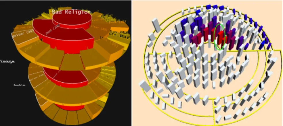
As the name suggests, the CodeCity approach uses a city metaphor to visualize a software project. While classes are represented as buildings, the packages they reside in form districts. This granularity was explicitly chosen, as both buildings and classes represent key elements in their respective domains. Class internals are not explicitly visualized, however they contribute to the metrics "number of attributes"(NOA) and "number of methods"(NOM) which are mapped to the width and height of the buildings. Color and transparency are used for user selection and also in the follow up work [41] to display design problems. Districts are displayed as platforms upon which the buildings are placed. The platforms can be stacked on top of each other to represent package hierarchies, which causes the buildings to be placed at different altitudes, creating a notion of topology. The layout of the city boils down to a 2D rectangle-packing problem and is constructed using a modified treemap algorithm, as the positions of the buildings do not reflect any relationships between them. Navigation is implemented in two ways. The user can either orbit/move/zoom the camera around the city, or he can navigate "on street level" among the buildings. Both navigation methods have constraints in order to avoid user disorientation. Object can be selected manually via a mouse pointer or by using an implemented query engine, which can also be used for filtering tasks. The approach however, does not visualize any low-level software artifacts such as methods or attributes, nor does it have a metaphor-aware representation of relationships between classes.
4https://wettel.github.io/codecity-download.html
3.6.2
VR Approaches
Exploring Software Cities in Virtual Reality
This work [44] can be considered as the most recent5approach to visualizing software in
virtual reality. The approach focuses on live trace visualizations using a city metaphor. Analogous to CodeCity, packages are displayed as plates which can be stacked on top of each other. However the approach allows packages to be opened or closed. While open packages follow the layout described above, closed packages hide the content of their children(sub packages,classes and connections) and are displayed as boxes which encompass the volume of their children. In contrast to CodeCity the focus lies on trace visualization, which is reflected by the shape of the buildings. The base of a building has a constant width while its height is mapped to the active instance count of the represented class. Connections play an important role and are visualized as straight lines where the width of a connection represents the call frequency of methods inside a class.
The visualization is presented to the user in a head mounted display(Occulus DK16), where his head rotation directly controls the view of the virtual camera. Since the used hardware does not incorporate any positional tracking, the position of the virtual camera is fixed and only its viewing direction can be changed. To alleviate this problem, the visualized system can be additionally moved, zoomed in and out, as well as rotated using gesture based controls. These rely on the movement and state of the hands, which are being tracked with a depth camera(Microsoft Kinect v2). Two hand states, hand closed or opened, can be recognized by the system, which is also the main selection/interaction mechanism. To determine which object the user wishes to interact with, the approach uses a virtual pointer which is centered in the middle of the users field of view. The authors also conducted a user study for their system, however it was of qualitative nature, where the participants rated their affinity towards the individual hand gestures. The main complaint of the system was the readability of text labels. Especially the labels of individual buildings, as they have been placed on top of them with a constant scaling. In combination with the low resolution of the head mounted display, the users were forced to zoom in by a large amount, which lead to loss of context and disorientation.
5At the time of writing this thesis and to the best knowledge of the author. 6The first generation HMD from Occulus targeted for the consumer market.
Chapter
4
Visualizing Software Architectures
as Islands
4.1
Island Metaphor
Requirements
The main emphasis of this work is to visualize OSGi based software architectures. As seen in section 3.3 a metaphor has to be expressive enough to provide mappings for all software artifacts the user is interested in. The required mappings of an OSGi based system encompass those of a classical Java system. However additional mappings are required to capture the added functionality of OSGi. These include the module layer and the concept of services. Overall, the chosen metaphor muss be expressive enough to provide mappings for the following aspects:
• Class types(Classes, Interfaces, Enums)
• Packages
• Bundles(Modules)
• Import/Export relations between Bundles
• Service components together with providing and referencing relationships
• Service interfaces
Although representing a software system at finer granularities than at class level is a nice feature, it is not particularly helpful when it comes to the understanding of the underlying architecture. As pointed out in [21], classes are the cornerstones of the object-oriented paradigm and are therefore, in the context of this thesis, the finest granular software artifacts which need to be visualized.
Figure 4.1: A rendering of the first island prototype.
The metaphor should also put more emphasis on the module layer as it forms a central part of OSGi and plays an essential role in the comprehension of software architectures based on it. As the application designed in this thesis targets a single-view visualization, the used metaphor would need to accommodate for this. Additionally, the metaphor should be based on a real-world concept, to take advantage of the familiar context these metaphors provide.
The Islands Metaphor
After careful analysis of the requirements the visualization had on the metaphor, the concept of mapping the software system onto a landscape metaphor was chosen. The landscape metaphor is a category of metaphors, which are, among others, characterized by the specific layout they impose on their elements. Each element is assumed to be a 3D object, which is laid out an a 2D plane. One example falling into this category would be the city metaphor, where each building is a 3D object, whose position can be exactly determined by its location on a 2D plane. While this layout allows for a more comprehensive visualization which is less disorienting for the user, it also has a sub optimal space utilization, as the height dimension remains mostly unused. This empty space however, can be efficiently used to accommodate the service connections specific to OSGi, without sacrificing the comprehensibility of the existing elements. As this thesis targets a single-view visualization, this quality is very important.
An islands metaphor is proposed to visualize OSGi based software systems in this work. As a member of the landscape class of metaphors it provides space for services in the height dimension and is an overall better fit for OSGi based systems than its main 22
contender, the city/cities metaphor.
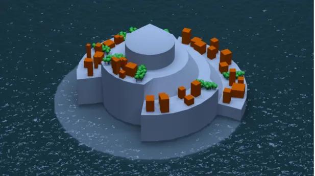
The whole software system is represented as an ocean with many islands on it. Each island represents an OSGi bundle and is split into multiple regions. Each region represents a Java package and contains multiple buildings. The buildings are the repre-sentatives of the individual class types which reside inside of a package. Each region provides enough space to accommodate all of its buildings without overlapping, and hence the overall size of an island is proportional to the number of class types inside of a bundle. Each island has an import and export dock which handles incoming and outgoing package dependencies between the individual bundles. Service connections are displayed as connected nodes which hover above buildings that describe a service interface or implement a service component. These nodes, together with their con-nections, are distributed into multiple height layers. This is done to reduce the visual complexity and to enable the users to selectively enable or disable specific layers.
The island metaphor provides a hierarchical structure with three different abstraction levels(island, region and building). The navigation between these layers should be based on our natural understanding of spatial relationships and should therefore be dependent on the relative size of the elements in the users view frustum. Hence, the transition between the levels should happen implicitly, as the user moves closer or further away from an element, or the element itself is scaled. This avoids the introduction of additional complexity into the navigation and ensures the consistency of the landscape metaphor. The metaphor is flexible enough to be extended if more than three abstraction levels are needed. Individual island groups can form archipelagos, which would provide an additional abstraction level. In the opposite direction, each island region could be interpreted as a country, which would open up even more possible hierarchical subdivisions.
There are several advantages of the islands metaphor as opposed to the cities metaphor. Islands provide a more intuitive representation of modules than cities do, since they express the aspect of decoupled entities, coexisting in the same environment more clearly. Additionally, despite the fact that both islands and cities are considered stationary in the real world, the concept of an island floating/moving along the ocean is more plausible than a city moving along the terrain. This opens up the possibility of dynamically relocating the islands at run-time, while maintaining a certain plausibil-ity. A software evolution visualization could benefit from this property, as the island movements would reflect the dependency changes within the system.
Another important advantage of the islands metaphor is the presence of the ocean as the "base plane", which spans over the landscape elements. Unlike terrain, water possesses interesting optical properties, which can be used for filtering tasks. Due to the absorption and scattering effects which take place in this medium, objects which are deeper under water appear more blurred and their color converges towards the color
of the surrounding ocean. This allows to submerge islands, which are currently of no interest to the user, into the ocean. While submerged, the user can still locate these islands and also estimate their size, however fine details are hidden, which results in reduced visual complexity.
It should be noted, that this thesis presents two distinct island representations(see section 4.3 and 4.4). While one is more realistic and is based on a cartographic approach, the other is more abstract but can represent the package hierarchy.
4.2
The Virtual Table Metaphor
Virtual Reality Metaphor
When designing a software visualization for an immersive virtual environment, addi-tionally to the selected software metaphor, it has to be put into consideration how the individual objects are represented in it. This mapping will be referred to as the virtual reality metaphor. Its choice affects many aspects. It encompasses the way how the visualization is integrated into the virtual environment, the interactions possible with it, as well as the navigational possibilities.
The choice for a suitable virtual reality metaphor is of course influenced by the choice of the software visualization metaphor itself. For example, the visualization could be transferred to the virtual environment in real-world scale. While this would seem natural and seemingly useful for a city metaphor, quite the opposite would be the case for a solar system metaphor. Here our natural navigation techniques would break down and the scale of individual objects, while surely providing a sense of awe to the user, would be far to huge to provide any reasonable overview of the whole system.
Virtual Table Metaphor
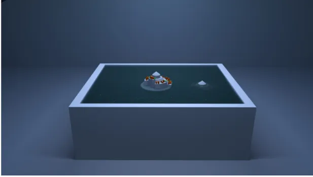
For this work, a virtual table metaphor was chosen to integrate the software visualization into the virtual environment. In it, the visualization is presented on top of a virtual table situated in an arbitrary room. The entire content of the visualization is confined to the extents of the table. In contrast to a real-world scale visualization, which is more likely to cause a feeling of presence of being inside the data, the table metaphor allows a more strategic/analytic view of the data. Indeed it was inspired by a strategic planing table that generals would use to plan their approach on the battle field. While they would be restricted to a 2D map which sits on top of the table, we can display arbitrary animated 3D objects on it. Although the table size may vary based on user preference, the metaphor itself imposes a restriction on the size of the visualization space. However this limitation does not have to be seen as a disadvantage, since it enforces the visualization to be shown in a more abstract, space saving, representation. While it can be helpful to 24
Figure 4.2: A rendering of the virtual table concept combined with the island metaphor.
see the fine grained details of software artifacts, it is the higher abstraction levels which contribute mostly to program and architecture comprehension. With that being said, the user should still be able to navigate freely between the individual abstraction levels as needed.
The virtual table metaphor provides a transparent transition between individual abstraction levels, as the user does not experience any relocation, since only the visual-ization in the confinements of the table has to be changed without altering the virtual room around it. This reduces user disorientation and motion sickness greatly, as the room always provides a stable frame of reference. This is especially important for the usability of the system in the context of software comprehension, as users can stay longer immersed in the virtual environment without interrupting their train of thought. As has been noted in section 4.1, the abstraction levels should be directly connected to the relative scale of the elements, which translates to an up or down scaling of the visualization itself. If, due to a high scaling factor, parts of the visualization extend beyond the confined bounds of the table, they would not be displayed. Only content inside of the table bounds is visible. This poses a significant problem for the display of fine granular software artifacts while preserving their surrounding context. However it is the trade-off when using this metaphor.
On the other hand, the limited visualization volume does not force the user to move around excessively in the virtual environment in order to view the desired information. This makes the metaphor also very suitable for a seated or standing VR experience, which can improve user comfort and reduce the dependency on VR hardware capable of precise positional tracking.
From a perception based stand point, a limited visualization volume puts also a constraint on the scene depth, where salient perceptual cues mostly emerge from. This is an interesting property of the metaphor when viewed in the context of the accommodation/convergence conflict, that all modern stereoscopic displays exhibit. The depth constraint on the salient cues leads to a more predictable convergence range for the eyes. This opens up the possibility of adjusting the accommodation distance of the display to match the most probable convergence distance inside of this range. By doing so, the mismatch between accommodation and convergence is reduced, which has a positive impact on visual discomfort and fatigue, symptoms related to motion sickness [45]. When the accommodation distance cannot be adjusted, there is the possibility of going the inverse route and moving the virtual table to match the fixed accommodation distance given by the display. However this will most probably move the table out of the users physical reach, which makes interactions with it more difficult and unnatural. Ideally, the accommodation distance of a display would be fixed to approximately 1 meter, which is a reasonable distance from a table to still enable natural interactions.
As the visualization content is presented on top of the table, the user will most likely view it in a downward angle of up to 50 degree. This should prove advantageous, as these viewing angles are recommendations for working with desktop systems, based on research in the ergonomics field [46].
4.3
Sunburst Islands
The main driving force behind the design of the first island representation was the desire to show the package hierarchy within the island structure, as well as to exploit the full potential of the ocean filtering mechanism. For this, the individual hierarchy levels had to be distributed over the height dimension. The representation of the package hierarchy had to be top-down, where the root node sits at the highest place of the island and the leaves at the bottom. This would allow a submerged island to be continuously raised from under the ocean, while revealing its deeper hierarchy levels as more and more of the island is above sea level. The reverse also works when submerging the island back into the ocean, in order to hide the deeper hierarchy levels.
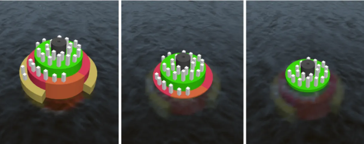
The chosen island layout is based on a sunburst diagram, as it provides the best fit from existing techniques, targeted at the visualization of hierarchical relationships. The ordering of the sunburst segments reflects the hierarchical package structure, present in the underlying bundle. In order to obtain a three dimensional island, each ring of sunburst segments is extruded in the height dimension. While the outermost ring receives the least extrusion, the rings around the center are extruded the most, resulting in a height profile similar to a pyramid.
Figure 4.3: Screenshot from the implemented Sunburst Island algorithm. As the island is lowered into the ocean, packages in the deeper hierarchical levels are the first to be filtered out.
Construction
To visually represent the hierarchy of all packages contained in a bundle, the first step is to construct a domain tree. For this, the fully qualified name of each package is taken and broken down into individual domain names, which are stored in the nodes of this tree. To obtain the full package name for a node, the parent nodes have to be recursively traversed up the hierarchy, while accumulating the individual domain names. However not all node traversals yield a valid package name, as developers can introduce an arbitrary number of domains into the package name, which do not contain any classes. Therefore, a node in the domain tree must also store the information if the recursively accumulated package name is of a non empty package.
Once the domain tree is fully populated, the sunburst structure can be constructed. This is done by traversing the domain tree in level order and creating a sunburst segment for each node in the tree. Three parameters need to be determined for the construction of such a segment. The radial extent, width and height. Segments in the original sunburst diagram posses all equal widths, which only allows to compare the relative area of sibling segments contained in the same ring. The segments used for the island however need to offer an absolute area, as they are used to accommodate objects on their surface. Since the area is dependent on both radial extent and width, a heuristic is used to determine the radial extent first. When a new segment is created, its radial extent is always a fraction of its parents extent and is proportional to the area required by this segment and all of its children. IfAcis the area required by the current segment and all of its children, andApthe area required by all children of its parent segment, then the radial extent of the current segmentRcis given by:
Rc=Rp· Ac Ap
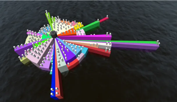
Figure 4.4: Screenshot from the implemented Sunburst Island algorithm showing one of the largest bundles in RCE. When bundles contain a large number of packages, the sub optimal use of space becomes apparent.
whereRpis the radial extent of the parent segment. WithRccalculated, the width of the segment can be easily determined based on the area equation of the segment. Although the width is the only unknown variable, the analytic solution is impractical as it returns a continuous width value, however the buildings that should fit on the surface of this segment are of discreet dimensions. Therefore a solution was used, where the buildings are iteratively laid out on the surface of the segment, extending the width each time the segment did not provide enough space for them. The width needs to be determined only for segments which contain buildings. Segments representing empty packages are assigned a constant width. To obtain a 3D structure, the segments need to be extruded along the height dimension. The extrusion amount is equal for all segments inside of a sunburst ring , which translates to domain tree nodes of the same hierarchy depth. The heightH of a ring at depth leveliis expressed by:
Hi =Hi+1+BHmaxi+1 +c (4.2)
where BiHmax is the maximal building height found at depth level i and c ∈ R+ is
a constant user variable. The computed ring height is guaranteed to be higher than all objects contained in the next ring, which is very important for the ocean filtering mechanism to work properly. The last step in the construction is to distribute the buildings on to their respective segments. Luckily this is a trivial task, as the individual placement positions have already been computed during the segment width estimation. 28
Figure 4.5: Left: The 3D sunburst as presented by Schedl et al.Right: Sunburst based software visualization by Langelier et al. Images are taken from [47] and [48]
Conclusion
The presented sunburst island representation showed promise in the fields it was de-signed for. Packages and their hierarchical structure could easily be recognized and the ocean filtering method worked as intended. However various problems lead to a reevaluation of this approach, which ultimately resulted in a completely new island representation(described in section 4.4).
The main problem of the sunburst layout is the sub optimal use of space, due to its radial layout. If a bundle contains many packages, the resulting segments have small radial extents. To compensate, the segments have to be extended in the width dimension until they are able to accommodate their contained buildings. This results in thin, long segments, which are especially problematic in islands whose segments exhibit a high variance in their building count, as this makes the long segments stand out. Although the underlying packages to not differ from packages represented with "normal" segments, the distinct shape can lead users to false conclusions about the package.
Another problem attributable to the radial layout is occlusion. The user cannot see buildings on the farther side of the island, as the extruded segments are occluding the view. This forces the user to navigate around it, which is cumbersome.
Related Work
Schedl et al. [47] extended the sunburst diagram into the third dimension to enable an exploration of a web page collection based on co-occurring terms. The height of each segment was used to represent an additional metric. The resulting 3D sunburst shares a visual similarity with the one presented in this thesis, as the overall height of all segments decreases with increasing distance from the center. However, the height is not normalized within a hierarchy level. Additionally, equal to the original sunburst algorithm, every segment has the same width.
For the purpose of visualizing Java based software architectures, Langelier et al. [48] employed a layout technique based on the sunburst diagram. Similar to this thesis, the individual sectors are mapped to Java packages and their area does not directly reflect any metric, but instead is used to accommodate the classes contained in the package. The classes are represented as simple boxes, where the height, color and twist are mapped to different metrics. In addition to sunburst, a tree map based layout algorithm is also presented. While the construction steps and rules for it are clear, the construction of the sunburst layout is not mentioned in such detail. This makes a direct comparison with this work rather difficult. With that being said, the angular extent of newly created segments is computed identically as to presented in this thesis. This makes the approach theoretically also prone to the "thin segment" problem when confronted with a system containing many packages. The results presented by Langelier et al. however do not exhibit this problem, although they mention the layout technique not having a sub optimal use of space, when confronted with systems containing many packages with very few classes. In contrast to this thesis, the sunburst is used only as a 2D layout and the individual segments are not extruded in the height dimension, resulting in a rather "flat" visualization.
4.4
Cartographic Islands
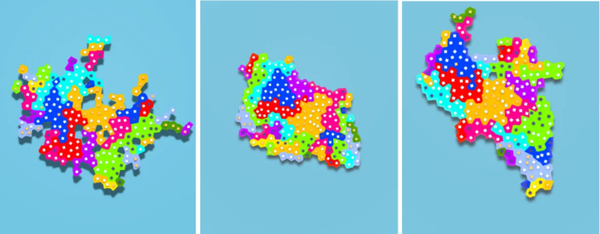
This approach aims at producing islands, which have a higher resemblance to their real-world counterparts. A cartographic approach is taken, where islands consist of multiple regions, which are subdivided into several cells. Each region represents a package and has an irregular, rugged shape, similar to countries when seen on a map. These regions share borders, and together, they determine the shape of the island. As opposed to the sunburst approach, package hierarchy is not represented, as all packages are laid out as independent regions. Also, all regions reside at the same height, which prohibits a continuous filtering mechanism as described with the sunburst islands. However the created islands look more realistic, which emphasizes the plausibility of the island metaphor. Additionally, each island and region has a very distinct shape, allowing a better memorability and thus a more efficient navigation. Space utilization is also higher than in the sunburst approach as the cells which make up every region are designed to provide enough accommodation area for buildings to be placed on top.
4.4.1
Construction
The island construction is based on claiming cells in a voronoi diagram. Every island is assigned an individual diagram. The first step in the construction is to create a voronoi diagram from a point distribution. It should yield enough cells to contain the whole 30
island and their size should be large enough to accommodate a building. Also, the most aesthetically pleasing islands were achieved with cells, which did posses only a low variance in their size and shape. To this end, a point distribution based on a regular grid is taken as a starting point. Each point is perturbed in a random direction to break the regular pattern and create more interesting cell shapes. However the introduced noise also results in a higher cell size variance. To reduce the size variance a few iterations of Lloyds relaxation [49] are performed. One iteration of this algorithm computes the centroid of each voronoi cell and translates the corresponding voronoi cell sites to this position. A new voronoi diagram is computed based on the new site points and can be used again as input for another relaxation iteration. From a frequency based perspective, the cell size variations can be attributed to the low frequency portion of the point set. A Lloyd relaxation generates point sets exhibiting blue noise characteristics, which posses a small amount of low frequency noise, with increasing amounts towards higher frequencies.
In the next step, each package claims multiple cells of the created voronoi diagram, corresponding to the number of contained classes. Cells are claimed one at a time and only cells adjacent to already existing entities can be claimed. Possible candidate cells are stored in a list, which is adjusted each time a new cell is claimed. Claiming a cell removes it from the candidate list, adds its neighbouring unclaimed cells to it(only if they are not already there) and flags the cell with a reference to the package it now belongs to. When the process is started for the first time(first package of each bundle), the candidate cell list is initiated with a cell which sits approximately in the middle of the diagram. In order to create rugged and irregular shapes for the package representations, the next cell from the candidate list is selected randomly. An entirely random selection however works only for a small amount of cells. When dealing with larger packages, this selection mechanism does tend to leave cells in the interior of the shape unclaimed, which results in a non continuous area filled with holes. To reduce this problem, the cells can not be selected with a uniform probability distribution. By introducing an estimating function as described by Yang et al. [50], the holes can be greatly reduced, while preserving the ragged appearance of the regions. This results in more interesting shapes.
Before a new tile is selected from the candidate list, each eligible cell counts its number of neighbours, which have already been claimed. If a cell is surrounded withn claimed cells, the probability of it being a hole grows withn. A score is calculated for each candidate, based on itsn:
Sn =bn (4.3)
wherebis a user definable cohesion factor. Once the scores are known, a new cell can be selected, where the probability of each candidate is directly proportional to its score Sn. Ifbis set to 2, the chances of selecting a cell which is surrounded with 4 claimed
Figure 4.6: Left: A minimal cohesion factor leads to very rugged islands with a lot of holes. Middle: A very high cohesion factor reduces holes greatly and creates compact islands. Right: Dynamic cohesion factor makes larger regions more cohesive than smaller ones. Combined with the claiming of large regions first, the island preserves some of the ruggedness, yet it minimizes holes.
cells is two times higher, than selecting a cell with only 3 claimed neighbours. Due to this, a higherbvalue results in less holes, but also more regular and compact shapes. A package can run out of space when claiming its territory, as only cells adjacent to the already existing area can be claimed. This can happen when the start cell is situated in a hole or is surrounded by other already existing regions. In such a case, a backtracking [50] is performed, where all currently claimed cells of a package are released and the process restarts at a different starting location. A higher cohesion factor reduces the risk of backtracking as the number of holes is smaller and the individual regions are more convex.
To further reduce the risk of backtracking, while preserving the rugged appearance of an island, the cohesion factor can be varied on a per region basis. This is done by definingbmin andbmax, which are assigned to the regions based on their size. While the smallest region is assignedbmin, the cohesion factor is interpolated towardsbmax for larger regions. Additionally, the regions are claimed in descending order, starting with the largest package first. This results in islands which contain smaller, irregular regions at their edge, while the larger, more regular regions reside in the interior. From a usability perspective, this layout is more advantageous, as smaller regions are harder to select when surrounded by larger ones.
Once all packages have claimed their cells, the islands need to assume a three dimensional form. This is done during the construction of the coast area. As regions are sequentially claimed, the candidate list accumulates all potentially claimable cells. When the final cell of the last region is claimed, this list consists mostly of cells situated at the boundary of the island. From here, the islands coast is created by iteratively claiming and expanding the boundary cells outwards. This process has the positive 32
Figure 4.7: A range of different coast shapes, created with specific height profiles.
side effect of filling any existing holes, as they are also part of the final candidate list. Each time the boundary ring is extended, a new height is associated to its cells. A user defined height profile controls this process, where each entry expands the coast by one cell and assigns the stored height value. In the final construction step, a polygonal mesh is generated from all claimed cells in the voronoi diagram using triangulation.
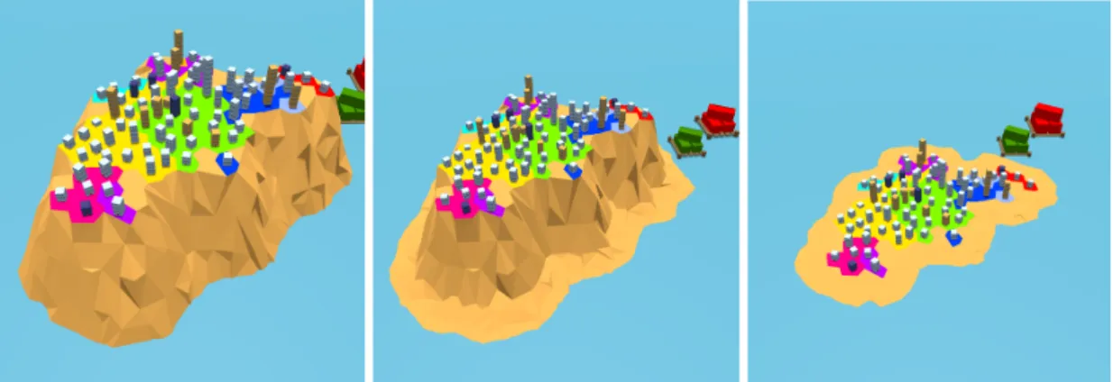
Representing Classes
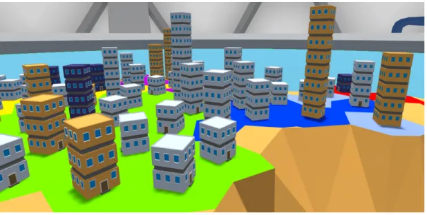
As previously stated, all classes are represented as buildings. Each region is spread across a number of voronoi cells which is at least equal to the number of classes in the underlying package. The buildings are placed at the center of each cell, as this provides the maximal distance towards neighbouring buildings, in order to avoid the risk of overlapping. Due to the use of Lloyd relaxation, the voronoi site points can be used as a good approximation for the centroid of each cell. The maximal scale of a building is limited to the cell size it resides in. When islands, composed of many cells, are viewed in their entirety, individual buildings become less perceivable. As a result, they are harder to locate and to compare against each other. In order to maximize the perceivability from afar without exceeding the cell boundaries, a multi-storey building representation is chosen, encouraging a metric based expansion in the height dimension.
Conclusion
The cartographic islands solve the main limitation of the sunburst based approach, as they offer a much better space utilization. In addition, the created islands have a more realistic appearance, which improves the overall plausibility of the metaphor. As a result of the probabilistic construction process, each island, each region exhibit a very distinct shape. This offers a very strong navigational cue to the user, as bundles and packages can be identified based on their shape or proximity to other known shapes.
Figure 4.8: Class types are represented as multi-storey buildings.
This also opens up the possibility of representing a bundle related metric based on the shape and height of a coast region. Although all island regions are located at the same height, the presented software visualization does not depend on this fact. A metric based height extrusion could bring aesthetically more pleasing islands, as well as additional information.
The point set generation used for the construction of a voronoi diagram, as well as the selection of the next claimable cell rely both on random numbers. It should be noted that all random numbers are picked from a sequence, which is generated beforehand with the use of a seed value. This allows to reliably reproduce the shape of all islands for a specific seed. To avoid repeating island shapes for bundles with equal package and class counts(also constructed in the same order), the seed is offset for each island by a value generated from the bundle name.
Related Work
The presented construction algorithm is based on the work of Yang et al. [50]. Their work focuses on the visual representation of general, hierarchically structured data in the form of a geographic map. While the authors employ a hexagonal grid as the underlying tile structure, this thesis uses a voronoi diagram. Although it is computationally more expensive, it allows for a wide variety of interesting cell shapes(hexagonal included). The main reason for this choice is, in comparison to Yang et. al, the small number of claimed tiles. Their method targets data sets with thousands of entries. At this resolution, irregular shapes can be created, despite the uniform shape of a single hexagon(Figure 4.9). The number of classes contained in a single package however is substantially smaller. To achieve interesting shapes, the tiles themselves have to exhibit a certain 34
Figure 4.9: Hexagonal tile claiming approach from Yang et al. Image taken from [50].
amount of irregularity, an attribute which voronoi cells provide.
Another important difference results from the restrictions Yang et al. put on the input data. It must be in the structure of a directed tree, where the size of each branch node must be equal to the sizes of its children. A package hierarchy however does not conform to this structure, as each package can contain, in addition to multiple sub-packages, also a number of classes. This complication prohibits the use of the hierarchical tile claiming algorithm as proposed in the authors paper. Instead, this thesis uses a simplified version, where the hierarchy is neglected and all packages are considered equal.
4.5
Package Dependencies
Due to the architecture oriented focus of the presented software visualization, the dependencies between individual modules are of high importance. When dealing with relationships between entities, it is beneficial to interpret the entire system as a graph. In this case, islands represent the nodes, while the package dependencies are the edges among them. The graph has to be a directed one, as each edge must be able to store a two way dependency. Bundle A can import from bundle B, but B can also potentially import from A. The export information is given implicitly by reversing the order of the nodes, which define an import edge. Additionally, each edge should store a weighting factor to represent the strength of a dependency, based on the number of imported packages.
Building on the island metaphor, an import and export port is added to each island. These ports are situated along the coast line and manage the incoming and outgoing dependencies. In order to visualize them, two orthogonal types of approaches can be considered. An explicit and an implicit dependency visualization.
Figure 4.10: A density map of the worldwide ship traffic for the year 2016. Certain sub-routes are often shared between multiple ships, as they offer a more efficient traversal. Image taken from MarineTraffic[51].
4.5.1
Explicit Visualization
The most uncomplicated approach to visualize the existing dependencies, is by drawing straight lines between the entities in question. While these entities are islands, the connections should be drawn between their respective ports, where export ports are connected only to other import ports and vice versa. Straight lines however are very unfavourable, as all ports are laid out on the same height level. This causes lines to intersect with each other, as well as with other islands. As a result, significant visual complexity is introduced into the visualization.
Ship Routes
To further elaborate on the island metaphor, the dependency relationships can be visualized as ship routes between corresponding import and export ports. In contrast to straight lines, ship routes connect two points exclusively via the use of the ocean, hence avoiding intersections with islands. Additionally, they are planed in respect to certain goals, such as: minimizing fuel consumption, maximizing travel speed or maximizing cargo safety. These considerations are derived from spatial environmental factors, which affect every travel route. As a result, ships often share certain advantageous sub-paths. This effectively bundles nearby routes together, greatly reducing visual clutter and revealing high-level edge patterns(Fig. 4.10). Indeed, these are the characteristics of known edge bundling algorithms [52] [53] [54] [55], which are very good candidates for implementing this behaviour.
In addition, animated ship models can travel along these routes to help convey the metaphor to the user. The ships carry containers, which represent the imported 36
![Figure 2.1: The OSGi Service Layer. Image taken from [3].](https://thumb-us.123doks.com/thumbv2/123dok_us/11067392.2993332/12.892.210.637.463.750/figure-osgi-service-layer-image-taken.webp)
![Figure 4.9: Hexagonal tile claiming approach from Yang et al. Image taken from [50].](https://thumb-us.123doks.com/thumbv2/123dok_us/11067392.2993332/37.892.315.620.106.365/figure-hexagonal-tile-claiming-approach-yang-image-taken.webp)
