Thinking outside the box: Developing dynamic data
visualizations for psychology with Shiny
David A. Ellis1*, Hannah L. Merdian2
1Department of Psychology, Lancaster University, United Kingdom, 2School of Psychology, University of Lincoln, United Kingdom
Submitted to Journal: Frontiers in Psychology Specialty Section:
Quantitative Psychology and Measurement ISSN: 1664-1078 Article type: Methods Article Received on: 30 Jul 2015 Accepted on: 05 Nov 2015
Provisional PDF published on: 05 Nov 2015
Frontiers website link: www.frontiersin.org Citation:
Ellis DA and Merdian HL(2015) Thinking outside the box: Developing dynamic data visualizations for psychology with Shiny. Front. Psychol. 6:1782. doi:10.3389/fpsyg.2015.01782
Copyright statement:
© 2015 Ellis and Merdian. This is an open-access article distributed under the terms of the Creative Commons Attribution License (CC BY). The use, distribution and reproduction in other forums is permitted, provided the original author(s) or licensor are credited and that the original publication in this journal is cited, in accordance with accepted academic practice. No use, distribution or reproduction is permitted which does not comply with these terms.
This Provisional PDF corresponds to the article as it appeared upon acceptance, after peer-review. Fully formatted PDF and full text (HTML) versions will be made available soon.
Thinking outside the box: Developing dynamic data visualizations for
1
psychology with Shiny
2 3
David A. Ellis1 & Hannah L. Merdian2
4
1 Department of Psychology, Lancaster University, Lancaster, UK
5
2 School of Psychology, University of Lincoln, Lincoln, UK
6 7
* Correspondence: David A. Ellis, Department of Psychology, Lancaster University, Lancaster,
8
LA1 4YF, UK.
9
10
Keywords: visualization1, knowledge-exchange2, research methods3, statistics4, R5, Shiny6
11
Abstract
12
The study of human perception has helped psychologists effectively communicate data rich
13
stories by converting numbers into graphical illustrations and data visualization remains a
14
powerful means for psychology to discover, understand and present results to others.
15
However, despite an exponential rise in computing power, the World Wide Web and ever more
16
complex data sets, psychologists often limit themselves to static visualizations. While these are
17
often adequate, their application across professional psychology remains limited. This is
18
surprising as it is now possible to build dynamic representations based around simple or
19
complex psychological data sets. Previously, knowledge of HTML, CSS or Java was essential, but
20
here we develop several interactive visualizations using a simple web application framework
21
that runs under the R statistical platform: Shiny. Shiny can help researchers quickly produce
22
interactive data visualizations that will supplement and support current and future
23
publications. This has clear benefits for researchers, the wider academic community, students,
24
practitioners, and interested members of the public.
25 26 27 28 29
Provisional
3 1. Introduction
30
Psychological data analysis continues to develop with a recent shift in focus from
31
significance testing to the exploration of effect sizes and confidence intervals (Sainani, 2009;
32
Schmidt, 1996). At the same time, psychology and related fields have made meaningful
33
contributions when it comes to developing innovative methods for visualizing and interpreting
34
findings (for a brief history see Friendly 2008). Historically, the focus has often been to
35
maximize the expressive power of figures, both with regards to conveying the content and
36
structure of the data as well as informing the analysis process (Campitelli & Macbeth, 2014;
37
Marmolejo-‐Ramos, 2014). This has included a number of computational developments, such as
38
the expansion of boxplots to include information about both distribution and density of the
39
data (Marmolejo-‐Ramos & Matsunaga, 2009; Marmolejo-‐Ramos & Tian, 2010) or explorations
40
of different data visualizations for particularly skewed data sets (Ospina, Larangeiras, & Frery,
41
2014).
42
However, while static graphical illustrations remain perfectly adequate in many
43
instances, these have become problematic as we move towards larger and more complex data
44
sets that evolve over time (Heer & Kandel, 2012). In a critical review concerning the use of data
45
visualizations in scientific papers, Weissgerber, Milic, Winham, and Garovic (2015) identified a
46
number of limitations and misrepresentations linked to the current practice of using static
47
figures when presenting continuous data from small sample sizes. Static data visualizations are
48
also limited in the quantity and type of information that can be presented, which is typically
49
directed towards the analysis conducted. These visualizations in isolation often raise additional
50
questions about the data itself or suggest an alternative analysis. Dynamic representations on
51
the other hand can provide an almost limitless supply of additional information; at a basic level,
52
for example, this would enable a regression model to be re-‐calculated in real-‐time for male and
53
female participants separately (Figure 1).
54
55
[Insert Figure 1 about here]
56
57
Complex applications can also provide online portals for interactive data augmentation
58
and collaboration (Tsuji, Bergmann & Cristia, 2014). However, such transformations rely on the
59
data being available to both a user interface and server to process these requests. Previously
60
this was only possible by developing interactive web applications using a combination of
61
HTML, CSS or Java, but this is no longer a limiting factor. For those who have a basic knowledge
62
of R, the move from static to dynamic reporting is relatively straightforward (e.g., Xie 2013).
63
Dynamic data visualization is likely to have clear advantages when teaching statistical
64
concepts to undergraduate students; for example, Newman and Scholl (2012) pointed towards
65
issues in students’ interpretation of bar graphs (a static representation), with Moreau (2015)
66
stating that visual and dynamic data representations may be more appropriate when teaching
67
complex statistical concepts. Learning via active exploration has been shown to be beneficial
68
for in a variety of contexts and any dynamic representation encourages this engagement
69
(Bodemer et al., 2004). It may also motivate students who were previously of the opinion that
70
becoming statistically literate involves understanding numbers in isolation (Papastergiou,
71
2009).
72
Going further, dynamic data visualization can also fulfill the particular research needs of
73
practitioners in the applied sciences including clinical and forensic psychology. One of the core
74
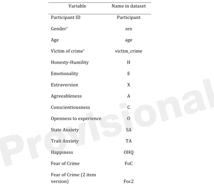
competencies of professional psychologists in practice is to develop an understanding and
75
application of scientific knowledge in evidence-‐based practice. These competencies should
76
remain closely aligned to the development of methodological skills when in evaluating
77
5
research. e.g., American Psychological Association, 2011; British Psychological Society, 2014).
78
Training is guided by the Scientist-‐Practitioner Model, postulating that effective psychological
79
services are underpinned by research that is informed by questions arising from clinical
80
practice (Jones & Mehr, 2007). However, there is no professional consensus in terms of the
81
exact nature of the relationship between psychological science and professional practice (Gelso,
82
2006; Peterson, 2000). In their review of current issues regarding the future development of
83
forensic psychology, Otto and Heilbrun (2002) emphasized practicing forensic psychology in
84
line with the “relevant empirical data” (p. 16) but failed to systematically incorporate the
85
scientific method as a development target for forensic psychologists. Gelso (2006) considers
86
that a low level of research engagement by clinical doctorate graduates (e.g., Barlow 1981;
87
Peterson, Eaton, Levine, & Snepp, 1982; Shinn, 1987) is due to neglect of the research training
88
within the academic environment for professional psychologists, and to a lack of specific
89
research skills required within their professions. Even for those undertaking pure research
90
degrees, Aiken, West, and Milsap (2008) identified significant gaps in the knowledge of doctoral
91
students with major misunderstandings evident in statistics, measurement, and methodology
92
training, specifically with regards to non-‐laboratory research, advanced research methods, and
93
innovative methodology and research design. These training gaps constitute a particular
94
disadvantage for clinical and forensic research productivity, where research is often based on
95
single-‐case studies (e.g., ABA-‐designs in clinical practice) or small sample sizes (e.g., specific
96
offender or clinical subtypes). Frequently, a large number of variables for each data point are
97
available for a small number of cases that will often not fulfill the assumptions required for
98
traditional linear tests (e.g., in offender profiling; Canter & Heritage, 1990s). Finally, with the
99
introduction of mobile technology, applied field-‐research has the capacity to produce very large
100
data sets through the use of mobile applications (e.g., in identifying friend networks; Eagle,
101
Pentland, & Lazer, 2009; in displaying individual gait patterns; Teknomo & Estuar, 2014).
102
However, both very small and very large data sets provide a challenge for standard linear
103
representations and testing (Rothman, 1990), which we argue can be in-‐part be compensated
104
for with the use of dynamic data visualizations. This would also allow non-‐experts to repeat
105
(complex) analyses in their own time, after the researcher has provided a summary (Valero-‐
106
Mora & Ledesma, 2014).
107
At present, several barriers remain when integrating these methods with
108
psychological research and practice. First, developing suitable applications that can process,
109
analyze and visualize psychological data requires a significant allocation of resources. Second,
110
the lack of concrete examples that directly relate to psychological data mean that current
111
applications are often overlooked. In this tutorial paper, we aim to address both aspects by
112
introducing Shiny (http://shiny.rstudio.com/), a data-‐sharing and visualization platform with
113
low threshold requirements for most psychologists. We then provide several examples
114
centered on a real-‐life forensic research dataset, which aimed to develop a predictive model for
115 crime-‐related fear. 116 117 2. Introducing Shiny 118
Shiny allows for the rapid development of visualizations and statistical applications that
119
can quickly be deployed online. By providing a web application framework for R
120
(http://www.r-‐project.org/), this platform allows researchers, practitioners and members of
121
the public to interact with data in real-‐time and generate custom tables and graphs as
122
required1.
123
1 An accompanying website is also available https://sites.google.com/site/psychvisualizations/
7
Shiny applications have two components: a user-‐interface definition and a server script.
124
These cleverly combine any additional data, scripts, or other resources required to support
125
the application; data can either be uploaded to or retrieved from an online repository. The
126
remainder of this paper will create and develop an interactive visualization using an example
127
data set concerning factors that predict an individual’s crime-‐related fear.
128
129
Developing any Shiny app or dynamic data visualization can be split into four steps:
130
(i) Data preparation
131
(ii) Creating static content to guide development
132
(iii) Development and testing
133
(iv) Deploying an application online
134
135
(i) Data Preparation
136
We recently collected data from around 300 participants which included a variety of
137
variables that might predict an individual’s fear of crime (see crime.csv). While we were
138
particularly interested in personality factors that predict fear, we also collected anxiety and
139
well-‐being scores along with every participant’s age and gender (see Table 1 for a list of
140
included variables). We felt that that these findings may be of interest to members of the public
141
and other interested parties (e.g., law enforcement agencies), and wanted to report the results
142
in a dynamic fashion that allow external parties access the data and subsequent results.
143 144 145 146
Provisional
Table 1: Information about the included dataset – crime.csv. Copies of this data set can be
147
found in all included code folders.
148
Variable Name in dataset
Participant ID Participant
Gender* sex
Age age
Victim of crime* victim_crime
Honesty-‐Humility H
Emotionality E
Extraversion X
Agreeableness A
Conscientiousness C
Openness to experience O
State Anxiety SA
Trait Anxiety TA
Happiness OHQ
Fear of Crime FoC
Fear of Crime (2 item
version) Foc2
note*=categorical variable. Remaining variables are all numeric with higher scores indicating increased
149
levels of each trait.
150
151
The crime.csv dataset can be loaded into R using the read.csv command:
152
data <- read.csv("crime.csv", header = T, sep = ",")
153
Care should be taken by the data provider to only include variables that will be used as part of
154
the final online application; for example, while almost all of our example variables were
155
calculated from an extensive set of standardized measures, including the HEXACO-‐PI-‐R
156
9
measure of personality (Ashton & Lee, 2009), we have not included the raw data for each
157
measure to ensure that the final application will load and update quickly once online. Raw data
158
can be viewed in raw_data.csv.
159
160
(ii) Creating Static Content to Guide Development
161
Before creating any Shiny application, it is useful to experiment with some simple
162
statistical analysis and static visualization in order to get a feeling for how the data can best be
163
represented within an application. One may conclude that a static visualization (e.g. a single
164
table or series of bar-‐graphs) is perfectly adequate without any additional development.
165
Code to install all relevant packages and generate static visualizations in R can be found
166
in the static_graphics folder. From these examples, we concluded that for our data on
167
crime-‐related fear, box and scatter plots were ideal when it came to exploring relationships
168
between our variables of interest. Based on our original predictions, it became evident that
169
specific aspects of personality, such as Emotionality, were likely to be the best predictors of
170
crime-‐related fear. We also observed that there were a large number of variables and
171
relationships we would like to explore and share with others; however, multiple scatter plots
172
and regression lines would quickly become overwhelming, leading us to develop an application
173
to share our results and data with others.
174
175
(iii) Development and Testing
176
We developed a series of examples that progress in complexity. Example 1 makes the
177
simple transition from static to dynamic visualization using a Shiny function. Examples 2 and 3
178
add advanced customization features using additional graphical and statistical functions.
179
180
181
Example 1
182
To run the first example, load the Shiny library and set your working directory to the
183
folder containing example1. This folder includes the data set and two scripts, ui.R and
184
server.R (see below): library(“shiny”).
185
The move from static to dynamic visualization only requires a few additional lines of
186
code. The ui.R script loads and labels the variables from the dataset. Here, we aimed to
187
demonstrate how different personality factors might predict an individual’s fear of crime, so
188
these are labeled as responses and predictors accordingly. The second part of this script
189
creates a simple Shiny page; various placeholders allow users to interact with the data. Finally,
190
a command to print graphical output is placed at the end of this loop.
191
Moving to the server.R script, variable names defined within ui.R are replicated here.
192
These variable names act as a link between both scripts. An IF function provides additional
193
user interaction by differentiating between participants’ gender. For example, if male, female or
194
both genders are selected, then the chart will color each data point accordingly. If no
195
participant gender is selected, then a standard plot is created that includes data from both male
196
and female participants.
197
To run this example, simply type: runApp('example1')into the console. A scatter
198
plot should now appear in a new window with a variety of options on the left (“Select
199
Response”, “Select Predictor”). By experimenting with different predictors, the scatter plot will
200
update accordingly; this process will assist the development of future predictions regarding
201
what individual differences are more predictive of crime-‐related fear than others.
202
203
11
Examples 2 & 32
204
Examples 2 and 3 are developed directly from Example 1. Marked-‐up code is available in
205
the attached folders, example2 and example3. These can be run in an identical fashion to
206
example1. Example 2 adds boxplots and statistical output, which again relies on standard
207
graphical and mathematical functions in R. This version also allows the user to build linear
208
regression models after choosing any predictor and response variable (e.g., the predictive value
209
of Honest-‐Humility); statistical output is presented underneath the scatter plot, providing
210
information relating to effect sizes and statistical significance. Box plots can be used to directly
211
compare the distribution of scores on these variables, or to compare levels of crime-‐related
212
fear between men and women directly. Example 3 (Figure 2) adds two additional functions,
213
which handle a variety of potential visualization options. This provides separate regression
214
outputs for male and female participants and/or those who have previously been a victim of
215
crime.
216
217
[Insert Figure 2 about here]
218
219
(iv) Deploying an Application Online3
220
There are several ways to deploy a Shiny application online; however, the fastest route is
221
to create a Shiny account (http://www.shinyapps.io/) and install the devtools package by
222
running the following code in your R console: install.packages('devtools').
223
Finally, the rsconnect package is also required and can be installed by running the following
224
code in your R console: devtools::install_github('rstudio/rsconnect). Load
225
2 Example 3 can be viewed online https://psychology.shinyapps.io/example3
3 Additional instructions are available http://shiny.rstudio.com/articles/shinyapps.html
this library: library(“rsconnect”). Once a shinyapps.io account has been created
226
online and authorized, any of the included examples can quickly be deployed straight from the
227
R console: deployApp(“example1”). However, it is also possible to host your own private
228
Shiny server4.
229
Deployment of the application will allow other users to access and engage with the data
230
set. However, the entire dataset could also be made available from the application itself with
231
some additional development.
232
233
3. Discussion
234
The last two decades have witnessed marked changes to the use and implementation of
235
data visualizations. While research has often focused on the enhancement of existing static
236
visualization tools, such as violin plots to express both density and distribution of data
237
(Marmolejo-‐Ramos & Matsunaga, 2009), these remain limited due to their static nature.
238
Specifically, static visualizations become exponentially more difficult to understand as the
239
complexity of the content they aim to display increases (e.g., Teknomo & Estuar, 2014).
240
Such data-‐rich representations are likely to be helpful when teaching statistical concepts
241
however, little research exists on its effectiveness within an educational context (Valero-‐Mora
242
& Ledesma, 2014). While an expert user may believe they have created something practical and
243
aesthetically pleasing, much of the literature surrounding human-‐computer interaction
244
repeatedly demonstrates how a seemingly straightforward system that an expert considers
245
‘easy’ to operate often poses significant challenges to new users (Norman, 2013). Future
246
research is required in order to fully understand the effect interactive visualizations could have
247
on a student’s understanding of complex statistical concepts.
248
4 http://www.rstudio.com/products/shiny/download-‐server/
13
Dynamic visualizations remain a promising alternative to display and communicate
249
complex data sets in an accessible manner for expert and non-‐expert audiences (Valero-‐Mora &
250
Ledesma, 2014). The above worked examples demonstrate the straightforward and flexible
251
nature of dynamic visualization tools such as Shiny, using a real-‐life example from forensic
252
psychology. This move towards a more dynamic graphical endeavor speaks positively towards
253
cumulative approaches to data aggregation (Braver, Thoemmes & Rosenthal 2014), but it can
254
also provide non-‐experts with access to simple and complex statistical analysis using a point-‐
255
and-‐click interface. For example, through exploration of our fear of crime data set, it should
256
quickly become apparent that while some aspects of personality do correlate with fear of crime,
257
the results are not clear-‐cut when considering men and women in isolation and this may
258
generate new hypotheses concerning gender differences and how a fear of crime is likely to be
259
mediated by other variables.
260
While a basic knowledge of R is essential, dynamic visualizations can make a technically
261
proficient user more productive, while also empowering students and practitioners with
262
limited programming skills. For example, an additional Shiny application could automatically
263
plot an individual’s progress throughout a forensic or clinical intervention. Relationships
264
between variables of improvement alongside pre and post scores across a several measures
265
could also be displayed in real-‐time with results accessible to clinicians and clients. Dynamic
266
data visualizations may therefore be the next step towards bridging the gap between scientists
267
and practitioners.
268
The benefits to psychology are not simply limited to improved understanding and
269
dissemination, but also feed into issues of replication. For example, the ability to compare
270
multiple or pairs of replications side by side is now possible by providing suitable user
271
interfaces. Tsjui and colleagues (2014), for example, have recently developed the concept of
272
community-‐augmented meta-‐analysis (CAMA), which involves a combination of meta-‐analysis
273
and an open repository (e.g., PsychFileDrawer.org; Spellman 2012). These alone can improve
274
research practices by ensuring that past research is integrated into current work. Using the
275
intervention example from above, one can envision a further application that plots the progress
276
of individual clients over several years, providing information on treatment change, outliers,
277
and group trends over time.
278
In other areas of psychological research, much of this data already exists and the
279
deployment of data on open access data repositories (e.g. such as Dryad or Figshare) makes
280
data deposition in the first instance more straightforward. However, the advantages of open-‐
281
access databases brings with it problems of navigation, organization and understanding. If
282
these new developments are to reach their full potential and remain relevant to all
283
psychologists, they still require a user-‐friendly interface that allows for rapid re-‐analysis and
284
visualization. Of course, dynamic or interactive data visualizations are only going to become
285
standard practice if psychologists start use these methods on a regular basis. Researchers
286
themselves will govern the speed of this development; journals may start to support this
287
additional interactivity within publications. We hope that improve data transparency further,
288
psychology will lead the way by ensuring that old and new data sets 2escape the confines of
289 static representation. 290 291 Acknowledgments 292
Funding: A Research Investment Grant (RIF2014-‐31) from The University of Lincoln supported
293
the preparation of this manuscript.
294 295 296
Provisional
15 References
297
Aiken, L. S., West, S. G. & Milsap, R. E. (2008). Doctoral Training in Statistics, Measurement,
298
and Methodology in Psychology Replication and Extension of Aiken, West, Sechrest, and Reno’s
299
(1990) Survey of PhD Programs in North America. American Psychologist, 63(1), 32-‐50. Doi:
300
10.1037/0003-‐066X.63.1.32
301
302
American Psychological Association (2011). Revised Competency Benchmarks for Professional
303
Psychology. Retrieved from http://www.apa.org/ed/graduate/competency.aspx
304
305
Ashton, M. C. & Lee, K. (2009). The HEXACO-‐60: A short measure of the major dimensions of
306
personality. Journal of Personality Assessment. 91(4), 340-‐345.
307
Doi:10.1080/00223890902935878
308
309
Barlow, D. H. (1981). On the relation of clinical research to clinical practice: Current issues, new
310
directions. Journal of Consulting and Clinical Psychology, 49, 147–155.
311
312
Bodemer, D., Ploetzner, R., Feuerlein, I. & Spada, H. (2004). The active integration of
313
information during learning with dynamic and interactive visualisations. Learning and
314
Instruction. 14(3), 325-‐341. doi:10.1016/j.learninstruc.2004.06.006
315
316
British Psychological Society (2014). Standards for Doctoral programmes in Clinical Psychology.
317 Retrieved from 318 http://www.bps.org.uk/system/files/Public%20files/PaCT/dclinpsy_standards_approved_m 319 y_2014.pdf 320
Provisional
Braver, S. L., Thoemmes, F. J. & Rosenthal, R. (2014). Continuously cumulating meta-‐analysis
321
and replicability. Perspectives on Psychological Science, 9(3), 333-‐342.
322
Doi:10.1177/1745691614529796
323
324
Campitelli, G., & Macbeth, G. (2014). Hierarchical graphical Bayesian models in psychology.
325
Revista Colombiana de Estadística, 37(2), 319-‐339. Doi: 10.15446/rce.v37n2spe.47940
326
327
Canter, D.V. & Heritage, R. (1990). A multivariate model of sexual offences behaviour:
328
Developments in ‘offender profiling’. International Journal of Forensic Psychiatry, 1, 185-‐212.
329
Doi: 10.1080/09585189008408469
330
331
Eagle, N., Pentland, A. S. & Lazer, D. (2009). Inferring friendship network structure by using
332
mobile phone data. Proceedings of the National Academy of Sciences, 106(36), 15274-‐15278.
333
Doi:10.1073/pnas.0900282106
334
335
Friendly, M. (2008). The golden age of statistical graphics. Statistical Science, 23(4), 502-‐535.
336
Doi: 10.1214/08-‐STS268
337
338
Gelso, C. J. (2006). On the making of a Scientist–Practitioner: A theory of research training in
339
professional psychology. Training and Education in Professional Psychology, S(1), 3-‐16. Doi:
340
10.1037/1931-‐3918.S.1.3
341
342
Heer, J. & Kandel, S. (2012). Interactive analysis of big data. XRDS: Crossroads. The ACM
343
Magazine for Students, 19(1), 50-‐54. Doi: 10.1145/2331042.2331058
344
17
Jones, J. L & Mehr, S. L. (2007). Foundations and assumptions of the Scientist-‐Practitioner
345
Model. American Behavioral Scientist, 50(6), 766-‐771. Doi: 10.1177/0002764206296454
346
347
Marmolejo-‐Ramos, F. (2014). Editorial. Current Topics in Statistical Graphics [editorial]. Revista
348
Colombiana de Estadística, 37(2), 1-‐4. Doi: 10.15446/rce.v37n2spe.48058
349
350
Marmolejo-‐Ramos, F., & Matsunaga, M. (2009). Getting the most from your curves: Exploring
351
and reporting data using informative graphical techniques. Tutorials in Quantitative Methods
352
for Psychology, 5(2), 40-‐50. Retrieved from http://www.tqmp.org/RegularArticles/vol05-‐
353
2/p040/p040.pdf
354
355
Marmolejo-‐Ramos, F., & Tian, T. S. (2010). The shifting boxplot. A boxplot based on essential
356
summary statistics around the mean. International Journal of Psychological Research, 3(1), 37-‐
357
45.
358
359
Moreau, D. (2015). When seeing is learning: dynamic and interactive visualizations to teach
360
statistical concepts. Front. Psychol. 6:342. Doi: 10.3389/fpsyg.2015.00342
361
362
Newman, G. E. & Scholl, B. J. (2012). Bar graphs depicting averages are perceptually
363
misinterpreted: The within-‐the-‐bar bias. Psychon Bull Rev, 19, 601-‐607. Doi: 10.3758/s13423-‐
364
012-‐0247-‐5
365
366
Norman, D. A. (2013). The Design of Everyday Things, Basic Books, United States. Revised and
367
Expanded Edition.
368
Ospina, R., Larangeiras, A. M., & Frery, A. C. (2014). Visualization of skewed data: A tool in R.
369
Revista Colombiana de Estadística, 37(2), 399-‐417. Doi: 10.15446/rce.v37n2spe.47945
370
371
Otto, R. K. & Heilbrun, K. (2002). The practice of forensic psychology: A Look Toward the
372
Future in Light of the Past. American Psychologist, 57(1), 5-‐18. Doi: 10.1037//0003-‐066X.57.1.5
373
374
Papastergiou, M. (2009). Digital game-‐based learning in high school computer science
375
education: Impact on educational effectiveness and student motivation. Computers & Education,
376
52(1), 1-‐12. Doi:10.1016/j.compedu.2008.06.004
377
378
Peterson, D. R. (2000). Scientist-‐Practitioner or Scientific Practitioner? American Psychologist,
379
55(2), 252-‐253 Doi: 10.1037//0003-‐066X.55.2.252
380
381
Rothman, K. J. (1990). No adjustments are needed for multiple comparisons. Epidemiology,
382
1(1), 43-‐46.
383
384
Sainani, K. L. (2009). The problem of multiple testing. Physical Medicine and Rehabilitation,
385
1(12), 1098-‐1103. Doi: 10.1016/j.pmrj.2009.10.04
386
387
Schmidt, F.L. (1996). Statistical significance testing and cumulative knowledge in psychology:
388
Implications for the training of researchers. Psychological Methods, 1, 115-‐129.
389 Doi:10.1037/1082-‐989X.1.2.115 390 391 392
Provisional
19
Shinn, M. R. (1987). Research by practicing school psychologists: The need for fuel for the lamp.
393
Professional School Psychology, 2, 235–243. Doi: 10.1037/h0090549
394
395
Spellman, B. A. (2012). Introduction to the special section on research practices. Perspectives on
396
Psychological Science, 7, 655–656. Doi: 10.1177/1745691612465075
397
398
Teknomo, K. & Estuar, M. R. (2014). Visualizing gait patterns of able bodied individuals and
399
transtibial amputees with the use of accelerometry in smart phones. Revista Colombiana de
400
Estadística, 37(2), 471-‐ 488. Doi: 10.15446/rce.v37n2spe.47951
401
402
Tsuji, S., Bergmann, C. & Cristia, A. (2014). Community-‐augmented meta analyses toward
403
cumulative data assessment. Perspectives on Psychological Science, 9(6), 661-‐665, Doi:
404
10.1177/1745691614552498
405
406
Valero-‐Mora, P., & Ledesma, R. (2014). Dynamic-‐interactive graphics for statistics (26 years
407
later). Revista Colombiana de Estadística, 37(2), 247-‐260. Doi: 10.15446/rce.v37n2spe.47932
408
409
Weissgerber, T. L., Milic, N. M., Winham, S. J., & Garovic, V. D. (2105). Beyond bar and line
410
graphs: Time for a new data presentation paradigm. PLoS Biol, 13(4): e1002128. Doi:
411
10.1371/journal.pbio.1002128
412
413
Xie, Y. (2013). animation: An R package for creating animations and demonstrating statistical
414
methods. Journal of Statistical Software, 53(1). Doi:10.18637/jss.v053.i01
415
416
Figure legends
417
Figure 1: Static vs dynamic data visualization. A static graph showing a positive relationship
418
between fear and emotionality (a) can quickly be turned into a dynamic visualization (b) which
419
in this example allows a website visitor to select a sub-‐group (male participants) of interest.
420
Other variables are also available from the drop-‐down menus on the left and an included
421
statistical analysis updates automatically based on user selections. However, this relies on the
422
data being available to both a user interface and server to process these requests. Previously
423
this was only possible by developing interactive web applications using a combination of
424
HTML, CSS or Java. However, this is no longer a limiting factor. For those who have a basic
425
knowledge of R, the move from static to dynamic reporting is relatively straightforward.
426
.
427
Figure 2: Showing a variety of visualization options within Example 3.
428