Visualizing Network Traffic to Understand the Performance of
Massively Parallel Simulations
Aaditya G. Landge, Joshua A. Levine, Katherine E. Isaacs, Abhinav Bhatele, Todd Gamblin, Martin Schulz, Steve H. Langer, Peer-Timo Bremer, and Valerio Pascucci
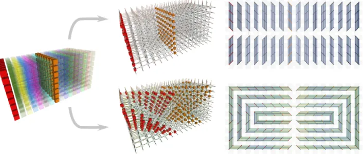
Fig. 1. Network traffic resulting from two different runs of the parallel simulation pF3D. This simulation models laser plasma interaction inside of a hohlraum chamber by decomposing the domain into a set of blocks (left). Depending on how data blocks are mapped to processor cores (middle), different communication patterns occur. When staggering data placement (bottom right) we observe significantly more balanced communication compared to a default mapping similar to how the domain is decomposed (top right). Abstract—The performance of massively parallel applications is often heavily impacted by the cost of communication among compute nodes. However, determining how to best use the network is a formidable task, made challenging by the ever increasing size and complexity of modern supercomputers. This paper applies visualization techniques to aid parallel application developers in understanding the network activity by enabling a detailed exploration of the flow of packets through the hardware interconnect. In order to visualize this large and complex data, we employ two linked views of the hardware network. The first is a 2D view, that represents the network structure as one of several simplified planar projections. This view is designed to allow a user to easily identify trends and patterns in the network traffic. The second is a 3D view that augments the 2D view by preserving the physical network topology and providing a context that is familiar to the application developers. Using the massively parallel multi-physics code pF3D as a case study, we demonstrate that our tool provides valuable insight that we use to explain and optimize pF3D’s performance on an IBM Blue Gene/P system.
Index Terms—Performance analysis, network traffic visualization, projected graph layouts.
1 INTRODUCTION
Computer simulations fill the gap between theory and experimenta-tion, allowing scientists to model and study extremely complex phys-ical phenomena in regimes where experiments are too expensive, too
• A. G. Landge, J. A. Levine, and V. Pascucci are with the Scientific Computing and Imaging Institute, University of Utah, e-mail: {aaditya,jlevine,pascucci}@sci.utah.edu.
• K. E. Isaacs is with University of California Davis, e-mail: [email protected].
• A. Bhatele, T. Gamblin, M. Schulz, S. H. Langer, and P.-T. Bremer are with Lawrence Livermore National Laboratory, e-mail:
{bhatele,tgamblin,schulzm,langer1,ptbremer}@llnl.gov.
Manuscript received 31 March 2012; accepted 1 August 2012; posted online 14 October 2012; mailed on 5 October 2012.
For information on obtaining reprints of this article, please send e-mail to: [email protected].
dangerous, or impossible to perform. In particular, scientists are inter-ested in analyzing biological, climate, and high energy physical phe-nomena, which require the immense computational power that only a supercomputer provides. Such a system may consist of tens or hun-dreds of thousands of compute nodes, each node typically made up of several processor cores. These nodes communicate using a high speed interconnection network. To perform massively parallel simulations, nodes typically interleave local computations with communication be-tween other nodes in the system. By working together, the nodes can perform calculations that would require millennia to perform on mod-ern personal computers.
The most common approach to implement parallel simulations is to decompose the simulated domain, e.g., a combustion chamber, into a collection of patches which are then distributed across processes. Each process is responsible for performing the computation necessary for its local data patch and intermittently exchanges data with other pro-cesses to coordinate the global computation. In this work we primarily focus on communication using the Message Passing Interface (MPI),
the most dominant model for high-performance computing commu-nication. However, our techniques also apply to other programming models such as Charm++ [16]. In an MPI program, communication between processes is expressed through routines that send data be-tween pairs or sets of processes. Given this frame of reference it is natural to analyze the message behavior as a graph of communication where nodes are processes and edges represent data exchanges. There exist a number of corresponding tools which visualize MPI communi-cation behavior in this fashion [8, 9, 17, 23].
However, this type of analysis disregards the routing of messages on the physical network hardware. Different MPI implementations, appli-cation domain decompositions, or system configurations may realize communication primitives such as global reductions or all-to-all mes-saging differently. Furthermore, the mapping of individual processes to cores strongly influences the network traffic because the length of message paths may vary, and the paths may interleave or interfere in complex ways. Moreover, systems like the IBM Blue Gene/P may dy-namically alter the paths taken by messages. Different physical routes may even be used for different parts of a message. To fully under-stand these effects on the network traffic and diagnose performance bottlenecks one must instead analyze the physicalpacketssent on the network. Packets are units of network traffic used for routing within the hardware interconnect. Here we propose a visualization frame-work to illustrate and analyze the netframe-work traffic of packets on some of the largest simulations performed on modern supercomputers. In particular, we show how different process-to-core assignments affect the network traffic, and, by using carefully designed visualizations, we gain insights for optimizing the performance.
Our contributions in this work focus around the design and appli-cation of a visualization tool that explores the behavior of the network traffic. We make use of a context that is both familiar to application de-velopers and representative of the underlying hardware interconnect. Few tools exist that directly visualize performance data using a sim-ilar context [4, 13, 14, 32], and none of these provide the flexibility or insight of our system. In particular, our approach in visualizing network traffic is to use projections of the network topology. These projections are two-dimensional and retain the intrinsic characteristics of the hardware network while illuminating communication patterns without visual clutter. We consider three-dimensional torus networks, common to many HPC systems such as the IBM Blue Gene series. Consequently, we augment this 2D view with an interactive, linked 3D view that provides a familiar context to application developers on these platforms.
Together, these linked views assist application developers in two ways. First, they allow developers to understand trends in application communication from two illustrative viewpoints. Second, application developers are able to understand the connection between the map-ping of MPI processes onto nodes and the resulting network traffic in runs on massive supercomputers. We conduct case studies using our approach to evaluate the performance of pF3D, a multi-physics code used to simulate laser-plasma interaction [5, 35]. These studies high-light the strengths of the visualization and the insights it provides to the performance experts on our team.
2 RELATEDWORK
Visualizing interconnect traffic for performance analysis requires a combination of concepts from both the visualization and high perfor-mance computing (HPC) communities. This section first discusses the state of the art in performance analysis using network traffic data. Next, we provide an overview of visualization efforts focused on simi-lar data modalities and techniques as well as general design principles relevant to our approach.
2.1 Communication Analysis to Improve Performance
With the growing popularity and complexity of parallel programming models, visualizations of communication behavior has been included into several performance tools [9]. One of the most frequently used visualizations is that of traces of MPI messages sent. This is used in
tools such as ParaGraph [14], JumpShot [8], and Vampir [17]. Con-ceptually, these views are similar to Gantt charts, and consequently rarely scale well, so Muelder et al. use visualizations of MPI function call durations to improve the visualizations of MPI traces [23]. These tools are interesting in part for the techniques they use, but also be-cause of the growing availability of performance data. In many cases however, the ability to achieve performance improvements is sharply limited by the specific data that can be collected.
Prior performance tools have attempted to correlate application per-formance with the network traffic behavior. For example, the Tuning and Analysis Utilities (TAU) software suite [32] and other tools [4, 14] allow the visualization of message call timings, cumulative instruction counter values, and other per-core measurements in the context of a communication trace. TAU, Scalasca [13], and Triva [29] offer em-bedded views of function call timings and hardware performance data directly on a 3D torus network topology, providing some notion of both communication patterns as well as descriptions of hardware re-source utilization. While these tools show per-core data in theshape of the hardware network, they do not show the actualtrafficthat trav-els over the network. Thus, the user must estimate quantities such as network bandwidth based on timings; they are not shown directly.
With the advent of high-diameter Cartesian networks in HPC, un-derstanding communication patterns has grown in importance. On such networks, the mapping of the simulated domain to network nodes can severely affect performance [34]. Bhatia et al. show how visualiz-ing the virtual topology of an application (as opposed to the physical topology of the network) can give insights [6]. Raponi et al. have characterized specific patterns than occur on the Blue Gene/P series of supercomputers [27]. These patterns are useful but they do not tie net-work behavior to its context within the simulated application domain. As our ability to collect performance data grows, so do the opportu-nities for insightful visualization approaches. Modern machines such as IBM’s Blue Gene series have performance counters that allow the measurement of raw traffic on links within the hardware network in addition to the traditional per-core and per-node counters. Schulz et al. propose to use hardware and network views in a holistic approach aimed to show performance data across multiple domains [31], and we build on this approach by tying raw network traffic to application com-munication structure where possible. Our linked views present perfor-mance data in contexts that afford better opportunities for insight to application developers and performance experts.
2.2 Visualizations of Network Traffic
On an abstract level, network traffic in a supercomputer can be thought of as a graph of communicating processor cores as nodes connected by edges representing load on particular links of the hardware inter-connect. General graph visualization has been a long standing re-search problem and we refer the reader to Herman et al. [15] for an excellent survey. However, most of these techniques, including hierar-chical clustering [26], projections into lower dimensional spaces [7], topologically-driven layouts [2], or edge bundling [11], are primarily concerned with the creating graph layouts to highlight the topology of a graph. In our case, the topology of the graph—a 3D torus—is well known and creating an unstructured layout may obscure this fact. We are interested in visualizing and analyzing data on the edges of the graph while maintaining as much of the known context as possible.
In this respect our application is more akin to techniques such as past visualizations of AT&T’s long distance phone network [3] or the PortVis tool to display TCP traffic [20]. In these cases the graph topol-ogy is known and thus a single, domain-driven layout is employed. For example, given that AT&T’s network consists of switches and lines in well known geographic locations, creating a corresponding, geo-graphic graph layout is a natural solution. However, such layouts are highly application dependent. Additional work has been done in at-tempts to understand flow across a network by comparing graph-based flow visualization with TreeMaps for local network monitoring [19]. Here too, both the problem space and necessary analysis techniques are highly application dependent. Summers et al. [36] applied existing visualization techniques to a network model of ASCI Q (a retired
su-percomputer at Los Alamos National Laboratory). This work focused on visualizing fat tree networks with the goal of improving modeling techniques for future architectures rather than providing new perfor-mance analysis results. To our knowledge the work presented here is the first to visualize and explore packet-level network data with mea-surements from a real system for performance analysis.
Beyond graph layouts, many of the standard design principles for effective visualizations apply to our setting. It is well known that inter-acting with the graph through zooming, highlighting, or linked views provides significant insights [21]. Coordinated views have been pro-posed for visualizing graphs in the context of email communication networks [24]. Filtering out unnecessary details and using fisheye-style distortion to maintain appropriate context [12] are popular tech-niques for graph visualization. Shneiderman provides one such survey for general practices with graphical interfaces [33]. The philosophies of overview first, zoom and filter, and details on demand are good practices that we have incorporated into our visual tool. We expand upon these by augmenting with selection and interaction. In particu-lar, we make use of interactive legends for more effective data explo-ration [28]. We additionally make use of color, size, and transparency to highlight important trends in the data [18].
3 NETWORKPERFORMANCEANALYSIS
The performance of many massively parallel applications is dominated by communication costs. As the degree of parallelism increases, this problem intensifies as more processors contend for communication bandwidth. To avoid scalability problems, it is paramount that de-velopers optimize the use of the hardware interconnect. However, ap-plications are typically written in terms of data exchanges between (groups of) processes managing portions of the simulated domain. Even for experts it is difficult to predict how a set of high level data ex-changes will be expressed on the hardware interconnect, because both the messaging layer and hardware routers are free to decompose and redistribute to optimize the transfer. Our ultimate goal is to understand how and why problems such as network contention and unnecessary dependencies form, so that we can avoid them. In this section, we re-view the more common high level MPI communication primitives and why a packet level analysis is necessary. Subsequently, we discuss the particulars of our case study by explaining some relevant idiosyn-crasies of the Blue Gene/P system and the pF3D application.
3.1 Application-Level Communication
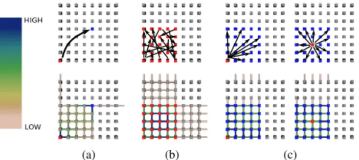
Parallel physics simulations typically decompose their domain into a collection of work units and assign the computation of each work unit to a different process in the simulation. Periodically, processes must exchange messages to fetch data that is not in local memory. One com-mon framework for this type of communication is the Message Passing Interface (MPI), which provides developers with point-to-point and collective communication primitives (see Fig. 2). As the names sug-gest, a point-to-point message sends data from one process to another. A collective communication involves a group of processes (such as all-to-all, broadcast and reduce), all of which must participate in the communication. In MPI, collective primitives take place using a com-municator, an abstraction for a set of communicating processes. An all-to-all sends all processes in a communicator a subset of data from all other processes (this is frequently used for parallel matrix transposi-tion). Similarly, for a broadcast/reduce, a single process sends/receives data to/from all other processes in the communicator.
However, MPI implementations rarely implement these collective communication patterns directly. Instead they use more sophisticated routing algorithms, e.g., binary broadcast trees, or they exploit special hardware features. On IBM Blue Gene/P supercomputers, for exam-ple, broadcasts can be implemented in hardware on particularly shaped partitions using a “deposit bit” allowing messages passing through a node to deliver (or deposit) a copy of the message. This leads to an almost even network traffic pattern away from the broadcast root, as seen in the Fig. 2(c).
While point-to-point messages are easiest to understand, even their behavior is not entirely obvious. In practice, a given process can be
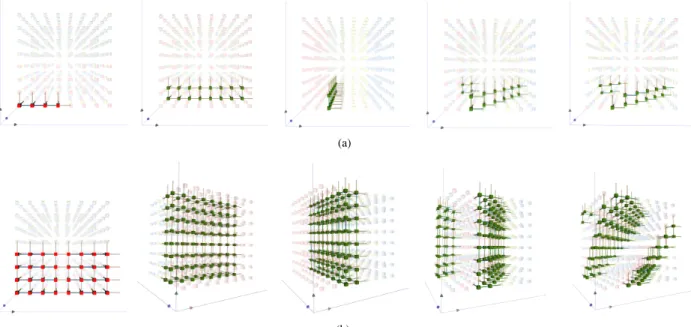
(a) (b) (c)
Fig. 2. Communication patterns for (a) point-to-point, (b) all-to-all, and (c) broadcast from the bottom left and center of a group of 25 nodes in the plane. Nodes colored red are sources, while nodes colored blue are destinations. Actual collected network traffic (colored by packets/link on edges) is shown in the bottom row.
assigned to any of the available compute nodes and thus the way pro-cesses are mapped heavily influences how far messages must travel and whether their paths may interfere. Despite being conceptually simple, understanding how a collection of point-to-point messages in-teract with each other on the hardware interconnect is often non-trivial. MPI implementations add additional complexity because communica-tion primitives may be highly optimized for specific parallel machines. The communication algorithm depends on the configuration, hard-ware, shape/size of the communicator, and/or the MPI library. This makes it practically impossible for application developers to predict the network traffic from non-trivial communication.
Our tool enables even non-experts to visualize packet-level traffic based on direct measurements. This provides insight into how and why particular implementation choices affect performance. Furthermore, as discussed in detail in Section 5, our tool provides an intuitive way to compare the behavior of different process-to-node mappings and a means to explain their effect on performance. As we will show, the performance of a parallel application is intimately tied to not only what messages are sent, but also how efficiently these messages can be sent along the network. This leaves application developers with the problem ofnode mapping, or determining how best to take a known set of processes and allocate them onto the available CPU cores of the system to balance computation and communication.
3.2 IBM Blue Gene/P
In our case study we focus on the IBM Blue Gene/P (BG/P) supercom-puters, such as the “Intrepid” system at Argonne National Laboratory, “Dawn” at Lawrence Livermore National Laboratory, and “Jugene” at J¨ulich Supercomputer Center, as well as numerous other systems on the TOP500 list of supercomputers [1]. Furthermore, the BG/P suc-cessor, the Blue Gene/Q, features a very similar architecture. The first installation, “Sequoia” at Lawrence Livermore National Laboratory, is currently the world’s most powerful supercomputer. For this pa-per, the most relevant aspects of the BG/P’s design are its 3D torus network (used by 12 of the top 100 systems as of June 2012) and its dynamic packet routing (common to both BG/P as well as 15 BG/Q systems in the top 100). In a 3D torus, each node is connected to six neighbors in 3D space through six links. Blue Gene systems dynam-ically route and split messages along shortest Manhattan paths within the Cartesian network (see Fig. 4). The dynamic routing means that, depending on the network traffic, messages on BG/P may take any of multiple possible shortest paths. Additionally, different portions of a large messages are split and distributed among the potentially shortest paths. This makes predicting network traffic difficult. On the other hand, the network topology remains fixed as a 3D torus for practical use cases.
3.3 Data Collection
Despite this complexity in the hardware, a major advantage of the BG/P system is its comprehensive set of performance counters (in-cluding counters for network activity) and its sophisticated set of data instrumentation tools. These allow for the collection of performance
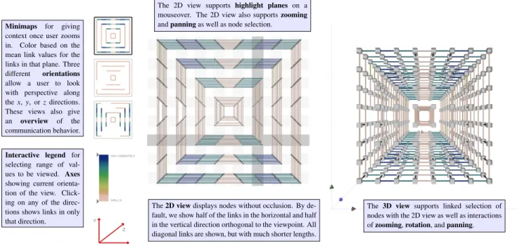
Minimaps for giving context once user zooms in. Color based on the mean link values for the links in that plane. Three different orientations allow a user to look with perspective along thex,y, orzdirections. These views also give an overview of the communication behavior.
Interactive legend for selecting range of val-ues to be viewed. Axes showing current orienta-tion of the view. Click-ing on any of the direc-tions shows links in only that direction.
The 3D view supports linked selection of nodes with the 2D view as well as interactions ofzooming,rotation, andpanning. The2D viewdisplays nodes without occlusion. By
de-fault, we show half of the links in the horizontal and half in the vertical direction orthogonal to the viewpoint. All diagonal links are shown, but with much shorter lengths.
The 2D view supports highlight planes on a mouseover. The 2D view also supportszooming andpanningas well as node selection.
Fig. 3. An overview of our visualization tool, illustrating the minimaps, interactive legends and axes, 2D projected view, and linked 3D torus view. Note that in this figure, the 3D view shows only the links that are seen in the 2D view to better illustrate the projections from 3D to 2D.
data at very fine granularities, allowing the characterization of packet-level network performance. Each node has the ability to track the num-ber of packets sent on its six links/directions available on the torus.
To track the communication bandwidth, we directly instrument phases in application codes, and we combine this instrumentation with the PNMPI [30] tool infrastructure to intercept calls to functions in the MPI library. This infrastructure, once linked with the code, allows the dynamic loading of modules that can read hardware counters on BG/P. Our instrumentation allows us to aggregate the data from spe-cific phases within the code, and we output sums of the network traf-fic that occurred over fixed spans of execution. Per-phase data gives us some temporal information without incurring unacceptable over-heads. Since data collection for such a massive system is highly non-trivial, such summaries are necessary. Moreover, they are reasonable for many simulations, including pF3D, as similar communication pat-terns repeat at each phase. If we were to instead record full packet traces, the runtime overhead and storage requirements of our measure-ment system would be unacceptable, potentially producing more data than the simulations themselves. On the other hand, if we were to sum per-link communication over the entire application run, we would fail to see enough detail to identify communication patterns.
3.4 pF3D
pF3D is a multiphysics code designed to simulate laser and plasma interactions [5, 35]. It provides an interesting case study as (a) it is ac-tively used in connection with inertial confinement fusion experiments at the National Ignition Facility (NIF) [22] and (b) since it is known to scale well to some of the largest supercomputers available today. In its typical setup, pF3D uses a regular 3D process grid in(x,y,z) coordi-nates with thez-direction aligned with the laser. This grid is typically sized with respect to the laser wavelength, resulting in grids of billions of zones. The domain is then decomposed into a set ofxyslabs per-pendicular to the direction of the laser and the computation is split into solving the light equations within each slab independently followed by hydrodynamic calculations along thez-direction. The dominant cost (especially with respect to communication) is the computation within each slab, which requires solving a (separable) FFT on each plane. Thus, each slab is subdivided further into a two dimensional array aligned with thex-/y-directions of the primary grid. The FFT is solved in two phases first along thex- and then they-direction. Both of these require alternating all-to-all operations among groups of processes in
a slab with the samexandycoordinate respectively. It is well known that the cost of these all-to-alls dominate the overall communication performance, so we focus our case study on providing insights into how different process-to-core mappings affect the network traffic.
4 VISUALIZINGNETWORKTRAFFIC
Designing a visualization of network traffic for performance analysis presents a number of challenges. Given the large number of hardware links on modern networks, we need tools that can illuminate trends at multiple scales. For example, depending on the application, net-work contention may manifest itself in a single or very small set of overloaded links requiring detailed illustrations. Simultaneously, there often exist patterns on the level of entire planes or large blocks of pro-cessors that may only be apparent in a global overview. Our system is designed to provide sufficient context for insight into the global per-formance picture while allowing a detailed, interactive exploration of the data at multiple scales.
Our tool is built around two different views of the hardware domain. First, we use a set of modified central projections to show all nodes and two-thirds of the links of a system in various combinations in an intuitive, planar layout. Second, we use a more traditional 3D layout of the hardware torus that mirrors the physical network topology, yet suffers from occlusion and visual clutter problems. Furthermore, we present summary views that provide context and identify global trends, enabling quick navigation and the ability to drill down in the often large graphs. Finally, we allow a user to sub-select data based on code phases or individual communicators. Both views are linked providing highlighting of important substructures, such as planar slices in the 3D torus, and enabling joined selection and analysis. Fig. 3 provides an overview of our visual tool, highlighting the strengths of the projected view and the different interaction mechanisms we include, as well as the linked 2D and 3D views described below.
4.1 Projected Views of the Network
We use a modified central projection, similar to the ones studied in optics and map design, to map the 3D torus of the BG/P system onto various different view directions. Conceptually, the projection is cre-ated by treating a torus viewed, for example along thex-axis, as a set of concentric, squared cylinders. For a cube shaped torus the innermost cylinder will contain a ring of four node sets extruded in the view di-rection, the next cylinder an extruded ring of twelve node sets, and so
(a) (b)
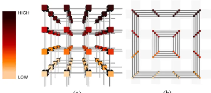
Fig. 4. A4×4×43D torus, (a) observed looking down thex-axis and (b) displayed in the projected view. Nodes are colored by their MPI rank (a unique identifier given to each process), indicating where each 3D node has been placed in the 2D view. A subset of links connecting the nodes are shown in the 2D view. Note that since the network is 3D torus, the 3D view shows open links where communication wraps around the network to connect to opposing faces.
on. Each cylinder is then projected into a set of concentric rings which show half the links in the direction orthogonal to the view as horizon-tal or vertical lines of roughly equal length and all the links along the view direction as short diagonal segments. As shown in Figs. 3 and 4, for a 2n×2n×2ntorus this results innconcentric sets of 2nrings.
While this projection creates significant geometric distortions, it also enables us to show all the nodes without occlusion and preserves much of the required context. For example, all horizontal (similarly, vertical or diagonal) links in the projection represent parallel links in the 3D torus and the different directions will be pairwise orthogonal. In this default version of the projection only half the vertical and hor-izontal links are shown. However, in our experiments this has usually proven sufficient to detect global patterns. Furthermore, we can easily show all existing horizontal/vertical links if we remove the links of the alternate direction completely (e.g., Figs. 1 and 6).
Another advantage of this projection is that the layout of the nodes retains a strong resemblance to their 3D arrangement. For example, as shown in Fig.??, nodes in a horizontal or vertical band of the projec-tion are highlighted to represent planes of the 3D torus providing an intuitive link to the original network topology. When designing this projection, there are six natural directions, each of which create six distinct node layouts. Furthermore, given that a torus has no bound-ary, the choice of center for the projection is arbitrary which provides a large amount of additional flexibility. In practice, however, we find that most problems tend to be symmetric and thus most of these differ-ent views provide roughly the same information. Therefore, we have currently limited the available choices to the three primary directions to avoid overwhelming users with mostly extraneous alternatives. Fi-nally, given the node layout we can color, highlight, or hide links and nodes according to, for example, the number of packets that were sent between two hardware nodes, MPIrank (unique identifiers given to label each communicating node), or other recorded performance mea-surements.
4.2 Visual Navigation
For each of the three projected views that we display to the user, we provide a minimap on the top left corner of the window in which each bundle of links is replaced by a single edge that represents the mean behavior of the bundle (see Fig. 3). The user can interactively switch between these views to explore the different layouts. Additionally, we provide a set of axes on the lower left corner that indicate which direc-tion of links in the projecdirec-tions are currently displayed with respect to the network topology. The user can select and deselect axes to show and hide the corresponding links as in Fig. 5(a). If both horizontal and vertical links are shown, we use the concentric ring layout to show half of each set. Instead, if only one direction is selected, all of the corresponding links will be shown.
Finally, we provide an interactive legend to interact with the
se-(a) (b)
Fig. 5. We use both an interactive set of axes and interactive legend to allow the user to explore the network traffic. (a) The axes allow different links to be turned on or off, each displaying the concentric ring layout (left) , or entirely vertical (middle) or horizontal (right) layouts. (b) The range on the color scale can be changed by using sliders for both the minimum and maximum values.
lected color space for showing the communication data, shown in Fig. 5(b). We explored different metaphors, such as thickness for com-munication, but found color to be the most intuitive for users. The user can drag and slide both the minimum and maximum values along the color bar, and we adjust the range of colors accordingly. Links be-low the minimum are not drawn (folbe-lowing a visual metaphor of them being insignificant amounts of communication), while links above the maximum are drawn with the same color as the maximum (indicating they are utilized at or above the maximum amount). When the leg-end is updated, we update all three minimaps as well as the full scale projected view. This feature synchronizes the two views without caus-ing discrepancies. Followcaus-ing this rule becomes particularly important when multiple datasets are loaded simultaneously. In this case, inter-action with the slider can update all views to provide an equal context for comparing performance of different runs.
4.3 Linking the Projection with a 3D View
While somewhat unintuitive for the uninitiated, we have found that most application developers are well accustomed to think in terms of the torus structure of the physical network topology. In response, we have included a 3D view representing the torus as a regular grid of nodes with a set of “open” links at the torus boundaries. As expected, the resulting view can suffer from occlusion and visual clutter which can make it difficult to comprehend. However, integrating the two views into a linked view system has proven remarkably effective. The 2D projection provides an intuitive way to study all communication data at a glance and, more importantly, to select interesting (sets of) nodes. The selection is then highlighted in the 3D environment deem-phasizing all unrelated nodes and links (see Fig. 6)
This tool provides developers with the desired context of the true network topology in which, for example, it is easy to judge distances and reason about potential hardware effects. Simultaneously, it largely solves the occlusion problem by concentrating on a small subset of nodes and links. The user can rotate, pan and zoom to find the most salient view of the data. Additionally, as discussed in more detail in Section 5, the 3D view has proven useful to understand the effects of different mappings of processes to nodes. By selecting and highlight-ing nodes and/or processes within MPI communicators, their physical location on the hardware can provide important insights. Our system enables cross-linked selection of (groups of) nodes either by selecting nodes one by one, through selection boxes, or according to predefined groups such as MPI communicators. Fig. 6 highlights some of the typical use cases for selected between the two windows.
4.4 Implementation
Given the large variety of different platforms and environments our users operate on portability and robustness are major concerns. Addi-tionally, performance analysis is notorious for requiring some amount of customization to adjust tools to the immense variety of specific tasks. Therefore, we have chosen to implement our system with Python [37] to ensure maximal portability and flexibility. The interac-tive rendering uses a OpenGL design written using PyOpenGL wrap-pers. While this sacrifices some amount of rendering performance, a Python based rendering better integrates with the other components and data structures. The data format is based on YAML [10] which
provides an easy to use cross-platform and cross-programming lan-guage data serialization that has been simple to integrate into the ex-isting data collection framework. Finally, the internal data represen-tation and querying uses NumPy [25] arrays of records as data tables; however our intention is to build upon a more sophisticated data store as the complexity and size of data grows. While the current imple-mentation is a prototype, the system is scheduled to be released under an open source licence as part of ongoing tool deployments.
5 CASESTUDY
Our team consists of a mix of experts in visualization, performance analysis, and computational science all of which contributed to the design of the tool. We are actively using the tool to study the per-formance of several massively parallel simulation codes and here we report results for pF3D running on a BG/P. We repeatedly ran the sim-ulation using three different node configurations containing 512 nodes (2,048 cores arranged on an 8×8×8 torus), 1,024 nodes (4,096 cores, 8×8×16) and 16,384 nodes (65,536 cores, 16×16×32).
The tool helped both the application developers and scientists on our team to investigate the scaling behavior of pF3D as well as the per-formance experts to explore idiosyncrasies in network behavior given different node mappings. Due to the structured 3D nature of pF3D, a fundamental problem for developers is managing how best to map the individual 2D slabs of this problem to the 3D torus network of BG/P, while also taking into account the cross slab communication.
5.1 Understanding the Default Behavior of pF3D
There exist a large number of different ways to map thexy-slabs used by pF3D onto the hardware domain. Therefore, one of the primary challenges for scientists and developers is to identify “good” map-pings that translate into high performance. Also, scalability as we run on greater number of nodes is important and in particular scalabil-ity that is well understood and predictable. This explains why pF3D by default uses the trivial “row-major” mapping usually called TXYZ as MPI ranks are assigned in order to: first the cores on a node (T); then, the nodes along thex-axis of the torus (X) within anxyplane, then along they-axis in the same plane (Y) and finally otherxyplanes perpendicular to thez-direction (Z).
Fig. 6. Visualizations of the aggregate communication for thex- and y-phases of pF3D using the default layout. Highlightingxy-slabs of 32 nodes in both the 2D and 3D view clearly indicates that all communica-tion (in these phases) is confined to the individual slabs. The minimaps confirm this conclusion by indicating that many links are entirely unused.
Fig. 6 shows this default mapping withxy-slabs highlighted for a 1,024 node (8×8×16) run of pF3D. In this case the application do-main is decomposed into 32xy-slabs each containing an array of 16×8 patches. Eachxy-slab uses 128 cores on 32 nodes and thus in the TXYZ mapping two pF3Dxy-slabs make up one plane of the hard-ware torus. The 2D view clearly displays thexy-slabs. Colors are used to distinguish slabs. Nodes lying in the same xy-slab are given the same color. Two selectedxy-slabs of pF3D are then shown in the 3D view to provide a context of the virtual application topology familiar to the scientists. In this case, the 32 slabs of pF3D clearly dominate the network traffic as communication is confined within each plane.
Given the visualization shown in Fig. 6, it is immediately apparent that a large number of available hardware links are not utilized which suggests there may be room for improvement. Nevertheless, this map-ping is fully symmetric and given the uniform nodes of a BG/P system ultimately scalable to the largest available partitions. At the largest configurations the scaling of a code will dominate all other effects, and experimenting with potentially sub-optimal mappings can be ex-pensive with respect to both time and resources. This explains the predilection for the default mapping whose behavior, while potentially not optimal, is well understood and exhibits little variation at different scales.
5.2 Comparing Node Mappings
As discussed above, the behavior of the default mapping is fairly pre-dictable and our tool was mainly used to validate prior expectations. However, when experimenting with different mappings the network traffic becomes far less predictable. Through extensive experiments in which the aggregated bandwidth was recorded for different mappings (see Table 1) the performance experts knew a priori that certain map-pings can achieve significantly better performance than the default. However, the causes of these differences were unclear. In particular, these may have been effects particular to a specific number of nodes or configuration which would raise doubts about the scalability of the mappings. Furthermore, understanding the difference in network traf-fic between various mappings in detail can provide insights into the design of even better mappings.
Table 1. Bandwidth (higher is better performance) of the 512 node runs using the five different mapping types we considered in this case study
Mapping Bandwidth (MB/s) Time per iteration (s)
TXYZ (Default) 41.81 1,886.76
XYZT 90.66 1,731.99
tile 106.94 1,703.67
tiltZ 109.61 1,702.48
tiltZY 102.84 1,708.48
We experiment with five different mapping types each with differ-ent characteristics. In addition to the default mapping we use an XYZT mapping, a tiled layout, and two different tilted layouts, one tilted just along thez-axis and one tilted along bothzandy. Fig. 7 shows the node mappings using the 3D view for an 8×8×8 hardware torus using 16 slabs of 16×8 patches. The XYZT layout spreads out the x-communicators by distributing them on individual nodes rather than four to a node as the default. As a result a single slab is spread between two planes of the torus rather than the half plane of the default. The tile mapping is similar to the XYZT mapping, but changes the orienta-tion of the layout by mapping slabs into tiles perpendicular to slabs in the default mapping. The tiltZ mapping starts from the tiled layout but then “tilts” eachyz-plane of the torus in thezdirection. This drasti-cally increases the size of their bounding box. TiltZY further modifies tiltZ by introducing a second tilt in theydirection. This increases the bounding box of the nodes even further.
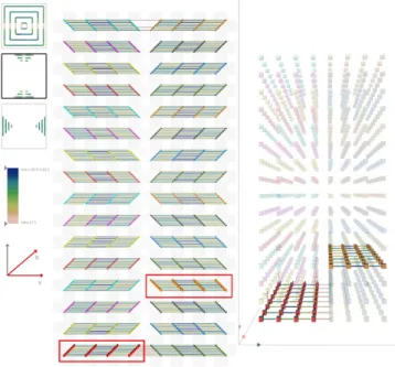
Given this context, we compare network traffic for the five different node mappings at different scales. These are concisely described by the minimaps of the 2D projection, as shown in Figs. 8(a) (512 nodes)
(a)
(b)
Fig. 7. (a) We explore the behavior of five different communicator layouts, from left to right we show an individualx-phase communicator in the TXYZ (default), XYZT, Tile, TiltZ, and TiltZY mapping strategies. (b) Nodes of a singlexy-slab highlighted for the different mappings.
and 8(b) (1,024 nodes). By using an interactive slider that controls all five views simultaneously we can provide potential explanations for the performance measurements in Table 1. In particular, the TXYZ mapping entirely excludes communication in thez-direction, strongly clustering communication in the other two as only half planes com-municate. Instead, the XYZT mapping spreads out the nodes more and utilizes somez-links within a slab. The minimaps clearly show a more even distribution of communication load even though the same patterns as the TXYZ mappings are apparent. This provides a sig-nificant boost in performance by more than doubling the total band-width. The tile mapping acts roughly like a rotated XYZT mapping and shows very similar behavior and performance. The TiltZ map-ping however further balances the communication. In particular, note how both the top and bottom minimap indicate (relative) increases in xcommunication. Since the total amount of communication is in-dependent of the mapping, this increase actually indicates a further balancing of the communication. The better distribution of traffic is correlated with higher performance. Finally, the TiltZY follows the same trend: The minimaps, especially the topmost, indicate much more evenly distributed network traffic and the bandwidth indicates better performance.
These experiments strongly suggest that evenly distributing the traf-fic leads to better bandwidth usage. Part of the current hypothesis is that increasing the effective bounding box sizes of the slabs and evening out their aspect ratios drastically increases the number of po-tential routes a packet can choose. Coupled with the dynamic routing of the BG/P system, this may be the cause for the increase in aggregate bandwidth. Note that the fact that providing more routes increases the potential bandwidth is expected. However, under the current think-ing pF3D is not bandwidth limited thus the fact that increasthink-ing the available bandwidth caused increased traffic rates was a novel finding. Additionally, the best mappings clearly increase the distance packets must travel which, however, does not seem to have a negative effect. This is especially surprising for the default mapping as much of its xcommunication is restricted to intra-node communication which is expected to be significantly faster than any inter-node messaging. By providing an intuitive way to explore and illustrate the network traf-fic our tool has been instrumental in better understanding this unex-pected network behavior, overturning assumptions, and forming new hypotheses.
(a)
(b)
Fig. 8. Comparison of five different node mappings for a simulation run of (a) 512 and (b) 1,024 node. Thexandyphases of simulation are shown in the top and bottom, respectively.
(a) TXYZ mapping,x(top) andy(bottom) phases (b) XYZT mapping,x(top) andy(bottom) phases
(c)
Fig. 9. Minimap summary of pF3D at different size runs for the (a) TXYZ and (b) XYZT node mappings at both thexandyphase of communication (top and bottom, respectively). (c) The 2D projection of communication for the 16,384 node run (with a plane selected in the 3D view) of pF3D in theyphase of communication with the XYZT mapping. In the 3D view, nodes lying in the sameycommunicator are given the same color. We can see that there is no communication in thezdirection (in the middle and bottom minimap and 3D view) as communication does not take place across communicators.We observe similar patterns at all scales of pF3D.
5.3 Visualizing the Behavior of pF3D at Scale
Our final experiment in the case study is to observe the communica-tion behavior of pF3D as the size of the problem scaled to larger runs on BG/P. Fig. 9 shows a summary of the different aspects of this visu-alization. By loading each run simultaneously, we were again able to visualize the data from each run using a shared color scale. One ob-servation we can draw from the combined minimap views in Figs. 9(a) and 9(b) is that, despite the problem size, the amount of communica-tion that happens on each link stays roughly the same across scales.
Moreover, even when the network topology changes from a cube to a rectangular-prism, generic communication trends in each direction stay relatively fixed. These two observations help explain why pF3D scales well to larger sizes and corroborate well with the scientists’ ex-periences running pF3D on larger scales.
5.4 Exploring Fine-Grained Network Behavior
For one of our simulation runs (1,024 nodes, using an XYZT node mapping described in Section 5.2) the tool immediately highlighted
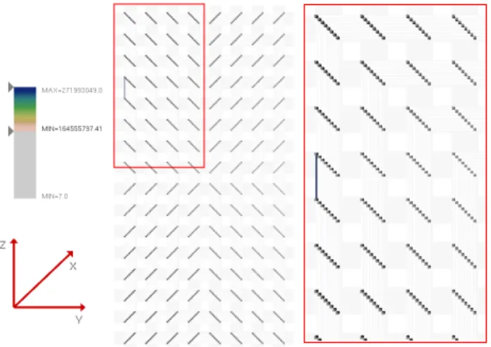
Fig. 10. Due to the nonuniform network utilization some links transfer high number of packets. By interacting with the legend (left), links with high network packet counts can be easily isolated and examined by zooming into the view (right).
one particular hot edge. On closer investigation we found that the maximum number of packets sent over this link was 271 million, a number far outside the expected range (and in fact outside the physi-cally feasible range). During discussion with the performance experts, it was determined that this anomaly was the result of a data collec-tion error. Our tool helped to easily identify correctness problem in the measurement environment indicated through the abnormal link. The link was discovered by simply restricting the color map to show only links above the expect values. Zooming into the neighborhood as shown in Fig. 10, and highlighting the respective planes of node, pro-vides the necessary context to locate and diagnose the problem. Even though a simple scan through the data could have revealed the same in-formation, our tool eliminated the needs for special tests, exposed this unexpected and otherwise probably overlooked issue, and provided a quick and intuitive means to understand and ultimately address the problem.
6 DISCUSSION
While the performance of single CPU applications is typically well summarized by simple profiles, understanding the behavior of mas-sively parallel systems is a challenging and largely unsolved problem. Here we have demonstrated a new tool to provide an intuitive visu-alization of one of the most crucial aspects of performance: network utilization. Our system enables the rapid visual analysis of otherwise abstract data and has been crucial in providing new insights to both ap-plication developers and performance analysis experts. Nevertheless, this is only a first step in applying advanced information visualization approaches to this type of performance analysis.
Two major design choices require further discussion. First, in this work we link together a 2D projected view of the network with a 3D view of the BG/P hardware torus. The 3D view, while familiar to appli-cation developers, has a number of obvious deficiencies with regards to occlusion and interaction. We chose to keep both views instead of using only a 2D view, as a direct response to feedback from the per-formance analysts working on our team. This domain is “natural” for application developers because both the network as well as the simula-tion domain are three dimensional, so often correlasimula-tions can be drawn between the two spaces. While there are a variety of different net-works used in HPC systems, many of the simulations of interest will remain in 3D for the foreseeable future.
A second important design choice was to use static views which summarize a single phase of computation. These provide a compro-mise from the point of view of data collection: instead of looking at the fine-grained data for each individual communication or the sum of all communication, we take coarse steps. Our tool allows for loading
up an entire simulation run, but then displays only a selected phase. What is missing in our tool is the notion of a timeline, where an an-alyst can play back individual runs and see how the communication changed throughout. This would surely be useful, as understanding the communication during the progression of phases has proven infor-mative in past work [31]. However, we remark that often, and espe-cially for pF3D, only a few phases of the computation have significant communication and viewing them individual has significant utility for optimization.
Many other avenues of future work remain. Our tool produces a large number of different projections, some of which may be more helpful than others. However, currently it is unclear how to make this large number of choices available without overwhelming users. Fur-thermore, the system is reaching its limit with current supercomputers in terms of the number of nodes that are practical to display. For fu-ture HPC machines one will likely need additional levels of resolution to provide an adequate context. This will have to lead to new ways to aggregate and summarize data, which is non-trivial in this abstract, non-spatial space. Furthermore, there exist other interesting classes of scientific applications, such as particle-based codes or simulations using adaptively refined grids. While many of our concepts will carry over, analyzing such applications will require new types of illustra-tions to highlight the dynamic changes as the simulation progresses. Finally, the next generation of HPC machines that are currently being deployed, rely on even higher dimensional networks, e.g., in the case of BG/Q a 5D torus. These machines will require more aggressive projections showing fewer links simultaneously, creating more chal-lenging problems to solve. For non-torus network topologies, we are also considering various projections which might work along either application space dimensions or other, user-defined, dimensions in the network space. Our goal is to extend the same level of interactivity and intuition to developers of future parallel applications, as we expect many of the most interesting scientific applications will ultimately use HPC resources.
Finally, we remark that both scientists and performance analysts have given us positive feedback regarding the use of this tool. This tool specifically made it easier for application developers to see the effects that different node mappings have on network traffic. In particular, the results of Section 5 have lead to the scientists using the tilt mappings for their current runs of pF3D, and the performance analysts better understanding why such mappings work well. Our next steps are to extend these visualizations for discovering new mappings and explor-ing which are most optimal. This work represents a first step towards understanding network behavior and identifying contention. We plan to next consider how best to use this tool to build models which can predict network behavior, and potentially use (semi-)automatic tech-niques to find optimal node mappings for large scale simulations.
ACKNOWLEDGMENTS
This work is supported in part by NSF awards IIS-1045032, OCI-0904631, OCI-0906379 and CCF-0702817, and by a KAUST award KUS-C1-016-04. This work was also performed under the auspices of the U.S. Department of Energy by the University of Utah un-der contracts DE-SC0001922, DE-AC52-07NA27344 and DE-FC02-06ER25781, and by Lawrence Livermore National Laboratory under contract DE-AC52-07NA27344 (LLNL-CONF-543359).
REFERENCES
[1] TOP500 Supercomputing Sites. http://www.top500.org/, Nov. 2011. [2] D. Archambault, T. Munzner, and D. Auber. Topolayout: Multilevel
graph layout by topological features. IEEE Trans. Vis. Comput. Graph., 13(2):305–317, 2007.
[3] R. A. Becker, S. G. Eick, and A. R. Wilks. Visualizing network data.
IEEE Trans. Vis. Comput. Graph., 1(1):16–28, 1995.
[4] R. Bell, A. D. Malony, and S. Shende. ParaProf: A portable, extensible, and scalable tool for parallel performance profile analysis. InEuro-Par 2003. Parallel Processing, pages 17–26, 2003.
[5] R. L. Berger, B. F. Lasinski, A. B. Langdon, T. B. Kaiser, B. B. Afeyan, B. I. Cohen, C. H. Still, and E. A. Williams. Influence of spatial and
temporal laser beam smoothing on stimulated Brillouin scattering in fila-mentary laser light.Phys. Rev. Lett., 75:1078–1081, Aug 1995. [6] N. Bhatia, F. Song, F. Wolf, J. Dongarra, B. Mohr, and S. Moore.
Auto-matic experimental analysis of communication patterns in virtual topolo-gies. InInternational Conf. on Parallel Processing, pages 465–472, 2005. [7] U. Brandes and C. Pich. An experimental study on distance-based graph
drawing. InIntl. Symp. on Graph Drawing, pages 218–229, 2008. [8] A. Chan, W. Gropp, and E. L. Lusk. An efficient format for nearly
constant-time access to arbitrary time intervals in large trace files. Sci-entific Programming, 16(2-3):155–165, 2008.
[9] I.-H. Chung, R. Walkup, H.-F. Wen, and H. Yu. MPI tools and perfor-mance studies - MPI perforperfor-mance analysis tools on Blue Gene/L. In
Proceedings of the ACM/IEEE SC2006 Conference on High Performance Networking and Computing, page 123, 2006.
[10] C. C. Evans. The official YAML web site. http://yaml.org/, Sept. 2011. [11] E. R. Gansner, Y. Hu, S. C. North, and C. E. Scheidegger. Multilevel
agglomerative edge bundling for visualizing large graphs. InIEEE Pacific Visualization Symposium, pages 187–194, 2011.
[12] E. R. Gansner, Y. Koren, and S. C. North. Topological fisheye views for visualizing large graphs. IEEE Trans. Vis. Comput. Graph., 11(4):457– 468, 2005.
[13] M. Geimer, F. Wolf, B. J. N. Wylie, E. ´Abrah´am, D. Becker, and B. Mohr. The Scalasca performance toolset architecture. Concurrency and Com-putation: Practice and Experience, 22(6):702–719, 2010.
[14] M. T. Heath and J. A. Etheridge. Visualizing the performance of parallel programs.IEEE Software, 8(5):29–39, 1991.
[15] I. Herman, G. Melanc¸on, and M. S. Marshall. Graph visualization and navigation in information visualization: A survey.IEEE Trans. Vis. Com-put. Graph., 6(1):24–43, 2000.
[16] L. Kal´e and S. Krishnan. CHARM++: A Portable Concurrent Object Oriented System Based on C++. In A. Paepcke, editor,Proceedings of OOPSLA’93, pages 91–108. ACM Press, September 1993.
[17] A. Kn¨upfer, H. Brunst, J. Doleschal, M. Jurenz, M. Lieber, H. Mickler, M. S. M¨uller, and W. E. Nagel. The Vampir performance analysis tool-set. InParallel Tools Workshop, pages 139–155, 2008.
[18] J. Liang and M. L. Huang. Highlighting in information visualization: A survey. InInformation Visualisation IV, pages 79 –85, July 2010. [19] F. Mansmann, F. Fischer, D. A. Keim, and S. C. North. Visual support for
analyzing network traffic and intrusion detection events using TreeMap and graph representations. In3rd ACM Symposium on Computer Human Interaction for Management of Information Technology, 2009.
[20] J. McPherson, K.-L. Ma, P. Krystosk, T. Bartoletti, and M. Chris-tensen. PortVis: a tool for port-based detection of security events. In
VizSEC/DMSEC: ACM workshop on Visualization and Data Mining for Computer Security, pages 73–81, 2004.
[21] T. Moscovich, F. Chevalier, N. Henry, E. Pietriga, and J.-D. Fekete. Topology-aware navigation in large networks. In27th International Conf. on Human Factors in Computing Systems, pages 2319–2328, 2009. [22] E. I. Moses. Overview of the national ignition facility. Fusion Science
and Technology, 54(2):361–366, 2008.
[23] C. Muelder, F. Gygi, and K.-L. Ma. Visual analysis of inter-process com-munication for large-scale parallel computing.IEEE Trans. Vis. Comput. Graph., 15(6):1129–1136, 2009.
[24] G. Namata, B. Staats, L. Getoor, and B. Shneiderman. A dual-view ap-proach to interactive network visualization. InConference on Information and Knowledge Management, pages 939–942, 2007.
[25] T. E. Oliphant.Guide to NumPy. Provo, UT, Mar. 2006.
[26] A. J. Quigley and P. Eades. Fade: Graph drawing, clustering, and visual abstraction. InIntl. Symp. on Graph Drawing, pages 197–210, 2000. [27] P. G. Raponi, F. Petrini, R. Walkup, and F. Checconi. Characterization
of the communication patterns of scientific applications on Blue Gene/P. In25th IEEE International Symposium on Parallel and Distributed Pro-cessing, pages 1017–1024, 2011.
[28] N. H. Riche, B. Lee, and C. Plaisant. Understanding interactive legends: a comparative evaluation with standard widgets.Comput. Graph. Forum, 29(3):1193–1202, 2010.
[29] L. M. Schnorr, G. Huard, and P. O. A. Navaux. Triva: Interactive 3D visualization for performance analysis of parallel applications. Future Generation Comp. Syst., 26(3):348–358, 2010.
[30] M. Schulz and B. R. de Supinski. PNMPITools: a Whole Lot Greater than the Sum of their Parts. InProceedings of SC07, 2007.
[31] M. Schulz, J. A. Levine, P.-T. Bremer, T. Gamblin, and V. Pascucci. In-terpreting performance data across intuitive domains. InInternational
Conference on Parallel Processing, pages 206–215, 2011.
[32] S. Shende and A. D. Malony. The Tau parallel performance system. Int. J. of High Perf. Comp. Appl., 20(2):287–311, 2006.
[33] B. Shneiderman. The eyes have it: a task by data type taxonomy for in-formation visualizations. InVisual Languages, 1996. Proceedings., IEEE Symposium on, pages 336 –343, sep 1996.
[34] B. E. Smith and B. Bode. Performance effects of node mappings on the IBM BlueGene/L machine. InEuro-Par, pages 1005–1013, 2005. [35] C. H. Still, R. L. Berger, A. B. Langdon, D. E. Hinkel, L. J. Suter, and
E. A. Williams. Filamentation and forward Brillouin scatter of entire smoothed and aberrated laser beams. Physics of Plasmas, 7(5):2023– 2032, 2000.
[36] K. L. Summers, T. P. Caudell, K. Berkbigler, B. Bush, K. Davis, and S. Smith. Graph visualization for the analysis of the structure and dynamics of extreme-scale supercomputers. Information Visualization, 3(3):209–222, Sept. 2004.
[37] G. van Rossum. Python tutorial. Technical Report CS-R9526, Centrum voor Wiskunde en Informatica (CWI), 1995.