Part II covers diagnostic evaluations of historical facility data for checking key assumptions implicit in the recommended statistical tests and for making appropriate adjustments to
the data (e.g., consideration of outliers, seasonal autocorrelation, or non-detects). Also included is a discussion of groundwater sampling and how hydrologic factors such as flow and gradient can impact the sampling program.
Chapter 9 provides a number of exploratory data tools and examples, which can generally be used in data evaluations. Approaches for fitting data sets to normal and other parametric distributions follows in Chapter 10. The importance of the normal distribution and its potential uses is also discussed. Chapter 11 provides methods for assessing the equality of variance necessary for some formal testing. The subject of outliers and means of testing for them is covered in Chapter 12. Chapter 13 addresses spatial variability, with particular emphasis on ANOVA means testing. In Chapter 14, a number of topics concerning temporal variation are provided. In addition to providing tests for identifying the presence of temporal variation, specific adjustments for certain types of temporal dependence are covered. The final Chapter 15 of Part II discusses non-detect data and offers several methods for estimating missing data. In particular, methods are provided to deal with data containing multiple non-detection limits.
9.1 TIME SERIES PLOTS... 9-1 9.2 BOX PLOTS... 9-5 9.3 HISTOGRAMS... 9-8 9.4 SCATTER PLOTS... 9-13 9.5 PROBABILITY PLOTS... 9-16
Graphs are an important tool for exploring and understanding patterns in any data set. Plotting the data visually depicts the structure and helps unmask possible relationships between variables affecting the data set. Data plots which accompany quantitative statistical tests can better demonstrate the reasons for the results of a formal test. For example, a Shapiro-Wilk test may conclude that data are not normally distributed. A probability plot or histogram of the data can confirm this conclusion graphically to show why the data are not normally distributed (e.g., heavy skewness, bimodality, a single outlier, etc.).
Several common exploratory tools are presented in Chapter 9. These graphical techniques are discussed in statistical texts, but are presented here in detail for easy reference for the data analyst. An example data set is used to demonstrate how each of the following plots is created.
Time series plots (Section 9.1) Box plots (Section 9.2)
Histograms (Section 9.3) Scatter plots (Section 9.4) Probability plots (Section 9.5)
Data collected over specific time intervals (e.g., monthly, biweekly, or hourly) have a temporal component. For example, air monitoring measurements of a pollutant may be collected once a minute or once a day. Water quality monitoring measurements may be collected weekly or monthly. Typically, groundwater sample data are collected quarterly from the same monitoring wells, either for detection monitoring testing or demonstrating compliance to a GWPS. An analyst examining temporal data may be interested in the trends over time, correlation among time periods, or cyclical patterns. Some graphical techniques specific to temporal data are the time plot, lag plot, correlogram, and variogram. The degree to which some of these techniques can be used will depend in part on the frequency and number of data collected over time.
A data sequence collected at regular time intervals is called a time series. More sophisticated time series data analyses are beyond the scope of this guidance. If needed, the interested user should consult with a statistician or appropriate statistical texts. The graphical representations presented in this section are recommended for any data set that includes a temporal component. Techniques described below will help identify temporal patterns that need to be accounted for in any analysis of the data. The analyst examining temporal environmental data may be interested in seasonal trends, directional trends, serial correlation, or stationarity. Seasonal trends are patterns in the data that repeat over time, i.e., the data
rise and fall regularly over one or more time periods. Seasonal trends may occur over long periods of time (large scale), such as a yearly cycle where the data show the same pattern of rising and falling from year to year, or the trends may be over a relatively short period of time (small scale), such as a daily cycle. Examples of seasonal trends are quarterly seasons (winter, spring, summer and fall), monthly seasons, or even hourly (e.g., air temperature rising and falling over the course of a day). Directional trends are increasing or decreasing patterns over time in monitored constituent data, which may be of importance in assessing the levels of contaminants. Serial correlation is a measure of the strength in the linear relationship of successive observations. If successive observations are related, statistical quantities calculated without accounting for the serial correlation may be biased. A time series is stationary if there is no systematic change in the mean (i.e., no trend) and variance across time. Stationary data look the same over all time periods except for random behavior. Directional trends or a change in the variability in the data imply non-stationarity.
A time series plot of concentration data versus time makes it easy to identify lack of randomness, changes in location, change in scale, small scale trends, or large-scale trends over time. Small-scale trends are displayed as fluctuations over smaller time periods. For example, ozone levels over the course of one day typically rise until the afternoon, then decrease, and this process is repeated every day. Larger scale trends such as seasonal fluctuations appear as regular rises and drops in the graph. Ozone levels tend to be higher in the summer than in the winter, so ozone data tend to show both a daily trend and a seasonal trend. A time plot can also show directional trends or changing variability over time.
A time plot is constructed by plotting the measurements on the vertical axis versus the actual time of observation or the order of observation on the horizontal axis. The points plotted may be connected by lines, but this may create an unfounded sense of continuity. It is important to use the actual date, time or number at which the observation was made. This can create discontinuities in the plot but are needed as the data that should have been collected now appear as “missing values” but do not disturb the integrity of the plot. Plotting the data at equally spaced intervals when in reality there were different time periods between observations is not advised.
For environmental data, it is also important to use a different symbol or color to distinguish non-detects from detected data. Non-non-detects are often reported by the analytical laboratory with a “U” or “<” analytical qualifier associated with the reporting limit [RL]. In statistical terminology, they are left-censored data, meaning the actual concentration of the chemical is known only to be below the RL. Non-detects contrast with detected data, where the laboratory reports the result as a known concentration that is statistically higher than the analytical limit of detection. For example, the laboratory may report a trichloroethene concentration in groundwater of “5 U” or “< 5” µg/L, meaning the actual trichloroethene concentration is unknown, but is bounded between zero and 5 µg/L. This result is different than a detected concentration of 5 µg/L which is unqualified by the laboratory or data validator. Non-detects are handled differently than detected data when calculating summary statistics. A statistician should be consulted on the proper use of non-detects in statistical analysis. For radionuclides negative and zero concentrations should be plotted as reported by the laboratory, showing the detection status.
The scaling of the vertical axis of a time plot is of some importance. A wider scale tends to emphasize large-scale trends, whereas a narrower scale tends to emphasize small-scale trends. A wide scale would emphasize the seasonal component of the data, whereas a smaller scale would tend to
emphasize the daily fluctuations. The scale needs to contain the full range of the data. Directions for constructing a time plot are contained in Example 9-1 and Figure 9-1.
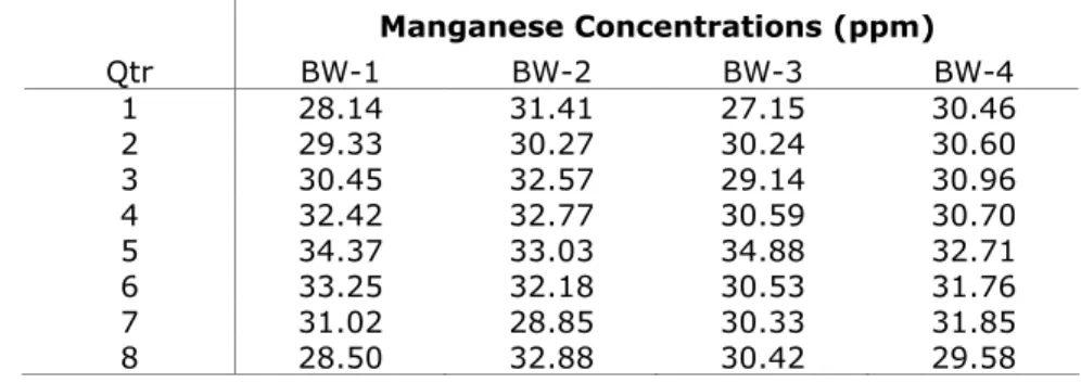
Construct a time series plot using trichloroethene groundwater data in Table 9-1 for each well. Examine the time series for seasonality, directional trends and stationarity.
! " ##!$!%!& ' #(%)* $! #% !%$ $"#%+
Well 1 Well 2
Date TCE Data TCE Data
Collected (mg/L) Qualifier (mg/L) Qualifier
1/2/2005 0.005 U 0.10 U
4/7/2005 0.005 U 0.12
7/13/2005 0.004 J 0.125
10/24/2005 0.006 0.107
1/7/2006 0.004 U 0.099 U
3/30/2006 0.009 0.11
6/28/2006 0.017 0.13
10/2/2006 0.045 0.109
10/17/2006 0.05 NA
1/15/2007 0.07 0.10 U
4/10/2007 0.12 0.115
7/9/2007 0.10 0.14
10/5/2007 NA 0.17
10/29/2007 0.20 NA
12/30/2007 0.25 0.11
NA = Not available (missing data). U denotes a non-detect.
J denotes an estimated detected concentration.
,
Step 1. Import the data into data analysis software capable of producing graphics. Step 2. Sort the data by date collected.
Step 3. Determine the range of the data by calculating the minimum and maximum concentrations for each well, shown in the table below:
Well 1 Well 2
TCE Data TCE Data
(mg/L) Qualifier (mg/L) Qualifier
Min 0.004 U 0.099 U
Max 0.25 0.17
Step 4. Plot the data using a scale from 0 to 0.25 if data from both wells are plotted together on the same time series plot. Use separate symbols for non-detects and detected concentrations. One suggestion is to use “open” symbols (whose centers are white) for non-detects and “closed” symbols for detects.
Step 5. Examine each series for directional trends, seasonality and stationarity. Note that Well 1 demonstrates a positive directional trend across time, while Well 2 shows seasonality within each year. Neither well exhibits stationarity.
Step 6. Examine each series for missing values. Inquire from the project laboratory why data are missing or collected at unequal time intervals. A response from the laboratory for this data set noted that on 10/5/2007 the sample was accidentally broken in the laboratory from Well 1, so Well 1 was resampled on 10/29/2007. Well 1 was resampled on 10/17/2006 to confirm the historically high concentration collected on 10/2/2006. Well 2 was not sampled on 10/17/2006 because the data collected on 10/2/2006 from Well 2 did not merit a resample, as did Well 1. Step 7. Examine each series for elevated detection limits. Inquire why the detection limits for Well 2
are much larger than detection limits for Well 1. A reason may be that different laboratories analyzed the samples from the two wells. The laboratory analyzing samples from Well 1 used lower detection limits than did the laboratory analyzing samples from Well 2.
/"0(! "1! !"!+ #$#2 " ##!$!%! #(%)* $! 2# 3! + %)
2#1 . 4
Open symbols denote non-detects. Closed symbols denote detected concentrations.
Well 1 Well 2
T
ri
ch
lo
ro
et
h
en
e
(m
g
/L
)
0.00 0.05 0.10 0.15 0.20 0.25
Jan 2005
Jul Jan
2006
Jul Jan
2007
Jul Jan
2008
5
Box plots (also known as Box and Whisker plots) are useful in situations where a picture of the distribution is desired, but it is not necessary or feasible to portray all the details of the data. A box plot displays several percentiles of the data set. It is a simple plot, yet provides insight into the location, shape, and spread of the data and underlying distribution. A simple box plot contains only the 0th (minimum data value), 25th, 50th, 75th and 100th (maximum data value) percentiles. A box-plot divides the data into 4 sections, each containing 25% of the data. Whiskers are the lines drawn to the minimum and maximum data values from the 25th and 75th percentiles. The box shows the interquartile range (IQR) which is defined as the difference between the 75th and the 25th percentiles. The length of the central box indicates the spread of the data (the central 50%), while the length of the whiskers shows the breadth of the tails of the distribution. The 50th percentile (median) is the line within the box. In addition, the mean and the 95% confidence limits around the mean are shown. Potential outliers are categorized into two groups:
data points between 1.5 and 3 times the IQR above the 75th percentile or between 1.5 and 3 times the IQR below the 25th percentile, and
data points that exceed 3 times the IQR above the 75th percentile or exceed 3 times the IQR below the 25th percentile.
6
The mean is shown as a star, while the lower and upper 95% confidence limits around the mean are shown as bars. Individual data points between 1.5 and 3 times the IQR above the 75th percentile or below the 25th percentile are shown as circles. Individual data points at least 3 times the IQR above the 75th percentile or below the 25th percentile are shown as squares.
Information from box plots can assist in identifying potential data distributions. If the upper box and whisker are approximately the same length as the lower box and whisker, with the mean and median approximately equal, then the data are distributed symmetrically. The normal distribution is one of a number that is symmetric. If the upper box and whisker are longer than the lower box and whisker, with the mean greater than the median, then the data are right-skewed (such as lognormal or square root normal distributions in original units). Conversely, if the upper box and whisker are shorter than the lower box and whisker with the mean less than the median, then the data are left-skewed.
A box plot showing a normal distribution will have the following characteristics: the mean and median will be in the center of the box, whiskers to the minimum and maximum values are the same length, and there would be no potential outliers. A box plot showing a lognormal distribution (in original units) typical of environmental applications will have the following characteristics: the mean will be larger than the median, the whisker above the 75th percentile will be longer than the whisker below the 25th percentile, and extreme upper values may be indicated as potential outliers. Once the data have been logarithmically transformed, the pattern should follow that described for a normal distribution. Other right-skewed distributions transformable to normality would indicate similar patterns.
It is often helpful to show box plots of different sets of data side by side to show differences between monitoring stations (see Figure 9-2). This allows a simple method to compare the locations, spreads and shapes of several data sets or different groups within a single data set. In this situation, the width of the box can be proportional to the sample size of each data set. If the data will be compared to a standard, such as a preliminary remediation goal (PRG) or maximum contaminant level (MCL), a line on the graph can be drawn to show if any results exceed the criteria.
It is important to plot the data as reported by the laboratory for non-detects or negative radionuclide data. Proxy values for non-detects should not be plotted since we want to see the distribution of the original data. Different symbols can be used to display non-detects, such as the open symbols described in Section 9.1. The mean will be biased high if using the RL of non-detects in the calculation, but the purpose of the box plot is to assess the distribution of the data, not quantifying a precise estimate of an unbiased mean. Displaying the frequency of detection (number of detected values / number of total samples) under the station name is also useful. Unlike time series plots, box plots cannot use missing data, so missing data should be removed before producing a box plot.
Directions for generating a box plot are contained in Example 9-2, and an example is shown in Figure 9-2. It is important to remove lab and field duplicates from the data before calculating summary statistics such as the mean and UCL since these statistics assume independent data. The box plot assumes the data are statistically independent.
Construct a box plot using the trichloroethene groundwater data in Table 9-1 for each well. Examine the box plot to assess how each well is distributed (normal, lognormal, skewed, symmetric, etc.). Identify possible outliers.
,
Step 1. Import the data into data analysis software capable of producing box plots. Step 2. Sort the data from smallest to largest results by well.
Step 3. Compute the 0th (minimum value), 25th, 50th (median), 75th and 100th (maximum value) percentiles by well.
Step 4. Plot these points vertically. Draw a box around the 25th and 75th percentiles and add a line through the box at the 50th percentile. Optionally, make the width of the box proportional to the sample size. Narrow boxes reflect smaller sample sizes, while wider boxes reflect larger sample sizes.
Step 5. Compute the mean and the lower and upper 95% confidence limits. Denote the mean with a star and the confidence limits as bars. Also, identify potential outliers between 1.5×IQR and 3×IQR beyond the box with a circle. Identify potential outliers exceeding 3×IQR beyond the box with a ` square.
Step 6. Draw the whiskers from each end of the box to the furthest data point to show the full range of the data.
The box plots in Figure 9-2 show the similarities and differences in the distributions of trichloroethene in Wells 1 and 2. The mean of trichloroethene in Well 1 is significantly lower than the mean in Well 2. The variance of the data from Well 1 is significantly larger than the variance from Well 2. A parametric t-test or nonparametric Wilcoxon Rank Sum test can quantitatively confirm these conclusions. Since the mean exceeds the median for both wells and the whiskers at the top of each box are much longer than the whiskers at the bottom of each box, we can conclude both distributions are skewed to the right, resembling a lognormal distribution. In fact, the Shapiro-Wilk test quantitatively confirms that both distributions are lognormally distributed. Both wells have their largest concentrations between 1.5 and 3 times the IQR, as denoted by a black circle. No data point lies outside 3 times the IQR. Since the data for both wells are lognormally distributed, the maximum concentrations in each well should not be removed just because they exceed 1.5 times the IQR. Long tails are expected for the lognormal distribution. The width of the 95% confidence limits confirms the large variability in Well 1 compared to the width of the confidence limits in Well 2. Well 1 has one concentration exceeding the PRG of 0.23 mg/L, while Well 2 has all concentrations below the PRG. The width of each box is similar since the sample size as shown in the frequency of detection (FOD) are nearly the same (11 detects out of 14 samples for Well 1 and 10 detects out of 13 samples for Well 2).
7
/"0(! 5#8 #$+#2 " ##!$!%! $ 2# 3! + 9
T
ri
ch
lo
ro
et
h
en
e
(mg
/L
)
0.00 0.05 0.10 0.15 0.20 0.25
Well 1 FOD 11/14
Well 2 FOD 10/13 95% LCL and UCL
mean
outlier > 1.5xIQR outlier > 3xIQR PRG = 0.23 mg/L
A histogram is a visual representation of the data collected into groups. This graphical technique provides a visual method of identifying the underlying distribution of the data. The data range is divided into several bins or classes and the data is sorted into the bins. A histogram is a bar graph conveying the bins and the frequency of data points in each bin. Other forms of the histogram use a normalization of the bin frequencies for the heights of the bars. The two most common normalizations are relative frequencies (frequencies divided by sample size) and densities (relative frequency divided by the bin width). Figure 9-3 is an example of a histogram using frequencies and Figure 9-4 is a histogram of densities. Histograms provide a visual method of accessing location, shape and spread of the data. Also, extreme values and multiple modes can be identified. The details of the data are lost, but an overall picture of the data is obtained. A stem and leaf plot offers the same insights into the data as a histogram, but the data values are retained.
The visual impression of a histogram is sensitive to the number of bins selected. A large number of bins will increase data detail, while fewer bins will increase the smoothness of the histogram. A good starting point when choosing the number of bins is the square root of the sample size n. The minimum number of bins for any histogram should be at least 4. Another factor in choosing bins is the choice of endpoints. When feasible, using simple bin endpoints can improve the readability of the histogram. Simple bin endpoints include multiples of 5k units for some integer k > 0 (e.g., 0 to <5, 5 to <10, etc. or 1 to <1.5, 1.5 to <2, etc.). Finally, when plotting a histogram for a continuous variable (e.g.,
concentration), it is necessary to decide on an endpoint convention; that is, what to do with data points that fall on the boundary of a bin. Also, use the data as reported by the laboratory for non-detects and eliminate any missing values, since histograms cannot include missing data. With discrete variables, (e.g., family size) the intervals can be centered in between the variables. For the family size data, the intervals can span between 1.5 and 2.5, 2.5 and 3.5, and so on. Then the whole numbers that relate to the family size can be centered within the box. Directions for generating a histogram are contained in Example 9-3.
Construct a histogram using the trichloroethene groundwater data in Table 9-1 for each well. Examine the histogram to assess how each well is distributed (normal, lognormal, skewed, symmetric, etc.).
,
Step 1. Import the data into data analysis software capable of producing histograms. Step 2. Sort the data from smallest to largest results by well.
Step 3. With n = 14 concentrations for Well 1, a rough estimate of the number of bins is 14 = 3.74 or 4 bins. Since the data from Well 1 range from 0.004 to 0.25, the suggested bin width is calculated as (maximum concentration – minimum concentration) / number of bins = (0.25 – 0.004) / 4 = 0.0615. Therefore, the bins for Well 1 are 0.004 to <0.0655, 0.0655 to <0.127, 0.127 to <0.1885, and 0.1885 to 0.25 mg/L.
Similarly, with n = 13 concentrations for Well 2, the number of bins is 13 = 3.61 or 4 bins. Since the data from Well 2 range from 0.099 to 0.17, the suggested bin width is calculated as (maximum concentration – minimum concentration) / number of bins = (0.17 – 0.099) / 4 = 0.01775. Therefore, the bins for Well 2 are 0.099 to <0.11675, 0.11675 to <0.1345, 0.1345 to <0.15225, and 0.15225 to 0.17 mg/L.
Step 4. Construct a frequency table using the bins defined in Step 3. Table 9-2 shows the frequency or number of observations within each bin defined in Step 3 for Wells 1 and 2. The third column shows the relative frequency which is the frequency divided by the sample size n. The final column of the table gives the densities or the relative frequencies divided by the bin widths calculated in Step 3.
Step 5. The horizontal axis for the data is from 0.004 to 0.25 mg/L for Well 1 and 0.099 to 0.17 for Well 2. The vertical axis for the histogram of frequencies is from 0 to 9 and the vertical axis for the histogram of relative frequencies is from 0% - 70%.
Step 6. The histograms of frequencies are shown in Figure 9-3. The histograms of relative frequencies or densities are shown in Figure 9-4. Note that frequency, relative frequency and density histograms all show the same shape since the scale of the vertical axis is divided by
the sample size or the bin width. These histograms confirm the data are not normally distributed for either well, but are closer to lognormal.
! "+$#0 1 5"%+2# " ##!$!%! #(%)* $! $
Relative
Bin Frequency Frequency (%) Density
Well 1
0.0040 to <0.0655 mg/L 9 64.3 10.5
0.0655 to <0.1270 mg/L 3 21.4 3.5
0.1270 to <0.1885 mg/L 0 0 0
0.1885 to 0.2500 mg/L 2 14.3 2.3
Well 2
0.099 to <0.11675 mg/L 8 61.5 34.7
0.11675 to <0.1345 mg/L 3 23.1 13.0
0.1345 to <0.15225 mg/L 1 7.7 4.3
/"0(! / !:(!% ; "+$#0 1+#2 " ##!$!%! ;3!
F
re
q
u
en
cy
0 1 2 3 4 5 6 7 8 9
Trichloroethene (mg/L) in Well 1
0.004 0.0655 0.127 0.1885 0.25
F
re
q
u
en
cy
0 1 2 3 4 5 6 7 8 9
Trichloroethene (mg/L) in Well 2
/"0(! - ! $"<!/ !:(!% ; "+$#0 1+#2 " ##!$!%! ;3!
R
el
at
iv
e
F
re
q
u
en
cy
(
%
)
0 10 20 30 40 50 60 70
Trichloroethene (mg/L) in Well 1
0.004 0.0655 0.127 0.1885 0.25
R
el
at
iv
e
F
req
u
en
cy
(
%
)
0 10 20 30 40 50 60 70
Trichloroethene (mg/L) in Well 2
-For data sets consisting of multiple observations per sampling point, a scatter plot is one of the most powerful graphical tools for analyzing the relationship between two or more variables. Scatter plots are easy to construct for two variables, and many software packages can construct 3-dimensional scatter plots. A scatter plot can clearly show the relationship between two variables if the data range is sufficiently large. Truly linear relationships can always be identified in scatter plots, but truly nonlinear relationships may appear linear (or some other form) if the data range is relatively small. Scatter plots of linearly correlated variables cluster about a straight line.
As an example of a nonlinear relationship, consider two variables where one variable is approximately equal to the square of the other. With an adequate range in the data, a scatter plot of this data would display a partial parabolic curve. Other important modeling relationships that may appear are exponential or logarithmic. Two additional uses of scatter plots are the identification of potential outliers for a single variable or for the paired variables and the identification of clustering in the data. Directions for generating a scatter plot are contained in Example 9-4.
-Construct a scatter plot using the groundwater data in Table 9-3 for arsenic and mercury from a single well collected approximately quarterly across time. Examine the scatter plot for linear or quadratic relationships between arsenic and mercury, correlation, and for potential outliers.
! #(%)* $! #% !%$ $"#%+2#1 3!
Arsenic Mercury Strontium
Date Conc. Data Conc. Data Conc. Data
Collected (mg/L) Qualifier (mg/L) Qualifier (mg/L) Qualifier
1/2/2005 0.01 U 0.02 U 0.10
4/7/2005 0.01 U 0.03 0.02 U
7/13/2005 0.02 0.04 U 0.05 U
10/24/2005 0.04 0.06 0.11
1/7/2006 0.01 0.02 0.05
3/30/2006 0.05 0.07 0.07
6/28/2006 0.09 0.10 0.03
10/2/2006 0.07 0.08 0.04
10/17/2006 0.10 NA 0.02 U
1/15/2007 0.02 U 0.03 U 0.15
4/10/2007 0.15 0.11 0.03
7/9/2007 0.12 0.08 0.10
10/5/2007 0.10 0.07 0.09
10/29/2007 0.30 0.29 0.05
12/30/2007 0.25 0.23 0.22
NA = Not available (missing data).
-,
Step 1. Import the data into data analysis software capable of producing scatter plots. Step 2. Sort the data by date collected.
Step 3. Calculate the range of concentrations for each constituent. If the range of both constituents are similar, then scale both the X and Y axes from the minimum to the maximum concentrations of both constituents. If the range of concentrations are very different (e.g., two or more orders of magnitude), then perhaps the scales for both axes should be logarithmic (log10). The data will be plotted as pairs from (X1, Y1) to (Xn, Yn) for each sampling date, where n = number of samples.
Step 4. Use separate symbols to distinguish detected from non-detected concentrations. Note that the concentration for one constituent may be detected, while the concentration for the other constituent may not be detected for the same sampling date. If the concentration for one constituent is missing, then the pair (Xi, Yi) cannot be plotted since both concentrations are required. Figure 9-5 shows a linear correlation between arsenic and mercury with two possible outliers. The Pearson correlation coefficient is 0.97, indicating a significantly high correlation. The linear regression line is displayed to show the linear correlation between arsenic and mercury.
/"0(! . $$! #$#2 +!%" *"$ ! (;2#1 3!
M
er
cu
ry
(
m
g
/L
)
0.00 0.05 0.10 0.15 0.20 0.25 0.30
Arsenic (mg/L)
0.00 0.05 0.10 0.15 0.20 0.25 0.30
both detected both non-detects arsenic non-detect only mercury non-detect only
Many software packages can extend the 2-dimensional scatter plot by constructing a 3-dimensional scatter plot for 3 constituents. However, with more than 3 variables, it is difficult to construct and interpret a scatter plot. Therefore, several graphical representations have been developed that extend the idea of a scatter plot for data consisting of more than 2 variables. The simplest of these graphical techniques is a coded scatter plot. All possible two-way combinations are given a symbol and the pairs of data are plotted on one 2-dimensional scatter plot. The coded scatter plot does not provide information on three way or higher interactions between the variables since only two dimensions are plotted. If the data ranges for the variables are comparable, then a single set of axes may suffice. If the data ranges are too dissimilar (e.g., at least two orders of magnitude), different scales may be required.
.
Construct a coded scatter plot using the groundwater data in Table 9-3 for arsenic, mercury, and strontium from Well 3 collected approximately quarterly across time. Examine the scatter plot for linear or quadratic relationships between the three inorganics, correlation, and for potential outliers.
,
Step 1. Import the data into data analysis software capable of producing scatter plots. Step 2. Sort the data by date collected.
Step 3. Calculate the range of concentrations for each constituent. If the ranges of both constituents are similar, then scale both the X and Y axes from the minimum to the maximum concentrations of all three constituents. Since the ranges of concentrations are very similar, the minimum to the maximum concentrations of all three constituents will be used for both axes. Step 4. Let each arsenic concentration be denoted by Xi, each mercury concentration be denoted by
Yi, and each strontium concentration be denoted by Zi. The arsenic and mercury paired data will be plotted as pairs (Xi, Yi) with solid blue circles for 1 i n. The arsenic and strontium paired data will be plotted as pairs (Xi, Zi) with solid red squares. The mercury and strontium paired data will be plotted as pairs (Yi, Zi) with solid green diamonds. If either concentration in each pair is a non-detect, then the non-detects will be displayed similar to Figure 9-5. Step 5. Interpret the plot. Figure 9-6 shows the linear correlation between arsenic and mercury with
two possible outliers. The Pearson correlation coefficient is 0.97, indicating a significantly high correlation. The approximate 45º slope of the regression line indicates a strong correlation between arsenic and mercury. However, the nearly zero slope of the regression line between arsenic and strontium indicates little or no correlation between arsenic and strontium. There are two possible outliers for arsenic and strontium. Similarly, the nearly zero slope of the regression line between mercury and strontium indicates little or no correlation between mercury and strontium. There are also two possible outliers for mercury and strontium. The Pearson correlation coefficients for both arsenic with strontium and mercury with strontium are 0.23 which are not significantly different from zero.
6
/"0(! 6 #)!) $$! #$#23! +!%"= ! (;= %) $#%$"(1
m
g
/L
0.00 0.05 0.10 0.15 0.20 0.25 0.30
mg/L
0.00 0.05 0.10 0.15 0.20 0.25 0.30
Arsenic (X) vs. Mercury (Y) Arsenic (X) vs. Strontium (Y) Mercury (X) vs. Strontium (Y)
.
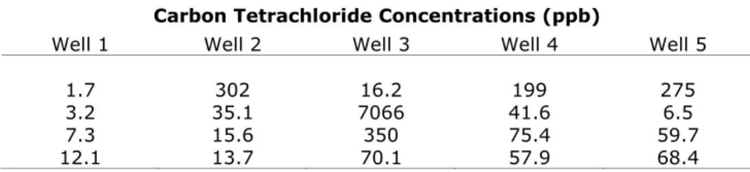
5 5
A simple, but extremely useful visual assessment of normality is to graph the data as a probability plot. The y-axis is scaled to represent quantiles or z-scores from a standard normal distribution and the concentration measurements are arranged in increasing order along the x-axis. As each observed value is plotted on the x-axis, the z-score corresponding to the proportion of observations less than or equal to that measurement is plotted as the y-coordinate. Often, the y-coordinate is computed by the following formula:
yi = Φ−1 i
n+1 [9.1]
where Φ−1denotes the inverse of the cumulative standard normal distribution, n represents the sample
size, and i represents the rank position of the ith ordered concentration. The plot is constructed so that, if
the data are normal, the points when plotted will lie on a straight line. Visually apparent curves or bends indicate that the data do not follow a normal distribution.
Probability plots are particularly useful for spotting irregularities within the data when compared to a specific distributional model (usually, but not always, the normal). It is easy to determine whether departures from normality are occurring more or less in the middle ranges of the data or in the extreme
tails. Probability plots can also indicate the presence of possible outlier values that do not follow the basic pattern of the data and can show the presence of significant positive or negative skewness.
If a (normal) probability plot is constructed on the combined data from several wells and normality is accepted, it suggests — but does not prove — that all of the data came from the same normal
distribution. Consequently, each subgroup of the data set (e.g., observations from distinct wells)
probably has the same mean and standard deviation. If a probability plot is constructed on the data residuals (each value minus its subgroup mean) and is not a straight line, the interpretation is more complicated. In this case, either the residuals are not normally-distributed, or there is a subgroup of the data with a normal distribution but a different mean or standard deviation than the other subgroups. The probability plot will indicate a deviation from the underlying assumption of a common normal distribution in either case. It would be prudent to examine normal probability plots by well on the same plot if the ranges of the data are similar. This would show how the data are distributed by well to determine which wells may depart from normality.
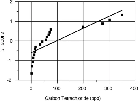
The same probability plot technique may be used to investigate whether a set of data or residuals follows a lognormal distribution. The procedure is generally the same, except that one first replaces each observation by its natural logarithm. After the data have been transformed to their natural logarithms, the probability plot is constructed as before. The only difference is that the natural logarithms of the
observations are used on the x-axis. If the data are lognormal, the probability plot of the logged
observations will approximate a straight line.
6
Determine whether the dataset in Table 9-4 is normal by using a probability plot.
,
Step 1. After combining the data into a single group, list the measured nickel concentrations in order
from lowest to highest.
Step 2. The cumulative probabilities, representing for each observation (xi) the proportion of values
less than or equal to xi, are given in the third column of the table below. These are computed
as i / (n + 1) where n is the total number of samples (n = 20).
Step 3. Determine the quantiles or z-scores from the standard normal distribution corresponding to the
cumulative probabilities in Step 2. These can be found by successively letting P equal each
cumulative probability and then looking up the entry in Table 10-1 (Appendix D)
corresponding to P. Since the standard normal distribution is symmetric about zero, for
cumulative probabilities P < 0.50, look up the entry for (1–P) and give this value a negative
sign.
Step 4. Plot the normal quantile (z-score) versus the ordered concentration for each sample, as in the
plot below (Figure 9-7). The curvature found in the probability plot indicates that there is
7
! - ">! #% !%$ $"#%+2#1 "%0 !3!
Nickel Concentration
(ppb)
Order (i)
Cumulative Probability
[i/(n+1)]
Normal Quantile (z-score)
1.0 1 0.048 –1.668
3.1 2 0.095 –1.309
8.7 3 0.143 –1.068
10.0 4 0.190 –0.876
14.0 5 0.238 –0.712
19.0 6 0.286 –0.566
21.4 7 0.333 –0.431
27.0 8 0.381 –0.303
39.0 9 0.429 –0.180
56.0 10 0.476 –0.060
58.8 11 0.524 0.060
64.4 12 0.571 0.180
81.5 13 0.619 0.303
85.6 14 0.667 0.431
151.0 15 0.714 0.566
262.0 16 0.762 0.712
331.0 17 0.810 0.876
578.0 18 0.857 1.068
637.0 19 0.905 1.309
942.0 20 0.952 1.668
5 5 / /
Step 1. List the natural logarithms of the measured nickel concentrations in Table 9-4 in order from
lowest to highest. These are shown in Table 9-5.
Step 2. The cumulative probabilities representing the proportion of values less than or equal to xi for
each observation (xi), are given in the third column of Table 9-4. These are computed as i / (n
+ 1) where n is the total number of samples (n = 20).
Step 3. Determine the quantiles or z-scores from the standard normal distribution corresponding to the
cumulative probabilities in Step 2. These can be found by successively letting P equal each
cumulative probability and then looking up the entry in Table 10-1 Appendix D
corresponding to P. Since the standard normal distribution is symmetric about zero, for
cumulative probabilities P < 0.50, look up the entry for (1–P) and give this value a negative
! . ">! #0 #% !%$ $"#%+2#1 "%0 !3!
Order (i)
Log Nickel Concentration
log(ppb)
Cumulative Probability [i/(n+1)]
Normal Quantile (z-score)
1 0.00 0.048 –1.668
2 1.13 0.095 –1.309
3 2.16 0.143 –1.068
4 2.30 0.190 –0.876
5 2.64 0.238 –0.712
6 2.94 0.286 –0.566
7 3.06 0.333 –0.431
8 3.30 0.381 –0.303
9 3.66 0.429 –0.180
10 4.03 0.476 –0.060
11 4.07 0.524 0.060
12 4.17 0.571 0.180
13 4.40 0.619 0.303
14 4.45 0.667 0.431
15 5.02 0.714 0.566
16 5.57 0.762 0.712
17 5.80 0.810 0.876
18 6.36 0.857 1.068
19 6.46 0.905 1.309
20 6.85 0.952 1.668
Step 4. Plot the normal quantile (z-score) versus the ordered logged concentration for each sample, as
in the plot below (Figure 9-8). The reasonably linear trend found in the probability plot
indicates that the log-scale data closely follow a normal pattern, further suggesting that the original data closely follow a lognormal distribution.
/"0(! 4 ">! #1 # ""$; #$
0 200 400 600 800 1000
-2 -1 0 1 2
Nickel Concentration (ppb)
/"0(! 7 # ""$; #$#2 #0 %+2#1!) ">! $
0 2 4 6 8
-2 -1 0 1 2
CHAPTER 10. FITTING DISTRIBUTIONS
10.1 IMPORTANCE OF DISTRIBUTIONAL MODELS... 10-1
10.2 TRANSFORMATIONS TO NORMALITY... 10-3
10.3 USING THE NORMAL DISTRIBUTION AS A DEFAULT... 10-5 10.4 COEFFICIENT OF VARIATION AND COEFFICIENT OF SKEWNESS... 10-9
10.5 SHAPIRO-WILK AND SHAPIRO-FRANCÍA NORMALITY TESTS... 10-13
10.5.1 Shapiro-Wilk Test (n ≤ 50) ... 10-13 10.5.2 Shapiro-Francía Test (n > 50) ... 10-15
10.6 PROBABILITY PLOT CORRELATION COEFFICIENT... 10-16
10.7 SHAPIRO-WILK MULTIPLE GROUP TEST OF NORMALITY... 10-18
Because a statistical or mathematical model is at best an approximation of reality, all statistical tests and procedures require certain assumptions for the methods to be used correctly and for the results to be properly interpreted. Many tests make an assumption regarding the underlying distribution of the observed data; in particular, that the original or transformed sample measurements follow a normal distribution. Data transformations are discussed in Section 10.2 while considerations as to whether the
normal distribution should be used as a ‘default’ are explored in Section 10.3. Several techniques for
assessing normality are also examined, including:
The skewness coefficient (Section 10.4)
The Shapiro-Wilk test of normality and its close variant, the Shapiro-Francía test (Section 10.5) Filliben’s probability plot correlation coefficient test (Section 10.6)
The Shapiro-Wilk multiple group test of normality (Section 10.7)
10.1
IMPORTANCE OF DISTRIBUTIONAL MODELS
As introduced in Chapter 3, all statistical testing relies on the critical assumption that the sample
data are representative of the population from which they are selected. The statistical distribution of the sample is assumed to be similar to the distribution of the mostly unobserved population of possible
measurements. Many parametric testing methods make a further assumption: that the form or type of the
underlying population is at least approximately known or can be identified through diagnostic testing. Most of these parametric tests assume that the population is normal in distribution; the validity or
accuracy of the test results may be in question if that assumption is violated.
Consequently, an important facet of choosing among appropriate test methods is determining whether a commonly-used statistical distribution such as the normal, adequately models the observed sample data. A large variety of possible distributional models exist in the statistical literature; most are not typically applied to groundwater measurements and often introduce additional statistical or mathematical complexity in working with them. So groundwater statistical models are usually confined to the gamma distribution, the Weibull distribution, or distributions that are normal or can be normalized via a transformation (e.g., the logarithmic or square root).
Although the Unified Guidance will occasionally reference procedures that assume an underlying gamma or Weibull distribution, the presentation in this guidance will focus on distributions that can be normalized and diagnostic tools for assessing normality. The principal reasons for limiting the discussion in this manner are: 1) the same tools useful for testing normality can be utilized with any distribution that can be normalized-- the only change needed is perform the normality test after first making a data transformation; 2) if no transformation works to adequately normalize the sample data, a non-parametric test can often be used as an alternative statistical approach; and 3) addressing more complicated scenarios is outside the scope of the guidance and may require professional statistical consultation.
Understanding the statistical behavior of groundwater measurements can be very challenging. The constituents of interest may occur at relatively low concentrations and frequently be left-censored because of current analytical method limitations. Sample data are often positively skewed and asymmetrical in distributional pattern, perhaps due to the presence of outliers, inhomogeneous mixing of contaminants in the subsurface, or spatially variable soils deposition affecting the local groundwater geochemistry. For some constituents, the distribution in groundwater is not stationary over time (e.g.,
due to linear or seasonal trends) or not stationary across space (due to spatial variability in mean levels from well to well). A set of these measurements pooled over time and/or space may appear highly non-normal, even if the underlying population at any fixed point in time or space is normal.
Because of these complexities, fitting a distributional model to a set of sample data cannot be done in isolation from checks of other key statistical assumptions. The data must also be evaluated for outliers (Chapter 12), since the presence of even one extreme outlier may cause an otherwise recognizable
distribution from being correctly identified. For data grouped across wells, the possible presence of spatial variability must be considered (Chapter 13). If identified, the Shapiro-Wilk multiple group test
of normality may be needed to account for differing means and/or variances at distinct wells. Data pooled across sampling events (i.e., over time) must be examined for the presence of trends or seasonal
patterns (Chapter 14). A clearly identified pattern may need to be removed and the data residuals tested
for normality, instead of the raw measurements.
A frequently encountered problem involves testing normality on data sets containing non-detect values. The best goodness-of-fit tests attempt to assess whether the sample data closely resemble the
tails of the candidate distributional model. Since non-detects represent left-censored observations where
the exact concentrations are unknown for the lower tail of the sample distribution, standard normality tests cannot be run without some estimate or imputation of these unknown values. For a small fraction of
non-detects in a sample (10-15% or less) censored at a single reporting limit, it may be possible to apply a normality test by simply replacing each non-detect with an imputed value of half the RL. However, more complicated situations arise when there is a combination of multiple RLs (detected values intermingled with different non-detect levels), or the proportion of non-detects is larger. The Unified Guidance recommends different strategies in these circumstances.
Properly ordering the sample observations (i.e., from least to greatest) is critical to any
distributional goodness-of-fit test. Because the concentration of a non-detect measurement is only known to be in the range from zero to the RL, it is generally impossible to construct a full ordering of the
sample.1 There are methods, however, to construct partial orderings of the data that allow the
assignment of relative rankings to each of the detected measurements and which account for the presence of censored values. In turn, a partial ordering enables construction of an approximate normality test. This subject is covered in Chapter 15.
10.2
TRANSFORMATIONS TO NORMALITY
Guidance users will often encounter data sets indicating significant evidence of non-normality. Due to the presumption of most parametric tests that the underlying population is normal, a common statistical strategy for apparently non-normal observations is to search for a normalizing mathematical transformation. Because of the complexities associated with interpreting statistical results from data that have been transformed to another scale, some care must be taken in applying statistical procedures to transformed measurements. In questionable or disputable circumstances, it may be wise to analyze the same data with an equivalent non-parametric version of the same test (if it exists) to see if the same general conclusion is reached. If not, the data transformation and its interpretation may need further scrutiny.
Particularly with prediction limits, control charts, and some of the confidence intervals described in
Chapters 18, 20, and 21, the parametric versions of these procedures are especially advantageous. Here,
a transformation may be warranted to approximately normalize the statistical sample. Transformations are also often useful when combining or pooling intrawell background from several wells in order to increase the degrees of freedom available for intrawell testing (Chapter 13). Slight differences in the
distributional pattern from well to well can skew the resulting pooled dataset, necessitating a transformation to bring about approximate normality and to equalize the variances.
The interpretation of transformed data is straightforward in the case of prediction limits for individual observations or when building a confidence interval around an upper percentile. An interval with limits constructed from the transformed data and then re-transformed (or back-transformed) to the
original measurement domain will retain its original probabilistic interpretation. For instance, if the data are approximately normal under a square root transformation and a 95% confidence prediction limit is constructed on the square roots of the original measurements, squaring the resulting prediction limit
allows for a 95% confidence level when applied to the original data.
The same ease of interpretation does not apply to prediction limits for a future arithmetic mean (Chapter 18) or to confidence intervals around an arithmetic mean compared to a fixed GWPS
(Chapter 21). A back-transformed confidence interval constructed around the mean of log-transformed
data (i.e., the log-mean) corresponds to a confidence interval around the geometric mean of the raw
(untransformed) data. For the lognormal distribution, the geometric mean is equal to the median, but it is
not the same as the arithmetic mean. Using this back-transformation to bracket the location of the true
arithmetic population mean will result in an incorrect interval.
For these particular applications, a similar problem of scale bias occurs with other potential
normality transformations. Care is needed when applying and interpreting transformations to a data set
1 Even when all the non-detects represent the lowest values in the sample, there is still no way to determine how this subset is
for which either a confidence interval around the mean or a prediction limit for a future mean is desired. The interpretation depends on which statistical parameter is being estimated or predicted. The geometric mean or median in some situations may be a satisfactory alternative as a central tendency parameter, although that decision must be weighed carefully when making comparisons against a GWPS.
Common normalizing transformations include the natural logarithm, the square root, the cube root, the square, the cube, and the reciprocal functions, as well as a few others. More generally, one might consider the “ladder of powers” (Helsel and Hirsch, 2002) technically known as the set of Box-Cox transformations (Box and Cox, 1964). The heart of these transformations is a power transformation of the original data, expressed by the equations:
yλ = x
λ −1
(
)
λ
forλ
≠0 logx forλ
=0
[10.1] The goal of a Box-Cox analysis is to find the value λ that best transforms the data to approximate
normality, using a procedure such as maximum likelihood. Such algorithms are beyond the scope of this guidance, although an excellent discussion can be found in Helsel and Hirsch (2002). In practice, slightly different equation formulations can be used:
yλ = x
λ for
λ
≠0logx for
λ
=0
[10.2]
where the parameter λ can generally be limited to the choices 0, -1, 1/4, 1/3, 1/2, 1, 2, 3, and 4, except
for unusual cases of more extreme powers.
As noted in Section 10.1, checking normality with transformed data does not require any additional tools. Standard normality tests can be applied using the transformed scale measurements. Only the interpretation of the test changes. A goodness-of-fit test can assess the normality of the raw measurements. Under a transformation, the same test checks for normality on the transformed scale. The data will still follow the non-normal distribution in the original concentration domain. So if a cube root transformation is attempted and the transformed data are found to be approximately normal, the original data are not normal but rather cube-root normal in distribution. If a log transformation is successfully used, the original measurements are not normal but lognormal instead. In sum, a series of non-normal distributions can be fitted to data with the goodness-of-fit tests described in this chapter without needing specific tests for other potential distributions.
Finding a reasonable transformation in practice amounts to systematically ‘climbing’ the “ladder of powers” described above. In other words, different choices of the power parameter λ would be attempted
— beginning with λ = 0 and working upward from -1 toward more extreme power transformations —
until a specific λ normalizes the data or all choices have been attempted. If no transformation seems to
10.3
USING THE NORMAL DISTRIBUTION AS A DEFAULT
Normal and lognormal distributions are frequently applied models in groundwater data because of their general utility. One or the other of these models might be chosen as a default distribution when designing a statistical approach, particularly when relatively little data has been collected at a site. Since the statistical behavior of these two models is very different and can lead to substantially different conclusions, the choice is not arbitrary. The type of test involved, the monitoring program, and the sample size can all affect the decision. For many data sets and situations, however, the normal distribution can be assumed as a default unless and until a better model can be pinpointed through specific goodness-of-fit testing provided in this chapter.
Assumptions of normality are most easily made with regard to naturally-occurring and measurable inorganic parameters, particularly under background conditions. Many ionic and other inorganic water quality analyte measurements exhibit decent symmetry and low variability within a given well data set, making these data amenable to assumptions of normality. Less frequently detected analytes (e.g., certain colloidal trace elements) may be better fit either by a site-wide lognormal or another distribution that can be normalized, as well as evaluated with non-parametric methods.
Where contamination in groundwater is known to exist a priori (whether in background or compliance wells), default distributional assumptions become more problematic. At a given well, organic or inorganic contaminants may exhibit high or low variability, depending on local hydrogeologic conditions, the pattern of release from the source, the degree of solid phase absorption, degradability of a given constituent, and the variation in groundwater flow direction and depths. Non-steady state releases may result in a historical, occasionally non-linear pattern of trend increases or decreases. Such data might be fit by an apparent lognormal distribution, although removal of the trend may lead to normally-distributed residuals.
Sample size is also a consideration. With fewer than 8 samples in a data set, formal goodness-of-fit tests are often of limited value. Where larger sample sizes are available, goodness-of-fit tests should be conducted. The Shapiro-Wilk multiple group well test (Section 10.7) — even with small sample sizes — can sometimes be used to identify individual anomalous wells which might otherwise be presumed to meet the criterion of normality. Under compliance/assessment or corrective action monitoring, one might anticipate only four samples per well in the first year after instituting such monitoring. Under these conditions, a default assumption of normality for testing of the mean against a fixed standard is probably necessary. Aggregation of multi-year data when conducting compliance tests (see Chapter 7) may allow large enough sample sizes to warrant formal goodness-of-fit testing. With 8 (or more) samples, it may be possible to determine that a lognormal distribution is an appropriate fit for the data. Even in this latter approach, caution may be needed in applying Land’s confidence interval for a lognormal mean (Chapter 21) if the sample variability is large and especially if the upper confidence limit is used in the comparison (i.e., in corrective action monitoring).
The normal distribution may also serve as a reasonable default when it is not critical to ensure that sample data closely follow a specific distribution. For example, statistical tests on the mean are generally considered more robust with respect to departures from normality than procedures which involve upper or lower limits of an assumed distribution. Even if the data are not quite normal, tests on the mean such
as a Student’s t-test will often still provide a valid result. However, one might need to consider transformations of the data for other reasons. Analysis of variance [ANOVA] can be run with small individual well samples (e.g., n = 4), and as a comparison of means, it is fairly robust to departures from normality. A logarithmic or other transformation may be needed to stabilize or equalize the well-to-well variability (i.e., achieve homoscedasticity), a separate and more critical assumption of the test.
Given their importance in statistical testing and the risks that sometimes occur in trying to interpret tests on other data transformation possibilities, it is useful to briefly consider the logarithmic transformation in more detail. As noted in Section 10.1, groundwater data can frequently be normalized using a logarithmic distribution model. Despite this, objections are sometimes raised that the log transformation is merely used to “make large numbers look smaller.”
To better understand the log transformation, it should be recognized that logarithms are, in fact, exponents to some unit base. Given a concentration-scale variable x, re-expressed as x=10yor
x =ey, the logarithm y is the exponent of that base (10 or the natural base e). It is the behavior of the resultant y values that is assessed when data are log-transformed. When data relationships are multiplicative in the original arithmetic domain ( x1×x2), the relationships between exponents (i.e., logarithms) are additive ( y1+ y2). Since the logarithmic distribution by mathematical definition is normal in a log-transformed domain, working with the logarithms instead of the original concentration measurements may offer a sample distribution much closer to normal.
Similar to a unit scale transformation (ppm to ppb or Fahrenheit to Centigrade), the relative ordering of log-transformed measurements does not change. When non-parametric tests based on ranks (e.g., the Wilcoxon rank-sum test) are applied to data transformed either to a different unit scale or by logarithms, the outcomes are identical. However, other relationships among the log-transformed data do change, so that the log-scale numerical ‘spacing’ between lower values is more similar to the log-scale spacing between higher values. While parametric tests like prediction limits, t-tests, etc., are not affected by unit scale transformations, these tests may have different outcomes depending on whether raw concentrations or log-transformed measurements are used. The justification for utilizing log-transformed data is that the transformation helps to normalize the data so that these tests can be properly applied.
There is also a plausible physical explanation as to why pollutant concentrations often follow a logarithmic pattern (Ott, 1990). In Ott’s model, pollutant sources are randomly dispersed through the subsurface or atmosphere in a multiplicative fashion through repeated dilutions when mixing with volumes of (uncontaminated) water or air, depending on the medium. Such random and repeated dilutions can mathematically lead to a lognormal distribution. In particular, if a final concentration ( c0) is the product of several random dilutions (ci) as suggested by the following equation:
(
)
∏
=× × × = =
n
i
n
i c c c
c c
1
2 1
0 K [10.3]
the logarithm of this concentration is equivalent to the sum of the logarithms of the individual dilutions: log
( )
c0 = log( )
cii=1
n
The Central Limit Theorem (Chapter 3) can be applied to conclude that the logged concentration in equation [10.4] should be approximately normal, implying that the original concentration ( c0) should be approximately lognormal in distribution. Contaminant fate-and-transport models more or less follow this same approach, using successive multiplicative dilutions (while accounting for absorption and degradation effects) across grids in time and space.
Despite the mathematical elegance of the Ott model, experience with groundwater monitoring data has shown that the lognormal model alone is not adequate to account for observed distribution patterns. While contaminant modeling might predict a lognormal contaminant distribution in space (and often in time at a fixed point during transient phases), individual well location points fixed in space and at rough contaminant equilibrium are more likely to be subject to a variety of local hydrologic and other factors, and the observed distributions can be almost limitless in form. Since most of the tests within the Unified Guidance presume a stationary population over time at a given well location (subject to identification and removal of trends), the resultant distributions may be other than lognormal in character. Individual constituents may also exhibit varying aquifer-related distributional characteristics.
A practical issue in selecting a default transformation is ease of use. Distributions like the lognormal usually entail more complicated statistical adjustments or calculations than the normal distribution. A confidence interval around the arithmetic mean of a lognormal distribution utilizes Land’s H-factor, which is a function of both log sample data variability and sample size, and is only readily available for specific confidence levels. By contrast, a normal confidence interval around the sample mean based on the t-statistic can easily be defined for virtually any confidence level. As noted earlier, correct use of these confidence intervals depends on selecting the appropriate parameter and statistical measure (arithmetic mean versus the geometric mean).
While a transformation does not always necessitate using a different statistical formula to ensure unbiased results, use of a transformation does assume that the underlying population is non-normal. Since the true population will almost never be known with certainty, it may not be advantageous to simply default to a lognormal assumption for a variety of reasons. Under detection monitoring, the presumption is made that a statistically significant increase above background concentrations will trigger a monitoring exceedance. But the larger the prediction limit computed from background, the less statistical power the test will have for detecting true increases. An important question to answer is what the consequences are when incorrectly applying statistical techniques based on one distributional assumption (normal or lognormal), when the underlying distribution is in fact the other. More specifically, what is the impact on statistical power and accuracy of assuming the wrong underlying distribution? The general effects of violating underlying test assumptions can be measured in terms of false positive and negative error rates (and therefore power). These questions are particularly pertinent for prediction limit and control chart tests in detection monitoring. Similar questions could be raised regarding the application of confidence interval tests on the mean when compared against fixed standards.
To answer these questions, a series of Monte Carlo simulations was generated for the Unified Guidance to evaluate the impacts on prediction limit false positive error rates and statistical power of using normal and lognormal distributions (correctly and incorrectly applied to the underlying distributions). Detailed results of this study are provided in Appendix C, Section C.1.