CURVE REGISTRATION AND HUMAN CONNECTOME DATA
Qunqun Yu
A dissertation submitted to the faculty of the University of North Carolina at Chapel Hill in partial fulfillment of the requirements for the degree of Doctor of Philosophy in the
Department of Statistics and Operations Research.
Chapel Hill 2017
Approved by:
J. S. Marron
Kai Zhang
Amarjit Budhiraja
Jan Hannig
c ○2017 Qunqun Yu
ABSTRACT
QUNQUN YU: CURVE REGISTRATION AND HUMAN CONNECTOME DATA.
(Under the direction of J. S. Marron and Kai Zhang.)
This dissertation consists of three main parts: the usefulness of principal nested spheres for
time warped functional data analysis, asymptotic study of the Fisher-Rao approach to time
warped curve registration, the Joint and Individual Variation Explained method for Human
Connectome Data.
There are often two important types of variation in functional data: the horizontal (or
phase) variation and the vertical (or amplitude) variation. These two types of variation have
been appropriately separated and modeled through a domain warping method (or curve
regis-tration) based on the Fisher-Rao metric. The first part focuses on the analysis of the horizontal
variation, captured by the domain warping functions. The square-root velocity function
repre-sentation transforms the manifold of the warping functions to a Hilbert sphere. Motivated by
recent results on manifold analogs of principal component analysis, we analyze the horizontal
variation via a Principal Nested Spheres approach. Compared with earlier approaches, such as
approximating tangent plane principal component analysis, this is seen to be an efficient and
interpretable approach to decompose the horizontal variation in both simulated and real data
examples.
The mathematical underpinnings of the Fisher-Rao curve registration are studied by a
consistency result for a signal that is observed under random warps, scaling and vertical
trans-lation. The signal estimator in the Fisher-Rao curve registration is known to be consistent.
The second part of this dissertation studies more asymptotic properties. The ultimate goal
is to compare available methods using rates of convergence. A challenging part is that closed
form solutions on the surface of the sphere are generally not available. We study a simple case
where the warps are piecewise linear warping functions. Points on the unit circle can represent
estimation. A class of metrics that share some good properties of the Fisher-Rao metric is also
studied.
A major goal in neuroscience is to understand the neural pathways underlying human
behavior. We introduce the recently developed Angle-based Joint and Individual Variation
Explained (AJIVE) method to the neuroscience community to simultaneously analyze imaging
and behavioral data from the Human Connectome Project. Motivated by recent
computa-tional and theoretical improvements in the AJIVE approach, we simultaneously explore the
joint and individual variation between and within imaging and behavioral data. In particular,
we demonstrate that AJIVE is an effective and efficient approach for integrating task fMRI
and behavioral variables using three examples: one example where task variation is strong, one
where task variation is weak and a reference case where the behavior is not directly related
to the image. These examples are provided to visualize the different levels of signal found in
the joint variation including working memory regions in the image data and accuracy and
re-sponse time from the in-task behavioral variables. Joint analysis provides insights not available
from conventional single block decomposition methods such as Singular Value Decomposition.
Additionally, the joint variation estimated by AJIVE appears to more clearly identify the
work-ing memory regions than Partial Least Squares (PLS), while Canonical Correlation Analysis
(CCA) gives grossly overfit results. The individual variation in AJIVE captures the behavior
unrelated signals such as a background activation that is spatially homogeneous and activation
in the default mode network. The information revealed by this individual variation is not
ex-amined in traditional methods such as CCA and PLS. We suggest that AJIVE can be used as
an alternative to PLS and CCA to improve estimation of the signal common to two or more
datasets and reveal novel insights into the signal unique to each dataset. We also investigate
an alternative to AJIVE which gives similar joint results as AJIVE, but with no information
ACKNOWLEDGEMENTS
Over the past five years I have received support and encouragement from many people. First
and foremost I want to thank my advisors, Professor J. S. Marron and Professor Kai Zhang,
for their generous guidance and unreserved support. I am grateful for their contributions of
time, insightful ideas, funding, and persistent help to make my Ph.D. experience productive
and stimulating. I also want to thank Professor Jan Hannig, Professor Amarjit Budhiraja, and
Dr. Perry D. Haaland for their constructive comments and suggestions on my dissertation.
In addition, I would like to take this opportunity to thank Dr. J. Derek Tucker and Dr.
Xiaosun Lu for the Fisher-Rao Matlab software and Dr. Qing Feng for providing the AJIVE
software. Part of my research is accomplished when I was an intern at BD Technologies,
I greatly appreciate the support from my former bosses, Elaine McVey and Dr. Perry D.
Haaland. Additionally, one chapter of my dissertation was done when I was a graduate fellow
at SAMSI (Statistical and Applied Mathematical Sciences Institute) and working in a big data
group. I want to thank the group members, especially Professor Timothy Johnson, for his great
advice on our paper.
Thanks also go to my parents and my parents in-law for taking care of my daughter, which
makes my life much easier. Last but not least, I would like to give my special appreciation to
my husband, Dehan Kong, who is always caring, patient, and supportive. His maturity and
optimism inspired me. Without his unconditional love, getting to this point would have not
TABLE OF CONTENTS
LIST OF FIGURES . . . i
1 Introduction . . . 1
2 Principal Nested Spheres for Horizontal Variation . . . 5
2.1 Function Alignment Based on the Fisher-Rao Metric . . . 5
2.2 PNS for Spherical Structure of Horizontal SRVFs . . . 8
2.3 Horizontal Analyses . . . 10
2.3.1 Conventional FPCA . . . 11
2.3.2 Analyses on SRVF Manifold . . . 13
2.4 Blood Glucose Example . . . 15
2.4.1 Phase and Amplitude Separation . . . 16
2.4.2 E-PCA vs S-PNS of Horizontal variation . . . 17
2.5 Conclusions . . . 19
3 Asymptotic study and variations of Fisher-Rao curve registration . . . 21
3.1 Asymptotic study of Fisher-Rao curve registration . . . 21
3.1.1 Fisher Rao curve registration of the model . . . 22
3.1.2 Discussion of asymptotic study of the amplitude mean . . . 25
3.1.3 Intrinsic mean on the surface of a finite dimensional sphere . . . 26
3.1.4 Toy example . . . 27
3.2 Variations of the Fisher-Rao metric . . . 36
3.2.1 Registration to multiples using the L2 distance . . . 36
3.2.3 General Root Derivative Transformations . . . 40
3.2.4 Comparison of SRVF and SRDS . . . 41
4 AJIVE integration of imaging and behavioral data . . . 43
4.1 JIVE . . . 44
4.2 Data . . . 50
4.3 Data preprocessing . . . 53
4.4 Results . . . 60
4.4.1 AJIVE low rank approximations . . . 62
4.4.2 Separate SVD on behavioral data . . . 64
4.4.3 Case 1: AJIVE on behavioral and working memory 2-0 back image data 66 4.4.4 Case 2: AJIVE on behavioral and 2-back tools image data . . . 72
4.4.5 Case 3: AJIVE on behavioral and motor image data . . . 76
4.4.6 Assessment of significance . . . 78
4.5 Discussion . . . 79
4.6 AJIVE alternative . . . 81
4.7 Conclusion . . . 85
LIST OF FIGURES . . . 86
LIST OF FIGURES
1.1 Right: the growth velocity curves for ten girls’ height. Left: the acceleration curves of the height. The blue dashed curves in both panels are the cross-sectional mean. The differencing shapes of the means with the sample curves suggests phase and amplitude variation. . . 2
2.1 Left: A toy example of bimodal functions with big horizontal variation. The color reflects the order of the horizontal positions of the peaks. Middle: The domain warping functions to align the functions based on the Fisher-Rao metric. Right: The aligned functions. A common color scheme is used in each panel using rainbow color in order of amount of warp. . . 6
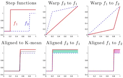
2.2 The problem withL2 metric alignment. The top left panel shows two step functions
f1 (solid red) and f2 (dashed blue). The four right p anels show that warping f2
to f1 (middle) is different from warpingf1 to f2 (right) under the L2 metric. The top two panels show the warping functions, while the bottom two panels show the aligned functions. Better than either is the Fisher-Rao alignment shown in the bottom left panel, where the black dotted line indicates the Karcher mean function. 7
2.3 Left: Horizontal variation of the toy example in Figure 2.1 (left). The color reflects the order of the horizontal positions of the peaks. Right: The Karcher mean function (red solid line) and the cross-sectional mean (blue dashed line). The same rainbow color is used here as in Figure 2.1. . . 10
2.4 Horizontal analyses of the toy data. The color is consistent with that in the first panel in Figure 2.3. From the left column to the right: H-PCA, E-PCA, S-PGA, S-PNS. Each column shows the first two components of each analysis. Note that successive improvement in quality of data representation and signal compression are shown. . . 11
2.5 A toy example to illustrate the potential problem of E-PCA. The first panel: A set of two-dimensional warping functions γi, each determined by γi(1/3) and γi(2/3).
The second panel: The scatter plot of γi(1/3) and γi(2/3) (black circles), the
E-PC1 direction (red line) of these points and the S-PNS1 curve (blue curve). The red crosses indicate the E-PC1 projections above the black diagonal line, and the cyan diamonds indicate the E-PC1 projections below the line. The blue curve of S-PNS1 projections remains in the positive orthant. The third panel: The projected curve visualization of those E-PC1 projections. Note that the cyan curves are not bijective, i.e. not valid warping functions. The fourth panel: The projected curve visualization of the S-PNS1 projections. These projections stay in the space Γ. . . 12
2.7 Study of effect of interpolation. Left panel shows the original blood glucose curves over 59 days for one subject. Middle panel shows the application of linear interpo-lation to the data in the left panel. The right panel is a close-up of the interpointerpo-lation of the red curve (chosen as a challenging case) on the left by the blue curve in the middle showing that the interpolation captures major shape aspects of the curve. . 15
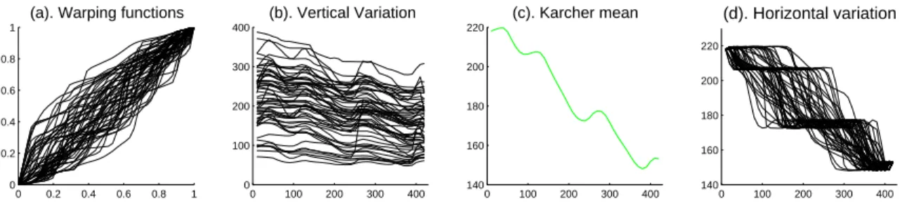
2.8 Phase and Amplitude Separation. (a): Warping functions. (b): Vertical variation. (c): Karcher mean derived by Fisher-Rao curve registration showing three distinct peaks. (d): Horizontal variation obtained via warping the Karcher mean by the inverse of the warping functions. These show both strong vertical (b) and horizontal (d) variation. . . 16
2.9 Horizontal variation analyses: The first column is the horizontal variation shown in the original space. These curves are the same as in the right panel in Figure 2.8, but with colors in the order of S-PNS1 scores, used in all the plots. The upper right three panels are the first three components of the transformed E-PC projections. The lower panels are the S-PNS analysis. These show S-PNS explains more variation with fewer components than E-PCA. . . 17
2.10 Equally spaced S-PNS1 projections using similar rainbow colors. This equal spacing of coefficients allows better interpretation of this mode of variation. . . 18
2.11 Visualization of S-PNS1 and E-PC1 scores in the 3-d space generated by the E-PC1, PC2 and PC3 directions for the blood glucose data: Stars are the PC1, E-PC2, E-PC3 scores, squares are the E-PC1 projections and circles are the S-PNS1 projections. Rainbow color in the order of S-PNS1 scores is used. This plot shows S-PNS1 gives a better one dimensional representation of the original data in this 3-d space. . . 19
3.1 Step 2: Find the center of [µ] with respect to the set {qi, i= 1,2, ..., n}. It starts with any elementµin [µ], warps the sample SRVF to thisµand the corresponding optimal warps areγi, i= 1,2, ..., n. The true center of the orbit isµwarping by the
inverse of Karcher mean of the optimal warps. . . 22
3.2 The exponential map. q: the north pole (0,0,0, ...,0,1). p : (x1, x2, ..., xd,1): a
point on the tangent space at point q. expq(p): the exponential map of ponto the sphere. This exponential map preserves the arc distance and direction fromq when
r < π. . . 27
3.3 True template and one warp in the toy example. Both the underlying template (left panel) and the warp function (right panel) are piecewise linear functions. . . 28
3.4 Data simulation (n =30). The upper left is the templategshown in Figure 3.3. The upper right gives the generated samples of inverse warps. The lower left shows the warp samples and curves in the lower right panel are the samplef curves. . . 29
3.6 The upper panels show a Gaussian density function f1 and its multiplef2, as
dot-dashed and dotted curves, respectively. The solid curve in the upper left panel is the aligned function off1 resulting from minγ||f2−(f1◦γ)||2. The optimal warping
functionγ is shown in the lower left panel. The solid curve in the upper right panel results from minimizing||f1−(f2◦γ)||2 with the optimal warping functionγ shown
in the lower right panel. This shows very non-intuitive pinching and stretching results from this optimization. . . 37
3.7 The SRVF template estimator (red) and the SRDS estimator (blue) comparison in the toy example (n = 100,000). The height of the peak in the red curve is around 0.8, while the height of the blue curve is 1. Thus, the SRDS estimator is consistent for the height. For the horizontal position, the SRDS is not consistent here, which is mainly because for the piecewise linear warps in this toy example, the Karcher mean is not approximately identity γid under the SRDS transformation. . . 42
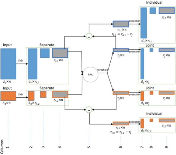
4.1 Analytical steps of the AJIVE algorithm. Raw data on the left are input to separate SVD low rank approximations (green boxes). Next steps use the separate SVD scores (all score matrices are shown as gray boxes), first thresholding the Principal Angle Analysis to obtain joint scores, then performing basis subtraction to obtain individual scores. Finally, projection gives the AJIVE loadings. . . 47
4.2 Data construction of the toy example. The first column presents the observed data matrices X and Y, which are sums of the joint and individual signals and the noise, shown in the remaining columns. This is a heat map view with entries colored according to the color bar at the bottom of each panel. These structures are difficult to capture using conventional methods due to different orders of magnitude of the numbers of features. . . 48
4.3 AJIVE estimation of the toy example. The first column shows the rank-2 approx-imations of X and Y, the second for the estimated joint signals and the third for the individual signals. The color scheme is the same as that in Figure 4.2. AJIVE captures these diverse types of variation for each data block. . . 49
4.4 PLS estimation of the toy example. The first column shows observed X and Y. The second and third show the PLS1 and PLS2, respectively. The fourth shows the rank-two approximation. This shows that PLS recovers the true signal nicely in the rank 2 estimation, but it poorly separates the joint and individual signals. . . 50
4.5 AJIVE analysis diagram of the HCP data, showing sources of loading vectors used in the plots. . . 52
4.7 Missings in the behavioral data. Left panel: the number of variables missing for each subject. 2 subjects have more than 10 variables missing. Right panel: the number of subjects missing for each behavioral variable after excluding the 2 subjects. All of them have less than 20 subjects missing, which account for at most 4% of the remaining 487 subjects. This indicates that imputing the missing values with the corresponding variable median is appropriate. . . 54
4.8 Marginal distributions of behavioral variables sorted on standard deviation. The upper left panel shows the summary statistics for the behavioral variables. The variables are sorted on their standard deviations and the blue curve shows the curve of standard deviations. The marginal distributions of 15 variables are shown here based on an equally spaced grid in the sorted variables. The red circles denote females and the blue plusses represent males. The scales of the variables vary by several orders of magnitude, suggesting a need for normalization. . . 56
4.9 Marginal distributions of behavioral variables sorted on skewness. The skewness range for the behavioral variables is [−18.91,6.46]. This shows the need for trans-formations to reduce skewness. . . 57
4.10 Marginal distributions of behavioral variables after transformation sorted on skew-ness. The skewness range from −4.62 to 0.96, which is much closer to Gaussian than Figure 4.9. . . 59
4.11 Marginal distributions of image variables sorted on standard deviation and skew-ness. Left: standard variation. The standard deviations range from 1.49 to 3.52, indicating that the image variables are in same scales. Right: skewness. The range of the skewness is (−0.95,1.19) and thus the variables look roughly Gaussian dis-tributed. Both the same scales and roughly Gaussian distribution suggest no need of transformation for the image variables. . . 60
4.12 Rank selection. Upper Left: scree plot of the behavioral data. The red lines are chosen based on the jump of adjacent points after containing 50% of the variation. The remaining three panels show the image scree plots and the choices of the initial ranks. . . 63
4.13 Comparison of the AJIVE results based on two different initial rank selection ap-proaches in Case 2. Left: the permutation test based on Dray [2008]. Right: scree plot rank choice. It shows that our scree plot procedure gives much more relevant results. . . 64
4.15 (a): SVD3 loadings of the behavioral data. Variables in domains of emotion (orange) and personality (green) are the major factors for SVD3. (b): A zoom in of these variables. Note that the variables measuring positive emotion or personality work in one direction while the negative variables work in the other direction. Same color scheme as in Figure 4.6 is used. . . 66
4.16 Overview of Case 1 (2-0 back). Separate SVD1/SVD2 loadings on the behavior are similar to joint SVD1/SVD2 loadings. The joint image SVD1 strengthens the working memory related signals because the strong task unrelated signals go to the individual component. AJIVE separates out intuitively sensible individual compo-nents and concentrates on the important activation in the joint component. The strong variation in overall activation appearing in the individual component shows that is not associated with behavior. . . 67
4.17 Comparison of PLS1 and AJIVE joint SVD1 in Case 1. This suggests slightly better performance by AJIVE. . . 70
4.18 CCA result in Case 1. The colored points are the non-zero entries on the cortical surface for the first loadings of the image data from CCA. The zero entries are colored gray. This strongly indicates that CCA is not an appropriate method in HDLSS case. . . 71
4.19 Subcortical results in Case 1. The overall red pattern in the separate PC1 goes to the individual component, while the activation pattern in the joint variation is similar to the group level analysis. The PLS1 also finds similar activation patterns in the subcortical regions as the group level analysis. . . 72
4.20 Overview of Case 2 (2-back tool). The first column shows the separate SVDs. SVD1 is again the overall red pattern, SVD2 finds important variation in the visual cortex, SVD3 reveals an important variation related to the default mode network and SVD4 feels some working memory related variation. The AJIVE joint SVD1 captures both the vision effect and working memory effect. The AJIVE individual component feels the overall activation in SVD1 and the variation in default mode network in SVD3. The PLS1 loadings show less contrast in memory related regions versus other regions, e.g., precuneus versus paracentral lobule. . . 74
4.21 AJIVE individual SVD2 loadings in Case 2. The hot spot shows some variation associated with the vision system. This reflects a different aspect of variation in the vision system, which is unrelated to behavioral variation. . . 75
4.23 Joint SVD1 of behavior. The variables in the motor domain (brown) contribute in a relatively stronger way to the weak signal associated with the motor cortex in the AJIVE joint component. . . 78
4.24 Permutation tests for statistical significance. The green vertical lines show the AJIVE joint image energies, the black dots show the joint image energies from permutations, and the black curves show density estimations. The AJIVE joint signals found in Case 1 and Case 2 are significant, while the joint signal in Case 3 is insignificant. . . 79
4.25 AJIVE and score CCA comparison in Case 1. The SVD1 loadings of AJIVE joint component (left panel) is very similar to that of score CCA (right panel). It shows the score CCA is also efficient for finding the working memory associated signals in Case 1. . . 84
4.26 AJIVE and score CCA comparison in Case 2. The score CC1 loadings are again similar to the AJIVE joint SVD1 loadings. The score CC1 loadings feel both the vision and the working memory effect. . . 84
CHAPTER 1: Introduction
Functional data analysis is a branch of statistics that works with information over curves,
surfaces or anything else varying over a continuum. There is a large literature on statistical
analysis of functions, such as Ramsay [1982], Kneip and Gasser [1992], Locantore et al. [1999].
A general overview of functional data analysis is provided by Ramsay and Silverman [2002]
and Ramsay and Silverman [2005]. Plenty of useful tools and methods are available, such
as Functional Principal Component Analysis (FPCA), with many important applications in a
wide variety of scientific fields.
A common phenomenon in functional data is that prominent features in the functions vary
in position from one sample to another, such as the timing variation of the adolescent growth
spurt in human growth velocity and acceleration curves (Ramsay and Silverman [2005], Marron
et al. [2015]), shown in Figure 1.1, based on data from the latter paper. In both panels, the
shapes of the cross-sectional means (red dashed) are poor representations of the shapes of the
sample curves (blue solid). The times of pubertal rapid growth vary from person to person
and this variation cause the mean to poorly reflect the true underlying growth pattern. This
positional, or phase, variation is called thehorizontal variation. Another important component
of variability in functional data is the amplitude variation, or thevertical variation, such as the
height differences among the individuals. Srivastava et al. [2011] studied amplitude and phase
variation using equivalence classes. A good understanding of choosing the proper data object
can be obtained using the terminology of object oriented data analysis (OODA), introduced by
Wang and Marron [2007] and recently surveyed in Marron and Alonso [2014]. The data objects
are understood as the atoms of the analysis. The equivalence classes are the data objects in
Srivastava et al. [2011]. A curve registration overview is provided by Marron et al. [2015].
Chapter 2 is essentially the paper (Yu et al. [2017a]) and studies phase from the overview of
Fisher-Rao curve registration. It gives examples illustrating some shortcomings of conventional
FPCA and uses an improved method, Principal Nested Spheres (PNS, Jung et al. [2012]), for
age
Gro
wth (cm/y
ear)
2 4 6 8 10 12 14 16 18
0
5
10
15
20
age
Acceler
ation (cm/y
ear^2)
2 4 6 8 10 12 14 16 18
−12
−8
−4
0
Figure 1.1: Right: the growth velocity curves for ten girls’ height. Left: the acceleration curves of the height. The blue dashed curves in both panels are the cross-sectional mean. The differencing shapes of the means with the sample curves suggests phase and amplitude variation.
velocity functions of the horizontal variation stay on a non-Euclidean sphere and PNS provides
an efficient decomposition of the high-dimensional sphere. In curve registration contexts, there
is substantial room for improvement over conventional functional data analysis because, in those
traditional approaches, the functional data are analyzed under the L2 metric, which tends to strongly focus on the vertical variation. The horizontal variation cannot be easily understood in
these vertical analyses. Srivastava et al. [2011] applied the Fisher-Rao metric to simultaneously
separate the phase and amplitude variation and to find the Karcher mean. The main purpose
of Chapter 2 is to find an improved method for the horizontal analysis. Considering the
special spherical structure of the horizontal variation (see Section 2.2 for details), we use an
approach involving PNS introduced by Jung et al. [2012]. Comparison with several other
popular approaches, such as the FPCA, suggests improved efficiency of PNS for horizontal
analysis. A toy example (Section 2.3) and a real data example of blood glucose time series
(Section 2.4) are used to illustrate the advantages of the PNS approach.
Chapter 3 studies the amplitude from the Fisher-Rao curve registration and it investigates
the theoretical properties ofamplitude mean, i.e. the mean of the amplitudes, by studying its
convergence rate. In particular, when the observed curves fi=cig◦γi+ei, i= 1,2, ..., n are a
true signalgunder random warpsγi∈Γ, scalingci ∈R+ and noiseei∈R, we observe that the Fisher-Rao estimator is biased, while the amplitude mean is a consistent estimator for g. We
prove that the amplitude mean is ˆga= ¯cg◦(γ−1)−1+ ¯eand its consistency is given in Srivastava
et al. [2011]. Chapter 3 aims to study additional asymptotic aspects of the amplitude mean and
rate of ˆga depends on ¯c, γ−1 and ¯e. The first and third of these means are the conventional
mean of scalars and their convergence rate are straightforward. However, the second mean,γ−1
is the Karcher mean of warps, from the transformation of the Karcher mean of their SRVFs on
the infinite unit sphere, and it generally has no closed form. Hence, we restrict our study to a
simple toy example, where the explicit form of the amplitude mean is derived by discretizing
the warps. In this case, we compare the amplitude mean with the conventional cross-sectional
mean and with an estimate based on landmark curve registration by studying their consistency
and convergence rates. Chapter 3 also extends the Fisher-Rao metric to a class of metrics with
properties of warp invariance and null identifiability, i.e. the optimal warp to align a curve to
any multiple is the identityγid. In particular, we focus on a family of transformations,General
Root-Derivative (GRD) transformations. We compare two transformations, SRVF and the new
Square Root of Derivative of Squared (SRDS), in the family. We prove that this transformation
is also bijective and the SRDS estimator (transform of the Karcher mean in the SRDS space)
is consistent, which is preferable to the biased Fisher-Rao estimator.
Chapter 4 is substantially another paper (Yu et al. [2017b]) and focuses on developing
methods to integrate neuroimaging and behavioral data from the Human Connectome Project
(HCP), whose primary goal is to characterize the neural pathways that underlie brain function
and behavior in healthy young adults (Van Essen et al. [2013]). To elucidate the relationship
between brain function and behavior, we simultaneously analyze both task functional
mag-netic resonance imaging (fMRI) and behavioral variables. Some of these behavioral variables
are measured at the time of task performance. Others are from the NIH toolbox, Penn
Com-puterized Neurocognitive Battery and other tests that characterize a range of motor, sensory,
cognitive and emotional processes. Chapter 4 uses an improved method for integrating
imag-ing and behavioral data over the traditional Canonical Correlation Analysis (CCA) and Partial
Least Squares (PLS) to study activation patterns. Motivated by recent results on integrating
different datasets, we use the Angle-based Joint and Individual Variation Explained (AJIVE)
method (Lock et al. [2013], Feng et al. [2015]). AJIVE is an approach to explore two different
types of variation: joint variation across different data blocks and individual variation that is
unique to each data block. We demonstrate the usefulness of AJIVE in three examples. In
task, but with different levels of working memory related variation. In the third example, the
imaging data is fMRI driven by a motor task. The behavioral data in all examples is the same
and contains some working memory task-related variables, but none of the motor task-related
variables. Thus, the imaging and behavioral data are very strongly, highly, and weakly
re-lated in these three examples and the results show the corresponding different levels of working
memory related signals in the joint component, indicating AJIVE is a powerful multivariate
statistical method for jointly analyzing imaging and behavior data. In addition, we study a
new approachscore CCA, applying CCA on the scores from SVD. The results of this method
CHAPTER 2: Principal Nested Spheres for Horizontal Variation 2.1 Function Alignment Based on the Fisher-Rao Metric
A useful approach to horizontal analysis is through the idea of elastic functions. Some
pioneering work in this area includes Cameron [1983], Hardle and Marron [1990], Ramsay
and Li [1998], Gervini and Gasser [2004], Liu and Mueller [2004], Kneip and Ramsay [2008],
Tang and Mueller [2008]. The basic idea is to first separate the vertical and the horizontal
variation throughfunction alignment, or curve registration. In particular, consider a collection
of functions fi(t), i= 1,2, ..., n in F ={f|fis absolutely continuous on[0,1]} (if the domain
is not [0,1], consider a linear transformation that maps the domain to [0,1]), having both
vertical and horizontal variation, such as the bimodal functions shown in Figure 2.1 (left).
Let Γ be the set of orientation-preserving diffeomorphisms of the unit interval [0,1] : Γ =
{γ : [0,1] → [0,1]| γ(0) = 0, γ(1) = 1 and γ is a diffeomorphism}, where a diffeomorphism
refers to a bijective differentiable function whose inverse is also differentiable. If functions
fi(t), i= 1,2, ..., n are well aligned by warping the domain properly, then the horizontal and
the vertical variation can be separately captured by the domain warping functions γi(t) ∈ Γ
and the resulting aligned functions fi(γi(t)), respectively. For this toy example, such a set of
warping functions and the corresponding aligned functions are shown in the middle and right
panels respectively (details about finding those warping functions are discussed later). Then,
the horizontal analysis can be done by studying those warping functions.
A crucial step in the function alignment is to find appropriate domain warping functions.
Consider two functions f1 and f2. Most of the past approaches involve solving infγ∈Γkf1−
(f2◦γ)k to align f2 to f1, where k · k is the standard L2 metric, i.e. kfk = (R01|f(t)|2dt)1/2. However, this criterion is problematic, since the objective function is not symmetric in the
sense that aligning f1 to f2 leads to a different optimal minimum. To illustrate this point,
Figure 2.2, similar to Figure 8 in Marron et al. [2015], shows a simple example of aligning
0 0.5 1 0
1 2 3 4 5
t
f(t)
Unaligned Functions
0 0.5 1
0 0.2 0.4 0.6 0.8 1
Warping Functions
Original t
Warped t
0 0.2 0.4 0.6 0.8 1
0 1 2 3 4 5
Aligned Functions
t
Figure 2.1: Left: A toy example of bimodal functions with big horizontal variation. The color reflects the order of the horizontal positions of the peaks. Middle: The domain warping functions to align the functions based on the Fisher-Rao metric. Right: The aligned functions. A common color scheme is used in each panel using rainbow color in order of amount of warp.
are different under the L2 metric. The difference between the horizontally hatched blue area in Panel (2, 2) and the vertically hatched pink area in Panel (2, 3) indicates that the two
corresponding objective functions kf1 −(f2 ◦γ)k and k(f1 ◦ γ)−f2k are not equal. This
is because the L2 metric is not invariant under re-parameterization, or domain warping. In particular,kf1−f2k 6=kf1◦γ−f2◦γk. Srivastava et al. [2011] considers a more appropriate
metric in the quotient spaceF/Γ. The rest of this section is a review of the curve registration
method proposed in that paper. The quotient space F/Γ is the set of equivalence classes (or
orbits) of the types [f] = {(f ◦γ)|γ ∈ Γ}. The metric on this quotient space motivates us
to change our data object from f in F to the equivalence class [f] in this quotient space. A
good understanding of choosing the proper data object can be obtained using the terminology
ofobject oriented data analysis(OODA), introduced by Wang and Marron [2007] and recently
surveyed in Marron and Alonso [2014]. The data objects are understood as the atoms of the
analysis. In this section, the data objects are the equivalence classes and a useful metric defined
on the quotient space is the Fisher-Rao metric. See Srivastava et al. [2011] for definition and
relevant theory. This metric is derived from a Riemannian metric first introduced by Rao [1945].
A nice property of the Fisher-Rao metric is that it is warping-invariant. In fact, Cencov [1982]
(Chapter 2) proved that it is the only metric in the tangent space ofF that has this property.
Thus, we use the Fisher-Rao metric to align functions for the purpose of the horizontal analysis.
Direct calculations based on the Fisher-Rao metric are challenging. In practice, a convenient
square-root velocity function (SRVF) representation, i.e. transforming the function f(t) to
ψ(t) = √f˙(t)
Figure 2.2: The problem with L2 metric alignment. The top left panel shows two step functions f 1
(solid red) andf2(dashed blue). The four right p anels show that warpingf2tof1(middle)
is different from warpingf1 to f2 (right) under the L2 metric. The top two panels show
the warping functions, while the bottom two panels show the aligned functions. Better than either is the Fisher-Rao alignment shown in the bottom left panel, where the black dotted line indicates the Karcher mean function.
is given by: ˜ψ(t) =
d
dt(f◦γ)(t)
q
|dtd(f◦γ)(t)| = (ψ
◦γ)(t)pγ˙(t). The orbit of an SRVF ψ∈L2 is given by:
[ψ] = closure{(ψ, γ)|γ ∈ Γ} = closure{(ψ◦γ)√γ˙|γ ∈ Γ}. Let S denote the set of all such
orbits. Under the SRVF representation, the Fisher-Rao metric becomes the standardL2metric, i.e,dF R(f1, f2) =||ψ1−ψ2||, whereψ1 andψ2are the SRVFs corresponding tof1andf2. Thus,
standard statistical tools for theL2 space, such as mean, covariance and principal components, can be used. The Karcher mean of the given SRVF orbits{[ψi]}in the space S is defined as a
local minimum of the sum of squares of elastic distance: [u]n=argmin[ψ]∈S
Pn
i=1d([ψ],[ψi])2= argmin[ψ]∈SPn
i=1infγ∈Γ||ψ−(ψi, γ)||. Then, we get a representativeu in the orbit [u]n with
respect to the SRVFs ψi, i= 1,2, ..., n. Warp ψi to u by γi =argminγ∈Γ||u−(ψi, γ)||. The
aligned functions offi, i= 1,2, ..., n are ˜fi =fi◦γi and the Karcher mean offi, i= 1,2, ..., n
is the transformation of u. Please refer to Section 3.1.1 and Srivastava et al. [2011] for more
details about the computation of Fisher-Rao curve registration. As an example of function
alignment based on the Fisher-Rao metric, the warping functions (middle) for the toy data
(left) in Figure 2.1 are found by an automatic and unsupervised approach based on this metric,
proposed by Srivastava et al. [2011].
The differentiation part of Fisher-Rao alignment means that it is more strongly impacted
peak alignment than these other methods can. In situations where the noise is so high that
many randomly located spurious peaks appear, peak alignment may not be a useful thing to
do, so other methods are expected to be more effective. However, the results in Section 2.4
indicate good performance even in a moderately high noise, real data context, and Srivastava
et al. [2011] show many more.
2.2 PNS for Spherical Structure of Horizontal SRVFs
In the above section, we found the SRVF representation to be very useful for replacing
the Fisher-Rao metric in the quotient space F/Γ with the L2 metric in the space S. In this section, we find that SRVF presents a major challenge, which is that it transforms the manifold
of the warping functions to a Hilbert sphere. As in Section 2.1, consider a set of functionsfi,
i= 1,2, ..., n and let γi ∈ Γ be a warping function for fi. Then the SRVF ψi of the warping
function γi, referred to later as the horizontal SRVF, can be written as √γi˙. Noting that
kψik2 = R1
0 ψi(t)2dt =
R1
0 γi˙(t)dt =γi(1)−γi(0) = 1, these horizontal SRVFs naturally lie on
the surface of a Hilbert unit sphere. More precisely, sinceγi is a diffeomorphism, the SRVFs
stay in the positive orthant of a Hilbert unit sphere.
Inspired by the spherical structure of the horizontal SRVFs, we use the PNS method for
horizontal analysis. Introduced by Jung et al. [2012], PNS is an extension of PCA for curved
manifolds, especially for high dimensional spheres. To understand PNS, it is useful to think of
PCA in terms of a nested series of approximating hyperplanes. Fork= 1, ..., d, the hyperplane
of dimension k is the best approximating hyperplane of the data, and is given by the plane
through the mean, in the direction of the first keigenvectors. From dimension k, the plane of
dimensionk−1 can be found by simply removing the k-th eigenvector. It can also be defined
as the minimizer, over hyperplanes of dimension k−1, of the sum of squared residuals of the
k-dimensional projections onto thek−1 dimensional plane. Note that the rankk−1 PC scores
are the resulting signed residuals. This characterization of PCA gives a clear view of PNS,
which is a nested series of sub-spheres of decreasing dimension, which similarly are each good
approximations of the data. Now this idea is extended to data on the unit d-sphere, which is
fitting subsphere of dimension k−1 is found to minimize the sum of squared arc lengths to
the projections onto the lower dimensional sphere. At each step, the signed arc lengths give
the corresponding PNS scores. This method uses a backward approach, which starts with the
high dimensional sphere and iteratively finds the best fitting subsphere of one dimension lower.
See Damon and Marron [2014] for more discussion of backwards PCA. It has been shown in
a number of cases that PNS can provide more effective analysis of manifold data than many
other analogous approaches. See Pizer et al. [2013] for a very effective use of PNS in the study
of 3D shapes.
For comparison purposes, another popular approach to data lying in curved manifolds,
Principal Geodesic Analysis (PGA) proposed by Fletcher et al. [2004], is also investigated in
this chapter. Unlike PNS, it is a forward approach, starting with the Karcher mean. In the
following horizontal analyses, the Karcher mean refers to the representer defined in Definition
3 of Srivastava et al. [2011]. PGA approximates the spherical surface by a tangent hyperplane
centered at the Karcher mean. By performing PCA on this tangent plane, PGA finds the
principal geodesics (i.e. great spheres) passing through the mean that best fit the data.
In contrast to PGA, the PNS method finds the best fitting subsphere regardless of whether
it is a great sphere or not. As noted in Jung et al. [2012], a great subsphere of a high dimensional
sphere is the intersection of the high dimensional sphere and a hyperplane which passes through
the center point of the sphere and is a natural extension of the concept of great circle in high
dimensional space. When the major variance is non-geodesic, PNS tends to find the best-fitting
small spheres instead of only great spheres. Thus, when the data variability on the sphere is big
enough, the PNS can give a much more effective decomposition of this variability than PGA.
On the other hand, if the data variability is small, the PNS method does not improve much
over the PGA method. This is because in this case the data do not have much curvature and
can be approximated by a tangent plane well enough. In the following discussion, we focus on
2.3 Horizontal Analyses
This section compares different horizontal analyses of the toy example in Figure 2.1 (left),
where the functions have big horizontal variation and the PNS method gives very useful
im-provement over PGA.
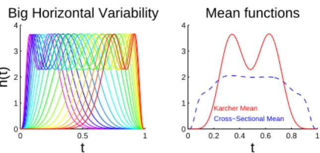
Figure 2.3 (left) visualizes the pure horizontal shifts of the peaks for this toy example,
which shows warps of the Karcher mean function (red curve in the right panel) by the
Fisher-Rao warping functions in Figure 2.1 (middle). These functions will be referred to later as the
horizontally shifted functions, denoted by hi,i= 1,2, ..., n.
0 0.5 1
0 1 2 3 4
t
h(t)
Big Horizontal Variability
0 0.2 0.4 0.6 0.8 1
0 1 2 3 4
Cross−Sectional Mean
Karcher Mean
t Mean functions
Figure 2.3: Left: Horizontal variation of the toy example in Figure 2.1 (left). The color reflects the order of the horizontal positions of the peaks. Right: The Karcher mean function (red solid line) and the cross-sectional mean (blue dashed line). The same rainbow color is used here as in Figure 2.1.
OODA provides a useful framework for studying and comparing the several options that
are available as representatives of horizontal variation. In this study, the original data objects
are functions. There are three potential candidate data objects for horizontal analysis that are
studied in this section: the horizontally shifted functionshi, the warping functionsγi and the
horizontal SRVFsψi. Oriented by the need to choose among these candidate data objects, four
different horizontal analyses have been performed on the toy data:
(1) H-PCA: FPCA of the horizontally shifted functionshi;
(2) E-PCA: FPCA of the warping functionsγi;
(3) S-PGA: PGA of the horizontal ψi;
(4) S-PNS: PNS of the horizontalψi.
The first two approaches, using the conventional FPCA, are discussed in Section 2.3.1. The
latter two manifold approaches, motivated by the spherical structure of the horizontal SRVFs,
glucose data set. Section 2.5 summarizes the comparison of these four approaches.
2.3.1 Conventional FPCA
An intuitive way to understand the horizontal variation of the toy data is to analyze either
the horizontally shifted functionshi or the warping functionsγi. As FPCA is one of the most
widely used statistical tools for functional data analysis, this section discusses both H-PCA
and E-PCA. It is seen that H-PCA is rarely a good option for horizontal analysis.
100 200 300
0 1 2 3 4 Raw Data
100 200 300
0 1 2 3 4 PC1
100 200 300
0 1 2 3 4 PC2
100 200 300
0 1 2 3 4 PC3 H-PCA H-PC1
100 200 300
0 1 2 3 4 Raw Data
100 200 300
0 1 2 3 4
PC1 of Warpings
100 200 300
0 1 2 3 4
PC2 of Warpings
100 200 300
0 1 2 3 4
PC3 of Warpings
E-PCA E-PC1
100 200 300
0 1 2 3 4 Raw Data
100 200 300
0 1 2 3 4 PG1
100 200 300
0 1 2 3 4 PG2
100 200 300
0 1 2 3 4 PG3 S-PGA S-PG1
100 200 300
0 1 2 3 4 Raw Data
100 200 300
0 1 2 3 4 PNS1
100 200 300
0 1 2 3 4 PNS2
100 200 300
0 1 2 3 4 PNS3 S-PNS S-PNS1
100 200 300 0 1 2 3 4 Raw Data
100 200 300 0 1 2 3 4 PC1
100 200 300 0 1 2 3 4 PC2
100 200 300 0 1 2 3 4 PC3 H-PC2
100 200 300 0 1 2 3 4 Raw Data
100 200 300 0
1 2 3 4
PC1 of Warpings
100 200 300 0
1 2 3 4
PC2 of Warpings
100 200 300 0
1 2 3 4
PC3 of Warpings
E-PC2
100 200 300 0 1 2 3 4 Raw Data
100 200 300 0 1 2 3 4 PG1
100 200 300 0 1 2 3 4 PG2
100 200 300 0 1 2 3 4 PG3 S-PG2
100 200 300 0 1 2 3 4 Raw Data
100 200 300 0 1 2 3 4 PNS1
100 200 300 0 1 2 3 4 PNS2
100 200 300 0 1 2 3 4 PNS3 S-PNS2
Figure 2.4: Horizontal analyses of the toy data. The color is consistent with that in the first panel in Figure 2.3. From the left column to the right: H-PCA, E-PCA, S-PGA, S-PNS. Each column shows the first two components of each analysis. Note that successive improvement in quality of data representation and signal compression are shown.
2.3.1.1 H-PCA
When there is a large amount of horizontal variation, H-PCA is strongly impacted in two
ways. First, as shown in the right panel of Figure 2.3, H-PCA is centered at the cross-sectional
mean which is a poor notion of centerpoint. In particular, that blue dashed line does not
show bimodal structure, which is an important characteristic of each member of the data set.
Second, H-PCA gives a hard to interpret impression of the major modes of variation in the data
set, as shown in the left two panels of Figure 2.4. In particular, the natural strong (intuitively
this type of variation is strongly non-linear in the PCA sense. Therefore, H-PCA is not an
appropriate approach for horizontal analysis.
2.3.1.2 E-PCA
E-PCA gives an eigenanalysis of the warping functions γi, i= 1,2, ..., n. Each component
gives a mode of variation in that space. It can be challenging to interpret such plots in
terms of their implications about the horizontal variation. Better interpretation comes from
transforming the decomposition of the warping functions into the original function space, i.e.
warping the Karcher mean function by the E-PC projections. The second column of Figure 2.4
shows the first two transformed E-PC projections for the toy example. These two components
provide a much more useful summary of the apparent horizontal variation in the raw data than
the previous ones from the H-PCA (first column). The first component reflects the horizontal
shifts of the peaks, while the second one is about the horizontal distance between the two
peaks.
0 0.5 1
0 0.2 0.4 0.6 0.8 1
Warping Functions γ
t
γ
(t)
0 0.5 1
0 0.2 0.4 0.6 0.8 1 γ(1/3) γ (2/3)
E−PC1 vs S−PNS1
0 0.5 1
0 0.2 0.4 0.6 0.8 1 t E−PC1
0 0.5 1
0 0.2 0.4 0.6 0.8 1 t S−PNS1
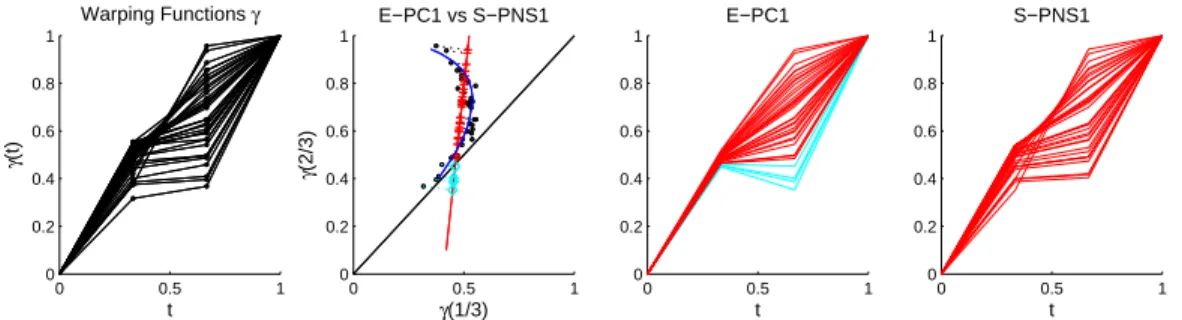
Figure 2.5: A toy example to illustrate the potential problem of E-PCA. The first panel: A set of
two-dimensional warping functionsγi, each determined byγi(1/3) andγi(2/3). The second
panel: The scatter plot of γi(1/3) and γi(2/3) (black circles), the E-PC1 direction (red
line) of these points and the S-PNS1 curve (blue curve). The red crosses indicate the E-PC1 projections above the black diagonal line, and the cyan diamonds indicate the E-E-PC1 projections below the line. The blue curve of S-PNS1 projections remains in the positive orthant. The third panel: The projected curve visualization of those E-PC1 projections. Note that the cyan curves are not bijective, i.e. not valid warping functions. The fourth panel: The projected curve visualization of the S-PNS1 projections. These projections stay in the space Γ.
However, this approach has a serious weakness. That is, the PC projection of a warping
function is not necessarily bijective, and thus, not a warping function. In other words, the
E-PCA can leave the space Γ of warping functions. To illustrate this, Figure 2.5 shows the FE-PCA
by two values, γi(1/3) and γi(2/3). It is seen in the middle two panels that some of the
E-PC1 projections (cyan) have a decreasing part, i.e. γi(1/3)> γi(2/3). Warping the Karcher
mean function with these non-warping E-PC projections is problematic. Computationally, this
causes the wiggly right end of the yellow and the red functions in Panel (1, 2) of Figure 2.4.
This problem can be avoided using the S-PNS method. The blue curve in the second panel in
Figure 2.5 shows the nonlinear path of the S-PNS1 projections. Note that this curve remains
entirely in the positive orthant. This is also seen in the fourth panel. In particular, these
S-PNS1 projections are all proper warps.
2.3.2 Analyses on SRVF Manifold
The following analyses avoid the problem shown in Section 2.3.1.2, by appropriately using
the spherical structure of the horizontal SRVFsψi. The idea is to first decompose the variability
of the spherical SRVFs and then transform the projections of the SRVF components back to
the warping function space Γ using the formula γξ(t) =
Rt
0 ξ(t)
2dt, where ξ is a point on
the SRVF sphere. It can be easily checked that γξ ∈ Γ. Finally, the decomposition of the
horizontal variation of the original functions can be obtained via warping the Karcher mean
function with the transformed SRVF projections. The following discussion shows how manifold
approaches, especially the S-PNS approach, can provide a more efficient decomposition for
horizontal analysis than the conventional FPCA.
2.3.2.1 S-PGA
The third column in Figure 2.4 shows the first two components of the horizontal variation in
the toy data, based on the S-PGA analysis. Compared with the H-PCA results (first column),
this approach gives a much better decomposition of the horizontal variation. At first glance,
the S-PGA decomposition (third column) looks similar to E-PCA (second column). But a close
look shows some distortion in the lower right of the red curves, and the purple curves moving
2.3.2.2 S-PNS
The first two components of the horizontal variation in the toy data based on S-PNS
are shown in the fourth column in Figure 2.4. Results from this decomposition give more
signal compression than those from the previous analyses. The first component simultaneously
captures both the mode of peak location and the mode of distance between peaks. Thus,
the two components previously needed are now reduced to essentially one. Among the four
panels in the first row, these S-PNS1 projections explain the horizontal variation of the original
bimodal functions best, as they are almost identical to the raw horizontal warps of the Karcher
mean, shown in the left panel of Figure 2.3. Very little variability is left for the second S-PNS
component to explain. This suggests that the horizontal variability is almost one dimensional
in some nonlinear sense, which is consistent with the fact that the warping functionγi in this
toy example can be summarized by a single parameterai. In particular, these were generated
asγi(t) = eeaitai−−11, forai ∈[−5,5].
0 5
10 15
−6 −5 −4 −3 −2
1 2 3
E−PC3
E−PC1 E−PC2
Figure 2.6: Visualization of S-PNS1 and E-PC1 scores in the 3-d space generated by the E-PC1, E-PC2 and E-PC3 directions for the toy example. Stars are the E-PC1, E-PC2, E-PC3 scores, squares are the E-PC1 projections and circles are the S-PNS1 projections. Same rainbow
color scheme as in Figure 2.1 is used. This plot shows S-PNS1 give a much better
1-dimensional representation than E-PC1, of the population of warps in this 3-d space.
For further insight of this type, Figure 2.6 compares S-PNS1 and E-PC1 scores in the
3-d space generated by the E-PC1, E-PC2 and E-PC3 directions. The stars are the scores
of the warping functions in Figure 2.1. The squares are the projections of the stars onto
The circles are the S-PNS1 projections, corresponding to the curves shown in the Panel (1,
4) in Figure 2.4. In this 3-d space, we can clearly see that S-PNS1 gives a much better one
dimensional representation of the original warps than E-PC1. Matlab scripts for generating this
toy example, and for analysis using the S-PNS method are provided on Marron’s homepage.
2.4 Blood Glucose Example
We now apply E-PCA and S-PNS to study phase and amplitude variation in Continuous
Glucose Monitoring (CGM) data in the management of type 1 diabetes in young children aged
4 - 9 years Mauras et al. [2012]. H-PCA is not shown because of its inferior performance in
Section 2.3.1.1 and S-PGA is not also explicitly shown here because it is similar to E-PCA. A
CGM device makes glucose measurements every few minutes (usually 5 or 10) every day. Our
data objects are the curves formed by the measurements for each day for each patient. The
number of days per patient ranges from 12 to 391. Both the height and timing of the glucose
peaks and valleys (amplitude and phase variation) are vital for diabetics. In this section, we
compare the performances of E-PCA and S-PNS on the horizontal phase variation and our
results will show that S-PNS1 explains much more variation than E-PC1, consistent with the
previous toy example.
0 50 100 150 200 250 300 350 400 0
50 100 150 200 250 300 350 400
Original data
0 50 100 150 200 250 300 350 400 0
50 100 150 200 250 300 350 400
Interpolated data
0 50 100 150 200 250 300 350 400 210
220 230 240 250 260 270 280 290 300
Direct Comparison
Blood Glucose (mg/dL)
Minute of the day
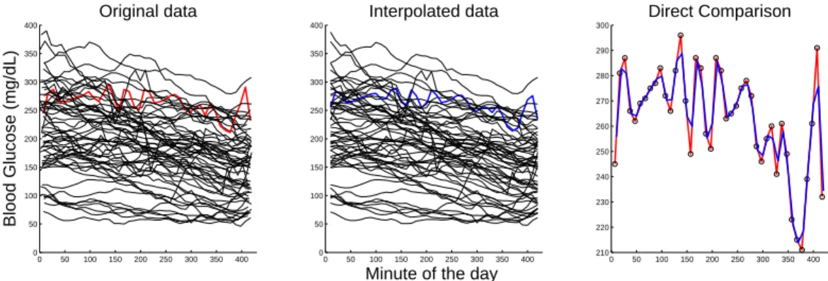
Figure 2.7: Study of effect of interpolation. Left panel shows the original blood glucose curves over 59 days for one subject. Middle panel shows the application of linear interpolation to the data in the left panel. The right panel is a close-up of the interpolation of the red curve (chosen as a challenging case) on the left by the blue curve in the middle showing that the interpolation captures major shape aspects of the curve.
There were 146 children in this study. We looked at multiple children at multiple time
PC1 score) in the night time window 00:00:00 - 07:00:00 over days as our data objects, shown in
the left panel of Figure 2.7. Missing values in the CGM data are an important challenge. First,
to avoid boundary interpolation problems, we excluded the days that had no measurement
within 10 minutes of the start or the end. To give the data curves a common set of time points,
we applied linear interpolation to the regular grid points (00:10:00, 00:20:00, ..., 07:00:00) in the
time window 00:00:00 - 07:00:00 (a time window of particular interest) over days. To reduce the
gap between the true blood glucose levels and the estimated blood glucose levels introduced by
the linear interpolation, we excluded the days having any pairwise empty interval bigger than
25 minutes. The middle panel in Figure 2.7 shows the interpolated curves. The red curve in the
left panel is one original curve, visually chosen as a challenging case to interpolate. The blue
curve in the middle panel is the corresponding interpolated version. The right panel focuses
on the quality of the interpolation by zooming in on those two curves. The blue curve reduces
the sharp corners of the red one, but doesn’t distort the overall shape of the data, which can
also be seen by the fact that the left panel and middle panel look similar to each other. Hence,
the following analysis is based on the interpolated data in Figure 2.7.
2.4.1 Phase and Amplitude Separation
0 0.2 0.4 0.6 0.8 1
0 0.2 0.4 0.6 0.8 1
(a). Warping functions
0 100 200 300 400
0 100 200 300 400
(b). Vertical Variation
0 100 200 300 400
140 160 180 200 220
(c). Karcher mean
0 100 200 300 400
140 160 180 200 220
(d). Horizontal variation
Figure 2.8: Phase and Amplitude Separation. (a): Warping functions. (b): Vertical variation. (c): Karcher mean derived by Fisher-Rao curve registration showing three distinct peaks. (d): Horizontal variation obtained via warping the Karcher mean by the inverse of the warping functions. These show both strong vertical (b) and horizontal (d) variation.
In order to compare the performance of E-PCA and S-PNS on horizontal variation of the
blood glucose example, we first applied Fisher-Rao curve registration to separate horizontal
and vertical variation on the interpolated curves in Figure 2.7. The first panel of Figure 2.8
large amount of vertical variation. Note most curves have been aligned with 3 common peaks.
The third panel is the Karcher mean of the interpolated curves showing the same 3 peaks. The
last one gives a more interpretable view of the horizontal variation obtained via warping the
Karcher mean by the inverse of the warping functions. This highlights the horizontal variation
in the 3 peaks. There is interesting variation in the timing of these peaks, which is studied
more deeply in next section.
2.4.2 E-PCA vs S-PNS of Horizontal variation
0 200 400
140 160 180 200 220 Horizontal variation
0 200 400
140 160 180 200 220 E−PC1
0 200 400
140 160 180 200 220 E−PC2
0 200 400
140 160 180 200 220 E−PC3
100 200 300 400
160 180 200 220
S−PNS1
100 200 300 400
160 180 200 220
S−PNS2
100 200 300 400
160 180 200 220
S−PNS3
Figure 2.9: Horizontal variation analyses: The first column is the horizontal variation shown in the original space. These curves are the same as in the right panel in Figure 2.8, but with colors in the order of S-PNS1 scores, used in all the plots. The upper right three panels are the first three components of the transformed E-PC projections. The lower panels are the S-PNS analysis. These show S-PNS explains more variation with fewer components than E-PCA.
In Figure 2.9, the upper left panel shows the horizontal variation using a rainbow color
scheme (purple, blue, cyan, green, yellow, red) in the order of S-PNS1 scores. The upper
second to fourth panels show the transformed E-PC projections using E-PCA with the same
color scheme. E-PC1 captures an overall timing effect, E-PC2 feels the slope from second peak
to third peak and E-PC3 is driven by the width of the third peak. The lower panels are the
first three components of the horizontal variation based on S-PNS. In comparison to E-PC1,
the slope from the second peak to the third peak, which drove E-PC2, indicated by the different
shapes of the curves, and it shows the width of the third peak, seen in E-PC3. S-PNS2 is driven
by the location of the third peak, which is split between E-PC2 and E-PC3. S-PNS3 shows
relatively less variation because the first two components have already explained most of the
interesting variation.
0 100 200 300 400 140
160 180 200 220
Equally spaced S−PNS1
Figure 2.10: Equally spaced S-PNS1 projections using similar rainbow colors. This equal spacing of coefficients allows better interpretation of this mode of variation.
To better understand the mode of variation explained in the S-PNS1 projections, we replace
the randomly spaced data scores by an equally spaced grid of coefficients from the smallest
S-PNS1 score to the largest and show the resulting S-S-PNS1 projections in Figure 2.10. We can
clearly see the timing effect, the effect of slope from the second peak to the third peak from
E-PC2 and the third peak’s width effect from E-PC3 simultaneously. S-PNS2 contains the
timing of the third peak, an important part of E-PC2. The main point is that S-PNS explains
much more variation with fewer components than E-PCA, i.e. gives a more efficient data
representation.
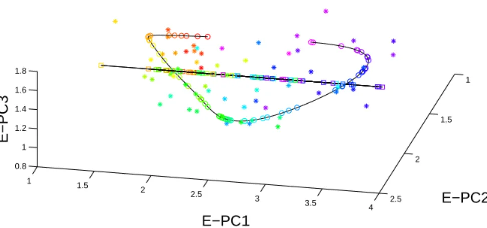
Figure 2.11 provides a 3D plot of S-PNS1 and PC1 in the space of PC1, PC2,
E-PC3 in the same format as Figure 2.6. The stars are the scores of the warping functions shown
in the left panel in Figure 2.8. The squares are the projections of the stars onto the E-PC1
direction, corresponding to the curves shown in the upper second panel of Figure 2.9, in this
3-d space. The black line shows the E-PC1 direction going through the mean, i.e. the best
1-d linear approximation of the data. The circles are the S-PNS1 projections, corresponding
to the curves in the lower second panel in Figure 2.9. The black curve shows the best
corresponding to the curves in Figure 2.10. The same rainbow color in the order of S-PNS1
scores is used everywhere in this plot. The stars are more close to the S-PNS1 curve than
the E-PC1 curve, which indicates S-PNS1 captures more variation and better represents the
original data in this 3-d space. This shows that S-PNS1 essentially has much greater flexibility
to allow modelling with a richer nonlinear one dimensional mode of variation.
1 1.5
2 2.5
3
3.5 4
1
1.5
2
2.5 0.8
1 1.2 1.4 1.6 1.8
E−PC2 E−PC1
E−PC3
Figure 2.11: Visualization of S-PNS1 and PC1 scores in the 3-d space generated by the PC1, E-PC2 and E-PC3 directions for the blood glucose data: Stars are the E-PC1, E-E-PC2, E-PC3 scores, squares are the E-PC1 projections and circles are the S-PNS1 projections. Rainbow color in the order of S-PNS1 scores is used. This plot shows S-PNS1 gives a better one dimensional representation of the original data in this 3-d space.
2.5 Conclusions
This chapter aimed at finding an appropriate method for horizontal analysis of functional
data, where the horizontal variation is separated from the vertical variation using a
domain-warping method based on the Fisher-Rao metric. Four different approaches, including two
conventional FPCA approaches (H-PCA and E-PCA) and two manifold approaches based on
the spherical structure of the horizontal SRVFs (S-PGA and S-PNS), have been applied to a toy
example and two of these (E-PCA and S-PNS) have been applied to the blood glucose example
for comparison. The manifold approaches are generally better than the FPCA approaches,
and S-PNS works the best in terms of both the signal compression and the interpretability
CHAPTER 3: Asymptotic study and variations of Fisher-Rao curve registration This chapter focuses on the theoretical properties of the Fisher-Rao curve registration
developed by Srivastava et al. [2011]. Readers are referred to Section 2.1 for a brief introduction
to this method. That paper established the consistency of the Fisher-Rao curve registration.
In this chapter, we further study the limiting distribution and optimality of the Fisher-Rao
approach. One major challenge is the lack of a closed form of the intrinsic mean on the surface
of the sphere. To study this problem, Section 3.1 studies a toy example, where the warps are
piecewise linear functions with a single knot at 12. In Section 3.2, motivated by the advantages
of the Fisher-Rao metric over the L2 metric when registering a function to its multiples, we found a class of metrics that have invariance properties comparable to the Fisher-Rao metric.
3.1 Asymptotic study of Fisher-Rao curve registration
Model 3.1. Suppose there is a template g and the observed curves fi, i = 1,2, ..., n are the functional compositions of the template subject to some random warps, random scaling and
random noise, i. e.
fi =ci(g◦γi) +ei, i= 1,2, ..., n, (3.1)
where g∈ F is the unknown template, and for i= 1,2, ..., n, ci ∈R+ are the random scalings,
γi are the random warps and the ei are random noise.
Srivastava et al. [2011] find conditions under which the cross-sectional mean of aligned
functions, i.e. 1nPn
i=1f˜i, is a consistent estimator of the template g. As in Section 1, we call
this the amplitude mean denoted as ˆga. On the other hand, the Fisher-Rao estimator, i.e. the
transformation of the Karcher mean in the SRVF space back to theF space is an inconsistent
estimator as shown in Section 3.1.2. Section 3.1.1 gives further details of the procedures of the
3.1.1 Fisher Rao curve registration of the model
An explicit form of the amplitude mean for model (3.1) doesn’t seem to exist in the
litera-ture, but it is desirable for investigating further asymptotic properties. Thus, such an explicit
form is provided in this section by revisiting the steps of the Fisher-Rao approach. The essential
ideas include studying the equivalence classes of the samplesfi, i= 1,2, ..., nand transforming
the Fisher-Rao metric in the quotient space to theL2 metric by the SRVF representation. See Srivastava et al. [2011] for underlying theoretical support.
STEP 1. Let [fi], i= 1,2, ..., n be the equivalence classes of fi, i = 1,2, ..., n and [qi], i=
1,2, ..., n be the corresponding SRVF orbits introduced in Section 2.1. This step is to consider
the Karcher mean in the SRVF orbit space, i.e. the Karcher mean of [qi], i= 1,2, ..., n . The
definition of this Karcher mean in the orbit space is provided in Section 2.1. It is shown that
this Karcher mean is [µ] = [¯sqg], where ¯s = n1Pn
i=1 √
ci. For the convenience of writing, the
factor of ¯sis temporarily suppressed.
Figure 3.1: Step 2: Find the center of [µ] with respect to the set{qi, i= 1,2, ..., n}. It starts with any
elementµin [µ], warps the sample SRVF to thisµand the corresponding optimal warps are
γi, i= 1,2, ..., n. The true center of the orbit isµwarping by the inverse of Karcher mean
of the optimal warps.
STEP 2. After obtaining the Karcher mean [µ] in the orbit space, the second step is to find a representative in the orbit which serves as thecenter of [µ] with respect to the samples
qi, i = 1,2, ..., n, shown in Figure 3.1. This center is defined as follows. An element ˜u in [µ]
is called the center of the orbit if the warping functions {γi = argminγ∈Γ||u˜−(qi, γ)||, i =
nontrivial and will be explained later. We shall focus on understanding the steps of Fisher-Rao
curve registration at the current stage. Figure 3.1 outlines a way to find the center of [µ]. First
choose any elementµ = (qg, γ0) in [µ], where γ0 is any warping function. Then warp qi to µ.
Note thatqi =√ci(qg, γi), so the warping function ˜γi=argminγ||(qi, γ)−µ||2=γ−1
i ◦γ0. Let γ−1 be the Karcher mean of γ−1
1 , γ
−1
2 , ..., γn−1 and γn be the Karcher mean of ˜γ1,γ˜2, ...,γn˜. It
is shown there that
γn= (γi−1◦γ0) =γ−1◦γ0
and
µn= (µ, γn−1) = ((qg, γ0),(γ−1◦γ0)−1)
=((qg, γ0), γ0−1◦(γ−1)
−1) = (q
g,(γ−1)−1)
(3.2)
is the center of [µ] w.r.tqi, i= 1,2, ..., n.
STEP 3. Now we have the Karcher mean µn= (qg,(γ−1)−1) in the SRVF space. Warping
the SRVF samples qi, i = 1,2, ..., n to this mean, we get the warping functions γi∗ = γ
−1
i ◦
(γ−1)−1, i = 1,2, ..., n. Then go back to the original function space, and align the functions
fi, i= 1,2, ..., n using the warping functions derived in the SRVF space, i. e.
˜
fi=fi◦γ∗i
=cig◦γ◦γi∗+ei◦γi∗
=cig◦γ0◦γ0−1◦(γ−1)
−1+e i
=cig◦(γ−1)−1+ei
(3.3)
The amplitude mean is the cross-sectional mean of these aligned functions, i. e.
ˆ
ga= ˜fi =cg◦(γ−1)−1+e,
where the c is the sample mean of c1, c2, ..., cn and e is the sample mean of e1, e2, ..., en. For
more detailed computational algorithms, please refer to Srivastava et al. [2011].
We now explain an important concept, the Karcher mean of warps, which appeared in
warp with SRVF being the center of the SRVFs of those warps. However, there is no consensus
about the notion ofcenterpoint on the sphere. We introduce three different types of mean.
1. Intrinsic (Fr´echet/Karcher) Mean: The distance between any two points on the unit
sphere is taken to be the length of the shortest arc of a great circle connecting them on the
sphere. The intrinsic mean of the pointsψi, i= 1,2, ..., non a sphere is a point
¯
ψ=argminψ∈S
n
X
i=1
d2S(ψ, ψi), (3.4)
wheredS is the geodesic distance on the sphere. The intrinsic definition of mean results in an
optimum potentially not unique on the sphere.
2. Extrinsic Mean: The extrinsic mean of points on the unit sphere treats the points as
lying in theR∞ space, finds the mean under theL2 metric and then projects that back to the sphere. That is
¯
ψ=
1 n
Pn
i=1ψi ||1
n
Pn
i=1ψi||
(3.5)
The extrinsic mean exists and is unique if||1nPn
i=1ψi|| 6= 0. It has an explicit form and tends
to be easy to compute and often admits statistical inference.
3. Backward mean: The backward mean is derived using the PNS method introduced in
Chapter 2. The points are projected onto successively lower dimensional spheres. The backward
mean is the intrinsic mean of these projection onS1. A useful property of the backward mean
is that when points are roughly uniformly distributed on the equator inS2, the backward mean
stays on the equator. In this case, the intrinsic mean can appear (and not uniquely) at the
north and south poles, and the extrinsic mean is not stable.
Srivastava et al. [2011] choose to use the intrinsic mean. They showed that ˆga= n1 Pn
i=1fi˜ → g, asn→ ∞under the following assumption:
Assumption 3.1.
1. The scaling coefficients ci, i= 1,2, ..., n are randomly sampled from a population c such
thatc >0 , Ec= 1 and Ec2 <∞.