The Interaction Between Tactile
Form and Background Design on
Taste Perception.
Lisa-Marie Kramer
S1749145[email protected] MSc. Communication Studies Faculty BMS
University of Twente
Abstract
There are plenty of studies showing the importance of packaging when it comes to taste experience and product evaluation. However, there is still little known about how touch and vision interact to impact taste perception. This study builds forth on previous research, which shows that packaging structure can have influence on the taste perception of food and beverages. The present study
Contents
Abstract ... 2
Contents ... 3
1 Introduction ... 4
2 Theoretical Framework ... 6
2.1 Taste Perception ... 6
2.2 Packaging tactile form ... 6
2.3 Atmospherics: background design ... 7
2.3.1 Background design ... 8
2.4 Overall product evaluation ... 9
3 Methods ... 10
3.1 Research design ... 10
3.2 Manipulations ... 11
3.2.1 Poster design ... 11
3.2.2 Tactile stimuli ... 13
3.2.3 Adjustments in taste concepts for main study ... 15
3.3 Main study ... 15
3.3.1 Participants and procedure ... 15
3.3.2 Measurements ... 16
4 Results ... 18
4.1 Taste dimensions: sweet and sour ... 18
4.2 Perceived intensity: creamy and soft ... 19
4.3 Perceived intensity: strong, sharp and intense ... 21
4.4 Hedonic taste & quality evaluation ... 23
4.5 Taste expectations ... 24
4.6 Overall product evaluation ... 25
5 General discussion ... 26
5.1 Limitations ... 28
5.2 Implications and recommendations for future research ... 28
References ... 31
APPENDIX ... 34
A. Pre-test 1: Poster Designs ... 35
A. Pre-test 2: Tactile forms ... 38
A. Pre-test 3: Tactile form x ice-cream flavour ... 40
1 Introduction
The way we experience food is not only determined by its intrinsic characteristics such as the ingredients, but also by factors surrounding the product. For example, extrinsic product attributes in the form of package design, brand name and price strongly influence our perception of the food as well (e.g. Becker, Rompay, Schifferstein & Galetzka, 2011; McDaniel & Baker, 1977; Rao & Monroe, 1989; Piqueras-Fiszman & Spence, 2011). For example, the colour of a package generates taste expectations of its content based on learned associations between flavours and colours (Piqueras-Fiszman & Spence. 2011). Similarly, the colour of a drink also generates taste expectations and intensifying the colour also leads to a more intense perception of the drink’s taste (Spence, Levitan, Shankar & Zampini, 2010). But besides intrinsic and extrinsic product factors (i.e. ranging from the ingredients to brand name and packaging), there are also plenty of non-product factors that influence our food-related decisions and perceptions
According to research (e.g. Scheibehenne, Todd & Wansink, 2010; Spence & Shankar, 2010; Turley & Milliman, 2000; Wansink & Sobal, 2007), cues in the environment constantly influence our food-related decisions and perceptions as well. Interestingly, we seem to be unaware of this effect and even deny it entirely when asked (see Wansink & Sobal, 2007). However, research provides plenty of evidence that a variety of environmental cues do in fact impact, among others, the amount of food we consume, its perceived pleasantness and quality, and even specific taste evaluations.
For example, Scheibehenne, Todd & Wansink (2010) found that food can appear more authentic when music of particular ethnic context is played. In their study, food seemed to score higher on its “frenchness”, when French music was playing in the background. Also, Spence and Shankar (2010) found that a variety of sounds, whether music, food-crunching sounds or pure tones, can systematically affect our food and drink-related perceptions. Furthermore, brightness of light also affects taste perception, as Gal, Wheeler & Shiv (2007) show in their study. They found that brighter lights stimulate pleasantness of coffee consumption, while consuming in the dark decreased
acceptability and the likelihood of future consumption.
In short, plenty of research indicates that a variety of cues can strongly influence perceptions of food and drinks. While a number of studies have focused on either the importance of (specific) atmospherics or extrinsic product cues in determining what, how much people eat/drink and even how much they liked the experience, there is a lack of research concerning how different sensory cues interact with extrinsic product characteristics such as packaging or container tactile form. Especially with the rapid development of new technologies, the future of packaging design is bound to be
the focus of this study. Because of the development of 3D-printing, there is plenty of opportunity to experiment with the way packaging tactile forms can influence taste perception (Rompay, Finger, Saakes & Fenko, 2017). Specifically, it is of importance to investigate how these new technologies interact with for example environmental cues. For marketers, chefs, and others working within the food industry, it may be of great importance to know how to improve food and drink experience in order to more effectively stimulate the senses of the consumer/buyer. Since technology is moving so fast, it is of increased interest to know how to utilize these developments to optimize food experience. Therefore, this study focuses on the interaction between atmospheric cues and extrinsic product characteristics, and how these work together in the experience of food. Specifically, this study will examine how background design, in combination with the tactile form of the container or package, work together in influencing food perceptions in terms of taste perception, pleasantness, quality and flavour. This study will build forth on previous research related to visual-tactual surface forms (i.e. perceived by touch and vision) based on two types of tactile forms: angular versus rounded.
2 Theoretical Framework
As stated before, it is a combination of intrinsic and extrinsic product attributions as well as cues in the environment that determine attitudes and in turn behaviour towards (food) products. In this chapter, a general overview of taste perception is given. Then, literature related to extrinsic product factors in the form of packaging tactile forms, as well as literature referring to atmospheric cues (i.e. background design) and their interaction. After each section, hypotheses are formulated based on stated research.
2.1 Taste Perception
Humans can distinguish between five tastes: sweet, sour, salty, bitter and umami (i.e. the taste of “savoury” or “deliciousness” (Ikeda, 2002)). But although we consume food regularly, it is difficult to discern one taste from another using solely our sense of taste (Krishna, 2012). Thus, without seeing or smelling the food, we are hardly able to tell the difference between an apple and a potato (Herz, 2007). Since our taste capability is limited to our five distinct tastes, something “tasty” may be influenced a great deal by our other senses. As early as the 1920’s, Elmer Wheeler introduced the catch-phrase “sell the sizzle, not the steak”, with which he indicated that the surroundings of a product (in this case food) were just as or even more important than the product itself. For example, Piqueras-Fiszman and Spence (2011) found that the colour of a bag of potato chips, as well as the crunching sound, significantly impacted the taste perception. Furthermore, Hoch and Ha (1986) explain that the ambiguity of food experience induce bigger susceptibility to influences from outside. Taste has been found to be susceptible to external influences such as physical attributes, brand name, product packaging, and advertising (e.g. Allison & Uhl, 1964; Elder & Krishna, 2010; Piqueras-Fiszman & Spence, 2011; Zeithaml, 1988). Therefore, “taste” can be summarized as the perceived pleasantness, quality and flavour of food. In this study, the influence of packaging tactile forms, as well as
environmental cues in the form of background design on taste perception are researched.
2.2 Packaging tactile form
Extrinsic product attributions such as package design, price and brand name have a great impact on the perceived expectations regarding product quality and value (see Rao & Monroe, 1989; Teas & Agarwal, 2000). For example, in the minds of the consumer, there exists a positive price-quality linkage, which is based on the expected market force that high-price-quality products often cost more to produce than low-quality products (Bearden & Shimp, 1982; Zeithaml, 1988). Furthermore, consumers rely on symbolic meanings implied by packaging features such as shape and materials to derive assumptions about its contents. Packaging tactile form is one of the most important
Becker, Van Rompay, Schifferstein and Galetzka (2011) found that angular forms enhanced meanings such as power and strength, leading to a more intense taste perception, whereas curved forms were related to harmony and softness. Furthermore, they found that rounded shapes are linked more closely to sweetness, whereas angular shapes are associated a greater deal with sour and bitter tastes.
Since packaging can be described as the material in which the food stuff confines, vessels from which we drink are also considered in this category. For example, researchers have shown that the ratings of wine differ as a function of the glass in which the wine is served (e.g. Hummel,
Delwiche, Schmidt, & Hüttenbrink, 2003; Vilanova, Vidal & Cortes, 2008). Furthermore, round plates (compared to square plates) enhanced the perceived sweetness and taste intensity of cheesecake (Stewart & Goss, 2013). More recently, Van Rompay et al. (2017) used 3D printing technology to create an experiment with angular versus rounded cups, using either coffee (i.e. bitter) or hot chocolate (i.e. sweet) samples. They found that the angular tactile form of the cup increased perceived bitterness and taste intensity ratings, whereas the rounded tactile form lead to a sweeter taste perception and a less intense taste experience (Van Rompay et al., 2017). This phenomenon that people intuitively make connections between sensory domains is called ‘cross-modal correspondence’ (e.g. Schifferstein & Spence, 2008; Spence, 2012). It can be stated that there exists such cross-modal correspondence between angular shapes and taste perceptions such as sourness and bitterness (see Velasco et al., 2016). Similarly, a cross-modal correspondence exists between rounded shapes and perceptions of sweetness. Based on this research, the following hypotheses are formulated:
H1a: An angular tactile form, as opposed to a smooth tactile form, results in higher perceived sourness.
H1b: A smooth tactile form, as opposed to an angular tactile form, results in higher perceived sweetness.
H2a: An angular tactile form, as opposed to a smooth tactile form, results in a stronger taste perception.
H2b: A smooth tactile form, as opposed to an angular tactile form, results in a softer taste perception.
2.3 Atmospherics: background design
Before going into detail about the specific atmospheric (i.e. background design) and its impact on taste perception, it is important to first introduce atmospherics generally and discuss the framework for researching the effect of atmospherics on evaluations.
up of tangible and intangible environmental features, such as furnishing, lighting and music (Liu & Jang, 2009). Furthermore, according to Bitner (1992), three dimensions of atmospherics can be identified: (1) “ambient conditions” (referring to intangible background characteristics such as lighting and scent), (2) “spatial layout and functionality” (ways in which tangible features such as furnishing are arranged within an environment), and (3) “signs, symbols, and artefacts” (explicit or implicit signals that inform about a space to its users). For this study, atmospherics has been limited to “signs, symbols, and arte” in the form of background design.
2.3.1 Background design
Cues in the environment are constantly influencing the way we feel and behave (e.g. Scheibehenne, Todd & Wansink, 2010; Spence & Shankar, 2010; Turley & Milliman, 2000; Wansink & Sobal, 2007). As stated before, these cues can also influence our taste perception. The design in our background is one of these cues affecting our behaviour and judgements (Arnheim, 1974). Different shapes (i.e. angular vs rounded) evoke different perceptions: angular shapes are perceived as more intense, forceful, while round shapes lead to a softer and smoother perception (Arnheim, 1974; Zhang et al., 2016). Furthermore, angularity is related more closely to words such as energy, toughness, and strength, whereas rounded shapes induce associations with words such as friendliness, harmony and smoothness (Zhang, Feick & Price, 2006). According to Bar and Neta (2006), round shapes and objects lead to a more positive attitude and mood, compared to sharp-angled shapes. They found that even if the shapes were made of meaningless patterns, rounded shapes were generally preferred over angular ones. However, the preference of a shape strongly depends on the desired goal or current state of mind (Aronoff, Woike & Hyman, 1992). In their study, they found that in situations where people expect harmony, rounded shapes were preferred, while in situations where toughness and individuality is sought, angular shapes were liked more. Thus, it can be expected that the congruency between taste of the food and its intuitive association (i.e. sourness is more strongly related to angular shapes compared to round shapes) is of great importance when it comes to taste perception. Furthermore, the congruency between background design and vessel tactile form plays a role as well. For example, it can be expected that when a sour ice cream is served in a rounded cup, using round shapes in the background design, decreases the taste intensity, compared to when it would have been served in a congruent cup and background (i.e. angular shapes). Therefore, the following hypotheses are formulated:
2.4 Overall product evaluation
The combination of these stimuli is expected to influence varying judgements about the flavours. However, the above-mentioned stimuli are also expected to have an impact on the overall evaluation of the product as a whole. A definition from literature about product evaluation is: “the awareness of the psychological effects by the interaction with a product, including the degree to which all our senses are stimulated, the meanings and values we attach to the product, and the feelings and emotions that are elicited” (Hekkert, Schifferstein, 2008; Fenko, Schifferstein & Hekkert, 2009). Whether we like a product or not is linked to the design of that product (Schifferstein et al., 2012). Furthermore, Peck & Childers (2003) found that when consumers are to touch and interact with products, the tactile structures can influence the evaluation of product experience. Similarly, Desmet and Hekkert (2007), found that shapes and materials influence the attitude regarding the product in human-product interaction. Therefore, congruency in product taste and packaging is again of
importance when it comes to the positive attitude towards a product (van Rompay & Pruyn, 2011). For this study, it is therefore expected that the angular tactile form, in combination with the congruent flavour (e.g. angular structure with lemon flavour) increases the product liking.
However, there are studies suggesting that subtle incongruences between what we see and what we feel can lead to a higher overall product evaluation (e.g. Berlyne, 1971; Hopkins, Zelazo, Jacobson & Kagan, 1976; Ludden, Schifferstein and Hekkert, 2009). According to Berlyne (1971), the relationship between incongruence and liking follows an inverted U-curve: moderate incongruence leads to positive effects, while high degree of incongruence leads to negative effects. Based on their studies, moderate incongruence may be described as the degree to which someone experiences perceived incongruence, which leads to an element of (positive) surprise (Ludden, Schifferstein and Hekkert, 2009). However, in their follow-up study where they tested tactile forms of cups, Ludden, Schifferstein and Hekkert (2012) found that overall, congruency between the visual cues of a cup and what it actually felt like is evaluated as most positive. For example, they found that a cup with the visual cues of metal, that also felt like metal (e.g. inflexible and heavy) was evaluated as more liked than if the same cup felt like hard plastic (i.e. less flexible and not as heavy). Therefore, it is still not clear what exactly defines moderate incongruence. Furthermore, because the results of these studies about the impact of incongruence seem inconclusive, the present study will still assume that
congruency between what we see, feel and taste leads to a higher evaluation of overall product liking. Therefore, the following hypothesis is defined:
3 Methods
This section elaborates on and justifies the methods of this research. The main purpose of this study is to investigate how packaging texture interacts with atmospherics, specifically background design, in the perception of taste. In this chapter, the research design is explained first. Then, the manipulations used for this study (i.e. poster design and tactile form) are defined based on the results of pre-testing. Finally, the participants, procedure and measurements of the main study are described.
3.1 Research design
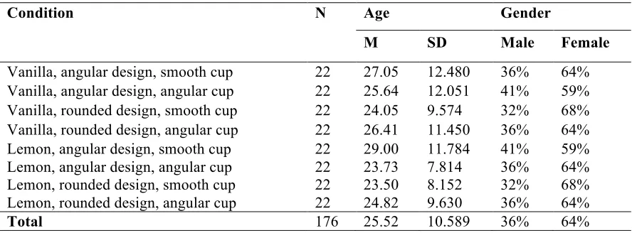
This study aims to find out what impact packaging tactile form and background design have on the taste perception of various flavours of ice-cream in terms of taste, quality and liking, and how these variables interact with each other (i.e. match vs. no-match). For this study, a 2 (angular vs smooth tactile form) x 2 (type of background design) x 2 (flavour of ice-cream; sweet/creamy vs sour/ sharp) between-subjects factorial design is constructed, resulting in eight manipulated conditions. For each manipulated condition 22 participants were used, resulting in a total of 176 participants. An overview of the conditions can be found in table 1.
[image:10.595.71.527.570.736.2]For the execution of this study, a field experiment took place at the Van der Poel ice-cream parlour in Enschede. This ice-cream parlour is well-known within the city and has a very central position. Together with Van der Poel, two ice-cream flavours were decided upon after an initial taste-test: vanilla to represent the sweet, creamy and smooth taste, and lemon to represent the sour, sharp and intense taste. These flavours were chosen because vanilla is, unlike lemon, milk-based, which results in the difference between smoothness. Furthermore, both flavours are very similar in colour and according to Van der Poel, both flavours are generally known and liked by everyone.
Table 1 2x2x2 between-subjects factorial design, n=176
Condition (n=176) Ice-cream flavour Background design Packaging surface
1 (n=22) Vanilla Angular Smooth
2 (n=22) Vanilla Angular Angular
3 (n=22) Vanilla Rounded Smooth
4 (n=22) Vanilla Rounded Angular
5 (n=22) Lemon Angular Smooth
6 (n=22) Lemon Angular Angular
7 (n=22) Lemon Rounded Smooth
3.2 Manipulations
In the following section, the manipulations that were used to conduct this study are described. First, the background designs in the form of posters are presented, which consists of one poster with an angular design and one with a rounded design. Then, the tactile stimuli in the form of 3D-printed cups are described. For both manipulations, pre-tests were conducted, which are discussed thoroughly.
3.2.1 Poster design
In order to decide on the appropriate background design, a set of four posters, each presented with angular or rounded shapes (i.e. eight posters in total), were pre-tested on certain taste concepts: sweet (1), sour (2), smooth (3), strong (4), mild (5), sharp (6), creamy (7), soft (8), intense (9) and rich (10). Furthermore, each poster was tested on realism and liking as well. The taste concepts as well as the realism and liking was measured on a 5-point Likert Scale. For the taste concepts, respondents rated the concepts on “not at all fitting” to “very fitting” in relation to the poster. The posters were created based on literature as mentioned in the previous chapter. The posters used for this pre-test can be found in figure 1. To summarize, round and smooth shapes are linked more closely to sweet, mild and soft tastes, whereas angular shapes are linked more closely to sour/bitter, intense and strong tastes (e.g. Becker et al., 2011; Rompay et al., 2017).
[image:11.595.61.518.404.737.2]A total of seventeen respondents filled out the pre-test. To analyse, a paired sample t-test was done to compare the taste concepts of the angular and rounded version of each four posters. Out of the four posters, only one poster showed significant (p < 0.05) results for all taste concepts except for “intense” (p = 0.090; p > 0.05). Furthermore, all taste concepts were ranked higher on the poster that was intended to relate to the taste concept (e.g. sour relates to angular; sweet relates to rounded). All means and standard deviations of the taste concept for both the angular and rounded poster version can be found in table 2.
Table 2 mean and standard deviation on taste concepts
Pair Taste concept N Mean SD Pair Taste concept N Mean SD
Pair 1 Sweet Angular
Sweet Rounded 17
2.53 3.53
0.943 1.068
Pair 6 Sharp Angular
Sharp Rounded 17
3.47 2.12
1.125 1.054 Pair 2 Sour Angular
Sour Rounded 17
2.65 1.94
0.996 0.996
Pair 7 Creamy Angular Creamy Rounded 17
2.65 3.76
1.057 1.091 Pair 3 Smooth Angular
Smooth Rounded 17
2.71 3.71
1.105 1.047
Pair 8 Soft Angular
Soft Rounded 17
2.47 3.41
1.179 1.278 Pair 4 Strong Angular
Strong Rounded 17
3.47 2.53
0.874 1.007
Pair 9 Intense Angular
Intense Rounded 17
3.65 3.24
0.702 0.831 Pair 5 Mild Angular
Mild Rounded 17
2.35 3.24
0.702 1.091
Pair 10 Rich Angular
Rich Rounded 17
3.06 3.47
0.827 1.068
NB. Note that the taste concepts, as well as the realism and liking constructs were translated from Dutch, which was the language used in all tests. For the original concepts and complete pre-tests including an overview of all posters, refer to the appendix.
Based on the pre-test, a few small adjustments were made, in order to optimize the poster for use in the main study. The text “ijsje proeven?” (roughly translates to: “(want to) taste
ice-cream?”) in the poster was changed from a dark grey colour to a more neutral light brown colour (same colour-group as the ice-cream cone). Furthermore, the text was adjusted in the rounded version of the poster to also portray more rounded
shapes. These changes were applied to make the difference between angular and rounded clearer, and to distract the focus more from the letters only. The final versions of the posters are shown in Figure 2. For a complete overview of the pre-test regarding the poster designs, refer to the Appendix.
3.2.2 Tactile stimuli
As this research built forth on previous research related to visual-tactual tactile forms (i.e. perceived by touch and vision), existing 3D-printed cups (see Rompay et al., 2017), made at the Design Lab of the University of Twente were used for this study. These cups were created based on findings by Becker et al. (2010), and Ngo, Misra and Spence (2011). In short, they found that rounded/smooth shapes are more related to soft, sweet and mild tastes, whereas angular shapes are more related to strong, sour/bitter and intense tastes.
A total of four cups were initially selected: two to represent the smooth shapes (labelled as cup C and D) and two to
represent the angular shapes (labelled as cup A and B). These cups were pre-tested on the same ten taste concepts as the posters in order to find which cups match the angular and rounded poster best. Twelve participants were
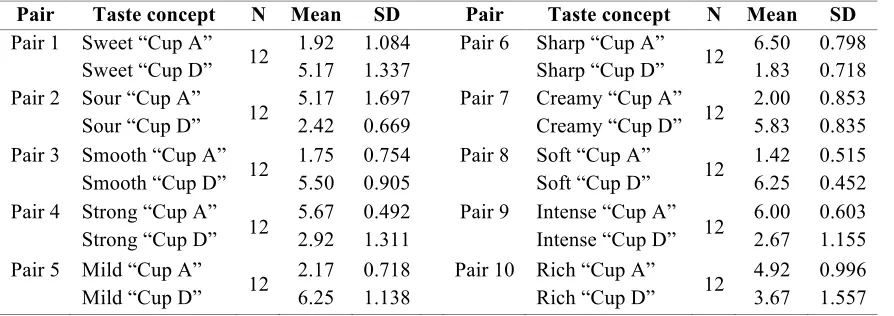
used for this pre-test. They were asked to interact with the cups and subsequently rate the cups in relation to the ten taste concepts on a 7-point Likert scale (from “not at all fitting” to “Very fitting”). “Cup A” and “Cup D”, were found to be most suitable for the main study based on this pre-test. The cups can be found in Figure 3, and an overview of the mean and standard deviation of the taste concepts in relation to the cups can be found in table 3.
Fig. 2 Final poster designs rounded (left) vs. angular (right)
[image:13.595.265.513.70.243.2] [image:13.595.284.517.512.632.2]Table 3 Pre-test results "cup A" and "cup D"
Pair Taste concept N Mean SD Pair Taste concept N Mean SD
Pair 1 Sweet “Cup A” Sweet “Cup D” 12
1.92 5.17
1.084 1.337
Pair 6 Sharp “Cup A” Sharp “Cup D” 12
6.50 1.83
0.798 0.718 Pair 2 Sour “Cup A”
Sour “Cup D” 12 5.17 2.42
1.697 0.669
Pair 7 Creamy “Cup A” Creamy “Cup D” 12
2.00 5.83
0.853 0.835 Pair 3 Smooth “Cup A”
Smooth “Cup D” 12 1.75 5.50
0.754 0.905
Pair 8 Soft “Cup A”
Soft “Cup D” 12 1.42 6.25
0.515 0.452 Pair 4 Strong “Cup A”
Strong “Cup D” 12 5.67 2.92
0.492 1.311
Pair 9 Intense “Cup A” Intense “Cup D” 12
6.00 2.67
0.603 1.155 Pair 5 Mild “Cup A”
Mild “Cup D” 12 2.17 6.25
0.718 1.138
Pair 10 Rich “Cup A”
Rich “Cup D” 12 4.92 3.67
0.996 1.557
The reason as to why a 7-point Likert scale was used as opposed to the 5-point scale used for the posters, was in order to find a wider spread in answers, leading to more conclusive answers regarding which cup is best to use for the main study.
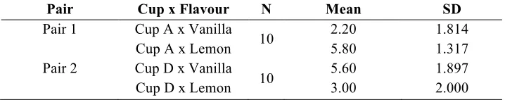
Furthermore, a final pre-test was designed in order to test the two ice-cream flavours on the ten taste concepts, as well as to check whether the right ice-cream flavour matches the right cups (i.e. lemon is expected to relate to the angular cups A and B, while vanilla is expected to relate to the smooth cups C and D). This pre-test was executed at the Van der Poel ice-cream parlour, using their vanilla and lemon ice-cream flavours.
Again, a short survey was created first asking participants to taste the vanilla followed by rating the flavour on the ten taste concepts on a 7-point Likert scale (from “not at all fitting” to “very fitting”). Then the participants did the same for the lemon flavour. Finally, participants were asked to rate to what degree they found vanilla and lemon a match for cup A, B, C and D (again on a 7-point Likert scale from “not at all fitting” to “very fitting”). Ten participants were used for this pre-test.
Vanilla was rated as significantly sweeter than lemon, while lemon was rated significantly sourer than vanilla (in both cases p < 0.001). Furthermore, the taste concepts “strong”, “sharp”, “creamy” and “intense”, also showed significant differences: vanilla was rated as significantly creamier, while lemon was rated as significantly stronger, sharper and more intense. The taste concepts “smooth” and “soft” were both in favour of vanilla, which was expected, but the differences were not significant. As for “mild” and “rich”, inconclusive results were found.
Table 4 Pre-test results flavour x cups
Pair Cup x Flavour N Mean SD
Pair 1 Cup A x Vanilla Cup A x Lemon 10
2.20 5.80
1.814 1.317 Pair 2 Cup D x Vanilla
Cup D x Lemon 10
5.60 3.00
1.897 2.000
To summarize, cup A and cup D were found to be most suitable to be used in the main study. This is because cup A (angular) showed to be scoring highest on the taste concepts sour, strong, sharp and intense, while cup D (smooth) showed to be scoring highest on sweet, smooth, mild, creamy and soft. These results confirm the expectations based on literature and previous research. Furthermore, vanilla and lemon showed sufficient differences in taste concepts and were linked to the expected cups (i.e. vanilla x cup D, and lemon x cup A).
3.2.3 Adjustments in taste concepts for main study
Originally for the pre-test, a set of ten taste concepts were used: sweet, sour, strong, sharp, creamy, mild, soft, rich, intense and smooth. These concepts can be divided into three categories: (1) the taste concepts sweet and sour to match either vanilla or lemon, (2) the smooth taste concepts including soft, smooth, creamy and mild, and (3) the intensity taste concepts including strong, sharp, intense and rich. Based on the results of the pre-test however, some taste concepts were found to give inconclusive results. Therefore, these inconclusive concepts were exempt from the main study. The final concepts for the main study for each category are: (1) sweet and sour, (2) soft and creamy, and (3) strong, intense and sharp.
3.3 Main study
For the main study, a 2 (angular vs smooth tactile form) x 2 (type of background design) x 2 (flavour of ice-cream; sweet/creamy vs sour/ sharp) between-subjects design was constructed,
resulting in eight manipulated conditions. The field-experiment was done in cooperation with Van der Poel ice-cream Parlour in Enschede, the Netherlands. The following chapters describe the participants and procedure of this study, followed by the measurements used.
3.3.1 Participants and procedure
gender distribution across the experimental conditions. Participants were approached at the ice-cream parlour and asked if they would be willing to participate in a simple ice-cream taste test. The type of ice-cream they were going to try was not mentioned. Upon agreement, participants were asked to taste either the vanilla or lemon ice-cream flavour from either the smooth or angular cup (depending on which condition was tested at that moment). Furthermore, participants were instructed to look at the poster, which was printed on A2 format and placed right in front of the participant. Next, participants filled out the survey comprising the dependent measures. Finally, participants were thanked for their participation and if interested, informed about the study.
Table 5 Demographics of participants for each experimental condition
3.3.2 Measurements
The goal of this research is to find out if packaging tactile forms and atmospherics in the form of background design interact in the impact of food perception regarding perceived taste concepts, quality and liking. For this study, two flavours of ice cream were selected; vanilla and lemon. These flavours have an opposite taste (i.e. vanilla is sweet and creamy while lemon is sour and sharp), which matches the rounded and angular shapes respectively based on previous research. However, the look of the flavours is very similar, controlling for the most part for influences by colour expectations.
Participants received taste samples in either the angular or smooth cup, with either a soft or strong background design (i.e. there are eight manipulated conditions). In order to measure the
perceived taste concepts, quality and liking of the ice-cream, participants filled out a short survey after having tasted the samples.
Perceived sweetness, sourness and intensity
The taste concepts were separated into perceived sweetness, perceived sourness, and perceived intensity. The first two taste concepts sweetness and sourness were measured with one item per construct. This was done on a 7-point Likert scale (from “not fitting at all” to “very fitting”) where
Condition N Age Gender
M SD Male Female
Vanilla, angular design, smooth cup 22 27.05 12.480 36% 64%
Vanilla, angular design, angular cup 22 25.64 12.051 41% 59%
Vanilla, rounded design, smooth cup 22 24.05 9.574 32% 68%
Vanilla, rounded design, angular cup 22 26.41 11.450 36% 64%
Lemon, angular design, smooth cup 22 29.00 11.784 41% 59%
Lemon, angular design, angular cup 22 23.73 7.814 36% 64%
Lemon, rounded design, smooth cup 22 23.50 8.152 32% 68%
Lemon, rounded design, angular cup 22 24.82 9.630 36% 64%
participants rated the taste concepts “sweet” and “sour”. Furthermore, within this same scale, the construct taste intensity was also measured. For this, five taste concepts were rated: “strong”, “sharp” and “intense” to match the ice-cream flavour lemon (Cronbach’s alpha 0.755), and “creamy” and “soft” to match the ice-cream flavour vanilla (Cronbach’s alpha 0.831).
Product taste liking & quality
Other than the evaluation of specific taste concepts, the general hedonic taste evaluation was also measured with one single item “I like the taste of the ice-cream”. Furthermore, the item quality was taken into account and measured with the item “I think this ice-cream is of good quality”. Even if the participant is not particularly fond of the taste (e.g. they do not like vanilla ice-cream in general), they might still be able to make an indication about the quality.
Taste expectations
Furthermore, there are two items that measure to what extent the taste of the ice-cream
matches the participant’s expectation: “The ice-cream tastes exactly as I expected” and “I am surprised about the taste of this ice-cream”. These items are based on the research by Ludden, Schifferstein and Hekkert (2009), and slightly adapted to fit this study (Cronbach’s alpha 0.766). With this, the possible element of surprise that the visual cues in the poster design and 3D cups could elicit in relation to the ice-cream taste are taken into account.
General product Liking
4 Results
The goal of this study was to find out what impact container tactile form has on taste perception and how this interacts with environmental cues in the form of background design. The following chapters reveal the results of the present study. To analyse the results of this study, an ANOVA was done for each taste concept. For each construct, the possible main effects were examined first followed by possible interaction effects. The elaboration of these results and the implications can be found in chapter five.
4.1 Taste dimensions: sweet and sour
An ANOVA with sweetness as the dependent variable revealed a main effect of ice-cream flavour (F (1.168) = 88.97, p < 0.001, η2 = 0.35), showing that vanilla was, as expected, perceived as significantly sweeter than the lemon ice-cream (M = 5.80, SD = 0.96, versus M = 3.94, SD = 1.63).
More interestingly, the ANOVA also showed a significant main effect of tactile form (F (1.168) = 10.13, p = 0.002, η2 = 0.06). This means that (regardless of ice-cream flavour) the smooth tactile form, as opposed to the angular tactile form, increased perceived sweetness (M = 5.18, SD = 1.59, versus M = 4.56, SD = 1.60). The main effect of poster design was not significant (F (1.168) = 1.77, p = 0.19, η2 = 0.01), and neither were the interaction effects (ice-cream flavour x tactile form: F < 1, ns; ice-cream flavour x poster design: F < 1, ns; tactile form x poster design: F < 1, ns; ice-cream flavour x tactile form x poster design: F (1.168) = 2.82, p = 0.10, η2 = 0.16).
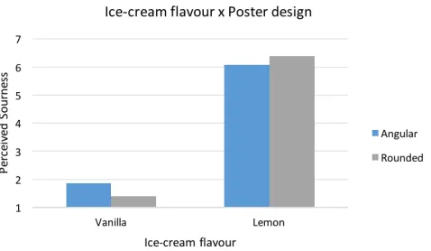
For the taste concept sourness, an ANOVA also revealed a main effect of ice-cream flavour (F (1.168) = 1261.27, p < 0.001, η2 = 0.88), which means that lemon was, as expected, perceived as significantly sourer than vanilla (M = 6.23, SD = 0.74, versus M = 1.63, SD = 1.00).
However, in contrast to the taste concept sweet, there was no main effect found of tactile form for the taste concept sour (F (1.168) = 2.78, p = 0.10, η2 = 0.02), which means that it did not matter which type of tactile form was used for either ice-cream flavours. Furthermore, the main effect of poster design was again not significant (F < 1, ns).
4.2 Perceived intensity: creamy and soft
As mentioned before, the taste intensity concepts were divided into soft and strong concepts (i.e. matching either vanilla or lemon). The soft taste concepts, to match vanilla, were “creamy” and “soft”, which were computed into the construct “Taste Intensity Soft”. An ANOVA with “Taste intensity Soft” as the dependent variable showed a main effect of ice-cream flavour (F (1.168) = 194.50, p < 0.001, η2 = 0.54), which means that vanilla was indeed perceived as softer than lemon (M = 6.02, SD = 0.86, versus M = 3.67, SD = 1.42). What is more, a main effect of tactile form surfaced (F (1.168) = 19.95, p < 0.001, η2 = 0.11), showing that indeed (regardless of ice-cream flavour), the smooth tactile form, as opposed to the angular tactile form increased the perceived softness (M = 5.23, SD = 1.41, versus M = 4.49, SD = 1.80). There was no main effect of poster design found (F < 1, ns). No interaction effects were found (ice-cream flavour x tactile form: F (1.168) = 2.57, p = 0.11, η2 = 0.02; ice-cream flavour x poster design: F (1.168) = 2.15, p = 0.14, η2 = 0.01; tactile form x poster design: F < 1, ns; ice-cream flavour x tactile form x poster design: F (1.168) = 3.02 p = 0.09, η2 = 0.02)
However, because of the lack of results within the computed construct and out of purposes to further investigate possible findings, the taste concepts “creamy” and “soft” were looked at separately as well. From this, more interesting results surfaced.
First, An ANOVA with “creamy” as the dependent variable showed, as expected, a main effect of ice-cream flavour (F (1.168) = 172.62, p < 0.001, η2 = 0.51), which means that vanilla was indeed perceived as creamier than lemon (M = 6.15, SD = 1.06, versus M = 3.51, SD = 1.63).
[image:19.595.80.319.77.216.2](ice-cream flavour x tactile form: F (1.168) = 1.85, p = 0.18, η2 = 0.01; ice-cream flavour x poster design: F < 1, ns; tactile form x poster design: F < 1, ns; ice-cream flavour x tactile form x poster design: F < 1, ns).
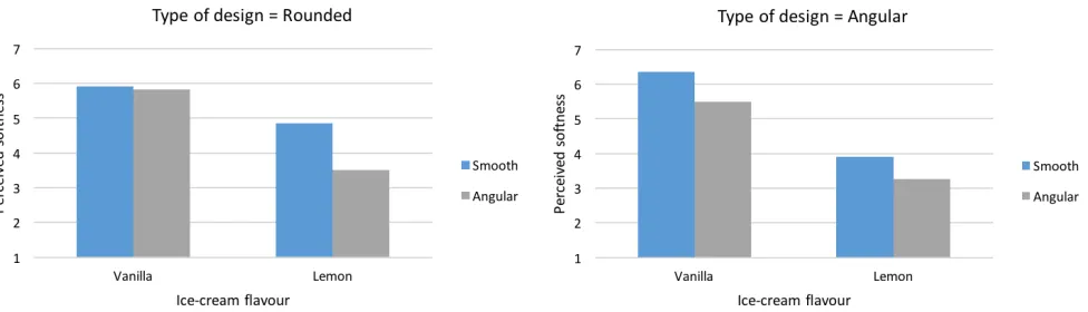
Likewise, an ANOVA with taste dimension “soft” also revealed a main effect of ice-cream flavour (F (1.168) = 113.30, p < 0.001, η2 = 0.40), confirming that vanilla is perceived as significantly softer than lemon (M = 5.90, SD = 0.96, versus M = 3.89, SD = 1.61). Furthermore, there was also a main effect of tactile form (F (1.168) = 15.28, p < 0.001, η2 = 0.08), again confirming the expectations that the smooth cup indeed increased perceived softness compared to the angular cup (regardless of the ice-cream flavour) (M = 5.26, SD = 1.47, versus M = 4.52, SD = 1.77). Again, the main effect of poster design was not significant (F (1.168) = 1.91, p = 0.17, η2 = 0.01). However, a weak, albeit significant interaction effect was found on ice-cream flavour x tactile form x poster design (F (1.168) = 3.94, p = 0.05, η2 = 0.02). Figure 5 and 6 present these interaction effects.
For the rounded poster design (figure 5), there was only a significant effect found of lemon x tactile form (F (1.168) = 13.02, p < 0.001, η2 = 0.07), which means that if the rounded poster was shown in combination with the congruent smooth cup, the perceived softness of the ice-cream increased (as was expected), as opposed to when the rounded poster was shown in combination with the angular cup (M = 4.86, SD = 1.28, versus M = 3.50, SD = 1.74). For vanilla, this interaction effect was not significant (F < 1, ns).
As for the angular poster design (figure 6), there was only a significant result found between vanilla x tactile form (F (1.168) = 5.22, p = 0.02, η2 = 0.03). This means that when the angular poster was presented in combination with the smooth cup, the perceived softness of vanilla increased, as opposed to when the angular poster was presented in combination with the angular cup (M = 6.36, SD = 0.72, versus M = 5.50, SD = 1.14). For lemon, this interaction effect was not significant, although it did indicate a trend (F (1.168) = 2.84, p = 0.09, η2 = 0.02).
[image:20.595.65.553.551.691.2]Fig. 5. Mean softness as a function of ice-cream flavour, tactile form and poster design (rounded)
4.3 Perceived intensity: strong, sharp and intense
For this construct, the strong taste concepts, to match lemon, were “strong”, “sharp” and “intense”, which were computed into the construct “Taste Intensity Strong”. An ANOVA with “Taste intensity Strong” as the dependent variable showed a main effect of ice-cream flavour (F (1.168) = 63.48, p < 0.001, η2 = 0.27), which means that lemon was indeed perceived as stronger than vanilla (M = 4.70, SD = 1.05, versus M = 3.46, SD = 1.09). More interestingly, a main effect of tactile form surfaced (F (1.168) = 6.88, p = 0.01, η2 = 0.04), showing that indeed (regardless of ice-cream flavour), the angular tactile form, as opposed to the smooth tactile form increased the perceived strength (M = 4.29, SD = 1.30, versus M = 3.88, SD = 1.14). What is more, there was also a main effect of poster design found (F (1.168) = 4.57, p = 0.03, η2 = 0.03), which means that in general, the angular poster design, as opposed to the rounded poster design increased the perceived strength (M = 4.25, SD = 1.12, versus M = 3.92, SD = 1.35). Furthermore, a weak albeit significant interaction effect of ice-cream flavour x tactile form x poster design surfaced (F (1.168) = 4.67, p = 0.03, η2 = 0.03). Figure 7 and 8 present these interaction effects.
For lemon (figure 7), when the ice-cream was tasted from the congruent angular cup, the poster design had no significant effect on the perceived taste intensity strong (F < 1, ns). However, a significant effect was found of smooth tactile form x poster design (F (1.168) = 4.57, p < 0.03, η2 = 0.03), which means that if the participants tried the lemon ice-cream from the incongruent smooth cup, poster design did have a significant effect in perceived taste intensity strong. In this case, the
congruent angular poster lead to a significantly higher evaluation of the perceived taste intensity strong as opposed to the incongruent rounded poster (M = 4.70, SD = 0.81, versus M = 4.03, SD = 1.09).
Although interesting results surfaced for this construct, to be consistent to the “Taste Intensity Soft” construct and out of purposes to further investigate possible findings, the taste concepts
“strong”, intense and “sharp” were looked at separately as well. From this, some more interesting results were found.
First, an ANOVA with “strong” as the dependent variable showed a main effect of ice-cream flavour (F (1.168) = 34.09, p < 0.001, η2 = 0.17), which means that lemon was indeed perceived as significantly stronger than vanilla (M = 5.42, SD = 1.22, versus M = 4.20, SD = 1.56). However, the main effects of tactile form (F (1.168) = 2.50, p = 0.12, η2 = 0.02), and poster design (F (1.168) = 3.65, p = 0.06, η2 = 0.02), were not significant. Furthermore, no interaction effects were found (ice-cream flavour x tactile form: F (1.168) = 1.86, p = 0.17, η2 = 0.01; ice-cream flavour x poster design: F < 1, ns; tactile form x poster design: F < 1, ns; ice-cream flavour x tactile form x poster design: F (1.168) = 2.86, p = 0.09, η2 = 0.02).
An ANOVA with “intense” as the dependent variable also showed a main effect of ice-cream flavour (F (1.168) = 51.38, p < 0.001, η2 = 0.23), which means that lemon was rated, as expected, more intense than vanilla (M = 5.58, SD = 0.96, versus M = 4.25, SD = 1.46). However, the main effects of tactile form (F (1.168) = 1.36, p = 0.25, η2 = 0.01) and poster design (F (1.168) = 3.61, p = 0.06, η2 = 0.02) were again not significant. Furthermore, the interaction effects were also not
significant (ice-cream flavour x tactile form: F < 1, ns; ice-cream flavour x poster design: F < 1, ns; tactile form x poster design: F (1.168) = 1.09, p = 0.30, η2 = 0.01; ice-cream flavour x tactile form x poster design: F (1.168) = 1.35 p = 0.25, η2 = 0.01).
Finally, an ANOVA with “sharp” as the dependent variable showed again a main effect of ice-cream flavour (F (1.168) = 27.41, p < 0.001, η2 = 0.14), which means that lemon was indeed
[image:22.595.85.513.99.229.2]experiences as sharper than vanilla (M = 3.11, SD = 1.71, versus M = 1.93, SD = 1.37). More interestingly, a main effect of tactile form surfaced (F (1.168) = 9.12, p = 0.003, η2 = 0.05), showing
Fig. 7. Mean Taste Intensity Strong as a function of, tactile
that indeed (regardless of ice-cream flavour), the angular tactile form, as opposed to the smooth tactile form increased the perceived sharpness (M = 2.86, SD = 1.78, versus M = 2.18, SD = 1.46). The main effect of poster design was not significant (F (1.168) = 1.23, p = 0.27, η2 = 0.01).
Furthermore, an ANOVA with “sharp” as the dependent variable showed a weak, albeit significant, interaction effect of ice-cream flavour x tactile form (F (1.168) = 4.06, p = 0.046, η2 = 0.03). A pairwise comparison showed that for lemon, this difference is significant (F (1.168) = 12.67, p < 0.001, η2 = 0.07), which means that lemon was, as expected, perceived as significantly sharper when tasted from the angular tactile form as opposed to the smooth tactile form (M = 3.68, SD = 1.81, versus M = 2.55, SD = 1.41). For vanilla, this effect was not found (F < 1, ns). Figure 9 visualizes this interaction effect
4.4 Hedonic taste & quality evaluation
An ANOVA with hedonics taste liking (i.e. “I like the ice-cream) as the dependent variable showed no main effect on ice-cream flavour (F < 1, ns), which means that both ice-cream flavours were liked equally (vanilla: M = 5.78, SD = 1.25; lemon: M = 5.90, SD = 1.21). The main effect of tactile form was not significant (F (1.168) = 1.24, p = 0.27, η2 = 0.01), and neither was the main effect of poster design (F < 1, ns).
[image:23.595.79.321.270.410.2]Interestingly though, an interaction effect was found of tactile form x poster design (F (1.168) = 5.54, p = 0.02, η2 = 0.03), which can be seen in figure 10. A pairwise comparison showed that when the angular poster design was shown in combination with the smooth tactile form (as opposed to the angular tactile form), the ice-cream (regardless of flavour) was liked significantly more than when there was congruency in poster design and tactile form (i.e. angular poster design combined with angular tactile form) (M = 6.07, SD = 1.11, versus M = 5.43, SD = 1.30). For the rounded poster, this interaction effect was not significant (F < 1, ns).
When it comes to the evaluation of quality, the main effect of ice-cream flavour was not significant, showing that both ice-cream flavours were rated of equal quality (vanilla: M = 5.97, SD = 0.89; lemon: M = 6.11, SD = 0.72). Furthermore, the main effect of tactile form and poster design were not significant (all F’s < 1, ns).
Finally, there were no interaction effects found on ice-cream quality (ice-cream flavour x tactile form: F < 1, ns; ice-cream flavour x poster design: F (1.168) = 1.96, p = 0.16, η2 = 0.01; tactile form x poster design: F (1.168) = 2.47, p = 0.23, η2 = 0.02; ice-cream flavour x tactile form x poster design: F < 1, ns)
4.5 Taste expectations
For the dependent variable taste expectancy, two items were combined: “the taste was as I expected”, and “the taste surprised me”. The latter one was recoded before it was added to the computed variable.
An ANOVA with taste expectancy as the dependent variable showed a main effect of ice-cream flavour (F (1.168) = 8.47, p = 0.004, η2 = 0.05), where vanilla tasted more as expected than lemon (M = 4.84, SD = 1.30, versus M = 4.26, SD = 1.34). No other main effect of tactile form or poster design was found (all F’s < 1, ns).
[image:24.595.96.334.78.215.2]Interestingly, an interaction effect of ice-cream flavour and tactile form was found (F (1.168) = 4.46, p = 0.04, η2 = 0.03). A pairwise comparison showed that tasting lemon from the smooth cup lead to a significantly lower score in taste expectancy than tasting vanilla from the smooth cup (F (1.168) = 12.60, p < 0.001, η2 = 0.07). This means that indeed, vanilla tasted more as expected from the smooth cup compared to lemon (M = 4.84, SD = 1.30, versus M = 4.26, SD = 1.34). For the angular cup, the interaction effect was not significant (F < 1, ns). See figure 9 for a visualization. No other interaction effects were found (all F’s < 1, ns).
4.6 Overall product evaluation
In line with the hedonic taste evaluation, an ANOVA with overall product liking as dependent variable showed no main effect of ice-cream flavour (F < 1, ns), which means that both flavours were evaluated similarly (vanilla: M = 5.53, SD = 0.94; lemon: M = 5.52, SD = 1.04). Furthermore, the main effects of tactile form and poster design were also not significant (all F’s < 1, ns).
[image:25.595.87.328.79.204.2]A very weak, yet significant, interaction effect of tactile form x poster design was found (F (1.168) = 4.16, p = 0.043, η2 = 0.02), which is in line with the hedonic taste evaluation outcome. Interestingly though, a pairwise comparison showed that neither the tactile form, nor the poster design showed significant results. However, a trend could be indicated when it comes to the angular poster design x tactile form (F (1.168) = 3.66, p = 0.06, η2 = 0.02). This trend indicates that the overall product evaluation is higher when the angular poster is shown in combination with the smooth cup, as opposed to the angular cup (M = 5.71, SD = 0.96, versus M = 5.30, SD = 0.84). A visualization can be found in figure 12. No other interaction effects were found (all F’s < 1, ns).
Fig. 11. Mean taste expectation as a function of tactile form and ice-cream flavour
[image:25.595.85.330.536.666.2]5 General discussion
Before going into the general discussion of this study, an overview of the hypotheses and whether they were confirmed or not is presented in table 6. After the general discussion, some limitations to this study are discussed, followed by finally suggesting some implications and recommendations for future research.
Table 6 Confirmation of hypotheses
H1a: An angular tactile form, as opposed to a smooth tactile form, results in higher perceived sourness.
Not confirmed
H1b: A smooth tactile form, as opposed to an angular tactile form, results in higher perceived sweetness.
Confirmed
H2a: An angular tactile form, as opposed to a smooth tactile form, results in a stronger taste perception.
Confirmed
H2b: A smooth tactile form, as opposed to an angular tactile form, results in a softer taste perception.
Confirmed
H3a: Angular background shapes, versus rounded shapes, lead to a stronger taste perception.
Confirmed
H3b: Rounded background shapes, versus angular shapes, lead to a softer taste perception.
Not confirmed
H4: Congruency of tactile form, background design and ice-cream flavour lead to a higher evaluation of product liking compared to when incongruence of one (or more) of these elements is present.
Not confirmed
The goal of this study was to find out what impact tactile form has on taste perception and how this interacts with environmental cues in the form of background design. Looking at solely the impact on container tactile form, the findings show that tactile form may significantly influence taste evaluation. To be more specific, as previous findings on sensory experience indicate (e.g. Becker et al., 2011; Rompay et al., 2017), a smooth tactile form resulted in a sweeter taste experience.
previous studies that suggest that the tactile form increases the congruent taste concepts and confirms the expectations of the ice-cream flavour.
Similarly, when looking at the impact of the poster design alone, the findings show that the angular poster increased the strong taste perceptions. Therefore, the congruency of tactile form and taste concept and poster design and taste concept seem of importance.
However, this specific topic about congruency becomes more interesting when looking at the interaction of all three fixed factors (i.e. ice-cream flavour, tactile form, and poster design) and their impact on the taste perceptions. For example, when both the tactile form and poster design are congruent, it also seems to impact the incongruent ice-cream flavour: e.g. lemon was perceived as softer when tasting from the smooth cup, and being shown the rounded poster design. Furthermore, the perceived softness of vanilla increased when presented with the angular poster design in combination with the smooth cup (i.e. this effect did not surface when the rounded poster was
presented in combination with the smooth cup). Also, when looking at the strong taste perceptions, the poster design showed to have impact when the tactile form was incongruent to the ice-cream flavour: when lemon was tasted from the incongruent smooth cup, the congruent angular poster design lead to a significantly higher evaluation in taste perception as opposed to the incongruent rounded poster. However, the function of the interaction effect that surfaced due to the poster design are slightly more complex when it comes to taste evaluation and they are not conclusive, requiring further investigation. Still, it may be very interesting to look into, especially since there are some studies suggest that subtle incongruence can also have positive effects (e.g. Berlyne, 1971; Hopkins, Zelazo, Jacobson & Kagan, 1976; Ludden, Schifferstein and Hekkert, 2009).
As mentioned before, these early studies found that a product was more liked when moderate incongruences were present. Still, it is unclear what exactly defines moderate incongruence, and with the findings of the present study, this is a question that might be interesting to find an answer to in the future. For example, this study found that indeed, both hedonic taste liking and overall product evaluation were evaluated as more positive when the angular poster was combined with the smooth cup. This also means that when the angular poster was combined with the congruent angular cup, the overall product evaluation and hedonic taste liking was in fact lower. Based on the early studies by Ludden, Schifferstein and Hekkert (2009), this could be explained by the taste expectations
contradicting the actual flavour, leading to a surprise effect. It may also be explained by the U-curve created by Berlyne (1971), suggesting that small incongruences lead to positive effects, while high degree of incongruence leads to negative effects. However, these findings seem to be debunked again in the follow-up study by Ludden, Schifferstein and Hekkert in 2012.
packaging is congruent to the flavour, but the environmental cues are incongruent. However, in order to say this the definition and importance of congruence has to be further investigated.
5.1 Limitations
Naturally, there are some limitations worth noting in this study. First, the tactile forms used in this study were enclosed in 3D-printed sample cups instead of realistic container variants. What is more, the angular tactile form was more extreme than it would be in a realistic container. Finally, the smooth tactile form was represented by a simple smooth sample cup, which does not defer from regular cups. This means that it could be that the smooth tactile form was too weak compared to the angular cup.
Furthermore, this study cannot conclusively assess the relative contributions of touch and vision to taste evaluation separately. Participants first saw the cups and then touched its surface. They also saw the ice-cream before tasting. What is more, it should be acknowledged that the participants were not actually tasting the ice-cream from the cup, but rather from plastic spoons. Although they were in fact holding the cup in one hand, the other hand was used to taste the actual ice-cream. Still, this was the case for all participants, but the effects of the spoon were not taken into consideration. Future research is necessary to explore the effects of the visual and tactual manipulations separately.
Although the research took place in a realistic setting, this also caused some limitations regarding the certainty with which we can say that the results were actually solely caused by our manipulations. First of all, the participants were sitting down while tasting the ice-cream, meaning that the cup was set on the table, and not always picked up by all participants. In other words, the
participants did not have to interact with the cup by holding it during the whole study. Furthermore, although the poster was placed in front of them and the research took place in a quiet area of the ice-cream parlour, there were still many other cues in their direct environment (e.g. noise of other
customers, people walking by them, decorations of the parlour, difference in weather, etc.). Therefore, the effect of the poster was perhaps too weak and needs further investigation. Still, participants were in a realistic setting and because they were seated, they could focus their attention better to the study.
Admittedly, although some interesting results were found in this study, confirming previous findings, it is still of importance to reach more conclusive results by further investigating certain limitations mentioned above. The next paragraph is focusing on more specific implications for future research.
5.2 Implications and recommendations for future research
theories that suggest that tactile stimuli lead to varying taste perceptions. This means that indeed, the perception of different tastes can be enhanced by correctly implying visuotactile stimuli.
For marketing purposes, the present study could be used (combined with other studies regarding this topic) to implement tactile stimuli into actual products in order to effectively enhance flavours. Based on this study, rounded and smooth tactile forms increase softness, while angular tactile forms increase sharpness and intensity. Therefore, a marketer could implement visuotactile stimuli to influence taste perception and then perhaps increase the overall product experience.
Still, also due to the aforementioned limitations to this study, there is plenty of opportunity for future research to investigate more deeply into this topic. First, although the importance of congruency between flavour and tactile form surfaced, the interplay with more subconscious stimuli (i.e. the poster design) is not yet conclusive. As mentioned before, this study suggests that some incongruence, may in fact, enhance product liking and overall product experience. This could be because of the surprise element mentioned by Ludden, Schifferstein and Hekkert (2009), leading to subtle incongruence and therefore to higher liking evaluations. However, this effect of incongruence as well as the overall interplay between conscious and subconscious stimuli on taste evaluation requires further
investigation. For future research, it is interesting to define the degrees of incongruence, and if there could exist a U-curve as suggested by Berlyne (1971). Furthermore, other than defining and possibly forming a framework for the positive effect of incongruence, it should also be investigated on which elements this incongruence has the most impact. For example, one could imagine a study where several cues are compared on importance and subsequently on incongruence.
Furthermore, the present study focuses on vision and touch combined rather than separately. When separating vision and touch, there is more room to study a wider variety of flavours. What is more, new technologies also allow for more research about different packaging types and varying elements in packaging. For example, in this study, the spoon that was used was a regular spoon. However, as this was the means the participants used to actually taste the ice-cream, it may be of interest to investigate how cutlery interacts with the evaluation of taste as well.
References
Allison, R. I., & Uhl, K. P. (1964). Influence of beer brand identification on taste perception. Journal of Marketing Research, 1, 36-39.
Arnheim, R. (1974). On the Nature of Photography. Critical Inquiry, 1(1), 149-161.
Aronoff, J., Woike, B. A., & Hyman, L. M. (1992). Which are the stimuli in facial displays of anger and happiness? Configurational bases of emotion recognition. Journal of Personality and Social Psychology, 26(6), 1050-1066.
Bar, M., & Neta, M. (2006). Humans Prefer Curved Visual Objects. Psychological Science, 17(8), 645-648.
Bearden, W. O., & Shimp, T. A. (1982). The Use of Extrinsic Cues to Facilitate Product Adoption. Journal of Marketing Research, 19(5), 89-99
Becker, L., Rompay, T. J. L., & Schifferstein, H. N. J., & Galetzka, M. (2011). Tough package, strong taste: The influence of packaging design on taste impressions and product evaluations. Food Quality and Preference, 22, 17-23.
Berlyne, D. E. (1971). Aesthetics and psychobiology (Vol. 336). New York: Appleton-Century-Crofts. Bitner, M. J. (1992). Servicescapes: the impact of physical surroundings on customers and employees.
Journal of Marketing, 56(2), 57-71.
Desmet, P., & Hekkert, P. (2007). Framework of product experience. International journal of design, 1(1), 57-66.
Donovan, R.J. & Rossiter, J.R. (1982). Store Atmosphere: An Environmental Psychology Approach. Journal of Retailing, 58(1), 34-57.
Elder, R., & Krishna, A. (2010). The effect of advertising copy on sensory thoughts and perceived taste. The Journal of Consumer Research.
Fenko, A., Schifferstein, H. N., & Hekkert, P. (2009). Which senses dominate at different stages of product experience?.
Gal, D., Wheeler, S. C., & Shiv, B. (2007). Cross-modal influences on gustatory perception. Available at http://ssrn.com/abstract=1030197.
Hekkert, P., & Schifferstein, H. N. J. (2008). Introducing product experience. Product experience, 1-8. Herz, R. (2007). The scent of desire: Discovering our enigmatic sense of smell. New York: William
Morrow.
Hirschman, E., & Solomon, M. R. (1984). Utilitarian, Aesthetic, and Familiarity Responses to Verbal Versus Visual Advertisements. Advances in Consumer Research, 11, 426-431.
Hoegg, J., & Alba, J. W. (2007). Taste Perception: More than Meets the Tongue. Journal of Consumer Research, 33(4), 490-498.
Hummel, T., Delwiche, J.F., Schmidt, C., & Hüttenbrink, K.B. (2003). Effects of the form of glasses on the perception of wine flavors: a study in untrained subjects. Appetite, 41(2), 197-202. Ikeda, K. (2002). New Seasonings. Chemical Senses, 27(9), 847-849.
Koch, C., & Koch, E. C. (2003). Preconceptions of taste based on color. Journal of Psychology Interdisciplinary Application, 137, 233-242.
Kotler, P. (1973). Atmospherics as a Marketing Tool. Journal of Retailing, 49(4), 48-64. Krishna, A. (2012). An Integrative review of sensory marketing: Engaging the senses to affect
perception, judgment and behaviour. Journal of Consumer Psychology, 22, 332-351. Liu, Y. & Jang, S. (2009). The Effects of Dining Atmospherics: An Extended Mehrabian-Russell
Model. International Journal of Hospitality Management, 28, 494-503.
Ludden, G. D. S., Schifferstein, H. N. J., & Hekkert, P. (2009). Visual-Tactual Incongruities in Product as Sources of Surprise. Empricial Studies of the Arts, 27(1), 63-89.
Ludden, G. D. S., Schifferstein, H. N. J., & Hekkert, P. (2012). Beyond Surprise: A Longitudinal Study on the Experience of Visual-Tactual Incongruities in Products. International Journal of Design, 6(1), 1-10.
McDaniel, C., & Baker, R. C. (1977). Convenience food packaging and the perception of product quality. Journal of Marketing, 41(4), 57-58.
Mehrabian, A. (1976). Public Spaces and Private Spaces: The Psychology of Work, Play, and Living Environments. New York, NY: Basic Books.
Mehrabian, A., & Russell, J. A. (1974). An Approach to Environmental Psychology. MIT press, Cambridge.
Milliman, R. E. (1986). The Influence of Background Music on the Behavior of Restaurant Patrons. Journal of Consumer Research, 13, 286-289.
Piqueras-Fiszman, B., & Spence, C. (2011). Cross-modal correspondences in product packaging. Assessing colour correspondences for potato chips (crisps). Appetite, 57, 753-757. Rao, A. R., & Monroe, K. B. (1989). The effect of price, brand name, and store name on buyers’
perception of product quality: An integrative review. Journal of marketing research, 351-357. Scheibehenne, B., Todd, P. M., & Wansink, B. (2010). Dining in the dark: the importance of visual
cues for food consumption and satiety. Appetite, 55, 710-713.
Schifferstein, H. N. J., Fenko, A., Desmet, P. M. A., Labbe, D., & Martin, N. (2012). Influence of package design on the dynamics of multisensory and emotional food experience. Food quality and Preference, 27, 18-25.
Spence, C. (2012). Managing sensory expectations concerning products and brands: Capitalizing on the potential of sound and shape symbolism. Journal of Consumer Psychology, 22(1), 37-54. Spence, C., Levitan, C. A., Shankar, M. U., & Zampini, M. (2010). Does food colour influence taste
and flavour perception in humans? Chemical Perception, 3, 68-84.
Spence, C., & Shankar, M. U. (2010). The influence of auditory cues in the perception of, and responses to, food and drink. Journal of Sensory Studies, 25, 406-430.
Stewart, P.C., & Goss, E. (2013). Plate shape and colour interact to influence taste and quality judgements. Flavour Journal, 8, 2-27.
Teas, K. R., & Agarwal, S. (2000). The Effects of Extrinsic Product Cues on Consumers’ Perceptions of Quality, Sacrifice, and Value. Journal of the Academy of Marketing Science, 28(2), 278-290.
Turley, L. W., & Milliman, R. E. (2000). Atmospheric Effects on Shopping Behaviour: A Review of the Experimental Evidence. Journal of Business Research, 94, 193-211.
Van Rompay, T. J. L., Finger, F., Saakes, D., & Fenko, A. (2017). “See me, feel me”: Effects of 3D-printed surface patterns on beverage evaluation. Food quality and preference, 2016, 1-8. Van Rompay, T. J., & Pruyn, A. T. (2011). When visual product features speak the same language:
Effects of shape-typeface congruence on brand perception and price expectations. Journal of
Product Innovation Management, 28(4), 599-610.
Van Rompay, T. J. L., Pruyn, A. T. H., & Tieke, P. (2009). Symbolic meaning integration in design and its influence on product and brand evaluation. International Journal of Design, 3(2), 19-26.
Vilanova, M., Vidal, P., & Cortés, S. (2008). Effect of the glass shape on flavour perception of “toasted wine” from Ribeiro (NW Spain). Journal of Sensory Studies, 23(1), 114-124. Wansink, B. (2004). Environmental Factors That Increase the Food Intake and Consumption Volume
of Unknowing Consumers. Annual Review Nutrition, 24, 455-479.
Wansink, B. & Sobal, J. (2007). Mindless Eating: The 200 Daily Food Decisions We Overlook. Journal of Environment and Behaviour, 39(1), 106-123.
Zeithaml, V. A. (1988). Consumer Perceptions of Price, Quality, and Value: A Means-End Model and Synthesis of Evidence. Journal of Marketing, 52, 2-22.
APPENDIX
A: Pre-test 1: Poster Designs Pre-test 2: Cups
A. Pre-test 1: Poster Designs A=Angular; R=Rounded
Posters 1A & 1R
Posters 2A & 2R
Poster 4A & 4R
Pre-test 1 Survey questions
NB. The following questions were asked after every poster design, which means every participant filled these out eight times. The order of the posters was randomized.
Welkom bij deze korte vragenlijst.
In deze vragenlijst krijg je steeds een afbeelding te zien, gevolgd door een aantal vragen. Het enige dat je hoeft te doen is de afbeelding eerst goed in je op te nemen om vervolgens de bijbehorende vragen te kunnen beantwoorden. Het invullen van alle vragen kost ongeveer 5 minuten van je tijd.
Voor vragen en opmerkingen m.b.t. de vragenlijst graag mailen naar: [email protected]
Geef aan in hoeverre u de volgende begrippen bij het bovenstaande beeld vindt passen. Helemaal niet
passend
Niet passend Neutraal Passend Heel Passend
Zoet 1 2 3 4 5
Zuur 1 2 3 4 5
Smeuïg 1 2 3 4 5
Krachtig 1 2 3 4 5
Mild 1 2 3 4 5
Scherp 1 2 3 4 5
Romig 1 2 3 4 5
Zacht 1 2 3 4 5
Intens 1 2 3 4 5
Geef vervolgens aan in hoeverre u het eens bent met de volgende stellingen Helemaal mee
oneens
Oneens Neutraal Mee eens
Helemaal mee eens Ik vind deze poster realistisch als
ijs-promotie
1 2 3 4 5
Ik vind deze poster aantrekkelijk 1 2 3 4 5
Ik vind deze poster niet geschikt voor het promoten van ijs
1 2 3 4 5
Pre-test 1 outcome overview
Overview means and standard deviation taste concepts (based on 5-point Likert Scale) Taste Concept Poster 1A Poster 1R Poster 2A Poster 2R Poster 3A Poster 3R Poster 4A Poster 4R
Zoet M=3.18
SD=0.95 M=3.94 SD=0.83 M=2.53 SD=0.94 M=3.53 SD=1.07 M=3.12 SD=0.99 M=3.94 SD=0.83 M=3.41 SD=1.12 M=4.29 SD=0.59
Zuur M=2.59
SD=1.06 M=1.82 SD=1.02 M=2.65 SD=1.00 M=1.94 SD=0.97 M=2.76 SD=1.15 M=1.88 SD=0.93 M=2.29 SD=1.05 M=2.12 SD=0.93 Smeuïg M=3.12
SD=1.05 M=3.76 SD=1.03 M=2.71 SD=1.11 M=3.71 SD=1.05 M=2.59 SD=1.00 M=3.47 SD=1.07 M=2.88 SD=1.05 M=3.88 SD=0.78 Krachtig M=3.35
SD=0.93 M=3.00 SD=0.87 M=3.47 SD=0.87 M=2.53 SD=1.01 M=3.53 SD=0.94 M=3.00 SD=1.00 M=3.24 SD=1.03 M=3.06 SD=0.90
Mild M=2.76
SD=0.83 M=3.06 SD=0.90 M=2.35 SD=0.70 M=3.24 SD=1.09 M=2.29 SD=0.69 M=2.82 SD=1.27 M=2.94 SD=0.83 M=3.41 SD=1.12 Scherp M=3.06
SD=0.90 M=2.06 SD=1.09 M=3.47 SD=1.13 M=2.12 SD=1.05 M=3.12 SD=1.17 M=1.88 SD=1.05 M=2.94 SD=1.20 M=2.41 SD=1.28
Romig M=3.18
SD=0.95 M=3.88 SD=0.99 M=2.65 SD=1.06 M=3.76 SD=1.09 M=2.76 SD=1.03 M=3.76 SD=1.15 M=2.88 SD=0.83 M=4.00 SD=0.87
Zacht M=2.88
SD=1.16 M=3.88 SD=0.86 M=2.47 SD=1.80 M=3.41 SD=1.28 M=2.53 SD=0.95 M=3.76 SD=1.15 M=3.12 SD=0.99 M=4.12 SD=0.60 Intens M=2.94
SD=0.83 M=2.82 SD=1.08 M=3.65 SD=0.70 M=3.24 SD=0.83 M=3.71 SD=0.92 M=3.29 SD=0.92 M=3.29 SD=0.85 M=2.82 SD=0.88
Vol M=3.18