The effects of color scheme and brand slogan on the
perception of brand personality and brand attitude
A STUDY OF THE CHANGE OF CVI ELEMENTS IN THE
REBRANDING PROCESS OF HANSA
Jule Lena Geißler
UNIVERSITY OF TWENTE
MASTER THESIS
ENSCHEDE, OCTOBER 2018
JULE LENA GEIßLER S1916432
SUPERVISORS: DR. J.F. GOSSELT DR. T. VAN ROMPAY
UNIVERSITY OF TWENTE
FACULTY OF BEHAVIOURAL, MANAGEMENT AND SOCIAL SCIENCES
Abstract
Aim
The technological progress in the last years led to a deep integration of audio-visual devices, such as smartphones, into our everyday life. Consequently, visual stimuli are omnipresent and play a crucial role in nowadays society. This development towards a visual orientation of society forces brands to rethink and reinforce their visual appearance. Furthermore, brands need to stand out in emerging markets and therefore their Corporate Visual Identity (CVI), as a key part of the visual appearance, needs to be further developed. This study researches the effects of such a modification in the CVI and focusses especially on the rebranding case of the convenience food brand hansa, which is a bulk customer brand in the sector of deep-frozen products, and functions as the practical setting of the study. More specifi-cally, the aim of the study is to examine the relative influence of the CVI elements slogan wording, the color scheme, their interaction effect and more precisely the element congruence on the attitudes towards the brand and the perception of brand personality.
Method
In order to examine these effects this research applies a 2 (color: bright vs dark colors) x 2 (slogan: exciting vs competent slogan) in between subject factorial design and was conducted through an online questionnaire using the survey software Qualtrics, which was spread via social media in order to gain a sufficient and diverse participant sample.
Results
The main findings of the current study indicate a significant effect of color on the perceived brand per-sonality. Furthermore, the congruency of the underlying semantic meaning of color scheme and brand slogan was found to affect the evaluation of the brand. Moreover, it was shown that the visual and verbal elements of the CVI influence the evaluation of the CVI differently. At the same time, the attitude to-wards the CVI had a significant effect on the evaluation of the brand.
Conclusion
Overall, these results provide an important contribution to elaborating previous research on the influence of CVI elements on brand associations and furthermore create a foundation for future research in this field. Moreover, the study outcomes offer a first guideline for selecting and changing CVI elements based on their congruence and on their effect on the brand personality and attitude, leading to better predictable and more successful rebranding effects. The study results emphasize the importance for companies to investigate their efforts when changing CVI elements in order to influence consumers’ brand associations.
Keywords
Table of contents
Abstract ... 1
1. Introduction ... 1
2. Theoretical framework ... 3
2.1 Rebranding as context of the study ... 3
2.2 Corporate Visual Identity ... 3
2.3 Elements of Corporate Visual Identity ... 3
2.4 Dependent variables ... 3
2.4.1 Brand personality ... 3
2.4.2 Brand attitude ... 4
2.5 Color scheme ... 6
2.6 Slogan ... 7
2.7 Congruency of color scheme and brand slogan ... 8
2.8 Mediating variable: Attitude towards CVI ... 9
2.9 Research Model ... 10
3. Method ... 11
3.1 Research Design ... 11
3.2 Stimulus Material ... 11
3.3 Measures ... 14
3.3.1 Brand personality ... 14
3.3.2 Attitude towards the CVI ... 15
3.3.3 Brand attitude ... 15
3.3.4 Brand familiarity as covariate ... 15
3.4 Participants ... 16
3.4.1 Homogeneity between Conditions ... 17
3.5 Procedure ... 17
4. Results ... 19
4.1 Main and Interaction effects ... 19
4.1.1 Brand Personality ... 19
4.1.2 Brand attitude ... 20
4.2 Mediating effects... 21
4.3 Brand familiarity as covariate ... 22
4.4 Hypotheses and research model ... 22
5. Discussion ... 24
5.2 Theoretical implications – Reflection on theory ... 24
5.3 Practical implications ... 26
5.4 Limitations and suggestions for future research ... 27
6. Conclusions ... 27
7. Literature ... 29
Appendix ... 35
Appendix 1 - Aakers brand personality scale (Aaker, 1997, p.345) ... 35
Appendix 2 – Hypothesis ... 36
Appendix 3 – Main survey ... 37
Appendix 4 – Ethics Committee Approval ... 43
Appendix 5 – Main effects of brand slogan on brand personality ... 44
Appendix 6 - MANOVA with interaction effects on brand personality ... 44
Appendix 7 - Main effects on brand attitude ... 45
Appendix 8 - Mediation analysis: Perceived congruence of color scheme and brand slogan ... 45
Overview of figures and tables
Figure 1: Website of hansa before and after rebranding as visualization of the change in CVI ... 1
Figure 2: Conceptualization of Research Design ... 11
Figure 3: Stimulus material (Condition 1) ... 13
Figure 4: Stimulus material (Condition 2) ... 13
Figure 5: Stimulus material (Condition 3) ... 13
Figure 6: Stimulus material (Condition 4) ... 13
Figure 7: Profile Plot of the interaction effect between color scheme and brand slogan ... 21
Figure 8: Profile Plot of the interaction effect between color scheme and brand slogan on Attitude towards the CVI ... 22
Figure 9: Research model with significant effects ... 23
Table 1: Experimental conditions ... 11
Table 2: Overview preliminary test with groups’ means and standard deviation ... 12
Table 3: Overview manipulation check main survey with groups’ means and standard deviation ... 14
Table 4: Constructs - reliability scores, mean scores, and standard deviations values ... 16
Table 5: Demographic information ... 17
Table 6: MANOVA main effects on brand personality with groups' means and standard deviation ... 19
Table 7: MANOVA with interaction effects on brand attitude... 20
1. Introduction
Practical setting and inspiration
[image:6.595.75.526.339.485.2]The process of rebranding describes a change in the elements of the visual appearance of a brand or company – their CVI – and functions as the background of this study, since it draws its inspiration from the practical rebranding case of the bulk customer brand hansa. The brand hansa is operating since 1966 in the bulk costumer and gastronomy food sector and embodies the core values of high-quality ingredi-ents and products, expertise, convenience, reliability and efficiency in their work ethics and products (hansa – Die GV-Profis, 2015). When the brand’s management decided to further develop the brand in order to adapt to the developing food sector, not only a new strategic orientation, such as a new posi-tioning, new guiding brand values, and an expansion of the product palette, but also the modification of the visual appearance of the brand was necessary to initiate a change in the stakeholders’ associations with the brand. As shown in Figure 1 the CVI of hansa changed fundamentally during the rebranding process, and the key elements changed were, on the one hand, the color scheme and on the other hand, the brand slogan, as the logo and brand name were maintained. Not only the central role of these CVI elements in the rebranding process of hansa but also their importance in branding literature make them the key variables of this study.
Figure 1: Website of hansa before and after rebranding as visualization of the change in CVI
Challenges for brands
Just as the brand hansa, many companies and brands need to adjust to evolving markets and consumer needs. A main factor influencing this process, is the rapid technological development in the recent years, which led to a deep integration of audiovisual devices, such as smartphones, TVs, tablets, and laptops, in our daily lives (Bekkers & Moody, 2015). Individuals nowadays use these audiovisual devices more than ever before and permanently include them in everyday routines. This leads to an omnipresence of visual stimuli in nowadays society and consequentially results in the visual orientation of individuals (Foroudi, Melewar & Gupta, 2014). Through this development towards more and more visually oriented individuals, the already crucial role of the visual appearance of companies and brands is further en-hanced.
actual sales volume (Jun et al., 2008). Thus, these findings make it clear how crucial the visual presence of brands is and how important it is for companies to adjust to those challenges and incorporate the visual presence into the strategic positioning of their brands.
CVI and rebranding as study context
Companies already invest significant resources in the visual design of their brands, which shows that marketers are quite aware of the enormous effect of the visual elements on impactful branding (Baja & Bond, 2017). This becomes clear when looking at the many successful brands, which are immediately recognized by their clear and unique visual elements, such as the triangle star of Mercedes Benz or the radiant golden arches of McDonald’s (Baja & Bond, 2017; Ready Artwork, 2018).
Here, the CVI of a company or brand plays a central role, as it incorporates the whole of all visual elements communicating a companies’ or brands’ core values and aims. Consequently, CVI communi-cates a companies’ or brands’ identity and therefore is vitally important in stakeholder communication (Westcott Alessandri, 2013). Due to this central role of CVI in conveying a companies’ or brands’ iden-tity, a modification in the visual brand elements becomes inevitable when a strategic reorientation of a company or brand is strived for. And thus, the CVI’s rejuvenation in the process of rebranding becomes significantly important (Westcott Alessandri, 2013; Melewar, Hussey & Srivoravilai, 2005; Bolhuis, de Jong & van den Bosch, 2015). The term rebranding describes exactly this modification of one or more CVI elements of an already established brand with the aim of developing a new brand identity and therefore brand associations (Muzellec & Lambkin, 2006, p.805).
Aim
Even though the topic of rebranding has been addressed in some previous studies, there is a general lack of research on the actual effects of rebranding sufficiently based on a solid theoretical foundation (Zahid & Raja, 2014; Bolhuis et al., 2015; Merrilees & Miller, 2008; Muzellec & Lambik, 2006; Doeschot, 2015; Miller, Merrilees & Yakimova, 2014). Furthermore, the specific effects of the modification of CVI elements besides the brand logo and brand name on the brand associations have not been investi-gated before. Since previous literature in the context of branding and advertisement highlights the ability of color and brand slogan to communicate a companies or brand’s identity, it becomes relevant to in-vestigate their role in the context of rebranding (Foroudi, Melewar & Gupta, 2014). Through this focus on the effects and interaction effects of the color scheme and brand slogan used in the CVI on the per-ceived brand personality and brand attitude, the study at hand aims to close this gap in research. The practical orientation of this research through the rebranding case of hansa along with the measurment of the actual outcomes of this rebranding, additionally give the study a significant relevance in the field of marketing communication.
Therefore, the aim of the study is to investigate how the perceived brand personality and attitude towards a brand are influenced by different color schemes and brand slogans, and their interaction. This moreo-ver leads to the objective of how a change of these elements during rebranding can be made more pre-dictable and therefore effective through communicating identity and evoking certain associations with the brand.
In order to achieve these goals, the following research question has been set:
2. Theoretical framework
2.1 Rebranding as context of the study
The concept of rebranding functions as the background of this study, which makes its definition neces-sary before further establishing the theoretical foundation. The term (corporate) rebranding must be clearly differentiated from corporate branding, which is a time-independent expression of the brand, characterized by the different elements of the brand, its name, its term, its design elements (American Marketing Association cited in Pavelka, 2014). Corporate branding can furthermore be defined from the angle of the consumers that “view brands as socio-psychological phenomena that consist of a set of associations” (Pavelka, 2014). This definition is crucial to this study since the associations with brands are the core of brand attitudes and brand identity, which will be used to identify the effect of rebranding (Low & Lamb Jr, 2000; Pavelka, 2014).
The prefix ‘re-‘ conveys the meaning of ‘again’ or ‘back’ and therefore rebranding can be described as “the creation of a new name, term, symbol, design or a combination of them for an established brand with the intention of developing a differentiated (new) position in the mind of stakeholders” (Muzellec & Lambkin, 2006, p.805). It specifies the transformation of one or more brand elements, which lead to a change in the perception of the brand’s values and identity. These brand elements also include all visual components of a brand, together they build the CVI, which will be introduced in the following paragraph.
2.2 Corporate Visual Identity
The visual identity of a brand can be defined as the visual elements that are used to communicate the brand’s identity. The whole of these elements builds CVI, which is a powerful tool for communicating and influencing stakeholders. It is used by every brand or organization, whether intended or not and the visual aspects of communication influence the stakeholders’ associations with the brand (Westcott Ales-sandri, 2013). One of the most elementary functions of CVI is the distinction from competitors in the market and therefore establishing recognition and memorability of the brand (Westcott Alessandri, 2013; Melewar et al. 2005). But above all CVI visually represents the brand’s identity, its core values and aims. Therefore, information about the brand is acquired through the visual elements whereby cer-tain associations in stakeholders’ minds are built (Westcott Alessandri, 2013). So, CVI significantly influences the representation of an organization or brand in the public (Bolhuis et al., 2015).
2.3 Elements of Corporate Visual Identity
CVI is composed of different elements, such as brand logo and brand name, slogan, typeface and color scheme, and additional design elements like the implemented photography (Van den Bosch, 2005). The logo and name of a brand or organization are the most memorable elements (Poon & Fatt, 1997), and earlier studies highlight their big impact on consumer attitudes, brand image, and perceived reputation (Foroudi et al., 2014). As the rebranding of hansa functions as setting of this study, the focus lies beyond the elements of brand logo and name, since they have not been changed in the rebranding process. But as these elements have been highly researched before, some of these findings stimulated hypotheses concerning the relevant elements of this study, which will be discussed more in-depth in this theoretical framework. These elements function as independent research variables and thus play an important role in the re-search model, therefore a solid theoretical foundation is needed.
2.4 Dependent variables
2.4.1 Brand personality
The brand personality describes the characteristics typically owned by humans which consumers per-ceive brands to possess (Sweeney & Brandon, 2006). The perspective taken here is the one focused on an interpersonal relationship between the consumer and the brand, which consists of the perceived per-sonality traits of the brand and the consideration of a brand as a “reciprocal partner” (Sweeney & Bran-don, 2006, p. 645). The concept of personality characteristics of brands delivers a central tool in cate-gorizing brands regarding general consumer responses and impressions (Aaker, 1997; Aaker, Fournier, & Brasel, 2004; Keller, 1993 as cited in Baja & Bond, 2017). Brand personality is thus a central element of the brand image and a driving force of brand equity (Keller, 1993, 2003 cited in Sweeney & Brandon, 2006; Rajagopal, 2008).
Furthermore, when brand managers are aiming to effectively reach the main company goals such as consumer satisfaction, loyalty, and profitability, the implementation of a comprehensive brand person-ality is crucial (Roncha, 2008 as cited in Rajagopal, 2008). The formation of strong brand personalities in consumers’ minds contributes to strong relationships between consumers and brands, which are con-ducive in maintaining attitudes towards the brand and “act as a buffer in the face of negative infor-mation” (Baja & Bond, 2017, p. 79). Previous studies on the effects of brand personality also highlight that favorable brand personality positively influences consumer preference, trust, and loyalty towards the brand, as well as stimulating emotional consumer response and the active processing of information (Freling, Crosno & Henard, 2010). Freling, et al. (2010) furthermore highlight the importance of the dimension of favorability of the consumer’ perception of brand personality for marketers because of its significant impact on consumer evaluations and especially the purchase intentions.
Regarding brand personality and its origins in the context of this study, the question of the relative influence of verbal and visual elements on the personality traits of the brand arises. This question has received little investigation up to this date, but it has been suggested that visual brand elements influence the consumers’ association brand personality traits because they visually communicate characteristics of the brand or products (Baja & Bond, 2017). Baja and Bond (2017) extended a line of reasoning concerning “spillover effects”, proposing that perceptions triggered by design characteristics induce spillovers not only on product evaluations but also on specific brand associations. However, they were not able to precisely investigate and compare the effect and the interaction of verbal and visual design elements on consumer assocuations (Baja & Bond, 2017).
Regarding the rebranding of the bulk customer brand hansa as the specific setting of the study, the application of brand personality as a depended variable is moreover a measurement to determine if the goal of influencing the brand characteristics through the rebranding is reached with the edited CVI ele-ments.
As stated above only limited research has determined and empirically reviewed the antecedents of brand personality in the context of verbal and visual CVI element. But previous literature proposes that the personality of a brand stems from various factors including the CVI elements brand logo, name and packaging design (Batra et al., 1993) - but so far widely without the needed empirical support (Labrec-que & Milne, 2012). This study aims to close this gap in research by highlighting the CVI elements slogan and color scheme as antecedents of brand personality and further establish the interaction effects of these elements on perceived brand personality.
2.4.2 Brand attitude
al. (1999) define “brand attitude as a favorable or unfavorable personal evaluation, emotional feeling, and behavior tendency that an individual keeps” (cited in Shin, Kim, Lim, & Kim, 2014). Hence, a brand attitude is one of the most crucial principles for determining the consumer evaluation of a brand. Because attitudes “often are considered relatively stable and enduring predispositions to behave” (Mitchel & Olson, 1981, p. 318), they are an essential concept in marketing and are identified as one of the factors forming the basis of human behavior. Consequently, brand attitudes form the basis of consumer behavior towards the brand or products such as purchase behavior (Grass & Seitner, 2015; Low & Lamb Jr, 2000). Earlier research highlights that positive attitudes towards a brand strengthen purchase intentions (Jun et al., 2008). And in the context of advertising, it has been detected that an attitude towards an advertise-ment stimulus influences brand attitude and purchase intention, which triggered actual sales (Jun et al., 2008). Thus, the establishment of favorable and strong consumer associations is a central corporate objective, as positive consumer attitudes towards the brand are a vital component for survival among competitors and furthermore success on the market (Suh & Youjae, 2006).
In that context, previous studies already established the influence of CVI as a symbolic representation of the brand and its products on brand attitudes. This study further extends these findings by focusing on the CVI elements color and slogan (Jun et al., 2008). These CVI elements differ in terms of their perception – whereas a brand slogan functions as a verbal stimulus, the color scheme can be classified as visual information. The question that hereby arises is if these elements influence the consumer dif-ferently?
In the field of consumer research earlier studies investigated the effects of verbal and visual stimuli on consumer responses regarding attitudes. In the context of advertisement Mitchell and Olson (1981) found that visually oriented advertisings as opposed to verbal oriented ones were more effective in evok-ing positive brand attitudes. They reasoned that visual information had a greater influence on the change of beliefs, leading to positive attitudes and purchase intentions (Mitchell & Olson, 1981). The distinction of the different processing of verbal and visual stimuli is based on the dual coding theory, which “views cognition activities as a result of two mental subsystems, a verbal system (processing verbal events) and an imaginal system (processing nonverbal events)” (Kim & Lennon, 2008, p.152). The dual coding model further proposes that verbal information is processed sequentially and encoded in memory with a verbal code, whereas non-verbal information simultaneously processed verbally and visually. This dual procedure due to “coding redundancy” is assumed to lead to a superior effect of visual stimuli, and previous research in the context of advertising generally has found support for this superior effect (Paivio & Csapo, 1973 as cited in Kim & Lennon, 2008, p. 153).
But however, in persuasion models, it is proposed that attitude formation is based on the processing of verbal information and that visual stimuli of advertisement are transformed to verbal information con-cerning product attributes (Mitchell, 1986). Furthermore, Mitchell (1986) proposed that visual advertis-ing elements influence consumers in two ways, on the one hand, the individual forms inferences about the brand based on the visual information accessible and on the other hand the general positive or neg-ative evaluation of the visual element affects the brand attitude. But it is also proposed that verbal infor-mation influences consumers in the same ways. Because of this unclear effect of the visual and verbal CVI elements on the brand attitude, this research aims to further investigate this influence and therefore following research questions were stated.
RQ1: What is the effect of the visual element color scheme on the dependent variable brand attitude?
2.5 Color scheme
One of the main elements changing the visual appearance of the brand hansa is the color scheme char-acterizing the CVI of the brand. The color scheme of hansa is a fundamental element in the rebranding process since its modification is based on the strategic approach of differentiation from competitors and the integration of present food trends. Not only its relevance in the specific rebranding case of hansa but particularly the connection of color with individuals’ associations and emotions establishes color scheme as the first independent variable of this study. Color is able to transport intrinsic meaning and “through symbolic interpretation …. identity [of color] is transferred from one object to another” (Favre, 1979 as cited in Singh & Srivastava, 2011, p. 203). Therefore, color decisively influences the perception of objects and thus also brands, hence it becomes a key element of a brand’s identity (Labrecque & Milne, 2012), the recognition of a brand (Abril, Olazábal & Cava, 2009) and the communication of a brand’s image (Bottomley & Doyle, 2006). This ability to convey associations facilitates colors to com-municate companies’ values and positioning. Consequently, this leads to colors communicating compa-nies’ or brands’ identities, influencing consumer perceptions and behavior towards a company, a brand and its products (Foroudi et al., 2014).
Prior research on color has indicated the systematic connection between color and emotions (Valdez & Mehrabian, 1994; Clarke & Costall, 2008) and furthermore in the context of branding a significant in-fluence of color on brand perceptions (Labrecque & Milne, 2012; Madden et al., 2000, Henderson and Cote, 1998, Hynes, 2009; Gordon, Finlay & Watts, 1994).
Thus, the element of color needs to be acknowledged as an effective tool in influencing and shaping consumers associations. But even though this impact of color is acknowledged, the research exploring this ability of color to affect consumers’ brand perceptions and particularly brand personality is limited. However, there are a few studies so far that took an initial step in this under-researched direction, that indicate an influence of color on brand personality. The study of Labrecque and Milne (2012) proposes color as a driver of brand personality and highlights a strong relationship between those variables. But the study findings are restricted because of the focus on the influence of color in the context of product design and brand logos on the five superior dimensions of brand personality (Labrecque & Milne, 2012). For further developing this approach to colors in branding, the starting point as proposed by Labrecque and Milne (2012) are previous studies on color associations. Amongst others, the research of Hanada (2017); Singh & Srivastava (2011), Hynes (2009) and Clarke & Costal (2008) suggest that bright colors such as yellow is associated with cheerfulness friendliness, and moreover excitement (Walters, Apter & Svebak, 1982 as cited in Labrecque & Milne, 2012). Furthermore, orange is proposed to be associated with excitement, liveliness, energy, extroversions, and sociability (Mahnke, 1996; Singh & Srivastava, 2011). The study of Labrecque and Milne (2012) additionally shows a partly positive relationship be-tween bright colors (yellow and orange) and excitement in the context of logos. But so far, the effect of color on the brand personality dimensions beyond the frame of a product design or logo as well as the effect on the particular personality traits are unclear. The above-mentioned study shows that color seems to be an effective CVI element in influencing brand personality perceptions, but these findings need to be generalized and therefore applied to other contexts as well as set in relation to other elements of the CVI in order to determine the relative strength of this effect.
Hypothesis 1a: A bright (yellow and orange) color scheme in the CVI will have a more positive influence on the perceived brand’s personality aspect of excitement as opposed to the dark (purple and black) color scheme.
The other relevant color scheme in this research context includes dark colors such as various tones of purple and black, which are proposed to be associated with characteristics related to the brand person-ality dimensions of sophistication and competence. For example, Mahnke (1966) and Wright (1988) outlined the association of purple and black with sophistication and quality, and additionally black is proposed to be associated with power (Singh & Srivastava, 2011; Odbert et al. 1942; Wexner 1954 as cited in Labrecque & Milne, 2012). Regarding these color schemes, the study of Labrecque and Milne (2012) shows a positive relation between black, purple and sophistication in the context of logos (Labrecque & Milne, 2012). But however, the connection of dark colors (purple and black) with the personality traits of competence, such as quality and power, indicated by color association studies, is not proven yet. Therefore, based on the previous studies on color associations, following hypotheses is derived:
Hypothesis 1b: A dark (purple and black) color scheme in the CVI will have a positive influence on the perceived brand’s personality aspect of Competence as opposed to the bright (yellow and orange) color scheme.
2.6 Slogan
In addition to the above-mentioned components, Kohli at al. (2007) describe the brands’ or companies’ slogan as a central element of the CVI. Not only this importance within the concept of CVI but also its central role in the rebranding process of hansa introduces the brand slogan as the second independent variable of this study. Slogans are described by Miller and Toman (2016, p. 475), as “short phrases that help establish brand identity but are mainly used to increase memorability for the brand”. Furthermore, they highlight the usage of slogans to enhance and strengthen associations with the brand, as well as influencing the evaluation of the brand (Miller & Toman, 2016). Early research on the effects of slogans has focused on the memorability and identification of slogans and the related products and brands, re-garding demographics, product, and media categories (Reece, Vanden Bergh & Li, 1994 as cited in Miller & Toman, 2016). More recent research on the effects of slogans highlights the ability of slogans to powerfully contribute to the communication of a brand’s identity, the enhancement of the recognition and differentiation from competitors (Kohli et al., 2007). Compared to logos, which “serve as visual cues for faster processing and universal recognition of brands” (Kohli et al., 2007, p. 415), slogans can be powerful in contributing to a brand’s identity because of their ability to convey more content and semantic meaning about the brand and its core values or aims (Kohli et al., 2007). Experimental studies support this role of brand slogans and have determined that slogans influence consumer beliefs about products, as well as brand evaluations by priming certain brand associations (Rosengren & Dahlén, 2006).
in the context of brand slogan attributes positively influencing the perception corresponding brand per-sonality aspects (Supphellen & Nygaardsvik, 2002; Boush, 1993; Pryor & Brodie, 1998).
In the case of the study setting, the rebranding of the bulk consumer brand hansa, the slogan was changed from “Garantiert Genuss erleben” (which translates as “Guaranteed enjoyment”) to “Seit 1966 – Aus
Liebe zum Besten” (which translates as “Since 1966 – Out of love for the best”). The old slogan empha-sizes reliability with the word “guaranteed”, but more important the noun “enjoyment”, which illus-trates the product experience, functions as the affective dimension of the slogan. These slogan attributes prime the personality trait of excitement. The new slogan consists two semantic fragments. The first fragment states the existence and work of the brand since 1966 and thus highlights the tradition. The second part could be translated as “out of love for the best” and starts with an affective focus imparted with the word love and ends with the word best, this could be linked to the high quality and the striving for the best as a leading principle of the brand and therefore to the personality trait of competence. Despite the unclear effect of different slogan attributes on the perception of the perceived brand person-ality, referring to the reviewed literature concerning brand attributes priming brand identity attributes in brand extensions, the study at hand will expect the following effects of slogan attributes as an independ-ent variable:
Hypothesis 2a: A brand slogan implementing exciting attributes positively influence the perception of the corresponding brand personality dimension excitement.
Hypothesis 2b: A brand slogan implementing competent attributes positively influence the perception the of corresponding brand personality dimension competence.
2.7 Congruency of color scheme and brand slogan
After focusing on these two individual elements of the CVI the following paragraph addresses the inter-action of color scheme and brand slogan, in order to gain deeper insights beyond the main effects of these two variables. A central theory in design literature and the starting point of understanding the interaction of visual elements is the Gestalt theory which emphasizes the way humans perceive visual stimuli and focuses on the interaction of the stimulus elements creating a whole impression (Koffka, 1935). The Gestalt psychology concludes that harmonious designs are leading to a more favorable reac-tion than disharmonious designs (Henderson, Giese & Cote, 2004). In the context of a logo, research already highlights that there is a significant and linear positive relationship between harmony in the logo design and pleasing responses (Henderson & Cote, 1998). And further, in the setting of advertising, congruency between the elements enhanced memory for the claims (Childers & Jass, 2002). These stud-ies generally indicate that the positive influence of unity and congruence of visual elements are well established as design principles (Hekkert, 2006).
the brand (Van Rompay et al., 2009). This line of reasoning is based on the concept of processing flu-ency, which theorizes that stimuli which can be processed rather easily lead to favorable attitudes be-cause they are evaluated as more positive and pleasant. Processing fluency is marked hedonically as fluent processing leads to a positive experience which is attributed to the stimulus itself leading to its positive evaluation (Reber, Schwarz & Winkielman, 2004).
Previous literature in product design addressing the interaction of visual and text stimuli indicates that the formation of impression and favorable consumer responses is positively influenced by visual-text congruence because it is easier for the consumer to infer the positioning and attributes of the brand and the displayed product for an unknown brand. A visual-text incongruence is regarded here as an ambigu-ity of information, because the elements concerning the same source, the brand, transmit incongruent meanings (Van Rompay et al., 2009). However, the research of Heckler and Childers (1999) indicates that an incongruence of advertising elements prompts elaborate processing, and therefore positive influ-ences the memorability. This might help brands to be better remembered and to stand out against com-petition, but it does not automatically have a positive influence on consumer attitudes. So, above all, a congruence of elements seems to lead to more favorable attitudes. Furthermore, Meyers-Levy and Perac-chio (1995) and Engel, Blackwell and Miniard (1995) highlight in their study that individuals use colors to evaluate advertisement and that if colors were consistent with the claims stated in the advertising, attitudes were strengthened because of increased message acceptance (as cited in Sojka & Giese, 2001). As lined out in the paragraph above, although the importance of symbolic meaning is already established in research, there is a lack of controlled studies that explore the relationship between those symbolic meanings of different elements (Van Rompay et al., 2009). Despite the unclear relationship of the brand slogan meaning and the intrinsic meaning of color schemes of a brand’s visual communication, the reviewed literature overall proposes that visual-text congruence leads to a more favorable evaluation of the brand. The visual-text congruence in this study is portrayed by following conditions: dark color scheme (purple and black) combined with the brand slogan implementing attributes priming compe-tence. The combination of a bright color scheme (yellow and orange) and a brand slogan implementing attributes priming excitement, is proposed as a less congruent visual-text combination because the slo-gan implements the attribute of reliability that is not proposed to be associated with the excitement dimension of the bright color scheme.
This leads to the following hypotheses:
Hypothesis 3a: A congruent combination of brand slogan meaning and the intrinsic meaning of the used color scheme will have a more positive effect on the attitude towards the brand, as opposed to an incongruent combination of brand slogan and used color scheme.
Hypothesis 3b: The effect of color scheme and brand slogan on the brand attitude and brand personality is mediated by the perceived congruence of the elements.
2.8 Mediating variable: Attitude towards CVI
this investigated influence of brand representations such as advertisement or CVI on the general brand evaluation can be delivered by the principles of classical conditioning, which suggests that “if a brand is repeatedly paired with a positively evaluated stimulus a "direct transfer" of that evaluation to the brand might occur” (Olson and Mitchell 1975 as cited in Mitchell & Olson, 1981, p. 325). Regarding the content of this study, it is important to distinguish between the visual (color scheme) and verbal (brand slogan) CVI elements because they are proposed to be processed differently and therefore influence consumers differently.
Also, the concept of attitudes can be regarded from the approach of dual processing, distinguishing between an affective and cognitive component of attitudes. “The cognitive component of attitude repre-sents the deliberate, conscious, and propositional thought process, whereas the affective component of attitude represents immediate evaluation and emotional responses to the attitude object.” (Kim & Len-non, 2008, p.154). Relating back to the dual processing theories (see 2.4.2), Kim and Lennon (2008) furthermore stated that visual information influences the affective component, whereas verbal infor-mation influences cognitive attitudes. On the other hand, Olson and Mitchell (1981) are proposing in their study on the influence of visual and verbal advertising elements on consumer attitudes, that also verbal advertising content can evoke the affective aspect of attitudes as it might stimulate visual imagery. And further, they indicate that visual information that is not product related might be converted into semantic information and beliefs about the advertised brand (Mitchell & Olson, 1981).
As shown in the literature review above the influence of visual and verbal stimuli is still somewhat unclear and in the context of CVI, these effects have not been studied before. But due to the literature about other CVI elements and the advertising literature, it is proposed that the attitude towards the CVI influences the evaluation of the brand. Consequently, the attitude towards the CVI will be included in this research as the variable mediating the attitude towards the brand (See Figure 2). Based on this and the studies of attitude structure and the influence of visual and verbal stimuli, the following hypotheses are formed.
Hypothesis 4: The influence of the brand slogan and the color scheme on the brand attitude is mediated by the attitude towards the CVI.
Hypothesis 5: The visual CVI element (color), as opposed to the verbal element (brand slogan), causes the activation of the affective attitude construct towards the CVI.
Hypothesis 6: The verbal CVI element (brand slogan), as opposed to the visual, causes the activation of the cognitive attitude construct towards the CVI.
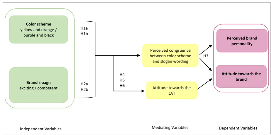
2.9 Research Model
Figure 2: Conceptualization of Research Design
3. Method
3.1 Research Design
The aim of the study is to answer the main question of the relative influence of the CVI elements color scheme and brand slogan on the brand attitude and brand personality. The study results are furthermore used to determine if the strategic intentions set in the rebranding process of hansa match the brand’s image caused by the changed CVI elements. This study was conducted with a 2x2 in between factorial design as an online experiment, therefore the data was collected through the quantitative method with an online questionnaire. The study examines the effects of the independent variables color scheme: bright (yellow and orange) vs dark (purple and black), and brand slogan: exciting vs. competent on two dependent variables brand attitude and brand personality. The attitude towards the CVI serve as a diator of brand attitude. Also, the congruence of the color scheme and brand slogan is proposed to me-diate the effect of the independent variables on dependent variables. In order to analyze which combi-nation of the independent variables leads to a higher effect on the dependent variables, four different experimental conditions were created, which are illustrated in Table 1.
Table 1: Experimental conditions
3.2 Stimulus Material
Preliminary tests
The first step of the study was to conduct a preliminary test to determine which personality constructs were associated with the color scheme and brand slogan used by the brand hansa. Therefore, the color schemes (dark colors: purple and black and bright colors: yellow and orange) and the brand slogans of
Brand sloagn exciting / competent
Attitude towards the brand Perceived brand
personality Color scheme
yellow and orange / purple and black
H1a H1b
Independent Variables Dependent Variables
Attitude towards the CVI Perceived congruence between color scheme and slogan wording
Mediating Variables H2a
H2b
H3
H4 H5 H6
Condition Color Scheme Slogan Wording Number of participants
1 Bright Exciting 34
2 Bright Competent 29
3 Dark Exciting 32
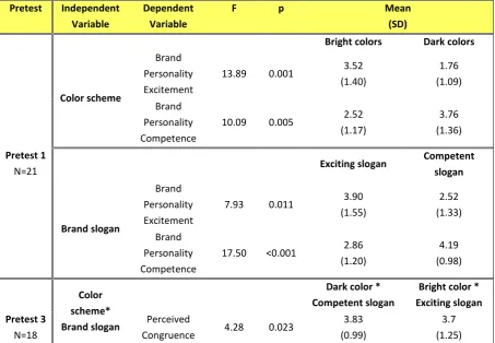
[image:16.595.72.537.557.686.2]hansa (exciting and competent) were presented as isolated factors to a group of recipients and they were asked to indicate which personality characteristics form the brand personality scale of Aaker (1997) they would choose to describe the presented stimulus. In total, 21 participants took part in the test. The anal-ysis of the results showed, that the bright color scheme and the brand slogan including exciting attributes were both connected to the personality dimension of excitement. Whereas the dark color scheme and the slogan including competent attributes were associated with competence, as proposed in the theoret-ical framework.
Additionally, a second preliminary test was conducted to moreover examine the interaction of elements and thus to test which of combinations of color scheme and slogan were perceived as most congruent or rather incongruent. For this reason, four representative advertisings with all possible combinations of the color schemes (bright vs dark) and brand slogans (exciting vs competent) as stimulus material were created. These conditions were presented to participants and they were asked to indicate on three 5-point semantic differential scales the perceived congruence of color and slogan. In total 23 subjects partici-pated, but the analysis of the collected data did not show that the participants perceived the congruence of the independent variables within the stimulus material of the four experimental conditions as signif-icantly different (p > 0.05).
[image:17.595.72.526.465.779.2]Therefore, the stimulus material was adjusted, and a third preliminary test, examining the congruence of the manipulated elements, was performed. Overall 23 participants took part in the third test, but only 18 of the response were without missing data. It was found, as proposed in the theoretical framework, that the combination of the dark color scheme and the competent brand slogan is the most congruent condition (M= 3.83, SD= 0.99), and the combination of bright color and exciting slogan the second most congruent combination (M= 3.7, SD= 1.25). The difference between all four conditions was significant (F(3,17)= 4.28, p= 0.023), therefore the created material could be applied in the main study.
Table 2: Overview preliminary test with groups’ means and standard deviation
Pretest Independent Variable
Dependent Variable
F p Mean
(SD)
Bright colors Dark colors
Pretest 1 N=21 Color scheme Brand Personality Excitement
13.89 0.001 3.52 (1.40) 1.76 (1.09) Brand Personality Competence
10.09 0.005 2.52 (1.17)
3.76 (1.36)
Exciting slogan Competent slogan
Brand slogan
Brand Personality Excitement
7.93 0.011 3.90 (1.55) 2.52 (1.33) Brand Personality Competence
17.50 <0.001 2.86 (1.20) 4.19 (0.98) Color scheme* Brand slogan
Dark color * Competent slogan
Bright color * Exciting slogan Pretest 3
N=18
Perceived
Congruence 4.28 0.023
3.83 (0.99)
Main study
Thus, the stimulus material in the main questionnaire of the study comprised of a representative adver-tising with informational content about the brand hansa in each of the four conditions. The used back-ground color was manipulated (bright (yellow & orange) vs dark (purple & black)) as well as the brand slogan (exciting vs competent). The four representative advertisements used as stimulus material are displayed below.
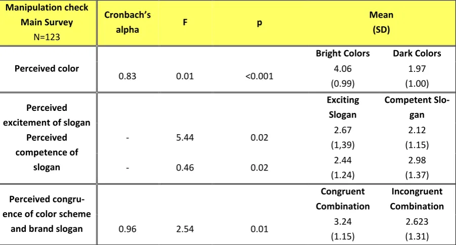
Manipulation check
[image:18.595.301.448.164.379.2]At the end of the main questionnaire with a final sample of N= 123 participants, three manipulation checks were conducted in order to estimate if the independent variable were successfully manipulated.
Figure 5: Dark color scheme - Exciting slogan stimulus material
Figure 6: Dark color scheme - Competent slogan stimulus material
[image:18.595.107.258.168.378.2]Figure 3: Bright color scheme - Competent slogan stimulus material
[image:18.595.110.257.419.632.2] [image:18.595.301.450.421.632.2]The first manipulation check for the perceived colors of the shown advertisement consisted of one ques-tion with the two scale items “The advertisement contained bright colors.” and “The advertisement con-tained dark colors.”, which were measured on a 5-point Likert-scale (1= I strongly disagree, 5= I strongly agree). The scale was found to be reliable (α= .83) and the results of a t-test showed a significant differ-ence (F(1,121)= 0.01, p= <0.001) between the dark and bright color scheme (Mbright colors=4.06, SD=0.99,
Mdark colors=1.97, SD=1.00).
The second manipulation check concerned the perceived character of the brand slogan and consisted of the two single items “The advertisement contained an exciting brand slogan.” and “The advertisement contained a competent brand slogan.”, which also were both measured on a 5-point Likert-scale (1= I strongly disagree, 5= I strongly agree). The results of two t-tests showed that a significantly (F(1,121)= 5.44, p <0.05) higher mean for the first item was reached for the exciting slogan manipulation (Mexciting slogan= 2,67, SD=1,39, Mcompetent slogan=2.12, SD=1.15). Also, the competent slogan reached a significantly
(F(1,121)= 0.46, p<0.05) higher score for the manipulation check of the competent slogan (Mcompetent slogan=2.98, SD=1.37, Mexciting slogan= 2,44, SD=1,24). Thus, both slogans were clearly distinguishable.
The third and final manipulation check was used to measure the perceived congruence of the independ-ent variables on a 5-point semantic differindepend-ential scale adapted from Rifon, Choi, Trimble, and Li (2004 as cited in Bruner, 2012) with three scale items, amongst which “not compatible/compatible” and “not a good fit/good fit”. The scale was found to be reliable (α= .963) and the results showed a significant difference (F(1,121)= 2.54, p<0.05) between the proposed congruent and incongruent experimental con-ditions (Mcongruent combination=3.24, SD=1.15, Mincongruent combination=2.62, SD=1.31, p<0.05). Overall the
[image:19.595.74.525.439.681.2]in-dependent variables were successfully manipulated.
Table 3: Overview manipulation check main survey with groups’ means and standard deviation
Manipulation check Main Survey
N=123
Cronbach’s
alpha F p
Mean (SD)
Perceived color
Bright Colors Dark Colors
0.83 0.01 <0.001 4.06
(0.99)
1.97 (1.00)
Perceived excitement of slogan
Perceived competence of slogan Exciting Slogan Competent Slo-gan
- 5.44 0.02 2.67
(1,39)
2.12 (1.15)
- 0.46 0.02 2.44
(1.24)
2.98 (1.37)
Perceived congru-ence of color scheme
and brand slogan
Congruent Combination
Incongruent Combination
0.96 2.54 0.01 3.24
(1.15)
2.623 (1.31)
3.3 Measures
3.3.1 Brand personality
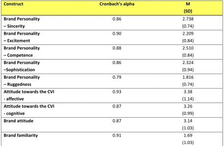
and has broadly been validated in a variety of cultures and contexts, hence it is the standard measure of a brand’s personality (Aaker, 1997; Baja & Bond, 2017; Labrecque & Milne, 2012). The scale is based on five human character traits namely sincerity, excitement, competence, sophistication and ruggedness and consists of 42 items, which together describe those five characteristics (see Appendix 1). In this study, a 5-point Likert scale (1= not at all descriptive of the material, 5= extremely descriptive of the material) is used to measure all 42 items, which include amongst others honest, exciting, reliable or successful, as well as the five superordinate dimensions. The full list of items can be found in the ques-tionnaire (Appendix 3). The scale was found to be reliable with high alpha values ranging from 0.79 to 0.90 for all personality dimensions (see Table 5).
3.3.2 Attitude towards the CVI
The attitude towards the CVI as the mediating variable of this study was measured on a scale adapted from Hirschman (1986 as cited in Kim & Lennon, 2008 p. 159). The affective component was measured with the items attractiveness and likeability, whereas the cognitive aspect was measured through the items perceived amount of information obtained through the stimulus material and the perceived use-fulness of the information. All items were measured on a 5-point Likert scale (1= I strongly disagree, 5= I strongly agree). An analysis showed the internal reliability of the scale with high alpha values for the affective (α= 0.93) and cognitive components (α= 0.87), which is depictured in Table 5 below.
3.3.3 Brand attitude
The scale used to measure the attitude towards the brand featured in the stimulus material was adapted from the study of Lee and Mason (1999, as cited in Bruner, 2012) and applied a 5-point Likert-scale (1= I strongly disagree, 5= I strongly agree). The four items of the scale included “I react favorably to the brand.” and “I dislike the brand.” These statements have been commonly used in earlier studies to meas-ure attitude towards brands in advertisements (Bruner, 2012), and were adjusted to match this study’s context, by excluding one unsuitable statement referring to the fulfillment of the advertising claim. The scale was found to be reliable (α= 0.87), which is presented in Table 5.
3.3.4 Brand familiarity as covariate
Table 4: Constructs - reliability scores, mean scores, and standard deviations values
3.4 Participants
Because the concepts proposed in the theoretical framework (color emotion connection and slogan at-tributes) are general concepts and not limited to a certain target group, the target group of the research was not solely focused on students or a specific age group. Since also the target group of the brand hansa is diverse and not limited to certain demographics, the aim was to get a sample as diverse as possible concerning the demographics.
In total 190 subjects participated in the research and after deleting 67 invalid responses the final sample of the research is N= 123. The reason for deleting these responses was the fact that 63 responses were incomplete, and four recipients were affected by colorblindness and therefore were excluded from fur-ther participating in the study. The remaining sample consisted of 80 female (65%) and 43 male (35%) participants. The average age of the respondents was M= 29.84 (SD= 12.26), ranging from 18 years to a maximum of 66 years. The majority of the recipients had either completed a secondary or undergrad-uate education (37% each). Because the original language used in the brand material of hansa is German, the survey was conducted in the German language, but in order to reach a significant sample size, addi-tionally an English version was developed. In total 59 recipients (48%) performed the study in German and 64 of the recipients (52%) filled in the English version of the questionnaire. Table 4 below shows an overview of all demographic information.
Construct Cronbach’s alpha M (SD) Brand Personality
– Sincerity
0.86 2.738
(0.74)
Brand Personality
– Excitement
0.90 2.209
(0.84)
Brand Personality
– Competence
0.88 2.510
(0.84)
Brand Personality
–Sophistication
0.86 2.324
(0.94)
Brand Personality
– Ruggedness
0.79 1.816
(0.74)
Attitude towards the CVI - affective
0.93 3.38
(1.14)
Attitude towards the CVI - cognitive
0.87 3.26
(0.99)
Brand attitude 0.87 3.14
(1.03)
Brand familiarity 0.91 1.69 (1.03)
3.4.1 Homogeneity between Conditions
In order to determine whether the sample characteristics were homogenously distributed over all exper-imental condition groups, ANOVA and Chi-square tests were conducted. The results showed, that the age of the recipients did not differ significantly (α > 0.05) between the experimental conditions (F (2,119)= 0.836, p= 0.477). The Chi-square test stated (Χ2(4)>= 1.939, p= 0.585) that the amount of
female and male study participants is distributed evenly over all experimental conditions. Furthermore, regarding the educational level of the participants, the Chi-square statistic was Χ2(4)>= 10.054, p=
0.611, which lies above the significance level of 0.05 and hence the educational level of the participants is also distributed equally through all experimental conditions. Also, the nationalities of the participants are distributed equally through the experimental conditions as the Chi-square test stated Χ2(4)>=
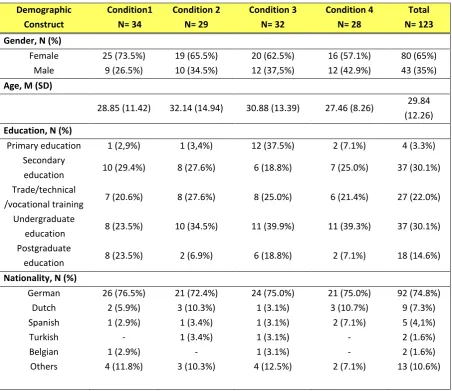
[image:22.595.73.526.265.656.2]1.939.804, p= 0.963. Table 5: Demographic information
Demographic Construct Condition1 N= 34 Condition 2 N= 29 Condition 3 N= 32 Condition 4 N= 28 Total N= 123 Gender, N (%)
Female 25 (73.5%) 19 (65.5%) 20 (62.5%) 16 (57.1%) 80 (65%) Male 9 (26.5%) 10 (34.5%) 12 (37,5%) 12 (42.9%) 43 (35%)
Age, M (SD)
28.85 (11.42) 32.14 (14.94) 30.88 (13.39) 27.46 (8.26) 29.84 (12.26)
Education, N (%)
Primary education 1 (2,9%) 1 (3,4%) 12 (37.5%) 2 (7.1%) 4 (3.3%) Secondary
education 10 (29.4%) 8 (27.6%) 6 (18.8%) 7 (25.0%) 37 (30.1%) Trade/technical
/vocational training 7 (20.6%) 8 (27.6%) 8 (25.0%) 6 (21.4%) 27 (22.0%) Undergraduate
education 8 (23.5%) 10 (34.5%) 11 (39.9%) 11 (39.3%) 37 (30.1%) Postgraduate
education 8 (23.5%) 2 (6.9%) 6 (18.8%) 2 (7.1%) 18 (14.6%)
Nationality, N (%)
German 26 (76.5%) 21 (72.4%) 24 (75.0%) 21 (75.0%) 92 (74.8%) Dutch 2 (5.9%) 3 (10.3%) 1 (3.1%) 3 (10.7%) 9 (7.3%) Spanish 1 (2.9%) 1 (3.4%) 1 (3.1%) 2 (7.1%) 5 (4,1%)
Turkish - 1 (3.4%) 1 (3.1%) - 2 (1.6%)
Belgian 1 (2.9%) - 1 (3.1%) - 2 (1.6%)
Others 4 (11.8%) 3 (10.3%) 4 (12.5%) 2 (7.1%) 13 (10.6%)
3.5 Procedure
questionnaire was administrated through the Qualtrics software and participants were randomly assigned to one of the four experimental conditions.
The beginning of the questionnaire introduced the participants to the topic, the purpose of the study, informed about the anonymity of the results and provided the e-mail of the researcher for further infor-mation or questions. After that, the participants gave their consent to participate and they were asked to answer questions about their demographics including gender, age, highest graduated level of education. A crucial control factor for this study is the ability of participants to differentiate colors because the relative influence of color schemes in the CVI is investigated. Therefore, the color-blindness of the participants was measured with a yes or no question. If the participants did not fulfill this requirement, they were forwarded to the end of the questionnaire.
After completing this part, the participants were randomly assigned to one of the four conditions and were presented with the respective advertisement of the condition. After that, they were asked to answer the questions illustrated in the next paragraph, which were the same for each condition.
Following the presentation of the stimulus material, the participants where requested to rate the descrip-tiveness of personality traits regarding the shown advertising on two 5-point Likert-scales. The next two questions requested the participants to indicate their attitude towards the advertising shown and the brand described in it on a 5-point Likert-scale. And furthermore, there was one question requesting the participants to indicate their familiarity with this brand on a 5-point semantic differential scale. The scales used to measure these variables are outlined below (see 3.5 Measures).
4. Results
In the following paragraphs, the results of this study are presented. The Software SPSS 25 was used to conduct various statistical tests in order to test the hypotheses formulated in the theoretical framework and to determine significant effects and interaction effects of the independent variables on the dependent variables of this study. To examine the main and interaction effects a multivariate analysis of variance (MANOVA) was performed to determine which effects were significant. To examine the differences in means between the types of color schemes and slogans on the dependent variables analyses of variance (ANOVA) with the Bonferroni tests were conducted. In the following sections, a detailed overview of the results is given.
4.1 Main and Interaction effects
4.1.1 Brand Personality
H1 and H1b: Color scheme
To determine the main effect of the independent variable color scheme on the dependent variable brand personality, a multivariate analysis of variance (MANOVA) was performed. The results showed a sig-nificant effect of the color schemes on the brand personality dimension of sincerity (F(1,122) = 5.05, p = 0.03), the brand personality dimension of competence(F(1,122) = 5.99, p = 0.02), and the brand per-sonality dimension of sophistication (F(1,122) = 9.08, p = 0.003) (see Table 6). However, the main effect of color schemes on the brand personality dimension of excitement (F(1,122)=2.26, p=0.14) and the brand personality dimension of ruggedness (F(1,122)=0.26, p=0.61), were not significant. Therefore, Hypothesis H1a about the influence of color on the brand personality dimension of excitement needs to be rejected.
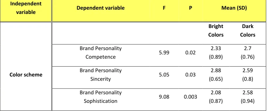
[image:24.595.71.528.492.682.2]Furthermore, in order to establish whether the dark color scheme had a more positive effect on the brand personality dimension of competence, as proposed in Hypothesis 1b, the means for both color schemes were compared through a univariate analysis of variance, the outcomes of are displayed in Table 6. Table 6: MANOVA main effects on brand personality with groups' means (1= not at all descriptive, 5= extremely descriptive) and standard deviation
The results showed a bigger influence of the dark color scheme on the brand personality dimension of competence compared to the bright color scheme (Mdark colors = 2.7, SD = 0.76; Mbright colors = 2.33, SD =
0.89). Therefore, the results positively confirm H1b.
Beyond that, the results of the ANOVA also revealed a bigger influence of the bright color scheme on the brand personality dimension of sincerity (Mbright colors = 2.88, SD = 0.65; Mdark colors = 2.59, SD = 0.8;),
Independent
variable Dependent variable F P Mean (SD) Bright Colors Dark Colors Color scheme Brand Personality
Competence 5.99 0.02
2.33 (0.89)
2.7 (0.76)
Brand Personality
Sincerity 5.05 0.03
2.88 (0.65)
2.59 (0.8)
Brand Personality
Sophistication 9.08 0.003
2.08 (0.87)
and a bigger effect of the dark color scheme on the brand personality dimension of sophistication (Mdark colors = 2.58, SD = 0.94; Mbright colors = 2.08, SD = 0.87).
H2a and H2b: Brand Slogan
An additional ANOVA was conducted in order to determine the effect of the independent variable brand slogan on the dependent variable brand personality. The results of this test did not show a significant effect of the brand slogan on any of the brand personality dimensions (p > 0.05) (see Appendix 5). This leads to the rejection of hypothesis H2a and H2b.
Congruence of color scheme and brand slogan
An ANOVA analysis showed that there is no significant interaction effect between the color scheme and brand slogan on the brand personality dimensions (see Appendix 6).
4.1.2 Brand attitude
RQ1: Color scheme
In order to identify the effect of the color scheme on the dependent variable brand attitude, an ANOVA was performed. The test showed no significant effect of any of the color schemes (bright and dark) on the attitude towards the brand (F(1,121)= 0.183, p= 0.669> 0.05) (see Appendix 7).
RQ2: Brand slogan
Another ANOVA analysis showed that also the main effect of the brand slogan on the brand attitude is not significant (F(1,121)= 0.403, p= 0.557 > 0.05) (see Appendix 7).
Congruence of color scheme and brand slogan
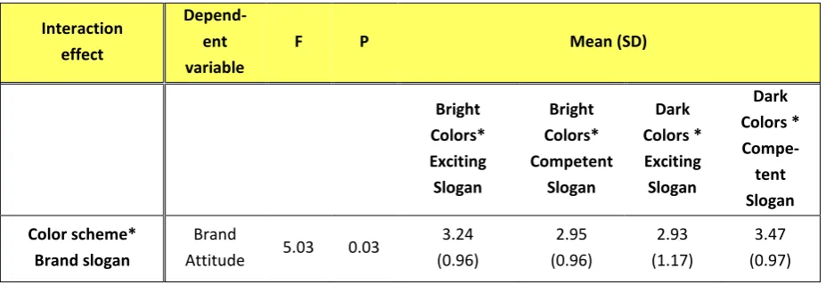
[image:25.595.71.535.481.641.2]A significant interaction effect, that is shown through an ANOVA is the interaction effect between the color scheme and brand slogan on the brand attitude (F(1,122)= 5.03, p= 0.03). Table 7 shows the results of this analysis and the interaction is furthermore visualized in Figure 3.
Table 7: MANOVA with interaction effects on brand attitude
Interaction effect
Depend-ent variable
F P Mean (SD)
Bright Colors* Exciting Slogan Bright Colors* Competent Slogan Dark Colors * Exciting Slogan Dark Colors * Compe-tent Slogan Color scheme* Brand slogan Brand
Attitude 5.03 0.03
The results show higher effects on the brand attitude when a bright color scheme is combined with an exciting slogan (M = 3.24, SD= 0.96), and when a dark color scheme is combined with a competent slogan (M = 3.47, SD= 0.97). In terms of the research hypothesis, with consideration of the non-signif-icant interaction effect on the brand personality, these results confirm H3a.
4.2 Mediating effects
For determining the mediation effects in this study, the program SPSS with the additional feature the program Process written by Andrew F. Hayes (2012) was used, which allows running all analyses needed to determine a significant mediation effect in one command. According to Baron and Kenny (1986), a variable functioning as a significant mediator needs to fulfill four criteria. The first criterion is the significant relationship between the independent variable and the mediating variable. Secondly, the relationship between the mediating variable and the dependent variable should also be significant. Fur-thermore, the relationship between the independent and the dependent variable should be significant and also improved when proceeding through the mediating variable. Also, the relationship between the in-dependent and the in-dependent variable should not be significant anymore when the mediator is introduced (Baron & Kenny, 1986). Furthermore, there is a distinction made between a single dominant (full) me-diation, when the value of the effect of the independent variable on the dependent variable is equivalent to zero, and multiple mediating factors (partial mediation), when this effect is not equivalent to zero but smaller in comparison to the effect of the independent variable on the dependent variable excluding the mediator (Baron & Kenny, 1986). Following these steps, an analysis was conducted in Process to deter-mine the presence of significant mediating effects.
4.2.1 Perceived congruence of color scheme and brand slogan
[image:26.595.76.372.73.283.2]The first mediation effect that was examined, is the effect of the independent variables color scheme and brand slogan on the dependent variable brand attitude mediated by the perceived congruence of the independent variables. Taken all steps of the analysis into account (see Appendix 8), the results reveal that the effects of the independent variables color scheme and brand slogan on both dependent variables brand attitude and brand personality are not significantly mediated by the perceived congruence of the independent variables, which leads to the rejection of the hypothesis 3b.
4.2.2 Attitude towards CVI
Second, the effect of the independent variables on the dependent variable brand attitude mediated by the attitude towards the CVI was examined. After conducting the mediation analysis (Appendix 9), the re-sults revealed that the effect of the brand slogan on brand attitude is not significantly mediated through the attitude towards the CVI. This leads to the rejection of hypothesis 4.
Interestingly, the third step of the analysis showed a significant effect of attitude towards the CVI on brand attitude (F(2,120) = 119.23, p < 0.001, R2 = 0.67, b = 0.90, t(120) = 15.40, p < 0.001).
Because of the missing mediating effect and in order to determine the effect of the independent variables on the attitude towards the CVI, the variable was treated as dependent variable and a MANOVA was conducted.
The results showed a significant effect of the color scheme on the affective attitude construct (F(1,122) = 4.13, p = 0.04), which confirms Hypothesis 5. But, as the MANOVA did not reveal a significant effect of the independent variable brand slogan on the cognitive construct of attitude towards the CVI (F(1,12) = 1.09, p = 0.3), the hypothesis 6 was rejected.
[image:27.595.77.454.383.582.2]Furthermore, the results of the MANOVA showed a significant interaction effect of color scheme and brand slogan (F(1,122)= 13.79, p < 0.001) on the attitude towards the CVI. The analysis revealed, that the combination of the competent brand slogan with a dark color scheme (proposed congruent combi-nation) had the most positive effect on the attitude towards the CVI (M= 3.85, SD= 0.83).
Figure 8: Profile Plot of the interaction effect between color scheme and brand slogan on Attitude towards the CVI
4.3 Brand familiarity as covariate
In order to determine whether brand familiarity functions as a covariate in this study an analysis of covariance (ANCOVA) was performed. The results show no significant effect of either color (F(1,123)=0.202, p= 0.65, partial η2 = 0.002) or brand slogan F(1,123)=0.34, p= 0.56, partial η2 = 0.003)
on the outcome variable brand attitude whilst controlling for the effect of a high brand familiarity.
4.4 Hypotheses and research model
Table 8: Overview of tested hypotheses
Hypothesis Result
H1
H1a: A bright (yellow and orange) color scheme in the CVI will have a more pos-itive influence on the perceived brand’s personality aspect of excitement as op-posed to the dark (purple and black) color scheme.
Rejected
H1b: A dark (purple and black) color scheme in the CVI will have a positive influ-ence on the perceived brand’s personality aspect of competinflu-ence as opposed to the bright (yellow and orange) color scheme.
Confirmed
H2
H2a: A brand slogan implementing exciting attributes positively influence the per-ception of the corresponding brand personality dimension excitement.
Rejected
Hypothesis 2b: A brand slogan implementing competent attributes positively influ-ence the perception the of corresponding brand personality dimension competinflu-ence.
Rejected
H3
H3a: A congruent combination of brand slogan meaning, and the intrinsic meaning of the used color scheme will have a more positive effect on a favorable attitude towards the brand, as opposed to an incongruent combination of brand slogan and used color scheme.
Confirmed
H3b: The effect of color scheme and brand slogan on the brand attitude and brand personality is mediated by the congruence of the elements.
Rejected
H4 The influence of the brand slogan and the color scheme on the brand attitude is
mediated by the attitude towards the CVI.
Rejected
H5 The visual CVI element (color), as opposed to the verbal element (brand slogan),
cause the activation of the affective attitude construct towards the CVI.
Confirmed
H6 The verbal CVI element (brand slogan), as opposed to the visual, causes the
acti-vation of the cognitive attitude construct towards the CVI.
Rejected
Figure 9: Research model with significant effects
Main effects (in blue) - H1b: p < 0.05; H6: p < 0.05, Effect of attitude towards CVI on brand attitude: p < 0.001
Interaction effects (in red) - H3a: p < 0.05; Interaction effect on attitude towards the CVI: p < 0.001
Brand slogan
exciting / competent
Perceived brand personality Color scheme
yellow and orange / purple and black
Independent Variables Dependent Variables
Attitude towards the CVI - overall Attitude towards the
CVI - affective
H3a
H1b
Attitude towards the brand