ISSN Print: 2327-5219
DOI: 10.4236/jcc.2018.611027 Nov. 28, 2018 299 Journal of Computer and Communications
Medical Data Visualization Analysis and
Processing Based on Machine Learning
Tong Wang, Lei Zhao, Yanfeng Cao, Zhijian Qu, Panjing Li
*School of Computer Science and Technology, Shandong University of Technology, Zibo, China
Abstract
Trying to provide a medical data visualization analysis tool, the machine learning methods are introduced to classify the malignant neoplasm of lung within the medical database MIMIC-III (Medical Information Mart for In-tensive Care III, USA). The K-Nearest Neighbor (KNN), Support Vector Machine (SVM) and Random Forest (RF) are selected as the predictive tool. Based on the experimental result, the machine learning predictive tools are integrated into the medical data visualization analysis platform. The platform software can provide a flexible medical data visualization analysis tool for the doctors. The related practice indicates that visualization analysis result can be generated based on simple steps for the doctors to do some research work on the data accumulated in hospital, even they have not taken special data analy-sis training.
Keywords
Data Visualization Analysis, Machine Learning, KNN, SVM, RF
1. Introduction
Medical data mainly include clinical trial data, biomedical data, electronic med-ical records and diagnosis books, and individual health information [1]. The da-ta type varies from image, text to numbers. The huge volume makes the doctors to be drowning in medical data accumulated in hospital but starved of informa-tion. Sometimes the doctors maybe want to reveal the rule behind the data; for instance, if a special disease is related to sex, age, residence region, or other things, and why. The medical data visualization analysis and processing can pro-vide an intuitional graphical tool, and more and more methods are developed in past decades. For instance, in 2014, Akilah L. [2] organized hierarchical data
*Corresponding author. How to cite this paper: Wang, T., Zhao,
L., Cao, Y.F., Qu, Z.J. and Li, P.J. (2018) Medical Data Visualization Analysis and Processing Based on Machine Learning. Journal of Computer and Communications, 6, 299-310.
https://doi.org/10.4236/jcc.2018.611027
Received: October 15, 2018 Accepted: November 25, 2018 Published: November 28, 2018
Copyright © 2018 by authors and Scientific Research Publishing Inc. This work is licensed under the Creative Commons Attribution International License (CC BY 4.0).
DOI:10.4236/jcc.2018.611027 300 Journal of Computer and Communications structures by using treemaps to examine large amounts of data in one overall view, which served as a proof that treemaps could be beneficial in assessing sur-gical data retrospectively by allowing surgeons and healthcare administrators to make quick visual judgments. In 2015, Gilbert Chien Liu [3] provided health services researchers a visualization tool to construct logic models for clinical de-cision support within an electronic health record. The mapping relationships could be acquired based on software for social network analysis: NodeXL and CMAP. Seonah Lee [4] developed time-oriented visualization for problems and outcomes and Matrix visualization for problems and interventions by using PHN-generated Omaha System data to help PHNs consume data and plan care at the point of care. In 2016, Shahid Mahmud [5] presented a data analytics and visualization framework for health-shocks prediction based on large-scale health informatics dataset based on fuzzy rule summarization, which can provide in-terpretable linguistic rules to explain the causal factors affecting health-shocks. Usman Iqbal [6] put forward an animated visualization tool called as Cancer Associations Map Animation (CAMA), which can depict the association of 9 major cancers with other disease over time based on 782 million outpatient data in health insurance database. Dror G. Feitelson [7] introduced multilevel spie chart to create a visualized combination of cancer incidence and mortality statis-tics. In 2017, Fleur Mougin [8] reviewed the current methods and techniques dedicated to information visualization and their current use in software devel-opment related to omics or/and clinical data. It can be seen from the past re-search on medical visualization that related rere-search progress has been made on the processing of medical big data, visualization of electronic health records and correlation analysis of disease characteristics. But the research on medical data visualization analyzed by fusion algorithm is still to be explored. Under the background of this study, this paper put forward general-purpose medical data visualization analysis tool within R and the machine learning methods, which are taken as predict tool.
2. Machine Learning Classification Algorithms
Sometimes the special type medical data need to be classified into clusters, then we can try to find the relationship between the cluster and disease. The cluster analysis is an important method as the data visualization analysis. So, the typical machine learning methods KNN, Support Vector Machine and Random Forest are selected as predict tool for the data classification.
2.1. K-Nearest Neighbor
K-Nearest Neighbor (KNN) [9] [10] is a typical supervised machine learning method. KNN is a non-parametric method used for classification, where the output is a class membership. The objects are classified by a majority vote of its neighbors, with the objects being allocated to the class most common among the
DOI: 10.4236/jcc.2018.611027 301 Journal of Computer and Communications to this category, and the samples contain the same attributions in this category. KNN algorithm only depends on the category of the nearest sample or several samples to determine the categories to be classified. The selected neighbors are objects that have been correctly classified. The distance is used as a non-similarity index for the objects, try to address the problem of matching be-tween objects. The commonly used distance is Euclidean distance (1) or Man-hattan distance (2).
( )
(
)
21
, nk k k
d x y =
∑
= x −y (1)( )
, nk 1 k kd x y =
∑
= x −y (2)KNN makes decisions based on the dominant categories of k objects, rather than a single object category. The KNN algorithm could be describes as:
Step 1: Calculate the distance between the test data and each training data; Step 2: Sort the distance according to the increasing relation;
Step 3: Select K points with the nearest distance;
Step 4: Determine the occurrence frequency of the category of the first K
points;
Step 5: Return the category with the highest frequency in the K points as the prediction classification of test data.
2.2. Support Vector Machines
Support Vector Machines (SVM) [11] [12] [13] [14] is a supervised learning model proposed by Corinna Cortes and Vapnik in 1995. In SVM classification algorithm, given a set of training sample
(
) (
)
(
)
{
1, 1 , 2, 2 , , m, m}
, i{
1, 1}
D= x y x y x y y ∈ − + , based on the training set D, a hyperplane founded in the sample space could be taken as the mark of the sam-ple belonging to one or the other of two categories. For the medical data, there exists two possible situations: linear separable data condition and non-linear se-parable data condition. If the data is linearly sese-parable, this Equation (3) is used in the n-dimensional space to find a set of weights (4) that specify two hyper-planes.
0
w x b ⋅ + = (3) 1
1
w x b w x b
⋅ + ≥ +
⋅ + ≤ −
(4)
The distance between two planes is w2 , where w stands for Euclidean
norm. Such task situations are expressed as a set of constraints (5). When the data is non-linear and separable, the constraint condition of the task case is (6).
(
)
2 1
min ,making 1
2 w y w x bi ⋅ −i ≥ ∀xi
(5)
(
)
2
1 1
min , making 1 , 0
2
n
i i i i i i
i
DOI:10.4236/jcc.2018.611027 302 Journal of Computer and Communications When dealing with vector xi, it can map to high-dimensional space through the kernel function. Kernel function which used commonly has linear kernel (7), polynomial kernel (8), sigmoid kernel (9), Gaussian RBF kernel (10), etc.
( )
i, j i jK x x = ⋅ x x (7)
( ) (
i, j i j 1)
dK x x = x x ⋅ + (8)
( )
i, j tanh(
i j)
K x x = k x x ⋅ −
δ
(9)( )
2
2
2
, e
i j
x x
i j
K x x σ
− −
=
(10)
2.3. Random Forest
Random Forest (RF) [15] is a combinatorial classifier algorithm, which is a classifier composed of multiple Decision Tree [16]
{
h x(
,θi)
,i=1,2, , k}
,where
{ }
θi is an independent and identically distributed random vector, and the final class label of input vector x is determined by all decision trees. The growth of each decision tree depends on an independent identically distri-buted random vector. The overall generalization error depends on the classi-fication ability of a single decision tree in the forest and the correlation degree between each tree. The algorithm consists of two parts: the growing process of the decision tree and the voting process. The random forest generates mul-tiple decision tree classifiers by bagging and bootstrap.3. Data Processing
Considering that the medical data varies from values to image, the original data may need to be pre-processed before the visualization analysis.
3.1. Data Sources
MIMIC-III (Medical Information Mart for Intensive Care III) is a large, free-ly-available database comprising identified health-related data associated with over forty thousand patients who stayed in critical care units of the Beth Israel Deaconess Medical Center between 2001 and 2012. The public MIMIC-III Crit-ical Care Database could be download from
DOI: 10.4236/jcc.2018.611027 303 Journal of Computer and Communications CO2, Chloride, Creatinine, Glucose, Hematocrit, Hemoglobin, Magnesium,
MCH, MCHC, MCV, pCO2, pH, Phosphate, Platelet Count, pO2, Potassium,
RDW, Red Blood Cells, Sodium, Urea Nitrogen, White Blood Cells.
3.2. Data Filling
In medical database, some values may be not available. Therefore, in most cases, the database is incomplete. The methods to deal with incomplete data sets mainly include [17]: 1) delete tuples, which is used to delete objects (tuples, records) with missing information attribute values; 2) data complement, which is used to fill the null value with a certain value to complete the data table. In general, a null value is filled according to the distribution of values of other ob-jects in the data table based on the principle of statistics. Common methods in-clude k-means clustering, Regression, etc.; 3) without processing. In some cases,
null values have little impact on the study, or the data analysis method adopted can automatically process the null values, in this case no additional operations are required.
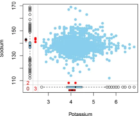
For the missing value in the medical database, we can use box chart as a miss-ing data analysis tool. For instance, by callmiss-ing the summary function in R, as shown in Figure 1 the box plot can give a missing data summary of the proper-ties of Sodium and Potassium. Considering various factors, filled the data in MIMIC-III by means of regression assignment. Given dataset
(
) (
)
(
)
{
1, 1 , 2, 2 , , m, m}
D= x y x y x y , where xi=
(
x xi1; ; ;i2 xid)
, yi∈R. Try to get a linear model to predict real value output tags as accurately as possible. We can construct a model as (11).( )
Ti i
[image:5.595.263.487.517.703.2]f x =w x b+ , making f
( )
xi yi (11) This is multivariate linear regression. The least square method is used to esti-mate w and b, and w and b are absorbed into the vector form wˆ =(
w b;)
. The data set D is represented as a matrix X of m d×(
+1)
size, as follows (12).DOI:10.4236/jcc.2018.611027 304 Journal of Computer and Communications
T
11 12 1 1
T
21 22 2 2
T 1 2 1 1 1 1 1 1 d d
m m md m
x x x
x x x
x x x
= = … x x X x
(12)
Given y=
(
y y1; ; ;2 ym)
,(
) (
)
T
ˆ = − ˆ − ˆ
w
E y Xw y Xw , and take the derivative
with respect to wˆ and we can get (13).
(
)
T
ˆ 2 ˆ
ˆ ∂
= −
∂ w
E X Xw y
w (13)
If X XT is positive definite matrix, the derivative is zero, and
(
)
1* T T
ˆ = −
w X X X y. If X XT is not positive definite matrix, the regularization
term is introduced.
4. Data Visualization Analysis and Processing Platform
Taken from MIMIC-III, 5000 records of the malignant neoplasm of lung are in-troduced as sample data. 4250 (85%) records are taken as training set, and 750 (15%) records are taken as test set. Within the training data set, 1275 patients have been diagnosed as lung tumor, up to 30%, and 2975 patients have not been infected, total to 70%. Among the test set, there were 225 (30%) lung tumor pa-tients, and 525 (70%) non-disease patients. Taking KNN, SVM and RF as classi-fication tool separately, the influence factor can be classified, and the prediction model can be extracted.At first, take KNN as extractor, and calculate the distance of features, which needs to convert the nominal features involved in the data set into a numerical format. Take dummy variable encoding method (14).
1 if gender 0 if x M x F = = =
(14)
Try to reduce the dependence of KNN on the measurement scale of the input features, the min-max standardized data is adopted, the classification results are shown in Table 1, where amount is the total number of the classified data, cate-gory A represents malignant neoplasm of lung, catecate-gory B represents non-tumors, and the classification rate means the accuracy of classifier, referring to the proportion of items correctly classified by classifier in all classified items. Then take SVM as extractor, the classification results are shown as in Table 2.
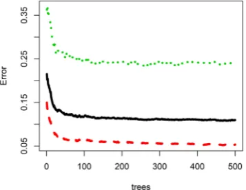
DOI: 10.4236/jcc.2018.611027 305 Journal of Computer and Communications flattens. We can set ntree’s value as 100. The final classification results are shown as in Table 3.
Sensitivity means the rate that the suffering samples detected take up all the suffering samples. Specificity is the rate of the non-suffering samples account for all the non-suffering samples. Comparing classification accuracy from Table 1,
Table 2 and Table 3, the KNN’s sensitivity is slightly higher than the SVM, the specificity of the SVM is far higher than the KNN, and RF is significantly higher than the former two kinds of algorithm. As shown in Table 4, taking the 750 records of test set, the correct rate can up to 99%.
As shown in Figure 4, RF has higher performance than KNN and SVM based on the obfuscation matrix, Kappa and other relevant performance eval-uation indexes, where the horizontal axis represents different performance evaluation indexes (There are 11 performance indicators involved, including Accuracy, No Information Rate, Kappa, Sensitivity, Specificity, Pos Pred Value, Neg Pred Value, Prevalence, Detection Rate, Detection Prevalence, Balanced Accuracy), and the vertical axis represents the evaluation ratio of performance indexes. For the RF, the importance of each characteristic value is measured concerning the decreasing accuracy and decreasing mean square error. As shown in Figure 5, in the horizontal coordinate value is Anion Gap, Base Excess, Bicarbonate, Calcium, Total, Calculated the Total CO2, Chloride,
Crea-tinine, Glucose, Hematocrit, Hemoglobin, Magnesium, MCH, MCHC, MCV, pCO2, pH, Phosphate, Platelet Count, pO2, Potassium, RDW, Red Blood Cells,
Sodium, Urea Nitrogen, White Blood Cells. The vertical axis represents the importance measure of input index, from this chart, it can be seen that pH, Platelet Count, Creatinine, and Calculated Total CO2, pO2 is the most
impor-tant indicators which determined whether patients suffer from the malignant neoplasm of lung, which can help doctors to focus on these indicators when examining patients.
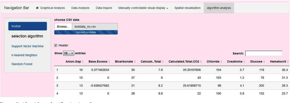
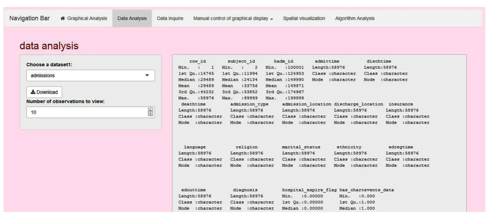
We introduced the machine learning methods is aimed to help medical per-sonnel with diagnosis and treatment of diseases (the disease which selected in our experiment is the malignant neoplasm of lung), and obtain the influence of different characteristics on diseases in the analysis process, as shown in Figure 6. At the same time, on this basis, we can provide prediction tools for the doctors. Try to provide a general-purpose medical data visualization analysis tool, within KNN, SVM and RF, a platform software including data processing, data extrac-tion, data analysis is developed based on R language, image software ImageJ, and database PostgreSQL.
DOI:10.4236/jcc.2018.611027 306 Journal of Computer and Communications
Table 1. Classification results of KNN.
Amount Category Classification rate Number of A Number of B
750 A 0.9905 520 5
[image:8.595.207.540.166.210.2]B 0.5156 109 116
Table 2. Classification results of SVM.
Amount Category Classification rate Number of A Number of B
750 A 0.9695 509 16
[image:8.595.208.539.241.284.2]B 0.8000 45 180
Table 3. Classification results of RF.
Amount Category Classification rate Number of A Number of B
750 A 0.9961 523 2
[image:8.595.203.538.308.706.2]B 0.9911 2 223
Table 4. Comparison of classification performance of three algorithms.
Character KNN SVM RF
Sensitivity 0.9905 0.9695 0.9961
Specificity 0.5156 0.8000 0.9911
[image:8.595.285.464.567.705.2]Accuracy 84.80% 91.87% 99.47%
Figure 2. The choosing of mtry chart.
DOI: 10.4236/jcc.2018.611027 307 Journal of Computer and Communications
[image:9.595.194.403.241.385.2]Figure 4. Performance evaluation indexes of the KNN, SVM and RF.
Figure 5. Histogram of the measure index of the importance of eigenvalues.
Figure 6. The structural framework of data visualization analysis platform.
[image:9.595.127.468.420.514.2] [image:9.595.58.538.545.715.2]DOI:10.4236/jcc.2018.611027 308 Journal of Computer and Communications
Figure 8. Manually control the visualization operation of the data.
Figure 9. Data analysis table.
5. Conclusion
[image:10.595.55.538.284.496.2]DOI: 10.4236/jcc.2018.611027 309 Journal of Computer and Communications MIMIC-III have indicated that the platform can provide a flexible medical data visualization analysis tool for the doctors, no data analysis training required.
Acknowledgements
This work was supported by SDUT & Zibo City Integration Development Project (NO. 2016ZBXC049); A Project of Shandong Province Higher Education Science and Technology Program (NO. J16LN20); Natural Science Foundation of Shandong Province (NO. ZR2016FM18).
Conflicts of Interest
The authors declare no conflicts of interest regarding the publication of this pa-per.
References
[1] Wang, Y. and Ren, S.X. (2017) Overview of Research on Medical Big Data Visuali-zation. Journal of Frontiers of Computer Science, 11, 681-699. (In Chinese) [2] Hugine, A., Guerlain, S. and Turrentine, F. (2014) Visualizing Surgical Quality Data
with Treemaps. Journal of Surgical Research, 191, 74-83.
https://doi.org/10.1016/j.jss.2014.03.046
[3] Liu, G., Odell, J. and Whipple, E. (2015) Data Visualization for truth Maintenance in Clinical Decision Support Systems. International Journal of Pediatrics & Adoles-cent Medicine, 2, 64-69. https://doi.org/10.1016/j.ijpam.2015.06.001
[4] Lee, S. and Kim, E. (2015) Public Health Nurse Perceptions of Omaha System Data Visualization. International Journal of Medical Informatics, 84, 826-834.
https://doi.org/10.1016/j.ijmedinf.2015.06.010
[5] Mahmud, S., Iqbal, R. and Doctor, F. (2016) Cloud Enabled Data Analytics and Vi-sualization Framework for Health-Shocks Prediction. Future Generation Computer Systems, 65, 169-181. https://doi.org/10.1016/j.future.2015.10.014
[6] Usman, I., Chun, K.H., Pang, A.N., Daniel, L.C., Richard, L., Shao, S.A., Sun, C. Y., Yao, C.W., Chu, Y.H., Chen, W.H., Yong, C.C., Ming, H.H., Wen, S.J. and Yu, C.L. (2016) Cancer-Disease Associations: A Visualization and Animation through Med-ical Big Data. Computer Methods and Programs in Biomedicine, 127, 44-51. [7] Dror, G.F. (2016) Data on the Distribution of Cancer Incidence and Death Across
Age and Sex Groups Visualized Using Multilevel SPIE Charts. Journal of Clinical Epidemiology, 72, 90-97.
[8] Mougin, F., Auber, D. and Bourqui, R. (2017) Visualizing Omics and Clinical Data: Which Challenges for Dealing with Their Variety? Methods, 132, 3-18.
[9] Liang, J., Xu, L. and Cheng, W.T. (2017) Application of Machine Learning Algo-rithms to Pharmaceutical Patent Categorization. Computers and Applied Chemi-stry, 24, 1341-1344.
[10] Gong, L.J. and Li, X.Y. (2014) Improvements of KNN Algorithm for Big Data Clas-sification. Application Research of Computers, 31, 1342-1344+1373. (In Chinese) [11] Gillies, C.E., Otto, E.A. and Vega, W.V. (2016) tarSVM: Improving the Accuracy of
Variant Calls Derived from Microfluidic PCR-Based Targeted Next Generation Se-quencing Using a Support Vector Machine. BMC Bioinformatics, 17, 233.
DOI:10.4236/jcc.2018.611027 310 Journal of Computer and Communications [12] Burges, C.J.C. (1998) A Tutorial on Support Vector Machines for Pattern
Recogni-tion. Data Mining and Knowledge Discovery, 2, 121-168.
https://doi.org/10.1023/A:1009715923555
[13] Zhang, X.G. (2000) Introduction to Statistical Learning Theory and Support Vector Machines. Acta Automatica Sinica, 26, 32-42.
[14] Ding, S.F., Qi, B.J. and Tan, H.Y. (2011) An Overview on Theory and Algorithm of Support Vector Machines. Journal of University of Electronic Science and Tech-nology of China, 40, 2-10.
[15] Zhao, X.H., Xia, J.B. and Li, M.H. (2013) Network Traffic Classification Method Based on Random Forest Algorithm. Journal of China Academy of Electronics and Information, 8, 184-190. (In Chinese)
[16] Yao, Y.T. and Xing, L.T. (2011) Improvement of C4.5 Decision Tree Continuous Attributes Segmentation Threshold Algorithm and Its Application. Journal of Cen-tral South University (Science and Technology), 42, 3372-3376. (In Chinese) [17] Healey, J. and Picard, R. (1997) Digital Processing of Affective Signals. IEEE