Indicators? A Human-Centered Design
Approach
Mohamed Amine Chatti, Arham Muslim, Mouadh Guesmi, Florian Richtscheid, Dawood Nasimi, Amin Shahin, and Ritesh Damera
University of Duisburg-Essen
{mohamed.chatti,arham.muslim}@uni-due.de,
{mouadh.guesmi,florian.richtscheid,ghulam.nasimi,amin.shahin,
ritesh.damera}@stud.uni-due.de
Abstract. Empowering learners and teachers to take control of the in-dicator design process can increase value and drive forward the accep-tance and adoption of learning analytics (LA) systems. In this paper, we present the Human-Centered Indicator Design (HCID) approach as a theory-driven framework to guide the systematic and effective design of LA indicators that truly meet user needs. With human needs at the forefront, the aim of HCID is to enable a shift from an ad hoc, data-first to a systematic, people-first approach to indicator design. As a proof of concept, we present a case of applying the HCID approach to indica-tor design in a higher education context. The case demonstrates that HCID could be a viable approach to design useful LA indicators for and with their users, informed by design practices from the human-computer interaction (HCI) and information visualization fields.
Keywords: human-computer interaction·humcentered learning
an-alytics·human-centered indicator design·information visualization
1
Introduction
Learning analytics (LA) aims at turning data into insights, decisions, and ac-tions to improve learning and teaching. In LA systems data is traditionally dis-played through dashboards with indicator visualizations developed from digital footprints that learners leave when they interact with different learning envi-ronments. Indicators represent a core part of any dashboard. An indicator can be defined as “a specific calculator with corresponding visualizations, tied to a specific question” [20]. A variety of LA dashboards and indicators were proposed to support learning and teaching processes. However, the current design of LA indicators is often without reference to theories in human-computer interaction (HCI) and information visualization [10, 13, 15, 26]. Further, the designed indica-tors are often not well aligned with user needs and expectations [5, 9]. In order to design effective indicators that fit user needs, it is essential to adopt a human-centered design (HCD) approach that aims at involving users throughout the
design process. Recently, there is a growing interest in human-centered learning analytics (HCLA) as the key to user acceptance and adoption of LA systems [4, 5, 8, 7, 11, 23]. HCLA is an approach that emphasizes the human factors in LA and truly meets user needs [5]. Research has recently begun to investigate how HCD principles developed in other related fields can be adopted and adapted to support the development of HCLA [4]. However, while there are few examples of case studies that integrate HCD and involve users within the design process of LA tools and platforms, there remain important gaps in the theory from which to conduct structured research on effective LA indicator design.
The guiding question for this work is: how to adopt an HCLA approach that effectively involves users (i.e. learners and/or teachers) in the design of LA indicators? To answer this question, we present the Human-Centered Indicator Design (HCID) approach as a theory-informed framework to guide the systematic and effective design of LA indicators that truly meet user needs. The main aim of HCID is to empower users to take control of the indicator design process in order to increase value and drive forward the acceptance and adoption of LA systems.
The remainder of this paper is structured as follows. After a discussion of related work (Section 2), we provide a short presentation of the theoretical back-ground of our work from the HCI and information visualization fields (Section 3). Then, we discuss the different stages of the Human-Centered Indicator Design (HCID) process. As part of this work, we introduce a novel method for abstract indicator definition based on Indicator Specification Cards (ISC) (Section 4). We then introduce a case of applying the HCID approach to indicator design in a higher education context (Section 5). We conclude this paper with a summary and avenues for future work (Section 6).
2
Related Work
2.1 Learning Analytics Dashboards
The purpose of visualization is insight [22]. By visualizing data, some insights emerge which might not be noticeable in the raw form of the data. Humans, in general, can process visual information faster and much easier as compared to text, which is why, in many cases, it is beneficial to present data in the form of visualizations. Therefore, visualization has been widely considered as a crucial step in the LA process and a variety of dashboards presenting data to various LA stakeholder groups were proposed in the LA literature [13, 15, 28]. LA dash-boards are “single displays that aggregate different indicators about learner(s), learning process(es) and/or learning context(s) into one or multiple visualisa-tions” [26]. Current reviews of learning dashboard research (e.g., [26, 29]) tried to identify what data is presented to different LA stakeholders, why is the data presented, and how data can be presented to support sense-making processes. Research around dashboards traditionally has a strong focus on visualizing data to support (self-)monitoring [26], awareness and reflection [12], metacognition [3], and self-regulated learning [18]. However, little attention has been paid to the
systematic design of the indicators to support the intended goals. In general, the current design of LA indicators suffers from two main limitations; thus hindering their acceptance and adoption. First, the design of the indicators is often without reference to theories in learning science [5, 10, 13, 14, 17, 27], human-computer in-teraction (HCI) [15, 28], and information visualization [2, 25]. In fact, the current indicator design solutions follow an ad hoc, data-first approach. Indicators were created because they could be - data were available and computational tech-nologies could be applied to those data [17]. Second, the indicators are designed for and not with its users and are thus often not well aligned with user needs. Consequently, users do not see the added-value of these indicators [5, 9]. There is still a divide between those who design the indicators (i.e. researchers, devel-opers), and those who use them (i.e. learners, teachers). In most of the cases, the indicators are designed by researchers and developers and imposed on learners and teachers. In this work, we posit that in order to design useful indicators, it is essential to (1) link the design to sound theories and models and (2) ac-tively involve users throughout the entire indicator design process. Examples of theory-informed approaches to design LA indicators do exist, but they are currently exceptions to the rule (e.g., [16]). And, approaches that systematically involve users in the indicator design process have been under represented in LA research.
2.2 Human-Centered Learning Analytics
There is a growing consensus in the LA community on the importance of human-centered LA (HCLA) to increase the acceptance and adoption of LA in real-world contexts. HCLA is an approach that emphasizes the human factors in LA and meets user needs. User involvement in the design, analysis, and evaluation of LA is a key requirement to serve the needs of different users with diverse goals in an effective way. It is vital to engage the various LA stakeholders (learners, teachers, institutions, researchers, designers, developers, etc.) in the LA process. Especially, the learner should take an active role in the LA process, if LA tools are to serve the intended objective of improving learning [5]. HCLA aims at bringing Human-Computer Interaction (HCI) to LA. While the HCI community evolved over several decades and the LA community is celebrating its tenth an-niversary, research on HCLA is still in the early stages of development [4]. In the LA literature to date, there are only few papers, mainly from LAK ’18, LAK ’19 and the recent special section of the Journal of Learning Analytics on HCLA, which provide mature examples of how HCI approaches can be applied to LA [4]. For instance, Dollinger and Lodge suggest that by co-creating with the users of LA, such as educators and students, researchers and experts can improve the usability and usefulness of LA platforms and discuss how researchers can inte-grate co-creation into LA interventions [8]. Building upon this work, Dollinger et al. compare different approaches of human-centered design (HCD) through an overview of participatory frameworks in LA, followed by a case study of how designers co-created LA platforms with teachers [7]. Chen and Zhu introduce two cases of applying the Value Sensitive Design methodology to LA design [6].
Holstein at al. argue that the co-design of LA systems requires new kinds of prototyping methods and introduce Replay Enactments (REs) as a prototyping method to address unique challenges of co-prototyping LA tools [11]. The au-thors exemplify this method through a case study of the iterative co-design of augmented reality glasses for K-12 teachers. This work demonstrates how non-technical stakeholders can participate throughout the design process of an LA system. Ahn et al. report on their design experience developing dashboards to support middle school teachers’ pedagogical practices and offer ways to adapt common HCD methods when developing visual analytics systems for educators [1]. And, Rehrey et al. suggest implementation strategies that consider the hu-man factor in adopting new technologies by practitioners [24]. The authors use action research strategies to engage faculty, staff, and administrators across a university with LA.
It is notable that the works mentioned above present case studies that target teachers as end-users. Examples of HCLA research involving learners within the design process remain rare (e.g., Prieto-Alvarez et al., 2018). In addition, the reported case studies are focused on the participatory design of LA tools and platforms (macro design level) rather than the systematic design of the under-lying indicators (micro design level). Furthermore, most of the current work on HCLA is not informed by information visualization design guidelines. To fill this gap, we propose in this work the Human-Centered Indicator Design (HCID) as an HCLA approach that targets learners and teachers as end-users by involv-ing them in the systematic design of LA indicators that fit their needs, based on well-established design practices from the HCI and information visualization fields. The HCID process builds upon Norman’s HCD process [21] and Mun-zner’s what-why-how visualization framework [19] that are briefly explained in the next section.
3
Theoretical Background
3.1 Human-Centered Design
Design thinking is an approach to problem forming and solving that is focused on who we are designing for. Human-Centered Design (HCD) is a powerful tool for design thinking. HCD is a user-centered process that starts with the user, creates design artifacts that address real user needs, and then tests those artifacts with real users [21]. There are four different activities in the HCD process: (1) make observations on the intended target population (Observation), (2) generate ideas (Ideation), (3) produce prototypes (Prototyping), and (4) test them (Testing). These four activities are iterated, with each cycle yielding more insights and getting closer to the desired solution.
3.2 The What-Why-How Visualization Framework
When designing indicators, guidelines in the information visualization litera-ture should be taken into consideration. Munzner’s what-why-how visualization
framework [19] provides practical guidelines on how to get started on devel-oping data visualizations, aligned with what one knows about cognition and perception. The framework breaks down visualization design according to
what-why-how questions that have data-task-idiom answers. The what-why-how
vi-sualization framework analyzes vivi-sualization use according to three questions:
what data the user sees,whythe user intends to use a visualization tool, andhow
the visual encoding and interaction idioms are constructed in terms of design choices.
What: Data Abstraction Thewhat? dimension refers to the abstract types of what data can be visualized. The four basic dataset types aretables,networks,
fields, andgeometry; other possible collections of items includeclusters,sets, and
lists. These datasets are made up of different combinations of the five data types:
items (nodes),attributes,links,positions, andgrids. The type of an attribute can
be categorical or ordered, with a further split into ordinal and quantitative [19].
Why: Task Abstraction Thewhy? dimension refers to tasks expressing the reason why a visualization tool is being used. A task is defined as an {action,
target} pair where action is a verb defining use goals and target is a noun
re-ferring to some aspect of the data that is of interest to the user. In general, visualization query actions can have three scopes: identify one target, compare
some targets, orsummarize all targets. Targets for all kinds of data aretrends
(e.g. increases, decreases, peaks),outliers, andfeatures, i.e. any particular task-dependent structures of interest (e.g. popularity, clusters, relationships). For one attribute, the target can be the extremes, i.e. minimum and maximum values, or thedistributionof all values for an attribute. For multiple attributes, the tar-get can bedependency,correlation, orsimilarity between them. The target with network data can betopology (i.e. structure of the network) in general orpaths
in particular, and with spatial data, the target can be shape [19]. Examples of task abstraction defined as {action, target} pairs include {identify, trends} or
{identify, outliers}in all data; {identify, extremes} of one attribute;{compare, correlation} of two attributes; {summarize, distribution} of all attributes; and
{identify, paths}in a network.
How: Idioms Thehow? dimension refers tohow a visualization idiom can be constructed out of a set of design choices. These choices can be broken down into two major classes: (a) how toencode a visualization which includes how to arrange data spatially and how to map data with all of the nonspatial visual channels such as color, size, angle, and shape and (b) how to interact with a visualization. Interactions include how tomanipulatea view e.g. change any as-pect of the view, select elements from within the view, or navigate to change the viewpoint within the view; how tofacet data between views e.g. by juxtaposing and coordinating multiple views, partitioning data between views, or superim-posing layers on top of each other; and how toreduce the data by filtering data
away, aggregating many data elements together, or embedding focus and context information together within a single view [19].
4
The Human-Centered Indicator Design Approach
The Human-Centered Indicator Design (HCID) approach borrows from the HCD and information visualization literature. It brings together Norman’s HCD pro-cess and Munzner’s what-why-how visualization framework to provide a theory-informed approach for the systematic and effective design of LA indicators. The primary aim of HCID is to help non-technical stakeholders (e.g., learners and teachers) meaningfully participate in the indicator design process. HCID enables to get the right indicator by following an HCD approach in which different stakeholders i.e. learners, teachers, designers, researchers, and developers work in close collaboration to co-design useful indicators that truly meet user needs. The HCID process requires to start from the user and work backward to the indica-tor, rather than develop indicators and then figure out how to make users adopt them. The aim is to enable a shift from an ad hoc, data-firstto a systematic, people-firstapproach to indicator design. In a data-first approach, indicators are created based on the data that is available, without determining beforehand which output is useful for the user. A people-first approach to indicator design, by contrast, starts with an understanding of the users’ real needs and goals and then designs indicators that best address these needs and goals. Indicators that are designed by following an HCID approach will be useful because they fit user needs. Further, HCID enables toget the indicator right by following state-of-the-art information visualization design practices, which provide guidelines concerning e.g. “which visualization is good for which data type” and “which visualization is good for which task” to get better insights. This would provide major help for non-technical stakeholders who may have limited experience in visualization techniques.
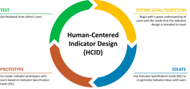
The HCID process is similar to the typical HCD process with its four stages, namely observation, ideation, prototyping, and testing. However, the HCID pro-cess differs from the HCD propro-cess in that the user is actively involved through every stage of the process. In a typical HCD process, user involvement is evi-dent in the first and last stages (i.e. observation and testing) but overlooked in the middle stages (i.e. ideation and prototyping) which are often performed by designers. The HCID process, by contrast, ensures that end-users meaningfully participate at every stage of the design. Concretely, the task of designing an indicator requires the user to take four iterative stages that help develop the right indicator: (1) Define Goal/Question, (2) Ideate, (3) Prototype, and (4) Test, as shown in Fig. 1.
4.1 Define Goal/Question
The HCID process begins with a good understanding of users and the needs that the design is intended to meet. In order to achieve a ‘fit for purpose’, HCID begins
DEFINE GOAL/QUESTION IDEATE PROTOTYPE Human-Centered Indicator Design (HCID) TEST
Get feedback from (other) users
Co-create indicator prototypes with users based on Indicator Specification Cards (ISC)
Begin with a good understanding of users and the needs that the indicator design is intended to meet
Use Indicator Specification Cards (ISC) to co-generate indicator ideas with users
Fig. 1.Human-Centered Indicator Design (HCID) approach
by identifying thewhy? (user needs and goals) rather than thewhat? (particular data sources and analytic methods) or the how? (particular visualizations). To achieve this, the initial stage in HCID is to define the Goal/Question to be addressed/answered by the indicator.
4.2 Ideate
It is crucial to actively involve users in the ideation stage to collaboratively derive design ideas. We propose in this work the Indicator Specification Cards (ISC) as a theory-informed method that enables designers and non-technical stakeholders to co-generate indicator ideas in a systematic manner. The novelty of the ISC method resides in the fact that it brings together design practices from Norman’s HCD process and Munzner’s what-why-how visualization framework. Designing LA indicators with knowledge of HCD and information visualization guidelines in mind enables to get effective indicators.
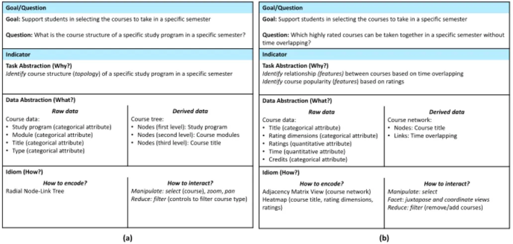
An ISC describes a systematic workflow to get from the why? (i.e. user goal/question) to the how? (i.e. visualization). It consists of two main parts, namelyGoal/Question andIndicator (example ISCs are shown in Fig. 2). The
Goal/Question part refers to the results of the previous stage of the HCID
ap-proach. TheIndicator part is further broken down into three sub-parts, namely
Task Abstraction (Why?),Data Abstraction (What?), andIdiom (How?), which
reflect the three dimensions of Munzner’s what-why-how visualization frame-work.
– TheTask Abstraction (Why?) part contains a transformation of the defined
goal/question into concrete task descriptions using the set of generic{action,
target}terms, outlined in Section 3.2. This would allow designers and users to
use the same language and think about indicator design ideas systematically. More than one task abstraction can be defined for a single question
– TheData Abstraction (What?) part lists the data required to perform the
needs to be derived from the raw (original) data, based on the nature of the task. For example, to identify structure or relationships between items, it might be helpful to transform the items’ data into a network format.
– TheIdiom (How?)part contains possible visualization idioms for the tasks
and data at hand, including how to encode and how to interact with the vi-sualization (see Section 3.2). In the design of indicators, there are important design decisions to be made at the level of encoding and interaction with the indicator. The information visualization literature (e.g., [19, 30]) suggest that the idioms (how?) depend heavily on the underlying tasks (why?) and data (what?) of the visualization and provides guidelines related to “what kind of idioms is more effective for what kind of tasks (mapping why? →
how?)” and “what kind of idioms is more effective for what kind of data (mapping what?→ how?)”. For example, scatterplots and parallel coordi-nates are effective idioms to visualize correlation tasks. And, stacked bar charts and heatmaps are effective idioms to visualize data with 2 categorical and 1 quantitative attributes.
4.3 Prototype
The next stage in the HCID process is to collaboratively create indicator proto-types based on the generated ISCs. The goal of this stage is to understand which of the visualization idioms proposed in the ideation stage are more effective for the tasks and data at hand. Paper or software prototypes can be used in this stage.
4.4 Test
The final stage in the HCID process is to get feedback from potential users on the indicator prototypes. The aim is to verify that these prototypes effectively address/answer the goal/question defined in the initial stage of HCID process. Ideally, the evaluators should not be the same users who participated in the previous HCID stages.
5
HCID in Action
As a proof of concept, we present in this section a case of applying the HCID ap-proach to LA indicator design in a higher education context. HCID was applied within the Learning Analytics and Visual Analytics (LAVA) lab course offered at the University of Duisburg-Essen. Sixteen students participated in the lab. They were asked to build four groups and develop indicators that can support students in the planning of their studies. Three initial meetings were held with the participating students (in the following referred to as designers) to introduce the concepts behind Norman’s HCD process, Munzner’s what-why-how visual-ization framework, and the HCID process. The designers were then asked to use the HCID approach to collaborate with students and co-design indicators by (1)
understanding students’ needs and defining goals/questions, (2) brainstorming ideas for possible indicators to answer these questions and co-generating ISCs, (3) co-developing prototypes of the indicators based on the ISCs, and (4) test-ing the developed indicators. Finally, the designers were asked to implement the indicators using web technologies and visualization libraries of their choice. The next sections present the results of one of the participating groups who developed indicators to support students in the course selection process.
5.1 Define Goal/Question
The first stage in the HCID process is to talk to the end-users in order to identify their goals and questions. The four designers in the group conducted informal interviews with five students not participating in the lab by asking them about difficulties and challenges they might face while planning their studies. All stu-dents stressed that the most critical issue they face during their planning is to select a set of courses to take in a semester. Next, the designers asked the students what information they would like to have at their disposal to support them in the course selection. The majority of the students informed that they would like to get first an overview of all courses that are being offered in a semester related to a specific study program. The reason they provided was that the course catalog only shows detailed information (e.g. time, location, course description, credit hours) of a selected course. Therefore, they have to manually traverse through interesting courses and compare them, which is a tedious task. Moreover, the students wanted the possibility of filtering the overview based on course type (e.g. lecture, practical lab, exercise). After selecting courses of inter-est, a comparison of the courses should be provided. In terms of the attributes to compare the courses, the time was identified as the most important attribute based on which the students select a course. According to the students, the num-ber of credits and the ratings of the course are important attributes which might help in course selection in case of time overlapping. Furthermore, the students mentioned average class grade, recommendation by peers, difficulty level, quality of learning resources provided, and level of additional support by lecturers as possible attributes to be used for the rating of the courses. To summarize, the students were interested in getting a simple overview of all courses offered in a specific study program where they can select and compare courses of interest based on different attributes. Based on this, the designers and students defined the goal to be “Support students in selecting the courses to take in a specific semester” and two questions were associated with this goal, namely “What is the course structure of a specific study program in a specific semester?” and “Which highly rated courses can be taken together in a specific semester without time overlapping?”.
5.2 Ideate
In the ideate stage of the HCID process, the designers and students used the ISC method to co-generate ideas for two indicators to answer the defined
ques-tions. For the question “What is the course structure of a specific study program in a specific semester?” they defined the abstract task “Identify course struc-ture (topology) of a specific study program in a specific semester”. In terms of data abstraction, the course catalog was identified as the main source of data providing information on study programs, related modules, courses (e.g. title, description, type, time, credits, location). Moreover, having the available course data as a course tree was proposed as an appropriate format to represent the underlying structure of the data. Based on the defined task and data abstrac-tions, the radial node-link tree diagram was selected as the most effective idiom for this indicator. In order to make the indicator more interactive and handle a large number of courses, it was suggested to provide visualization manipulation options through selecting a course to add it to the list of courses of interest, zooming and panning to focus on a specific area, as well as filtering based on course type (see Fig. 2(a)).
Goal/Question
Goal: Support students in selecting the courses to take in a specific semester Question: What is the course structure of a specific study program in a specific semester? Indicator
Task Abstraction (Why?)
Identify course structure (topology) of a specific study program in a specific semester
Data Abstraction (What?) Raw data Course data:
•Study program (categorical attribute)
•Module (categorical attribute)
•Title (categorical attribute)
•Type (categorical attribute)
Derived data Course tree:
•Nodes (first level): Study program
•Nodes (second level): Course modules
•Nodes (third level): Course title
Idiom (How?) How to encode? Radial Node-Link Tree
How to interact? Manipulate: select (course), zoom, pan Reduce: filter (controls to filter course type)
Goal/Question
Goal: Support students in selecting the courses to take in a specific semester Question: Which highly rated courses can be taken together in a specific semester without time overlapping?
Indicator Task Abstraction (Why?)
Identify relationship (features) between courses based on time overlapping Identify course popularity (features) based on ratings
Data Abstraction (What?) Raw data Course data:
•Title (categorical attribute)
•Rating dimensions (categorical attribute)
•Ratings (quantitative attribute)
•Time (quantitative attribute)
•Credits (categorical attribute)
Derived data Course network:
•Nodes: Course title
•Links: Time overlapping
Idiom (How?) How to encode? Adjacency Matrix View (course network) Heatmap (course title, rating dimensions, ratings)
How to interact? Manipulate: select
Facet: juxtapose and coordinate views Reduce: filter (remove/add courses)
(a) (b)
Fig. 2.Indicator specification cards for questions (a) “What is the course structure of a specific study program in a specific semester?” (b) “Which highly rated courses can be taken together in a specific semester without time overlapping?”
The question “Which highly rated courses can be taken together in a spe-cific semester without time overlapping?” was abstracted to two tasks, namely
“identifyrelationship (features) between courses based on time overlapping” and
“Identify course popularity (features) based on ratings”. To achieve these tasks,
course data including the attributes title, rating dimensions (e.g. understand-ability, support, quality of learning materials, effort required to pass the course), ratings, time, and credits were identified as part of data abstraction. Having a course network with the course title as nodes and time overlapping between courses as edges was selected as an appropriate data abstraction format to rep-resent the time relationship between different courses. Based on the defined task
and data abstractions, the adjacency matrix view was selected as the best-suited idiom to visualize the time relationship between different courses. Moreover, the heatmap idiom was selected to show course popularity based on the ratings of different dimensions. In terms of interactions, it was suggested to provide visu-alization manipulation options through selecting a cell in the adjacency matrix view to show more information about the time schedule and overlapping between two courses. Additionally, it was proposed to put side-by-side (juxtapose) the adjacency matrix and heatmap views to provide information about time over-lapping and course ratings in one place as well as to give filtering options to remove/add courses and see the cumulated credits (see Fig. 2(b)).
5.3 Prototype
Based on the two ISCs above, the designers and students created three paper prototypes for each of the two indicators to answer the questions “What is the course structure of a specific study program in a specific semester?” and “Which highly rated courses can be taken together in a specific semester without time overlapping?”.
5.4 Test
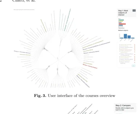
The prototypes were iteratively tested with 15 students (three groups of five students) who did not take part in the indicator design process in order to gauge the effectiveness of the indicator visualizations to answer the related questions. The collected feedback has led to a final prototype which was implemented as a web-based application named “Course Insights” using HTML, CSS (Boot-strap 4), and JavaScript libraries (jQuery and D3.js). In order to provide ratings for the courses, an online teaching evaluation website of German universities (www.meinprof.de) was used, which provides student ratings for a large num-ber of courses in terms of recommendation, understandability, fairness, support, learning materials, interest, fun, and effort required to pass the course. On the home page of the “Course Insights” web application, the students can select a study program of their interest.
As shown in Fig. 3, the overview page provides an overview of all the courses offered in the selected study program using a radial node-link tree diagram along with select, zoom, pan, and filter interaction possibilities. The students can select courses of interest which are then compared with each other on the comparison page in terms of time overlapping and ratings using the adjacency matrix and heatmap views. The interaction possibilities on the comparison page enables students to select courses of interest which can be taken together in a specific semester, based on time, popularity, and required credits (see Fig. 4).
6
Conclusion and Future Work
Involving stakeholders throughout the learning analytics (LA) design process can help increase the acceptance and adoption of LA solutions. However, despite the
Fig. 3.User interface of the courses overview
Fig. 4.User interface of the courses comparison
fact that research on human-centered learning analytics (HCLA) has been gain-ing momentum in the LA community in recent years, approaches that involve stakeholders in the design of LA indicators remain very rare in the literature. With a user-centered mindset, we presented in this work the Human-Centered Indicator Design (HCID) approach which provides methodological guidance for non-technical stakeholders to actively participate in the design of LA indica-tors. As part of the HCID approach, we introduced the Indicator Specification Card (ISC) method intended as a scaffold to help stakeholders think about in-dicator design choices systematically. We then presented a case of applying the HCID approach to LA indicator design in a higher education context. The case demonstrated that HCID could be a viable methodology to design useful LA indicators for and with their users. This work makes a significant contribution to LA research because it lays down a theoretical foundation that can guide the systematic design of effective indicators that truly meet user needs, informed
by design practices from the HCI and information visualization fields. As future work, we plan to perform user studies which will allow us to thoroughly evaluate the HCID approach in terms of ease of use, usefulness, and user acceptance. Furthermore, we will apply this approach in different learning contexts.
References
1. Ahn, J., Campos, F., Hays, M., DiGiacomo, D.: Designing in context: Reaching beyond usability in learning analytics dashboard design. Journal of Learning
An-alytics6(2), 70–85 (2019)
2. Alhadad, S.S.: Visualizing data to support judgement, inference, and decision mak-ing in learnmak-ing analytics: Insights from cognitive psychology and visualization
sci-ence. Journal of Learning Analytics5(2), 60–85 (2018)
3. Bodily, R., Kay, J., Aleven, V., Jivet, I., Davis, D., Xhakaj, F., Verbert, K.: Open learner models and learning analytics dashboards: A systematic re-view. In: Proceedings of the 8th International Conference on Learning Analyt-ics and Knowledge. pp. 41–50. LAK ’18, ACM, New York, NY, USA (2018). https://doi.org/10.1145/3170358.3170409
4. Buckingham Shum, S., Ferguson, R., Martinez-Maldonado, R.: Human-centred
learning analytics. Journal of Learning Analytics6(2), 1–9 (2019)
5. Chatti, M.A., Muslim, A.: The perla framework: Blending personalization and learning analytics. International Review of Research in Open and Distributed
Learning20(1) (2019). https://doi.org/https://doi.org/10.7202/1057982ar
6. Chen, B., Zhu, H.: Towards value-sensitive learning analytics design. In: Proceedings of the 9th International Conference on Learning Analytics &
Knowledge. pp. 343–352. LAK19, ACM, New York, NY, USA (2019).
https://doi.org/10.1145/3303772.3303798
7. Dollinger, M., Liu, D., Arthars, N., Lodge, J.M.: Working together in learning
analytics towards the co-creation of value. Journal of Learning Analytics 6(2),
10–26 (2019)
8. Dollinger, M., Lodge, J.M.: Co-creation strategies for learning analytics. In: Proceedings of the 8th International Conference on Learning Analytics and Knowledge. pp. 97–101. LAK ’18, ACM, New York, NY, USA (2018). https://doi.org/10.1145/3170358.3170372
9. Gaˇsevi´c, D., Dawson, S., Pardo, A.: How Do We Start? State Directions of Learning
Analytics Adoption. International Council for Open and Distance Education (2016)
10. Gaˇsevi´c, D., Dawson, S., Siemens, G.: Let’s not forget: Learning analytics are about
learning. TechTrends 59(1), 64–71 (Jan 2015).
https://doi.org/10.1007/s11528-014-0822-x
11. Holstein, K., McLaren, B.M., Aleven, V.: Co-designing a real-time classroom or-chestration tool to support teacher-ai complementarity. Journal of Learning
Ana-lytics6(2), 27–52 (2019)
12. Jivet, I., Scheffel, M., Drachsler, H., Specht, M.: Awareness is not enough: Pitfalls of
learning analytics dashboards in the educational practice. In: Lavou´e, ´E., Drachsler,
H., Verbert, K., Broisin, J., P´erez-Sanagust´ın, M. (eds.) Data Driven Approaches
in Digital Education. pp. 82–96. Springer International Publishing, Cham (2017) 13. Jivet, I., Scheffel, M., Specht, M., Drachsler, H.: License to evaluate: preparing
learning analytics dashboards for educational practice. In: Proceedings of the 8th International Conference on Learning Analytics and Knowledge. pp. 31–40. ACM (2018)
14. Kelly, N., Thompson, K., Yeoman, P.: Theory-led design of instruments and repre-sentations in learning analytics: Developing a novel tool for orchestration of online
collaborative learning. Journal of Learning Analytics2(2), 14–43 (2015)
15. Klerkx, J., Verbert, K., Duval, E.: Learning analytics dashboards. In: Lang, C., Siemens, G., Wise, A., Gasevic, D. (eds.) The handbook of learning analytics, pp. 143–150. Society for Learning Analytics Research (SoLAR) (2017)
16. Martinez-Maldonado, R., Pardo, A., Mirriahi, N., Yacef, K., Kay, J., Clayphan, A.: Latux: An iterative workflow for designing, validating, and deploying learning
analytics visualizations. Journal of Learning Analytics2(3), 9–39 (2016)
17. Marzouk, Z., Rakovic, M., Liaqat, A., Vytasek, J., Samadi, D., Stewart-Alonso, J., Ram, I., Woloshen, S., Winne, P., Nesbit, J.: What if learning analytics were
based on learning science? Australasian Journal of Educational Technology32(6)
(2016). https://doi.org/10.14742/ajet.3058
18. Molenaar, I., Horvers, A., Dijkstra, R., Baker, R.: Designing dashboards to sup-port learners’ self-regulated learning. In: Companion Proceedings 9th International Conference on Learning Analytics & Knowledge (LAK19). pp. 764–775. [Sl]: Soci-ety for Learning Analytics Research (SoLAR) (2019)
19. Munzner, T.: Visualization Analysis and Design. AK Peters Visualization Series, CRC Press (2014)
20. Muslim, A., Chatti, M.A., Mughal, M., Schroeder, U.: The goal-question-indicator approach for personalized learning analytics. In: Proceedings of the 9th Interna-tional Conference on Computer Supported Education CSEDU. pp. 371–378 (2017) 21. Norman, D.: The design of everyday things: Revised and expanded edition. Basic
books (2013)
22. North, C.: Toward measuring visualization insight. IEEE Computer Graphics and
Applications26(3), 6–9 (May 2006). https://doi.org/10.1109/MCG.2006.70
23. Prieto-Alvarez, C.G., Martinez-Maldonado, R., Anderson, T.D.: Co-designing learning analytics tools with learners. Learning Analytics in the Classroom: Trans-lating Learning Analytics for Teachers (2018)
24. Rehrey, G., Shepard, L., Hostetter, C., Reynolds, A., Groth, D.: Engaging faculty in learning analytics: Agents of institutional culture change. Journal of Learning
Analytics6(2), 86–94 (2019)
25. Ritsos, P.D., Roberts, J.C.: Towards more visual analytics in learning analytics. In: Proceedings of the 5th EuroVis Workshop on Visual Analytics. pp. 61–65 (2014) 26. Schwendimann, B.A., Rodriguez-Triana, M.J., Vozniuk, A., Prieto, L.P., Boroujeni,
M.S., Holzer, A., Gillet, D., Dillenbourg, P.: Perceiving learning at a glance: A systematic literature review of learning dashboard research. IEEE Transactions on
Learning Technologies10(1), 30–41 (2016)
27. Sedrakyan, G., Malmberg, J., Verbert, K., J¨arvel¨a, S., Kirschner, P.A.: Linking
learning behavior analytics and learning science concepts: designing a learning analytics dashboard for feedback to support learning regulation. Computers in Human Behavior (2018)
28. Verbert, K., Duval, E., Klerkx, J., Govaerts, S., Santos, J.L.: Learning analytics
dashboard applications. American Behavioral Scientist57(10), 1500–1509 (2013).
https://doi.org/10.1177/0002764213479363
29. Verbert, K., Govaerts, S., Duval, E., Santos, J.L., Assche, F., Parra, G.,
Klerkx, J.: Learning dashboards: An overview and future research
op-portunities. Personal Ubiquitous Comput. 18(6), 1499–1514 (Aug 2014).
https://doi.org/10.1007/s00779-013-0751-2