Google Analytics based Temporal-Geospatial Analysis for Web Management: A Case Study of a K-12 Online Resource Website
Wanli Xing
University of Missouri, Columbia, United States Corresponding author: [email protected]
Rui Guo
University of South Florida, United States
Gail Fitzgerald
University of Missouri, Columbia, United States [email protected]
Chengcheng Xu Southeast University, China
Abstract
As Google Analytics becomes increasingly popular, more detailed records of users’ behaviors can be captured and analyzed to better understand the performance of websites. However, current Google Analytics related research usually draws conclusions from rough estimation based on the observation of the dashboard or other basic statistical processing of the data. This study aims to provide a more accurate and informative analysis from both temporal and geospatial perspectives via clustering and GIS application. The results obtained from a resource website case study demonstrate that the proposed method is able to help web managers better examine the temporal effect on users’ visiting patterns based on accurate mathematical computation as well as provides more geographical insight into website performance through the constructed density measure and 3D graphic presentation. By offering in-depth quantitative information relying on mining data from web logs, such a study can help web stakeholders make better decisions on how to maintain and improve the websites, especially adjusting resources by considering temporal fluctuations and inequity in geographical distribution.
Keywords: Google Analytics, Cluster Analysis, Geospatial analytics, Web management
Introduction
(Farney & McHale, 2013; Kirk et al. 2012; Pakkala et al. 2012; Kent, 2011).
As a result, interpretations of visitors’ traffic data may be oversimplified and subject to limitations endemic to Google Analytics’ existing functionalities. Increasingly it is necessary to take these approaches to the next level and use Google Analytics traffic data more strategically (Sen et al., 2006). Jones et al. (2004) have indicated that the employment of more complex methods of analyzing web metrics would be beneficial and must be vigorously advanced. Clifton (2012) concluded that web analytics cannot simply rely on the flood of data alone. Website stakeholders should not only interpret the data, but also fine-tune the metrics to accurately reflect website goals and objectives.
In response to these needs, we investigated a data mining method and a geographical
tool, i.e., temporal and a geospatial perspectives, to provide a longitudinal and accurate view as well as a density measure for web stakeholders towards the ultimate goal of strategic improvement of users’ experiences. While this study utilizes a particular educational website (eThemes http://ethemes.missouri.edu/) to illustrate a proposed methodological framework, the application of that framework is not restricted to this website or any particular type of site; these procedures may be readily employed with any website. The approach involves transforming Google Analytics data from a somewhat limited and raw state to something that is richer, more accurate, and informative. Compared with rough estimation from Google Analytics Dashboard, the proposed approach, relying on mining log data, is expected to offer more reliable and accurate quantitative results for web manager to make more informed decisions e.g. website maintenance, marketing and strategic planning.
Literature Review 1. Google Analytics and Educational Websites
visibility of the website. Kent et al. (2011) employed bounce rate (percentage of people immediately leaving the site) and the time on site (length of time people spend on the site) to explain the reduction in traffic on an academic website. In sum, most researchers do not further analyze visitor’ traffic beyond the figures, graphs, and functionalities residing in Google Analytics. The application of Google Analytics to education information systems is still in its infancy.
2. Temporal Effect and Visitors’ Behavior
Khoo et al. (2008) stated that temporal fluctuation has a definite effect on the interpretation of Web traffic metrics. One of the earlier temporal studies (Jansen et al., 2005), examined traffic patterns on a major search engine covering a period of a few years and compared these numbers to those of other search engines. Beitzel et al. (2007) adopted temporal factors to research the quality of web searches, namely search effectiveness and efficiency. Zhang et al. (2009) firmly established search engine transactional logs and time series analysis as viable means of anticipating future web traffic on these sites. Temporal analysis has also been applied to study the fluctuating dynamics of a blog community and detect web bloggers’ unique posting behaviors (Chi et al., 2007).
Current time series analysis of Google analytics data is basically following two paths. One of these is merely based on observing the Google Analytics time traffic dashboard to roughly estimate the overall trend of the visits to the website. Kent et al. (2011) discovered that a particular website experienced a decline in usage over time and tried to explain the reasons behind it. Kirk (2012) studied two years’ worth of data for a health professional education website. Relying on the visitors’ growth trend, he concluded that this particular site would further expand to be a global source on genetics-genomics education. Their conclusions about their websites over time depended on observation and estimation of the Google Analytics dashboard rather than accurate computation.
The second path that has been taken is based on regression analysis of traffic data over a certain period of time and its relationship with other website metrics. Plaza (2009; 2011) examined the effectiveness of entries (visit behavior and length of sessions) depending on their traffic source: direct visit and in-link entries. Basically, the author ran a regression analysis to test the relationship between returning visit behavior and length of sessions over approximately a two-year period. Wang et al. (2011) studied whether users behave differently during weekdays and weekends. They found numerous significant relationships between several key web metrics and traffic variables. Until now, no precise quantitative method has been applied to investigate users’ patterns of interaction with a website.
3. Geospatial Effect and Visitors’ Behavior
important for targeting online marketing activities (Clifton, 2012) such as estimation of the website’s influence over a particular region. When it comes to the academic world, researchers have already taken advantage of visitors’ location information gathered by Google Analytics. Pakkala et al. (2012) used Google Analytics to study visitor use of three food composition websites located in three different countries. Based on the users’ geolocation graph provided by Google Analytics, they concluded that the website manager should increase promotion for a particular country over the other two. Similarly, according to the usage of website data in different areas offered by the Google Analytics dashboard, Patton and Kaminski (2010) evaluated the influence of their agency’s extension program over their client territories.
Most studies have drawn conclusions simply based on the Google Analytics geographical dashboard. Their procedures were to insert screenshots of the Google Analytics geographies into their articles and then draw implications from those graphs (Pakkala, 2012; Kirk, 2012; Plaza, 2011; Patton & Kaminski, 2010; Fang, 2007). However, researchers could only obtain location and corresponding number of visits data based on Google Analytics geo-graphs. According to Turner (2010), broad measures of website usage such as virtual visits can be useful; nonetheless, these numbers provide little insight or ability to measure website goals. A more sophisticated measure of the geospatial distribution of visits needs to be developed.
Clifton (2012) introduced the geomap overlay technique for adding other dimensions into visitors’ geographical distribution map to deliver information at a glance, and in turn, obtain a more comprehensive picture of the performance of the website. Nevertheless, until now few studies have applied these techniques. Moreover, Clifton’s map overlay method has its own limitation in that the dimensions he suggested were limited to the data factors already contained in Google Analytics. For example, geospatial visit distribution data for the United States can be cross-referenced with data from which search engines these visitors are coming (data already collected by Google Analytics) and then displayed in the same graph. This solution does not add outside dimensions into the Google Analytics geographical graph which might have significant impact on website stakeholders’ decision-making. For instance, academic websites may need to evaluate usage over different school districts (e.g. Xu et al, 2010) and commercial sites might want to consider a website’s influence on different demographics (age, race, or income scale etc.) in different areas (e.g. Kumar et al, 2009). Therefore, Clifton’s map overlay methodology is limited by not adding new outside factors to the graph.
from statistical analysis rather than graph presentation. Their graphical display was in 2D format and therefore limited in presenting multiple metrics in the same picture. Neither did they create any other sophisticated measures besides the number of visits in each location. From an aesthetical perspective, using a screenshot of the Google Analytics dashboard or using the dashboard as a base (Recker et al., 2010) is insufficient because it is merely presents a flat, color-coded graph. Various researchers have indicated that aesthetic pleasure with different display formats could improve the perceivers’ information processing dynamics from a design perspective, a psychological perspective, and a practical perspective (Tractinsky, 2013 & 1997, Reber et al, 2004, Petersen et al, 2004).
In summary, current web analytics has three flaws: 1) no precise quantitative method has been applied to examine users’ patterns of interaction with a website and especially educational websites. 2) no sophisticated metrics exist; 3) the graphical display is limited in the Google Analytics dashboard. To fill the gaps in the literature, this research explores methods to identify the temporal patterns and create new metrics and graphical presentations for spatial distribution of web visitors for an online resource. Such a study could help stakeholders or web managers make decisions on how to maintain and improve the websites, especially adjusting resources by considering temporal fluctuations and inequity in geographical distribution. Mining data from web logs promises more valuable and in-depth quantitative information as compared to direct screenshots of Google Analytics.
Research Question and Methodology Research Questions
Two research questions are constructed for this study:
1. How can we precisely identify visitors’ behavior patterns over a longitudinal period rather than using a rough estimation procedure through Google Analytics Dashboard?
2. How could we present a more comprehensive and aesthetically pleasing view of visitors’ spatial distribution besides graphs based on the Google Analytics Dashboard?
Clustering and ArcGIS based methods are applied to answer the above research questions. Details of this research framework are explained below.
3.2 Cluster Analysis for Temporal Analytics
the following steps.
State Definition and Matrix Formulation
A significant step in clustering is to define the system scale and select the proper cluster elements. By considering the website log data collected by Google Analytics in different resolution/granularity levels (e.g., daily, weekly and monthly), it is possible to capture the temporal features of website users’ behavior with a mathematical method. The system states in our study are defined as follows, assuming there are M representative years in the log datasets and yearly visits are recorded into T time intervals. For instance, the yearly visit rate (i.e., visits/year) can be subdivided into 52 weekly visit rates (i.e., visits/week) and then T is 52.
X (t) = (X1, Xm, XM, XM+1 ) Where X (t) is the system state at time t, t=1, 2, ,T;
Xm is the weekly website visits in year #m,m=1, 2, , M; XM+1 is the time variable indicating the time of visit occurring.
Then the data X, a K (M+1) × K (T) matrix, will have the format as following.
11 12 1M 1(M +1)
21 22 2M 2(M +1)
(T -1)1 (T -1)2 (T -1)M (T -1)(M +1)
T1 T2 TM T(M +1)
x
x
x
x
x
x
x
x
x
x
x
x
x
x
x
x
X
To deal with the differences in scale between website visits and time variables in different years, the cluster elements should be properly normalized (Guo & Zhang, 2013). This process, which uses Eq. (1), is performed prior to the cluster analysis so as to make original data dimensionless.
= ̅ ( ; ) (1) Where , ̅ and represent original, average, and standard deviation of website visits or time variables, respectively, for any particular observation.
Clustering for Temporal Analytics
To identify the patterns of website visitors, K-means cluster analysis—including selection of the number of clusters, clustering algorithms, distance measures and validation of the analysis—is conducted step-by-step.
The Number of Clusters
Gap-statistic is to find an “elbow” in the plot of the optimized cluster criterion against the number of clusters K. In this approach, the graph of log ( ) against the number of clusters is plotted, where (an overall average within the cluster sum-of-squares) is a cluster criterion that has been minimized for K clusters by comparing it with its expectation under an appropriate null reference distribution. For this purpose, letting denote the expectation under a sample size of N from the reference distribution, the optimal value for the number of clusters is then the value k for which the “Gap” is the largest.
(K)= {log( )}-log( ) (2) In Eq. (2), K is the number of clusters, N is sample size, and denotes an overall average within the cluster sum-of-squares. Those interested in the theoretical details of this method can refer to the original paper (Tibshirani et al., 2001).
Cluster Algorithms and Validation
In cluster analysis, cluster elements are grouped according to their similarities, or more specifically, the distances between them. Therefore, the smaller the distances between the elements, the more similar they are and the more likely they belong to the same cluster. For our study, squared Euclidean distance, as shown in Eq. (2), is implemented for calculating the distance between clusters.
=∑ ( ; ) (3)
Where is the squared Euclidean distance between state elements and j; is the
elementin state ; and
is the elementin state j.
The validation of the optimal number of clusters is one of the most critical steps in the cluster analysis. An insufficient number of clusters would muddle up different users’ visiting patterns, while too many clusters would add unnecessary difficulty of pattern explanation. To validate the efficiency of selected number of clusters, the Silhouette measure is used in this study (Rousseeuw, 1987). The overall average Silhouette width, denoted as the Silhouette Coefficient (SC), is the average of the s(i) for all elements in the dataset as shown in Eq. (4).
SC= ∑ = ∑ { { }
}
(4)
Where denotes cluster labels that do not include element i as a member; denotes the cluster label that includes element i; is the averaged distance between element i and all elements in cluster (in other clusters); { } is the minimum of average dissimilarity i to all elements in another cluster (in the closest cluster); and is the averaged distance between element i and all elements in cluster (in the same cluster).
that the element could be assigned to another closest cluster as well, and the element lies equally far away from both clusters. If SC is close to –1, it means that the element is “misclassified” and is merely somewhere in between the clusters. After cluster analysis, post-processing is conducted to determine the intervals and identify the visits’ patterns.
ArcGIS for Spatial Distribution Analysis Data Preparation
Geographically, Google Analytics allows one to export data to a file according to granularity. For example, if the main target users of the studied website are located in the United States, United States can be selected as the primary study scope to compare the distribution features between different states. The second study scope (e.g., one particular state) can be further selected according to the findings from the study in primary scope.
To conduct spatial density analysis of a resource inventory, Geographic Information System (GIS) is adopted. In undertaking any GIS-based work, additional spatial data should be collected to generate the base map besides the data collected by Google Analytics. The supplemented spatial data includes the data for layer generation and data for computation. In our study, we mainly supplement the TIGER/Line Shape-file data and population information for primary and secondary study scope, respectively. ESRI Data and Maps 10 software package is used to generate basic maps for the following nation-wide and state-wide study.
Density Computation
In additional to the total visits by location directly obtained from Google Analytics, the visits density, representing the number of visits per person at one place, is computed for comparison as well. Assuming there are m representative years in the log datasets and website visits are cumulated through the total studied time period for different locations, density of website visits can be computed by the following equation.
Case Study Study website: eThemes
To illustrate this approach, a K-12 online resource – eThemes – was chosen for the case study. eThemes, hosted by the School for Information Science & Learning Technologies at the University of Missouri, is an online educational resource that is primarily used by K-12 educators (http://ethemes.missouri.edu/). It supports educators by providing themed collections of links to websites relevant to their instructional goals; this saves teachers countless hours that would be otherwise spent searching the Web and culling through lengthy lists of search results, and it frees them to concentrate their efforts on other, more important aspects of teaching. Teachers can request online resources according to a variety of criteria including: subject matter, grade level, type of resource, etc. eThemes currently includes over 2,100 themed collections of over 10,000 total links and is available for anyone to use at no cost via the Internet. The site is maintained and marketed by staff from the University of Missouri with graduate students from the School of Information Science & Learning Technologies serving as internet resource scouts (Wang, 2001). These eThemes resource scouts ensure that the links in the collections are rich in content, age-appropriate, and safe for children. The topics covered range from literature to mathematics, grammar to geography, author studies to teaching tips, and more. eThemes also provides the respective state educational standards that correlate to each themed collection for states such as Missouri, Alabama, Arkansas, Delaware, Texas, and others. eThemes has been in service for more than 12 years.
Data Collection
Temporal data of eThemes website visits
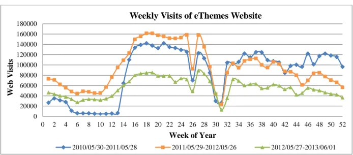
Figure 1: Weekly visits of eThemes website from 2010 to 2013.
Spatial data of eThemes website visits
Similar to temporal data, we exported the CSV files containing visits to eThemes website from Google Analytics over the three studied years by location. Since the main users of eThemes were from the United States, we downloaded the CSV file in the granularity of state to better examine eThemes’ influence over states in the US. In addition, we chose Missouri as the study area for state-wide analytics because we wanted to closely examine how eThemes performed in its host state.
In order to compare eThemes’ influence over different states, we downloaded the data by state. To compute density of visits, the 2012 population data for each state (except Alaska and Hawaii) of the United States and 2012 population data for major cities in the state of Missouri were collected as well. Moreover, TIGER/Line Shape-files by different layer types (e.g., block groups, census tracts and school districts) were collected from different online open sources. Table 1 lists the selected sources of spatial and population data for this study.
Table 1
Selected sources of spatial and population data
Organization/data provider URL address Type of data &data description
Federal Geographic Data Committee
http://www.fgdc.gov/dataandservices
Geo-Platform and Geography
network clearinghouse
TIGER/Line Shapefiles-U.S. Census Bureau
http://www.census.gov/cgi-bin/geo/shapefiles2012/main
Line Shape-file Data
(nation-wide and state-wide)
U.S. Population by State, 1790 to 2012
http://www.infoplease.com/ipa/A0004986.html
Census Data
(nation-wide, year 2012)
Missouri Spatial Data Information Service
http://msdis.missouri.edu/data/datalist.html
State-wide Spatial Data 0
20000 40000 60000 80000 100000 120000 140000 160000 180000
0 2 4 6 8 10 12 14 16 18 20 22 24 26 28 30 32 34 36 38 40 42 44 46 48 50 52
Web
V
isi
ts
Week of Year
Weekly Visits of eThemes Website
Missouri (USA): State, Major Cities & Places
-City Population
http://www.citypopulation.de/USA-Missouri.html
Census Data
(state-wide, year 2012)
TIGER/Line Shapefiles: School Districts
http://www.census.gov/cgi-bin/geo/shapefiles2012/layers.cgi
Layer Data by School Districts
(state-wide)
Results of Case Study
Results of Temporal Pattern Identification Selection of Cluster Numbers
To determine the optimal number of clusters, the Gap statistics measure was conducted by coding in R, a software package for statistical computing and graphics. Fig. 2(a) shows the observed and expected log (Wk) and Fig. 2(b) shows the Gap values against the number of
clusters in our case study. As shown in Fig. 2(b), the largest Gap value occurs when the number of clusters is three. Thus, we selected three as the number of clusters for further analysis in the next step.
a) Obs and Exp log (Wk) plots of visits b) Gap plots of visits
Figure 2: Gap as a function of number of clusters.
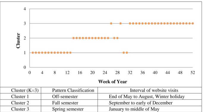
Identification of Patterns
Cluster (K=3) Pattern Classification Interval of website visits Cluster 1 Off-semester End of May to August, Winter holiday Cluster 2 Fall semester September to early of December Cluster 3 Spring semester January to middle of May
Figure 3: Results of cluster analysis for pattern identification.
The findings of cluster analysis, shown in Fig. 3, are consistent with existing knowledge (common sense) on eThemes resource website visits where summer vacation (off-semester), fall semester, Thanksgiving week and winter break (holiday seasons), and spring semester are the most commonly observed phenomena/patterns in a year.
Validation of Clustering
To validate how good the number of selected clusters is, the Silhouette Coefficient was calculated by using MATLAB coding. Fig. 4 shows the Silhouette coefficients as a function of number of clusters. The “elbow” occurs when the number of clusters is three, which validates the efficiency of our cluster analysis.
Figure 4: Silhouette coefficients as a function of number of clusters.
The results showed that a larger number of visitors came to the eThemes website during 0
1 2 3 4
0 4 8 12 16 20 24 28 32 36 40 44 48 52
C
luster
Week of Year
0.5 0.55 0.6 0.65 0.7 0.75 0.8
0 1 2 3 4 5 6 7 8 9 10
Sihouet
te
C
oef
fi
ci
ent
s
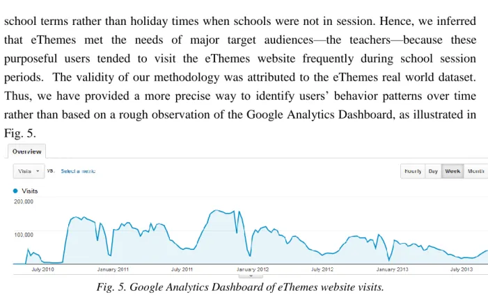
school terms rather than holiday times when schools were not in session. Hence, we inferred that eThemes met the needs of major target audiences—the teachers—because these purposeful users tended to visit the eThemes website frequently during school session periods. The validity of our methodology was attributed to the eThemes real world dataset. Thus, we have provided a more precise way to identify users’ behavior patterns over time rather than based on a rough observation of the Google Analytics Dashboard, as illustrated in Fig. 5.
Fig. 5. Google Analytics Dashboard of eThemes website visits.
Results of Geospatial Distribution Analysis
In this case study, two scopes of geospatial distribution analysis were selected: nation-wide study and nation-wide study. The base network shape files, both nation-nation-wide and state-wide, were retrieved from TIGER line data, as listed in Table 1. In accordance to state and city boundaries, proper edits (cut, divide, split, and merge) were conducted to meet the requirements.
Nation-wide Geospatial Analytics of eThemes
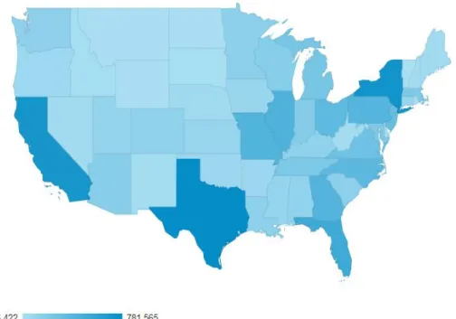
Figure 6: Google Analytics nation-wide spatial distribution of eThemes website visits.
Figure 7: Nation-wide geospatial distribution of eThemes website visits.
State-wide Geospatial Analytics of eThemes
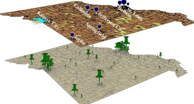
As shown in Fig. 8, we used the two layers of number of visits and density in the analysis. However, in some situations it may be beneficial to add a third or more layers into one graph for a more complete analysis. Building such a comprehensive graph that is both informative and easy to read was explored using the ArcGIS for graph presentation and display using Missouri as the study area for state-wide analytics. In state-wide spatial analytics, ESRI’s ArcScene was used to display multiple layers (e.g., city population layer, city density layer, and school districts layer) in one graph. Unlike 50 states in the US, there are hundreds of cities in each state and some of them are very small in region. It was difficult to clearly recognize the city’s name just simply based on its location on the map. Therefore, it was necessary to label city name with noticeable density or population features.
visitors’ geographical distribution. In this case study we utilized density metrics for measuring a website’s influence over a region rather than merely depending on the numbers of visits to make conclusions. Further, we demonstrated that additional map layers and labels could be overlaid on an existing graph, and thus, present all of this information in one graph to provide a more refined analysis.
Figure 8: State-wide spatial analytics of eThemes website visits (Missouri).
Discussion
Moreover, this method provides a precisely quantified and longitudinal point of view, and thus, has the potential to be applied in different contexts and for different usages. Currently, the most popular temporal metrics to describe website visits are the times when it has the highest or lowest visits based on Google Analytics Dashboard; average visits per day, week or month etc. Nevertheless, it is insufficient to make strategic plans based on those metrics because it lacks a longitudinal view of website usage. For instance, suppose the 28th week, 2011 has the highest visits of the three-year period; one cannot simply assume the 28th week of 2014 or 2015 would also have relatively higher hits and use this projection in website management decisions. However, based on our proposed method, website stakeholders could utilize information from a longitudinal view of whether 28th week is in the highest cluster over the years. If yes, then it might be a good decision not to schedule adjustments or do maintenance during that time. Otherwise if it is in the lower clusters, the 28th week might be just a random fluctuation; other times, the visits to the website might be very low and therefore, it might be the best time period to make adjustments or do maintenance. Our methodology offers a method to do a longitudinal analysis of the pattern of website visits and then utilize those data to improve the quality of decision making.
In terms of geospatial analytics, we create a new metric – density to more accurately reflect the influence of the website over a particular area. To illustrate, the states of Texas, California and New York in Fig. 7 still showed the most visits (red color) when comparing the total website visits. However, when it comes to visit density, the state of Missouri shows the largest density, while the star symbols of California and Texas are relatively small. This finding is in line with both our website strategy and the fact that Missouri includes more eThemes member schools than any other state. Thus, a count of the frequency of visits in each location directly from Google Analytics does not appear to be the best measure to describe visitors’ geospatial distribution as it does not take density into consideration. It is not necessarily true that a website has the most influence in a location with the largest number of visits. In fact, we argue that the constructed new measure—density—is a better indicator when analyzing a website’s influence within a particular region.
Conclusion
As Google Analytics becomes more popular, more detailed records of user activities can be captured and analyzed, and in turn, offer feedback to website administrators, design teams, and domain experts to better understand their users and users’ interactions with website resources. As an exploratory study, this research presented an experiment undertaken with time series and geographically distributed click steaming data that Google Analytics collected for an educational website. A new methodological framework based on advanced analytical techniques was developed to more accurately examine the visitors’ behavior patterns over time. To better measure a website’s influence over a particular region, the authors introduce the density measure to give more insight into website performance geographically. Additionally, our study filled the gap for current Google Analytics research on map overlay procedures, and expanded the graph representation format both aesthetically and functionally. Data aggregation, manipulation and presentation strategies were also provided. From an applied perspective, this study contributes methodologically to website analytics in the education field.
In the future, the results from this study can be compared with other case studies. In addition, Clifton (2012) proposed that the comparison of visitors’ key performances by advanced segmentation would contribute to a more comprehensive informational view of visitors. We recommend the investigation of visitors’ behavior patterns from different traffic sources (direct, reference or search engine) as well as return visitors’ navigation in comparison with that of new visitors. To identify the loyal users of a website, behavior characteristics can be further explored in the extended study as well. On the other hand,
References
Beitzel, S.M., Jensen, E.C., Chowdhury, A., Frieder, O. & Grossman, D. (2007). Temporal analysis of a very large topically categorized web query log, Journal of the American Society for Information Science and Technology, 58(2), 166-78.
Chi, Y., Zhu, S., Song, X., Tatemura, J. & Tseng, B.L. (2007). Structural and temporal analysis of the blogosphere through community factorization, Proceedings of the ACM SIGKDDInternational Conference on Knowledge Discovery and Data Mining. Available at: http://portal.acm.org/citation.cfm?doid=1281192.1281213
Clifton, B. (2012). Advanced web metrics with Google Analytics. John Wiley & Sons.
Duda, R.O., Hart, P.E., & Stork, D.G. (2001). Pattern Classification, 2nd ed. John Wiley& Sons, Inc., New York.
Everitt, B.S., Landau, S., Leese, M., & Stahl, D. (2011). Cluster Analysis, 5th ed. John Wiley & Sons, Ltd., 2011.
Farney, T. & Mchale, N. (2013). Data Viewing and Sharing: Utilizing Your Data to the Fullest. Library Technology Reports49(4), 39-42. American Library Association.
Guo, R., & Zhang, Y. (2013). Identifying Time-of-Day Breakpoints Based on Non-intrusive Data Collection Platforms. Journal of Intelligent Transportation Systems.
Hess, M. R. (2012). Web Analytics: Using Evidence for Improvement-Über analytics: Customizing Google Analytics to track multiple library platforms.
Jansen, B. J., & Spink, A. (2005). How are we searching the World Wide Web? A comparison of nine search engine transaction logs. Information Processing & Management, 42(1),248–263.
Jones, C., Giersch, S., Sumner, T., Wright, M., Coleman, A. & Bartolo, L. (2004). Developing a web analytics strategy for the National Science Digital Library, D-Lib Magazine, 10(10). Available at: www.dlib.org/dlib/october04/coleman/10coleman.html. Kent, M. L., Carr, B. J., Husted, R. A., & Pop, R. A. (2011). Learning web analytics: A tool
for strategic communication. Public Relations Review, 37(5), 536-543.
Khoo, M., Pagano, J., Washington, A. L., Recker, M., Palmer, B., & Donahue, R. A. (2008). Using web metrics to analyze digital libraries. InProceedings of the 8th ACM/IEEE-CS joint conference on Digital libraries (pp. 375-384). ACM.
Kirk, M., Morgan, R., Tonkin, E., McDonald, K., & Skirton, H. (2012). An objective approach to evaluating an internet-delivered genetics education resource developed for nurses: using Google Analytics™ to monitor global visitor engagement. Journal of Research in Nursing, 17(6), 557-579.
Kumar, C., Norris, J. B., & Sun, Y. (2009). Location and time do matter: A long tail study of website requests. Decision Support Systems, 47(4), 500-507.
Marek, K. (2011). Chapter 2: Getting to Know Web Analytics. Library Technology Reports, 47(5), 11-16.
Pakkala, H., Presser, K., & Christensen, T. (2012). Using Google Analytics to measure visitor statistics: The case of food composition websites. International Journal of Information Management, 32(6), 504-512.
Patton, A. J., & Kaminski, J. E. (2010). Tracking the impact of your web-based content. Journal of extension, 48(4), 4TOT1.
Petersen, M. G., Iversen, O. S., Krogh, P. G., & Ludvigsen, M. (2004). Aesthetic Interaction: a pragmatist's aesthetics of interactive systems. In Proceedings of the 5th conference on Designing interactive systems: processes, practices, methods, and techniques (pp. 269-276). ACM.
Plaza, B. (2009). Monitoring web traffic source effectiveness with Google Analytics: An experiment with time series. In Aslib Proceedings 61(5), pp. 474-482). Emerald Group Publishing Limited.
Management, 32(3), 477-481.
Reber, R., Schwarz, N., & Winkielman, P. (2004). Processing fluency and aesthetic pleasure: is beauty in the perceiver's processing experience? Personality and social psychology review, 8(4), 364-382.
Recker, M., Xu, B., Hsi, S., & Garrard, C. (2010). Where in the World? Demographic Patterns in Access Data. In EDM (pp. 337-338).
Rousseeuw, P.J. (1987). Silhouettes: A Graphical Aid to the Interpretation and Validation of Cluster Analysis. Journal of Computational and Applied Mathematics20(1), 53–65. Sen, A., Dacin, P.A. and Pattichis, C. (2006), “Current trends in web data analysis”,
Communication of the ACM, 49(11), 85-91.
Tibshirani, R., Walther, G., and Hastie, T. (2001). Estimating the Number of Clusters in a Data Set via the Gap Statistic. Journal of Royal Statistical Society, B63, Part 2, 411–423. Tractinsky, N. (1997). Aesthetics and apparent usability: empirically assessing cultural and
methodological issues. In Proceedings of the ACM SIGCHI Conference on Human factors in computing systems (115-122). ACM.
Tractinsky, N. (2013): Visual Aesthetics. In: Soegaard, Mads and Dam, Rikke Friis (eds.).
The Encyclopedia of Human-Computer Interaction, 2nd Ed. Aarhus, Denmark: The Interaction Design Foundation. http://www.interaction-design.org/encyclopedia/visual_ aesthetics.html.
Turner, S. J. (2010). Website statistics 2.0: Using Google Analytics to measure library website effectiveness. Technical Services Quarterly, 27(3),261-278.
Wang, F.K. & Wedman, J.F. (2001) eThemes: An Internet instructional resource service.
Information Technology and Libraries. 20(4), 179-184.
Wang, X., Shen, D., Chen, H. L., & Wedman, L. (2011). Applying web analytics in a K-12 resource inventory. The Electronic Library, 29(1), 20-35.
Xu, B., Recker, M., & Hsi, S. (2010). The data deluge: Opportunities for research in educational digital libraries. Internet Issues: Blogging, the Digital Divide and Digital Libraries. Nova Science Pub Inc., New York.