Accelerating
Understanding Through
Data Visualization
Accenture Technology Lab’s Data Insights R&D Group
focuses on accelerating the ways in which companies extract
meaning from data. Visualization, and increased visual
literacy, makes it easier to communicate and comprehend
key insights gleaned from data using graphical formats
3
Introduction
As companies go digital and leverage exponentially larger big data sources, they have to apply a new logic to how they manage their data supply chain—from ingestion to insights. Yesterday’s model of data warehousing and periodic reporting is a slow, linear approach; the future model is nimble and multi-faceted, dynamically supplying the right data in appropriate and insightful ways through interactive, story-driven visualizations.
At Accenture, we believe storytelling is the capstone of the data supply chain and an essential method to accelerate understanding. With more data available than ever before, companies need a better way to synthesize meaning from it. (For additional information, see the Accenture Technology Labs point of view “Why Big Data Needs Visualization to Succeed.”)
Telling a story with data takes preplanning, clear objectives and the right interactive visual elements. The result can be a competitive differentiator: the ability to share information that quickly guides people toward a conclusion, persuades them to take a different action or invites them to ask entirely new questions.
This approach is quickly gaining traction. The growing prominence of interactive storytelling visualizations in data-journalism pieces from organizations like The Guardian or The New York Times are causing
companies to ask for similar capabilities from their enterprise software.
Given this rapidly changing visualization landscape, tradition Business Intelligence (BI) tools are struggling to keep up with these new demands. Disruptive companies like Qlik and Tableau not only offer compelling visualization packages, but also include storytelling focused features with Qlik Sense and Tableau Story Points. Qlik even allows for extensions that utilize the same open-sourced, web-based frameworks many of these data-journalism organizations use. As these visualization software packages and open-sources tools mature, expect to see an increasing emphasis on interactive storytelling visualizations as the go to method for understanding data.
Unleashing the
power of storytelling
But why is storytelling through data visualization so effective? The human brain has a unique ability to perform visual pattern recognition. This is an important capability to leverage in addressing data because it accelerates understanding of complex situations, which is especially critical as companies strive to make decisions and act at digital speed in a constantly changing landscape.Equally important, the human brain has evolved to remember and understand stories more easily than other presentations of information. In recent years, researchers have shown that when people talk about
facts, only two areas of the brain are activated—language processing and comprehension. When people hear a story, however, multiple areas of the brain are activated, helping an audience to better digest, understand and remember the relevance of the data. This is why sharing work and data visualizations within the framework of a story makes it more comprehensible and memorable.1, 2
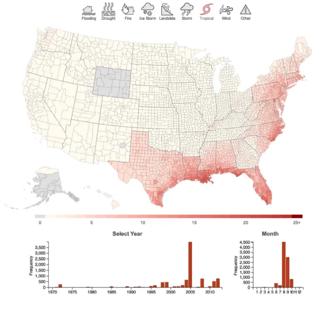
Case in point: the Federal Emergency Management Agency (FEMA) has been responding to national disasters for over 35 years and has amassed huge datasets relating to these significant events, but these are typically in unwieldy and difficult to comprehend spreadsheets. The Disaster Visualization in Figure 3 compiles this FEMA data and presents it in one of the most intuitive visualization styles: a geographic map. Users can parse national disasters all the way down to their own communities. This immediately makes the data more relatable and accessible for a wide audience by paring down the information into understandable regional, chronological, and categorical events. More important, it provides a data discovery tool that encourages the formation of highly memorable, curiosity-driven narratives like “How did a tropical storm hit the entire United States except for Wyoming?” or “Which county has had the most disasters?” By developing the stories within its data, well-designed visualizations help viewers better understand its insights and make more accurate, faster decisions.
1 “How Stories Change the Brain,” by Paul J. Zak, GreaterGood, the Science of a Meaningful Life, University of California-Berkeley, December 17, 2013, http://greatergood.berkeley.edu/article/item/how_ stories_change_brain
2 “The Science of Storytelling: Why Telling a Story is the Most Powerful Way to Activate our Brains,” by Leo Widrich, May 12, 2012, http://lifehacker.com/5965703/ the-science-of-storytelling-why-telling-a-story-is-the-most-powerful-way-to-activate-our-brains
Your brain
engagement
on facts
Your brain
engagement
on stories
To help craft stories around data
visualization, Accenture developed
a visual literacy methodology with
five essential steps (See Figure 1):
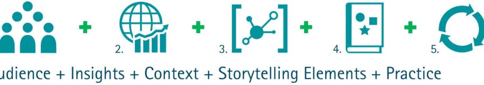
1. Define audience
Develop an understanding of who is going to use the data visualization. By understanding the audience’s background, goals and needs, companies can tailor the language, explanations and presentation style accordingly. Once the audience profile is defined, companies can add more granularity in terms of specific personas with different needs and characteristics. Defining the audience helps inform design decisions for the data visualization, provides focus for the team’s effort and establishes an agreed benchmark for reference.
2. Frame insights
With the audience in mind, companies should select the snapshots that directly align with the audience’s needs and wants and provide targeted messages that support the story to be told. This is a useful step for gathering thoughts, reviewing the steps that it took to find and refine the data, as well as what other information might be helpful to explain the specialized knowledge.
3. Consider context
Focus on how and where the data will be shared, such as via a mobile device, through a web-based presentation or in front of a live audience. Also determine whether the data visualization will be used collaboratively by multiple individuals or by a single user. For example, a data visualization intended for a presentation to 1,000 people in an
auditorium will be different from one viewed by a few co-workers via Skype. In addition, define the parameters of the experience, anticipate contextual considerations and plan the materials needed to make the story clear, accessible and actionable. These decisions will impact how the content is organized and presented.
4. Select storytelling elements
Choose an appropriate visualization category or style to communicate the information. In some cases, the data lends itself more toward an exploratory—or explanatory—styled element. Exploratory data visualizations are often used as part of the initial analysis process to find insight through the data, whereas explanatory data visualizations are typically used to present insights, patterns or trends that were discovered during the data analysis phase. Sometimes the two categories can be blended to achieve a particularly effective narrative.
Another way to think about data is through objective or persuasive categories. Objective data visualizations communicate insights in a format to inform or teach. Persuasive versions are used to build a compelling point of view clearly supported by data, which guides the audience to a specific conclusion or call to action.
Borrowing certain literary narrative techniques can be especially useful in directing visual storytelling. For example, juxtaposing two data sets can help an audience more easily draw comparisons or contrasts in what the data visualization conveys, thus aiding comprehension. Similarly, injecting dramatic or “visual” irony into a data visualization can help the
audience discern between what the data initially seems to reveal versus what is ultimately the truth.
There are many other visualization categories and styles that can also be used as elements, just as there are many storyline structures in which those elements can be arranged. Choosing the appropriate combination depends on understanding the audience and deciding what will be the most effective for them.
5. Organize and practice
To bring everything together into an organized story, companies must decide which type of storyline structure best fits the defined goals based on the audience, insights, context and elements. Possible ways to structure a story include describing a process, telling an anecdote, sharing global then local findings, setting the stage for future exploration or developing a vision to move from a current to future state. Companies can also use various tools to help organize a story, such as scripts or storyboards. Experience maps are another useful tool for planning the touchpoints and interactions the audience will have before or after seeing the data visualization.
As a final step, companies should gather feedback during the process, present the story and accompanying data visualizations to a test audience (this can be an informal group such as colleagues working on other projects), and iterate as needed.
Audience + Insights + Context + Storytelling Elements + Practice
1.
2.
3.
4.
5.
Storytelling + Data = Understanding
Data visualization is the capstone of the data supply chain—
and especially critical in this era of big data. Companies can
produce hundreds of facts and depict them in static charts,
but if not done in a certain way, they only create more noise.
On the other hand, if a company tells a story and applies
the right design principles, the data visualization can cut
through the noise and provide more clarity. In response to
this need, Accenture has developed an approach that blends
the art of storytelling with the science of data to accelerate
understanding and drive innovation.
5
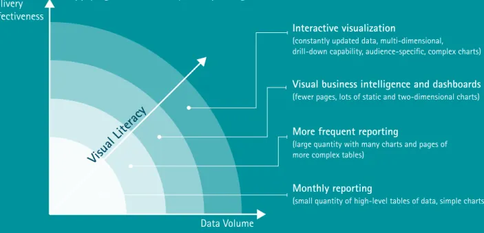
Figure 2: Companies are at various points along the visual literacy maturity curve
Monthly reporting
(small quantity of high-level tables of data, simple charts)
Interactive visualization
(constantly updated data, multi-dimensional,
drill-down capability, audience-specific, complex charts)
Visual business intelligence and dashboards
(fewer pages, lots of static and two-dimensional charts)
More frequent reporting
(large quantity with many charts and pages of more complex tables)
Data Volume Delivery
Effectiveness
Applying Visual Literacy to Reporting
Conclusion
Companies are much more apt to succeed with data
visualization by setting a goal based on business need,
leveraging their investment in available data visualization
technology, and synthesizing the data in a meaningful way
through the storytelling methodology described above.
The result? A powerful way to turn data insights into
actions—accelerating understanding and decision-making
ability at all levels of the organization.
Achieving visual literacy
Think of data visualization as a new, common
language for data exploration and communication
with numerous applications. Moving past
traditional key performance indicators and
static charts to more appropriate and interactive
representations of data unlocks new ways to
understand the data faster and more efficiently.
The better an organization can do this, the more
visually literate they are.
Data visualization in action: Natural disaster heat map
To make FEMA’s decades of data more accessible, Accenture Technology Labs assembled the publically
available information into a highly dynamic visualization that shows the type and frequency of nearly
every FEMA-designated disaster, down to the county level. Companies and individuals can use it to
find interesting stories, such as how the massive spike in 2005 tropical storm disasters was a result
of FEMA providing hurricane Katrina evacuation aid to the majority of states in the continental US,
or that Los Angeles is the most disaster-prone county in the nation, due to its susceptibility to fires.
There are countless other explorative stories to find, from weather to population trends, and data
visualization helps to tell them by providing a platform for communicating insights.
For more, visit www.disasterviz.com.
7
Figure 3: Accenture Disaster Visualization showing a curious data pattern
About Accenture
Technology Labs
Accenture Technology Labs, the dedicated technology research and development (R&D) organization within Accenture, has been turning technology innovation into business results for more than 20 years. Our R&D team explores new and emerging technologies to create a vision of how technology will shape the future and invent the next wave of cutting-edge business solutions. Working closely with Accenture’s global network of specialists, Accenture Technology Labs help clients innovate to achieve high performance. The Labs are located in Silicon Valley, California; Sophia Antipolis, France; Arlington, Virginia; Beijing, China and Bangalore, India. For more information, please visit www.accenture.com/technologylabs.
This document makes descriptive reference to trademarks that may be owned by others. The use of such trademarks herein is not an assertion of ownership of such trademarks by Accenture and is not intended to represent or imply the existence of an association between Accenture and the lawful owners of such trademarks.
Copyright © 2014 Accenture
About Accenture
Accenture is a global management consulting, technology services and outsourcing company, with more than 293,000 people serving clients in more than 120 countries. Combining unparalleled experience, comprehensive capabilities across all industries and business functions, and extensive research on the world’s most successful companies, Accenture collaborates with clients to help them become high-performance businesses and governments. The company generated net revenues of US$28.6 billion for the fiscal year ended Aug. 31, 2013. Its home page is www.accenture.com.
Contacts
John Y. Miller [email protected] Nathan Shetterley [email protected]Acknowledgements
We’d like to thank Joshua Patterson and Allan Enemark for contributing to this paper.