INTERFACE DESIGN FOR DOMAIN-SPECIFIC IMAGE RETRIEVAL: A PILOT STUDY
by
Zhen Zhen Deng
A Master’s paper submitted to the faculty of the School of Information and Library Science of the University of North Carolina at Chapel Hill in partial
fulfillment of the requirements for the degree of Master of Science in Information Science.
Chapel Hill, North Carolina
April, 2001
Approved by:
______________________________
Zhen Zhen Deng. Interface Design for Domain-Specific Image Retrieval: A Pilot Study. A master’s paper for the M.S. in I.S. degree. May, 2001. 66 pages. Advisor: Gary Marchionini
This paper describes a prototype interface designed based on Overview/Preview
principles for an online ads retrieval system, which was created and maintained by Duke university.
A pilot study was conducted on the UNC-Chapel Hill campus in order to compare the performance of the new design and the existing interface with the goal to finding out which interface gives higher levels of user interface satisfaction and saves users time in searching. Based on the results gleaned from the usability test, the prototype was redesigned to resolve the issues arising from the test. In general, the study shows how various applications of Overview/Preview design guidelines can add value to user interfaces and gives suggestions to further study in this field.
Headings:
Information systems – Interface design Information retrieval – Evaluation User group study – End-user searching
Table of Contents
Introduction ……….2
Background ……….4
Design a Prototype ………..8
A Pilot Study ………..17
Redesign the Prototype………...22
Conclusions and Suggestions ……….32
References ………..36
Introduction
The project described in this paper started in spring, 2000 with the design of a prototype interface employing overview/preview design guidelines for the search interface of Ad*Access, an online ads collection; during the summer a pilot study was conducted in order to compare the performance of the new design and the existing interface; later in the fall, the prototype was redesigned based on the results from the usability test.
The first phase of the project aimed to find appropriate applications of overview/preview design guidelines to this specific online image retrieval system; later, a usability test was carried out not only to test the efficiency of the new design, but also to enhance our understanding of users’ likes and dislikes to the features and functions implemented in the prototype, in hope that in the redesign phase better overview/preview applications would result. Furthermore, this work could contribute to further refine the framework of overview/preview design guidelines and improve practice, especially in the field of image retrieval.
coherent view of a number of major campaigns and companies through images preserved in one particular advertising collection available at Duke University”.
Chapter 1 of this paper provides brief background on image retrieval, lists the challenges of interface design and specific problems with the current search interface of Ad*Access. Chapter 2 reports current activity in the study and research on overview/preview design principles, and describes the design and implementation of these guidelines in the new prototype. Chapter 3 covers the pilot study carried out in order to compare the
Chapter 1 – Background
With the explosion of desktop publishing, the ubiquity of digital media and the advent of the World Wide Web, people now have easy access to tens of thousands of digital images. This trend is very likely to continue, thus bigger and more complex image databases will be available for retrieval. However, to find an image among hundreds (maybe thousands) of images online is still considered a time consuming process. Most of the current interfaces to image retrieval systems fail to provide users with quick and accurate information on what the collection includes and what it does not; users spend a considerable amount of time going through different screens and downloading big image files, only to find out later that the results retrieved are not what they are looking for. Ad*Access provides access to thousands of ads online, with the number of ads in the database increasing over time, thus the performance of the search engine and interface becomes crucial in helping the collection users locate what they try to find without wasting them too much time. The first phase of the project aimed to improve the
performance of the search interface of this collection; such improvement faces challenges to interface design in general and for images in particular:
1. Accommodate different end user needs
style.” (Marchionini, 98) In 1986, Peter Ingwersen proposed the classification of three fundamental types of information needs in IR: “
1. Verificative needs, or locational information problems, i.e. the user wants to verify or locate items, […], e.g. source, pages, author name, title words […] , are in this case known to the user.
2. Conscious topical needs, i.e. the user wants to clarify, review or pursue aspects of known subject matter.
3. Muddled topical needs, or ill-defined information problems, i.e. the user wants to explore some new concepts or concept relations outside known subject matter.
“ (Ingwersen, 1986)
Later user group studies/researches proved the validity of this classification; among them, one that is most similar to Ad*Access in subject domain was done by Susanne Ornager (1995) on a newspaper image database. Ornager proposed a user typology based on the journalists’ queries she gathered in the study and the mapping from her user types to Ingwersen’s three fundamental information needs:
Specific Inquirer --- Verificative Needs
Story Teller Inquirer --- Conscious Topical Needs Story Giver Inquirer --- Muddled Topical Needs
According to Ornager, “The study of user types and needs suggest that a user model is necessary for building an interface”. (Ornager, 1995)
search page with the cursor blinking in the query box, the user is urged to input a keyword query with partial or no knowledge of the collection he is searching. On the other hand, for experienced users, e.g. who are familiar with the collection and the search interface, it would be very tedious if every time they have to start from the top of the collection hierarchy instead of going directly to the category where they want to start search.
2. Rapid, incremental, reversible exploratory actions
“Users prefer comprehensible, predictable and controllable search environments in which they can rapidly and safely explore and use information”(Greene et al., 00) Not only should the interface help users explore different features/functions on the screen, but also it’s necessary that users be informed of what will happen after each action they are going to take. For an image collection like Ad*Access, a predictable search environment becomes more important in that it will help to save users lots of time in downloading big image files online which are actually of no interest to them. Ad*Access mainly provides text to give user instructions on how to do search; but, instead of putting the text close to the feature which it explains, the interface overwhelms users by trying to tell them everything along the search process once; users forget most of them quickly and if later in the search users encounter some problem, they still have to go several screens back in order to look for explanation on that particular part.
3. Make review of results more efficient
presses the "search" button, he has to go through three different windows (if the search engine finds some results to the query) in order to see the images. There isn’t any thumbnail-size image for the user to preview and the interface displays each ad in a separate full-size window, which means that the user has to spend a considerable amount of time downloading candidate results and even much more time in review. This problem becomes more evident when the number of retrieved images is large.
4. Relevance Feedback
Chapter 2 - Design a Prototype
Current activity in the field of image retrieval focuses on developing methodologies for searching image collections using the image data itself (Cawkell, 98 and Heidorn & Sandore, 97); the most recent research efforts introduce different approaches – similarity measures (Pei & Cheng, 99), knowledge-based visual query languages (Chu & Hsu, 98) and fuzzy logic to retrieve images based on their content (Wu et al., 98). But fewer studies have been done in order to find out how the interface of an image retrieval system can help to improve the search performance.
Overview/preview interface design guidelines have been introduced and promise to offer more intuitive and efficient information representations in order to support visual
information seeking. Overviews and previews are “graphical or textual representations of objects of interest. […] a preview is extracted from, and acts as a surrogate for, a single object of interest; […] an overview is constructed from, and represents, a
00), and based on their long-time experience in building and testing interfaces, the researchers propose the following design guidelines: “
1. Use salient surrogates 2. Use multiple surrogates
3. Use multiple levels of surrogates
4. Use surrogates to inform users about size, extent, and availability of collections or objects
5. Leverage data types (use visual surrogates for visual data, etc.) 6. Choose metaphors that map onto the data or most common task; 7. Provide logically sequenced surrogate levels and capitalize on natural
orderings (e.g., geography, chronology)
8. Provide directly manipulable control mechanisms (visual, incremental, and reversible controls) for navigating both within and across surrogates
”(Greene et al., 00)
Through the years these design guidelines have been applied to diverse interfaces of different information systems: such as NASA’s Earth Observing System Data
Information System (EOSDIS), National Digital Library Program (NDLP) Collections Browser prototype, WebTOC overview of the American Variety Stage Collection; and previous usability studies produce positive results. One good example of
overview/preview’s application to image collection interface is the visible human explorer system (North et al., 96), which offers a user interface for remote access of the National Library of Medicine’s Visible Human digital image library; it has overview images providing a “global view of the overall search space” and preview images
providing “details about high resolution images available for retrieval”. (North et al., 96) Feedbacks from the user group “indicate the users’ excitement with the interface’s highly interactive nature, fast feedback, and quick learnability, trademarks of a direct
using Lifelines” (Alonso et al., 98) indicates that overview/preview techniques “led to much faster response times, primarily for questions which involved interval comparisons and making intercategorical connections”(Alonso et al., 98). The evaluation study conducted by ATT lab compared SCAN (Spoken Content-based Audio Navigation) browser with a control interface and the result showed that SCAN has advantages for fact-finding and relevance judgment tasks over the traditional speech access interface. “The overview and transcript elements of the SCAN UI offer multiple methods for users to reduce the problems of time-consuming serial access to speech”(Whittaker et al., 99). Results from the controlled experiment on the Restaurant Finder, an interface designed to help users identify restaurants that match certain criteria, show that by using the interface users have higher subjective satisfaction and query previews guide “users in rapidly and dynamically eliminating undesired records, reducing the data volume to a manageable size, […]”(Plaisant et al., 99).
1. Solution to problem one – accommodate different end user needs
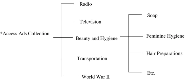
The structure of Ad*Access collection is hierarchical (Table 1), which contains five main categories and several sub-categories.
Ad*Access Ads Collection
Table 1 – Hierarchical Structure of Ad*Access Collection
The prototype gives users two ways in which they can do search, e.g. at each level of the collection users can either do search directly or do browsing first, then key in queries. Results of a user study carried out for the FotoFile system indicates that there is "a considerable role for browsing techniques in supporting consumers' multimedia information seeking activities" (Kuchinsky, 99). The prototype is composed of four frames (appendix 1), three of them are dynamic; five thumbnail-size images representing five main categories are displayed in the right-hand-side frame. When user clicks on one
Radio
Television
Beauty and Hygiene
Transportation
World War II
of them, thumbnail-size images representing the sub-categories under the selected main category will appear in the upper frame.
For users with verificative needs, who come to the collection with a very clear idea of what ads they want to find, they can use the query text box directly to express their information needs. A query box appears at each level under a main category; take "Beauty and Hygiene" as an example, at the bottom of the page representing the first-level sub-categories (appendices 2-3), users get a similar query form to the one they can find in the left-hand-side frame on the screen. The only difference lies in that the
Category and Time attributes have been changed to the values belonging to that particular sub-category group. If the main category has two-level sub-categories, the page for the second level will appear in a pop-up window (appendix 4).
2.Solution to problem two – rapid, incremental, reversible exploratory actions
Instead of overwhelming users by telling them everything related to the search once, the prototype controls both the information volume and the time when the information should appear, in order to give instruction/help only related to the task the user is currently carrying out and only when user needs it. Besides, in order to make these instructions more intuitive and easier to understand, the new prototype adopts different forms, e.g. mouse-over function, pop-up window and dynamic select menus.
Mouse-over: information/instruction can appear when it is needed and leave space for other information when the target it explains is not chosen; for example, when the user mouse-overs the thumbnail-size image representing the Beauty and Hygiene category, a brief description on this category will appear at the bottom of the frame telling user the total number of ads under this category, names and volumes of the sub-categories, etc. (appendix 5)
down menus under “Category” and “Time”; for example, if according to the “site
suggestion” there is 0 result under Radio-1950-56 for his query, he knows that he should avoid choosing the time attribute “1950-56” under the Radio category.
Dynamic select menu: since Ad*Access uses different timelines under each main category as well as sub-category, instead of mixing all the time values in the pull-down list under "Time", the prototype uses dynamic select menus for Category and Time, e.g. each time the user selects a category, the values of the Time box will automatically become the corresponding timelines under the chosen category. Thus, the system always predefines a set of valid time attributes for the user to choose; to a certain degree, this helps to prevent the occurrence of invalid queries.
3.Solution to problem three - make review of results more efficient
Mouse-over, thumbnail-size images, and pop-up windows were used in order to reduce the time and avoid screen transitions in results review.
The prototype lets the user decide how much time he wants to invest in review by informing him of number of results the system has retrieved to a query, how long it will take to download all thumbnails and it allows user to determine how many
right-hand-side browse frame will change into the result display page with a bigger size of the chosen image inside. (appendix 8) if any time during the review, user wants to go back to the browse window, he can find the link "go back to browse" easily at the top of the page. "Full Record" and "Enlarge" buttons lead to pop-up windows where the user can get to know more about the selected image.
4.Solution to problem four - relevance feedback
Seldom does a user come to an information system with clear idea of what he wants to find. The image-text content of the collection makes it more difficult for the system user to formulate a productive query quickly, plus the user's lack of knowledge of the database and the vagueness in query's meaning often lead to unsatisfied results even after several search attempts. The prototype suggests that interactive scanning, one of the analytical search strategies, be implemented in the search process. "This approach requires much user-system interaction and is less algorithmic and more like guided discovery. […] Hawkins and Wagers note that this strategy is useful […] for problems in domains
unfamiliar to the end users or the searchers. […] The interactive scanning strategy is used by novices in many different environments and is much closer to browsing strategies than to other analytical strategies". (Marchionini, 95) Besides, "the results of studies of end users searching primary systems reveal the importance of feedback" (Marchionini, 95)
image, etc. or directly click the "find similar" button. A pop-up window (appendix 9) with new results will appear, in which the user can review the thumbnails and give relevance feedback again. In addition, the new prototype aims to combine relevant features the user finds in different images together through use of the "similar plus" button. In the real system, a temporary database may save the images the user has selected and the relevance feedback for each of them; if the user selects the same attribute(s) for two images, the later one will overwrite the previous one.
Chapter 3 – A Pilot Study
Purpose
The primary purpose of the usability test was to observe the strengths and weakness of both interfaces, so as to develop a prototype, which incorporates the best features of two. Specific questions for the test were:
! Does the new prototype save users’ time in search?
! Based on the Overview/Preview design guidelines, I have implemented mouse-over function, dynamic select menus and pop-up windows in the prototype; besides, the new interface gives users more control over the whole search process by allowing them to do both search and browsing at the same time and offering equal access to each level of the collection, so
o How do users react to these new features, e.g. do they like them or not?
o Compared with features in the current interface, which do they prefer?
Hypotheses
Pre-test Work
A small database was set up in order to back-up the prototype; “coupon”, a keyword randomly selected, was used to do a search in the existing search interface, which
retrieved a total of 25 records. All the results were then copied from the real collection to the local database. In the usability test, a controlled experiment was used, e.g. participants were given the query word “coupon” for each search, in order to make search engine performance be equal to both interfaces and only features related to the interface itself be tested.
Tasks
Participants used both interfaces in the test, and with each of them they did three tasks: 1. try to find two particular ads (from different categories) using the query word
“coupon” --- for the usability test, two ads were selected from category Beauty and Hygiene and two from Radio with the insurance that ads from the same category belong to the same level in the collection hierarchy, so that the searches for the two sets of ads (each has one ad from Beauty and Hygiene and the other from Radio) share the same search complexity. This task aimed to determine how fast users can a) find a certain ad in the collection and b) do search across
categories, by using each interface.
reaction towards the features/functions on the screen. With the participants’ permission, all the conversations were recorded.
3. after exploring both interfaces, participants were asked to fill out a subjective questionnaire (appendix 11), which was composed of a selected set of items from QUIS 7.0, plus some designed especially for this usability test purpose (items with asterisk beside them). According to Hix and Hartson, “
Questionnaires are the most effective technique for producing quantitative data on subjective user opinion of an interface. The QUIS survey is one of the most comprehensive and readily available of these validated
questionnaires
”. (Hix & Hartson, 93)
Selecting Participants
The ads collection Ad*Access is an open URL, so the boundary of its user group is not well defined. Based on user feedback (mainly in form of email), two main existing user groups are:
• Librarians working on special collections
• Scholars and researchers doing study on cultural history, history in advertising, or some other related topics
They often come to the collection with specific study/research topics in mind and most of them have considerable background knowledge in this field.
interests are topics related to advertising; two participants were librarians from the Manuscripts Department in Wilson Library, who have working experience with
photo/image collections; and one participant was currently a PhD student in the History Department, whose dissertation topic is related to American advertising history.
Only one participant among the six had used the Ad*Access collection before the usability test, most of them have done online image search, but not frequently.
Participants were more familiar with paper/slide collections and their experience with computers was mainly using Word, Excel and PowerPoint software, only one of them knew how to build web page with HTML.
Procedure and Measurements
Each participant used one interface first (participants of odd numbers in sequence, e.g. participants 1, 3, 5, used the prototype first, then the existing interface; those who were of even numbers, used the existing interface first, then the prototype); each participant was given some time to examine the first ad he was supposed to find, then started the search; after he found the record, he was shown the second ad, then from the screen where he stopped in the first search, he started to find the second. During these two searches, the participant was not made to answer any question, so that he could concentrate on the task. But he was encouraged to speak out what he was thinking while doing the search; in case the participant had problems during the search, for example, some participant asked for advice on what he should do next when he got to certain screen, he was always
After he found both records, each participant was given some time to free-use the interface, e.g. he could explore whatever feature/function as he wanted and at the same time I asked questions according to what I observed; then the participant filled out the subjective questionnaire.
Chapter 4 – Redesign the Prototype
Results and Analysis
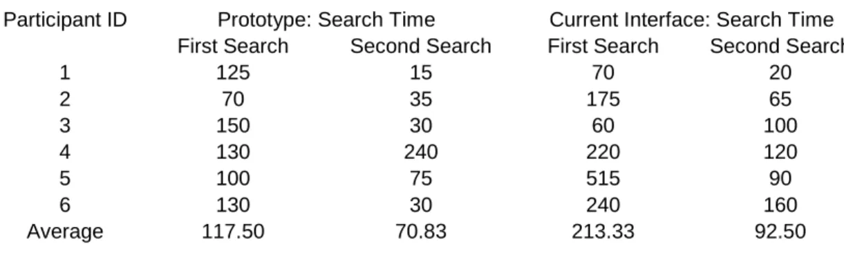
Search Time (appendices 12-15): the result proves the first hypothesis to be true; on average, the prototype saved participants 95.83 seconds on the first search and 21.67 on the second.
The hypothesis also predicts that for cross category search, e.g. the second searches in the usability test, the prototype works faster than the current interface. The time showed in the second and fourth columns in Table 1 is for the second search; during the usability test, after participants located the first record, they were asked to stay with the result screen, from which they then started the second search. So the time recorded for the second search actually includes the time participants spent in finding their way back to the query input form and doing a new search. Since one of the design goals of the
Subjective Questionnaire (Appendices 16): according to Table 2, the prototype gets higher scores on most of the questions than the current prototype, which confirms the second hypothesis; the features participants like better in the existing interface are:
# Question 2.1 : characters on the computer screen are easier to read # Question 2.3.2: size of images are more adequate
# Question 3.1.2: instructions for commands or functions are clearer
Other questions on which the prototype gets average score less than 6.00 out of 1.00-9.00 scale are:
# Question 2.4 : sequence of screens
# Question 3.1 : messages which appear on screen
Result from the questionnaire suggests that all these five features mentioned above be improved in the prototype.
Feedbacks from Participants (Appendix 17-18) : the list in Appendix 18 are all the positive feedbacks from the participants recorded during the conversations in the usability test, from which we can tell that the features users especially liked in the prototype were :
# mouse-over function (No. 2) # thumbnail size images(No.4)
# the interface offers access to information of different levels in the collection and allows users to do search, result evaluation and record examination at the same time (No.1,3,6,8)
In Appendix 18 all the recommendations are listed and for analysis purposes, related suggestions have been grouped together. In general, users have problems dealing with the four-frame structure of the prototype, they want to gain more control over browsing and find it hard to understand the Site Suggestion function ; besides, the My Own Page feature is not easy enough for this user group to use. Detailed discussion is given in the Redesign part.
Redesign
The redesign of the prototype was mainly based on the results gotten from the subjective questionnaire and suggestions/feedbacks from the participants recorded during the conversation. In the redesign
(http://dbserv.ils.unc.edu/projects/Teresa/searchm2_rev.html; in pages where group of images appears, always take the first image as example), all the features that users like are kept, and efforts have been made to improve the ones that didn’t work that well in the test. In the paragraphs below, comments/questions from the participants are listed first, then we have the discussions which try to find the reasons causing these problems, finally come the solutions that have been taken accordingly in the redesign.
(Prototype1 is used to refer to the prototype used in the usability test, and prototype2, to the redesigned interface.)
1. The frame structure of the prototype (Appendix 18: 1-4): three of the
Related problems are: one participant hoped to have a bigger result page and four of them suggested that the thumbnail size images in the result display page be enlarged, at least users should be able to read the headlines of the ads.
These feedbacks correspond to the problems we find through questions 2.1, 2.3.2 in the questionnaire.
Discussion: in order to save users’ time and make the interface give continuous feedback during search, prototype1 was divided into four frames in order to capture all the main changes within one screen space, thus, to avoid unnecessary whole screen change. But since the size of the whole screen itself is limited, everything inside the frames has to be reduced in size, which makes participants feel that the fonts on the screen and thumbnail size images are not big enough. Besides, during the design of prototype1 the border value of each frame was set to be “false” when it was possible, in order to make the screen appear “seamless” and more coherent. This actually posed a problem to most of the participants when they did result evaluation; after all, the four-frame-structure interface is not something that we come across frequently when doing online search.
Additionally, the result from question 2.4 in the Questionnaire shows that the sequence of screens in prototype1 is not clear enough to the participants, which, in my opinion, is also caused by the multi-frame structure of the interface. The sequence of screens in prototype1 (Appendices 1-10) is:
# Browsing – it starts from the lower right frame, goes to the upper right one, then a pop-up window.
Solution: prototype2 has only two frames, and the fonts appearing on the screen all get increased by one size bigger than their original sizes. In the sample result page (appendix 20), which now occupies half of the screen space, every
thumbnail size image has been increased in size so that the ad headline is visible. The sequence of screens in prototype2 (Appendices 19-23), which only has two frames and more pop-up windows implemented, is much simpler than that in prototype1:
# Search – appendices 19-21, it starts from the left-hand-side frame, goes to the right one, then comes the pop-up window.
# Browsing – appendices 22-23, it starts from the right-hand-side frame, subcategory gets displayed in a pop-up window, and the third level category (if any) is shown in a second pop-up window.
2. Browsing (Appendix 18: 5): none of the participants did the search through
browsing, even though most of them had never used the collection before the test. Later when they were given time to freely use the interface, two of the
Discussion: one of the reasons for the participants not doing browsing is due to the nature of the task, e.g. in the test each participant was asked to find four ads in the collection and before each search he was shown the ad he was going to find, which made it unnecessary for the participant to start search through browsing, whose main role is to help users with “muddled topical [information] needs, or ill-defined information problems” (Ingwersen, 86) to further clarify their questions in mind. Besides, even though participants were told that the purpose of the test was not to test their search skill, somehow they felt the time pressure to a certain degree and tried to finish the task as soon as possible.
In prototype1 when users mouse-over certain images in the browsing frame, related information of the category will appear on the screen in order to give them “[…] Immediate, continuous, visual feedback[…]". (Shneiderman, 92) The descriptions should also have informed users of the number of images which will appear in the next screen, which hasn’t been implemented in prototype1 and reminds us again that “Users prefer […], predictable, and controllable
environments in which they can rapidly and safely explore and use information”. (Greene et al, 00)
3. “Site suggestion” function(Appendix 18: 6-7): none of the users could tell what this button did by only looking at the label on it; only two of the six participants clicked on it and both of them suggested it would be better if they could click on the numbers appearing in that pop-up window to see the images.
Discussion: the primary purpose for this “site suggestion” button is to give a statistical feedback to the user when he keys in some query, in hope that it would give him a better idea how the information he is currently interested in is
distributed in the collection. The problem is that participants didn’t understand the label on the button itself; during the test, the participants were asked to suggest some possible labels for this button after they got to understand what the function does, but no one could come up with a short phrase which can express efficiently what this feature is for.
These feedbacks correspond to the problems we find through questions 3.1 and 3.1.2 in the questionnaire.
Solution: the approach here is to put this feature in context, e.g. to make the relationship between the tasks users carry out and the information offered by this feature, more obvious to end users.
4. Zero Result (Appendices 24-25): fewer studies have addressed issues related to how an interface to an IR system should deal with zero result. Usually when zero result has been retrieved, the search interface would only tell user there’s no matching record in the collection, which puts the user at a dead end without giving any suggestion on what might be done next. Unfortunately prototype1 is not an exception, participants’ feedback (Appendix 18: 8) indicates the necessity of some online help features from the system side.
Solution: In prototype2, two efforts have been made in order to help user come up with more productive search:
# below the zero result statement (Appendix 24), the search engine lists the number of retrieved records under other categories and time values, which themselves are hyperlinks to the real set of records, so that the user can try other possibilities in the collection;
# controlled vocabulary search – in the left frame, the interface offers the user access to both natural language search and controlled vocabulary search; “zero result” indicates that the user didn’t use the controlled vocabulary function before, so here the link to that feature appears again, in hope that by using it the user can learn more about what is in the collection and avoid getting zero result in the future. (appendix 25)
5. “My own page” function (Appendix 18: 9-10): similar to what happened with
page even though the interface already gives basic html code and what they will have to do is fill in blanks.
A related problem is: most of the participants thought it would be nice if they could use some of the images in Ad*Access and customize the way in which these records are displayed for their teaching and research purposes (of course, copyright issues should be taken care of).
These feedbacks correspond to the problems found through the questions 3.1 and 3.1.2 in the questionnaire.
Discussion: taking into consideration the characteristics of the participants, which indicates that most of them have little more than basic computer skills, the result might not be that surprising. On the other hand, current information retrieval systems seldom offer users features through which they can customize the display of information retrieved from the collection, which might partially explain why participants can’t figure out what “my own page” button does at first glance (the meaning of “my own page” itself is not clear can be another one).
Solution: participants were asked to suggest phrases that would be more adequate for this feature, and several of them thought that to include “html” in the label
Chapter 5 – Conclusions and Suggestions
The digitized image is an important format in information retrieval and the importance of the interface to an image retrieval system lies in that it serves as a mediator between the end user and the methodologies adopted by the system behind the screen. Well-designed interfaces will help to make the communication between the end user and the system easy and smooth, while inefficient interface design would prevent users from taking full advantage of the methodologies and index systems available in the system.
function, pop-up windows, thumbnail size images and dynamic interface which offers equal access to information located in different levels in the collection at the same time, were all welcomed by the user group.
The redesign phase of the project focused on improving the overview/preview
applications in the prototype based on the analysis of the findings from the pilot study, which suggest the importance of
# online help when zero result happens;
# offering users a predicable and controllable search environment;
# giving users some easy and convenient way to add new interpretation/value to the information they retrieve from the IR system
these issues have all been addressed accordingly in the newer version of the prototype.
Suggestions
Even though the results from the pilot study show the advantage of the new design over the current search interface, the application of overview/preview in the prototype is only one possible way in which an online image collection can adopt these design guidelines. Design and testing of previews and overviews for other image retrieval systems with different user groups are needed in order to better answer the research questions. Besides, in the redesign, different approaches have been taken in order to deal with several new issues brought to our attention during the usability test, e.g.
1) How can the interface better guide the user when the zero result is retrieved 2) How to introduce a richer controlled vocabulary to the user (from an interface
3) How to make it easier for the user to customize the information he has retrieved To the second question, in prototype2 a Java applet is used to list the controlled
vocabulary, give the corresponding descriptions and lead to the page where thumbnail-size images are shown. Currently there is no real index system backing up the interface itself, a sample controlled vocabulary is suggested to be introduced in order to test the performance of the applet and further questions we might want to ask are: With the number of images in the collection and the size of the controlled vocabulary growing, is the applet still efficient for this task? If not, what alternatives exist? Besides, the
interface of the Java applet itself is quite primitive and more work is needed to be done in this aspect.
carry out the task using drag and drop functions, which will make the whole process more intuitive and user-friendly.
References
Ahlberg, C., & Truve, S. Exploring terra incognita in the design space of query devices. In Proceedings of engineering for human computer interaction, EHCI ’95. Amsterdam: North Holland.
Alonso, Diane Lindwarm, Rose, Anne, Plaisant, Catherine, Norman, Kent L. Viewing personal history records: a comparison of tabular format and graphical presentation using LifeLines. Behaviour & Information Technology, 1998, Vol. 17, No. 5, pp. 249-262.
Cawkell, A.E. Checking research progress on “image retrieval by shape-matching” using the Web of Science. Aslib Proceedings, 1998, 50(2), pp.27-31.
Chu, W. W., & Hsu, C.-C. Knowledge-based image retrieval with spatial and temporal constructs. IEEE Transactions on Knowledge & Data Engineering, 1998, 10, pp.872-888.
Heidorn, P. B., & Sandore, B. (Eds.). Digital Image Access & Retrieval. Urbana, IL: University of Illinois at Urbana-Champaign Graduate School of Library & Information Science, 1997.
Hix, D., & Hartson, H.R. Developing User Interfaces: Ensuring Usability Through Product & Process. New York: Wiley, 1993.
Ingwersen, Peter. Cognitive analysis and the role of the intermediary in information retrieval. Intelligent Information Systems. Chichester: West Sussex: Horwood, 1986.
Marchionini, Gary. Advanced Interface Design for the BLS Website: Final Report to the Bureau of Labour Statistics. http://ils.unc.edu/~march/blsreport98/final_report.html 1998.
North, C., Shneiderman, B., & Plaisant, C. User controlled overviews of an image library: A case study of the visible human. In Proceedings of the ACM digital libraries ’96, pp.74-82. New York: ACM.
Pei, S.-C., & Cheng, C.-M. Extracting color features and dynamic matching for image data-base retrieval. IEEE Transactions on Circuits & Systems for Video Technology, 1999, 9, p. 501-512.
Plaisant, Catherine, Shneiderman, Ben, Doan, Khoa, and Bruns, Tom. Interface and Data Architecture for Query Preview in Networked Information Systems. ACM TOIS, 1999, 17(3), pp.320-341.
Shneiderman, B. The eyes have it: A task by data type taxonomy for information visualization. In Proceedings of the 1996 IEEE symposium on visual languages, pp.336-343.
Tweedie, L. Characterizing interactive externalizations. In Proceedings of CHI97, 1997, pp.375-382. New York: ACM.
Van Someren, M. W., Barnard, Y. F., & Sandberg, J.A.C. The Think Aloud Method. Hartnolls Limited, Bodmin, Cornwall, 1994.
Appendix 1
upper left frame upper right frame
Appendix 2
Upper right frame changes after the user clicks on one of the images appearing in the lower right frame; thumbnail-size ads represent the sub-categories under Beauty and Hygiene.
Appendix 3
Appendix 5
Appendix 6
Appendix 7
Result page appears in the upper left frame after the
user clicks “search” Brief description of the ad brought
Appendix 8
Appendix 9
Appendix 10
Appendix 11 Usability Test – Subjective Questionnaire
Participant ID __________
Choose the interface you are evaluating ( ) current search page of Ad*Access ( ) the new prototype
Part 1 : Overall User Reactions
Please circle the numbers which most appropriately reflect your impression about using this interface. Not Applicable = NA.
1.1 Overall reactions to the system: terrible wonderful
1 2 3 4 5 6 7 8 9 NA
1.2 frustrating satisfying
1 2 3 4 5 6 7 8 9 NA
1.3 difficult easy
1 2 3 4 5 6 7 8 9 NA
1.4 inadequate adequate
1 2 3 4 5 6 7 8 9 NA
1.5 dull stimulating
1 2 3 4 5 6 7 8 9 NA
1.6 rigid flexible
1 2 3 4 5 6 7 8 9 NA
Part 2 : Screen
2.1 Characters on the computer screen: hard to read easy to read 1 2 3 4 5 6 7 8 9 NA
2.1.1 Image of characters fuzzy sharp
1 2 3 4 5 6 7 8 9 NA
2.1.2 Character shapes (fonts) barely legible very legible
1 2 3 4 5 6 7 8 9 NA
2.2 Use of bolding: unhelpful helpful
1 2 3 4 5 6 7 8 9 NA
2.3 Screen layouts were helpful: never always
1 2 3 4 5 6 7 8 9 NA
*2.3.1 Number of images that can be inadequate adequate
displayed on screen 1 2 3 4 5 6 7 8 9 NA
*2.3.2 Size of images inadequate adequate
2.3.3 Arrangement of information on screen illogical logical
1 2 3 4 5 6 7 8 9 NA
2.4 Sequence of screens: confusing clear
1 2 3 4 5 6 7 8 9 NA
2.4.1 Next screen in a sequence unpredictable predictable
1 2 3 4 5 6 7 8 9 NA
*2.4.2 Going back to the previous screen(s) impossible easy
1 2 3 4 5 6 7 8 9 NA
2.4.3 Progression of work related tasks confusing clearly marked
1 2 3 4 5 6 7 8 9 NA
Part 3 : System Information
3.1 Messages which appear on screen: confusing clear
1 2 3 4 5 6 7 8 9 NA
3.1.1 Position of instructions on the screen inconsistent consistent
1 2 3 4 5 6 7 8 9 NA
3.1.2 Instructions for commands or confusing clear
functions 1 2 3 4 5 6 7 8 9 NA
3.2 Interface keeps you informed about never always
what it is doing 1 2 3 4 5 6 7 8 9 NA
3.3.1 Performing an operation leads to a never always
predictable result 1 2 3 4 5 6 7 8 9 NA
3.3.2 Controlling amount of feedback impossible easy
125 70 150 130 100 130 70 175 60 220 515 240 0 100 200 300 400 500 600
1 2 3 4 5 6
Participant
Time(seconds)
New Prototype Current Interface
15 35 30 240 75 30 20 65 100 120 90 160 0 50 100 150 200 250 300
1 2 3 4 5 6
Participant
Time(seconds)
New Prototype Current Interface
117.50
213.33
70.83
92.50
0.00 50.00 100.00 150.00 200.00 250.00
Tim
e
(seconds)
First Search
Appendix 15
Table 1: Time Participants Spent for Each Search
Participant ID Prototype: Search Time Current Interface: Search Time First Search Second Search First Search Second Search
1 125 15 70 20
2 70 35 175 65
3 150 30 60 100
4 130 240 220 120 5 100 75 515 90 6 130 30 240 160 Average 117.50 70.83 213.33 92.50
Appendix 16
Average Score/Question for Both Interfaces in Subjective Questionnaire
Question Number
Average Score of the Prototype
Average Score
of Current Interface Better
1.1 7.00 5.67 PT 1.2 7.00 5.17 PT 1.3 7.00 6.00 PT 1.4 7.33 5.33 PT 1.5 7.83 4.67 PT 1.6 7.67 4.33 PT
2.1 7.83 8.17 CI
2.1.1 8.33 8.33 NA
2.1.2 8.33 7.83 PT
2.2 7.20 5.25 PT 2.3 6.33 5.33 PT
2.3.1 7.50 5.67 PT
2.3.2 6.83 7.50 CI
2.3.3 6.00 5.33 PT
2.4 5.83 5.67 PT
2.4.1 7.00 5.67 PT
2.4.2 8.33 7.33 PT
2.4.3 6.33 5.50 PT
3.1 5.50 5.33 PT
3.1.1 6.33 5.60 PT
3.1.2 4.50 5.00 CI
3.2 6.75 4.60 PT
3.3.1 6.83 5.33 PT
3.3.2 7.00 5.40 PT
Appendix 17
Positive Feedbacks
The number behind each point is the numbers of participant who mentioned the issue during the test.
1. pop-up windows help to display information from different levels in the collection on the same screen (4)
2. mouse-over is really convenient (4)
3. like to have the query input form and the result display page appearing on the same screen (3)
4. thumbnail size images make the search really fast and save lots of time (2) 5. like relevance feedback (2)
6. the prototype is dynamic and avoids screen transitions, users don’t have to go back and forth during the search (1)
7. like the way in which browsing is done in the prototype, e.g. clicking on one image leads to the next level in the collection (1)
8. do results evaluation and single record examination at the same time, e.g. after user clicks the search button, result page appears in the upper right frame; if user clicks on one of the images in the result set, the enlarged view of that certain ad appears in the left frame with detailed information of the record (1) 9. bold faced and different-color fonts in the texts appearing on the screen are useful (1)
Appendix 18
Suggestions
The number behind each point is the numbers of participant who mentioned the issue during the test.
1. can’t tell the boundary between the frames (1) 2. didn’t notice the scroll bar beside the frames (3) 3. the size of the result page should be bigger (1) 4. thumbnail size images aren’t big enough (4)
5. in browsing, there’s no way to know beforehand how many images will be displayed when clicking on an image (2)
6. what the button “site suggestion” does is not clear (6)
7. in the pop-up window brought by “site suggestion”, make the numbers of results under each category into hyperlinks, so that users can view the records quickly (2)
8. hope the interface could give some help when no result is retrieved (2) 9. what “my own page” does is not clear (6)
Appendix 19
Category description brought up by mouse-over function
Appendix 20
result page
Appendix 21
Detailed information of one ad
Appendix 22
Pop-up window with images representing subcategories under Beauty and Hygiene
Appendix 23
Second pop-up window with images representing third-level categories under Beauty and Hygiene
Appendix 24
Appendix 25
Appendix 26