This paper introduces the ShelterViz web app, an interactive visualization
platform developed to make U.S. animal shelter and rescue data accessible and
easy to explore. Using a dataset provided by the nonprofit organization Shelter
Animals Count, the ShelterViz project allows users to manipulate more than 100
different intake and outcome statistics collected from over 4,000 shelters and
rescues across the United States.
This research project employed a design-study methodology as well as
approaches grounded in visual analytics and user-centered design. The website
was developed using HTML5, CSS, Javascript, and D3.js. The results of the
usability testing indicate support for the project and its potential to help shelter
and rescue organizations to better understand the impacts of various factors on
animal outcomes, recognize trends in their data over time, and ultimately take
steps to improve animal welfare.
A demo version of the website can be accessed at https://www.shelterviz.com.
Headings:
Information Visualization
Web Development
Web Design
by
Carmen S. Dolling
A master’s paper submitted to the faculty
of the School of Information and Library Science
of the University of North Carolina at Chapel Hill
in partial fulfillment of the requirements
for the degree of Master of Science in
Information Science.
Chapel Hill, North Carolina
April 2019
Approved by:
Contents
Introduction 2
Background Literature 4
1. Animal Shelters and Rescues in the U.S. 4
1.1.Defining Shelters and Rescues 4
1.2.Understanding Intake 5 1.3.Understanding Outcomes 7 1.4.Reducing Euthanasia Rates 8 2. Insight through Data Visualization 14
2.1.Visualizing Shelter Data 16
2.2.Visualizing Data Over Time 17
Methodology 19
1. Research Design 19
2. Data Selection & Processing 20
2.1.Data Selection 20
2.2.Data Processing 21
3. Problem, Users, & Tasks 24
4. Initial Design 27
5. Prototype Development 32
6. User Testing & Evaluation 35
6.1.Recruitment 35
6.2.Testing Procedure 38
6.3.Results 40
Conclusion 48
1. Challenges & Limitations 48
2. Future Work 50
References 52
Appendix A: Recruitment Email 60
Appendix B: Consent Form 61
Introduction
Overpopulation of animal shelters has been a longstanding cause for concern in the
United States. Approximately 6.5 million animals enter U.S. shelters annually; of these
animals, some 1.5 million, or 23%, are euthanized each year (American Society for the
Prevention of Cruelty to Animals [ASPCA], 2018). While overall shelter numbers and
euthanasia rates are declining, this figure nevertheless continues to represent a large
proportion of animal deaths which in many cases ought to be preventable.
Numerous efforts have been made to identify variables influencing shelter intake
and outcome statistics. Intake refers to the number and type of animals which enter a
shelter, such as strays or owner surrenders; outcome refers to an animal’s departure
from the shelter, whether via adoption, euthanasia, or other means. Factors ranging
from an individual animal’s coat color (DeLeeuw, 2012; Svoboda & Hoffman, 2015) to
the efficacy of subsidized spay and neuter programs (White, Jefferson, & Levy, 2010;
Scarlett & Johnston, 2012) have been linked to changes in intake and outcome rates,
and live outcomes have been successfully improved in some parts of the country.
Despite this, little cohesive guidance exists on how best to approach the systematic
problem of shelter overpopulation and the correspondingly high rates of companion
animal euthanasia.
Much of the information necessary to assist with a solution, however, is ready and
“Big Data, One Dog at a Time,” many shelters collect comprehensive data on their
operations, but their systems are often outdated, making the reports difficult to parse
(Dyché, 2016). For this reason, although animal-welfare organizations are now
collecting and reporting data in greater volume than ever before, the many benefits of
such information have yet to be fully realized. Dyché calls on shelters to make use of
modern technology and big-data techniques to put their data to work.
This paper introduces the ShelterViz web app, an interactive visualization platform
developed to make U.S. animal shelter and rescue data accessible and easy to explore.
Using a dataset provided by the nonprofit organization Shelter Animals Count, the
ShelterViz project allows users to manipulate more than 100 different intake and
outcome statistics collected from over 4,000 shelters and rescues across the United
States. Through interactive visualization and analysis, this tool has the potential to help
shelter and rescue organizations to better understand the impacts of various factors on
animal outcomes, recognize trends in their data over time, and ultimately take steps to
Background Literature
This paper will consider two key areas of related literature: research in the animal
shelter and rescue domain, and research on data visualization and analysis. The first of
these sections will focus on the work that has already been done not only to
understand intake and outcome trends, but more importantly to find ways to improve
euthanasia rates through a variety of academic studies and shelter initiatives. The
second section will examine the benefits of interactive data visualization and its
applications for animal welfare. Together, these two areas of scholarship should offer a
framework within which to position the potential contributions of the ShelterViz project.
1.
Animal Shelters and Rescues in the U.S.
1.1.
Defining Shelters and Rescues
For the purposes of brevity, this paper may occasionally use the term “shelter” to refer
to both shelters and rescues when the topic in question is more broadly applicable.
However, it is worth clarifying the distinction between these two types of organizations.
Although the terms are often used interchangeably, and the organizations themselves
have many overlapping goals and processes, shelters and rescues do typically function
in different ways.
In general, an animal shelter is government-operated, government-contracted, or
receives supplemental government funding. Most shelters are operated out of a
services, and the majority of animals are housed on-premises in kennels, runs,
crates, cages, or communal feline rooms. Shelters often perform community services
such as animal control for lost, stray, neglected, or dangerous animals; rehabilitation of
sick or injured wildlife; and trap-neuter-release of feral cat populations. Many shelters
have capacity-, time-, or behavioral-based policies of euthanasia, though there has
been some movement toward a “no-kill” shelter ideology.
Animal rescues, by contrast, are often smaller and independently operated, without
governmental support. While some may maintain official premises, many house their
animals through an extensive volunteer foster-care system. Depending on state,
county, and municipal laws, rescues may or may not be permitted to accept stray or
owner-surrended animals; in many cases, rescues receive the majority of their animals
as transfers in from shelters. Transfer programs represent an important partnership
between shelters and rescues, through which shelter animals which might otherwise be
euthanized due to space, health, or behavioral constraints are instead placed with
rescue organizations. Most if not all rescues are explicitly “no-kill,” and they will keep
the animals in their possession indefinitely until homes are found.
1.2.
Understanding Intake
In order to understand trends in animal outcomes, it is necessary first to understand
how animals come to be in shelters. Shelters and rescues report four predominant
forms of intake, or the means of an animal’s arrival at the shelter: found as stray,
transferred in, owner relinquishment, and owner-intended euthanasia.
Strays constitute those animals brought in to the shelter (perhaps by individuals,
which have been moved between one shelter or rescue and another; it is not
uncommon for these organizations to collaborate in an attempt to optimize space or
better position an animal for adoption.
Owner relinquishment refers to animals which have been voluntarily surrendered by
their owners. Previous research has explored some of the reasons people come to
surrender their pets. New, Salman, et al. (1999) found that “moving” was the number
one cause for relinquishment of dogs and the third most-common cause for
relinquishment of cats. Of interest is the fact that “friends” were the number one
reported source by which owners obtained their animals, suggesting a cycle may exist
in which pets that one cannot or would prefer not to keep are passed on through
multiple homes before finally arriving at the shelter. Weiss, Gramann, et al. (2015)
similarly found that for survey respondents who rented their homes or who were of
lower income, housing issues were a primary reason for re-homing their pets. In cases
where pets were re-homed, 37% were given to a friend or family member, closely
followed by being taken to a shelter.
A pet which is re-homed due to a problem with the animal itself as opposed to
personal family issues is more likely to be taken to a shelter (Weiss, Gramann, et al.,
2015). New, Salman, et al. (1999) likewise found that undesirable characteristics, such
as problem behaviors and hyperactivity, were commonly reported in animals which
were relinquished. These findings are supported by Patronek, Glickman, et al. (1996),
who observed that cats with behavioral problems such as eliminating inappropriately or
behaving aggressively (both most common in sexually intact cats) were at the highest
risk for relinquishment.
Not all relinquishments, however, necessarily represent a “failure of the bond”
Prato Previde, et al., 2004; Marston & Bennett, 2003). Owner-intended euthanasia (OIE),
the last of the principal intake categories, is an important but less critically understood
component of shelter data. Kass, Scarlett, and Salman (2011) found that roughly 24%
of dogs and 17% of cats were brought to the animal shelter for euthanasia due to
reasons such as serious illness, old age, and extreme behavioral problems—a function
not dissimilar from that served ordinarily by a veterinarian’s office. The decision to
euthanize at an animal shelter, as opposed to a veterinary office, may therefore be more
an act of economic practicality than an explicit abandonment of the animal. It is
necessary to consider these cases carefully—both at the time of intake and at the time
of outcome—when analyzing animal shelter statistics.
1.3.
Understanding Outcomes
At the most fundamental level, there are two possible outcomes for a shelter animal:
survival or death. In practice, however, there are a variety of forms which these
outcomes can take. Most desirable is the successful return of an animal to its original
owner (RTO), which happens for about 710,000 strays each year, or 11% of the 6.5
million animals admitted to shelters nationwide (ASPCA, 2018). Failing this, adoption to
a new owner is a highly positive outcome: roughly 3.2 million shelter animals, or 49%,
are adopted annually (ASPCA, 2018).
Trap-neuter-return or trap-neuter-release (TNR) programs trap feral cats and
transport them directly to a spay and neuter clinic for sterilization, vaccination, and
identification ear-clipping before releasing them back to their local colonies (Million Cat
Challenge [MCC], n.d.). Similarly, return-to-field (RTF) is an increasingly common
practice wherein stray or community cats already admitted to a shelter are sterilized
allow otherwise-healthy unowned cats to continue to live in their neighborhoods or feral
communities, reducing euthanasia while also minimizing reproduction (MCC, n.d.).
Transfer programs have also become a very important solution for shelters with
limited capacity or strict euthanasia policies. In such cases, animals are typically
transferred out of the shelter and into the possession of a rescue organization or shelter
with a no-kill policy. While such a transfer may not represent the final outcome for the
animal, it will be the outcome status reported by the original shelter. Other
occasionally-reported live outcomes include “escaped,” “stolen,” and “lost in care.”
Non-live outcomes constitute roughly one quarter of animal outcomes nationally
(ASPCA, 2018). Not all such outcomes are avoidable—shelter animals do die of illness,
injury, and other ordinary causes, and “dead on arrival” and “died in care (not
euthanized)” make up a small portion of reported shelter outcomes. As discussed
previously, owner-intended euthanasia is also an important factor. The percentage of
OIE outcomes is difficult to estimate: OIE is not always reported consistently, and not
all owner-requested euthanasias are actually performed if the shelter deems the animal
to be adoptable. On the whole, however, shelter euthanasia is the overwhelming cause
of non-live outcomes, accounting for 23% of outcomes overall (ASPCA, 2018).
Common reasons for euthanasia include illness and injury, behavioral aggression, and
lack of shelter space (Gray, 2015).
1.4.
Reducing Euthanasia Rates
There are three principal means of reducing euthanasia rates: increasing the number of
animals which leave the shelter via a live outcome; decreasing the number of animals
which enter the shelter in the first place; and optimizing the resources available for
shelters and researchers have focused primarily on improving rates of animal adoption.
Efforts to decrease shelter intake have emphasized spay and neuter awareness and
affordability. A variety of other shelter initiatives have further assisted with the above
aims, as well as improving the shelters’ ability to care for displaced animals over time.
1.4.1.
Factors Influencing Adoption
Numerous studies have attempted to identify factors which lead to animal adoption. To
begin with, there is demonstrated human preference for certain biological and
demographic characteristics in shelter animals, and these characteristics are
statistically associated with changes in outcome. A survey conducted by Weiss, Miller,
et al. (2012) found that appearance, social behavior, and personality were the most
influential factors when it came to choosing a pet for adoption. Lepper, Kass, and Hart
(2002), modeling predictors of adoption for eight thousand dogs and cats in the
Sacramento County Department of Animal Care and Regulation, found that age, sex,
coat color, and reason for relinquishment were influential factors across both types of
animals, in addition to breed, purebred status, and injury status in dogs. Similarly,
Protopopova, Gilmour, et al. (2012) found that breed type, mode of intake, and dogs’
attractiveness (as rated by experimental participants) were predictive of adoption and
length of shelter stay. Posage, Bartlett, and Thomas (1998) found that terrier, hound,
toy, and nonsporting breeds were significantly associated with successful adoption, as
were gold, gray, and white coat colors, small size, and history of an indoor living
environment. More recently, Svoboda and Hoffman (2015) found that black coat color,
popularly believed to impede the adoption prospects of a dog, did not significantly
did, with older dogs and bully breeds spending significantly longer in shelters and being
euthanized at higher rates.
Meanwhile, certain programs and human interventions have been found to
improve live shelter outcomes. A detail as simple as an animal’s housing situation may
be linked to its likelihood of adoption. Propotova, Gilmour, et al. (2012) found that an
individual animal’s kennel location within the shelter influenced adoption rates.
Gourkow (2001) found that cats housed in communal and “enriched” environments
(furnished with perching shelves and hiding spaces) were significantly more likely and
more quickly to be adopted than those housed alone in basic stainless-steel cages. In a
recent study of twenty-one thousand dogs admitted to the Pima Animal Care Center in
Tucson, Patronek and Crow (2018) found that temporary placement outside of the
shelter in a foster home increased the odds of adoption by five times for all dogs, and
by greater than 20 times for adult dogs. Of the 1,510 dogs in this study which
interacted with the foster care system, 98.9% had a live release, and dogs returned
from foster care had a 70% reduction in health concerns.
Beyond optimizing an animal’s environment, there are basic steps which a shelter
can take to improve outcomes. Luescher and Medlock (2009) found that dogs which
underwent basic obedience training were adopted 1.4 times more often than untrained
dogs; “being good with other dogs” was also a statistically significant trait when it came
to increased adoption rates. Multiple studies conducted in Australia (Zito, Paterson, et
al., 2015; Crawford, Fontaine, & Calver, 2017) found that discounted or waived adoption
fees for adult cats positively influenced adoption and were not correlated with “poor
adoption outcomes” (e.g. attracting less responsible owners), suggesting that such
1.4.2.
Spay & Neuter Programs
Without doubt, one of the largest undertakings in animal welfare has been the spay and
neuter movement. Conventional wisdom holds that the widespread sterilization of
companion animals helps to reduce the incidence of unplanned litters and, by
extension, the number of unwanted animals which ultimately wind up in shelters.
Shelters, rescues, and affiliated nonprofit organizations have invested millions of dollars
both in educating the public on the benefits of spay and neuter and in subsidizing free
or low-cost sterilization programs to make these services more accessible.
Unfortunately, the evidence to support these programs is mixed. Frank and
Carlisle-Frank (2006) conducted an analysis of five communities participating in the
Maddie’s Fund program, one of the nation’s largest animal welfare nonprofits, which
provides economic incentives to increase both sterilization levels and adoption rates.
The study found that the discount program did not fall prey to substitution (in which
owners already planning to sterilize their pets at full cost instead simply do so at lower
cost) and did successfully increase the total number of spay and neuter procedures
performed. However, the study was not able to demonstrate an inverse relationship
between communitywide sterilization levels and shelter intake rates.
Evaluating the impact of a subsidized spay and neuter clinic in rural North
Carolina, Scarlett and Johnston (2012) found that the rate of decline in dog intake and
euthanasia did not improve in the four years following the clinic’s opening. Intake and
euthanasia of cats decreased significantly, but the proportion of cats euthanasized did
not change. White, Jefferson, and Levy’s (2010) regression analysis of a low-cost spay
and neuter initiative in New Hampshire had similar results: there was a significant
decline in cat intake and euthanasia, but there was no impact on dog intake or
EmanciPET Free Spay/Neuter Program found that there was a positive impact on both
dog and cat intake and euthanasia, with the program areas demonstrating a
significantly lower rate of increase than nonprogram areas.
Measurable success has recently been observed with several community cat
programs. With approaches such as return-to-field (RTF) and trap-neuter-return (TNR),
neighborhood and feral cats are brought in for sterilization before being returned to their
original colonies or trapping locations. Assessing the impact of formal RTF and TNR
programs at a municipal shelter in Albuquerque, New Mexico, Spehar and Wolf (2018)
reported that feline intake declined by 37.6%, feline euthanasia declined by 84.1%, and
the live release rate saw a corresponding increase of 47.7%. Operation Catnip, a
combined TNR and RTF program in Gainesville, Florida, has been credited with helping
to reduce euthanasia at the municipal shelter from 81% to 42% over the course of 13
years (MCC, n.d.). Similarly, a study of a TNR program in Auckland, New Zealand,
found that there was a considerable reduction in incoming stray felines, underage
euthanasias, and unsocialized adult stray cat euthanasias in the targeted suburb as
compared to the non-targeted suburb group, though the authors warned that causation
could not be totally inferred due to the short-term nature of the pilot program (Zito,
Aguilar, Vigeant, & Dale, 2018).
Clearly, there are many different ways of publicizing, incentivizing, and performing
spay and neuter, and White et al. (2010) emphasize that different models may have
varying degrees of effectiveness depending on the needs of an individual community.
Frank (2004) also suggests that evaluation must be a long-term and ongoing process,
since the full impact of sterilization initiatives may not be realized for thirty years or
more. Still, several of the papers above noted that a lack of comprehensive data
highlighting the increasing importance of data-backed practices. Given the large
amounts of time and money which have been invested in spay and neuter programs, it
is important for communities to be able to make informed decisions so that they can
put their resources to the best possible use.
1.4.3.
Other Shelter Initiatives
Outside of spay and neuter programs, a number of other initiatives have sought not only
to reduce euthanasia rates, but to improve shelters’ ability to provide for the animals in
their custody. In her paper “Managed Intake and Capacity for Care,” Karsten (2015) has
outlined a model for shelters to follow—focused on improved housing, reduced length
of stay, managed intake, and advance criteria planning to avoid decision fatigue—to
ensure the best possible care without becoming overwhelmed. A subsequent study by
Karsten, Wagner, Kass, and Hurley (2017) found that implementation of the Capacity for
Care (C4C) model in three target shelters led to lower daily shelter populations, shorter
length of stay to adoption, increased adoption probability, and decreased probability of
euthanasia. Meanwhile, the Pets for Life (PFL) program seeks to bring veterinary
services and educational information out into underserved and impoverished
communities, where many animals end up in shelters not because they are unwanted,
but because their owners lack the basic resources to continue caring for their pets (Pets
for Life, 2017). In providing these outreach support services, PFL-participating shelters
are relieved of both the financial and operational burden of accepting new animals into
their facilities to house, care for, and attempt to adopt out, all while helping pets to stay
Multiple papers again emphasized the importance of data collection. Kim (2018)
discussed the difficulty of devising, implementing, and evaluating the success of new
programs when shelters do not collect fundamental statistics, observing too that a lack
of funding and resources means that many shelters do not have access to basic
data-collection or analysis software. More promisingly, Weiss, Patronek, Slater, Garrison,
and Medicus (2013) conducted a study of six communities participating in the American
Society for the Prevention of Cruelty to Animals (ASPCA) Partnership, a collaborative
grant program which guides community partners in collecting and sharing data using
standardized metrics to reach a data-driven goal. With support from the grant,
participating organizations were able to experiment with new procedures and modify
their strategies based on the data that they gathered. Over the five years of the study,
there was an average improvement in live outcomes of 62%; within individual
communities, the improvement ranged from 18% to 96%. This is just one example of
the positive impact that can be made when shelters are given the guidance and
resources needed to effectively utilize their data.
2.
Insight through Data Visualization
As the previous section makes clear, there have been many attempts to understand
animal shelter outcomes. The majority of academic efforts, however, have taken the
form of case studies rather than large-scale data analysis. In 2012, Shelter Animals
Count (SAC), a nonprofit organization formed by a cross-section of animal welfare
agencies, set out to aggregate a national database of U.S. animal shelter outcome
take a comprehensive and detailed look at shelter outcome statistics across the country
(Shelter Animals Count, 2016).
The SAC report helped to capture important trends and relationships within the
shelter data. There is mounting evidence, however, that interactive visualizations offer
greater opportunities for insight over static reports. Thomas and Cook’s (2005)
Illuminating the Path set the stage for the nascent discipline of visual analytics, in which
interactive visual representations enable users to explore large and complex datasets.
Today, visual analytics is well-established as a means of organizing and clarifying
information for human interpretation. As Thomas and Cook discussed, visual
representation encourages users to quickly and effectively engage with data, while
interactivity guides them in reorganizing, interpreting, and reasoning about the
information presented. Keim, Andrienko, Fekete, et al. (2008) described the role of
visual analytics in transforming information overload into an improved process of
analytical decision-making. Eick (2000) argued that visualization enables users to think
iteratively, asking questions of the data and exploring linked events, while Yi, Kang,
Stasko, & Jacko (2007) emphasized the value of the interactive component in allowing
users to manipulate the data, augment cognition, and arrive at important insights.
Numerous papers have underscored the primary goal of interactive visualization as
providing such “insight,” a term which these same papers have agreed is difficult both
to define and to quantify. North (2006) proposed five characteristics of insight: it is
complex, involving large amounts of data in a synergistic way; deep, accumulating over
time and giving rise to further questions; qualitative in nature; unpredictable and
serendipitous in how it arises; and closely relevant to the data domain. Yi, Kang,
Stasko, & Jacko (2008) positioned insight as an initial mental framework within which a
suggested that information visualization facilitates the identification of trends, patterns,
and anomalies, as well as a flexible exploratory perspective, both of which are
necessary to developing the aforementioned mental framework. Meanwhile, Chang,
Ziemkiewicz, Green, & Ribarksy (2009) observed that visualization assists in the solving
of complex problems by supporting a continuous feedback loop of deep knowledge
acquisition, followed by novel connections and spontaneous moments of insight.
Jankun-Kelly, Ma, & Gertz (2007) described a similarly cyclical process of achieving
insight through the repeated modification of parameters to generate new visualization
results.
2.1.
Visualizing Shelter Data
Information visualization has already made its debut in the animal shelter domain. An
open-source dataset produced by the Austin Animal Center and popularized through
Kaggle has resulted in static visualizations by a variety of interested coders (Papiu,
2016; Hong, 2016) and even a few interactive dashboards (Seagraves, 2018;
Nakareseisoon & Wang, 2018), all of which contribute meaningfully to our
understanding of animal shelter outcomes. Like much of the animal shelter research
described in this paper, however, these visualizations are limited to the data produced
by a single shelter. While they offer specific and valuable insights, they cannot paint a
complete picture of the state of shelter animals across the United States, nor can they
facilitate individual shelters’ analysis of their own unique data.
Dyché (2016) charged shelters to begin acting like businesses, leveraging data and
analytics to improve efficiency and outreach. In an article published in the MIT Sloan
Management Review, organizations which relied on analytics were found to consistently
important emerging analytic technique, “transform[ing] numbers into information and
insights that can be readily put to use” (LaValle, Lesser, Shockley, et al., 2011). There is
little question that visual analysis of comprehensive shelter data has the power to
provide real and lasting insight into animal shelter outcomes. To that end, the ShelterViz
project undertook to design and develop an interactive visualization utilizing the
nationwide data collected by Shelter Animals Count.
2.2.
Visualizing Data over Time
Based on the results of the persona creation, task identification, and initial design
outlined in the methodology below, the ShelterViz project focused on the visualization
of data over time. Graham Wills’ (2011) book Visualizing Time has discussed many
important considerations and ways to approach the design process. Wills described the
distinction between a presentation graphic, in which known features are displayed to
provide answers to specific questions, and an exploratory visualization, in which users
reflect on the data, compose hypotheses, and draw conclusions based on revelations
arrived at through the visualization. In an exploratory context, it may not always be
known which variables or features are important, and the design should support users
in making these kinds of discoveries. For time-based data, this often involves helping
users to see trends and patterns over time, identify cyclical effects and relationships
between variables, and spot unusual features which diverge from the overall state of the
system (Wills, 2011).
Wills (2011) argued that good design is often a trade-off between ease of use and
level of detail: a visualization should assume the least complex form possible which
accurately presents the data. For displaying a continous variable over time, Wills
suggested a line chart as “one of the simplest charts with multiple variables” as well
(Wills, 2011, p. 77-78). Wills went on to describe the benefits of interactivity in this
context, allowing users to modify the parameters of the visualization as they select
different subsets of the data, show and hide variables, and access further details on
demand. For this last capability, Wills recommended the tool-tip, a ubiquitous and
well-understood pop-up technique through which additional information is displayed only
Methodology
1.
Research Design
The principle goal of this project was to design and develop an interactive data
visualization tool which facilitates the exploration of large and complex animal shelter
datasets, allowing users to visually examine the shelter intake and outcome rates and
draw meaningful conclusions. To that end, this study employed an adapted version of
the methodology outlined in Sedlmair, Meyer, and Munzner’s (2012) Design Study
Methodology: Reflections from the Trenches and the Stacks. In addition, the work was
focused through the lens of user-centered design.
Design studies, in contrast to more traditional data-gathering and data-analyzing
research, present unique challenges when it comes to assessing the study’s value and
efficacy: What does the project set out to accomplish? Does the design fulfill the needs
of that project? How does one measure the success of a design implementation? In
order to best answer these questions, Sedlmair et al. suggest a nine-stage framework
for the design-study researcher to follow. While not every step proposed by these
authors is applicable in the context of a master’s paper, the basic procedure they
establish offers comprehensive guidance for a design-based project such as this one.
This study’s research design thus proceeded in the following manner:
1) familiarization with visualization and domain (animal shelter) literature;
3) characterization of the primary problem, with associated tasks and
requirements;
4) articulation of design goals;
5) development of design prototype;
6) user testing and evaluation;
7) analysis of results and corresponding plans for revision; and
8) discussion of the project and its implications.
2.
Data Selection & Processing
2.1.
Data Selection
The ShelterViz web app was developed using the Shelter Animals Count (SAC)
2011-2018 CSV dataset, which contains monthly animal intake and outcome statistics
collected from approximately 4,000 animal shelter and rescue organizations nationwide.
This dataset was selected for use in the project because it is by far the largest and most
comprehensive dataset of its kind. Several other shelter datasets are freely available for
use (the Los Angeles Animal Services 2012-2018 dataset and Austin Animal Shelter
2013-2016 dataset being the best-known), but each of these contains detailed
information on the animals within a single organization only. Furthermore, several data
visualization projects have already been conducted using these two sets. At the time of
this writing, no data visualization project involving the Shelter Animals Count dataset is
known to exist beyond the static visualizations present in their own 2016 report.
The SAC data is self-reported by participating organizations, collected using a
basic data matrix created by SAC (Shelter Animals Count, 2019). This data matrix
juvenile, and unknown). In addition to tracking beginning and ending monthly total
counts for each of the two animal species, the matrix tracks the intake and outcome
types summarized in Table 1.
The data is aggregated by organization, location, reporting year, and reporting
month, with each spreadsheet row representing one month’s totals. Organization and
location are distinguished because one organization may operate multiple facilities or
rescue locations. There are also separate data fields for organization and location EIN,
name, type, city, state, zip, county, county FIPS, open date, and close date.
2.2.
Data Processing
Python’s Jupyter Notebook and Pandas library were used for data processing. Some
basic data cleaning was required before visualization development could begin, and the
first step was to drop unnecessary fields from the spreadsheet. As the FIPS code was
not needed, and the opening- and closing-date fields had frequently been left blank,
these columns were removed.
There was also a question of whether the data should be accessed by
organization name or by location name: because the latter is a subsidiary of the former,
it seemed cumbersome and potentially redundant to include both. Analysis of the data
Intake Live Outcome Non-Live Outcome
Stray / at large
Relinquished by owner Owner-intended euthanasia Transferred in
Other
Adoption
Returned to owner Transferred out Returned to field Other live outcome
Died in care Lost in care Shelter euthanasia
Owner-intended euthanasia
revealed that the spreadsheet contained 4108 unique organization names and 4153
unique location names. Of those 45 instances (1% of the total dataset) for which the
organization and location name were not an exact match, many proved to be the result
of a typo or other minor variation in what was clearly intended to be the same name;
only a very small number of organizations were found to operate multiple locations
under different names. Since little to no information would be lost, it was decided that
all “organization”-related fields would be also dropped from the file, and the location
name and related details would be used for identification purposes.
As development entered its initial stages, it became clear that the format of the
spreadsheet’s column labels was another important detail. The visualization design
included a three-part selection menu through which users could “build” a desired
parameter, selecting in turn the intake or outcome type, animal group, and age group
for which they wished to visualize data. The program was structured to concatenate
results from each of the dropdown menus in order to pass on a single variable in the
following format: [intake/outcome]_[type]_[canine/feline/all]_[adult/juvenile/unknown/all].
In order to facilitate this, the dataset’s variable names needed to match those that
would be generated by selection system, and the spreadsheet’s columns were
correspondingly relabelled to match this design standardization.
The next stage of data processing occurred much later in the project’s
development. The design intention had always been to offer aggregate totals among
the selectable parameter options: for example, the total number of canine strays across
all ages; or the total number of adult euthanasias for both types of animals; or the total
number of live outcomes of all types across all animals of all ages. This feature would
allow users to examine individual statistics in relationship with categorical totals, which
proportion of the whole. The original dataset, however, did not include these cumulative
sums. Each of the aggregate totals—amounting to roughly 120 new data variables—
therefore needed to be calculated in order to fulfill the requirements of the design.
Several possible means of calculating these totals were considered. The most
flexible method would have been to do so within the Javascript code, so that future
datasets could be loaded into the web app with minimal preprocessing required.
However, the differing state of the cumulative variables as opposed to the original
variables began to introduce other complications in the program, and it was decided to
instead hard-code these values into the original CSV file. Pandas dataframes were used
to calculate the various totals and append their new columns to the spreadsheet. This
process was simple but not particularly efficient, as it required manually writing the
formulas for each of the many different sums. In hindsight, it would likely have been
better to conduct the calculations in the live running of the program, and this issue may
be revisited in the future.
The final data-processing decision to be made was how to handle the four
variables for beginning and ending total canine and feline. On and off throughout
development, these variables were used as placeholders for the initial view loaded each
time a new location was selected to be visualized. It made sense, from a design
standpoint, to always have something on the graph to invite users in (rather than load a
blank chart), but it took some time to solidfy what the best starting view would be.
According to the SAC data matrix, the beginning totals are meant to be the total
number of canines or felines present in the shelter at the start of each month, and the
ending totals are meant to be the total number present at the end of each month. In
other words, these statistics should be relatively redundant to one another: the ending
immediately follows it. These figures are also somewhat unique among the many other
variables of the dataset, in that they represent static totals on a single day as opposed
to total movement over the course of a month.
At a glance, then, the beginning and ending totals should provide a snapshot of
the shelter’s typical occupancy. For design purposes, this idea of total occupancy
seemed like a good metric to display on initial load. It would offer users a general
overview of the number of animals typically handled by the organization on a
day-to-day basis, and then the myriad other parameters would be available for the user to
explore with greater specificity.
The ending totals were thought to be the more appropriate choice as a
representation of total occupancy, since these would have been counted after the effect
of each month’s intake and outcome numbers. In practice, however, many
organizations seemed to report ending totals incorrectly: the ending totals often
diverged wildly from the beginning totals, and they commonly included negative
numbers, suggesting that organizations were reporting the figure by which their
occupancy decreased, rather than the total number of animals remaining. Therefore,
beginning totals were used as the stand-in for total occupancy. The two parameters of
“total canine occupancy” and “total feline occupancy” were plotted on each initial
visualization load, and they were also made available in the selection menu for users to
add and remove at will.
3.
Problem, Users, & Tasks
As this paper has already discussed, a wealth of animal shelter and rescue data is
information makes it difficult for individuals to engage with in a meaningful way. Even in
situations where the data is comprehensive and well understood, pages upon pages of
spreadsheets can be difficult for the human brain to absorb, sort through, and translate
into a narrative of what is important, what strategies work well or do not work, and what
factors might influence the ability to do even better. For that reason, the fundamental
problem that this project sought to address was improving the accessibility of animal
shelter and rescue data.
Following a review of the research literature and relevant media coverage, it was
determined that the most useful visualization tool would be one which simplified the
data-exploration process for two specific stakeholder groups. First and foremost, the
interactive visualization should support individual shelters and rescues in better
understanding their own data. By assessing their performance and the needs of their
service areas, these organizations should be able to implement data-backed practices
to optimize their resources and improve their outcomes.
Second, the interactive visualization should assist governing entities in gaining a
clearer grasp of the “big picture” of animal welfare, guiding them as to which steps
might be taken to make further progress. Legislators and policymakers should be able
to investigate trends in the data in order to identify areas most in need of intervention,
conduct comparisons between like and unlike shelter and rescue situations, gauge the
impact of different factors on animal outcomes, and determine which interventions will
provide the most benefit under which circumstances.
In keeping with user-centered design philosophy, two distinct personas were
developed to represent each of these two potential user groups. These personas were
then used to determine the essential user tasks that the visualization tool would be
User #1: Sebastian the Shelter Manager
Sebastian is the manager of a large municipal animal shelter. The shelter is
under-funded and often over-filled, but Sebastian is passionate about the animals under
his care, and he is constantly seeking ways to improve their prospects of a happy
outcome. He would like to be able to view the data trends for his shelter over time,
as well as evaluate how his shelter fares in comparison to others within the region.
He would also like to know whether any shelters handling similar numbers and
types of animals have found ways to better their own outcomes, so that he can
consult them for advice and inspiration.
Task 1.1: Explore detailed time-series data for an individual shelter.
Task 1.2: Compare an individual shelter with others within the geographic region.
Task 1.3: Compare an individual shelter with other similar organizations across the
country, and retrieve contact information for those organizations as desired.
User #2: Penny the Policymaker
Penny is a junior-level board member for a mid-sized county, and she has taken
an interest in the animal shelters under her jurisdiction. Penny would like to
familiarize herself with the current state of shelters and rescues across her service
area: what do their intake and outcome statistics look like, and are there specific
municipalities or neighborhoods that appear to be struggling? She has information
on local animal welfare policies that have been implemented in the recent past,
and she would like to be able assess whether these policies have had a
corresponding impact on any of the shelters. Lastly, she would like to be able to
the country, in order to make sure that needs and standards are being
appropriately met.
Task 2.1: Explore county-wide and individual shelter and rescue data, identifying
instances of sub-standard outcomes.
Task 2.2: Explore time-series data for individual shelters and rescues, particularly
as corresponds with implementation of known policy changes.
Task 2.3: Compare specific target shelters and rescues with similar organizations
across the country (matched according to factors such as geographic region,
outcome statistics, average capacity, longevity, or organization type).
4.
Initial Design
The design goals of the project arose very closely from the users’ required tasks.
Because of the number and variety of tasks that should be supported, it quickly
became clear that a successful visualization tool would need to offer multiple interfaces,
so that users could interact with the data in different ways depending on which
questions they wished to answer or factors they wished to explore.
To begin the design process, the user tasks were clustered into groups based on
their core function. These task clusters thus became the following three design goals:
Goal #1: Allow users to explore the data for an individual shelter over time.
Supported tasks: 1.1, 2.1, & 2.2.
Goal #2: Allow users to compare multiple shelters with one another.
Goal #3: Allow users to explore and compare shelters based on filters such as
geographic region, average capacity, or organization type.
Supported tasks: 1.2, 1.3, 2.1, & 2.3.
The initial project design was then developed as a series of rough pen-and-paper
sketches. These took the form of three visualization “views”:
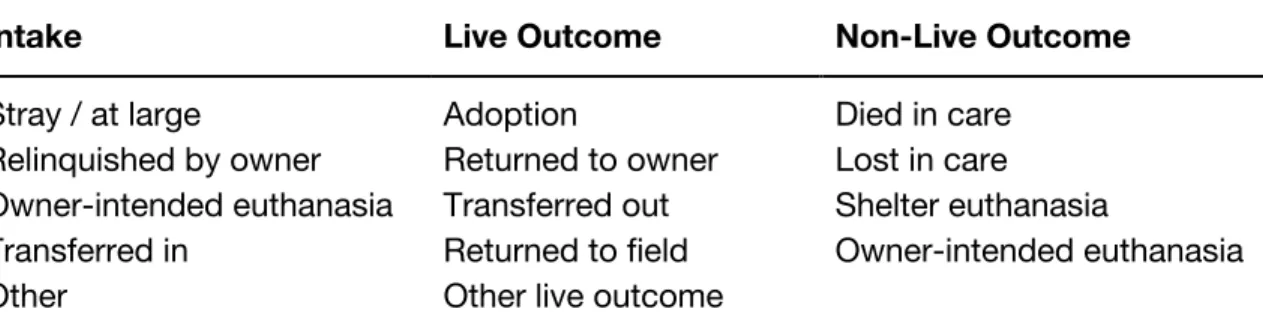
1) a time-series multiple-line graph, in which users could search by shelter and
then filter by intake and outcome parameters, supporting goal #1 or tasks 1.1,
2.1, & 2.2 (Figure 1);
2) a comparison multiple-line graph, in which users could compare variables
across multiple organizations, filtering by organization type, geographic region,
and name, supporting goals #2 & #3 or tasks 1.2, 1.3, 2.1, & 2.3 (Figure 2); and
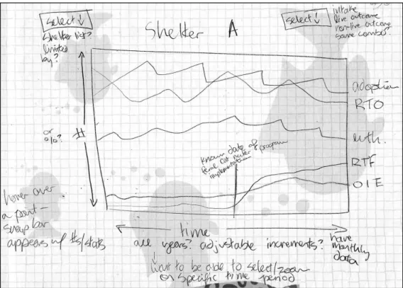
3) a choropleth map, in which users could click to drill down by state, county, and
finally individual organization, supporting tasks 1.2 & 2.1 (Figure 3).
It was subsequently determined that the map view, though perhaps visually interesting,
would not contribute significantly to user understanding of the data, and this view was
eliminated from the project in its current iteration.
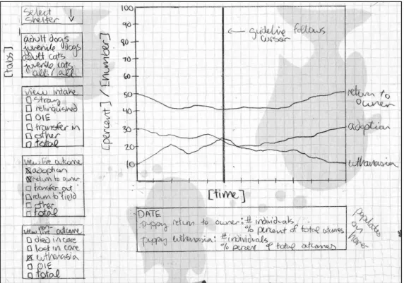
The remaining two design views were refined through a second round of wireframe
sketches, during which the interfaces and their intended functionality were further
specified. Due to the inherent time constraints of a master’s paper, it was decided that
the time-series view (Figure 4) would take priority, since this view supported the most
fundamental goal of the project: helping individual shelters and rescues to easily
explore their own data. User recruitment and testing focused on the corresponding
persona group (User #1, “Sebastian the Shelter Manager”). Ultimately, time did not
permit for the development of the comparison view (Figure 5), but the user testing did
Figure 1. Initial sketch of the individual time-series multiple-line graph.
Figure 4. Refined sketch of the individual time-series multiple-line graph.
5.
Prototype Development
The ShelterViz web prototype was developed using HTML5, CSS, Javascript, and the
D3.js (Data-Driven Documents) Javascript library. The design underwent several minor
changes during the development process, but overall it remained very similar to the
initial specifications. A demo version can be accessed at https://www.shelterviz.com.
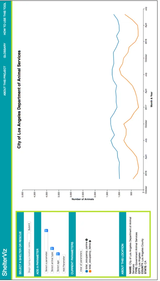
In keeping with the design goals, the time-series visualization is the central focus
of the website. This multiple-line graph occupies approximately two-thirds of the
screen, with a selection menu to the left and a navigation bar along the top. The starting
page view loads data from the City of Los Angeles Department of Animal Services,
inviting users to immediately interact with the visualization (Figure 6).
The chart’s x-axis measures time by month and year, and the y-axis measures
number of animals. Both axes re-scale automatically based on the values present in the
data subset for a chosen shelter or rescue location. By default, the chart displays two
parameter lines—total canine occupancy and total feline occupancy—each time a new
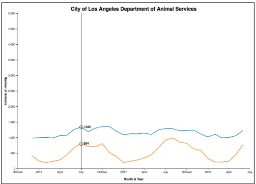
location is loaded. When users mouse over the visualization, a guideline appears and
follows the cursor, displaying the number of animals for each parameter at any given
point in time (Figure 7).
Using the menu panel to the left of the visualization, users can select a new
location, add and remove parameters, and view basic demographic details about the
chosen shelter or rescue. The location search bar is populated with a dropdown list of
locations in the dataset, which automatically refines itself as the user begins to type in a
location name (Figure 8). Clicking “submit” refreshes the visualization with the new
location data and updates the information in the “about” box (consisting of location
Fi
gu
re
6
. T
he
st
ar
tin
g
pa
ge
vi
ew
o
f t
he
S
he
lte
rV
iz
w
eb
a
pp
Figure 7. A cursor guideline displays the number of animals for each parameter.
Figure 8. The location dropdown list refines automatically as the user begins to type.
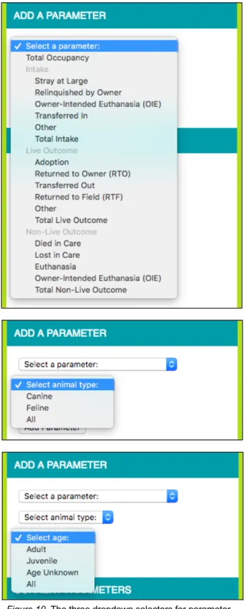
Parameters can be added using the three dropdown selectors for parameter type,
animal type, and animal age (Figure 10). A pop-up alerts the user if he or she fails to
select a variable, or if the parameter he or she selects has already been plotted. In the
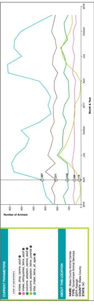
box below, all active parameters are listed, with a colored icon to identify each
corresponding line (Figure 11). Clicking the “x” icon beside each parameter will remove
it from the visualization, or all parameters can be removed at once by clicking the “clear
all parameters” button.
The navigation bar contains links to three supporting pages: “About this Project,”
“Glossary,” and “How to Use this Tool.” The first of these provides background
information about the ShelterViz project, Shelter Animals Count, and the author of this
paper. The glossary uses definitions provided by SAC to explain the different intake and
outcome variables, as well as other basic information which might be helpful to users of
the tool. The how-to page provides simple instructions. Lastly, the “ShelterViz” link on
the left-hand side of the navigation bar allows users to return to the home visualization.
6.
User Testing & Evaluation
6.1.
Recruitment
Small-scale user testing was conducted to assess the usability of the ShelterViz web
app’s design. The primary aims of the testing were to:
1) identify strengths and weaknesses in the interface;
2) evaluate whether the tool was supporting the proposed tasks;
3) learn whether participants found the tool useful; and
Given the limited scope of a master’s project, the user testing was not intended to
be an exhaustive foray into visualization usability (which could fill multiple studies on its
own), but rather to provide a means of evaluating this particular tool. Furthermore, as
Beyer & Holtzblatt (1998) discuss in their introduction to contextual inquiry, the
frequency of new insights drops off dramatically following a comparatively small
number of interviews.
The usability testing focused on users resembling the “Sebastian the Shelter
Manager” persona. Recruitment occurred through the distribution of a template email to
ten local shelter and rescue organizations (Appendix A). Four of the ten organizations
were represented in the Shelter Animals Count dataset; the remaining six evidently do
not report to SAC. Through a combination of targeted and snowball sampling, four
study participants were recruited from among the shelter and rescue volunteers and
employees. The participant types were varied: one volunteer for a governmental animal
services organization represented in the dataset; two employees of a shelter with
government contract not represented in the dataset; and one employee of a shelter
without government contract represented in the dataset. This allowed for a reasonable
distribution of perspectives on how one might use the tool.
6.2.
Testing Procedure
The testing took the form of individual semi-structured interviews, which lasted
between 30 and 60 minutes in length. Each interview began with a brief explanation of
the purpose of the tool and what the participant would be asked to do, as well as the
provision of a consent form (Appendix B). The structure of the interview then proceeded
Each participant was first instructed to click the “Begin Test” link on the initial
blank page, which took him or her to the homepage of the ShelterViz interface. The
participant was then asked to explore the interface as though it were a new website
that he or she had come across. During this exploratory session, the participant was
encouraged to think out loud, discuss his or her actions and decisions, and articulate
any details which were helpful, interesting, confusing, or frustrating. The participant was
also encouraged to ask questions, though the participant was informed that these
questions may not be answered until after the exploratory session was concluded. This
process provided an opportunity to observe how the tool presented itself without any
outside assistance.
Following the initial exploration, the participant was instructed to select a location
of his or her choice. A series of five specific tasks were then administered to help guide
the participant in his or her testing. These tasks were designed to be characteristic of
the tool’s intended use and were approximately the same for each participant, though
the details were tailored slightly to match the individual organizations which had been
selected. (For example, rescues rarely have animals “transferred out,” and instead are
the ones receiving “transfers in” from government shelters.) Depending on the
information yielded by each task, the participant was prompted to discuss anything
interesting or insightful about it, and occasionally was asked to perform additional tasks
which stemmed naturally from the discussion.
To conclude the study, each participant was asked several specific follow-up
questions. In cases where the participant had already discussed the topic of a question,
6.3.
Results
The usability testing provided very useful feedback, both in terms of verbal discussions
with the participants and tacit observation of their interaction with the tool. Overall,
response to the ShelterViz app was enthusiastic and encouraging, and a number of
elements were helpfully identified as facilitating or hindering the information-seeking
process. The feedback tended to fall into one of three groups: technical details of the
interface and its functionality; conceptual approach to the tool as a whole; or desired
areas for additional development. The full interview notes are available in Appendix C.
6.3.1.
Interface Functionality
All four participants spoke positively about the interface, and several described it as
being intuitive to use. However, though the participants were each navigating the tool
quite comfortably by the end of their interviews, there was some trial and error at the
beginning. Not all of the participants immediately understood that they could select a
new location to visualize, and three out of the four left off the “age” variable when
adding a parameter for the first time. Both of these problems suggest that the
requirements and capabilities of the menu are not entirely clear. Possible solutions
could include making the location selection menu more prominent, as well as
introducing a numbered hierarchy to more explicitly guide users through the different
selection steps.
Once aware of the location search, participants seemed pleased with how the
dropdown list of locations populated based on text entry. However, two of the four
participants were interested in scrolling through the list of names, which was not
text search has been entered. Given that there are over 4,000 location names, scrolling
through them all is rather cumbersome, and this is what the autofill feature was meant
to help circumvent. It may be that scrolling itself was only desired as an alternative to
name-based lookup, since the participants expressed that they would like to be able to
search by means other than having a particular location in mind. Either way, scrolling
should be better supported, but the introduction of other ways to search (geographic,
shelter or rescue type, capacity, etc.) should also help to mitigate the need to scroll.
The participants were generally comfortable adding and removing parameters
once they understood how the three-variable system worked. The pop-up alert for
incomplete parameters did confuse some participants, who did not know to click “OK”
to dismiss the message before resuming their activities. This could be improved by
replacing the pop-up with a text alert embedded directly in the selection menu, which
would be shown or hidden based on the same criteria but not require any response for
the user to continue. Only occasionally did participants click the “clear all parameters”
button, though they frequently removed parameters one-by-one. It is unclear whether
this is because the button was often overlooked, or because participants simply did not
wish to remove parameters all at once, preferring instead to follow each line separately.
There was some confusion about the parameter for “total occupancy.” This metric
had to be explained several times, and even once participants understood how it was
calculated, there seemed to be a little bit of uncertainty regarding the relationship
between this statistic and the other parameters. Part of the problem is that the figures
for beginning and ending total canine and feline each represent counts on a single day
of the month: they are a snapshot of total occupancy, whereas the other parameters
represent cumulative numbers throughout the month. While it seems worthwhile to be
possible that simply using “total intake” would be a clearer metric for understanding a
location’s size.
The participants enjoyed interacting with the visualization chart, and they found
the hover line helpful with its specific numbers. In cases where there were multiple
parameters plotted closely together, these numbers could overlap and be difficult to
read, so the program code should be tweaked to spread them apart more responsively.
The visualization’s ten-point color scale seemed to work well with the exception of one
instance where the participant, having added more than ten different parameters to the
chart, removed most of them and was left with two overlapping red lines, which were
difficult to distinguish. Expanding the color scale would assist with this, as would
adjusting the program code so that a parameter could be re-added in a different color.
Multiple participants voiced a desire to be able to zoom in and out on the
visualization chart. In addition to clarifying the user’s view of parameters with
overlapping data points, this would help with an occasional problem of the y-axis scale.
Because the possible parameters include aggregates for total intake, total live outcome,
and total non-live outcome, these values are often much larger than those of the
individual intake and outcome types. This results in a comparatively large scale for
which only a few lines approach the top of the y-axis, while the rest are clustered in the
bottom half of the chart.
Participants also wanted to be able to select a specific date range on the x-axis.
This could be accomplished through the zooming feature described above, or through
the implementation of a slider filter for the desired dates. Meanwhile, the testing
revealed a few quirks with the rescaling of the x-axis which should be corrected. If a
selected location contains less than one year of data, the x-axis tick marks will consist
they had no way to know which year of data had been reported. By contrast, when the
selected location contained many years of data, it was difficult for participants to
determine which month of the year was represented at a given data point. This could be
resolved by including the active month in the hover display.
Only one of the four participants demonstrated any interest in the “about” box,
which provides basic demographic information on the location currently being
visualized. This participant paid a fair amount of attention to those details, so they do
appear to add at least some value. It is possible that this information may become more
relevant once a comparison view is introduced.
For the most part, participants did not make use of the supplementary navigation
links, though they did find the glossary to be helpful once directed toward it. Given
sufficient improvements to the main interface, the “how to” page should hopefully
become redundant and can be removed. A clearer “home” button could be added in its
place, since the title link was not immediately apparent to all participants.
6.3.2.
Conceptual Approach
Each of the participants valued the ability to visualize and interact with their data. Two
of the four described themselves as data enthusiasts, with one saying of the web app,
“as a numbers person, [it’s] really nice to have it at my fingertips,” and the other
describing herself as “really into” data visualization and analysis. Both of these
participants discussed the current tools they use to analyze their data, which primarily
involve static reports and spreadsheets, and lamented the lack of resources to create
visualizations of their own.
All of the participants felt that data visualization would benefit their organizations,
“would make for easier reporting and would be useful to visualize the data.” One
participant stated that it was “really awesome” to be able to track not just by monthly
count but by trends visually over time, adding, “I think this could be incredibly valuable
in terms of tracking trends, what people are interested in and what times. You know,
working in a shelter, that summers are busy, but it’s cool to see it visually.” When asked
how they envisioned this sort of tool being used, the participants demonstrated a clear
interest in tracking the success of various shelter initiatives: the effect of foster and
transfer programs on euthanasia rates, the effect of summer adoption events on
adoption and return rates, and changes in the spay and neuter statistics of incoming
animals. This desire to evaluate and respond to the impact of different organizational
procedures reflects exactly the kind of data-driven practice that the ShelterViz project
was designed to facilitate.
Even in the context of a relatively brief interview, the participants were able to
make a number of interesting observations about the data that was visualized. All four
participants immediately noticed the extreme peak-and-valley trends corresponding
with kitten season, the period running from approximately March through October
during which a majority of kittens are born. Though most shelter and rescue affiliates
are already familiar with the phenomenon of kitten season and the increased
occupancy pressures that it heralds, the participants still seemed to benefit from the
visual representation, and they were interested in exploring the kitten season trends via
the chart.
One participant observed an annual uptick in adult cat intake around the month of
October, which she interpreted as coinciding with the point in time at which many of the
felines born during kitten season transition to being counted as adults (typically around
the summer months. She speculated that this might be linked to her organization’s
summer promotional events, during which adoption fees are reduced or waived, and
expressed curiosity to learn more about whether this trend was correlated.
A different participant observed that although kitten season drove a steep spike in
intake during the late spring and early summer months, adoptions did not rise until later
in the summer. The number of animals transferred out of the shelter, however,
increased in a pattern which closely mirrored that of the intake rates. In other words,
this participant discovered that while adoptions do eventually rise over the summer,
many animals have to be transferred out to other rescues first in order to cope with the
demands of kitten season. The participant recognized this relationship as a direct result
of her ability to visualize multiple parameter trends. Insights such as this can help
shelters and rescues to better understand their operations and decide how best to
allocate their resources.
6.3.3.
Additional Development
All of the participants had ideas for other features that they would find useful in a tool of
this nature. Chief among these was the ability to compare multiple locations
side-by-side with one another, whether on a county or an individual level. One of the
participants even stated that part of her organization’s updated strategic plan is to visit
other shelters with similar intake numbers in order to see what they are doing and learn
from one another. Since a comparison view was one of the original design aims of this
project, it is encouraging to have this functionality confirmed to be a valuable area for
future development.
Another common request was for additional means of location searching, since