N. R. Kaye, A. Hartley, and D. Hemming
Met Office Hadley Centre, Exeter, EX1 3PB, UK
Correspondence to: N. R. Kaye ([email protected])
Received: 28 July 2011 – Published in Geosci. Model Dev. Discuss.: 10 August 2011 Revised: 27 January 2012 – Accepted: 12 February 2012 – Published: 17 February 2012
Abstract. Maps are a crucial asset in communicating cli-mate science to a diverse audience, and there is a wealth of software available to analyse and visualise climate informa-tion. However, this availability makes it easy to create poor maps as users often lack an underlying cartographic knowl-edge. Unlike traditional cartography, where many known standards allow maps to be interpreted easily, there is no standard mapping approach used to represent uncertainty (in climate or other information). Consequently, a wide range of techniques have been applied for this purpose, and users may spend unnecessary time trying to understand the map-ping approach rather than interpreting the information pre-sented. Furthermore, communicating and visualising uncer-tainties in climate data and climate change projections, us-ing for example ensemble based approaches, presents addi-tional challenges for mapping that require careful consider-ation. The aim of this paper is to provide background in-formation and guidance on suitable techniques for mapping climate variables, including uncertainty. We assess a range of existing and novel techniques for mapping variables and un-certainties, comparing “intrinsic” approaches that use colour in much the same way as conventional thematic maps with “extrinsic” approaches that incorporate additional geometry such as points or features. Using cartographic knowledge and lessons learned from mapping in different disciplines we pro-pose the following 6 general mapping guidelines to develop a suitable mapping technique that represents both magnitude and uncertainty in climate data:
– use a sensible sequential or diverging colour scheme;
– use appropriate colour symbolism if it is applicable;
– ensure the map is usable by colour blind people;
– use a data classification scheme that does not misrepre-sent the data;
– use a map projection that does not distort the data
– attempt to be visually intuitive to understand.
Using these guidelines, we suggest an approach to map cli-mate variables with associated uncertainty, that can be easily replicated for a wide range of climate mapping applications. It is proposed this technique would provide a consistent ap-proach suitable for mapping information for the Fifth As-sessment Report of the Intergovernmental Panel on Climate Change (IPCC AR5).
1 Introduction
Visualisation of geographical information has a long tradi-tion in meteorology and climatology (Nocke, 2008), going back at least as far as Galton’s “Methods of Mapping the Weather” (Galton, 1863). Maps are a crucial asset in com-municating climate science to a diverse audience, and ge-ographic information systems (GIS) are frequently used to store, process, and visualize climate data (Nocke, 2008).
(Fig. SPM.1. in IPCC, 2007) is titled “Changes in physi-cal and biologiphysi-cal systems and surface temperature between 1970 and 2004”. They assess the map for eight categories of generally accepted cartographic principles on a scale that in-cludes good, satisfactory or poor, and rate it as poor in four of the categories and satisfactory in the remaining four (McK-endry and Machlis, 2009).
As the quality of graphic design can directly impact decision-making by revealing or obscuring information (Tufte, 1997), it is vital that suitable consideration is given to map design. With poorly chosen colour schemes and map projections, data from individual climate variables or mod-elling centres can be distorted or misrepresented. This is-sue is exacerbated by the progression from single models to the now widely accepted ensemble-based approaches that explore uncertainties in climate model projections (Collins et al., 2006; Murphy et al., 2007, 2004). Such ensembles come in various flavours. These include “multi-model en-sembles” that explore uncertainties across different climate models, (Collins et al., 2011; Tebaldi and Knutti, 2007), “perturbed physics ensembles” that explore uncertainties as-sociated with the physical parameterisations within a model (Tebaldi and Knutti, 2007; Collins et al., 2011), and future emissions scenario uncertainties which explore differences among climate models forced by a range of future emissions scenarios (Nakicenovic and Swart, 2000). These ensemble-based approaches present additional challenges for the way in which climate projections are visualised and communi-cated, because the additional dimension of uncertainty is added to the information to be mapped.
In the IPCC AR4 (IPCC, 2007) a “multi-model ensem-ble” of precipitation projections is visualised using a black dot stippling to indicate regions of greatest agreement and a whiteout to indicate least agreement (see Sect. 2.2). However this technique requires additional symbology to be added to the map which makes it more difficult to implement and it also only allows one level of agreement to be shown with the stippling. Recent work by Teuling et al. (2010) has attempted to map 2 climate variables (e.g. precipitation and temper-ature) on one map using a bivariate (defined in Sect. 2.1) mapping technique (Teuling et al., 2010). In principle this technique could be adapted so that uncertainty is the second variable. However the maps in the paper use up to 25 differ-ent colours, which make the maps very difficult to interpret and visually confusing for colour blind people. In a differ-ent discipline Hengl et al. (2006) (see Sect. 2.1) use differdiffer-ent colours to show topsoil thickness and whiteness to indicate uncertainty of the value. However, the use of a smooth colour scheme and many different hues could make the maps diffi-cult to interpret and confusing for colour blind people.
It is suggested the method outlined in this paper is an im-provement on the techniques briefly described above. This is because it attempts to use standard cartographic principles to increase the clarity of the resulting maps. The approach de-scribed allows more than one level of uncertainty to be shown
and is very easy to implement for gridded climate data. This method could provide a consistent approach for mapping in-formation for the Fifth Assessment Report of the Intergov-ernmental Panel on Climate Change (IPCC AR5).
The paper is structured so that Sect. 2 reviews the literature on mapping uncertainties across a wide range of disciplines, highlighting key features that are applicable for mapping of climate variables and uncertainties. Section 2 also provides guidance on the appropriate use of colour on maps, how to use colour symbology and how to cater for colour blindness. Section 3, highlights key issues relating to mapping climate variables and their uncertainties. It shows how to create an appropriate palette that combines a variable with its uncer-tainty and how to apply it for maps of precipitation and tem-perature. Finally, Sect. 4 discusses some of the limitations of the technique and discusses future work that could be under-taken to further visualise uncertainty.
2 Mapping and interpreting uncertainty
There is considerable literature outlining methods to repre-sent uncertainty in general, and a number of recent review papers have described these (MacEachren et al., 2005; Aerts, 2003; Kardos et al., 2007; Kardos, 2005). While much of the work described has focussed on dynamic methods of un-certainty visualisation (for example, animation and sound; Fisher, 1996, or interactive tools; Howard and MacEachren, 1996), this paper focuses on visualisations using static tech-niques that can be printed and distributed as hard copies (Hengl and Toomanian, 2006). This static mapping tech-nique is by far the most common method currently used to communicate climate science through peer reviewed papers and scientific reports.
One of the most frequently used methods to map uncer-tainty (if unceruncer-tainty is shown at all) is a map pair strategy in which magnitude data are presented in the left portion of the display and a measure of uncertainty in the right portion (MacEachren, 1992; Aerts, 2003). These maps provide the user with an unobstructed visualisation of both the map value information and the uncertainty information, but not simul-taneously (Kardos, 2005). A common criticism of this ap-proach is that a user must look from side-to-side between the maps to link the variable with its uncertainty, mean-ing mentally overlaymean-ing the maps is difficult (Muehrcke and Muehrcke, 1992). A solution, when the maps are related in some way and the goal is to show the relationship between them, would be to combine the variables onto a single map (Tyner, 2010).
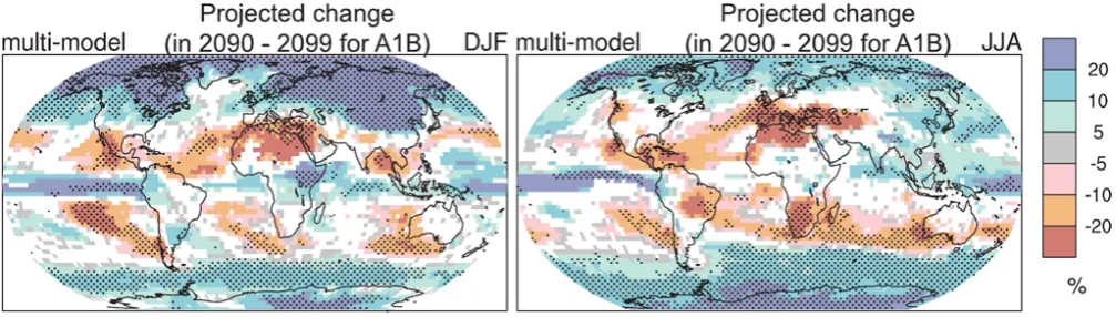
Fig. 1. Spatial patterns of changes (%) in precipitation by the period 2090 to 2099 relative to 1980 to 1999 based on the SRES A1B scenario. December to February means are in the left column, June to August means in the right column. Changes are plotted only where more than 66 % of the models agree on the sign of the change. The stippling indicates areas where more than 90 % of the models agree on the sign of the change. (Map and legend of Fig. TS.30., reprinted from IPCC Working Group I “Summary for Policymakers” (2007a, p. 76).
2.1 Intrinsic approach
The intrinsic approach changes an object’s appearance by, for example, altering the colour of a quantitative dataset, using colours in much the same way as conventional thematic maps (Tyner, 2010). A common intrinsic option is to use bivari-ate representations that depict data and uncertainty together, treating uncertainty as a second variable (MacEachren et al., 2005). Bivariate maps can be defined as a variation of a simple thematic map that portray two separate phenom-ena simultaneously, this is achieved by covering each aerial unit by a tone (or pattern) representing a combination of values for two variables (Leonowicz, 2006). For example, colour hue can be used to convey quantitative information while intensity and/or saturation represents quality informa-tion (Drecki, 2002). This has been done with some success by Evans (1997), for example, who looked at the reliability of land use/land cover classification. She created a “static” map where all pixels were shown, but with those having high classification certainty depicted with highly saturated colours (Evans, 1997; MacEachren et al., 2005). Similarly, Hengl (2003) describes an approach where whiteness or pale-ness is used to visualise uncertainty of topsoil thickpale-ness in-terpolated using regression kriging (Hengl, 2003). In this approach a fully saturated colour is used when relative uncer-tainty is equal to or less than 40 %, and a completely white colour shown when relative uncertainty is equal to or higher than 80 %. In a later paper, Hengl and Toomanian (2006) use this approach to compare detection of sand, silt and clay where the dominance of white on the map indicates that clay is the least confidently predicted variable (Hengl and Tooma-nian, 2006).
2.2 Extrinsic approach
The extrinsic approach uses additional geometry to por-tray information about the object (Slocum et al., 2003),
representing extra variables with, for example, additional graphs or point symbols (Tyner, 2010). A simple example of an extrinsic approach is outlined by MacEachren et al. (1998) who create maps where a colour fill represents mortality data and a hatching is overlaid over less reliable data. A similar approach was employed in the IPCC AR4 (shown in Fig. 1) with maps illustrating both the ensemble-average precipita-tion change and the level of agreement in the direcprecipita-tion of the change across a multi-model ensemble. In this approach a stippling effect is used to highlight areas of high agreement (>90 %) among ensemble members, and a whiteout shows areas of low agreement (<66 %).
2.3 Using colour saturation to show uncertainty
whether the season will be wetter or drier than average) are depicted with white and grey, and more intense colours are reserved for the more extreme ends of the scale, less than 30 % or more that 70 % (WMO, 2008).
2.4 Interpreting maps that incorporate uncertainty
Teuling et al. (2010) suggest that bivariate maps (as discussed in Sect. 2.1) are more difficult to interpret than their univari-ate counterparts (Teuling et al., 2010). Whilst it is true that the extra variable (uncertainty) means that careful attention should be paid to production of bivariate maps (Teuling et al., 2010), it does not necessarily follow that merging data with their quality information make maps more complex and dif-ficult to read. For example, a study where participants were asked to locate the most suitable site for an airport and park after being shown certain land classification data with vary-ing reliability, found that inclusion of certainty information appeared to clarify map patterns without taking additional time to reach a decision (Leitner and Buttenfield, 1997). This finding agrees with MacEachren et al. (1998) who showed that map readers can cope with the added visual burden of distinguishing between 7 different map categories.
The ability to interpret a visualisation incorporating un-certainty depends on a number of factors. Work by Slocum et al. (2003) showed that decision makers tend to prefer in-trinsic methods when they want to get the “big picture”, but find them awkward for getting specific information. In con-trast, they note that extrinsic methods appear very compli-cated when a large area is shown, but are useful for gleaning detailed information. This suggests that different methods are suitable for different scales and indeed ability to interpret different visualisation methods has been shown to vary with scale (MacEachren et al., 1998).
Familiarity with the mapping approach can also affect the user’s interpretation or understanding of mapped data. Data quality information is rarely incorporated into map displays (Leitner and Buttenfield, 1997), and therefore no standard approach exists. This results in the user spending time try-ing to understand the mapptry-ing approach rather than inter-preting the information presented. This contrasts with tradi-tional cartography, where standard conventions are in place, which once learned, allow the reader to make full use of a map (Hearnshaw et al., 1994). This means that although it would be possible to develop very sophisticated multivariate mapping techniques, there is a danger of creating a cluttered, hard to read map if too many variables and symbols are used (Tyner, 2010). Tufte advises that graphics should be experi-enced visually and not verbally (Tufte, 1983), so readers do not have to keep running sentences through their head to try and “remember” what each individual colour or symbol rep-resents. It makes sense then to create a technique to visualise uncertainty that already includes many of the standard and known conventions of traditional cartography.
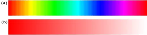
Fig. 2. (a) Variation in the hue of a colour; (b) variation in the saturation of a colour.
2.5 Use of colour on maps
Surprisingly perhaps, under the right conditions perceiving a million separate colours is conceivable (Bertin, 2011). For the purpose of this paper, colour will be defined with 2 at-tributes; hue and saturation. Hue is the property of colours by which they can be perceived as ranging from red through yellow, green, and blue (Ramanath et al., 2002). Saturation (for our purposes) is the amount of white apparently mixed with a pure colour, for example, red can have white added to create pink. These properties are illustrated in Fig. 2.
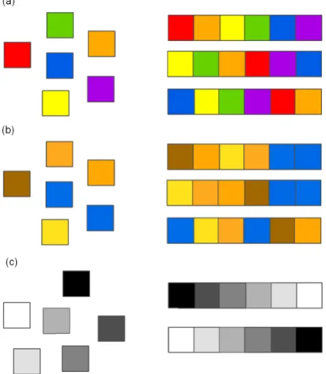
When visualising categorical data, such as for soil types or geology, using a variety of contrasting hues can be useful, as long as similar hues represent similar categories (Mon-monier, 1996). However, using hue to represent continuous data is deeply flawed. In this situation, map users cannot eas-ily and consistently organize colours into a logical sequence (see Fig. 3a) (Monmonier, 1996). When used to represent continuous data, viewers could perceive the sharp transitions between these colours as sharp transitions in the data, even when this is not the case (Borland and Taylor, 2007). This contrasts well with the greyscale sequence in Fig. 3c. There are only two sensible orders, white to black or black to white. In cartography, darker usually means more and lighter means less (Monmonier, 1996), and a logical, consistent sequence of grey tones describes intensity variations more reliably than a complex, graphically illogical sequence of spectral hues (Monmonier, 1996; Tufte, 1983).
Fig. 3. (a) A demonstration that six colours of different hue have no natural order and are unsuitable for continuous data; (b) a Deutera-nope colour blind simulation of the colours shown in (a), this shows orange and green and blue and purple look almost identical to colour blind people; (c) a greyscale sequence is easily ordered and there-fore very suitable for sequential data. Adapted from Borland and Taylor, 2007.
Unlike in some disciplines of science, climate science does have some symbolic colour associations that can and should be used. As Bertin (2011) states “throughout the entire world, water, seas and rivers are never red; fire, heat, and dry-ness are not generally accompanied by a blue sensation; veg-etation is most often green.” (Bertin, 2011). For the readers of colour weather maps, the useful association of blue with cold and red with hot is reinforced by the daily exposure of such a scheme (Monmonier, 1996; Tyner, 2010). This colour symbolism applies to other climate variables such as precip-itation where blue implies wetter and red or brown drier. It would be illogical to ignore this symbolism when it is avail-able, although it must be recognised that it does not exist for all climate-related variables.
There are two types of colour schemes that are appropri-ate for displaying continuous climappropri-ate data variables. When the variable does not have a natural break point (e.g. varying about zero) such as absolute precipitation or absolute tem-perature it makes sense to use a sequential scheme. Light-ness steps dominate the look of these schemes, usually with light colours for low data values and dark colours for high values (Harrower and Brewer, 2003). This allows perceptual
Fig. 4. Appropriate diverging and sequential colour schemes for the following climate data (a), absolute temperature (b), absolute precipitation (c), temperature anomaly (d), precipitation or runoff anomaly (e and f) other climate variables with no symbolic associ-ation. Schemes in this figure are 7 class ones designed by Cynthia Brewer, (Brewer et al., 2003).
ordering like the greyscale legend in Fig. 3c. Figure 4a shows a yellow-orange-red scheme which is appropriate for abso-lute temperature and a yellow-green-blue scheme (Fig. 4b) that could be used for absolute precipitation.
Diverging colour schemes should be used when a critical data class or break point needs to be emphasized (Harrower and Brewer, 2003). So, for example, the scheme in Fig. 4c could be used for temperature anomalies where blue means cooler than average and red warmer than average, the pale yellow in the middle would be for areas of little change. Another scheme uses brown to green-blue, with a dry and wet association (Fig. 4d) and would be suitable for precipi-tation or runoff anomalies. When there is no specific subjec-tive colour association to a climate variable then the palettes shown in Fig. 4e could be used; purple to orange, and Fig. 4f; magenta to green. All of these schemes are also suitable for people with colour vision impairment (Gardner, 2005).
Hearnshaw et al. (1994) report that the ability to discrim-inate between saturation levels of fixed hues depends on the area of a coloured image and on its spatial separation of other coloured images. This means that, for example, if two blues of slightly different saturation are placed adjacent on a map legend they will be easier to distinguish than if they are small areas separated by a large distance on a map. The implica-tion of this for mapping is that choosing colours is not sim-ple, since it depends at least on the resolution of the map and the distance between pixels of the same colour (Hearnshaw et al., 1994).
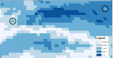
Fig. 5. Simultaneous contrast illusion means that the grid cell cir-cled on the right hand side does not appear the same colour as the one on the left. Also the grid cell on the right does not match the legend (even though they are both in the 1–2 category).
both the cells circled are the same colour and belong to the “1 to 2” category. However, the right hand cell appears lighter than the left hand cell and does not appear to match the leg-end. As a general rule, the more complex the spatial patterns of the maps, the harder it is to distinguish slightly different colours (Harrower and Brewer, 2003).
3 Standardising an approach to visualising uncertainty of climate variables
“A single map is but one of an indefinitely large number that might be produced in the same situation from the same data” (Monmonier, 1996). It is essential when creating maps that illustrate aspects of climate and climate change that we do not (either from ignorance or with intent) create maps that give an unnecessarily distorted view of the data. To prevent this, careful attention must be given to different aspects of map creation.
Map readers automatically give regions with larger ar-eas more weighting whether or not area is appropriate as a weighting factor (Carr et al., 2005). This is an issue when choosing a map projection to display climate data. For ex-ample, many climate projections have large Arctic warming, which may be perceived as larger or more significant than the actual mapped information. To avoid such polar distor-tions that occur in many projecdistor-tions of the globe, it is rec-ommended that global maps are presented using an equal area projection (for example Mollweide), as is the case for all global maps presented in this paper.
As well as map projections, the selection of class inter-vals can strongly affect the visual impression given by a map (Evans, 1977), and there are complexities in assign-ing classes to data (Brewer and Pickle, 2002). For exam-ple selecting the value for the maximum and minimum class boundary can impact how the map is perceived. However, from the wide literature on the subject of data classification it is clear there is no consensus on the best way to classify
data (Brewer and Pickle, 2002), and it varies from map to map. For this reason, the data classification presented in this paper is done manually and in a way that attempts to avoid misrepresentation of the underlying data.
As mentioned earlier, we can use ensembles to explore uncertainties in climate projections. This approach enables the calculation of the percentage of ensemble members that agree on the sign of change for a particular climate variable. For example, for an ensemble with 20 members, if 10 project an increase in temperature for a particular grid cell (or global average) and 10 Project a decrease, then only 50 % of models agree on the sign of change (the most uncertain outcome). If all 20 members show an increase (decrease) in temperature then 100 % of models agree (the most certain outcome).
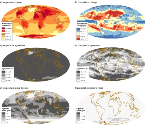
Figure 6a and b shows changes for temperature and pre-cipitation, respectively, for June-July-August between 1961– 1990 and 2070–2099 for the multi-model mean of the 22 cli-mate models used in IPCC (AR4) for the A1B scenario (IPCC, 2007). At first glance these maps show which re-gions of the world are projected to warm the most and which areas are projected to get wetter or drier. However, they only provide a summary of the model means and as such do not provide information on agreement across the ensemble of models. To achieve this, one approach is the ensemble con-sensus method. This is illustrated by Fig. 6c and d, which show the percentage agreement in the sign of the mean tem-perature and precipitation changes at each grid box location. Figure 6c shows that across most of the globe (except regions in the North Atlantic and Southern Ocean) more than 95 % of the AR4 ensemble members agree on the sign of temper-ature change (i.e. a warming). For precipitation (Fig. 6d), the reverse is true, in most areas, less than 95 % of ensemble members agree on a wetting or drying.
Fig. 6. Change in temperature (a) and precipitation (b) between 1961–1990 and 2070–2099 for the mean of the IPCC AR4 ensemble based on the SRES A1B scenario. Model agreement percentage across the ensemble for (c) temperature and (d) precipitation. Signal-to-noise (µ/σ )across the ensemble for (e) temperature and (f) precipitation.
to assess water availability in different regions, for example the Middle-East (Hemming et al., 2010).
Creating a single map combining climate projections with their associated uncertainty is not a straightforward task. Here we describe an approach detailed in Kaye (Kaye, 2010), which has been used in a paper exploring uncertainty of cli-mate model projections of water availability indicators across the Middle East (Hemming et al., 2010). This technique ad-justs the hue of a small palette of colours to show the mean or median of a climate variable and the saturation of the colour to indicate a measure of uncertainty in this value. This ap-proach, therefore, synthesises two maps into one following a number of guidelines:
– use a sensible sequential or diverging colour scheme;
– use appropriate colour symbolism if it is applicable;
– ensure the map is usable by colour blind people;
– use a data classification scheme that does not misrepre-sent the data;
– use a map projection that does not distort the data;
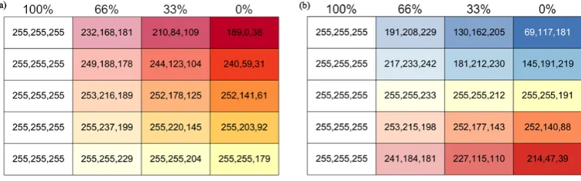
Fig. 7. (a) Adding different proportions of white to the temperature legend shown in Fig. 6a and (b) adding different proportions of white to the precipitation legend shown in Fig. 6b.
3.1 Creating a palette with different levels of saturation
The Red Green Blue (RGB) colour model is one in which red, green and blue light is added together to make different colours. In computing, each RGB value is normally stored as a 1 byte integer in the range 0 to 255. This means that, to create the secondary colour orange, which is 100 % red, 50 % green and 0 % blue, an RGB value of 255, 127, 0 is used. In order to add different proportions of white to an RGB colour, a technique called alpha blending is utilised. In principle, this technique can combine any two RGB colours together, however because white is the colour being added this simplifies the technique and Eq. (1) is used to mix white with any RGB colour.
outRGB=(100−x)inRGB+255x
100 (1)
The percentage of white to be added is represented byx and each RGB element is represented by inRGB. So, for exam-ple, a colour with the RGB value 214, 47, 39 can be mixed with 66 % white by substituting each RGB value into Eq. (1). So for the red value it is:
241=(100−66)×214+255×66 100
By substituting each RGB component we get a pink with value 241, 184, 181.
Using Eq. (1) it is possible to desaturate a legend so that it contains 100 %, 66 %, 33 % and 0 % white. So, taking the legends used to show temperature and precipitation in Fig. 6a and b (as shown in the 0 % column of Fig. 7a and b) it is possible to create three more columns with 33 %, 66 % and 100 % white added.
Potentially these colours could then be used on a map with the more saturated ones on the right illustrating regions with more confidence in climate projections and the less saturated ones showing regions with less confidence in the projections. Unfortunately, although these colours can be distinguished as unique on a legend, where they cover pretty large ar-eas and are adjacent to each other, differentiating them on
a map where they may be smaller and separated by larger distances is more difficult. For this reason, it is necessary to make the palette for the unsaturated colours (0 % column) far bolder, to enable differentiation of colours at different levels of saturation. The palettes in Fig. 8a and b attempt to retain the sequential and diverging characteristics of the palettes in Fig. 7a and b, but use more visually distinctive colours. Note that the palette in Fig. 8a is not a pure sequential one as it has a sky blue added at the bottom. This is done to increase the range of colours from those available with different shades of yellow, orange and red. Also, these 2 palettes have been designed using colour blind simulation software to attempt to make them usable by people with colour vision impairment.
3.2 Applying the palette to climate variables
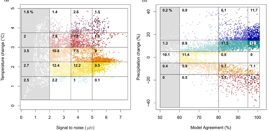
The application of this palette can be seen by referring to Fig. 9a and b. Figure 9a is a plot of the global temperature data for each model grid cell (Fig. 6a) on the y-axis and asso-ciated ensemble signal-to-noise (Fig. 6e) on the x-axis. Like-wise, Fig. 9b is a plot of global precipitation data (Fig. 6b) on the y-axis and ensemble agreement percentage (Fig. 6d) on the x-axis (note that because the model agreement % is a number of discrete values (e.g. 72.7 %), the points on the x-axis have been jittered to illustrate the density of points). In each of these graphs, the percentage of the total grid cells in each graph box is shown in the top left of the boxes. So, for example, in Fig. 9a, 12.2 % of grid cells have a temperature anomaly between 1.5 and 2.25◦C and a signal-to-noise ratio between 3.5 and 5. This shows that the data points attached to highest confidence values are rendered in the most satu-rated colours, and those with least confidence are given less saturated colours all the way to white for those data points with the lowest confidence.
Fig. 8. (a) Alternative to the desaturated legend in Fig. 7a, suitable for showing temperature anomalies and associated uncertainty. (b) Alter-native to the desaturated legend in Fig. 7b, suitable for showing precipitation anomalies and associated uncertainty.
Fig. 9. (a) Scatter plot of temperature data used for Fig. 6e on the x-axis and data used for Fig. 6a on the y-axis, and (b) scatter plot of precipitation data used for Fig. 6d on the x-axis (randomly jittered so it does not appear as a series of straight lines) and data used for Fig. 6b on the y-axis.
temperature anomaly between 1.5 and 2.25◦C and a signal-to-noise ratio between 3.5 and 5). Once all categories have been assigned a unique number it is possible to create the map shown in Fig. 10a. Using the same technique for the categories in Fig. 9b on the datasets of precipitation (Fig. 6b) and ensemble agreement (Fig. 6d), the map shown in Fig. 10b is produced.
This method produces maps that incorporate both the value of the climate change as well as a measure of the un-certainty associated with it. Using this approach illustrates, for example, the contrast in areas such as Australia for tem-perature and precipitation projections. While for temtem-perature (Fig. 10a), the strong oranges and red show there is high con-fidence in a June-July-August warming of about 3◦C. For precipitation (Fig. 10b) the pale oranges, yellows and white show there is very low confidence in a slight drying but the signal is very mixed between models. However, directly
comparing variables such as precipitation and temperature is difficult, this is because the global mean signal-to-noise ratio for temperature is about 4, compared to only about 1 for precipitation. For model agreement, the global average is about 98 % for temperature compared to 80 % for precip-itation. This means it is not possible to use one scale that allows comparison without either temperature or precipita-tion occurring in mostly one class. Of course this may be the intended message, if for example projections of precipi-tation are shown as almost entirely white it effectively shows how low the confidence is in them. Nevertheless, for a mean-ingful direct comparison, variables with similar uncertainties should be used. So, for example, comparing precipitation with runoff may be appropriate as these variables could also use the same colour palette to make comparison easier.
Fig. 10. (a) A synthesis of the maps shown in Fig. 6a and Fig. 6e, the different hues represent change in temperature between 1961– 1990 and 2070–2099 for the mean of the IPCC AR4 ensemble based on the SRES A1B scenario, the different saturations repre-sent signal-to-noise (µ/σ )across the ensemble. (b) a synthesis of the maps shown in Fig. 6b and d, the different hues represent change in precipitation between 1961–1990 and 2070–2099 for the mean of the IPCC AR4 ensemble based on the SRES A1B scenario, the dif-ferent saturations represent percentage model agreement across the ensemble.
comparing the 1961–1990 average to the 2020s, 2050s and 2080s. This would reveal whether uncertainty in climate pro-jections increases or decreases over time and in which spatial regions the uncertainty changes.
4 Discussion and future work
The technique used to create the maps in Fig. 10a and b is a form of bivariate one. Leonowicz (2003) recommends 9 classes, i.e. a 3×3 matrix, (Leonowicz, 2006) as the maxi-mum number of classes to use in bivariate maps. The reason for this is that maps with 16 (4×4) classes have been shown to be too complicated to be interpreted easily (Olson, 1981), and are described by Tufte as “visual puzzles” that must be interpreted through a verbal rather than visual process (Tufte, 1983). It would be possible to keep close to the 9 class rec-ommendation if there were only 3 classes of the climate vari-able mean, for example using blue, yellow and red. However, this would limit the climate information presented to average, above average and below average. An alternative would be to keep the 5 climate classes but only have 3 classes of uncer-tainty so the maps would include the fully saturated colour, a 50 % saturated version and white, i.e. 10 colours plus white.
The maps in Fig. 9a and b use 15 colours in each map (plus white). However, because only five distinct hues are used and the extra colours are created by varying the saturation of these hues interpretation should not be too difficult.
Although it is recommended in Sect. 2.5 that hue should not be used to represent continuous data, it is unavoidable to some extent for the technique described in Sect. 3.1. The reason for this is that it would be impossible to distinguish between colours that are too similar in hue if the saturation of these colours is also varied. This issue is described in Sect. 3.1 and illustrated by Fig. 7. As a compromise, the leg-end in Fig. 8 is in attempt to create a diverging and sequential legend that also ensures all the colours are distinguishable from each other. By using software to simulate colour blind-ness, an attempt is also made in these figures to make the map legends usable by colour blind people. However, colour blindness varies from individual to individual so it is impos-sible to guarantee that the colours used will be interpretable by every colour blind individual.
As well as colour blind issues, reproduction of colour for both print and computer displays is a complex problem in its own right model (Light and Bartlein, 2004). While com-puter monitors use the additive (RGB) colour model, printers usually use a subtractive (CMYK) colour model (Light and Bartlein, 2004). This means that the maps in Fig. 10 may ap-pear quite differently on different monitors and printers and the devised colour scheme may vary in its effectiveness. Be-cause of this, it may be necessary to slightly alter the colours used depending on the primary method for delivering the map (e.g. digitally or hard copy). Also, because an attempt was made to make the maps interpretable for colour blind people, the palette of colours available is limited to those that are not confused by colour blind people. By removing this constraint there may be more contrast in the maps by adding colours such as green.
The use of paleness or colour saturation as a method to il-lustrate uncertainty has been questioned. In an extensive re-view paper, (MacEachren et al., 2005) describe various stud-ies that indicate that saturation is not the best method to indi-cate uncertainty. However, work by Drecki (2002) who did an empirical comparison of different methods (to visualise uncertainty), based on 50, mostly student, users found that whilst not the most effective of methods he studied, users had a strong preference for the use of colour saturation (Drecki, 2002). This is supported by positive feedback the author has had for the technique proposed here (Sect. 3.1) from col-leagues in the climate science community (personal commu-nication, 2010). Clearly, a more empirical study would be useful to determine the effectiveness of the colour saturation technique. It would be beneficial to compare this technique with some of the other techniques described in the literature for visualising uncertainty and assess how applicable they are for visualising uncertainty in climate projections.
technique would help communicate climate information, in-cluding uncertainties in a clear and consistent way.
Acknowledgements. This paper was supported by the Joint DECC/Defra Met Office Hadley Centre Climate Programme (GA01101). I would also like to thank Hugo Lambert and Inika Taylor for passing comments on an initial draught of the paper. Also, thanks to the reviewers for their helpful and insightful comments.
Edited by: M. Kawamiya
References
Aerts, J. C. J. H., Clarke, K. C., and Keuper, A. D.: Testing Popular Visualization Techniques for Representing Model Uncertainty, Cartogr. Geogr. Inform., 30, 249–261, doi:10.1559/152304003100011180, 2003.
Bertin, J.: Semiology of Graphics, ESRI Press, Redlands, Califor-nia, 438 pp., 2011.
Borland, D. and Taylor, R. M.: Rainbow color map (still) consid-ered harmful, IEEE Comput. Graph., 27, 14–17, 2007.
Brewer, C. A. and Pickle, L.: Evaluation of Methods for Classi-fiying Epidomological Data on Choropleth Maps in Series, Ann. Assoc. Am. Geogr., 92, 662–681, 2002.
Brewer, C. A., Hatchard, G. W., and Harrower, M. A.: ColorBrewer in Print: A Catalog of Color Schemes for Maps, Cartogr. Geogr. Inform., 30, 5–32, doi:10.1559/152304003100010929, 2003. Carr, D. B., White, D., and MacEachren, A. M.: Conditioned
Choropleth Maps and Hypothesis Generation, Ann. Assoc. Am. Geogr., 95, 32–53, 2005.
Collins, M., Booth, B. B. B., Harris, G. R., Murphy, J. M., Sex-ton, D. M. H., and Webb, M. J.: Towards quantifying uncer-tainty in transient climate change, Clim. Dynam., 27, 127–147, doi:10.1007/s00382-006-0121-0, 2006.
Collins, M., Booth, B. B., Bhaskaran, B., Harris, G. R., Murphy, J. M., Sexton, D. M. H., and Webb, M. J.: Climate model er-rors, feedbacks and forcings: a comparison of perturbed physics and multi-model ensembles, Clim. Dynam., 36, 1737–1766, doi:10.1007/s00382-010-0808-0, 2011.
Dalton, J.: Extraordinary facts relating to the vision of colours: With observations, Mem. Proc. Manchester Lit. Philos. Soc, 5, 28–45, 1798.
Drecki, I.: Visualisation of uncertainty in geographical data, in: Spatial data quality, edited by: Shi, W., Fisher, P., and Goodchild, M., Taylor & Francis, London, 140–159 color plates: 141–143, 2002.
accommodation of map readers with impaired color vision, Mas-ters Thesis in Geography, The Pennsylvania State University, 162 pp., 2005.
Gershon, N.: Visualization of an imperfect world, IEEE Comput. Graph., 18, 43–45, 1998.
Harrower, M. and Brewer, C. A.: ColorBrewer.org: An Online Tool for Selecting Colour Schemes for Maps, Cartogr. J., 40, 27–37, 2003.
Hawkins, E. and Sutton, R.: The Potential to Narrow Uncertainty in Regional Climate Predictions, B. Am. Meteorol. Soc., 90, 1095– 1107, doi:10.1175/2009bams2607.1, 2009.
Hearnshaw, H. M., Unwin, D., and Association for Geographical Information: Visualization in geographical information systems, Wiley & Sons, Chichester, West Sussex, England, New York, xv, 243 pp., 1994.
Hemming, D., Buontempo, C., Burke, E., Collins, M., and Kaye, N.: How uncertain are climate model projections of water avail-ability indicators across the Middle East?, Philos. T. R. Soc. A, 368, 5117–5135, doi:10.1098/rsta.2010.0174, 2010.
Hengl, T.: Visualisation of uncertainty using the HIS colour model: Computations with colours, Proceedings of the 7th International Conference on GeoComputation, Southampton, UK, 8–17, 2003. Hengl, T. and Toomanian, N.: Maps are not what they seem: rep-resenting uncertainty in soil-property maps, Proceedings of the 7th International Symposium on Spatial Accuracy Assessment in Natural Resources and Environmental Sciences (Accuracy 2006), Lisbon, Portugal, 805–813, 2006.
Howard, D. and MacEachren, A. M.: Interface design for geo-graphic visualization: Tools for representing reliability, Cartogr. Geogr. Inform., 23, 59–77, 1996.
IPCC: Summary for policymakers, Cambridge University Press, Cambridge, UK, 2007.
Kardos, J.: Visualising attribute and spatial uncertainty in choro-pleth maps using hierarchical spatial data models, PhD thesis, University of Otago, 2005.
Kardos, J., Benwell, G. L., and Moore, A. B.: Assessing different approaches to visualise spatial and attribute uncer-tainty in socioeconomic data using the hexagonal or rhom-bus (HoR) trustree, Comput. Environ. Urban, 31, 91–106, doi:10.1016/j.compenvurbsys.2005.07.007, 2007.
Kaye, N.: An assessment of visualisation methods to communi-cate uncertainty in climate projections, Hadley Centre Technical Note 81, available at: http://www.metoffice.gov.uk/publications/ HCTN/HCTN81.pdf (last access: 1 August 2011), 1–40, 2010. Leitner, M. and Buttenfield, B. P.: Cartographic guidelines for
Leonowicz, A.: Two-variable choropleth maps as a useful tool for visualization of geographical relationship, Geografija, 42, 33–37, 2006.
Light, A. and Bartlein, P.: The End of the Rainbow?, Color Schemes for Improved Data Graphics, Eos, Transactions American Geo-physical Union, 85, 385–391, 2004.
MacEachren, A. M.: Visualizing uncertain information, Carto-graphic Perspectives, 13, 10–19, 1992.
MacEachren, A. M.: SOME truth with maps: A primer on sym-bolization and design, Association of American Geographers, Washington, DC, 129 pp., 1994.
MacEachren, A. M., Brewer, C. A., and Pickle, L. W.: Visualizing Georeferenced Data: Representing Reliability of Health Statis-tics, Environ. Plann. A, Abstracts of Papers of the American Chemical Society, 30, 1547–1561, 1998.
MacEachren, A. M., Robinson, A., Hopper, S., Gardner, S., Mur-ray, R., Gahegan, M., and Hetzler, E.: Visualizing Geospa-tial Information Uncertainty: What We Know and What We Need to Know, Cartogr. Geogr. Inform., 32, 139–160, doi:10.1559/1523040054738936, 2005.
McKendry, J. E. and Machlis, G. E.: Cartographic design and the quality of climate change maps, Climatic Change, 95, 219–230, doi:10.1007/s10584-008-9519-5, 2009.
Monmonier, M.: How to lie with maps, Chicago, 207 pp., 1996. Muehrcke, P. C. and Muehrcke, J. O.: Map Use: Reading, Analysis,
and Interpretation, edited by: Publications, M. W. J., 3rd Edn., 1992.
Murphy, J. M., Sexton, D. M. H., Barnett, D. N., Jones, G. S., Webb, M. J., and Collins, M.: Quantification of modelling uncertainties in a large ensemble of climate change simulations, Nature, 430, 768–772, doi:10.1038/Nature02771, 2004.
Murphy, J. M., Booth, B. B. B., Collins, M., Harris, G. R., Sex-ton, D. M. H., and Webb, M. J.: A methodology for proba-bilistic predictions of regional climate change from perturbed physics ensembles, Philos. T. R. Soc. A, 365, 1993–2028, doi:10.1098/rsta.2007.2077, 2007.
Nakicenovic, N. and Swart, R.: IPCC Special Report on Emissions Scenarios, 2000.
Nocke, T. S., Sterzel, T, B¨ottinger, T., and Wrobel, M.: Visualiza-tion of Climate and Climate Change Data: An Overview, Digital Earth Summit on Geoinformatics 2008: Tools for Global Change Research Wichmann, Heidelberg, 226–232, 2008.
Olson, J.: Spectrally Encoded Two-variable Maps, Ann. Assoc. Am. Geogr., 71, 259–276, 1981.
Ramanath, R., Snyder, W. E., Bilbro, G. L., and Sander, W. A.: De-mosaicking methods for Bayer color arrays, J. Electron. Imaging, 11, 306–315, doi:10.1117/1.1484495, 2002.
Slocum, T., Cliburn, D., Feddema, J., and Miller, J.: Evaluating the Usability of a Tool for Visualizing the Uncertainty of the Fu-ture Global Water Balance, Cartogr. Geogr. Inform., 30, 299– 317, 2003.
Tebaldi, C. and Knutti, R.: The use of the multi-model ensemble in probabilistic climate projections, Philos. T. R. Soc. A, 365, 2053–2075, doi:10.1098/rsta.2007.2076, 2007.
Teuling, A. J., St¨ockli, R., and Seneviratne, S. I.: Bivariate colour maps for visualizing climate data, Int. J. Climatol., 31, 1408– 1412, 2010.
Tufte, E. R.: The visual display of quantitive information, edited by: Cheshire, G., Conneticut, 1983.
Tufte, E. R.: Visual explnations, edited by: Cheshire, G., Conneti-cut, 1997.
Tyner, J. A.: Principles of map design, The Guilford Press, 72 Spring Street, New York, NY 10012, ISBN 978-1-60623-544-7, 2010.