Social Networks Data Mining Using Visual Analytics
K. Nikolopoulou
1, I. Xydas
2, G. Miaoulis
2Technological Educational Institute of Athens, Ag.Spiridona St.,GR 12210, Athens, Greece 1 Master ISICG - Department of Informatics ([email protected])
2 Department of Informatics ([email protected], [email protected] )
ABSTRACT
Internet-based social networks are facilities (typically web sites) where people can form online communities, connect to each other and share information. This paper explores the area of applying visual analytics to represent data and underlying relationships in social networks – more specifically, on the Twitter micro-blogging service. Networks of this kind can be treated as graphs, where each node corresponds to a user or a specific piece of information and edges connect such nodes representing relationships. Visualizing graphs is a vast research area in its own right, with numerous applications in science and engineering. In this assignment we are using readily-available software to visualize parts of the network, via filtering or other operations, in order to be able to draw conclusions. Social networks are an excellent candidate to apply visual analytics to, due to their exponential growth when new users join.
Keywords
Social Networks, Data Mining, Social Network Data Mining, Visual Analytics, Social Network Visualization, Twitter Visualization.
1. Introduction
Online social networks are much like social networks that exist in real life. People who have something in common form a community and interact with each other. Boyd [1] defines a social network site as “a web-based service that allow individuals to (1) construct a public or semi-public profile within a bounded system, (2) articulate a list of other users with whom they share a connection, and (3) view and traverse their list of connections and those made by others within the system”.
The websites of social networks are used daily by millions of people and it seems that this trend will continue, making internet-based social networking a part of people’s daily activities. As such, social networks can be seen as an emerging paradigm for collaboration, communication and information dissemination between online communities.
Twitter is a social network which is going to be the subject of our work. It is a micro-blogging service and has attracted the attention of a very large number of internet users. It is known as the “Internet’s SMS”. Once someone creates a profile in Twitter, he/she can send a text message of up to 140 characters, known as a “tweet”. This tweet can contain links to photographs, videos, music tracks or other media. Tweets are displayed on profile pages and they can be seen by one’s friends known as “followers”. It should also be noted that tweets are, by default, open to the public. That is, if someone knows the URL for a tweet, he/she can see it without authorization being required. If a follower likes someone’s tweet, he/she can retransmit it to his/her friend. This is known as a “retweet” and is preceded by a different notation. Twitter is free of charge and people can use their PC or even mobile phones to send tweets. They can have followers from all over the world, create lists of people and publish them for others to follow. Following and ignoring Twitter
users is a very easy and straight-forward process. In today’s social networks there are many people who assess their status depending on the number of friends or followers they have.
2. Related Work
The visualization and analysis of social networks concern many areas of science such as sociology and mathematics for example. Freeman [2] says that there are two ways to display such information. The first one is with points/nodes that represent the actors and lines/links that represent the relationship between the actors. The second representation is with matrices, where rows and columns represent the actors and the numbers/symbols in the cell show the relationship linking those actors.
There are plenty of visual analytics tools and programs that use social networks and visualize relevant information. The most widely used such visualization is the node-link diagram [3]. Apart from social networks, significant and similar work in visualization comes from the area of computer networks: monitoring network traffic, web site attacks, and even trying to understand where a network attack originates from or what its category is, by looking at a 3D graph visualization [4]. According to the visualized subjects and relationships, many kinds of visualization techniques can be utilized to present social networks. In [5] a detailed description and analysis of the online social network visualization is presented and categorized into three types: user-centric visualization, content-centric visualization, and hybrid visualization. The latest Visualization tools and applications are presented in [5] to visualize Online Social Networks such as: Club Nexus to visualize Web Communities, FOAF (Friend-Of-A-Friend) to visualize groups of actors with shared interests and social relations, EntityCube to visualize human social relationships, Soylent to visualize social relationships
among email groups, CircleView to visualize co-authorships and paper citations in academic digital libraries and Nexus, TouchGraph and IRNet to visualize social relationships in Facebook.
Micro-blogging is a very new type of application. It is best known via its most famous application, Twitter. Research papers on the topic are still rare. While a good body of knowledge is developing around Twitter itself ([6], [7], [8]) there is less research on the further development of micro-blogging for adoption in enterprise [9] or better visualization [10].
This past year, the US Library of Congress acquired a database of all public messages posted on Twitter [11]. Searching, browsing, and accessing information in this database is a completely open problem. For instance, how can we browse through millions of tweets, the name for these short 140 character messages, for comments on the confirmation of Supreme Court justice Sonia Sotomayor for example? And what informationare people interested in finding in Twitter archives? These are not yet mathematically tractable problems, but beg for new mathematical models designed for Twitter. Recent research on Twitter has identified many fascinating properties among the activity of users. See refs. [12,13,14] for basic statistics of behavior on Twitter, see [15] for a discussion of whether Twitter behaves more like a social network or news site and finally see [16] for a way to model authority among Twitter users. In [17] a visualization of Twitter social network of at least one one-way acquaintanceship and a visualization of mutual acquaintances are presented. Analyzing the community structure and properties of the two graphs, users can recognize the features and differences of two social groups over Twitter. In [18] visualization of students’ learning activities to increase awareness and to support self-reflection in an educational institution is presented.
The aim of this assignment is to use visual analytics to represent information from
social networks. The information that is visualized on-screen must be easy and clear to read, in order to allow the correct conclusions to be drawn. The problem is that social networks are very large which makes them very complex to represent graphically. In order to tackle this problem one has to use the appropriate criteria. These criteria depend on the problem at hand and one must first and foremost focus on accurate and relevant information. So, information must be processed before visualization to meet the user criteria, something which has not been available up to now. To achieve this we have created a tool to first process then visualize information based on the following criteria: 1. Find the day with the most tweets, 2. Day with most tweets for a specific user, 3. Find out who is following whom,
4. Find out who made a retweet and the followers that read it,
5. Show all users and their tweets,
6. Give a location to find the users in that location,
7. See all locations and respective users, 8. Give a word to see who wrote something about it and who read it,
9. Give a user name and see all his/her tweets,
10. Give a name and find out who follows him/her,
11. Find out the tweets (with code) and the followers of users,
12. Discover discussions that have taken place for a user,
13. Give the name of a user and see texts he/she has written,
14. Find the day with the most retweets. In this work we were able to illustrate relationships and trends within the Twitter social network, making it easy to understand at a glance who are the important actors, the crucial links, roles and subgroups, without previous knowledge of the participants’ background. Using intelligent visualizations we have
given the community the possibility to extract knowledge more easily from a social network helping the analytical reasoning and the decision making process. In this way we have been able to improve the diversity of the information retrieved from micro-blogging sites which has been lacking up to now and enhance the visualization of said information.
3. Twitter Networks Visualization
Because of Twitter’s 150 queries per hour restrictions, offline information gathered over several hours was used. Data was collected using the Tweepy module [19] ofthe Python programming language and then was stored into a MySQL database that was consequently processed to create output graphs. The user sees a menu, offering predefined query options: most influential people in the network, most verbose, direct or indirect recipients of a tweet, etc. Visualization takes place using the Gephi [20] open source software. In this assignment and as a starting point for API-based data collection, a Twitter user with a large number of followers (approx. 450) was chosen together with his/her tweets and those of his/her followers queried in batch-mode; a total of approximately 33.500 tweets and retweets.
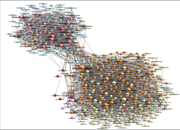
Figure 1: Followers and the people they follow Fig. 1 is the visualization of the most
popular user of the network we captured. It is a very complex graph but with the right visualization it becomes much easier to understand. Bigger nodes represent users who have many followers, or who follow
many users, or both. There are many communities with different colours. The higher the connectivity is, the closer the communities are. Fig. 2 displays the tweets that were retweeted, by whom and to whom they were sent.
Figure 2: Who made retweets and who read them Fig. 3 shows which are the users that wrote
about a topic, but did not retweet the original post. Here, the user gave the world DNT, the latin-alphabet representation of the Greek acronym for the International Monetary Fund (IMF). In Greece this was a subject of lengthy discussion and it has obviously affected users considering the
number of comments made about it. Compared with Fig. 4, it is clear that iPad – the tablet computer recently released by Apple Inc.- was of great interest to the users during that period. It is a very different subject but from that conclusions about consumer behavior can easily been drawn.
Figure 3: Users mentioning a specific
4. Conclusion
Twitter is a site with 55 million short messages posted every day. As a result, the information circulates in such large quantities that it becomes difficult to analyze. Nevertheless, various visualization techniques provide the tools to make the task easier to comprehend. Visual representation of such information can facilitate the comprehension of data semantics. The visualization of the queries resulted in interesting representations of data relationships. Queries were used to represent the users’ country of origin; numbers of tweets per day per user and in general; user popularity based on numbers of followers; popularity of tweets based on re-tweet numbers; social trends based on frequent keywords. In our paper the queries are static and the user can choose from a given list. In a further project this could be achieved by using artificial intelligent techniques, in order to have dynamic queries depending on the needs of an analyst looking at the data.
5. References
[1] D. Boyd, N. Ellison, “Social Network Sites: Definition, History and
Scholarship”, Journal of Computer-Mediated Communication, vol.13(1), art.11, Oct. 2007.
[2] LC. Freeman: “Visualizing social networks”, Journal of social structure, Vol.1 Issue 1, p.1, 2000.
[3] Visual complexity:
http://www.visualcomplexity.com/vc/ [4] I. Xydas, G. Miaoulis, P.-F. Bonnefoi,
D. Plemenos, D. Ghazanfarpour, “3D Graph Visualisation of Web Normal and Malicious Traffic”, Proceedings of the 10th International Conference on Information Visualization IV06, IEEE Computer Society, London, UK, p. 621-629, July 2006.
[5] I-X. Chen, C-Z. Yang, “Visualizing of Social Networks, Chapter 27”, B.
Furht (ed.), Handbook of Social Network Technologies and Applications, Part 5, p. 585-610, Springer Science + Business Media, LLC 2010.
[6] S.J. Barnes, M. Böhringer, “Continuance Usage Intention in Microblogging Services: The Case of Twitter”, Proceedings of the 17th European Conference on Information Systems (ECIS), 2009.
[7] I. Erickson, “The Translucence of Twitter”, Proceedings of Ethnographic Praxis in Industry Conference (EPIC), Vol. 2008, Issue 1, p. 58-72, 2008.
[8] C. Honeycutt, S.C. Herring: “Beyond Microblogging: Conversation and Collaboration via Twitter”, Proceedings of the Forty-Second Hawaii International Conference on System Sciences (HICSS-42), IEEE Computer Society, Los Alamitos, CA, USA, p. 1-10, 2009.
[9] M. Böhringer, A. Richter, “Adopting Social Software to the Intranet: A Case Study on Enterprise Microblogging”, Proceedings of the M&C Conference, September 6-9, Berlin, 2009.
[10] Y. Assogba, J. Donath, “Mycrocosm: Visual Microblogging”, Proceedings of the Forty-Second Hawaii International Conference on System Sciences (HICSS-42), IEEE Computer Society, Los Alamitos, CA, USA, p. 1-10, 2009.
[11] D. Gleich, Y. Wang, X.Meng, F. Ronaghi, M. Gerritsen, A. Saberi, “Some computational tools for digital archive and metadata maintenance”, Journal BIT Numerical Mathematics, Online First, March 2011, Sprieger Science + Business Media, B.V. 2011. [12] B.A. Huberman, D.M. Romero, F. Wu, “Social networks that matter: Twitter under the microscope”, First Monday, 14(1), 2009.
[13] A. Java, X. Song, T. Finin, B. Tseng, “Why we twitter: understanding microblogging usage and communities”, Proceedings of the 9th WebKDD and 1st SNA-KDD 2007 workshop on Web mining and social network analysis, p. 56-65, 2007. [14] B. Krishnamurthy, P. Gill, M. Arlitt,
“A few chirps about twitter”, WOSP '08: Proceedings of the first workshop on Online social networks, p. 19-24, 2008.
[15] H. Kwak, C. Lee, H. Park, S. Moon, “What is Twitter, a social network or a news media”, In: WWW ’10: Proceedings of the 19th International Conference on World Wide Web, ACM, New York, p. 591–600, 2010. [16] J. Weng, E.P. Lim, J. Jiang, Q. He,
“TwitterRank: finding topic-sensitive influential twitterers”, In: WSDM ’10:
Proceedings of the Third ACM International Conference on Web Search and Data Mining, ACM, New York, p. 261–270, 2010.
[17] http://ebiquity.umbc.edu/blogger /2007/04/19/twitter-social-network-analysis/
[18] S. Govaerts, K. Verbert, J. Klerkx, E. Duval: “Visualizing Activities for Self-reflection and Awareness”, X.Luo (ed.), Lecture Notes in Computer Science, Vol. 6483, Advances in Web-Based Learning, p. 91-100, Springer-Verlag, ICWL 2010. [19] Tweepy:
http://pypi.python.org/pypi/tweepy/1.6 [20] M. Bastian, S. Heymann, M. Jacomy: “Gephi: An Open Source Software for Exploring and Manipulating Networks”, 2009.