Software Engineering Research Group
Technical Report Series
Supporting Professional Spreadsheet
Users by Generating Leveled Dataflow
Diagrams
Felienne Hermans, Martin Pinzger and Arie van Deursen
Report TUD-SERG-2010-036
Published, produced and distributed by:
Software Engineering Research Group
Department of Software Technology
Faculty of Electrical Engineering, Mathematics and Computer Science
Delft University of Technology
Mekelweg 4
2628 CD Delft
The Netherlands
ISSN 1872-5392
Software Engineering Research Group Technical Reports:
http://www.se.ewi.tudelft.nl/techreports/
For more information about the Software Engineering Research Group:
http://www.se.ewi.tudelft.nl/
Supporting Professional Spreadsheet Users by Generating
Leveled Dataflow Diagrams
Felienne Hermans
Delft University of Technology
Martin Pinzger
Delft University of Technology
Arie van Deursen
∗Delft University of Technology
ABSTRACT
Thanks to their flexibility and intuitive programming model, spreadsheets are widely used in industry, often for business-critical applications. Similar to software developers, pro-fessional spreadsheet users demand support for maintaining and transferring their spreadsheets.
In this paper, we first study the problems and informa-tion needs of professional spreadsheet users by means of a survey conducted at a large financial company. Based on these needs, we then present an approach that extracts this information from spreadsheets and presents it in a com-pact and easy to understand way, using leveled dataflow diagrams. Our approach comes with three different views on the dataflow and allows the user to analyze the dataflow diagrams in a top-down fashion also using slicing techniques. To evaluate the usefulness of the proposed approach, we conducted a series of interviews as well as nine case studies in an industrial setting. The results of the evaluation clearly indicate the demand for and usefulness of our approach in ease the understanding of spreadsheets.
Categories and Subject Descriptors
H.4.1 [Information Systems]: Office Automation— Spread-sheets; D.2.2 [Software]: Design Tools and Techniques— Flowcharts
General Terms
Design, Experimentation, Human Factors, Languages
Keywords
Data flow Diagrams, Visualization, Spreadsheets, End-User programming
∗Work partially done while at theComputer Human Interac-tion and Software Engineering Lab (CHISEL), Department of Computer Science, University of Victoria, Canada.
Permission to make digital or hard copies of all or part of this work for personal or classroom use is granted without fee provided that copies are not made or distributed for profit or commercial advantage and that copies bear this notice and the full citation on the first page. To copy otherwise, to republish, to post on servers or to redistribute to lists, requires prior specific permission and/or a fee.
Copyright 200X ACM X-XXXXX-XX-X/XX/XX ...$10.00.
1. INTRODUCTION
Spreadsheets are widely used in industry: Winston [23] es-timates that 90% of all analysts in industry perform calcula-tions in spreadsheets. Their use is diverse, ranging from in-ventory administration to educational applications and from scientific modeling to financial systems. The financial busi-ness is a domain where spreadsheets are especially prevail-ing. Panko [18] estimates that 95% of U.S. firms, and 80% in Europe, use spreadsheets in some form for financial re-porting.
Business analysts using spreadsheets usually have very limited (if any) training as a programmer. In spite of that, they effectively areend-user programmers, and as such face many of the challenges of professional developers, such as identifying faults, debugging, or understanding someone else’s code [13].
This paper aims at providing support for spreadsheet users to take on the end-user programming challenges. To that end, we first study the problems and information needs of professional spreadsheet users and then present an approach that presents this information in a compact and easy to un-derstand way using leveled dataflow diagrams.
The context, in which we conduct our research, is formed by the analysts of Robeco, a Dutch asset management com-pany with approximately 1600 employees worldwide, and overe130 billion worth of assets under management. In a survey we conducted among 27 of their analysts, we found that they use Excel for an average of 3 hours a day, under-lining the large role spreadsheets play in their daily work. Furthermore, spreadsheets have an average lifetime of more than five years, and individual spreadsheets are used by 13 different analysts on average.
In order to support analysts in their work with spread-sheets, we start by identifyinginformation needs. In par-ticular, we describe how we conducted interviews with the same group of 27 analysts, using agrounded theory[8] ap-proach, to obtain a clear picture of their use of spreadsheets. As a result,spreadsheet transfer scenarios(to a new user, to an auditor, and to a professional developer creating custom software) were identified as problematic. In those scenarios, end-users search for a better insight into the dependencies between cells, formulas, groups of cells and worksheets.
To meet these demands, we propose an approach for the automated extraction ofdataflow diagramsfrom spreadsheets. Such diagrams can be used to visualize data, processes ma-nipulating data, and dependencies between them. Further-more,leveleddiagrams can be used to accommodate hierar-chies, for example for blocks of cells or worksheets.
We implemented our approach in a tool calledGyroSAT, which can generate dataflow graphs from Excel spreadsheets. To evaluate our approach we conducted a series of evalua-tions in the concrete setting of Robeco. First, we interviewed the same group of 27 spreadsheet users, analyzing how the tool would help in transferring their own spreadsheets to col-leagues. Furthermore, we conducted nine case studies, three for each type of transfer task identified. The findings of these evaluations indicate that (1) spreadsheet professionals from Robeco consider the tool as helpful; (2) the visualizations derived help to create a story lineto explain spreadsheets to colleagues in transfer tasks; (3) the visualizations scale well to the complex spreadsheets in use at Robeco.
This paper is organized as follows. In Section 2, we de-scribe the interviews leading to the information needs of spreadsheet users. Then in Section 3, we provide back-ground information on dataflow diagrams, after which we describe our algorithm to derive dataflow diagrams in Sec-tions 4 and 5. In Section 6, we cover our implementation, which we use in the evaluation described in Section 7. We conclude with a discussion of our results, an overview of related work, and a summary of our contributions and di-rections for future research.
2. SPREADSHEET INFORMATION NEEDS
To gain an insight into the problems around spreadsheet usage, we conducted a survey at Robeco. Robeco is a Dutch asset management company with approximately 1600 em-ployees worldwide, of which 1000 work in their headquarters in Rotterdam, where we performed our survey.
The survey was conducted following the grounded the-ory approach. Grounded theory is a qualitative research method that discovers theory from data [8]. When using grounded theory, observations are documented and subse-quentlycoded into categories. During this coding process, that takes place after each observation—as opposed to after all observations—a theory might emerge [2].
Grounded theory is a method especially suited for discov-ering problems that exist for the participants. Therefore, in a grounded theory study, the researcher works with a general area of interest rather than with a specific problem [16].
The area of interest in our study is the use of spreadsheets in industry. To investigate this area we conducted a survey amongst employees of Robeco using semi-structured inter-views. For each interview, we kept a memo of statements, questions asked and answers provided by the employee. Fol-lowing the grounded theory approach we continuously ana-lyzed the memos of each day and used the results to direct the following interviews.
A total of 47 employees was invited to participate in the survey, with varying spreadsheet knowledge and expertise, working in different departments, making it a maximum variation sample [15]. Of the 47 invitees, 27 participated in the interviews. The interviews were performed over a time period of 4 weeks, with 1 or 2 interviews per day. We started the interviews by asking subjects about the role of spreadsheets in their daily work and let subjects tell their own story.
During the course of the first interviews, many subjects stated that problems with spreadsheets occur inspreadsheet transfer scenarios. In such a scenario, a spreadsheet is trans-ferred from one employee to another, for instance when an employee leaves the company and a colleague has to start
working with his spreadsheet.
From that point on, we started asking subjects in inter-views whether they experienced such scenarios. We found that the vast majority (85%) agreed that they often trans-ferred spreadsheet to a colleague. We coded all described scenarios into the following three categories:
S1 A spreadsheet has to be transferred to a colleague. This scenario typically occurs when, for example, a new em-ployee starts working for the company, an emem-ployee leaves the company or when a new spreadsheet is cre-ated that has to be used by an other employee.
S2 A spreadsheet has to be checked by an auditor. Audit-ing periodically happens at large companies, to deter-mine whether spreadsheets in key processes are well designed, error free and well documented.
S3 A spreadsheet is being replaced by custom software. When a spreadsheet created by an end-user, becomes so complex that it no longer complies to standards in the company such as safety, access control or readabil-ity, it is transformed into a custom software system. To determine ways to support users in these scenarios, we dived deeper into the problems occurring during a transfer scenario. As it turns out, problems typically occur when the receiving employee has too little understanding of the spreadsheet. The most of the subjects (70%) expressed that they had difficulties with understanding a spreadsheet they received from a colleague. Zooming in even further, we iden-tifiedinformation needsspreadsheet receivers have, from the stories we heard about the problems during a transfer. We then analyzed the memos and coded them into the following four categories (with the percentage of memos mentioning one of the information needs in parentheses).
I1 How are the different worksheets—spreadsheet tabs— related? (44%)
I2 Where do formulas refer to? (38%)
I3 What cells are meant for input? (22%)
I4 What cells contain output? (22%)
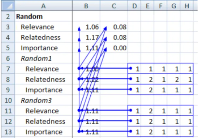
These results show that the most important information needs of professional spreadsheet users concern the struc-ture of the formula dependencies. Users indicated that the only way they can find these dependencies currently is by using the Excel Audit Toolbar. This Excel feature, that shows cell dependencies within one worksheet by overlaying the worksheet with a dependency graph, insufficiently meets these needs. Firstly, this graph becomes incomprehensible quickly when arrows cross each other, as shown in Figure 1. Furthermore, it has to be enabled cell by cell, making it impractical for large spreadsheets. Finally, it is not able to show dependencies between worksheets.
Underlining the importance of spreadsheets at Robeco were the answers to the final question about the nature of the tasks performed with spreadsheets. We classified these answers into three categories:
Presentation of data (30%) For instance, to show data to colleagues or customers.
Figure 1: A spreadsheet in Excel, with the Audit Toolbar enabled.
Calculations without a direct decision (18%) For in-stance, calculating the performance numbers of a port-folio to put in a brochure.
Calculations to base decisions on (52%) For instance, calculating the stocks that are generating the lowest profit, to remove them from a portfolio.
These numbers show many spreadsheets within Robeco play a key role in decision making within the company.
3. BACKGROUND
Before presenting how we support professional users’ in-formation needs, we provide a brief overview of the prelimi-naries this paper builds upon.
3.1 Dataflow diagrams
Dataflow diagrams—or similar techniques for represent-ing the flow within systems, such as flowcharts—have been present in literature since the seventies [7]. Dataflow di-agrams show how data moves from one process to another and illustrate the relationship of processes and data in an in-formation system. We follow the definition of De Marco [14] who recognizes the following four types of objects:
• Rectangles representing entities, which are sources or sinks of data
• Rounded rectanglesrepresenting processes, which take data as input, perform an operation on the data and yield an output value
• Open-ended rectanglesrepresenting data stores • Arrowsrepresenting the dataflow between objects Figure 2 shows an example of a data flow diagram for a simple order system in which we can recognize a process ‘process order’ that takes data from entities ‘client data’ and ‘books DB’ and outputs its data to entity ‘delivery system’ and to data store ‘order history’.
Figure 2: A data flow diagram for a simple order system.
3.2 Leveled dataflow diagrams
A key element in data flow diagrams is the ability to represent a hierarchical decomposition of a process or func-tion, using what De Marco calls aleveled data flow diagram. Higher levels are used to abstract the details from lower lev-els. The lower levels containing the details are revealed by expanding an entity at a higher level. Bycollapsing the entity, the details are hidden again.
4. DATAFLOW DIAGRAM EXTRACTION
ALGORITHM
From our analysis of the interviews we concluded that professional spreadsheet users often have difficulties with understanding spreadsheets received in transfer scenarios. We propose to support users in those scenarios by visualiz-ing the structure and contents of a spreadsheet as a leveled dataflow diagram. Dataflow diagrams are commonly used and well understood by spreadsheet end-users. They show the dependencies between cells in the spreadsheet, grouped in levels for worksheets and data blocks.
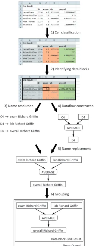
In the following, we present our approach to derive lev-eled dataflow diagrams from spreadsheets. The approach consists of six steps which are outlined in Figure 3. The first two steps were also used in our earlier work extracting class diagrams from spreadsheets [11]. The first step de-termines the cell type of all cells in the spreadsheet, which can be: Data,Formula,LabelorEmpty(Section 4.1). The second step identifies data blocks within a spreadsheet as described in Section 4.2. In the third step, labels describ-ingDataandFormulacells are computed (Section 4.3). The fourth step generates an initial dataflow diagram by creating entities for cells of typeDataandFormulaand creating ar-rows corresponding to formula dependencies. Details on the dataflow creation can be found in Section 4.4. In the fifth step, the labels of cells computed in step 3 are attached to the corresponding entities in the diagram (Section 4.5). The final step adds the levels to the dataflow diagram. A level is introduced for each worksheet within the spreadsheet and for each data block within every worksheet (Section 4.6).
4.1 Cell classification
To distinguish between different cell types, we use a cell classification strategy based on the one described by Abra-ham and Erwig [1]. This algorithm starts with identifying all cells containing a formula and marking them as type For-mula. Next, the content of the formulas is inspected. Cells that are referred to in a formula are marked Data, unless they were already typed asFormulain the first step.
recognized asLabelwhen not empty andEmptyotherwise. Applying this algorithm to the example in Figure 3 results in the colored spreadsheet. The orange cells of the columns ‘exam’ and ‘lab’ are markedDatacells. The green cells of the column ‘overall’ are markedFormulacells. The remaining gray cells are markedLabelcells.
4.2 Identifying data blocks
A data block is defined as a rectangle containing a con-nected group of cells of typeData,Label, orFormula. Two cells are connected if they touch each other horizontally, vertically or diagonally. To find such a data block, the fol-lowing strategy is applied: Find the left-most upper-most non-empty cell that is not yet contained within a data block. The initial data block is set to contain only this cell. Next, this data block is expanded by inspecting all cells that are next to the data block in all directions. If one of these cells is non empty, the data block is enlarged to include this cell. Expanding is done, until all cells next to the data block are empty. In the example in Figure 3 the cells are grouped into one data block atA1×E7.
4.3 Name resolution
In this step, names are resolved for cells of type Data and Formula. To determine the name of such a cell, we consider the data block in which it lies. We assume the name of the cell can be found on the borders of this data block as illustrated by the rectangle in the third spreadsheet of Figure 3.
The name of a cell is constructed of two parts: a horizontal part, the firstLabelin the row in which the cell lies, and a vertical part, the firstLabelin the corresponding column.
The algorithm for localizing the vertical part for a cell Cis as follows: it starts with inspecting the first cell of the column in whichClies. If this cell is of typeLabel, the value of the cell is set as the vertical part of the name. If the cell is of typeFormulaorData, the procedure is ended without having a vertical part forC. If the cell is of typeEmpty, the algorithm continues with inspecting the next cell in the column. The algorithm is repeated until either aFormula orData cell is encountered or the position of the cell, for which the name is computed, is reached. The procedure for computing the horizontal part of the name is similar. Once the two parts are found, the name of a cell is constructed by concatenating the names of the two parts. If the name is empty, the algorithm uses the location of the cell (such as B5) as name.
Referring to our example in Figure 3, the calculation of the vertical part of the name for cellC4 starts atC1, which is empty. Next,C2 is inspected where the name part ‘exam’ is found. For the horizontal part the algorithm obtains the name ‘Richard Griffin’ resulting in the final name ‘exam Richard Griffin’ for cellC4.
The name resolution is heuristic in nature, so it is not always able to find a suitable name. However, as we will see in Section 7, users participating in our case studies found the names useful.
4.4 Initial dataflow diagram construction
To create the initial dataflow diagram, we only consider cells of typeFormulaorData. For each cell of typeFormula two objects are created: an entity denoting the result of a formula and a process representing the formula’s calculation.
1) Cell classifica!on
2) Iden!fying data blocks
4) Dataflow construc!on 3) Name resolu!on 5) Name replacement 6) Grouping C4 D4 AVERAGE E4 C4 exam Richard Griffin
D4 lab Richard Griffin E4 overall Richard Griffin
exam Richard Griffin lab Richard Griffin AVERAGE
overall Richard Griffin
Data block-End Result Sheet-Overall exam Richard Griffin lab Richard Griffin
AVERAGE overall Richard Griffin
Figure 3: Overview of the approach for extracting leveled dataflow diagrams from spreadsheets.
The name for this process node consists of all functions in the formula, like ‘SUM’ or ‘*’. One arrow is created from the process to the entity. As can be seen in Figure 3 the cell on E4 results in an entity ’E4’ and a process named ‘AVERAGE’, showing what is calculated inE4. For a cell of typeData, for exampleC4, only one entity is created.
Next the arrows are created: If a formulaA refers to a cellB, an arrow is introduced from the entity of Bto the process ofA. As shown in Figure 3 the entities forDatacells C4 andD4 are connected to the process ofE4.
4.5 Name replacement
In the fifth step of the transformation, the names for cells found in the name resolution step are attached to the cor-responding entities of the initial diagram. This is done so dataflow diagrams show the calculations in terms of labels occurring in the spreadsheet, in order to make the diagrams easier to understand for end-users.
4.6 Grouping
The final step groups the entities and processes, accord-ing to the levels identified in a spreadsheet, for data blocks and worksheets. First, a level for each data block is created, and entities and processes of the cells in that data block are included in it. We try to find a name for the data block by inspecting its left-most upper-most cell: if this cell is of typeLabel this label is used as the name of this data block. If no label can be found, the location of the left-most upper-most cell is used. Subsequently a level for each work-sheet is created that contains the levels of its data blocks. For worksheets the level gets the name the user gave to the worksheet. Referring to our example in Figure 3, there is one worksheet ‘Sheet-Overall’ containing one data block named ‘Data block-End Result’.
5. DATAFLOW VIEWS
Having described the generation of dataflow diagrams from spreadsheets in the previous section, we turn our attention to supporting users in navigating the diagrams obtained. We decided to express our diagrams in an existing graph format, since several sophisticated graph browsing tools already ex-ist, like Dot, GraphML and DGML. After investigating the available options, we decided to use the DGML (Directed Graph Markup Language) an XML schema for hierarchical directed graphs that can be viewed with the graph browser that is part of Microsoft Visual Studio 2010 Ultimate. It is intended to visualize software architectures and dependency graphs for systems of around 50,000 lines of code.1
The DGML graph browser offers a number of features that are directly relevant to the dataflow diagrams we de-rive from spreadsheets. In particular, zooming, collapsing and expanding levels, the automatical grouping of multiple arrows between entities and processes in one thick arrow and the ‘butterfly’ mode, a feature that slices a graph showing only the nodes that depend on the selected node.
Users can also add and remove nodes, color nodes and add additional levels with the DGML browser options, that proved to be very useful in the experiments. In the next subsections, we will see how we use these features in the three views we support.
1http://www.lovettsoftware.com/blogengine.net/
post/2010/05/27/Managing-Large-Graphs.aspx
As a running example for all these views we use the sheet to calculate exam scores from Figure 3. This spread-sheet consist of four workspread-sheets, and contains 161 cells of which 62 are formulas. It can be obtained online from our website2 as well as the generated dataflow diagrams and a
screencast showing our approach in more detail.
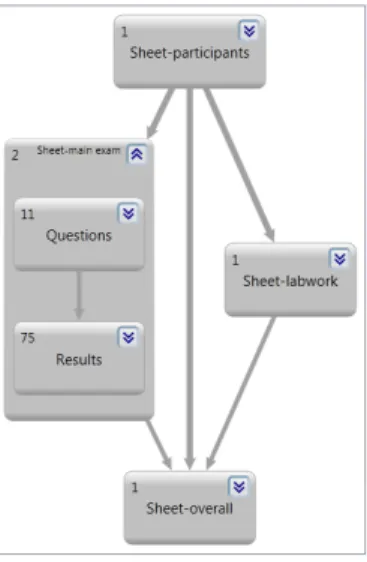
Figure 4: The global view for the exam spreadsheet. Numbers in the upper left corner indicate the num-ber of data blocks within the worksheet.
Figure 5: The worksheet ‘main exam’ expanded to worksheet view. Numbers in the upper left corner indicate the number of cells within the data block.
5.1 Global view
The most top-level view of the dataflow diagram is the global view. This view shows all worksheets within the spread-sheet and the relations between them. An arrow from work-sheetAto worksheetBindicates a formula in worksheetB refers to a cell in worksheetA. The DGML-browser groups multiple arrows into one, so the thicker the arrow is, the more formulas reference cells of an other worksheet. Figure
2http://swerl.tudelft.nl/bin/view/FelienneHermans/
4 shows the worksheet view of the grades example spread-sheet, where formulas in worksheet ‘main exam’ refer to cells in worksheet ‘participants’.
5.2 Worksheet view
While examining the spreadsheets we gathered during the initial interviews we noticed that spreadsheet users often structure the contents of a worksheet into data blocks. These data blocks as well as the dependencies between them are vi-sualized by the worksheet view. The view is derived from the global view by expanding a level representing a worksheet. In this way, details of a worksheet are revealed while keep-ing the overall picture of the spreadsheet. Figure 5 shows the worksheet view for worksheet ‘main exam’ containing the two data blocks: ‘Questions’ and ‘Results’. The data block ‘Results’ contains formulas that refer to cells in the data block ‘Questions’.
5.3 Formula view
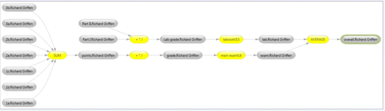
More details about the calculations within a worksheet can be observed in the formula view. At this level the rela-tion between one specific formula and the cells it depends on is shown. To obtain this view the user opens a data block-node in the worksheet view, showing all calculations in the data block. The user can select the formula for which he wants to enable the formula view, by using DGML’s but-terfly mode. The original data flow diagram is then sliced to show only the entities and processes connected to the selected node. Figure 6 shows the formula view for the cal-culation of an overall exam score.
6. IMPLEMENTATION
The visualization of dataflow diagrams is developed as an extension to the existing Gyro Spreadsheet Analysis Toolkit (GyroSat [11]) and is implemented in C# 4.0 using Visual Studio 2010. GyroSAT, that is currently implemented as stand-alone program, parses an Excel file, identifies formu-las, blocks, and cell names, and generates dataflow diagrams according to the algorithm described in Section 4. The out-put of GyroSAT is an DGML file which can be navigated by means of Microsoft Visual Studio 2010 Ultimate’s built-in DGML browser.
7. EVALUATION
To evaluate the use of dataflow visualization we performed two studies. First, we asked all respondents to the initial interviews their opinion on the usefulness of dataflow visu-alization. Secondly, we performed a multiple-case study [24] of nine individual case studies in which we observed users working with GyroSAT. The following two subsections de-scribe both studies in more detail. With these interviews and observations we seek to answer the following research questions.
R1 How does dataflow visualization help users to understand spreadsheets better?
R2 How is our approach able to visualize large and complex spreadsheets?
R3 What are the main limitations of the current approach?
With R1 we seek to understand if and why the approach works well; via R2 how the approach works in extreme cases; and with R3 in what situations the approach does not work well. Both our interviews and the cases aim at addressing all three questions: the interviews aim at getting generalizable answers, whereas the cases seek to increaserealism, focusing on actual tasks the analysts had to work on in real-life cases.
7.1 Interviews
7.1.1 Study design
To test the idea of dataflow visualization we asked all 27 respondents of the initial interviews to express their opinion about dataflow diagrams in general. We interviewed them about this in individual sessions. During the interviews we first showed them an example of a simple dataflow diagram with only a few entities and processes and one level. Next, we showed them a visualization of a more complex spread-sheet, which we obtained during the information needs in-terviews. We asked them to what extent they were able to understand the given visualization and how they thought these kinds of visualizations could help their work.
7.1.2 Findings
During these interviews we found that almost all inter-viewees understand dataflow diagrams well. Only one of the respondents indicated that he was not familiar with the dataflow notation and that he had trouble understanding it. All other respondents expressed they feel comfortable using dataflow diagrams. As one of the respondents stated “as analysts we are used to thinking in processes and therefore this kind of diagrams is very natural to us”.
With respect to the usefulness of the transformation of spreadsheet visualization to their daily work, around 80% (21 out of 27 respondents) indicated their work could benefit from these diagrams. “They really outperform the Excel Audit Toolbar, because they show the entire view of the sheet”, one of the respondents answered, clearly indicating the benefits of dataflow visualization. The most positive respondent stated that this tool “would make my work 10 times easier”.
Six respondents indicated problems with the visualiza-tion, for different reasons. Two subjects found the gener-ated dataflow diagrams complex and said that they needed more time working with the diagrams to determine whether it could help their work. Two other subjects missed informa-tion aboutfilteringin the diagrams. In some cases spread-sheets at Robeco are filled with large amounts of data and Excel’s filter is used to obtain the needed rows. This infor-mation is not conveyed with the dataflow diagram, so for these two participants important information was missing.
The fifth subject liked the idea but preferred a visualiza-tion within Excel, so it would be easier to see the connecvisualiza-tion between the two. The final negative respondent indicated his spreadsheets—used to keep track of laws and regulations— were not critical to the company so it would not be worth the trouble of analyzing them.
7.2 Case studies
7.2.1 Study design
To evaluate the use of dataflow visualization in more depth we performed nine case studies; three for each transfer
sce-Figure 6: A detailed calculation of an exam grade in the formula view.
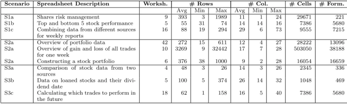
nario. In each case study two subjects participated: an ex-pert, the user who has the most knowledge of the spread-sheet and areceiver, the user who needs to learn about the spreadsheet. During the case study they performed a real-life transfer scenario with their own spreadsheet. There was no time limit to the observation, i.e., we let experts finish their entire explanation. Typically, one study took about one hour. Table 1 shows characteristics of the spreadsheets used in the studies; the number of worksheets; the average, minimum and maximum nuber or rows and columns over all these worksheets; the number of non-empty cells and the number of formulas.
All experts were somewhat familiar with the generated dataflow diagrams, since all of them also participated in the first evaluation study. Therefore, we did not provide them with instructions on how to use GyroSAT and the DGML-browser. We only intervened in the observation if partici-pants got stuck. Participartici-pants were allowed to have a second machine with the spreadsheet on it, to point out information about the specifics of the spreadsheet, such as layout or dia-grams. They could choose to use both the dataflow diagram and the spreadsheet for supporting their explanation.
Before the observation started we asked experts to briefly explain the contents of the spreadsheet and how complicated the spreadsheet was according to them. During the case study we gathered information both by observing subjects and asking them to reflect about the actions they were per-forming during the course of the study. We gathered all this information in hand-written notes which we used to describe the observations and reactions of the subjects.
With respect to repeatability, we unfortunately cannot provide the spreadsheets used in this experiment since they are confidential. We do give as much information about all other factors of the study to make it as easy as possible for other researchers to perform a similar study.
7.2.2 Findings
In this section, we describe the most important observa-tions we made during the nine case studies.
S1: Transferring a spreadsheet to a colleague.
A common observation in all three S1 observations is that experts are surprised by the complexity of their own spread-sheets. Before the actual transfer started they mention the
spreadsheet is not very complicated. However when they see the visualization they realize that it is more complicated then they thought. In all cases there were some links in the visualization that were not immediately obvious to the ex-perts. We observed all three experts asking “where does this data actually come from?” more than once.
The global view, with the graphical layout of the work-sheets, helps receivers to see what sheet the expert is talking about. As the receiver in scenario S1c (S1c-R) puts it: “This really helps me to understand what [worksheet] is what.” Experts use the global view to create a logical story line through the spreadsheet. By starting with, for instance, the worksheet at the end of the flow they can explain the struc-ture of the computations. Expert S1a-E stated that “the global view reminds me of the plan I had when building this spreadsheet. Normally, I just walk through the worksheets from left to right, but that is not the logical way.”
There were also differences between the three cases, the most significant being that in scenario S1a the spreadsheet also contained a Visual Basic for Applications (VBA) script and the effects of this script are not considered by our ap-proach yet. The expert in this case clearly thought this was a shortcoming stating “because the VBA part is missing, we only see half of the picture, that is a pity.”
S2: Checking a spreadsheet by an auditor.
All three receivers, in this case auditors, appreciated the help the visualization provided them, especially with acquir-ing a feelacquir-ing of how the spreadsheet was built. As 2a-R put it “this picture leads me straight to the fishy parts”. He felt that in some cases, when he was suspicious about a certain part of a spreadsheet, the experts gave an explanation for a certain formula, without him being able to check easily whether this explanation was correct. The only way to do that was to select the cell and track the dependencies with the Excel Audit Toolbar. Subject S2c-R agrees with S2a-R that the only choice he had, when performing a spreadsheet audit, was “clicking through all the cells”, a time-consuming and tedious process. Subject S2b-R furthermore stated that the global view shows him the “idea behind the spreadsheet” helping him to “find errors on a whole new level.” All three subjects felt this tool has the potential to make their work easier.
On the downside, S2a-R and S2b-R indicated that audi-tors are often interested in relations between the spreadsheet and its environment; i.e. external files the spreadsheet
re-Scenario Spreadsheet Description Worksh. # Rows # Col. # Cells # Form.
Avg Min Max Avg Min Max
S1a Shares risk management 9 393 3 1989 11 1 24 29671 221 S1b Top and bottom 5 stock performance 5 55 31 74 14 14 16 7386 5680 S1c Combining data from different sources
for weekly reports
16 88 19 294 29 6 73 9555 7215 S2a Overview of portfolio data 42 272 15 611 12 4 27 28222 13096 S2a Overview of gain and loss of all trades
for one week
10 3269 9 32442 17 7 28 503050 38188 S2a Constructing a stock portfolio 6 376 38 1000 9 2 28 16054 16659 S3a Comparison of stock data from two
sources
4 48 3 26 14 3 26 2345 336 S3b Data on loaned stocks and their
divi-dend date
5 100 5 374 26 14 32 1048 469 S3c Calculating which trades to perform in
the future
18 62 1 158 16 5 40 7386 5680
Table 1: Summary of spreadsheets used in the nine case studies.
trieves its information from or outputs it results to, such as other spreadsheets or databases. This underlines informa-tion needs I3 and I4, although in a manner we did not find during the interviews.
S3: Replacing a spreadsheet by custom software.
All S3 receivers stated they understood the experts much better with the use of the dataflow diagrams. The global view was appreciated, since all three expressed that in the software replacing the spreadsheet similar dependencies will exist; often what is modeled in a spreadsheet as a worksheet, is represented in software by a class. As S3b-R stated: “This diagram is a basis for the architecture of the software I will build”.
In these three cases, we again found that the dataflow di-agram helped experts to tell their spreadsheet’s story. The top-down way of starting with the global view, advancing through the detailed worksheet view to the formula view reflects the way experts normally explain the spreadsheet, yet is made more tangible by means of the diagrams. We repeatedly saw how experts use the names of cells and re-gions in the spreadsheet (which are present in the dataflow diagram) to explain the sheet in their own terms.
S3a-R did point out an additional downside of our ap-proach: In industrial spreadsheets, one formula sometimes contains multiple calculations. In our current approach, each formula calculation is represented by only one entity, making it difficult to see what is calculated in the formula. Note that this is particularly relevant to the S3 scenarios, in which the receiver is a software engineer who needs to understand exactly how calculations are performed.
7.3 Conclusions
With the results of the 27 interviews and the 9 case studies we are able to answer the research questions.
R1: How does dataflow visualization help users to understand spreadsheets better? One of the main reasons why dataflow visualization supports a spreadsheet transfer scenario is that the global view provides an overview of the spreadsheet helping the expert to create a story around the spreadsheet. Both experts and receivers feel that the global view shows theideabehind the spreadsheet. The de-tailed worksheet view supports the top-down way in which experts normally explain their spreadsheets. Finally the for-mula view allows end-users to find details of calculations
when necessary. The interactive visualization furthermore allows users, both experts and receivers, to edit the dataflow diagram by adding or removing entities or giving them a specific color, so they can customize the diagram to fit their story exactly.
R2: How is our approach able to visualize large and complex spreadsheets? Several of the spreadsheets under study were large (see Table 1), containing thousands of formulas and dependencies. To be able to handle indus-trial spreadsheets of these sizes we introduced levels in the dataflow diagrams and three different views on the leveled diagram. In all nine case studies the global view was found easy to understand, even for cases with more than 10 work-sheets. This is probably caused by the fact that spreadsheet users divide a spread sheet into worksheets and data blocks themselves. The names for these sheets and blocks are ob-tained from the spreadsheet, helping users understand levels in terms of the underlying application domain. The formula view shows the calculation for one formula only, abstracting away from all other details of the spreadsheet, no matter how large it is. This feature was also appreciated by many receivers, especially in scenarios 2 and 3, since there the receivers want to know exactly how formulas are built up.
R3: What are the main limitations of the cur-rent approach? There are some spreadsheet concepts the current implementation cannot handle properly. For in-stance, Visual Basic code is not considered in generating the dataflow visualization. In the observations we noticed that users do see this as a limitation of the current approach, as these concepts are important in the spreadsheets.
Furthermore, our treatment of formulas (representing them by just one process) works well for smaller ones with few op-erators, but is less helpful for more complex ones. An option might be to represent a formula as multiple processes, for instance representing (a+b)/(c∗d) with three processes, one for +,∗and/. We keep this as a point for future work.
For auditors I3 and I4 where broadened by the case stud-ies, in which we found that there is also the need to visualize dependencies between a spreadsheet and it’s external data sources. This can be other spreadsheets, but also databases or programs. The visualization of external spreadsheets with our approach is quite straight forward. It could be created by introducing an additional file level in which we group the worksheet by the file they occur in, and visualize re-lations between different spreadsheet files based on formula
dependencies as before. The implementation of relationships between a spreadsheet and other types of data sources is a bit more involved, so we defer that to future work.
In some cases, users would like to see the connection be-tween the dataflow diagram and the original spreadsheet, which is not possible with the current implementation. This need typically occurred when users switched from the global view to the worksheet view. Then they wanted to have a look inside the worksheet to see what region in the spreadsheet corresponded to what data block, especially when GyroSAT was not able to find a name for a data block. Once they understood the connection, they continued their explana-tion with the support of the dataflow diagram and left the spreadsheet.
8. DISCUSSION
The current implementation of GyroSAT, while still a pro-totype, helps users explain their spreadsheet to colleagues in a structured way. In this section, we discuss a variety of issues that affect the applicability and suitability of the proposed approach.
8.1 Meaningful identifiers
It is not in all cases possible to find identifiers in the spreadsheet. In some cases they are simply not present, while in other cases the layout of the spreadsheet is too complicated for our name resolution algorithm. For exam-ple, when there are empty rows between the names of the columns and the actual data, the names will be in one data block and the values will be in another, making it impossi-ble for our current naming algorithm to find names for these cells. A point for future work is the improvement of this al-gorithm. Note that when names are not present they will obviously never been found. This might be overcome by al-lowing users to attach missing names to cells, for instance by means of a wizard.
8.2 Spreadsheet comprehension
Although currently we focus on using our approach for aiding in spreadsheet transfer scenarios, we believe this ap-proach is also suited for what we callindividual spreadsheet comprehension. This is a scenario in which one person needs to understand a spreadsheet, without someone explaining it. In future work, we will evaluate our approach in this kind of scenarios. In this type of use of our approach the identifica-tion of meaningful identifiers is even more important since there is no expert present to explain missing information.
8.3 Threats to validity
A threat to the external validity of our evaluation con-cerns the representativeness of the selected set of employees at Robeco and their spreadsheets. However other papers report on industrial spreadsheet stories [10, 18] similar to the ones we found at Robeco, so their practice seems to be representable.
Furthermore, there is a risk of aptitude treatment inter-action since all of the 27 initial participants where invited for the second evaluation, and it could be the case that only the most positive ones responded to this request. Judging by the number of points of criticism in the second evaluation this seems not to be the case here.
With respect to internal validity, one of the threats is the fact that we did not pick a random sample. This effect can be
decreased by using a larger test group in future experiments. We however believe the current test group serves as a good reference group, as the persons varied in their age, function and daily tasks with spreadsheets.
In our empirical study we tried to maximize the realism of our evaluation, which unfortunately comes at the price of reduced repeatability. As an alternative, we considered using the EUSES spreadsheet corpus [6], which is often used in spreadsheet research (including ours [11]). In this case, however, we could not use this corpus, since we were not able to identify users and transfer tasks for the spreadsheets in this corpus.
9. RELATED WORK
Flowcharts—direct family members of the dataflow dia-grams—have been present in computer science since its early days [9]. Later, Knuth developed a system that could draw them automatically from source code [12]. Experiments done by Scanlan [21] showed flowcharts can be a good asset aiding users in comprehending source code.
The problems around spreadsheet use are a topic for many papers. Nardi and Miller [17] for instance found that “it is difficult to get a global sense of the structure of a spread-sheet, that requires tracing the dependencies among the cells.” This statement is very similar to the ones we gath-ered in the interviews. Users in the survey of Nardi and Miller named this tedious process their biggest complaint about spreadsheets. Burnett and Rothermel have written a series of papers on testing spreadsheets [3, 20]. Underlying their test methods is the Cell Relationship Graph (CRG), a graph that shows the relation between cells. They however use this graph to calculate what cells depend on what other cells and the CRGs are not shown to end-users testing the spreadsheet.
Many papers describe mechanisms to visualize spread-sheet structure to support user understanding. The first one was Davis [5] suggesting the ‘online data dependency tool’ that extracts aspreadsheet flow diagram, as proposed by Ro-nenet al.[19] to document spreadsheets. The tool was never implemented because at the time of writing graphical layout of these diagrams was too complicated to automate. They did perform an evaluation with a hand-generated diagram and compared its usefulness to an arrow diagram, a diagram showing dependencies directly in the spreadsheet, similar to Excel’s Audit Toolbar. Results show that participants iden-tified more cell dependencies with the diagrams than with-out, although the arrow diagram performed slightly better then the online diagram.
Clermont [4] introduces the notion of data-dependency graph (DDG), showing end-users the relation between all cells within a spreadsheet as part of an auditing toolkit. A DDG however only contains cell names (such as B5) and does not show the formula calculations.
Shiozawaet al.[22] proposes to create a dataflow diagram in 3D on top of a given spreadsheet, where more distinct connections are placed higher above the spreadsheet. This is an interactive process in which users can select cells and ‘lift them up’. Although their approach seems very promising it has to date never been evaluated in practice.
The main difference between these related approaches and ours is the introduction of levels in the dataflow diagram, the automatic extraction of names for worksheets, data blocks and cells and our extensive evaluation in industry.
10. CONCLUDING REMARKS
The goal of this paper is to underline the importance of spreadsheet analysis and visualization as a means to aid users in understanding spreadsheets. To that end we have designed an approach to represent calculations within a spread-sheet as data flow diagrams and implemented this approach in the Gyro Spreadsheet Analysis Toolkit. The key contri-butions of this paper are as follows:
• A detailed survey analyzing the information needs of spreadsheet users (Section 2)
• An algorithm to extract a dataflow diagram from a spreadsheet (Section 4)
• Different views on the dataflow diagram (Section 5) • An implementation of the proposed methods in the
GyroSAT toolkit (Section 6)
• An evaluation of the proposed approach within a large Dutch financial company (Section 7)
The current research gives rise to several directions for fu-ture work. As mentioned before we should concentrate on gathering more information from the spreadsheets, not only from formula dependencies, but from Visual Basic code as well. It would also be an improvement to link the dataflow diagram to the spreadsheet. Ideal would be to have a dataflow diagram and a spreadsheet on the screen simultaneously and highlight a certain part of the data flow diagram when a cor-responding part of the spreadsheet was selected, and vice versa.
11. REFERENCES
[1] R. Abraham and M. Erwig. Header and unit inference for spreadsheets through spatial analyses. In
Proceedings of the IEEE International Symposium on Visual Languages and Human-Centric
Computing(VL/HCC), pages 165–172. IEEE, 2004. [2] S. Adolph, W. Hall, and P. Kruchten. A
methodological leg to stand on: Lessons learned using grounded theory to study software development. In Proceedings of the 2008 Conference of the Center for Advanced Studies on Collaborative Research (CASCON), pages 166–178. ACM, 2008.
[3] M. Burnett, A. Sheretov, and G. Rothermel. Scaling up a what you see is wat you test methodology to spreadsheet Grids. InProceedings of the IEEE Symposium on Visual Languages (VL), pages 30–37. IEEE, 1999.
[4] M. Clermont.A Scalable Approach to Spreadsheet Visualization. PhD thesis, Universitaet Klagenfurt, 2004.
[5] J. Steve Davis. Tools for spreadsheet auditing. International Journal of Human Computer Studies, 45(4):429–442, 1996.
[6] M. Fisher and G. Rothermel. TheEUSESspreadsheet corpus: A shared Resource for supporting
experimentation with spreadsheet dependability mechanisms. InProceedings of the Workshop on End-User Software Engineering, pages 47–51. ACM, 2005.
[7] C. Gane and T. Sarson.Structured Systems Analysis: Tools and Techniques. McDonnell Douglas
Information, 1977.
[8] B.G. Glaser and A. Strauss.The Discovery of Grounded Theory: Strategies for Qualitative Research. Aldine Transaction, 1967.
[9] H.H. Goldstein and J. von Neumann. Planning and coding problems of an electronic computing instrument. 1947.
[10] D. G. Hendry and T. R. G. Green. Creating, comprehending and explaining spreadsheets: a cognitive interpretation of what discretionary users think of the spreadsheet model.International Journal of Human-Computer Studies, 40(6):1033 – 1065, 1994. [11] F. Hermans, M. Pinzger, and A. van Deursen.
Automatically extracting class diagrams from spreadsheets. InProceedings of the European Conference on Object Oriented Programming (ECOOP), pages 52–75, 2010.
[12] D.E. Knuth. Computer-drawn flowcharts. Communication of the ACM, 6(9):555–563, 1963. [13] A.J. Ko, R. Abraham, L. Beckwith, A. Blackwell,
M.M. Burnett, M. Erwig, C. Scaffidi, J. Lawrence, H. Lieberman, B.A. Myers, M.B. Rosson, G. Rothermel, M. Shaw, and S. Wiedenbeck. The state of the art in end-user software engineering.ACM Computing Surveys, 2010. To Appear.
[14] T. De Marco.Structured Analysis And System Specification. Prentice Hall PTR, 1979.
[15] M. N. Marshall. Sampling for Qualitative Research. Family Practice, 13(6):522–526, 1996.
[16] A. McCallin. Designing a grounded theory study: Some practicalities.Nursing in Critical Care, 8:203–208, 2003.
[17] B. Nardi and J. Miller. The spreadsheet interface: A basis for end user programming. InProceeding of Tthe IFIP Conference on Human-Computer Interaction (INTERACT), pages 977–983. North-Holland, 1990. [18] R. Panko. Facing the problem of spreadsheet errors.
Decision Line, 37(5), 2006.
[19] B. Ronen, M. Palley, and H. Lucas Jr. Spreadsheet analysis and design.Communication of the ACM, 32(1):84–93, 1989.
[20] G. Rothermel, L. Li, C. DuPuis, and M. Burnett. What You See is What You Test: A methodology for testing form-based visual programs. InProceedings of the International Conference on Software Engineering (ICSE), pages 198–207, 1998.
[21] D. Scanlan. Structured flowcharts outperform pseudocode: An experimental comparison.IEEE Software, 6(5):28–36, 1989.
[22] K. Shiozawa, K. Okada, and Y. Matsushita. 3d interactive visualization for inter-cell dependencies of spreadsheets. InProceedings of The IEEE Information Visualization Conference (INFOVIS), pages 79–83. IEEE, 1999.
[23] W.L. Winston. Executive education opportunities. OR/MS Today, 28(4), 2001.
[24] R. K. Yin.Case Study Research : Design and Methods. SAGE Publications, 2002.