R E S E A R C H
Open Access
Scoring and classifying regions via
multimodal transportation networks
Aaron Bramson
1,2,3,4*, Megumi Hori
1, Bingran Zha
1and Hirohisa Inamoto
1*Correspondence: a_bramson@ga-tech.co.jp 1GA Technologies Inc., Roppongi Grand Tower 40F, Roppongi 3-2-1, Minato-ku, Tokyo, 106-6290, Japan 2Laboratory for Symbolic Cognitive Development, RIKEN Center for Biosystems Dynamics Research, 6-7-3 Minatojima-Minamimachi, Chuo-ku, Kobe 650-0047, Japan Full list of author information is available at the end of the article
Abstract
In order to better understand the role of transportation convenience in location preferences, as well as to uncover transportation system patterns that span multiple modes of transportation, we analyze 500 locations in the Tokyo area using properties of their multimodal transportation networks. Multiple sets of measures are used to cluster regions by their transportation features and to classify them by their synergistic properties and dominant mode of transportation. We use twelve measures collected at five different radii for five distinct combinations of transportation networks to rank locations by their transportation characteristics. We introduce an additional 114 scores derived from the 300 measures to assess, among other things, access to public transportation, the effectiveness of each mode of transportation, and synergies among the modes of transportation. Additionally, we leverage those scores to classify our locations as being train-centric, bus-centric, or car-centric and to uncover geographic patterns in these characteristics. We find that business hubs, despite having low populations, are so conveniently reachable via train and road systems that they consistently achieve the highest sociability and convenience scores. Suburban regions have more serviceable bus systems, but lower connectivity overall resulting in lower reachable populations despite greater local populations. Even though Tokyo has the largest and densest public transportation system in the world we find that the road network consistently dominates the train and bus networks for all accessibility measures.
Keywords: Transportation networks, Accessibility, Classification, Machine learning
Introduction
Because transportation systems are so naturally seen as graphs/networks they are a com-mon subject for graph theory and network analysis – including the original Königsberg bridge problem. Most studies of transportation networks focus on one mode: typically train (Derrible and Kennedy 2009; Derrible 2012), road (Crucitti et al. 2006), or air (Guimera et al.2005) (for a review of how network theory has been applied to transporta-tion systems see (Derrible and Kennedy2011)) Although focusing on one mode allows for simpler analyses of structural patterns and similarities among cities, it is insufficient for characterizing how people use a transportation system. For example, one mode may compensate for another and/or using them together may be more effective than any single mode alone. The current work analyzes the transportation system of the Greater Tokyo Area (Tokyo, Kanagawa, Chiba, and Saitama prefectures) integrating the train, bus, and road systems along with a geographical hexagonal grid foundation. As such it includes
highly urbanized areas, suburban areas, rural areas, desolate mountainous areas, and everything in between.
Although there exist purely graph theoretic studies of transportation networks in terms of measures like centrality scores, small world properties, etc., these kinds of networks are fundamentally geographically embedded. The physical constraints on the network structure requires the inclusion of continuous distance and time weights in otherwise discrete network measures. Furthermore, rather than focus on purely structural features, we perform an analysis that combines demographic data with geographically modified network methods. This is done at multiple time and distance scales in order to assess a variety of transportation and sociologi-cal characteristics such as transportation access limitations, synergies among dis-tinct modes, transportation mode importance, and heterogeneity in transportation effectiveness.
For the purpose of utilizing machine learning techniques we perform an analysis of var-ious transportation subnetworks centered on 500 randomly chosen locations within the Tokyo area. The individual transportation modes are combined in five different ways for each of five different distance/time thresholds and 12 networks measures are collected from each resulting subnetwork. We introduce an additional 114 scores derived from the 300 core measurements to assess higher-order features such as scaling patterns and mode synergies. We perform a battery of clustering experiments on selected network, spatial, and sociological measures in order to identify locations with similar characteristics and identify geographic patterns in those characteristics. In order to evaluate the appropriate-ness of different clustering techniques for different tasks we apply k-means, hierarchical, and spectral clustering and compare their results.
Data
Our analysis includes four separate transportation networks (train, bus, road, and hex) as well as walking links that connect the disparate networks together. In addition to these networks we utilize fine-grained population data distributed to each hex on the grid. The population and road network data are publicly available (as described below) while the train and bus networks come from proprietary third party data sources (Ekitan2019).
Hexagonal geographic grid
The geographic foundation of our analysis is a 125m inner radius (54,127m2) hexag-onal grid covering all of Japan. We use GoogleMap’s coordinates of Tokyo Station (139.7649361E, 35.6812405N) as a fixed reference point and grow the hexes outward from there. Because at different latitudes, the translation between meters and degrees changes, we use this method to ensure a true 250m hexagonal grid with minimal lat/lon distortion around Tokyo.
Demographic data
In order to assess practical (versus potential) accessibility we incorporate the population distribution into our analysis. We use 250m2square grid population data obtained from (Official Statistics of Japan2015) combined with mesh coordinates from (Association for Promotion of Infrastructure Geospatial Information Distribution2015). However, instead of using the square grid as our locations, we interpolate the population of hexesHifrom
square grid locationsSjusing their overlap proportions as depicted in Fig.1using Eq.1.
Population(Hi)=
⎢ ⎢ ⎢
⎣
j
Population(Sj)
Area(Hi∩Sj)
Area(Sj)
⎤ ⎥ ⎥
⎥ (1)
This resampling method allows us to convert any geographical data into a common baseline with attractive geospatial properties; a feature which will be crucial for future work incorporating additional socioeconomic data. This resampling ability is especially important for Japan because most data is only available by administrative area (e.g. by city or some subdivision thereof ), and even the available grid datasets utilize grids of differing resolutions and reference points.
Network data and construction
We utilize four separate networks representing distinct modes of transportation: rail, bus, road, and hex/local. The four transportation networks are connected to each other via walking links. All network edges in the current work are modeled as symmetric (undirected). Here we provide the details of each network and their integration.
Hex network
The hex network is created from the hexagonal grid by connecting each hex to its neigh-boring hexes. The generated links all have a length of 250 m and a traversal time of 3
min based on a 5 kph (walking) speed. This creates a transportation network represent-ing slow local travel; usually walkrepresent-ing, but may also represent drivrepresent-ing on small streets to throughways, cycling, etc. As such, we use “walking links” to refer to the intermodal edges discussed below and “hex links” to refer to edges among hex nodes.
The hex network serves two main purposes. First, not all grid spaces are accessi-ble directly via other transportation networks, so this ensures all hexes are reachaaccessi-ble. Second, in many cases using purely transportation links based on the closest sta-tion/stop/intersection leads to unnatural and inaccurate travel times for locations. For example, for many suburban locations the closest station is one serviced by only local trains; however, there may be another station only slightly further away where an express/commuter train stops. The total travel time from such a location to the city cen-ter would therefore be shorcen-ter by walking to the station with an express train rather than using the closest station. Connecting the hexagonal grid spaces into a local transport net-work eliminates this problem while providing an intuitive shared geographic foundation for all the transportation networks.
Train network
Rail (train, subway, and streetcar) travel is considered the dominant mode of transporta-tion in Japanese cities (Calimente2012). The rail system in Tokyo is the densest in the world with the greatest ridership and frequency of trains (OECD Statistics2016; Train Media2017). Although in terms of sheer numbers of nodes and edges the bus and road networks are both larger than the train network (Table1), for most urban areas the train network handles the greatest traffic in terms of the number of people per kilometer (Public Purpose2003).
One natural and common representation of a rail network is to connect nodes repre-senting each station with edges reprerepre-senting routes/tracks having stops at those stations (Barthélemy2011). If distinct routes sharing tracks are captured as distinct edges, then this creates a multigraph (Goczyłla and Cielatkowski1995). However, for our analysis the transfer times between trains/lines as well as platform waiting/exit times are crucial to the total travel times. In order to integrate these transfer and access times into our network algorithms we decided to include them directly as part of the train network.
Our train data includes all routes of all types (excluding Shinkansen bullet trains) within the Greater Tokyo Area. To create our network we first create route nodes and route edges from the stops and links of each route type (e.g., local, rapid, commuter express) of each line. The route nodes can be thought of as representing the station platforms for
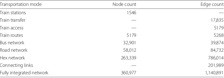
Table 1Summary of basic network features for the fully integrated network
Transportation mode Node count Edge count
Train stations 1546 —
Train transfer — 17,835
Train access — 5179
Train routes 5179 5268
Bus network 32,901 39,874
Road network 58,012 84,732
Hex network 263,339 786,014
Connecting links — 201,989
passenger loading and unloading, although they are abstracted so that distinct route types of the same line have separate nodes even if they share the same physical platform. The route edges are weighted by the mean weekday traversal time for a route link of that type on that rail segment.
We next create nodes representing each physical station in the system. Then, for each station we connect the station node to each platform node at that station via an access link with a time-weight of 3 min. The access links capture traveling between the station entrance and the platforms including congestion and waiting. Finally, we directly connect all platform nodes at the same station with a transfer link having a time-weight of 5 min. This time approximates walking times between platforms and train waiting times without overly complicating our intra-station network specification (Hibino et al.2005).
An example of the resulting train network construction is shown in Fig.2. There are two node types (station and platform) and three edge types (route, access, and transfer). Non-local routes (i.e., ones that skip stations) are represented as links that directly connect the platform nodes where that route actually stops (e.g., line 2 in Fig.2). One could consider our construction of the train network as a multiplex network with station and platform nodes representing the same object at different layers and the access/transfer edges acting as inter-layer links (Kivelä et al.2014; Bianconi2018). However, there are no advantages to that formalism for our purposes. We simply consider it as a geographically embedded network that is abstracted to distinguish train lines that share the same station and/or platform. This construction allows us to include the walking and waiting times within each station seamlessly with standard shortest-path algorithms (described below).
For a network constructed in this way, the meanings and/or calculations of many stan-dard network measures are altered. For example, because station nodes only have access links connected to them, the degree of the station nodes is the number of line types with stops at that station (40% of our stations have a single line type, so a degree of one). The degree of the platform nodes equals (1) the single access link to that platform’s
station node, (2) plus the number of platforms at adjacent stations on that route (usu-ally two, except at line termini), plus (3) the number of other line types (platforms nodes) at the same station. The platform node degrees range from 2 to 50, with 190 having a degree of 40 or more (degree distributions appear in the Additional file1). To get the station degree corresponding to the more traditional railway representation (Barthélemy 2011) one needs to sum the number of route links connected to all the platform nodes connected to each station.
This representation also changes network path lengths because entering and exiting a station adds two jumps and every transfer adds an additional jump. As discussed later, this difference is one of a few reasons why many standard network measures, especially topological ones, were less informative for our analysis and made their values based on our analysis incommensurable with other analyses. Due to the geographically embedded nature of our network analyses, we use the sum of time-weighted edge traversals to mea-sure network distances (i.e., not in terms of the number of edge traversals) and limit our algorithms to ones that can handle weighted graphs.
Figure3shows the result of constructing a rail network in this way. Train lines with only local stops can seen as sequences of blue dots connected only to the neighboring dots. A variety of rapid and express trains, sometimes multiple version on the same railway, appear as darker lines directly connecting more distant points.
Bus network
The bus network is constructed in the more traditional manner as links among bus stops. We still use direct links for stops of express buses even when they run the same path as a local bus. Traversal times are set from the bus schedules using the average traversal time for each link for a given type of bus (e.g., local, express). This time does not include
fluctuations in road congestion, loading and unloading times, differences in speeds from skipped stops, or other interference. Unlike the train network, we do not create sepa-rate physical and route-stop nodes because bus-to-bus transfers play a much smaller role in Japanese transit. However, we found that as byproduct of this modeling choice we were unable to include wait and transfer times into the bus network, so future work will represent the bus network in the same manner as the train system.
Road network
Our road network is constructed from road segments tagged as tertiary or above, or not specifically labeled and left as ‘road’, in OpenStreetMaps data (OpenStreetMap Con-tributors2019). OpenStreetMap data is sparse in Japan compared to other developed countries. Furthermore, in Japan’s fragmented and heterogeneous infrastructure it is common for roads to frequently change their thickness and allowable speeds, which com-plicates road classification efforts. We had to make assumptions based on typical values to fill in missing road speed limits and typical drive speeds (Japan Traffic Safety Associ-ation2017). For approximate drive speeds we adopted a convention of 70kph for major highways, 30kph for other major roads, and 25kph for minor roads (see the Additional file1for more road details). OpenStreetMap data includes points between intersections to capture the bending of the road, however we simplify the network by removing all nodes from the network with a degree of two between nodes of the same road type; leav-ing only actual intersections. We calculate the edge traversal time based on the Haversine distance (a measure of the distance that accounts for the curvature of the Earth and the variable conversion from lat/lon degrees into meters) between intersection node and the approximated drive speed (which are slower than the respective speed limits and meant to include considerations for traffic congestion, railway crossings, turning, traffic signals, etc.).
Excluding the small local roads results in some disconnected segments and a large num-ber of apparent dead ends as seen in Fig.4. Although some areas are denser than others, the included roads in addition to the hexagon grid provides ample coverage of the popu-lated areas. When we analyze the road network it is fused to the geographic hex network via connecting links. Travel along the connecting links and across interhex links fills in the gaps between intersection nodes. Although we use the walking speed of 5kph for con-necting and interhex links, and 5kph is an underestimated speed even for narrow Japanese residential roads, this includes travel to and from parking spaces, congestion, waiting, and various other factors – and typically only for short distances to the nearest included intersection.
Connecting links
Fig. 4A sample of the road network superimposed on the map. Although small local roads were excluded from the road network, connections to the hex network fill in the gaps and provide dense coverage. The diagram demonstrates both the high frequency of apparent dead-ends (leaf nodes) and our elimination of non-intersection nodes. Map data ©2019 Google
walking speed is meant to accommodate various common factors for which we do not have data: congestion, stairs, obstacles, non-direct routes, etc.
The connecting links in our network serve the role of intermodal edges, and in many cases can be considered as actually walking from one form of transportation to another because the distances/times are based on the actual longitudes and latitudes of the respec-tive nodes. That said, the connecting links are intended to be an abstraction rather than an approximation – although we obviously need some approximation of the intermodal change times (Ayed et al. 2011; Idri et al. 2017). All of the analyses performed here combine at least two modes (hex +. . ., see Table 2), and in the fully integrated net-work connecting links make up 17.7% of the edges, but different combinations of modes naturally require the inclusion of different subsets of connecting links.
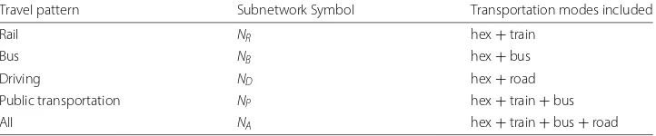
Table 2The multimodal transportation networks included in each travel pattern we analyse
Travel pattern Subnetwork Symbol Transportation modes included
Rail NR hex+train
Bus NB hex+bus
Driving ND hex+road
Public transportation NP hex+train+bus
All NA hex+train+bus+road
Network summary
Although one could consider the distinct transportation modes as layers and the inter-mode links as interlayer edges, the nodes in each network represent different locations; i.e., a bus stop and taxi stand at Tokyo station are distinct from the station itself, which is again distinct from the many train platforms in that station. We use intermode links to represent physical travel between the single-mode transportation networks to create an integrated geographically embedded network. Because nodes are unique across modes, the network structure is identical for the layered and flat conceptualizations. We perform our analyses while treating the combined networks as simple (non-multi), non-layered, undirected graph. The node and edge counts for the components of the fully integrated network are shown in Table1.
We use different combinations of the four transportation networks to capture five distinct travel patterns: rail, bus, driving, public transportation, and all together (see Table2).
The hex grid provides the geographic foundation and holds the sociological data, so it must be included in all our analyses. Each travel pattern also includes the appropriate connecting links for the included transportation modes; for example, for the rail travel pattern, only connecting links between train stations and hexes are included.
Methods
Our focal analysis approach is the unsupervised learning of similar locations among 500 randomly selected hexes from the Greater Tokyo Area1. Similarity is determined from various combinations of measures on five different subnetworks for each of the five travel patterns in Table2. The five subnetworks we analyse are: all nodes within 5 km as well as all nodes reachable within 20, 30, 45, and 60 min. In all cases travel times are calculated using Dijkstra’s single-source algorithm: the breadth-first summation of traversed edges’ time-weights (Hagberg et al.2008).
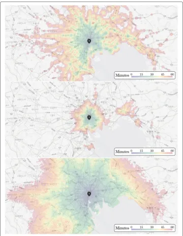
As an example of both the differences among modes and large scale of the subnet-works, Fig. 5 shows the travel times and extent of travel within 60 min from the hex including Tokyo Station for the rail (top), bus (middle), and driving (bottom) travel pat-terns. Rail travel produces a signature dappled pattern of walking times radiating from stations. Suburban stations with express trains are easily identifiable as clumps of hexes that are greener and larger than their neighboring stations, while the central region has a more diffuse pattern due to the high density of stations and tangled collection of routes. Due to the close proximity of adjacent bus stops, the bus network shows a smoother radiating pattern from the city center, but also islands of reachable hexes where express buses make connections. The driving pattern yields the widest extent and the most even coverage with major highways creating tendrils of higher-speed travel into the suburbs.
For each of the distance/time and travel pattern subnetworks we compute a battery of scores based on network and geotemporal measures. These scores are used (1) directly to sort and characterize the neighborhoods, (2) are combined to produce scores for higher-order features, and (3) are the fuel for machine learning techniques to cluster and compare these locations.
Fig. 5Figure demonstrating the total travel time using rail (top), bus (middle), and driving (bottom) from the hex including Tokyo station to each hex reachable within 60 min. Zoomed in to show detail. Map data ©2019 Google
Network measures
Our most basic evaluation utilizes the following standard network measures applied to each subnetwork: number of nodes, number of edges, the eccentricity of the focal loca-tion node, the closeness centrality of the focal localoca-tion node, the mean degree centrality, the mean eigenvector centrality, and the number of nodes on the boundary of the subnet-work. All of these measures were calculated using the time-weights of the edges where appropriate.
Network measure descriptions
Python package (Hagberg et al.2008). For each of the travel patterns, the number of nodes and the number of edges are inclusive of the modes for that pattern. For example, the pub-lic transportation pattern includes the train, bus, and hex networks as well as connecting links binding them together; thus the number of edges includes train access, transfer, and route links, plus the bus links, plus the hex links, plus the connecting links within that subnetwork. Withki representing the number of neighbors (of any kind) of nodeiand
NSbeing the number of nodes in subnetworkS, the mean degree centrality of a location
equals
1 NS
NS
i=1 ki
NS−1
. (2)
The sole exception to our use of time-weighted measures, the eccentricity of focal loca-tion nodeiis the number of edge jumps fromito the furthest node in its subnetwork. Because the furthest distance in meters/time is set by the subnetwork-creating parameter (5 km, 20 min,. . .) this becomes a measure of network efficiency that captures the linkage structure to achieve that distance (especially for the 5k case).
Although we use the Wasserman and Faust version of closeness centrality, because all subnetwork nodes are reachable from the focal location it is equivalent to the original Freeman formulation (Hagberg et al.2008). For focal hex nodeithe closeness centrality is the number of hexes in the subnetwork divided by the shortest distance weighted by traversal timed(i,v)to each reachable hexv.
NS−1
NS−1
i=1 d(i,v)
. (3)
This gives higher scores for more compact and densely connected subnetworks with the idea of comparing locations when subnetworks are made using the same distance/time parameter.
Eigenvector centrality measures the influence of a node by increasing a node’s score the more it is connected to by highly connected nodes (Newman2003; Hagberg et al. 2008). Instead of using the eigenvector centrality of the location hex node, we calculate the eigenvector centrality of each node in the relevant subnetwork (with a tolerance of 0.001) and use the mean value to characterize the subnetwork.
Boundary nodes are those not in the subnetwork but connected directly to nodes that are in the subnetwork. This is akin to a measure of the perimeter size or circumference of the reachable area, but it accommodates irregular shapes. It does not count hexes along the coastline or boundaries (because there are no hexes further out), so it is biased toward central, inland areas.
Exclusion of specific network measures
As an example, consider the betweenness centrality of the 5 km subnetwork of any given location. We could choose either the betweenness centrality of the location’s focal node or an aggregate (mean/max) of all the nodes in the subnetwork. As for the betweenness of the focal node, recall that all location nodes are hex nodes, and travel along any trans-portation edge is faster than the walking-speed hex and connecting links. As a result, the focal hex will only be on a shortest path when walking is the fastest way to cross through the center of the region. That case can only occur when there are few to zero transportation links running through the region. We directly measure the number of transportation nodes/edges, so this measure is uninformative given the structure of our integrated network.
The mean or max (or max−mean) betweenness should tell us whether there are bottlenecks and/or high-throughput corridors for the traffic within the region. High betweenness scores are expected among highway intersection and train station nodes, but these make up a small fraction of the nodes in any subnetwork so mean values would fail to differentiate locations. Furthermore, we would be measuring betweenness only among points within the subnetwork, not the full transportation network, so there is no clear useful interpretation of the score. For example, some location may include the world’s busiest train station (Shinjuku station) at the fringe of its subnetwork, but within that subnetwork it would still have a low betweenness score.
One alternative is to calculate the betweenness scores (and other measures) for all nodes in the full network and aggregate them within each subnetwork, but with 360,977 nodes and more than a million edges the computation was impractical. The other measures were excluded for similar reasons. Due to the high connectivity of the hex network, the clustering coefficient is high across the network. Also due to the hex network, graph com-munities can only form when there are express trains/busses/highways with long edges (as in Fig.5top and middle), but the number of such communities does not correspond to any intuitive feature of the transportation networks for a region. If we want the pres-ence/impact of long-range edges we can directly aggregate the edge lengths within a subnetwork. It should be noted that the interpretation of some of the included measures is also affected by the hex network, as is discussed in more detail in the results section.
Geotemporal measures
In addition to the measures from network theory we include specifically geographic and transportation-focused measures. For each subnetwork we determine both the number of hexes and the number of people within the subnetwork. The number of hexes is nat-urally similar to the number of nodes above (especially because the hex nodes are always by far the most numerous), but counting only the hex nodes provides a fairer comparison of the transportation modes’ ability to access an area. Counting the hexes is equivalent to measuring the area because each hex covers the same amount of space. Each hex con-tains the population of its covered area, so the number of people is simply the sum of the populations of the hexes included in the subnetwork.
reachabilityi:=
NS
j=1 1 tij
(4)
in whichtijis the shortest time in minutes from hexito each hexjin subnetworkNS(we
usetij = 1 wheni = j). Inversely weighting by time produces a measure that discounts
far-off locations so that greater connectivity to transportation networks near the focal locationiis more strongly rewarded. That is, being far from a major station or next to a minor station may generate similar numbers of hexes within a certain time horizon, but we can differentiate these cases using the reachability measure.
In a similar vein we use the population data to determine thesociability scoreof each location defined as the number of people who can reach each location weighted by the time it takes to reach it. We simplify and generalize the measure from (Biazzo et al.2018) to handle continuous travel time values and averaged edge traversal times. Specifically, the sociability score for hex grid locationiis calculated as
sociability scorei:=
NS
j=1 Pj
tij
(5)
in whichPjis the population of hexjandtijis again the shortest time in minutes from hex
ito hexj.
For each subnetwork we also determine thefurthest pointfrom the focal location. This requires a different measure for distance-constrained vs time-constrained subnetworks. For the 5 km subnetwork it is the longest travel time; i.e., how long it takes to reach the most remote hex within the area. It is thus a measure of the spatial efficiency of the region. For the 20, 30, 45, and 60 min subnetworks it is the distance to the furthest hex reachable in that amount of time. It is often possible to reach additional transportation nodes even further out, but we only consider hex nodes in this score.
Custom combined measures
Up to this point we have a total of 300 measures for each hex: 12 network measures×5 subnetworks×5 travel patterns. We also combine these core measures across subnet-works for each hex to reveal higher-order features for comparison and clustering. Here is where we try to ascertain more sophisticated accessibility features such as the relative efficiency, interplay, and dominance of modes of transportation.
Network synergies
By subtracting the number of hexes from the number of nodes we recover the number of transportation nodes, which is useful in discerning a location’s mode-dependencies and the synergistic effects of multiple transportation modes. We evaluate the degree to which combining networks amplifies their efficacy by comparing selected measures of therail+bus and rail+bus+driving networks compared to the rail, bus, and driving net-works separately. Figure6shows one example of how combining the rail and bus networks facilitates greater accessibility.
Fig. 6The nodes reachable within 30 min for the rail (top-left), bus (top-right) and public transportation (bottom) networks for location #2621 shown at the same geographic scale
dominated by one of the transportation modes such that adding another does not expand the reachable area.
There are three aspects to our measurement of network synergy. First we measure satu-ration synergyusing the number of transportation nodes in the combined network divided by the sum of transportation nodes in the individual networks. Using the travel pattern subnetwork symbols from Table2focused on hexiandnt,nb, andnrto refer to nodes of
the train, bus, and road modes respectively we have
saturation synergyP:= |nt+nb∈NPi| |nt∈NRi| + |nb∈NBi|
(6)
saturation synergyA:= |nt+nb+nr∈NAi| |nt∈NRi| + |nb∈NBi| + |nr ∈NDi|
. (7)
We measuredistance synergyof locationiusing the ratio of the Haversine distances to the furthest reachable hex of the combined networks over the max of the individual networks. Lettingdmax(NSi)= maxjd(ni,nj),nj ∈NSi; i.e., the furthest pointnjfrom the focal hex
nodeniin subnetworkNSi, we have
distance synergyP:= dmax(NPi)
max(dmax(NRi),dmax(NBi))
(8)
distance synergyA:= dmax(NAi)
max(dmax(NRi),dmax(NBi),dmax(NDi))
. (9)
the sociability of subnetworkNSiof location hex nodeithese synergies are calculated as
follows:
reachability synergyP := R(NPi) max(R(NRi),R(NBi))
(10)
reachability synergyA:= R(NAi)
max(R(NRi),R(NBi),R(NDi))
(11)
sociability synergyP:= S(NPi) max(S(NRi),S(NBi))
(12)
sociability synergyA:= S(NAi)
max(S(NRi),S(NBi),S(NDi))
. (13)
For simplicity, in the current work we only perform these synergy measure calculations for the 30 min subnetworks.
Mode centricity
Because for every location we expect the road network to facilitate the greatest accessi-bility by all measures we evaluate transportation mode dominance in a relative manner. Specifically, for each measureMof the 30 min rail subnetworks, we divide it by the cor-responding measure for the bus, and repeat that for the driving travel pattern. We also take the bus subnetwork values divided by the driving subnetwork values to complete all pairwise competitions. In the current paper we use this measure to assess travel mode dominance, and for this reason we limit its application to the following variables: reach-able hexes, reachreach-able people, reachability, sociability, and furthest point. As a result, each location has 5 values for each of three comparisons: Rail|Bus, Rail|Driving, Driving|Bus.
Rail|BusMcentricityi:= M(NRi30m) M(NBi30m)
(14)
Rail|DrivingMcentricityi:= M(NRi30m) M(NDi30m)
(15)
Driving|BusMcentricityi:= M(NDi30m) M(NBi30m)
(16)
We can use these scores to directly measure the relative usefulness (and hence domi-nance) of each location and to cluster the locations by similar relative values.
Summary of measures
The twelve measures in listed in Table3applied to the subnetworks generated by each of the five travel patterns (Rail, Bus, Driving, Public Transportation, All) for the five dis-tance/time parameters (5 km, 20 m, 30 m, 45 m, 60 m) gives us 300 core measures from network theory and geotemporal analyses. We further add the combined measures listed in Table4to the core measures as well as additional variations introduced below.
Table 3Table summarizing the collection of core (network plus geotemporal) measures applied to each travel pattern subnetwork for each location
Core measure name
1 Number of nodes
2 Number of edges
3 Mean degree centrality
4 Focal node eccentricity
5 Focal node closeness centrality
6 Mean eigenvector centrality
7 Boundary size
8 Reachable hexes
9 Reachable people
10 Reachability
11 Sociability
12 Furthest point
structure makes interpreting measures such as degree centrality and clustering coeffi-cient less straightforward. Although we computed several additional measures that we could add into the mix (e.g., population centrality, population scaling, 60m|30m measure scaling), the core measures plus our selected combined measures suffice for enabling our classification of locations using machine learning.
Machine learning techniques
In addition to providing a profile of the multifaceted transportation system, the network and geotemporal measures above are also fuel for our clustering and dominance analysis. Much like our evaluation of network measures used in previous transportation network analyses, we found that previous work on network similarity and structural profiling (Soundarajan et al. 2014) became unusable or inappropriate for our model/purposes. Specifically, previous network similarity measures depend on calculating features of the network that are either too computationally expensive or that fail to reveal characteristic features of our networks (again mostly due to the inclusion of the hex network).
For example, measures of whole-network similarity like NetSimile (Berlingerio et al. 2012) and Normalized LBD (Richards and Macindoe 2010) depend on collections of
Table 4Table summarizing the collection of combined measures generated for each location using multiple subnetworks
Combined measure name
1 Saturation synergy public transport
2 Saturation synergy all
3 Distance synergy public transport
4 Distance synergy all
5 Reachability synergy public transport
6 Reachability synergy all
7 Sociability public transport
8 Sociability synergy all
9 Mode centricity 30m Rail|Bus
10 Mode centricity 30m Rail|Driving
measures of the micro-structures of the network. Graphlet methods (Pržulj et al.2004)) similarly depend on the frequency of particular motifs within a network to act as a pro-file or fingerprint to measure similarity. However, structures like cliques and trees among small numbers of nodes are not predictive of accessibility, speed, and reach of travel. Also, the geographic nature of these transportation networks implies bounds on the frequency of certain structures that do not exist for social and other networks. Finally, the inclusion of the hex grid and connecting links, and even just the inclusion of multiplekinds of links makes these techniques difficult to apply and/or interpret.
Clustering algorithms
As a result, instead of relying on existing network similarity and profiling methods to act as a metric for clustering, we rely on standard unsupervised machine learning methods applied to the core and combined measures for each location. We first standardize each measure on the [ 0 1] range using(xi−minx)/(maxx−minx)to improve the
perfor-mance of distance-based clustering methods2. By combining our data in different ways we create several different experiments (described below) to uncover clusters for a variety of location characteristics.
In order to more easily compare the results of multiple clustering algorithms and exper-iments we decided to fix the number of groups to seven. The motivation for clustering into seven groups derives from the train vs bus vs road tricotomy and our interest in mode comparisons. With three poles there are 7 possible dominance combinations: train, bus, road, train+bus, train+road, bus+road, and all three being even. Although not all of our analyses are about dominance, and we don’t expect all the results to fall neatly into these particular groups, we needed to choose a number of groups and this is why we chose seven (in addition to being a nice medium-sized number for our dataset).
For each set of variables we apply three common unsupervised learning techniques: K-means, hierarchical (agglomerative) clustering, and spectral clustering from Python’s Scikit-learn package (Pedregosa et al.2011). Although other clustering methods could be applied to the data, we limited ourselves to ones that (1) include a parameter for the number of clusters, (2) output partitions of the data (no outliers), and (3) are sufficiently performative on our data.
For K-means we used Scikit-learn’s default parameters except for the number of clus-ters. Because our data is dense, the Elkan algorithm is used, run with 10 seeds for 100 iterations, and with a tolerance of 0.0001 (Pedregosa et al.2011). For spectral clustering we used the nearest neighbors affinity parameter and seven clusters, and the default val-ues for the other parameters (Pedregosa et al.2011). For hierarchical clustering we used a bottom-up agglomerative clustering approach with seven clusters and the “average” link-age parameter; the defaults were used for the remaining parameters (such as Euclidean affinities and no distance threshold) (Pedregosa et al.2011). Our primary interest here is differences in clusters from considering different specific subsets of our data, so we only briefly investigate the differences in clustering results for these three approaches using mostly the default parameters. Future work on more specific clustering goals may explore tuning additional parameters to achieve improved categorization for those narrower purposes.
2We also processed normalized data,(x
i− ¯x)/std(x), but do not include this analysis in the results or discussion because
Comparing clusterings
We compare the results of different clustering algorithms and the results of the same algorithm on different datasets using the AMI score (adjusted normalized mutual infor-mation score, henceforth “mutual inforinfor-mation” or “AMI”)(Vinh et al.2010). Although we also examine the adjusted Rand index and the percent similarity in the label assignments, these are largely redundant with mutual information and thus not included in the results below.
All algorithms are set to find seven clusters, but the sizes of the clusters are heteroge-neous. Some clusters may have just one or a few members (especially with hierarchical clustering) and this can be interpreted as the number of clusters found by the algorithm being fewer than seven. We can evaluate the diversity of the cluster sizes using a measure of theeffective number of groups; and we use the inverse Simpson index following (Laakso and Taagepera1979):
1 7
i=1p2i
(17)
where pi is the proportion of the locations in groupi. If all clusters are of equal size,
then the result is 7. As the heterogeneity in the group member counts increases the value moves closer to one. Unlike simply measuring variance, this has the additional merit of providing an intuitive interpretation. For example, if two groups are nearly empty and the others are roughly even, then it informs us that there are effectively five groups.
To ease the intuition of reading our clustering result diagrams we want to match clus-ters to the same group number as much as possible, and this requires a measure of label similarity. To assign label similarity scores we first sorted the labels of the k-means results of each experiment by the mean of the values of the cluster centers (across all included dimensions). We then mapped the labels of the other two clustering methods to the k-means labels using the Python Munkres package version of the Hungarian algo-rithm (Clapper2008). In this way, clusters with similar data values will be assigned the same label number for all three clustering methods. These shared labels are used both to identify which locations are classified differently and to maintain consistent group colors for plots. However, this process is not completely consistent in assigning labels because differences in included points can sufficiently change the centroid values to make label similarity impossible (and meaningless – if the clusters have widely different members then they fail to be similar enough to merit similar indices anyway). Because mutual infor-mation is not sensitive to the labels it is adopted for quantitative cluster comparisons but is less useful for visualizing the differences in results.
to get some idea of the relationship between the values of the features and the cluster membership of each location.
Results
With a dataset as rich as this, the collection of methods that we could use, and the col-lection of experiments we could run, is excessively large. As such, many of the analyses we performed are not covered in this treatment. We narrowed it down to those which we judged to be most revealing for our substantive questions after broad preliminary investigations.
Feature correlation
As previously explained, we excluded some network measures because they were com-putationally too expensive or uninformative for our network construction. It is also advantageous to exclude measures that provide redundant information. In considera-tion of space and focus, we omit the details of our feature selecconsidera-tion/dimension reducconsidera-tion analysis. However, we briefly examine the correlation levels among the core measures because they also reveal important differences between our network construction and most previous analyses of transportation networks.
We assess the similarity in the core measure correlation matrices using the standardized Frobenius norm of the difference between two correlation matrices. With twelve vari-ables ranging from−1 to 1, the maximum difference is 24, so we divide by that number to get the proportion of possible difference. All pairwise comparisons grouped by travel pattern and distance/time threshold are available in the Additional file1while Table5 presents the mean values by travel pattern (left) and by distance/time threshold (right). We find a high level of similarity in the correlation levels across transportation modes; e.g., the mean difference in the correlations of the core measures across all 500 locations and across the five distance/time thresholds for the train+hex subnetworks is only 5.6%. Among the distance/time aggregates it is unsurprising that the 5 km has the highest level of correlation similarity because the hex grid is indistinguishable and dominant within 5 km (excepting locations along the boundaries). We also find that similarity decreases with increasing time radius as should be expected.
A similar correlation pattern exists across all the travel patterns and subnetworks, which reflects the purpose-oriented and physical constrains of transportation networks. How-ever, the differences that do exist tell us that these 12 core measures do capture a profile that is distinguishable for each travel pattern and distance/time threshold. There is one notable difference that we can highlight using the two correlation matrix plot samples in Fig.7(correlation plots for the other subnetworks appear in the Additional file1): the 5
Table 5The mean percent difference in the correlation matrices across time-radii subnetworks for each network (left) and the mean across travel patterns (right) for each subnetwork
Travel pattern Percent difference Distance/Time Percent difference
Rail 5.6 5 km 7.9
Bus 6.7 20min 8.63
Driving 6.32 30min 9.98
Public transport 7.74 45min 12.07
All 7.11 60min 13.07
Fig. 7Correlation matrices of the core measures on the fully integrated travel pattern within 5 km (left) and 30 min (right) across locations. Figures for other travel patterns appear in the Additional file1. For each travel pattern the correlation pattern is consistent across time threshold, so only the 30 min matrix is shown
km and distance-based subnetworks have specifically distinct correlation patterns. Recall that thefurthest point measures has different definitions for distance-based and time-based thresholds. The reason for this is clear when we examine the correlation matrices: the distance to the furthest location for the 5 km case, and the longest travel time for the time-based cases, are uncorrelated with anything because they are nearly or exactly con-stant. It is because these measures are useful in mutually exclusive cases that we collapse the two measures into the singlefurthest pointmeasure.
The numbers of nodes and edges are nearly perfectly correlated in every case as one would expect (note that the numbers of nodes and edges are dominated by the hex net-work). Most of the measures are consistently positively correlated with the number of nodes across networks and subnetworks, with mean degree centrality and eigenvector centrality being typically anti-correlated. Eccentricity and the furthest point are nega-tively correlated for the 5 km subnetworks, but are both posinega-tively correlated for the time-threshold subnetworks. The measure with the most volatility is closeness cen-trality (which is sometimes positive and sometimes negatively correlated for the same travel pattern at different time thresholds); however it is also weakly correlated with the other measures. None of these patterns are surprising when we carefully consider the construction of the network and features being measured.
less than the hex nodes. If we isolate the degree to only among non-hex links, then a greater mean degree would correlate with larger and further-reaching subnetworks. But the inclusion of the hex network changes this relationship so that higher values (i.e., closer to six) indicates fewer transportation nodes, and hence lower reachability.
Eccentricity is nearly always positively correlated with the number of nodes for the time-threshold subnetworks, but is always negatively correlated for the 5 km subnetworks. This is because for the 5 km case more nodes/edges always means more transportation nodes and therefore fewer edge jumps to reach the perimeter: more nodes leads to lower eccen-tricity. However, for the time-threshold subnetworks more nodes almost always results from a greater range, and this typically requires more jumps to reach the furthest edge.
Closeness centrality’s correlation is the most volatile across time-threshold subnet-works and across travel patterns. Recall that closeness is calculated as the number of nodes in a subnetwork minus one divided by the sum of the time-weighted distances from the focal hex to each node in the subnetwork. For the 5 km cases, more nodes means more transportation nodes, hence more connectivity and shorter travel times within the region, and therefore greater closeness centrality of the focal hex: they are positively cor-related. As one can see from Fig.5(top), train travel is only efficient along the tracks, so the number of reachable nodes does not increase as fast as the time to reach the further nodes, making closeness and the number of nodes negatively correlated. Figure5 (bot-tom) also shows how the reachable nodes for driving subnetworks expand radially; as a result the number of nodes and the distance to those nodes increase together. The rate of increase in the number of nodes (numerator) and distances (denominator) turns out to be similar, and as a result the closeness centrality for the driving subnetworks is not strongly nor consistently correlated with anything.
The above analysis of the correlation patterns is meant to highlight differences in the measure relationships resulting from our geographically embedded network construc-tion and between distance- and time-constrained subnetworks. The discovered patterns reveal that each subnetwork has a distinct signature, but that the differences across time-thresholds for the same travel pattern are small (≤ 7.74%). We additionally used these correlation patterns to select measures to include in the experiments described below.
Geospatial patterns in transportation network characteristics
Here we examine the spatial distribution of the groups found by clustering and how they differ by clustering method and included measures. There is no ground truth regarding which category a location should be in or which locations should be grouped together. As such there is no metric for how correctly an algorithm clustered the locations. Instead, our exploratory analysis aims to uncover relationships between the characteristics of the hexes, their surrounding area, and their locations on the map.
All core measures
Fig. 9Numbers of locations and mean values across the 300 core measures per group for the three clustering techniques. Hierarchical clustering more evenly spaces out the values to create groups that vary more in their characteristics by essentially creating fewer (i.e., empty) groups
group (right) by clustering method. The k-means and spectral algorithms generate sepa-rate groups among locations with similar characteristics (especially in the outskirts) while grouping locations with different features together (especially in the city center). Hier-archical clustering, on the other hand, leaves two groups essentially empty to create five groups that are more diversified in values.
Due to the differences in group sizes the effective number of groups for k-means is 5.97, but only 1.75 for hierarchical and 4.05 for spectral clustering. Hierarchical clustering creates groups with just 6 and 2 members for the greatest two mean val-ues, and these accurately separate the most central locations into intuitively different classes (near and not-so-near major stations). Locations near secondary city cen-ters are among the 14 members of the next category. More than 200 locations are binned together yet a single location makes up a group with a similar mean value. This single location truly is an outlier (the blue dot in the southwest corner out in the water in Fig. 8) so it is reasonably different in its measure values from all other nodes.
Whether a finer breakdown of suburban and rural areas (k-means and spectral) is preferred to a finer breakdown of central locations (hierarchical) is a matter of prefer-ence. Note that although clustering in 300 dimensions could reveal clusters that align in unimaginable patterns, due to the high correlation of the variables, all clustering methods generate groups in a roughly concentric ring geographic pattern. The Pearson clustering coefficient of the mean value of the 300 variables and the location’s distance from Tokyo Station is -0.6833. By exploring the core measures and various combinations of these core measures we uncovered many patterns that are useful for better understanding accessi-bility quality around the Greater Tokyo Area. For now, however, we move on to specific analyses directly related to accessibility and clustering.
Reachability and sociability
Reachability and sociability are highly related measures: reachability aggregates the time-weighted area and sociability aggregates the time-time-weighted population of that area. There is a key difference, due to the inclusion of the hex network the reachability of a location is always strictly positive, while sociability can be zero. Figure10shows the reachability and sociability values for each location for each travel pattern using the 5 km and 60 m subnetworks. The 5 km plots clearly reveal this difference: there is a dense line around a
Fig. 10 Reachability and sociability scores for each location broken down by travel pattern for the 5 km and 60m subnetworks. The patterns reveal similarities and differences between these geotemporal measures as well as demonstrate the role of synergy and the overall dominance of the road network discussed in detail later
reachability of 45 representing regions requiring a lot of walking from the focal location; lower values indicate locations near a boundary.
For the 5 km subnetworks, rail travel is the weakest for both reachability and sociability, followed by bus and public transportation (rail+bus), while driving and the fully com-bined network have the greatest (and roughly equal) distribution of values. Examining the 60m subnetworks reveals two interesting differences: (1) the best rail values are supe-rior to the best bus values, and (2) public transportation is notably supesupe-rior to both the rail and bus networks that it is composed of. The latter result comes from mode synergy, which we discuss in detail below. It is also clear that including the road network system-atically enhances both reachability and sociability, which is discussed below regarding dominance.
Here we want to reiterate that trains are very fast once you reach the station, but they only foster travel along the tracks. Bus networks are more dense and pervade more areas, so on average they provide greater reachability; however, some areas (esp near the city center) have very high rail connectivity and these areas can out-compete bus reachability (Fig.10bottom-left). Moreover, these central areas with multiple convenient train lines provide access to many densely populated suburban areas, so within 60m the train sociability is even more competitive with buses than the reachability (Fig.10 bottom-right).
Table 6Summary of mutual information (AMI) results for sociability and reachability aggregated across travel patterns (modes)
Clustering
Radii Method min AMI mean AMI max AMI
Reachability 5 km k-means 0.168 0.3361 0.77
Reachability 60 m k-means 0.106 0.3004 0.762
Sociability 5 km k-means 0.616 0.7096 0.967
Sociability 60 m k-means 0.293 0.5225 0.899
Reachability 5 km Hierarchical 0.139 0.3236 0.799
Reachability 60 m Hierarchical 0.124 0.2926 0.686
Sociability 5 km Hierarchical 0.629 0.7371 0.938
Sociability 60 m Hierarchical 0.232 0.4605 0.747
Reachability 5 km Spectral 0.007 0.0405 0.088
Reachability 60 m Spectral 0.067 0.2707 0.726
Sociability 5 km Spectral 0.716 0.7656 0.942
Sociability 60 m Spectral 0.398 0.5256 0.795
Full travel mode comparison tables for reachability and sociability for the 5 km and 60 m subnetworks are available in the Additional file1
similar than the 60m for sociability, but not consistently so for reachability, and (3) the particular comparisons giving the min and max values vary greatly among methods and subnetworks. For point (3) we simply note that the same All vs Driving comparison yields the lowest sociability similarity for 5 km subnetworks, but the highest similarity for 60 m subnetworks. A more in-depth analysis is not revealing of general patterns so is left out of this paper (more comparison details are available in the Additional file1).
It is surprising to find that sociability similarity is much higher than reachability similar-ity, especially on the 60m subnetworks, because the two measures are so related. Spectral clustering in particular produces an anomalous level of dissimilarity for the 5 km reacha-bility scores (0.0405 on average). We examine this more closely by looking directly at the relationship between the two variables. Figure11shows the correlation and the mutual information of group members formed by clustering on reachability and sociability val-ues. From it we can see that k-means produces the most similar pattern to the correlation levels for both subnetworks, followed closely by hierarchical clustering (which consis-tently generates more similarity for public transportation), while spectral clustering yields rather dissimilar results. Although producing similarity levels matching correlation has an intuitive appeal as a reality check for the accuracy of a clustering method, it is not a full-fledged benchmark. The correlation between reachability and sociability for the
60m subnetworks is 0.956, and we are clustering on just one variable here, so the clus-tering methods only need to find appropriate divisions for both variables to match up the groups. In consideration of that all the clustering results are lower than expected. This could be a result of the parameters used for clustering, but more likely it is a feature of the data: despite being highly correlated, the reachability and sociability variables are clumped differently, and therefore put different locations in different groups.
Network synergies
One of our custom geospatial measures is the degree of transportation network synergy among the different modes. In contrast to determining which mode of transportation is dominant, the network synergies reveal interplay between the modes that reinforce each other. We are particularly interested in synergies for public transportation access; i.e., improvements in accessibility from the joint use of trains and buses. The most obvious benefit of joint usage is for locations far away from their closest station. Trains, especially express trains, are excellent methods for reaching distant points. But if a location is far from the station then the walking time can drastically reduce the usefulness of the train network. In many such cases there are bus routes dedicated to bringing people to the station.
Based on our measures of synergy, a location will have a value of zero if no nodes of one type exist, a value of 1 if there is no synergy (i.e., the joint value is no better than one of the components), and larger values from there based on the proportion of added benefit generated. Figure12shows locations with similar public transportation synergy levels according to hierarchical clustering (colors) along with their level of synergy (size). The Rail+Bus+Driving synergy values tend to be significantly higher than the Rail+Bus synergies because the road network is the most expansive and dense (excepting the hex network, of course). If we think of the road network as taxi usage, then this confirms how much more convenient trains (and even buses) are if we can take a taxi to them from our homes. We perform two analyses to test the idea that distance from the station or bus stop plays an important role in the synergy levels. First we examine the correlation of the distance to each kind of transportation node to each synergy score separately in Table7. Negative values for each relationship means that beingcloserto the nodes creates greater synergies. We actually expected Rail+Bus synergies to be higher when further from the station, but this result implies that the combined network reaches more people because of bus use to spread more diffusely away from each station. We also expected that the distance to the nearest intersection would have the lowest synergy values because the furthest distance from a location to its nearest intersection is less than 1750m (compared to 12 km for the furthest train station).
Fig. 12 Public transportation synergy scores (sizes) and groups via hierarchical clustering (colors). Size represents the mean of the four synergy measures, so the small purple dots indicate a score of 0 (no trains, sometimes no buses either). Although the regions of similar synergy levels are scattered geographically, regions of low synergy may indicate areas where increased bus service could substantially increase reachability
places one can go via car, but not via train or bus, are places where considerably fewer people live.
Although these synergy measures and statistical analyses are extremely valuable for our interests in accessibility, the clustering results are somewhat less useful. Figure13shows (via color) the clusters found by each algorithm. Not only do the synergy values not form cohesive geographical patterns as seen in Fig.12, but they are also highly mixed when viewed as related to distances to the nearest transportation nodes. There are noticeable clusters in the plot, as we expect from the correlation values, but it is still unclear how to use the synergy cluster information to gain a better understanding of accessibility. We may develop a better understanding of the factors leading to high synergy in follow-up research that analyses every hex instead of selected locations.
Table 7Correlation of each synergy score with the distance to each relevant node type
Saturation Distance Reachability Sociability
Comparison Synergy Synergy Synergy Synergy
RailBus↔Station -0.578 -0.246 -0.309 -0.688
RailBus↔Bus Stop -0.649 -0.251 -0.257 -0.597
RailBusDriving↔Station -0.475 -0.129 -0.122 -0.279
RailBusDriving↔Bus Stop -0.51 -0.164 -0.316 -0.304
Table 8R2of linear fit models predicting the synergy score from the distances to each relevant node type
Saturation Distance Reachability Sociability
Comparison Synergy Synergy Synergy Synergy
RailBus Distances 0.494 0.08 0.107 0.545
RailBusDriving Distances 0.344 0.04 0.104 0.113
Transportation mode dominance
We utilized multiple approaches to identify regions with similar dominance patterns. The first approach is to simply group the locations using all the measures we defined for this purpose: the pairwise mode comparisons of reachable hexes, reachable people, reachabil-ity, sociabilreachabil-ity, and furthest point for the 30 m subnetworks (described above). This allows us to cluster locations by the relative strength of their transportation modes. For example, clustering on the reachability comparison measures puts together regions without trains and buses, ones with buses and no trains, areas that are strong in all three, and areas with particularly strong trains. Figure14shows that our experiments using clustering meth-ods to identify areas with similar transportation mode dominance patterns met with only partial success.
Locations with similar profiles are scattered throughout the area so they must be bound by other features of the locations. A hex that happens to be far from its closest station is going to have a weak train strength, and whether it is dominated by road or bus will depend on whether any bus lines run nearby, for example. A different hex, maybe just one kilometer away, could be one kilometer closer to the same station, and that difference may make the train network extremely useful. That local difference in the relative usefulness of each transportation mode drowns out any large-scale geographic pattern.
To test this hypothesis we also investigate the relationship of the comparison measure values to the local mode-dependent accessibility. First we calculate the distance from every hex to its closest train, bus, and road network node. We use these distances to perform both a correlation analysis and a clustering comparison, so we also group the resulting distances into 7 groups using the same three clustering methods. Next we intro-duce three new measures to explicitly measure dominance based on thenon-standardized core measures. LettingLbe the list of measures we use to assess dominance (reachable hexes, reachable people, reachability, sociability, and furthest point) we have
Fig. 14 Hierarchical clustering using all the Rail|Bus, Rail|Driving, and Driving|Bus comparison variables together. Map data ©2019 Google
rail dominance :=
M∈L
M(NRi30m)
M(NBi30m) +
M(NRi30m)
M(NDi30m) (18)
bus dominance :=
M∈L
M(NBi30m)
M(NRi30m) +
M(NBi30m)
M(NDi30m)
(19)
driving dominance :=
M∈L
M(NDi30m)
M(NRi30m) +
M(NDi30m)
M(NBi30m)
(20)
We eliminate rows with a 0 or 1 value for any of the comparison measures to ensure real values, leaving 355 of the 500 locations. Using these dominance measures we revisit the relationship between distance to the nearest node and mode dominance.
The Pearson’s correlation between the rail dominance measure and the distance to the nearest station is−0.168; indicating that being near a station contributes only slightly to rail travel being important for that location. Similarly, the correlation of bus dominance to the nearest bus stop distance is only−0.199. However, road dominance has a much lower correlation (−0.073) with the nearest intersection. The level of mode dominance likely depends on many nuanced features of a location’s transportation network, but access to transportation systems must be important.
Table 9The mutual information (AMI) between the groups created from the dominance scores and the groups created from the distances to the nearest node of the appropriate type
k-means Hierarchical Spectral
Rail dominance 0.018 0.0 0.048
Bus dominance 0.052 -0.011 0.043
Driving dominance 0.14 0.03 0.129
In each case the dominance and distance groups were created using the same algorithm
groups may not be an effective method for evaluating the relationship between two vari-ables (at least with the current set of parameters). Actually, this only confirms that the two features are not as connected as our intuition would have us believe. The dominance measures include the relative strengths of five sophisticated geotemporal measures that depend on many complex and idiosyncratic features of the integrated transportation net-works. It is thus not surprising that no single variable, however intuitively linked, would provide strong explanatory support on its own.
Figure 15 shows the geographic distribution of the rail dominance score groups according to hierarchical clustering for the 355 remaining locations. There is a partial geographical pattern that is revealed in the correlation of the dominance scores to the distance from Tokyo Station: rail dominance is 0.287, bus dominance is−0.067, and driv-ing dominance is−0.227 (a scatterplot of these relationships is available in the Additional file1). These results reverse the pattern we see from other analyses and our expectations: rail is most powerful far from the city center, driving is most powerful in the center and suburbs, and buses are widely dispersed and evenly spread out. We find the largest rail