Methods for the Metagenomic
Data Visualization and Analysis
Konstantin Sudarikov
1*, Alexander Tyakht
2,3and
Dmitry Alexeev
21
ThNational Research University Higher School of Economics, Myasnitskaya ulitsa 20, Moscow, Russian Federation.
2Moscow Institute of Physics and Technology, Institutskiy pereulok 9, Dolgoprudny, Russian Federation.
3Federal Research and Clinical Centre of Physical-Chemical Medicine, Malaya Pirogovskaya 1a, Moscow, Russian Federation.
*Correspondence: [email protected] https://doi.org/10.21775/cimb.024.037
Abstract
Surveys of environmental microbial communities using a metagenomic approach produce vast volumes of multidimensional data regarding the phylogenetic and functional composi-tion of the microbiota. Faced with such complex data, a metagenomic researcher needs to select the means for data analysis properly. Data visualization became an indispensable part of the exploratory data analysis and serves a key to the discoveries. While the molecular genetic analysis of even a single bacterium presents multiple layers of data to be properly displayed and perceived, the studies of microbiota are significantly more challenging. Here we present a review of the state-of-the-art methods for the visualization of metagenomic data in a multilevel manner: from the methods applicable to an in-depth analysis of a single metagenome to the techniques appropriate for large-scale studies containing hundreds of environmental samples.
Introduction
Sudarikov et al. 38 |
various niches, from soils and oceans to urban environment and host-associated microbiota. Particularly, human microbiota is of high interest to the biomedical researchers: analysis of microbial gut community balance and dynamics allows us to discover new biomarkers of disease and predict more precisely the influence of diet, medical treatment and other factors on human organism homeostasis, as well as to design efficient predictive and therapeutic approaches.
Faced with the vast volumes of biological experimental data (both published and gen-erated in-house), a researcher can only efficiently process them provided availability of adequate methods for visual display of these complex datasets. In this way, visualization is only partially concerned to graphical expression of the data; in fact, it is an essential tool of exploratory analysis in biology. The studies of microbiota are not an exclusion: the datasets obtained in such surveys are characterized by intrinsic multidimensionality, presence of multiple levels of hierarchy and connectivity. Even a genomic study dedicated to a single isolated microbial species contains multidimensional data with heterogeneous structure that are challenging to perceive, illustrate and navigate, and microbiota contains hundreds and thousands of such entities. Visualization of metagenomics is an active area of research, with dozens of new publications describing novel original methods every year, and bringing new tools for generating and testing novel biological hypotheses from the visualization.
Here we represent a comprehensive overview of the existing methods for the visualiza-tion of metagenomic datasets. While the general graphic design guidelines of choosing the proper palette, illustration composition, proportions, fonts and other artistic elements are described elsewhere (Tufte, 1986; Steele and Iliinsky, 2010), the main focus of our review is on various visual techniques that prove particularly appropriate for mining the data on microbiota and can be easily adopted by a beginning metagenomic researcher using publicly available software implementations (as a Web service or a stand-alone application). We have illustrated applications of described implementations with figures especially constructed. We have also summarized the general methods for the metagenomic data visualization in Table 3.1.
Depending on the environmental niche in focus, microbial studies involving metagen-omics widely range in the scale of the generated datasets: particularly, the number of metagenomes can vary from few (i.e. for a novel niche and/or sequenced with high cover-age) to hundreds of samples (previously studied niches like human gut microbiota and/or studies performing meta-analysis of the published data). Such variation of the number of samples suggests that different methods should be applied in order to efficiently navigate the different levels of visualization. Even within a project with thousands of samples, a researcher can choose to examine a single sample in details or zoom out to overview the whole general landscape of the metagenomes in the analysis. The fact that a researcher’s success is based on effective navigation between different scales of visual representation for the data is neatly expressed by the so-called Visual Information Seeking Mantra: ‘Overview first, zoom and
Table 3.1 Methods for metagenomic data visualization, with a short description, rationality for the visualization of single, several and multiple metagenomes, theadvantagesanddrawbacksofeachapproachandsomeselectedtoolsandarticleswherethisapproachwasimplemented
Method
Suggested usage and subtypes Single metagenome Several metagenomes Multiple
metagenomes Advantages Drawbacks
Selected implementations
Pie charts Taxon abundance at all
taxonomic ranks + + – Convenient for overviewing the
community structure of a single metagenome
Poor comparability between several metagenomes
Krona, AmphoraVizu, Taxonomer
Taxon abundance at a fixed taxonomic rank with various characteristics of contigs
+ + – Multiple metagenomic
can be represented as rings
Can be too large and contain too much information for easy perception
Anvi’o
Comparison of metagenomic features
+ + – Many metagenome
features represented as rings
Can be too large and contain too much information for easy perception
Anvi’o
Bar charts Taxon abundance at all
taxonomic ranks + + + Summarizes the information about all
metagenomes
Can contain too many coloured bars for easy perception
AmphoraVizu
Taxon abundance at a fixed taxonomic rank
– + – Opportunities for
the demonstrative comparison of several metagenomes
Too many taxa are shown
Community Analyzer, Phinch
Taxon abundance for any numerical meta-data category
+ + + Information about all
samples is used Difficult to perceive if the number of the categories is high
Phinch
Distribution of samples for each taxonomic rank
– + – Difficulty for
perception if the number of taxa is large
Community Analyzer
Manhattan plots Metagenomic SNPs distribution along the microbial genomes
+ - – The highest values of
each metagenomic SNP are clearly distinguishable
Too many SNPs can
Method
Suggested usage and subtypes Single metagenome Several metagenomes Multiple
metagenomes Advantages Drawbacks
Selected implementations
Bubble charts Contig graph of a single
metagenome + – – Dimension reduction and nice representation
in the form of densely concentrated contigs
Large number of contigs can be disorientating
Elviz, R package ‘gbtools’
Taxonomic graph at any taxonomic rank
+ + + When large, the
representation is chaotic
Phinch
Rarefaction
curves Richness of the community (alpha-diversity) + – – Shows multilevel information QIIME, Eren (Pacific Symposium on etal.
Biocomputing, 2011) Parallel
coordinate plots Clustering of metagenomes into different groups by their taxonomic or other properties
+ + + Multiple simultaneous
groupings Too many clusters can lead to disorientation Juxter
Pathways Metabolic potential analysis + – – Detailed representation
of the functional properties of microbiota
Large map does not allow the overall view of the whole pathway
iPath
Trees and dendrograms
Taxonomic composition – + – Taxonomic
classification and abundance comparison of each taxon at the same time
Comparing only the same taxon in different samples (no between-taxa comparison)
MetaSee
Contig tree: hierarchical clustering of contigs based on their sequence composition and their distribution across the samples
+ + + Too difficult for
perception when the number of contigs is high
Anvi’o
Phylogenetic tree + + + If number of taxa is not
very large, this method can be representative
Too difficult for perception when the number of contigs is high
MetaSee, GraPhlAn, iTOL, MEGAN, Eren et al. (Pacific Symposium on Biocomputing, 2011)
Sample clustering tree (dendrogram according to the similarity of the samples’ composition)
– + + If number of taxa is not
very large, this method can be representative
Too difficult for perception when the number of contigs is high
PanPhlAn, Eren etal. (Pacific Symposium on Biocomputing, 2011)
Box plots Distribution of a taxon
across the samples – + – Visual display of the means and quartiles
and their visual comparison
Not possible for easy comparison of many metagenomes
Anvi’o
Dot plots Dots representing the presence of several taxa for several sample categories
– + + Combination with a box
plot results in a nice representation
Difficult comparison with the high number of samples
API ‘dimple’, R package ‘rCharts’, Eren etal. (Pacific Symposium on Biocomputing, 2011)
Heatmaps Coloured matrix of
nucleotide positions for each bin in each sample
– + – Colour comparing
of bins at the same positions of metagenomes
Many alternate bins Anvi’o
Taxa abundance in the samples
– + + Special areas are
highlighted
Difficulty with identifying a selected sample or taxon
R package ‘matR’, Eren etal. (Pacific Symposium on Biocomputing, 2011) Presence/absence of
gene family profiles for the strains in samples
– – + Exclusive areas are
highlighted
Difficulty with identifying a selected sample or taxon
PanPhlAn
Coloured table of taxa correlation
+ + + Selected correlation is
displayed well
Too many numbers are not representative if the number of datasets is high
MetaFast, Community Analyzer
Slopegraphs Connected taxa levels in two metagenomes
– + – Good if the displayed
number of the taxa is not high
Only two
metagenomes, many taxa will lead to chaos
R package ‘ggplot2’
Layouts Bipartite graphs: graph with connections between the samples and taxa
– + – Taxa are displayed
according to their co-occurrence
Edges are superimposed, so they can not be
Community Analyzer Table3.1 Continued
Method Suggested usage and subtypes Single metagenome Several metagenomes Multiple metagenomes Advantages Drawbacks Selected implementations
Bubble charts Contig graph of a single
metagenome + – – Dimension reduction and nice representation
in the form of densely concentrated contigs
Large number of contigs can be disorientating
Elviz, R package ‘gbtools’
Taxonomic graph at any
taxonomic rank + + + When large, the representation is
chaotic
Phinch
Rarefaction curves
Richness of the community (alpha-diversity)
+ – – Shows multilevel
information
QIIME, Eren etal. (Pacific Symposium on Biocomputing, 2011) Parallel
coordinate plots
Clustering of metagenomes into different groups by their taxonomic or other properties
+ + + Multiple simultaneous
groupings
Too many clusters can lead to disorientation
Juxter
Pathways Metabolic potential analysis + – – Detailed representation
of the functional properties of microbiota
Large map does not allow the overall view of the whole pathway
iPath
Trees and dendrograms
Taxonomic composition – + – Taxonomic
classification and abundance comparison of each taxon at the same time
Comparing only the same taxon in different samples (no between-taxa comparison)
MetaSee
Contig tree: hierarchical clustering of contigs based on their sequence composition and their distribution across the samples
+ + + Too difficult for
perception when the number of contigs is high
Anvi’o
Phylogenetic tree + + + If number of taxa is not
very large, this method can be representative
Too difficult for perception when the number of contigs is high
MetaSee, GraPhlAn, iTOL, MEGAN, Eren et al. (Pacific Symposium on Biocomputing, 2011)
Sample clustering tree (dendrogram according to the similarity of the samples’ composition)
– + + If number of taxa is not
very large, this method can be representative
Too difficult for perception when the number of contigs is high
PanPhlAn, Eren etal. (Pacific Symposium on Biocomputing, 2011)
Box plots Distribution of a taxon across the samples
– + – Visual display of the
means and quartiles and their visual comparison
Not possible for easy comparison of many metagenomes
Anvi’o
Dot plots Dots representing the presence of several taxa for several sample categories
– + + Combination with a box
plot results in a nice representation
Difficult comparison with the high number of samples
API ‘dimple’, R package ‘rCharts’, Eren etal. (Pacific Symposium on Biocomputing, 2011)
Heatmaps Coloured matrix of
nucleotide positions for each bin in each sample
– + – Colour comparing
of bins at the same positions of metagenomes
Many alternate bins Anvi’o
Taxa abundance in the
samples – + + Special areas are highlighted Difficulty with identifying a selected
sample or taxon
R package ‘matR’, Eren etal. (Pacific Symposium on Biocomputing, 2011) Presence/absence of
gene family profiles for the strains in samples
– – + Exclusive areas are
highlighted
Difficulty with identifying a selected sample or taxon
PanPhlAn
Coloured table of taxa
correlation + + + Selected correlation is displayed well Too many numbers are not representative if the number of datasets is high
MetaFast, Community Analyzer
Slopegraphs Connected taxa levels in two metagenomes
– + – Good if the displayed
number of the taxa is not high
Only two
metagenomes, many taxa will lead to chaos
R package ‘ggplot2’
Layouts Bipartite graphs: graph with connections between the samples and taxa
– + – Taxa are displayed
according to their co-occurrence
Edges are superimposed, so they can not be distinguished
Method Suggested usage and subtypes Single metagenome Several metagenomes Multiple metagenomes Advantages Drawbacks Selected implementations
Bipartite graphs: graph with grouping of taxa near the samples where the taxa are abundant
– + – Showing similarity of
several samples
Using information only about the most abundant taxa
Sedlar etal. (Evolutionary Bioinformatics Online, 2016)
Spring graph layout with
both samples and taxa – + – Distances from sample to taxa are proportional
to abundances of taxa in that sample
Edges are superimposed, so they can not be distinguished
Community Analyzer
PCA, PCoA and MDS – + + Dimension reduction Can be low-descriptive metaG, EMPeror, R
packages ‘GrammR’ and ‘matR’, Arumugam
etal. (Nature, 2011) BCA (between-class
analysis)
– + + Visual enhancement of
clusters display
Arumugam etal. (Nature, 2011) Sankey
diagrams
Diagram with taxa abundance and connections between different taxonomic ranks
+ + + Displaying any number
of taxonomic ranks
Sometimes the figure is too large and carries too much information to be perceived
Phinch
Bacterial rose
garden Plot showing phylogenetic distances from the selected sample to other metagenomes in relation a selected taxon
+ + + Interactive and original Alexeev etal. (BioData
Mining, 2015)
Self-organizing maps
Large map that preserves the SOM projection topology
– + + Coloured clusters of
data
Difficulty with identifying a selected sample or taxon
Laczny etal. (Scientific Reports, 2014)
Co-occurrence graphs
Links between the species reflecting their simultaneous presence in the same environments
+ + + Visual identification
of the clusters of co-occurring taxa
Large number of taxa will lead to a chaotic picture
CoNet, MEGAN, Lui etal. (BioData Mining, 2015); Freilich
Visualization of Metagenomic Data | 43
Visualizing a single metagenome
On the most detailed level, visualization of a single metagenomic dataset is needed to repre-sent clearly some taxonomic, functional or other properties of a given metagenome in order to understand its structure and infer biological insights. Analysis of a metagenomic dataset involves certain feature extraction: millions of metagenomic reads produced as the result of the DNA sequencing can hardly be directly visualized in a comprehensive way. One of the steps involved at this point is metagenomic classification of each read, either taxonomic (when each read is assigned to a specific microbial taxon) or functional (when it is assigned to genes, gene groups or metabolic pathways). The classified reads are then aggregated to form a relative abundance feature vector, with each position reflecting a taxon or gene group, respectively. This vector represents the composition of a single metagenome and its sum is frequently normalized to 100%. Thus, the metagenomic data are inherently compositional.
The best-known visualization of compositional data is a pie chart. It looks like a circular graphic divided into chunks. Each chunk is a share of group of corresponding data in per cent. It can also be applied to a metagenomic datasets. In the field of metagenomics, a pie chart can be used to visualize the community structure of an environmental sample. If the taxonomic rank (i.e. species, genus, family, etc.) is fixed, then each pie chunk represents a taxon of this rank. Usually every share is also denoted with the percentage of the respec-tive share. The total amount of chunks equals to the total amount of taxa identified in this sample at the fixed taxonomic rank. This approach is common and implemented in any of the spreadsheet processors. For a researcher with more advanced computer skills inclined towards coding rather than using a graphical interface, this, as well as most of the primitive visualizations described in the text, can be carried out in a code-based statistical analysis environment, one of the most popular being R programming language (R Core Team, 2014).
Advanced variations on the theme of a pie chart have been developed for the metagen-omic data. Scientists often want to explore the structure of metagenomes at a deeper level, and interact with it. For these purposes, there exist approaches that allow visualizing the relative abundance of all taxonomic ranks represented in a given sample. One of such tools popular in the life science researchers community is Krona (Ondov et al., 2011). In this software, a metagenome is represented as nested concentric rings forming a circle together. Each of the rings corresponds to a single fixed taxonomic rank, the more distant the ring, the lower the rank. At each level, a taxon is shown as a part of the ring proportional to the abundance of the taxon in the sample. Thus, this visualization gives a multi level view of the community structure. Krona is distinguished by its hierarchical interactivity: when a user clicks a sector or a segment, another pie chart is displayed that shows the embedded taxo-nomic hierarchy of this fragment. So it becomes possible to examine in detail each taxon in a metagenome and view the levels of its member taxa.
Sudarikov et al. 44 |
et al., 2015). It allows to draw a ring of the sample divided into the contigs and represent
each one of its properties as a bar with the value for each contig. Anvi’o is a flexible tool applicable for comparing several metagenomes, so it will be mentioned in the next section also.
Another well-known representation of a data distribution is a bar chart. It produces rectangular colourful bars for each group of data. The length (or height) of these bars is proportional to the values of corresponding groups. For a single metagenome, a bar chart can be used for representing the abundance of taxa (or microbial genes). For each taxon inside the fixed taxonomic rank, there is a bar if this taxon is present in the sample. The height of the bar shows the proportion of the taxon normalized by the total abundance of all taxa. Hence, the summary length of all bars is equal. Such representation can be generated, for instance, with the AmphoraVizu (Kerepesi et al., 2014) tool. The R packages like ‘gplots’ (Warnes, 2016) and ‘metricsgraphics’ (Rudis et al., 2015) provide functions for construct-ing bar plots.
Considering the dimensionality of the features to visualize, even a single metagenome can yield tens of thousands of primitive values. An example of this is the metagenomic single nucleotide polymorphisms (metagenomic SNPs) that can be calculated in large numbers in each of the most prevalent genomes in the metagenome (Luo et al., 2015). For such cases, an approach called Manhattan plot is especially useful. Genomic coordinates (for example, taxa) are displayed along the x-axis while the negative logarithm of each SNP’s P-values is displayed along y-axis. This approach is used in the Explicet (Robertson et al., 2013) tool that provides wide metagenomic analysis and visualization options.
When a metagenome is represented in the form of contigs (as a result of de novo assem-bly), the contigs can be grouped into bins based on the similarity of their characteristics.
This process is called binning, and one of the convenient methods for visualizing its results is a bubble chart. The chart consists of circles and can represent up to four dimensions of data by changing the values of x- and y-axis, circle size and colour. Every contig is placed on the grid where the two coordinates are chosen from the three following values: average fold coverage (a measure of contig abundance), GC-content and length of contig, and the circle size denotes the third remaining value. The contigs included into each bin are coloured in their own colour. Bubble chart method gives visual clues for discovering multiple microbial species (especially phylogenetically distant taxa) and detecting mobile genetic elements.
The method is implemented, for example, in ‘gbtools’ R package (Seah and Gruber-Vodicka, 2015). There is also an elegant tool called Elviz (Cantor et al., 2015) that allows us to con-struct interactive versions of such illustrations. It provides means for isolating and examining a specific group of the contigs or to search the biological databases for any part of a contig sequence.
Visualization of Metagenomic Data | 45
when the read number is increased artificially. One of the tools providing the means for plotting alpha-diversity rarefaction curves for 16S rRNA datasets is QIIME (Kuczynski et al., 2012).
In a way similar to cutting the pie, a single metagenome, having intrinsically compo-sitional nature, can be divided into portions in multiple ways. For instance, 100% of the metagenome can be divided into the relative abundance of gene groups, or into the relative abundance of the microbial phyla. One of the methods for visualizing multiple division of a single metagenome at the same time is a parallel coordinate plot: every parallel line on this plot corresponds a new division of the dataset data into groups. For example, in the case of gene composition, each curve from the top to the bottom is a gene belonging to one of the groups-dots at every horizontal level. The highest and the lowest levels represent the taxonomic assignment of the genes into the gene families, whereas the medium levels cluster data according to the confidence value and the phylum. In the case of taxonomic composition, each level represents the taxonomic division into groups at a fixed taxonomic rank. The means for plotting parallel coordinate plots is available in the Juxter tool (Havre et al., 2005) that visualizes the clusters of metagenomic data using multiple colours.
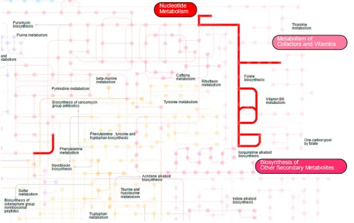
As ‘shotgun’ metagenomics allow assessing of the composition of the microbial com-munity not only from the taxonomic, but also from the functional perspective, a researcher needs the appropriate visual representation for such gene-centric profile also. Genes and their groups are grouped into metabolic pathways that can be illustrated as a pathway map, a convenient representation of functional data. The maps usually consist of the nodes, denoting the genes encoding enzymes that are detected in the metagenome, and the edges, linking the genes involved in consequent biochemical reactions. The tool iPath (Yamada
et al., 2011) allows us to explore metabolic, regulatory and biosynthetic pathway maps of
metagenome. Each biochemical process encoded in the metagenome is highlighted on the map and accompanied by the relevant information from the public databases about metabo-lism and biochemical reactions. Fig. 3.1 shows the folate biosynthesis pathway visualization using iPath tool.
Visualizing several metagenomes
Metagenomic scientists often want not only to explore the structure of one metagenome, but also to compare it across multiple metagenomes. Below is the description of the meth-ods that were developed to represent the difference between community structures and functional composition of the samples clearly.
Visualization of Metagenomic Data | 47
discard the low-abundance noisy taxa identifications before the display. A general word of caution is that common pie charts should not be abused during the comparison of several metagenomes, because it is difficult for an eye to compare the angular sizes of more than 2–3 sections.
Another way in which pie charts can be used is comparing the metagenomes using their features like the average coverage or relative abundance of contigs in a given sample or across the samples. With this approach, information about every contig is shown as a bar chart and about all contigs as a circle. This method is implemented in Anvi’o (Eren et al., 2015). It is particularly clear for comparing the metadata about the samples.
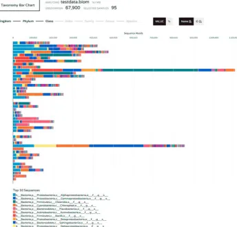
Some of the commonly used methods for visualizing several metagenomes are based on bar charts that were presented previously. Bar charts are suitable for displaying the taxonomic composition of the samples. Each sample can be shown as a bar divided into taxa detected in the sample according to their abundance. Every taxon has a unique colour. Bars can be shown for any taxonomic rank. This technique is used in Community Analyser (Kuntal et al., 2013) and Phinch (Bik, 2014). Both are publicly available services that can display the information about the name, observational data and taxonomy for every sample.
They can reflect absolute or normalized number of observations.
Phinch is a versatile tool. Particularly, if a factor from the metadata is quantitative (for example, pH value) then Phinch allows displaying the taxon abundance summary (about all samples) for each category. A bar chart shows the taxon bars (of the selected rank), where every bar consists of sample bars that depict abundance of the taxon in each sample. Every sample is coloured in a one and only colour. An example of using Phinch for taxon abun-dance representation is presented in Fig. 3.2. This approach is mentioned in Kuntal et al. (2013).
When a researcher has more than one metagenome in the analysis, it is natural to state the question of to what extent is the content of metagenomes similar and which metage-nomes are closer to each other by the set of their components, whether assessed from the taxonomic or functional perspective. In microbial ecology the respective measure of pairwise dissimilarity between the microbiomes is called beta-diversity. Once computed for all the metagenomes in the study (and represented as a pairwise dissimilarity matrix), it is subsequently used for the cluster analysis of the metagenomes. The obtained clusters are often represented using a tree diagram (or dendrogram) that shows how datasets are similar on different hierarchical levels.
A static taxonomic tree including all taxa detected in the samples gives detailed informa-tion but is applicable only for a small number of samples simultaneously. For each node (taxon), there is a small bar chart near the taxon name that displays the abundance distribu-tion of this taxon across all samples. Every sample has its own bar chart filled with a specific colour. This was implemented in MetaSee pipeline (Song et al., 2012).
Another way of implementing trees and dendrograms for the analysis of several metagen-omes is a contig tree. It displays the hierarchical clustering of contigs based on their sequence composition and their distribution across samples. Anvi’o (Eren et al., 2015) includes such dendrogram implementation. The contigs are displayed with small bars as parts of a ring. Circular clustering dendrogram is placed in the centre of this ring. Metagenomic data can be also represented as trees with the R package ‘phyloseq’ (McMurdie and Holmes, 2013).
Sudarikov et al. 48 |
variance. For instance, the method can be used for showing the distribution of the coverage of contigs in the bin. Box plots for several samples can be visually compared. These can be performed with R package ‘plotly’ (Ohri, 2014), as well as in the Anvi’o tool. Box plots can be combined with the scatter plots (dot plots) to complement the graph with additional information. If a box plot shows a relative abundance distribution of a taxon across all sam-ples, then each dot represents the level of the taxon in a specific sample so that it is easier to spot the outliers. The dot plot is overlaid on the box plot. In a way, the samples can be com-pared by the taxon abundances. The functionality of drawing the dot plots combined with the box plots is implemented in Framework (Eren et al., 2011). One of the advantages of this tool is that it denotes the samples divided into different groups (for example, on the basis of their functional properties) using different colours. Dot plots can be also constructed using the JavaScript charting application programming interface (API) ‘dimple’ (Kiernander et al., 2014) or the R package ‘rCharts’ (Vaidyanathan, 2013). It is worth mentioning an advanced implementation of a box plot (‘violin plot’) that shows more details about the variable Figure 3.2 Bar chart showing taxonomic composition of microbial communities at the level of class. Constructed using PHINCH and the default test dataset from http://phinch.org as an
Visualization of Metagenomic Data | 49
distribution due to the presence of a histogram (especially useful for the data distributed in a non-normal way); the method is available in the R package ‘vioplot’ (Adler and Adler, 2014).
The standard way of representing the community structure inferred from metagenomic data is by means of an abundance table, where the rows correspond to samples and col-umns to features (microbial taxa); the values in the cells show the relative abundance of the respective taxa in the sample. However, a large table with hundreds of digits is hard to grasp visually. A natural extension of the abundance table is a ‘heatmap’, a table where each cell is
filled with a colour, usually a gradient, with the distinct colours corresponding to the lowest and the highest values. Another specific feature of the heatmap is clustering visualization: the rows are subject to reordering in a way that the most similar rows are put in the proximity (same with the columns).
In reference to metagenomics data, heatmaps usually combine the taxonomic abun-dances with the clustering of samples. However, for a small number of samples there is another implementation of heatmaps. For instance, with Anvi’o it is possible to draw a heatmap of variable nucleotide positions. Here each column is a sample and every row is a nucleotide base. While each of the four nucleotide bases is displayed in a different colour, the cells can also be coloured using a gradient according to the normalized ratio of the two bases most frequently occurring at the position. The R package ‘d3heatmap’ (Cheng, 2016) is a multifunctional package that has many options for microbiome analysis allowing to construct many types of heatmaps. They are interactive and provide the information about any element of the heatmap table when a mouse hovers over it.
Layouts are visualization methods oriented towards the optimal location of data on the plane or in space. It is usually a two- or three-dimensional plot that plots dots represent-ing the datasets accordrepresent-ing to a certain principle based on the mutual relations between the datasets. One of the types is a bipartite graph. These are the graphs that consist of two groups of nodes where the nodes within each group are not connected. Each edge of this graph connects a vertex from one group to a vertex from another group. Such graphs can be implemented for visualization of data about several metagenomes.
Metagenomic analysis involves many entities, microbial taxa of various ranks, metagen-omic samples, relative abundance values, etc. and it is useful to represent several types of entities on the same figure. One of the implementations is the representation of the metage-nomes and the taxa together to reflect the community structure and the relations between them. This approach was used in Community Analyser, where each sample and each taxon is represented as a node of the graph. From each vertex depicting a sample, there is an edge to the taxon contained in the samples (usually above certain threshold value). Moreover, the taxa that have high correlations of abundance levels are connected and set apart of the taxa with which the correlation is low. Although this approach can display mutually exclu-sive relations between the taxa, the limitation is that it does not show the abundances of individual taxa.
Sudarikov et al. 50 |
taxa that are the most represented in samples. It is also an effective method for determining similarities and differences between the groups of samples, basing on commonalities and variations in taxonomic composition of the groups.
Besides the connectivity, the location of the vertices can also be used for the purposes of visually exploring the community structures. One such approach is Spring Graph Layout (implemented in Community Analyser), which simulates a model in which vertices are considered as electrically charged particles and edges as forces of attraction and repulsion. When processes in this system end, then the desired layout is achieved. Since the data are metagenomic, vertices are samples (painted in one colour) and taxa (painted in another colour), while edges connect taxa with all samples where they occur.
A special case of the several metagenomes analysis is the paired comparison, when the samples are grouped into pairs. Examples include human gut microbiota of the same patient before and after the antibiotic treatment. In such cases it is important to emphasize this twoness visually. For the display of individual taxa, there is a method of the visual repre-sentation of data called a slopegraph. The slopegraph allows to show the abundance level of a taxon in the two datasets (for example, before and after the experiment). Multiple slope graphs help to understand the dynamics of the individual microbial members of the com-munity. And when it is necessary to compare the overall structure of the paired samples, a researcher can visualize the metagenomes using the dimension reduction plot like principal coordinates analysis (PCoA, described in the next section) plot and subsequently connect-ing the paired samples with arrows, usconnect-ing, for example, R package ‘ggplot2’ (Wickham and Hadley, 2009). This approach was introduced by Tufte (1986).
Overall, a network (or a graph) is a very descriptive form of metagenomic data repre-sentation because it allows us to display the numerous interactions between the elements of the microbial system. Popular tools that work with graphs include Cytoscape (Smoot
et al., 2011). It allows to work with complex molecular interaction networks providing
their analysis and visualization. Cytoscape has a broad functionality, so recently it has also been often used for non-bioinformatic analyses. Many of the functions for constructing, arranging and drawing the graphs are also available in R, for example, in the ‘igraph’ package (Csárdi and Nepusz, 2006).
Visualizing multiple metagenomes
The most challenging task is to visualize the data calculated from a large number of metage-nomes. Most methods used for the cases of single and few metagenomes are not applicable here because such procedures would require a vast amount of space and overwhelm the visual perception of the researcher.
Bubble charts are useful to display the total distribution of each taxon across the samples. In this case, each bubble represents a taxon filled with a specific colour, the size of which is proportional to the summary level of this taxon in the examined samples. This concept is implemented in the Phinch tool that also provides a user with the information regarding any taxon of interest and allows to arrange the plot at any taxonomic rank.
Visualization of Metagenomic Data | 51
It is possible to construct a ramification representing relative abundance of the taxa that groups metagenomic data into taxa at every taxonomic rank. Each rank is represented as a column bar. Its width corresponds to the number of reads assigned to each taxon. Such a Sankey plot can be constructed using Phinch. Additionally, it allows to use an arbitrary number of the taxonomic ranks. Fig. 3.3 depicts a simple Sankey diagram constructed with Phinch and used for the taxonomic and quantitative representation of metagenomes. How-ever, this approach generally tends to result in large maps that are too complex for a clear observation of the taxa abundances and metagenomic taxonomy.
A dendrogram can be used to analyse multiple metagenomes efficiently, the researcher just has to be careful with the choice of text labels in the case of large trees that can be substituted with a colour legend. One frequent implementation of a phylogenetic tree represents a dendrogram of clustered microbial taxa. All taxa are clustered accordingly to their co-occurrence across the set of samples and can be displayed as a simple or a circular dendrogram. The former is used in Framework (Eren et al., 2011) in combination with a heatmap. The latter is presented in MetaSee and GraPhlAn (Asnicar et al., 2015). GraPhlAn has many additional options like drawing a bar chart for each taxon representing its abun-dance, comparing the abundances for each group of data with drawing every group as a circle and marking special taxa of interest with dedicated colours. iTOL, interactive tree of life (Letunic and Bork, 2016) is an original tool that allows us to draw simple as well as circular dendrograms with bar charts of taxon abundance and colour the specific nodes. The most popular tool for analysis of metagenomic data, MEGAN (Huson, 2016) can visually represent taxonomic abundance of a given dataset using different approaches.
However, there is a more common approach to the clustering and visualizing of a given set of samples basing on the set of the microbial taxa detected in each of them. Here the samples are represented as leaves. There are many tools for such tree visualization including PanPhlAn (Scholz et al., 2016) and Framework (Eren et al., 2011). These tools allow to con-struct typical dendrograms of samples located on the side of the heatmaps. The Framework also provides functionality to accompany each of the leaves with a pie charts representing the taxonomic composition of the respective sample.
A heatmap is one of the most popular ways of visualizing the quantitative compositional data with the information about many objects. In metagenomics, it is often taxon abundance in each metagenome. Although the approach is convenient for displaying few samples, when the number of the metagenomes becomes over 20 to 30 or the number of the features is high, certain limitations appear. For instance, the row-side labels and the cell colours can become indistinguishable. These problems can be solved by discarding the low-abundance species or pooling the samples into subgroups. An alternative implementation of a heatmap is based on binarized values and it can be used to display the presence and absence of the fea-tures, for instance, of the gene-family profiles of strains during the analysis of pan-genome, as demonstrated in PanPhlAn.
Sudarikov et al. 52 |
Visualization of Metagenomic Data | 53
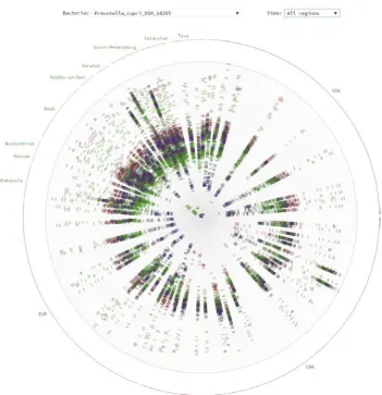
As mentioned before, analysis of the ‘shotgun’ metagenomics produces not only the information about the taxonomic and gene composition of the microbiota, but the data on genomic variability of the environmental microbes. Commonly produced in the form of metagenomic SNPs, they require the specialized visualization methods. A novel method for displaying such data layer when the number of the metagenomes is high was proposed (Alexeev et al., 2015) and applied to visualize the SNPs for a large set of human gut metage-nomes. For each selected microbial species, a circular chart is drawn (a ‘bacterial rose’), where each ray shows the presence of the SNPs in an individual metagenome. Such a typical ‘bacterial rose’ is shown in Fig. 3.4.
Sudarikov et al. 54 |
When the number of the metagenomes in the analysis reaches tens or hundreds, the economy of space becomes an urgent requirement for a visualization technique. One of the most effective ways of visualizing multidimensional data are based on dimension reduction, including the classical scatterplot layouts such as principal component analysis (PCA) plots (Vidal et al., 2016). Each metagenome described by hundreds of the features (relative abun-dance of individual species) is subject to dimension reduction and ultimately shown as a dot on the scatter plot of two (or three, in the case of 3D visualization) principal components.
The underlying statistical algorithm implies that the first principal component corre-sponds to the direction of the highest variance in the cloud of the analysed metagenomes, the second component is orthogonal to the first one and corresponds to the next highest direction. PCA is a very common method, because it allows to evaluate quickly the overall distribution of the metagenomes by their composition, identify the samples with similar composition and detect the ‘outliers’. In the case of metagenomics, the variations usually used instead of the PCA are principal coordinate analysis (PCoA) and multidimensional scaling (MDS) because the taxa relative abundance values are distributed in a non-normal way and alternative metrics of pairwise dissimilarity between the samples are used, like UniFrac, Bray–Curtis measure, etc.
A good example of the application of PCoA to the analysis of microbiota datasets was demonstrated in the study of adult humans’ microbiota sampled from 18 body sites includ-ing oral, vaginal, gut and skin from the Human Microbiome Project (HMP). The samples on a PCoA can be coloured by the country of origin to highlight the country-specific features of microbiota in the populations of the world (Tyakht et al., 2013). The approach can be used to track the temporal dynamics, for example, of an infant gut metagenome with respect to the adults’ samples: this visualization was performed using the EMPeror tool (Vázquez-Baeza et al., 2013). A variation of PCoA – one with an inclusion of an instrumental variable – is called between-class analysis (BCA). It was used to visualize the enterotypes (the dis-tinct types of human gut microbiota composition) in the original paper by Arumugam et al. (2011). Overall, PCoA and its versions are indispensable tools for exploratory analysis of metagenomic data.
Sometimes the adoption of the machine learning methods, including neural net-works, to the field of the metagenomics is especially fruitful. One of such approaches is self-organizing maps (SOM). A SOM is an unsupervised neural network algorithm that represents multidimensional data in a two-dimensional space in a clustered way. This concept has an effective implementation, emergent SOM (ESOM) which is simply a large map that preserves the SOM projection topology. On these maps, every cell colour represents the quantity of certain selected feature. The ESOM approach is widely used in metagenomic projects for binning the data. For example, ESOM-clustering has been used for classifying the metagenomic sequence structures for the selected metagenomes (Laczny et al., 2014).
As the microbiota contains many species that are in cooperative or competitive relations with each other, it is especially needed to highlight the so-called co-occurrence networks as a visualization method. Generally, these networks show the relationships between some objects (organisms, social groups, words in texts) reflecting their presence in the same envi-ronment. Every object is depicted with a node. If two objects tend to co-occur (for example, microbial species across multiple metagenomes) then an edge is drawn to connect them.
Visualization of Metagenomic Data | 55
size of nodes and the width of links can vary according to the object abundance and the co-occurrence frequency, respectively.
In the context of metagenomics, this method is usually implemented for bacterial spe-cies co-occurrence. Every taxon is drawn as a node while a link between nodes is their co-occurrence (measured as the correlation between the respective levels in metagenomes).
This approach was used for the microbial network construction where the vertices of the graph were selected to be individual genera, their size reflected the relevant abundance of the genera and the colours distincted network modules (Liu et al., 2015). Another imple-mentation with the human microbiota example is given in the large-scale microbial network organization article (Freilich et al., 2010). The MEGAN tool for the deep analysis and visualization of metagenomic data also includes the functionality of constructing the co-occurrence plots. Particularly, it allows changing dynamically the co-co-occurrence threshold as well as lowest abundance threshold; a similar functionality is provided by CoNet (Faust
et al., 2012).
The number of metagenomic datasets is growing not only in number and volume but also in the relation to the metadata: the samples are accompanied with a description con-taining the type of environment, date of collection and others including the geographic coordinates. The geographic data lead to the challenging task of visualizing the data using the combination of metagenomic and geovisualization approaches. One of the recent metagenomic visualization tools that implements such hybrid is ResistoMap (Yarygin et al., 2016), an interactive Web-based application showing the level of the potential resistance to antibiotics (resistome) in human gut microbiome. This tool allows visual exploration of the resistome levels in more than 1600 gut metagenomes of the populations of the world for most known antimicrobial drug types as an interactive heatmap. The navigation and sum-mary resistome information are implemented as a geographic map of the world, where the countries are filled with the colour according to the median resistome levels of their popula-tions. A researcher can quickly switch between the two visual forms due to the application interactivity. The ResistoMap interface is shown in Fig. 3.5. Such tools demonstrate that the efficient display of metagenomic data with the external factors describing the metagenomes can be useful for improving the value of accumulated data and help to gain insights into the complex interactions between the factors.
Conclusions
Sudarikov et al. 56 |
Acknowledgements
This work was financially supported by the Ministry of Education and Science of Russian Federation (RFMEFI57514X0075).
References
Adler, D., and Adler, M. (2014). Package ‘vioplot’, CRAN repository. https://CRAN.R-project.org/ package=vioplot
Alexeev, D., Bibikova, T., Kovarsky, B., Melnikov, D., Tyakht, A., and Govorun, V. (2015). Bacterial rose garden for metagenomic SNP-based phylogeny visualization. BioData. Min. 8, 10. http://dx.doi. org/10.1186/s13040-015-0045-5
Arumugam, M., Raes, J., Pelletier, E., Le Paslier, D., Yamada, T., Mende, D.R., Fernandes, G.R., Tap, J., Bruls, T., Batto, J.M., et al. (2011). Enterotypes of the human gut microbiome. Nature 473, 174–180. http:// dx.doi.org/10.1038/nature09944
Asnicar, F., Weingart, G., Tickle, T.L., Huttenhower, C., and Segata, N. (2015). Compact graphical representation of phylogenetic data and metadata with GraPhlAn. PeerJ 3, e1029. http://dx.doi. org/10.7717/peerj.1029
Bik, H.M. (2014). Phinch: An interactive, exploratory data visualization framework for -Omic datasets. bioRxiv 009944. http://dx.doi.org/10.1101/009944
Cantor, M., Nordberg, H., Smirnova, T., Hess, M., Tringe, S., and Dubchak, I. (2015). Elviz - exploration of metagenome assemblies with an interactive visualization tool. BMC Bioinf.16, 130. http://dx.doi. org/10.1186/s12859-015-0566-4
Figure 3.5 The genomic potential of gut microbes for antibiotic resistance (resistome) in world populations is shown on a heatmap combined with geographic map using ResistoMap, http://
Visualization of Metagenomic Data | 57
Cheng, J. (2016). Package ‘d3heatmap’, CRAN repository. https://CRAN.R-project.org/ package=d3heatmap
Csárdi, G., and Nepusz, T. (2006). The igraph software package for complex network research. InterJournal Complex Syst. 1695, 1695.
Eren, A.M., Ferris, M.J., and Taylor, C.M. (2011). A framework for analysis of metagenomic sequencing data. Pac. Symp. Biocomput., 131–141.
Eren, A.M., Esen, Ö.C., Quince, C., Vineis, J.H., Morrison, H.G., Sogin, M.L., and Delmont, T.O. (2015). Anvi’o: an advanced analysis and visualization platform for ‘omics data. PeerJ 3, e1319. http://dx.doi. org/10.7717/peerj.1319
Faust, K., Sathirapongsasuti, J.F., Izard, J., Segata, N., Gevers, D., Raes, J., and Huttenhower, C. (2012). Microbial co-occurrence relationships in the human microbiome. PLOS Comput. Biol. 8, e1002606. http://dx.doi.org/10.1371/journal.pcbi.1002606
Flygare, S., Simmon, K., Miller, C., Qiao, Y., Kennedy, B., Di Sera, T., Graf, E.H., Tardif, K.D., Kapusta, A., Rynearson, S., et al. (2016). Taxonomer: an interactive metagenomics analysis portal for universal pathogen detection and host mRNA expression profiling. Genome Biol. 17, 111. http://dx.doi. org/10.1186/s13059-016-0969-1
Freilich, S., Kreimer, A., Meilijson, I., Gophna, U., Sharan, R., and Ruppin, E. (2010). The large-scale organization of the bacterial network of ecological co-occurrence interactions. Nucleic Acids Res. 38, 3857–3868. http://dx.doi.org/10.1093/nar/gkq118
Havre, S.L., Webb-Robertson, B.J., Shah, A., Posse, C., Gopalan, B., and Brockman, F.J. (2005). Bioinformatic insights from metagenomics through visualization. Proc. IEEE. Comput. Syst. Bioinform. Conf. 341– 350. http://dx.doi.org/10.1109/CSB.2005.19
Huson, D.H., Beier, S., Flade, I., Górska, A., El-Hadidi, M., Mitra, S., Ruscheweyh, H.J., and Tappu, R. (2016). MEGAN Community Edition - Interactive Exploration and Analysis of Large-Scale Microbiome Sequencing Data. PLOS Comput. Biol.12, e1004957. http://dx.doi.org/10.1371/journal. pcbi.1004957
Kerepesi, C., Bánky, D., and Grolmusz, V. (2014). AmphoraNet: the webserver implementation of the AMPHORA2 metagenomic workflow suite. Gene 533, 538–540. http://dx.doi.org/10.1016/j. gene.2013.10.015
Kiernander, J. et al. (2014). Dimple, A simple charting API for d3 data visualisations. http://dimplejs.org/ Kuczynski, J., Stombaugh, J., Walters, W., González, A., Caporaso, J.G., and Knight, R. (2012). Using
QIIME to analyze 16S rRNA gene sequences form microbial communities. Curr. Protoc. Microbiol.
EmergingT, 1–20. http://dx.doi.org/10.1002/9780471729259.mc01e05s27
Kuntal, B.K., Ghosh, T.S., and Mande, S.S. (2013). Community-analyzer: a platform for visualizing and comparing microbial community structure across microbiomes. Genomics 102, 409–418. http:// dx.doi.org/10.1016/j.ygeno.2013.08.004
Laczny, C.C., Pinel, N., Vlassis, N., and Wilmes, P. (2014). Alignment-free visualization of metagenomic data by nonlinear dimension reduction. Sci. Rep. 4, 4516. http://dx.doi.org/10.1038/srep04516 Letunic, I., and Bork, P. (2016). Interactive tree of life (iTOL) v3: an online tool for the display
and annotation of phylogenetic and other trees. Nucleic Acids Res. 44, W242–5. http://dx.doi. org/10.1093/nar/gkw290
Liu, Z., Lin, S., and Piantadosi, S. (2015). Network construction and structure detection with metagenomic count data. BioData. Min. 8, 40. http://dx.doi.org/10.1186/s13040-015-0072-2
Luo, C., Knight, R., Siljander, H., Knip, M., Xavier, R.J., and Gevers, D. (2015). ConStrains identifies microbial strains in metagenomic datasets. Nat. Biotechnol. 33, 1045–1052. http://dx.doi. org/10.1038/nbt.3319
McMurdie, P.J., and Holmes, S. (2013). phyloseq: an R package for reproducible interactive analysis and graphics of microbiome census data. PLOS ONE8, e61217. http://dx.doi.org/10.1371/journal. pone.0061217
Ohri, A. (2014). R with Cloud APIs. R Cloud Comput. Springer, New York. htt p://dx.doi.org/10.1007/978-1-4939-1702-0_7
Ondov, B.D., Bergman, N.H., and Phillippy, A.M. (2011). Interactive metagenomic visualization in a Web browser. BMC Bioinf.12, 385. http://dx.doi.org/10.1186/1471-2105-12-385
R Core Team (2014). R: A language and environment for statisticalcomputing. R Foundation for Statistical Computing, Vienna, Austria. URL http://www.R-project.org/.
Sudarikov et al. 58 |
management, analysis and visualization of microbiome data. Bioinformatics 29, 3100–3101. http:// dx.doi.org/10.1093/bioinformatics/btt526
Rudis, B., Almossawi, A., Ulmer, H., and jQuery Foundation and contributors (2015). Package ‘metricsgraphics’. CRAN repository. https://CRAN.R-project.org/package=metricsgraphics
Scholz, M., Ward, D.V., Pasolli, E., Tolio, T., Zolfo, M., Asnicar, F., Truong, D.T., Tett, A., Morrow, A.L., and Segata, N. (2016). Strain-level microbial epidemiology and population genomics from shotgun metagenomics. Nat. Methods 13, 435–438. http://dx.doi.org/10.1038/nmeth.3802
Seah, B.K.B., and Gruber-Vodicka, H.R. (2015). gbtools: Interactive Visualization of Metagenome Bins in R. Front. Microbiol. 6, 1451. http://dx.doi.org/10.3389/fmicb.2015.01451
Sedlar, K., Videnska, P., Skutkova, H., Rychlik, I., and Provaznik, I. (2016). Bipartite Graphs for Visualization Analysis of Microbiome Data. Evol. Bioinform. Online.12, 17–23. http://dx.doi.org/10.4137/EBO. S38546
Shneiderman, B. (1996). The eyes have it: a task by data type taxonomy for information visualizations. Proc. IEEE Symp. Vis. Lang. 336–343. http://dx.doi.org/10.1109/VL.1996.545307
Smoot, M.E., Ono, K., Ruscheinski, J., Wang, P.L., and Ideker, T. (2011). Cytoscape 2.8: new features for data integration and network visualization. Bioinformatics 27, 431–432. http://dx.doi.org/10.1093/ bioinformatics/btq675
Song, B., Su, X., Xu, J., and Ning, K. (2012). MetaSee: an interactive and extendable visualization toolbox for metagenomic sample analysis and comparison. PLOS ONE7, e48998. http://dx.doi.org/10.1371/ journal.pone.0048998
Steele, J., and Iliinsky, N. (2010). Beautiful visualization: looking at data through the eyes of experts. O’Reilly Media, Inc. Sebastopol, Canada.
Tufte, E. (1983). The Visual Display of Quantitative Information. Graphics Press, Cheshire, Connecticut. Tyakht, A.V., Kostryukova, E.S., Popenko, A.S., Belenikin, M.S., Pavlenko, A.V., Larin, A.K., Karpova, I.Y.,
Selezneva, O.V., Semashko, T.A., Ospanova, E.A., et al. (2013). Human gut microbiota community structures in urban and rural populations in Russia. Nat. Commun. 4, 2469. http://dx.doi.org/10.1038/ ncomms3469
Ulyantsev, V.I., Kazakov, S.V., Dubinkina, V.B., Tyakht, A.V., and Alexeev, D.G. (2016). MetaFast: fast reference-free graph-based comparison of shotgun metagenomic data. Bioinformatics 32, 2760–2767. http://dx.doi.org/10.1093/bioinformatics/btw312
Vaidyanathan, R. (2013). rCharts: Interactive charts using javascript visualization libraries. R package version 0.4 5.
Vázquez-Baeza, Y., Pirrung, M., Gonzalez, A., and Knight, R. (2013). EMPeror: a tool for visualizing high-throughput microbial community data. GigaScience 2, 16. htt p://dx.doi.org/10.1186/2047-217X-2-16
Vidal, R., Ma, Y., and Sastry, S. (2016). Generalized Principal Component Analysis. Springer Publishing Company. http://dx.doi.org/10.1093/0.1109/TPAMI.2005.244
Warnes, M., Bolker, B., Bonebakker, L., Gentleman, R., Liaw, W.H., Lumley, T., Maechler, M., Magnusson, A., Moeller, S., Schwartz, M., et al.(2016). Package ‘gplots’, CRAN repository. https://CRAN.R-project. org/package=gplots
Hadley, W. (2009). ggplot2: Elegant graphics for data analysis. Springer Science & Business Media. http:// dx.doi.org/10.1007/978-0-387-98141-3
Yamada, T., Letunic, I., Okuda, S., Kanehisa, M., and Bork, P. (2011). iPath2.0: interactive pathway explorer. Nucleic Acids Res. 39, W412–5. http://dx.doi.org/10.1093/nar/gkr313
Yarygin, K., Kovarsky, B., Bibikova, T., Melnikov, D., Tyakht, A., and Alexeev, D. (2016). ResistoMap - online visualization of human gut microbiota antibiotic resistome (Cold Spring Harbor Labs Journals,