Abstract
How important is it for a nation’s legislature to be proportional to the population in physical characteristics, like race and sex? Would such a legislature produce policies that better represent the constituency’s interests? With a descriptive representation framework, this study examines how a newly enfranchised population changes the sex and racial composition of the South African Parliament, and how this fundamental legislative change impacts the
poverty/inequality rates, policy rhetoric, and public opinion since 1994. South Africa is an ideal case study because of the nation’s abrupt, rapid revolution that over-turned apartheid rule, thereby placing the start of universal suffrage at a distinct period of time compared to other countries. Past research has focused on inequality and economic policies in South Africa; however, scholars have yet to discuss these two important topics within the context of the descriptive representation of the South African Parliament. Using data from the census, national surveys, and personal compilation, this research explores how proportional the race and sex of Parliament members have been compared to the overall population and impoverished groups. Also, to determine the degree of substantive representation, the content and goals of significant macroeconomic policies since 1994 were evaluated and compared to the corresponding public opinion in newspaper articles. The findings show that the government has become more descriptively representative of the South African population since 1994. Poverty rates have recently decreased, but national inequality remains the same since before democracy. Because the public opinion of the poverty and inequality policies was generally positive, with a few criticisms, this study demonstrates that descriptive representation led to substantive
Introduction
In 1994, South Africa experienced a unique political phenomenon. Within one election, the country changed from disenfranchising the majority of the population to sponsoring universal
suffrage; from fostering a white-dominated social and economic system to facilitating affirmative action; and from producing policies that racially segregated communities to
encouraging integration. Or, so the idealized South African narrative goes. However, the legacy of apartheid still holds power. For decades, apartheid limited economic opportunities for the majority of the population, and non-white South Africans still struggle with poverty and
inequality today. This background knowledge of a dramatic and swift political transition for a marginalized majority, combined with poverty/inequality marked by years of racist laws and
institutionally discriminatory social structures, established my research questions. Firstly, I was curious to discover how a population would exercise their hard-fought right to vote. In other words, would a population that had been previously disenfranchised on the basis of race
purposefully change the racial composition of its elected politicians? Secondly, how would any racial and sex ratio change affect the policy rhetoric of poverty and inequality, which
disproportionately affects women and blacks? Thirdly, would a greater policy emphasis on poverty and economic inequality alleviation lead to lower numbers of people affected by both of
these issues? Lastly, does the South African population feel satisfied with these policy efforts? Can increased descriptive representation lead to substantive representation?
My hypothesis is that the South African Parliament will become more representative in
terms of race and sex over time. If this improved representation of historically unrepresented ethnic groups occurs, it will lead to greater policy emphasis on eliminating poverty and
true, then it will be reflected in a reduction of South African poverty and inequality rates and a high public opinion of the policies, meaning that descriptive representation led to substantive
representation.
Various data and methods were employed for this research. Before attempting to assess
the relationship between South African representation and policy, I determined to what extent socioeconomic changes in South Africa were similar to or different from those in other Southern African countries. To achieve this, a polynomial regression was run on World Bank poverty and
inequality data to calculate the strength of the relationship between South African and the surrounding countries. Then, racial and sex composition data for the 1994 and 1999 South
African parliaments were obtained from Dr. Andrew Reynolds’ publications. With Dr. Reynolds, I compiled this data for the 2004-2014 Parliaments since the information was not available. Next, the 2010 paper “Trends in South African Income Distribution and Poverty since the Fall of Apartheid” by Murray Leibbrandt et al. and the 2014 Statistics South Africa publication “Poverty Trends in South Africa: An examination of absolute poverty between 2006 and 2011” were used
to study how poverty and inequality changed since 1994 according to race and sex, with recalculations when necessary. For the policy analysis, one policy from each of the first four terms was evaluated by answering two questions: 1. What are the recurring themes and rhetoric
and how do they change over time? 2. Do these policies approach solutions to poverty and inequality in the same way? Finally, newspaper articles were studied to gauge the public opinion
on each of these policies.
My findings mostly supported my hypotheses. The poverty and inequality rates of regional Southern Africa were only weakly correlated with those of South Africa. This result
possibility of influence, I studied the descriptive representation of the National Assembly in terms of race and sex. Overall, the National Assembly has progressively become more
descriptively representative regarding race and sex ratios since 1994, which supports the first part of my hypothesis. Over the same time period, poverty has decreased for both sexes and all
races since 1994, which supports my hypothesis. But, national inequality remains roughly
unchanged, which goes against my hypothesis. Every one of the four policies analyzed contained unrealistic goals and ambiguous implementation plans. Still, each policy emphasized poverty and
inequality reduction, and this result is consistent with my hypothesis. The public opinion also criticized the overly ambitious goals and vague delivery plans, but the overall public view
regarding each policy was positive. This finding demonstrates that descriptive representation did lead to substantive representation in South Africa, so my hypothesis is mostly supported.
In this research paper, I start with a review of the relevant literature, discussing important
theories and known research. Then, I describe the data and methods used to investigate my research questions in detail. Afterwards, I explain the results and discuss how they answer each
Literature Review
A democratic system of government implies that supreme power lies with all citizens
equally. Therefore, after apartheid ended in 1994 and universal suffrage was practiced for the first time, South Africa became a true democracy in theory. However, this research project
examines whether South Africa’s government has fulfilled the duties associated with democratization, such as legislators being representative of the population. This study is
primarily framed by the theory of descriptive representation as a means to achieving substantive
representation. Considering the historical discrimination of apartheid, descriptive representation is an appropriate framework through which to explore South Africa’s politics. To describe South
African politics and economics since 1994, I will review the debate between experts on three topics: 1. Descriptive representation theory; 2. the state of political representation; 3. the overall economic policy progress since 1994; and 4. public opinion.
Descriptive Representation as a Theory
To understand the importance of political representatives’ characteristics reflecting those
of the population, one must also understand the theory and legitimacy behind descriptive representation. For the purposes of this project, the theory of descriptive representation argues that democratic representatives should represent politically relevant characteristics of the
constituency in addition to their preferences.1 Descriptive representation claims that these characteristics, such as race and sex, play an important role in politicians’ abilities to respond to
public interests. However, the importance of descriptive representation is contested among scholars.
In support of descriptive representation, Jane Mansbridge, an American political scientist
and professor at Harvard University, notes two historical circumstances when the benefits of
descriptive representation exceed the cost. The first situation is when adequate communication is damaged by mistrust. In this context, descriptive representation often helps to encourage
communication and create bonds of trust between representatives and constituents through a shared experience, usually as a result of subordination.2 The second occasion is when a set of
issues are ignored by the representatives. The best way to bring attention to these interests is often to elect a representative whose descriptive characteristics reflect those of the voter and relate to the issues, such as class or ethnicity.3 Mansbridge also explains two reasons why
descriptive representation is beneficial. The first reason involves a group that has been legally excluded from voting and/or deemed unsuitable to rule. Descriptive representation can redefine the social meaning of these groups’ characteristics. For example, low percentages of blacks in
the legislature symbolize the idea that blacks cannot rule. On the other hand, higher percentages of black representatives suggest that they are fully capable leaders.4 The second benefit of
descriptive representation is improving the citizens’ opinion of government legitimacy by making them feel part of the policy process.5 So, according to Mansbridge, descriptive
representation appears to generally lead to substantive representation, especially for historically marginalized groups.
Anne Phillips furthers Mansbridge’s argument in favor of descriptive representation by
explaining not only the benefits, but its political importance. Phillips gives three main reasons for why descriptive representation matters. First, descriptive representatives help to compensate for
past and continued injustices towards disadvantaged groups. Phillips supports this first argument by asserting that past and present betrayals by privileged groups cause trust to only be given to
2Mansbridge, Jane. “Should Blacks Represent Blacks and Women Represent Women?” 641.
descriptive representatives. Her second reason explains that descriptive representation allows historically excluded groups a greater opportunity of having their interests and preferences, that
had been previously ignored, put on the legislative agenda. Lastly, Phillips claims that descriptive representation increases political participation and strengthens democratic
legitimacy.6 Therefore, according to Phillips, descriptive representation can increase substantive representation for historically discriminated groups and improve the democratic institution for the entire nation.
Hannah Pitkin’s The Concept of Representation provides one of the most famous
arguments against descriptive representation. In her work, Pitkin claims that descriptive
representation is mutually exclusive to leadership and creativity.7 She also argues that descriptive representation is incompatible with accountability.8 Some studies support Pitkin’s opinion. Irene Diamond’s 1977 study on the New Hampshire legislature revealed that women politicians did
not consider their actions and decisions to represent women interests in particular.9 In this case, the mere presence of women in the legislature did not inherently advance the female
constituency’s interests. Iris Marion Young complicates the justification of descriptive
representation in her book Inclusion and Democracy. She explains how descriptive
representation can be deceptively counterintuitive. For example, a Latino representative could
only substantively represent heterosexual Latinos at the expense of homosexual Latinos.10 This example illuminates the possibility that descriptive representation can simultaneously include
and exclude groups. Pitkin, Diamond, and Young make an important point: descriptive representation should not focus on politically defining characteristics at the expense of
6Phillips, “Democracy and Representation” 224-240.
7
Pitkin, The Concept of Representation, 90.
8 Ibid., 89.
accountability for a population’s preferences. However, these authors overlook the importance of descriptive representation for historically disadvantaged groups.
Knowing this previous research helps to identify gaps in the literature. None of the authors addressed descriptive representation through the contexts of a newly enfranchised
population or economic inequality. This study adds to the literature by examining the descriptive representation after a dramatic extension of South African voting rights and compares the
Parliament composition to the population in addition to the impoverished groups.
Political Representation
The composition of South Africa’s legislature matters because they are in charge of
passing policies that affect everyone. Therefore, knowing the legislators’ sex and race identities will enlighten the role that descriptive representation has played in the policy attempts to decrease poverty and inequality. As of 2014, women made up 45% of the South Africa
Parliament.11 Although this figure is one of the highest in Africa and an improvement from the 27.24% MPs that were in 1993, it is still under-representative of the population since the 2014
mid-year estimates declared 51.2% of the population as female.12 Questions still remain about how these demographic factors have changed compared to female and male poverty/inequality rates, which I explore in my own research.
Shockingly, no one has compiled data on the racial composition of Parliament members since 1999. The only person to have tallied the ethnic percentages is Andrew Reynolds, who did
so for the National Assembly in 1994 and 1999. For 1994, Reynolds concluded that 52% of the members were African, 32% were white, 7% were coloured, and 3% were Indian. For 1999, the
calculations were 58% African, 26% white, 10% coloured, and 5% Indian13. Still, the fact that no researcher since Reynolds has counted the ethnic breakdown in Parliament is inherently
interesting because it reflects the political culture and dialogue currently in South Africa. In a country that is still plagued by the effects of apartheid, this lack of attention on the racial
make-up of the legislature is puzzling, especially considering that other social concerns, such as poverty, have been described in terms of race. My project fills this gap in the research by compiling the racial and gender history of the Parliament since 1999 with Dr. Reynolds.
Policy Causes and Progress
Examining the overall policies since 1994 and their effects illuminates the possible
connection between political representation and poverty/inequality trends in South Africa. Despite the hope that a new democracy brought to South Africa, government policies have not had the significant results that were at first expected. Adam Habib breaks down the economic
policies in South Africa for the past twenty years into three phases: (i) the Growth, Employment and Redistribution Strategy (GEAR) from 1996 to 2001; (ii) considerable expansion of the social
support system and the growing of the black middle and upper classes from 1999-2007; and (iii) Jacob Zuma’s presidency from 2008 to the present14
.
Many critics have blamed the Growth Employment and Redistribution strategy (GEAR)
for causing the rising inequalities, increased job losses, and the stagnation of poverty in post-apartheid South Africa.15 GEAR essentially encouraged the commodification of services, cuts in
social spending, and the privatization of state assets.16 Indeed, the percentage of people living on less than R462/month increased from 53% in 1995 to 58% in 2000, and those living on less than
13 Reynolds, Election ’99 South Africa, 199. 14 Habib, South Africa’s Suspended Revolution, 75. 15Naidoo, “The ‘politics of poverty,’” 59.
16 Ibid.
R250/month increased from 31% to 38%, respectively.17 Perhaps even more representative of GEAR’s intent, the income of the poorest 10% of citizens remained at 0.6% from 1996 to 2001,
while the richest 20% of citizens experienced an increase from 72.9% to 73.7%, respectively.18 Therefore, GEAR’s implementation and its corresponding effects on the poor and marginalized
show the African National Congress’ divergence from its promises during the 1994 election. GEAR’s harmful consequences caused social protests across the country.19
Even former President Mbeki admitted in his inaugural address that not enough had been done to help the
marginalized groups during the first ten years since democracy.20 These demonstrations influenced politicians’ policy shift to the left with the goal of benefitting South Africa’s poor.21 During the later years of Mbeki’s presidency, social expenditures expanded greatly, new
legislation targeted equity and progressive change in industries, and market failures leading to poverty and inequality received more focus.22 However, GEAR was still very much in place
during these policy changes, meaning that South Africa had a conservative macro-economic policy coupled with focused progressive policies in certain sectors.23 This dichotomy between
the economic levels explains why unemployment decreased from 42.5 % in 2003 to 34.3 % in 2007, and the poorest 10% increased their per capita real income from R921 to R1032 (using 2007 Rand currency values). Yet, inequality was still persistent and had remained constant since
the late 1990s (PCAS, 2008: 21; Habib 92). Even though definite advances had been made to ease the plight of the poor, Mbeki’s strategy failed to implement this on a macro-economic scale,
which limited the improvements possible.
17 PCAS, Development Indicators 2008, 26. 18
PCAS, Development Indicators 2008, 26.
19 Naidoo, “The ‘politics of poverty,”’ 55.
Habib, South Africa’s Suspended Revolution, 87.
20
Mbeki, “Address of the President of South Africa.”
21 Ballard, R., Habib, A. & Valodia, I., eds. Voices of Protest, 415. 22 Habib, South Africa’s Suspended Revolution, 88-89.
After ousting Mbeki from the presidency, Jacob Zuma deepened the shift to the left in economic and social policies that Mbeki had already started. For instance, the government
adopted the Industrial Policy Action Plan 2011/12-2013/14 and the New Growth Path.24 The Industrial Policy Action Plan set a goal to create 2.4 million jobs by 2020, using a strategy that
regularly recapitalizes important public financing institutions to ensure that they support development projects, revise legislation so that companies doing business with the government are forced to act according to favorable future development outcomes, and organize trade
policies so that they promote jobs and punish organizations that practice anti-competitive schemes.25 The main goal of the New Growth Path is to reduce South African economic
inequality. The plan of action incorporates policies that improve the lives of people with the lowest socio-economic status, while also temporarily and voluntarily limiting the incomes of the upper-middle classes and beyond.26 Unsurprisingly, the latter part of this policy plan has sparked
great opposition.27 In addition, the New Growth Path aims to redirect the state’s empowerment resources in order to benefit small businesses, which, if done successfully, should also improve South Africa’s economy.28
Doubts have been raised concerning both of these plans’ abilities to decrease unemployment, when only three sectors – tourism, agro-processing, and clothing and textiles – are likely to create jobs.29 Therefore, in order to have a significant effect on one of South Africa’s biggest issues, unemployment, better policies must be passed that aim to
incorporate unskilled workers. Still, the social and economic policies under the Zuma
24
Department of Trade and Industry, “Industrial Policy Action Plan 2011/2012-2013/2014.” Department of Economic Development, “The New Growth Path: The Framework.”
25 Habib, South Africa’s Suspended Revolution, 98. 26
Ibid.
27 Ibid., 99.
administration have proven to be much more progressive due to their explicit targeting of unemployment, inequality, and poverty.
This policy analysis provides valuable background information on the socioeconomic and political history in South Africa since 1994. However, my research categorizes the policies
according to Parliament, not presidential, term. In this way, my results reflect the legislative, rather than the executive, policy decisions and rhetoric.
Public Opinion
Over the past twenty years, the South African Parliament’s intended effects of
anti-poverty policies have often not corresponded to a positive opinion amongst the people. In order
to gauge citizens’ thoughts on government since 1994, Naidoo collected surveys from people living in historically racialized neighborhoods and with an income below 2000 Rands per month, which is considered impoverished for a family of four. One of the main concerns for white voters
was the deterioration of privileges, which they defined as having resources taken away or not as widely available based on their race.30 On the other hand, coloureds who were sampled
suggested that it was futile to vote for institutions that are not committed to easing the life struggles of the poor.31 They also considered themselves excluded from state resources, but for very different reasons than those given by whites. In general, coloureds stated that they were not
white enough during apartheid, and now they are not black enough in post-apartheid, which means that they have suffered unique long-term social exclusion due to their marginal status.32
Indians who were asked answered similarly to the coloured respondents. They mentioned that they felt discriminated against in post-apartheid South Africa, the poor continued to suffer, and
30 Naidoo, “The ‘politics of poverty,’” 67-72. 31 Ibid., 68.
there had been no change in the fight for poor citizens, despite having a democracy.33 Lastly, black African respondents presented more mixed emotions about their personal circumstances and the state of the nation. Some thought that people’s livelihoods had improved (especially
concerning water and electricity access); some believed that situations had remained the same
since 1994, and others stated that conditions had worsened and felt deep resentment toward public officials.34 Thus, more black Africans saw themselves as without rights and power than whites.35 Although general opinions of progress varied depending on race, high proportions from
every group considered their parents to have had better lives.36
Naidoo’s study suggests important discrepancies between what citizens expect in change
of economic outcomes due to a more representative government and the resources that they receive. Naidoo’s findings are important because they indicate the problems low-income people
notice about their representation, and they highlight the differences in political opinion according
to ethnicity. Unlike Naidoo’s methods, my study uses newspaper articles to understand the public opinion of government. My research studies how people have reacted to specific policies
over time, rather than more general reactions to politics and economics.
33
Ibid., 69.
Data and Methods
Poverty and Inequality in the Southern Africa Region
In order to determine whether South Africa’s poverty and inequality rates are related to
the Southern African regional economy, I analyzed the correlation between the poverty and
inequality observed in Southern African countries and compared those to the trends seen in South Africa. The country comparison was originally framed around the member states of the Southern African Development Community: Angola, Botswana, Democratic Republic of Congo,
Lesotho, Madagascar, Malawi, Mauritius, Mozambique, Namibia, Seychelles, Swaziland, United Republic of Tanzania, Zambia, and Zimbabwe.37 With the goal of considering only regionally
relevant countries to South Africa, the Democratic Republic of Congo and the United Republic of Tanzania were eliminated because they are the furthest North. For the same reason, Mauritius and Seychelles were excluded since they are comparatively small islands off the coast. However,
Madagascar was included, which is also an island, because its large geographic and population size is, logically, more likely to impact the regional economy than Mauritius and Seychelles.
Angola and Zimbabwe were also removed since they had fewer than three data entries from 1990-2014 for either poverty (a headcount ratio of less than $2 a day) or inequality (as measured by Gini Indexes) because a trend would be not applicable and inaccurate. Thus, after these
eliminations, I included Botswana (3 observations), Lesotho (4 observations), Madagascar (6 observations), Malawi (3 observations), Mozambique (3 observations), Namibia (3
observations), Swaziland (3 observations), Zambia (7 observations), and South Africa (6
observations) because they are geographically relevant to South Africa and provided enough data via the World Bank datasets.
37
Although there are different ways to measure poverty, the World Bank’s measure of
“Poverty headcount ratio at $2 a day (PPP) (% of population)” is most appropriate because it is
the closest match to South Africa’s national poverty level. The World Bank’s poverty indicator is based on the 2005 international prices.38 The 2005 lower-bound poverty line, or the more
extreme poverty line, in South Africa is 288 Rand and the upper-bound line is 413 Rand per capita per month.39 Since the World Bank does not offer lower and upper-bound poverty lines, I averaged the two and divided by 30 in order to calculate the Rand amount per day, which is
11.68 Rand. Next, I researched the currency exchange rate of Rands per U.S. dollar in 2005, 6.36, and divided 11.68 by 6.36 to get $1.80.40 So, the average 2005 poverty line in South Africa
was $1.80 per day per capita. The World Bank provides two different poverty headcount ratio levels: $1.25 a day and $2.00 a day. Since $1.80 is closer to $2.00 a day, that monetary amount is most appropriate because it represents poverty on an international level, and it is closest to the
South African poverty measurements.
With the goal of comparing poverty in the Southern African region to poverty in South
Africa, the World Bank population percentages from 1993 to 2011 (the most recent year with data) were entered in Microsoft Excel for the countries listed above. Two graphs were created: one plotted the various poverty percentages in the Southern African region over time; and the
other included the same plotted points but specified according to country. Time, as measured by year, was the independent variable and the percentage of the population in poverty was the
dependent variable. Using the functions available in Excel, I ran the polynomial regression to get the R2 value. By taking the square root of R2, the correlation of changes in poverty percentages over time for the Southern African region was determined. This step was repeated using the
38 The World Bank Group. “Poverty headcount ratio.”
39 Statistics South Africa. “Poverty Trends in South Africa,” 8.
graph that specified the country, and the polynomial regression and correlation for only South Africa were calculated.
In addition to comparing poverty, I also analyzed the inequality in both a regional and South African context. I used the World Bank’s Gini index.41 Besides being the most commonly
used inequality measure, I selected it because I am most familiar with evaluating Gini
coefficients as opposed to the alternatives. The Gini index measures the disparity of the societal income distribution from a perfectly equal income distribution. A Lorenz curve plots the
cumulative total income percentage against the cumulative share of people, starting from the poorest to the richest. The Gini index quantifies the area between the Lorenz curve and the line
of equality (a 45° line). A Gini coefficient of 0 signifies perfect equality, and a coefficient of 100 shows perfect inequality.42 Since the economy and population sizes do not affect the Gini
coefficient, it is a helpful measure to compare income distributions of different countries over
time.43 Moreover, the Gini coefficient is a relative measure of inequality, meaning that the number of people in poverty can decrease (the poor are getting richer) while the Gini coefficient
simultaneously increases (the rich are also getting richer).44 For this reason, analyzing both poverty head counts and the Gini index is important because, together, they provide a more holistic view of inequality.
Similar to the methods in comparing poverty, Microsoft Excel was used to graphically demonstrate the change in the World Bank Gini coefficients from 1993 to 2011 for South Africa
and the surrounding region. One graph showed the Gini coefficients of the Southern African region in general, and the other graph specified which data belong to which country. Time, or
41
The World Bank Group. “GINI Index.”
42 Ibid.
year, was the independent variable and the Gini coefficient was the dependent variable. I ran the polynomial regression and obtained the R2 value of changes in Gini coefficients over time for the
Southern African region using the Excel functions. The correlation coefficient, R, was
determined by taking the square root of the R2 value. Then, the separate polynomial regression
and correlation for only South Africa was calculated. Parliament and Population Demographics
With the help of Dr. Andrew Reynolds, I compiled the racial and sex identification of the
South African National Assembly for three terms, starting with the current group and working backwards to 2004. Dr. Reynolds had already compiled this data for the 1994 and 1999 terms,
and we kept the same methods. Since Dr. Reynolds has lived and worked in South Africa, he provided a valuable cultural context for this data collection. The race and sex were determined from five indicators: 1. Name; 2. Region; 3. Party Affiliation; 4. Pictures; 5. Online information.
We categorized sex by male or female and settled on four racial groups: 1. Black African; 2. Indian/Asian; 3. Coloured; 4. White – which we also subdivided into English and Afrikaner. The
South African government also uses these racial and sex population groups for their own
publications.45 In total, there are 400 observations in 1994, 1999, and 2014; 395 observations for 2004; and 393 observations for 2009. The South African Parliament website for the 2014
National Assembly members list,46 the April 2009 In Session Parliament publication for the 2009 list of names,47 and a government Word Document that included the 2004 members of
Parliament were used.
For two people residing in the United States, determining the sex of politicians in South Africa is more straightforward than race. By observing gendered names and titles and looking at
45 Statistics South Africa. “Mid-year Population Estimates.”
pictures, we gained an accurate count for males and females in the South African Parliament. As is the case for most multicultural nations, names in South Africa are usually a strong clue to a person’s race and identity. For example, we decided Yolanda Rachel Botha, a current Parliament
member, is a white Afrikaner female due to her historically Dutch surname. In order to support
our conclusions based on names, regional associations were also considered, like for Archibold Mzuvukile Figlan. Figlan represents the Western Cape Province, where coloureds are the predominant population, so we decided he was coloured.48 If either of these two characteristics
caused doubt, pictures and party affiliation were evaluated for confirmation. In most cases, “googling” an MP returned helpful image results. If no picture existed, some political parties
carry years of racial history and were useful to consider. The African National Congress (ANC) is multiracial and multiethnic and has been the majority party in the National Assembly since 1994. Still, other parties tend to be more racially exclusive. The Freedom front Plus Party, also
known as Vryheidsfront Plus, states that it is committed to “the realisation of communities’, in particular the Afrikaner’s, internationally recognised right to self-determination.”49
This
alignment with the Afrikaner culture almost certainly guarantees that no black African, coloured, Asian, or Indian politician would be involved. On the other hand, the Inkatha Freedom Party (IFP) encourages Zulu nationalism, which means that no Afrikaner would join.50 So, political
parties were used to narrow down or confirm the MPs’ racial identifications when applicable. Along with party membership, online information concerning racially ambiguous individuals proved very useful. For instance, an MP’s political history might show that he or she was a part
of the SA Indian Council, as it did in the case of Salamuddi Abram.51 Therefore, as race
48
Statistics South Africa. “Census 2011,” 17.
49 The Vryheidsfront Plus. “Mission.”
indicators, name; region; party affiliation; pictures; and online information may not individually ensure that Dr. Reynolds and I correctly identified the race of the South African National
Assembly members. But, combined, they provide a strong degree of confidence.
No major complications arose during the collection of the racial and sex data for the 2014
and 2009 National Assemblies. After we compiled the 2014 data, I shortened the 2009 list of names by eliminating the duplicates who had been re-elected in 2014. I did the same for the repeated names from 2014 and 2009 in the 2004 list, but the best available list of MPs for the
2004-2009 term was published in November 2008. Although this list reflected the National Assembly later in the term, it also included a list of originally elected MPs who had been
replaced earlier. After Dr. Reynolds and I determined the race and sex for the 2008 version, I redid the 67 people who had been replaced so that the data only reflected the MPs who were originally elected in 2004.
In order to gauge the change in descriptive representation as determined by race and sex, I obtained the South African population racial and sex demographics documented over time. Statistics South Africa’s 2011 census and 2014 mid-year estimates publications were used.52
The 2011 census summarized the population changes from the previous two censuses, 2001 and 1996. Even though census information was collected before 1996, the government during the
Apartheid era published unreliable information, especially concerning the black African population.53 For my research purposes, it would have been useful to have demographic data
before 1996, but the 1996 census information is the most reliable and valid starting point. Poverty and Inequality Since 1993
52 Statistics South Africa. “Census 2011,” 17-18.
Statistics South Africa. “Mid-year Population Estimates,” 3,7.
For data on poverty and inequality, I used the 2010 paper “Trends in South African Income Distribution and Poverty since the Fall of Apartheid” by Murray Leibbrandt et al. and the 2014 Statistics South Africa (Stats SA) publication “Poverty Trends in South Africa: An
examination of absolute poverty between 2006 and 2011.” The 2014 Stats SA paper offers the
most recent statistics, but it only starts with 2006. In order to analyze information prior to 2006 and remain consistent with Stats SA’s measurements, available research was chosen based on the
same poverty line as Stats SA and the inclusion of race, sex, and Gini index variables. Leibbrandt et al.’s research best fit these requirements. This paper discusses poverty and
inequality in 1993, 2000, and 2008, and defines the poverty line as R515 per capita per month in
2008 prices.54 Stats SA defines the 2008 upper-bound poverty line as R507 per capita per month.55 A difference of 8 Rands between poverty lines for the same year was the smallest possible, and it is minor enough to not significantly distort the trends in poverty and inequality.
Statistics South Africa (Stats SA) defined the poverty lines using the survey data collected through the Income and Expenditure Survey (IES) 2005/2006, the Living Conditions
Survey (LCS) 2008/2009, and the IES 2010/2011. Samples for the three surveys included all domestic households, holiday homes, and the combination of household and workers’ residences.56 Stats SA started the process of defining poverty lines in 2007 by studying
commonly consumed food in lower to middle income households and then calculating the cost per kilocalorie. They created the food poverty line by selecting 33 food items based on their
portion of the total food expenditure and total number of households that consumed them. Then, Stats SA calculated the energy content and prices of these items. Building on this food poverty
54 Leibbrandt, M. et al. “Trends in South African Income Distribution,” 17. 55 Statistics South Africa. “Poverty Trends in South Africa,” 8.
line, Stats SA defined the lower and upper-bound poverty lines by adding the average non-food expenditures of two separate income households.57
Similar to the Stats SA publication, the Leibbrandt et al. paper uses data from past surveys: the Project for Statistics on Living Standards and Development (PSLSD) for 1993; the
Labour Force Survey (LFS) and IES for 2000; and the National Income Dynamics Study (NIDS) for 2008. Instead of reviewing all of the methodologies from each survey separately, Leibbrandt et al. focused on comparing the strategies in order to identify any disparities that could be
sources of bias. For instance, the income variables in the 2000 data were measured annually, but the 1993 and 2008 data were measured on a monthly basis. In addition, the 1993 survey
instruments consisted of one respondent answering for the entire household. The 2008 survey provided questionnaires for everyone in the household, which is less prone to error. Liebbrandt et al. acknowledged not knowing how the bias from either measurement difference would affect the
data. Due to different methods in these surveys, they decided to exclude agricultural income and implied rental income.58
I made my own numerical adjustments with the information provided by these two sources in order to apply the data to my research question of how poverty and inequality have changed over time according to race and sex. The original Gini coefficients were kept from both
sources since the methods of calculation were the same. The Stats SA poverty headcount ratios were also used because they were separated by race and sex, which is the necessary
categorization for this research. Because the Leibbrandt et al. study calculated the poverty
statistics of South African race and sex population groups combined, such as “African female” or
“White male,” these figures were recalculated so that each was counted as a different group. To
57Statistics South Africa. “Poverty Trends in South Africa,” 63-71.
do this, the four racial percentages (black African, coloured, Indian, and white) were first multiplied by the total population number to obtain the separate racial population numbers. For
instance, in 1993, black Africans composed 77.0% of the 38,118,616 population total. When multiplied together, the total black African population count comes to 29,351,334. Next, the
population percentages of race and sex were multiplied by the population total to find the
corresponding population counts combining both characteristics. For example, coloured females made up 4% of the population, so .04 multiplied by 38,118,616 (population total) equals
1,524,745. This means that there were 1,524,745 coloured females in 1993. Then, the poverty head count percentages were multiplied with the population numbers according to race and sex.
To continue the last example, the population total of coloured females, 1,524,745, multiplied by the coloured female headcount ratio of .32, equals 487,918. This number means that 487,918 coloured females were in poverty in 1993. After all of these calculations, I had the poverty
population totals of black African, coloured, Indian, and white men and women. So, to find the total black African poverty percentage, the number of impoverished black African women was
added with that of the black African men, and then divided this by the total black African population number. For example, the black African women in poverty, 10,978,161, added to the black African men in poverty, 9,056,983, equals 20,044,144 black Africans. And this number
divided by the total black African population, 29,351,334, is 0.68. So, 68% of those in poverty were black Africans. Similarly, in order to gauge the percentage of females (and males) in
poverty, the black African female poverty total, the coloured female poverty total, the
race and sex for 1993, 2000, and 2008, I compared them to the Stats SA statistics to analyze the trends over time.
Policy Analysis
After comparing how the sex ratio and race of the South African Parliament relates to
that of the population and the poverty/inequality rates, the next question is how increasing descriptive representation has manifested in the policies produced. In other words, does
descriptive representation lead to substantive representation by focusing policies on poverty and
inequality, which is a social problem that disproportionately affects blacks and females?59 One policy or social program was chosen for each of the four National Assembly terms: 1.
1994-1999; 2. 1999-2004; 3. 2004-2009; 4. 2009-2014. Because the 2014 term started less than a year ago, it is too early to pick an important and definitive policy. The requirements for choosing these policies/programs were that they were on a macroeconomic scale and that the main goal
focused on reducing poverty and/or inequality. The macro-economic aspect is essential because the National Assembly governs on a national, not local or provincial, level.
Based on my literature review and research, I had already known about certain historically significant policies/programs, which aided the selection. For the 1994 term, the Reconstruction and Development Programme (RDP) was analyzed because it was the main
platform on which the African National Congress (ANC) won the majority of National Assembly seats in the first democratic election.60 The 2004 Expanded Public Works Programme and the
2006 Accelerated and Shared Growth Initiative (AsgiSA) were chosen because they were essentially the only macroeconomic plans from their respective terms that focused on poverty
59
Statistics South Africa. “Census 2011.”
and inequality.61 Lastly, the National Development Plan (NDP), which was introduced in 2012, was selected because it represents Parliament’s latest long-term strategy for poverty and
inequality alleviation.62 When reading through each of these policies, my goal was to answer two questions: 1. What are the recurring themes and rhetoric and how do they change over time? 2.
Do these policies approach solutions to poverty and inequality in the same way? Public Opinion
The last research question explores the public opinion of these four policies as a measure
of substantive representation. Public opinion surveys would have been an appropriate dataset to understand the population’s views on the policies. But, the World Values Survey did not ask
politically relevant questions, and the Afrobarometer data only begin in 2000, which is 6 years too late for this research. Online newspaper archives best provided the applicable content dating back to 1994. However, popular South African newspapers, like The Sunday Times and The
Daily Sun, do not post online newspaper articles dated as far back as 1994, which are needed when discussing the Reconstruction and Development Programme. The Articles + database
through the UNC library website includes articles on South African policy from before 1994 to the present. The results for each search were limited by sorting according to relevancy and including only newspaper articles and full text online content. I searched for each policy
according to the title or abbreviation. Only four results were available that pertained to the RDP. For the other three policies, I read the ten most relevant articles. While reading, I evaluated the
public opinion as determined by the negative/critical or supportive/hopeful comments and tone.
61
Department of Public Works. “Expanded Public Works Programme.”
The Presidency: Republic of South Africa. “Accelerated and Shared Growth Initiative.”
Results and Discussion
Poverty and Inequality in the Southern African Region
Before analyzing South African political representation and policy, I studied the regional
economic changes since the results could have completely redefined my research question. Using the World Bank international data on the poverty headcount ratios at $2 a day, I created a graphic
representation of the Southern African information but kept the national information anonymous. I calculated the linear, exponential, polynomial, logarithmic, and power regression and compared their correlating R2 values to determine the line of best fit. For this graph, and the other three, the
polynomial regression had the highest R2 values, which means that it would also have the highest correlation figure. To compute the correlation between the poverty dependent variable and the
independent variable, time, I took the square root of the R2 value, 0.0766, so R is equal to .277. Next, I graphed the same data, but I noted the country-specific plotted points. With the same Excel function, I supplied the polynomial regression and the R2 number, 0.9724. The square root
of 0.9724 is 0.9861, which is a very strong correlation. Therefore, the weak regional correlation of 0.277 compared to the South African correlation of 0.9861 shows that there is not a strong
relationship between regional Southern African poverty percentages and time as measured by years. Instead, it is much more useful to analyze South African poverty as its own separate
occurrence.
Like the poverty analysis, I employed the same methodologies for the Southern African countries’ inequality measures and calculated similar results. First, I represented the relationship
between the regional Gini coefficients and time with a line graph. In Excel, I computed the polynomial regression and the R2 figure, 0.1053, because it proved to be the line of best fit.
data, but indicating the points with their respective countries, I also calculated the polynomial regression and R2 number, 0.6359, for only the South African Gini coefficients. The square root
of 0.6359 is 0.7974, which denotes a strong correlation. The weak regional correlation compared to the strong South African one demonstrates that there is not a strong relationship between
changes in Southern African inequality and time. Like poverty, an internal analysis of changes in South African national inequality over time would reveal more accurate societal information than a regional evaluation.
This comparison between the region and South Africa answers the preliminary question: Are changes in South African poverty and inequality influenced by the regional economy? My
research above proves that South African poverty and inequality are more affected by national factors that regional ones. These findings lead to the next research question: If the South African economy is relatively unrelated to the changes in surrounding countries, what does affect poverty
and inequality? The descriptive representation of Parliament? The policies that Parliament passes?
Parliament and Population Demographics
Evaluating the degree of descriptive representation in South Africa involves a
comparison between the changes of the National Assembly’s race and sex to the population over
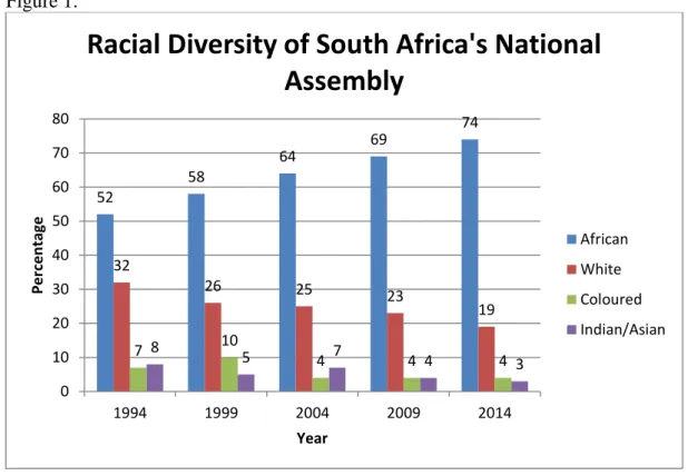
time. The National Assembly has undergone some dramatic changes since the first democratic election in 1994. The percentage of black Africans elected has risen from 52% in 1994 to 74% in
2014 (see Figure 1). Conversely, the percentage of white politicians has progressively decreased over five terms, starting with 32% in 1994 and declining to 19% in 2014. In general, South African white identity can be divided into two main categories: English and Afrikaner. The
with 53% and 54%, respectively (see Figure 2). The English gained 54% in 2014, meaning that 46% were an Afrikaner minority for the first time in history. The composition of coloureds and
Indians/Asians has a less consistent pattern. In 1994, coloured politicians comprised 7% of the National Assembly (see Figure 1). This percentage rose in 1999, where 10% of the MPs were
coloured. But, from 2004-2014, the percentage of coloured MPs remained steady at 4%.
Together, Indians and Asians constituted 8% of the National Assembly in 1994, which decreased to 5% after the next election in 1999. However, their Parliament presence rose again to 7% in
2004, but it also fell the following two terms and concluded with 3% of National Assembly seats in 2014. Knowing this racial composition of the South African National Assembly is essential to
assessing the descriptive representation of the population. Figure 1.
52
58
64 69
74
32
26 25
23
19
7 10
4 4 4
8
5 7 4 3
0 10 20 30 40 50 60 70 80
1994 1999 2004 2009 2014
Per
ce
n
tage
Year
Racial Diversity of South Africa's National
Assembly
African
White
Coloured
Figure 2.
Although the race of South African Parliament members has altered relatively drastically since 1994, the population’s racial make-up has undergone fewer changes. The percentage of
black African residents has risen from 77.4% in 1994 to 80.2% in 2014 (see Figure 3). Along
with the population figures, the number of black African MPs has progressively increased over the past twenty years to 74% in 2014. Therefore, the National Assembly has become more
descriptively representative of black African citizens, but the black African population is still underrepresented.
47 53 46 54 54 46
0 10 20 30 40 50 60 70 80 90 100
2004 2009 2014
Per
ce
n
tage
Year
White Identity of South Africa's National
Assembly
English
Figure 3.
On the other hand, white citizens have been historically overrepresented in Parliament. For the 1994 term, 32% of the elected National Assembly were white politicians, but only 11% of the population was white in 1996 (see Figure 4). Since then, both groups have decreased. The
year 2014 included a Parliament that was 19% white and a population that was 8.4% white. The decline of white members in the National Assembly means that representation has become more
proportional to the national constituency.
52 58
64 69
74
77.4 79 78.9 79.2 80.2
0 10 20 30 40 50 60 70 80 90
Per
ce
n
tage
Year
Comparison of Black Population to Black
MPs
Black African MPs
Figure 4.
The coloured and Indian/Asian populations have been much more stable over the years. Coloured residents have fluctuated between comprising 9% and 8.95% of the population from 1996-2011 (see Figure 5). In 2014, 8.8% of the South African population identified themselves
as coloured. As mentioned earlier, the number of coloured politicians in Parliament rose from 7% in 1994 to 10% in 1999, but then held stable at 4% for the next 15 years. While the
difference is only a few percentage points, coloured citizens have historically been underrepresented descriptively, except in 1999.
32
26 25
23
19
11
9.6 9.5 8.9 8.4
0 5 10 15 20 25 30 35
1994 1996 1998 2000 2002 2004 2006 2008 2010 2012 2014
Per
ce
n
tage
Year
Comparison of White Population to White
MPs
White MPs
Figure 5.
Lastly, the Indian/Asian national percentages swayed between 2.6% (1994, 2004) and 2.5% (1999, 2009, 2014) (see Figure 6). The Indian/Asian MPs showed a bit more variation,
dipping from 8% of National Assembly seats in 1994 to 5% in 1999. Indian/Asian politicians rose again to 7% in 2004, but they continued to have a decreased presence and only made up 3%
of the 2014 elected members. With the overall decline in Indian/Asian MPs, there has also been a reduction of descriptive overrepresentation of the Indian/Asian population since 1994. In fact, the 2014 Indian/Asian proportion of representatives to the population provides the closest
example to perfect descriptive representation of any group because there is only a 0.5% difference between MPs and population percentages.
7
10
4 4 4
9 8.9 9 8.9 8.8
0 2 4 6 8 10 12
Per
ce
n
tage
Year
Comparison of Coloured Population to MPs
Coloured MPs
Figure 6.
Like the racial composition of the South African National Assembly, the male to female ratio of MPs has changed considerably since 1994. The first democratic election resulted in a
Parliament that was 72.76% male and 27.24% female (see Figure 7). However, women have historically been in the majority of the populace. In 1996, the population was 51.9% female and
48.1% male. These percentages have only altered slightly over the years. Females reached the lowest population percentage in recent history at 51.2% in 2014, but the percent of female MPs achieved its highest that year with 45%. Still, South African women have been historically
underrepresented. Since there has been a continual increase of female MPs over the last 20 years, the country has trended towards becoming more descriptively representative in terms of sex
ratio. The knowledge that the South African National Assembly has progressively become more descriptively representative concerning race and sex supports my hypothesis. The next
consideration should be: how does this change compare to the population in poverty? 8
5
7
4
3
2.6 2.5 2.6 2.5 2.5
0 1 2 3 4 5 6 7 8 9
1994 1996 1998 2000 2002 2004 2006 2008 2010 2012 2014
Per
ce
n
tage
Year
Comparison of Indian/Asian Population to
MPs
Indian/Asian MPs
Figure 7.
Poverty and Inequality Since 1993
Although the poverty headcount ratios have changed over time, it has always most
affected the black African population (see Figure 8). In 1993, 68.3% of black Africans lived in poverty. While this percentage has fluctuated over time, it has stayed above 60% until recently.
In 2011, the percentage of black Africans living in poverty fell to 54.0%, which is a 14.3 percentage point decrease since 1993. The year prior to the first democratic election, 30.1% of coloureds, 9.2% of Indians/Asian, and 5.4% of whites were considered poor. When poverty rates
increased for both coloureds and Indians/Asians in 2006 to 41.6% and 13%, respectively, the white population experienced a decrease in poverty to 0.6%. Since then, the proportions of poor
coloureds and Indians/Asian have both declined to 27.6% and 3.4% in 2011, respectively. Between 2006 and 2008, the white population living in poverty rose to 3.5%, but then
progressively decreased to 0.8% in 2011. Even though poverty head count ratios by race have
variously increased and decreased between 1993 and 2011, certain trends can be determined
27.24 30 32.75
43 45
51.9 52.2 51.7 51.4 51.2
72.76 70 67.25
57 55
48.1 47.8 48.3 48.6 48.8
0 10 20 30 40 50 60 70 80
1994 1996 1998 2000 2002 2004 2006 2008 2010 2012 2014
Per
ce
n
tage
Year
Comparison of MPs to Population
by Sex
Female MPs
Female Pop.
Male MPs
from the graph below. In general, poverty has always affected the majority of blacks. The coloured population has been second most afflicted, and whites have been the least affected
racial group. Figure 8.
Considering that South African females have historically enjoyed fewer rights and privileges than males, it is important to study poverty head counts in terms of sex. Since 1993, females have been more impoverished than males (see Figure 9). In 1993, 60% of females and
54% of males were living in poverty. Even though these poverty levels were reduced in 2000 and 2008, the 2006 and 2009 data showed that these poverty rates were almost the same as in 1993,
with 59.7% (2006) and 58.6% (2009) of females and 54.6% (2006) and 54.9% (2009) of males living in poverty. However, 2011 presented the lowest female and male head count since democracy – 47.1% for females and 43.8% for males. The difference in the poverty head count
68.3
63.4 66.8 64.7 66.9
54
5.37 7.8 0.6
3.5 1.5 0.8
30.1 30.8
41.6
36 37.8
27.6
9.2 7.7 13 11.5 11.6
3.4 0 10 20 30 40 50 60 70 80
1993 1995 1997 1999 2001 2003 2005 2007 2009 2011
Per
ce
n
tage
Year
South African Poverty Head Count
by Race
Black African
White
Coloured
between males and females has also lessened over time, dropping from 6 percentage points in 1993 to 3.3 percentage points in 2011.
Figure 9.
Poverty head counts and Gini coefficients measure different types of inequality. As noted earlier, poverty head counts illustrate the proportion of a population living below a certain
poverty line. Gini coefficients represent the income distribution of a nation. It remains important to analyze both because they provide a more complete understanding of inequality together. Although it would be useful and interesting to study South Africa’s Gini coefficients according
to sex, neither the Stats SA paper nor the Leibbrandt et al. publication provided those figures. Instead, they both presented the Gini coefficients organized by race (see Figure 10). Nationally,
the South African Gini coefficient has essentially remained the same since 1993; it has only decreased by 0.01 from the 1993 coefficient of 0.66 to 0.65 in 2011. As expected from the poverty rates, whites have consistently experienced the lowest levels of inequality amongst the
54 51.8 54.6 52.1 54.9
43.8 60
56 59.7 54.8 58.6
47.1 0 10 20 30 40 50 60 70 19 93 19 94 19 95 19 96 19 97 19 98 19 99 20 00 20 01 20 02 20 03 20 04 20 05 20 06 20 07 20 08 20 09 20 10 20 11 Per ce n tage Year
South African Poverty Head Count
by Sex
Male
racial groups. In 1993, the Gini coefficient for white South Africans was 0.43. Eighteen years later in 2011, the Gini coefficient was 0.42, only 1 percentage point less than 1993, and reached
its highest point in 2008 with 50% inequality. There is much more variation among the other racial population groups. Both black Africans and coloureds had 2011 Gini coefficients that were
greater than in 1993. Black South Africans had a Gini coefficient of 0.54 in 1993, which peaked in 2008 at 0.62 and decreased in 2011 to 0.55. The increase in inequality was more dramatic for coloureds since 1993 had a Gini coefficient of 0.44, but 2011 saw a Gini coefficient of 0.53.
2006 was the worst year for coloured inequality due to a high Gini coefficient of 0.57. Lastly the Indian/Asian population experienced relatively consistent inequality between 1993 and 2011,
with Gini coefficients of 0.47 and 0.45, respectively. The most unequal time for Indians/Asians was in 2008 with a Gini coefficient of 0.61, which was only 1 percentage point less than blacks for that same year. Despite all of these differing trends between racial groups, it is apparent that
inequality has persisted in South Africa across all races. So, while these results have shown that after twenty years of democracy, poverty has decreased overall, national inequality remains the
same. This finding does only partially supports my hypothesis, as I originally believed that inequality and poverty would both decrease over time. Such curious outcomes beg the questions: what policies were implemented during this period? And what socioeconomic solutions did they
Figure 10.
Policy Analysis
After assessing the degree of South African descriptive representation by comparing the race and sex of the Parliament to that of the population since 1994, it is appropriate to view how
these changes in Parliament have affected the policies they produce. This section addresses these research questions: as the Parliament becomes more descriptively representative, does it
demonstrate a greater focus on social issues that affect the majority, like poverty and inequality?
Do these policies approach solutions to poverty and inequality in the same way? What are the recurring themes and rhetoric and how do they change over time? As explained in the “Data and Methods” section, one policy or program was chosen for the first four democratic Parliament
terms, excluding the 2014 term because it has been less than a year since the elections. The four policies/programs are the 1994 Reconstruction and Development Programme (RDP), the 2004
1993 2000 2006 2008 2009 2011
Black African 0.54 0.6 0.54 0.62 0.56 0.55
White 0.43 0.47 0.43 0.5 0.49 0.42
Coloured 0.44 0.53 0.57 0.54 0.52 0.53
Indian/Asian 0.47 0.51 0.53 0.61 0.5 0.45
Country 0.66 0.68 0.67 0.7 0.65 0.65
0.4 0.45 0.5 0.55 0.6 0.65 0.7 0.75
Per
ce
n
tage
Year
Gini Coefficients by Race
Black African
White
Coloured
Indian/Asian
Expanded Public Works Programme (EPWP), the 2006 Accelerated and Shared Growth
Initiative – South Africa (AsgiSA), and the 2012/3 National Development Plan (NDP). Although
the descriptive characteristics of the Parliament have changed over time, there are common themes in all of these programs. Every policy prioritized poverty and inequality alleviation, but
they also include goals that are too ambitious and vague implementation plans.
The Reconstruction and Development Programme was significant in South African history because it was the first macro-economic plan pursued by the democratic government. The
RDP provided a holistic, people-driven framework in order to achieve its first priority of
attacking poverty and meeting everyone’s basic needs. It also inherited the very difficult task of
rethinking past policies in order to accommodate the current social and economic climate. However, my evaluation revealed that the RDP’s goals were not feasible. For example, the RDP aspired to build “at minimum, one million low-cost houses… over five years.”63 This statement
is impractical for most developing countries, especially one that was still redefining its social and political infrastructure. Unclear implementation strategies only add to the unrealistic aspect of the RDP’s goals. For instance, the RDP states, “short-term interventions should support nutrition
education and the stable, low-cost supply of staple foods combined with carefully targeted income transfers and food subsidies.”64 The use of “should” in the above statement and
throughout the policy demonstrates the unguaranteed strategy and results. While my analysis shows that the RDP focused on alleviating poverty and inequality, it also deserves criticism for
the overly ambitious goals and vague implementation descriptions.
Unlike the RDP, the Expanded Public Works Programme (EPWP) does not take a holistic approach, but focuses on the unemployment problem. This attention on one issue helps to
increase implementation specificity and goal feasibility. The goal of the EPWP is “to alleviate
unemployment for a minimum of one million people in South Africa, of which at least 40% will
be women, 30% youth and 2% disabled, by 2009.”65 Compared to the RDP, this goal is much more practical. Still, the short time allotment of five years and the particular percentages
assigned to women, youth, and the disabled are reasons it may be not be achievable. Overall, my analysis indicated that the EPWP provides considerably more detailed plans regarding objectives and approach, like “the plan aims to create 200,000 jobs through programmes such as the
Department of Agriculture’s Land Care programme; the Department of Environmental Affairs and Tourism’s People and Parks…”66
As seen in this quotation, the EPWP gives precise
sub-goals and partnering organizations. It also offers explicit information about the estimated costs of each sector involved. However, this program remains vague when discussing funding sources, like the assertion that “the EPWP is predicated on a multi-year budgeting system that ensures a steady flow of government investment in the identified service areas.”67
This “multi-year budgeting system” and “government investment” are never addressed or explained later.
Therefore, compared to the RDP, my assessment concluded that the EPWP includes a more feasible goal due to its narrowed target of reducing unemployment and more details about implementation plans. But there are still vaguely discussed topics, like funding. And, I consider
the goal of increasing employment opportunities for historically marginalized groups by such a large percentage noble, yet overly ambitious. Even with these flaws, the mission of reducing poverty through employment demonstrates a commitment to the constituency’s interests.
In addition to the first two policies, I found that the Accelerated and Shared Growth Initiative -- South Africa (AsgiSA) continues the pattern of focusing on poverty and inequality
65 Department of Public Works. “Expanded Public Works Programme,” 14. 66 Ibid, 16.
alleviation, but with an impractical socioeconomic goal and few details regarding the delivery system. AsgiSA aims to reduce unemployment to below 15% and halve poverty to less than
one-sixth of households by 2014.68 Although AsgiSA asserts that this goal is feasible, the short amount of time (less than ten years) and economic approach suggest that it is unrealistic. The
AsgiSA is more business-oriented than the RDP or the EWPW. The necessary environment for the AsgiSA to be successful is a growth rate of about 5% on average between 2004 and 2014.69 This focus on economic growth in order to reduce poverty and unemployment is reminiscent of
the trickle-down theory, and so it provides no guarantees for any actual socioeconomic improvement. Vague policy responses also do not assure the realization of the AsgiSA. For
example, “an upgraded career guidance programme” is one of the recommendations to improve education and skills development.70 But, the AsgiSA fails to explain any details regarding this aspect of the plan. Most importantly, there is no mention of project costs anywhere in the
AsgiSA document. Not including cost estimates in a national program automatically raises feasibility and implementation doubts. Although I assessed that the AsgiSA succumbed to the
same pattern of proposing relatively unrealistic goals and glossing over the implementation process, it attempted a new policy approach by focusing on businesses and national economic growth as a means to decrease poverty and unemployment.
The last policy, the National Development Plan, starts in a unique manner, but ultimately follows the same trend of quixotic goals and ambiguous application as a means to improving
socioeconomic conditions. The first thirteen pages of the NDP executive summary are filled with vision statements for 2030, such as “we all see to it and assist so that all life’s enablers are
68
The Presidency: Republic of South Africa. “Accelerated and Shared Growth Initiative,” 2.
69
Ibid., 4.