New Statistical Tools for Microarray Data and Comparison with
Existing Tools
Xuxin Liu
A dissertation submitted to the faculty of the University of North Carolina at Chapel Hill in partial fulllment of the requirements for the degree of Doctor of Philosophy in the Department of Statistics and Operations Research.
Chapel Hill 2007
Approved by
Advisor: Dr. J. S. Marron Reader: Dr. Andrew B. Nobel
© 2007 Xuxin Liu
ABSTRACT
XUXIN LIU: New Statistical Tools for Microarray Data and Comparison with Existing Tools
(Under the direction of Dr. J. S. Marron)
Microarray technologies have gained tremendous interest from researchers in recent years. The problem we are interested in is how to combine two microarray data, which have systematic batch dierences. The reason for the combination is that the combined data set contains more samples which will give improved statistical power. This disser-tation covers two topics about microarray batch adjustment. The rst topic is about the visualization of paired High Dimension Low Sample Size (HDLSS) data. We propose two in-teresting directions: the Canonical Parallel and the Canonical Orthogonal Directions (CPD & COD). This pair of directions gives an insightful 2-d parallel view for understanding paired HDLSS data sets. The CPD can be used for adjusting the batch dierences. An ap-plication to the NCI60 cell lines data shows good performance of this method. The second topic is about the comparison between three commonly used batch adjustment methods: the Support Vector Machine (SVM), the Distance Weighted Discrimination (DWD), and the Prediction Analysis of Microarray (PAM). We show that SVM has some serious prob-lems for the HDLSS data. The DWD method is much more robust than PAM under the Unbalanced Subgroup Model.
The mathematical studies made in this dissertation are in the area of HDLSS asymp-totics, in the sense that the sample sizes are xed and the dimension (the number of genes) goes to innity. Hall et. al (2004) have studied the geometric structure of the data when the dimension is high. In this dissertation, we study the geometric structure of the data under more complicated models. In the rst topic, we give the conditions for the consistency and the strong inconsistency of the CPD under the Linear Shift Model. This model reects the eects of systematic biases and the random measurement errors. In the second topic, we compare the PAM and the DWD method using the Unbalanced Subgroup Model. Both
methods are biased when the dimension goes to innity. However, DWD is shown to be consistently more robust than PAM. We give the quantitative bias of them.
ACKNOWLEDGEMENTS
I would like to express my deepest thanks and appreciation to my advisor, Dr. J.S. Marron for his tremendous help during my research and the writing of this dissertation. Dr. Marron lead me to this interesting eld of statistical analysis on microarrrays. His sound advice and guidance were invaluable during my research. I would also like to thank my committee members: Dr. Andrew B. Nobel, Dr. Yufeng Liu, Dr. Charles M. Perou and Dr. Haipeng Shen for their suggestions and comments.
This dissertation is dedicated to my mom and dad for their support and encouragement.
CONTENTS
List of Figures vii
1 Introduction and Background 1
1.1 Microarray Data Introduction . . . 1
1.2 High Dimension Low Sample Size data Visualization . . . 3
1.2.1 Gene by Gene View . . . 4
1.2.2 Multivariate View . . . 7
1.3 Microarray Batch Adjustment Methods . . . 9
1.3.1 NCI60 Cancer Cell Line Data . . . 9
1.3.2 Microarray Batch Adjustment . . . 10
1.3.3 Linear Batch Adjustment Methods . . . 14
1.4 Organization of the Dissertation . . . 20
2 HDLSS Canonical Parallel Direction 22 2.1 Visualization and Adjustment using the Canonical Parallel Direction . . . . 23
2.2 Canonical Parallel Direction (CPD) and Canonical Orthogonal Direction (COD) . . . 27
2.2.1 Linear Algebra and PCA Overview . . . 28
2.2.2 Algorithm for the CPD and COD . . . 32
2.3 Asymptotic results for the CPD . . . 37
2.3.1 Three Types of Asymptotic Studies . . . 37
2.3.2 Linear Shift Model . . . 39
2.3.3 The Consistency and Inconsistency of the empirical CPD . . . 40
2.3.5 Proofs of the Theorems . . . 52
3 Comparison among SVM, DWD, and PAM 78
3.1 The Comparison between DWD and SVM . . . 78 3.2 The Comparison between PAM and DWD . . . 81 3.2.1 Robustness of DWD and PAM for Data with Fixed Dimension . . . 83 3.2.2 Unblanced Subgroup Model . . . 86 3.2.3 The d Asymptotic Properties of the DWD and PAM directions . . . 89 3.2.4 Simulation Study . . . 95 3.2.5 Proofs of the Theorems . . . 97
Bibliography 112
LIST OF FIGURES
1.1 Shows the scheme of a cDNA microarray experiment. This gure is taken from Duggan et al. (1999). . . 2 1.2 The expression matrix for a microarray data set. Each column corresponds
to a sample and each row corresponds to a gene. The gene expression values are displayed in a matrix. (This plot is taken from Brazma et al. (2004)). . 4 1.3 Projection view of the toy data, which contain two batches and two biological
clusters. Symbols are for the batches and colors are for the biological clusters. 5 1.4 Gene by Gene view of the toy data. On-diagonal plots show single gene
expression values. O-diagonal plots are scatter plots of the expression values for two genes. Symbols represent batches, and colors represent biological clusters. The black dashed segments are used to connect the associated samples from the two batches. . . 6 1.5 Toy data are projected onto the rst four PC directions. On-diagonal plots
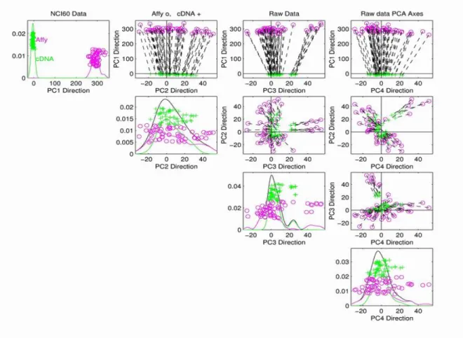
are one-dimensional projection plots. O-diagonal plots are 2-d projection plots for corresponding PC directions. Symbols represent batches, and colors represents biological clusters. The black dashed segments are used to connect the associated samples from the two batches. . . 9 1.6 NCI60 data are projected onto the rst four PC directions. The purple
circles are Ay samples. The green pluses are cDNA samples. The black dashed segments are used to connect the same biological samples from the two platforms. . . 11 1.7 Underlying conceptual model shows that the SVD/PCA direction (green
dashed line) is not consistent with the batch dierence direction (magenta dashed line). Classes are represented by dierent colors and symbols. . . 12 1.8 Toy data set for comparing the adjustments of squashing and shifting. The
left subplot shows the data set before adjustment. Batches are represented by symbols, and the important biological clusters are represented by colors. The green line shows the rst SVD/PCA direction. The upper right subplot shows the data after squashing along the direction of the green line. Both batch dierence and biological dierences are removed. The bottom right subplot shows the data sets after rigidly shifting along the direction of green line. The batch dierence is removed and the biological dierences are preserved. 14 1.9 SVM hyperplane to separate two classes, represented by crosses and pluses
1.10 DWD hyperplane to separate crosses and pluses. The Purple Normal Vector is the DWD direction. . . 20
2.1 Left Plot: NCI60 data are projected on two specic directions which make all the line segments parallel. Symbols and colors are the same as in Figure 1.6. Right Plot: NCI60 data are projected onto the plane formed by the canonical parallel direction and the canonical orthogonal direction. . . 23 2.2 The NCI60 data are adjusted using CPD and then are column standardized.
The adjusted data are projected onto the rst four PC directions of the raw data. Symbols and colors are the same as in Figure 1.6. . . 27 2.3 The underlying conceptual linear shift model. Blue points represent the
observations in the batch X(d). Red diamonds represent the observations
in the batch Y(d). Dashed lines show the direction of the systematic batch
dierence. . . 41 2.4 Simulation results for Theorem 2.3.1. Each subplot illustrates the results for
data sets with a choice of . The three plots in the rst row indicate the strong inconsistency of the empirical CPD, i.e. the AIP converges to 0. The last two plots in the second row illustrate the consistency of the empirical CPD. The second row, rst colum subplot is for the data sets with = 0:5, which shows no trend of convergence. These plots are consistent with the conclusions in Theorem 2.3.1. . . 48 2.5 Simulation results for Theorem 2.3.1. It shows the same results as in Figure
2.4, using the same axes for each subplot. This plot shows the convergence ( = 0:75; 1:0), and strong inconsistency ( = 1; 0; 0:25) more clearly. . . . 49 2.6 Simulation results for Theorem 2.3.3. Each subplot illustrates the results for
data sets with a choice of . The three plots in the rst row indicate the strong inconsistency of the empirical CPD, i.e. the AIP converges to 0. The last two plots in the second row illustrate the consistency of the empirical CPD. The second row, rst colum subplot is for the data sets with = 0:5, which shows no trend of convergence. These plots are consistent with the conclusions in Theorem 2.3.3. . . 50 2.7 Simulation results for Theorem 2.3.4. The two subplots in each column
illus-trate the results for data sets with a choice of , i.e. the two subplots in the rst column corresponding to the data sets with = 0:5. Three subplots in the rst row illustrate the AIPs between the empirical CPD and the theoret-ical CPD. The three subplots in the seond row show the AIPs between the empirical CPD and the spike direction. . . 52
3.1 Two data sets are represented by blue circles and red crosses respectively. The SVM Direction (magenta dashed line) is orthogonal to the SVM hyperplane, which is determined only by those points on the margin. Combining two data sets along this direction will not produce a good result. A much better batch adjustment direction is shown using the green line. . . 80 3.2 This Figure is taken from Marron et al. (2005) to illustrate the data piling
problem of SVM. The toy data contain two batches, represented by blue cir-cles and red pluses. Each data set contains 20 observations in 50 dimensional space. The left plot shows the projection view of the toy data on the plane formed by the rst two principal component directions. The SVM direction is shown using the magenta line. The dashed line shows the optimal direc-tion. The two plots on the right show the projection view of the toy data along the SVM direction and the optimal direction. . . 81 3.3 This Figure is taken from Benito et al. (2004) to illustrate the data piling
problem of SVM. Two data sets are projected along the SVM direction. The estimated density curves are tted for the two populations separately. Similar projection plots can be found on the diagonal of Figure 1.6. . . 82 3.4 This Figure is taken from Benito et al. (2004) to illustrate that DWD does not
have the data piling problem. The two data sets are projected along the DWD direction. The estimated density curves are tted for the two populations separately. Similar projection plots can be found on the diagonal of Figure 1.6. 82 3.5 Toy example to illustrate the eect of unbalanced subgroup eect. Symbols
are for the batches and colors are for the biological eects. The rst, second, third columns are the PC projection plots for the Raw, PAM adjusted, and DWD adjusted data, respectively. The purple line is the DWD direction. The black line is the PAM direction. . . 83 3.6 Toy example to illustrate the eect of sub-sample size. Symbols and colors are
the same as above. The purple line is the DWD adjustment direction. The black line is the best adjustment direction. Top and bottom panels show the projections of the Raw data and DWD adjusted data onto the plane formed by the rst two PC directions. . . 85 3.7 Toy example to illustrate the underlying conceptual structure of the
unbal-anced subgroup model. Symbols are for the batches and the colors are for the biological subgroups. . . 89 3.8 This gure illustrates the theoretical, DWD and PAM direction to adjusted
the systematic dierences between data from two batches. The same data has been shown in Figure 3.7. . . 91 3.9 Shows the two angles: P AMand DW Dfor dierent choices of r, when > 12.
3.10 This gure shows the dierence between the two asymptotic angles: the DWD direction and best combination direction, and the PAM direction and the best combination direction. The red dashed line shows the location, at which the dierence is maximized. . . 95 3.11 Toy example to illustrate the conclusions in Theorem 3.2.1 and 3.2.2. Each
column is for a choice of . The rst row is for the AIPs between the DWD direction and the best combination direction. The second row is for the AIPs between the PAM direction and the best combination direction. . . 96 3.12 Shows the asymptotic geometric structure of the data in the unbalanced
subgroup model, when > 1=2 and d ! 1. . . 104
CHAPTER 1
Introduction and Background
This Chapter is organized as follows: Section 1.1 gives an introduction to microarray data. Section 1.2 discusses the High Dimensional, Low Sample Size (HDLSS) problem. It introduces the multivariate view of microarray data. It also illustrates the principal component direction visualization for HDLSS data. In Section 1.3, the NCI60 cancer cell line data sets are introduced. They will be used for illustration of many dierent points in the rest of this dissertation. This section also describes the statistical analysis problem of batch adjustment for microarray data sets. Several batch adjustment methods are reviewed and compared. Section 1.4 gives the organization of the rest of the dissertation.
1.1 Microarray Data Introduction
Genes and their products (such as RNA and protein) play an important role in the function of living organisms. The traditional methods of molecular biology generally worked on a \one gene studied in one experiment" basis. The cost was extremely high to get the expressions for thousands of genes, which meant the \whole picture" of gene function was hard to obtain. In recent years, a collection of new technologies called DNA microarrays has attracted tremendous interest among biologists; see Schena et al. (1995), Eisen and Brown (1999), and Alter et al. (2000). These technologies permit the expression proling of thousands of genes simultaneously. This highly reduces the costs of collecting gene expression data. Thus researchers can monitor the whole genome and study the interactions among thousands of genes.
are at least two currently most widely-used formats of DNA microarray technology. One is single channel microarray, the other is two-channel microarray. An example of single channel microarray is Oligonucleotide microarray, i.e. Aymetrix microarray (Ay), developed at Aymetrix, Inc. Aymetrix microarray technology uses synthetic DNA fragments, i.e. oligonucleotides, consisting of around 25 bases. A technique called photolithographical array production is applied to synthesize the oligonucleotides on the chip. An example of two-channel microarray is cDNA Microarray (cDNA) , developed at Stanford University. cDNA molecules are usually 0.2 to 5 kb long and are immobilized on the chip using robot spotting (printing).
A microarray experiment consists of three steps: sample preparation and labeling; sam-ple hybridization and washing; and microarray image scanning and processing. We will take the cDNA microarray as a basis for a general discussion of these steps. Other technologies such as the Aymetrix microarray follow similar principals.
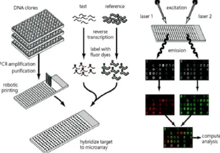
Figure 1.1: Shows the scheme of a cDNA microarray experiment. This gure is taken from Duggan et al. (1999).
The general scheme of a cDNA microarray experiment is illustrated in Figure 1.1. For gene expression levels studies, each spot on the chip is representative of a certain gene or a transcript. The total mRNA from the cells in test tissue and in reference tissue is extracted and labeled with two dierent uorescent dyes separately, e.g. green dye for the mRNA
from the test tissue and red dye for the mRNA from the reference tissue. More precisely, the labeling is done on the nucleotides that are complementary to the isolated mRNA. All the extracted mRNA from both tissues are prepared and hybridized to the immobilized molecules on the spots. The mRNA that did not bind to the immobilized molecules during the hybridization process is washed away. The relative abundance of hybridized molecules on a dened spot can be determined by measuring the uorescent level of this spot. This is done done by scanning the chip twice with red and green lasers. If the mRNA from the test tissue is abundant, the spot will be green; if the mRNA from the reference tissue is abundant, the spot will be red. If both are equally abundant, the spot will be yellow. If neither are in abundance, the spot will appear black. Thus the relative gene expression level at each spot can be estimated from the uorescence intensities, i.e. the color for this spot. This method has the advantage of measuring the expression levels for thousands of genes in one experiment.
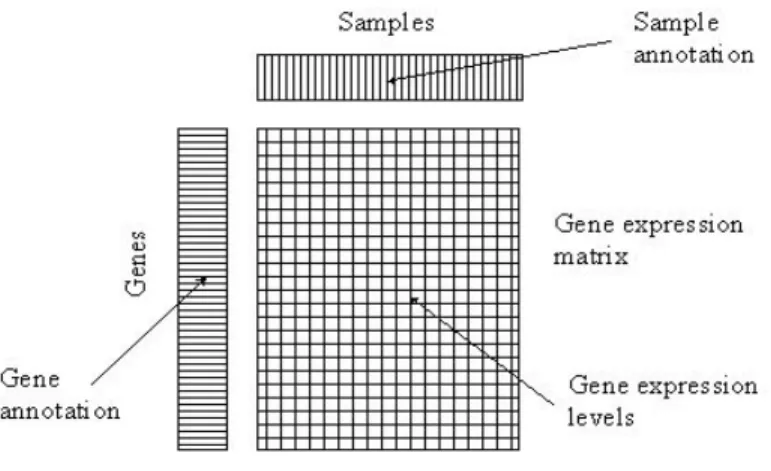
A microarray experiment produces massive amounts of gene expression data. Figure 1.2 illustrates the organization of one microarray data set. The top row displays the sample (or individual) annotations. The rst column on the left shows the gene annotations. The large rectangle displays the gene expression matrix, which is organized in this paper as a d n matrix X, where d is the number of genes (rows), and n is the number of the samples (or individuals, i.e. columns). Thus Xi;j is the expression value for the ith gene and jth
sample (or individual). Sometimes, a microarray data set is organized using the transpose of the above matrix , e.g. each column as a gene and each row as an array (individual); see for example in Irizarry et al. (2003).
1.2 High Dimension Low Sample Size data Visualization
There are at least two important view points for the analysis of microarray data Xdn.
One is the gene by gene view. It treats the gene expression matrix Xdn as d separate
Figure 1.2: The expression matrix for a microarray data set. Each column corresponds to a sample and each row corresponds to a gene. The gene expression values are displayed in a matrix. (This plot is taken from Brazma et al. (2004)).
matrix as a set of n d dimensional vectors. The data set contains n data objects. Each data object is a d dimensional vector (the column of the expression matrix), which represents the gene expression values for some specic sample (individual). Since the dimension d is typically much larger than the sample size n, we call this a High Dimension Low Sample Size (HDLSS) setting, as studied in Hall et al. (2005).
In this section, we will introduce and compare these two viewpoints for HDLSS data. Section 1.2.1 presents the \Gene by Gene" view. Section 1.2.2 introduces the Principal Component Directions view as a the multivariate view method.
1.2.1 Gene by Gene View
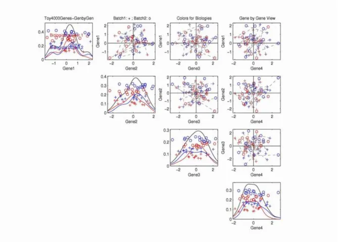
The \Gene by gene" view needs to be regarded with healthy skepticism in the analysis of microarray data, because the data are intrinsically multivariate in nature. A toy example in Figure 1.3 is presented to show that \gene by gene view" doesn't provide sucient insights into the multivariate nature of these data sets.
The toy data set in the Figure 1.3 are for the expression values, measured on 4000 genes (dimensions), and are intended to model an important biological eect with gene expression
Figure 1.3: Projection view of the toy data, which contain two batches and two biological clusters. Symbols are for the batches and colors are for the biological clusters.
analysis, as done by Kuo et al. (2002).
Figure 1.4: Gene by Gene view of the toy data. On-diagonal plots show single gene ex-pression values. O-diagonal plots are scatter plots of the exex-pression values for two genes. Symbols represent batches, and colors represent biological clusters. The black dashed seg-ments are used to connect the associated samples from the two batches.
Figure 1.4 shows the gene-by-gene view of the simulated data for the rst four genes. In these plots, each point represents a sample (i.e. case). Every plot on the diagonal displays the expression values for a single gene. A one-dimensional \jitter plot" (see Tukey and Tukey (1990)) is used with a random vertical coordinate for visual separation of the data points. Also kernel density estimation curves are drawn to provide another view of how the expression values of one single gene are distributed. For example, the subplot in the top row, the rst column shows the expression values on the rst gene. Three kernel density curves, colored with black, blue and red, are drawn for the all the samples, the blue samples only (biological cluster 1), and red samples only (biological cluster 2) respectively.
In this direction, there is no appropriate separations of batches, or biological clusters. All the o-diagonal plots show the two dimensional scatterplots for the two corresponding genes. For example, the top row, second column subplot shows the projection of the data onto the plane, formed by the rst and the second genes. As in Figure 1.3, symbols are used to represent samples from dierent batches. Colors are used to represent the samples from dierent biological clusters. Dashed line segments are used to connect the associated samples from the two dierent batches.
In all the subplots of Figure 1.4, there are no appropriate separations of batches (circles and pluses), or biological types (reds and blues). This is due to the very small dierence in the mean values of entries, compared with the noise level for each gene. Thus from the gene by gene view, both batch eect and biology eect are invisible. In the next subsection, we will present the multivariate view of the data, which shows that there are actually some biological and batch eects, which can be seen using an appropriate view.
1.2.2 Multivariate View
The multivariate view treats a microarray data set Xdn as a cloud of n points in d
dimensional space. Due to limitations of the human perceptual system, it is challenging to visually understand the full geometric structure of the data with dimension more than 3. However, we can project the data points onto some carefully chosen directions of interest. There are many interesting directions in HDLSS settings, e.g. you could nd a direction (which is not unique) such that the projections of all the samples on this direction are piled up on one single point. Ahn and Marron (2006) developed the maximal data piling direction. In this direction, the projections of some samples are piled up on one single point, the projections of all the other samples are piled up on another single point, and the distance between these two points is maximized. On the webpage for this dissertation (see Liu (2007b)), these types of projections are illustrated for some interesting examples.
batch eects and biological eects are invisible in this gene by gene view, because the dif-ference between batches or biological clusters are very small in a single gene. However, this dierence is signicant, if all the genes are taken into considerations. E.g. instead of projecting data onto single gene direction, we could project the data onto some linear combinations of the gene directions, such as the principal component directions.
Principal Component Directions View
Principal Component Analysis (PCA) is a classical statistical method, which continues to be widely used for statistical data representation and data compression. For a data set in high dimensional space, PCA nds a set of directions called the Principal Component directions (PC directions) such that the rst PC direction accounts for as much of the variability in the data as possible, and each succeeding PC direction accounts for as much of the remaining variability as possible. Often, the rst several PC directions will express most of the variability in the data. Thus, PC directions are often commonly used to visualize the data. This kind of view for HDLSS data was used by Benito et al. (2004), Liu et al. (2007) and Marron and Liu (2005).
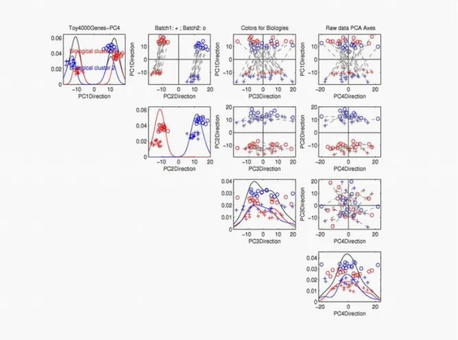
We use the the toy data in Figure 1.3 to illustrate the idea of the PC projection plot. Note that all the PC directions are the linear combinations of gene directions. Fig 1.5 shows the PC projections of the data on the 1-d directions or 2-d planes formed by the rst four PC directions. Every plot on the diagonal has displayed a one-dimensional projection on the PC directions. All the o-diagonal plots show 2-d views of the data projected on the plane formed by the two corresponding PC directions.
The limitation of the gene-by-gene view is made clear in the PCA multivariate scatter-plot view of these data in Figure 1.5. Note that the rst two principal components (top row, second column) contain the deliberately constructed structure in the data. In particular, the batch eect (indicated by pluses and circles) is clear, shown mostly on the rst PC direction. The strong simulated biological eect is shown as two clusters (indicated by the red and blue colors) on the second PC direction.
In the rest of this dissertation, we will focus on the multivariate view of the data.
Figure 1.5: Toy data are projected onto the rst four PC directions. On-diagonal plots are one-dimensional projection plots. O-diagonal plots are 2-d projection plots for correspond-ing PC directions. Symbols represent batches, and colors represents biological clusters. The black dashed segments are used to connect the associated samples from the two batches.
1.3 Microarray Batch Adjustment Methods
1.3.1 NCI60 Cancer Cell Line Data
the cDNA gene expression data were collected as a 5244 60 matrix. Missing data were imputed using K-Nearest Neighbors imputation (KNN, see Troyanskaya et al. (2001)). The same list of 60 cancer cell lines were measured with the Aymetrix Microarray Suit 4.0 for 7070 genes. There are some negative values in the Ay, which were set to 1 before taking log2 transformation. We linked genes from cDNA and Ay data sets by mapping their identiers to Unigene Cluster Identiers (UCID). Duplicate UCIDs were collapsed by taking the median value within each sample. The paired cDNA and Ay data set were created from the intersection of UCIDs of these two sets. Both the cDNA and the Ay data contain 60 common samples and 2267 common genes. In the rest of the dissertation, We refer the NCI60 data as two such Ay and cDNA data sets with common samples and genes.
Fig 1.6 shows the PC projection view of the NCI60 data, which have a similar format to Figure 1.5. In this gure, The purple circles are the Ay samples, and the green pluses are the cDNA samples. The dashed line segments are used to connect the associated bio-logical samples measured on the two dierent platforms. Long segments tell us that there are signicant dierences between the expression values of the associated biological samples measured by cDNA and by Ay. The top row, second column subplot shows the projections of the data on the plane formed by the rst and the second PC directions. Note that the dierences between cDNA and Ay are mostly along the rst PC direction. We also nd that the dashed line segments are quite parallel.
1.3.2 Microarray Batch Adjustment
Microarray data contain the expression values for thousands of genes. The measurements tend to be noisy. The noise in the data could be countered by running a large number of arrays, and averaging the results. However, this is currently not practical because array costs are still relatively high. Another approach to reduce the eect of noise is to combine the current data with previously existing data sets, many of which are web available. The combined data set will have larger sample size, which will boost statistical power. However, as noted by Irizarry et al. (2003), hurdles to such combinations include biases introduced
Figure 1.6: NCI60 data are projected onto the rst four PC directions. The purple circles are Ay samples. The green pluses are cDNA samples. The black dashed segments are used to connect the same biological samples from the two platforms.
same high dimensional gene space.
Some researchers have used the Singular Value Decompositions (SVD/PCA) to correct for systematic biases in the data set of yeast cell cycle experiments (Alter et al. (2000)), and to correct for microarray batch bias in a data set containing many soft tissue tumors Nielsen et al. (2002)). Recall that the SVD/PCA seeks to nd the \directions of greatest variation". To adjust the batch dierence, the variations of the data sets along the SVD direction were totally removed. However, as noticed by Benito et al.(2002), there are some serious problems for this method.
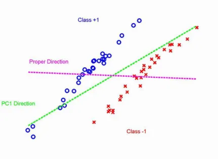
Figure 1.7: Underlying conceptual model shows that the SVD/PCA direction (green dashed line) is not consistent with the batch dierence direction (magenta dashed line). Classes are represented by dierent colors and symbols.
Firstly, it works well only when the direction of the batch dierence is consistent with the SVD/PCA direction. This means that the between-group dierences are much larger than the within batch variation. Figure 1.7 shows an underlying conceptual model. The observations from two batches are represented by symbols and colors. In this toy data set, the within group variation is much larger than the batch dierence. The rst SVD/PCA direction (green dashed line) is very dierent from the actual batch dierence direction (magenta dashed line). The adjustment of the data along the rst SVD/PCA direction will not eliminate the dierences between batches. Notice that SVD/PCA direction doesn't
use the batch memberships of the observations. A natural way to improve the analysis is to make full use of the systematic bias information (i.e. the batch membership of each observation). Instead of choosing the direction to maximize the variation of the full data, i.e. SVD/PCA, we could choose the direction which gives the maximum separation between two batches. In the next subsection, we will introduce and compare several such methods, which separate two batchesas well as possible, in some sense.
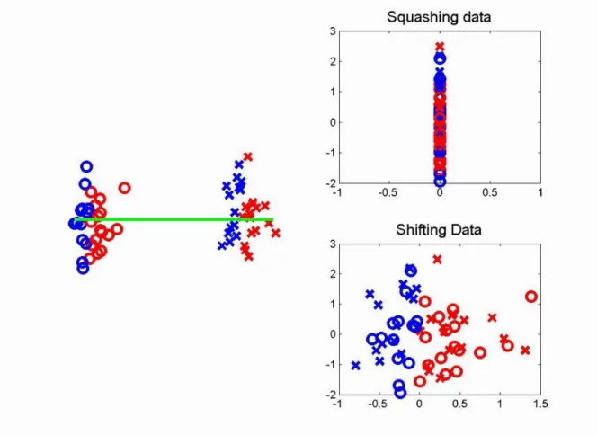
Figure 1.8: Toy data set for comparing the adjustments of squashing and shifting. The left subplot shows the data set before adjustment. Batches are represented by symbols, and the important biological clusters are represented by colors. The green line shows the rst SVD/PCA direction. The upper right subplot shows the data after squashing along the direction of the green line. Both batch dierence and biological dierences are removed. The bottom right subplot shows the data sets after rigidly shifting along the direction of green line. The batch dierence is removed and the biological dierences are preserved.
1.3.3 Linear Batch Adjustment Methods
In this dissertation, we are mainly interested in linear batch adjustment methods, be-cause they have direct and meaningful geometric interpretations. Using the multivariate view, two HDLSS data sets are treated as two clouds of points in high dimensional space. Linear batch adjustment methods nd an appropriate direction and then move the two clouds along this direction until they overlap. The problem of batch adjustment is equiv-alent to the problem of binary discrimination problem for two data sets. The objective of linear discrimination between two data sets is to nd a hyperplane, which separates them
as well as possible. The orthogonal direction of the hyperplane gives the maximum separa-tion of two data sets and can be used for adjusting the batch dierence. In this Secsepara-tion , several important linear discrimination methods are introduced and compared for the batch adjustment.
Binary Classication (Discrimination) Problem
Here we introduce some mathematical notations for the classication problems, (see Hastie et al. (2001)). In the binary classication problem, we use class labels +1 and 1 to rep-resent two dierent classes. Suppose that we have the training data f(x1; y1); (xn; yn)g.
Each xi 2 <d represents the observation vector for the ith sample. Each yi = +1; or 1
represents the class membership for the ith sample. The objective of binary classication is to nd a classication rule (classier) f(x) : <d! f 1; 1g , which assigns a cluster label
(+1 or 1) to a given sample x. One goal of f(x) is the consistency with the observed data, i.e. for (x; y)s is in the training data set. A second goal is the prediction of new observa-tions. Sometimes f(x) can be a function from <d! R. Then the sample is classied to +1
if f(x) > 0, and to 1 if f(x) < 0.
Linear Discrimination Problem
If the classier f(x) is a linear function of x, we call f(x) is a linear classier, i.e.
f(x) = wTx + b (1.1)
where w is a d dimensional vector, and b is the threshold for the classication. The class label +1 or 1 is given to the sample x, if f(x) > 0 or f(x) < 0. Using the multivariate view, each sample x is a point in d dimensional space. A linear classier attempts to nd a d 1 dimensional hyperplane, which separates two the classes +1; 1 as well as possible. The vector w denes the orthogonal direction of the separation hyperplane.
linear classier (discrimination hyperplane). In the following, we will take a further look at some basic and widely used discrimination methods. The comparison between them will be further studied in Chapter 3.
Nearest Centroid method
Suppose Xdn1 and Ydn2 are two clusters of d dimensional data. Using the multivariate
view, they are treated as two clouds of points in d dimensional gene space. The nearest centroid method uses the within class sample mean as the representative for each cluster. Every sample is classied to the cluster with nearest centroid to this sample. This is a linear discrimination method in the sense that the normal direction w of this method is the normalized direction vector which connects the centroids of the two clusters. Thus
w = x y jjx yjj;
where x and y are the sample mean vectors of the two classes. Tibshirani et al. (2002) uses this direction for adjusting the batch dierence in their Predicton Analysis of Microarray (PAM) software.
The gene by gene view of the PAM method is that the observations for every gene are subtracted by their within batch mean for this gene. Using multivariate view, this adjustment has a very simple multivariate geometric interpretation. It can be treated as rigidly shifting two clusters such that their centroids are moved to the origin. After adjusting within group mean, the mean value for every gene is zero. To preserve the variation of the mean values of genes, the observations for each gene are added by the mean value of this gene across two batches. The geometric interpretation of this adjustment and the previous within batch mean adjustment is to rigidly shift two clusters along the direction which connects two centroids, until both centroids move to the centroid of two clusters. Instead of moving two clusters to the centroid of two clusters, some researchers choose to x one cluster and move the other cluster to the rst one until their centroids overlap. This method preserves the mean values of genes on the chosen batch.
No matter what kind of centroids adjustment, they are the results of shifting two clusters
along the direction which connects two centroids. From now on, we call this direction as the PAM direction. In addition to adjust the mean, the PAM software has a step to adjust batch variation dierences. However, in this dissertation, we focus on the batch dierence adjustment, and hence we won't consider the variation adjustment.
The PAM adjustment has been shown to work very well for many data sets, see Tib-shirani et al. (2002). It involves easy calculation and has a simple geometric interpretation. However, the PAM method is not robust if there are outliers, which are away from the main population. Johnson et al. (2006) proposed the empirical Bayesian methods to improve the robustness. In Chapter 3, Section 3.2, we will study other properties of the PAM direc-tion. In particular, PAM is not asymptotically robust for combining two data sets with unbalanced subgroup sample sizes, when the number of genes goes to innity.
Note that every observation has some inuence on locating the PAM direction. However, it is natural to think that those points which are close to the separating hyperplane are more important than the observations which are away from the separation hyperplane. Another discrimination method, called the Support Vector Machine (SVM), directly addresses this problem.
Support Vector Machine (SVM)
SVM, (see Vapnik (1982), Vapnik (1995), Burges (1998) and Liu (2007a)) is a popular linear discrimination method. It is introduced in two cases: when the data are linear separable, and when they are not. In this dissertation, we will focus on the separable case, because two HDLSS data sets are linear separable with probability one, if the data follow distributions that are absolutely continuous with respect to d dimensional lebesgue measure. Consider a linear classier f(x) = wTx + b, as in Section 1.3.3. A special linear
maximized. The hyperplane between the two margins: f(x) = 0 is the SVM discrimination hyperplane. Given w and b, the class label +1 is given to a new sample xi, if f(xi) > 0
and the class label 1 is given if f(bxi) < 0. The SVM can be interpreted as the solution of the following optimization problem over w and b:
minimize 12jjwjj2
subject to yi f(xi) > 1; i = 1; ; n: (1.2)
where yi represents the class membership of the ith sample xiin the training data set. The
normalized direction vector of w represents the SVM direction. The constrains yi f(xi) >
1 i = 1; ; n indicate that the f(x) must classify all the samples in the training data set correctly. The SVM classier gives as accurate predication to the class membership of new samples as possible, in the sense of maximizing the distance between two margins.
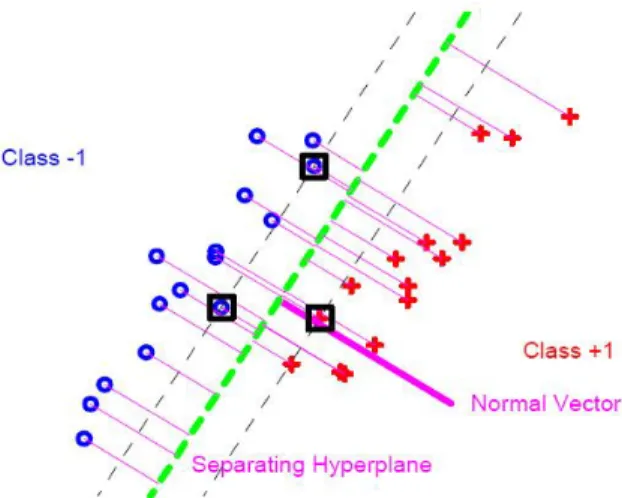
Figure 1.9: SVM hyperplane to separate two classes, represented by crosses and pluses for a two dimensional toy data set. The Purple normal vector is used for batch adjustment.
Figure 1.9 shows the SVM method for classifying a 2 d toy data set, with the two classes represented by blue circles and red pluses respectively. The two grey thin dashed lines show the two hyperplanes for the margins (fx : f(x) = 1g), with some support vectors (black boxes) on the margins. The SVM nds two margins (over w and b) such that the distance between them is maximized. The green dashed line between two margins
represents the discrimination hyperplane (fx : f(x) = 0g). The observations on the left side of this hyperplane are classied to the class with label 1 (the class of blue circles). The observations on the right side of this hyperplane are assigned to the class with label +1 (the class of red pluses). The purple normal vector of the hyperplane is the direction showing the batch dierence. It can be used for adjusting the batch dierence by rigidly shifting the blue class and the red class along this direction. The SVM method has been shown to be very successful in a variety of classication problems. However, as noticed by Marron and Todd (2002) and Benito et al. (2004), the SVM can be improved in HDLSS settings. There are two main drawbacks of the SVM method. Firstly, the SVM suers from a substantial data piling on the margins, which could lead to biased batch adjustment. Secondly, only those observations on the margins have an inuence on locating the SVM hyperplane; the observations which are away from the margins have no inuence at all. For example, in Figure 1.9, if you move o-margin blue circles to anywhere on the left side of the above margin, the discrimination hyperplane won't change at all. These two problems of the SVM will be studied more precisely in Chapter 3. Marron et al. (2005) have addressed these problems by the development of Distance Weighted Discrimination (DWD) method.
Distance Weighted Discrimination (DWD)
The DWD method, developed by Marron et al. (2005) is an improvement upon the Sup-port Vector Machine (see Burges (1998)) in HDLSS contexts, as explained by Benito et al. (2004). Suppose two classes are separable, which is very likely for HDLSS data. Again, sup-pose the separating hyperplane is f(x) = wTx+b. Denote the distance from the observation
xi to the hyperplane as ri (see Figure 1.10). DWD nds the hyperplane that minimizes
the sum of the inverse distances. This gives larger inuence to those points which are close to the hyperplane relative to the points that are farther away from the hyperplane. For separable classes, the DWD method is the solution of the following optimization problem,
minimize Xn
i=1
1 ri
Figure 1.10: DWD hyperplane to separate crosses and pluses. The Purple Normal Vector is the DWD direction.
As shown in Figre 1.10, DWD nds a linear hyperplane (Green) to separate the two clouds of points (blue circles and red pluses) as well as possible, in the sense of minimizing the sum of the inverse distances from the samples to the hyperplane. The normal direction of the hyperplane is called the DWD direction. The computing of this hyperplane can be formulated as a Second-Order Cone Programming (SOCP) problem and is solved using the software package SDPT3 (for Matlab), which is web-avaible at Toh et al. (2006). The DWD direction has been shown to provide eective bias adjustment for many situations by Benito et al. (2004), including eective across-platform adjustment. In Chapter 3, we will demonstrate the robustness of DWD method, compared with PAM, when the dimension d goes to innity.
1.4 Organization of the Dissertation
This dissertation covers two dierent aspects of microarray data adjustment, which are organized as two chapters. In each chapter, we will introduce the motivation of the problem, review the literature, and present our work.
Chapter 2 is about HDLSS parallel directions. We propose two interesting directions: the canonical parallel direction and the canonical orthogonal direction. This pair of direc-tions gives an insightful 2-d view for understanding paired HDLSS data sets. The algorithm to produce these two directions is developed in this chapter. Under some mild conditions,
these two directions exist and are unique. The canonical parallel direction shows the dif-ferences between batches and can be used for adjusting the dierences. The mathematical properties of this direction are studied using a Linear Shifted Model, for which, we know the theoretical canonical parallel direction between two data sets. We present and prove the asymptotic properties of the empirical canonical parallel direction, as the dimension d increases. We explore the Consistency and the Strong Inconsistency of the empirical direction under dierent conditions. Simulated data sets are used to verify the asymptotic results.
CHAPTER 2
HDLSS Canonical Parallel Direction
2.1 Visualization and Adjustment using the Canonical
Par-allel Direction
Two microarray data sets Xdnand Ydnare called paired, if xi;j and yi;j (the ith row,
jth column of the two data sets, (i = 1; ; d; j = 1; ; n) are the measurements for the same gene and related biological samples. For paired data sets, the multivariate view treats these two data sets as two clouds of points in d dimensional space. Each cloud contains n points. Since the two data sets are paired, an insightful illustration is to use a line segment to connect the associated points from the two data sets. The vector of the line segment shows the dierences of measurements between each pair of associated points.
The top row, second column of Figure 1.6 in Chapter 1 shows the projections of the NCI60 data on the plane formed by the PC1 and PC2 directions. The dierence between the two data sets is mostly in the PC1 direction. We notice that all the line segments are almost parallel, but not exactly. Actually we can replace PC1 and PC2 by two other directions such that the projections of the data on the plane formed by these two directions have all of the line segments exactly parallel. The left plot in Figure 2.1 shows one such parallel projection.
Figure 2.1: Left Plot: NCI60 data are projected on two specic directions which make all the line segments parallel. Symbols and colors are the same as in Figure 1.6. Right Plot: NCI60 data are projected onto the plane formed by the canonical parallel direction and the canonical orthogonal direction.
settings, there are many direction vectors of x and y axes, which will also give a parallel projection. A special choice among these, called the Canonical Parallel Direction and the Canonical Orthogonal Direction is shown in the right plot of Figure 2.1. Among all the possible parallel projection plots, this plot shows the most variability in the data, i.e. on the x-axis, the variation of the projected data is maximized; on the y-axis, the sum of the squared projected lengths of line segments is maximized. This projection plot shows the dierences between batches as well as possible, since the y-axis highlights the dierences between batches. The denitions of the two canonical directions are given in the following:
Denition 2.1.1. Assume Xdn and Ydnare paired HDLSS matrices (d > n). Associated
samples are connected using dashed line segments. The d dimensional direction vector is called the Canonical Parallel Direction (CPD), denoted as vcpd, if the projections of
the line segments (i.e. columns of X Y ) have the maximum, over all direction vectors in <d, sum of squared lengths.
Denition 2.1.2. Assume that Xdn and Ydn are paired HDLSS matrices (d > n).
The d dimensional direction vector, which satises the following conditions, is called the Canonical Orthogonal Direction (COD), denoted as vcod:
this direction vcodis orthogonal to all the directions of line segments (i.e. to all column
vectors of X Y );
the projections of the column vectors of X along vcod have the maximum, over all
direction vectors in <d, variation, i.e. the sum of the squared distances from each
projection to the center of the projections.
The above two denitions indicate that these two canonical directions can be derived separately and they are orthogonal to each other. The CPD is the direction, which shows the dierences between batches as much as possible. The COP is the direction which makes all the projected line segments parallel. The projections of the data onto the plane spanned
by these two directions have all the line segments parallel and show as much of the vari-ability in the data as possible among such vectors. Under some mild conditions, these two directions exist and are unique. The following two theorems give the conditions for the existence and uniqueness of these two directions separately.
Theorem 2.1.1. (Existence and Uniqueness of CPD)
Suppose Xdn = (x1; ; xn) and Ydn = (y1; ; yn) are paired HDLSS matrices (n <
d). The vcpd between X and Y exists and is unique (modulo the ip of direction) if
the rst eigenvalue of (X Y )(X Y )T is positive and strictly larger than all the rest
eigenvalues.
Proof. This theorem will be proved when the derivation for this direction is given in Section 2.2. In real data analysis, the conditions in this theorem are very likely to be satised. From the deviations in Section 2.2, we will show the CPD is the rst eigenvector of (X Y )(X Y )T. Suppose the eigenvalues of (X Y )(X Y )T are 1; 2; ; d. Because the rank of
(X Y )(X Y )T is no larger than n (n < d). Among these eigenvalues, at most n of them
are nonnegative. If the rst eigenvalue is positive and strictly larger than the others, the rst eigenvector exists and is unique (modulo the ip of direction). Otherwise, suppose the rst two eigenvalues are the same, i.e. 1 = 2 > 0, then the rst two eigenvectors
could be any pair of orthogonal basis vectors in an two dimensional plane, and hence the rst eigenvector is not unique.
Theorem 2.1.2. (Existence and Uniqueness of COD)
Suppose Xdn = (x1; ; xn) and Ydn = (y1; ; yn) are paired HDLSS matrices (n <
d). If all the columns of X and Y are independent and they are from distributions which are absolutely continuous with respect to d dimensional Lebesgue measure, the vcod between
X and Y exists and is unique almost surely (modulo the ip of direction).
the matrices X, Y and X Y are full rank almost surely. And their eigenvalues are not the same almost surely. The algorithms for the COD will be given in Section 2.2 and it indicates the proof for this theorem. The conditions are very likely to be satised in the real data analysis.
The NCI60 data projected onto the plane generated by vcpd and vcod are shown in the
right plot of Figure 2.1. The dierences between cDNA and Ay are shown clearly on the CPD. It looks similar to the left plot of Figure 2.1. Both of them show that all line segments are parallel. However, they are not the same. On the x axis, the data points spread from around -20 to 30 on the left plot, and from around -20 to 40 on the right plot. On the y axis, the data points are distributed from 0 to around 150 in the left plot, and from 0 to around 300 on the right plot. Thus the right plot shows much stronger dierences between the two data sets and much more variations on the x axis.
As shown in Figure 2.1, the CPD shows the systematic dierence between Ay and cDNA. This dierence can be eliminated by shifting two data sets along the CPD until the two centers overlaps, as we have done for the other linear adjustment method in Chapter 1, Section 1.3. Ay data have much larger variation than cDNA data. Thus after linear shifting, we standardize each column of the data (each entry is subtracted by the column mean, and divided by the column standard deviation) to adjust the variation dierence. The adjusted data are projected onto the rst four PC direction of the Raw data, in order to compare with the projection view of the raw data.
In Figure 2.2, line segments become much shorter than those in Figure 1.6, which in-dicate the systematic batch dierence has been successfully removed. In addition, some biological clusters emerge in Figure 2.2 for the data after adjustment. E.g. in the second row, third column subplot, a cluster, colored as read, shows up in the right part of the plot. This cluster has been examined to be a cluster of melanoma cancer cell lines. In the second row, forth column subplot, there is a cluster in the top corner, colored as blue. It has been examined to the cluster of leukemia cell lines. These two clusters can not be seen clearly
Figure 2.2: The NCI60 data are adjusted using CPD and then are column standardized. The adjusted data are projected onto the rst four PC directions of the raw data. Symbols and colors are the same as in Figure 1.6.
in Figure 1.6. Thus by adjusting data along the CPD, we boost statistical power to detect some biological clusters.
In the next section, we will present the algorithms for producing the CPD and the COD for paired HDLSS data sets. The algorithms indicate the proofs for Theorem 2.1.1 and Theorem 2.1.2.
2.2 Canonical Parallel Direction (CPD) and Canonical
Or-thogonal Direction (COD)
recommended reference is the book by Jollie (2002). In Section 2.2.2, we give algorithms to produce the CPD and the COP. The algorithms establish the existence and uniqueness of these two directions and can be treated as the proofs of Theorem 2.1.1 and Theorem 2.1.2.
2.2.1 Linear Algebra and PCA Overview
Denition 2.2.1. A matrix M is called symmetric, if it equals its transpose.
A matrix M is called a square matrix, if it has the same number of rows and columns.
Lemma 2.2.1. For a real-valued symmetric square matrix Mdd, there exists an
eigen-value decomposition,
M = V DVT;
such that Ddd is a diagonal matrix,
D = 0 B B B B @
1 0
... ... ... 0 d
1 C C C C A;
and 1 > 2> > d> 0 are called eigenvalues; Vdd is an orthonormal matrix, which
means VTV = V VT = I. The columns of V = (v1; ; v
d) are called eigenvectors.
Specically, vi is called the ith eigenvector.
Note that if 1 is positive and strictly larger than the rest eigenvalues, the rst
eigen-vector v1 exist and is unique. If the columns of X are independent with each other and are
from distributions which are absolutely continuous with respect to d dimensional lebesgue measure, then 1 is positive and strictly larger than the rest eigenvalues almost surely,
which means that the rst eigenvector v1 exists and is unique almost surely (modulo the
ip of direction).
Lemma 2.2.2. Suppose Xdn = (x1; ; xn) is a real-valued matrix. If we view the
columns of X as vectors in the d dimensional Euclidean space, the rst eigenvector of XXT
is the direction such that the projections of all the column vectors on this direction have the maximum sum of squared length.
This result is very well known; see Jollie (2002). The details of the proof are written out here because a very similar idea is used for the computation of canonical directions.
Proof. Assume Xdn = (x1; ; xn), where xi is the ith column of X. Given any
normal-ized direction vector 2 Rd(i.e. kk = 1), the projection of xiin this direction is denoted
as P(xi). Then the sum of squared lengths of the projected column vectors of X are
n
X
i=1
kP(xi)k2 = n
X
i=1
khxi; ik2 = n
X
i=1
hxi; i2kk
=
n
X
i=1
hxi; i2 = n
X
i=1
(xiT)2
= Xn
i=1
Tx ixiT
= TXXT
Since XXT is a real-valued symmetric square matrix, according to Lemma 2.2.1, there is
an eigenvalue decomposition, such that
XXT = V DVT:
Thus
n
X
i=1
kP(xi)k2 = TXXT = (TV )D(TV )T:
Because TV = T(v
have
n
X
i=1
kP(xi)k2 = d
X
i=1
ih; vii2:
Since V is an orthonormal matrix, we have =Pdi=1h; viivi. It follows that
d
X
i=1
h; vii2 = h; d
X
i=1
h; viivii
= h; i = kk2 = 1:
If the eigenvalues are ordered, e.g. 1 2 d,Pni=1kP(xi)k2 =Pdj=iih; vii2
is maximized (over ) by putting a maximal amount of the energy in the largest direction, i.e. = v1, and
maxXn
i=1
kP(xi)k2 = 1
The direction which maximizes the sum of squared projected lengths in this direction is the rst eigenvector of XXT. Again, as in Lemma 2.2.1, if
1 is positive and strictly larger
than the rest eigenvalues, the rst eigenvector v1 exist and is unique. If the columns of X
are independent with each other and are from distributions which are absolutely continuous with respect to d dimensional lebesgue measure, then 1 is positive and strictly larger than
the rest eigenvalues almost surely, which means that the rst eigenvector v1 exists and is
unique almost surely (modulo the ip of direction).
Lemma 2.2.3. Xdn = (x1; ; xn) can be viewed as n points in the d dimensional
Eu-clidean space. The center of these points is expressed as x := 1
n(xi+ + xn). We dened
X as a matrix with n duplicate columns, x, which means X = (x; ; x). Then, the rst eigenvector of (X X)(X X) T is the direction such that the projections of these n points
on this direction have the maximum variation.
Lemma 2.2.3 is also well known; see Jollie (2002). The proof of this lemma is very
similar to the proof of Lemma 2.2.2.
Proof. Xdn = (x1; ; xn). Given a direction vector 2 Rd. (i.e. kk = 1). The
projection of x in this direction is P(x). The center of all these projections is
1 n
n
X
i=1
P(xi) = n
X
i=1
1
nhxi; i = hx; i = P(x)
The center of the projections is exactly the projection of x in this direction, P(x). Thus
the variation of the projections of the data on the direction is
n
X
i=1
kP(xi) P(x)k2 = n
X
i=1
khxi; i hx; ik2
= Xn
i=1
kh(xi x)ik2 = n
X
i=1
h(xi x)i2kk
=
n
X
i=1
h(xi x); i2= n
X
i=1
((xi x)T)2
= Xn
i=1
T(xi x)(xi x)T
= T(X X)(X X) T
The rest of the argument is very similar to the proof for Lemma 2.2.2 . We conclude that when is the rst eigenvector direction of (X X)(X X), the projections of the data on this direction have the maximum variation. This rst eigenvector is also called the rst principal component direction of the matrix X. Again, if the columns of X; Y are independent with each other and are from distributions which are absolutely continuous with respect to d dimensional lebesgue measure, the rst eigenvector of (X X)(X X) T
2.2.2 Algorithm for the CPD and COD
In this part, the algorithms for the computations of the two canonical directions are developed. We will also discuss the existence and uniqueness of these two directions. The discussion results in the proofs of Theorem 2.1.1 and Theorem 2.1.2.
Again, we assume that Xdn = (x1; ; xn) and Ydn = (y1; ; yn) are paired
HDLSS data sets, which means that xiand yi (i = 1; ; n) are the expression vectors for
associated samples. E.g. for the NCI60 data, we have X as the expression matrix for the cDNA samples and Y as the expression matrix for the corresponding Ay samples, mea-sured on the same list of genes. The direction vectors of the line segments which connect the same sample from dierent platforms are the columns of X Y .
Algorithm for the CPD
We intend to nd a vector vcpd which maximizes the sum of squared lengths of the
projected line segments in this direction. That is to maximize
n
X
i=1
kPvcpd(xi yi)k2 = vTcpd(X Y )(X Y )Tvcpd (over vcpd):
According to Lemma 2.2.2, vcpd is the rst eigenvector of (X Y )(X Y )T, which can
be easily calculated by eigenvalue analysis.
If the rst eigenvalue of (X Y )(X Y )T is strictly larger than all the rest
eigenval-ues, the rst eigenvector of (X Y )(X Y )T exists and is unique (modulo the ip of
direction), which means that the CPD exists and is unique. This proves Theorem 2.1.1.
Algorithm for the Canonical Orthogonal Direction
Before we give the algorithm for COD, we rst introduce some denitions and lemmas about the linear algebra.
Denition 2.2.2. A nonzero vector 2 Rdis called a normalized direction vector, if
kk = 1.
Denition 2.2.3. We dene the following notations: HX : the space spanned by the column vectors of X.
H[X;Y ]: the space spanned by all the column vectors of X and Y . HX Y: the space spanned by the column vectors of X Y .
Denition 2.2.4. HX?: the orthogonal complement of the space HX in Rd, which means
HX HX?= Rd.
H[X;Y ]=X is dened as the orthogonal complement of the space HX in the space H[X;Y ],
which means HX H[X;Y ]=X = H[X;Y ].
Lemma 2.2.4. Let H be any proper subspace of Rd. H? is the orthogonal complement of
the space H. For any nonzero vector 2 Rd, there exist two normalized vectors 1 2 H
and 2 2 H?, such that has an orthogonal decomposition:
= h; 1i1+ h; 2i2:
Note that If =2 H and =2 H?, the two such directions
1 and 2 are unique (modulo
the ip of direction). The 1 is actually the direction vector of the projection of onto
the space H, and the 2 is the direction vector of the projection of onto the space H?.
Lemma 2.2.4, it can be orthogonally decomposed into two directions such that
vcod = hvcod; 1i1+ hvcod; 2i2;
where 1, 2 are normalized vectors and 1 2 H[X;Y ] , 2 2 H[X;Y ]?. Then the projection
of any vector v 2 H[X;Y ] on this normalized direction vcod can be expressed as:
Pvcod(v) = hv; vcodivcod
= hv; (hvcod; 1i1+ hvcod; 2i2) ivcod
= hv; hvcod; 1i1ivcod+ hv; hvcod; 2i2ivcod
= hvcod; 1ihv; 1ivcod+ hvcod; 2ihv; 2ivcod:
Since v 2 H[X;Y ], we have hv; 2i = 0 (because 22 H[X;Y ]?). Thus ,
Pvcod(v) = hvcod; 1ihv; 1ivcod: (2.1)
Recall that Denition 2.1.2 requires that vcod rstly needs be orthogonal to all the direction
vectors of the line segments, which means it is orthogonal to the space HX Y, thus
Pvcod(X Y ) = 0 =) Pvcod(X) = Pvcod(Y ):
Since X and Y have exactly the same projections on the direction vcod, the second condition
in Denition 2.1.2 actually assures that the COD is the one which maximizes the variability of the projections of the data in this direction. The projection of the ith sample of X can be expressed as Pvcod(xi). The center of the samples in X is x. Thus the variability of the
projected data on vcod is
n
X
i=1
kPvcod(xi x)k2:
Since xi x 2 H[X;Y ], we have
n
X
i=1
kPvcod(xi x)k2 =
n
X
i=1
khvcod; 1ihxi x; 1ivcodk2
= Xn
i=1
hvcod; 1i2vTcod(xi x)(xi x)Tvcod;
where 1 2 H[X;Y ].
In order to maximize this variation, we choose vcodsuch that hvcod; 1i = 1. This means
that vcod 2 H[X;Y ], i.e. the maximizing direction is in the subspace generated by the data.
Considering vcod ? HX Y (because vcod is orthogonal to all the direction vectors of the
line segments), we have vcod2 H[X;Y ]=(X Y ). This also means vcod2 H[X Y;Y ]=(X Y ), since
H[X;Y ] = H[X Y;Y ].
Next, we will derive a set of basis vectors for the space H[X Y;Y ]=(X Y ). Suppose the matrix [X Y; Y ] has an orthogonal-triangular decomposition
[X Y; Y ]d2n = Qd2nR2n2n;
where R is an upper triangular matrix, and Q is a d2n unitary matrix (QTQ = I
2n2n). As
we mentioned in Theorem 2.1.2, the columns of X and Y are from continuous distributions, which assumes that [X Y; Y ] is a full rank matrix a.s. and hence both Q and R are full rank matrices a.s. These two matrices exist and are unique if we ignore the direction ip in Q and ignore the sign of the corresponding entries in R. We decompose Q as Q = [Q1; Q2], where Q1 is the rst n columns, and Q2 is the last n columns of Q. Because
R is a full rank upper triangular matrix, Q1forms a basis for the space HX Y and Q2forms
a set basis vectors for the space H[X Y;Y ]=(X Y ), i.e.
HQ1 = HX Y;
Since vcod 2 H[X Y;Y ]=(X Y ) = HQ2, it can be expressed as a linear combination of the
columns of Q2 , say
vcod = Q2C;
where C is an n 1 vector.
The variation to be maximized (over , i.e. over C) is :
n
X
i=1
kPvcod(xi x)k2 =
n
X
i=1
vTcod(xi x)(xi x)Tvcod
= Xn
i=1
CT(QT
2(xi x))((xi x)TQ2)C
= CT(QT
2(X X))(Q T2(X X)) TC:
From Lemma 2.2.3, in order to maximize the above variability, we choose C as the rst eigenvector of
QT2(X X)(X X) TQ2:
To produce the canonical orthogonal direction, we rst calculate Q2 by the
orthogonal-triangular decomposition of [X Y; Y ], then we get C as the rst eigenvector of QT 2(X
X)(X X) TQ
2 by the eigenvalue analysis. The canonical orthogonal direction is
vcod = Q2C:
When the columns of X and Y are independent with each other and are from distribu-tions which are absolutely continuous with respect to d dimensional lebesgue measure, each of X, Y , and X Y is a full rank matrix a.s. Thus, the orthogonal-triangular decompo-sition exists and is unique a.s (modulo the ip of directions). Also, the rst eigenvector of QT
2(X X)(X X) TQ2 exists and is unique a.s. These establishes the existence and
uniqueness of the COD, and can be treated as the proof for Theorem 2.1.2.
Note that vcpd is the rst eigenvector of (X Y )(X Y )T, thus vcpd 2 HX Y. The
COD is orthogonal to all the directions of line segments, i.e. vcod2 H[X Y;Y ]=(X Y ). Thus
we have vcod ? vcpd. The denitions of these two directions assure that they are orthogonal
to each other, hence we could derive CPD and COD separately.
2.3 Asymptotic results for the CPD
The CPD shows the systematic dierences between two paired HDLSS data. It could be used for adjusting the these dierences, as we have done for the NCI60 data in Section 2.1. In the previous Section, we have given the algorithms to produce CPD and these al-gorithms indicate the existence and uniqueness of the CPD, under some mild conditions. In this Section, we will study the asymptotic properties of the CPD using a linear shift model, when the sample sizes are xed and the dimension increases to innity. In Section 2.3.1, we discussed three types of viewpoints to study asymptotic properties. Section 2.3.2 introduces a linear shift model, which is an underlying conceptual model for studying the batch dierence between two HDLSS data sets with Gaussian errors. In Section 2.3.3, we study the asymptotic properties of the CPD for two data sets under the linear shift model. Section 2.3.4 gives the simulation verication for the results in Section 2.3.3.
2.3.1 Three Types of Asymptotic Studies
Using multivariate view, a random matrix Xd;nare viewed as n vectors in d dimensional
space, or n samples from the distribution of a d dimensional variable. There are at least three types of asymptotic viewpoints to study a random matrix Xd;n. We call them the n
asymptotics, the (d; n) asymptotics and the d asymptotics.
The n asymptotics
The (d; n) asymptotics
The (d; n) asymptotic studies the problem when both d and n increase to innity. This research falls in the area, called random matrices, see Silverstein (1989), Bai et al. (1988). The main problems include the distribution of the eigenvalues, the spectral measure of a random symmetric matrix and so on. Fujikoshi (2004) reviewed some (d; n) asymptotic results. Johnstone (2001) studied the distribution of the rst eigenvalue of the random matrix, when the dimension d and the sample size n both increase to innity and the ratio of them goes to 0, a constant, and 1 respectively.
The d asymptotics
The third type of asymptotics is d asymptotics, which means that the sample size n is xed and the dimension d goes to innity. This viewpoint is much more practical than the rst two, especially in micorarray data analysis. Hall et al. (2005) studied the geometric representation of a random matrix Xd;n, when the dimension is high. From multivariate
view, each column of Xdn is a point in d dimensional space. The matrix Xdn can be
represented as a cloud of n points in the d dimensional space. Hall et al. (2005) conclude that when d goes to innity, under some mild conditions, these points converge to the vertices of a simplex with all the edges of the same length, after scaling by a constant d 12. They also study and compare the d asymptotic properties of several discrimination
methods, such as SVM, PAM and DWD. We will discuss these results in Chapter 3. Ahn et al. (2005) establish the same result as in Hall et al. (2005) under a milder condition with Gaussian assumptions, which will be discussed in Theorem 2.3.2.
In this dissertation, we will focus on the d asymptotics for HDLSS data. The d asymptotics provide an important viewpoint of HDLSS data. E.g, for a microarray data set, It explains what will happen if the number of measured genes increases. In the next subsection, we will introduce an underlying conceptual model, called the linear shift model to study the CPD between two data sets.
2.3.2 Linear Shift Model
Suppose that f(X(1); Y(1)) ; (X(d); Y(d)); g is a series of paired HDLSS random
matrices, where the dimensions of these paired matrices are 1n; ; dn; respectively. For example, the rst paired matrices (X(1); Y(1)) are the expression values for 1 genes, and
the paired matrices (X(d); Y(d)) are the expression values for d genes, d = 1; 2; 3; . From
now on, any variable with superscript (d) indicates that it is specically for the data with d genes.
Using the multivariate view, each of Xdn(d) = (x1(d); ; xn(d)) and Ydn(d) = (y1(d); ; yn(d))
is a cloud of n points in the d dimensional space (d > n). We construct the linear shift model, such that
xi(d) = si(d)+ (d)1;i; (2.2)
yi(d) = si(d)+ v(d)+ (d)2;i (i = 1; 2; ; n): (2.3)
The si(d) represents the vector for the true expression values of d genes in the ith array,
and it is unknown. In the batch X(d), the observation vector of the ith array is the sum
of si(d) (true expression values) and (d)1;i (random errors). In the other batch, Y(d), the
observations have systematic batch dierence v(d), from the observations in the batch X(d).
The systematic dierence v(d)= (v(d)
1 ; ; v(d)d )T is a d dimensional vector. The asymptotic
norm of the triangular sequence fv(d)(d = n + 1; )g is of the order cd, in the sense that
lim
d!1k
1
cdv(d)k = 1; (2.4)
where c is a constant and is the parameter which describes how fast the length of the systematic dierences increase as the dimension d goes to innity. For example, v(d)d1 = (1; ; 1)T has c = 1; = 1
2. The dierence vectors are the same for any pair of arrays,
i.e. (xi(d); yi(d)); i = 1; 2; ; n. We dene the normalized direction vector of v(d) as v(d)t ,
i.e.