when communicating climate change
Jordan Philip Harold 100068596
Submitted for consideration for a Doctorate of Philosophy in Psychology University of East Anglia, School of Psychology
September, 2017
© This copy of the thesis has been supplied on condition that anyone who consults it is understood to recognise that its copyright rests with the author and that use of any information derived there from must be in accordance with current
UK Copyright Law. In addition, any quotation or extract must include full attribution.
Abstract
Data visualisations can be effective for communicating scientific data, but only if they are understood. Such visualisations (i.e. scientific figures) are used within assessment reports produced by the Intergovernmental Panel on Climate Change (IPCC). However, IPCC figures have been criticised for being inaccessible to non-experts. This thesis presents a thematic analysis of interviews with IPCC authors, finding that a requirement to uphold scientific accuracy results in complex figures that are difficult for non-experts to comprehend, and which therefore require expert explanation. Evidence is subsequently presented showing that figures with greater visual complexity are associated with greater perceived comprehension difficulty among non-experts. Comprehension of complex data visualisations may require readers to make spatial inferences. When interpreting a time-series graph of climate data, it was found that non-experts did not always readily identify the long-term trend. Two experiments then show that linguistic information in the form of warnings can support spatial representations for trends in memory by directing visual attention during encoding (measured using eye-tracking). This thesis also considers spatial inferences when forming expectations about future data, finding that expectations were sensitive to patterns in past data. Further, features that act on bottom-up perceptual processes were largely
ineffective in supporting spatial inferences. Conversely, replacing spatial inferences by explicitly representing information moderated future expectations. However, replacing spatial inferences might not always be desirable in real-world contexts. The evidence indicates that when information is not explicitly
represented in a data visualisation, providing top-down knowledge may be more effective in supporting spatial inferences than providing visual cues acting on bottom-up perceptual processes. This thesis further provides evidence-based guidelines drawn from the cognitive and psychological sciences to support climate change researchers in enhancing the ease of comprehension of their data visualisations, and so enable future IPCC outputs to be more accessible.
Contents
Abstract ... 2
List of Tables ... 6
List of Figures ... 10
Acknowledgements and declarations ... 14
Chapter 1: Introduction ... 15
Cognition for scientific data visualisations ... 18
Intuitions for effective data visualisations ... 21
Improving accessibility of scientific data visualisations ... 22
The role of visual attention ... 22
Directing attention by visual design ... 24
Directing attention by informing expectation ... 26
Handling complexity ... 26
Supporting inference-making ... 28
Using text to support cognition ... 29
Tailoring data visualisations to different audiences ... 31
Gaps in current knowledge ... 32
The purpose and outline of this thesis ... 34
Chapter 2: Are there comprehension difficulties with IPCC figures? ... 36
The IPCC - background context ... 37
Communication challenges with IPCC reports ... 37
IPCC data visualisations ... 39
Study 1: What factors influence the production and communication of IPCC figures? ... 41
Method ... 41
Analysis and results ... 46
Discussion ... 69
Study 2: Perceived ease of comprehension of IPCC figures ... 73
Method ... 75
Results ... 77
Discussion ... 82
Study 3: Visual complexity of IPCC Figures ... 85
Computational measures of visual clutter ... 87
Subband entropy as a measure of visual clutter ... 88
The present study / design ... 89
Method ... 89
Results ... 90
Discussion ... 92
General discussion ... 95
Chapter 3: Supporting spatial inferences ... 98
Interpreting trends in data ... 99
Perception of a complex line ... 101
Study 4 (pilot study): Do non-experts describe trends in an IPCC figure? ... 103
Method ... 103
Results ... 106
Discussion ... 107
Study 5: Can language support spatial inferences for trends? ... 109
Method ... 110
Results ... 117
Discussion ... 122
Study 6: What language supports spatial inferences for trends? ... 124
Method ... 125
Results ... 128
Discussion ... 136
General discussion ... 137
Chapter 4: Forming expectations from data ... 140
How do people form expectations about the future from time-series graphs? 141 Study 7: Expectations with and without a trend line ... 145
Method ... 146
Results ... 151
Discussion ... 160
Study 8: Expectations with and without an informational arrow ... 162
Method ... 163
Results ... 164
Discussion ... 171
Method ... 174 Results ... 176 Discussion ... 182 General discussion ... 183 Chapter 5: Discussion ... 188 Results overview ... 189
Translating insights from cognitive and psychological research into practice 195 Putting guidance in to practice ... 200
Limitations ... 201
Future directions ... 204
Conclusions... 205
References ... 207
Appendix 1 ... 233
Interview protocol / guide ... 233
Appendix 2 ... 238
Graph stimuli allocation to blocks for Study 5. ... 238
Appendix 3 ... 240
Data tables (means and standard deviations) for Study 5 analyses. ... 240
Appendix 4 ... 242
Graph stimuli allocation to blocks for Study 6. ... 242
Appendix 5 ... 244
Data tables (means and standard deviations) for Study 6 analyses. ... 244
Appendix 6 ... 248
Data tables (means and standard deviations) for Study 7 analyses. ... 248
Appendix 7 ... 251
Data tables (means and standard deviations) for Study 8 analyses. ... 251
Appendix 8 ... 254
Data tables (means and standard deviations) for Study 9 analyses. ... 254
Appendix 9 ... 257
Harold, Lorenzoni, Shipley & Coventry (2016) ... 257
Appendix 10 ... 293
List of Tables
Table 1. Study 1 comparison of demographics of the interviewed sample to the full set of authors to the AR5 WG1 SPM.
Table 2. Study 1 definitions of themes and their sub-themes Table 3. Study 4 coding criteria for the four characteristics.
Table 4. Study 4 frequency of the number of individuals who verbally described each characteristic.
Table 5. Study 5 mixed ANOVA table (test graph x x-ticks x warning); * indicates significance at the .05 level.
Table 6. Study 5 mixed ANOVA table (test graph x block x warning); * indicates significance at the .05 level.
Table 7: Study 5 mean (M) and standard deviations (SD) of fixation duration in ms during study for each AOI.
Table 8. Study 6 mixed ANOVA table (test graph x block x warning); * indicates significance at the .05 level.
Table 9. Meta analyses of the effect size of the paired difference between sensitivity for gradient differences and amplitude differences in Study 5 and 6; negative effect sizes indicate better performance on amplitude different trials, positive effect sizes indicate better performance on gradient different trials. Table 10. Study 6 mixed ANOVA table (test graph x warning user goal x warning informational content); * indicates significance at the .05 level.
Table 11. Study 6 mixed ANOVA table (test graph x warning informational content); * indicates significance at the .05 level.
Table 12. Study 7 mixed ANOVA for changes in mean location of expected future values; * indicates significance at the .05 level. † indicates Greenhouse-Geisser corrected statistic.
Table 13. Study 7 mixed ANOVA for mean acceptance rates of the outer probes; * indicates significance at the .05 level.
Table 14. Study 7 mixed ANOVA for mean confidence ratings on ‘yes’ judgements; * indicates significance at the .05 level.
Table 15. Study 8 mixed ANOVA for changes in mean location of expected future values; * indicates significance at the .05 level. † indicates Greenhouse-Geisser corrected statistic.
Table 16. Study 8 mixed ANOVA for mean acceptance rates of the outer probes; * indicates significance at the .05 level.
Table 17. Study 8 mixed ANOVA for mean confidence ratings on ‘yes’ judgements; * indicates significance at the .05 level.
Table 18. Study 9 mixed ANOVA for changes in mean location of expected future values; * indicates significance at the .05 level.
Table 19. Study 9 mixed ANOVA for mean confidence ratings on ‘yes’ judgements; * indicates significance at the .05 level.
Table 20. Summary of key findings across studies 7-9.
Table 21. Evidence-informed guidelines to improve accessibility of scientific data visualisations of climate science.
Table A2-1. Study 5 same-different graph stimuli allocation to blocks. Table A2-2. Study 5 filler trials graph stimuli allocation to blocks.
Table A3-1. Study 5 means and standard deviations of sensitivity (d') as a function of trial type, warning and x-ticks.
Table A3-2. Study 5 means and standard deviations of sensitivity (d') as a function of trial type, warning and block.
Table A4-1. Study 6 same-different graph stimuli allocation to blocks. Table A4-2. Study 6 filler trials graph stimuli allocation to blocks.
Table A5-1. Study 6 means and standard deviations of sensitivity (d'), as a function of trial type and block, for the ‘no warning’ and ‘identify trend, ignore extreme warning’ groups.
Table A5-2. Study 6 means and standard deviations of sensitivity (d') on
completely different trials as a function of block, warning user goal and warning informational content.
Table A5-3. Study 6 means and standard deviations of sensitivity (d') as a function of trial type, warning user goal and warning informational content. Table A5-4. Study 6 means and standard deviations of sensitivity (d') as a function of trial type and warning informational content, including the ‘no warning’ group.
Table A6-1. Study 7 means and standard deviations of mean location of expected future values (in units of SDs of the distribution of the noise) as a function of recent data direction, trend line, global trend direction and block order.
Table A6-2. Study 7 means and standard deviations of the mean number of ‘yes’ responses to the outer probes as a function of trend line and block order.
Table A6-3. Study 7 means and standard deviations of VAS scores for trials in which the probe was judged consistent with past data, as a function of probe location, trend line and block order.
Table A7-1. Study 8 means and standard deviations of mean location of expected future values (in units of SDs of the distribution of the noise) as a function of recent data direction, arrow, global trend direction and block order.
Table A7-2. Study 8 means and standard deviations of the mean number of ‘yes’ responses to the outer probes as a function of arrow and block order.
Table A7-3. Study 8 means and standard deviations of VAS scores for trials in which the probe was judged consistent with past data, as a function of probe location, arrow and block order.
Table A8-1. Study 9 means and standard deviations of mean location of expected future values (in units of SDs of the distribution of the noise) as a function of recent data direction, orientation, global trend direction and block order.
Table A8-2. Study 9 means and standard deviations of the mean number of ‘yes’ responses to the outer probes as a function of orientation and block order.
Table A8-3. Study 9 means and standard deviations of VAS scores for trials in which the probe was judged consistent with past data, as a function of probe location, orientation and block order.
List of Figures
Figure 1. Figure SPM.5 from IPCC Fourth Assessment Report, Working Group 1, Summary for Policy Makers (IPCC, 2007).
Figure 2: Conceptual overview of the process of comprehension for data visualisations and approaches to improving accessibility.
Figure 3. Example of visual attention for an IPCC figure for a non-expert viewer trying to interpret the data visualisation (measured using eye tracking: first 15 seconds of data shown). a: eye gaze shown as individual fixations and
connections between fixations; b: areas receiving visual attention; computed from the locations of the fixations, weighted by the duration of each fixation.
Figure 4. Schematic of properties known to direct visual attention that can be used in the design of data visualisations to help direct viewers’ attention to important information.
Figure 5. Thumbnails images of the ten figures from the IPCC AR5 Working Group 1 Summary for Policy Makers (IPCC, 2013a). Larger versions of figures are not provided here due to copyright, but can be accessed in reference IPCC, 2013a.
Figure 6. Summary of themes and sub-themes.
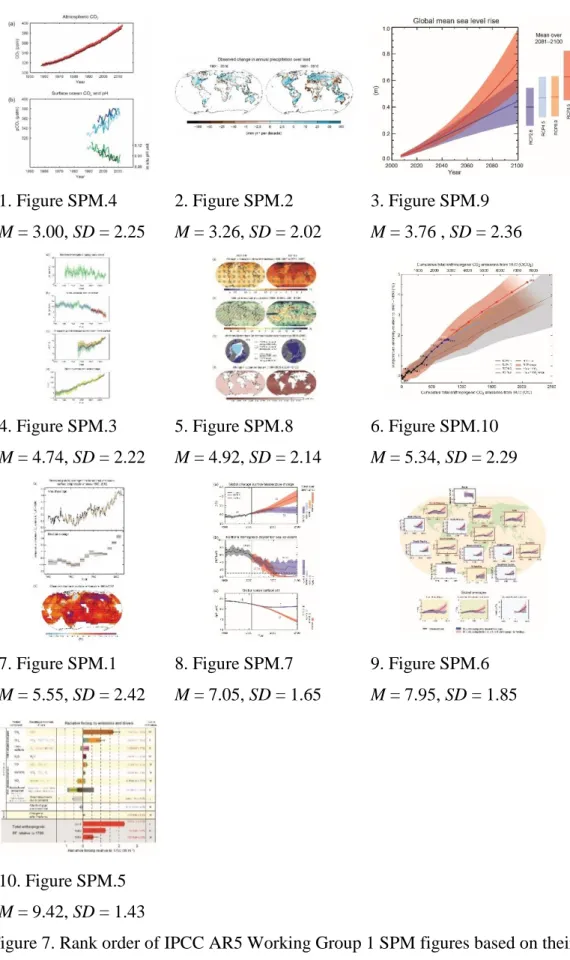
Figure 7. Rank order of IPCC AR5 Working Group 1 SPM figures based on their perceived ease of comprehension across all undergraduates – figures are shown from easiest (rank 1) to most difficult (rank 10). Mean and standard deviation of the ranks are provided under each figure.
Figure 8. Rank order, across all experts, for IPCC AR5 Working Group 1 SPM figures based on their importance to inform future policy. Figures shown from most important (rank 1) to least important (rank 10). Mean and standard deviation of the ranks are provided under each figure.
Figure 9. Subband entropy scores for each figures, numbered from the least cluttered (lowest subband entropy score) through to the most cluttered figure (highest subband entropy score).
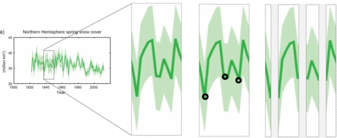
Figure 10. Figure SPM.3, panel a, showing extent of Northern Hemisphere March-April (spring) average snow cover; time-series show annual values, and where assessed, uncertainties are indicated by coloured shading. Reproduced from IPCC, 2013a.
Figure 11. Schematic of how part of a complex line (solid green line) might be decomposed into chunks by segmenting the line at points of local curvature extrema. Black circles in middle box indicate points at which the connected line may be segmented. Right-hand box shows the resulting segmentation. In this example, for simplicity, it is assumed that the area under the line is foreground and the area above the line background, to determine locations of local curvature extrema. Figure shown is Figure SPM.3 reproduced from IPCC, 2013a.
Figure 12: Presentation of experimental trial.
Figure 13: Three examples of study graphs (solid line) and associated test graphs (dashed line) shown here together. Study and test graphs both used solid lines for stimuli presentation and were shown sequentially in the experiment.
Figure 14: Line of best-fit AOI and extreme data AOI for one of the 24 study graphs.
Figure 15: Presentation of same-different and filler trials.
Figure 16: Average sensitivity (d') for amplitude different and gradient different trials in each group, with 95% confidence intervals.
Figure 17. Comparison of interaction between test graph and warning in Study 5 (left) and Study 6 (right). Error bars represent 95% confidence intervals. Note: d’ values are generally greater in Study 6 than Study 5 as expected as stimuli were adapted to in Study 6 to reduce the potential for floor effects. The pattern of differences between conditions data is consistent across both experiments.
Figure 18. Average sensitivity (d') for amplitude and gradient trials by informational content in Study 6, with 95% confidence intervals. Error bars represent 95% confidence intervals.
Figure 19. Interaction between test graph and informational content in Study 6, including the no warning group. Error bars represent 95% confidence intervals. Figure 20. Yearly global mean surface temperature anomalies (relative to 1961– 1990) between 1975 and 2009. Grey shaded area indicates period of supposed pause between 1998 and 2009. Data from HadCRUT4.
Figure 21. Examples of graph stimuli, showing the three levels of recent data for a graph with a positive global trend, and an example of trend line added.
Figure 22. Example of the probe locations in relation to one of the graph stimuli. Note: only one probe appeared on any given trial in the experiment.
Figure 23. Summary of a trial.
Figure 24. Worked example of the calculation of the mean location of
expectations for one participant and one cell of the study design. Each box in the ‘Yes’ responses column represented a single trial where a response was given; crosses in boxes indicates a ‘yes’ response to that trial; empty boxes indicates a ‘no’ response to that trial.
Figure 25. Interaction between trend line and global trend direction. Vertical dark grey bars indicate the 95% confidence interval for the mean location of
expectation distributions. Vertical line at probe location 0 provided as a reference point. Light grey shaded areas indicate the full distribution of ‘yes’ responses for each condition.
Figure 26. Interaction between trend line and recent data. Vertical dark grey bars indicate the 95% confidence interval for the mean location of expectation
distributions. Vertical line at probe location 0 provided as a reference point. Light grey shaded areas indicate the full distribution of ‘yes’ responses for each
Figure 27. Example of ‘arrow present’ stimuli.
Figure 28. No interaction between arrow and global trend direction. Vertical dark grey bars indicate the 95% confidence interval for the mean location of
expectation distributions. Vertical line at probe location 0 provided as a reference point. Light grey shaded areas indicate the full distribution of ‘yes’ responses for each condition.
Figure 29. No interaction between arrow and recent data. Vertical dark grey bars indicate the 95% confidence interval for the mean location of expectation
distributions. Vertical line at probe location 0 provided as a reference point. Light grey shaded areas indicate the full distribution of ‘yes’ responses for each
condition.
Figure 30. Example of vertical graph stimuli.
Figure 31. No interaction between orientation and global trend direction. Vertical dark grey bars indicate the 95% confidence interval for the mean location of expectation distributions. Vertical line at probe location 0 provided as a reference point. Light grey shaded areas indicate the full distribution of ‘yes’ responses for each condition.
Figure 32. No interaction between orientation and recent data. Vertical dark grey bars indicate the 95% confidence interval for the mean location of expectation distributions. Vertical line at probe location 0 provided as a reference point. Light grey shaded areas indicate the full distribution of ‘yes’ responses for each
Acknowledgements and declarations
I would to thank my supervisors, Prof Kenny R. Coventry, Dr Irene Lorenzoni and Dr Thomas F. Shipley for their guidance and support throughout the PhD. I would also like to thank colleagues within the Tyndall Centre for Climate Change Research, particularly Asher Minns and Prof Corinne Le Quéré, for reflective discussions, which have helped to inform my thinking. Furthermore, I am very grateful to Jackie Orford for her help in coordinating and facilitating
administrative aspects related to the PhD work. In addition, I would like to thank Isla Harold and Peter Harold for their support and their willingness to act as a sounding board throughout my studies.
The candidate has not previously submitted any of this work towards the award of a degree.
Some of the work contained within this thesis has been communicated to the scientific community via publications. In all instances Jordan Harold was the primary author who drafted the text, which was then provided for secondary authors’ review and input.
Parts of Chapter 1 and 5 are presented in Harold, Lorenzoni, Shipley and Coventry (2016) and Studies 4 and 5 are presented in Harold, Coventry, Lorenzoni and Shipley (2015).
Harold, J., Lorenzoni, I., Shipley, T. F. & Coventry, K. R. (2016) Cognitive and psychological science insights to improve climate change data visualization. Nature Climate Change, 6, 1080-1089.
Harold, J., Coventry, K. R., Lorenzoni, I., & Shipley, T. F. Making Sense of Time-Series Data: How Language Can Help Identify Long-Term Trends. In Noelle, D. C., Dale, R., Warlaumont, A. S., Yoshimi, J., Matlock, T., Jennings, C. D., & Maglio, P. P. (Eds.) (2015). Proceedings of the 37th Annual Meeting of the Cognitive Science Society. Austin, TX: Cognitive Science Society; pp 872-77.
Chapter 1: Introduction
This introductory chapter presents a summary of why there is a need to support improved communication of climate science through data visualisations, followed by a review of relevant psychological and cognitive science evidence to help inform how data visualisations could be enhanced to support readers’
comprehension. The chapter ends by stating the overarching goals of the research presented in this thesis and an overview of the thesis chapters.
Visualising data is integral to modern scientific practice. Scientists create visualisations to explore and analyse data and to communicate the findings of those analyses to others. In academic contexts, data visualisations for
communication readily bring to mind scientifically rigorous figures published in journal articles (typically read by other scientific experts). However, scientific endeavour is also a social endeavour; research is often funded by society, is usually directly or indirectly relevant to society, and scientific findings often have the potential to change society. Critically, for science to be useful to society, scientific findings need be communicated with society – as emphasised by the UK Government Chief Scientific Advisor, Sir Mark Walport, stating that,“Science isn’t finished until it’s communicated” (Ewles, 2013, pp. 1). Scientific data
visualisations have the potential to support understanding of scientific information within society, and in turn, support societal decision-making. However, data visualisations are only effective for communication if they are understood, especially if communication is to support decision-making and action.
Take climate change for example, where greenhouse gas emissions from human activities are causing the world to warm, resulting in widespread impacts to natural and human systems (IPCC, 2014a). Over recent decades, scientific research about the causes and impacts of climate change has grown rapidly (Minx et al., 2017), identifying that mitigating and/or adapting to a changing climate will require large-scale action across society (IPCC, 2014a). The Intergovernmental Panel on Climate Change (IPCC) are tasked by governments (under the
climate change, its impacts, and options for society to mitigate and adapt to a changing climate. Assessments by the IPCC are typically published every 5-7 years, and contain scientific data visualisations to support their communication.
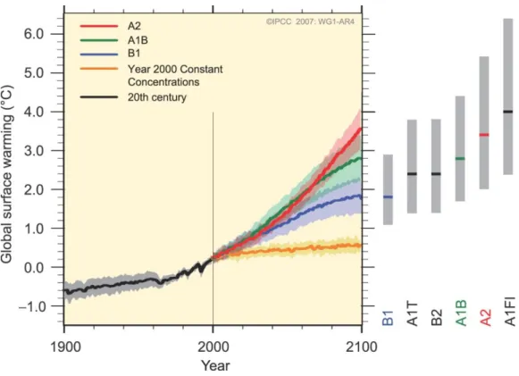
However, the data visualisations of IPCC reports have been criticised for being inaccessible to non-expert audiences (acknowledged by the IPCC, see IPCC, 2016) and evidence suggests that these criticisms are valid. For example, non-expert viewers tasked with interpreting an IPCC figure of climate model projections struggled to understand it as intended by the authors of the figure (McMahon, Stauffacher, & Knutti, 2015). In this study, novice readers (academics in disciplines other than climate change, and governmental
representatives) and expert readers (climate science academics) were tasked with interpreting a figure showing projected global surface warming under different scenarios through to the year 2100 (Figure 1). Novice readers typically failed to identify uncertainty related to scenarios (represented in the figure by the spread of the scenario projections – i.e. the range between the lower orange line and the upper red line), and instead attributed the uncertainty in projections to climate models. This suggests a failure of the figure to communicate an important
message – namely that uncertainty in future warming is primarily due to uncertain societal choices and not due to uncertainty in climate models.
Figure 1. Figure SPM.5 from IPCC Fourth Assessment Report, Working Group 1, Summary for Policy Makers (IPCC, 2007).
Original figure caption: Solid lines are multi-model global averages of surface warming (relative to 1980–1999) for the scenarios A2, A1B and B1, shown as continuations of the 20th century simulations. Shading denotes the ±1 standard deviation range of individual model annual averages. The orange line is for the experiment where concentrations were held constant at year 2000 values. The grey bars at right indicate the best estimate (solid line within each bar) and the likely range assessed for the six SRES marker scenarios. The assessment of the best estimate and likely ranges in the grey bars includes the AOGCMs in the left part of the figure, as well as results from a hierarchy of independent models and observational constraints.
Uncertainty is particularly challenging to visually synthesize and represent in climate knowledge, and there is a diversity in normative judgements about the implications of such uncertainties (Mahoney & Hulme, 2012). Furthermore, climate scientists and non-experts may also use different strategies to create
meaning from climate science data visualisations (Stofer & Che, 2014). In this study experts (oceanographers) and non-experts interpreted thematic maps showing oceanographic data, such as surface sea temperature, while being eye-tracked. Experts were found to make more fixations (which were on average shorter in duration) than non-experts on each visualisation, suggesting greater “meaning-making” (Stofer & Che, 2014, pp. 7). Furthermore, data visualisations of the same data represented in various visual styles have been shown to
differentially influence judgements about future climate (Daron, et al., 2015). These data indicate that comprehension of scientific figures depends not only on the visual content of a visualisation, but also on parameters related to the viewer.
As outlined, there is an unmet need to support improved communication of climate science with society. One of the goals of the cognitive and
psychological sciences is to understand how people comprehend written and visual information. Therefore, the evidence-base from these disciplines can offer potential solutions to support the communication of scientific data in data
visualisations in contexts such as climate change. This chapter next reviews evidence from the cognitive and psychological sciences about how people
construct meaning from a scientific figure and evidence relevant to enhancing the accessibility (i.e. ease of comprehension) of climate science figures, such that they can be more easily understood by non-expert audiences.
Cognition for scientific data visualisations
Data visualisations are often an effective way to communicate data - not only can they store and organise data efficiently, but they enable us to think about the data using visual perception (Hegarty, 2011). Representing data visually can create patterns that the human visual system can easily process (e.g. the iconic climate change ‘hockey-stick’ graph). However, data visualisations are not direct representations of reality; the meaning of the data they represent must be
interpreted by the viewer.
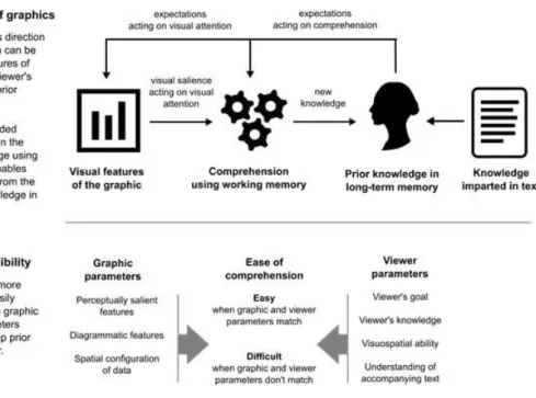
Cognitive models of the comprehension of visual displays, including data visualisations such as scientific figures, posit that both the visual features of the
display, and an individual’s prior knowledge, influence comprehension (Pinker, 1990; Freedman & Shah, 2002; Trickett & Trafton, 2006) (Figure 2). First, sensory processes direct the eyes to specific features of the display. Visual attention determines which features of the display the viewer looks at. Features that are visually salient (e.g. by virtue of their colour, shape, size) can draw the attention of the viewer – known as bottom-up visual processing. Conversely, the viewer’s expectations, driven by prior knowledge (their previous experience of the world, and their goal or reason for looking at the display), can also direct visual attention – top-down visual processing (Figure 2a) (Pinker, 1990). As visual information is perceived from the features of the display, a mental
representation of the information is created in memory. The nature of the mental representation is influenced by prior knowledge and goals and is constantly updated as the viewer visually explores the display (Freedman & Shah, 2002; Hegarty, 2011).
These cognitive processes are cyclical in nature; perceived and mentally represented information acts on expectations, which in turn direct further
exploration of the display (Neisser, 1976). The human brain is thought to support cognition by constantly trying to match incoming sensory information against predictions of what to expect (Clark, 2013). When perceived information matches our expectations, comprehension is easy. Accessibility of a display can therefore be improved by matching visual features and prior knowledge (Figure 2b).
Figure 2: Conceptual overview of the process of comprehension for data visualisations and approaches to improving accessibility.
Importantly, alternative representations of a dataset that are informationally equivalent, i.e. contain the same information, are not
computationally equivalent in terms of the cognitive processes involved in their comprehension (Larkin & Simon, 1987). Visualising data in graphical formats can ‘augment’ cognition, afforded by the human visual system (Hegarty, 2011; Scaife & Rogers, 1996). First, displays can meaningfully organise information in a spatial array, grouping similar aspects of the data in close spatial proximity (Larkin & Simon, 1987; Wickens & Carswell, 1995). Consequently, scientific data visualisations can provide structure to the data. Second, this visual structure can be relatively easily encoded by the human perceptual system (Scaife & Rogers, 1996). Patterns in the data can emerge when the data are visualised, such as trends in line graphs via connected lines (Hegarty, 2011). In contrast to a data visualisation, extracting such patterns from numerical or textual presentations of the data requires effortful cognitive processing (Larkin & Simon, 1987).
While existing cognitive models provide a useful framework to consider how individuals comprehend scientific figures, the nature of the cognitive processes involved in integrating perceived visual information with prior
knowledge, and the nature of mental representations in these processes, are to a large extent under-defined. For example, individuals may need to mentally animate internal representations to support inference-making and therefore it has been suggested that cognitive models should integrate a spatial processing component (Trickett & Trafton, 2006). Furthermore, cognitive insights that fall under the broad banners of ‘bottom-up visual perception’ and ‘top-down knowledge’ are rich and diverse. Identifying relevant insights from the broader cognitive and psychological literatures therefore has the potential to inform how visual parameters and viewer parameters can be better matched to support comprehension of data visualisations (Figure 2b).
Intuitions for effective data visualisations
Prior to considering the broader psychology and cognitive science literature relevant to supporting comprehension of scientific figures, it is worthwhile to briefly consider to what extent designers and viewers of data visualisations have an intuitive awareness of what makes an effective visual for communication. This is particularly relevant to scientific domains where advances in computing and software technologies have enabled scientists to create a wide-range of visual representations, as is the case in climate science (Nocke, et al., 2008). It is also important because representations may offer the viewer flexibility in how the data are displayed via interaction with the display. Such advances offer the potential to better match visual parameters to viewer parameters to improve accessibility. However, these advances also place demands on creators and viewers of data visualisations in terms of their competence in selecting effective visual representations of the data for the task at hand (diSessa, 2004).
Evidence suggests there may be limits to experts’ self-awareness
(metacognition) for creating or choosing effective visual representations of data. For example, some experts, as well as non-experts, show preferences for visual features that can actually impair comprehension, such as realistic features (Smallman & St John, 2005), 3D features (Zacks, et al.,1998), and extraneous variables in data (Hegarty, et al., 2009). Consequently, intuitions about good
design practices may not always match best practice informed by cognitive principles, and viewer preferences may not always be predictive of ease of comprehension. This highlights the potential for designing data visualisations with cognitive principles in mind, and testing them with viewers. Such an
approach offers an empirical approach to improving the visual communication of scientific data.
Improving accessibility of scientific data visualisations
This section reviews four key areas of psychological and cognitive science research relevant to improving the accessibility of data visualisations: directing visual attention; reducing visual complexity; supporting inference-making; and integrating text with data visualisations.
The role of visual attention
To understand the details of a data visualisation we use our central vision,
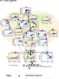
afforded by the fovea centralis, which provides greater acuity than our peripheral vision. The visual field of the fovea centralis is approximately two degrees of visual angle in diameter (Rayner, 2009), meaning that when viewing an image from a distance of 60 cm (such as on a computer screen at about arm’s length), our central vision covers an area approximately 2 cm wide. At any one moment in time our central vision can only focus on a limited area of a visual. Therefore, we move our eye gaze to sample information from different spatial locations (Figure 3a), and to build a detailed representation of the data visualisation as a whole we encode and retain information from these different spatial locations in memory. If visual features are not visually salient, they may not be attended to. For example, as shown in Figure 3, an individual may give little attention to the legend of data visualisation, preventing information in the legend being used to support
comprehension.
Limited cognitive resources mean that only a fraction of the rich visual information entering the eyes at any given point in time is meaningfully processed
and encoded to our internal representation in memory (Simons & Chabris, 1999). Where to look, and what information to process, is directed by visual attention. Consequently, if important details in a data visualisation are not captured by our attention, they will not be processed by the brain and will not be drawn on to help comprehend and interpret the data in the visual (Figure 3b). Directing visual attention to important details can therefore make data visualisations more accessible by supporting viewers to look at aspects of the visual that afford understanding.
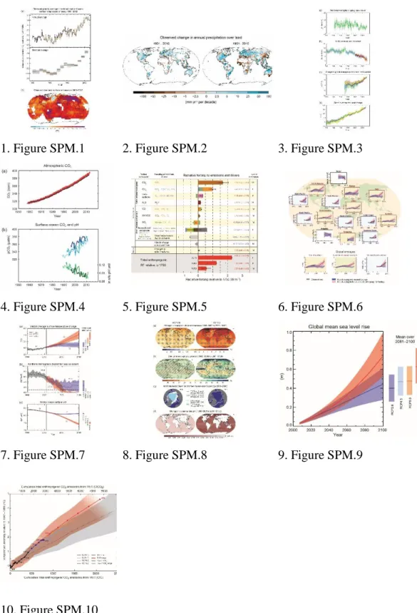
Figure 3. Example of visual attention for an IPCC figure for a non-expert viewer trying to interpret the data visualisation (measured using eye tracking: first 15 seconds of data shown). a: eye gaze shown as individual fixations and
connections between fixations; b: areas receiving visual attention; computed from the locations of the fixations, weighted by the duration of each fixation.
Figure shown is IPCC, AR5, Working Group 1, Figure SPM.6 (IPCC, 2013a), original figure caption: Comparison of observed and simulated climate change based on three large-scale indicators in the atmosphere, the cryosphere and the ocean: change in continental land surface air temperatures (yellow panels), Arctic and Antarctic September sea ice extent (white panels), and upper ocean heat
content in the major ocean basins (blue panels). Global average changes are also given. Anomalies are given relative to 1880–1919 for surface temperatures, 1960–1980 for ocean heat content and 1979–1999 for sea ice. All time-series are decadal averages, plotted at the centre of the decade. For temperature panels, observations are dashed lines if the spatial coverage of areas being examined is below 50%. For ocean heat content and sea ice panels the solid line is where the coverage of data is good and higher in quality, and the dashed line is where the data coverage is only adequate, and thus, uncertainty is larger. Model results shown are Coupled Model Intercomparison Project Phase 5 (CMIP5) multi-model ensemble ranges, with shaded bands indicating the 5 to 95% confidence intervals.
Directing attention by visual design
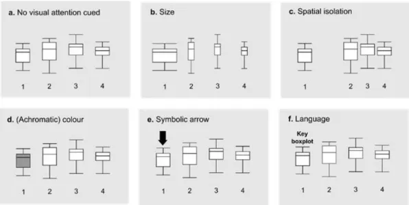
Visual properties that can capture attention by acting on bottom-up perceptual processing include colour, motion, orientation and size (Wolfe & Horowitz, 2004). In addition, there are well-documented ‘Gestalt’ principles governing how individual elements in a visual are grouped together psychologically into
meaningful entities (Bruce, Green, & Georgeson, 2003). When elements of a visual show a large degree of contrast in these properties, the contrasting visual information is automatically captured by attention and appears to ‘pop-out’ from the display (Figure 4b-4d).
Another way to direct attention is through the use of arrows. Arrows are the symbolic visual equivalent of pointing gestures, which have a widely accepted meaning of ‘look here’ and are thought to direct attention automatically
(Hommel, et al., 2001). They can therefore be particularly efficient visual cues to establish joint attention between the author and the viewer for specific features in a data visualisation (Figure 4e). Of course, arrows also have other uses – such as denoting motion or temporal change – and one has to be careful not to use arrows to denote different operations within the same data visualisation.
Using these properties in the visual design of climate science figures can therefore help guide attention. Particular visual properties (or combinations of
these properties) to direct attention may be more suited than others, depending on the context in which they are used.
Informed by human behaviour and neuroscience, computational models of ‘bottom-up’ visual attention have been able to accurately predict which features of an image are most likely to be attended to (Itti & Koch, 2001). Such models provide immediate assessments of visually salient features of a visual display, and might be useful to inform the design process (Rosenholtz, Dorai, Freeman, 2011). To check viewers’ actual visual attention for a data visualisation, eye-tracking can provide empirical evidence to inform visual design. For example, eye tracking has been used to observe differences in the eye movements of individuals who were successful or unsuccessful in solving a problem scenario depicted in a visual display; visual elements that supported problem solving could then be made more visually salient (Grant & Spivey, 2003).
Figure 4. Schematic of properties known to direct visual attention that can be used in the design of data visualisations to help direct viewers’ attention to important information.
Directing attention by informing expectation
The details that are looked at within a data visualisation can also be directed by expectations about the task at hand. For example, patterns of eye gaze are
different when viewers search a visual display for a specific feature, compared to when they try to memorise the visual display as a whole (Henderson, Weeks, & Hollingworth, 1999), or when a map is studied to learn routes as opposed to the overall layout (Brunyé & Taylor, 2009). Explicitly stating the intended task for which the data visualisation was created can help guide viewers’ visual attention to appropriate information. Furthermore, prior knowledge about the data, and prior knowledge about the format or type of data visualisation chosen to represent the data, can also influence a viewer’s cognition (Carpenter & Shah, 1998;
Peebles & Cheng, 2003).
Research on the comprehension of meteorological charts has shown that providing viewers with relevant knowledge can support attention by directing it towards task-relevant features and away from task-irrelevant features (Hegarty, Canham, & Fabrikant, 2010). Furthermore, making task-relevant features visually salient by adapting visual design may enhance performance once appropriate knowledge is provided(Hegarty, Canham, & Fabrikant, 2010). Hence the interaction between bottom-up perceptual processing and top-down attentional control should be considered when designing data visualisations, with particular consideration given to what knowledge the viewer needs to correctly interpret the data.
Handling complexity
Some climate science figures are more visually complex than others. For example, ensemble datasets of climate models can be particularly complex and challenging to visualise (Potter, et al., 2009). What is visual complexity, and how can complexity be handled to enable data visualisations to be more accessible? Possible components that might contribute towards defining and measuring visual complexity include the number of variables and/or data points in a data
relationships represented by the data (Carpenter & Shah, 1998), or the degree to which the data are organised to make relevant relationships in the data easier to identify (Shah, Mayer, & Hegarty, 1999). However, while these components might be informative for simple data visualisations, they may not be easily applied across the diverse types of figures used to communicate climate science, and may not always be predictive of comprehension. For example, in some instances an increasing number of data points might make patterns in the data more obvious.
An alternative proxy for visual complexity is ‘visual clutter’, where excess visual information, or a lack of organisation of that information, impairs cognition (Rosenholtz, Li, & Nakano, 2007). Excess visual clutter can increase the time it takes to search for an item (Neider & Zelinsky, 2011), increase errors in
judgments (Baldassi, Megna, & Burr, 2006), and impair processing of language accompanying a visual display (Coco & Keller, 2009). Computer models, based on principles of human cognition, can assess data visualisations for visual clutter and have been validated against viewers’ actual performance when undertaking simple tasks with data visualisations, such as searching for a specific feature (Rosenholtz, Li, & Nakano, 2007). Although such models have yet to be established as offering diagnostic value in identifying comprehension problems with data visualisations, they can be useful to inform the design process by comparing different design options for a given data visualisation (Rosenholtz, Dorai, & Freeman, 2011).
One approach to avoid unnecessary visual complexity is to only include information in a data visualisation that is absolutely needed for the intended purpose (Kosslyn, 2006). However, climate science figures may need to contain a certain level of detail or information to maintain scientific integrity (i.e. to
accurately represent the extent of, or limits to, scientific knowledge). Such figures may still be visually complex in spite of only showing important information. While experts can integrate complex visual features into meaningful units of information (perceptual ‘chunks’), non-experts may lack such skills (Chase & Simon, 1973). Hence, segmenting information into chunks of appropriate size and difficulty, and guiding viewers’ attention to connections between these
components could make comprehension of the data easier (Gobet, 2005).
However, such an approach should be taken with care. If the task expected of the viewer is to compare or contrast data represented in a data visualisation (known as ‘integrative tasks’), then this may be more easily performed when the data to be compared share representational similarities, such as close spatial proximity, or the same colour (Wickens & Carswell, 1995).
Supporting inference-making
Comprehension of a data visualisations of climate data goes beyond just
perceptual processing of visual features. For example, enabling viewers to make relevant and scientifically robust inferences from data might be preferable to merely stating intended inferences in the accompanying text of a figure.
Furthermore, data visualisations are not only used to impart information, they can also be used to support sense-making and guide decision-making. In the context of the science-policy interface, this is indeed one of the goals of science
communication and aligns with the IPCC’s remit of being policy-relevant and not policy prescriptive (IPCC, 2016).
Improving accessibility to climate science data visualisations therefore involves supporting viewers to make appropriate inferences. Symbolic elements in diagrams, such as lines, boxes, crosses and circles can support inference-making about relationships in the data, based on their geometric properties (Tversky, 2005). For example, lines indicate connections, while arrows can indicate dynamic, causal or functional information (Heiser & Tversky, 2006).
Inferences may also relate to the mappings between the visual features of the data visualisation and the data that they represent. Much of our cognition of conceptual ideas is thought to be metaphorical in nature (Lakoff & Johnson, 1980). For example, more of something is conceptualised in mind as up, and so temperature is said to be rising; similarly, financial concepts are used
metaphorically in speech with regards to limiting carbon emissions, i.e. having a carbon budget. Using mappings that match natural or cultural metaphors can therefore aid cognition (Lakoff & Johnson, 1980). For example, colour contains
symbolic meaning, with red usually associated with ‘warm’ and blue with ‘cold’ (Ho, et al., 2014) and indeed these colour choices are often used to represent temperature values in meteorological data visualisations. Metaphors often differ between cultures (Kövecses, 2005), and so choice of metaphors should be
informed by the target audience (see section below on tailoring data visualisations to different audiences).
How data are structured in a visualisation can influence the type of
information extracted, and in turn, what inferences are made about the data (Shah & Carpenter, 1995). For example, global climate projections are typically plotted as line graphs with time on the x-axis and the variable of interest (e.g. temperature anomaly) on the y-axis, which may direct viewers to consider given points in time and their associated temperature projections. Conversely, plotting temperature anomalies on the x-axis and time on the y-axis frames the data in terms of a projection of time for a given temperature threshold (Joshi, et al., 2011). Although in both cases the data are the same, the alternative graphical representations may result in viewers drawing different inferences.
Sometimes the viewer of a data visualisation may need to make inferences about the data that are not explicitly represented in the visual. Examples include making inferences about the uncertainty of the data (Trickett, et al, 2007), relationships across multiple data visualisations (Trafton, et al., 2000), and relationships between a theory and data in a visual (Trafton, Trickett, & Mintz, 2005). Such tasks involve spatial reasoning, i.e. the viewer must mentally infer information through spatial processes and transformations (Trafton, et al., 2002). In such cases, inferences can be supported either by explicitly showing the inferences in the data visualisation (and so removing the need for spatial processing), or by supporting viewers’ spatial reasoning, for example by using text accompanying the visual (see below).
Using text to support cognition
Visualisations of climate data are rarely used in isolation of accompanying text - text labels typically indicate the referents of the data, such as what the axes and
data points represent. In accordance with norms of scientific reporting, captions provide contextual information and are placed under figures, while the relevance of the figure and inferences that can be drawn from it are placed in the body text, sometimes spatially distant from the visual.
Separating text from data visualisations comes with a cognitive cost, known as the spatial contiguity effect (Mayer, 2009). When there is distance between the spatial locations of the text and corresponding visual, attention must be split between the two. The viewer must visually search for the corresponding elements (i.e. moving from text to visual, or vice versa) and then integrate both sources of information. Viewers may not exert effort to do this and instead may simply treat text and data visualisations as independent units of information and read them independently of one another (Holsanova, Holmberg, & Holmqvist, 2009). However, when the distance between text and visual is reduced, less searching is required, and connections can be more easily made, resulting in improved comprehension (Ginns, 2006). Tightly integrating text and data visualisations has been advocated as good design practice to support comprehension, i.e. embedding text within a visual (Figure 4f), or even embedding small data visualisations within text (Tufte, 2006).
Furthermore, language that accompanies a data visualisation has the potential not only to provide context, but also to influence thought about the spatial relationships of the properties of the visual. Tasks involving spatial relationships might include comparisons of temperature anomalies at different spatial locations on a map, inferring trends in data from observed time-series data (which spatially plot x-y relationships), or comparing uncertainty ranges for future projections of climate under different scenarios. These tasks all involve spatial cognition, i.e. thinking about spatial relationships. Attending to linguistic information while looking at visual information is known to influence spatial cognition, such as supporting spatial reasoning (Loewenstein & Gentner, 2005). Language can also influence the extent to which a static visual is mentally animated and the manner in which it is animated (Coventry, et al., 2013), which again might help with spatial reasoning. Accompanying text can therefore support viewers in making appropriate spatial inferences from a data visualisation.
Tailoring data visualisations to different audiences
So far, insights drawn from general principles of human cognition to help inform improved visual communication of climate science data have been considered. However, it is important to acknowledge that certain cognitive factors may differ between audience groups, and between individuals within those groups.
Colour is one area where there is marked individual and cultural variation. People who experience colour-blindness perceive colours differently from the general population and so colour choices for scientific figures should be carefully chosen to avoid perceptual difficulties (Light & Bartlein, 2004). The native language one speaks can also influence colour perception – the number of colour terms available in a language can influence colour discrimination (Thierry, et al., 2009), which might result in perceptual differences in the boundaries of colour-mapped data. Such problems can be avoided by using achromatic (e.g. greyscale) colour mappings in which data values are mapped to luminance rather than hue (Moreland, 2009), or by using colour scales that enable easy differentiation of colour (Harrower & Brewer, 2003).
As well as perceptual differences, there are also group differences in higher-level cognitive skills, such as spatial reasoning. Experts often have strong spatial reasoning skills, as has been shown in the geosciences (Shipley, et al., 2013), whereas spatial reasoning by non-experts may depend on their general visuospatial abilities (Hambrick, et al., 2012). Moreover, how attention is directed across a page exhibits marked cultural variations, with reading direction in a language (e.g. English – left to right; Arabic – right to left) associated with the direction of attention in visuospatial tasks (Shaki, Fischer, & Petrusic, 2009).
Other differences are more tied to an individual’s personal knowledge and experience. For example, prior experience can lead to a knowledge of ‘where to look’ and so can limit visual attention to specific spatial locations (Torralba, et al., 2006). Similarly, the extent of prior knowledge about the data being visualised and prior experience using specific graphical formats can influence the ease with which inferences can be drawn from data (Ratwani & Trafton, 2008). There can be trade-offs between using an unfamiliar graphical format that may be difficult
to initially interpret but which efficiently represents a set of data, and a more familiar format whose structure can easily be grasped but which may provide an inefficient representation of the data (Peebles & Cheng, 2003). Individuals may hold different and sometimes inaccurate mental models about complex scientific systems (Gentner & Gentner, 1983), such as the underlying physical principles of climate change (Sterman & Sweeney, 2007). Understanding a viewer’s existing mental model about the data and the systems from which the data originate can inform how they can best be supported to make scientifically robust inferences. While comprehension of a data visualisation can be dependent on such factors outlined above, the underlying mechanisms responsible for human cognition are shared by everyone. Hence, general principles drawn from human cognition can inform approaches to improve the accessibility of data
visualisations, but the specific way in which they are applied needs to be tailored. Consequently, testing of data visualisations is important to ensure they are
comprehensible to achieve the desired communication goals (McMahon, Stauffacher, & Knutti, 2015; Hegarty, 2011).
Gaps in current knowledge
Despite advances in our understanding of the comprehension of data
visualisations, there are important gaps in current knowledge that are of direct relevance to visualising climate data. Uncertainties of data can be difficult to communicate (Gigerenzer, et al., 2005; Budescu, Broomell, & Por, 2009). Although general principles have been proposed for visually communicating probabilistic uncertainty, the deep uncertainties of climate change, in which knowledge and values are often disputed and outcomes are dependent on human behaviour, may not easily translate into visual representations (Spiegelhalter, Pearson, & Short, 2011). Further research is needed on how different visual representations of uncertainty might support or hinder decision-making (Andrienko, 2010), and the cognitive processes involved in such tasks.
To provide decision-makers with access to data tailored to their needs, researchers and climate service providers are exploring the use of interactive
web-based data visualisations, such as The Climate Explorer (part of the U.S. Climate Resilience Toolkit) (toolkit.climate.gov) and The IMPACT2C web-atlas
(atlas.impact2c.eu). Interaction, such as filtering or highlighting task-relevant information (Crampton, 2002) has the potential to support comprehension. However, there can be large individual differences in the degree to which people use interactive functions and the extent to which they use these functions
effectively (Cohen & Hegarty, 2007); viewers require competence in meta-representational skills to make appropriate interactions (diSessa, 2004).
Consequently, unless viewers have the required skills, there may be limits to how useful interactive data visualisations are to support comprehension and
accessibility.
Both interactive data visualisations and animated data visualisations have been suggested to support the outreach of future IPCC assessments (IPCC, 2016). Research comparing static visuals with animated visuals is often confounded by additional information being provided in animated visuals; hence observed benefits of animation in some tasks may not be due to animation per se (Tversky, Morrison, & Betrancourt, 2002). In some cases animation may impair
comprehension (Mayer, et al., 2005). Viewers may extract perceptually salient information rather than task-relevant information from animations (Lowe, 1999; Lowe, 2003) and cognitive processing of the visual information may not be able to keep up with the pace of the animation (Hegarty, Kriz, & Cate, 2003; Lowe, 1999). Animating data visualisations might be beneficial in specific situations if cognitive demands of processing the information are factored into the design of such visuals (Griffin, et al., 2006). Providing an element of user-control offers the potential to overcome some of these information processing limitations
(Betrancourt, 2005). The decision to use an animated or interactive data
visualisations over a static visual should be informed by cognitive demands and task requirements, be designed taking cognitive principles into account, and be tested with viewers to check comprehension (Shipley, Fabrikant, & Lautenscütz, 2013).
Together with the gaps identified above, there are also limitations in the extent to which existing cognitive models (as outlined at the start of this chapter)
reflect cognitive processes involved in the comprehension of complex real-world data visualisations. The evidence-base on which existing cognitive models are based is largely drawn from studies involving comparatively simple datasets involving comparatively simple tasks (Hegarty, 2011). Consequently, there is a risk that theoretical work does not reflect the range of cognitive processes involved in more ecological valid contexts. This has led to calls to advance translational research between cognitive science and applied disciplines (Fisher, Green, & Arias-Hernández, 2011; Hegarty, 2011). Such an approach is gaining ground in disciplines such as cartography (Fabrikant, Hespanha, & Hegarty, 2010) and geoscience (Shipley, et al., 2013), but there remains an opportunity to do so in the context of climate science.
The purpose and outline of this thesis
The over-arching goal of this thesis is to advance understanding of cognition of scientific data visualisations (i.e. scientific figures) relevant to real-world contexts, using climate change and the work of the IPCC as an example. This is achieved through two strands of complimentary work. The first strand uses mixed methods to understand the goals, contexts and constraints of the IPCC’s
communication of climate change via scientific figures. The second strand uses experimental methods to elucidate cognitive processes involved in the
comprehension and interpretation of data visualisations, using stimuli inspired by, and analogous to, those used in real-world contexts. Here, inferences that are thought to require spatial processing are considered. Bringing the two strands together in this thesis provides two clear opportunities. First, the opportunity to draw on insights from real-world contexts to inform theoretical research on the comprehension of data visualisations. Second, the opportunity to translate research evidence from the cognitive and psychological sciences into practice to support communication of scientific knowledge within society - specifically in the context of IPCC communications.
Chapter 2 presents further context regarding the work of the IPCC and then presents evidence from interviews with IPCC authors to understand the
purpose of scientific figures in IPCC Summaries for Policy Makers (SPMs), who their intended audience is, and the context in which figures are communicated. This chapter also compares the views of experts and non-experts on the ease of comprehension of ten figures from an IPCC report to explore whether there may be differences between these groups.
Chapter 3 then investigates cognition for time-series graphs that exhibit both underlying trends and short term-variability (i.e. noise) in the data – analogous to graphs used in climate science to communicate patterns in climate data. Furthermore, this chapter also considers to what extent language (verbal instruction) might support cognition for inferring trends in noisy data.
Chapter 4 follows-on from the work in Chapter 3 by asking whether particular aspects of the data when plotted in time-series line graphs influences individuals’ expectations of how the data will evolve into the future. Here perceptual design features (trend lines, directional arrows, and the orientation of the graph), are also investigated to see to what extent they influence expectations for future data.
Chapter 5 discusses findings across the research studies and reflects on how the findings can help inform further research on cognition of scientific data visualisations. Research evidence is synthesised into a set of cognitively inspired guidelines to support producers of scientific figures to enhance the accessibility of their data visualisations while maintaining the scientific integrity of their content.
Chapter 2: Are there comprehension difficulties with
IPCC figures?
This chapter outlines the role of the IPCC and provides a brief review of the communication challenges associated with the outputs from the IPCC. Three associated studies are then presented, which together provide insights on how climate change data visualisations produced by the IPCC are communicated at the science-policy interface and potential challenges for their cognition.
Study 1 presents a thematic analysis of interviews with IPCC authors, identifying that a significant constraint when producing data visualisations for policy audiences is to ensure that scientific accuracy is upheld. Furthermore, the interviews highlight that data visualisations in the report are not designed for policy-makers or non-experts, but rather they are designed for other experts. Non-experts are expected to need the support of Non-experts to understand the data
visualisations.
Study 2 reports on a set of sort tasks involving the ten figures from the IPCC Working Group 1 Summary for Policy Makers (SPM) with the same group of experts in the interviews and with a group of non-experts (university
undergraduates). The results indicate that experts have a good appreciation of the types of figures that non-experts feel are more difficult to understand (relative to other figures in the report) and that some of the most policy-relevant figures are expected to be particularly difficult for non-experts to understand.
Study 3 then investigates whether non-experts’ perceptions of the ease of comprehension of the ten figures is associated with the visual complexity of the figures, as measured via a computational measure of visual clutter. Findings suggest that greater visual complexity is positively associated with greater perceived comprehension difficulties.
The IPCC have stated a desire to communicate outputs of future reports and assessments such that they can be understood by non-expert audiences (IPCC, 2016). The findings across these three studies highlight a need to develop
approaches to creating scientifically rigorous data visualisations that are more accessible to non-experts than those currently available.
The IPCC - background context
Reports by the IPCC provide robust scientific assessments of current knowledge regarding climate change, related to: the physical science basis (Working Group 1) (IPCC, 2013a); impacts and adaptation (Working Group 2) (IPCC, 2014b); and mitigation (Working Group 3) (IPCC, 2014c). Each working group produces their own report and, in addition, the IPCC produces a synthesis report summarising and integrating findings from across the three working groups (IPCC, 2014a). Each group report consists of underlying chapters which provide detailed
assessments, and a Summary for Policy Makers (SPM), designed to highlight key information to support governments in decision-making.
IPCC assessments are typically conducted every 5-7 years, with the most recent being the fifth assessment report (known as AR5), published in 2013-14 (IPCC 2014a). Reports are written by author teams, undergo extensive peer
review and are formally accepted by 195 national governments (IPCC, 2013b). As such, IPCC reports are held in high regard within the scientific community and by the national governments – the IPCC was a joint recipient of the Nobel Peace Prize in 2007 (IPCC, 2012) and the IPCC receives continued support via the United Nations (IPCC, 2013b) with the sixth assessment report commissioned for publication in 2021-22 (IPCC, 2017a). Furthermore, the release of IPCC reports attracts wide media coverage (Boykoff & Boykoff, 2007; Barkemeyer, et al., 2016) and commentary on social media (O’Neill et al., 2015; Newman, 2016), highlighting a high degree of societal interest in the work of the IPCC.
Communication challenges with IPCC reports
IPCC reports have been criticised for being inaccessible to many non-experts, with a particular focus on the complexity of the language used in the SPMs (Barkemeyer, et al., 2016; Hollin & Pearce, 2015; Budescu, et al., 2014). The
figures within SPMs (that is, data visualisations of scientific information in the form of graphs, diagrams, thematic maps and other visuals) may also be inaccessible to non-experts. For example, viewers looking at figures of climate model projections can confuse scenario uncertainty (that is, unknown future societal choices) with model uncertainty (McMahon, Stauffacher, & Knutti, 2015). There are also challenges in visually synthesizing and representing uncertainty in climate knowledge, and diversity in normative judgements about the implications of such uncertainties (Mahoney & Hulme, 2012). Accordingly, IPCC SPMs have been critiqued as being “summaries for wonks” (Black, 2015, pp. 282) – in other words, documents that can only be understood by experts, and which are not fit for purpose for use by policy makers, such as government ministers, or by the general public.
The IPCC is aware of the need to make information more accessible to broader audiences in society (IPCC, 2016). IPCC authors have responded directly to these criticisms, highlighting how communication of AR5 has changed since the publication of AR4 in 2007. For example, by providing headline statements for the Working Group 1 report, which consists of a concise (2-page) summary of the report (Stocker & Plattner, 2016); delivering press conferences with the media to explain key findings and answer questions (Jacobs, et al., 2015) and widening the provision of outreach activities, such as presenting key IPCC findings at various events (IPCC, 2016). In addition, organisations other than the IPCC create what are known as ‘derivative products’ (IPCC, 2016). These are communications that are adapted from IPCC materials for specific purposes and audiences – for example briefings for business (Symon, 2013). However, despite these efforts there still appears to be a disconnect between a demand for more accessible communication outputs and the IPCC’s supply of highly technical
communications (IPCC, 2016).
There are strong arguments for the IPCC to make reports more accessible to broader audiences beyond just experts. First, climate change is a societal issue that has profound implications across the world including on energy production, food security, biodiversity and health (IPCC, 2014a). Therefore, the work of the IPCC is highly relevant to broader society. Second, the work of the IPCC is
funded by national governments, via the United Nations (IPCC, 2013b), and so tax-payer money is spent enabling the IPCC to conduct their work. Therefore, broader society has a vested interest in IPCC outputs. Third, there is clearly an appetite from broader society to access information about climate change. Climate change issues regularly attract media coverage (Schmidt, Ivanova, & Schäfer, 2013) and there is growing demand for tailored climate information for decision-makers, for example within industry and local government (Vaughan & Dessai, 2014).
IPCC data visualisations
Data visualisation, in the form of scientific figures, is an integral component of the IPCC reports. Each SPM contains 8-14 figures capturing specific aspects of each working group’s assessment (IPCC, 2013a; IPCC 2014a; IPCC 2014b; IPCC 2014c). These figures, or a selection thereof, are typically presented at press conferences at the launch of the reports and are also re-used in slide kits provided by the IPCC (IPCC, 2016).
On the face of it, these figures appear to be created for policy makers, as per the name - ‘Summary for Policy Makers’ – would suggest. However, ‘policy-makers’ is a broad term that can encompass junior civil servants right through to senior politicians, who may work in wide range of diverse agencies, and whose role may vary; for example, they may be a decision-maker or an advisor (Tyler, 2013). The IPCC SPMs do not state specifically who the reports are aimed at, how they are intended to be used, or what prior knowledge is needed to understand and interpret them. Here it is important to note that national governments review and approve the SPMs, and so it may be the case that the IPCC and the national governments have an implicit knowledge of who the SPMs are created for, even if this isn’t explicitly stated.
One might assume that IPCC authors make active decisions and choices with regards to how climate science data and evidence are visually represented in the IPCC SPM figures. There may for example be norms and constraints that
influence design and communication choices. Therefore, to constructively critique the IPCC figures as communication devices and identify how they might be made easier to understand, it is important to first establish who they are intended to be used by, how they are intended to be used, and the main factors that influence how they are produced. Understanding these aspects will provide important context to the communication challenges when using data visualisation of climate science. This was the purpose of the three studies outlined in the next sections below.