T E C H N I C A L A D V A N C E
Open Access
Dynamical density delay maps: simple, new
method for visualising the behaviour of complex
systems
Anton Burykin
1, Madalena D Costa
1,2, Luca Citi
1,3and Ary L Goldberger
1,2*Abstract
Background:Physiologic signals, such as cardiac interbeat intervals, exhibit complex fluctuations. However, capturing important dynamical properties, including nonstationarities may not be feasible from conventional time series graphical representations.
Methods:We introduce a simple-to-implement visualisation method, termeddynamical density delay mapping (“D3-Map”technique)that provides an animated representation of a system’s dynamics. The method is based on a generalization of conventional two-dimensional (2D) Poincaré plots, which are scatter plots where each data point,x(n),in a time series is plotted against the adjacent one,x(n + 1). First, we divide the original time series,x(n) (n= 1,…,N), into a sequence of segments (windows). Next, for each segment, a three-dimensional (3D) Poincaré surface plot ofx(n), x(n+1), h[x(n),x(n+1)] is generated, in which the third dimension,h,represents the relative frequency of occurrence of each (x(n),x(n+1)) point. This 3D Poincaré surface is then chromatised by mapping the relative frequencyhvalues onto a colour scheme. We also generate a colourised 2D contour plot from each time series segment using the same colourmap scheme as for the 3D Poincaré surface. Finally, the original time series graph, the colourised 3D Poincaré surface plot, and its projection as a colourised 2D contour map for each segment, are animated to create the full“D3-Map.”
Results:We first exemplify the D3-Map method using the cardiac interbeat interval time series from a healthy subject during sleeping hours. The animations uncover complex dynamical changes, such as transitions between states, and the relative amount of time the system spends in each state. We also illustrate the utility of the method in detecting hidden temporal patterns in the heart rate dynamics of a patient with atrial fibrillation. The videos, as well as the source code, are made publicly available.
Conclusions:Animations based on density delay maps provide a new way of visualising dynamical properties of complex systems not apparent in time series graphs or standard Poincaré plot representations. Trainees in a variety of fields may find the animations useful as illustrations of fundamental but challenging concepts, such as
nonstationarity and multistability. For investigators, the method may facilitate data exploration.
Keywords:Atrial fibrillation, Delay map, Heart rate variability, Nonlinear dynamics, Poincaré plot, Sleep, Time series, Visualisation
* Correspondence:[email protected]
1Wyss Institute for Biologically Inspired Engineering at Harvard University,
Boston, MA 02115, USA
2Margret and H.A. Rey Institute of Nonlinear Dynamics in Physiology and
Medicine, Division of Interdisciplinary Medicine and Biotechnology, Beth Israel Deaconess Medical Center, Harvard Medical School, Boston MA 02215, USA
Full list of author information is available at the end of the article
Background
Physiologic and physical systems often generate highly complex output signals. An inherent feature of these signals is nonstationarity, defined as changes in their statistical properties (mean, variance, and higher moments) over time [1]. Furthermore, nonstationarities are important because they may contain information of both basic and trans-lational interest. However, conventional representations, such as time series graphs, may not fully capture these time-varying properties. This challenge motivates the deve-lopment of alternative ways to visualise the dynamics of complex time series.
We present a simple, new visualisation approach, based on the concept of delay maps, which highlights nonstatio-narities and related features. A classical delay map is the Poincaré plota[1], widely used in biomedicine by investi-gators probing heart rate variability [2]. Our dynamical density delay map method, termedD3-Map, extends this concept to generate animated, colourised two and three-dimensional representations.
This paper is intended to serve both as a theoretical intro-duction and a practical tutorial so that readers can recreate all the figures and animations using our data or their own. Therefore, all videos, data and source code are made pub-licly available (http://reylab.bidmc.harvard.edu/.D3Map/).
Although Poincaré plots are among the simplest rep-resentation of a system’s phase space [1], they may pro-vide important information about the dynamics. For illustration purposes here we use heartbeat time series, i.e., a sequence of consecutive ventricular interbeat (QRS) intervals (termed RR) intervals obtained from an electrocardiographic (ECG) recording [2]. However, our method is applicable to any time series of sufficient length.
A Poincaré plot (map) of a time series is the scatter plot of x(n)versusx(n + 1) or equivalently,x(n-1)versusx(n), hence the general term delay mapb [1-7]. In Figure 1 (top), we show the RR interval time series from a healthy subject during sleeping hours, along with its histogram and the standard (“black and white”) Poincaré plot. As de-scribed further below, this dataset was selected because it exhibits a common type of nonstationarity characterized by relatively abrupt changes of “state”. The “comet-like” shape of the Poincaré plot of the RR interval time series (Figure 1, top) indicates a statistical relationship between consecutive data points where a given RR interval is likely followed or preceded by one of similar duration. In fact, the spread of the data points in the direction perpendicu-lar to the diagonal of the Poincaré plot is a measure of the time series’local variance (“short term variability”).
To highlight the added information that Poincaré plots provide, we shuffled (randomised) the order of the RR intervals. The histogram for this shuffled time series is unchanged from that of the original signal. However, the Poincaré plot is dramatically altered by the breakdown of correlations caused by the randomisation procedure (Figure 1, bottom).
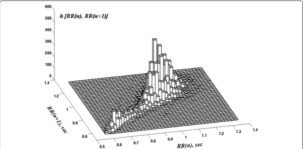
This example illustrates how the standard Poincaré plot resolves one limitation of the histogram, namely that the latter does not provide information aboutcorrelations among the data points. However, standard (“black and white”) Poincaré plots have a salient limitation of their own; namely, they do not capture information about the density of the data points. This limitation can be overcome by modifying the standard Poincaré plot to include the relative frequency of pairs of consecutive data points by constructing a 2D histogramc of RR(n), RR(n + 1) (Figure 2).
0 5000 10000 15000 20000
n 0.6 0.8 1 1.2 1.4 RR(n), sec Time series
0.6 0.8 1 1.2 1.4
RR(n), sec 0 0.4 0.8 1.2 1.6 2
Count (x 10
3 )
Histogram
0.6 0.8 1 1.2 1.4
RR(n), sec 0.6 0.8 1 1.2 1.4 RR(n+1), sec Poincaré plot
0 5000 10000 15000 20000
n 0.6 0.8 1 1.2 1.4 RR(n), sec
0.6 0.8 1 1.2 1.4
RR(n), sec 0 0.4 0.8 1.2 1.6 2 2.4
Count (x 10
3 )
0.6 0.8 1 1.2 1.4
RR(n), sec 0.6 0.8 1 1.2 1.4 RR(n+1), sec
However, even this so-called “3D Poincaré plot”omits information about the time evolution of a system’s namics. For example, consider a time series from a dy-namical system with two states, A and B. The 3D Poincaré plot constructed from the entire time series will be the same whether the system spends the first half of the time in state A and the second half in state B, or whether the system changes states on a much shorter time scale. Thus, the 3D Poincaré plot for the entire time series does not capture the time sequence of state changes. This limitation is particularly important when probing the dynamics of physiologic systems, which are typically non-stationary. Here, we introduce a visualization technique, termed D3-Map, based on a moving window analysis of the data.
Methods
The D3-Map approach consists of five simple steps:
I. Divide the initial time series into a sequence of either overlapping or non-overlapping segments. Here, we analyse overlapping segments selected using a 500 sec moving window, shifted 10 sec at a time.
II. For each data segment, construct a normalised 2D histogram of RR(n)vsRR(n + 1) and its contour map. Letmbe the number of counts in the highest bin of the histogram. The normalisation procedure consists of dividing the number of counts in each bin of the histogram bym.Here, we also opted for smoothing the histogram, using the dscatterdMatlab
function with the default parameter, which implements the method described in [8].
III.Colourise both the normalized 2D histogram and its contour map. In this implementation, we selected thejetcolourmap,ewhere blue represents the lowest and dark red-brown the highest density values, respectively. The colourised, normalised and smoothed 2D histogram of RR(n), RR(n + 1) is called the 3Dsurface Poincaré plot.
IV.In a single figure, present the 3D surface Poincaré plot, its colourised contour mapfand the graph of the original data segment used to generate them. V. Sequentially present the figures with the analysis of
each data segment as an animation [5]. Here, we used free video editing software VirtualDub (www. virtualdub.org) to create AVI movies and animated GIF images.g
The cardiac interbeat interval time series used in the ex-amples were from open-access, deidentified data freely available at the NIH-sponsored PhysioNet website (www. physionet.org) [9]. The links to the specific PhysioNet data sets used are indicated in parenthesis in the text below.
Results and discussion
org/physiobank/database/nsr2db/), which we chose be-cause it exhibits a type of nonstationarity characterised by relatively abrupt state transitions, which are commonly observed in the output of “free-running” physiologic signals.
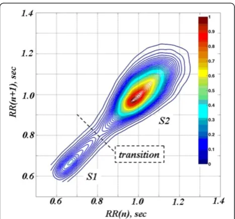
In this specific case, (Figure 3, colourised 2D contour plot), there are two states (termed S1 and S2), centered around RR intervals of 0.65 sec and 1 sec (corresponding to periods of faster and slower heart rates of about 92 beats/min and 60 beats/min, respectively). These two states likely correspond to different sleep stages [10]: the faster rates to periods of rapid eye movement (REM) sleep (or transient awakenings) and the slower rates to deeper sleep. A movie of the 2D contour plots (Anima-tion 1, Sleep2D.avi) providing informa(Anima-tion about the na-ture (rapid or gradual) of the transitions between the two states is included in the supplemental material. From a physiologic point of view, the“flipping”between these two states represents a highly nonstationary behav-ior, reminiscent ofbistability[11].
Figure 4 shows “snapshots” of the D3-Map animation included in the online supplementary material (Animation 2, Sleep3D.avi) for four different data segments. These snapshots demonstrate system transitions between differ-ent states over time. The D3-Map animations show that the states, themselves, are not static. Instead they appear Figure 3Colourised contour map for the time series presented
in the top panel of Figure 1.The relative density of each pair of points (RR(n), RR(n + 1)) is represented using thejetcolourmap. Two states, S1 and S2 (local density maxima), separated by a dashed line drawn through the region of minimum density, are discernable.
to consist of multiple sub-states, manifesting as local un-dulations in the 3D surface, which continuously emerge and disappear. This finding is not apparent from visual in-spection of the raw interbeat interval time series.
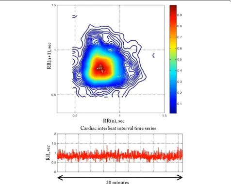
To further explore the utility of this visualisation method, we also show the analysis of cardiac interbeat interval time series from two patients with chronic atrial fibrillation, a common cardiac arrhythmia that may be associated with stroke or heart failure. The RR dynamics during atrial fibrillation are presumed to be random. In fact, clinicians use the expression “irregularly irregular” to describe the unpredictable timings of the heartbeat during this arrhythmia. This assumption is supported by the circular shape of the contour map in Figure 5 from the first of these subjects (dataset a1nn from http:// www.physionet.org/challenge/chaos/), which is typical of time series of uncorrelated values. The D3-Map movie (snapshot shown in Figure 6) shows that in this case, the dynamics is relatively stationary.
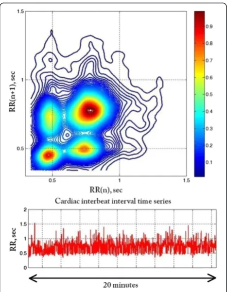
In contrast, for the second patient with chronic atrial fibrillation (dataset a2nn from http://www.physionet.org/ challenge/chaos/), the contour map (Figure 7) shows four loci of high density consistent with a more structured pat-tern of ventricular response, which are not readily dis-cerned from the time series. The structure centered around (0.4, 0.4) sec in the contour map indicates that the RR in-tervals fluctuate around 0.4 sec for at least three consecu-tive beats. Similarly, the structure centered around (0.8, 0.8) sec indicates that the RR intervals fluctuate around 0.8 sec for at least three consecutive beats. The changes from 0.4 to 0.8 and from 0.8 to 0.4, respectively, generate the structures centered around (0.4, 0.8) and (0.8, 0.4) sec. The D3-Map (snapshot shown in Figure 8) animation con-firms the dynamical nature of these fluctuation patterns.
This interesting and anomalous pattern of heartbeat timings during AF illustrated in Figures 7 and 8 has been noted by other investigators [12]. However, its elec-trophysiologic mechanism (possibly involving dual AV
Figure 5Colourised contour map (top) of the RR interval time series (bottom) from a patient with typical pattern of atrial fibrillation.
nodal pathways or His bundle alternans) and its bedside (diagnostic and prognostic) implications have not been fully addressed. (Clinical details are not available in the two cases presented here). The D3-Map visualization tool may help foster basic and clinical work on different dynamical subsets of AF, which in current practice are all grouped together.
Conclusions
We present a new animation method for visualising the temporal evolution of complex signal dynamics. For trainees, such simple-to-construct plots (termed “ D3-Maps”) may be used to illustrate technical concepts, such as nonstationarity and multistability, which are difficult to grasp, but essential to understanding the dynamics of physiologic control systems. In addition, the animations may reveal unexpected patterns in data structure, which make the D3-Maps useful in exploratory research, facili-tating hypothesis generation and development and testing of mathematical/physiologic models.
Animations
All animations are available at http://reylab.bidmc.har-vard.edu/.D3Map/.
Animation 1 (Sleep2D.avi) Movie of the 2D contour Poincare plots. Each frame shows both the colourised 2D contour plot and the 500 sec interbeat interval time series segment used to generate it. Movie frames were generated using "RR.dat" dataset (Additional file 1) and "Sleep2D.m" Matlab script (Additional file 2).
Animation 2 (Sleep3D.avi) D3-Map animation. Each frame shows a 500 sec interbeat interval time series seg-ment (bottom) and the corresponding colourised 3D surface Poincaré (top) and colourised 2D contour
(middle) maps. Movie frames were generated using "RR. dat" dataset (Additional file 1) and "Sleep3D.m" Matlab script (Additional file 3). Note: The duration of the Sleep2D.avi and Sleep3D.avi movies is 3 min 20 sec, repre-senting approximately 6 hours of heart rate dynamics ob-tained during sleep. A 500 sec moving window shifted 10 sec at a time was used to select the data segments dis-played in each frame.
Animation 3 (Typical_AF_2D.avi) Movie of the 2D con-tour Poincare plots for a patient with a typical pattern of atrial fibrillation. Each frame shows both the colourised 2D contour plot and the 1200 sec interbeat interval time series segment used to generate it. Movie frames were generated using "Typical_AF.dat" dataset (Additional file 4) and "Typical_AF_2D.m" Matlab script (Additional file 5).
Animation 4 (Typical_AF_3D.avi) D3-Map animation derived from the analysis of the RR interval time series of a patient with a typical pattern of atrial fibrillation. Each frame shows a 1200 sec interbeat interval time series segment (bottom) and the corresponding colourised 3D surface Poincaré (top) and colourised 2D contour (middle) maps. Movie frames were generated using "Typical_AF. dat" dataset (Additional file 4) and "Typical_AF_3D.m" Matlab script (Additional file 6).
Figure 7Colourised contour map (top) of the RR interval time series (bottom) from a patient with an atypical pattern of atrial fibrillation.
Animation 5 (Atypical_AF_3D.avi) Movie of the 2D contour Poincare plots for a patient with an atypical pat-tern of atrial fibrillation. Each frame shows both the colourised 2D contour plot and the 1200 sec interbeat interval time series segment used to generate it. Movie frames were generated using "Atypical_AF.dat" dataset (Additional file 7) and "Atypical_AF_2D.m" Matlab script (Additional file 8).
Animation 6 (Atypical_AF_3D.avi) D3-Map animation derived from the analysis of the RR interval time series of a patient with an atypical pattern of atrial fibrillation. Each frame shows a 1200 sec interbeat interval time series segment (bottom) and the corresponding colourised 3D surface Poincaré (top) and colourised 2D contour (middle) maps. Movie frames were generated using "Atypical_AF. dat" dataset (Additional file 7) and "Atypical_AF_3D.m" Matlab script (Additional file 9).
Note: The duration of the Typical_AF_2D.avi and Typica-l_AF_3D.avi movies is 56 sec, representing approximately 24 h of heart rate dynamics. The duration of the Atypica-l_AF_3D.avi, and Atypical_AF_3D.avi movies is 47 sec, representing approximately 20 h of heart rate dynamics. A 1200 sec moving window shifted 300 sec at a time was used to select the data segments displayed in each frame of the movies. All Matlab scripts listed above use dscatter2 Matlab function (Additional file 10) to calculate smoothed Poincare map.
Endnotes
a
The Poincaré plot is sometimes referred to as a Lorenz plot, a delay map, or a return map.
b
Matlab code for creating Poincaré plot from the se-quence of RR intervals is listed below:
data = load(‘RR.dat’); % load the Additional file 1 with the RR time series
RR = data(:,2); RRx = RR(1:end-1); RRy = RR(2:end); c
Due to the normalisation, the height of the 2D histo-gram is not exactly equivalent to the probability density, but represents a relative occupancy of the phase space mapped onto the [0:1] interval.
d
Available at www.mathworks.com/matlabcentral/fileex-change/8430-flow-cytometry-data-reader-and-visualisation.
e
A colourmap is defined as a specific chromatic sequence, which is linearly mapped onto the [0:1] interval, so any number between 0 and 1 corresponds to a particular colour.
f
Since we cannot see the“back”of the 3D surface Poin-caré plot, we included its 2D contour PoinPoin-caré plot in each figure.
g
We opted to create animations using stand-alone spe-cialised software, rather than Matlab see Appendix in ref. [13]. Specialised multimedia editing software has additional options for post-processing, such as compres-sion algorithms, annotation editing (e.g., adding extra frames with a movie title, explanatory text or subtitles), as well as audio (e.g., narrations or music).
Additional files
Additional file 1:(RR.dat).ASCII file with the cardiac interbeat (RR) intervals obtained from the electrocardiographic recording of a healthy subject during sleep (~6 hour long). This dataset was used to create Sleep2D.avi and Sleep3D.avi movies.
Additional file 2:(Sleep2D.m).Matlab script used to generate the frames of the Sleep2D.avi movie.
Additional file 3:(Sleep3D.m).Matlab script used to generate the frames of the Sleep3D.avi movie.
Additional file 4:(Typical_AF.dat).ASCII file with the cardiac interbeat (RR) intervals obtained from the electrocardiographic recording of a subject with atrial fibrillation.
Additional file 5:(Typical_AF_2D.m).Matlab script used to generate the frames of the Typical_AF_2D.avi movie.
Additional file 6:(Typical_AF_3D.m).Matlab script used to generate the frames of the Typical_AF_3D.avi movie.
Additional file 7:(Atypical_AF.dat).ASCII file with the cardiac interbeat (RR) intervals obtained from the electrocardiographic recording of a subject with atrial fibrillation, whose contour and D3 maps show atypical dynamical patterns.
Additional file 8:(Atypical_AF_2D.m).Matlab script used to generate the frames of the Atypical_AF_2D.avi movie.
Additional file 9:(Atypical_AF_3D.m).Matlab script used to generate the frames of the Atypical_AF_3D.avi movie.
Additional file 10:(dscatter2.m).Matlab function that creates a scatter plot coloured by density. This is a modified version of the original dscatter function http://www.mathworks.com/matlabcentral/
fileexchange/8430-flow-cytometry-data-reader-and-visualization/content/ dscatter.m. All Matlab scripts listed above use this function.
Abbreviations
D3-Map:Dynamical density delay map; HR: Heart rate.
Competing interests
The authors declare that they have no competing interests.
Authors’contributions
The conceptualization and initial implementation of the dynamical density delay map method were developed by AB, MDC and ALG. All four authors contributed to the refinement of the method, analysis of the findings and to the composition and editing of the manuscript. All authors have read and approved this manuscript.
Acknowledgments
We gratefully acknowledge support from the Wyss Institute for Biologically Inspired Engineering, the G. Harold and Leila Y. Mathers Charitable Foundation, the James S. McDonnell Foundation and the National Institutes of Health (grants R00AG030677 and R01GM104987).
Author details
1
Wyss Institute for Biologically Inspired Engineering at Harvard University, Boston, MA 02115, USA.2Margret and H.A. Rey Institute of Nonlinear Dynamics in Physiology and Medicine, Division of Interdisciplinary Medicine and Biotechnology, Beth Israel Deaconess Medical Center, Harvard Medical School, Boston, MA 02215, USA.3School of Computer Science and Electronic Engineering, University of Essex, Wivenhoe Park, Colchester CO4-3SQ, UK.
Received: 23 September 2013 Accepted: 6 January 2014 Published: 18 January 2014
References
1. Kantz H, Schreiber T:Nonlinear Time Series Analysis.Cambridge: Cambridge University Press; 1997.
2. Camm AJ, Malik M, Bigger JT, Breithardt G, Cerutti S,et al:Heart rate variability. Standards of measurement, physiological interpretation, and clinical use.Eur Heart J1996,17:354–381.
3. Brennan M, Palaniswami M, Kamen P:Do existing measures of Poincare plot geometry reflect nonlinear features of heart rate variability?
IEEE Trans Biomed Eng2001,48:1342–1347.
4. Piskorski J, Guzik P:Filtering Poincaré plots.CMST: Comput Meth Sci Tech
2005,11:39–48.
5. Piskorski J, Guzik P:Dynamic decomposition of Poincaré plots for multivariate analysis and visualization of simultaneously recorded physiological time series.CMST: Comp Meth Sci Tech2010,16:181–186. 6. Piskorski J, Guzik P:Geometry of the Poincare plot of RR intervals and its
asymmetry in healthy adults.Physiol Meas2007,28:287–300.
7. Piskorski J, Guzik P:Asymmetric properties of long-term and total heart rate variability.Med Biol Eng Comput2011,49:1289–1297.
8. Eilers PH, Goeman JJ:Enhancing scatterplots with smoothed densities.
Bioinformatics2004,20:623–628.
9. Goldberger AL, Amaral LAN, Glass L, Hausdorff JM, Ivanov PC, Mark RG, Mietus JE, Moody GB, Peng CK, Stanley HE:PhysioBank, PhysioToolkit, and PhysioNet: components of a new Research Resource for Complex Physiologic Signals.Circulation2000,101:e215–e220.
10. Tsuboi K, Deguchi A, Hagiwara H:Relationship between heart rate variability using Lorenz plot and sleep level.Conf Proc IEEE Eng Med Biol Soc2010,2010:5294–5297.
11. Gammaitoni L, Hanggi P, Jung P, Marchesoni F:Stochastic resonance.
Rev Mod Phys1998,70:223–287.
12. Climent AM, de la Salud GM, Husser D, Castells F, Millet J, Bollmann A: Poincare surface profiles of RR intervals: a novel noninvasive method for the evaluation of preferential AV nodal conduction during atrial fibrillation.Biomed Eng IEEE Trans Biomed Eng2009,56:433–442. 13. Burykin A, Peck T, Krejci V, Vannucci A, Kangrga I, Buchman TG:Toward
optimal display of physiologic status in critical care: I. Recreating bedside displays from archived physiologic data.J Crit Care2011,26(105):e101–e109.
doi:10.1186/1472-6947-14-6
Cite this article as:Burykinet al.:Dynamical density delay maps: simple, new method for visualising the behaviour of complex systems.BMC Medical Informatics and Decision Making201414:6.
Submit your next manuscript to BioMed Central and take full advantage of:
• Convenient online submission
• Thorough peer review
• No space constraints or color figure charges
• Immediate publication on acceptance
• Inclusion in PubMed, CAS, Scopus and Google Scholar
• Research which is freely available for redistribution
![Figure 1 Time series graph (left), histogram (center) and Poincaré plot (right) of the interbeat interval [RR(n)] time series derived froman electrocardiographic recording of a healthy subject during sleep (top) and from a randomized/shuffled sequence of t](https://thumb-us.123doks.com/thumbv2/123dok_us/569604.1552067/2.595.56.541.511.685/histogram-poincare-interbeat-electrocardiographic-recording-randomized-shuffled-sequence.webp)