How does this message make you feel?
A study of user perspectives on software
update/warning message design
Michael Fagan
*, Mohammad Maifi Hasan Khan and Nhan Nguyen
Background
Keeping computing systems up-to-date with the latest software and security updates [1–
4] is one of the most effective ways to prevent security attacks that often exploit known
software vulnerabilities [5–7]. Unfortunately, as software companies are constantly
try-ing to identify various security vulnerabilities and release fixes promptly, users often ignore recommended updates, exposing their systems to potential cyber-attack. As elim-inating human from the system maintenance loop is not an option and/or desirable in many cases, it is critical to understand the underlying reasons behind the widespread reluctance of users in updating their systems. Once identified, design choices can be
Abstract
Software update messages are commonly used to inform users about software updates, recent bug fixes, and various system vulnerabilities, and to suggest recom-mended actions (e.g., updating software). While various design features (e.g., update options, message layout, update message presentation) of these messages can influ-ence the actions taken by users, no prior study can be found that investigated users opinions regarding various design alternatives. To address this void, this paper focuses on identifying software update message design features (e.g., layout, color, content) that may affect users positively or negatively. Toward that, we conducted a user study where users are shown 13 software update messages along with 1 virus warning mes-sage. We collect responses from 155 users through an online survey. Participants gave a total of 809 positive comments and 866 negative comments along with ranking of each image in terms of perceived importance, noticeability, annoyance and confusion. As many of the comments are repetitive and often contain multiple themes, we manu-ally analyzed and performed a bottom-up, inductive coding to identify and refine the underlying themes. Over multiple iterations, positive comments were grouped into 52 categories which were subsequently grouped under four themes. Similarly, negative comments were first grouped into 38 categories which were subsequently grouped under four themes. Based on our analysis, we present the list of design features that are found to be highly correlated to confusion, annoyance, noticeability, and importance, either positively or negatively.
Keywords: Update message design, Affective-cognitive design, User opinions, User experiences
Open Access
© 2015 Fagan et al. This article is distributed under the terms of the Creative Commons Attribution 4.0 International License (http://
creativecommons.org/licenses/by/4.0/), which permits unrestricted use, distribution, and reproduction in any medium, provided you give appropriate credit to the original author(s) and the source, provide a link to the Creative Commons license, and indicate if changes were made.
RESEARCH
made when making software update messages to help them effectively communicate the risk of not updating and convince users to take the necessary actions voluntarily.
While recent efforts can be found that studied the complexity of software update
message content and pointed out that users are often confused by update messages [8],
we argue that message content is only one aspect of software update/warning mes-sage design and there are other design factors (e.g., layout, placement, color) that may also significantly affect user’s behavior which have not been studied. Inspired by prior
efforts [3, 4] and to address this void, this paper aims to identify design features that may
significantly influence the level of confusion, annoyance, noticeability, and perceived importance experienced by users once a software update message is delivered. Our analysis considers several variables which are all operationally defined in our study using
survey instruments and self-reported ratings, as explained in “Definition of variables”.
This report presents a study of 155 users using real software update and warning mes-sages. Each participant was shown 14 images in random order and asked to rate on a Likert scale how important, annoying, confusing, and noticeable he/she considered each message, as well as what they “liked” and “didn’t like” about each message in an open-ended format. The messages shown to participants varied in terms of software type/brand, message complexity, font size, background/feature color, button design, and offered features.
Our analysis centers on a bottom-up inductive coding to identify the underlying themes across comments left by participants and qualitative analysis of ratings left by participants for each message. Over multiple iterations, 809 positive comments were ini-tially grouped into 52 codes. Similarly, 866 negative comments were grouped into 38 codes. After further analysis, we identified that comments (both positive and negative) fell under one of the following themes: (1) design/layout, (2) message content, and (3) update mechanism. In addition to these three themes, users also left comments express-ing emotions toward updates and software brand in general, which we discuss separately in “General affective-cognitive considerations by participants”.
To summarize, in this paper we make the following key contributions:
1. We analyze and present the composition of themes derived from the coding analysis along with patterns noticed in the comments.
2. To identify the design features that are correlated to message noticeability, perceived importance, level of annoyance, and confusion caused by the message, we analyze the relationship between comment frequency and average participant ratings for each message.
3. We present evidence of the effect of prior experience on current behavior in response to software update and warning messages.
The rest of the paper is organized as follows: “Related work” describes prior research
that is related to our work. “Methods” explains the design of our data collection policy
and mechanism used in this paper. “Results” presents our Results and relate them back
to our paper’s central argument. “Limitations” discuss the limitations of our study along
Related work
Our work is motivated by prior work from other domains such as marketing research and communication theory that investigated the effect of various message design fea-tures on effective risk communication for consumer products such as poisons,
ciga-rettes, fire extinguishers, cars, and industrial equipment [9–16]. Specifically, prior
investigations looked into the impact of font size, contrasting colors, pictures, and audio
on salience and noticeability of warning messages [11, 16–19]. The effect of word choice,
layout, and placement on message effectiveness and level of perceived hazard have also
been studied [15, 20, 21]. Human factors such as personal attitudes, beliefs, past
expe-rience, and demographic variables such as age, gender, language, and ethnicity are all
shown to impact the effectiveness of warning message [8, 19, 21–23].
While a large volume of research exists that investigates the problem of designing effective warning messages in other domains, only a limited number of prior efforts can be found in the domain of software that primarily focus on analyzing the understand-ability of messages. Among these, one recent work investigated the effect of education level on understandability of computer warning messages, and reported that, on average, a user needs to have at least 10 years of education to understand the presented
mes-sages [8]. Another recent work reported that only 17 % paid attention to Android
per-mission settings while installing new mobile application software, and only 3 % showed
full comprehension of the messages [24], demonstrating widespread lack of
comprehen-sion and attention. Another work studied the affective-cognitive and linguistic aspects of software warning and security messages, and pointed out that the linguistic complexity
of messages is often related to the effect of attention, attitudes and beliefs [25]. All of
these cases point to deficiencies in the update message design and content since users should be able to easily understand these important messages.
Another team found large differences between actual changes made by updates and
the changes the participants thought were being made [4]. We argue that this failure to
grab attention and effectively communicate the intended information falls on the soft-ware messages and it is important to identify why users do not pay attention to and do not understand the messages.
These issues have prompted some to try and fix or avoid this disconnect between users and software companies. Several have looked into effective notification
strate-gies [3, 26, 27], but these studies mostly focus on how to manage the notification system
and not on the design of the message itself. An applicable lesson from these projects is that past experiences are very important to decision making when it comes to software
updates [3], as they find that bad experiences with a software’s updates will make users
less likely to apply updates for that software in the future.
Though proper message delivery is important to adherence, the design and commu-nication potential of those messages is also important. A notable redesign study altered smartphone application permission warnings by including real-life mobile data security risks (i.e., what information from the phone will be available based on the apps’
permis-sions) to make users more aware of privacy concerns [28]. The researchers found that
Finally, the authors of this paper have previously published a study examining opinions
of users about software updates from specific and different software packages [29]. That
investigation found that hesitation to apply updates and confusion with messages was common among the sampled users. Additionally, annoyance and confusion with mes-sages proved a predictor for hesitation to apply updates for some of the softwares tested. Finally, when comparing quantitative data gathered while users viewed the same images as in this study, that analysis found a correlation between how annoying and confus-ing users rated each message as well a correlation between importance and noticeability. This prior publication is of a different focus than this work and uses different analysis methods to make it’s argument (i.e., quantiative analysis). Data for both studies were col-lected together using the same survey, but this paper analyzes data not reported on in the prior work.
While there have been some recent study into the comprehension of security warn-ing and software update messages to some extent, the authors have found no study that specifically looked into the effect of message design features (e.g., layout, font, button designs) on the level of confusion, annoyance, noticeability, and perceived importance experienced by users once a message is delivered, which is the main focus of our study.
Methods
A multi-formatted survey was used to gather the opinions of participants about current software update and warning messages. Participants were shown a series of images, each a screen-shot of an update or warning message. While viewing the image, they were asked to rate their perception of four qualities: importance, annoyance, confusion, and
noticeability. The format of the questions asked to respondents can be seen in Table 1.
Responses to these questions were given on a 7-point Likert scale. Along with the scaled questions, participants were invited to describe, in an open-answer format what they “liked” and “didn’t like” about the message in the image.
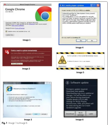
The images used included messages from well-known software companies such as Microsoft and Apple, and also included messages from software companies that are less well-known or popular (e.g., VLC media player). The samples of messages used contains 13 update messages and 1 virus warning message. Although the virus warning message is not an update message, it shares many similar characteristics with update messages: similar size and layout, explicitly mentioning immediate security threats, and asking users to take certain actions. Thus, we argue it’s inclusion in this study is appropriate since the goal is to identify user opinions about software messages that attempt to moti-vate the user to action, and both types of message (i.e., update and virus warning) fall
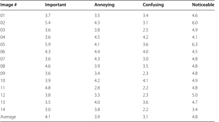
into this category. Images 1–6 can be seen in Fig. 1, Images 7–12 can be seen in Fig. 2,
and Images 13–14 can be seen in Fig. 3.
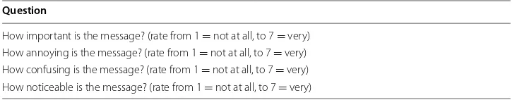
Table 1 Qualitative questions shown with update images Question
Fig. 1 Image 1 to Image 6
Sampling methodology
The flyer advertising the survey was distributed through university student and commu-nity email lists. We gathered 172 sets of responses during a two day period. Approxi-mately 155 of these were complete and were used in our analysis. The study was approved by the IRB and each participant received a $15 (USD) Amazon gift card for participation. To facilitate taking breaks while taking the survey, participants were required to create an account before beginning the survey. This allowed participants to leave in the middle of the survey and log back in later at their convenience. Respondents also provided email addresses for the purpose of compensation. Participation in the sur-vey was completely voluntary.
Definition of variables
Fig. 2 Image 7 to Image 12
Emotions evoked by specific messages (i.e., annoyance, confusion, importance, and
noticeability) are defined using the questions in Table 1. In this case, the emotion
men-tioned in the question is the emotion that question is used to measure. We also ana-lyze the update messages included in the study on several aspects. Broadly, they are design and layout, content, and delivery mechanism. Codes were developed to describe each of these categories for every message. Those codes are described in more detail in “Results”.
Results
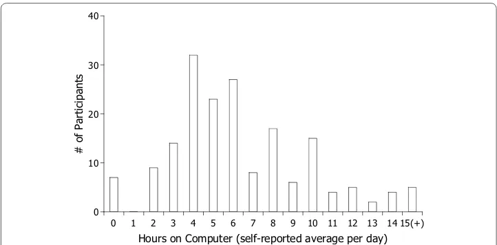
A total of 155 adults participated in the study. All were university students and staff recruited using email-lists that distributed our flyer to those populations. The sample population has a median age of 21 years. The average age is 22 years with a standard deviation of 5.4. 60 % of the respondents is female and 40 % is male. We asked partici-pants to report their average hours-per-day on a computer. Based on a scale from 0 to 24 h, the average response was 6.4 with a standard deviation of 3.6. The median response
was 6 h per day. Figure 4 shows the full distribution of participants’ responses to this
question.
As described in “Methods”, participants in our study were shown 14 images in series
and asked to rate how important, annoying, confusing, and noticeable they thought each message was. The average ranking of each image in these four categories are listed in
Table 2.
To identify the design features that may explain the image rankings, participants were also invited to express what they liked and did not like about each message in an open-answer, comment format. To help identify the underlying design features that are corre-lated to message noticeability, perceived importance, level of annoyance, and confusion caused by the message, we first performed a bottom-up inductive coding to identify the underlying themes across comments left by users. We discuss the results of this coding and tie them to the qualitative rankings collected for each image to help identify design
0 1 2 3 4 5 6 7 8 9 10 11 12 13 14 15(+) Hours on Computer (self-reported average per day) 0
10 20 30 40
# of Participants
features preferred and disliked by participants. To help bring context to these findings, we also relate each to results from a prior analysis of different data collected in the same survey as the data analyzed here.
Open‑answer response coding procedure
Bottom-up inductive coding was used to better understand the wealth of information contained in the comments collected. Participants left a total of 1676 comments, includ-ing 809 positive comments and 866 negative comments. Throughout this report, “posi-tive comments” and “nega“posi-tive comments” refers to responses to the prompt for comment regarding what participants “like” and “dislike” about each message, respectively.
The comments were first coded by a member of our lab who was unaffiliated with the design, implementation, and execution of the web-survey. From that process, we have 52 codes to describe the positive comments. The negative comments are described with 38 codes. These codings were then analyzed by the lead researcher and bottom-up induc-tive coding was used to summarize the initial codes into three broad themes: design/lay-out, message content, and update mechanism. The resulting process was then reviewed by a third member of our group for validity.
Summary of themes and qualitative codings
Positive and negative comments were coded and analyzed independently, so we organize our evaluation to appropriately separate the two analyses.
Design/layout features preferred by participants
Participants left a wide range of comments regarding various positive aspects of message design/layout such as color, font size, organization of information, button designs, and
win-dow size. Sample positive comments that are related to design/layout are listed in Table 3.
Some comments highlight the importance of selecting background color carefully to reduce the level of annoyance experienced by users. One example is:
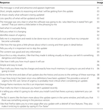
Table 2 Average ratings for each image
Image # Important Annoying Confusing Noticeable
01 3.7 3.5 3.4 4.6
02 5.4 4.3 3.1 6.0
03 3.6 3.8 2.5 4.9
04 3.6 4.5 4.2 4.1
05 5.9 4.1 3.6 6.3
06 4.3 4.4 4.0 4.5
07 3.6 4.3 3.0 4.8
08 4.6 3.9 3.5 4.8
09 3.6 3.4 2.3 4.8
10 3.9 4.2 4.1 4.9
11 4.8 2.8 2.2 4.8
12 3.8 3.3 2.3 5.0
13 3.5 4.0 3.6 4.7
14 3.0 3.8 2.2 3.4
“The blue background makes it look nicer and calmer. It makes it less annoying. (Image 3)”
Other comments highlight the effect of design symbols and patterns on the perceived level of importance of a message that can help to attract a user’s attention, for example:
“Symbol and yellow/black band gives clear indication this is important. (Image 5)” Moreover, numerous comments regarding the placement and design of buttons under-score the importance of well-designed buttons on usability, which also help to reduce the level of confusion.
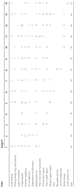
Coding analysis of the positive comments initially identified 18 codes that were later combined because they shared the common theme of design/layout. The frequency of these codes’ assignment to the positive comments left for each image tested can be
seen in Table 4. Comparing these values with the average rating for each image seen
in Table 2, it is interesting to see that Image 5 received the highest number of positive
design/layout comments while also having the highest rating for perceived importance and noticeability. On the other end of the spectrum, the image with the lowest number of positive comments, Image 4 received the highest ratings for annoyance and confusion. Table 3 Sample positive comments regarding various aspects of design/layout
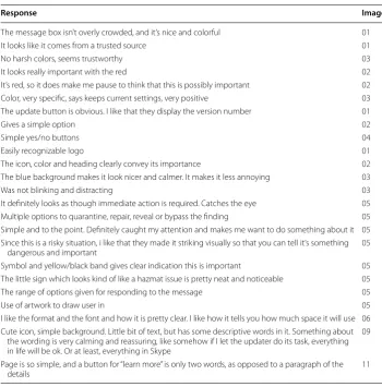
Response Image #
The message box isn’t overly crowded, and it’s nice and colorful 01
It looks like it comes from a trusted source 01
No harsh colors, seems trustworthy 03
It looks really important with the red 02
It’s red, so it does make me pause to think that this is possibly important 02
Color, very specific, says keeps current settings, very positive 03
The update button is obvious. I like that they display the version number 01
Gives a simple option 02
Simple yes/no buttons 04
Easily recognizable logo 01
The icon, color and heading clearly convey its importance 02
The blue background makes it look nicer and calmer. It makes it less annoying 03
Was not blinking and distracting 03
It definitely looks as though immediate action is required. Catches the eye 05
Multiple options to quarantine, repair, reveal or bypass the finding 05
Simple and to the point. Definitely caught my attention and makes me want to do something about it 05 Since this is a risky situation, i like that they made it striking visually so that you can tell it’s something
dangerous and important 05
Symbol and yellow/black band gives clear indication this is important 05
The little sign which looks kind of like a hazmat issue is pretty neat and noticeable 05
The range of options given for responding to the message 05
Use of artwork to draw user in 05
I like the format and the font and how it is pretty clear. I like how it tells you how much space it will use 06 Cute icon, simple background. Little bit of text, but has some descriptive words in it. Something about
the wording is very calming and reassuring, like somehow if I let the updater do its task, everything in life will be ok. Or at least, everything in Skype
09
Page is so simple, and a button for “learn more” is only two words, as opposed to a paragraph of the
Table 4 F requenc y of c ommen ts r egar ding p ositiv e asp ec ts of design/la yout f
or all 14 sample messages
Code
Image # 1
2 3 4 5 6 7 8 9 10 11 12 13 14 Clean look ing 5 2 2 1 1 1 5 3 2 Alt er ing desig n ( e.g ., color , la yout) 1 9 2 1 1 1 1 Looks trust w or th y 3 2 1 1 2 1 Simple options 9 2 8 9 10 7 4 2 6 2 5 10 1 A tt ention g rabbing 2 21 1 21 1 1 4 2 2 1 2 2
Use of logo/icon
5 2 1 2 4 3 1 1 1 Or
ganization of inf
or mation 2 1 1 1 1 Applealing t o see 9 1 6 1 3 7 4 9 2 2 6 6 1 1 “M or e inf or mation ” butt on/link 1 1 2 12 7 4 “A
sk me lat
er ” option 8 3 2 3 2 9 9 1 “D on ’t install ” option 4 3 1 2 3 2 4 9 9
Range of options g
iv en 8 2 1 3 6 Font 1 1 Big updat e butt on 8
Use of multiple tabs
As our previous study found, annoyance and confusion were sometimes related to
hes-itation with applying software updates [29]. Additionally, it found correlations between
annoyance and confusion, and importance and noticeability, based on numerical ratings of each emotion, provided by participants. The above results indicate that good design, as percieved by users can help reduce at least some negative emotions while increase at least some positice ones, particialy those found to be further associated with hesitation to apply updates. Multiple studies, including our own have found annoyance and
confu-sion to be common for users when seeing updates [3, 4, 29]. Better designs could help
alleviate this common issue, while also increasing importance and noticeability.
Design/layout features disliked by participants
Design/layout was also a common theme in the negative comments left by participants. Comments identified unfamiliar logo/design, use of boring colors, small font size, lim-ited range of options, and poor button designs. Sample negative comments that are
related to design/layout are listed in Table 5.
Some negative comments bring attention to the importance of placing and designing buttons that consider the users’ perspectives. For example:
“I don’t like that the “Ignore” button is so close to the others. “Ignore” should be of a smaller size and require you to verify that you wish ignore the alert. It’s not clear to those technologically-illiterate what they need to do in this scenario. (Image 5) ”
Other comments highlight the negative effect of using hard-to-understand button labels, which may lead to confusion and possibly noncompliance. One such comment is:
“Too many button options. Why would I choose to “quarantine” versus “repair”? What does “reveal in finder”? (Image 5)”
Coding analysis produced 12 codes for negative comments that were combined into the theme of design/layout. Those codes along with their frequency in the comments
for all 14 messages tested can be seen in Table 6. Consistent with the pattern found in
positive design/layout comments, Image 4, the image ranked highest in annoyance and confusion received the largest number of negative design/layout comments.
As mentioned for positive comments, the tendency of negative comments about design to show up on messages also ranking high in annoyance and confusion suggests that bet-ter designs could help alleviate these concerns. Some participants mentioned the logo of the message in their comments, showing that they were negatively aware of brand while viewing the message. This shows that branding and update origin could have an effect on
perception of update messages, a finding echoed by the previous investigation [29].
Message content features preferred by participants
Comments about message content proved another common theme in the qualitative data. Participants noted many times that they appreciated when the update message clearly mentions what software is being updated, uses simple language, explains the reason(s) behind the update, and explains the benefits clearly. Sample positive
Table 5 Sample negative comments regarding various aspects of design/layout
Response Image #
It’s not even clear that this message is an alert. It seems like a greeting or fyi until you see the “update
now” button 01
There is no ’remind me later’ button 01
Reading white on red is difficult 02
The one color background. It is unappealing, no matter how much it caught my eye 02 The message does not make it clear to users who aren’t as computer savvy that it is an update to
Internet Explorer. By displaying a button that says “Install” I’m tempted to ignore it because I tend to ignore random pop-ups that ask me to install things as they tend to be random software I do not want
03
Though it’s pleasant and there’s not much to complain about, I suppose it’s a bit bland. Something about the same sized text and same font throughout the message (plus the calm blue background) make it very boring
03
Boring colors. Too much writing at the top to understand what it means 04
I dislike that this message almost seems fake or like a virus. I also have almost no clue what they are
talking about in the first few sentences 04
It has lots of small print that makes it more annoying than anything. I don’t like to read blocks of print
like that 04
I don’t like the interface. It looks like a virus 05
I get distracted by the border 05
Is that a biohazard symbol? 05
The yellow bars make the warning very obvious. I don’t like that the “Ignore” button is so close to the others. “Ignore” should be of a smaller size and require you to verify that you wish ignore the alert. It’s not clear to those technologically-illiterate what they need to do in this scenario
05
Again, like FireFox: too many boxes within boxes. The colors seem mismatched. I see a green bar that says I’m protected, so why do I still need this update (just pointing out that this makes it less impor-tant and less urgent)?
08
Simplistic is nice, but I’d like at least a tiny link so I can try to learn more about this update. 09
Small words, lots of blank space 11
The formatting is pretty bad. Now here, there is a tiny bit of text. Within a border. Within a box.
Between some lines. Within a window. It’s a bit too much packaging for too little information. 12
Not noticeable and uninformative 14
Very cluttered. Too many choices. I am not going to take the time to scroll. A list would be better. The
icon on the left is not necessary. It takes up half the message 10
Table 6 Frequency of comments regarding negative aspects of design/layout for all 14 sample messages
Code Image #
1 2 3 4 5 6 7 8 9 10 11 12 13 14
No “cancel” button 2 4 1 1 1 1
No “remind later” option 3 1 3 2 1 3
Color is bad 1 9 1 2 8 1 5 1 2
Layout is bad 5 2 7 9 8 3 4 12 1 8 8 2 4 12
Looks malicious/fake 4 10 7 17 2 4 1 2 1 3
Small font/hard to read 1 3 6 3 7 4 4
Looks confusing 1 4 9 4 1 4 10 6 2 1
Doesn’t seem important 8 6 1 4 4 6 2 4 7 3 2 5
No option to learn more 2 1 1 3
Not noticeable 2 4 3 1 1 1 14
Looks boring 10 6 2 2 2 4 2 4
Unfamiliar logo/design 8 1 1 1 2
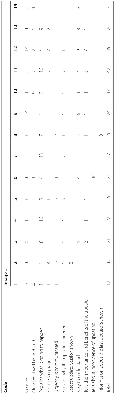
Table 7 Sample positive comments regarding various aspects of message content
Response Image #
The message is small and attractive and appears legitimate 01
Short, simple, explains its reasoning and what I will be getting from the update 03
It shows clearly what software is being updated 01
Lists specifics of what will be updated and fixed 03
The message was very clear in what the software was going to do. I also liked how it stated “let’s get
started”. That just seems a little better in the phrasing to me 03
Said what it is actually fixing 04
Tells you what it is changing 04
Identifies reason of urgency 02
Tells me it is important and needs to be done now so I do not just x out and have my computer
become vulnerable 02
I like how the top gives a little phrase about what is wrong and then goes in detail below 02
Tells you why it is important not to skip the update 02
The content was good and very informative 04
Since this is a risky situation, I like that they made it striking visually so that you can tell it’s something
dangerous and important. 05
I like how it tells you how much space it will use 06
Simple and easy to read 06
That it tells you there may be charges and exactly how much memory it is going to use and what it is
going to reset 06
Gives me the time and date of last update also the history and access to the settings of these warnings 08 It says how long it has been since virus definitions have been updated. This provides a sense of
urgency for the user. Sense of urgency is probably most critical when considering an update. 08
Orange frame mentions me this is an important message 08
That it tells me that it is because you haven’t updated recently 08
It is telling you what it’s going to do when you install it and that theres a privacy statement you can
read 10
The fact it seems like the learn more about the update opens in the same window, and tells you that
there was something wrong in the previous version. 11
I like that FireFox takes you to a new page after you update with a debrief of new features. They also
make it enticing to update by saying it’s “6× faster” 12
Some participant’s answers bring attention to the importance of word choice in com-municating message urgency and/or positive emotions. Two such examples are:
“Tells me it is important and needs to be done now so I do not just x out and have my computer become vulnerable (Image 2)”
“The message was very clear in what the software was going to do. I also liked how it stated “let’s get started”. That just seems a little better in the phrasing to me. (Image 3)”
Other comments speak to the importance of communicating the problem(s) being fixed by the update. For example:
“Said what it is actually fixing. (Image 4)”
From qualitative analysis, 10 codes were combined into the broader theme of mes-sage content. Those codes along with the frequency of assignment to positive
Table 8 F requenc y of c ommen ts r egar ding p ositiv e asp ec
ts of message c
on
ten
t f
or all 14 sample messages
Code
Image # 1
2 3 4 5 6 7 8 9 10 11 12 13 14 Concise 5 3 5 1 1 3 2 1 14 1 8 14 4 3
Clear what will be updat
ed 4 1 9 2 2 1 1
Explains what is going t
o happen 1 1 6 16 5 4 13 7 1 3 16 4 9 Simple language 1 3 1 1 2 2 2 Ur genc
y is communicat
ed 1 14 5 1 2 Explains wh
y the updat
e is needed
12 2 4 5 7 1 1 2 7 1 Lat est updat e v ersion sho wn 2 Easy t o understand 5 1 4 2 5 6 1 4 9 3 3
Tells the impor
tance and benefits of the updat
e 3 1 1 1 1 1 3 7 1
Tells about incon
vience of updating
10
3
Inf
or
mation about the last updat
e is sho
received the highest number of total positive content-related comments. Interestingly, as
seen in Table 2, Image 11 also ranks lowest in terms of annoyance and confusion.
Many prior studies have found issues with confusion related to update messages, but most focus on confusion about the update’s actions or the importance of the update
rather than confusion with the message content exactly [3, 4, 29]. The above results
sup-port these prior findings by highlighting that users care about understanding urgency, but also makes the connection between this communication of urgency with the actual content of update messages, as shown in some user comments. Well written messages can not only communicate the importance of update messages, but can also possibly increase other positive emotions for viewers, which could help towards convincing them to apply the update.
Message content features disliked by participants
Participants’ sometimes complained about lack of explanation regarding the risks of not updating, not mentioning the benefits of updating, use of unfamiliar words, and being too technical, all comments connected to message content. Sample comments that are
related to message content are listed in Table 9.
Some participants feel frustration when the update message fails to properly commu-nicate the risks and benefits of an update. For example:
“It doesn’t say anything about the update at all. It doesn’t let you know what’s actu-ally is being done to your computer and what benefit you get from doing the update. (Image 1)”
Meanwhile, other comments highlight a lack of urgency or importance in the minds of participants related to updating. Two such comments are:
“People don’t like to change unless they have to, thus I’m not going to change some-thing that works. And Firefox is clearly working and will continue to work if I do or do not update. (Image 12)”
“Firefox doesn’t need this red box to get users’ attention because it’s just a browser not anti-virus software. No disadvantages to use an old version. No hurts to com-puters. (Image 2)”
We argue that this disconnect for some participants is not only due to messages not properly communicating the benefits of staying up to date, but are also at least partly due to ignorance on the part of the participants. A lack of urgency exists concurrently with a fear of change, which may be exacerbated by unfamiliarity with the language being used in messages. One comment highlights this effect, in this case the unfamiliar word being “Firmware”:
This stresses the importance of using familiar and accessible language in update mes-sages and the need to design them while keeping non-technical users in mind, which is often not the case.
Ten codes from qualitative analysis of negative comments make up the theme of mes-sage content for those comments. The codes and their corresponding frequencies in
negative comments received for each image are shown in Table 10.
When looking at negative aspects of message content, confusion was a big concern, specificially with hard to read texts that are too long or too technical for most users. These issues with confusion were also identified in our prior work, but this work shows that for many of our participants, this confusion was at least particially caused by poorly
written text, a connection not made in the last publication [29]. Avoiding these negative
content features could go a long way towards better update message design. Table 9 Sample negative comments regarding various aspects of message content
Reponse Image #
It doesn’t say anything about the update at all. It doesn’t let you know what’s actually is being done to
your computer and what benefit you get from doing the update 01
It was confusing to note that definitions had been created such a long time ago, but then the nota-tion states, “these defininota-tions are updated automatically”. One would think that any manual update would then not be needed as definitions would always stay current
08
The message seems to suggest a download that does not make too many changes and almost seems
like it would not be worth the time to download it 11
Firefox doesn’t need this red box to get users’ attention because it’s just a browser not anti-virus
soft-ware. No disadvantages to use an old version. No hurts to computers 02
I think it focuses on features that I won’t use, especially using buzzwords and jargon. This may be more about Microsoft’s tendency to release big versions of new software, compared to Chrome and Firefox iterating frequently
03
It was too long. The list of things that the update improves upon should be bulleted or written in
some sort of list 04
Uses language not every user could understand 04
The vibrant colors and use of scary words (“infected,” “malware,” “threat”) definitely make this a very urgent and noticeable message, but if I haven’t seen this before, I would wonder if it was fake (and is actually trying to get me to install some malware). I would like more definitions of terms, and descriptions of what the buttons (particularly “quarantine” and “repair”) will do
05
I dislike that it sounds like this update is going to make a bunch of changes to my device that I would not like. I also dislike that I don’t know what Firmware is and that it is not clear whether or not I would get charged for the update
06
There’s a lot of text to read. The words “incur additional charges” immediately makes me want to delay downloading the update, or not update at all. I can see that it is a large sized download, and may take a long time, so that may make me want to delay it further. I don’t like that I will lose some of my settings as a result of the upgrade. The button about Wi-Fi Settings is a little confusing, although after thinking about it I can guess that it is to make sure I am satisfied with my network settings before possibly using my data plan
06
I’m not sure what a spyware definition is, so I don’t know how important it is to update it 08 It talks about security which is important but it’s only saying it would be good to update things, not
that it’s in danger 08
I dislike that the message does not tell me what is going to change about Skype 09 People don’t like to change unless they have to, thus I’m not going to change something that works.
And firefox is clearly working and will continue to work if I do or do not update 12 I dislike how I don’t understand what some of the words mean like “Ubuntu” and “regular releases” 13 I mostly dislike the names of the items in the message. I have no clue what Quantal Quetzal is an I
Table 10 F requenc y of c ommen ts r egar ding nega tiv e asp ec
ts of message c
on
ten
t f
or all 14 sample messages
Code
Image # 1
2 3 4 5 6 7 8 9 10 11 12 13 14 D
oes not explain what it will do
36 8 5 2 5 9 8 8 23 14 1 12 7 17 D
oes not t
ell ho
w long it will tak
e t o updat e 1 2 3 1 D
oes not explain the benefits of updating
1 1 1 8 12 4 4 Includes r edundant inf or mation 1 1 1 D
oes not explain what is happening
6 4 1 1 3 1 2
Too much cont
ent 2 6 15 10 8 4 17 1 1 15 Ambiguous language 1 9 6 10 2 2 6
Risk of ig
nor
ing not explained
1 5 2 3 11 9 6 3 8 2 3
Too much t
Update mechanism features preferred by participants
Interestingly, very few participants commented positively about update mechanism. Those that did appreciated when the update message clearly mentioned the inconven-ience of updating (e.g., machine restart, time needed to update, pop-up being small and
unobtrusive). Sample comments related to update mechanism are listed in Table 11.
Some positive comments about update mechanism show that participants like update messages that do not interrupt ongoing tasks. For example:
“ In the corner, and goes away by itself, I don’t have to click on anything. (Image 14)” However, such message may also suffer from poor noticeability and low perceived importance. For example, Image 14 was ranked lowest in terms of perceived importance
and noticeability, as can be seen in Table 2, while receiving the largest number of
posi-tive comments for being not obtrusive, which can be seen in Table 12.
We combine 9 codes to create the theme of update mechanism. The codes and their
frequencies in the positive comments left for each image are available in Table 12.
Interestingly, update mechanisms are a popular research topic [3, 26, 27], but as
indi-cated by these results, are not much on the minds of our participants. This could be due to several factors, most improtantly that participants were examining static messages
and asked to rate the messages, specifically. This could have biased against responses
about mechanisms. Alternatively, the lack of mention about mechanism could indicate that users are generally happy with how updates are applied and so they do not notice it, thus it does not come to mind. More investigation is needed to confirm this notion, though.
Update mechanism features disliked by users
Even fewer participants commented regarding negative aspects of update mechanism than comments about positive aspects of update mechanism. Among those that did, one of the biggest concerns was the use of scare tactics to convince users to update their sys-tems. Participants also commonly complained about the interruption caused by updates, including needing to perform multiple steps to update and having to restart after.
Table 11 Sample positive comments regarding various aspects of update mechanism
Response Image #
The fact that it tells you right away that you can continue to use your phone during the update 06
You can use your phone while it is updating 06
It allows to restart at a later time 07
Let’s you know a restart of your computer will be required in addition to details about the update itself
(version and size) 07
I like that or explains that it’ll be fast and alludes to your Skype experience being better 09
It explains that it won’t take long which is always a concern 09
It explicitly says that it won’t take a long time... 09
iOS updates are pretty unobtrusive 11
In the corner, and goes away by itself, I do not have to click on anything 14
Informs you of an update without too much distraction 14
It does not effect what I am working on, on my computer 14
Table 12 F requenc y of c ommen ts r egar ding p ositiv e asp ec ts of up da
te mechanism f
or all 14 sample messages
Code
Image # 1
2 3 4 5 6 7 8 9 10 11 12 13 14
User can choose t
o updat
e on star
t 1 Unobtrusiv e 2 1 2 1 19 Let ’s y ou updat e immediat ely 2 1 1 1 Keeps cur rent settings 4
Can use de
vice while updating
3 “R esar t lat er ” option 3 Fast updat e pr ocess 15 1 Pr ovides suppor t link 1 Updat
e messages does not int
Sample negative comments that are related to message update mechanism can be seen
in Table 13. Nine codes were combined to make the update mechanism theme. Table 14
shows the codes and frequency of those codes being assigned to negative comments overall for each image.
Image based response patterns
As indicated in the summaries, it was not uncommon that images that ranked high/low in one or two of the self-reported scales would also garner the most positive/negative comments in the qualitative data. To explore this pattern, we calculated Pearson’s cor-relation coefficient between the total number of postivie/negative comments for two themes with each image’s average importance, annoyance, confusion, and noticeability
ratings. Table 15 shows the resulting calculations. Content and design were the themes
focused on because the other theme had relatively few comments related to it in the data.
As shown in Table 15, messages that received more positive comments about design
and layout were more likely to have high noticeability (p = 0.55) and importance (p =
0.57) ratings and low confusion and annoyance ratings. This connection is intuitive if one considers the goal of software update and warning messages, which is to be easy to follow, eye-catching, and persuasive. If these are the goals, messages that score high on importance/noticeability (i.e., an eye-catching, persuasive message) and low on annoy-ance/confusion (i.e., an easy to follow message) are likely “well” designed and thus garner more positive design comments. Even ignoring the goals of message design, this result is intuitive since high ratings imply positive emotions (i.e., high importance and/or notice-ability), thus making them more likely to be paired with positive comments.
With this in mind, the number of negative comments regarding design/layout appears
to be strongly correlated to annoyance (p = 0.61) and confusion (p = 0.53) while also
weakly correlated to importance (p = 0.23). We believe this indicates a similar
rela-tionship as with the positive comments. “Well” designed update and warning messages should be clear, pleasant, and persuasive, thus it makes sense that messages that were more annoying and confusing would attract more negative design comments since more negative design comments is intuitively indicative of poor design. Since annoyance and confusion are negative emotions, it is logical that participants would leave more negative comments in conjunction with higher ratings for these emotions.
For content, messages that received higher importance (p = 0.41) and noticeability (p
= 0.41) ratings also tended to receive more positive comments regarding message
con-tent. Messages that better communicate in the context of software update and warning
Table 13 Sample negative comments regarding various aspects of update mechanism
Response Image #
This message pops up a lot and can be very annoying 14
It pops up in front of whatever program you already have open 09
Table 14 F requenc y of c ommen ts r egar ding nega tiv e asp ec ts of up da
te mechanism f
or all 14 sample messages
Code
Image # 1
2 3 4 5 6 7 8 9 10 11 12 13 14 “D on ’t lik
e the int
er ruption ” 3 5 7 1 1 2 5 4 6 2 1 5 2 13 Scar e tac tic/thr eat 21 12 1 1 3 “D on
’t trust impr
ov
ement
”
1
Updating cost mone
y 11 Updat es ar e t oo fr equent 2 Requir es r estar ting 5 M essage is “look ing ” f or updat e 2 M ultiple st eps r equir ed 2 A dditional inf or
mation is ex
messages will do so by communicating importance and noticeability since these are goals of such messages. It is possible this relationship explains the correlations between posi-tive content comments (i.e., comments explaining content features participants “like”) and importance and noticeability.
Inversely, images that scored higher in terms of annoyance (p = 0.45) and especially
confusion (p = 0.61) were more likely to elicit more negative comments about message
content. The connection with these emotions, particularly confusion makes sense con-sidering that a message with poor composed content is likely to be confusing. A key goal of update and warning message content is to be accessible and easy to understand. Mes-sages that fail at this goal are regarded as confusing and a confusing message is intui-tively more likely to be seen as annoying for many reasons (e.g., a perceived waste of time in reading a confusing message, frustration due to lack of understanding).
All of these findings are in line with our prior work that found relationships between self-rated levels of confusion/annoyance and importance/noticeability when looking
at update messages [29]. The correlations between aspects of design and content with
these emotion pairs suggests that these variables could be manipulated in messages to improve their noticeability and importances, while reducing annoyance and/or confu-sion. How this could be done is an area of further research, but towards that goal, we present some initial directions by identifying correlations between design features and self-reported emotions.
High‑impact design features
Finally, we counted the total number of positive and negative comments in different cat-egories for each image and identify if there is any correlation between these numbers and image ratings in terms of annoyance, confusion, perceived importance, and notice-ability. Intuitively, if feature ‘x’ somehow relates to annoyance and it is present in certain
images, those images should receive a high annoyance rating. Table 16 list the
correla-tion coefficients for positive design features as coded in our analysis. As can be seen, messages that tell the importance/benefits of a message correlate with significantly lower confusion and annoyance (i.e., messages with this feature receives low rating for being annoying and confusing). Similarly, use of color is correlated with higher noticeability.
Table 17 lists the correlation coefficients for negative design features. Messages that
are too technical or use too much content are correlated with higher ratings for confu-sion and annoyance. Scare tactics, commonly used to increase noticeability and impor-tance in messages, correlates with higher annoyance for our participants, which may hurt the message effectiveness in the long run.
Table 15 Correlation between number of comments of each type and quantitative ratings across the 14 images tested
Comment type Annoyance Confusion Importance Noticeability
Positive design/layout −0.24 −0.14 0.57 0.55
Negative design/layout 0.61 0.53 0.23 −0.1
Positive content −0.36 −0.31 0.41 0.41
General affective‑cognitive considerations by participants
In addition to the emotions associated with the messages being viewed, another pattern in the qualitative data brought attention to the importance of emotion in decision mak-ing process in both the short and long terms. There were a total of 88 comments in both the positive and negative comment sets that expressed some form of general emotion that was not directly related to the message being viewed.
Some participants expressed a general appreciation or distaste for a particular soft-ware company or brand. Two comments that demonstrate this from both a positive and negative viewpoint are:
“I like Google (Image 1)”
“QuickTime is just annoying. (Image 7)”
Table 16 Correlations between each images’ ratings for each emotion and the frequency of the indicated positive feature codes being applied to comments about the image
Code Confusion Annoyance Noticeability Importance
Tells the importance/benefits −0.45 −0.56
Easy to understand −0.58 −0.54
Concise −0.69 −0.74
Looks trustworthy/legitimate −0.45 −0.65
Cleaner looking −0.51
Button/link for more information −0.54
Brand effect −0.72
Simple language 0.51 0.41
Alerting design 0.57 0.63
Choice of color 0.54
Makes the user want to take action 0.72
Table 17 Correlations between each images’ ratings for each emotion and the frequency of the indicated negative feature codes being applied to comments about the image
Code Confusion Annoyance Noticeability Importance
Too technical 0.82 0.64
Too much content 0.70 0.60
Ambiguous language 0.67 0.55
Unpleasant color 0.49
Boring 0.65 0.48 −0.37
Confusing 0.53 0.47
Annoying 0.42
Feel of authenticity 0.44 0.39
Charging money for the update 0.34 0.31
Makes users worried regarding adverse consequences
of applying update 0.48
Use of scare tactics/threat 0.27
Use of hard-to-read font size 0.53 −0.45 −0.38
Does not explain the benefit of the update −0.40
Not noticeable −0.71 −0.46
Pops up / interruption −0.43 −0.48
Users consider their prior experiences with a brand when considering a new message from that brand. Thus, cultivating a good image in the view of users is key because posi-tive emotions when viewing a message due to a user’s “like” for a brand may help that message persuade the user to take an action. On the other hand, bad experiences with a brand, be it due to a faulty update, annoying program, or even bad media attention, can hurt how persuasive new messages from that brand are. A comment that could reflect a bad past experience with updates is:
“I just know as soon as this update is installed, I’m going to be greeted with a whole bunch of problems I didn’t have before. (Image 6)”
The tone of the above comment indicates a fair amount of frustration with some updates in the past. It is very likely this participant would consider in their decision the inconvenience felt in the past when pondering to apply the update presented in the mes-sage. Frustration can also manifest in response to the messages as well. For example:
“I am now scared. Something bad will happen if I don’t update. (Image 2)”
This comment underscores the effect update messages can have on users’ fear levels. However, as pointed out by participants, scare tactics may in fact play a negative role while convincing users on the long run. Consider an update that scares a user into apply-ing only to do nothapply-ing but change the interface of the program while still leavapply-ing vul-nerabilities open. In such cases, the interface changes could annoy the user and come off as unnecessary and undeserving of the applied scare tactic. When another update is needed to fix the open vulnerabilities, the same user may be less inclined to apply due to no longer “believing” the level of urgency.
How an individual feels about a message, specifically in terms of annoyance and confu-sion, has been found in our prior work to sometimes be a predictor of their hesitation
in applying the update [29]. Like our results in this paper, other studies have highlighted
the effect of previous user frustations with software updates on the users’ perception of
updates overall [3, 4]. All these findings suggest that increasing postive associations with
updates by combating negative experiences could also be a good step towards increasing update application rates.
Limitations
Our study aims to uncover the limitations of current software update message designs and mechanisms. Though we have presented several key findings related to the user per-ception of software update and warning messages, we are unable to extrapolate our find-ings to the population in general. That said, our findfind-ings are well aligned with reported
limitations of update messages in prior studies [3, 4, 24, 25, 28, 29]. Specifically, our
into the design and delivery of software update and warning messages for the general population by prompting similar investigations that focus on other populations or mes-sage designs/types.
Conclusion
In this paper, we perform both quantitative and qualitative studies using existing soft-ware update messages to identify softsoft-ware update message design features (e.g., layout, color, content) that may affect users positively or negatively. By analyzing quantitative data and qualitative comments from 155 users, we identified multiple designs features that are highly correlated to messages being confusing, annoying, noticeable, and impor-tant. We also identified a general negative attitude associated with software warning and update messages, often due to negative past experience with specific software update. Though current messages do make mistakes and cause users negative emotions/deci-sions, our findings show that some messages are well designed and can be used, with human behavior theory in mind, to identify features that should be most effective at con-vincing users to update.
Authors’ contributions
MF and MK designed the study and prepared the necessary materials for execution. MF executed the study and collected data from participants. NN and MK manually analyzed the resulting data, developed descriptive codes, and refined those codes into the themes presented. MF and MK wrote and revised the resulting report presented in this research paper. All authors read and approved the final manuscript.
Acknowledgements
This work is supported by the National Science Foundation under Grant no. CNS-1343766 and GAAAN Fellowship no. P200A100141 and P200A130153. Any opinions, findings, or recommendations expressed in this material are those of the authors and do not necessarily reflect the views of the funding agencies.
Competing interests
The authors declare that they have no competing interests.
Received: 29 May 2015 Accepted: 11 November 2015
References
1. Norton by Symantec. Why security updates are vital. http://us.norton.com/vital-security/article. Accessed 1 Aug 2014
2. MIT Information Systems and Technology. Software patches and os updates. https://ist.mit.edu/security/patches. Accessed 1 Aug 2014
3. Vaniea KE, Rader E, Wash R (2014) Betrayed by updates: how negative experiences affect future security. In: Proceed-ings of the 32nd Annual ACM Conference on Human Factors in Computing Systems, CHI ’14. New York: ACM, pp 2671–2674
4. Wash R, Rader E, Vaniea K, Rizor M. Out of the loop: How automated software updates cause unintended security consequences. USENIX Association, 9999, pp 89–104
5. Internet social networking risks. http://www.fbi.gov/about-us/investigate/counterintelligence/internet-social-networking-risks. Accessed 18 Sep 2013
6. Jakobsson M, Myers S (2006) Phishing and countermeasures: understanding the increasing problem of electronic identity theft. USA: Wiley
7. Sheng S, Magnien B, Kumaraguru P, Acquisti A, Cranor LF, Hong J, Nunge E (2007) Anti-phishing phil: the design and evaluation of a game that teaches people not to fall for phish. In: Proceedings of the 3rd symposium on Usable privacy and security. ACM, pp 88–99
8. Harbach M, Fahl S, Muders T, Smith M (2012) Towards measuring warning readability. In: Proceedings of the 2012 ACM conference on Computer and communications security. ACM, pp 989–991
9. Curt C Braun, Stephanie A Glusker, Ronda S Holt, Clayton Silver N (1995) Adding consequence information to product instructions: changes in hazard perceptions. In: Proceedings of the human factors and ergonomics society annual meeting, vol 39, pp 346–349. SAGE Publications
10. Edworthy J, Austin SA (1996) Warning design: a research prospective. CRC Press, Boca Raton
12. Wogalter MS, Brelsford JW (1994) Incidental exposure to rotating warnings on alcoholic beverage labels. In: Pro-ceedings of the Human Factors and Ergonomics Society Annual Meeting, vol 38. SAGE Publications, pp 374–378 13. Wogalter MS, DeJoy D, Laughery KR (1999) Warnings and risk communication. CRC Press
14. Wogalter MS, Dietrich DA (1995) Enhancing label readability for over-the-counter pharmaceuticals by elderly con-sumers. In: Proceedings of the Human Factors and Ergonomics Society Annual Meeting, vol 39, SAGE Publications, pp 143–147
15. Wogalter MS, Shaver EF (2001) Evaluation of list vs. paragraph text format on search time for warning symptoms in a product manual. Adv Occup Ergon Safety 4:434–438
16. Young SL, Wogalter MS (1998) Relative importance of different verbal components in conveying hazard-level infor-mation in warnings. In: Proceedings of the Human Factors and Ergonomics Society Annual Meeting, vol 42, SAGE Publications. pp 1063–1067
17. Kline PB, Braun CC, Peterson N, Silver NC (1993) The impact of color on warnings research. In: Proceedings of the Human Factors and Ergonomics Society Annual Meeting, vol 37. SAGE Publications, pp 940–944
18. Wogalter MS, Kalsher MJ, Rashid R (1999) Effect of signal word and source attribution on judgments of warning credibility and compliance likelihood. Int J Ind Ergon 24(2):185–192
19. Zobel GP (1998) Warning tone selection for a reverse parking aid system. In: Proceedings of the Human Factors and Ergonomics Society Annual Meeting, vol 42, SAGE Publications, pp 1242–1246
20. Frantz JP (1993) Effect of location and presentation format on attention to and compliance with product warnings and instructions. J Safety Res 24(3):131–154
21. Wogalter MJ, Racicot BM, Kalsher MJ, Simpson SN (1994) Personalization of warning signs: the role of perceived relevance on behavioral compliance. Int J Ind Ergon 14(3):233–242
22. Gardner-Bonneau DJ, Kabbara F, Hwang M, Bean H, Gantt M, Hartshorn K, Howell J, Spence R (1989) Cigarette warn-ings: recall of content as a function of gender, message context, smoking habits and time. In: Proceedings of the Human Factors and Ergonomics Society Annual Meeting, vol 33. SAGE Publications, pp 928–930
23. Haugtvedt CP, Petty RE (1992) Personality and persuasion: Need for cognition moderates the persistence and resist-ance of attitude changes. J Pers Soc Psychol 63(2):308
24. Felt AP, Elizabeth HA, Egelman S, Haney A, Chin E, Wagner D (2012) Android permissions: user attention, compre-hension, and behavior. In: Proceedings of the Eighth Symposium on Usable Privacy and Security, p 3. ACM 25. Harbach M, Fahl S, Yakovleva P, Smith M (2013) Sorry, i dont get it: an analysis of warning message texts. In: Financial
cryptography and data security. Springer, pp 94–111
26. Parthesarathy S, Fink R, Flynn SL, Sun R (2002) Software update notification. US Patent 6,353,926 27. Reha MK, Morris CF (2001) Software update manager, August 28 2001. US Patent 6,282,709
28. Harbach M, Hettig M, Weber S, Smith M (2014) Using personal examples to improve risk communication for security and privacy decisions. In: Proceedings of the 32nd annual ACM conference on Human factors in computing sys-tems. ACM, pp 2647–2656