Quantitative Approach on Parallel Coordinates and
Scatter Plots for Multidimensional-Data Visual Analytics
Phi Giang Pham
1, 2*, Mao Lin Huang
11 University of Technology, Sydney, NSW, Australia. 2 Cantho Technical Economic College, Cantho, Viet Nam.
* Corresponding author. Email: [email protected]
Manuscript submitted March 1, 2017; accepted June 8, 2017. doi: 10.17706/jcp.13.4.407-416
Abstract: Parallel coordinates and scatter plots are two well-known visualization techniques for multidimensional data analytics and often employed cooperatively for flexibility increase in exploration of such data. Existing approaches approximately consider qualitative issues and single attribute comparison, which might face statistic challenges in case of quantitative requirement. This paper introduces a new quantitative approach for visual enhancement of parallel coordinates and scatter plots in term of multiple attribute comparison. The method is based on the visual integration of interactive stacked bars and visual queries on parallel axes and scatter charts. The parallel coordinates play the role of a context view while the scatter charts are for focus details. Using the technique, users could not only quantitatively analyze multivariate data, but also flexibly compare multiple target attributes. Moreover, further investigation is enabled for deep understanding of desired information. The characteristics and usefulness of our approach are demonstrated via a case study with two typical use cases.
Key words: Multidimensional data, visual analysis, parallel coordinates, scatter plots, visual query.
1.
Introduction
Multivariate data analytics are critically essential activities for retrieving and understanding a large number of complicated information in term of types and contents. While the variety of data types is resulted by different information-generating sources, the complexity of contents is along with increase of data dimensions and their attributes. Once organized and structured, such data analysis requires distinctive techniques and equipment in order to deal with high-dimensional challenges.
Parallel coordinates and scatter plots are quite popular visualization techniques in the area. While parallel coordinates is well suited to provide a general display of a large number of attribute values given by their dimensions, scatter plots is a right choice in detailed comparison for pairs of dimensions. Therefore, cooperative employment of the two techniques might not only enhance quantitative assessment of parallel coordinates but also supply an overview comparison for scatter plots. For parallel coordinates, quantitative measurement of polyline density at axes is one of the most considered topics since it shows the instance distribution given by dimensions and their relations. The existing visualization tools can deal with the issue [1], [2]; however, they almost concentrate on single range of polyline density and independent stages of exploration. As a result, such approach would face limitations in case of complicated analytics expecting multiple measurements and relative discovery.
with multiple density assessment and further investigation. The method is based on designing interactive parallel coordinates and scatter plots integrated with quantitative stacked bars and drilling-down queries. Quantitative stacked bars encode polyline-density ratio on dimensions, and drilling-down queries are for deep retrieving results in continuous exploration. Thus, the approach can enrich the strength of parallel-coordinate and scatter-plot usage in term of quantitative analyzing. The usefulness of our approach is demonstrated via a case study with two typical use cases.
The major contributions of the paper include:
- A novel visualization approach for statistical analysis and further investigation of multidimensional data with interactive parallel coordinates and scatter plots using stacked bars and drilling-down queries.
- A prototype and a case study for the approach utility demonstration.
2.
Related Works
2.1.
Parallel Coordinate Manipulation
Parallel coordinates visualizes multivariate data to a view containing parallel axes and traversing polylines through intersection points, which might be considered as un-friendly graphical interfaces to novices, especially in navigation tasks [3]. Although, for navigation improvement, a number of density-based approaches are proposed for qualitative comparison by color schema, density opacity and hierarchical clustering [4], [5], these methods would be more appropriate to experienced users due to the complex model operation. Employing simple interaction techniques on parallel-coordinate browsers can help users to control data exploration conveniently without much expert knowledge. Brushing, ordering and scaling are the three well-known manipulations on parallel coordinates [6]. By brushing customized zones on polylines and their ranges on axes, users can make considered instances to be distinct and noticeable [7]-[9], which improves parallel-coordinate browsers to be more adaptive with focus-plus-context views. Brushing targets to data instance filtering, while ordering and scaling help reduce overlapping and adjust density opacity [10], [11]. In parallel coordinates, correlative comparison of dimensions is highly considered in pairs of axes; however, one axis is not always placed next to the others, which causes increase of users’ efforts to trace patterns and match details together. Based on the motivation, ordering purpose is to reorder axes automatically or manually for more flexible views of analytics. Another challenge in the area is about increase of the number of traversing polylines through axes. A large number of intersection points displayed in a limited range can make difficulties for statistical analysis. Dimension zooming is a simple way for polyline counting support, but not suitable in case of overlapped polylines [4]. Although the mentioned methods accomplish handling a large volume of data, they do not take into account quantitative comparison. The models applying box plots and bar charts are existing approaches for quantitative mining of density measurement [1], [2]. However, the techniques are designed for analysis based on single attributes of dimensions and separate stages of discovery processes, which might not fulfill complex analytics requiring multiple-attribute comparison and further data exploration.
This paper proposes an interactive parallel-coordinate browser enabling to quantitatively compare and analyze multiple ranges of polyline density and support further investigation. Visual queries embedded on parallel-coordinate axes plays the guiding role of creating and adjusting measurement of polyline density while further investigation is conducted via drilling-down scatter plots. The method enables users not only to make statistical manipulation easily, but also to explore data flexibly and deeply.
2.2.
Scatter Plot Scalability
horizontal direction. One common challenge of the model is high density of data points when a number of attribute values greatly increase and are shown in a small space. Zooming by fisheye is a typical way to deal with the problem [12]; however, this kind of distortion is not proper for the overlapping caused by growth of same values at one data point. Rolling-the-dice is offered to reduce such overlapping by 3D transformation and query interaction enhancement [13]. In addition, in order to improve representation features at data points in 2D space, flow-based approach is proposed with using virtual Z dimension and local variation [14], [15]. These methods allow scatter plots to encode and display more data details, which brings more understanding for users in analyzing. Since scatter-plot characteristics are to strongly support discovery of the relation in pairs of data dimensions, it is widely available in data visualization tools such as Tableau and Polaris [16], [17].
Our approach is to employ 2D scatter plots for representing drilled-down data from query inputs of parallel coordinates. We design scatter plots as a matrix of data summary. The stacked bar in data cells is to show the distribution of instances given by target attributes, which enables users to both observe overview correlation and specify detailed values between dimensions at the same time and view.
3.
Quantitative Parallel Coordinates
3.1
Visualization Design
The primary design of our approach includes two overlaid layers of the parallel coordinates and stacked bars where the parallel axes are the baselines of stacked bars and the component for the attribute and polyline range selection (Fig. 1). While the parallel coordinates play the role of a basic browser, the horizontal stacked bars encode statistical results associated with the ranges on each axis. The purpose of this method is to utilize the vertical space between the axes and to allow tracing the statistical results directly in the same view of data browsing.
The length of a total bar represents the total number of polylines based on all the target attributes, and that of each stacked bar encodes the number of polylines given by a corresponding attribute. The height of stacked bars encodes the range size of the polylines traversing through an axis and selected as inputs of queries. The size of a bar is proportionally represented in statistical values. As a consequence, the stacked bars can show statistical results towards multiple attributes of dimensions, which enriches amount of information encoded in the display space of the parallel coordinates.
The visual query components are designed to be embedded in parallel-coordinate axes for data discovery manipulation. A query is created primarily by conventional brushing operations. The brushing operations are adaptive with multiple brushes for selecting ranges of traversing polylines or intersection points to be involved in the query. The function of queries is to compute the number of traversing polylines through all axes grouped by a set of attributes.
The formal definition of the query function is described as follows.
• Rk is the axis of target attributes, D’ ⊂ D and D’ ∌ Rk, where D and D’ are the sets of all dimensions and
activated ones.
• A = {ai|i=1,2,…n} is a set of target attributes selected from axis k, and ai is either a single value (one
intersection point) or multiple values (a set of intersection points).
• Rq is axis q (Rq ∈ D) of selected traversing-polyline ranges as set {rqj|j=1, 2,…m}, and rqjis either a
single value or multiple values.
Functions Sq (A, Rq) and S’q (A, D’) are to compute the statistical results by operators Or and And.
Computation by operator Or considers the polylines of ranges in Rqsatisfying A, while that by operator And
takes A and D’ into account as a satisfactory condition for Rq.
3.2
Visual Comparison
Fig. 1 shows a query example, which compares car models of three representatives from Europe, Japan and USA, including Volkswagen, Toyota and Ford based on 25-and-lower MPG (Miles per gallon) and all cylinder numbers. To perform the query, we select all the origins as target attributes, select the three brands, then select associated ranges of traversing polylines as requirements on axes MPG and Cylinder. The result pattern indicates that the majority of models were owned by Ford, with 39 ones, whereas the minority of that belonged to Toyota and Volkswagen, with 9 and 3 ones. While all of the brands employed 4-cylinder engines, only Ford employed 8-cylinder engines, and only Volkswagen did not install 6-cylinder engines for their cars with the fuel economy for MPG 25 and lower.
As common employment of stacked bars, the size, colour and data label representing the summary of attribute values are visual comparison principles. The length of the total bar at range rqj is computed by
l (rqj) = ∑ S(𝑎𝑖, 𝑟𝑞𝑗) 𝑛
𝑖=1 and l’(r
qj) =∑ S′(𝑎𝑖, 𝐷′) 𝑛
𝑖=1
where l and l’ are the lengths resulted with operators Or and And.
The colour variety assigned to stacked bars depends upon the number of attributes involved in the query, with a defaulted range of twenty categorical colours. For graphic legend, coloured labels and coloured brushes are corresponding to single attribute values and ranges of ones.
4.
Statistical Scatter Plots
Our statistical scatter plots are matrices of data summary, which enables for both representing correlation of a couple of dimensions and allowing further data exploration. Horizontal and vertical dimensions plot data cells containing horizontal stacked bars to encode the numbers of instances satisfying the target attributes retrieved from the parallel coordinates. A selected data cell provides narrow instances considered for further investigation.
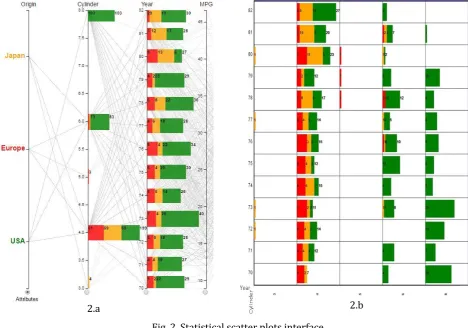
year-based time. In general of Fig. 2.a, most of the models were featured 4-6-and -8-cylinder engines, with 199, 83 and 103 models, while very few of them had 3 and 5 cylinders, with 4 and 3 ones. The most delivery of car models was at 1973, with 40 models, and the least of that was at 1974, with 26 ones.
Fig. 2. Statistical scatter plots interface.
The drilling-down step by scatter plots provides the information in details (Fig. 2.b). Japan exclusively delivered 3-cylinder models at 1972, 1973, 1977 and 1980, with one model of each, while only Europe delivered 5-cylinder models from 1978 to 1980, with one of each also. 4-cylinder segment was contributed by all manufacture origins Japan, Europe and USA. The highest number was at 1982, with 27 models including 2 of Europe, 9 of Japan and 16 of USA, while the lowest number was at 1970, with 7 models including 5 of Europe, 2 of Japan and no ones of USA. For 6-and-8-cylinder market, USA largely contributed and exclusively delivered 8-cylinder models. The most contribution of USA for 6-cylinder engines was at 1975, with 12 models, and that for 8-cylinder engines was at 1973, with 20 models. However, there was neither 6-cylinder models delivered at 1972 nor 8-cylinder models introduced at 1980 and 1982.
The height of stacked bars is designed to be eighty-percent high to the cells while their length calculation is based on statistical results from drilling-down steps of queries. We define it as follows.
• Xt and Yt are two sets of attribute values of horizontal dimension and vertical one selected at step t,
and t>1
• C (ai, xt, yt) is a set of the data instances satisfying target attribute aiby drilled-down values xt and yt,
and xt∈ Xt and yt∈Yt Therefore,
S”t(A,xt,yt) = ∑ (𝐶(𝑎𝑖, 𝑥𝑡, 𝑦𝑡) ∩ 𝐶(𝑎𝑖, 𝑥𝑡−1, 𝑦𝑡−1)) 𝑛
𝑖=1
where S”t (A, xt, yt) is the function to compute the length of a stacked bar as the summary of total number of
data instances satisfying all the target attributes in A by xt and yt.
5.
Visual Scalability
Since stacked bars are overlaid on parallel coordinates, it might cause loss of visual patterns of polylines due to their overlapped position. For dealing with this, the transparency of the stacked-bar layer can be freely customized, which keeps both layers clearly visible and switchable in the same display space without loss of visual pattern. Besides, in case of lengths of stacked bars in very small values, their labels would be shown when the space is sufficient, or mouse-click interaction is applied.
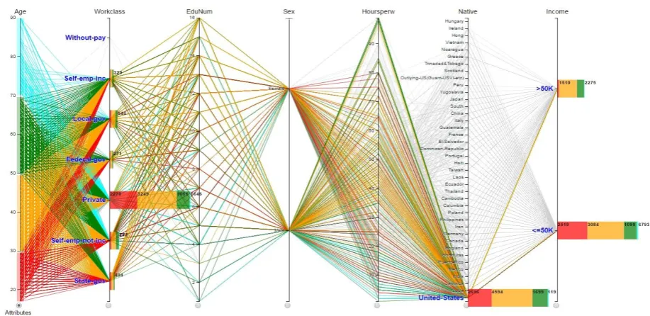
A common visual challenge of parallel coordinates is representing a large number of polylines in a 2D space. This might cause high density and affect to navigation tasks. We develop an adaptive filtering feature using stacked-bar interaction to handle the challenge. Users can highlight and trace polylines by selecting clustered colours on associated stacked bars. Thus, the polyline clusters can be kept visible by groups of colours according to user needs, and navigation tasks can be performed easily, which could make density decreased and appropriate for comparison and analysis (Fig. 3).
Fig. 3. Quantitative visual comparison on census income data.
Although current parallel-coordinate browsers support statistical functions, they would focus on numerical data rather than support categorical ones. Motivated by this reason, we deliver a statistical query feature that can work with both such data types. Categorical data can be mapped as either inputs for creating target attributes or ranges of selected traversing polylines.
For scatter-plot layouts, one of the common scalability challenges is to dealing with dense clusters of data points due to un-sufficient spaces displaying a large number of data and over-plotted data points. With our quantitative approach using stacked bars embedded on data cells instead of data points, the scatter-plot browser is clear and coherent for statistical summary and does not face the mentioned problems. Moreover, we make the scatter plots adaptive with fisheye distortion, which is efficient for navigation in case of large increase of data cells (Fig. 5.b).
6.
Case Study
6.1.
Quantitative Visual Comparison
multiple attributes with flexible ranges of traversing polylines, which has not been supported by existing parallel-coordinate browsers. Furthermore, the technique well supports for both numerical and categorical data in term of visual query performance in the area.
We use Census income data set containing fifteen dimensions and 9998 instances [18], and the purpose is to explore Income and Workclass towards ages of population in United States. We consider and brush on numerical dimension Age to create target query attributes by four ranges including the ages under 30, from 30 to under 50, from 50 to under 70, and 70 and above. All categorical names of Workclass and Income are selected besides value United States of Native. The result, then, is displayed in Fig. 3.
According to the pattern, there was a large difference in the numbers of people at the Workclass summary; the number at Private was the highest, with 6646 people, and multiple times greater than that at the others, with just a few hundred ones. The population aged 30 to 49 years was the most, with 3249, followed by that aged under 30 years and aged 50 to 69 years, with 2270 and 1061, whereas the smallest was corresponding to the ages 70 and above, with 66 people. The number of 50-69-year-old people at the level of 50K-and-under incomes, with 1090, was mostly two times greater than that at above-50K incomes, with 609. While at the level of 50K-and-under incomes the population aged 30-49 years, with 3084, was about 500 more than that aged under 30 years, with 2519, at the level of above-50K incomes, the difference was more significant, with 1510 of 30-49 ages and 137 of under-30 ages. In general, the population at the level of 50K-and-under incomes, with 6793, was about three times greater than that of above-50K incomes, with 2275 people.
6.2.
Flexible Data Exploration
This use case illustrates how our parallel coordinates and scatter plots support coherent and further investigation on multidimensional data. We would like to explore Census income data of United States in term of two levels of Income including over 50K and 50K-and-lower.
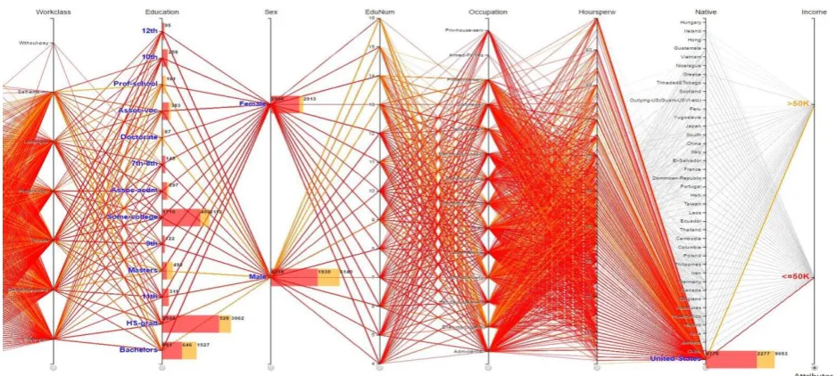
Fig. 4. Statistical parallel coordinates of United States census income data towards sex and education.
that was at Prof-school and Doctorate of Education, with a few cases. The greatest number of people having over-50K incomes was at Bachelor, with 646, whereas the smallest numbers of that were at the education levels from 7th to 12th, with a few hundred. In this data set of United States, the number of Male population recorded, with 6140, was double times greater than that of Female, with 2913.
Fig. 5. Quantitative scatter plots for further investigation on United States census income data.
Afterward, we would like to have more understanding of income distribution between Education and Workclass through the Male population. According to the scatter plots drilled down on the Male population by Education and Workclass, the most population was at Private of Workclass and HS-grad of Education; therefore, we are eager for finding more details of that data cell in term of Occupation and HourPerWeek. For this step of drilling down, we concern all of the Occupation and 40-to-50 HourPerWeek. By observing the final pattern (Fig. 5.a), it is easily to recognize that most of the people worked 40, 45 and 50 hours per week. We are curious to see the details of those who worked 45 hours per week. By visual enhancement with fisheye distortion (Fig. 5.b), it is clearly indicated that the largest population earning 50K-and-lower incomes was at Craft-repair, with 54 cases, whereas that earning over 50K incomes was at Exec-managerial, with 68 ones. The smallest number of population having 50K-and-lower incomes was at Tech-support, with 5 cases, while that having over-50K incomes were at Handlers-cleaners, Machine-op-inspct and Other-service, with 2 of each. There were no data recorded of both Priv-house-serv and Armed-Forces in this context.
7.
Conclusion
This paper has introduced a new visualization approach in enhancing quantitative comparison on multidimensional data. The primary technique is to synchronously employ interactive stacked bars embedded on parallel coordinates and scatter plots with visual queries and drilling down features. By using the method, users can quantitatively assess the polyline density of parallel coordinates and relatively explore
5.a
data by dimension correlation. Therefore, the users are enabled to not only easily analyze general data summary but also flexibly seek and retrieve desired information of a high dimensional data set in coherent exploration processes. The beneficial characteristics of the approach have been demonstrated through the two typical use cases.
In future, we will enrich the operators for the visual query function, completely refine the prototype and conduct further data testes and scalability studies in depth for the technique usability evaluation.
References
[1] Siirtola, H. (2000). Direct manipulation of parallel coordinates. Proceedings of IEEE International Conference on Information Visualization (pp. 373–378).
[2] Ho, Q., Lundblad, P., Aström, T., & Jern, M. (2011). A web enabled visualization toolkit for geo visual analytics. IS&T/SPIE Electronic Imaging, International Society for Optics and Photonics.
[3] Siirtola, H., & Raiha, K. (2006). Interacting with parallel coordinates. Interacting with Computers, 18(6),
1278-1309.
[4] Fua, Y., Ward, M., & Rundensteiner, E. (1999). Hierarchical parallel coordinates for exploration of large datasets. Proceedings of the Conference on Visualization ’99: Celebrating Ten Years, VIS ’99 (pp. 43–50). [5] Andrews, K., Osmi´C, M., & Schagerl, G. (2015). Aggregated parallel coordinates: Integrating hierarchical
dimensions into parallel coordinates visualisations. Proceedings of the 15th International Conference on Knowledge Technologies and Data-driven Business, i-KNOW ’15.
[6] Heinrich, J., & Weiskopf, D. (2013). State of the art of parallel coordinates. STAR Eurographics, 95–116. [7] Martin, A. R., & Ward, M. O. (1995). High dimensional brushing for interactive exploration of multivariate
data. Proceedings of the 6th Conference on Visualization’95, IEEE Computer Society (p. 271).
[8] Fua, Y., Ward, M. O., & Rundensteiner, E. A. (2000). Structure-based brushes: A mechanism for navigating ierarchically organized data and information spaces. Visualization and Computer Graphics, IEEE Transactions, 6(2), 150–159.
[9] Hauser, H., Ledermann, F., & Doleisch, H. (2002). Angular brushing of extended parallel coordinates.
Proceedings of IEEE Symposium on Information Visualization, INFOVIS (pp. 127–130).
[10] Andrienko, G., & Andrienko, N. (2001). Constructing parallel coordinates plot for problem solving.
Proceedings of the 1st International Symposium on Smart Graphics (pp. 9–14).
[11] Lu, L. F., Huang, M. L., & Huang, T. (2012). A new axes reordering method in parallel coordinates visualization. Proceedings of the 11th International Conference on Machine Learning and Applications (ICMLA): Vol. 2. IEEE (pp. 252–257).
[12] Keim, D. A., Hao, M. C., Dayal, U., Janetzko, H., & Bak, P. (2010). Generalized scatter plots. Information Visualization, 9(4), 301-311.
[13] Elmqvist, N., Dragicevic, P., & Fekete, J. D. (2008). Rolling the dice: Multidimensional visual exploration using scatterplot matrix navigation. IEEE Transactions on Visualization and Computer Graphics, 14(6),
1539-1148.
[14] Chan, Y. H., Correa, C. D., & Ma, K. L. (2010). Flow-based scatterplots for sensitivity analysis. Proceedings of
IEEE Symposium onVisual Analytics Science and Technology (VAST) (pp. 43-50).
[15] Huang, T. H., Huang, M. L., & Zhang, K. (2012). An interactive scatter plot metrics visualization for decision trend analysis. Proceedings of the 11th International Conference on Machine Learning and Applications (ICMLA): Vol. 2. IEEE (pp. 258-264).
[16] Taubeau. (2016). Retrieved from http://www.tableau.com/
52-65.
[18] Lichman, M. (2013). UCI machine learning repository. Retrieved from http://archive.ics.uci.edu/ml
Phi Giang Pham was born in Hanoi, Vietnam. He received his bachelor degree in informatics from Cantho University, Vietnam in 2006. He obtained the MSc in information management from Asian Institute of Technology, Thailand in 2008. He is a lecturer in Cantho Technical Economic College, Cantho, Viet Nam. Currently, he is a PhD candidate in Faculty of Engineering and IT, University of Technology, Sydney, Australia. His research interests are human-computer interaction, information visualization and information system development.
![Fig. 1. A graphical interface of quantitative parallel coordinates for a visual query on car data set with nine dimensions and 392 instances [18]](https://thumb-us.123doks.com/thumbv2/123dok_us/7809047.1662293/3.595.127.484.538.730/graphical-interface-quantitative-parallel-coordinates-visual-dimensions-instances.webp)