Wealth, top incomes and inequality
LSE Research Online URL for this paper: http://eprints.lse.ac.uk/101818/ Version: Published Version
Monograph:
Cowell, Frank, Nolan, Brian, Olivera, Javier and van Kerm, Philippe (2016) Wealth, top incomes and inequality. Working Paper (9). International Inequalities Institute, London School of Economics and Political Science, London, UK.
lseresearchonline@lse.ac.uk https://eprints.lse.ac.uk/
Reuse
Items deposited in LSE Research Online are protected by copyright, with all rights
reserved unless indicated otherwise. They may be downloaded and/or printed for private study, or other acts as permitted by national copyright laws. The publisher or other rights holders may allow further reproduction and re-use of the full text version. This is
Wealth, Top Incomes and Inequality
Frank Cowell, Brian Nolan, Javier Olivera
and Philippe Van Kerm
Working paper 9
December 2016
Chapter in preparation for the book “Wealth: Economics and Policy”, K. Hamilton and C. Hepburn (Eds.). Oxford University Press.
III Working paper 9 F. Cowell, B. Nolan, J. Olivera and P. Van Kerm
2
LSE International Inequalities Institute
The International Inequalities Institute (III) based at the London School of Economics and Political Science (LSE) aims to be the world’s leading centre for interdisciplinary research on inequalities and create real impact through policy solutions that tackle the issue. The Institute provides a genuinely interdisciplinary forum unlike any other, bringing together expertise from across the School and drawing on the thinking of experts from every continent across the globe to produce high quality research and innovation in the field of inequalities.
In addition to our working papers series all these publications are available to download free from our website: www.lse.ac.uk/III
For further information on the work of the Institute, please contact the Institute Manager, Liza Ryan at e.ryan@lse.ac.uk
International Inequalities Institute
The London School of Economics and Political Science Houghton Street
London WC2A 2AE
Email: Inequalities.institute@lse.ac.uk Web site: www.lse.ac.uk/III
@LSEInequalities
© Frank Cowell, Brian Nolan, Javier Olivera and Philippe Van Kerm. All rights reserved.
Short sections of text, not to exceed two paragraphs, may be quoted without explicit permission provided that full credit, including notice, is given to the source.
III Working paper 9 F. Cowell, B. Nolan, J. Olivera and P. Van Kerm
3
Abstract
Although it is heartening to see wealth inequality being taken seriously, key concepts are often muddled, including the distinction between income and wealth, what is included in "wealth", and facts about wealth distributions. This chapter highlights issues that arise in making ideas and facts about wealth inequality precise, and employs newly-available data to take a fresh look at wealth and wealth inequality in a comparative perspective. The composition of wealth is similar across countries, with housing wealth being the key asset. Wealth is considerably more unequally distributed than income, and it is distinctively so in the United States. Extending definitions to include pension wealth however reduces inequality substantially. Analysis also sheds light on life-cycle patterns and the role of inheritance. Discussion of the joint distributions of income and wealth suggests that interactions between increasing top income shares and the concentration of wealth and income from wealth towards the top is critical.
Keywords: Inequality, Wealth, Income, Households, Inheritance, Top Incomes, Cross
national, comparative
Editorial note and acknowledgements
The paper uses data from the Eurosystem Household Finance and Consumption survey distributed by the European Central Bank. We are grateful to LIS Cross-National Data Center in Luxembourg.
III Working paper 9 F. Cowell, B. Nolan, J. Olivera and P. Van Kerm
4
1. Introduction
These days, discussion of wealth and inequality is everywhere. It is the stuff of political discussion, journalistic fascination and serious academic research. This was not always so. In the 20th century there was a great deal of academic and policy interest in income distribution and inequality: wealth only occasionally peeked through as a distinct issue.1 But we are now in an era when a book with the title Capital in the 21st Century can become a best seller and politicians of both left and right find it prudent to make reference to the accumulation and ownership of personal wealth.
Unfortunately, although it is heartening to see wealth inequality being taken seriously in economic discussion, key concepts are often muddled, often by commentators who should know better. Sometimes this muddle appears in the failure to distinguish clearly between income and wealth. It also concerns what is to be included in “wealth”, and the muddle often extends to the facts about wealth distribution.
Accordingly, the purpose of this chapter is to provide an overview of the main issues that arise in making important ideas and facts about wealth distribution and wealth inequality precise. It also covers the economics that underlie the generation of wealth distributions and that perpetuate inequality. Here is a brief guide to what we do.
The Basics
We begin with the fundamental concepts of private wealth and the problems of interpreting them empirically (Section 2). This means making clear what is and is not included in wealth statistics gathered at household level. The principal problem involved is that of valuing a wide range of financial and nonfinancial assets; some of these assets – such as public and private pension rights – raise special difficulties. It also requires careful consideration of the ways in which measurement of inequality presents particular difficulties in the case of wealth: this includes the theoretical requirement that inequality measures deal with negative as well as zero values and empirical circumstances such as the presence of negatives and the skewness and fat tails of the wealth distributions resulting in sparse, extreme data. These issues have important implications for modelling wealth inequality and for statistical inference. They also give rise to major issues concerning data quality and the problem of cross-country comparisons are reviewed.
1 Honourable exceptions to this neglect include Atkinson (1974), Atkinson and Harrison (1978), Miller and McNamee (1977), Revell (1967) and Wolff (1955).
III Working paper 9 F. Cowell, B. Nolan, J. Olivera and P. Van Kerm
5
Application
These theoretical and empirical issues are more convincingly discussed in the context of a specific application. To do this, we examine in Section 3 what can be learned from data now becoming available from specially-designed harmonised surveys carried out across 15 European countries, initiated and organised by the European Central Bank: the Eurosystem Household Finance and Consumption Survey (HFCS). We use data from this source for five European countries (France, Germany, Italy, Luxembourg, Spain) and data from the Luxembourg Wealth Study for three more non-HFCS countries (Australia, the UK and the USA) to focus on the key issues of wealth distribution to take a fresh look at some of the basic questions about wealth and wealth inequality. We then, in Section 4, examine the size and composition of household net worth in these eight countries and use the techniques discussed in Section 2 of the chapter to compare wealth inequality and income inequality across countries.
The Mechanisms that Drive Inequality
Later in the chapter we set out the elements of the essential economic story of personal wealth and income. Both market and non-market mechanisms in the story of how wealth inequalities and long-run income inequalities develop and persist.
This story divides naturally into two parts, each part having a distinctive account of the mechanisms that determine the dynamics of wealth distributions.
The first of these two parts concerns what happens within a person’s lifetime. So in Section
5 we examine the lessons that may be learned from the literature on life-cycle models. The simplest of these intra-generational models attempt to understand and replicate the transmission and concentration of wealth, based on the actions of rational individuals in
financial markets. The variation in people’s wealth over their life cycle will itself contribute to
dispersion of wealth and so it is useful to consider how much this process contributes to wealth inequality and income inequality. However, a substantial part of the assets accumulated through this process, public and private pension rights, present special problems when one considers including them in an aggregation of personal or household assets: these problems – discussed in Section 6 - are not mere technicalities, as they can
substantially influence one’s estimates of, and interpretations of wealth inequality.
The second part of the story concerns the connections through wealth between the generations: the role of bequests and inheritances. It is clear that this intergenerational component of the wealth-distribution process has the potential to be a major force in the creation of and perpetuation of wealth inequality. But the economic analysis of the intergenerational process presents a number of difficulties. Unlike the intra-generational story where the baseline model is fairly clear and founded on market activity, there is no simple
III Working paper 9 F. Cowell, B. Nolan, J. Olivera and P. Van Kerm
6 consensus on the appropriate way to model what is going on, and economists have to accept that here the role of the family is likely to be much more important than the role of the market. These issues are discussed in Section 7.
Top Incomes and Wealth
It is clear that there ought to be some connections between high wealth and high income. But the links are not mechanical and the relationship between these two important economic concepts can be complex. Income inequality and wealth inequality each deserve careful analysis in their own right and it would be foolish to suggest that either of them should be pursued to the exclusion of the other: one needs to keep an analytical eye on both. Section 8 examines the key messages about trends in top incomes and the contrasting patterns across the developed countries revealed by the recent research led by Atkinson, Piketty and Saez based principally on data from the administration of income tax systems. It then draws on the comparative survey data employed in the rest of the chapter to investigate the wealth holdings and sources of income of those at the top of the income distribution in those surveys (which will in all likelihood not adequately capture the top 1%), and the extent to which their wealth and income sources are distinctive.
2. Measuring wealth with survey data
The empirical measurement of wealth is even more challenging than that of income. How best to assign values to assets and liabilities at a certain point of the life-cycle, the choice of unit of analysis and whether differences in household size are taken into account, and deciding which assets to include all represent significant methodological choices. Here we highlight some of the distinctive empirical and statistical issues arising in the measurement of wealth inequality using household survey data; Cowell and Van Kerm (2015) provides a more detailed and technical discussion of problems and potential solutions.
Measuring household wealth
Sources of data
Several sources have historically been used to obtain information on wealth at the ‘micro’ level (individuals, families or households): wealth tax data, estate tax data, capitalisation methods based on capital income data and, of course, direct surveys. We focus on the latter. The main advantage of household surveys is that they allow coverage of a wide range of assets for representative samples of a population. They are becoming available in a growing number of countries. Collecting survey data on wealth is however notably more complicated than collecting data on income. Issues of sampling and non-sampling error are compounded by the nature of wealth data and its distribution.
III Working paper 9 F. Cowell, B. Nolan, J. Olivera and P. Van Kerm
7
Household net worth
The most common concept used to analyse the distribution of household wealth is the current net worth defined as the difference between the monetary value of a household’s assets and its total liabilities:
𝑤 = ∑ 𝑝𝑗𝐴𝑗 𝑚 𝑗=1
− 𝐷
where 𝐴𝑗 is the amount of asset type j owned by the household, 𝑝𝑗 is its price or unit value
and D is the household’s total outstanding debt. Empirically, this definition requires decision
about what assets---financial and non-financial---are included, a decision which is typically dictated by data availability and decisions of the survey agency. In general, one will include among non-financial assets the value of the household’s main residence and other real estate property, the value of self-employment business and of additional real assets such as cars and jewellery. Financial assets will usually include deposits on current or savings accounts, mutual funds, bonds, shares and other financial assets. Financial assets also often include life insurance and voluntary private pension plans. (Inclusion of occupational and public pensions is an issue to which we return below.) On the other side of the household’s balance sheet, liabilities typically include home-secured debts, loans and lines of credit as well as
informal debt. On the aggregate, the household’s main residence represents, by far, the
largest share of household assets.
There are two main issues with respect to this definition of net worth. The first is that it misses public pension entitlements (also referred to as social security wealth), which are generally considered to represent an important asset. One motive for wealth accumulation is to finance consumption in old age and it is clear that the incentives for accumulation are lower when people are entitled to generous pensions organised though public transfer mechanisms.
Ideally, one would like to be able to capture the ‘wealth equivalent’ of future pension
entitlements in a comprehensive measure of net worth which would reflect better the capacity of people to finance future consumption. While this is generally done with private pension plans, it is a difficult task for public pensions, since this requires knowledge of employment careers and of future state pension parameters. We return to this question in Section 7.
The valuation of assets
The second key issue is the valuation of assets, especially of real assets, that is the choice for pj in equation (1) above. These valuation choices may have a major impact on measured
wealth inequality, including whether the market price is to be used for each asset j, or some type of imputed price – for example, choosing the market price, the imputed rent or the self-reported price for housing may affect the size of wealth and its distribution. Bastagli and Hills
III Working paper 9 F. Cowell, B. Nolan, J. Olivera and P. Van Kerm
8 (2013) show the dramatic effect of fluctuating house prices on wealth inequality in the UK, while Wolff (2012) analyses how sharp changes in asset prices affected the distribution of wealth in the USA. In a survey context, respondents’ assessments of the current market value of their house may often be reasonably good, but their knowledge of the current market value of financial assets such as stocks and shares may be much more variable and the value of insurance-related long-term savings may be particularly opaque. Under-valuation by respondents of the value of these financial assets is likely to be one contributor to their overall under-representation in household surveys when compared with external aggregate figures (along with non-sampling and representativeness problems to be discussed shortly). There are even greater difficulties in assigning a market value to unincorporated businesses, which will be very important for the minority of households affected but to which they may have great difficulty assigning a value (as reflected in the often high non-response rate to that item in surveys by those who say they do have such a business). Distinctive problems also arise when one aims to incorporate pension wealth – both private and public – into the analysis, as will be discussed below.
The unit of analysis
It is standard practice in analyzing inequality in the distribution of income to take the household as the recipient unit but convert total household income into “single-adult
equivalent income” and analyse the distribution of that equivalent income across individuals.
This is intended to take economies of scale in household spending and the lower needs of children versus adults into account when evaluating the living standard attained with a given income level and household size. By contrast, application of equivalence scales to household
wealth data is more controversial (Bover 2010, Jäntti et al. 2013, OECD 2013, Sierminska
and Smeeding 2005). This reflects the fact that the conceptual and empirical issues arising in the case of wealth are distinctive. For example, if wealth is interpreted as the value of potential future consumption (say after retirement), it is not current household composition that should matter, but future composition. Taking a different tack, if one is interested in wealth as an indication of status or power, there is little reason to adjust wealth for household size at all. Furthermore, one might be interested in the wealth held by each individual within the household rather than their holdings in aggregate – particularly from a gender perspective, for example – but the information required to do so satisfactorily may not be available. Practice therefore varies in empirical work and choices can legitimately differ according to the purpose of the analysis. Here, largely for convenience, we take the household as unit of analysis and analyze the wealth (and income) distribution across households rather than individuals, without any account being taken of differences in household size and composition.
Non-sampling error and representativity of wealth surveys
Survey data is subject to both sampling and non-sampling errors, and when sampling from a highly skewed distribution like that of wealth, most samples will underestimate inequality and
III Working paper 9 F. Cowell, B. Nolan, J. Olivera and P. Van Kerm
9 the length of the upper tail. This can be addressed by over-sampling the upper tail, although the information required to provide a sampling frame allowing that to be done satisfactorily is not always available. Non-sampling errors take the form of differential unit non-response and misreporting of asset (or debt) amounts. Misreporting commonly takes the form of under-reporting or item non-response – the response rate on wealth items may be particularly high for the wealthy. Re-weighting to improve the representativeness of the sample will be of some help, especially if a high-wealth sampling frame has been used, since respondents from the main and special high-wealth samples can be separately weighted; however, as Davies (2009) points out, a perfect fix for differential response is not available. He also notes that under-reporting and item non-response vary by asset or debt type, appearing to be most severe for financial assets notably stocks and bonds, whereas house values show little bias and mortgage debt is on average only moderately under-reported. Non-sampling errors may be growing more severe because both unit and item response rates are declining in household surveys generally.
International survey data on household wealth
The Eurosystem Household Finance and Consumption survey
The Eurosystem Household Finance and Consumption survey (HFCS) has been initiated and coordinated by the European Central Bank. Two waves of HFCS data have been collected to date. At the time of writing however, data from the first wave only, collected in late 2010 or early 2011 in 15 Eurozone countries, are available.
The HFCS provides comparable data across all Eurosystem countries. The collection is based on an ex ante harmonised approach: centrally coordinated definitions of core target variables were adopted, a harmonized questionnaire template was designed, and all countries coordinated sampling design and processing. The survey was designed on the model of the US Survey of Consumer Finances (SCF), which is generally considered to be the 'gold standard' for household surveys on wealth. In particular, various SCF procedures were adopted regarding (multiple) imputation of missing data, over-sampling of wealthy households, the provision of bootstrap replication weights, and the design of the questionnaire. See European Central Bank (2013) and HFCS (2014) for details.
The Luxembourg Wealth Study (LWS)
The Luxembourg Wealth Study (LWS) is a large-scale project of ex post harmonisation of household survey data on wealth from thirteen countries. It is a sibling of the well-established Luxembourg Income Study known for providing harmonized data on household incomes
across 48 countries since the early 1980s. The LWS database focuses on wealth and debt of households and “the goal of LWS is to enhance studies on understanding of households' financial stability through both the analysis of wealth distribution and other related dimensions
III Working paper 9 F. Cowell, B. Nolan, J. Olivera and P. Van Kerm
10 on economic well-being” (LIS Cross-National Data Center, 2016, p.1). The data files contain variables constructed from a set of independent surveys collected in different countries. The LWS team has defined a template of variables about household assets, debt and income and data from national surveys are manipulated and recoded to fill the LWS template variables and adhere as closely as possible to the LWS definitions. See Sierminska et al. (2006) for details.
After the release of a first pilot database in 2007, a new version of LWS has been available since 2016. The new release contains more countries and years – including data sets originally collected through the HFCS for a few countries. It is therefore now easy to use consistent definitions of wealth variables for combined analysis of data from the HFCS and from LWS for non-Eurozone countries.
3. Evidence on household wealth in eight countries
We now take advantage of data available in the HFCS and LWS to provide fresh empirical evidence about the size and distribution of household wealth in eight developed countries. We focus our empirics on eight countries covering a range of economic environments as well as institutional and cultural backgrounds: Germany, France, Italy, Luxembourg, Spain (from HFCS) and Australia, the United Kingdom and the United States of America (from LWS). The underlying surveys for the LWS countries are the Wealth and Assets Survey collected in Britain by the Office for National Statistics (2010-12), the Survey of Consumer Finance 2010 by the US Federal Reserve and the Survey of Income and Housing (2009-10) by the Australian Bureau of Statistics.
The size of net wealth
Table 1 displays the level of net worth in the eight countries examined. The first column provides values for average net worth expressed in euros.2 To help appreciate the size of net worth compared to household income, all subsequent columns express net worth in terms of average annual gross household income. We believe this alternative metric is useful for comparing the importance of net worth in the different countries, and we use it throughout the chapter.
If we except Luxembourg, and Australia to a lesser extent, cross-country differences in average net worth are not very large, from just under 200,000 euros in Germany to 290,000 in Spain and the UK, up to 350,000 in the United States. Cross-country variations are further
2 For non eurozone countries, original values were converted from national currency values at the September
III Working paper 9 F. Cowell, B. Nolan, J. Olivera and P. Van Kerm
11 muted when average net worth is expressed in years of average household income, from a low 4.5 years in Germany, between 6 and 7 years in France, Australia, the UK and the USA, about 8 years in Italy and Luxembourg and up to 9.3 in Spain.
Average net worth statistics are essential to inform us of the 'size of the cake' but, as is well known, the distribution of net worth tends to be very skewed and concentrated among the richest households, so it is useful to examine differences in median net worth and other quantiles. Cross-country differences appear to be much larger if we consider median net worth. The US now has the lowest value at just under 1 year worth of average annual income, a value close to Germany. This is more than five times less that the median net worth in Luxembourg (4.8), Italy (5) or Spain (5.8). Cross-country differences are of similar orders of magnitude if we look at the other two quartiles (the 25th and 75th percentiles) shown in Table 1, again showing the comparatively low values in the United States. These figures provide a first indication that, although the aggregate levels of net worth are not hugely different in the countries considered here, their distribution across households appear to be remarkably different. As a matter of curiosity at this stage, it is interesting to point out the similarity of values between the United Kingdom and France (and perhaps Australia to a lesser extent) and between Luxembourg and Italy, once net worth is expressed in terms of years of gross household income.
The last column of Table 1 shows the fraction of households having zero or negative net worth (when total asset values are less than liabilities). These shares are relatively low and comparable across countries, with notable exceptions perhaps of Germany (9%) and United States (14%). Although these shares are small, they are sufficiently common to be a practical source of concern for the calculation of net worth inequality measures, as we discuss below.
Table 1. The level of net worth
Mean 1st quartile Median 3rd quartile Share <=0
(In euros) (In average annual income)
Germany 195,170 4.5 0.2 1.2 4.8 0.09 Italy 275,205 8.0 1.0 5.1 9.4 0.03 Luxembourg 710,092 8.5 0.7 4.8 8.8 0.04 Spain 291,352 9.3 2.5 5.8 10.6 0.04 France 233,399 6.3 0.3 3.1 7.6 0.04 Australia 434,952 6.8 1.1 4.2 7.7 0.02 United Kingdom 290,285 6.0 0.8 3.5 7.2 0.03 United States 348,835 6.4 0.1 0.9 3.8 0.14
Notes: Values in euros are converted at the September average exchange rate of the year of survey, namely 0.72 EUR/AUD, 0.75 EUR/USD and 1.15 EUR/GBP. Values expressed in average annual income have been divided by the mean annual gross total household income in the respective country (as reported in the survey).
III Working paper 9 F. Cowell, B. Nolan, J. Olivera and P. Van Kerm
12
The composition of household wealth
It has been well documented that the lion's share of total assets are in the form of real assets, and in particular in the value of owner-occupied household's main residence (see, e.g., Sierminska et al., 2006, Cowell & Van Kerm, 2015). Figure 1 depicts the composition of net worth in the eight countries examined here. In each panel, the unit length bar at the top represents total household assets. The white segment on this bar shows how much total assets are to be reduced by debts to give net worth. The following four shorter segments show the composition of total assets across four broad asset types: financial assets first (in light grey) and then three real asset types (in dark grey) - the value of household's main owner-occupied residence, the value of self-employment businesses and the value of other real assets (such as other real estate, cars, jewellery, etc.). (The actual values of net worth, debt and each components expressed in years of average household income are shown on the segments.)
Figure 1 shows that, in the aggregate, the level of debts represent a relatively small fraction of total assets, in the range of 5-15 percent. This is in line with estimates provided, e.g., in Davies (2009). The largest incidence of debt relative to the size of total assets is observed in the USA, Australia and the United Kingdom. It is somewhat lower in the Eurozone countries, especially in Italy. On the other side of the balance sheet, the importance of real assets -housing wealth in particular – over financial assets is clear. On average, households own about one year’s worth of average income in financial assets in almost all countries. The USA is again an exception with financial holdings of a value up to 3 years’ worth of average income. Households' main residence is on average worth between just above two years of income (in Germany or the USA) and above five years of income (in Spain and Italy). Variations in the value of housing relative to income not only informs us of the composition of household asset portfolio, but it is also a direct indication of the cost of acquisition of housing for non-owners. The high value-to-income ratios observed in Spain, Italy or Luxembourg suggest that housing acquisition through inheritance may play a bigger role than elsewhere in this context. We return to the role of inheritance below.
Figure 1. The composition of average net worth: real assets, financial assets and debt
(a) Germany (b) Italy
Debts Net worth
Financial assets
Main residence Other real assets Self-employment business 4.5 0.60.6 2.1 1.3 0.7 1.1 Debts Net worth Financial assets Main residence Other real assets
Self-employment business 8.0 0.3 0.3 5.1 1.7 0.7 0.8
III Working paper 9 F. Cowell, B. Nolan, J. Olivera and P. Van Kerm
13
(c) Luxembourg (d) Spain
(e) France (f) Australia
(g) United Kingdom (h) United States
Figure 1 reveals the composition of overall assets in the population. There is obviously a lot of heterogeneity in specific households' portfolio. Specifically there is interest in examining how the composition of net worth for the wealthiest differs from the average just discussed. It is often argued that the wealthy are able to accumulate assets yielding higher returns and thereby consolidate their advantage. Figure 2 shows the asset composition of the
wealthiest 5% in our samples. Whether the surveys adequately represent the richest 5% in the population is unlikely, given the difficulties in capturing this segment in surveys as discussed above. Our notion of 'richest 5%' should therefore be interpreted with care, but we believe that comparing the wealthiest in our samples to the rest of the population remains an interesting contrast.
Figure 2 is in all respects designed like Figure 1. One should however first note of course the different levels of net worth: the average net worth of the wealthiest 5% ranges from just above 40 years of annual income in Germany and the United Kingdom, up to 80 years of annual income in the USA!
Unsurprisingly, debts bite a much smaller chunk of total assets than in the overall population, although they remain non-negligible (and higher in absolute value than in the average
Debts Net worth
Financial assets
Main residence Other real assets Self-employment business 8.5 1.0 1.0 4.9 3.2 0.3 1.1 Debts Net worth Financial assets Main residence Other real assets
Self-employment business 9.3 1.01.0 5.6 2.8 0.9 1.1 Debts Net worth Financial assets Main residence
Other real assets
Self-employment business 6.3 0.7 0.7 3.3 1.7 0.6 1.4 Debts Net worth Financial assets Main residence
Other real assets
Self-employment business 6.8 1.4 1.4 4.1 2.5 0.2 1.4 Debts Net worth Financial assets Main residence
Other real assets
Self-employment business 6.0 1.1 1.1 3.8 1.4 0.5 1.4 Debts Net worth Financial assets Main residence
Other real assets
Self-employment business 6.4 1.3 1.3 2.3 1.3 1.2 2.9
III Working paper 9 F. Cowell, B. Nolan, J. Olivera and P. Van Kerm
14 population). The share of financial assets is not much bigger than in the rest of the population but there is a reallocation of the composition of real assets towards self-employment business and, more importantly, towards 'other real assets' (which notably includes real estate other than one's own residence). So, overall, while the level of net worth is much higher for the top 5%, its composition does not appear to differ a lot from the rest of the population.
Figure 2. The composition of net worth among the wealthy: real assets, financial assets and debt in the top 5% of the net worth distribution
(a) Germany (b) Italy
(c) Luxembourg (d) Spain
(e) France (f) Australia
(g) United Kingdom (h) United States
Debts Net worth
Financial assets Main residence
Other real assets Self-employment business 41.0 2.1 2.1 10.4 14.1 12.3 6.4 Debts Net worth Financial assets Main residence Other real assets Self-employment business 51.4 1.01.0 21.8 15.2 9.5 5.9 Debts Net worth Financial assets Main residence
Other real assets Self-employment business 68.4 2.2 2.2 21.0 38.4 4.5 6.7 Debts Net worth Financial assets Main residence
Other real assets Self-employment business 57.8 2.0 2.0 15.5 22.8 12.9 8.6 Debts Net worth Financial assets Main residence
Other real assets
Self-employment business 46.2 1.8 1.8 11.3 16.0 8.8 11.9 Debts Net worth Financial assets Main residence
Other real assets
Self-employment business 46.8 3.1 3.1 14.2 16.3 3.5 15.9 Debts Net worth Financial assets Main residence
Other real assets
Self-employment business 40.6 1.9 1.9 14.6 6.0 9.6 12.3 Debts Net worth Financial assets Main residence
Other real assets
Self-employment business 80.3 4.6 4.6 12.5 14.0 20.4 38.2
III Working paper 9 F. Cowell, B. Nolan, J. Olivera and P. Van Kerm
15
4. Evidence on wealth vs. income inequality
As is well-known, wealth is much more unequally distributed than income.
Figure 3 displays Lorenz curves and Gini coefficients for gross household income, total assets and net worth. The Lorenz curve plots cumulative wealth (or income) shares against cumulative population shares. The further apart the Lorenz curve is from the main diagonal the more unequally distributed is wealth, that is, the smaller is the share of wealth held by poor households relative to the share held by rich households. Notice how the Lorenz curve for net worth briefly cumulates below zero since households with the lowest net worth actually have negative net worth (their liabilities exceed the value of their assets). The Gini coefficient is defined as (twice) the area between the 45 degree line and the Lorenz curve. It summarizes the degree of inequality in the distribution of wealth and is a most popular measure of inequality. The Gini coefficient is prominent among the many alternative measures of inequality in the context of wealth analysis because it remains appropriately defined in the presence of negative values, unlike many other measures based on logarithmic or fractional power transformations of the data (e.g., the Theil index, the mean log deviation, Atkinson inequality measures). See Cowell & Van Kerm (2015) for further discussion. The implication of the presence of negative data for the Gini index is that the index is not bounded above at 1, but can take any positive value; notionally, there is no theoretical maximum for inequality
when poor households can borrow infinitely to finance regressive transfers to rich households. It has become popular to examine top wealth or income shares. These can naturally be
read off the Lorenz curve directly: this is equivalent to reading the Lorenz curve from the top-right corner down instead of from the bottom-left corner up. Top shares can also be connected to Gini coefficients (G) quite easily: (1+G)/2 gives the average wealth share of the richest 100p percent, for a randomly chosen p.
The much larger inequality in wealth than in income is clear from Figure 2: Lorenz curves for wealth are further away from the 45 degree line and their Gini coefficients are larger. This holds even though we look at inequality in gross income (direct taxes further reduce inequality). The degree to which wealth is more unequally distributed however varies across countries. The difference is smallest in Australia, Spain or the UK (where the Gini of net worth is still around 19 points larger than the Gini of income) and it is largest in Germany, Spain or France (where the net worth Gini is about 30 points larger than the income Gini).
Countries also differ remarkably in terms of the level of inequality: from the lowest net worth Gini of 0.580 in Spain to the highest of 0.758 in Germany and 0.852 in the United States. These cross-country variations are bigger than those observed for income inequality which range between 0.384 (in France) and 0.440 (in the UK) or 0.548 (in the USA).
III Working paper 9 F. Cowell, B. Nolan, J. Olivera and P. Van Kerm
16 Reassuringly, we note that our Gini coefficient estimates are very close to those reported in Sierminska et al. (2006) for the three countries examined in both our work and theirs, namely Germany, Italy and the United States. This is remarkable since the data cover different years (2001/2002 vs. 2011) and the underlying data are completely different surveys for Germany and Italy.
We believe it fair to claim that Gini coefficients for net worth are large, especially in the USA. Using the formula mentioned above, a Gini of 0.852 means that on average the share of total net worth held by the richest p percent for any random p is 92 percent! (In a perfectly equal distribution, this average would be 50 percent.) Even for the lower, Spanish value of 0.580, the corresponding share would be 79 percent.
We have not yet discussed the difference between the Lorenz curves for total assets and for net worth. The difference between these curves gives us indication of how much liabilities reduce or exacerbate inequality of assets. In all countries, inequality of net worth is higher than inequality of assets. This means that deducting liabilities from household assets further exacerbates inequality: the burden of debts is disproportionately carried by households with lower assets too. It is again in the USA that this effect is the strongest while it is hardly noticeable in Italy, Germany or France.
III Working paper 9 F. Cowell, B. Nolan, J. Olivera and P. Van Kerm
17
Figure 3. Lorenz curves and Gini coefficients for gross household income, total assets and net worth
(a) Germany (b)Italy (c) Luxembourg (d) Spain
(e) France (f) Australia (e) United Kingdom (f) United States
Source: Calculations from HFCS and LWS
Gini income: Gini assets: Gini net worth:
0.428 0.725 0.758 0 .2 .4 .6 .8 1 0 .2 .4 .6 .8 1
Gross income Assets Net worth
Gini income: Gini assets: Gini net worth:
0.398 0.599 0.609 0 .2 .4 .6 .8 1 0 .2 .4 .6 .8 1
Gross income Assets Net worth
Gini income: Gini assets: Gini net worth:
0.420 0.614 0.661 0 .2 .4 .6 .8 1 0 .2 .4 .6 .8 1
Gross income Assets Net worth
Gini income: Gini assets: Gini net worth:
0.413 0.542 0.580 0 .2 .4 .6 .8 1 0 .2 .4 .6 .8 1
Gross income Assets Net worth
Gini income: Gini assets: Gini net worth:
0.384 0.651 0.679 0 .2 .4 .6 .8 1 0 .2 .4 .6 .8 1
Gross income Assets Net worth
Gini income: Gini assets: Gini net worth:
0.427 0.567 0.611 0 .2 .4 .6 .8 1 0 .2 .4 .6 .8 1
Gross income Assets Net worth
Gini income: Gini assets: Gini net worth:
0.440 0.571 0.626 0 .2 .4 .6 .8 1 0 .2 .4 .6 .8 1
Gross income Assets Net worth
Gini income: Gini assets: Gini net worth:
0.548 0.776 0.852 0 .2 .4 .6 .8 1 0 .2 .4 .6 .8 1
III Working paper 9 F. Cowell, B. Nolan, J. Olivera and P. Van Kerm
18
Popular debates tend to emphasize the gap between “the top” and “the bottom rest”. How
much does the distance between the wealthiest and the rest of the population drive overall inequality? Inequality is not just a matter of differences between two homogeneous groups
of “wealthy” and “poor” households; there is much heterogeneity in wealth levels across many
different the segments of the population. One way to quantify this is to use a decomposability property of the Gini coefficient. Given a partition of the population into two groups – the top p
percent and the bottom (100-p) percent – we can express the Gini coefficient as
G= p*mt*Gt + (1-p)*mb*Gb + GB
where mt (resp. mb) is mean wealth among the wealthy top (resp. the “bottom”) divided by
overall mean wealth, Gt is the Gini coefficient of wealth within the top p percent, Gb is the Gini coefficient within the bottom 100-p percent and GB is the 'between-group' Gini coefficient. So we can examine how much of the overall Gini coefficient can be attributed to inequality
within the groups and how much can be attributed to inequality between the groups. Inequality
between groups is one that would be observed if all people in the groups received the average
wealth of their group.
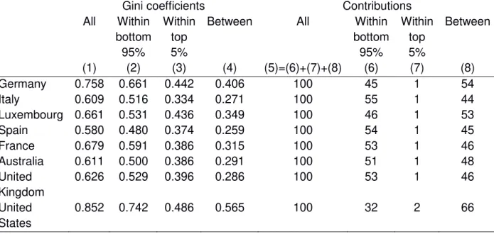
Table 2 shows decomposition components for a partition into the richest 5% and the bottom 95%. The first four columns report Gini coefficients (overall, within bottom, within top and between group) while the last four show contributions of each component divided by overall Gini. Clearly overall inequality is not just a matter of inequality between groups. There is more inequality within the bottom 95% (see column (2)) than between the two groups (column (4)).
Table 2. Decomposition of Gini coefficients of net worth by groups: the bottom 95% versus the top 5%
Gini coefficients Contributions All Within bottom 95% Within top 5%
Between All Within bottom 95% Within top 5% Between (1) (2) (3) (4) (5)=(6)+(7)+(8) (6) (7) (8) Germany 0.758 0.661 0.442 0.406 100 45 1 54 Italy 0.609 0.516 0.334 0.271 100 55 1 44 Luxembourg 0.661 0.531 0.436 0.349 100 46 1 53 Spain 0.580 0.480 0.374 0.259 100 54 1 45 France 0.679 0.591 0.386 0.315 100 53 1 46 Australia 0.611 0.500 0.386 0.291 100 51 1 48 United Kingdom 0.626 0.529 0.396 0.286 100 53 1 46 United States 0.852 0.742 0.486 0.565 100 32 2 66
III Working paper 9 F. Cowell, B. Nolan, J. Olivera and P. Van Kerm
19
Also inequality within the top 5% is substantial. Inequality within the bottom 95% accounts for between 45 and 55 percent of overall inequality while inequality between groups accounts for between 44 and 54 percent. The outlier is the US where between group inequality's share goes up to 66 percent (for only 32 percent attributed to inequality within the bottom 95%). Inequality within the top 5% only accounts for a very small share of overall Gini – this is largely due to the relatively small inequality within that group and, especially, to the small population size of this group.
5. Accumulation over the life-cycle: age profiles in wealth holdings
The sheer nature of wealth accumulation makes it important to examine the age profile of net worth. At least in part, households accumulate assets during their working life to provide income security and finance consumption in old age. This is the prediction of life cycle accumulation models. One may be tempted to argue that overall wealth inequality is not particularly relevant but that one should instead examine wealth inequality within cohorts for people at the same stage of their lives (Paglin, 1975; Almas & Mogstad, 2012).
The underlying story is straightforward. Figure 4 illustrates a highly simplified version of the
person’s economic life. He or she is “born” economically at time t0, on entry into the world of
work; earnings follow a rising path until time tR, retirement, after which there may be a small amount of earnings from doing casual jobs: this is the broken line e(t). Imagine that consumption c(t) is broken down into expenditure on needs cN(t) and discretionary expenditure cD(t), that is largely determined by tastes (we do not need a precise, scientific definition of the boundary between the two components). We can imagine that cN(t) starts out modestly, jumps upwards at tF when a family is formed and falls again at tE, when the nest is empty again. Everything stops at tD, death. Of course one can put additional bends and kinks into both lines, but the sketch is enough to interpret what is going on in the basic dynamics of the life cycle.
Figure 4. The life cycle: a stylised picture
At any moment t in the lifetime net worth w(t) is accumulating/decumulating according to the following equation:
III Working paper 9 F. Cowell, B. Nolan, J. Olivera and P. Van Kerm
20
d𝑤(𝑡)
d𝑡 = 𝑦(𝑡) − 𝑐(𝑡),
where y(t) is total income and c(t) is consumption expenditure. We have income defined as 𝑦(𝑡) = 𝑟 𝑤(𝑡) + 𝑒(𝑡) + 𝑧(𝑡),
where r is the interest rate on net worth (for simplicity we are assuming that it is the same in cases where w(t) is positive and where the person is in debt so that w(t) is negative, e(t) is earnings and z(t) is any form of transfer income. We have consumption defined as
𝑐(𝑡) = 𝑐N(𝑡) + 𝑐D(𝑡)
Obviously the exact path that w(t) follows from t0 to tD depends on the initial conditions at t0, wealth inherited from the past. But if w(t0)=0, and if the person tries to plan cD(t) so that consumption is fairly smooth over the life cycle we can imagine that w(t) might start rising at first, then go substantially negative (mortgage on the house and so on), gradually recover and become positive again as the person heads in the direction of tR; after retirement w(t) might be expected to decumulate, but probably might not go back to zero.3 Let us see how this works out in practice.
Figures 5 and 6 display average and median household net worth by age of the household head. Again, we express net worth in units of average annual income in each country.4 As is expected, wealth displays a hump shape when plotted against age. Of course, because we use a single cross-section of the population, the age profiles that we show here may possibly reflect a generational pattern (a cohort effect) or a genuine household-level life-cycle accumulation process. But the similarity of age profiles across countries is worth pointing out: it is interesting to stress that a hump shape predicted by basic life-cycle models is observed
3 Obviously this elementary intragenerational story will be affected by events that are essentially
intergenerational: inheritances that bump w(t) upwards and planned bequests that bump w(t) downwards.
These events may occur at any time between t0 andtD. We discuss the intergenerational part of the story in
section 7.
4Technically, estimates are obtained by local smoothing techniques: to calculate statistics “at age A” we first
reweight all households in our sample according to the distance between the age of the household head and target age A. A familiar, bell-shaped, Epanechnikov kernel weighting function with bandwidth of 3.75 years is used in all countries---this means that only households whose head is +-/- 8 years age older/younger than age A are used for calculations, and the further apart from A, the smaller the household weight. Average and
median net worth, as well as ‘conditional’ Gini coefficients were then calculated using ‘age-reweighted’ household for a range of values of A between 25 and 85.
III Working paper 9 F. Cowell, B. Nolan, J. Olivera and P. Van Kerm
21
in all eight countries. Peaks in average or median net worth are observed at 60 or 65 years of age, with only very few exceptions.
The steepness of the ‘accumulation phase’ of the age profile varies somewhat across
countries, with Australia and Luxembourg seemingly exhibiting the fastest growth of average and median net worth between the ages of 25 and 65 (or 55 in Australia). The growth is also fast in the United States if we examine average net worth, but it disappears completely if one examines median net worth which grows at a slow, but continuous pace. There is also some cross-country variation in the ‘decumulation phase’ after 60-65: in most countries, average net worth at age 80 is about the same as at age 40-45. Notable exceptions are Australia and the United States that display a much slower decline in net worth – both in the average or the median.
Systematic variations in average net worth by age are indicative of “between (age) group inequality”. Countries with steep accumulation and decumulation profiles, such as
Luxembourg and possibly Spain or Italy, can plausibly be seen as displaying the largest
between group inequality, but such inequality may well be interpreted as ‘legitimate’ to the
extent that it reflects household accumulation and decumulation patterns.
To capture inequality that is not driven by age profiles in wealth accumulation, Figure 7 shows
within group Gini coefficients by age, that is Gini coefficients calculated on the ‘age
reweighted households’. In general inequality tends to decline with age: inequality among
households younger than 35-40 tends to be higher than overall, unconditional inequality, sometimes largely so. However the profile differ across countries for older ages: it keeps declining in most countries (notably in the UK or the US) but it may also flatten out (in Spain or France) or even increase in very old age. Peak to trough differences in Gini coefficients
approximately range from .2 to .3 ‘Gini points’.
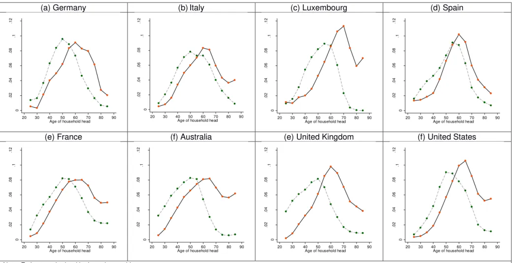
In the previous section we contrasted the net worth of the top 5% percent and of the bottom 95%. Figure 8 shows where the top 5% are distributed by age groups: it plots the probability to be in the top 5% by age of household head. The hump shape observed in average net worth is clear here again. The similarity of this plot across countries is again striking. The peak is achieved at age 60-65 in all countries.
Figure 8 also shows the probability to be in the top 5% of income distribution. This probability is also hump shaped but with a peak at earlier ages at around 50. With the exception of France, older households have a very low probability to be in the top 5% of the income distribution. On the contrary, they are largely over-represented in the top 5% of the net worth distribution in all countries (except in Germany or Spain). At the other end of the age range, households whose head is younger than 35 are under-represented in both the top of income and of the net worth distribution. Such shapes make it plain to see how policies about top marginal tax rates on income and wealth affect (or would affect) different populations.
III Working paper 9 F. Cowell, B. Nolan, J. Olivera and P. Van Kerm
22
Figure 5. Average net worth by age of household head
(a) Germany (b)Italy (c) Luxembourg (d) Spain
(e) France (f) Australia (e) United Kingdom (f) United States
Note: Estimates obtained by kernel smoothing. The horizontal line gives the population average. Source: Calculations from HFCS and LWS
0 2 4 6 8 10 12 14 20 30 40 50 60 70 80 90 Age of household head
0 2 4 6 8 10 12 14 20 30 40 50 60 70 80 90 Age of household head
0 2 4 6 8 10 12 14 20 30 40 50 60 70 80 90 Age of household head
0 2 4 6 8 10 12 14 20 30 40 50 60 70 80 90 Age of household head
0 2 4 6 8 10 12 14 20 30 40 50 60 70 80 90 Age of household head
0 2 4 6 8 10 12 14 20 30 40 50 60 70 80 90 Age of household head
0 2 4 6 8 10 12 14 20 30 40 50 60 70 80 90 Age of household head
0 2 4 6 8 10 12 14 20 30 40 50 60 70 80 90 Age of household head
III Working paper 9 F. Cowell, B. Nolan, J. Olivera and P. Van Kerm
23
Figure 6. Median net worth by age of household head
(a) Germany (b)Italy (c) Luxembourg (d) Spain
(e) France (f) Australia (e) United Kingdom (f) United States
Figure 5. Median net worth by age of household head Note: Estimates obtained by kernel smoothing. The horizontal line gives the population median.
Source: Calculations from HFCS and LWS
0 2 4 6 8 10 12 14 20 30 40 50 60 70 80 90 Age of household head
0 2 4 6 8 10 12 14 20 30 40 50 60 70 80 90 Age of household head
0 2 4 6 8 10 12 14 20 30 40 50 60 70 80 90 Age of household head
0 2 4 6 8 10 12 14 20 30 40 50 60 70 80 90 Age of household head
0 2 4 6 8 10 12 14 20 30 40 50 60 70 80 90 Age of household head
0 2 4 6 8 10 12 14 20 30 40 50 60 70 80 90 Age of household head
0 2 4 6 8 10 12 14 20 30 40 50 60 70 80 90 Age of household head
0 2 4 6 8 10 12 14 20 30 40 50 60 70 80 90 Age of household head
III Working paper 9 F. Cowell, B. Nolan, J. Olivera and P. Van Kerm
24
Figure 7. Within cohort Gini coefficient
(a) Germany (b)Italy (c) Luxembourg (d) Spain
(e) France (f) Australia (e) United Kingdom (f) United States
Note: Estimates obtained by kernel smoothing. The horizontal line gives the population Gini coefficient. Source: Calculations from HFCS and LWS
.3 .4 .5 .6 .7 .8 .9 1 1 .1 20 30 40 50 60 70 80 90 Age of household head
.3 .4 .5 .6 .7 .8 .9 1 1 .1 20 30 40 50 60 70 80 90 Age of household head
.3 .4 .5 .6 .7 .8 .9 1 1 .1 20 30 40 50 60 70 80 90 Age of household head
.3 .4 .5 .6 .7 .8 .9 1 1 .1 20 30 40 50 60 70 80 90 Age of household head
.3 .4 .5 .6 .7 .8 .9 1 1 .1 20 30 40 50 60 70 80 90 Age of household head
.3 .4 .5 .6 .7 .8 .9 1 1 .1 20 30 40 50 60 70 80 90 Age of household head
.3 .4 .5 .6 .7 .8 .9 1 1 .1 20 30 40 50 60 70 80 90 Age of household head
.3 .4 .5 .6 .7 .8 .9 1 1 .1 20 30 40 50 60 70 80 90 Age of household head
III Working paper 9 F. Cowell, B. Nolan, J. Olivera and P. Van Kerm
25
Figure 8. Share of households belonging to the richest 5% of the overall income or net worth distribution by age of household head
(a) Germany (b)Italy (c) Luxembourg (d) Spain
(e) France (f) Australia (e) United Kingdom (f) United States
Note: Estimates obtained by kernel smoothing. Source: Calculations from HFCS and LWS
0 .0 2 .0 4 .0 6 .0 8 .1 .1 2 20 30 40 50 60 70 80 90 Age of household head
0 .0 2 .0 4 .0 6 .0 8 .1 .1 2 20 30 40 50 60 70 80 90 Age of household head
0 .0 2 .0 4 .0 6 .0 8 .1 .1 2 20 30 40 50 60 70 80 90 Age of household head
0 .0 2 .0 4 .0 6 .0 8 .1 .1 2 20 30 40 50 60 70 80 90 Age of household head
0 .0 2 .0 4 .0 6 .0 8 .1 .1 2 20 30 40 50 60 70 80 90 Age of household head
0 .0 2 .0 4 .0 6 .0 8 .1 .1 2 20 30 40 50 60 70 80 90 Age of household head
0 .0 2 .0 4 .0 6 .0 8 .1 .1 2 20 30 40 50 60 70 80 90 Age of household head
0 .0 2 .0 4 .0 6 .0 8 .1 .1 2 20 30 40 50 60 70 80 90 Age of household head
III Working paper 9 F. Cowell, B. Nolan, J. Olivera and P. Van Kerm
26
6. Pension wealth and inequality
Standard measures of household wealth only include marketable wealth, i.e. the value of actual holdings such as savings, bonds, housing and loans, and sometimes the value of private pension balances. The expected income from pensions is generally unaccounted. However, this practice can mislead the analysis of wealth distribution because of the well-known crowding-out effects of public transfers on private wealth. Feldstein (1974) was one of the first authors to document the extension of the crowding-out effects and estimated that social security wealth reduces personal saving by 30%-50% in the U.S. Although these effects have been contested or confirmed in later studies, it is generally accepted that pension wealth reduces private savings. Recent evidence from the Survey of Health, Ageing and Retirement in Europe (SHARE) shows that pension wealth has a displacement effect of 17%-31% on household savings for the individuals aged 60 and more (Alessie et al. 2013). Given that the levels of wealth observed today have been affected by the accumulation of social security contributions, it seems reasonable to include pension wealth in the measures of household wealth. This addition will, certainly, have consequences on the measurement of the distribution of wealth. In one of the first papers dealing with social security wealth inequality, Feldstein (1976) found that the Gini index of net wealth was 0.72, while the Gini index of augmented wealth (adding social security wealth) was 0.51. It is also important to consider public and private pensions in the computation of pension wealth. In this respect, public pensions are mostly Defined Benefit (DB), while occupational pension plans offer Defined Contribution (DC) pensions which can be publicly and/or privately managed. The former type of pensions are generally more equally distributed than the latter. Wolff (2015) illustrates this with US data of 2010 for the 47-64 years old households by showing that the Gini index of net wealth falls from 0.83 to 0.80 after private pension wealth is added, and it is further reduced to 0.66 with the inclusion of public (Social Security) pension wealth.
The relative size of pension wealth with respect to total wealth in the household can be considerable. For example, Frick and Grabka (2013) show that pension wealth amounts to 57% of the wealth of German retirees, while the rest is mostly composed of housing wealth. The contribution of pension wealth also differs considerably along the distribution of wealth. For the total population, these authors find that within the fourth and fifth decile of the distribution of wealth, the participation of pension wealth is 95% and 87%, respectively; while this is 42% and 21% within the ninth and tenth decile, respectively. A recent study by Crawford and Hood (2016), employing a sample of retirees aged 65-79 from the English Longitudinal Study of Ageing (ELSA), shows that both private and public pensions are very important in the augmented measure of household wealth and in its distribution. From Crawford and Hood (2016)’s Table 1 it is possible to infer that private and public pension wealth represent about 19% and 22%, respectively, of an augmented measure of household wealth that includes both types of pensions. The equalization effects of pension wealth are
III Working paper 9 F. Cowell, B. Nolan, J. Olivera and P. Van Kerm
27
also important. The Gini index of household wealth falls from 0.524 to 0.489 after private pensions are included, and this is further reduced to 0.382 with the inclusion of public pensions.
The ideal database to compute pension wealth and its contribution to wealth inequality is one that includes social security administrative records and household wealth holdings. Such databases are scarce, and hence studies must rely on household surveys inquiring for wealth holdings and employ alternative methods to compute pension wealth. For the retirees, the computation of pension wealth is much less complex because the benefit is reported by the individual. In the case of workers, some studies have employed various forms of statistical matching between survey information and social security data (Frick and Grabka 2013; Engelhardt and Kumar 2011), reported social security information (Wolff 2007), and self-reported retrospective and subjective information (Alessie et al. 2013).
Studies such as the ones by Frick and Grabka (2013), Wolff (2007) and Banks et al. (2005) define pension wealth as the present value of expected pension streams, which involves the use of discount rates and survival probabilities. Generally, the official life tables of the country are used to compute individual survival probabilities disaggregated by sex. However, other alternatives include the estimation of individual subjective survival rates (Gan et al. 2015, Bissonnette et al. 2014, Peracchi and Perotti 2014) which facilitate the simulation of life-cycle models, and the estimation of life tables by socio-economic status such as in Brown et al. (2002).
In this section, we explore the distributional effects of including public and private pension wealth in an augmented measure of household wealth in 13 European countries participating in the first and available round (circa 2010) of the Household, Finance and Consumption Survey (HCFS)5. In order to simplify the computation of pension wealth and reduce the abuse
of ad-hoc assumptions, the analysis is focused on elderly households. In this way, all
households will be in the same section of the life-cycle, so that the inequality measures will be less affected by life-cycle effects. In particular, we restrict the analysis to all households whose reference person is aged 65-84 and the spouses are younger than 85. This is done because the age is top coded at 85 in HFCS. Individual survival probabilities are country, age
and sex specific and are drawn from Eurostat’s life tables6. We assume that future pensions
keep their real value, i.e. future increases in pensions and inflation are balanced out. Similar to Frick and Grabka (2013) and Crawford and Hood (2016) the discount rate is assumed to be 2%, but instead of simply employing the expected life expectancy as the horizon to receive
pensions, we compute ‘annuity prices’ for each individual and multiply it by the corresponding
5 Malta is left out of the analysis due to unavailability of the specific age of the individuals (only age groups),
while Cyprus is discarded because the variable sex has many missing points.
6 Because the last age with survivors’ information for these tables is 85, we had to estimate the number of
III Working paper 9 F. Cowell, B. Nolan, J. Olivera and P. Van Kerm
28
pension. It is also assumed that surviving spouses receive 50% of the partner’s pension. The
computation of pension wealth employs the following formula: 𝐴𝑧 = ∑𝑀−𝑧𝑡=0 (1+𝑟)𝑝𝑧,𝑧+𝑡𝑡 (1)
𝐴𝑧,𝑦 = 𝐴𝑧+ 𝜃 ∑𝑀−𝑦𝑡=0 𝑞𝑦,𝑦+𝑡(1+𝑟)(1−𝑝𝑡𝑧,𝑧+𝑡) (2)
𝑊𝑧 = 𝐴𝑧,𝑦𝑃 (3)
Table 3. Gini indices and means of household wealth (Euros, circa 2010)
Country
sample net worth including public pension wealth
including public & private pension wealth diff in Gini (1 - 3) n N mean Gini (1) mean Gini (2) mean Gini (3) AT 524 794,743 238,141 0.696 604,245 0.450 651,690 0.485 0.211 BE 620 1,062,455 477,203 0.559 782,970 0.411 787,675 0.412 0.147 DE 1,022 9,860,230 210,224 0.681 516,755 0.430 540,263 0.436 0.245 ES 2,242 4,170,933 300,627 0.554 443,503 0.481 443,503 0.481 0.073 FI 1,887 524,541 199,119 0.516 228,812 0.453 548,247 0.379 0.138 FR 4,169 6,271,336 287,467 0.626 632,385 0.432 633,723 0.432 0.194 GR 546 911,786 124,338 0.507 300,943 0.361 301,860 0.359 0.148 IT 2,592 6,914,360 292,248 0.581 567,111 0.431 574,544 0.435 0.146 LU 159 36,472 1,067,059 0.564 1,686,588 0.450 1,714,426 0.448 0.116 NL 381 1,653,892 237,626 0.561 425,977 0.358 676,730 0.357 0.204 PT 1,406 1,101,183 154,443 0.656 294,621 0.509 297,802 0.511 0.145 SI 79 169,154 101,549 0.484 190,796 0.424 197,207 0.408 0.076 SK 181 357,333 71,099 0.379 140,693 0.258 141,771 0.261 0.118 Source: first round of HFCS (circa 2010) and Life tables from Eurostat year 2010.
The annuity price 𝐴𝑧 is the necessary amount of capital, in present value, to finance a monetary unit of life pension for a single person at age z. 𝑝𝑧,𝑧+𝑡 is the probability of survival
III Working paper 9 F. Cowell, B. Nolan, J. Olivera and P. Van Kerm
29
from age z to z + t according to official life tables; M is the maximum survival age (assumed to be 110); r is the discount rate; yis the age of the pensioner’s spouse and 𝑞𝑦,𝑦+𝑡 represents the probability of survival from age y to y + t. The fraction 𝜃 indicates the percentage of pension that a spouse will receive upon the death of the pensioner. 𝐴𝑧,𝑦 is the annuity price for the individual that will be used to compute pension wealth. In order to consider cases of single and married individuals, the parameter 𝜃 will be either 0% or 50%, respectively. The value of pension wealth is simply the product of the annuity price of the individual and the value of the yearly pension (equation 3). The pension wealth is computed for the reference person of the household and the spouse if she/he also receives a pension. Then, we sum up the pension wealth of both the reference person and spouse to obtain the measure of pension wealth at the level of the household. The results are reported in next tables and figures.
Table 4. Distribution of household wealth by quartiles Country
net worth including public pension
wealth
including public & private pension wealth bottom 25% next 25% next 25% top 25% bottom 25% next 25% next 25% top 25% bottom 25% next 25% next 25% top 25% AT 0.01 0.06 0.18 0.76 0.07 0.14 0.23 0.57 0.06 0.13 0.21 0.60 BE 0.03 0.11 0.21 0.65 0.07 0.16 0.24 0.53 0.07 0.15 0.24 0.53 DE 0.00 0.05 0.20 0.75 0.07 0.14 0.24 0.55 0.07 0.14 0.24 0.55 ES 0.03 0.12 0.21 0.64 0.05 0.13 0.24 0.58 0.05 0.13 0.24 0.58 FI 0.02 0.13 0.25 0.60 0.05 0.14 0.25 0.56 0.08 0.16 0.26 0.50 FR 0.01 0.09 0.21 0.69 0.07 0.14 0.24 0.55 0.07 0.14 0.24 0.55 GR 0.03 0.14 0.24 0.59 0.09 0.17 0.25 0.49 0.09 0.17 0.25 0.49 IT 0.02 0.11 0.21 0.66 0.07 0.14 0.24 0.55 0.07 0.14 0.23 0.55 LU 0.04 0.12 0.18 0.66 0.07 0.14 0.23 0.56 0.07 0.14 0.24 0.55 NL 0.01 0.09 0.27 0.63 0.09 0.16 0.27 0.48 0.09 0.17 0.26 0.49 PT 0.01 0.08 0.18 0.73 0.06 0.12 0.20 0.62 0.06 0.12 0.20 0.62 SI 0.04 0.12 0.33 0.51 0.07 0.14 0.25 0.54 0.07 0.15 0.25 0.52 SK 0.08 0.16 0.25 0.50 0.13 0.20 0.26 0.41 0.13 0.19 0.26 0.41 Source: first round of HFCS (circa 2010) and Life tables from
Eurostat year 2010.
The results show a sharp fall of wealth inequality when pension wealth is included in the measure of household wealth. Germany is the country that experiences the largest drop in the Gini index, which decreases from to 0.681 to 0.436, i.e. 0.245 points. Then, Austria, Netherlands and France report a decrease in the Gini index of about 0.19-0.21 points. Spain is the country that reports the most modest decrease in the Gini index, which decreases by 0.073 points, from 0.554 to 0.481. Public pensions have a sizeable and clear equalization effect on the distribution of wealth. The effect of private pension wealth in the distribution of wealth is, in general, not very important after public pension wealth has been included, although Austria and Finland are exemptions. The Gini index of wealth in Austria falls from 0.696 to 0.450 when public pension are added, but it increases to 0.485 when both public and private are included in the measure of household wealth. The opposite effect is found in
III Working paper 9 F. Cowell, B. Nolan, J. Olivera and P. Van Kerm
30
Finland where both public and private pension wealth reduces wealth inequality. In that country, the Gini index drops from 0.516 to 0.453 and to 0.379 after public and private pension wealth is included, respectively, in household wealth. One of the distinctive characteristics of the Finish pension system is the existence of a state pension for all citizens and a well-developed system of compulsory occupational pension plans. A similar case is Netherlands, although the occupational pensions have a negligible effect on the distribution of household wealth. In other European countries, the pensions are mostly based on public schemes, while the market for occupational pensions is limited.
Figure 9. Size and equalization power of pension wealth
In line with what is indicated in Marx et al. (2015), that a low level of inequality in rich economies cannot be achieved with a low level of social spending, it is interesting to note in our results that countries that expend more in pensions are also able to reduce wealth inequality by larger values. In this respect, Figure 9 plots the difference between the Gini indexes of net worth and augmented wealth (last column of Table 3, which we call
‘equalization power’) against the relative size of pension wealth, which is measured as the
ratio of the means of total pension wealth over national net worth. The correlation between the equalization power of pensions and the size of pension wealth is large at r=0.70. Interestingly, the correlation becomes stronger (r=0.97) after removing Finland and Netherlands, which are the countries with the most developed systems of occupational pensions in our sample.
AT BE DE ES FI FR GR IT LU NL PT SI SK 0.00 0.05 0.10 0.15 0.20 0.25 0.30 0.25 0.50 0.75 1.00 1.25 1.50 1.75 2.00 2.25 2.50 2.75 equ al iz ati o n p o we r (Gi n i o f n et wo rth -Gi n i o f au g m ented we al th )
size of pension wealth (total pen wealth mean / national net worth mean)