Large Datasets at a Glance: Combining Textures
and Colors in Scientific Visualization
Christopher G. Healey and James T. Enns
Abstract— This paper presents a new method for usingtexture and color to visualize multivariate data elements arranged on an underlying height field. We combine sim-ple texture patterns with perceptually uniform colors to increase the number of attribute values we can display si-multaneously. Our technique builds multicolored perceptual texture elements (or pexels) to represent each data element. Attribute values encoded in an element are used to vary the appearance of its pexel. Texture and color patterns that form when the pexels are displayed can be used to rapidly and accurately explore the dataset. Our pexels are built by varying three separate texture dimensions: height, density, and regularity. Results from computer graphics, computer vision, and human visual psychophysics have identified these dimensions as important for the formation of perceptual tex-ture patterns. The pexels are colored using a selection tech-nique that controls color distance, linear separation, and color category. Proper use of these criteria guarantees col-ors that are equally distinguishable from one another. We describe a set of controlled experiments that demonstrate the effectiveness of our texture dimensions and color selec-tion criteria. We then discuss new work that studies how texture and color can be used simultaneously in a single dis-play. Our results show that variations of height and density have no effect on color segmentation, but that random color patterns can interfere with texture segmentation. As the difficulty of the visual detection task increases, so too does the amount of color on texture interference increase. We conclude by demonstrating the applicability of our approach to a real-world problem, the tracking of typhoon conditions in Southeast Asia.
Keywords— Color, color category, experimental design, hu-man vision, linear separation, multivariate dataset, percep-tion, pexel, preattentive processing, psychophysics, scien-tific visualization, texture, typhoon
I. Introduction
T
HIS paper investigates the problem of visualizing mul-tivariate data elements arrayed across an underlying height field. We seek a flexible method of displaying ef-fectively large and complex datasets that encode multiple data values at a single spatial location. Examples include visualizing geographic and environmental conditions on to-pographical maps, representing surface locations, orienta-tions, and material properties in medical volumes, or dis-playing rigid and rotational velocities on the surface of a three-dimensional object. Currently, features like hue, in-tensity, orientation, motion, and isocontours are used to represent these types of datasets. We are investigating the simultaneous use of perceptual textures and colors for mul-tivariate visualization. We believe an effective combination C. G. Healey is with the Department of Computer Science, North Carolina State University, Raleigh, NC 27695-7534. E-mail: [email protected].J. T. Enns is with the Department of Psychology, University of British Columbia, Vancouver, British Columbia, Canada, V6T 1Z4. E-mail: [email protected].
of these features will increase the number of data values that can be shown at one time in a single display. To do this, we must first design methods for building texture and color patterns that support the rapid, accurate, and effec-tive visualization of multivariate data elements.
We use multicolored perceptual texture elements (or pex-els) to represent values in our dataset. Our texture ele-ments are built by varying three separate texture dimen-sions: height, density, and regularity. Density and regular-ity have been identified in the computer vision literature as being important for performing texture classification [39], [40], [50]. Moreover, results from psychophysics have shown that all three dimensions are encoded in the low-level hu-man visual system [1], [28], [51], [58]. Our pexels are col-ored using a technique that supports rapid, accurate, and consistent color identification. Three selection criteria are used to choose appropriate colors: color distance, linear separation, and named color category. All three criteria have been identified as important for measuring perceived color difference [3], [4], [14], [31], [60].
One of our real-world testbeds is the visualization of sim-ulation results from studies being conducted in the De-partment of Zoology. Researchers are designing models of how they believe salmon feed and move in the open ocean. These simulated salmon are placed in a set of known envi-ronmental conditions, then tracked to see if their behavior mirrors that of the real fish. A method is needed for vi-sualizing the simulation system. This method will be used to display both static (e.g., environmental conditions for a particular month and year) and dynamic results (e.g., a real-time display of environmental conditions as they change over time, possibly with the overlay of salmon loca-tions and movement). We have approached the problems of dataset size and dimensionality by trying to exploit the power of the low-level human visual system. Research in computer vision and human visual psychophysics provides insight on how the visual system analyzes images. One of our goals is to select texture and color properties that will allow rapid visual exploration, while at the same time min-imizing any loss of information due to interactions between the visual features being used.
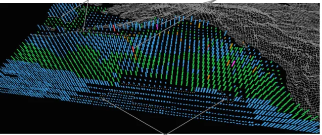
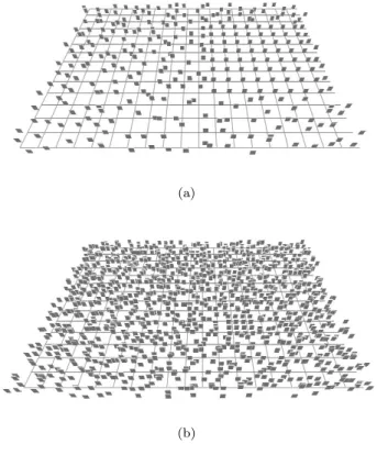
Fig. 1 shows an example of our technique applied to the oceanographic dataset: environmental conditions in the northern Pacific Ocean are visualized using multicolored pexels. In this display, color represents open-ocean plank-ton density, height represents ocean current strength (taller for stronger), and density represents sea surface tempera-ture (denser for warmer). Fig. 1 is only one frame from a much larger time-series of historical ocean conditions. Our choice of visual features was guided by experimental
re-temperature gradients (density)
dense plankton blooms (colour) current strength gradient (height)
Fig. 1. Color, height, and density used to visualize open-ocean plankton density, ocean current strength, and sea surface temperature, respectively; low to high plankton densities represented with blue, green, brown, red, and purple, stronger currents represented with taller pexels, and warmer temperatures represented with denser pexels
sults that show how different color and texture properties can be used in combination to represent multivariate data elements.
Work described in this paper is an extension of earlier texture and color studies reported in [22], [23], [25]. We began our investigation by conducting a set of controlled experiments to measure user performance and identify vi-sual interference that may occur during vivi-sualization. Indi-vidual texture and color experiments were run in isolation. The texture experiments studied the perceptual salience of and interference between the perceptual texture dimen-sions height, density, and regularity. The color experiments measured the effects of color distance, linear separation, and named color category on perceived color difference. Positive results from both studies led us to conduct an additional set of experiments that tested the combination of texture and color in a single display. Results in the literature vary in their description of this task: some re-searchers have reported that random color variation can interfere significantly with a user’s ability to see an under-lying texture region [8], [9], [49], while others have found no impact on performance [53], [58]. Our investigation ex-tends this earlier work on two-dimensional texture patterns into an environment that displays height fields using per-spective projections. To our knowledge, no one has studied the issue of color on texture or texture on color interference during visualization. Results from our experiments showed that we could design an environment in which color vari-ations caused a small but statistically reliable interference effect during texture segmentation. The strength of this effect depends on the difficulty of the analysis task: tasks that are more difficult are more susceptible to color inter-ference. Texture variation, on the other hand, caused no interference during color segmentation. We are using these results to build a collection of pexels that allow a viewer to
visually explore a multivariate dataset in a rapid, accurate, and relatively effortless fashion.
We begin with a description of results from computer vision, computer graphics, and psychophysics that dis-cuss methods for identifying and controlling the perceptual properties of texture and color. Next, we describe an area of human psychophysics concerned with modeling control of visual attention in the low-level human visual system. We discuss how the use of visual stimuli that control atten-tion can lead to significant advantages during visualizaatten-tion. Section 4 gives an overview of the experiments we used to build and test our perceptual texture elements. In Section 5, we discuss how we chose to select and test our percep-tual colors. Following this, we describe new experiments designed to study the combined use of texture and color. Finally, we report on practical applications of our research in Section 7, then discuss avenues for future research in Section 8.
II. Related Work
Researchers from many different areas have studied tex-ture and color in the context of their work. Before we discuss our own investigations, we provide an overview of results in the literature that are most directly related to our interests.
A. Texture
The study of texture crosses many disciplines, including computer vision, human visual psychophysics, and com-puter graphics. Although each group focuses on separate problems (texture segmentation and classification in com-puter vision, modeling the low-level human visual system in psychophysics, and information display in graphics) they each need ways to describe accurately the texture patterns being classified, modeled, or displayed. [41] describes two
general classes of texture representation: statistical models that use convolution filters and other techniques to measure variance, inertia, entropy, or energy, and perceptual mod-els that identify underlying perceptual texture dimensions like contrast, size, regularity, and directionality. Our cur-rent texture studies focus on the perceptual features that make up a texture pattern. In our work we demonstrate that we can use texture attributes to assist in visualization, producing displays that allow users to rapidly and accu-rately explore their data by analyzing the resulting texture patterns.
Different methods have been used to identify and investi-gate the perceptual features inherent in a texture pattern. Bela Jul´esz [27], [28] has conducted numerous psychophys-ical experiments to study how a texture’s first, second, and third-order statistics affect discrimination in the low-level visual system. This led to the texton theory [29], which proposes that early vision detects three types of features (or textons, as Jul´esz called them): elongated blobs with specific visual properties (e.g.,hue, orientation, or length), ends of line segments, and crossing of line segments. Other psychophysical researchers have studied how visual features like color, orientation, and form can be used to rapidly and accurately segment collections of elements into spatially coherent regions [7], [8], [52], [58], [59].
Work in psychophysics has also been conducted to study how texture gradients are used to judge an object’s shape. Cutting and Millard discuss how different types of gradi-ents affect a viewer’s perception of the flatness or curvature of an underlying 3D surface [13]. Three texture gradients were tested: perspective, which refers to smooth changes in the horizontal width of each texture element, compres-sion, which refers to changes in the height to width ratio of a texture element, and density, which refers to changes in the number of texture elements per unit of solid visual angle. For most surfaces the perspective and compression gradients decrease with distance, while the density gradient increases. Cutting and Millard found that viewers use per-spective and density gradients almost exclusively to iden-tify the relative slant of a flat surface. In contrast, the compression gradient was most important for judging the curvature of undulating surfaces. Later work by Aks and Enns on overcoming perspective foreshortening in early vi-sion also discussed the effects of texture gradients on the perceived shape of an underlying surface [1].
Work in computer vision is also interested in how viewers segment images, in part to try to develop automated tex-ture classification and segmentation algorithms. Tamura et al. and Rao and Lohse identified texture dimensions by conducting experiments that asked observers to divide pic-tures depicting different types of texpic-tures (Brodatz images) into groups [39], [40], [50]. Tamura et al. used their results to propose methods for measuring coarseness, contrast, di-rectionality, line-likeness, regularity, and roughness. Rao and Lohse used multidimensional scaling to identify the pri-mary texture dimensions used by their observers to group images: regularity, directionality, and complexity. Haral-ick built grayscale spatial dependency matrices to identify
features like homogeneity, contrast, and linear dependency [21]. These features were used to classify satellite images into categories like forest, woodlands, grasslands, and wa-ter. Liu and Picard used Wold features to synthesize tex-ture patterns [35]. A Wold decomposition divides a 2D homogeneous pattern (e.g., a texture pattern) into three mutually orthogonal components with perceptual proper-ties that roughly correspond to periodicity, directionality, and randomness. Malik and Perona designed computer algorithms that use orientation filtering, nonlinear inhibi-tion, and computation of the resulting texture gradient to mimic the discrimination ability of the low-level human vi-sual system [37].
Researchers in computer graphics are studying methods for using texture to perform tasks such as representing sur-face shape and extent, displaying flow patterns, identifying spatially coherent regions in high-dimensional data, and multivariate visualization. Schweitzer used rotated discs to highlight the shape and orientation of a three-dimensional surface [47]. Grinstein et al. created a system called EXVIS that uses “stick-men” icons to produce texture patterns that show spatial coherence in a multivariate dataset [19]. Ware and Knight used Gabor filters to construct texture patterns; attributes in an underlying dataset are used to modify the orientation, size, and contrast of the Gabor ele-ments during visualization [57]. Turk and Banks described an iterated method for placing streamlines to visualize two-dimensional vector fields [54]. Interrante displayed texture strokes to help show three-dimensional shape and depth on layered transparent surfaces; principal directions and cur-vatures are used to orient and advect the strokes across the surface [26]. Salisbury et al. used texturing techniques to build computer-generated pen-and-ink drawings that con-vey a realistic sense of shape, depth, and orientation [46]. Finally, Laidlaw described two methods for displaying a 2D diffuse tensor image with seven values at each spatial loca-tion [32]. The first method used the shape of normalized ellipsoids to represent individual tensor values. The second used techniques from oil painting [38] to represent all seven values simultaneously via multiple layers of varying brush strokes.
Visualization techniques like EXVIS [19] are sometimes referred to as “glyph-based” methods. Glyphs are graphi-cal icons with visual features like shape, orientation, color, and size that are controlled by attributes in an underlying dataset. Glyph-based techniques range from representation via individual icons to the formation of texture and color patterns through the overlay of many thousands of glyphs. Initial work by Chernoff suggested the use of facial charac-teristics to represent information in a multivariate dataset [6], [10]. A face is used to summarize a data element; indi-vidual data values control features in the face like the nose, eyes, eyebrows, mouth, and jowls. Foley and Ribarsky have created a visualization tool called Glyphmaker that can be used to build visual representations of multivariate datasets in an effective, interactive fashion [16]. Glyphmaker uses a glyph editor and glyph binder to create glyphs, to ar-range them spatially, and to bind attributes to their visual
properties. Levkowitz described a prototype system for combining colored squares to produce patterns to represent an underlying multivariate dataset [33]. Other techniques such as the normalized ellipsoids of Laidlaw [32], the Gabor elements of Ware [57], or even the pexels described in this paper might also be classified as glyphs, although we prefer to think of them as texture-based visualization methods. B. Color
As with texture, color has a rich history in the areas of computer graphics and psychophysics. In graphics, re-searchers have studied issues related to color specification, color perception, and the selection of colors for information representation during visualization. Work in psychophysics describes how the human visual system mediates color per-ception.
A number of different color models have been built in computer graphics to try to support the unambiguous spec-ification of color [60]. These models are almost always three-dimensional, and are often divided into a device-dependent class, where a model represents the displayable colors of a given output device, and a device-independent class, where a model provides coordinates for colors from the visible color spectrum. Common examples of device-dependent models include monitor RGB and CMYK. Com-mon examples of device-independent models include CIE XYZ, CIE LUV, and CIE Lab. Certain models were de-signed to provide additional functionality that can be used during visualization. For example, both CIE LUV and CIE Lab provide rough perceptual uniformity; that is, the Eu-clidean distance between a pair of colors specified in these models roughly corresponds to perceived color difference. These models also provide a measure of isoluminance, since their L-axis is meant to correspond to perceived brightness. Previous work has also addressed the issue of construct-ing color scales for certain types of data visualization. For example, Ware and Beatty describe a simple color vi-sualization technique for displaying correlation in a five-dimensional dataset [56]. Ware has also designed a method for building continuous color scales that control color sur-round effects [55]. The color scales use a combination of luminance and hue variation that allows viewers to deter-mine the value associated with a specific color, and to iden-tify the spatial locations of peaks and valleys (i.e., to see the shape) in a 2D distribution of an attribute’s values. Controlling color surround ensures a small, near-constant perceptual error effect from neighboring colors across the entire range of the color scale. Robertson described user interface techniques for visualizing the range of colors a display device can support using perceptual color mod-els [44]. Rheingans and Tebbs have built a system that allows users to interactively construct a continuous color scale by tracing a path through a 3D color model [43]. This technique allows users to vary how different values of an attribute map onto the color path. Multiple col-ors can be used to highlight areas of interest within an attribute, even when those areas constitute only a small fraction of the attribute’s full range of allowable values.
Levkowitz and Herman designed a locally optimal color scale that maximizes the just-noticeable color difference between neighboring pairs of colors [34]. The result is a significantly larger number of just-noticeably different col-ors in their color scales, compared to standard scales like red-blue, rainbow, or luminance.
Recent work at the IBM Thomas J. Watson Research Center has focused on a rule-based visualization tool [45]. Initial research addressed the need for rules that take into account how a user perceives visual features like hue, lumi-nance, height, and so on. These rules are used to guide or restrict a user’s choices during data-feature mapping. The rules use various metadata, for example, the visualization task being performed, the visual features being used, and the spatial frequency of the data being visualized. A spe-cific example of one part of this system is the colormap selection tool from the IBM Visualization Data Explorer [5]. The selection tool uses perceptual rules and metadata to limit the choice of colormaps available to the user.
Finally, psychophysicists have been working to identify properties that affect perceived color difference. Two im-portant discoveries include the linear separation [3], [4], [14] and color category [31] effects. The linear separation theory states that if a target color can be separated from all the other background colors being displayed with a sin-gle straight line in color space, it will be easier to detect (i.e., its perceived difference from all the other colors will increase) compared to a case where it can be formed by a linear combination of the background colors. D’Zmura’s initial work on this phenomena [14] showed that a target color could be rapidly identified in a sea of background ele-ments uniformly colored one of two colors (e.g.,an orange target could be rapidly identified in a sea of red elements, or in a sea of yellow elements). The same target, however, was much more difficult to find when the background el-ements used both colors simultaneously (e.g., an orange target could not be rapidly identified in a sea of red and yellow elements). This second case is an example of a tar-get color (orange) that is a linear combination of its back-ground colors (red and yellow). The color category effect suggests that the perceived difference between a pair of col-ors increases when the two colcol-ors occupy different named color regions (i.e., one lies in the “blue” region and one lies in the “purple” region, as opposed to both in blue or both in purple). We believe both results may need to be considered to guarantee perceptual uniformity during color selection.
C. Combined Texture and Color
Although texture and color have been studied exten-sively in isolation, much less work has focused on their combined use for information representation. An effective method of displaying color and texture patterns simulta-neously would increase the number of attributes we can represent at one time. The first step towards supporting this goal is the determination of the amount of visual in-terference that occurs between these features during visu-alization.
Experiments in psychophysics have produced interest-ing but contradictory answers to this question. Callaghan reported asymmetric interference of color on form during texture segmentation: a random color pattern interfered with the identification of a boundary between two groups of different forms, but a random form pattern had no effect on identifying color boundaries [8], [9]. Triesman, however, showed that random variation of color had no effect on de-tecting the presence or absence of a target element defined by a difference in orientation (recall that directionality has been identified as a fundamental perceptual texture dimen-sion) [53]. Recent work by Snowden [49] recreated the dif-fering results of both Callaghan and Triesman. Snowden ran a number of additional experiments to test the effects of random color and stereo depth variation on the detec-tion of a target line element with a unique orientadetec-tion. As with Callaghan and Triesman, results differed depending on the target type. Search for a single line element was rapid and accurate, even with random color or depth vari-ation. Search for a spatial collection of targets was easy only when color and depth were fixed to a constant value. Random variation of color or depth produced a significant reduction in detection accuracy. Snowden suggests that the visual system wants to try to group spatially neighboring elements with common visual features, even if this grouping is not helpful for the task being performed. Any random variation of color or depth interferes with this grouping process, thereby forcing a reduction in performance.
These results leave unanswered the question of whether color variation will interfere with texture identification dur-ing visualization. Moreover, work in psychophysics studied two-dimensional texture segmentation. Our pexels are ar-rayed over an underlying height field, then displayed in 3D using a perspective projection. Most of the research to date has focused on color on texture interference. Less work has been conducted to study how changes in texture dimensions like height, density, or regularity will affect the identifica-tion of data elements with a particular target color. The question of interference in this kind of height-field envi-ronment needs to be addressed before we can recommend methods for the combined use of color and texture.
III. Perceptual Visualization
An important requirement for any visualization tech-nique is a method for rapid, accurate, and effortless vi-sual exploration. We address this goal by using what is known about the control of human visual attention as a foundation for our visualization tools. The individual fac-tors that govern what is attended in a visual display can be organized along two major dimensions: bottom-up (or stimulus driven) versus top-down (or goal directed).
Bottom-up factors in the control of attention include the limited set of features that psychophysicists have identified as being detected very quickly by the human visual sys-tem, without the need for search. These features are often called preattentive, because their detection occurs rapidly and accurately, usually in an amount of time independent of the total number of elements being displayed. When
applied properly, preattentive features can be used to per-form different types of exploratory analysis. Examples in-clude searching for data elements with a unique visual fea-ture, identifying the boundaries between groups of elements with common features, tracking groups of elements as they move in time and space, and estimating the number of el-ements with a specific feature. Preattentive tasks can be performed in a single glance, which corresponds to 200 mil-liseconds (ms) or less. As noted above, the time required to complete the task is independent of the number of data elements being displayed. Since the visual system cannot choose to refocus attention within this timeframe, users must complete their task using only a “single glance” at the image.
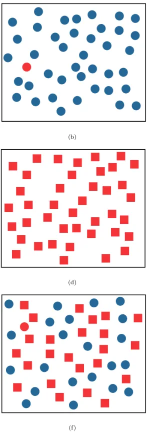
Fig. 2 shows examples of both types of target search. In Fig. 2a-2d the target, a red circle, is easy to find. Here, the target contains a preattentive feature unique from the background distracters: color (red versus blue) or shape (circle versus square). This unique feature is used by the low-level visual system to rapidly identify the presence or absence of the target. Unfortunately, an intuitive combina-tion of these results can lead to visual interference. Fig. 2e and 2f simulate a two-dimensional dataset where one at-tribute is encoded with color (red or blue), and the other is encoded with shape (circle or square). Although these features worked well in isolation, searching for a red circle target in a sea of blue circles and red squares is signifi-cantly more difficult. In fact, experiments have shown that search time is directly proportional to the number of ele-ments in the display, suggesting that viewers are searching small subgroups of elements (or even individual elements themselves) to identify the target. In this example the low-level visual system has no unique feature to search for, since circular elements (blue circles) and red elements (red squares) are also present in the display. The visual system cannot integrate preattentively the presence of multiple vi-sual features (circular and red) at the same spatial location. This is a very simple example of a situation where knowl-edge of preattentive vision would have allowed us to avoid displays that actively interfere with our analysis task.
In spite of the perceptual salience of the target in Fig. 2a-2d, bottom-up influences cannot be assumed to operate independently of the current goals and attentional state of the observer. Recent studies have demonstrated that many of the bottom-up factors only influence perception when the observer is engaged in a task in which they are expected or task-relevant (see the review by [15]). For ex-ample, a target defined as a color singleton will “pop out” of a display only when the observer is looking for targets defined by color. The same color singleton will not influ-ence perception when observers are searching exclusively for luminance defined targets. Sometimes observers will fail completely to see otherwise salient targets in their visual field, either because they are absorbed in the performance of a cognitively-demanding task [36], there are a multitude of other simultaneous salient visual events [42], or because the salient event occurs during an eye movement or other change in viewpoint [48]. Therefore, the control of
atten-(a) (b)
(c) (d)
(e) (f)
Fig. 2. Examples of target search: (a, b) identifying a red target in a sea of blue distracters is rapid and accurate, target absent in (a), present in (b); (c, d) identifying a red circular target in a sea of red square distracters is rapid and accurate, target present in (c), absent in (d); (e, f) identifying the same red circle target in a combined sea of blue circular distracters and red square distracters is significantly more difficult, target absent in (e), present in (f)
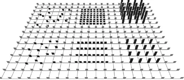
Fig. 3. A background array of short, sparse, regular pexels; the lower and upper groups on the left contain irregular and random pexels, respectively; the lower and upper groups in the center contain dense and very dense pexels; the lower and upper groups to the right contain medium and tall pexels
tion must always be understood as an interaction between bottom-up and top-down mechanisms.
Our research is focused on identifying relevant results in the vision and psychophysical literature, then extend-ing these results and integratextend-ing them into a visualization environment. Tools that make use of preattentive vision of-fer a number of important advantages during multivariate visualization:
1. Visual analysis is rapid, accurate, and relatively effort-less since preattentive tasks can be completed in 200 ms or less. We have shown that tasks performed on static dis-plays extend to a dynamic environment where data frames are shown one after another in a movie-like fashion [24] (i.e.,tasks that can be performed on an individual display in 200 ms can also be performed on a sequence of displays shown at five frames a second).
2. The time required for task completion is independent of display size (to the resolution limits of the display). This means we can increase the number of data elements in a display with little or no increase in the time required to analyze the display.
3. Certain combinations of visual features cause interfer-ence patterns that mask information in the low-level visual system. Our experiments are designed to identify these sit-uations. This means our visualization tools can be built to avoid data-feature mappings that might interfere with the analysis task.
Since preattentive tasks are rapid and insensitive to dis-play size, we believe visualization techniques that make use of these properties will support high-speed exploratory analysis of large, multivariate datasets. Care must be taken, however, to ensure that we choose data-feature map-pings that maximize the perceptual salience of all the data attributes being displayed.
We are currently investigating the combined use of two important and commonly used visual features: texture
and color. Previous work in our laboratory has identified methods for choosing perceptual textures and colors for multivariate visualization. Results from vision and psy-chophysics on the simultaneous use of both features are mixed: some researchers have reported that background color patterns mask texture information, and vice-versa, while others claim that no interference occurs. Experi-ments reported in this paper are designed to test for color-texture interactions during visualization. A lack of interfer-ence would suggest that we could combine both features to simultaneously encode multiple attributes. The presence of interference, on the other hand, would place important limitations on the way in which visual attributes should be mapped onto data attributes. Visualization tools based on these findings would then be able to display textures with the appropriate mapping of data dimensions to visual attributes.
IV. Pexels
One of the main goals of multivariate visualization is to display multiple attribute values at a single spatial loca-tion without overwhelming the user’s ability to comprehend the resulting image. Researchers in vision, psychophysics, and graphics have been studying how the visual system analyzes texture patterns. We wanted to know whether perceptual texture dimensions could be used to represent multivariate data elements during visualization. To this end, we designed a set of perceptual texture elements, or pexels, that support the variation of three separate tex-ture dimensions: density, regularity, and height. Density and regularity have been identified in the literature as pri-mary texture dimensions [39], [40], [50]. Although height might not be considered an “intrinsic textural cue”, we note that height is one aspect of element size, and that size is an important property of a texture pattern. Results from psychophysical experiments have shown that differences in
(a) (b) (c)
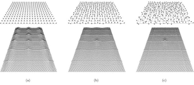
Fig. 4. Three displays of pexels with different regularity and a 5×3 patch from the center of the corresponding autocorrelation graphs: (a) a completely regular display, resulting in sharp peaks of height 1.0 at regular intervals in the autocorrelation graph; (b) a display with irregularly-spaced pexels, peaks in the graph are reduced to a maximum height between 0.3 and 0.4; (c) a display with randomly-spaced pexels, resulting in a completely flat graph except at (0,0) and where underlying grid lines overlap
height are detected preattentively [51], moreover, viewers properly correct for perspective foreshortening when they perceive that elements are being displayed in 3D [1]. We wanted to build three-dimensional pexels that “sit up” on the underlying surface. This allows for the possibility of applying various orientations (another important texture dimension) to a pexel.
Our pexels look like a collection of one or more upright paper strips. Each element in the dataset is represented by a single pexel. The user maps attributes in their dataset to density (which controls the number of strips in a pexel), height, and regularity. The attribute values for a particular element can then control the appearance of its pexel. When all the pexels for a particular data frame are displayed, they form texture patterns that represent the underlying structure of the dataset.
Fig. 3 shows an example of regularity, density, and height varied across three discrete values. Each pexel in the origi-nal array (shown in gray) is short, sparse, and regular. The lower and upper patches on the left of the array (shown in black) contain irregular and random pexels, respectively. The lower and upper patches in the middle of the array contain dense and very dense pexels. The lower and upper patches on the right contain medium and tall pexels. A. Ordering Texture Dimensions
In order to use height, density, and regularity during visualization, we needed an ordinal ranking for each di-mension. Height and density both have a natural order-ing: shorter comes before taller, and sparser comes before denser.
Although viewers can often order regularity intuitively, we required a more formal method for measurement. We chose to use autocorrelation to rank regularity. This tech-nique measures the second-order statistic of a texture
pat-tern. Psychophysicists have reported that a change in reg-ularity produces a corresponding change in a texture’s sec-ond order statistic [27], [28], [30]. Intuitively, autocorrelat-ing an image shifts two copies of the image on top of one another, to see how closely they can be matched. If the texture is made up of a regular, repeating pattern it can be shifted in various ways to exactly overlap with itself. As more and more irregularity is introduced into the texture, the amount of overlap decreases, regardless of where we shift the copies. Consider two copies of an image A and B, each with a width of N and a height ofM pixels. The amount of autocorrelation that occurs when A is overlaid ontoBat offset (t, u) is:
C(t, u) =K1 N X x=1 M X y=1 (A[x, y]−A)(B[x+t, y+u]−B) (1) K=NMpσ2(A)pσ2(B) (2) A= 1 NM N X x=1 M X y=1 A[x, y] (3) σ2(A) = 1 NM N X x=1 M X y=1 (A[x, y]−A)2 (4)
withBandσ2(B) computed in a similar fashion. Elements inAthat do not overlap withBare wrapped to the opposite side ofB(i.e.,elements inAlying above the top ofBwrap back to the bottom, elements lying below the bottom ofB wrap back to the top, similarly for elements to the left or right ofB).
As a practical example, consider Fig. 4a (pexels on a reg-ular underlying grid), Fig. 4b (pexels on an irregreg-ular grid),
and Fig. 4c (pexels on a random grid). Irregular and ran-dom pexels are created by allowing each strip in the pexel to walk a random distance (up to fixed maximum) in a random direction from its original anchor point. Autocor-relation was computed on the orthogonal projection of each image. A 5×3 patch from the center of the corresponding autocorrelation graph is shown beneath each of the three grids. Results in the graphs mirror what we see in each display, that is, as randomness increases, peaks in the au-tocorrelation graph decrease in height. In Fig. 4a peaks of height 1.0 appear at regular intervals in the graph. Each peak represents a shift that places pexels so they exactly overlap with one another. The rate of increase towards each peak differs in the vertical and horizontal directions because the elements in the graph are rectangles (i.e.,taller than they are wide), rather than squares. In Fig. 4b, the graph has the expected sharp peak at (0,0). It also has gentle peaks at shift positions that realign the grid with itself. The peaks are not as high as for the regular grid, because the pexels no longer align perfectly with one an-other. The sharp vertical and horizontal ridges in the graph represent positions where the underlying grid lines exactly overlap with one another (the grid lines showing the orig-inal position of each pexel are still regular in this image). The height of each gentle peak ranges between 0.3 and 0.4. Increasing randomness reduces again the height of the peaks in the correlation graph. In Fig. 4c, no peaks are present, apart from (0,0) and the sharp ridges that occur when the underlying grid lines overlap with one another. The resulting correlation values suggests that this image is “more random” than either of its predecessors. Informal tests with a variety of regularity patterns showed a near-perfect match between user-chosen rankings and rankings based on our autocorrelation technique. Autocorrelation on the perspective projections of each grid could also be computed. The tall peaks and flattened results would be similar to those in Fig. 4, although the density of their spacing would change near the top of the image due to perspective compression and foreshortening.
B. Pexel Salience and Interference
We conducted experiments to test the ability of each tex-ture dimension to display effectively an underlying data attribute during multivariate visualization. To summa-rize, our experiments were designed to answer the following three questions:
1. Can the perceptual dimensions of density, regularity, and height be used to show structure in a dataset through the variation of a corresponding texture pattern?
2. How can we use the dataset’s attributes to control the values of each perceptual dimension?
3. How much visual interference occurs between each of the perceptual dimensions when they are displayed simul-taneously?
C. Experiments
We designed texture displays to test the detectability of six different target types: taller, shorter, denser, sparser,
more regular, and more irregular. For each target type, a number of parameters were varied, including exposure du-ration, texture dimension salience, and visual interference. For example, during the “taller” experiment, each display showed a 20×15 array of pexels rotated 45◦ about the X-axis. Observers were asked to determine whether the array contained a group of pexels that were taller than all the rest. The following conditions varied:
• target-background pairing: some displays showed a medium target in a sea of short pexels, while others showed a tall target in a sea of medium pexels; this allowed us to test whether some target defining attributes were generally more salient than others,
• secondary texture dimension: displays contained either no background variation (every pexel was sparse and reg-ular), a random variation of density across the array, or a random variation of regularity across the array; this al-lowed us to test for background interference during target search,
• exposure duration: displays were shown for 50, 150, or 450 ms; this allowed us to test for a reduction in perfor-mance when exposure duration was decreased, and • target patch size: target groups were either 2×2 pexels or 4×4 pexels in size; this allowed us to test for a reduction in performance for smaller target patches.
The heights, densities, and regularities we used were cho-sen through a set of pilot studies. Two patches were placed side-by-side, each displaying a pair of heights, densities, or regularities. Viewers were asked to answer whether the patches were different from one another. Response times for correct answers were used as a measure of performance. We tested a range of values for each dimension, although the spatial area available for an individual pexel during our experiments limited the maximum amount of density and irregularity we were able to display. The final values we chose could be rapidly and accurately differentiated in this limited setting.
The experiments that tested the other five target types (shorter, denser, sparser, regular, and irregular) were de-signed in a similar fashion, with one exception. Exper-iments testing regularity had only one target-background pairing: a target of regular pexels in a sea of random pexels (for the regular experiment), or a target of random pexels in a sea of regular pexels (for the irregular experiment). The pilot studies used to select values for each dimension showed that users had great difficulty discriminating an ir-regular patch from a random patch. This was due in part to the small spatial area available to each pexel.
Our pilot studies produced experiments that tested three separate heights (short, medium, and tall), three separate densities (sparse, dense, and very dense) and two separate regularities (regular and random). Examples of two dis-play types (taller and regular) are shown in Fig. 5. Both displays include target pexels. Fig. 5a contains a 2×2 tar-get group of medium pexels in a sea of short pexels. The density of each pexel varies across the array, producing an underlying density pattern that is clearly visible. This dis-play type simulates two dimensional data elements being
(a)
(b)
Fig. 5. Two display types from the taller and regular pexel experi-ments: (a) a target of medium pexels in a sea of short pexels with a background density pattern (2×2 target group located left of center); (b) a target of regular pexels in a sea of irregular pexels with no background texture pattern (2×2 target group located 3 grid steps right and 7 grid steps up from the lower-left corner of the array)
visualized with height as the primary texture dimension and density as the secondary texture dimension. Recall that the number of paper strips in a pexel depends on its density. Since three of the target pexels in Fig. 5a are dense, they each display two strips. The remaining pexel is sparse, and therefore displays a only single strip. Fig. 5b contains a 2×2 target group of regular pexels in a sea of random pexels, with a no background texture pattern. The taller target in Fig. 5a is very easy to find, while the regular target in Fig. 5b is almost invisible.
D. Results
Detection accuracy data were analyzed using a multi-factor analysis of variance (ANOVA). A complete descrip-tion of our analysis and statistical findings is available in [22], [23], [25]. In summary, we found:
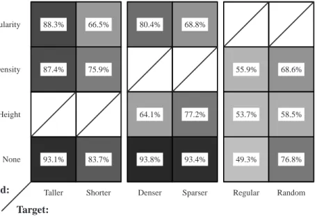
1. Taller target regions were identified rapidly (i.e., 150 ms or less) with very high accuracy (approximately 93%); background density and regularity patterns produced no significant interference.
2. Shorter, denser, and sparser targets were more difficult to identify than taller targets, although good results were obtained at both 150 and 450 ms (82.3%, 94.0%, and 94.7% for shorter, denser, and sparser targets with no background variation at 150 ms). This was not surprising, since similar
results have been documented by [51] and [1] using displays of texture on a two-dimensional plane.
3. Background variation in non-target attributes produced small, but statistically significant, interference effects. These effects tended to be largest when target detectability was lowest. For example, density and regularity interfered with searching for shorter targets; height and regularity in-terfered with searching for sparser targets; but only height interfered with the (easier to find) denser targets.
4. Irregular target regions were difficult to identify at 150 and 450 ms, even with no secondary texture pattern (ap-proximately 76%). Whether this accuracy level is suffi-ciently high will depend on the application. In contrast, regular regions were invisible under these conditions; the percentage of correct responses approached chance (i.e., 50%) in every condition.
(a)
(b)
Fig. 6. Two displays with a regular target, both displays should be compared with the target shown in Fig. 5b: (a) larger target, an 8×8 target in a sea of sparse, random pexels; (b) denser background, a 2×2 target in a sea of dense, random pexels (target group located right of center)
Our poor detection results for regularity were unex-pected, particularly since vision algorithms that perform texture classification use regularity as one of their primary decision criteria [35], [39], [40], [50]. We confirmed that our results were not due to a difference in our definition of regularity; the way we produced irregular patches matches the methods described by [20], [28], [30], [39], [40], [50]. It may be that regularity is important for classifying differ-ent textures, but not for the type of texture segmdiffer-entation that we are performing. Informal post-experiment investi-gations showed that we could improve the salience of a
reg-93.1% 83.7% 93.8% 93.4% 49.3% 76.8% 88.3% 66.5% 80.4% 68.8%
87.4% 75.9% 55.9% 68.6%
64.1% 77.2% 53.7% 58.5%
Taller Shorter Denser Sparser Regular Random Height Density Regularity None Background: Target:
Fig. 7. A table showing the percentage of correct responses for each target-background pairing; target type along the horizontal axis, background type along the vertical axis; darker squares represent pairings with a high percentage of correct responses; blank entries with diagonal slashes indicate target-background pairings that do not exist
ular (or irregular) patch by increasing its size (Fig. 6a), or by increasing the minimum pexel density to be very dense (Fig. 6b). However, neither of these solutions is necessarily useful. There is no way to guarantee that data values will cluster together to form the large spatial regions needed for regularity detection. If we constrain density to be very dense across the array, we lose the ability to vary density over an easily identifiable range. This reduces the dimen-sionality of our pexels to two (height and regularity), pro-ducing a situation that is no better than when regularity is difficult to identify. Because of this, we normally choose to display an attribute with low importance using regu-larity. While differences in regularity cannot be detected consistently by the low-level visual system, in many cases users may be able to see the changes when areas of interest in the dataset are identified and analyzed in a focused or attentive fashion.
Fig. 7 shows average subject performance as a table rep-resenting each target-background pair. Target type varies along the horizontal axis, while background type varies along the vertical axis. Darker squares represent target-background pairings with highly accurate subject perfor-mance. The number in the center of each square reports the percentage of correct responses averaged across all sub-jects.
V. Perceptual Colors
In addition to our study of pexels, we have examined methods for choosing multiple individual colors. These ex-periments were designed to select a set of n colors such that:
1. Any color can be detected preattentively, even in the presence of all the others.
2. The colors are equally distinguishable from one another; that is, every color is equally easy to identify.
We also tested for the maximum number of colors that can be displayed simultaneously, while still satisfying the above requirements. Background research suggested that we needed to consider three separate selection criteria: color distance, linear separation, and color category. A. Color Distance
Perceptually balanced color models are often used to measure perceived color difference between pairs of colors. Examples include CIE LUV, CIE Lab, Munsell, and the Optical Society of America Uniform Color Space. We used CIE LUV to measure color distance. Colors are specified in this model using three axes: L∗,u∗, andv∗. L∗encodes luminance, while u∗ and v∗ encode chromaticity (u∗ and v∗correspond roughly to the red-green and blue-yellow op-ponent color channels). CIE LUV provides two important properties. First, colors with the sameL∗ are isoluminant, that is, they have roughly the same perceived brightness. Second, the Euclidean distance between a pair of colors cor-responds roughly to their perceived color difference. Given two colorsxandyin CIE LUV space, the perceived differ-ence measured in ∆E∗ units is:
∆E∗
xy=
q
(∆L∗xy)2+ (∆u∗xy)2+ (∆vxy∗ )2 (5) Our techniques do not depend on CIE LUV; we could have chosen to use any perceptually balanced color model. We picked CIE LUV in part because it is reasonably well known, and in part because it is recommended by the Com-mission Internationale de L’´Eclairage (CIE) as the appro-priate model to use for CRT displays [11].
B. Linear Separation
Results from vision and psychophysics suggest that col-ors that are linearly separable are significantly easier to
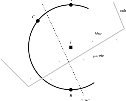
T-BC linear separation C A T B blue-purple color category boundary
blue
purple
Fig. 8. A small, isoluminant patch within the CIE LUV color model, showing a target colorTand three background distracter colorsA,B, andC; note thatTis collinear withAandB, but can be separated by a straight line fromBandC; note also thatT,A, andCoccupy the “blue” color region, whileBoccupies the “purple” color region
distinguish from one another. Initial work on this prob-lem was reported in [14]. These results were subsequently confirmed and strengthened by [3], [4] who showed that a perceptually balanced color model could not be used to overcome the linear separation effect.
As an example, consider a target colorTand three back-ground distracter colors A, B, and C shown in CIE LUV space in Fig. 8. Since the Euclidean distancesTA,TB, and TCare equal, the perceived color difference betweenTand A,B, andCshould also be roughly equal. However, search-ing for a target element colored Tin a sea of background elements coloredAandBis significantly more difficult than searching forTin a sea of elements coloredBandC. Ex-perimental results suggest that this occurs because T is collinear withA and B, whereasTcan be separated by a straight line in color space fromBandC. Linear separation increases perceived color difference, even when a perceptual color model is used to try to control that difference. C. Color Category
Recent work reported by Kawai et al. showed that, dur-ing their experiments, the named categories in which peo-ple place individual colors can affect perceived color differ-ence [31]. Colors from different named categories have a larger perceived color difference, even when Euclidean dis-tance in a perceptually balanced color model is held con-stant.
Consider again the target color T and two background distracter colors A and B shown in CIE LUV space in Fig. 8. Notice also that this region of color space has been divided into two named color categories. As before, the Euclidean distances TAand TB are equal, yet finding an
element coloredTin a sea of background elements colored A is significantly more difficult than findingT in a sea of elements colored B. Kawai et al. suggest this is because both T and A lie within a color category named “blue”, while B lies within a different category named “purple”. Colors from different named categories have a higher per-ceived color difference, even when a perceptual color model is used to try to control that difference.
D. Color Selection Experiments
Our first experiment selected colors by controlling color distance and linear separation, but not color category. The reasons for this were twofold. First, traditional methods for subdividing a color space into named color regions are te-dious and time-consuming to run. Second, we were not convinced that results from [31] were important for our color selection goals. If problems occurred during our ini-tial experiment, and if those problems could be addressed by controlling color category during color selection, this would both strengthen the results of [31] and highlight their applicability to the general color selection task.
We selected colors from the boundary of a maximum-radius circle embedded in our monitor’s gamut. The cir-cle was located on an isoluminant slice through the CIE LUV color model. Previous work reported in [7], [9] showed that a random variation of luminance can interfere with the identification of a boundary between two groups of differ-ently colored elements. Holding the perceived luminance of each color constant guaranteed variations in performance would not be the result of a random luminance effect. Fig. 9 shows an example of selecting five colors about the circum-ference of the maximum-radius circle inscribed within our
monitor’s gamut at L∗ = 61.7. Since colors are located equidistant around the circle, every color has a constant distance d to its two nearest neighbors, and a constant distance lto the line that separates it from all the other colors. YR Y GY G BG B PB P RP R Gamut Boundary d d l
Fig. 9. Choosing colors from the monitor’s gamut, the boundary of the gamut atL∗= 61.7 represented as a quadrilateral, along with the maximum inscribed circle centered at (L∗,u∗,v∗) = (67.1,13.1,−0.98), radius 70.5∆E∗; five colors chosen around the circle’s circumference; each element has a constant color distance
dwith its two neighbors, and a constant linear separationlfrom the remaining (non-target) elements; the circle’s circumference has been subdivided into ten named categories, corresponding to the ten hue names from the Munsell color model
We split the experiment into four studies that displayed three, five, seven, and nine colors simultaneously. This allowed us to test for the maximum number of colors we could show while still supporting preattentive identifica-tion. Displays in each study were further divided along the following conditions:
• target color: each color being displayed was tested as a target, for example, during the three-color study some ob-servers searched for a red target in a sea of green and blue distracters, others search for a blue target in a sea of red and green distracters, and the remainder searched for a green target in a sea of red and blue distracters; asymmet-ric performance (that is, good performance for some colors and poor performance for others) would indicate that con-stant distance and separation are not sufficient to guarantee equal perceived color difference, and
• display size: experiment displays contained either 17, 33, or 49 elements; any decrease in performance when display size increased would indicate that the search task is not preattentive.
At the beginning of an experiment session observers were asked to search a set of displays for an element with a par-ticular target color. Observers were told that half the dis-plays would contain an element with the target color, and half would not. They were then shown a sequence of ex-periment displays that contained multiple colored squares randomly located on an underlying 9×9 grid. Each dis-play remained onscreen until the observer indicated via a keypress whether a square with the given target color was present or absent. Observers were told to answer as quickly as possible without making mistakes.
E. Results
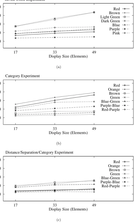
Observers were able to detect all the color targets rapidly and accurately during both the three-color and five-color studies; the average error rate was 2.5%, while the average response times ranged from 459 to 661 ms (response times exceeded the normal preattentive limit of 200 ms because they include the time required for observers to enter their responses on the keyboard). Increasing the display size had no significant effect on response time.
Observers had much more difficulty identifying certain colors during the seven-color (Fig. 10a) and nine-color stud-ies. Response times increased and accuracy decreased dur-ing both studies. More importantly, the time required to detect certain colors (e.g., light green and dark green in the seven-color study) was directly proportional to display size. This indicates observers are searching serially through the display to find the target element. Other colors exhib-ited relatively flat response time curves. These asymmetric results suggest that controlling color distance and linear separation alone is not enough to guarantee a collection of equally distinguishable colors.
F. Color Category Experiments
We decided to try to determine whether named color categories could be used to explain the inconsistent results from our initial experiment. To do this, we needed to sub-divide a color space (in our case, the circumference of our maximum radius circle) into named color regions. Tra-ditional color naming experiments divide the color space into a fine-grained collection of color samples. Observers are then asked to name each of the samples. We chose to use a simpler, faster method designed to measure the amount of overlap between a set of named color regions. Our technique runs in three steps:
1. The color space is automatically divided into ten named color regions using the Munsell color model. The hue axis of the Munsell model is specified using the ten color names red, yellow-red, yellow, green-yellow, green, blue-green, blue, purple-blue, purple, and red-purple (or R, YR, Y, GY, G, BG, B, PB, P, and RP). Colors are converted to Munsell space, then assigned their hue name within that space (Fig. 9).
2. Representative colors from each of the ten named re-gions are selected. We chose the color at the center of each region to act as the representative color for that region.
500 750 1000 1250 1500 17 33 49 Response Time (ms)
Display Size (Elements) Seven-Color Experiment Red Brown Light Green Dark Green Blue Purple Pink (a) 500 750 1000 1250 1500 17 33 49 Response Time (ms)
Display Size (Elements) Category Experiment Red Orange Brown Green Blue-Green Purple-Blue Red-Purple (b) 500 750 1000 1250 1500 17 33 49 Response Time (ms)
Display Size (Elements) Distance/Separation/Category Experiment Red Orange Brown Green Blue-Green Purple-Blue Red-Purple (c)
Fig. 10. Graphs showing averaged subject response times for three of the six studies: (a) response time as a function of display size (i.e.,
total number of elements shown in each display) for each target from the seven-color study; (b) response times for each target from the color category study; (c) response times for each target from the combined distance-separation-category study
3. Observers are asked to name each of the representative colors. The amount of overlap between the names cho-sen for the reprecho-sentative colors for each region defines the amount of “category overlap” that exists between the re-gions.
Consider Table I, which lists the percentage of observers who selected a particular name for six of the tive colors. For example, the table shows that representa-tive colors from P and R overlap only at the “pink” name. Their overlap is not that strong, since neither P nor R
are strongly classified as pink. The amount of overlap is computed by multiplying the percentages for the common name, giving a P-R overlap of 5.2% ×26.3% = 0.014. A closer correspondence of user-chosen names for a pair of regions results in a stronger category similarity. For exam-ple, nearly all observers named the representative colors from the G and GY regions as “green”. This resulted in an overlap of 0.973. Representative colors that overlap over multiple names are combined using addition, for example, YR and Y overlapped in both the “orange” and “brown”
TABLE I
A list of six representative colors for the color regions purple, red, yellow-red, yellow, green-yellow, and green, and the percentage of observers who chose a particular name for each representative color
purple magenta pink red orange brown yellow green
P 86.9% 2.6% 5.2% R 26.3% 71.0% YR 5.3% 86.8% 7.9% Y 2.6% 44.7% 47.4% GY 97.3% G 100.0%
names, resulting in a YR-Y overlap of (86.8% ×2.6%) + (7.9%×44.7%) = 0.058.
G. Color Category Results
When we compared the category overlap values against results from our seven and nine-color studies, we found that the amount of overlap between the target color and its background distracters provided a strong indication of performance. Colors that worked well as targets had low category overlap with all of their distracter colors. Colors that worked poorly had higher overlap with one or more of their distracter colors. A measure of rank performance to total category overlap produced correlation values of 0.821 and 0.762 for the seven and nine-color studies, respec-tively. This suggests that our measure of category overlap is a direct predictor of subject performance. Low category overlap between the target color and all of its background distracters produces relatively rapid subject performance. High category overlap between the target color and one or more background distracters results in relatively slow subject performance.
These results might suggest that color category alone can be used to choose a set of equally distinguishable col-ors. To test this, we selected seven new colors that all had low category overlap with one another, then reran the ex-periments. Results from this new set of colors were as poor as the original seven-color study (Fig. 10b). The seven new colors were located at the centers of their named categories, so their distances and linear separations varied. The colors with the longest response times had the smallest distances and separations. This suggests that we need to maintain at least a minimum amount of distance and separation to guarantee acceptable identification performance.
In our last experiment, we chose a final set of seven colors that tried to satisfy all three selection criteria. The cate-gories in which the colors were located all had low overlap with one another. Colors were shifted within their cate-gories to provide as large a distance and linear separation as possible. We also tried to maintain constant distances and linear separations for all the colors. Results from this final experiment were encouraging (Fig. 10c). Response times for each of the colors acting as a target were sim-ilar, with little or no effect from increased display size. The mean response error was also significantly lower than during the previous two seven-color experiments. We
con-cluded that up to seven isoluminant colors can be displayed simultaneously while still allowing for rapid and accurate identification, but only if the colors satisfy proper color distance, linear separation, and color category guidelines.
VI. Combining Texture and Color
Previous work in our laboratory focused on selecting per-ceptual textures and colors in isolation. Clearly, we would like to use multicolored pexels during visualization. The ability to combine both features effectively would increase the number of attributes we can visualize simultaneously. Results in the literature are mixed on how this might be achieved. Some researchers have reported that task irrele-vant variation in color has no effect on texture discrimina-tion [51], [58], while others have found exactly this kind of interference [8], [9], [49]. Moreover, we are not aware of any studies that address whether there is interference from ran-dom variation in texture properties when discrimination is based on color. Experiments are therefore needed that ex-amine possible interference effects in both directions, that is, effects of color variation on texture discrimination and effects of texture variation on color discrimination. A. Experiments
In order to investigate these issues, we designed a new set of psychophysical experiments. Our two specific questions were:
1. Does random variation in pexel color influence the de-tection of a region of target pexels defined by height or density?
2. Does random variation in pexel height or density influ-ence the detection of a region of target pexels defined by color?
We chose to ignore regularity, since it performed poorly as a target defining property during all phases of our origi-nal texture experiments [23], [25]. We chose three different colors using our perceptual color selection technique [22], [23]. Colors were initially selected in the CIE LUV color space, then converted to our monitor’s RGB gamut. The three colors corresponded approximately to red (monitor RGB = 246, 73, 50), green (monitor RGB = 49, 144, 21) and blue (monitor RGB = 82, 109, 168). Our new experi-ments were constructed around a set of conditions similar to those used during the original texture experiments.
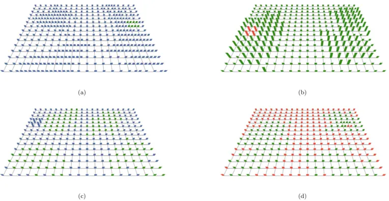
(a) (b)
(c) (d)
Fig. 11. Four displays from the combined color-texture experiments, printed colors may not match exactly on-screen colors used during our experiments: (a) a green target in a sea of blue pexels with background density variation; (b) a red target in a sea of green pexels with background height variation; (c) a tall target with background blue-green color variation; (d) a dense target with background green-red color variation
• target-background pairing: some displays contained a green target region in a sea of blue pexels, while others con-tained a red target region in a sea of green pexels (Fig. 11a and 11b); two different pairings were used to increase the generality of the results,
• secondary dimension: displays contained either no back-ground variation (e.g., every pexel was sparse and short), a random variation of density across the array, or a ran-dom variation of height across the array; this allowed us to test for interference from two different texture dimensions during target detection based on color,
• exposure duration:displays were shown for either 50, 150, or 450 ms; this allowed us to see how detection accuracy was influenced by the exposure duration of the display, and • target patch size: target regions were either 2×2 pexels or 4×4 pexels in size. This allowed us to examine the influence of all the foregoing factors at both relatively difficult (2×2) and easy (4×4) levels of target detectability.
Two texture dimensions (height and density) were stud-ied, and each involved two different target types: taller and shorter (for height) and denser and sparser (for den-sity). For each type of target, we designed an experiment that tested a similar set of conditions. For example, in the taller experiment we varied:
• target-background pairing: half the displays contained a target region of medium pexels in a sea of short pexels, while the other half contained a target region of tall pexels in a sea of medium pexels; two different pairings were used to increase the generality of the results,
• secondary dimension: the displays contained pexels that were either a constant gray or that varied randomly be-tween two colors; when color was varied, half the displays contained blue and green pexels, while the other half of the displays contained green and red pexels (Fig. 11c), • exposure duration: displays were shown for 50, 150, or 450 ms, and
• target patch size: target groups were either 2×2 pexels or 4×4 pexels in size.
Fig. 11 shows examples of four experiment displays. Fig. 11a and 11b contain a green target in a sea of blue pexels, and a red target in a sea of green pexels, respec-tively. Density varies in the background in Fig. 11a, while height varies in Fig. 11b. Fig. 11c contains a tall target with a blue-green background color pattern. Fig. 11d contains a dense target with a green-red background color pattern. Any background variation that is present can pass through a target. This occurs in Fig. 11d, where part of the target is red and part is green. Note also that, as described for Fig. 5, the number of paper strips in an individual pexel depends on its density.
The colors we used during our experiments were chosen in CIE LUV color space. A simple set of formulas can be used to convert from CIE LUV to CIE XYZ (a standard device-independent color model), and from there to our monitor’s color gamut. To move from LUV to XYZ: