5
Exploratory Data Analyses
5.1 Introduction
What do time series data look like? The purpose of this chapter is to provide a number of different answers to this question. In addition, we outline the rudiments of a time series analysis of air pollution and mortality that can be used to connect the two to look for interesting relationships.
5.2 Exploring the Data: Basic Features and Properties
5.2.1 Pollutant data
The NMMAPS database has information about six of the criteria pollutants defined by the United States Environmental Protection Agency. These pol-lutants are measured by the EPA’s monitoring network and the raw data are available on the EPA’s Air Quality System Web site. In this section we describe some of the features of the pollutant data.
Particulate matter
For illustration, we begin with the Baltimore, Maryland data. > balt <- readCity("balt", asDataFrame = FALSE)
The air pollution and weather data are stored in a data frame called “ex-posure”. The PM10 time series in particular is stored in a variable named
“pm10tmean”.
> with(balt$exposure, summary(pm10tmean))
Min. 1st Qu. Median Mean 3rd Qu. -35.1300 -10.7200 -3.1500 -0.1274 7.5330
Max. NA's 94.8700 3173.0000
There are a number of interesting features of the PM10 data here. First,
notice the large number of missing values (NAs) in this particular variable. The time series contains daily data for 14 years (January 1, 1987 through December 31, 2000), which means the total length of the series (including missing values) is 5114. Of those 5114 possible values, 3173 of them are missing. The reason for this is that PM10 measurements are only made once every three days in
Baltimore. So for every three days of potential measurement, two are always missing. For the later years, the sampling pattern is changed to be one in six days, so there are even more missing values for those years. Most cities in the U.S. have this kind of sampling pattern for PM10 data, although there are a
handful of cities with daily measurements.
Another feature is that the mean and median are close to zero. How can there be negative PM10 values one might wonder? Each of the pollutant time
series have been detrended so that they are roughly centered about zero. Details of the detrending can be found in [101] and in Chapter 2. Generally speaking, the detrending does not have a big impact on potential analyses because in time series studies we are primarily interested in differences from day to day, rather than differences between mean levels. If one is interested in reconstructing approximately the original values, the “median trend” is stored in a variable called “pm10mtrend” and can be added to the “pm10tmean” variable.
> with(balt$exposure, summary(pm10tmean + + pm10mtrend))
Min. 1st Qu. Median Mean 3rd Qu. 0.5449 21.2300 28.6000 32.1900 40.0800
Max. NA's 130.5000 3173.0000
Another aspect worth noting about the pollutant data is that air pollution concentrations in the NMMAPS database are averaged across multiple mon-itors in a given city. When multiple monitor values are available for a given day, a 10% trimmed mean is taken to obtain the value stored in the database (hence the “tmean” part of the variable name).
We can plot the data to examine some more features. The resulting plot is shown in Figure 5.1.
> with(balt$exposure, {
+ plot(date, pm10tmean + pm10mtrend,
+ ylab = expression(PM[10]), cex = 0.6) + })
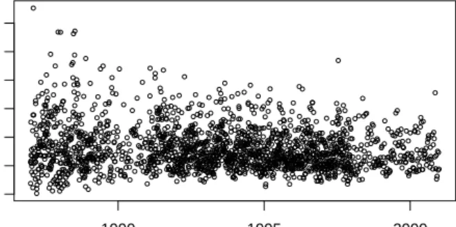
One thing that is clear from the time plot of the data in Figure 5.1 is that the variability of PM10 has decreased over the 14 year period. After about 1995,
we do not see the same number of very high values as we do before 1995. Note that here we have plotted the PM10 data with the trend added back in
5.2 Exploring the Data: Basic Features and Properties 43 0 20 60 100 PM 10 1990 1995 2000
Fig. 5.1.PM10 data for Baltimore, Maryland, 1987–2000.
so that we can examine the long-term trends in PM10. To look at the trend
more formally, we can conduct a simple linear regression of PM10 and time.
> library(stats)
> pm10 <- with(balt$exposure, pm10tmean + + pm10mtrend)
> x <- balt$exposure[, "date"] > fit <- lm(pm10 ˜ x)
The table of regression parameter estimates is shown in Table 5.1. The neg-ative slope parameter indicates a downward linear trend in PM10. If we look
Estimate Std. Error t value Pr(>jtj) (Intercept) 47.8966 2.3076 20.76 0.0000 x −0.0018 0.0003 −6.89 0.0000
Table 5.1. Regression analysis of long-term trend in PM10.
more closely at a few years, we can see more patterns and trends. In partic-ular, we can examine differences in these patterns across locations. Here, we plot the Baltimore, Maryland PM10 data for the years 1998–2000.
> subdata <- subset(balt$exposure, date >= + as.Date("1998-01-01"))
> subdata <- transform(subdata, pm10 = pm10tmean + + pm10mtrend)
> fit <- lm(pm10 ˜ ns(date, df = 2 * 3), + data = subdata)
> x <- seq(as.Date("1998-01-01"), as.Date("2000-12-31"), + "week")
> par(mar = c(2, 4, 2, 2), mfrow = c(2,
+ 1))
> with(subdata, {
+ plot(date, pm10, ylab = expression(PM[10]), + main = "(a) Baltimore", cex = 0.8) + lines(x, predict(fit, data.frame(date = x))) + })
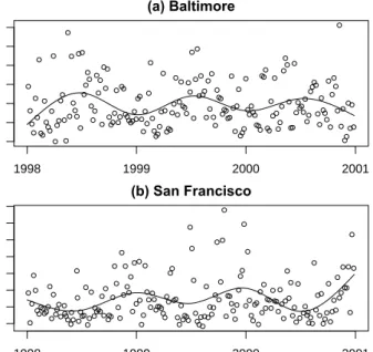
These data are plotted in Figure 5.2(a). In addition to plotting the data, we have added a simple natural spline smoother to highlight the overall trends. The smoother uses two degrees of freedom per year of data to capture the seasonality. There is a clear seasonal pattern in the PM10data in Figure 5.2(a),
10 30 50 70 (a) Baltimore PM 10 1998 1999 2000 2001 10 30 50 70 (b) San Francisco PM 10 1998 1999 2000 2001
Fig. 5.2.PM10data for (a) Baltimore, Maryland, and (b) San Francisco, California,
1998–2000.
where the summer days tend to have higher levels than the winter days. The Baltimore PM10 data exhibit a common pattern among eastern U.S.
cities, which is a summer increase in PM10levels and a winter decrease. The
pattern in the western United States is somewhat different. We can take a look at data from San Francisco, California for the same three year period. > sanf <- readCity("sanf", asDataFrame = FALSE)
> subdata <- subset(sanf$exposure, date >= + as.Date("1998-01-01"))
5.2 Exploring the Data: Basic Features and Properties 45
> subdata <- transform(subdata, pm10 = pm10tmean + + pm10mtrend) > fit <- lm(pm10 ˜ ns(date, df = 2 * 3), + data = subdata) > x <- seq(as.Date("1998-01-01"), as.Date("2000-12-31"), + "week") > with(subdata, {
+ plot(date, pm10, ylab = expression(PM[10]), + main = "(b) San Francisco", cex = 0.8) + lines(x, predict(fit, data.frame(date = x))) + })
The seasonal pattern for San Francisco in Figure 5.2(b) on the west coast is the exact opposite of the pattern exhibited for Baltimore on the east coast. Here, we have winter peaks in PM10 and summer lows. It is useful to note
these patterns when we examine the mortality data in the next section.
Ozone
Another pollutant that is of great interest to many researchers is ozone (O3)
which has been linked to mortality and morbidity in various parts of the world [e.g., 6, and references therein]. Ozone is a gas that can form primarily but is usually a result of secondary interactions with other gases and sunlight. In particular, the formation of ozone is closely related to local meteorology. In many locations ozone is not measured during the fall and winter months because of the generally lower levels during that time.
Not every city in the NMMAPS database has ozone measurements. Here we look at the Baltimore and Chicago data. Ozone is measured in parts per billion (ppb) and has hourly measurements. TheNMMAPSlitepackage has the hourly measurements for ozone for each day as well as an aggregate mea-sure for the entire day. The variable o3tmean is a daily time series of the trimmed mean of the detrended 24-hour average of ozone. The trend for this series is stored in the variableo3mtrend.
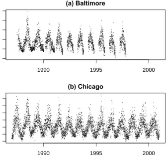
We plot the ozone data for Baltimore and Chicago in Figure 5.3(a, b). > balt <- readCity("balt", asDataFrame = FALSE)
> chic <- readCity("chic", asDataFrame = FALSE)
> par(mfrow = c(2, 1), mar = c(3, 4, 2,
+ 2))
> with(balt$exposure, plot(date, o3tmean + + o3mtrend, main = "(a) Baltimore", + ylab = expression(O[3] * " (ppb)"), + pch = "."))
> with(chic$exposure, plot(date, o3tmean +
+ o3mtrend, main = "(b) Chicago", ylab = expression(O[3] * + " (ppb)"), pch = "."))
One can see immediately that ozone, like PM10, is highly seasonal, here with a
summer peak and winter trough in both cities. Baltimore has a different sam-pling pattern than Chicago in that for Baltimore there are only measurements between the six months of April through October.
In the United States, when ozone is measured it tends to be measured every day, so we do not have the kinds of missing data problems that we have with particulate matter. Ozone tends to be missing in a seasonal way, as with Baltimore, or sporadically. This pattern of missingness is also present with the other gases: sulphur dioxide, nitrogen dioxide, and carbon monoxide.
0 20 60 100 (a) Baltimore O3 (ppb) 1990 1995 2000 0 20 40 60 (b) Chicago O3 (ppb) 1990 1995 2000
Fig. 5.3.Daily ozone data for (a) Baltimore and (b) Chicago, 1987–2000
5.2.2 Mortality data
The mortality data are stored in a separate element in the list returned by readCity. That element is named “outcome” and consists of a data frame. For the NMMAPS data, the outcomes consist of daily mortality counts start-ing from January 1, 1987 through December 31, 2000. The mortality counts are split into a number of different outcomes including mortality from all causes excluding accidents, chronic obstructive pulmonary disease (COPD), cardio-vascular disease, respiratory disease, and accidents. Each mortality count series has an associated “mark” series of the same length which is 1 or 0 de-pending on whether a given day’s count is seemingly outlying. One may wish
5.2 Exploring the Data: Basic Features and Properties 47
to exclude very large counts in a given analysis and the “mark” variables are meant to assist in that.
The mortality data are also stratified into three age categories: mortality for people under age 65, age 65 to 74, and age over 75. The “outcome” object has a slot named “strata” which is a data frame containing factors indicating the different strata for the outcome data. In this case there is only one factor variable (agecat) indicating the three age categories. Lastly, the “outcome” object contains a “date” slot which is a vector of class “Date” indicating the date of each observation.
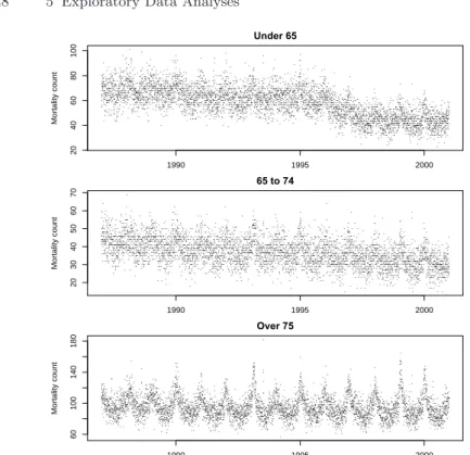
The outcome data for New York City can be read in viareadCity. Here we have extracted the outcome data frame only. We can plot the mortality count for all-cause mortality by age group to see the different trends and seasonal patterns.
> data.split <- split(outcome, outcome$agecat) > par(mfrow = c(3, 1), mar = c(2, 4, 2,
+ 2) + 0.1)
> with(data.split[[1]], plot(date, death,
+ main = "Under 65", ylab = "Mortality count", + pch = "."))
> with(data.split[[2]], plot(date, death,
+ main = "65 to 74", ylab = "Mortality count", + pch = "."))
> with(data.split[[3]], plot(date, death,
+ main = "Over 75", ylab = "Mortality count", + pch = "."))
The mortality data for the three age categories are shown in Figure 5.4. Notice in Figure 5.4 that the three age categories have slightly different trends in mortality. The under 65 group appears to have a decreasing trend, particularly after 1995. The 64–75 group appears to have a more gradual decrease trend over the 14 year period and the over 75 group has a relatively stable trend in mortality. All groups have a strong seasonal pattern with a peak in winter and a trough in summer. The seasonality seems to be most pronounced in the over 75 group. The peak in winter mortality is most likely due to the spread of infectious diseases such as influenza as well as temperature-related phenomena in cold weather areas. Most important for subsequent health-related analyses, aside from temperature, data related to the causes of these seasonal changes in mortality are largely unavailable or unmeasured.
We can examine other features of the data such as the autocorrelation structure. With time series data such as these, we would expect that neigh-boring values (in time) would be more similar than distant values. One such tool for examining this behavior is the autocorrelation function, or acf. The acf is defined as [13] r(k) = 1 N N−k X t=1 (xt−x¯)(xt+k−x¯)/c(0)
20 40 60 80 100 Under 65 Mortality count 1990 1995 2000 20 30 40 50 60 70 65 to 74 Mortality count 1990 1995 2000 60 100 140 180 Over 75 Mortality count 1990 1995 2000
Fig. 5.4.New York City daily mortality data by age category, 1987–2000
where c(0) = 1 N N X t=1 (xt−x¯)2
The integerkindicates the lag of the variable. A plot ofr(k) fork= 0,1, . . . , K is called a correlogram. Figure 5.5(a) shows a correlogram for the New York City mortality data. The correlogram can be computed in R using the acf function in thestatspackage.
> library(stats) > par(mfrow = c(2, 1))
> x <- with(subset(outcome, agecat == "75p"), + death)
> acf(x, lag.max = 50, main = "(a) New York City mortality", + ci.col = "black")
The very slow decrease in autocorrelation from lag 1 to lag 50 shown in the plot indicates that there is some nonstationarity in the series. We can remove this by regressing the values of the series against a smooth function of time. This smooth function of time can be estimated using natural splines or possibly
5.3 Exploratory Statistical Analysis 49
other nonparameteric methods. Here we use a natural spline smoother for simplicity.
> library(splines)
> fit <- lm(x ˜ ns(1:5114, 2 * 14)) > xr <- resid(fit)
> label <- "(b) New York City mortality (seasonality removed)" > acf(xr, lag.max = 50, main = label, ci.col = "black")
Figure 5.5(b) shows the correlogram of the residuals after removing some of the seasonality. There remains some autocorrelation but substantially less than that exhibited before the seasonality was removed. Season is an important
0 10 20 30 40 50 0.0 0.4 0.8 Lag ACF
(a) New York City mortality
0 10 20 30 40 50 0.0 0.4 0.8 Lag ACF
(b) New York City mortality (seasonality removed)
Fig. 5.5. Autocorrelation functions for New York City mortality data for (a) raw
data and (b) residuals after removing seasonality.
variable to consider because as shown in Figures 5.4 and 5.2, season is related very strongly to both mortality and air pollution.
5.3 Exploratory Statistical Analysis
In many time series analyses, one is often interested in how a single variable, such as temperature, PM10, or mortality, varies over time. We might be
in-terested in how that variable varies from day to day, month to month, season to season, or year to year. The particular timescale of interest depends on the type of scientific question one is interested in addressing.
We may also be interested in examining how two variables co-vary with each other over time. Such questions may come in the form of, “If X increases today, does Y also increase today?” or, “If X increases this month, does Y increase next month?”
In the previous section, we examined individual variables and how they varied over time. We noticed that both PM10and mortality have strong
sea-sonal patterns and long-term (generally decreasing) trends. In this section we look at the relationship between mortality and PM10and also examine what
other variables might potentially confound that relationship.
5.3.1 Timescale decompositions
Common to all time series data is that we have values that vary over a time index. In the case of air pollution and mortality data, we have values that change from day to day. However, we may also be interested in timescales of variation beyond the day-to-day changes. For example, we may be interested in looking at the overall 14 year long-term trend of mortality or the seasonal behavior of PM10. In such cases, it is useful to decompose the time series into
separate components so that we can examine them separately rather than mix them all together.
We can conceptualize a time seriesfYtgas following the model
Yt= trendt+ seasonalityt+ short-term and other variationt (5.1)
where Yt is either mortality or perhaps PM10. Given access to the separate
timescale components (trend, seasonality, short-term) we could compare them separately for mortality and PM10.
Table 5.2 gives a schematic of the potentially interesting timescales in which we may be interested when examining air pollution and mortality. The three timescales for each variable are labeled generally as “Trend” for trends spanning across years, “Seasonal” for within-year patterns, and “Short-Term” for shorter-term fluctuations. Although we are interested in the timescale de-compositions of both mortality and pollution separately, we are more inter-ested in looking at how the two variables correlate at different timescales and in determining what kind of evidence is provided by such correlations.
Timescale decompositions of this kind are common in time series analy-sis. One example is the STL decomposition of [15] which is implemented in R in the stl function of thestats package. Cleveland’s STL uses the non-parameteric smoother loess to decompose a time series into three separate
5.3 Exploratory Statistical Analysis 51
components. Another possibility is to compute the Fourier transform of the time series and group the different frequency components together into trend, seasonal, and short-term components. The use of the Fourier transform allows for more precise examination of timescales beyond those already mentioned.
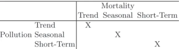
Mortality
Trend Seasonal Short-Term Trend X
Pollution Seasonal X
Short-Term X
Table 5.2. Example timescales of interest for air pollution and health studies and
the correlations between timescales of interest (marked with Xs)
One question that is useful to ask is how are mortality and air pollution levels correlated at each of the three different timescales?
In particular, we are potentially interested in estimating the correlations between the respective long-term trends of mortality and pollution, the sea-sonal trends, and the short-term fluctuations (the Xs marked in Table 5.2). Hence, the cells of interest in Table 5.2 are the ones falling on the diago-nal. Although it is possible to look at other correlations in the table, their interpretation is less clear.
A related question one needs to ask is what might confound the relation-ship between mortality and air pollution at different timescales? For example, long-term decreases in PM10 might be positively correlated with long-term
decreases in mortality, indicating that lowering air pollution levels is ben-eficial. However, there might be factors explaining both decreases, such as changes in population demographics and community-level activity patterns. Weather, and specifically temperature, is a factor that can confound the rela-tionship between mortality and pollution at both the seasonal timescale and the short-term timescale because it too has seasonal trends and short-term flucutations. As with all correlation analyses, any evidence of association at a given timescale must be interpreted in the context of what might potentially confound that association.
5.3.2 Example: Timescale decompositions of PM10 and mortality
We use data from Detroit, Michigan to demonstrate the timescale decompo-sition introduced in the previous section. Here, we use the full 14 year daily time series available from the NMMAPS database and not the shortened series shown in Figure 4.1.
We decompose the time series data into three different timescales using moving averages as defined in Section 4.3. Because our method of using moving averages does not work well with missing values in the exposure variable, we
will fill in the missing values with the mean of the entire series. There are only 52 missing values out of 5114 observations, thus this filling-in procedure does not have an impact on the results.
A simple linear regression ofyandxgives us the results in Table 5.3. > library(NMMAPSlite)
> library(stats) > initDB("NMMAPS")
> data <- readCity("det", collapseAge = TRUE) > y <- data[, "death"]
> x <- with(data, pm10tmean + pm10mtrend) > dates <- data[, "date"]
> x[is.na(x)] <- mean(x, na.rm = TRUE) > fit <- lm(y ˜ x)
Estimate Std. Error t value Pr(>jtj) (Intercept) 46.1798 0.2263 204.11 0.0000 x 0.0232 0.0057 4.06 0.0000
Table 5.3.Simple linear regression of PM10 and mortality
There appears to be strong evidence of a positive association between PM10
and mortality. We can conduct a full timescale decomposition of the PM10
data to obtain a more detailed picture of the relationship between mortality and PM10 in Detroit.
> library(stats)
> x.yearly <- filter(x, rep(1/365, 365)) > z <- x - x.yearly
> z.seasonal <- filter(z, rep(1/90, 90)) > u <- z - z.seasonal
> u.weekly <- filter(u, rep(1/7, 7)) > r <- u - u.weekly
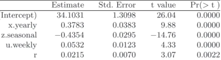
Upon decomposing the data, we can fit the model in (4.4) to obtain estimates of the yearly, seasonal, weekly, and sub-weekly associations.
> fit <- lm(y ˜ x.yearly + z.seasonal + + u.weekly + r)
All of the timescales appear strongly associated with mortality. However, the seasonal component has a strong negative association. This is because Detroit’s PM10 levels tend to be higher in the summer season and lower in
the winter. In contrast, mortality is generally higher in the winter and lower in the summer. This inverse relationship gives us the negative coefficient for the seasonal component.
We can also produce a timescale decomposition of the mortality data and then plot the different timescales for mortality and PM10next to each other to
5.3 Exploratory Statistical Analysis 53
Estimate Std. Error t value Pr(>jtj) (Intercept) 34.1031 1.3098 26.04 0.0000 x.yearly 0.3783 0.0383 9.88 0.0000 z.seasonal −0.4354 0.0295 −14.76 0.0000 u.weekly 0.0532 0.0123 4.33 0.0000 r 0.0215 0.0070 3.07 0.0022
Table 5.4. Linear regression of PM10 and mortality, full decomposition
check for any interesting relationships. First we can decompose the mortality time series in to the same yearly, seasonal, weekly, and sub-weekly timescales. > y.yearly <- filter(y, rep(1/365, 365))
> yz <- y - y.yearly
> yz.seasonal <- filter(yz, rep(1/90, 90)) > yu <- yz - yz.seasonal
> yu.weekly <- filter(yu, rep(1/7, 7)) > yr <- yu - yu.weekly
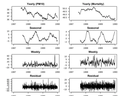
Figure 5.6 shows a portion of the timescale decompositions for the Detroit PM10 (left column) and daily mortality data (right column) for the years
1988–2000. Data are shown for the period 1988–2000 because we use the first year of data to calculate the moving averages. We can see a little more clearly the strong positive association between the yearly trends and the negative association between the seasonal components. The less smooth weekly and residual/subweekly components are difficult to examine by eye and we must resort to linear regression results in those cases.
5.3.3 Correlation at different timescales: A look at the Chicago data
Dominici et al.[29] provided software for creating timescale decompositions of time series data via a Fourier transform. We have packaged their software and have included it in thetsModelpackage. Thetsdecompfunction can be used to decompose a time series into user-specified timescales. We demonstrate the use of tsdecompon mortality and PM10 data from Chicago, Illinois.
> data <- readCity("chic", collapseAge = TRUE) > death <- data[, "death"]
> is.na(death) <- as.logical(data[, "markdeath"])
The Chicago mortality data contain a few days with extremely high mortality counts. Although these may be of interest in another analysis, they are outliers with respect to the other data points and we remove them for the time being by setting them to be NA. The variablemarkdeath is an indicator of days that have outlying mortality counts.
First we can identify important characteristics of the mortality data by decomposing the series into three different timescales. The timescales include
36 37 38 39 Yearly (PM10) 1987 1988 1989 1990 −5 0 5 10 Seasonal 1987 1988 1989 1990 −20 0 20 40 60 Weekly 1987 1988 1989 1990 −40 −200 20 40 60 80 Residual 1987 1988 1989 1990 48.5 49.0 49.5 50.0 Yearly (Mortality) 1987 1988 1989 1990 −2 0 2 4 Seasonal 1987 1988 1989 1990 −10 −50 5 10 Weekly 1987 1988 1989 1990 −10 0 10 20 Residual 1987 1988 1989 1990
Fig. 5.6.Timescale decomposition for Detroit PM10and mortality data, 1987–2000.
• A single cycle over the entire series
• 2–14 cycles over the entire series
• 15 or more cycles
These timescales correspond roughly to long-term trends, seasonal trends, and higher frequency short-term trends.
> library(tsModel)
> mort.dc <- tsdecomp(death, c(1, 2, 15, + 5114))
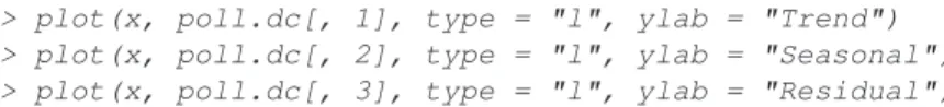
The three time scales are plotted in Figure 5.7. > par(mfrow = c(3, 1), mar = c(3, 4, 2, + 2) + 0.1)
> x <- seq(as.Date("1987-01-01"), as.Date("2000-12-31"), + "day")
> plot(x, mort.dc[, 1], type = "l", ylab = "Trend", + main = "(a)")
> plot(x, mort.dc[, 2], type = "l", ylab = "Seasonal", + main = "(b)")
> plot(x, mort.dc[, 3], type = "l", ylab = "Residual", + main = "(c)")
Figure 5.7(a) shows the long-term trend which is generally decreasing, not unlike the trend observed with the New York City mortality data. Here we
5.3 Exploratory Statistical Analysis 55
have collapsed the three age categories and are examining the aggregated se-ries. Figure 5.7(b) shows the obvious seasonal pattern in the mortality data, again with a winter peak and summer trough. Figure 5.7(c), the bottom plot, shows the residual variation in mortality, once the long-term trend and sea-sonality have been removed. Note that the original series is equal to the sum of the three plots in Figures 5.7(a–c). A similar timescale decomposition can
34 36 38 40 (a) Trend 1990 1995 2000 25 35 45 55 (b) Seasonal 1990 1995 2000 0 20 40 60 80 100 (c) Residual 1990 1995 2000
Fig. 5.7.Chicago mortality timescale decomposition, 1987–2000, into (a) long-term
trend, (b) seasonality, and (c) short-term variation.
be conducted for the PM10 data, which we do below.
> pm10 <- with(data, pm10tmean + pm10mtrend) > poll.dc <- tsdecomp(pm10, c(1, 2, 15, + 5114))
Figure 5.8 shows the three timescales for the Chicago PM10 data in the
same format as Figure 5.7.
> par(mfrow = c(3, 1), mar = c(3, 4, 1, + 2) + 0.1)
> x <- seq(as.Date("1987-01-01"), as.Date("2000-12-31"), + "day")
> plot(x, poll.dc[, 1], type = "l", ylab = "Trend") > plot(x, poll.dc[, 2], type = "l", ylab = "Seasonal") > plot(x, poll.dc[, 3], type = "l", ylab = "Residual")
Comparing Figures 5.8 and 5.7 visually, we can see that the seasonal compo-nents of mortality and PM10 do not correspond and in fact appear negatively
correlated. The long-term trend components seem to behave similarly in that they are both generally decreasing. From the plots alone, it is difficult to tell if the short-term fluctuations are in fact correlated at all.
9 10 12 14 Trend 1990 1995 2000 0 5 10 15 20 Seasonal 1990 1995 2000 0 50 150 250 Residual 1990 1995 2000
Fig. 5.8.Chicago PM10timescale decomposition, 1987–2000
We can examine the correlations at different timescales more formally by actually computing the correlations separately for each timescale.
> c1 <- cor(mort.dc[, 1], poll.dc[, 1], + use = "complete.obs") > c2 <- cor(mort.dc[, 2], poll.dc[, 2], + use = "complete.obs") > c3 <- cor(mort.dc[, 3], poll.dc[, 3], + use = "complete.obs")
5.3 Exploratory Statistical Analysis 57
Doing so gives us a correlation of 0.65, for the long-term trend component
−0.81 for the seasonal component, and 0.12 for the short-term component. Hence, the long-term and short-term timescales are positively correlated and the seasonal timescale has a negative correlation. We had already suspected the positive correlation in the long-term trends and the negative correlation in the seasonality, but the positive correlation in the short-term variation is interesting. Table 5.5 shows the correlations between mortality and PM10for
each timescale in the context of Table 5.2.
Mortality
Trend Seasonal Short-Term Trend 0.65
Pollution Seasonal -0.81
Short-Term 0.12
Table 5.5.Correlations for mortality and PM10 at different timescales
An alternative and perhaps more flexible approach is to use linear re-gression to analyze everything at once and simultaneously conduct tests of significance (if such tests are of interest).
> library(stats)
> poll.df <- as.data.frame(poll.dc) > names(poll.df) <- c("Trend", "Season", + "ShortTerm")
> fit <- lm(death ˜ Trend + Season + ShortTerm, + data = poll.df)
Table 5.6 shows the results of such a regression analysis. Because of the linear model assumption and the orthogonality of the predictors, the results of the regression analysis lead us to the same conclusions as the simple correlation analysis.
Estimate Std. Error t value Pr(>jtj) (Intercept) 118.5628 1.1507 103.04 0.0000 Trend 0.8299 0.0936 8.87 0.0000 Season −1.2029 0.0375 −32.11 0.0000 ShortTerm 0.0714 0.0099 7.23 0.0000
Table 5.6. Regression of daily mortality on different timescales of PM10
5.3.4 Looking at more detailed timescales
Although the long-term, seasonal, and short-term trends are common timescales to examine in time series analysis, particular applications may allow for other
interesting and relevant timescales to examine. For example, in pollution stud-ies one might be interested in separating out the effects of daily variation in pollutant levels on mortality counts from the effects of weekly or monthly variation.
Thetsdecompfunction can be used to look at more detailed timescales of either pollution or mortality.
> freq.cuts <- c(1, 2, 15, round(5114/c(60, + 30, 14, 7, 3.5)), 5114)
> poll.dc <- tsdecomp(pm10, freq.cuts)
> colnames(poll.dc) <- c("Long-term", "Seasonal", + "2-12 months", "1-2 months", "2-4 weeks", + "1-2 weeks", "3.5 days to 1 week",
+ "Less than 3.5 days")
We plot these more detailed timescales in Figure 5.9. > par(mfcol = c(4, 2), mar = c(2, 2, 2, + 2)) > x <- seq(as.Date("1987-01-01"), as.Date("2000-12-31"), + "day") > cn <- colnames(poll.dc) > for (i in 1:8) {
+ plot(x, poll.dc[, i], type = "l", + frame.plot = FALSE, main = cn[i], + ylab = "")
+ }
When looking at multiple timescales, it is a little easier to simply conduct a multiple regression analysis of the outcome versus the timescales of the pollutant rather than compute individual correlations.
> poll.df <- as.data.frame(poll.dc[, 1:8]) > fit <- lm(death ˜ ., data = poll.df)
Table 5.7 shows the results of regressing all-cause nonaccidental mortality on the eight timescales shown in Figure 5.9. Notice that the coefficients for the “Long-term” and “Seasonal” timescales are identical to those in Table 5.6. This is to be expected because of the linearity assumption and the orthogo-nality of the different timescales. However, now the short-term timescale has been broken down even further so that we have estimates of the association between mortality and timescales ranging from 2–12 months down to <3.5 days. Not all of the timescales could be considered statistically significant with respect to their relationship with mortality. The summary in Table 5.6 pro-vides a “breakdown” of the evidence for Chicago and allows for a potentially more informed discussion of what evidence might be relevant for subsequent decisions or actions.
Unfortunately, the timescale analysis usingtsdecomp()can only be done with cities that have relatively complete data on PM10. In the next chapter
5.3 Exploratory Statistical Analysis 59 2 4 6 8 Long−term 1990 1995 2000 −5 0 5 10 Seasonal 1990 1995 2000 −10 0 10 20 2−12 months 1990 1995 2000 −10 0 10 20 1−2 months 1990 1995 2000 −30 0 20 40 2−4 weeks 1990 1995 2000 −20 0 20 40 1−2 weeks 1990 1995 2000 −50 0 50 100 3.5 days to 1 week 1990 1995 2000 −50 50
Less than 3.5 days
1990 1995 2000
Fig. 5.9. Detailed timescale decomposition for Chicago, Illinois PM10data, 1987–
2000.
Estimate Std. Error t value Pr(>jtj) (Intercept) 115.1945 0.5491 209.80 0.0000 Long-term 0.8300 0.0935 8.88 0.0000 Seasonal −1.2029 0.0374 −32.15 0.0000 2-12 months −0.0267 0.0363 −0.74 0.4623 1-2 months 0.0670 0.0421 1.59 0.1116 2-4 weeks 0.1251 0.0256 4.90 0.0000 1-2 weeks 0.1040 0.0197 5.27 0.0000 3.5 days to 1 week 0.0638 0.0184 3.46 0.0005 Less than 3.5 days 0.0364 0.0229 1.59 0.1121
Table 5.7. Regression of daily mortality on more detailed timescales of PM10,
Chicago, Illinois, 1987–2000
5.4 Exploring the Potential for Confounding Bias
Under the linear regression model, there is evidence of an association between mortality and PM10 at all three timescales (yearly, seasonal, and shorter).
However, as noted before, the association is positive in two timescales and negative in one. How should we interpret these results along with the regres-sion analysis? If PM10were truly associated with mortality (either positively
or negatively) we would at least expect that the correlations for each of the timescales would all be in the same direction.
One possible explanation is that there is some confounding going on. It is possible that at one or more of the timescales, the relationship is in fact confounded by a third not-yet-included variable. One such variable is tem-perature. Temperature has strong seasonal patterns as well as short-term fluctuations that are often correlated with PM10 and mortality. In addition,
temperature has long-term trends that could potentially affect both PM10and
mortality. Figure 5.10 shows the daily temperature values for Chicago.
> data <- readCity("chic", collapseAge = TRUE) > with(data, plot(date, tmpd, type = "l", + ylab = "Temperature")) −20 0 20 40 60 80 Temperature 1990 1995 2000
Fig. 5.10.Daily temperature for Chicago, 1987–2000.
We can remove the effect of temperature by regressing both mortality and PM10 on temperature and taking the residuals.
> temp <- data[, "tmpd"]
> pm10.r <- resid(lm(pm10 ˜ temp, na.action = na.exclude)) > death.r <- resid(lm(death ˜ temp, na.action = na.exclude))
5.4 Exploring the Potential for Confounding Bias 61
> poll.dc <- tsdecomp(pm10.r, c(1, 2, 15, + 5114))
Figure 5.11 shows a timescale decomposition of PM10after the variation due
to temperature has been removed.
> par(mfrow = c(3, 1), mar = c(3, 4, 1, + 2) + 0.1)
> x <- seq(as.Date("1987-01-01"), as.Date("2000-12-31"), + "day")
> plot(x, poll.dc[, 1], type = "l", ylab = "Trend") > plot(x, poll.dc[, 2], type = "l", ylab = "Seasonal") > plot(x, poll.dc[, 3], type = "l", ylab = "Residual")
−3 −1 1 2 3 4 Trend 1990 1995 2000 −6 −2 0 2 4 6 Seasonal 1990 1995 2000 −50 50 150 250 Residual 1990 1995 2000
Fig. 5.11.Timescale decomposition of the residuals of PM10regressed on
temper-ature.
We can then take the mortality residuals and regress them on the timescale decomposition of the PM10 residuals.
> poll.df <- as.data.frame(poll.dc) > names(poll.df) <- c("Trend", "Season", + "ShortTerm")
> fit <- lm(death.r ˜ Trend + Season + ShortTerm, + data = poll.df)
Table 5.8 shows the estimated regression coefficients for the relationship between PM10 and mortality after removing temperature. Notice now in
Estimate Std. Error t value Pr(>jtj) (Intercept) −0.0988 0.1835 −0.54 0.5902 Trend 0.8829 0.0894 9.88 0.0000 Season 0.3226 0.0661 4.88 0.0000 ShortTerm 0.1061 0.0103 10.29 0.0000
Table 5.8.Regression of mortality on PM10with temperature removed
Table 5.8 that the regression coefficient for the seasonal timescale has changed sign whereas the coefficients for the short-term and long-term trend timescales are relatively unchanged. Clearly temperature has some relationship with both mortality and PM10 at the long-term and seasonal timescales. The potential
confounding effect of temperature on the short-term timescale is perhaps less substantial.
Temperature is an example of ameasured confounder. We have daily data on temperature and can adjust for it directly in our models. Often, there are other potential confounders in time series analysis for which we generally do not have any data. Such confounders are unmeasured confounders and an example of one in this application is a group of variables that we might collectively call “season”.
Season affects mortality because in the winter there is generally thought to be an increase in the spread of infectious diseases such as influenza. Unfortu-nately, there is little reliable data on such infectious disease events. Season can also affect pollution levels via periodic changes in sources such as power plant production levels or automobile usage. Yet another unmeasured confounder is the group of variables that might produce long-term trends in both pollution and mortality. As mentioned before, these include population demographics and activity patterns.
The potential for confounding from seasonal and long-term trends might lead us to discount the evidence of association between the trend and seasonal components found in Tables 5.5 and 5.6. In subsequent analyses we may wish to completely remove their influence on any assocations we choose to estimate. We can observe the potential confounding effect of season on the relation-ship between PM10 and mortality by conducting a simple stratified analysis.
We demonstrate this effect using data from New York City, New York. > data <- readCity("ny", collapseAge = TRUE)
We can make a simple scatterplot of the daily mortality and PM10 data for
5.4 Exploring the Potential for Confounding Bias 63
> with(data, plot(l1pm10tmean, death,
xlab = expression(PM[10]), + ylab = "Daily mortality", cex = 0.6, + col = gray(0.4)))
We can also overlay a simple linear regression line on the plot to highlight the relationship between the two variables.
> f <- lm(death ˜ l1pm10tmean, data) > with(data, {
+ lines(sort(l1pm10tmean), predict(f,
+ data.frame(l1pm10tmean = sort(l1pm10tmean))),
+ lwd = 4)
+ })
The resulting scatterplot is shown in Figure 5.12. The PM10 data we have
−20 0 20 40 60 80 100 150 200 250 300 PM10 Daily mortality
Fig. 5.12. Scatterplot of daily mortality and lag 1 PM10for New York City, New
York, 1987–2000.
chosen to plot is the lag 1 PM10value. This means that for each day’s mortality
count, we plot the previous day’s PM10value. Time series studies of mortality
and PM10have shown this to be an important lag structure [101]. The overall
relationship between lag 1 PM10 and mortality in New York City appears to
In Figures 5.13(a–d) we have plotted the New York City mortality and PM10 data four times, with each plot highlighting a different season of the
year. Within each plot we have overlaid in black the data points correspond-ing to that season as well as the regression line fit to only the data from that season. We can see that for each season, the relationship between lag 1
−20 0 20 40 60 80 100 150 200 250 300 (a) Winter PM10 Daily mortality −20 0 20 40 60 80 100 150 200 250 300 (b) Spring PM10 Daily mortality −20 0 20 40 60 80 100 150 200 250 300 (c) Summer PM10 Daily mortality −20 0 20 40 60 80 100 150 200 250 300 (d) Fall PM10 Daily mortality
Fig. 5.13. Simple linear regression of New York City PM10 and mortality data,
stratified by season.
PM10 and mortality is positive, but the overall, the relationship is negative,
as shown in Figure 5.12. This example with New York City data illustrates how estimated associations between air pollution and mortality can change depending on whether one decides to adjust for season.
In general, without data on the factors that cause the seasonal and long-term trends we cannot adjust for them directly when modeling air pollution and mortality. However, one approach is to make an assumption that these variables affect mortality and pollution in a smooth manner. Given this as-sumption we can use a smooth function of time itself to adjust for the various seasonal and long-term trends that may confound the relationship between air pollution and mortality. We explore this approach to adjusting for unmeasured confounding in Chapter 6.
5.7 Problems 65
5.5 Summary
Many standard tools of statistical analysis can be brought to bear when an-alyzing time series data. Looking at correlations or simple linear regression models can provide insight into relationships between variables. In addition, smoothing techniques can be used for exploratory analysis.
With time series data, a feature that we can take advantage of is the fact that there is an underlying process evolving over time. We can meaning-fully decompose a time series into a long-term trend, a seasonal pattern, and residual short-term variation. This kind of timescale decomposition can give us insight into where the evidence of an association exists. In epidemiologi-cal studies, there is an added benefit of timesepidemiologi-cale decompositions in that we can examine each timescale independently and evaluate the strength of the evidence.
For example, with air pollution and mortality, even though the associ-ations at the long-term trend and seasonal timescales may be confounded, the variation at the short-term timescale is not necessarily confounded by the same factors and the associations there may still be credible. This fact highlights the benefits of the timescale decomposition. By decomposing the predictor into separate long-term trend, seasonal, and short-term timescales, we can isolate the sources of evidence and use our subject matter knowledge to upweight or downweight the evidence appropriately.
In any epidemiological study one might reasonably ask, “From where does the evidence of association come?” In air pollution and health time series studies it would appear that perhaps the most reliable evidence comes from the short-term timescale variation. We explore this question in greater depth in the chapters to follow.
5.6 Reproducibility Package
For the sake of brevity, some of the code for producing the analyses in this chapter has not been shown for the sake of brevity. However, the full data and code for reproducing all of the analyses and plots can be downloaded using
thecacherpackage by calling
> clonecache(id = "2a04c4d5523816f531f98b141c0eb17c6273f308")
which will download the cached analysis from the Reproducible Research Archive.
5.7 Problems
In this set of problems we explore the daily time series data of air pollu-tion and mortality and we visually inspect their long-term, seasonal, and
short-term variation. We also calculate the associations between air pollution and mortality at these different scales of variation.
The data frames for each of the cities all have the same variable names. The primary variables we need from each data frame are
• death, daily mortality counts from all-cause non-accidental mortality
• pm10tmean, daily detrended, PM10 values • pm10mtrend, daily median trend of PM10 • date, the date, stored as an object of classDate
• tmpd, daily temperature
The data for a given city (denoted by its abbreviated name) can be read into R using thereadCityfunction from theNMMAPSlite package described in Chapter 2.
1. Load data for Chicago (chic), New York (ny), and Los Angeles (la) into R.
2. For each city, plot the PM10 data versus date. Try plotting PM10 both
with and without the trend added in. Try plotting the data in smaller windows of time to see more detail.
3. Using the tsdecomp function, decompose the Chicago PM10 data into
three timescales: long-term variation, seasonal variation short-term vari-ation. Plot your results.
4. For each of the three cities, plot the all-cause non-accidental mortality data versus date separately for each of the three age categories:under65, 65to74, and 75p.
5. Using the tsdecompfunction, decompose the mortality data into three timescales (as before).
6. Revisit the timescale decompositions for both PM10 and mortality in
Chicago. Visually compare the long-term trend for mortality with the long-term trend for PM10. Do the same comparison for the seasonal and
short-term components.
7. Compute the correlation coefficient between the long-term trends for mor-tality and PM10. Compute the correlation coefficients for both the seasonal
and short-term components of mortality and PM10. If there are any
miss-ing data, set use = "complete" in the call to cor when computing the correlation.
8. Try the same timescale/correlation analysis with the city of Seattle, WA (seat). Do you get the same correlations?
9. Try the same timescale/correlation analysis with Pittsburgh, PA (pitt). 10. Fill in the following table with the correlations between PM10 and
5.7 Problems 67
Long-Term Seasonal Short-Term Chicago
Seattle Pittsburgh
Upon completing the problems above, consider the following questions. 1. What are the main characteristics of the time series data for mortality
and air pollution?
2. What are the long-term, seasonal, and short-term variations in air pollu-tion in U.S. cities? Are there differences between cities?
3. What are the long-term, seasonal, and short-term variations in mortality in U.S. cities? Are there differences between cities? Are there differences between age categories?
4. How do the long-term, seasonal, and short-term variations in PM10 and
mortality relate to each other? How do they relate on different timescales? 5. Is there any evidence of an association between PM10 and mortality in
these cities? Which timescale is more suitable for drawing inferences? 6. How should we weigh the evidence from the different timescales? What
evidence is more important? What evidence should be discounted and why?