Think Stats
Exploratory Data Analysis in Python
Think Stats
Exploratory Data Analysis in Python
Version 2.0.38
Allen B. Downey
Copyright c2014 Allen B. Downey.
Green Tea Press 9 Washburn Ave Needham MA 02492
Permission is granted to copy, distribute, and/or modify this document under the terms of the Creative Commons Attribution-NonCommercial-ShareAlike 4.0 Inter-national License, which is available athttp://creativecommons.org/licenses/
by-nc-sa/4.0/.
The original form of this book is LATEX source code. Compiling this code has the effect of generating a device-independent representation of a textbook, which can be converted to other formats and printed.
Preface
This book is an introduction to the practical tools of exploratory data anal-ysis. The organization of the book follows the process I use when I start working with a dataset:
• Importing and cleaning: Whatever format the data is in, it usually takes some time and effort to read the data, clean and transform it, and check that everything made it through the translation process intact. • Single variable explorations: I usually start by examining one variable
at a time, finding out what the variables mean, looking at distributions of the values, and choosing appropriate summary statistics.
• Pair-wise explorations: To identify possible relationships between vari-ables, I look at tables and scatter plots, and compute correlations and linear fits.
• Multivariate analysis: If there are apparent relationships between vari-ables, I use multiple regression to add control variables and investigate more complex relationships.
• Estimation and hypothesis testing: When reporting statistical results, it is important to answer three questions: How big is the effect? How much variability should we expect if we run the same measurement again? Is it possible that the apparent effect is due to chance?
vi Chapter 0. Preface
This book takes a computational approach, which has several advantages over mathematical approaches:
• I present most ideas using Python code, rather than mathematical notation. In general, Python code is more readable; also, because it is executable, readers can download it, run it, and modify it.
• Each chapter includes exercises readers can do to develop and solidify their learning. When you write programs, you express your under-standing in code; while you are debugging the program, you are also correcting your understanding.
• Some exercises involve experiments to test statistical behavior. For example, you can explore the Central Limit Theorem (CLT) by gener-ating random samples and computing their sums. The resulting visu-alizations demonstrate why the CLT works and when it doesn’t. • Some ideas that are hard to grasp mathematically are easy to
under-stand by simulation. For example, we approximate p-values by running random simulations, which reinforces the meaning of the p-value. • Because the book is based on a general-purpose programming language
(Python), readers can import data from almost any source. They are not limited to datasets that have been cleaned and formatted for a particular statistics tool.
The book lends itself to a project-based approach. In my class, students work on a semester-long project that requires them to pose a statistical question, find a dataset that can address it, and apply each of the techniques they learn to their own data.
To demonstrate my approach to statistical analysis, the book presents a case study that runs through all of the chapters. It uses data from two sources:
• The National Survey of Family Growth (NSFG), conducted by the U.S. Centers for Disease Control and Prevention (CDC) to gather “information on family life, marriage and divorce, pregnancy, infer-tility, use of contraception, and men’s and women’s health.” (See
0.1. How I wrote this book vii
• The Behavioral Risk Factor Surveillance System (BRFSS), conducted by the National Center for Chronic Disease Prevention and Health Promotion to “track health conditions and risk behaviors in the United States.” (See http://cdc.gov/BRFSS/.)
Other examples use data from the IRS, the U.S. Census, and the Boston Marathon.
This second edition ofThink Statsincludes the chapters from the first edition, many of them substantially revised, and new chapters on regression, time series analysis, survival analysis, and analytic methods. The previous edition did not use pandas, SciPy, or StatsModels, so all of that material is new.
0.1
How I wrote this book
When people write a new textbook, they usually start by reading a stack of old textbooks. As a result, most books contain the same material in pretty much the same order.
I did not do that. In fact, I used almost no printed material while I was writing this book, for several reasons:
• My goal was to explore a new approach to this material, so I didn’t want much exposure to existing approaches.
• Since I am making this book available under a free license, I wanted to make sure that no part of it was encumbered by copyright restrictions. • Many readers of my books don’t have access to libraries of printed ma-terial, so I tried to make references to resources that are freely available on the Internet.
viii Chapter 0. Preface
The resource I used more than any other is Wikipedia. In general, the arti-cles I read on statistical topics were very good (although I made a few small changes along the way). I include references to Wikipedia pages through-out the book and I encourage you to follow those links; in many cases, the Wikipedia page picks up where my description leaves off. The vocabulary and notation in this book are generally consistent with Wikipedia, unless I had a good reason to deviate. Other resources I found useful were Wol-fram MathWorld and the Reddit statistics forum,http://www.reddit.com/
r/statistics.
0.2
Using the code
The code and data used in this book are available from https://github.
com/AllenDowney/ThinkStats2. Git is a version control system that allows
you to keep track of the files that make up a project. A collection of files under Git’s control is called arepository. GitHub is a hosting service that provides storage for Git repositories and a convenient web interface.
The GitHub homepage for my repository provides several ways to work with the code:
• You can create a copy of my repository on GitHub by pressing theFork
button. If you don’t already have a GitHub account, you’ll need to create one. After forking, you’ll have your own repository on GitHub that you can use to keep track of code you write while working on this book. Then you can clone the repo, which means that you make a copy of the files on your computer.
• Or you could clone my repository. You don’t need a GitHub account to do this, but you won’t be able to write your changes back to GitHub. • If you don’t want to use Git at all, you can download the files in a Zip
file using the button in the lower-right corner of the GitHub page. All of the code is written to work in both Python 2 and Python 3 with no translation.
0.2. Using the code ix
code (and lots more). I found Anaconda easy to install. By default it does a user-level installation, not system-level, so you don’t need administrative privileges. And it supports both Python 2 and Python 3. You can download Anaconda from http://continuum.io/downloads.
If you don’t want to use Anaconda, you will need the following packages:
• pandas for representing and analyzing data, http://pandas.pydata.
org/;
• NumPy for basic numerical computation, http://www.numpy.org/; • SciPy for scientific computation including statistics, http://www.
scipy.org/;
• StatsModels for regression and other statistical analysis, http://
statsmodels.sourceforge.net/; and
• matplotlib for visualization, http://matplotlib.org/.
Although these are commonly used packages, they are not included with all Python installations, and they can be hard to install in some environments. If you have trouble installing them, I strongly recommend using Anaconda or one of the other Python distributions that include these packages.
After you clone the repository or unzip the zip file, you should have a folder called ThinkStats2/code with a file called nsfg.py. If you run nsfg.py, it should read a data file, run some tests, and print a message like, “All tests passed.” If you get import errors, it probably means there are packages you need to install.
Most exercises use Python scripts, but some also use the IPython notebook. If you have not used IPython notebook before, I suggest you start with the documentation at http://ipython.org/ipython-doc/stable/notebook/
notebook.html.
x Chapter 0. Preface
I assume that the reader knows basic mathematics, including logarithms, for example, and summations. I refer to calculus concepts in a few places, but you don’t have to do any calculus.
If you have never studied statistics, I think this book is a good place to start. And if you have taken a traditional statistics class, I hope this book will help repair the damage.
—
Allen B. Downey is a Professor of Computer Science at the Franklin W. Olin College of Engineering in Needham, MA.
Contributor List
If you have a suggestion or correction, please send email to
[email protected]. If I make a change based on your feedback, I
will add you to the contributor list (unless you ask to be omitted).
If you include at least part of the sentence the error appears in, that makes it easy for me to search. Page and section numbers are fine, too, but not quite as easy to work with. Thanks!
• Lisa Downey and June Downey read an early draft and made many correc-tions and suggescorrec-tions.
• Steven Zhang found several errors.
• Andy Pethan and Molly Farison helped debug some of the solutions, and Molly spotted several typos.
• Dr. Nikolas Akerblom knows how big a Hyracotherium is.
• Alex Morrow clarified one of the code examples.
• Jonathan Street caught an error in the nick of time.
• Many thanks to Kevin Smith and Tim Arnold for their work on plasTeX, which I used to convert this book to DocBook.
0.2. Using the code xi
• Julian Ceipek found an error and a number of typos.
• Stijn Debrouwere, Leo Marihart III, Jonathan Hammler, and Kent Johnson found errors in the first print edition.
• J¨org Beyer found typos in the book and made many corrections in the doc-strings of the accompanying code.
• Tommie Gannert sent a patch file with a number of corrections.
• Christoph Lendenmann submitted several errata.
• Michael Kearney sent me many excellent suggestions.
• Alex Birch made a number of helpful suggestions.
• Lindsey Vanderlyn, Griffin Tschurwald, and Ben Small read an early version of this book and found many errors.
• John Roth, Carol Willing, and Carol Novitsky performed technical reviews of the book. They found many errors and made many helpful suggestions.
• David Palmer sent many helpful suggestions and corrections.
• Erik Kulyk found many typos.
• Nir Soffer sent several excellent pull requests for both the book and the supporting code.
• GitHub user flothesof sent a number of corrections.
• Toshiaki Kurokawa, who is working on the Japanese translation of this book, has sent many corrections and helpful suggestions.
• Benjamin White suggested more idiomatic Pandas code.
• Takashi Sato spotted an code error.
Contents
Preface v
0.1 How I wrote this book . . . vii
0.2 Using the code . . . viii
1 Exploratory data analysis 1 1.1 A statistical approach . . . 2
1.2 The National Survey of Family Growth . . . 3
1.3 Importing the data . . . 4
1.4 DataFrames . . . 5
1.5 Variables . . . 7
1.6 Transformation . . . 8
1.7 Validation . . . 10
1.8 Interpretation . . . 12
1.9 Exercises . . . 13
xiv Contents
2 Distributions 17
2.1 Histograms . . . 17
2.2 Representing histograms . . . 18
2.3 Plotting histograms . . . 19
2.4 NSFG variables . . . 19
2.5 Outliers . . . 22
2.6 First babies . . . 23
2.7 Summarizing distributions . . . 25
2.8 Variance . . . 26
2.9 Effect size . . . 27
2.10 Reporting results . . . 28
2.11 Exercises . . . 28
2.12 Glossary . . . 29
3 Probability mass functions 31 3.1 Pmfs . . . 31
3.2 Plotting PMFs . . . 33
3.3 Other visualizations . . . 35
3.4 The class size paradox . . . 35
3.5 DataFrame indexing . . . 39
3.6 Exercises . . . 41
Contents xv 4 Cumulative distribution functions 45
4.1 The limits of PMFs . . . 45
4.2 Percentiles . . . 46
4.3 CDFs . . . 48
4.4 Representing CDFs . . . 49
4.5 Comparing CDFs . . . 50
4.6 Percentile-based statistics . . . 51
4.7 Random numbers . . . 52
4.8 Comparing percentile ranks . . . 54
4.9 Exercises . . . 55
4.10 Glossary . . . 55
5 Modeling distributions 57 5.1 The exponential distribution . . . 57
5.2 The normal distribution . . . 60
5.3 Normal probability plot . . . 62
5.4 The lognormal distribution . . . 65
5.5 The Pareto distribution . . . 67
5.6 Generating random numbers . . . 69
5.7 Why model? . . . 70
5.8 Exercises . . . 71
xvi Contents 6 Probability density functions 75
6.1 PDFs . . . 75
6.2 Kernel density estimation . . . 77
6.3 The distribution framework . . . 79
6.4 Hist implementation . . . 80
6.5 Pmf implementation . . . 81
6.6 Cdf implementation . . . 82
6.7 Moments . . . 84
6.8 Skewness . . . 85
6.9 Exercises . . . 88
6.10 Glossary . . . 89
7 Relationships between variables 91 7.1 Scatter plots . . . 91
7.2 Characterizing relationships . . . 95
7.3 Correlation . . . 96
7.4 Covariance . . . 97
7.5 Pearson’s correlation . . . 98
7.6 Nonlinear relationships . . . 100
7.7 Spearman’s rank correlation . . . 101
7.8 Correlation and causation . . . 102
7.9 Exercises . . . 103
Contents xvii
8 Estimation 105
8.1 The estimation game . . . 105
8.2 Guess the variance . . . 107
8.3 Sampling distributions . . . 109
8.4 Sampling bias . . . 112
8.5 Exponential distributions . . . 113
8.6 Exercises . . . 115
8.7 Glossary . . . 116
9 Hypothesis testing 117 9.1 Classical hypothesis testing . . . 117
9.2 HypothesisTest . . . 119
9.3 Testing a difference in means . . . 121
9.4 Other test statistics . . . 123
9.5 Testing a correlation . . . 124
9.6 Testing proportions . . . 125
9.7 Chi-squared tests . . . 127
9.8 First babies again . . . 128
9.9 Errors . . . 130
9.10 Power . . . 130
9.11 Replication . . . 132
9.12 Exercises . . . 133
xviii Contents 10 Linear least squares 137
10.1 Least squares fit . . . 137
10.2 Implementation . . . 139
10.3 Residuals . . . 140
10.4 Estimation . . . 141
10.5 Goodness of fit . . . 144
10.6 Testing a linear model . . . 146
10.7 Weighted resampling . . . 148
10.8 Exercises . . . 150
10.9 Glossary . . . 150
11 Regression 153 11.1 StatsModels . . . 154
11.2 Multiple regression . . . 156
11.3 Nonlinear relationships . . . 158
11.4 Data mining . . . 159
11.5 Prediction . . . 161
11.6 Logistic regression . . . 163
11.7 Estimating parameters . . . 165
11.8 Implementation . . . 166
11.9 Accuracy . . . 168
11.10 Exercises . . . 169
Contents xix 12 Time series analysis 173
12.1 Importing and cleaning . . . 174
12.2 Plotting . . . 176
12.3 Linear regression . . . 178
12.4 Moving averages . . . 180
12.5 Missing values . . . 182
12.6 Serial correlation . . . 183
12.7 Autocorrelation . . . 185
12.8 Prediction . . . 187
12.9 Further reading . . . 192
12.10 Exercises . . . 192
12.11 Glossary . . . 193
13 Survival analysis 195 13.1 Survival curves . . . 195
13.2 Hazard function . . . 198
13.3 Inferring survival curves . . . 199
13.4 Kaplan-Meier estimation . . . 200
13.5 The marriage curve . . . 202
13.6 Estimating the survival curve . . . 203
13.7 Confidence intervals . . . 204
13.8 Cohort effects . . . 206
13.9 Extrapolation . . . 209
13.10 Expected remaining lifetime . . . 210
13.11 Exercises . . . 214
xx Contents 14 Analytic methods 217
14.1 Normal distributions . . . 217
14.2 Sampling distributions . . . 219
14.3 Representing normal distributions . . . 220
14.4 Central limit theorem . . . 221
14.5 Testing the CLT . . . 222
14.6 Applying the CLT . . . 227
14.7 Correlation test . . . 228
14.8 Chi-squared test . . . 230
14.9 Discussion . . . 232
Chapter 1
Exploratory data analysis
The thesis of this book is that data combined with practical methods can answer questions and guide decisions under uncertainty.
As an example, I present a case study motivated by a question I heard when my wife and I were expecting our first child: do first babies tend to arrive late?
If you Google this question, you will find plenty of discussion. Some people claim it’s true, others say it’s a myth, and some people say it’s the other way around: first babies come early.
In many of these discussions, people provide data to support their claims. I found many examples like these:
“My two friends that have given birth recently to their first ba-bies, BOTH went almost 2 weeks overdue before going into labour or being induced.”
“My first one came 2 weeks late and now I think the second one is going to come out two weeks early!!”
“I don’t think that can be true because my sister was my mother’s first and she was early, as with many of my cousins.”
2 Chapter 1. Exploratory data analysis
there is nothing wrong with anecdotes, so I don’t mean to pick on the people I quoted.
But we might want evidence that is more persuasive and an answer that is more reliable. By those standards, anecdotal evidence usually fails, because: • Small number of observations: If pregnancy length is longer for first babies, the difference is probably small compared to natural variation. In that case, we might have to compare a large number of pregnancies to be sure that a difference exists.
• Selection bias: People who join a discussion of this question might be interested because their first babies were late. In that case the process of selecting data would bias the results.
• Confirmation bias: People who believe the claim might be more likely to contribute examples that confirm it. People who doubt the claim are more likely to cite counterexamples.
• Inaccuracy: Anecdotes are often personal stories, and often misremem-bered, misrepresented, repeated inaccurately, etc.
So how can we do better?
1.1
A statistical approach
To address the limitations of anecdotes, we will use the tools of statistics, which include:
• Data collection: We will use data from a large national survey that was designed explicitly with the goal of generating statistically valid inferences about the U.S. population.
• Descriptive statistics: We will generate statistics that summarize the data concisely, and evaluate different ways to visualize data.
1.2. The National Survey of Family Growth 3
• Estimation: We will use data from a sample to estimate characteristics of the general population.
• Hypothesis testing: Where we see apparent effects, like a difference between two groups, we will evaluate whether the effect might have happened by chance.
By performing these steps with care to avoid pitfalls, we can reach conclusions that are more justifiable and more likely to be correct.
1.2
The National Survey of Family Growth
Since 1973 the U.S. Centers for Disease Control and Prevention (CDC) have conducted the National Survey of Family Growth (NSFG), which is intended to gather “information on family life, marriage and divorce, preg-nancy, infertility, use of contraception, and men’s and women’s health. The survey results are used ... to plan health services and health education pro-grams, and to do statistical studies of families, fertility, and health.” See
http://cdc.gov/nchs/nsfg.htm.
We will use data collected by this survey to investigate whether first babies tend to come late, and other questions. In order to use this data effectively, we have to understand the design of the study.
The NSFG is across-sectional study, which means that it captures a snap-shot of a group at a point in time. The most common alternative is a lon-gitudinal study, which observes a group repeatedly over a period of time. The NSFG has been conducted seven times; each deployment is called a
cycle. We will use data from Cycle 6, which was conducted from January 2002 to March 2003.
4 Chapter 1. Exploratory data analysis
population called a sample. The people who participate in a survey are calledrespondents.
In general, cross-sectional studies are meant to be representative, which means that every member of the target population has an equal chance of participating. That ideal is hard to achieve in practice, but people who conduct surveys come as close as they can.
The NSFG is not representative; instead it is deliberatelyoversampled. The designers of the study recruited three groups—Hispanics, African-Americans and teenagers—at rates higher than their representation in the U.S. popula-tion, in order to make sure that the number of respondents in each of these groups is large enough to draw valid statistical inferences.
Of course, the drawback of oversampling is that it is not as easy to draw conclusions about the general population based on statistics from the survey. We will come back to this point later.
When working with this kind of data, it is important to be familiar with the codebook, which documents the design of the study, the survey ques-tions, and the encoding of the responses. The codebook and user’s guide for the NSFG data are available from http://www.cdc.gov/nchs/nsfg/nsfg_ cycle6.htm
1.3
Importing the data
The code and data used in this book are available from https://github.
com/AllenDowney/ThinkStats2. For information about downloading and
working with this code, see Section 0.2.
Once you download the code, you should have a file called
ThinkStats2/code/nsfg.py. If you run it, it should read a data file,
run some tests, and print a message like, “All tests passed.”
1.4. DataFrames 5
The format of the file is documented in 2002FemPreg.dct, which is a Stata dictionary file. Stata is a statistical software system; a “dictionary” in this context is a list of variable names, types, and indices that identify where in each line to find each variable.
For example, here are a few lines from 2002FemPreg.dct:
infile dictionary {
_column(1) str12 caseid %12s "RESPONDENT ID NUMBER"
_column(13) byte pregordr %2f "PREGNANCY ORDER (NUMBER)"
}
This dictionary describes two variables: caseid is a 12-character string that represents the respondent ID; pregorderis a one-byte integer that indicates which pregnancy this record describes for this respondent.
The code you downloaded includesthinkstats2.py, which is a Python mod-ule that contains many classes and functions used in this book, including functions that read the Stata dictionary and the NSFG data file. Here’s how they are used in nsfg.py:
def ReadFemPreg(dct_file='2002FemPreg.dct', dat_file='2002FemPreg.dat.gz'): dct = thinkstats2.ReadStataDct(dct_file)
df = dct.ReadFixedWidth(dat_file, compression='gzip') CleanFemPreg(df)
return df
ReadStataDct takes the name of the dictionary file and returns dct, a
FixedWidthVariables object that contains the information from the
dic-tionary file. dct providesReadFixedWidth, which reads the data file.
1.4
DataFrames
6 Chapter 1. Exploratory data analysis
In addition to the data, a DataFrame also contains the variable names and their types, and it provides methods for accessing and modifying the data. If you print df you get a truncated view of the rows and columns, and the shape of the DataFrame, which is 13593 rows/records and 244 columns/variables.
>>> import nsfg
>>> df = nsfg.ReadFemPreg() >>> df
...
[13593 rows x 244 columns]
The DataFrame is too big to display, so the output is truncated. The last line reports the number of rows and columns.
The attribute columns returns a sequence of column names as Unicode strings:
>>> df.columns
Index([u'caseid', u'pregordr', u'howpreg_n', u'howpreg_p', ... ])
The result is an Index, which is another pandas data structure. We’ll learn more about Index later, but for now we’ll treat it like a list:
>>> df.columns[1] 'pregordr'
To access a column from a DataFrame, you can use the column name as a key:
>>> pregordr = df['pregordr'] >>> type(pregordr)
<class 'pandas.core.series.Series'>
The result is a Series, yet another pandas data structure. A Series is like a Python list with some additional features. When you print a Series, you get the indices and the corresponding values:
>>> pregordr
0 1
1 2
2 1
1.5. Variables 7
...
13590 3
13591 4
13592 5
Name: pregordr, Length: 13593, dtype: int64
In this example the indices are integers from 0 to 13592, but in general they can be any sortable type. The elements are also integers, but they can be any type.
The last line includes the variable name, Series length, and data type; int64
is one of the types provided by NumPy. If you run this example on a 32-bit machine you might see int32.
You can access the elements of a Series using integer indices and slices:
>>> pregordr[0] 1
>>> pregordr[2:5]
2 1
3 2
4 3
Name: pregordr, dtype: int64
The result of the index operator is an int64; the result of the slice is another Series.
You can also access the columns of a DataFrame using dot notation:
>>> pregordr = df.pregordr
This notation only works if the column name is a valid Python identifier, so it has to begin with a letter, can’t contain spaces, etc.
1.5
Variables
We have already seen two variables in the NSFG dataset, caseid and
pregordr, and we have seen that there are 244 variables in total. For the
explorations in this book, I use the following variables:
8 Chapter 1. Exploratory data analysis
• prglngthis the integer duration of the pregnancy in weeks.
• outcomeis an integer code for the outcome of the pregnancy. The code
1 indicates a live birth.
• pregordr is a pregnancy serial number; for example, the code for a
respondent’s first pregnancy is 1, for the second pregnancy is 2, and so on.
• birthordis a serial number for live births; the code for a respondent’s
first child is 1, and so on. For outcomes other than live birth, this field is blank.
• birthwgt_lb and birthwgt_oz contain the pounds and ounces parts
of the birth weight of the baby.
• agepregis the mother’s age at the end of the pregnancy.
• finalwgtis the statistical weight associated with the respondent. It is
a floating-point value that indicates the number of people in the U.S. population this respondent represents.
If you read the codebook carefully, you will see that many of the variables are recodes, which means that they are not part of the raw data collected by the survey; they are calculated using the raw data.
For example, prglngth for live births is equal to the raw variable wksgest
(weeks of gestation) if it is available; otherwise it is estimated usingmosgest
* 4.33(months of gestation times the average number of weeks in a month).
Recodes are often based on logic that checks the consistency and accuracy of the data. In general it is a good idea to use recodes when they are available, unless there is a compelling reason to process the raw data yourself.
1.6
Transformation
1.6. Transformation 9
nsfg.py includes CleanFemPreg, a function that cleans the variables I am
planning to use.
def CleanFemPreg(df): df.agepreg /= 100.0
na_vals = [97, 98, 99]
df.birthwgt_lb.replace(na_vals, np.nan, inplace=True) df.birthwgt_oz.replace(na_vals, np.nan, inplace=True)
df['totalwgt_lb'] = df.birthwgt_lb + df.birthwgt_oz / 16.0
agepreg contains the mother’s age at the end of the pregnancy. In the data
file, agepregis encoded as an integer number of centiyears. So the first line divides each element of agepreg by 100, yielding a floating-point value in years.
birthwgt_lb and birthwgt_oz contain the weight of the baby, in pounds
and ounces, for pregnancies that end in live birth. In addition it uses several special codes:
97 NOT ASCERTAINED 98 REFUSED
99 DON'T KNOW
Special values encoded as numbers are dangerous because if they are not handled properly, they can generate bogus results, like a 99-pound baby.
The replace method replaces these values with np.nan, a special
floating-point value that represents “not a number.” The inplaceflag tells replace
to modify the existing Series rather than create a new one.
As part of the IEEE floating-point standard, all mathematical operations return nan if either argument is nan:
>>> import numpy as np >>> np.nan / 100.0 nan
So computations with nan tend to do the right thing, and most pandas functions handle nan appropriately. But dealing with missing data will be a recurring issue.
10 Chapter 1. Exploratory data analysis
One important note: when you add a new column to a DataFrame, you must use dictionary syntax, like this
# CORRECT
df['totalwgt_lb'] = df.birthwgt_lb + df.birthwgt_oz / 16.0
Not dot notation, like this:
# WRONG!
df.totalwgt_lb = df.birthwgt_lb + df.birthwgt_oz / 16.0
The version with dot notation adds an attribute to the DataFrame object, but that attribute is not treated as a new column.
1.7
Validation
When data is exported from one software environment and imported into another, errors might be introduced. And when you are getting familiar with a new dataset, you might interpret data incorrectly or introduce other misunderstandings. If you take time to validate the data, you can save time later and avoid errors.
One way to validate data is to compute basic statistics and compare them with published results. For example, the NSFG codebook includes tables that summarize each variable. Here is the table for outcome, which encodes the outcome of each pregnancy:
value label Total
1 LIVE BIRTH 9148
2 INDUCED ABORTION 1862
3 STILLBIRTH 120
4 MISCARRIAGE 1921
5 ECTOPIC PREGNANCY 190
6 CURRENT PREGNANCY 352
The Series class provides a method, value_counts, that counts the num-ber of times each value appears. If we select the outcome Series from the DataFrame, we can usevalue_countsto compare with the published data:
>>> df.outcome.value_counts().sort_index()
1.7. Validation 11
2 1862
3 120
4 1921
5 190
6 352
The result of value_counts is a Series; sort_index() sorts the Series by index, so the values appear in order.
Comparing the results with the published table, it looks like the values in
outcome are correct. Similarly, here is the published table forbirthwgt_lb
value label Total
. INAPPLICABLE 4449
0-5 UNDER 6 POUNDS 1125
6 6 POUNDS 2223
7 7 POUNDS 3049
8 8 POUNDS 1889
9-95 9 POUNDS OR MORE 799
And here are the value counts:
>>> df.birthwgt_lb.value_counts(sort=False)
0 8
1 40
2 53
3 98
4 229
5 697
6 2223
7 3049
8 1889
9 623
10 132
11 26
12 10
13 3
14 3
15 1
12 Chapter 1. Exploratory data analysis
The counts for 6, 7, and 8 pounds check out, and if you add up the counts for 0-5 and 9-95, they check out, too. But if you look more closely, you will notice one value that has to be an error, a 51 pound baby!
To deal with this error, I added a line to CleanFemPreg:
df.loc[df.birthwgt_lb > 20, 'birthwgt_lb'] = np.nan
This statement replaces invalid values with np.nan. The attribute loc pro-vides several ways to select rows and columns from a DataFrame. In this example, the first expression in brackets is the row indexer; the second ex-pression selects the column.
The expression df.birthwgt_lb > 20 yields a Series of type bool, where True indicates that the condition is true. When a boolean Series is used as an index, it selects only the elements that satisfy the condition.
1.8
Interpretation
To work with data effectively, you have to think on two levels at the same time: the level of statistics and the level of context.
As an example, let’s look at the sequence of outcomes for a few respondents. Because of the way the data files are organized, we have to do some processing to collect the pregnancy data for each respondent. Here’s a function that does that:
def MakePregMap(df): d = defaultdict(list)
for index, caseid in df.caseid.iteritems(): d[caseid].append(index)
return d
df is the DataFrame with pregnancy data. Theiteritems method enumer-ates the index (row number) and caseid for each pregnancy.
dis a dictionary that maps from each case ID to a list of indices. If you are not familiar withdefaultdict, it is in the Pythoncollectionsmodule. Using
1.9. Exercises 13
This example looks up one respondent and prints a list of outcomes for her pregnancies:
>>> caseid = 10229
>>> preg_map = nsfg.MakePregMap(df) >>> indices = preg_map[caseid] >>> df.outcome[indices].values [4 4 4 4 4 4 1]
indices is the list of indices for pregnancies corresponding to respondent
10229.
Using this list as an index into df.outcome selects the indicated rows and yields a Series. Instead of printing the whole Series, I selected the values
attribute, which is a NumPy array.
The outcome code 1 indicates a live birth. Code 4 indicates a miscarriage; that is, a pregnancy that ended spontaneously, usually with no known med-ical cause.
Statistically this respondent is not unusual. Miscarriages are common and there are other respondents who reported as many or more.
But remembering the context, this data tells the story of a woman who was pregnant six times, each time ending in miscarriage. Her seventh and most recent pregnancy ended in a live birth. If we consider this data with empathy, it is natural to be moved by the story it tells.
Each record in the NSFG dataset represents a person who provided honest answers to many personal and difficult questions. We can use this data to answer statistical questions about family life, reproduction, and health. At the same time, we have an obligation to consider the people represented by the data, and to afford them respect and gratitude.
1.9
Exercises
Exercise 1.1 In the repository you downloaded, you should find a file named
chap01ex.ipynb, which is an IPython notebook. You can launch IPython
14 Chapter 1. Exploratory data analysis
$ ipython notebook &
If IPython is installed, it should launch a server that runs in the back-ground and open a browser to view the notebook. If you are not familiar with IPython, I suggest you start at http://ipython.org/ipython-doc/
stable/notebook/notebook.html.
To launch the IPython notebook server, run:
$ ipython notebook &
It should open a new browser window, but if not, the startup message pro-vides a URL you can load in a browser, usually http://localhost:8888. The new window should list the notebooks in the repository.
Open chap01ex.ipynb. Some cells are already filled in, and you should
execute them. Other cells give you instructions for exercises you should try. A solution to this exercise is in chap01soln.ipynb
Exercise 1.2In the repository you downloaded, you should find a file named
chap01ex.py; using this file as a starting place, write a function that reads
the respondent file, 2002FemResp.dat.gz.
The variable pregnum is a recode that indicates how many times each re-spondent has been pregnant. Print the value counts for this variable and compare them to the published results in the NSFG codebook.
You can also cross-validate the respondent and pregnancy files by comparing
pregnum for each respondent with the number of records in the pregnancy
file.
You can use nsfg.MakePregMap to make a dictionary that maps from each
caseid to a list of indices into the pregnancy DataFrame.
A solution to this exercise is in chap01soln.py
Exercise 1.3 The best way to learn about statistics is to work on a project you are interested in. Is there a question like, “Do first babies arrive late,” that you want to investigate?
1.10. Glossary 15
Look for data to help you address the question. Governments are good sources because data from public research is often freely available. Good places to start include http://www.data.gov/, and http://www.science. gov/, and in the United Kingdom, http://data.gov.uk/.
Two of my favorite data sets are the General Social Survey athttp://www3.
norc.org/gss+website/, and the European Social Survey at http://www.
europeansocialsurvey.org/.
If it seems like someone has already answered your question, look closely to see whether the answer is justified. There might be flaws in the data or the analysis that make the conclusion unreliable. In that case you could perform a different analysis of the same data, or look for a better source of data. If you find a published paper that addresses your question, you should be able to get the raw data. Many authors make their data available on the web, but for sensitive data you might have to write to the authors, provide information about how you plan to use the data, or agree to certain terms of use. Be persistent!
1.10
Glossary
• anecdotal evidence: Evidence, often personal, that is collected casu-ally rather than by a well-designed study.
• population: A group we are interested in studying. “Population” often refers to a group of people, but the term is used for other subjects, too.
• cross-sectional study: A study that collects data about a population at a particular point in time.
• cycle: In a repeated cross-sectional study, each repetition of the study is called a cycle.
• longitudinal study: A study that follows a population over time, collecting data from the same group repeatedly.
16 Chapter 1. Exploratory data analysis
• respondent: A person who responds to a survey.
• sample: The subset of a population used to collect data.
• representative: A sample is representative if every member of the population has the same chance of being in the sample.
• oversampling: The technique of increasing the representation of a sub-population in order to avoid errors due to small sample sizes. • raw data: Values collected and recorded with little or no checking,
calculation or interpretation.
• recode: A value that is generated by calculation and other logic ap-plied to raw data.
Chapter 2
Distributions
2.1
Histograms
One of the best ways to describe a variable is to report the values that appear in the dataset and how many times each value appears. This description is called the distribution of the variable.
The most common representation of a distribution is ahistogram, which is a graph that shows the frequency of each value. In this context, “frequency” means the number of times the value appears.
In Python, an efficient way to compute frequencies is with a dictionary. Given a sequence of values, t:
hist = {} for x in t:
hist[x] = hist.get(x, 0) + 1
The result is a dictionary that maps from values to frequencies. Alternatively, you could use the Counterclass defined in the collectionsmodule:
from collections import Counter counter = Counter(t)
18 Chapter 2. Distributions
Another option is to use the pandas methodvalue_counts, which we saw in the previous chapter. But for this book I created a class, Hist, that represents histograms and provides the methods that operate on them.
2.2
Representing histograms
The Hist constructor can take a sequence, dictionary, pandas Series, or an-other Hist. You can instantiate a Hist object like this:
>>> import thinkstats2
>>> hist = thinkstats2.Hist([1, 2, 2, 3, 5]) >>> hist
Hist({1: 1, 2: 2, 3: 1, 5: 1})
Hist objects provide Freq, which takes a value and returns its frequency:
>>> hist.Freq(2) 2
The bracket operator does the same thing:
>>> hist[2] 2
If you look up a value that has never appeared, the frequency is 0.
>>> hist.Freq(4) 0
Values returns an unsorted list of the values in the Hist:
>>> hist.Values() [1, 5, 3, 2]
To loop through the values in order, you can use the built-in functionsorted:
for val in sorted(hist.Values()): print(val, hist.Freq(val))
Or you can use Items to iterate through value-frequency pairs:
2.3. Plotting histograms 19
0 2 4 6 8 10 12 14
pounds 0
500 1000 1500 2000 2500 3000
frequency
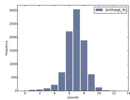
[image:39.612.164.382.131.299.2]birthwgt_lb
Figure 2.1: Histogram of the pound part of birth weight.
2.3
Plotting histograms
For this book I wrote a module calledthinkplot.pythat provides functions for plotting Hists and other objects defined in thinkstats2.py. It is based
on pyplot, which is part of the matplotlib package. See Section 0.2 for
information about installing matplotlib. To plot hist with thinkplot, try this:
>>> import thinkplot >>> thinkplot.Hist(hist)
>>> thinkplot.Show(xlabel='value', ylabel='frequency')
You can read the documentation forthinkplot athttp://greenteapress.
com/thinkstats2/thinkplot.html.
2.4
NSFG variables
Now let’s get back to the data from the NSFG. The code in this chapter is in
first.py. For information about downloading and working with this code,
see Section 0.2.
20 Chapter 2. Distributions
0 2 4 6 8 10 12 14 16
ounces 0
200 400 600 800 1000 1200
frequency
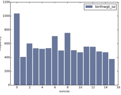
[image:40.612.220.429.136.301.2]birthwgt_oz
Figure 2.2: Histogram of the ounce part of birth weight.
looking at histograms.
In Section 1.6 we transformed agepreg from centiyears to years, and com-bined birthwgt_lb and birthwgt_oz into a single quantity, totalwgt_lb. In this section I use these variables to demonstrate some features of his-tograms.
I’ll start by reading the data and selecting records for live births:
preg = nsfg.ReadFemPreg() live = preg[preg.outcome == 1]
The expression in brackets is a boolean Series that selects rows from the DataFrame and returns a new DataFrame. Next I generate and plot the histogram of birthwgt_lbfor live births.
hist = thinkstats2.Hist(live.birthwgt_lb, label='birthwgt_lb') thinkplot.Hist(hist)
thinkplot.Show(xlabel='pounds', ylabel='frequency')
When the argument passed to Hist is a pandas Series, any nan values are dropped. label is a string that appears in the legend when the Hist is plotted.
2.4. NSFG variables 21
5 10 15 20 25 30 35 40 45
years 0
100 200 300 400 500 600 700
frequency
[image:41.612.164.380.160.330.2]agepreg
Figure 2.3: Histogram of mother’s age at end of pregnancy.
0 10 20 30 40 50
weeks 0
1000 2000 3000 4000 5000
frequency
prglngth
[image:41.612.162.382.437.609.2]22 Chapter 2. Distributions
of thenormaldistribution, also called a Gaussian distribution. But unlike a true normal distribution, this distribution is asymmetric; it has atailthat extends farther to the left than to the right.
Figure 2.2 shows the histogram of birthwgt_oz, which is the ounces part of birth weight. In theory we expect this distribution to beuniform; that is, all values should have the same frequency. In fact, 0 is more common than the other values, and 1 and 15 are less common, probably because respondents round off birth weights that are close to an integer value.
Figure 2.3 shows the histogram of agepreg, the mother’s age at the end of pregnancy. The mode is 21 years. The distribution is very roughly bell-shaped, but in this case the tail extends farther to the right than left; most mothers are in their 20s, fewer in their 30s.
Figure 2.4 shows the histogram ofprglngth, the length of the pregnancy in weeks. By far the most common value is 39 weeks. The left tail is longer than the right; early babies are common, but pregnancies seldom go past 43 weeks, and doctors often intervene if they do.
2.5
Outliers
Looking at histograms, it is easy to identify the most common values and the shape of the distribution, but rare values are not always visible.
Before going on, it is a good idea to check for outliers, which are extreme values that might be errors in measurement and recording, or might be ac-curate reports of rare events.
Hist provides methods Largest and Smallest, which take an integer n and return the n largest or smallest values from the histogram:
for weeks, freq in hist.Smallest(10): print(weeks, freq)
In the list of pregnancy lengths for live births, the 10 lowest values are [0,
4, 9, 13, 17, 18, 19, 20, 21, 22]. Values below 10 weeks are certainly
2.6. First babies 23
30 weeks, it is hard to be sure; some values are probably errors, but some represent premature babies.
On the other end of the range, the highest values are:
weeks count
43 148
44 46
45 10
46 1
47 1
48 7
50 2
Most doctors recommend induced labor if a pregnancy exceeds 42 weeks, so some of the longer values are surprising. In particular, 50 weeks seems medically unlikely.
The best way to handle outliers depends on “domain knowledge”; that is, information about where the data come from and what they mean. And it depends on what analysis you are planning to perform.
In this example, the motivating question is whether first babies tend to be early (or late). When people ask this question, they are usually interested in full-term pregnancies, so for this analysis I will focus on pregnancies longer than 27 weeks.
2.6
First babies
Now we can compare the distribution of pregnancy lengths for first babies and others. I divided the DataFrame of live births using birthord, and computed their histograms:
firsts = live[live.birthord == 1] others = live[live.birthord != 1]
first_hist = thinkstats2.Hist(firsts.prglngth) other_hist = thinkstats2.Hist(others.prglngth)
24 Chapter 2. Distributions
30 35 40 45
weeks 0
500 1000 1500 2000 2500
frequency
Histogram
first other
Figure 2.5: Histogram of pregnancy lengths.
width = 0.45
thinkplot.PrePlot(2)
thinkplot.Hist(first_hist, align='right', width=width) thinkplot.Hist(other_hist, align='left', width=width) thinkplot.Show(xlabel='weeks', ylabel='frequency',
xlim=[27, 46])
thinkplot.PrePlottakes the number of histograms we are planning to plot;
it uses this information to choose an appropriate collection of colors.
thinkplot.Histnormally usesalign=’center’so that each bar is centered
over its value. For this figure, I use align=’right’ and align=’left’ to place corresponding bars on either side of the value.
Withwidth=0.45, the total width of the two bars is 0.9, leaving some space
between each pair.
Finally, I adjust the axis to show only data between 27 and 46 weeks. Fig-ure 2.5 shows the result.
2.7. Summarizing distributions 25
2.7
Summarizing distributions
A histogram is a complete description of the distribution of a sample; that is, given a histogram, we could reconstruct the values in the sample (although not their order).
If the details of the distribution are important, it might be necessary to present a histogram. But often we want to summarize the distribution with a few descriptive statistics.
Some of the characteristics we might want to report are:
• central tendency: Do the values tend to cluster around a particular point?
• modes: Is there more than one cluster?
• spread: How much variability is there in the values?
• tails: How quickly do the probabilities drop off as we move away from the modes?
• outliers: Are there extreme values far from the modes?
Statistics designed to answer these questions are calledsummary statistics. By far the most common summary statistic is the mean, which is meant to describe the central tendency of the distribution.
If you have a sample of n values, xi, the mean, ¯x, is the sum of the values divided by the number of values; in other words
¯
x= 1
n
X
i
xi
The words “mean” and “average” are sometimes used interchangeably, but I make this distinction:
• The “mean” of a sample is the summary statistic computed with the previous formula.
26 Chapter 2. Distributions
Sometimes the mean is a good description of a set of values. For example, apples are all pretty much the same size (at least the ones sold in supermar-kets). So if I buy 6 apples and the total weight is 3 pounds, it would be a reasonable summary to say they are about a half pound each.
But pumpkins are more diverse. Suppose I grow several varieties in my gar-den, and one day I harvest three decorative pumpkins that are 1 pound each, two pie pumpkins that are 3 pounds each, and one Atlantic GiantR pumpkin
that weighs 591 pounds. The mean of this sample is 100 pounds, but if I told you “The average pumpkin in my garden is 100 pounds,” that would be misleading. In this example, there is no meaningful average because there is no typical pumpkin.
2.8
Variance
If there is no single number that summarizes pumpkin weights, we can do a little better with two numbers: mean and variance.
Variance is a summary statistic intended to describe the variability or spread of a distribution. The variance of a set of values is
S2 = 1
n
X
i
(xi−x¯)2
The term xi −x¯ is called the “deviation from the mean,” so variance is the mean squared deviation. The square root of variance, S, is the standard deviation.
If you have prior experience, you might have seen a formula for variance with
n−1 in the denominator, rather than n. This statistic is used to estimate the variance in a population using a sample. We will come back to this in Chapter 8.
Pandas data structures provides methods to compute mean, variance and standard deviation:
2.9. Effect size 27
For all live births, the mean pregnancy length is 38.6 weeks, the standard deviation is 2.7 weeks, which means we should expect deviations of 2-3 weeks to be common.
Variance of pregnancy length is 7.3, which is hard to interpret, especially since the units are weeks2, or “square weeks.” Variance is useful in some calculations, but it is not a good summary statistic.
2.9
Effect size
An effect size is a summary statistic intended to describe (wait for it) the size of an effect. For example, to describe the difference between two groups, one obvious choice is the difference in the means.
Mean pregnancy length for first babies is 38.601; for other babies it is 38.523. The difference is 0.078 weeks, which works out to 13 hours. As a fraction of the typical pregnancy length, this difference is about 0.2%.
If we assume this estimate is accurate, such a difference would have no prac-tical consequences. In fact, without observing a large number of pregnancies, it is unlikely that anyone would notice this difference at all.
Another way to convey the size of the effect is to compare the difference between groups to the variability within groups. Cohen’s d is a statistic intended to do that; it is defined
d= x¯1−x¯2
s
where ¯x1 and ¯x2 are the means of the groups and s is the “pooled standard
deviation”. Here’s the Python code that computes Cohen’s d:
def CohenEffectSize(group1, group2): diff = group1.mean() - group2.mean()
var1 = group1.var() var2 = group2.var()
28 Chapter 2. Distributions
pooled_var = (n1 * var1 + n2 * var2) / (n1 + n2) d = diff / math.sqrt(pooled_var)
return d
In this example, the difference in means is 0.029 standard deviations, which is small. To put that in perspective, the difference in height between men and women is about 1.7 standard deviations (see https://en.wikipedia.
org/wiki/Effect_size).
2.10
Reporting results
We have seen several ways to describe the difference in pregnancy length (if there is one) between first babies and others. How should we report these results?
The answer depends on who is asking the question. A scientist might be interested in any (real) effect, no matter how small. A doctor might only care about effects that are clinically significant; that is, differences that affect treatment decisions. A pregnant woman might be interested in results that are relevant to her, like the probability of delivering early or late. How you report results also depends on your goals. If you are trying to demonstrate the importance of an effect, you might choose summary statis-tics that emphasize differences. If you are trying to reassure a patient, you might choose statistics that put the differences in context.
Of course your decisions should also be guided by professional ethics. It’s ok to be persuasive; youshoulddesign statistical reports and visualizations that tell a story clearly. But you should also do your best to make your reports honest, and to acknowledge uncertainty and limitations.
2.11
Exercises
2.12. Glossary 29
Which summary statistics would you use if you wanted to get a story on the evening news? Which ones would you use if you wanted to reassure an anxious patient?
Finally, imagine that you are Cecil Adams, author of The Straight Dope
(http://straightdope.com), and your job is to answer the question, “Do
first babies arrive late?” Write a paragraph that uses the results in this chapter to answer the question clearly, precisely, and honestly.
Exercise 2.2 In the repository you downloaded, you should find a file named
chap02ex.ipynb; open it. Some cells are already filled in, and you should
execute them. Other cells give you instructions for exercises. Follow the instructions and fill in the answers.
A solution to this exercise is in chap02soln.ipynb
In the repository you downloaded, you should find a file namedchap02ex.py; you can use this file as a starting place for the following exercises. My solution is in chap02soln.py.
Exercise 2.3 The mode of a distribution is the most frequent value; see
http://wikipedia.org/wiki/Mode_(statistics). Write a function called
Mode that takes a Hist and returns the most frequent value.
As a more challenging exercise, write a function calledAllModesthat returns a list of value-frequency pairs in descending order of frequency.
Exercise 2.4 Using the variabletotalwgt_lb, investigate whether first ba-bies are lighter or heavier than others. Compute Cohen’s d to quantify the difference between the groups. How does it compare to the difference in pregnancy length?
2.12
Glossary
• distribution: The values that appear in a sample and the frequency of each.
30 Chapter 2. Distributions
• frequency: The number of times a value appears in a sample.
• mode: The most frequent value in a sample, or one of the most frequent values.
• normal distribution: An idealization of a bell-shaped distribution; also known as a Gaussian distribution.
• uniform distribution: A distribution in which all values have the same frequency.
• tail: The part of a distribution at the high and low extremes.
• central tendency: A characteristic of a sample or population; intu-itively, it is an average or typical value.
• outlier: A value far from the central tendency.
• spread: A measure of how spread out the values in a distribution are. • summary statistic: A statistic that quantifies some aspect of a
distri-bution, like central tendency or spread.
• variance: A summary statistic often used to quantify spread.
• standard deviation: The square root of variance, also used as a measure of spread.
• effect size: A summary statistic intended to quantify the size of an effect like a difference between groups.
Chapter 3
Probability mass functions
The code for this chapter is in probability.py. For information about downloading and working with this code, see Section 0.2.
3.1
Pmfs
Another way to represent a distribution is a probability mass function
(PMF), which maps from each value to its probability. A probability is a frequency expressed as a fraction of the sample size, n. To get from frequen-cies to probabilities, we divide through byn, which is callednormalization. Given a Hist, we can make a dictionary that maps from each value to its probability:
n = hist.Total() d = {}
for x, freq in hist.Items(): d[x] = freq / n
32 Chapter 3. Probability mass functions
>>> import thinkstats2
>>> pmf = thinkstats2.Pmf([1, 2, 2, 3, 5]) >>> pmf
Pmf({1: 0.2, 2: 0.4, 3: 0.2, 5: 0.2})
The Pmf is normalized so total probability is 1.
Pmf and Hist objects are similar in many ways; in fact, they inherit many of their methods from a common parent class. For example, the methods
Values and Items work the same way for both. The biggest difference is
that a Hist maps from values to integer counters; a Pmf maps from values to floating-point probabilities.
To look up the probability associated with a value, use Prob:
>>> pmf.Prob(2) 0.4
The bracket operator is equivalent:
>>> pmf[2] 0.4
You can modify an existing Pmf by incrementing the probability associated with a value:
>>> pmf.Incr(2, 0.2) >>> pmf.Prob(2) 0.6
Or you can multiply a probability by a factor:
>>> pmf.Mult(2, 0.5) >>> pmf.Prob(2) 0.3
If you modify a Pmf, the result may not be normalized; that is, the probabil-ities may no longer add up to 1. To check, you can callTotal, which returns the sum of the probabilities:
3.2. Plotting PMFs 33
To renormalize, call Normalize:
>>> pmf.Normalize() >>> pmf.Total() 1.0
Pmf objects provide a Copy method so you can make and modify a copy without affecting the original.
My notation in this section might seem inconsistent, but there is a system: I use Pmf for the name of the class,pmffor an instance of the class, and PMF for the mathematical concept of a probability mass function.
3.2
Plotting PMFs
thinkplot provides two ways to plot Pmfs:
• To plot a Pmf as a bar graph, you can usethinkplot.Hist. Bar graphs are most useful if the number of values in the Pmf is small.
• To plot a Pmf as a step function, you can use thinkplot.Pmf. This option is most useful if there are a large number of values and the Pmf is smooth. This function also works with Hist objects.
In addition, pyplot provides a function calledhistthat takes a sequence of values, computes a histogram, and plots it. Since I use Hist objects, I usually don’t use pyplot.hist.
Figure 3.1 shows PMFs of pregnancy length for first babies and others using bar graphs (left) and step functions (right).
By plotting the PMF instead of the histogram, we can compare the two distributions without being mislead by the difference in sample size. Based on this figure, first babies seem to be less likely than others to arrive on time (week 39) and more likely to be a late (weeks 41 and 42).
34 Chapter 3. Probability mass functions
30 35 40 45
weeks 0.0 0.1 0.2 0.3 0.4 0.5 0.6 probability first other
30 35 40 45
weeks 0.0 0.1 0.2 0.3 0.4 0.5 0.6 first other
Figure 3.1: PMF of pregnancy lengths for first babies and others, using bar graphs and step functions.
thinkplot.PrePlot(2, cols=2)
thinkplot.Hist(first_pmf, align='right', width=width) thinkplot.Hist(other_pmf, align='left', width=width) thinkplot.Config(xlabel='weeks',
ylabel='probability', axis=[27, 46, 0, 0.6])
thinkplot.PrePlot(2) thinkplot.SubPlot(2)
thinkplot.Pmfs([first_pmf, other_pmf]) thinkplot.Show(xlabel='weeks',
axis=[27, 46, 0, 0.6])
PrePlottakes optional parametersrowsand colsto make a grid of figures,
in this case one row of two figures. The first figure (on the left) displays the Pmfs usingthinkplot.Hist, as we have seen before.
The second call to PrePlot resets the color generator. Then SubPlot
switches to the second figure (on the right) and displays the Pmfs using
3.3. Other visualizations 35
on the same axes, which is generally a good idea if you intend to compare two figures.
3.3
Other visualizations
Histograms and PMFs are useful while you are exploring data and trying to identify patterns and relationships. Once you have an idea what is going on, a good next step is to design a visualization that makes the patterns you have identified as clear as possible.
In the NSFG data, the biggest differences in the distributions are near the mode. So it makes sense to zoom in on that part of the graph, and to transform the data to emphasize differences:
weeks = range(35, 46) diffs = []
for week in weeks:
p1 = first_pmf.Prob(week) p2 = other_pmf.Prob(week) diff = 100 * (p1 - p2) diffs.append(diff)
thinkplot.Bar(weeks, diffs)
In this code, weeksis the range of weeks;diffsis the difference between the two PMFs in percentage points. Figure 3.2 shows the result as a bar chart. This figure makes the pattern clearer: first babies are less likely to be born in week 39, and somewhat more likely to be born in weeks 41 and 42. For now we should hold this conclusion only tentatively. We used the same dataset to identify an apparent difference and then chose a visualization that makes the difference apparent. We can’t be sure this effect is real; it might be due to random variation. We’ll address this concern later.
3.4
The class size paradox
36 Chapter 3. Probability mass functions
34 36 38 40 42 44 46
weeks 8
6 4 2 0 2 4
percentage points
Difference in PMFs
Figure 3.2: Difference, in percentage points, by week.
At many American colleges and universities, the student-to-faculty ratio is about 10:1. But students are often surprised to discover that their average class size is bigger than 10. There are two reasons for the discrepancy:
• Students typically take 4–5 classes per semester, but professors often teach 1 or 2.
• The number of students who enjoy a small class is small, but the num-ber of students in a large class is (ahem!) large.
The first effect is obvious, at least once it is pointed out; the second is more subtle. Let’s look at an example. Suppose that a college offers 65 classes in a given semester, with the following distribution of sizes:
size count
5- 9 8
10-14 8
15-19 14
20-24 4
25-29 6
30-34 12
35-39 8
40-44 3
3.4. The class size paradox 37
If you ask the Dean for the average class size, he would construct a PMF, compute the mean, and report that the average class size is 23.7. Here’s the code:
d = { 7: 8, 12: 8, 17: 14, 22: 4,
27: 6, 32: 12, 37: 8, 42: 3, 47: 2 }
pmf = thinkstats2.Pmf(d, label='actual') print('mean', pmf.Mean())
But if you survey a group of students, ask them how many students are in their classes, and compute the mean, you would think the average class was bigger. Let’s see how much bigger.
First, I compute the distribution as observed by students, where the proba-bility associated with each class size is “biased” by the number of students in the class.
def BiasPmf(pmf, label):
new_pmf = pmf.Copy(label=label)
for x, p in pmf.Items(): new_pmf.Mult(x, x)
new_pmf.Normalize() return new_pmf
For each class size,x, we multiply the probability byx, the number of students who observe that class size. The result is a new Pmf that represents the biased distribution.
Now we can plot the actual and observed distributions:
biased_pmf = BiasPmf(pmf, label='observed') thinkplot.PrePlot(2)
thinkplot.Pmfs([pmf, biased_pmf])
thinkplot.Show(xlabel='class size', ylabel='PMF')
Figure 3.3 shows the result. In the biased distribution there are fewer small classes and more large ones. The mean of the biased distribution is 29.1, almost 25% higher than the actual mean.
38 Chapter 3. Probability mass functions
0 10 20 30 40 50
class size 0.00
0.05 0.10 0.15 0.20 0.25
PMF
actual observed
Figure 3.3: Distribution of class sizes, actual and as observed by students.
the Dean. An alternative is to choose a random sample of students and ask how many students are in their classes.
The result would be biased for the reasons we’ve just seen, but you can use it to estimate the actual distribution. Here’s the function that unbiases a Pmf:
def UnbiasPmf(pmf, label):
new_pmf = pmf.Copy(label=label)
for x, p in pmf.Items(): new_pmf.Mult(x, 1.0/x)
new_pmf.Normalize() return new_pmf
3.5. DataFrame indexing 39
3.5
DataFrame indexing
In Section 1.4 we read a pandas DataFrame and used it to select and modify data columns. Now let’s look at row selection. To start, I create a NumPy array of random numbers and use it to initialize a DataFrame:
>>> import numpy as np >>> import pandas
>>> array = np.random.randn(4, 2) >>> df = pandas.DataFrame(array) >>> df
0 1
0 -0.143510 0.616050
1 -1.489647 0.300774
2 -0.074350 0.039621
3 -1.369968 0.545897
By default, the rows and columns are numbered starting at zero, but you can provide column names:
>>> columns = ['A', 'B']
>>> df = pandas.DataFrame(array, columns=columns) >>> df
A B
0 -0.143510 0.616050
1 -1.489647 0.300774
2 -0.074350 0.039621
3 -1.369968 0.545897
You can also provide row names. The set of row names is called the index; the row names themselves are called labels.
>>> index = ['a', 'b', 'c', 'd']
>>> df = pandas.DataFrame(array, columns=columns, index=index) >>> df
A B
a -0.143510 0.616050
b -1.489647 0.300774
c -0.074350 0.039621
40 Chapter 3. Probability mass functions
As we saw in the previous chapter, simple indexing selects a column, return-ing a Series:
>>> df['A']
a -0.143510
b -1.489647
c -0.074350
d -1.369968
Name: A, dtype: float64
To select a row by label, you can use the loc attribute, which returns a Series:
>>> df.loc['a']
A -0.14351
B 0.61605
Name: a, dtype: float64
If you know the integer position of a row, rather than its label, you can use the iloc attribute, which also returns a Series.
>>> df.iloc[0]
A -0.14351
B 0.61605
Name: a, dtype: float64
loccan also take a list of labels; in that case, the result is a DataFrame.
>>> indices = ['a', 'c'] >>> df.loc[indices]
A B
a -0.14351 0.616050
c -0.07435 0.039621
Finally, you can use a slice to select a range of rows by label:
>>> df['a':'c']
A B
a -0.143510 0.616050
b -1.489647 0.300774
c -0.074350 0.039621
3.6. Exercises 41
>>> df[0:2]
A B
a -0.143510 0.616050
b -1.489647 0.300774
The result in either case is a DataFrame, but notice that the first result includes the end of the slice; the second doesn’t.
My advice: if your rows have labels that are not simple integers, use the labels consistently and avoid using integer positions.
3.6
Exercises
Solutions to these exercises are in chap03soln.ipynband chap03soln.py
Exercise 3.1 Something like the class size paradox appears if you survey children and ask how many children are in their family. Families with many children are more likely to appear in your sample, and families with no chil-dren have no chance to be in the sample.
Use the NSFG respondent variable NUMKDHHto construct the actual distribu-tion for the number of children under 18 in the household.
Now compute the biased distribution we would see if we surveyed the children and asked them how many children under 18 (including themselves) are in their household.
Plot the actual and biased distributions, and compute their means. As a starting place, you can use chap03ex.ipynb.
Exercise 3.2 In Section 2.7 we computed the mean of a sample by adding