Rochester Institute of Technology
RIT Scholar Works
Theses
Thesis/Dissertation Collections
2004
Brand color tolernaces: A Comparison of memory
color vs. paired comparison color matching
Allison K. Santoro
Follow this and additional works at:
http://scholarworks.rit.edu/theses
This Thesis is brought to you for free and open access by the Thesis/Dissertation Collections at RIT Scholar Works. It has been accepted for inclusion
in Theses by an authorized administrator of RIT Scholar Works. For more information, please contact
ritscholarworks@rit.edu
.
Recommended Citation
School of
Print Media
Roche
s
ter Institute of Technology
Rochester
,
N
ew
York
Certificate of Approval
Master's T
h
esis
This
i
s
to certify that
th
e
M
as
ter'
s
The
s
is of
A
lli
son
K.
Santoro
has been approved by
the T
h
esis Committee as sat
i
sfactory
for
the th
es
is
requirement for
th
e
Master of Science degree
~e
convocat
;
~n
of
~{ll
f1Vf
date
Th
es
is
Committee:
9/Jr/
o'/
Edward Granger
P
ri
mary TI
,es
i
s Ad
v
i
so
r
Name Illegible
Secondary
TI,e
s
i
s
Advi
sor
Name Illegible
Gradmte
TIlesis Coo
rdinator
Twyla J. Cummings
Graduate Program
Coo
rdinator
Brand Color Tolerances:
A Comparison
ofMemory
Color
vs.Paired Comparison Color
Matching
By
Allison
K. Santoro
A
thesis
projectsubmittedin
partialfulfillment
ofthe
requirementsfor
the
degree
ofMaster
ofScience
in
the
School
ofMedia in
the
College
ofImaging
Arts
andSciences
ofthe Rochester
Institute
ofTechnology
August 2004
Permission granted
Brand Color Tolerances: A Comparison of Memory Color vs. Paired Comparison Color
Matching.
I, Allison Santoro, hereby grant permission to the Wallace Memorial Library of the
Rochester
Institute of Technology to reproduce my thesis in whole or in part, any
reproduction will not be for commercial use or profit.
Signature of Author:
Table
ofContents
List
ofTables
vList
ofFigures
viAbstract
viiChapter 1:
Introduction
1
Chapter 2: Theoretical Basis
ofStudy
3
Psychophysics
3
Psychological:
Consumer Point
ofView
4
Hyper-Graeco Latin Squares
5
Chapter 3: Literature Review
6
Simultaneous
vs.Successive Color
Matching
6
Chapter 4: Hypothesis
10
Chapter
5:
Methodology
11
Introduction
11
Brand Color Creation
12
Test Procedure
15
Sampling
Plan
16
Chapter
6: Results
19
Introduction
19
Paired Comparison
Study
20
Paired Comparison Comments
23
Memory
Color
Study
25
Memory
Color Comments
28
Chapter 7:
Summary
& Conclusion
30
Introduction
30
Hypothesis: Tolerance is larger
30
Hypothesis: Tolerance is
equalto
or smaller31
Benefits
ofthe
Study
31
Recommendations
for Further
Study
32
Bibliography
33
Appendix
35
Appendix
A:Data
36
Appendix B: Text Color Patches
43
Appendix C: Oral Presentation
49
List
ofTables
Table 5.1: First Selection
forjudge
#1
16
Table 5.2:
Lightness, Hue,
Saturation Values
for
Patch#
1
17
Table 5.3: Judge
"Logo"Color Extended Latin Square
17
Table 5.4: Lightness Plane
ofHyper-Graeco Latin Square
17
Table
5.5: Hue Plane
ofHyper-Graeco Latin Square
18
List
ofFigures
Figure 5.1: Hue
Distribution
13
Figure 5.2: Chroma
Distribution
13
Figure
5.3
:Lightness
Distribution
14
Figure
6.1
:Paired Comparison Chroma
vs.Hue 1 JND Discrimination Limit
20
Figure 6.2:
Paired Comparison Chroma
vs.Hue 2 JND
Discrimination
Limit
21
Figure 6.3
:Paired Comparison Chroma
vs.Hue
3 JND
Discrimination
Limit
21
Figure 6.4: Paired Comparison Lightness
vs.Hue 1 JND
Discrimination
Limit
22
Figure 6.5: Paired Comparison Lightness
vs.Hue 2 JND
Discrimination
Limit
22
Figure 6.6: Paired Comparison Lightness
vs.Hue 3 JND Discrimination Limit
23
Figure 6.7: Paired Comparison CIE Delta E
vs.Cumulative
Probability
24
Figure 6.8:
Memory
Color Chroma
vs.Hue 1 JND Discrimination Limit
25
Figure 6.9:
Memory
Color Chroma
vs.Hue 2 JND
Discrimination
Limit
26
Figure 6. 10:
Memory
Color Chroma
vs.Hue 3 JND Discrimination Limit
26
Figure 6.11:
Memory
Color Lightness
vs.Hue 1 JND Discrimination Limit
27
Figure 6.12:
Memory
Color Lightness
vs.Hue 2 JND Discrimination Limit
27
Figure 6.13:
Memory
Color Lightness
vs.Hue 3 JND Discrimination Limit
28
Figure 6.14:
Memory
Color CIE Delta E
vs.Cumulative
Probability
29
Figure 6.15:
Memory
Color Delta E
vs.Paired Comparison Delta E
29
Abstract
The
proposedthesis
topic
is
to
comparetwo
methods ofjudging
brand
colors,
pairedcomparisonand
memory
color.Today's
currentpracticefor
press approvalin
the
graphicarts
industry
involves
anindividual using
asensitive comparison ofaproofto
a presssheet.
The resulting
pieceis
later
viewedby
auser who willhave
noknowledge
ofthe
original
(a
proof).The
exception,
however,
is
the
memory
ofthe
"logo"orbrand
colorthat the
usermay have. The
argument canbe
madethat the
additional costofapressapproval
is justified
by
the
possibility
ofaccruing
extracostin
the
reprint ofthe
pieceif
users
do
notfind
it
acceptable.Determined
in
this
study is
the
magnitudeofthe
"memory"
error
in
judging
the
printed colorby
comparing
the
"memory"errorto
the
tolerance
limits
usedby
printbuyers. The
ratio ofthese two
tolerances
canbe
usedto
determine
the
wastein
materials andtime
generatedby
the
approval process.Unlike
the
other researchdone
on relatedtopics,
wewill create ourown"logo"
color
patches
using
the
current methods ofreproductionin
the
graphicartsindustry. The ""s
are used
to
denote
that
wehave
chosencolor centersthat
do
notrepresentany
retail/commercial
brand. Brand
colorstend to
be
very
saturated and will not allowfor
experimentalexploration of plus/minus
tolerance
variationsin
the
"logo"
color.
Additionally,
the
experimental methods andviewing
environment weredesigned
to
represent
that
ofthe
graphic artsindustry.
Chapter 1
Introduction
The printing
industry
spends alarge
amountoftime
andmoney
trying
to
perfect colorquality
for
their
customers.An
individual,
typically
a printbuyer,
using
asensitivecomparisonofa proof
to
a press sheet approvesthe
printdecision (paired
comparisonmethod).
Print buyers demand high
standardsfor
their colors,
morespecifically
their
brand/logo
colors,
whichmay
notbe justifiable.
When
the
end-userfinally
viewsthe
printedmaterial
they
do
nothave
an originalto
compareit
to
in
orderto
know if
the
coloris
accurate(color memory
method).The
purpose ofthis
study is
to
determine if
there
is
asignificantdifference between
the
tolerances
ofthe
two
methods.A
large
difference
wouldimply
that
the tight
tolerances
imposed in
the
current printbuying
practices arenecessary.A larger
acceptance oftolerance
willhave
alarge
impact
on possible savingsin
prepress andpress cost.A
smalldifference
wouldimply
that the
currentprintbuying
practices arenecessary
anddo
If
there
is
alarge difference between
the
tolerances
of paired comparison and colormemory
then
the
current practicescouldbe
wastefulin
both
materials andtime.
Several
proofing iterations
arerequiredbefore
the
desired
matchis
achievedbetween
the
designer's
creation andthe
proof.There
arethen
severalhours
or evendays
ofpressapproval
to
matchthe
proofs.Additionally,
the
current colorimetrictolerance
is
suspected
to
be
many
times
moresensitivein
detecting
colordifferences
than
the
tolerance
developed
from
memory
ofthe
color.Therefore,
the
allowabletolerance
for
Chapter 2
Theoretical
Basis
ofStudy
Psychophysics
The
experience ofrecognizing
a changein
stimulationis
studiedin
the
area ofpsychophysics.
Psychophysics
is
the
study
ofourability
to
recognize achangein any
sensation, visual, audio,
etc.It
is important
to
know how
muchchangeis
necessary in
order
for humans
to
recognizeadifference
in
these
sensationsto
better
understandthe
end users experience and meet
their
expectations.Gerscheider
(1985)
defines
a stimulusorabsolute
threshold
aschanging
the
stimulusenergy just
enoughto
produceasensation.The
difference
threshold
is
a measureofthe
changein
astimulusto
produceasensationof a
just
noticeabledifference
(JND). These
sensations candiffer
by
intensity,
quality,
extension,
andduration
(p. 1). The
observerexaminestwo
stimuliandis
asked whichproduces a
different
sensation.One
ofthe
stimulihas
afixed
value andis
referredto
asthe
standard stimulus.The
otherstimulusis
variedfrom
trial to trial
andis
referredto
asthe
comparison stimulus.It
is
commonfor
there to
be
five,
seven,
ornine-comparisonstimulus
equally
separatedfor
an experiment(p. 42).
Depending
onthe
experiment,
the
stimuli arepresented
simultaneously
or successively.However,
in
the
successiveobserver
has
to
usethe
memory
ofthe
first image
to
useas a comparisonfor
the
secondstimulus.
The
memory
image may
fade
between
the
first
stimulus andthe
secondstimulusandso on.
However,
one possibleway
to
prevent atime
erroris
to
presentthe
standardstimuli at
the
first
half
ofthe
trial
andthen
again atthe
secondhalf,
depending
on
the
amountofstimuli(p. 43).
A
forced
choiceprocedureis
a methodofmeasuring
the
observer's sensitivity.This
procedure consists of
two
or moreobservationintervals
by
the
participantin
whichthey
are asked
to
decide
which observation containeda signal.Typically
the
observer willchoose
the
interval
withthe
largest sensory
observation(p. 116).
Psychological:
Consumers
point ofviewWhen
developing
consumer products corporate executivesmostimportant
concernis
what will get
the
customerto
buy
ornotbuy
their
product.According
to
Judd
andWyszecki
(1975)
consumersdecide
whatto
buy
based
on allthe
senses(touch,
taste,
smell,
lift,
andlook).
Using
the
sense ofsightthe
customer perceivesthe
colorasbelonging
to the product,
whichis
referredto
as an objectcolor(p.32). Whether
the
consumer
is
conscious ofthis
or notthey
carry
the
memory
ofthe
perceived color withthem to
makedecisions
orcomparisons as needed.Due
to
this,
packaging
ofproductsmust show
the
background
andtrademark colors,
whichthe
consumer will recognize.perceived
that the
differences in
a color cause abad
impression
to the
customer.For
example,
if
the
coloris lighter
than
the
originalthis
may
suggestthe
producthas
been
sitting
around,
whichmay lead
the
consumerto
believe
that the
productis
old orspoiled.Also if
the
coloris
too
dark
orgray
this
may
senda messageofdirt
or excessivehandling. These
color characteristicsarethought to
inhibit
a customerfrom purchasing
aproduct.
It
is important
to
recognizethere
aremany influences
onthe
perception of acolor.
The
mostimportant
arelighting,
surrounding
colors,
orpreviously
viewed colors(p.33). The
following
areanexample ofthe
considerationstaken
for
viewing:the
kind
oflighting
the
productwillbe
viewedunder, the
distance it
willbe
viewedfrom,
andthe
surrounding
objects aroundthe
product(p. 3 5).
Hyper-Graeco-Latin Squares
When
developing
any
research methodsit is important
to
avoidbiased
or unevensampling
andresults.Hyper-Graeco-Latin Squares
are usedto
produce an efficientsampling
plan sothat the
individual judges
have
areasonable number ofjudgmentspertest
session.Latin
squareshelp
design
anexperimentto
be
appropriately
randomized.This
method samplesthree
independent dimensions
to
produce5
samples.The five
samples
from
eachdimension
canthen
be
addedtogether.
Please
referto the
methodsChapter 3
Literature
Review
Simultaneous
vs.Successive
colormatching
Simultaneous
(paired comparison)
colormatching is
the
comparisonoftwo
juxtaposed
color sampleswithzero
time
delay. This
methodis
based
on perception withnouse ofmemory.
Additionally
withthis
methodobservershave little
difficulty
in
colordiscrimination
(Capilla, Carpinelli, Fez, Lunque,
&
Pozo,
2001).
Successive (color memory)
colormatching
occurswhenthere
is
adelay
in
time
between
viewing
ofthe
reference andthe
match.The decision
ofthe
matchis
made withno colorreference under
the
same ordifferent
viewing
conditions.The
observer mustusetheir
memory
to
make adecision.
From
previousresearch weknow
somepeoplehave
excellent color
memory
and othersdo
not(Capilla, Carpinelli, Fez, Lunque,
&
Pozo,
2001).
In
the
area of simultaneous and successive colormatching
researchhas been
done
onthe
different
illuminants have
onmemory
matching.All
oftheses
studies usedMunsell
chipsand paint chipswith varied amounts ofobservers.
Two
studies comparedthe
method of simultaneous and successive colormatching,
but
avery different
procedureis
proposedin
this
research.The first study
usedan apparatusthat
had
two
fields
for
color.For
the
simultaneous experimenthalf
wasfilled
withthe
test
color andthe
observeradjustedthe
otherhalf
untilthey
sawamatch.In
the
successiveexperiment
the
field
wascompletely
filled
withthe test
color andthen
replacedwith
the
adjustablecomparisoncolor.Again
the
observer was askedto
adjustuntil
they
saw a match.The
time
delay
for
this
experiment was5
seconds.The
resultsfrom
these
experimentsfound
successivematching
wasmorevariable,
but
wasmuchquicker.
Additionally,
morepurity
andluminance
wouldbe
neededto
makeaccuratecolormatches
based
on colormemory
(Burnham,
Clark, Newhall,
1975).
The
secondstudy comparing
simultaneous and successive colormatching
usedanapparatus of a
bipartite
circularfield
whereeachhalf
couldhave
adifferent
stimulusproduced
by
beams
oflight
controlledby
a shutter.Two
observersparticipatedin both
experiments.
In
the
successiveexperiment, the
stimulus wasshownfor
either1
or8
seconds
followed
by
aninterval
of no stimulus.They
werethen
shownthe
nextstimulusand asked
to
decide if
it
was a matchto the
previous stimulus.For
the
simultaneousfrom
this
study
also showedthat there
is
less
accuracy in
the
ability
to
discriminate
among
colorsuccessively
than
simultaneously
(Barco, Hita, Romero,
1986).
For
the
study
onthe
effectoftime
onmemory matching
the
referencetest
instrument
was agray
cardboard circlepanel withpaint chips placed onthe
outeredge.Both
experimentsused
20
comparisoncolorsfrom
the
Munsell
Book
ofColor varying in
hue,
value,
andchroma.One
hundred
observerswereselected with normal color visionto
take
partin
the
experiments.For
the
simultaneousexperiment, the
referencetest
was shown withthe
color chips andthe
observer was askedto
pick outthe
chipsthat
matched.The
result wasthe
correct color wasalmostalways chosen.For
the
successiveexperiment, the
observer was shownthe
referencetest
for 1 0
secondsfollowed
by
atime
delay
ofeither1 5
seconds,
1 5
minutes,
or24
hours. After
the time
delay
the
observer was askedto
pickamatchfrom
the
comparisonchips.The
resultsshowedthe
observer wasmoreinclined
to
pick alighter
andhigher
chromacolor.Additionally,
they
found
that,
astime
increased
there
wasgreatervariability in
colormemory
(Baldovi, Castro,
Fez,
&
Perez-Capinelli,
1998).
The
last
study
was onthe
effect ofdifferent illuminants
oncolormemory
matching.The
experimentusedaMacbeth
Cabinet,
whichwas splitin
half
withtwo
different
illuminants,
D65
andA. Test
colors werepickedfrom
the
Munsell
chipsvarying in
hue,
chroma,
and value.Ten
observers withnormal color visiontook
partin both
color under
D65 illumination for 10
seconds.Then
after a10-minute
time
delay
the
observerwas given
Munsell
chartsunderilluminant
A
and askedto
find
a match.The
simultaneousexperimentasks
the
observerto
viewtest
andmatching
samples underdifferent illuminants. The
referencetest
was viewed underD65
andthe
four
comparisoncharts viewed under
illuminant A. The
observers wereaskedto
select a color matchfrom
the
comparisoncharts.The
resultsdid
not provewhetherdifferent illuminants had
anChapter 4
Hypothesis
There
aretwo
hypotheses
for
this
research.The
first
hypothesis
is
the tolerance
for
colormemory
colormatching
ofbrand
colors usedby
the
averageuseris larger
than the
pairedcomparisoncolor
matching
ofbrand
colors usedby
the
printbuyer. The
secondhypothesis is
the tolerance
for
colormemory
colormatching
systemis
equalto
or smallerthan the
pairedcomparisoncolormatching
ofbrand
colorsusedby
the
printbuyer.
Chapter 5
Methodology
Introduction
Brand
colortolerances
willbe
determined
by judging
five
"logo"
colors
distributed
around
the
colorspectrum;
blue,
cyan, green, yellow,
and red.Each
ofthe
five
samplescreated will
vary in
five
steps ofhue,
saturation,
andlightness. Two
experiments willbe
administered
to
eachjudge,
colormemory
andpairedcomparison colormatching
to
compare
the
colormatching
tolerances
ofthe
enduser andthe
printbuyer. The judge's
estimation of matchwill
be
usedto
develop
the
response surfacefor
both
colormemory
and paired comparison.
The
response surfacedifferences
arethen
usedto
determine
the
number ofpaired comparison
JND's (print
buyer)
that
lie
withinthe
one(1
.0)JND
rangeof
the
memory
colors.The
number ofprintbuyer (paired
comparison) JND's that
lie
within
the
first
JND
of colormemory judgment
willgiveameasureofhow many
currentiterations
to
final
printquality
are not requiredfor
saleablebrand
color.Using
Thurstons
Method
wedetermined
1
sigma was equalto
a z-score ofapproximately
0.85
being
the
upper
limit 1
JND,
2
sigma equalto
a z-scoreofapproximately
1
.29being
the
upperlimit
for
2
JND's,
and3
sigmato
equal a z-score ofapproximately 2.33
being
the
upperlimit
for
3 JND's.
Brand Color
Creation
The
"logo"sampleswerecreated
in Adobe
Photoshop
7.0
in
aCMYK
setto
SWOP
standards.
Sets
of25
color patchesfor
each"logo"
(5x5x5 matrix)
werecreatedto
usein
the test
experiment.For
each"logo"
(red,
green,
blue,
cyan, yellow)
a5
x5
x5
matrixwas created.
Each
patchin
the
matrix willvary in increments
ofhue,
saturation,
andlightness. And
the
combinationofthese
increments is determined
by
using
the
hyper-graeco-latin squares
sampling
method.Once
the
matrixeswerecreatedthe
colorpatcheswere printedon
the
Kodak Approval
Proofing
System. This proofing
system was chosenbased
onits
overall colorquality stability
andpopularity
of usein
the
graphic artsindustry
for
color proofing.Figures 1-3
showthe
distribution
of color patchesfor
the test
experiments.The
third
sampleshown
in
each graphis
the
"logo"color.Samples 2
and4
arethe
CIE
delta E
steps
that
aredetermined
to
give sensitive resultsfor
the
paired comparison studies.Samples 1
and5
arethe
stepsdetermined for
the
successiveormemory
color experiment.200
150
100
I
50
w
0
O -50
-100 -150 -200
Sample Hue Steps
2
3
4
Sample
Number
?
Green
Yellow
Red
Cyan
Blue
Figure
5.1: Hue
Distribution
or\
Sample Chroma Steps
yu
80
-70
-60
.
50
m
40
-
30-20
-10
-n
Green
Yellow
Red
Cyan
Blue
i
u
(
ii
D
1
2
3
4
5
(
[image:23.563.101.462.79.288.2]Sample
Number
Figure 5.2: Chroma
Distribution
[image:23.563.104.463.374.580.2]80
70
60
*j
50
iu
40
O
30
20
10
0
Sample
Lightness Steps
Green
Yellow
Red
Cyan
Blue
2
3
4
Sample
Number
Figure
5.3:
Lightness Distribution
[image:24.563.101.462.79.288.2]Test
Procedure
Once
the test
patcheswere created20
students were selectedfrom
withinthe
School
ofPrint Media
atthe
Rochester Institute
ofTechnology
to
judge
the
acceptability
ofthe
color.
For
each"logo"
color
the
student completed acolormemory
anda pairedcomparison color
matching
experiment.Both
ofthese
experimentstook
place withinthe
Color Management Systems Lab using
aD50
light booth. The
colormemory
experimentwas given
first.
The
student weregiven a minuteto
viewthe
"logo" color.It
wasthen
taken
away
for
one minute.Next
25 varying
patches ofthe
"logo"color(including
the
logo
colorfirst
shown)
weregivenindividually
to the
student.The
student was askedto
judge
whetheror notit
was an acceptablerepresentationofthe
"logo"colorfirst
shown.
The
answers wererecorded anddocumented. This
wasrepeatedfor
the
other4
"logo"
colors.
After
the
colormemory
experimentthe
student was giventhe
pairedcomparison experiment.
For
this
experimentthe
student wasallowedto
keep
the
"logo"color while
they
weregiventhe
other24 varying
patches.Again
the
observerswereasked
to
judge
whether ornotthe
patchis
an acceptablerepresentation ofthe
"logo"color
first
shown.The
answerswererecorded anddocumented. This
was repeatedfor
the
other
4
"logo"colors.In
additionto the
subjectiveanalysis,
the
final
patchesweremeasuredin
XYZ
for
conversions
to
CIE Lab. This
data
was comparedto the
subjective results ofthe
experiment.
Sampling
Plan
Hyper-Graeco-Latin Squares
are usedto
produceanefficientsampling
plan sothat
the
individual judges
have
areasonablenumber ofjudgments
pertest
session.The sampling
plan
for
this
experiment usesfive levels
oflightness, hue,
and saturationfrom
each"logo"
color.
The lightness
levels
aredenoted
LI, L2, L3, L4,
andL5;
the
hue
levels,
HI, H2, H3, H4,
andH5
andthe
saturationlevels, SI, S2, S3, S4,
andS5. The
test
willbe
madefor
each ofthe
five
"logo"colors,
denoted
Gl, G2, G3, G4,
andG5. The first
extended
Latin
squareshownbelow is
the
order ofthe
"logo" colorto
be judged
by
a 10-member panel.There
arefive
ofthese
hyper
planesets; the
setto
useis determined
by
the
"logo" color number.The
samplesto
be
usedin
the
judgment
aredetermined
by
the
row and columnlocation
ofthe
observer"logo"
color extended
Latin
square.For
example, the
first
judge's initial
selectionis
"logo"
color number
1 in
the
first
rowandcolumn of
the
observer"logo" grid.
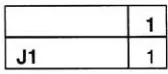
1
[image:26.563.242.326.489.526.2]J1
1
Table 5.1: First
selectionfor Judge #1
The
patchto
be judged
also comesfrom
the
first
rowandcolumn ofthe
Hyper-Graeco-Latin
Square for
that
color.In
this
case a patch wouldhave
chosenthat
has
a maximumnegative
hue
error,
maximum positive saturation andlightness
error.1
L1
1
1
H1
1
1
[image:27.563.172.399.346.446.2]S1
1
Table 5.2:
Lightness, Hue,
& Saturation
valuesfor Patch #1
Judge Number
1
2
3
4
5
6
7
8
9
10
G1
1
2
3
4
5
1
2
3
4
5
G2
2
3
4
5
1
2
3
4
5
1
G3
3
4
5
1
2
3
4
5
1
2
G4
4
5
1
2
3
4
5
1
2
3
G5
5
1
2
3
4
5
1
2
3
4
TaWe 5.3: Judge
-"Logo
"
Color Extended Latin Square
Judqe Number
1
2
3
4
5
6
7
8
9
10
L1
1
2
3
4
5
1
2
3
4
5
L2
2
3
4
5
1
2
3
4
5
1
L3
3
4
5
1
2
3
4
5
1
2
L4
4
5
1
2
3
4
5
1
2
3
[image:27.563.172.391.515.625.2]L5
5
1
2
3
4
5
1
2
3
4
Table 5.4:
Lightness
planeof
the
Hyper-Graeco-Latin
Square
Judqe
Number
1
2
3
4
5
6
7
8
9
10
H1
1
2
3
4
5
1
2
3
4
5
H2
2
3
4
5
1
2
3
4
5
1
H3
3
4
5
1
2
3
4
5
1
2
H4
4
5
1
2
3
4
5
1
2
3
H5
5
1
2
3
4
5
1
2
3
4
7a6/e 5.5: Hue
planeof
the
Hyper-Graeco-Latin
Square
Judqe
Number
1
2
3
4
5
6
7
8
9
10
S1
1
2
3
4
5
1
2
3
4
5
S2
2
3
4
5
1
2
3
4
5
1
S3
3
4
5
1
2
3
4
5
1
2
S4
4
5
1
2
3
4
5
1
2
3
[image:28.563.183.383.114.212.2]S5
5
1
2
3
4
5
1
2
3
4
Table 5.6: Saturation Plane of
the
Hyper-Graeco-Latin
Square
Once
the
testing
was completedthe
data
wasenteredinto
anexcelspread sheetandputthrough
comparative analysiswiththe
CIE Lab
readings of each color patch.As
statedearlier
the
z-score was calculatedfor
each patch andthen
usedto
determine
the
tolerance
limits for
the
JND's. The
results canbe
found
in
the
nextchapter,
Chapter 6.
Chapter
6
Results
Introduction
As
a result ofthese
experiments we wereableto
startdefining
colortolerances
for
colormatching in
the
graphicartsindustry. To find
the
colortolerances
wefirst
usedthe
paired comparison
data
to
establishthe
JND
(just
noticeabledifference)
scalesfor
hue,
saturation,
andlightness.
By
using
aforced
choicemethodthe
judges
were askedto
estimate
the
distance
between
the
"logo" color andthe test
patch.In
paired comparisonwe
found
limited
capabilities whenthe
differences in
stimuli arelarge
whichcausedthe
judges
to
always choosethe
distant
color patches.We
then
found
the
overlapping data
between
the
usable paired comparisondata
andthe
distance
estimatesmadeby
the
judges
in
orderto
translate the
distance
estimatesto terms
ofJND's. Thurston's Law
ofComparative Judgment
was usedto
analyzethe
results ofthe
paired comparisonandmemory
colorexperiment andto
convertthe
data into
aninterval
z-score.Crossing
the
scales
using
commoncolor patches comparesthe
JND's from both
experiments.The
ratioof
the
JND
scalesis
a measure ofthe
degree
ofloss
in productivity in
the
printbuying
processcomparedto
using
the
colormemory
process.Paired Comparison
Study
The
results ofthe
paired comparisonscaling
areshownonthe
nextfew
graphs.The
data
for
allgraphsis displayed for
allthe
"logo"colors asafunction
ofhue. Each
graphillustrates
the
boundary
for discrimination limits
ofone,
two,
andthree
JND's.
The
ordinalaxis
is
chosento
be
hue because
wefound hue
to
be
the
most criticalfactor in
determining
amatch.This
yieldsanearly
one-dimensional measure ofthe
discrimination
limits
for lightness
and chroma.As
the
graphsshow,
eachjudge
tolerated
arelatively
large
variationin
chromaandlightness
aslong
asthe
colortest
patchhad
the
samehue
angleas
the
"logo" color.This illustrates
the
importance
ofhue in making
a color match.Paired Comparison
-1 JND
GREEN1 JND YELLOW 4RED1JND
[image:30.563.78.495.420.646.2]CYAN 1 JND BLUE1 JND O Target Centers
Figure 6.1: Paired
Comparison
Chroma
vs.Hue 1 JND Discrimination Limit
In Figure 6.1
above,
we can seethat
patchesin 1 JND vary only in
chroma withonly
aslightvariation
in
hue,
if
any
at all.In
the
graphbelow,
figure
6.2,
we can seethat there
is
stillonly
aslight variationin
hue
axis(more
than
the
1 JND
data)
with most ofthe
variation
in
the
chromaaxisfor 2 JND.
Paired Compaison- 2 JND
*GREEN2 JND YELLOW2 JND
4RED2 JND
CYAN 2 JND
BLUE2 JND
oTargetCenters
-180 -150 -120 -90 -60 -30 0 30 60 90 120 150 Hue
Figure
6.2: Paired Comparison Chroma
vs.Hue 2 JND Discrimination Limit
Figure 6.3
onthe
nextpage,
illustrates
that
alarger
changein hue
createsamorenoticeable
difference. Notice
that
nowthe
patchesvary
muchmorein hue
and withstillvariation
in
chroma. [image:31.563.81.498.198.425.2]Paired Comparison- 3
JND
90
80
70
60
j?
50o
o 40
30
20
10
0
-180
*oi
-150 -120 -60 -30 0 Hue
30 60 90
?GREEN 3 JND
* YELLOW3 JND
ARED3 JND
CYAN 3 JND
*
BLUE3 JNDoTargetCenters
120 150 180
Figure
6.3: Paired Comparison Chroma
vs.Hue
3 JND
Discrimination
Limit
Paired Comparison
-1 JND
?GREEN 1 JND
YELLOW1 JND
ARED1 JND
CYAN 1 JND
BLUE 1 JND
oTarget Centers o:
*
-180 -150 -120 -90 -60 -30 0 30 60 90 Hue
180
Figure
6.4: Paired Comparison Lightness
vs.Hue 1 JND
Discrimination
Limit
[image:32.563.75.491.94.314.2] [image:32.563.77.493.400.628.2]In Figure 6.4
above,
we can seethat
patchesin 1 JND vary only in lightness
withonly
aslightvariation
in
hue,
if any
at all.In
the
graphbelow,
Figure
6.5,
wecan seethat there
is
stillonly
a slight variationin
hue
axis(more
than the
1 JND
data)
withmostofthe
variation
in
the
lightness
axis.Paired Comparison
-2 JND
GREEN 2 JND YELLOW2 JND
ARED2JND
CYAN 2 JND BLUE2 JND
oTargetCenters
Figure
6.5: Paired Comparison Lightness
vs.Hue
2 JND Discrimination Limit
Figure
6.6
onthe
nextpage,
illustrates
that
alarger
changein
hue
creates amorenoticeable
difference.
Notice
that
nowthe
patchesvary
much morein hue
andwith stillvariation
in lightness.
[image:33.563.87.497.226.452.2]Paired Comparison-
3
JND
GREEN 3 JND YELLOW 3 JND 4RED3JND
CYAN 3 JND BLUE3JND oTargetCenters
-180 -150 -120 -90 -60 -30 0 30 60 90 120 150 180
Hue
Figure
6.6: Paired Comparison Lightness
vs.Hue
3 JND
Discrimination
Limit
Paired
Comparison
Comments
The discrimination limits for
the
paired comparison experimentareshownin
Figures
6.1-6.6. As
canbe
seenin
the graphs, the
smallestdiscrimination
tolerance
is in
the
hue
direction. The
majoraxescontributing to
the
largest discrimination
tolerance
werelightness
and chroma.The
sampling
for
hue,
chroma,
andlightness
wereuniformly
distributed in
eachdimension.
Therefore,
achart withtolerance
plottedas afunction
ofthe
cumulativeprobability
(z-score)
willyield a measureofthe
discriminability
tolerance.
Additionally,
asmallCIE Delta E
erroratthe
oneJND
tolerance
boundary
along
withasmall [image:34.563.81.496.94.317.2]cumulative
probability indicates
the
judgment
systemis
very
sensitiveto
smallcolorimetricerrors.
This illustrates
that
almost allthe
samplesmadefor
the
study
werenot a suitable match
to the
"logo"color.Figure
6.7 below
showsthe
averageDelta
E
error asafunction
ofthe
proportion ofthe
sampleswhich were within
one,
two,
andthree
JND boundaries. Sixty-six
percentofthe
samples are outside
the
3 JND boundaries.
Therefore,
two thirds
ofourtotal
samplegrid wouldhave been
rejectedby
the
standardprintbuying
practice.Notice
the
oneJND
boundary
is
atapproximately four Delta E level
oferror.This indicates
that
oursubjects,
on
average,
wouldhave
acceptedsamples asamatch witha4
delta E
error orless. Print
buying
based
on colorimetricmeasurements wouldhave
rejected all samplesin
our colorpatch
test
grid.Paired
Comparison Judgment
Statistics
20
UJ
15
0.2
0.4
0.6
0.8
[image:35.563.101.464.412.621.2]Cumulative
Probability
Figure 6. 7: Paired Comparison CIE Delta E
vs.Cumulative
Probability
ofNot
Matching
the
"Logo
"Color
Memory
Color
Study
The
results ofthe memory
colorscaling
areshownonthe
nextfew
graphs.The
data for
all graphs
is displayed for
allthe
"logo" colorsasafunction
ofhue. Each
graphillustrates
the
boundary
for discrimination limits
ofone,
two,
andthree
JND's. The
ordinal axis
is
chosento
be hue for
the
reasons statedfor
the
paired comparison study.The
graphicaldata for
the
memory
colorstudy
is
presentedin
the
same orderasthe
paired comparison experiment.
Figures
6.8
-6.10
present
the tolerances to
chormavariationat
the
1-3
JND
tolerance
boundaries. Figures 6.1 1-6.13
showthe
data for
lightness
tolerance
bounds.
Memory
Color
-1 JND
?GREEN 1 JND YELLOW 1 JND 4RED1JND
CYAN 1 JND
"
BLUE 1JND O Target Centers
Figure
6.8:
Memory
Color Chroma
vs.Hue 1 JND
Discrimination
Limit
[image:36.563.83.498.346.562.2]Similar
to the
resultsfrom
the
paired comparisontext,
in Figure 6.8
above,
wecan seethat
patchesin 1 JND
vary
only in
chroma withonly
a slight variationin
hue,
if any
atall.In
the
graphbelow,
figure
6.9,
we canseethat there
is
stillonly
a slightvariationin
hue
axis
(more
than the
1 JND
data)
with most ofthe
variationin
the
chroma axisfor 2 JND.
Memory
Color
-2JND
E o
.c
o
GREEN2 JND YELLOW 2 JND A RED 2JND
*CYAN 2 JND BLUE 2 JND OTarget Centers
[image:37.563.80.497.225.441.2]Hue
Figure 6.9:
Memory
Color Chroma
vs.Hue 2 JND
Discrimination
Limit
Figure 6.10
onthe
nextpage,
illustrates
that
alarger
changein
hue
createsamorenoticeable
difference. Notice
that
nowthe
patchesvary
muchmorein
hue
andwith stillvariation
in
chroma.Single Stimulus
-3 JND
re
E
O 50 .C
o
'
H||
-150 -120 -90 -60 -30 0
Hue
60 90
?
o
?GREEN3JND
YELLOW 3 JND
RED3 JND *CYAN 3 JND
[image:38.563.77.492.79.293.2]BLUE3 JND OTargetCenters
Figure 6.10:
Memory
Color Chroma
vs.Hue
3 JND
Discrimination
Limit
Single Stimulus
-1 JND
GREEN 1 JND
YELLOW 1 JND
4 RED 1 JND
CYAN 1 JND
BLUE1 JND
oTarget Centers
180
Figure
6.11:
Memory
Color Lightness
vs.Hue 1 JND
Discrimination
Limit
[image:38.563.80.493.382.597.2]Similar
to the
resultsfrom
the
paired comparisondata,
in figure 6.1 1
above,
wecanseethat
patchesin 1 JND
vary
only in lightness
withonly
aslight variationin
hue,
if any
atall.
In
the
graphbelow,
figure
6.12,
wecan seethat
there
is
stillonly
a slight variationin
hue
axis(more
than
the
1
JND
data)
withmostofthe
variationin
the
lightness
axis.Single
Stimulus
-2 JND
tGreen2 JND YELLOW2 JND A RED 2 JND
CYAN 2 JND BLUE2 JND
oTargetCenters
[image:39.563.78.498.252.470.2]60 90 120 150 180
Figure 6.12:
Memory
Color Lightness
vs.Hue 2 JND Discrimination Limit
Figure 6.13
onthe
nextpage,
illustrates
that
alarger
changein
hue
createsa morenoticeable
difference.
Notice
that
nowthe
patchesvary
muchmorein hue
and with stillvariation
in lightness.
Single Stimulus
-3 JND
*GREEN 3 JND
YELLOW3 JND
ARED 3 JND
CYAN 3 JND
BLUE3 JND
oTarget Centers
Figure
6.13:
Memory
Color Lightness
vs.Hue
3
JND Discrimination
Limit
Memory
Color
Study
Comments
A
comparativemethodis
usedto
best
analyzethe
above results.Figure 6.14
summarizesthe
memory
colordiscrimination
tolerance
limits. When
this
data is
comparedto the
data
of
the
paired comparisonstudy
onFigure
6.15,
we can seethat
nearly
twice
asmany
samples are acceptedfrom
memory
colorasacceptedin
paired comparison.The
pairedcomparison experiment
found
that
only 34%
ofthe
samples were considered matchesatthe
3 JND level. The memory
color experiment showsthat
57%
ofthe
samples wereacceptablematches.
This
is
a neardoubling
ofthe tolerance
limit.
[image:40.563.73.493.82.299.2]Memory
Color Judgment
Statistics
0.2
0.4
0.6
0.8
[image:41.563.112.456.68.262.2]Cumulative
Probability
Figure 6.14:
Memory
Color
CIE Delta E
vs.Cumulative
Probability
ofNot
Matching
the
"Logo
"Color
The
tolerance
limits
for
both
conditions are cross-plottedfor
each"logo"
coloron
Figure
6.15 below. Plotted in
this manner,
it is
mucheasierto
seethe
acceptance ofthe
"logo"color
has
nearly
twice the
rangefor memory
colorascomparedto
paired comparison(a
slope witharatio of
nearly 2:1).
o E 0)
E
HI re
**
a
Q
n re
_i
UJ
O
Memory
Color
vsPaired Comparison
15
10
O
D
A
6
D
? 1JND H.2 JND
o3 JND
0 5 10 15
ClELabDeltaE-Paired Comparison
Figure
6.15:
Memory
Color Delta E
vs.Paired Comparison Delta E
[image:41.563.151.425.468.649.2]Chapter 7
Summary
andConclusion
The
purpose ofthis
study
wasto
examineif
the
printbuying
practices ofjudging
brand
color
(paired comparison)
was an accuraterepresentation ofthe
way
endusersorconsumers
judge
brand
colorin
the
marketplace(color
memory).The first hypothesis
stated
the
tolerance
for
colormemory
colormatching
ofbrand
colors usedby
the
averageend user
is larger
than the
paired comparisoncolormatch usedby
the
printbuyer. The
second
hypothesis
statedthe tolerance
for
colormemory
colormatching is
equalto
orsmaller
than the
pairedcomparison colormatching
ofbrand
colorsusedby
the
printbuyer.
Hypothesis:
Tolerance
is larger
According
to the results,
welearned
that the
tolerance
limits for
aconsumerusing
colormemory
colormatching
are muchlarger
than that
ofthe
pairedcomparison method.When
examining
whichdimension
of colorhad
the
least
amountofinfluence
on adecision
wefound
that
chroma(saturation)
andorlightness
ofthe
"logo"reproductionhad less importance.
Hypothesis:
Tolerance is
equalto
or smallerAccording
to
ourstudy, the
secondhypothesis
ofthe tolerance
for
colormemory
colormatching
is
equalto
or smallerthan the
pairedcomparisoncolormatching
ofbrand
colorwhich
is
usedby
printbuyers is false.
There
wasno evidencewhichfound using
colormemory
matching
to
have
atighter
acceptancetolerance.
However,
ourresultsshowedus
that
the
mostimportant dimension in logo
reproductionis
the
maintenanceofhue for
that
color.Benefits
ofthe
Study
The
resultsofthis
researcharebeneficial
to the
printing
and printbuying
industry. The
findings
imply
that
there
is
alarge
amountofmoney
to
be
savedby
re-examining the
color
buying
practice.Currently
there
are nostandardsfor
colorbuying
andthese
resultshelp
show standards arenecessary
and wouldbe very
costeffective.Additionally,
nomatter which method
is
usedwehave found
that the
mostimportant
colordimension
in
logo
reproductionis
the
maintenance ofhue
andless important is
saturationandlightness.
Recommendations
for Further Study:
Recommendations
for
further
study include:
more"logo"
colors,
actuallogo
colors(4
colorvs. special
color),
anincreased
numberofobservers,
and asurvey
on colormatching
standards.It
is
recommendedthat
this
experimentbe
repeatedfor
more"logo"
colors,
possibly
actuallogo
colorswithvarying
colordimensions (4
color and specialcolors),
andusing
more observers(40
or more).Further
moreit
is
recommendedto
survey
current colormatching
methodsin
useby
printbuyers
to
createacolormatching
standard.Bibliography
Bibliography
Box,
George
E.P., Hunter, J.S.,
&
Hunter,
W.G.
(1978). Statistics
For
Experimenters:
An
Introduction
to
Design,
Data
Analysis,
andModel
Building. New
York,
New York: John
Wiley
&
Sons,
255
-258.
Gescheider,
George A. (1985).
Psychophysics:
Method,
Theory,
andApplication
2ndEdition.
Hillsdale,
New
Jersey:
Lawrence Erlbaum
Associates, Publishers,
1,12,
42-43,116-119.
Judd,
Deane
B.,
&
Wyszecki,
Gunter (1975). Color
in
Business, Science,
andIndustry
3rdEdition.
New
York,
New York:
John
Wiley
&
Sons,
32-35,
342.
Barco, L.J., Hita, E.I.,
&
Romero,
J. (1986). A
Comparative
Study
of
Successive
and
Simultaneous
Methods
in
Color
discrimination.
Vision
Research, 26(3),
471-476.
Burnham,
R.W., Clark,
J.R.,
&
Newhall,
S.M. (1957).
Comparison
of
Successive
with
Simultaneous Color Matching. Journal
ofthe
Optical
Society
ofAmerica,
47,
43-56.
Capilla,
P.,
Carpinelli,
J.P, Fez, M.D., Lunque, M.J.,
&
Pozo,
J.C. (2001).
Asymmetric Colour Matching:
Memory Matching
Versus
Simultaneous Matching.
Color
Research
andApplication,
26(6),
458-468.
Baldovi, R., Castro, Jose, Fez, M.D.,
&
Perez-Carpinelli,
J.P. (1998).
Color
Memory
Matching: Time Effect
andOther Factors. Color
Research
andApplication,
23(4)234-247.
Appendix
Appendix A
Original Data
Color: Green
PatchID X Y Z L a b Saturation Delta E Hue Zscore la 2.45 3.94 2.09 23.47 -22.41 14.49 26.69 20.83 147.12 -2.33
lb 3.07 5.48 2.37 28.06 -30.66 20.11 36.66 9.94 146.73 1.28
lc 3.93 7.26 2.96 32.39 -35.66 23.28 42.59 3.52 146.86 0.00
Id 4.84 9.37 3.19 36.69 -41.74 29.17 50.92 7.03 145.05 0.84
le 5.79 11.7 3.77 40.74 ^7.78 32.62 57.85 15.03 145.68 -2.33 2a 2.26 3.77 1.71 22.90 -23.85 16.96 29.27 18.74 144.58 -2.33 2b 2.96 5.39 2.04 27.82 -31.54 22.42 38.69 8.14 144.60 0.84 2c 3.86 7.23 2.6 32.32 -36.40 25.71 44.57 1.00 144.77 0.25
2d 4.79 9.33 3.17 36.61 ^2.06 29.17 51.18 7.20 145.26 0.84
2e 6.07 12.1 3.88 41.42 -47.62 33.17 58.03 15.54 145.14 -2.33 3a 2.27 3.78 1.68 22.93 -23.79 17.32 29.43 18.59 143.95 -2.33
3b 3.08 5.51 2.15 28.14 -30.83 22.03 37.89 8.65 144.45 0.84
3c 3.82 7.22 2.48 32.30 -36.90 26.57 45.48 0.00 144.24 0.25 3d 4.75 9.23 3.04 36.42 -41.76 29.70 51.24 7.09 144.58 0.84 3e 6.18 12.2 4.04 41.56 -47.03 32.52 57.18 14.96 145.33 -2.33 4a 2.32 3.79 1.63 22.96 -22.89 17.88 29.04 18.95 142.01 -2.33 4b 3.03 5.48 2.07 28.06 -31.35 22.57 38.63 8.05 144.24 0.84
4c 3.87 7.27 2.53 32.41 -36.64 26.39 45.15 0.34 144.24 0.52 4d 4.71 9.23 3.05 36.42 -42.28 29.63 51.63 7.43 144.98 0.52 4e 5.85 11.8 3.73 40.93 -47.94 33.18 58.30 15.49 145.31 -2.33 5a 2.31 3.76 1.58 22.86 -22.65 18.21 29.06 19.03 141.21 -2.33
5b 3.24 5.7 2.14 28.64 -30.28 22.98 38.01 8.38 142.80 0.84
5c 3.86 7.23 2.51 32.32 -36.40 26.38 44.96 0.53 144.07 0.25
5d 4.82 9.4 3.1 36.74 -42.24 29.85 51.72 7.68 144.75 1.28
5e 6.07 12.1 3.73 41.44 -47.69 34.06 58.60 15.99 144.46 -2.33
Color: Red
Patch
ID X Y Z L a b Saturation Delta E Hue Zscore
la 17.62 10.42 1.53 38.59 49.86 45.84 67.73 13.09 42.59 -2.33
lb 20.87 12.04 1.48 41.28 54.80 51.02 74.87 12.88 42.95 1.28
lc 24.06 13.73 1.58 43.84 58.40 54.38 79.80 14.91 42.96 0.84
Id 26.65 14.93 1.62 45.54 62.06 56.90 84.20 17.54 42.51 -2.33
le 27.39 15.23 1.5 45.95 63.30 58.85 86.43 19.69 42.91 1.28
2a 17.89 10.52 2.28 38.76 50.56 39.27 64.02 10.79 37.84 -2.33
2b 21.18 12.3 1.86 41.69 54.52 47.94 72.60 10.26 41.33 0.52
2c 24.04 13.65 1.57 43.73 58.81 54.29 80.04 14.79 42.71 0.84
2d 26.65 14.95 1.59 45.57 61.94 57.25 84.35 17.88 42.75 1.28
2e 27.56 15.4 1.53 46.18 62.99 58.93 86.26 19.73 43.09 0.84
3a 18.11 10.53 4.17 38.78 51.65 27.01 58.29 15.94 27.61 -2.33
3b 21.44 12.25 3.94 41.61 56.10 33.16 65.16 7.86 30.59 1.28
3c 24.88 14.08 3.65 44.35 59.78 39.54 71.68 0.00 33.48 0.25
3d 27.38 15.26 3.37 45.99 63.08 44.07 76.95 5.84 34.94 1.28
3e 28.29 15.74 2.91 46.63 63.93 48.17 80.05 9.84 37.00 0.84
4a 18.39 10.57 5.58 38.85 52.83 20.26 56.58 21.23 20.98 -2.33
4b 21.79 12.29 5.74 41.67 57.47 24.43 62.45 15.52 23.03 -2.33
4c 25.06 13.99 5.81 44.22 61.11 28.51 67.43 11.11 25.01 0.84
4d 28.09 15.46 5.99 46.26 64.75 31.26 71.90 9.85 25.77 -2.33
4e 29.01 15.92 5.86 46.87 65.71 32.87 73.47 9.28 26.57 0.84
5a 18.29 10.44 7.39 38.62 53.28 12.57 54.74 28.33 13.28 -2.33
5b 22.05 12.39 7.85 41.83 58.01 16.44 60.30 23.30 15.83 -2.33
5c 25.73 14.2 8.7 44.52 62.65 18.18 65.23 21.56 16.18 -2.33
5d 28.66 15.56 9.15 46.39 66.41 19.95 69.34 20.79 16.72 -2.33
5e 30 16.13 9.63 47.14 68.31 19.74 71.11 21.75 16.12 -2.33
Color: Blue
Patch
ro X Y Z L a b Saturation Delta E Hue Zscore
la 5.64 5.24 14.87 27.41 7.95 -28.18 29.28 12.17 -74.24 1.28
lb 6.33 5.64 17.88 28.49 10.96 -32.85 34.63 14.23 -71.55 0.84
lc 6.98 6.07 21.19 29.59 12.92 -37.33 39.50 16.92 -70.91 -2.33
Id 7.91 6.8 24.82 31.35 14.25 -40.57 43.00 19.19 -70.65 1.28
le 8.33 7 27.27 31.81 16.07 -43.67 46.54 22.36 -69.80 1.28
2a 5.79 5.82 15.05 28.95 3.00 -25.93 26.10 8.51 -83.40 1.28
2b 6.63 6.56 18.2 30.78 4.20 -29.54 29.84 7.01 -81.90 0.84
2c 7.5 7.31 21.93 32.50 5.43 -33.64 34.08 8.09 -80.83 0.84
2d 8.15 7.81 25.39 33.58 6.80 -37.64 38.25 11.22 -79.77 0.52
2e 8.93 8.39 29.12 34.78 8.45 -41.33 42.19 14.95 -78.44 1.28
3a 5.97 6.6 15.24 30.88 -3.28 -23.04 23.27 8.32 -98.09 1.28
3b 6.77 7.42 18.08 32.74 -2.81 -25.91 26.07 4.91 -96.19 0.84
3c 7.72 8.31 22.1 34.62 -1.62 -30.29 30.33 0.00 -93.06 0.00
3d 8.55 9.04 25.72 36.06 -0.33 -33.90 33.91 4.10 -90.56 0.25
3e 9.96 10.6 31.39 38.90 -0.86 -37.50 37.51 8.42 -91.32 0.84
4a 6.13 7.21 15.09 32.28 -7.56 -20.28 21.65 11.87 -110.44 1.28
4b 7.16 8.63 18.38 35.26 -9.75 -22.18 24.23 11.51 -113.74 -2.33
4c 8.38 10.3 22.61 38.39 -11.88 -24.68 27.39 12.28 -115.70 -2.33
4d 9.75 11.7 28.13 40.80 -10.73 -29.48 31.37 11.04 -110.00 0.84
4e 10.9 13.3 32.85 43.24 -12.54 -32.03 34.40 14.02 -111.38 1.28
5a 6.47 8.39 15.27 34.78 -14.70 -16.38 22.01 19.10 -131.91 -2.33
5b 7.7 10.2 19.08 38.20 -17.23 -18.50 25.28 19.89 -132.97 -2.33
5c 8.91 11.9 23.26 41.07 -18.83 -21.19 28.35 20.51 -131.63 -2.33
5d 10.2 13.8 27.94 43.94 -20.74 -23.77 31.55 22.25 -131.10 -2.33
5e 11.4 15.5 33.21 46.24 -21.82 -27.34 34.98 23.49 -128.59 -2.33
Color: Yellow
Patch
ID X Y X L a b Saturation DeltaE Hue Zscore
la 28.33 33.14 5.11 64.27 11.96 66.24 67.31 19.18 100.23 -2.33 lb 33.59 38.38 5.29 68.30 -9.80 72.35 73.01 17.12 97.71 -2.33 lc 33.57 38.4 5.39 68.31 -9.93 71.92 72.60 17.20 97.86 1.28 Id 40.03 44.98 5.58 72.88 -8.25 78.93 79.36 19.21 95.97 1.28 le 46.25 52.15 6.06 77.37 -9.12 84.60 85.09 24.91 96.15 -2.33 2a 23.77 26.31 4.22 58.33 -5.32 60.46 60.69 16.83 95.03 1.28 2b 29.06 31.66 4.64 63.06 -3.89 66.44 66.55 11.46 93.35 1.28 2c 33.8 36.33 4.82 66.77 -2.48 71.94 71.98 9.66 91.97 0.84 2d 39.78 41.71 5.1 70.67 0.49 77.32 77.32 11.21 89.64 -2.33 2e 44.51 46.71 5.49 74.00 0.39 81.27 81.27 15.79 89.72 -2.33 3a 23.99 25 3.93 57.08 1.06 59.88 59.89 14.09 88.99 -2.33 3b 28.76 29.36 4.22 61.10 3.41 65.23 65.32 7.04 87.01 -2.33 3c 33.93 33.7 4.46 64.72 6.80 70.22 70.55 0.00 84.47 0.84 3d 38.04 37.26 4.49 67.47 8.74 74.80 75.31 5.68 83.34 0.52 3e 42.56 41.28 4.62 70.37 10.29 79.14 79.81 11.12 82.59 0.84 4a 24.49 23.71 3.63 55.80 8.75 59.40 60.04 14.16 81.62 -2.33 4b 28.46 26.73 3.72 58.72 12.48 63.92 65.13 10.38 78.96 0.84 4c 33.59 30.99 3.96 62.50 15.20 69.06 70.72 8.77 77.59 1.28 4d 37.2 33.78 4.07 64.79 17.58 72.40 74.50 10.99 76.35 1.28 4e 40.71 36.45 4.21 66.86 19.80 75.22 77.78 14.08 75.26 -2.33 5a 24.11 21.42 3.29 53.41 17.40 57.36 59.94 20.14 73.12 -2.33 5b 28.39 24.73 3.38 56.81 20.44 62.66 65.91 17.48 71.93 -2.33 5c 31.99 27.41 3.45 59.35 23.06 66.61 70.49 17.50 70.90 -2.33 5d 36.1 30.11 3.54 61.75 27.03 70.20 75.23 20.45 68.94 -2.33 5e 37.85 31.33 3.52 62.79 28.33 72.11 77.47 21.69 68.55 -2.33
Color: Cyan
PatchID X Y Z L a b Saturation Delta E Hue Zscore
la 9.32 11.45 27.02 40.33 -12.19 -28.60 31.09 15.08 -113.09 -2.33
lb 10.21 12.6 31.07 42.15 -12.94 -31.44 34.00 13.72 -112.38 -2.33
lc 11.57 14.33 36.09 44.70 -13.81 -33.79 36.50 12.59 -112.23 1.28
Id 12.59 15.31 41.37 46.06 -12.56 -37.90 39.93 15.34 -108.34 -2.33
le 13.86 16.53 47.37 47.66 -11.19 -41.82 43.29 18.71 -104.98 0.84
2a 9.68 12.52 27.44 42.03 -16.60 -26.31 31.11 10.83 -122.25 -2.33
2b 10.96 14.19 32.21 44.50 -17.39 -28.98 33.79 8.43 -120.96 -2.33
2c 11.92 15.53 36.64 46.35 -18.44 -31.64 36.63 7.23 -120.23 1.28
2d 13.33 17.15 42.96 48.45 -17.98 -35.61 39.89 9.49 -116.79 0.84
2e 14.69 18.63 49.23 50.25 -17.20 -39.32 42.91 12.91 -113.62 -2.33
3a 10.03 13.95 27.08 44.16 -23.00 -22.08 31.88 8.39 -136.17 -2.33
3b 11.33 15.74 32.74 46.63 -23.85 -26.04 35.31 3.68 -132.49 -2.33
3c 12.75 17.65 38.05 49.07 -24.47 -28.72 37.73 0.00 -130.43 0.25
3d 14.06 19.6 43.74 51.38 -25.96 -31.43 40.77 3.86 -129.55 0.00
3e 15.83 21.99 51.63 54.02 -26.65 -35.28 44.22 8.50 -127.07 0.25
4a 10.32 14.9 27.45 45.50 -26.50 -20.35 33.41 9.33 -142.48 -2.33
4b 11.82 17.25 32.58 48.57 -28.72 -22.47 36.47 7.57 -141.96 1.28
4c 13 18.92 37.75 50.59 -29.38 -25.72 39.05 5.95 -138.80 0.52
4d 14.44 21.06 44.08 53.02 -30.64 -29.00 42.19 7.33 -136.57 0.25
4e 16.42 23.86 51.79 55.95 -31.60 -32.11 45.05 10.47 -134.54 0.25
5a 10.88 16.68 27.9 47.85 -32.42 -16.97 36.59 14.24 -152.37 -2.33
5b 12.02 18.58 32.15 50.19 -34.30 -19.09 39.25 13.80 -150.90 1.28
5c 13.58 21.43 37.47 53.42 -37.78 -20.50 42.98 16.23 -151.51 1.28
5d 15.54 24.33 45.33 56.42 -38.69 -24.52 45.81 16.55 -147.64 0.84
5e 15.8 24.3 47.99 56.39 -37.05 -27.44 46.10 14.60 -143.47 0.84
Appendix
B
Test Color Patches
Allison
Santoro
4/23/03
CMYK
epsfrom
Photoshop
Allison
Santoro
4/23/03
CMYK
epsfrom
Photoshop
Allison
Santoro
4/23/03
CMYK
epsfrom
Photoshop
Allison Santoro
4/23/03
Appendix
C
(/>
<D
^'
o
O
^amm mm*-1
L-0
o
o
o
O
"D
I
O
CD
^^
.^^
*o
'ro
o
c
0-o
8
co
O
~>
ro
~
n
Q.
O
E
o
O
co
<
o
E
0
0
>
o
c
o
0
</)
0
CO
O)
co
0
co
co
CD
^
^
o
o
Q.
-QCL
I
CO
O
~P
CD
CO
O
Q.
CO
CD
>^
Q
CO
CD
CO
c
3
o
CO
O
CO
CD
"O
CD
E
E
o
o
CD
(f)
CD
C/)
O
o
o
o
0
CE
03
.=1,O
s-O
3
O)0
">^
.=i,03o
^
co^
"^3
O
o
z.
C
C
Q
S S 5
92rcE
03
>,0
0)03
C
CO
=
CO
o
03
CD
"O
0
CO
O)
c
o
+03
E
"O
c
03
o
CD
0
o
o
o^
co
c
o
0
CO
0
5
2
co
0
O
O
2
CD-CO
CO
0
CL
+
O
o
0
03
c
Q-
Z5
0
CO
0
0
o
o
0
o
0
+2C
0
<
03
O
13
II
s0
>>
CD
CL
C0
0
O
CO
CO
Q-3 ^"DC
C
0 0
i_ i3
O
O
^0
|
0
CO
c
c
t
o<