City, University of London Institutional Repository
Citation
:
Mayhew, L. and Smith, D. (2012). Gender convergence in human survival and the postponement of death (Actuarial Research Paper No. 200). London, UK: Faculty of Actuarial Science & Insurance, City University London.This is the unspecified version of the paper.
This version of the publication may differ from the final published
version.
Permanent repository link:
http://openaccess.city.ac.uk/2331/Link to published version
:
Actuarial Research Paper No. 200Copyright and reuse:
City Research Online aims to make research
outputs of City, University of London available to a wider audience.
Copyright and Moral Rights remain with the author(s) and/or copyright
holders. URLs from City Research Online may be freely distributed and
linked to.
City Research Online: http://openaccess.city.ac.uk/ publications@city.ac.uk
Faculty of Actuarial
Science and Insurance
Actuarial Research Paper
No. 200
Gender Convergence in Human Survival
and the Postponement of Death
Les Mayhew & David Smith
July 2012
Cass Business School 106 Bunhill Row London EC1Y 8TZ Tel +44 (0)20 7040 8470
1
Gender convergence in human survival and the
postponement of death
CONTENTS
1. Introduction
2. Gender gap in life expectancy at age 30 - Why is death being postponed? - Other factors
- Future prospects - Outline of rest of paper
3 A simplified model of survival and death postponement - Postponement of death in selected cases
4. Fitting the model
- Calibrating the survival function 5. Initial results
- Further analysis (a)Trends in survival
(b)Trends in the mode, mean and standard deviation in age of death (c)Trends in the postponement of death
6. Conclusions
Annex A: Stylised model of survival
Annex B: Smoking prevalence and gender gap in life expectancy
Les Mayhew David Smith
Faculty of Actuarial Science and Insurance Cass Business School
106, Bunhill Row London
EC1Y 8TZ
2
Gender convergence in human survival and the
postponement of death
Abstract
It has been a long accepted demographic maxim that females outlive males. Using data for England and Wales, we show that life expectancy at age 30 is converging and continuation of this long-term trend suggests it could reach parity in 2030. Key among the reasons identified for the narrowing of the gap are differences in smoking prevalence between males and females which have narrowed considerably. Using data from 30 comparator countries gender differences in smoking prevalence are found to explain over 75% of the variance in the life expectancy gap, but other factors such as female emancipation and better health care are also considered. The paper presents a model which considers differences in male and female longevity in greater detail using novel methods for analysing life tables. It considers the ages from which death is being postponed to the ages at which people now die; the relative speed at which these changes are taking place between genders; how the changes observed are affecting survival prospects at different ages up to 2030. It finds that as life expectancy continues to rise there is evidence for convergence in the oldest ages to which either gender will live.
Key words: life expectancy gender gap smoking prevalence survival model convergence
1.0Introduction
It has been a long accepted demographic maxim that females outlive males. However, when one examines the historical record for the last century the gap in life expectancy tends to vary but as part of a long term trend. For years at a time the gap appears to close, while other times it widens or remains the same.
Sometimes the reasons are obvious and coincide with either wars or epidemics but at other times life expectancy drifts apart or narrows due to no obvious event. It would be hard to justify these differences on biological grounds since the gender gap varies so much and is different in each country and so is more likely to be societal in origin. Currently we are in a period in which overall life expectancy is increasing rapidly, with death being postponed to much older ages. Also apparent in a number of countries is a convergence in gender life expectancy which Trovato (2007) calls the ‘emerging epidemiological feature of post-industrial societies’ (see also Trovato, 1996, 2003 and 2006, Tuljapurkar et al 2000).
Convergence has become a well entrenched trend over recent decades in England and Wales as male life expectancy catches up with that of females. To this end, we develop a model which enables us to discern differences in survival by age and gender and which allow us to project the consequences of this trend in future years in order to understand the processes in detail and how they affect each gender separately.
3 break on further advances in life expectancy itself and therefore confound the trends currently underway (Thatcher et al, 2008).
Taking a more positive view, males will be enabled to work for longer in reasonable health and be expected to live for almost as long as their partners (after taking account of the typical age difference upon union), whilst cohabitation itself is a factor in reducing mortality (Cheung, 2000, Karlsson et al, 2009).
In this paper, we address two sets of issues: firstly, how quickly is life expectancy increasing and why is it converging, including the prospect it will continue to increase at the same pace. Secondly, we consider whether convergence is benefitting all ages or just some, and the degree to which these benefits vary by gender. In the next section, we deal with the first of these questions, by reviewing the trends and comparing England and Wales with other countries.
As we shall argue, many of these advances that are described are due to the adoption of healthier lifestyles over a period, but key among these is the huge reduction in the prevalence of smoking since 1948. To assist with the second set of issues we develop a model of survival and apply it to the England and Wales population. Section 3 describes the model; Section 4 fits the model to data and Section 5 analyses the results. A concluding section then follows.
2.0 Gender gap in life expectancy at age 30
Life expectancy is defined as the average number of years an individual is expected to live based on mortality rates at different ages. An increase in life span may affect individual age cohorts differently, resulting in a variety of postponement of death patterns and trends over time.
A distinction can be drawn between pre- and post 30 years of age. Before age 30 there are currently more gender related differences in male and female mortality than post 30. At birth, more males die before age one than females although with reductions in infant mortality of 75% since 1970 in England and Wales this difference is less noticeable than previously.
There is also a marked increase in male mortality between 16 and 30 years but much less so for females. In 2009 the male ‘accident hump’ had reduced slightly and now there is no discernible female hump at all. Reasons for the hump include the fact that men tend to be involved in riskier activities such as dangerous sports, tend to be more prone to road and other accidents, and are more likely to commit suicide.
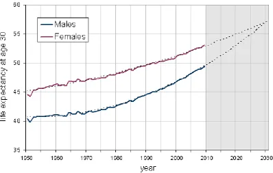
4 By 2009 female life expectancy stood at 53.2 years and male life expectancy at 49.4 years, a difference of 3.8 years. This compares with a gap of 5.7 years in 1970 when it was at a maximum. The trends in life expectancy are very accurately described by a second order polynomial equation, shown in Figure 1 as dotted lines.
[image:7.595.97.496.216.469.2]Based on this, male and female life expectancy is forecast to converge at 57.1 years by 2030. That is not say that the convergence will definitely occur but the trends are well entrenched. However, it is necessary to investigate the mechanisms that underpin such a prediction and its robustness.
Figure 1: Trends in life expectancy at age 30 in England and Wales by gender
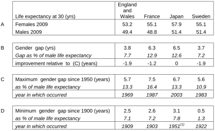
If England and Wales is compared with France, Japan and Sweden, it turns out that England and Wales is the only one in which male life expectancy has increased by more than female life expectancy in the period 1950 to 2009 (8.9 years versus 8.6 years) and in where female life expectancy has increased least.
5 Of the four countries, Japan is the odd country out. Here the gender gap has been mainly growing in size since 1950 and reached a peak at 6.7 years or 13.3% of male life expectancy in 2003, the highest of any of the countries shown. Part of the reason for this is that female life expectancy in Japan has grown faster than elsewhere, but also that the rate of growth in male life expectancy has lagged behind.
It is instructive to investigate how the gender gap in life expectancy has changed over the longer term. Although one would expect the gap to be smaller because life expectancy was much lower in earlier decades, it was also smaller as a percentage of male life expectancy in the early part of last century as is apparent in section D of Table 1 (data for Japan are unavailable before 1947).
Life expectancy at 30 (yrs)
England and
Wales France Japan Sweden
A Females 2009 53.2 55.1 57.9 55.1
Males 2009 49.4 48.8 51.4 51.4
B Gender gap (yrs) 3.8 6.3 6.5 3.7
Gap as % of male life expectancy 7.7 12.9 12.6 7.2
improvement relative to (C) (years) -1.9 -1.2 0 -1.9
C Maximum gender gap since 1950 (years) 5.7 7.5 6.7 5.6
as % of male life expectancy 13.3 16.4 13.3 10.9 year in which occurred 1969 1987 2003 1983
D Minimum gender gap since 1900 (years) 2.5 2.6 3.1 0.5
as % of male life expectancy 7.1 7.2 7.8 1.3 year in which occurred 1909 1903 1951(1) 1922
Table 1: Comparative life expectancy at age thirty in selected countries by gender (source: HMD).(Note (1): Japanese data unavailable before 1947)
In England and Wales and France a minimum gap was attained in 1909 and 1903 respectively. In Sweden it reached a minimum in 1922, after falling gradually for most of the previous century, of just 0.5 years or 1.9% of male life expectancy. This marks the year when the gender gap was at its narrowest in any of the four countries. The Swedish case lends weight to the argument that there are no fundamental biological differences between male and female life expectancy, but that the factors responsible for the gap are primarily societal and gender-centric (Trovato, 1996).
2.1Why is death being postponed?
[image:8.595.94.513.235.491.2]6 born around the turn of the century and who especially developed smoking habits from the 1920s onward.
The following points are noteworthy:
About one in six of all deaths in England and Wales are smoking related. Of these, about 60% are among men and 40% women. Smoking exacts a large death toll in the form of chronic obstructive lung disease, and ischemic heart disease among the over 65s, whilst death from lung cancer is attributable to smoking in about 85% of cases.
Since 1948, 82% of males smoked some form of tobacco and 65% smoked cigarettes. Today only 21% smoke cigarettes1. Females took up the smoking habit later than males peaking at about 40% before declining to 20%. As smoking among women increased, there were accompanying increases in female rates of lung cancer and other smoking related diseases (e.g. see Pampel, 2006, 2003, 2002).
The levels of smoking related mortality depend on tobacco consumption, quitting rates and lifetime exposure. It is not inconsistent for example for mortality rates to continue rising whilst smoking prevalence is falling and so the benefits of smoking cessation tend to percolate gradually at least initially (Murphy and Di Cesare, 2012).
According to Doll et al (2004), a ceased smoker at age 30 could expect to live 10 years and at 60 three years extra. Crudely speaking, if the remaining 20% of smokers ceased smoking then this would eventually add another two years to the life expectancy of the whole population after which time the full dividend from smoking cessation will be approached.
Coronary heart disease (CHD) mortality, itself smoking related, has been declining since the 1960s. Unal et al (2004) found that 58% of the coronary heart disease mortality decrease in England and Wales between 1981 and 2000 was attributable to reductions in major risk factors, principally smoking, blood pressure and cholesterol. In addition, there are now effective treatments for heart disease such as coronary artery surgery, angioplasty, statins, and other medications (Laatikainen et al, 2005).
Trovato (2005), using data from Canada, found that in 1971, 41% of the difference in male an female life expectancy at birth could be accounted for by heart disease, 19.7% by accidents, violence and suicide and 9.5% by lung cancer. Based on data from 2000, he found that the gap had narrowed by two years in which time the contribution of heart disease had fallen to 27.5% and accident, violence and suicide to 11.5%.
The relatively small gender gap in life expectancy in Sweden is of particular interest. While smoking rates among Swedish women have been consistent with those of other European countries (a fact reflected in comparable lung cancer rates), smoking rates
7 among men in Sweden have always been lower than those of their European counterparts. Sweden’s neutrality in both world wars is a factor in the low take up of smoking among Swedish males; however, a second reason is the traditional consumption of ‘snus’, a moist powder form of tobacco which is placed under the lip and not smoked.
Japan is an exception where smoking is still relatively widespread among males; statistics show Japanese men smoke at one of the highest rates in the world at 36% but only 12.1% of Japanese women do so. In France, 36% of males also smoke but prevalence in women is over twice the rate of Japanese females. More generally, we find that the difference in smoking prevalence between genders is a good indicator of gaps in life expectancy. Using data from 37 countries (see also Annex B), we ascertained for example that 75% of the variation in the gap in life expectancy at age 30 could be explained in this way confirming similar results obtained by Trovato (2005).2
The greatest gender differences in life expectancy and smoking prevalence occur in Russia and east European countries and the least differences in west European countries, Australia, Canada and New Zealand. However, this correlation is truer for more developed countries with long established patterns of tobacco consumption. In less developed countries, the gender gap is less because life is shorter and death tends to be from non-smoking related causes. Clearly, there will come a time when smoking will take a similar toll on human life in rapidly developing regions such as China, India, Middle Eastern countries and South America, as more people reach the age at which smoking related diseases make an impact.
2.2 Other factors
Not all of the gender gap can be explained by differences in smoking prevalence although smoking is often implicated indirectly. Other factors are important and may be correlated with people who smoke but they are not as well supported by comprehensive data. A distinction can be drawn between those affecting both genders and those that are gender specific. Hence, working in hazardous industries affects males more than females but infectious diseases, cold winters, hot summers, economic depressions, urban smog and so on are largely gender neutral, especially if there is a pre-existing health condition.
Since the 1980s the UK has undergone a significant industrial transformation with the numbers employed in manufacturing and mining falling substantially. Employment in the coal mining industry, strongly associated with lung disease, has fallen from a peak of 1.2m in 1920, 0.3m in 1970 to 5,000 today. There are also factors causing female life expectancy to rise more slowly. An example is increasing female adoption of unhealthier male behaviours, increases in smoking being a prime example (Pampel, 2005 a and b). Trovato (2005), for example, finds that while increased female labour force participation is not significantly associated with female smoking, it is inversely correlated with gender differences in life expectancy.
2 See WHO report on the global tobacco epidemic, 2011: warning about the dangers of tobacco.
8 A more contemporary phenomenon and threat to life expectancy is the rise in obesity. According to Eurostat (2011), 22% of males in the UK were obese and 23.9% of women.3 Obese people are more likely to suffer from diabetes which in turn can lead to other health complications and premature death (Hippisley-Cox et al, 2010). Among the morbidly obese (BMI levels of 40+), an individual could lose between 5.6 and 10.9 years of future life at age 30 if they remain obese (Mayhew et al, 2009).4 Although obesity in women does not affect life expectancy as much as it does in men, it has the potential to limit life expectancy gains among women if obesity grows at a faster rate.
It has been argued that the root causes of disparities in life expectancy are health inequalities, most of which are largely preventable (Marmot, 20115). Smoking, obesity, alcohol abuse and other factors are strongly associated with disparities in wealth and income. For example, Marmot shows that people living in the poorest neighbourhoods in England will on average die seven years earlier than people living in the richest neighbourhoods. The causes are complex, but appear to impact more on men than women due to differences in their health behaviours. Mayhew (2010, 2011), for example, found a gender gap of up to 14 years among male adults who are economically inactive, have low educational status, live alone and who smoke as compared with the longest lived lives.
2.3 Future prospects
In looking forward the question arising is whether the gender gap will continue to narrow at current rates and for life expectancy to converge by 2030. There do not appear to be any fundamental biological reasons or barriers why the extra level of life expectancy required is unattainable. Already Japanese females are living to the age forecast for England and Wales in 2030 i.e. 57 years and so we know that extra years are achievable. More fundamentally, Oeppen and Vaupel (2002) find that there has been an unbroken linear rise in life expectancy of about three months a year for at least 150 years and so increases post 2030 are also probable.
The main barriers, if any, are societal in origin. Vaupel (2010), summarising reasons for increases in life expectancy, finds that only about 25% of the variation in adult life spans is attributable to genetic differences. As long as there is continued access to health care, etc. life expectancy should continue to improve, he suggests, especially if coupled with healthier lifestyles, exercise and diet. Karlsson et al (2010), studying the effects of a reduction in income inequality would have on life expectancy, found that reducing the UK income inequalities to the levels recorded in Sweden would increase
3
Eurostat, 2011. Overweight and obesity - BMI statistics.
http://epp.eurostat.ec.europa.eu/statistics_explained/index.php/Overweight_and_obesity_-_BMI_statistics
4 For various reasons there is an increasing preference for using waist to height ratio (WHtR) instead of
BMI for measuring obesity. For example WHtR is easier to measure and provides better visual representation. A WHtR of 0.5 (i.e. height is twice waist) is considered optimal in males and equivalent to a BMI value of 25. In females the equivalent is a WHtR of 0.43. It is estimated that a BMI of 30 (borderline obese) equates to a WHtR of 0.53 in women and 0.60 in men.
5 Fair Society, Healthy Lives – the report of the Marmot review (2011)
9 life expectancy by 0.16 years and eliminating inequalities altogether would achieve 0.41 years.
As disparities in life expectancy reduce, death should gradually be concentrating into fewer years at older age. If true, this means that gender differences in survival will also gradually disappear subject to the caveats set out above. These processes are collectively known as the compression of mortality or sometimes as ‘rectangularisation of the survival curve’, about which there is a substantial literature, e.g. see Robine (2008), Thatcher et al (2008), Bongaarts (2005), Kannisto (2000), Wilmoth and Horiuchi (1999), and Fries (1980).
There is debate however about whether rectangularisation is actually occurring in the way envisaged (Canudas-Romo, 2008). In results presented here, we find that patterns in survival are a more complex mixture of effects depending on age, gender and period. We tackle this issue by developing a simple stylised model of survival of which there are three basic types: the divergent, parallel and convergent cases. In the divergent case, health inequalities widen and life expectancy gains are shared unequally; in the parallel case gains are shared equally but health inequalities are unchanged; in the convergent case, based on rectangularisation of the survival curve, gains are also shared unequally but health inequalities are reduced.
2.4 Outline of rest of paper
Thus far we have used life expectancy as a yardstick for measuring the differences between genders. However, life expectancy is a broad measure that does not take account of variations in the mortality experience at various ages. For example, a population with a constant death rate from birth in which everybody is dead by age 100 would have the same life expectancy as a population that all died on their 50th birthday. In order to understand what lies behind the finding that male and female life expectancy is converging we therefore need to go into considerably more detail. There are three issues to consider:
1. How changes in life expectancy are affecting survival prospects at different ages over time, for example the relative chances of a male or female reaching very old ages both in the past and future, and the parts of the survival distribution that are benefitting most.
2. Changes in the mean and modal age of death to ascertain whether, as well as a convergence in life expectancy, there is a trend towards greater concentration of death within a narrower age range and if this is different for males and females.
3. By comparing different periods, to identify the ages from which death is being postponed to the ages at which people now die, including the relative speed at which these changes are taking place and how to interpret the patterns that are the result.
10 be compared with patterns found in reality and enable us to address these issues. We use this model to understand the processes by which life expectancy and survival are interrelated.
To apply the model in practice, we exploit the empirical relationship between life expectancy and the probability of survival to a given age. We then use this relationship to establish age specific survival probability in some future year to which we then fit a Gompertz-Makeham function (e.g. see Olshansky and Carnes 1977 or Forfar and Smith 1987).
Using life tables for England and Wales, we extend our previously developed approach (Mayhew and Smith, 2011 and 2012). From this we derive full single year life tables which we then use to extract the current and future predicted number of deaths by year and gender. We then compare differences in age of death at ten year intervals from 1950 to 2030. The results appear as waves which are broadly sinusoidal in shape. From these waves we derive measures such as amplitude and wave length to compare differences in the pattern of change between males and females.
The results show substantially different gender patterns and confirm that the momentum for improvements in life expectancy has switched from younger to older ages and that men are outperforming women in some sections of the survival distribution and under performing in others. In the next section we set out a stylised and simplified version of the model. In Section 4 we fit the model to data from England and Wales, in Section 5 we set out results and in Section 6 we discuss the findings and conclusions.
3.0A simplified model of survival and death postponement
Mathematically the survival curve
S
(
x
)
denotes the probability of surviving to agex, wherease
(
x
)
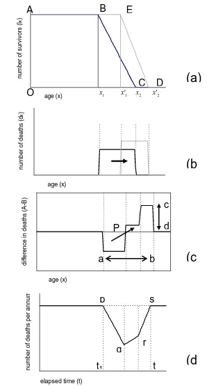
defines life expectancy at age x. We initially develop our ideas into the form of a simple, stylized model in order to gain insights into the processes linking the probability of survival, death and life expectancy. This allows us to derive a basic relationship between the survivorship and the postponement of death.Imagine a stationary population in which there are a constant number of births and deaths and no migration and that is subjected to the same mortality regime each year. Consider Figure 2(a), which shows the survival curves ABC and AED for hypothetical populations at two points in time, t1andt2.
The
S
(
x
)
curve may be compared to a life table which is based on an imaginary population usually of 100,000 people. This means that 1000 deaths represent 1% of all deaths. Deaths at each age are recorded and subtracted from the remaining lives. The life table continues until an age is reached by which all 100,000 are dead corresponding to x2(point C) or x2' (point D) depending on the time period.11 or the maximum age to which anyone lives, and so life expectancy is originally given by (x1 x2)/2.
Figure 2: Simplified model of survivorship and death
age (x) n u m b e r o f s u rv iv o rs (l x ) age (x) d if fe re n ce i n d e a th s (A -B ) age (x) n u m b e r o f d e a th s (d x )
elapsed time (t)
n u m b e r o f d e a th s p e r a n n u m 1 x
A
O
B
E
2 x x'2
C D
(a)
(d
)
(c
)
(b
)
P
t
1t
2
1
'
x
a
b
p
q
r
s
c
12 Both x1and x2 are somewhat fuzzy quantities in the real world. In developed countries we could assume the onset of mortality (x1) occurs from around 50 years onward.
The exact age is imprecise but may be defined by reference to particular percentiles of deceased, for example, 10%. The same applies to maximum age at death in which it may be more appropriate to assume that x2 is the age of death of the 90th percentile. However, our purpose is to use x1 and x2 as conceptually useful devices to anchor and compare distributions and mortality processes, rather than to determine them empirically.
Now imagine the age distribution of the population at another point in time, t2. In Figure 2(a), we see that x1 has shifted to the right to '
1
x , while x2 has advanced to x2'
(point D). Life expectancy is now ( ' 2' )/2.
1 x
x
In other words, the onset of mortality and maximum age has increased, and as a result many more people live to older ages. In this example, we see that x1 and x2 have advanced by slightly different amounts, such that the mortality gradient in t2 is steeper than in t1 and so more die at each age after x1'.
Figure 2(b) shows the pattern of deaths in t1 and t2. The later commencement of mortality in t2 has caused a shift in the ages of death to the right, but because the mortality gradient is steeper the deaths are bunched into a shorter age range.
In Figure 2(c), we subtract deaths by age in t2 from t1 in order to show how death has been effectively postponed between each snapshot. It shows that before point P there were fewer deaths at t2 than at t1 but more after point P. The effect is to create a
wave or pulse with a fall in death prior to age P and an increase post P.
We define P as the pivot point, the heights (c-d) of the peak and trough as the amplitude, and the distance (a-b) the peak-to-trough age range. These quantities are identified by arrows with a diagonal arrow indicating the postponement effect which the stylised model is trying to capture.
Note also that since we fix at the outset the maximum deaths occurring in any one year to 100,000, it follows that the total deaths below the horizontal axis defined by zero, i.e. deaths postponed, must equal the total deaths above. As we shall see later, using actual life tables the waves are smooth curves and so there is no difficulty in defining a or b accurately.
Let us assume that at time t1 lives aged below x1 have the mortality rates that are assumed by '
1
x and x2' whereas lives aged x1 and over at t1 still remain with the old
13 period in which the population that has become healthier adjusts to its new steady state. It shows the expected change in the number of deaths between periods which, for the purposes of the stylised model, is assumed to be an incremental process that progresses at an even rate year on year. In other words, we assume a process in which mortality affects future cohorts and not cohorts already aged x1or over.
Consider the simplest case in which ' 1
1 x
x at t1 and t2. For t x1 i.e. before these new ‘healthier’ lives reach x1
Death rate 2 1
2 1
x
x
l
x x l
x x
in which lxis the number of survivors to agex. This is intuitive as we start with a stable population and if lx people are born then the same number must die.
Forx1 t x2 i.e. when the new ‘healthier’ lives reach x1and die at the new lower rate
but we still have some older lives dying at the original rate
Death rate 2 1
2 1 2 1
x x
l l
x t t x
x x x x
The first term involves the older lives who die at the original rate. As t increases this number reduces (as the population with original mortality rates dies out). The second term involves the newer lives dying at the newer, lower rate. A more general case can be constructed involving changes to both x1and x2but is slightly more complicated.
The main result of this process is that death rates fall initially as the new healthier cohort ages and then once the whole population is part of this cohort rates climb again to previous levels. The area pqrs represents the total deaths avoided between t1 and
2
t and is equivalent to the area BECD in Figure 2(a).
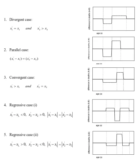
3.1 Postponement of death in selected cases
Averting deaths may either increase or reduce life disparity between ages of deaths depending on changes in shape of the survival curve (Zhang and Vaupel, 2009). Our principal interest lies in changes to the distribution of deaths over the age register, for example whether they are bunched or spread out.
14 Figure 3 lists each case. An adjacent diagram shows the change in the pattern of deaths between time periods. Postponed deaths are represented below the line and are of course exactly balanced by deaths above the line.
1. Divergent case:
2 ' 2 1
'
1 x and x x
x
2. Parallel case:
) (
)
( ' 2
2 1 '
1 x x x
x
3. Convergent case:
2 ' 2 1
'
1 x and x x
x
4. Regressive case (i)
2 ' 2 1 ' 1 2 ' 2 , 1 '
1 x 0, x x 0, x x x x
x
5. Regressive case (ii)
2 ' 2 1 ' 1 2 ' 2 , 1 '
1 x 0, x x 0, x x x x
[image:17.595.95.554.139.668.2]x
Figure 3: Postponement of death in selected cases. The graphs to the right show the postponement patterns consequent upon the parameter changes to the left
[image:17.595.375.553.143.665.2]15 In the divergent case, the age of onset of mortality x1does not change but the maximum age of death progresses from x2to
' 2
x . Deaths are postponed to older ages around a unique pivot point and life expectancy benefits by ( ' 2)/2
2 x
x years. The amplitude of the wave above the line is lower than that below the line, but also the width of the trough is narrower than the peak because death is being postponed from a narrow to an extended age band.
In the parallel case, the age of onset increases by exactly the same number of years as the maximum age of death. Everyone benefits similarly as life expectancy increases by( 2)
'
2 x
x . Postponed deaths form a peak below the line and are matched in shape and amplitude by deaths above the line separated by a gap of ( ' 1)
1 x
x years, so the width of the trough and the peak and also the amplitudes are the same.
In the convergent cases, the age of onset of death progresses but the age of maximum deaths is fixed. The survival curve now becomes more rectangular in shape leading to greater equality in life span and hence a demonstration of the rectangularisation hypothesis. Deaths bunch and increase in amplitude above the line and are separated from deaths below the line by a unique pivot point. In this case, the width of the trough is wider than the peak but the amplitude of the peak is greater. In this case, life expectancy increases by ( 1)/2
'
1 x
x years as with the divergent case.
The two regressive cases describe situations in which there is either a reduction in the age of onset of death balanced by an increase in the maximum age of deaths or an increase in the age of onset of death balanced by a fall in the age of maximum death. In neither case is there necessarily any change in life expectancy. In such cases, we would expect to see either a double peak in the number of deaths or a double dip. This is caused by one part of the age distribution experiencing an improvement in mortality and in the other part deterioration.
The cases are unusual but not impossible and one could speculate specific scenarios that might generate such patterns. Examples could include an epidemic affecting younger age groups or an upsurge in smoking prevalence, a significant increase in obesity in people of young to middle age leading to earlier death, or simply the result of a slow process of change over time relating to general increases or decreases in health inequalities.
4.0 Fitting the model
The identification of patterns of postponement in deaths is split into two parts. In the next section, we fit the Gompertz-Makeham function to life tables extracted from the Human Mortality Database (HMD). We fit a mathematical function rather than use the actual life tables because we wish to extrapolate them so as to identify any future trends.
16 To create the life tables required to calibrate the model needed to predict survival in future years and to characterise patterns or trends in postponement, we adopt the two stage process described in Mayhew and Smith (2012).
In the first stage, using actual data based on the Human Mortality Database (HMD) for each calendar year from 1950 to 2009, we calculate the expected future lifetime and the percentiles of people that have survived in 1% steps.
For each calendar year and every percentile, the results are tabulated in a spreadsheet with life expectancy in the first column and percentile survival ages in subsequent columns.
We then fit linear regressions for each percentile to the resulting array of points using an equation of the following form in which x, the age at death, is the dependent variable:
p p
p
p e u
x 30
where
p
x is the age of death of the population surviving to the pth percentile
p, p are the regression parameters of the p
th
percentile
30
e is the expected future life expectancy at age 30
p
u is a random error term
Table 2 sets out the fitted regression parameters for both males and females for a selected range of percentile survivorship. So for example for the male 70th survival percentile, the value 70 = 19.8159 and β70= 1.1274.
If life expectancy at 30 is assumed to be 50 years then the predicted age to which 70 per cent of the male population survives (or 30% die) is 76.2 years [i.e. 19.8159 +1.1274 50]. The equivalent value for females is 23.8491+1.0385 50 or 75.8 years.
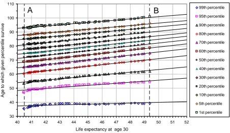
Table 2 shows that the goodness of fit statistic, or coefficient of determination R-squared, is always greater than 0.98 between the 1st and 90th percentiles suggesting that a high degree of accuracy is possible throughout the percentile range. Figure 4 shows the results for males based on the 99th, 95th, 90th, 80th …… 10th, 5th, and 1st survival percentiles including the fitted regression lines.
17
Male Female
percentile
(th) p p R2 p p R2
[image:20.595.125.474.103.306.2]99 26.7993 0.2623 0.4977 -1.4470 0.8794 0.9174 95 19.1094 0.7318 0.9362 -1.0879 1.1521 0.9833 90 16.4518 0.9367 0.9825 6.9702 1.1335 0.9894 80 17.1963 1.0776 0.9977 17.4051 1.0755 0.9881 70 19.8159 1.1274 0.9992 23.8491 1.0385 0.9930 60 23.1957 1.1213 0.9987 27.8809 1.0268 0.9975 50 27.3860 1.0950 0.9976 31.3071 1.0159 0.9994 40 31.3516 1.0688 0.9973 34.7070 0.9999 0.9993 30 35.8936 1.0296 0.9971 38.5608 0.9733 0.9983 20 41.0291 0.9826 0.9972 42.4869 0.9487 0.9960 10 47.1910 0.9303 0.9965 48.3621 0.8986 0.9907 5 51.7976 0.8912 0.9935 53.2636 0.8518 0.9861 1 59.5101 0.8280 0.9816 61.3460 0.7785 0.9740
Table 2:Fitted regression parameters to data from the HMD (1950-2008)
Figure 4: Male life table survival percentiles as a function of life expectancy at 30 England and Wales
This table of parameters is primarily for use in fitting the survival function (see next section) but it also has a direct interpretation. The slope parameter p represents the
change in age of death for each one year improvement in life expectancy for a given percentile of the population. If it is greater than one, it means that this percentile gains more than one year of life for each added year of life expectancy of the population. Similarly, when p is less than one, the percentile gains are less than one year of life for each added year of life expectancy.
30 40 50 60 70 80 90 100 110
40 41 42 43 44 45 46 47 48 49 50 51 52
Life expectancy at age 30
Ag
e to
wh
ich
give
n p
erce
ntile
su
rvive
99th percentile
95th percentile
90th percentile
80th percentile
70th percentile
60th percentile
50th percentile
40th percentile
30th percentile
20th percentile
10th percentile
5th percentile
1st percentile
[image:20.595.95.548.341.603.2]18 Three cases can be recognised: (a) divergent, (b) parallel and (c) convergent. As Annex A explains, if values of p are initially less than one and increase to above
one as we move down the table, the corresponding stylised survival distribution is the divergent case. This means that higher percentiles are not benefitting from general increases in life expectancy as much as lower percentiles. If slope values are equal to one then the parallel case is indicated in which all ages benefit equally from increases in life expectancy. If values are initially above one and then fall to below one, the ‘convergent’ case is indicated, in which case the trend points to a maximum age of attainment to which percentiles converge (i.e. rectangularisation).
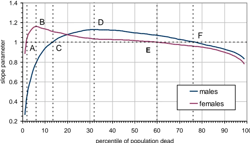
From Table 2 we observe that the trends in the value of p do not fall exactly into any of the three cases. Overall the range of values appears to come closest in definition to the parallel case since a clear majority of values are close to one; however, the top and bottom of the distribution indicate contrary trends. Figure 5 plots values of p from 0% to 100% of deaths for males and females (or equivalently
100% to 0 % survival). It has been sub-divided into sections depending on whether
p is less or greater than one and whether p is increasing or decreasing.
If we take males first, p increases in the range from 0% to 32% of deaths whereupon it reaches a maximum value at point D (age 76 in 2009). From this point onwards it turns from being a divergent pattern to being gently convergent suggesting a possible eventual limit to life span. Up to point C, when p equals exactly one, equating to the 13th percentile (or people dying age 65 in 2009), males are benefitting less from general improvements in life expectancy. From point C to F, p is greater than one and so this percentile range (age 65 to 92 in 2009) is benefitting most from general increases in life expectancy, for some lives by as much as 12%. Beyond point F, the 76th percentile, p falls below one and so males are benefitting less.
In the female case, p
increases as far as the 6
th
percentile of deaths at point A (age 61 in 2009), whereupon it reaches a maximum value. From this point onward, it turns from being a strongly divergent pattern into being gently convergent. Up to point A (age 51 in 2009) when p equals exactly one, females are benefitting less from general improvements in life expectancy. Between points A and C, p becomes
greater than one and so this percentile range is benefitting most from general improvements in survival – that is those dying between ages 51 and 88 in 2009. Beyond point E, p falls to below one, and so, just as for males, the oldest lived
females are benefitting less.
19 Hence convergence, albeit at a gentle rate of change, is occurring for 94% of the female percentile range as compared with 68% of the percentile range in the case of males. So we can say that females are converging more than males but the trend is for males to outlive females at the oldest ages.
Figure 5: Variations in survival parameter p for the males and females that are
dead
4.1 Calibrating the survival function
A life table demands that the results be in the form of the proportion of people surviving to age x in strict one year intervals rather than surviving to a given percentile, and so we need a method of converting the results from percentiles into single year units.
Following the method described in Mayhew and Smith (2011), we make use of the Gompertz-Makeham equation, which is a well-known and often used highly flexible function for fitting human survival curves (for historical review see Olshanksy and Carnes 1977).
This states that the death rate is the sum of an age-dependent component (named after Gompertz 1825), which increases exponentially with age, and an age-independent component (named after Makeham, 1860).
Using standard notation, the function for the force of mortality, x, is given as:
x
x A Bc or where ln
x
x A Be c
Where A, B, and c are empirically determined parameters which control the shape of the curve and xis age. The survival function which we seek is then simply defined as:
0.2 0.4 0.6 0.8 1 1.2 1.4
0 10 20 30 40 50 60 70 80 90 100
percentile of population dead
slope parameter
males females
A B
E
C
D
[image:22.595.100.507.153.385.2]20
x
a sds
x S( ) exp
Based on an age a from which lives are expected to start dying (which in our case is age 30), and substituting the parameters of the model we obtain the empirical representation ofS(x):
) (
) ( exp ) (
ˆ x A a x B ea ex
S
For a population assumed to have 100,000 people alive at aged 30, multiplying the equation above by 100,000 will give the number of people alive at age x, i.e. we have simply lx 100,000 Sˆ(x). The parameters A, B and c are estimated using an
iterative heuristic optimisation technique of our own design.
5.0 Initial results
To demonstrate the suitably of the function, we initially apply the formula at two points in time, 1950 and 2009, using male data. These years mark the start and end points of our actual data and are a test of the model. Later, we split the data into ten year intervals from 1950 onwards and project the model to 2030.
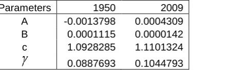
Table 3 gives the fitted values of A, B and c for 1950 and 2009 based on the procedure of the previous section. As B gets smaller there are fewer deaths in middle age and hence a fall in mortality over the period, whereas as c increases there are more deaths at older ages.
The main contribution of A is to temper the number of deaths at younger ages after parameters B and c have been used to fit the majority of the ages. The advantage of a commencement age of 30 is that the model fits are generally extremely good since we do not have to contend with childhood and early adult mortality.
Parameters 1950 2009
A -0.0013798 0.0004309 B 0.0001115 0.0000142 c 1.0928285 1.1101324
[image:23.595.97.336.546.615.2]0.0887693 0.1044793
Table 3: Fitted Gompertz-Makeham parameter for 1950 and 2009
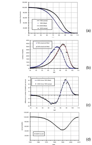
Figure 6(a-d) corresponds with each component of the stylised model described in Section 2. Data points are based on male life tables for England and Wales in 1950 and 2009 and fitted lines are based on the Gompertz-Makeham formula using the parameters in Table 3.
21 course continuous and so there is no direct correspondence with x1 or x2 as previously explained. -20,000 40,000 60,000 80,000 100,000 120,000
30 40 50 60 70 80 90 100 110
age n u m b e r o f su rvi vo rs 1950 (actual) 1950 (fitted) 2009 (fitted) 2009 (actual) 0 500 1000 1500 2000 2500 3000 3500 4000 4500
30 40 50 60 70 80 90 100 110
age n u m b e r o f d e a th s
1950 actual and fitted 2009 actual and fitted
-30 -20 -10 0 10 20 30 40 50
30 40 50 60 70 80 90 100 110
age d if fe re n ce i n n u m b e r o f d e a th s p e r a n n u
m 2009 minus 1950 (fitted)
2009 minus 1950 (actual)
(a)
(b)
(c)
(d)
-20,000 40,000 60,000 80,000 100,000 120,0001950 1960 1970 1980 1990 2000 2010
time a n n u a l d e a th s
[image:24.595.102.474.110.693.2]deaths by year
22 Figure 6(b) shows the pattern of deaths in 1950 and 2009 with a shift in modal age of death clearly visible, occurring at age 75 in 1950 and at age 87 in 2009 (a 12-year advancement over the period), also as per the stylised model. However, also evident is a spur of deaths at the very oldest ages in both years, although for reasons of simplicity this was not one of the features designed into the stylised model at the outset but one which could be considered in further work.
Figure 6(c) shows the difference in deaths at each age over the life span. It illustrates the expected pattern with a postponement of death from the early to the later part of the age register. Clearly, the waves are not square waves as in the stylised model but more sinusoidal in shape although certainly not symmetrical in amplitude as would be indicated if survival behaved like the parallel model. For consistency with later examples, we have annualised the number of deaths between snapshots by dividing throughout the age range by the number of elapsed years, in this case 59 years.
In this example, the wave crosses the horizontal axis at age 78, which we defined earlier as the pivot point. Since there is neither a double dip nor a double peak in the data, the regressive variants shown in Figure 3 ((d) and (e)) are clearly not applicable. The wave itself is asymmetric with amplitude that is less below the axis than above and so the parallel case is again ruled out. In the lower register there were an average of 24 fewer deaths per year at age 68, the bottom of the trough, and 40 more deaths per year at age 89 at the tip of the wave. The difference from peak to trough is 21 years (89-68).
Figure 6(d) shows the transition in deaths over the period from one assumed steady state to another with an annual maximum of 100,000. This is represented in the figure by a sudden jump from mortality rates in 1950 to those in 2009. Since we are working with life tables rather than actual populations, the effect may be interpreted as a change in mortality rates rather than a change in actual deaths over the adjustment period.
5.1 Further analysis
In this section, we wish to break down these patterns into more detail in order to identify any significant trends over time in the postponement of death, focussing especially on differences in gender. We do so by dividing the period from 1950 to 2030 into ten year periods, the last two of which, 2020 and 2030, are technically projections. As previously noted there are three issues to discuss. The first of these is trends in survival; the second issue are changes in the distribution in age of death including the mode, mean and standard deviation of age of death; and the third issue is death postponement.
(a) Trends in survival
23
parameters 1950 1960 1970 1980 1990 2000 2010 2020 2030
A -0.0013798 -0.0013798 -0.0013851 -0.0009285 -0.0003608 0.0002141 0.0009000 0.0005566 0.0005487 B 0.0001115 0.0001115 0.0001058 0.0000745 0.0000440 0.0000229 0.0000142 0.0000084 0.0000075 C 1.0928285 1.0926881 1.092691 1.096213 1.1014624 1.107427 1.1095334 1.111649 1.1062989
0.0887693 0.0886408 0.0886435 0.0918615 0.0966387 0.1020393 0.1080000 0.1058445 0.1010201
Table 4: Male parameter values for the Gompertz-Makeham formula
parameters 1950 1960 1970 1980 1990 2000 2010 2020 2030
A 0.0004751 0.000334 0.000333 0.0002456 0.0001985 0.0001861 0.0001779 0.0001552 0.0001496 B 0.0000248 0.0000237 0.0000197 0.0000180 0.0000137 0.0000105 0.0000080 0.0000059 0.0000043 C 1.1082509 1.1080316 1.1092629 1.1086508 1.1107354 1.1124291 1.113858 1.1148711 1.1160122
0.102783 0.1025851 0.1036958 0.1031437 0.1050223 0.106546 0.1078297 0.1087388 0.1097618
24 As the previously identified trend in life expectancy is extrapolated through to 2030, the survival curves shift from left to right. Solid lines are outcomes and the hatched lines are projections. The projections are consistent with the trend in life expectancy at age 30 and with the predicted survival probabilities derived from the model based on the Gompertz-Makeham parameters in Tables 4 and 5.
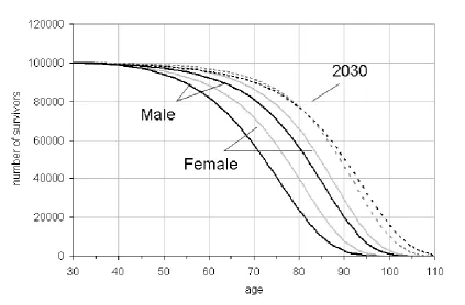
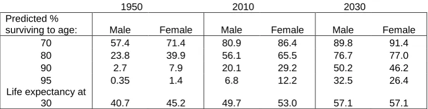
Whereas in 1950 and 2010 there are still considerable differences in male and female patterns of survival, projected survival curves by 2030 are more or less co-incident indicating almost identical survival probabilities at age 30. There are some small differences with the chances of male survival slightly lower than females between ages 50 to 75 but higher post 85.
For males the improvement in life expectancy between 1950 and 2010 is roughly equivalent to the improvement that is projected to occur between 2010 and 2030. Table 6 shows that compared with 1950 the percentage of males surviving to age 70 in 2010 increased by 23.5% (80.9% - 57.4%) as compared with 15% for females (86.4% - 71.4%); between 2010 and 2030 the increases are somewhat less at 8.9% and 5% but still faster for males.
[image:27.595.93.517.444.722.2]To take an older age, the percentage of males surviving to 90 increased by 17.4 % between 1950 and 2010 as compared with 21.3% for females; between 2010 and 2030 the increases are projected to be 25.7% and 14.2%, so in this case there has been reversal with survival fortunes with males set to improve more than females at the oldest ages. As for living beyond 100, in 1950 the chances were negligible for either gender. By year 2010 they were 0.8% for males and 1.8% for females, increasing to a projected 4% and 3% by 2020 and then more than doubling again by 2030.
25
1950 2010 2030
Predicted %
surviving to age: Male Female Male Female Male Female
70 57.4 71.4 80.9 86.4 89.8 91.4
80 23.8 39.9 56.1 65.5 76.7 77.0
90 2.7 7.9 20.1 29.2 50.2 46.2
95 0.35 1.4 6.8 12.2 32.5 26.4
Life expectancy at
[image:28.595.90.523.86.197.2]30 40.7 45.2 49.7 53.0 57.1 57.1
Table 6: Predicted survival to given ages and life expectancy at age 30, males and females
(b) Trends in the mode, mean and standard deviation in age of death
While death can occur at any age, the distribution of ages of death typically show a tendency to bunch in older age (see for example Figure 6(b)). A feature of the data over many years has been a sliding to the right of the whole distribution with corresponding shifts in the modal age of death (Zhang and Vaupel, 2009; Cheung and Robine, 2007, Kannisto, 2001).
Table 7 (a) and (b) is fully consistent with this picture. It is based on three measures of central tendency in the age of death and two measures of dispersion: these are the mode, mean and median and the standard deviation, and inter-quartile range. The results show that all three are steadily increasing in value over time. The predicted gains made by males have been higher with, for example, the male modal age of death advancing by 18 years between 1950 and 2030 compared with 12 years for females. The mean age of death plus or minus one standard deviation will contain 68.2% of all deaths post 30 years of age assuming a normal distribution; in practice the distribution is not exactly normal and so the actual percentage differs slightly and is higher (about 72% of all deaths). The trends in the mean and standard deviation of age of death are shown in Figure 8. The results indicate mean ages of death of males and females are converging and just as with life expectancy are expected to reach parity by around 2030.
26 (a) Males
year mode mean
standard
deviation median IQR
1950 75 70.4 11.9 71 17
1960 75 70.5 11.9 71 16
1970 76 71.1 11.9 72 16
1980 77 72.3 11.9 73 16
1990 79 74.0 12.0 75 16
2000 82 76.2 12.2 78 15
2010 85 79.2 12.5 81 16
2020 89 82.6 12.8 84 15
2030 93 87.0 13.5 89 16
(b) Females
year mode mean
standard
deviation median IQR
1950 80 74.7 12.3 76 16
1960 81 75.4 12.2 77 16
1970 82 76.4 12.2 78 16
1980 83 77.7 12.2 79 15
1990 85 79.1 12.1 81 15
2000 86 80.6 12.0 82 15
2010 88 82.1 11.9 84 15
2020 90 84.3 11.9 86 14
2030 92 86.5 11.9 88 15
[image:29.595.91.496.79.401.2]Table 7(a) and (b): Modal age of death, mean and standard deviation, median and inter-quartile range (IQR) for each year by gender
Figure 8: Male and female trends in the mean and standard deviation in the age of death
50 60 70 80 90 100 110
1940 1960 1980 2000 2020 2040
year
age
[image:29.595.108.530.450.716.2]27
(c) Trends in the postponement of death
Figures 9 and 10 show the differences in the average annual number of deaths between males and females between successive decades. Axes are drawn on a similar scale to facilitate gender comparisons based on the pattern of evolution in the resulting waves. Since the population is constrained to 100,000 at age 30, deaths below the axis equal deaths above.
Visually the results show that the waves are trending higher up the age register and at the same time are increasing in amplitude both above and below the axis. In later periods, the waves below the axis trend closer to zero as there are fewer lives to save and therefore deaths to postpone. These patterns are consistent with an accelerating shift in deaths to older ages.
The increase in the amplitude of the waves for males is far more striking than for females and is a reflection of previously identified trends in the data. To better understand these trends, we defined the following eight indictors:
A. Trough - age at the lowest point in wave B. Peak - age at the highest part of wave C. Trough to peak age range - B minus A (years)
D. Pivot age - age at which difference in deaths is zero E. Pivot to peak - B minus D (years)
F. Trough to pivot - D minus A (years)
G. Amplitude below zero - difference in deaths at trough age H. Amplitude at peak - difference in deaths at peak age
[image:30.595.95.516.490.727.2]The results are shown in Tables 8 and 9 and the first six of the indicators are represented graphically in Figure 11(A-F).
Figure 9: Changes in male deaths by age in ten periods from 1950 to 2030
-200 -150 -100 -50 0 50 100 150 200
30 40 50 60 70 80 90 100 110
age
d
if
fe
re
n
ce
s
in
a
va
rg
e
d
e
a
th
s
p
e
r
ye
a
r
1960-1950 1970-1960
1980-1970 1990-1980
2000-1990 2010-2000
28
Figure 10: Changes in male deaths by age in eight ten-year periods from 1950 to 2030
The trough age is the age at which deaths have fallen most between two points in time and therefore where the greatest improvement in survival has resulted. The age when the male trough occurs has increased from age 66 between 1950 and 1960 and is expected to reach 83 between 2020 and 2030. Based on Figure 11(A) the male trough will surpass the female trough between 2020 and 2030 again emphasising the rapidity in male gains.
The peak represents the age at which the difference in deaths compared with a previous point in time are greatest. Based on Figure 11(B) the male peak will surpass the female peak, in terms of age when the peak is reached, between 2010 and 2020. The smaller the age difference between trough and peak, the more death is being postponed over a shorter age range. The effect observed is as a result of compression, as the middle percentiles of the survival distribution catch up with the subsequent percentiles. The net result, shown in Figure 11(C), is that gains in life expectancy are tending to occur at increasingly older ages with successive waves to the right of the age register.
The advancement of pivot age is another way of measuring postponement. Pivot age denotes the age at which deaths turn from being lower than at the same age at a previous point in time to becoming higher. Results show that male pivot age increased just two years from 77 to 79 years prior to 2000, but then jumped to 83 years between 2000 and 2010 and is expected to increase again to 92 years between 2020 and 2030. As Figure 11(D) shows, male and female pivot ages will converge between 2020 and 2030.
The reduction in the years between pivot and peak indicates a compaction of deaths into a narrower age range between two points in time. Figure 11(E) shows that initially female deaths are more compacted than for males. The indictor is more
-200 -150 -100 -50 0 50 100 150 200
30 40 50 60 70 80 90 100 110
age
d
if
fe
re
n
c
e
i
n
d
e
a
th
s
p
e
r
y
e
a
r
29 erratic than some of the previous indicators but again it shows that convergence will occur between 2020 and 2030.
Differences in wave amplitudes are also indicative of the pattern of postponement, for example if death is being postponed from a wider range of ages below the line to a narrower range of ages above the line. Tables 8 and 9 rows G and H indicate that this applies here with the amplitude below the line being consistently less than the amplitude above.
As suggested by the stylised model (see Figure 3), this pattern would be consistent withx1', the age of onset of mortality, increasing by more than age x2' , the maximum age of death and so the net effect can be conceptualised as a combination of the compression and parallel cases. That is the onset of death is being postponed by more than the advancement in maximum age with greater compaction of death being the net outcome.
30
row age
1960-1950
1970-1960
1980-1970
1990-1980
2000-1990
2010-2000
2020-2010
2030-2020
A trough (age) 66 65 63 66 69 74 77 83
B peak (age) 87 86 85 87 89 93 96 101
C peak to trough (years) (B-A) 21 21 22 21 20 19 19 18
D pivot age (P) 77 75 75 77 79 83 87 92
E pivot to peak (years) (B-D) 10 11 10 10 10 10 9 9
F pivot to trough (years) (D-A) 11 10 12 11 10 9 10 9
G -ve amplitude (difference in deaths per year) 2 8 21 30 42 54 62 86
[image:33.842.63.778.89.222.2]H +ve amplitude (difference in deaths per year) 3 16 48 51 71 98 115 154
Table 8: Values of the eight specified indicators for males
row age
1960-1950
1970-1960
1980-1970
1990-1980
2000-1990
2010-2000
2020-2010
2030-2020
A trough (age) 71 71 74 73 75 77 79 81
B peak (age) 90 90 92 92 94 93 95 99
C peak to trough (years) (B-A) 19 19 18 19 19 16 16 18
D pivot age (P) 80 81 83 82 84 86 88 90
E pivot to peak (years) (B-D) 10 9 9 10 10 7 7 9
F pivot to trough (years) (D-A) 9 10 9 9 9 9 9 9
G -ve amplitude (difference in deaths per year) 9.9 15.9 21.9 20.1 25 26.8 38.8 40.61 H +ve amplitude (difference in deaths per year) 21.3 30.7 43.0 40.0 48.7 51.9 74.9 78.0
[image:33.842.62.791.257.389.2]31 (A)
[image:34.842.563.755.110.430.2](D)
Figure 11: Convergence indicators males and females (B) (E) (C) (F) 50 55 60 65 70 75 80 85 90 95 100 1960-1950 1970-1960 1980-1970 1990-1980 2000-1990 2010-2000 2020-2010 2030-2020 period age female trough male trough 60 65 70 75 80 85 90 95 1960-1950 1970-1960 1980-1970 1990-1980 2000-1990 2010-2000 2020-2010 2030-2020 period age
female pivot age male pivot age
75 80 85 90 95 100 105 1960-1950 1970-1960 1980-1970 1990-1980 2000-1990 2010-2000 2020-2010 2030-2020 period age
female peak age male peak age
0 2 4 6 8 10 12 1960-1950 1970-1960 1980-1970 1990-1980 2000-1990 2010-2000 2020-2010 2030-2020 period ye a rs
female pivot to peak male pivot to peak
0 5 10 15 20 25 1960-1950 1970-1960 1980-1970 1990-1980 2000-1990 2010-2000 2020-2010 2030-2020 period ye a rs
female peak to trough male peak to trough
0 2 4 6 8 10 12 14 1960-1950 1970-1960 1980-1970 1990-1980 2000-1990 2010-2000 2020-2010 2030-2020 period ye a rs
32
Figure 12: Difference in number of deaths by age in 1950, 2010 and 2030.
6.0 Conclusions
This paper has compared trends in male and female life expectancy in England and Wales. It deliberately focussed on people at age 30 rather than birth in order to remove biologically related differences in survival in the first years of life and higher deaths record by males from accident, suicides, etc. in the their early adult years. The results show a well entrenched trend with male life expectancy improving more quickly than females in the most recent periods. The gap was at its greatest in 1970 at 5.7 years but fell to 3.7 years in 2009, and based on current trends may converge with a future life expectancy of 57 years in 2030. It was argued that most of the differences in life expectancy were due to societal factors and not to fundamental biological differences.
A stylised survival model was developed to show how improved survival prospects were being transmitted through the age range with death being postponed from younger to older ages. Based on data from 1950 to 2009, this yielded the following findings:
Improvements in survival are occurring at most ages for both genders in line with general increases in life expectancy at age 30. In terms of the stylised survival model, visually the pattern of improvement most closely resembled the parallel case and so rectangularistion is ruled out; however, the pattern is not clear cut and elements of divergent and convergent behaviour are clearly present especially in the upper and lower age registers. We found weak convergence in 94% of the age range in females and 68% in males.
More detailed analysis finds that males that were expected to die between ages 65 to 89 and females aged 50 to 89 had experienced faster than average improvements in survival than the general population. In contrast to the
-1400 -1200 -1000 -800 -600 -400 -200 0 200 400 600 800 1000
30 40 50 60 70 80 90 100 110
age
d
if
fe
re
n
ce
i
n
d
e
a
th
s