City, University of London Institutional Repository
Citation:
Wood, J., Isenberg, P., Isenberg, T., Dykes, J., Boukhelifa, N. and Slingsby, A.
(2012). Sketchy rendering for information visualization. IEEE Transactions on Visualization
and Computer Graphics, 18(12), pp. 2749-2758. doi: 10.1109/TVCG.2012.262
This is the accepted version of the paper.
This version of the publication may differ from the final published
version.
Permanent repository link:
http://openaccess.city.ac.uk/1274/
Link to published version:
http://dx.doi.org/10.1109/TVCG.2012.262
Copyright and reuse: City Research Online aims to make research
outputs of City, University of London available to a wider audience.
Copyright and Moral Rights remain with the author(s) and/or copyright
holders. URLs from City Research Online may be freely distributed and
linked to.
City Research Online:
http://openaccess.city.ac.uk/
[email protected]
Sketchy Rendering for Information Visualization
Jo Wood,Member, IEEE, Petra Isenberg, Tobias Isenberg,Member, IEEE, Jason Dykes, Nadia Boukhelifa and Aidan Slingsby,Member, IEEE
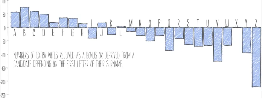
Numbers of extra votes received as a bonus or deprived from a
candidate depending on the first letter of their surname.
A B C D E F G H
I
J
K
L
M N O P Q R S T U V W X Y Z
100
50
0
-50
-100
-150
-200
[image:2.612.86.524.123.294.2]-250
Fig. 1. Bar chart displayed using theHandyrenderer for Processing.
Abstract—We present and evaluate a framework for constructing sketchy style information visualizations that mimic data graphics drawn by hand. We provide an alternative renderer for the Processing graphics environment that redefines core drawing primitives including line, polygon and ellipse rendering. These primitives allow higher-level graphical features such as bar charts, line charts, treemaps and node-link diagrams to be drawn in a sketchy style with a specified degree of sketchiness. The framework is designed to be easily integrated into existing visualization implementations with minimal programming modification or design effort. We show examples of use for statistical graphics, conveying spatial imprecision and for enhancing aesthetic and narrative qualities of visual-ization. We evaluate user perception of sketchiness of areal features through a series of stimulus-response tests in order to assess users’ ability to place sketchiness on a ratio scale, and to estimate area. Results suggest relative area judgment is compromised by sketchy rendering and that its influence is dependent on the shape being rendered. They show that degree of sketchiness may be judged on an ordinal scale but that its judgement varies strongly between individuals. We evaluate higher-level impacts of sketchiness through user testing of scenarios that encourage user engagement with data visualization and willingness to critique visualization de-sign. Results suggest that where a visualization is clearly sketchy, engagement may be increased and that attitudes to participating in visualization annotation are more positive. The results of our work have implications for effective information visualization design that go beyond the traditional role of sketching as a tool for prototyping or its use for an indication of general uncertainty.
Index Terms—NPR, non-photorealistic rendering, sketch, hand-drawn, uncertainty, visualization.
1 INTRODUCTION
Information visualization as a discipline has developed largely in par-allel with the computing technologies that have provided the rapid and precise graphical rendering of digital datasets. It has enabled the tan-gible representation of abstract information with a detail and volume that would not be possible without computer assistance. Consequently we have become accustomed to a visual style of information visualiza-tion that suggests ‘computer producvisualiza-tion’ along with the messages of objectivity and authority that can imply.
In this paper we propose and explore an alternative visual style for information visualization that mimics hand-drawn graphics. We do
• Jo Wood, Jason Dykes, and Aidan Slingsby are at the giCentre, City University London ({j.d.wood|j.dykes|a.slingsby}@city.ac.uk). • Petra Isenberg and Nadia Boukhelifa are with INRIA, Paris
({petra.isenberg|nadia.boukhelifa}@inria.fr).
• Tobias Isenberg is at the University of Groningen, the Netherlands, and with DIGITEO/CNRS/INRIA, France ([email protected]).
Manuscript received 31 March 2012; accepted 1 August 2012; posted online 14 October 2012; mailed on 5 October 2012.
For information on obtaining reprints of this article, please send e-mail to: [email protected].
so because sketchy depictions that imply human input into the design process offer different ways of communicating ideas of narrative, pur-pose, ownership, accuracy and aesthetic. At the same time, using the computer to generate these depictions maintains the advantages of in-teractive rapid processing of complex data.
Sketchy graphics with hand-drawn appearance are not new to computer-generated visualization. Non-photorealistic rendering has been widely applied in medical, architectural and illustrative contexts. Sketching is common in user interface design and rapid prototyping, exploiting expectations that a hand-drawn design has not yet been fi-nalised and is open to redesign. Yet in these contexts, the referent—the thing being symbolised graphically—is usually tangible, be it a build-ing, skeletal structure or collection of interface elements. What has not been explored is the potential for sketchy graphics to represent the more abstract data common in information visualization. Unlike with tangible referents, there tends to be no agreed objective visual depic-tion of abstract data opening up new possibilities for representadepic-tion.
2 RELATEDWORK
Inspiration for the work reported in this paper to a large degree comes from the domain of non-photorealistic rendering (NPR) [12, 41] where sketchy rendering styles have been an important goal from the start. Many different techniques have been developed, from sketchy line rendering (e. g., [9, 11]) to applying sketchy styles to shapes and 3D objects [32, 33, 38, 40, 47]. Important for our own work, however, are specifically attempts within the NPR community to understand how non-photorealistic images differ from traditional hand-made de-pictions, how people see and/or perceive imagery produced with NPR, and how sketchy styles can assist a certain goal [24].
Researchers were naturally interested in understanding the differ-ences between the computer-generated images they were producing and the hand-made images they were using as an inspiration. For ex-ample, Cole et al. [8] could confirm that most of the line types typ-ically employed in NPR rendering are indeed the same as those that would also be naturally drawn by humans. In the context of illustra-tive visualization of 3D shapes, Isenberg et al. [26] compared pen-and-ink renderings between professional illustrators and NPR techniques. They found that people were generally able to tell both types apart but that participants would also use NPR results for different purposes than hand-drawn images. People preferred NPR specifically for de-tailed visualization, an observation that may be important for the use of sketchiness in the context of information visualization.
Early in the development of NPR as a field, researchers also in-vestigated the effect that the images produced have on people. For example, the seminal work by Schumann et al. [39] specifically com-pared shaded images with the use of wireframe and sketchy line render-ings in the domain of Computer-Aided Design (CAD). They found that images in a sketchy style are better suited for depicting early design stages, were found to be less artificial and more interesting, and were more inviting for people to discuss designs or suggest changes. The emotional affect of NPR visuals was later discussed and confirmed by others for different application domains within NPR [10, 17, 31]. Af-fecting people emotionally is an interesting observation, particularly the ability to invite active participation, and this forms part of the mo-tivation for our own work to see whether similar effects can also be found for visuals that depict abstract data.
People also examined the usefulness of non-photorealistic images in assisting more specific goals. For example, Santella and DeCarlo [37] found not only that people are attracted to parts of an abstracted image that retain meaningful detail but also that using people’s local interest in images can help to create useful NPR abstractions. Ab-straction as introduced by NPR techniques was shown to also have an effect on how well people learn. Gooch et al. [13] demonstrated that computer-generated illustrations and caricatures of human faces are learned faster than the respective photographs but that they do not negatively affect people’s ability to recognize faces. Tietjen et al. [42] examined the use of abstracting NPR styles for showing context in 3D medical visualizations and, in an evaluation with experts and laypeo-ple, found that they can be employed to provide useful context infor-mation without affecting the focus of a visualization. For two-dimen-sional scientific visualization, Healey et al. [18, 19] examined the use of NPR styles to increase the number of available visual variables, a goal that is also important for the visualization of abstract data.
In the specific domain of information visualization, however, not many stylistic depiction techniques have been explored to date—even though “information visualization never had the option to use photore-alistic techniques due to the abstract nature of the data” as Rautek et al. [35] state. On the other hand, people naturally make frequent use of hand-drawn sketchy visualizations of abstract data, e. g., on tradi-tional whiteboards [46]. Walny et al. report that people make use of
intentionalsketchiness in these settings to invite discussion and com-munication, similar to how it is used in interface design [15] and CAD [39]. Connecting the nature of sketchiness with a visualization task, Browne et al. [5] explored sketchy drawing as a means to support the interactiveexplorationof information visualizations, using techniques from sketch-based interaction to drive a visualization system.
Sketchy rendering has only rarely been directly applied to
informa-tion visualizainforma-tion. Luboschik et al. [29] use two techniques, a waterco-lor-inspired area fill for map-based visualizations and a wavy line style for visualizations such as parallel coordinates that use lines as their main primitive. The line as the primary primitive is also the focus of Boukhelifa et al.’s [4] work. They found that sketchiness is as intuitive as other visual variables (such as blur) for depicting uncertainty, and that it is possible for people to distinguish between 3 and 4 different discrete levels of sketchiness without the need to consult the legend. These results are encouraging for our own work but we want to look at sketchiness as a visual variable beyond the context of uncertainty and to extend beyond line primitives to examine areal shapes.
3 POTENTIAL FORUSEININFORMATIONVISUALIZATION
We start our discussion by considering some of the potential uses of sketchy representation in information visualization. In particular, we highlight some of the opportunities that sketching offers to enhance the effectiveness of information visualization design.
3.1 Digital Prototyping
Perhaps the most widely established application of sketching in the computing domain is in the field of rapid prototyping of interfaces and visual design. It exploits our ability to generate visuals rapidly via hand-drawn sketching and affords quick and easy amendment and col-laborative development of visual design [15]. The fluidity of design that results from using hand-drawn sketches and the ‘permission’ it gives to continue to amend is one of the reasons digital facsimiles of sketches are often used in user interface prototyping. This, in turn, may encourage annotation and involvement in the design process [39]. Prototyping software (e. g., Balsamiq;www.balsamiq.com) can pro-vide sketchy rendering to facilitate the discussion of interface designs. Yet for exploring designs for information visualization, incorporat-ing rich data into such mockups is more challengincorporat-ing. The studies of Lloyd and Dykes [28] suggest that prototyping of data visualization designs with domain experts requires the ability to work with real, or at least realistic, data in mockups. Since the act of data exploration and discovery is often what is being explored there is a need to be able to render data as well as interfaces in a sketchy style. If interaction de-sign is to be explored in a data visualization context, the ability to filter, refine and reproject real and potentially complex data while maintain-ing the benefits of sketchy prototypes is required. This may be taken a step further by allowing sketchy visual interaction to be incorporated into the prototyping process [16].
3.2 Sketchy Visual Variables
An interesting possibility for information visualization is to consider ‘sketchiness’ as a visual variable [3]. It may be viewed as such because it can be altered somewhat independently of other visual variables such as shape, size, and orientation and may have the capacity to carry infor-mation in its own right. If we define sketchiness as being the degree to which graphic marks are perturbed either in terms of spatial posi-tion (e. g., ‘wobbly’ lines) or graphical consistency (e. g., variaposi-tion in line thickness or intensity), sketchiness has the potential to represent ratio-scale data. A value of 0 would be represented with no spatial or graphical perturbation and increasing magnitude represented by a proportional increase in perturbation. Fig. 2 shows an example where the degree of sketchiness of each circular symbol is used to indicate geographic displacement on a ratio scale.
The success of this approach depends on our ability to perceive the degree of sketchiness on a scale proportional to that of the mea-surement of the represented data. Or more precisely, using Bertin’s classification [2, 6], can sketchiness be selective(allow a symbol’s sketchiness to distinguish it from others in a group),associative(allow symbols with similar sketchiness to be grouped together),quantitative
(allow measurements to be read from the degree of sketchiness), and
Fig. 2. Regular grid of London bike station locations with capacity (open circles) and current status (blue circles) shown using size. Vectors show geographic displacement, which is double encoded using sketchiness. The close-up on the right shows detail for a selected section of the map.
[3] found that users generally did not intuitively associate line sketch-iness with measurement accuracy. Some of the other aspects of uncer-tainty identified by MacEachren et al. [30] such as completeness, con-sistency, lineage, currency, credibility, and subjectivity may be better represented with sketchiness since they do not have obvious or agreed symbolic representation via other visual variables.
One of the weaknesses of sketchy representation is that it typically has a lower data/ink ratio than its more precisely rendered equivalent. Techniques such as hachuring or double-stroking may add ‘ink’ to the graphic without significant addition of information. Tufte’s dis-cussion of chart junk [43] identifies hachuring of bar chart symbols as unnecessary distractions that divert the reader’s eye away from the data. While this observation was made in an era before the widespread use of computer-generated data graphics, there may be an additional distraction effect with modern digitally generated sketchy graphics in that their comparative rarity may focus too much attention on their rendering rather than the data they represent.
3.3 Aesthetics and Narrative
The attention-grabbing character of some sketchy rendering that Tufte identifies as problematic may also be part of its appeal. When most data-rich information visualization is generated via computer and in a style that could not be drawn by hand, the sketchy graphic can stand apart. Designers and users of sketchy data visualization have commented on the visual appeal of sketchiness [21] or its ‘artsy ap-peal’ [45]. The hand-drawn information visualizations featured in the XKCD web comic (e. g.,xkcd.com/832) have attracted much atten-tion, in part because of their intricate beauty combined with the irrev-erence implied by the sketchy comic style.
Isolating what it is about sketchy information visualization design that may invoke a positive emotional response is challenging but we may hypothesize possible causes. The imprecision suggested by sketchy features may reinforce perceptions of simplicity (e. g., Fig. 3 or [25]) and thus reduce the expectation of cognitive effort required to interpret the visual scene. Tversky’s work on sketching and visual thinking [44] suggested that sketches are more likely to omit irrele-vant information and therefore simplify what needs to be interpreted and reveal the sketcher’s conception of a domain. On the other hand, sketching may make some details harder to interpret (e. g., small fea-tures such as the islands of SE Asia in Fig. 3 or ‘poor’ handwritten text such as the caption in Fig. 1). In terms of the work of Hullman and colleagues [22], the ‘disfluence’ created by sketchy rendering may, in some contexts aid understanding by focusing attention of the reader.
The idea that ‘intension’ is revealed in a sketch with greater clarity than with conventional data visualization, may also form part of its appeal. Fig. 1 shows a relatively simple dataset, but its hand-crafted
appearance implies manual effort has gone into its construction and, therefore, that the graphic was authored for a purpose. The greater the apparent effort that is implied by the graphic (e. g., see Fig. 4), the more importantly that purpose may be perceived. We might, therefore, hypothesize that sketchy information visualization has a role to play in constructing visualization narratives where an author’s voice is im-portant. It may have an important framing effect [23] on the narrative.
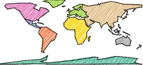
Fig. 3. Abstracted world map rendered with a sketchy ‘marker pen’ style.
4 THEHANDYRENDERINGLIBRARY
While illustrative rendering techniques have been available for some time, their availability to a wider audience who may wish to con-struct sketchy information visualization is more limited. Existing software to support sketchy rendering tends to be limited to user in-terface rapid prototyping (e. g., Microsoft Sketchflow) or specific do-mains such as CAD or architecture (e. g., Google Sketchup). To widen participation in constructing sketchy graphics for information visual-ization we have created theHandylibrary (gicentre.org/handy) for the widely used graphics programming environment Processing (processing.org). The design goal of this library was to allow users to easily re-render existing Processing applications in a sketchy style. We achieved this by creating an alternative renderer for Processing that contains the standard set of drawing commands familiar to Pro-cessing programmers (see Fig. 5). In addition, we used the factory method design pattern to enable the Handy renderer to be plugged in to existing higher-level Processing libraries such as chart, treemap, and cartographic libraries with minimal changes to existing code.
[image:4.612.322.553.368.473.2]Fig. 4. Sketchy spatial treemaps of London boroughs (left) and London wards (right).
Fig. 5. Sketchy Processing primitives.
enabling interaction in a sketchy style. The degree of a line’s sketchi-ness is controlled by a roughsketchi-ness parameterrmeasured in pixel units.
rdefines the radius within which the two endpoints of the line are ran-domly perturbed (with a uniform random deviate). In addition, approx-imately 75% along the length of the line an additional vertex is added at a random displacement withinr, orthogonal to the straight lineAB. To avoid aliasing effects when close parallel lines are drawn, the po-sition of the displacement is itself randomly selected with a range of 10% of the distanceAB. Finally, to mimic hand-drawn control, the line is ‘bowed’ by adding a midpoint vertex randomly perturbed within 0.5% ofAB. The four vertices are joined using a Catmull-Rom spline (implemented in Processing with thecurveVertex()command). To create a more sketchy effect, each line is rendered twice with uniform random selection of displacement vertices. Increasingrcan thus in-crease the sketchy appearance of the rendered line.
Ar rB
r AB/10
[image:5.612.55.279.497.525.2]AB/200
Fig. 6. Parameterization of sketchy lines.
The sketchy line primitive is used to construct other straight edged polygons (see Fig. 5). Because the vertex displacement of each line has an equal chance of being to the left or right of the vectorAB, there is, on average, no net change in the area of polygons constructed this way regardless of the roughnessr. For ellipse rendering a related ap-proach was taken (see Fig. 7). Here Catmull-Rom spline vertices are defined radially around the ellipse centroid with a uniform random perturbationr. To mimic the hand-drawn habit of overlap between the start and end of a circle stroke, the penultimate vertex is joined to the second vertex defining the ellipse. This tends to flatten the shape near the end of the stroke and leaves a ‘tail’ and a short overlap (osandoe
in Fig. 7). While the flattening will result in a small reduction in the area of the closed portion of the ellipse, this is countered by the ‘tail’
osfalling on the outside of the shape. Whereris sufficiently large, it
is possible for the vertices around the tail and flattened sections of the curve to overlap. When joined with the Catmull-Rom spline this can result in a ‘flourish’ across the centre of the ellipse (see, for example, the filled circles in Fig. 9). This may be a desirable way of helping to distinguish higher and lower levels of roughnessr.
r s
o
e
o
Fig. 7. Parameterization of sketchy ellipses.
The Handy library provides the option to fill all closed shapes with hachures (see Fig. 5). These are implemented by simply drawing lines in sketchy style within the outline shapes, as inspired by other work [1]. Line intersection between the unsketchy geometry is used to define the endpointsAandBnecessary to contain hachures approximately within the shape boundary. The visual appearance of the rendered shapes can be further customised by changing fill colors, line thicknesses, hachure density, and hachure angle. To facilitate production of sketchy graph-ics the Handy library offers a number of preset styles based on differ-ent line thickness, density and color settings (see Fig. 8).
Fig. 8. Preset styles in the Handy library. Produced—clockwise from top left—withcreatePencil(), createedPencil(), createMarker()and
createWaterAndInk().
5 LOW-LEVELEVALUATION
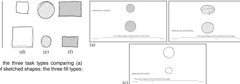
We conducted a series of controlled experiments to explore the effects of sketchy rendering on graphical perception [7]. Our particular objec-tives were twofold: to determine the degree to which the sketchiness of graphic primitives could be consistently perceived; and to explore the effects of sketchy rendering on information carrying characteristics of a rendered shape. We constructed trials using rectangles and circles as simple examples of primitives comprising straight and curved edges.
[image:5.612.319.557.514.593.2](a) (b) (c) (d) (e) (f)
Fig. 9. Example trials involving: the three task types comparing (a) sketchiness, (b) size and (c) size of sketched shapes; the three fill types: (d) outline, (e) hachure and (f) fill.
tasks conducted within each shape condition. These involved compar-ison of pairs of shapes with the following variations:
1. sketchiness: size of shapes was held constant, sketchiness varied (Fig. 9(a));
2. size: size of shapes varied, no sketchy rendering applied (Fig. 9(b));
3. size with sketchiness: size of shapes varied, with sketchiness con-stant within trial, but varying across experiment (Fig. 9(c)). We focused onsizeas a secondary visual variable as its graphical perception has been thoroughly researched [7, 20, 27]. Historical re-sults have been reproduced in recent online experiments that have pro-vided additional information about the way that the sizes of shapes are estimated [20]. Within the size comparison tasks, the ratio of sizes between the pairs of shapes displayed were randomly selected from the set {32%, 48%, 58%, 72%} to address possible differences due to response bias [27]. Aspect ratios of rectangles were consistent within each trial with random selection from the set {23, 1,32} following from the observations by Kong et al. [27].
In the sketchiness tasks, we varied the roughness parameterr ran-domly fromr=0 tor=18 pixel units (as defined in Section 4) since our informal experiments with this characteristic suggested that, in contrast to the perception of size, the perception of relative roughness may be effective where values are extreme.
We were keen to explore the effects of the fill style on perception and so controlled for these characteristics. Three fill conditions were presented to each participant within each task:
1. outline: outlines of shapes with no internal filling (Fig. 9(d)); 2. hachured: sketchy rendering of outlines and internal filling with
sketchy hachures (Fig. 9(e));
3. solid: outlines of shapes with solid (non-sketchy) internal filling (Fig. 9(f)).
Participants were presented with a series of 8 trials consisting of pairs of shapes of varying sizes and sketchiness for each fill condition, as shown in Fig. 9. Our experimental design thus con-sisted of 72 unique trials within each experiment: 3(task)×3(f ill)×
8(pairs o f shapes with replication), closely following the protocols used in previous studies [7, 27]. In each trial we asked participants to estimate the relative size or sketchiness based upon the visual charac-teristics of the two shapes through “quick visual judgments” [7], with the aim of responding within a few seconds. In accordance with es-tablished protocols, in size comparison tasks, we asked participants to select the smaller shape and judge its percentage size in relation to the larger. Examples of size comparison stimuli are shown in Fig. 9(b)–(f) and in Fig. 10(a),(c). In the sketchiness task participants were asked to select the less sketchy shape and then judge its percentage sketchiness in relation to the sketchier shape (Fig. 9(a) and Fig. 10(b)).
Trials were ordered by task and by fill condition. In addition to vary-ing sketchiness and relative size as described, trials were differentiated by variations in rectangle aspect ratio and minor random variations in symbol position and absolute size.
Using theHandylibrary we developed a Java applet to conduct the experiment online. Whilst we lost some control of the conditions un-der which the task was unun-dertaken, this approach enabled us to access
(a) (b)
(c)
Fig. 10. Screen shots of the experiment interface for size (a), sketch-iness (b) and size with sketchsketch-iness (c) tasks with circle shapes in the filled, hachured and outline conditions respectively.
participants effectively and log results efficiently. We minimised differ-ences by asking participants to maximise the browser window, to set the zoom level to 100% and to ensure that the area in which the applet ran was at least 1,000 pixels wide. Participants were asked to activate keyboard focus and were given two introductory trials involving one size and one sketchiness comparison task. As in the introductory trials, shapes were shown one above the other in all experimental trials, and selected by clicking, with proportions recorded through a horizontally orientated slider (Fig. 10). This slider was set to zero at the start of each trial to encourage a response.
5.1 Participants and Pre-Processing
We recruited 137 unpaid volunteers to participate in our study through mailing lists and social networks. Of these, 84 completed the tasks in full, with 42 participating in each shape condition. In line with recent studies [7, 20], we analyzed our data using the log trans-formed absolute error of participants’ judgments. The absolute error
AbsErr=|judged percent−truepercent|returns the amount of differ-ence between a participant’s judgment of a magnitude differdiffer-ence and the true difference between the two tested stimuli. We log-transformed the absolute error as recommended by Cleveland & McGill [7] as:
log2(18+AbsErr).
Pre-processing drew attention to a systematic bias in 4 sets of responses to the sketchiness task. Each consistently recorded high judged percent differences in the case of low true percent differences and vice versa (r2>0.33 for true roughness ratio vs. judged rough-ness ratio with strong negative gradient<−0.2). These participants were omitted from our subsequent analysis leading to 80 completed experiments and 5,760 responses across all trials.
5.2 Analysis and Results
Initially we analyzed responses to the size estimation tasks undertaken without sketchiness. Performance in the sizetask was significantly worse in the case of circles (r2=.35) than rectangles (r2=.56) , with an unpaired t-test returningt(1918) =5.436,p< .001. However, un-like [27], we did not find a statistically significant difference between the aspect ratios under consideration (23, 1, 32) in therectangletrials through ANOVA :F(2,76) =.883,p=.418.
We then explored a series of four research questions relating to our experimental objectives.
1. Can the degree of sketchiness be perceived on a ratio scale?
We found strong evidence for this being true, but with low levels of precision and high levels of variability between people. Judged ratios were correlated with true ratios (r2=.23,p< .001) across the 1,920
[image:6.612.167.552.48.183.2]Fig. 11. Scatterplots of true sketchiness ratio (X) vs. judged sketchiness ratio (Y) for allsketchinesstrials for all respondents (grey) with two indi-viduals selected (red). The substantial errors are evident (RMSE=32%
overall), but the black line of best fit shows an overall positive correla-tion (r2=0.23). The two selected individuals (red highlights and
regres-sion line) respond consistently (r2>0.7) but measured error is greater for the respondent on the left (r2=0.71,RMSE=40%) than the right (r2=0.75,RMSE=16%) due to the different scaling factor in
determin-ing sketchiness.
(N=80,M=0.38,SD=0.24) and individual RMS error ranging from 11% to 56% (N=80,M=30.4,SD=8.8). Some of this error can be explained by the differing scaling factors applied by participants (re-sulting in high absolute error) in their relative judgments despite within experiment consistency (and associated highr2) as Fig. 11 illustrates.
2. Does sketchiness have an effect on people’s ability to estimate the relative area of shapes?
We found strong evidence that the error in relative size judgments significantly increased when thesize with sketchytask was compared to thesizetask. Forcirclesa paired samples t-test showed a significant difference in errors for thesize(M=3.3,SD=0.64) andsize with sketchinesstrials(M=3.7,SD=0.47),t(41) =−5.1,p< .001. Like-wise, a paired samples t-test onrectangleshowed a significant differ-ence in errors forsize(M=2.9,SD=0.66) andsize with sketchiness
trials(M=3.1,SD=0.66),t(38) =−2.460,p=.019.
3. Does the interior styling of sketchily rendered shapes have an effect on people’s ability to estimate their relative sizes or sketchiness?
We found evidence that fill style can have an effect on the estimation of thesizeof sketchycircles. A repeated measures ANOVA identified a significant effect of fill style on absolute error for thesize with sketch-inesstask in the case of circles:F(2,80) =3.365,p=.04. Subsequent pair-wise comparisons did not show a significant result, but revealed a trend for error to be higher in the case ofoutlinefill style than in the
hachured(p=.08) orsolid(p=.09). A repeated measures ANOVA did not find a significant effect of fill style on absolute error in the rect-angletrials:F(1,76) =2.410,p=.097. The trend detected is in line with the findings for circles, but our renderer seems to be making size estimation more difficult in sketchy circles with no fill.
In terms of fill style and sketchiness estimation we found no evi-dence of an effect, despite the additional sketchy fill in thehachure
cases. Repeated measures ANOVA conducted on responses to trials in-volving the two shapes found no differences in sketchiness estimation relating to fill style in either case – circles:F(2,80) =.086,p=.918; rectangles:F(2,76) =.003,p=.997.
4. Do shape type or sketchiness influence the accuracy or precision of measurement estimates?
To analyze the effect of sketchiness onaccuracywe aggregated tri-als into three roughness bins:r<=2 (low); 2<r<5 (middle);r>=5 (high); A repeated measures ANOVA showed a significant effect of roughness bin on the accuracy of relative size estimation in the case of
circles:F(2,80) =13.352,p< .001. Post-hoc pairwise comparisons (adjusted with Bonferroni for multiple comparisons) showed that tri-als classified aslowwere significantly different thanhigh(p< .001)
and that judgments made inmiddletrials were significantly different to those categorized ashigh(p< .001). Thus, the relative sizes of pairs of circles with roughness<5 were significantly more difficult
Roughness Bin
Mean Absolute Error
5
4
3
2
1
0
Error Bars: 95% CI
High Middle
Low
Rectangle Circle
Fig. 12. Mean absolute error insize with sketchinesstasks for the two shapes according to the three roughness bins. Area judgment errors increase significantly for circles as sketchiness increases, whereas per-formance is maintained in the case of rectangles.
to judge than those classified as less sketchy. Conversely, a repeated measures ANOVA on trials involvingrectanglesdidnotshow a signifi-cant effect of roughness bin on the accuracy of relative size estimation:
F(2,76) =.582,p=.561. So whilst size estimation appears to be af-fected by our broad categorization of roughness in the case of circles, we cannot show this effect for rectangles where size estimation under the three levels of roughness was not performed with any significant difference (Fig. 12).
To considerprecisionwe analyzed the final digits used in the judg-ments made. We found no significant difference in the digits used for sketchy vs. non-sketchy shapes (all conditions,χ2=.65), or for
the estimates made of the sizes of non-sketchy rectangles and circles (χ2=.73). However in the case of non-sketchy size estimation a
dif-ference wassuggestedbetween shapes (χ2= .075) with a tendency for round numbers (those ending in 0 and 5) to be used to estimate relative rectangle size. We did detect a significant difference in the digits used to estimate relative sketchiness between shapes. Once again, round numbers were associated with rectangles with χ2 = .024 providing strong evidence for differences in precision between estimates of the relative sketchiness of circles and rectangles.
In summary our low-level experiments found that:
• sketchiness can be perceived on a scale, though not consistently amongst all participants – performance in the sketchiness estima-tion tests was very variable,
• our renderer has different perceptual effects when applied to dif-ferent shapes, and
• sketchy rendering results in greater error for relative size estima-tion tasks despite having little actual effect on true area ratios.
5.3 Discussion
[image:7.612.315.563.51.188.2]minority may be due to chance, but profiles include some relatively consistent individual responses with very different scalings. It does not seem inappropriate to hypothesize that this capacity for consistent judgments along different individual scalings or notions of sketchiness might be used advantageously with a common agreed baseline and calibration. As such, training, communication and reference materi-als might establish consistency between individumateri-als in more applied settings—should sketchiness be used as a visual variable. Experiments to study such effects in both response trials and more applied contexts would be useful additions to these preliminary tests.
6 HIGH-LEVELEXPLORATORYEVALUATION
Beyond low-level perception of sketchiness, we were interested in its general influence on viewers. In particular, we were interested in the effects of a partially sketchy (i. e., hybrid) or a completely sketchy vi-sualization on people’s willingness to engage with the depicted data, to discuss it, and to participate in the development of a visualization. We were motivated by previous work in the NPR community [39] that found that sketched architectural drawings elicited higher partici-pation, engagement, and willingness to critique than realistically ren-dered 3D models. However, we were aware that the influence of a visualization on its viewers and analysts may depend on a number of factors other than the sketchy style such as the type of data, the type of representation, or the motivation of the viewer. We, therefore, decided to conduct an exploratory study in which we wanted to examine a wider variety of different datasets and tasks to glean a first insight into the possible effect of sketchiness in general. In this study we were not hoping to derive concrete answers but instead derive further hypothe-ses on the influence of sketchiness to test in future experiments.
6.1 Study Design
We designed a between-subjects experiment in which participants were shown visualizations to annotate. People were assigned to one of two conditions. In the sketchy condition (SC) participants were given hybrid (partially sketchy and partially non-sketchy) or com-pletely sketchy visualizations. In thenormal condition(NC) partici-pants saw completely non-sketchy visualizations. The first four tasks required participants to annotate visualizations and use them in a hy-pothetical scenario that involved some sort of subsequent presentation, while the final one required the participants to critique a visualiza-tion and suggest improvements to it. Of the first four visualizavisualiza-tions, half were created such that their sketchy version was a hybrid design, while the other half of the sketchy visualizations used a completely sketchy style. The first four tasks were also created with different levels of personal relevance such that we could see whether the anno-tation behaviour would change with respect to how much the partici-pants would be personally affected. We used willingness to annotate a visualization as an indirect measure of engagement with it.
6.2 Tasks
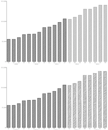
[image:8.612.321.551.48.324.2]In thefirst scenario, participants were shown a bar graph of the rev-enue development of a company (non-sketchy or hybrid, Fig. 13) and asked to envision presenting it in a board meeting, discussing the trends for the past and projected future development of the company. In thesecond scenario, participants were asked to envision being a city employee and having to report to the city council about the use of stations in a public bicycle hire scheme. They received a visualization that showed the stations distributed over the city with a circle per sta-tion, in which the circle’s size indicated the capacity of each station and the fill level of the circle showed how many bikes are available on average (non-sketchy or sketchy, Fig. 14). Participants had to ar-gue that certain locations had problems with bike distribution: some stations being frequently empty with others typically full. In thethird scenario, participants envisioned meeting a friend the next day who wants to donate EUR 500 to a campaign to fight environmental crime and who requested an opinion about which type of cause to support. Each participant was asked to use a visualization consisting of two pie charts with reported and estimated numbers of different types of en-vironmental crime (non-sketchy or hybrid, Fig. 15) to convince their
Fig. 13. Non-sketchy and hybrid visualizations for Scenario 1.
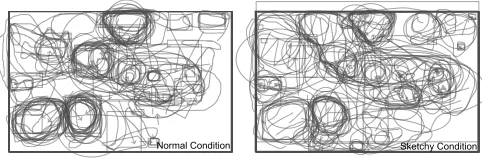
friend to support a particular cause. Scenario 4asked participants to envision having a personal competition with a close friend about phys-ical exercise and weight loss, and asked them to report in an e-mail about their own recorded calorie intake and exercise activity of the past few weeks using an area chart (non-sketchy or sketchy, Fig. 16) and to explain parts of the data (Christmas meals and a period of ill-ness). Finally, in thefifth scenarioparticipants had to critique a net-work graph visualization produced by someone else (non-sketchy or sketchy, Fig. 17) in which several mistakes were intentionally included (bad formatting and typography, bad visualization design, etc.).
In tasks 1–4, participants were asked to annotate the presented im-age from scenarios 1–4 using basic drawing tools and to provide tex-tual bullet points for a PowerPoint slide or an e-mail according to the envisioned scenarios. The order of the scenarios was randomly as-signed to the tasks. However, Scenario 5 was always presented as the last task as it differed in style from the other four.
6.3 Apparatus
Fig. 14. Non-sketchy and sketchy visualizations for Scenario 2. Inset on the bottom showing detail of the sketchy rendering.
Fig. 15. Non-sketchy and hybrid visualizations for Scenario 3.
6.4 Participants
We recruited 52 unpaid participants (40 male, 12 female) via personal e-mails and social networking posts to participate in our Web-based evaluation. Participants were predominantly in the 22–34 years age group (31 participants) and 11 participants were between 35–44 years of age. All but three participants reported to have at least monthly exposure to data charts (19 daily, 15 weekly, 15 monthly).
6.5 Results
[image:9.612.310.565.55.209.2]We analyzed the number of annotations per condition and task as well as the length of annotations as a way to study annotation coverage. We
[image:9.612.314.565.241.344.2]Fig. 16. Non-sketchy and sketchy visualizations for Scenario 4.
Fig. 17. Non-sketchy and sketchy visualizations for Scenario 5.
also analyzed the types of annotations people made quantitatively and assessed the quality of the critique for Task 5. Overall, we found rela-tively high and equal engagement in both conditions based on the quan-titative measures, with a median of 7 annotations in the sketchy con-ditions and 6 in the normal condition and a slightly longer annotation length in the normal condition. Overall, however, these differences were not statistically significant. We, therefore, focus on reporting our qualitative assessment of the difference between the two conditions.
Scenario 1:In this hybrid scenario only part of the data was drawn in a sketchy style for SC. For both conditions participants drew the same type of annotations including trendlines, highlights of data items and ranges, data labels and comments—all only with slightly varying counts between the conditions. 29% of participants in SC used free-hand annotations but also 25% of participants in the normal condition did so. We also analyzed the spatial distribution of comments across the charts that referred to the past (always drawn non-sketchy) and the future (drawn in sketchy style in SC). We observed a slight trend for participants to draw more annotations in SC that referred to the future (53% of annotations) compared to the normal condition where only 47% of annotations referred to this part. Overall, however, the difference between the annotation styles was relatively small.
Scenario 2: In this scenario participants annotated a bike map of London. We found that they drew slightly more annotations in SC (median=10) vs. NC (median=7). The type of annotations in both conditions were fairly similar and largely concentrated on highlighting data regions with circles. In SC, 46% of participants drew at least one freehand annotation while only 36% did so in NC. Labels were signif-icantly more common in SC (p=.044 using a Mann-Whitney U test). 46% of participants in SC used labels to provide a legend for their an-notations while only 11% of participants in NC did so. Considering the spread of annotations (Fig. 18) we noticed a tendency for partici-pants in NC to highlight the same four regions, while the annotations in SC seemed to be more spread across the map.
[image:9.612.50.301.409.589.2]Normal Condition Sketchy Condition
Fig. 18. Region annotations for Scenario 2 for both conditions (labels and color removed), showing a tendency for annotations to be more concentrated on specific regions in the normal condition.
was similar with a median count of 4 items. Most annotations high-lighted specific data items, such as one sector of a pie chart using cir-cles and arrows. In SC, 38% of participants used freehand annotations while only 14% did so in NC. We found a strong difference between the two scenarios on where annotations were placed and what part of the data they referred to. In NC 42% of annotations were drawn in the left half and 43% in the right half of the image. Similarly, 44% of annotations referred to the left pie chart and 45% to the right. In SC where the right pie chart was drawn in a sketchy style only 23% of an-notations were drawn on the left side and only 26% referred to the left pie. Instead, 46% were drawn on the right (the remainder in between the two) and 54% of annotations referred to the right pie chart.
Scenario 4:In this scenario participants annotated an area chart of exercise and eating habits. To do so they largely used arrows and cir-cles to highlight specific points in the data and labels to describe their highlight. We again saw a stronger tendency for participants in SC to annotate their data (88% vs. 54% in NC). People also used emoticons more often than in other scenarios (36% of participants in NC and 33% in SC). About the same percentage of participants in both conditions used freehand annotations (29%). Besides the difference in annotation, however, we found no strong difference between the two conditions.
Scenario 5:This scenario was different from the others in that par-ticipants had to critique a visualization of a circular graph layout. To do so participants used a large number of different techniques includ-ing highlights with arrows, circles, or lines and data annotations and comments. We again observed a stronger tendency for participants in SC to use data labels (33% vs. 21%) and comment labels (33% vs. 11%). Interestingly, 46% of participants in NC used freehand anno-tations for this task but only 29% in SC. The use of emoticons was also more prevalent in NC (18% vs. 4%). We had designed the visu-alization to critique with eight main problems including wrong labels, label/node overlap, structure, etc. Most participants critiqued the struc-ture of the layout: in NC 25% of participants included little sketches or annotations for how to restructure the graph while 42% of partici-pants did so in SC. Other problems such as a wrong data legend were commented on relatively equally between the two conditions.
Questionnaire: In the questionnaire we elicited mainly demo-graphic information but also included a general comment box that participants could fill in as they wished. While we had not initially intended to analyze the data from this field, we noticed a strong bias in the comments. 43% of participants in NC gave negative comments about the study or interface while only 17% in SC did so. Instead, 29% of participants in SC reported that the study was fun or very interesting while only 7% of the participants in NC did so.
6.6 Discussion
Overall, the results of the second study led us to derive a number of hypotheses to study further. In particular, we noticed a strong differ-ence in how people reacted to sketchiness across the wide variety of different datasets and scenarios we tested. For some visualizations engagement—as studied through annotation—was fairly similar over-all, for other some others there were differences. The strongest differ-ence between both styles was observed in the hybrid Scenario 3 where participants were indeed led to more engagement with the sketchy pie chart. Several factors could have set this scenario apart from others, in
particular the other hybrid scenario: first, the type of data may have been more engaging than the financial data of our other hybrid sce-nario; secondly, the aesthetics of the sketched pie and, in particular, its stylistic difference to the other pie chart may have drawn attention more strongly. The non-hybrid scenarios and to a lesser extent also Scenario 1 had an overall more similar aesthetic across the picture so that perhaps differences were not as pronounced. Another indicator that sketchiness draws engagement with the data differently may be the overall spread of responses for Scenario 2. It would be very inter-esting to study further whether certain data characteristics were muted or overpowered by the sketchy style of the graphic which could be an indicator of sketchiness actually being detrimental for certain types of analyses. It was interesting to note that participants in SC seemed to have an overall more pleasant experience conducting the study as indicated by the more prevalent positive comments. Norman [34] ar-gues that aesthetically pleasing objects appear to be more effective and that decision making depends on both cognition and affect. Simi-lar observations have previously been reported in the domain of NPR [10, 17]. A venue for further research on sketchiness, therefore, would be to see whether it is perceived as aesthetically (more) pleasing and whether it affects people’s experience and decision making with visual-ization tools. Further exploration of the types of data and phenomena for which sketchy styles and sketchiness as a visual variable would be most appropriate is warranted—not all types of data and tasks may be influenced to the same degree, as our exploratory study revealed.
7 CONCLUSION
Our initial investigations into the use of sketchy information visualiza-tion are promising. We have demonstrated the ability to implement sketchy rendering in a range of information visualizations. By provid-ing a library for the Processprovid-ing environment we create the opportunity for researchers and designers to implement sketchy rendering with lit-tle extra programming effort. It offers new possibilities for informa-tion visualizainforma-tion design, especially as a visual variable with selective, associative and orderable qualities. Real world applications include digital prototyping of data-rich information visualization designs, vi-sualization of uncertain data, and ‘casual’ data vivi-sualization for non-expert audiences. It offers new opportunities to the designer wishing to shape the aesthetic of data-rich information visualization. The role of sketchy rendering in highly interactive design offers intriguing pos-sibilities where the apparent hand drawn sketch comes ‘off the page’ as the user interacts with it.
Sketchy information visualization offers the prospect of greater en-gagement, as demonstrated by our high level annotation tasks and pos-itive affect. It is not clear to which degree such responses may be due to the novelty of the visual appearance as opposed to the intrin-sic properties of sketchy design. Further work is required to assess its narrative framing effect, especially through its ability to add a more human touch to the visualization design. One possible mechanism for emphasizing human input and purpose would be to animate the evolu-tion of a sketched graphic, as if the viewer is watching a picture being drawn in front of them, much as in the style of the ‘RSA Animate’ series [36].
REFERENCES
[1] Z. AlMeraj, B. Wyvill, T. Isenberg, A. A. Gooch, and R. Guy. Automati-cally mimicking unique hand-drawn pencil lines.Computers & Graphics, 33(4):496–508, 2009. doi> 10.1016/j.cag.2009.04.004
[2] J. Bertin. Semiology of Graphics: Diagrams, Networks, Maps. ESRI Press, Redlands, California, 2010.
[3] N. Boukhelifa, A. Bezerianos, T. Isenberg, and J.-D. Fekete. Evaluat-ing sketchiness as a visual variable for the depiction of qualitative un-certainty. IEEE Transactions on Visualization and Computer Graphics, 18(12), 2012. Conditionally accepted.
[4] N. Boukhelifa, A. Bezerianos, T. Isenberg, and J.-D. Fekete. Evaluating sketchy lines for the qualitative visualization of uncertainty. Technical Report RR-7910, INRIA, France, 2012.
[5] J. Browne, B. Lee, S. Carpendale, N. Riche, and T. Sherwood. Data anal-ysis on interactive whiteboards through sketch-based interaction. In Pro-ceedings, Interactive Tabletops and Surfaces, pp. 154–157. ACM, New York, 2011. doi> 10.1145/2076354.2076383
[6] S. Carpendale. Considering visual variables as a basis for information visualisation. Technical Report #2001-693-16, University of Calgary, De-partment of Computer Science, 2003. doi> 1880/45758
[7] W. Cleveland and R. McGill. Graphical perception: Theory, experimen-tation, and application to the development of graphical methods.Journal of the American Statistical Association, 79(387):531–554, 1984. doi> 10. 1080/01621459.1984.10478080
[8] F. Cole, A. Golovinskiy, A. Limpaecher, H. S. Barros, A. Finkelstein, T. Funkhouser, and S. Rusinkiewicz. Where do people draw lines?
ACM Transactions on Graphics, 27(3):88:1–88:11, 2008. doi> 10.1145/ 1360612.1360687
[9] C. Curtis. Loose and sketchy animation. InSIGGRAPH Technical Sketches, p. 317. ACM, New York, 1998. doi> 10.1145/281388.281913 [10] D. J. Duke, P. J. Barnard, N. Halper, and M. Mellin. Rendering and
affect. Computer Graphics Forum, 22(3):359–368, 2003. doi> 10.1111/ 1467-8659.00683
[11] A. Finkelstein and D. H. Salesin. Multiresolution curves. InProceedings, SIGGRAPH, pp. 261–268. ACM, New York, 1994. doi> 10.1145/192161. 192223
[12] B. Gooch and A. A. Gooch.Non-Photorealistic Rendering. A K Peters, Ltd., Natick, 2001.
[13] B. Gooch, E. Reinhard, and A. Gooch. Human facial illustrations: Cre-ation and psychophysical evaluCre-ation. ACM Transactions on Graphics, 23(1):27–44, 2004. doi> 10.1145/966131.966133
[14] N. G. Gradwohl. Simulation of hand drawn lines in process-ing. Blog entry: http://www.local-guru.net/blog/2010/4/23/simulation-of-hand-drawn-lines-in-processing, 2010.
[15] S. Greenberg, S. Carpendale, N. Marquardt, and B. Buxton. Sketching User Experiences: The Workbook. Morgan Kaufmann, 2012.
[16] M. D. Gross. Visual languages and visual thinking: Sketch based inter-action and modeling. InProceedings, Symposium on Sketch-Based In-terfaces and Modeling, pp. 7–11. ACM, New York, 2009. doi> 10.1145/ 1572741.1572743
[17] N. Halper, M. Mellin, C. Herrmann, V. Linneweber, and T. Strothotte. Psychology and non-photorealistic rendering: The beginning of a beauti-ful relationship. InMensch & Computer 2003: Interaktion in Bewegung, pp. 277–286. Teubner Verlag, Stuttgart, 2003.
[18] C. G. Healey and J. T. Enns. Perception and painting: A search for effec-tive, engaging visualizations.IEEE Computer Graphics and Applications, 22(2):10–15, 2002. doi> 10.1109/38.988741
[19] C. G. Healey, L. Tateosian, J. T. Enns, and M. Remple. Perceptually-based brush strokes for nonphotorealistic visualization. ACM Transac-tions on Graphics, 23(1):64–96, 2004. doi> 10.1145/966131.966135 [20] J. Heer and M. Bostock. Crowdsourcing graphical perception: Using
Mechanical Turk to assess visualization design. InProceedings, CHI, pp. 203–212. ACM, New York, 2010. doi> 10.1145/1753326.1753357 [21] P. Hendrikx. SAP BusinessObjects exploration views. Web
page: http://www.pieterhendrikx.com/sap-businessobjects-exploration-views/, 2011.
[22] J. Hullman, E. Adar, and P. Shah. Benefitting InfoVis with visual dif-ficulties. IEEE Transactions on Visualization and Computer Graphics, 17(12):2213–2222, 2011. doi> 10.1109/TVCG.2011.175
[23] J. Hullman and N. Diakopoulos. Visualization rhetoric: Framing effects in narrative visualization. IEEE Transactions on Visualization and Com-puter Graphics, 17(12):2231–2240, 2011. doi> 10.1109/TVCG.2011.255
[24] T. Isenberg. Evaluating and validating non-photorealistic and illustrative rendering. In P. Rosin and J. Collomosse, editors,Image and Video based Artistic Stylisation. Springer Verlag, Berlin, Heidelberg, 2012. To appear. [25] T. Isenberg. Visual abstraction and stylisation of maps.The Cartographic
Journal, 2012. To appear. doi> 10.1179/1743277412Y.0000000007 [26] T. Isenberg, P. Neumann, S. Carpendale, M. C. Sousa, and J. A. Jorge.
Non-photorealistic rendering in context: An observational study. In
Proceedings, Non-Photorealistic Animation and Rendering, pp. 115–126. ACM, New York, 2006. doi> 10.1145/1124728.1124747
[27] N. Kong, J. Heer, and M. Agrawala. Perceptual guidelines for creating rectangular treemaps.IEEE Transactions on Visualization and Computer Graphics, 16(6):990–998, 2010. doi> 10.1109/TVCG.2010.186 [28] D. Lloyd and J. Dykes. Human-centered approaches in
geovisualiza-tion design: Investigating multiple methods through a long-term case study. IEEE Transactions on Visualization and Computer Graphics, 17(12):2498–2507, 2011. doi> 10.1109/TVCG.2011.209
[29] M. Luboschik, A. Radloff, and H. Schumann. Using NPR-rendering tech-niques for the visualization of uncertainty. InPosters of IEEE InfoVis. IEEE Computer Society, Los Alamitos, 2010.
[30] A. MacEachren, A. Robinson, S. Hopper, S. Gardner, R. Murray, M. Gahegan, and E. Hetzler. Visualizing geospatial information uncer-tainty: What we know and what we need to know. Cartography and Geographic Information Science, 32(3):139–160, 2005. doi> 10.1559/ 1523040054738936
[31] D. Mould, R. L. Mandryk, and H. Li. Emotional response and visual attention to non-photorealistic images. Computers & Graphics, 36(5), 2012. doi> 10.1016/j.cag.2012.03.039
[32] M. Nienhaus and J. Döllner. Sketchy drawings. InProc., AFRIGRAPH, pp. 73–81. ACM, New York, 2004. doi> 10.1145/1029949.1029963 [33] M. Nienhaus, F. Kirsch, and J. Döllner. Sketchy illustrations for
present-ing the design of interactive CSG. InProceedings, Information Visual-ization, pp. 772–777. IEEE Computer Society, Los Alamitos, 2006. doi> 10.1109/IV.2006.97
[34] D. A. Norman. Emotional Design: Why We Love (or Hate) Everyday Things. Basic Books, Cambridge, 2004.
[35] P. Rautek, S. Bruckner, E. Gröller, and I. Viola. Illustrative visualiza-tion: New technology or useless tautology?ACM SIGGRAPH Computer Graphics, 42(3):4:1–4:8, 2008. doi> 10.1145/1408626.1408633 [36] Royal Society for the encouragement of the Arts. RSA animate. Web
page: http://comment.rsablogs.org.uk/videos/, 2012.
[37] A. Santella and D. DeCarlo. Visual interest and NPR: An evaluation and manifesto. InProceedings, Non-Photorealistic Animation and Rendering, pp. 71–150. ACM, New York, 2004. doi> 10.1145/987657.987669 [38] S. Schlechtweg, B. Schönwälder, L. Schumann, and T. Strothotte.
Sur-faces to lines: Rendering rich line drawings. InProceedings, WSCG, volume 2, pp. 354–361, 1998.
[39] J. Schumann, T. Strothotte, S. Laser, and A. Raab. Assessing the effect of non-photorealistic rendered images in CAD. InProceedings, CHI, pp. 35–41. ACM, New York, 1996. doi> 10.1145/238386.238398
[40] T. Strothotte, B. Preim, A. Raab, J. Schumann, and D. R. Forsey. How to render frames and influence people. Computer Graphics Forum, 13(3):455–466, 1994. doi> 10.1111/1467-8659.1330455
[41] T. Strothotte and S. Schlechtweg.Non-Photorealistic Computer Graphics. Modeling, Animation, and Rendering. Morgan Kaufmann, 2002. [42] C. Tietjen, T. Isenberg, and B. Preim. Combining silhouettes, shading,
and volume rendering for surgery education and planning. InProceedings, EuroVis, pp. 303–310. Eurographics Association, Goslar, Germany, 2005. doi> 10.2312/VisSym/EuroVis05/303-310
[43] E. Tufte.The Visual Display of Quantitative Information. Graphics Press, Cheshire, 1983.
[44] B. Tversky. What do sketches say about thinking? InProceedings, AAAI Spring Symposium on Sketch Understanding. AAAI Press, Menlo Park, CA, 2002.
[45] C. VanLang. Project 5: Information visualization. Web page: http://chasenvanlang.wordpress.com/2010/11/04/project-5-information-visualization/, 2010.
[46] J. Walny, S. Carpendale, N. Riche, G. Venolia, and P. Fawcett. Visual thinking in action: Visualizations as used on whiteboards.IEEE Transac-tions on Visualization and Computer Graphics, 17(12):2508–2517, 2011. doi> 10.1109/TVCG.2011.251