The WEB Book experiments in electronic textbook
design
Ruth Wilson, Monica Landoni and Forbes Gibb,
Department of Computer and Information Sciences, University of Strathclyde
Email: ruth.wilson@cis.strath.ac.uk, monica.landoni@cis.strath.ac.uk, forbes.gibb@cis.strath.ac.uk
Keywords: electronic textbooks, design, evaluation, usability
Abstract: This paper describes a series of three evaluations of electronic textbooks on the Web, which focused on assessing how appearance and design can affect users’ sense of engagement and directness with the material. The EBONI Project’s methodology for
evaluating electronic textbooks is outlined and each experiment is described, together with an analysis of results. Finally, some recommendations for successful design are suggested, based on an analysis of all experimental data. These recommendations underline the main findings of the evaluations: that users want some features of paper books to be preserved in the electronic medium, while also preferring electronic text to be written in a scannable style.
1. Introduction
The importance of appearance in the design of electronic textbooks was highlighted in the Visual Book experiment (Landoni, 1997), which
studied the application of the paper book metaphor to the design and production of electronic textbooks. The study found that electronic texts which closely resemble their paper counterparts in terms of visual components such as size, quality and design were received positively by users. Readers felt familiar with the representation of the book on screen and were able to rely on their experience with paper books to interact with the electronic textbook.
The Visual Book experiment was conducted between 1993 and 1997. Since then, users have become increasingly familiar with the Web and its associated technologies (hypertext, browser interfaces, subject
directories, search engines, and so on). Therefore, when today’s reader approaches an electronic textbook, a second set of expectations
inherited from the Web (in addition to expectations derived from using paper books) comes into play.
In order to discover the best design of electronic textbooks for today’s user, expectations derived from experience with Web
technologies should be taken into account. The EBONI (Electronic Books ON-screen Interface) Project (2000a) assessed the importance of this factor in a series of electronic textbook evaluations running from 1999 to 2002. In this paper, the term “electronic textbook” will be used to refer to the material evaluated during the project. This included:
• Textbooks which were previously published in print, but made available in electronic format by their authors;
• Published textbooks, available electronically from the publisher; • Unpublished textbooks, made available in electronic format by their
authors; and
• Electronic encyclopaedias.
The project studied the importance of appearance in the design of such material, with over 100 students, lecturers and researchers in UK Higher Education participating in its experiments.
The ultimate objective of the evaluations was to define a set of best practice guidelines for designing electronic textbooks (Landoni et al., 2001). Two central hypotheses ran through the evaluations:
H1: Altering the original appearance/design of an electronic textbook will have an effect on its success, according to the criteria for evaluation listed in 2.2 below.
H2: Applying aspects of successful Web design to electronic textbooks will have a positive impact on their success.
emerged. Finally, some general conclusions about e-textbook interfaces are drawn and directions for future research are discussed.
2. A methodology for electronic textbook evaluation
In order to test the experimental hypotheses and to define electronic textbook design guidelines that reflect the needs and preferences of a wide cross-section of the Higher Education community, it was decided to conduct several experiments in different academic disciplines. This enabled specific evidence to be gathered about the individual
preferences of students and lecturers in particular subject areas, while identifying general themes.
A methodology for evaluating electronic textbooks was developed by the project (Wilson and Landoni, 2001), to provide cohesiveness to all the individual experiments. This comprised a number of techniques,
including tasks measuring participants’ ability to retrieve and recall information, and questionnaires designed to measure user satisfaction. By adopting these different techniques, the methodology aimed to
measure the three criteria which contribute to the success of an electronic textbook: “usability”, “memorability” (the extent to which content is recalled and recognised by readers) and “satisfaction”. The steps taken to organise each experiment suggested four phases:
2.1 Selection of material
Texts could be selected for comparison according to three parameters:
• Format/appearance; • Content; and
• Medium.
For example, the original WEB Book experiment compared two electronic versions of the same text (Wilson, 1999), each of which exhibited
different styles of presentation, while the Psychology Ebook experiment (EBONI Project, 2002b) evaluated three different textbooks, in the same subject area, which also differed in their styles of presentation. In the former, format/appearance was the only variable; in the latter, format/appearance and content varied across the experimental material.
2.2 Definition of evaluation criteria
Depending on the objectives of each electronic textbook evaluation and the resources at its disposal, the implementation of different
combinations of tasks and/or evaluation techniques was appropriate, and the total expense of each experiment varied across two dimensions:
• Task complexity, ranging from simple retrieval tasks (see section 2.3 below) to more complex high cognitive skill tasks; and
• Technique complexity, from inexpensive questionnaires to interviews requiring time and expertise.
Reductionist principles were applied to the evaluation model so that very sophisticated experiments with unlimited resources which comprised most of the tasks and techniques described above, could be broken down to their constituent elements and “mapped” to simple, unsophisticated experiments employing only one task or technique. Therefore, all of EBONI’s experiments were comparable at some level.
The different tasks and techniques, their measurements and their relationship to the criteria for evaluation are outlined in Table 1 below.
Meta-criteria Criteria Measures Data collection methods
Quality Ease of use Likeability Satisfaction User affect Subjective satisfaction questionnaires (qualitative and quantitative) and interviews (qualitative) Recognition Sense of engagement (level of interest
[image:4.612.85.525.70.247.2]induced in the user) Memorability Recall Exams (quantitative) Task success Sense of directness (user’s ability to learn and internalise the interface) Usability Task time Fact searching (quantitative) and think-aloud sessions (qualitative)
Table 1. Techniques used in EBONI’s methodology, and their relationship to the evaluation criteria
Sense of engagement is “the level of interest the system induces in the user” and is related to the level of interaction available to the user and the novelty of the system. Sense of directness is “the degree of feeling that the changes on the screen are the result of the user’s actions” and “helps the user to learn and internalise the interface” (Landoni and Gibb, 2000).
2.3 Selection of tasks
Tasks are a way of bringing together participants and the test material in a structured manner, and enable quantitative data about particular aspects of interacting with the electronic textbook to be gathered. Two types of task were used, intended to measure usability and memorability at different levels:
• Fact searching, which involved participants in hunting through the material selected for evaluation in search of specific facts. For example,“Which drug acts by blocking the reuptake of the
neurotransmitters dopamine, norepinephrine and serotonin in the brain?” Tasks such as these are also referred to as Scavenger Hunts by Spool (Spool et. al., 1999).
• Exams, which involved the participant reading a chapter or a chunk of text for a short period of time, learning as much as possible in preparation for a short exam. These comprised a mixture of multiple-choice questions and questions requiring short written responses. Lecturers provided advice on appropriate exam formats and types of question for particular groups of participants. Responses were used to infer how the appearance of information on screen affects users' ability to remember that information.
2.4 Selection of evaluation techniques
Several procedures were suggested for obtaining qualitative and quantitative feedback about the selected material:
• Subjective satisfaction questionnaires. Satisfaction is measured after participants have used the test material and carried out any tasks which form part of the experiment, so that their responses are informed and based on experience.
processes, explanations of how he or she is navigating the test material, and reasons for difficulties.
• Interviews. These can be used to elicit full feedback on selected aspects of the experiment, and to follow leads on additional themes raised by the participant.
2.5 Selection of actors
The methodology recognised that evaluations vary in terms of the effort and skills required to set up an experiment. In general, though, four main roles, or possible actors, can be distinguished:
• The participants, who interact with the selected texts during a structured evaluation session and whose feedback forms the results of the experiment.
• The evaluator, who coordinates all aspects of the experiment, from the selection of material and participants, to the design of the methodology and the selection of evaluation techniques and tasks. • The task developer, who devises and sets tasks for the participant
to carry out, using the selected texts.
• And the assessor who accumulates and interprets the evaluative data provided by the participant.
The WEB Book researchers conducted the role of evaluators in the experiments; task development and assessment were carried out by lecturers in the relevant subject areas and, where appropriate, the researchers.
2.6 Summary of experiments
The WEB Book series of evaluations, which formed an integral part of the EBONI Project, is described below. The first, the original WEB Book experiment (Wilson, 1999) took Morkes and Nielsen’s guidelines for scannability (1997), proven to increase the usability of web sites by up to 47%, and applied them to a chapter of an electronic textbook (for example, using headings, bold and coloured text, bulleted lists,
graphics, captions and so on). The two versions of the same electronic chapter (the original, and the revised, scannable version) were then compared. This experiment was conducted prior to the EBONI Project, and its techniques formed the basis of the methodology outlined above, which was then employed by the other experiments described here. The second evaluation in the series, the WEB Book II, adopted the
methodology derived by EBONI after the original WEB Book experiment, and applied an interpretation of Morkes and Nielsen’s scannability guidelines to a chapter of another electronic textbook. The two electronic chapters were then compared to each other and to the hard copy version of the chapter, thereby extending the scope of the first WEB Book experiment.
The WEB Book and the WEB Book II (Dunn, 2002) took place in highly controlled environments, with appearance being manipulated by an evaluator according to specific rules, and identical content being compared. The third and final evaluation in the series, the Psychology Ebook (EBONI Project, 2002b), built on and extended the first two evaluations and was conducted in a less controlled environment. Three different electronic textbooks in psychology, displaying different styles and techniques, were compared; the books already existed on the Web, and no modifications were made by the EBONI evaluators. Therefore, this experiment was used to assess differences in texts, as they were designed by their authors (lecturers, in all three cases), rather than differences artificially manufactured by EBONI.
terms of both relevance and level of difficulty. In addition, the first two experiments also involved participants from mailing lists who
worked or were interested in the subject matter of the textbooks.
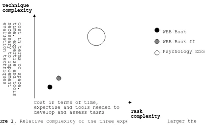
Table 2 summarises the differences between the three experiments (ticks indicate that particular variables/criteria/tasks/techniques were used in an experiment, crosses indicate that they were not), while Figure 1 shows the progression (in terms of complexity and the degree of control on the experimental conditions) of the WEB Book series.
WEB Book WEB Book II Psychology Ebook
Appearance • • •
Content X X •
Experimental variables
Medium X • X
Satisfaction • • •
Memorability X X •
Criteria
Usability • • •
Fact Searches • • •
Tasks
Exams X X •
Questionnaires • (online) • •
Think-alouds X X •
Evaluation techniques
Interviews X X •
Participants 18 (members of IR mailing lists & Postgraduate students in Information Science)
22 (members of ebook mailing lists and Postgraduate students in Information Science)
30 (2nd , 3rd
& 4th year Psychology Undergraduates) Actors
Other actors 1 evaluator who also acted as task developer and task assessor
1 evaluator who also acted as task developer and task assessor
[image:7.612.85.530.80.305.2]3 evaluators, 1 task assessor (also an evaluator), 2 task developers (2 lecturers in Psychology)
Table 2. Key differences between the three experiments in the WEB Book series.
Figure 1. Relative complexity of the three experiments. The larger the bubble, the less controlled the environment.
As discussed above, the WEB Book experiments were prompted by Morkes and Nielsen’s studies into web usability, and their methods of
analysing data were adopted here.
In each experiment, quantitative data was averaged for each criterion (task success, recall, ease of use, and so on), and scores were
compared across each textbook. Instances of statistical significance are noted throughout. Qualitative data from each experiment was
examined by the researchers and recurrent themes and issues identified. These are discussed in this paper in some detail. Finally, results were analysed across experiments, and general conclusions drawn. These are outlined in section 6.
The following sections describe the three experiments in more detail.
3. The WEB Book
The WEB Book was based on the central hypothesis of the Visual Book project, that appearance is an important factor in the effective
presentation of information on screen, and applied this premise to the production of books on the Web (Landoni et al., 2000). The experiment followed the procedures used in Morkes and Nielsen’s studies into
writing for the Web (Morkes and Nielsen, 1997), and employed relatively unsophisticated data collection methods and simple measures, but formed a strong foundation on which to base the other evaluations in the WEB Book series.
Chapter Five ("Search Strategies") of C.J. van Rijsbergen's Information
Retrieval formed the material for the experiment (1979a). This textbook
is one of the fundamental readings of IR, and a relatively plain machine readable version of the book already existed on the Web (van Rjsbergen, 1979b). This was compared against a revised version of the same chapter (van Rijsbergen, 1979c), with Morkes and Nielsen’s
guidelines for “scannable” writing on the Web applied to it, in order to study whether focusing on the appearance of the content when
preparing a scientific textbook for electronic publication has a positive impact on its effectiveness. The scannability guidelines
Task
complexity Technique
complexity
Cost in terms of time,
expertise and tools needed to develop and assess tasks
Cost in terms of space,
time, expertise and tools
necessary to implement
evaluation techniques
WEB Book
WEB Book II
suggest using headings, large type, bold text, highlighted text,
bulleted lists, graphics, captions, and tables of contents to make text easier to browse.
3.1 Design issues
Two electronic versions of Chapter Five were used in this study: the original and a revised version, written for the purpose of the
experiment.
In the original electronic version only minor concessions were made to the new medium. Each chapter was allocated a separate "page" (i.e. a Web page) and text was organised in a linear way so that users had to keep scrolling down until they reached the end of the chapter.
The revised version of the chapter was prepared for this study by the research team and followed Morkes and Nielsen's guidelines for improved scannability. The chapter was divided into ten separate files according to the sub-headings in the original text, so that each sub-section occupied a separate page. In addition, a chapter contents page was created to list and provide links to each section. Hyperlinks were inserted to enable the user to jump back to the previous section, forward to the next section, back to the table of contents for the chapter, or to any other section in the chapter. Extra headings, coloured and sized, were inserted in the text in order to divide it into smaller, more digestible chunks. All diagrams were centred to give the pages a neater, more symmetrical appearance, and in order that they could be easily distinguished from the text. Key words and phrases were selected by a subject expert and coloured red to call attention to important pieces of text. Lists were indented and their numbers or bullets also coloured red. These changes were intended to make the chapter more easily scannable by giving it a design which exploited more fully the functions of the Web as a medium.
3.2 Evaluation criteria
As explained in 2.6 above, this experiment was the first and simplest in the series, employing only two of the three evaluation criteria which would eventually form EBONI’s methodology:
• Usability, measured via participants’ success at fact searches (untimed) and indicating their sense of directness.
• Satisfaction, measured via the four properties of the subjective satisfaction questionnaire (quality, ease of use, likeability and user affect), indicating participants’ sense of engagement with the text.
The resulting methodology was used to test two sub-hypotheses:
Sub-hypothesis 1: Users of the revised, scannable version of the
chapter will make fewer errors on tasks than will users of the original version.
Sub-hypothesis 2: Users of the revised version will report higher subjective satisfaction with the site than will users of the original.
3.3 Users
3.4 Findings and analysis
Results showed that users of the revised version made fewer task errors and recorded higher subjective satisfaction. The chapter which was rewritten to take into account the appearance of the content so that it was more scannable achieved a higher score in every measure (task
success, quality, ease of use, likeability and user affect) than the original version of the text, and the two sub-hypotheses were
substantiated:
Sub-hypothesis 1 was verified. Users of the revised version made fewer errors on tasks than users of the original version.
Sub-hypothesis 2 was supported. Users of the revised version reported higher subjective satisfaction than users of the original version (significant at p<.001).
Therefore, the revised version exceeded the original version in terms of usability and satisfaction, the criteria used to determine
participants’ sense of engagement and sense of directness with the books.
Meta-criteria Criteria Measures WEB Book
Quality S
Ease of use S
Likeability S
Satisfaction
User affect S
Recognition Sense of engagement
Memorability
Recall
Task success S
Sense of directness Usability
Task time
Key
[image:11.612.84.527.101.498.2]S indicates where the scannable chapter rated more highly than the original indicates measures that were not used in this experiment
Table 3. Shows measures and criteria on which the scannable text had a positive influence in the WEB Book experiment
Participants' comments were in accordance with these results. Users of the original version of the chapter disliked the design of the pages, describing it variously as "flat and not very appealing", "very user-unfriendly" and "plain", with formulae that were difficult to read, making it difficult to concentrate on searching for information. Users of the revised version, on the other hand, made some positive remarks about the page design, describing it as "easy to navigate" and "clean-looking".
This case study indicated the positive impact of focusing on the appearance of the content when preparing a scientific textbook for publication on the Web. It was also in accordance with a key premise of the Visual Book project, which states that a book's appearance is a main factor in the specification of interfaces designed to present information which has been published on paper.
4. The WEB Book II
Like the original WEB Book experiment, this study compared different versions of the same chapter of a book. In this case, a chapter of the out-of-print Hypertext in Context, edited by Cliff McKnight, Andrew Dillon and John Richardson, formed the experimental material and was compared in three formats: a simple electronic version (McKnight et al., 1991a), a revised, scannable electronic version (McKnight et al., 1991b), and a hard copy version (McKnight et al., 1991c). A different interpretation of Morkes and Nielsen's scannability guidelines resulted in a revised chapter which looked considerably different to the revised chapter in the WEB Book.
The aim of the experiment was to discover which of these formats is most successful in enabling students to achieve their learning
4.1 Design issues
The design of the original electronic version was very plain and simple. Each chapter was allocated a separate page and, within each chapter, there were links to other chapters in the book, but not to bibliographic references or the glossary. Text was black on a white background, and spanned from one edge of the screen to the other.
The revised version of the chapter, prepared for this study, was divided into 8 separate files according to the sub-headings in the original text, so that each sub-section occupied a separate page. A chapter contents page was created to list and provide links to each section; this also provided links to the glossary and references, again stored in two separate files.
At the top of each page were links to the chapter's table of contents and sitemap, and the title of the current section. At the bottom of each page was a link to the top, to all the other sections in the
chapter, and to the references and glossary. Throughout the text, links were provided to other chapters in the book, from citations to
bibliographic references, and from words and phrases to the glossary. All images were centred.
It is possible to interpret Morkes and Nielsen’s scannability guidelines in different ways and, in this experiment, they were implemented in a way which varied from the WEB Book in several key respects. Some of these differences built on feedback from the first experiment:
• Text was inset so that lines were shorter, and each page had a blue border. This was in response to user comments in the WEB Book
experiment, that lines of text spanning from one edge of the screen to the other are difficult to read.
• In the WEB Book, some participants found the use of coloured text confusing, as it was unclear which items were hyperlinks and which were not. Therefore, in the WEB Book II, important words and phrases were highlighted in yellow, with the effect of being marked with a highlighter pen.
Other differences were not based on feedback from the first experiment, but simply reflected a different interpretation of the guidelines:
• Quotations were italicised, made bold, centred and set inside a blue-bordered box.
• At the top of longer pages, a set of internal links was provided to sub-sections and to figures.
• A sitemap was also created, listing and linking to all the sections and sub-sections within the chapter.
4.2 Evaluation criteria
The criteria used in the WEB Book were employed here, with the additional measurement of task time:
• Usability, measured via participants’ success at fact searches and the time taken to complete the tasks, indicating their sense of directness.
• Satisfaction, measured via the four properties of the subjective satisfaction questionnaire (quality, ease of use, likeability and user affect), indicating participants’ sense of engagement.
Sub-hypothesis 3: Users of the revised electronic version of the chapter will make fewer errors on tasks than users of the original electronic version.
Sub-hypothesis 4: Users of the revised electronic version of the chapter will spend less time performing tasks than users of the original electronic version.
Sub-hypothesis 5: Users of the revised electronic version of the chapter will report higher subjective satisfaction than users of the original electronic version.
4.3 Users
22 participants comprising respondents to mailing lists for the
electronic textbook community and a group of postgraduate students from the Department of Computer and Information Sciences at Strathclyde University took part in this experiment.
Three variants were employed: the paper version of Hypertext in
Context, the original electronic version, and a revised electronic
version. A between-subjects design was adopted so that participants were assigned to just one version, but never to more than one.
Respondents from mailing lists were randomly assigned to the electronic versions; respondents from the Postgraduate course were randomly
assigned to the electronic versions and to the paper version. In total, ten respondents used the original electronic version of the book, nine used the revised electronic version, and four used the paper book.
4.4 Findings and analysis
The hard copy version of the book was more successful than either of the electronic versions in terms of task success and overall subjective satisfaction, and significantly higher than the revised version in terms of satisfaction (p<.05). However, isolating the results for the
two electronic versions of the chapter confirmed two of the three sub-hypotheses:
Sub-hypothesis 3: Users of the revised electronic version of the
chapter made fewer errors on tasks than users of the original version.
Sub-hypothesis 4: Users of the revised electronic version of the chapter spent less time performing tasks than users of the original version.
Users of the original electronic version reported greater subjective satisfaction than users of the revised version, rating it higher in terms of ease of use, user affect and likeability. Sub-hypothesis 5
was therefore not validated.
Take in Table 4
Meta-criteria Criteria Measures WEB Book II
Quality S
Ease of use O
Likeability O
Satisfaction
User affect O
Sense of engagement
Recall
Task success S
Sense of directness Usability
Task time S
Key
S indicates where the scannable chapter rated more highly than the original
O indicates where the original chapter rated more highly than the scannable chapter
[image:14.612.86.523.74.343.2]Indicates measures that were not used in this experiment
Table 4. Shows measures and criteria on which the scannable text had a positive influence in the WEB Book II experiment
Thus, some of the findings of the WEB Book were corroborated, while others were contradicted. This study employed a different
interpretation of Morkes and Nielsen's scannability guidelines, and it is suggested that these differences in some cases lowered, rather than improved, satisfaction. This was borne out in the definition of best practice guidelines (see section 6).
Participants’ sense of engagement was weaker with the revised chapter, as they reported the lowest overall satisfaction with this medium. However, their sense of directness was stronger with the revised chapter, and they were able to complete tasks more successfully and quickly than with the original electronic chapter.
The scannable text provoked strong, and sometimes contradictory,
responses, with users finding it more interesting and likeable than the original electronic version, but also more boring and annoying. This was reflected in the users' comments at the end of the questionnaire, in response to the question, "What stylistic features of the text in this chapter did you find particularly effective and/or ineffective?" After using the original electronic version, a couple of participants commented negatively on the length of its pages, and the fact that there are no links between citations and full bibliographic references. They also complained that there was not enough "white space", and that navigation between pages was difficult.
The revised version received by far the most positive comments. The navigation system received positive feedback, as did the site map and contents page. The use of highlighted words and phrases provoked the most comment, with some users feeling that it helped important keywords to stand out from the text, and others stating that it looked
unattractive and distracting. The division of the chapter into sections and subsequent use of headings received positive comments from users of all three versions.
5. The Psychology Ebook
The Psychology Ebook experiment studied three online textbooks in the field of psychology, all of which were very different in appearance. The evaluation was an extension of the WEB Book and WEB Book II
Furthermore, the findings of the first two experiments were used as a platform for the design of the Psychology Ebook evaluation. The WEB Book and WEB Book II had already shown that applying certain aspects of successful Web design (specifically, scannability) to electronic
textbooks can have a positive impact on their success. The Psychology Ebook not only took the series away from highly controlled experimental conditions towards a real-world setting, but also widened the scope to consider users’ expectations derived from consulting paper books. Incorporating aspects of the paper book metaphor into electronic textbooks had previously been proven to be successful in the Visual Book study. By using one online textbook with many scannable features, and another online textbook inheriting many features of paper books, the experiment was able to examine both sets of user expectations
(those derived from experience with paper books, and those derived from experience with the Web) simultaneously. It addressed the following questions:
• Is adherence to the paper book metaphor still important to today’s readers?
• Is adherence to the paper book metaphor more or less important to today’s reader than the use of a scannable design? And,
• Would a combination of features reflecting both sets of user expectations provide the optimum electronic textbook design?
5.1 Design issues
In The Joy of Visual Perception (Kaiser, 2002) the table of contents
(displayed on the left of the screen when viewing the book in frames mode) divided the book into 23 main sections, with some sub-divisions, and over 200 subjects were listed in the index. The book's structure was heavily dependent on hypertext, which provided links within each "chapter" to pages of the book containing more detailed information, explanatory diagrams, the glossary, and other relevant sections. Most pages had links at the foot to the TOC (a useful function when not viewing in frames mode) and related chapters. The book was primarily figures and diagrams supplemented by text; the style of presentation was not uniform throughout and often images sat to the left or right of chunks of text on screen. Content was displayed as black text (left-justified) on a white background, with keywords in red.
Neuroscience for Kids (Chudler, 1996-2003) (the most scannable of the
three texts, according to Morkes and Nielsen’s checklist) did not use frames. There was a table of contents, divided into general topics; under these headings were more specific section titles which
hyperlinked to the pages with relevant text and images. Most of these sections contained links back to the main section, contents page,
search facility and note-taking facility at the foot. Some longer pages contained mini tables of contents at the top, linking to sub-sections within the page. There were internal and external hyperlinks
throughout, and lists of references at the end of each page contained hyperlinks to other sources of information. The site was heavily image-based, with each block of text illustrated with at least one colour cartoon-style image, diagram, or animation. The text contained many bullet points, was usually split into short chunks and was black throughout (some paragraphs were in bold), with some headings and
keywords coloured in red or blue or italicised. Pages varied in length, averaging at several screens-full of information.
In Drugs, Brains and Behaviour (Timmons and Hamilton, 1990)(the book
that adhered most to the paper book metaphor) each chapter was
each chapter was a summary of the main points, and a list of key terms from the text, with links to the glossary. There were also hyperlinks throughout the text which linked to the glossary, references, and
figures. The glossary (which had definitions for several hundred terms) and list of references (around 200) were stored in separate files. Figures were stored in a separate set of pages, with "previous figure", "next figure" and "figure index" icons at the foot; there was no link from the collection of figures back to the text. Chapters had light blue backgrounds, and figures were often in colour against white backgrounds. Chapters were very long and plain (images were stored separately), and the text, sometimes broken by tables and sub-headings, stretched from one side of the screen to the other.
5.2 Evaluation criteria
The Psychology Ebook, the most sophisticated experiment in the series, employed all three evaluation criteria, as set out in the EBONI
methodology:
• Usability, measured via participants’ success at fact searches and the their comments during the “think-aloud” procedure, indicating their sense of directness.
•
Memorability, measured via recognition and recall in an exam (using pre-questionnaire results as a gauge), indicating participants’ sense of engagement with the book.• Satisfaction, measured via the four properties of the subjective satisfaction questionnaire (quality, ease of use, likeability and user affect), also indicating participants’ sense of engagement.
In addition to the data collection methods used in the WEB Book and the WEB Book II, exams were conducted (measuring recognition and recall) and interviews and think-alouds provided additional feedback about satisfaction and usability respectively.
Again, the sub-hypotheses tested the strength of the most scannable text, although the impact of introducing a book employing aspects of the paper book metaphor would also be examined:
Sub-hypothesis 6: Users of Neuroscience for Kids (the most scannable text) will make fewest errors on fact searching tasks.
Sub-hypothesis 7: Users of Neuroscience for Kids (the most scannable text) will make fewest errors on memory tasks.
Sub-hypothesis 8: Users of Neuroscience for Kids (the most scannable text) will report highest subjective satisfaction.
5.3 Users
30 subjects participated in the main experiment: 13 Psychology
undergraduates at the beginning of their third year, and 17 Psychology undergraduates at the beginning of their fourth year, all from the University of Strathclyde. An additional eight second and third year Psychology undergraduates participated in a pilot experiment, run several months prior to the main experiment.
Three electronic textbooks were employed: Peter Kaiser's The Joy of
Visual Perception, Eric Chudler's Neuroscience for Kids, and C. Robin
(in the pilot, second year students) looked at either The Joy of Visual
Perception or Neuroscience for Kids, while fourth year students (in the
pilot, 3rd year students) looked at Drugs, Brains and Behaviour.
5.4 Findings and analysis
Sub-hypothesis 7 was confirmed, and sub-hypothesis 8 was partially confirmed:
Sub-hypothesis 7: Users of Neuroscience for Kids (the most scannable text) made fewest errors on memory tasks.
Sub-hypothesis 8: High subjective satisfaction was recorded for both
Neuroscience for Kids and Drugs, Brains and Behaviour (the least
scannable text of the three).
Users of The Joy of Visual Perception and Drugs, Brains and Behaviour
made significantly fewer errors on retrieval tasks than Neuroscience
for Kids users (p<.01 and p<.05 respectively); sub-hypothesis 6 was
therefore not validated.
Drugs, Brains and Behaviour, the book which adheres most closely to the
paper book metaphor, exceeded the others in terms of usability,
indicating that participants experienced a greater sense of directness with the text. Neuroscience for Kids scored highest in terms of
memorability, and highly in terms of satisfaction, indicating that participants had a strong sense of engagement with that book.
Meta-criteria Criteria Measures Psychology Ebook
Quality S
Ease of use S
Likeability -
Satisfaction
User affect S
Recognition S
Sense of engagement
Memorability
Recall S
Task success P
Sense of directness Usability
Task time
Key
S indicates where the most scannable chapter rated most highly
- indicates where neither the scannable chapter nor the text closest to a paper book rated most highly
[image:18.612.86.515.91.428.2]P indicates where the text closest to a paper book rated most highly indicates measures that were not used in this experiment
Table 5. Shows measures and criteria on which the scannable text and the text which imitated the paper book metaphor had a positive
influence in the Psychology Ebook experiment.
In terms of extracting recommendations for the design of successful electronic textbooks, the following issues, highlighted by participants in questionnaires and in interviews, were significant:
5.4.1 Layout
Drugs, Brains and Behaviour was the plainest of the three textbooks,
and had the clearest layout. This enabled users to find specific information quickly and easily. However, several users commented that the text was set out in a block, with paragraphs that were too long, making it "dull" in appearance. Although Neuroscience for Kids lacked the simple structure of Drugs, Brains and Behaviour, its use of colours and graphics to interrupt the flow of text made it more attractive, and students found it easier to recall information in the exam.
5.4.2 Diagrams and pictures
Users of all three texts made positive comments about the inclusion of diagrams and pictures. It was suggested that, for mathematical and scientific subjects, larger and more detailed versions of images be stored separately and hyperlinked to from the main text.
5.4.3 Glossary and references
interrupt the text but were just a click away. However, a
straightforward means of returning from the glossary/references to the corresponding place in the text was considered important.
5.4.4 Multimedia
Participants expressed a wish for multimedia and interactive elements, methods of communication that are impossible in the paper medium: “I didn’t notice if it had interactive questions/answers but this would be useful”; and “It could be improved with moving pictures,
neurotransmitter movements, etc.” Where these elements were available, they were appreciated by users who found the textbooks fun and
engaging.
5.4.5 Font size
Users of all three texts commented that the font was too small and that they found it a strain on their eyes. "I disliked the fonts of the words. They were too small and it was tiring to read - quite a strain", said one Drugs, Brains and Behaviour user.
5.4.6 Table of contents
The Joy of Visual Perception has the option to view the table of
contents in a frame on the left side of the screen, throughout the book. Users said they liked being able to view the contents and structure of the book without having to return to a "contents page". Descriptive and meaningful chapter names and section headings aided retrieval.
6. Design recommendations
Throughout the WEB Book series of experiments, adherence to the paper book metaphor and scannable text were variously shown to have a
positive impact on satisfaction, memorability and usability and,
therefore, users’ sense of engagement and sense of directness. This was borne out by participants’ comments in interviews and questionnaires and by observations made during think-aloud sessions, which highlighted specific features and design techniques (some exemplifying
scannability, others imitating the paper book) which contribute to successful electronic textbooks:
• Tables of contents are an essential feature in both print and electronic media, used by readers to skim the contents of an unfamiliar book to gain an idea of what can be found inside. They also provide the reader with a sense of structure, which can easily be lost in the electronic medium, and can be an important navigation tool where hypertext is used to link from the table of contents to individual chapters. In the words of one participant in the WEB Book experiment, “browsing a well-structured book [like this] helps the learning process”.
• Some participants in the WEB Book experiments noted that tables of contents and strong structures were sometimes not enough when
seeking specific information. For example, one Neuroscience for Kids
reader observed that particular theories and laws were not listed in the table of contents nor in the headings within each chapter, and that being able to locate such information quickly and easily is very important to students. An index, therefore, should always be provided. By including hyperlinks from each index item to the relevant section in the textbook, the index can become a useful navigation tool.
simple searches (searching the whole book, a chapter or a page for a keyword), and advanced searches should be offered to suit different levels of reader.
• It should be possible to treat the book as a closed environment, which contains no links to external sources unless clearly labeled as such (for example in a reference section or bibliography). This assists the user in understanding the book as a single unit, avoids confusion about which pages are part of the book, and which are part of another resource, and, in the case of texts available via the Web, prevents readers from becoming “lost” in cyberspace. Two of the books in the Psychology Ebook experiment used a combination of
internal and external hyperlinks, leading to some confusion. One participant was observed during the think-aloud session clicking on an external web site and not realising he was reading material from a different source. Another complained, “I kept getting lost and straying into other parts of the Web”.
• Cross-referencing between the pages of a book, between the main text and table of contents, index, footnotes, glossary or references, and between two or more books is considered an important property of the printed medium. Participants strongly valued the ability to carry out these cross-referencing tasks in an electronic environment. It can be difficult to achieve the same simplicity and effectiveness as that provided by flicking through paper pages, but it can be made more possible in an electronic textbook by adopting a strong structure and a clear and simple navigation system. The approach adopted in Drugs, Brains and Behaviour, whereby the glossary and references were separated from the main body of text, was
appreciated by all those who commented; they did not interrupt the text but were just a click away.
• Participants expected typographical sophistication, and pagination has to be designed carefully to enhance readability. They found text that spanned from one edge of the screen to the other difficult to read: “Lines of text are quite long, so sometimes I jumped to another line by mistake”. Line lengths similar to that of the
printed page (10 to 15 words) were preferred, punctuated with plenty of ‘white space’ to give each page a clean, uncluttered appearance: “There was plenty of ‘white space’ on screen and when the
information being conveyed is fairly complex… I would find it very off-putting if the text was more crowded”. Paragraphs should be left-justified, providing a uniform starting point for each line and enabling the reader to scan the text effectively. Finally, the
typographical style should be consistent throughout the book in order that the book has a recognisable, uniform identity and that readers are not distracted by changing designs.
• Participants in all experiments complained about having to scroll down long pages to find information. This was taken into account in the WEB Book II, in which Hypertext in Context was redesigned so that a single page was divided into eight sections according to headings used in the original text. The evaluation of the resulting chapter found that participants performed better in fact searches and expressed higher satisfaction. The typical page length of a print textbook should be considered as an approximate model for the length of pages in an electronic textbook, and the amount of
scrolling required should be minimised, especially for smaller screen sizes.
• Section headings, keywords or abstracts under chapter headings in the main table of contents inform the reader’s understanding of the contents of each chapter at a glance. By the same token, the
inclusion of abstracts, keywords or tables of contents (linking to headings in the text) at the top of a page help readers to decide on the relevance of the contents of that page quickly. Drugs, Brains
and Behaviour included mini-tables of contents at the top of each
during think-aloud sessions. One noted, “It gives you the contents of the book, what each chapter’s about, but then you can go into what’s actually in the contents of that chapter as well, and it doesn’t take you long to click on things and find exactly the part you’re looking for.”
• Readers gain a sense of their place in a printed book via the page numbers and by comparing the thickness and weight of the pages read against the thickness and weight of the pages still to be read. The WEB Book experiments showed that it is important for this “sense of place” also to be present in the electronic medium, via page
numbers, chapter and section headings, or navigation bars which highlight the current position. Moreover, these indications of a reader’s progress through the book should be accurate and visible.
The Joy of Visual Perception, for example, displays its table of
contents in a separate frame at the side of the text, and
participants relied on this as a measure of their progress, saying they liked having it always present as it enabled them to view the contents and structure of the book at a glance and to jump quickly to other sections.
• Participants expected images, diagrams and formulae to be included and to look as visually sophisticated as they do on the printed page. If possible, and where appropriate, they would like pictures to be in colour. The advantages of dividing long streams of text using colours and graphics are outlined below, and it is suggested that diagrams therefore be included in the main body of the text to add colour and interest. In Drugs, Brains and Behaviour (used in the Psychology Ebook experiment), images are stored in separate files from the text. One participant commented, “I’d rather have figures within the text because it takes a long time to switch back and forth…”; another, “I’d prefer illustrations/figures to perhaps be on the pages themselves to break up the text a little”. However, in scientific and mathematical disciplines, it is often necessary to study diagrams and formulae closely and to make comparisons, and this should be taken into account when positioning these items in the text. For example, some participants in the WEB Book experiment complained that it was difficult to compare two formulae amid text on the same page, requiring a lot of scrolling. In such cases, it is advisable not only to insert images, diagrams and formulae within the main body of the text, but also to allow the user to view enlarged versions in a separate window. Images should be of a sufficient resolution to remain clear when viewed in either size. • Fonts should be large enough to read comfortably for long periods of
time. In the Psychology Ebook experiment, users of all three
textbooks commented that the font was too small and that they found it a strain on their eyes. “I disliked the font of the words. They were too small and it was tiring to read – quite a strain”, said one participant. If possible, readers would like to choose a font style and size to suit their individual preferences, thereby satisfying the needs of those with perfect vision and those with low vision or reading difficulties. Nielsen recommends sans-serif typefaces such as Verdana for small text, 9 points or less, since the low
resolution of many monitors means that the detail of a serif font cannot be rendered fully (Nielsen, 2000). Fonts which include specific special characters such as italics should be used, and a colour that contrasts sufficiently with the background should be chosen.
emphasis meant it wasn’t too busy”. Pure white backgrounds, however, can “dazzle” readers, causing eye-strain, and should be avoided. • Participants found it difficult and unpleasant to read long streams
of text on screen: “Text was set out too much in a block – there was no breaking up of the text, e.g. by illustrations, photos. It all appeared a mass of words – not easy to read or follow”. Within each page, breaking the text into short chunks improves the scannability of the page. This can be achieved by, for example, interspersing text with images and diagrams and keeping paragraphs short, and by using meaningful sub-headings, indented, bulleted lists, and colour to break the uniformity of the text. Neuroscience for Kids, for example, uses colour and graphics to interrupt the flow of text, and participants reacted positively: “I found it very attractive because everything’s very spaced out, it’s not just block text all the
time”.
• As noted in 5.4.4 above, where interactive elements were not
available in an electronic textbook, participants expressed a wish for them to be included. Readers of books which did include such elements (such as The Joy of Visual Perception, which contains an interactive diagram of the eye, and Neuroscience for Kids which includes online puzzles and experiments) had a greater sense of engagement with their books, finding them more likeable and performing better in the exams, hinting that interactivity could increase readers’ ability to remember the information being conveyed. That such elements can improve learning has been the subject of previous research (Rumetshofer and Woss, 2003).
• Participants expressed a desire to have bookmarking, highlighting and annotating facilities, often supplied by commercial ebook reader software products. In the words of one student, “I’m used to reading and highlighting – I couldn’t do this!”
7. Conclusions and future research
The two central hypotheses which ran through all three evaluations in the WEB Book series were validated:
H1: Altering the appearance/design of an electronic textbook does have an effect on its success.
H2: Applying aspects of successful Web design to electronic textbooks has a positive impact on their success.
It was also found that, by combining good Web design features with aspects of well-designed paper books, a usable, successful electronic textbook can be produced (Wilson, 2002). This can be represented as the following equation:
Aspects of well-designed paper
textbooks
+
Aspects of well-designed Web
resources
=
Well-designed electronic
textbooks
The ultimate objective of the evaluations, to define a set of best practice guidelines for designing electronic textbooks, was achieved by combining these results with the results of other experiments conducted by the EBONI Project, including an investigation into usability issues surrounding ebook hardware (Wilson et al., 2002). The guidelines advise on interface design issues such as use of tables of contents, indexes, colour, images, hypertext, search tools and typographical aspects, and are a valuable resource for all developers of digital educational content, including lecturers, writers, publishers, designers, digitisation projects and information professionals.
task success and subjective satisfaction. It would seem that, despite their increasing familiarity with digital information, users’ sense of engagement with the printed medium remains stronger, and they are able to retrieve information from this environment with great ease and speed. A useful area of future research will be to compare a paper textbook with an electronic version of the same book, with EBONI’s best practice guidelines applied. This will reveal whether users’ lifelong relationship with paper yields over even electronic text that has been designed specifically to meet their needs, and may indicate the
ultimate role of the electronic medium in delivering books to students.
Other areas of future research will include applying innovative techniques to the evaluation of fiction and poetry in electronic format, investigations into the “e-reading experience” when reading from different types of screens, and the design of electronic books for children and adaptive electronic textbooks for special needs uses.
8. Acknowledgements
The authors would like to thank Joan Dunn for her hard work conducting the WEB Book II evaluation.
9. References
Chudler, E. (1996-2003), Neuroscience for Kids, Available at:
http://faculty.washington.edu/chudler/neurok.html (visited 10 February 2003).
Dunn, J. (2002), The importance of appearance in the design of Web
books, MSc dissertation, Department of Computer and Information
Sciences, University of Strathclyde.
EBONI Project. (2002a), EBONI, Available at:
http://ebooks.strath.ac.uk/eboni/ (visited 10 February 2003).
EBONI Project. (2002b), Evaluations, Available at:
http://ebooks.strath.ac.uk/eboni/evaluations/ (visited 10 February 2003).
Kaiser, P. (2002), The Joy of Visual Perception, Available at: http://www.yorku.ca/eye/thejoy1.htm (visited 10 February 2003).
Landoni, M. (1997), The Visual Book system: A study of the use of
visual rhetoric in the design of electronic books, PhD thesis,
Department of Information Science, University of Strathclyde.
Landoni, M. and Gibb, F. (2000), The importance of visual rhetoric in the design and production of electronic books: The Visual Book, The
Electronic Library, 18(3), 190-201.
Landoni, M., Wilson, R. and Gibb, F. (2000), From the Visual Book to the WEB Book: the importance of design, The Electronic Library, 18 (6).
Landoni, M., Wilson, R. and Gibb, F. (2001), Looking for guidelines for the production of electronic textbooks, Online Information Review, 25 (3).
McKnight, C., Dillon, A. and Richardson, J. (1991a), Hypertext in
Context, http://telecaster.lboro.ac.uk/HiC/HiC.html (visited 10
February 2003).
McKnight, C., Dillon, A. and Richardson, J. (1991b), Chapter 5 of
Hypertext in Context (redesigned by Joan Dunn),
McKnight, C., Dillon, A. and Richardson, J. (eds.)(1991c), Hypertext in
Context, Cambridge: Cambridge University Press.
Morkes, J. and Nielsen, J. (1997), Concise, SCANNABLE, and objective:
how to write for the Web, Available at:
http://www.useit.com/papers/webwriting/writing.html (visited 10 February 2003).
Nielsen, J. (2000), Designing web usability, Indiana: New Riders.
van Rijsbergen, C.J. (1979a), Information Retrieval, 2nd ed., London: Butterworths.
van Rijsbergen, C.J. (1979b), Information Retrieval, 2nd ed.,
http://www.dcs.gla.ac.uk/Keith/Preface.html (visited 10 February 2003).
van Rijsbergen, C.J. (1979c), Chapter 5 of Information Retrieval, 2nd ed. (redesigned by Ruth Wilson),
http://ebooks.strath.ac.uk/eboni/ir/index.htm (visited 10 February 2003).
Rumetshofer, H. and Woss, W. (2003), An approach for adaptable learning systems with respect to psychological aspects, 18th ACM Symposium on
Applied Computing (SAC 2003), Florida, USA.
Spool, J., Scanlon, T., Schroeder, W., Snyder C., and DeAngelo, T. (1999), Web site usability: a designer's guide, California: Morgan Kaufmann,
Timmons, C. and Hamilton, L. (1990), Drugs, Brains and Behaviour, http://www.rci.rutgers.edu/~lwh/drugs/ (visited 10 February 2003).
Wilson, R. (1999), The importance of appearance in the design of Web
books, MSc dissertation, Department of Information Science, University
of Strathclyde.
Wilson, R. (2002), The “look and feel” of an ebook: considerations in interface design, 17th ACM Symposium on Applied Computing (SAC 2002), Universidad Carlos III de Madrid, Spain.
Wilson, R. and Landoni, M. (2001), Evaluating electronic textbooks: a methodology, Fifth European Conference on Research and Advanced
Technology for Digital Libraries, Darmstadt, Germany, 4-9 September.
Wilson, R., Landoni, M. and Gibb, F. (2002), Guidelines for designing electronic textbooks, Sixth European Conference on Research and