An
Introduction
to GIS
Yiping Fang | Vivek Shandas | Eugenio Arriaga Cordero
Spatial Thinking
in Planning
Spatial Thinking in Planning Practice: An
Introduction to GIS
By
© 2018 Yiping Fang, Vivek Shandas, & Eugenio Arriaga
Originally published in 2014
This work is licensed under a
Creative Commons Attribution-NonCommercial 4.0 International License
You are free to:
Share — copy and redistribute the material in any medium or format
Adapt — remix, transform, and build upon the material
The licensor cannot revoke these freedoms as long as you follow the license terms.
Under the following terms:
Attribution — You must give appropriate credit, provide a link to the license, and indicate if changes were made. You may do so in any reasonable manner, but not in any way that suggests the licensor endorses you or your use.
NonCommercial — You may not use the material for commercial purposes.
This publication was made possible by PDXOpen publishing initiative
About the Authors:
Yiping Fang is an Assistant Professor of Urban Studies and Planning at Portland State University.
Her research and teaching examines spatial structures from social sciences' perspective,
focusing on China's urbanization, and other international urban development challenges. Dr.
Fang has an undergraduate degree in Architecture, Masters in Urban planning from Tsinghua
University in Beijing, and completed her PhD in Design and Planning at the University of
Colorado. Prior to joining Portland State, she worked as a research associate at Brown
University (Rode Island), and an academic staff at Erasmus University (Rotterdam, the
Netherlands).
Vivek Shandas is an Associate Professor of Urban Studies and Planning at Portland State
University. His research and teaching interests focus on the intersection of humans, their
biophysical environment, and the role of institutions in guiding the growth of urban areas. Dr.
Shandas has an undergraduate degree in Biology, Masters in Economics, and Environmental
Management and Policy, and completed his PhD at the University of Washington. Prior to
joining Portland State, he worked as an outdoor school teacher (Oregon), grade-school
curriculum developer (California), and a policy analyst and regional planner (New York).
Eugenio Arriaga is a doctoral candidate in Urban Studies and Planning at Portland State
University. His areas of research are sustainable transportation –with an emphasis on bicycling;
access to public transit; and the role of the built environment on gendered travel behavior and
how it vary by class, race, and family structure. Eugenio has an undergraduate degree in Law, a
Masters in Sustainable International Development from Brandeis University, and a Masters in
Public Management from ITESO University. Before starting his PhD in Portland he worked for
the city of Guadalajara in Mexico in the fields of social policy, cultural affairs, city planning, and
active transportation, where he was responsible of the construction of the first segregated
TABLE OF CONTENTS
Preface
...1
Chapter 1: De
fi
ning a Geographic Information System
...2
Chapter 2: Coordinate Systems and Projecting GIS Data
...12
Chapter 3: Topology and Creating Data
...21
Chapter 4: Mapping People with Census Data
...27
Chapter 5: Lying with Maps
...39
Chapter 6: To Standardize or Not to Standardize?
...40
Chapter 7: Geographic Considerations in Planning Practice
...42
Chapter 8: Manipulating GIS Data
...45
Chapter 9: Raster Data Models
...46
PREFACE
THE EMERGENCE OF GIS IN URBAN AND REGIONAL PLANNING PRACTICE
During the last 20 years, geographic information systems (GIS) have transitioned from scientific laboratories into the heart of conventional planning practice. During this period, planners have been aggressive adopters and adapters, and strong advocates for local governments deploying GIS. This is true in part because GIS provides a platform for collecting and organizing spatial data, along with analyzing and manipulating capabilities that align closely with the professional needs of urban and regional planners.
When facilitating GIS courses in the field of urban and regional planning, we have observed a deficit of intro-ductory textbooks specifically written for planning students, whose career paths may require a certain set of GIS skills that differ from those taught in geography or other departments. This textbook is our first effort to compile a series of readings that we find compelling and relevant for planning graduate students to explore spatial think-ing and application, which will support a spatially informed future in the profession.
The goals of this textbook are to help students acquire the technical skills of using software and managing a data-base, and develop research skills of collecting data, analyzing information and presenting results. We emphasize that the need to investigate the potential and practicality of GIS technologies in a typical planning setting and evaluate its possible applications. GIS may not be necessary (or useful) for every planning application, and we anticipate these readings to provide the necessary foundation for discerning its appropriate use. Therefore, this textbook attempts to facilitate spatial thinking focusing more on open-ended planning questions, which require judgment and exploration, while developing the analytical capacity for understanding a variety of local and re-gional planning challenges.
CHAPTER 1: DEFINING A GEOGRAPHIC INFORMATION SYSTEM
Although GIS has been around since the 1970s, the concepts surrounding GIS are old, and even the practice of doing GIS began before computers. The difference today is that GIS is computerized. By computerizing GIS, we have taken the processes away from our hand-drawn depictions, which tend to require extensive time, money, training, and energy. Computers process numbers and mathematical equations far quicker than people. Yet, before the concepts behind GIS were transferred to computers, people were doing manual GIS by combining spatial and attribute data on various types of media including hard-copy maps, hard-copy overlays (acetate or vellum), aerial photographs, written reports, field notebooks, and—of course—their eyes and minds.
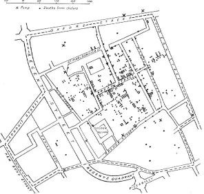
[image:7.612.156.452.292.574.2]With manual GIS, a large base map was often placed on a tabletop, and a series of transparent overlay maps, drawn at the same scale, were placed on top of the base map. One would then look for relationships among the base map and the features on the transparent overlays. Frequently, spatial data were copied from one map (or aerial photograph) to another. This took time, and because of it, many great ideas about the relationships of the Earth’s features (both physical and human) were not analyzed. These ideas were constrained by the amount of time it took to do the analysis. Still, some impressive manual GIS projects did occur. The much-repeated exam-ple of Dr. John Snow’s Cholera map is a great examexam-ple of manual GIS (Figure 1.1).
Figure 1.1. Dr. John Snow’s Cholera Map of London’s Soho. Source: Wikipediahttp://en.wikipedia.org/wiki/ Geographic_information_system
In the 1840s, a cholera outbreak killed several hundred residents in London’s Soho section. Snow, a physician, located the address of each fatality on a hand-drawn base map and soon a cluster of cases was visible. Then, on the base map, over the streets and fatalities, he drew the locations of water wells. Familiar with the idea of distance decay, he knew that people might go a far distance to purchase a product that was cheaper, but they would go to the nearest well because water was free and heavy to carry. Snow could see that the fatalities clus-tered largely among those who lived near the Broad Street water well. He and his students took the handle off
Even with the advent of computers, GIS applications to several decades to transform to the personal computer that we use today. Originally, the largest and most powerful computers were mainframes that were available to some academics and government officials. In the 1980s, most GIS applications ran on workstation computers tied to mainframe computers because the early microcomputers (IBM, Apple, etc.) did not have enough mem-ory, storage capacity, or processing ability. Today’s personal computers, however, are fast, capable of storing and processing large datasets, and can process multiple tasks simultaneously. This enables many academics, govern-ment agencies (from local to federal), organizations, and small and large businesses to use GIS. Computer-based GIS has its advantages, but requires trained users.
GIS DATA MODELS
In order to visualize natural phenomena, one must first determine how to best represent geographic space. Data models are a set of rules and/or constructs used to describe and represent aspects of the real world in a computer. Two primary data models are available to complete this task: raster data models and vector data models.
VECTOR DATA MODEL
An introductory GIS course often emphasizes the vector data model, since it is the more commonly used in the planning professions. Vector data models use points and their associated [X and Y] coordinate pairs to represent the vertices of spatial features, much as if they were being drawn on a map by hand (Aronoff 1989)1. The data attributes of these features are then stored in a separate database management system. The spatial information and the attribute information for these models are linked via a simple identification number that is given to each feature on a map. Three fundamental vector types exist in GIS: points, lines, and polygons, each of which we define below (and illustrate in Figure 1.2):
Points are zero-dimensional objects that contain only a single coordinate pair. Points are typically used to model singular, discrete features such as buildings, wells, power poles, sample locations, and so forth. Points have only the property of location. Other types of point features include the node and the vertex. Specifically, a point is a stand-alone feature, while a node is a topological junction representing a common X, Y coordinate pair between intersecting lines and/or polygons. Vertices are defined as each bend along a line or polygon feature that is not the intersection of lines or polygons. Points can be spatially linked to form more complex features.
Lines are one-dimensional features composed of multiple, explicitly connected points. Lines are used to represent linear features such as roads, streams, faults, boundaries, and so forth. Lines have the property of length. Lines that directly connect two nodes are sometimes referred to as chains, edges, segments, or arcs.
Polygons are two-dimensional features created by multiple lines that loop back to create a “closed” feature. In the case of polygons, the first coordinate pair (point) on the first line segment is the same as the last coordinate pair on the last line segment. Polygons are used to represent features such as city boundar-ies, geologic formations, lakes, soil associations, vegetation communitboundar-ies, and so forth. Polygons have the properties of area and perimeter. Polygons are also called areas.
Figure 1.2. A simple vector map, using each of the vector elements: points for wells, lines for rivers, and a poly-gon for the lake. Source: Wikipedia. http://en.wikipedia.org/wiki/GIS_file_formats
RASTER DATA MODEL
The raster data model is widely used in applications ranging far beyond geographic information systems (GISs). Most likely, you are already very familiar with this data model if you have any experience with digital photographs.
The raster data model consists of rows and columns of equally sized pixels interconnected to form a planar surface.
These pixels are used as building blocks for creating points, lines, areas, networks, and surfaces. Although pixels may be triangles, hexagons, or even octagons, square pixels represent the simplest geometric form with which to work. Accordingly, the vast majority of available raster GIS data are built on the square pixel. The contrast between raster and vector model reflect the ‘pixilization’ of a raster, which would be points, lines and polygons in a vector data model (Figure 1.3). The raster data model is a part of a later chapter.
Figure 1.3. Visual depiction of the difference between a raster (left) and vector (right) data model. Source: GIS Commons. http://giscommons.org/introduction-concepts/
VECTOR VS. RASTER
Which is better? Although GIS users have their own personal favorite data model, the question of which is “bet-ter” is an incomplete question. There are advantages and disadvantages to both data models, so a better ques-tion is which is better for particular applicaques-tions or datasets. Some in the GIS industry use the slogan “Raster is faster, but vector is corrector.” While this is a good starting point, it conceals the details. Yes, your computer can process raster data quicker, but today computer processors are so fast the difference may be negligible. Yes,
tor output looks more accurate, but you can increase pixel resolution to something resembling vector resolution (this, however, greatly increases the database size). In the following we try to list the advantage and disadvantag-es of vector and raster file.
VECTOR ADVANTAGES:
1. Intuitive. In our minds, we picture features discreetly rather than made up of contiguous square cells.
2. Resolution. If the locations of features are precise and accurate, you can maintain that spatial accuracy. The
features will not float somewhere within a cell.
3. Topology. Although the raster data model preserves where features are located in relation to one another,
they do not represent how they are related to one another. This complex form of topology can be con-structed in most vector systems, so you can track the connections in a municipal water network between pipe and valve features and thus track the direction and flow of water.
4. Storage. Vector points, lines, and simple polygons use little disk space in comparison to raster systems. This
was once a major consideration when hard-disk storage was limited and expensive.
VECTOR DISADVANTAGES:
1. Geometry is complex. The geometrical algorithms needed for geoprocessing, for example polygon overlay
and the calculation of distances, depending on the projection/coordinate system used, require experienced programmers. This is not usually a problem for most GIS users since most functions are directly coded in the software.
2. Slow response times. The vector data model can be slow to process complex datasets especially on low-end computers.
3. Less innovation. Since the math is more complex, new analysis functions may not surface on vector sys-tems for a couple of years after they have debuted on raster system.
RASTER ADVANTAGES:
1. Easy to understand. Conceptually, the raster data model is easy to understand. It arranges data into
col-umns and rows. Each pixel represents a piece of territory.
2. Processing speed. Raster’s simple data structure and its uncomplicated math produce quick results. For
example, to calculate a polygon’s area, the computer takes the area contained within a single cell (which remains consistent throughout the layer) and multiples it by the number of cells making up the poly-gon. Likewise, the speed of many analysis processes, like overlay and buffering, are faster than vector systems that must use geometric equations.
3. Data form. Remote sensing imagery is easily handled by raster-based systems because the imagery is
pro-vided in a raster format.
RASTER DISADVANTAGES:
1. Appearance. Cells “seem” to sacrifice too much detail (Figure 1.9). This disadvantage is largely aesthetic
and can be remedied by increasing the layer’s resolution.
2. Accuracy. Sometimes accuracy is a problem due to the pixel resolution. Imagine if you had a raster layer
with a 30 by 30 meter resolution, and you wanted to locate traffic stop signs in that layer. The entire 30 by 30 meter pixel would represent the single stop sign. If you converted this raster layer to vector, it might place the stop sign at what was the pixel’s center. Sometimes problems of accuracy (and appearance) can be resolved by selecting a smaller pixel resolution, but this has database consequences.
3. Large database. As just described, accuracy and appearance can be enhanced by reducing pixel size (the
[image:11.612.77.533.275.651.2]area of the Earth’s surface covered by each cell), but this increases your layer’s file size. By making the res-olution 50 percent better (say from 30 to 15 meters), your layer grows four times. Improve the resolution again by halving the pixel size (to 7.5 meters) and your layer will again increase by four times (16 times larger than the original 30-meter layer). The layer quadruples because the resolution increases in both the x and y direction.
Figure 1.4. Visual depiction of overlay analysis. Source: ESRI. http://www.esri.com/news/arcnews/fall04articles/ arcgis-raster-data-model.html
MORE ON VECTOR DATA MODELS
The real world is too complex and unmanageable for direct analysis and understanding because of its countless variability and diversity. It would be an impossible task to describe and locate each city, building, tree, blade of
grass, and grain of sand. How do we reduce the complexity of the Earth and its inhabitants, so we can portray them in a GIS database and on a map? We do it by selecting the most relevant features (ignoring those we do not think are necessary for our specific research or project) and then generalizing the features we have selected. The image above shows the real world is selectively represented by different features that we are interested in. They are also called map layers in GIS.
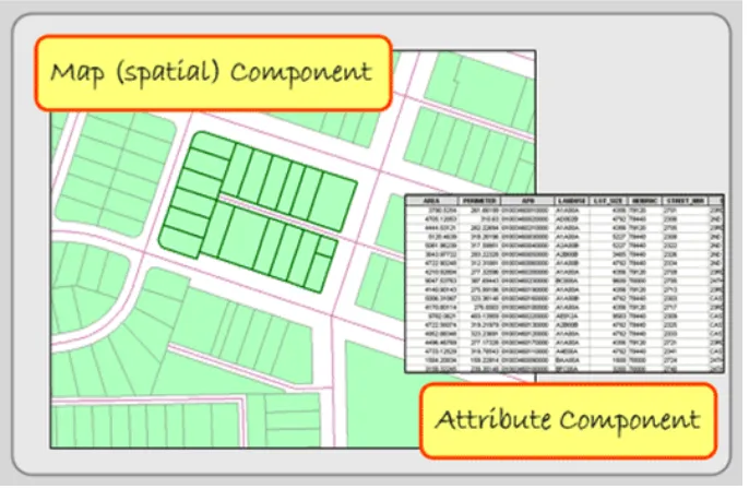
FEATURES AND FEATURE CLASS
In ArcGIS, map layers are also called shape files, or feature classes. Conceptually, there are two parts of a shape
file: a spatial or map component and an attribute or database component. Features have these two components as well. They are represented spatially on the map and their attributes, describing the features, are found in a data
[image:12.612.136.479.256.480.2]file. These two parts are linked. In other words, each map feature is linked to a record in a data file that describes the feature. If you delete the feature’s attributes in the data file, the feature disappears on the map. Conversely, if you delete the feature from the map, its attributes will disappear too.
Figure 1.5. Spatial and attribute data. GIS Commons. http://giscommons.org/introduction-concepts/
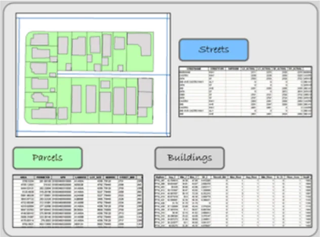
Features are individual objects and events that are located (present, past or future) in space. In the above Fig-ure, a single parcel is an example of a feature. Within the GIS industry, features have many synonyms including objects, events, activities, forms, observations, entities, and facilities. Combined with other features of the same type (like all of the parcels in Figure), they are arranged in data files often called layers, coverages, or themes.
In the Figure below, three features—parcels, buildings, and street centerlines—of a typical city block are visi-ble. Every feature has a spatial location and a set of attributes. Its spatial location describes not only its location but its extent.
Figure 1.6. Each feature in the layers above has a spatial location and attribute data, which describes the indi-vidual feature. GIS Commons. http://giscommons.org/introduction-concepts/
Besides location, each feature usually has a set of descriptive attributes, which characterize the individual fea-ture. Each attribute takes the form of numbers or text (characters), and these values can be qualitative (i.e. low, medium, or high income) or quantitative (actual measurements). Sometimes, features may also have a temporal dimension; a period in which the feature’s spatial or attribute data may change. As an example of a feature class, think of a streetlight. Now imagine a map with the locations of all the streetlights in your neighborhood. In Figure 1.5, streetlights most are depicted as small circles. Now think of all of the different characteristics that you could collect relating to each streetlight. It could be a long list. Streetlight attributes could include height, mate-rial, basement matemate-rial, presence of a light globe, globe matemate-rial, color of pole, style, wattage and lumens of bulb, bulb type, bulb color, date of installation, maintenance report, and many others. The necessary streetlight attri-butes depends on how you intend to use them. For example, if you are solely interested in knowing the location of streetlights for personal safety reasons, you need to know location, pole heights, and bulb strength. On the other hand, if you are interested in historic preservation, you are concerned with the streetlight’s location, style, and color.
Now continue thinking about feature attributes, by imagining the trees planted around your campus or
of-fice. What attributes would a gardener want versus a botanist? There would be differences because they have different needs. You determine your study’s features and the attributes that define the features.
ATTRIBUTE DATA TABLE
Once you have decided on the features and their attributes, determine how they will be coded in the GIS data-base. There are multiple ways to code features in different scale and circumstance. For example, schools can be coded as a point in large scale maps, and a polygon of their campus in small scale maps. You can decide whether to code each feature type as a point, line, or polygon. Together you also need to define the format and storage requirements for each of the feature’s attributes.
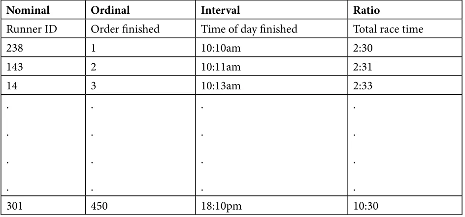
While thinking about your attribute values, consider where it fits in the “levels of measurement” scale with its four different data values: nominal, ordinal, interval, and ratio. Stanley S. Stevens, an American psychologist, developed these categories in 1946. For our purposes, these categories are useful way to conceptualize how data values differ, and it is an important reminder that only some types of variables can be used for certain mathe-matical operations and statistical tests, including many GIS functions. The different “levels” are depicted in the
following table and demonstrated using an example of a marathon race:
Nominal Ordinal Interval Ratio
Runner ID Order finished Time of day finished Total race time
238 1 10:10am 2:30
143 2 10:11am 2:31
14 3 10:13am 2:33
. . . . . . . . . . . . . . . .
301 450 18:10pm 10:30
Figure 1.7. Levels of Measurement. Adopted from GIS Commons. http://giscommons.org/chapter-2-input/
Nominal data use characters or numbers to establish identity or categories within a series. In a marathon race, the numbers pinned to the runners’ jerseys are nominal numbers (first column in the figure above). They iden-tify runners, but the numbers do not indicate the order or even a predicted race outcome. Besides races, tele-phone numbers are a good example. It signifies the unique identity of a telephone. The phone number 961-8224 is not more than 961-8049. Place names (and those of people) are nominal too. You may prefer the sound of one name, but they serve only to distinguish themselves from each other. Nominal characters and numbers do not suggest a rank order or relative value; they identify and categorize. Nominal data are usually coded as char-acter (string) data in a GIS database.
Although census data originate as individual counts, much of what is counted is individuals’ membership in nominal categories. Race, ethnicity, marital status, mode of transportation to work (car, bus, subway, railroad...), and type of heating fuel (gas, fuel oil, coal, electricity...) are measured as numbers of observations assigned to unranked categories. Using nominal data we can use the Census Bureau’s first atlas to depict the minority groups with the largest percentage of population in each U.S. state (Figure 1.8). Colors were chosen to differentiate the groups through a qualitative color scheme to show differences between the classes, but not to imply any quanti-tative ordering. Thus, although numerical data were used to determine which category each state is in, the map depicts the resulting nominal categories rather than the underlying numerical data.
[image:14.612.71.543.59.280.2]Ordinal datasets establish rank order. In the race, the order they finished (i.e. 1st, 2nd, and 3rd place) are mea-sured on an ordinal scale (second column in Figure 2.5). While order is known, how much better one runner is than the other is not. The ranks ‘high’, ‘medium’, and ‘low’ are also ordinal. So while we know the rank order, we do not know the interval. Usually both numeric and character ordinal data are coded with characters because ordinal data cannot be added, subtracted, multiplied, or divided in a meaningful way. The middle value, the “median”, in a string of ordinal values, however, is a good substitute for a mean (average) value.
Examples of ordinal data often seen on reference maps include political boundaries that are classified hierarchi-cally (national, state, county, etc.) and transportation routes (primary highway, secondary highway, light-duty road, unimproved road). Ordinal data measured by the Census Bureau include how well individuals speak En-glish (very well, well, not well, not at all), and level of educational attainment (high school graduate, some college no degree, etc.). Social surveys of preferences and perceptions are also usually scaled ordinally.
Individual observations measured at the ordinal level are not numerical, thus should not be added, subtracted, multiplied, or divided. For example, suppose two 600-acre grid cells within your county are being evaluated as potential sites for a hazardous waste dump. Say the two areas are evaluated on three suitability criteria, each ranked on a 0 to 3 ordinal scale, such that 0 = completely unsuitable, 1 = marginally unsuitable, 2 = marginally suitable, and 3 = suitable. Now say Area A is ranked 0, 3, and 3 on the three criteria, while Area B is ranked 2, 2, and 2. If the Siting Commission was to simply add the three criteria, the two areas would seem equally suitable (0 + 3 + 3 = 6 = 2 + 2 + 2), even though a ranking of 0 on one criteria ought to disqualify Area A.
The Interval scale, like we will discuss with ratio data, pertains only to numbers; there is no use of character data. With interval data the difference—the “interval”—between numbers is meaningful. Interval data, unlike ratio data, however, do not have a starting point at a true zero. Thus, while interval numbers can be added and subtracted, division and multiplication do not make mathematical sense. In the marathon race, the time of the day each runner finished is measured on an interval scale. If the runners finished at 10:10 a.m., 10:20 a.m. and 10:25 a.m., then the first runner finished 10 minutes before the second runner and the difference between the
first two runners is twice that of the difference between the second and third place runners (see third column 3 Figure 2.5). The runner finishing at 10:10 a.m., however, did not finish twice as fast as the runner finishing at 20:20 (8:20 p.m.) did. A good non-race example is temperature. It makes sense to say that 20° C is 10° warmer than 10° C. Celsius temperatures (like Fahrenheit) are measured as interval data, but 20° C is not twice as warm as 10° C because 0° C is not the lack of temperature, it is an arbitrary point that conveys when water freezes. Re-turning to phone numbers, it does not make sense to say that 968-0244 is 62195 more than 961-8049, so they are not interval values.
Ratio is similar to interval. The difference is that ratio values have an absolute or natural zero point. In our race, the first place runner finished in a time of 2 hours and 30 minutes, the second place runner in a time of 2 hours and 40 minutes, and the 450th place runner took 10 hours. The 450th place finisher took over five times longer than the first place runner did. With ratio data, it makes sense to say that a 100 lb woman weighs half as much as a 200 lb man, so weight in pounds is ratio. The zero point of weight is absolute. Addition, subtraction, multipli-cation, and division of ratio values make statistical sense.
The main reason that it’s important to recognize levels of measurement is that different analytical operations are possible with data at different levels of measurement (Chrisman 2002). Some of the most common operations include:
Group: Categories of nominal and ordinal data can be grouped into fewer categories. For instance, group-ing can be used to reduce the number of land use/land cover classes from, for instance, four (residential, commercial, industrial, parks) to one (urban).
Isolate: One or more categories of nominal, ordinal, interval, or ratio data can be selected, and others set aside. For example, consider a range of temperature readings taken over a large area. Only a subset of those temperatures are suitable for mosquito survival, and health officials can select and isolate areas based upon a specific temperature range that is likely there to take action in order to reduce the threat of a West Nile Virus or Dengue Fever outbreak from these mosquitoes.
Difference: The difference of two interval level observations (such as two calendar years) can result in one ratio level observation (such as one age). For example, in 2012 (a year is an interval level value), someone born in 2000 (also interval level, of course) is 12 years old (age is ratio level, since it has a definite zero).
Other arithmetic operations: Two or more compatible sets of interval or ratio level data can be added or subtracted. Only ratio level data can be multiplied or divided. For example, the per capita (average) income of an area can be calculated by dividing the sum of the income (ratio level) of every individual in that area (ratio level), by the number of persons (ratio level) residing in that area (a second ratio level variable).
Classification: Numerical data (at interval and ratio level) can be sorted into classes, typically defined as non-overlapping numerical data ranges. These classes are frequently treated as ordinal level categories for thematic mapping with the symbolization on choropleth maps, for example, emphasizing rank order with-out attempting to represent the actual magnitudes.
This chapter text has been compiled from the following web links that holds information with CC copyrights: use and share alike.
http://giscommons.org/introduction-concepts/
http://giscommons.org/chapter-2-input/
http://2012books.lardbucket.org/books/geographic-information-system-basics/s08-02-vector-data-models.html#
https://www.e-education.psu.edu/geog160/c3_p8.html
Discussion Questions
1. In what ways would John Snow’s mapping process differ given the GIS technologies available today? How would his results be different or the same?
2. How do the differences between discrete and continuous attribute data impact the selection of using vector and/or raster data models?
3. Find an internet source that contains an interesting map that visualizes data from two of the different attri-bute measurement scales: nominal, ordinal, interval, and ratio. How do the different measurement scales reflect the type of data provided?
Contextual Applications of Chapter 1
All Cities Are Not Created Unequal (Brookings)
American Migration
CHAPTER 2: COORDINATE SYSTEMS AND PROJECTING GIS DATA
A coordinate system is a way to reference, or locate, everything on the Earth’s surface in x and y space. The meth-od used to portray a part of the spherical Earth on a flat surface, whether a paper map or a computer screen, is called a map projection. Each map projection used on a paper map or in a GIS is associated with a coordinate system. To simplify the use of maps and to avoid pinpointing locations on curved latitude-longitude reference lines, cartographers superimpose a rectangular grid on maps. Such grids use coordinate systems to determine the x and y position of any spot on the map. Coordinate systems are often identified by the name of the particular projection for which they are designed. Because no single map projection is suitable for all purposes, many dif-ferent coordinate systems have been developed. Some are worldwide or nearly so, while others cover individual countries (such as the United Kingdom’s Ordnance Survey’s coordinate system), and others cover states or parts of states in the U.S.
This chapter begins with concepts that define the geographical referencing standards of the Earth. Topics include latitude and longitude, projections, coordinate systems, and datums.
GEOGRAPHIC COORDINATE SYSTEM- LATITUDE AND LONGITUDE
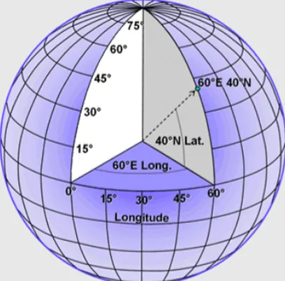
Any feature can be referenced by its latitude and longitude, which are angles measured in degrees from the Earth’s center to a point on the Earth’s surface (see Figure 2.1). Across the spherical Earth, latitude lines stretch horizontally from east to west (left image in Figure 2.2), and they are parallel to each other, hence their alter-native name, parallels. Longitude lines, also called meridians, stand vertically and stretch from the North Pole to the South Pole (center image in Figure 2.2). Together these “north to south” and “east to west” lines meet at perpendicular angles to form a graticule, a grid that encompasses the Earth (right image in Figure 2.2).
Latitude can be thought of as the lines that intersect the y-axis, and longitude as lines that intersect the x-axis.
[image:17.612.204.408.515.716.2]Think of the equator as the x axis; the y axis is the prime meridian, which is a line running from pole to pole through Greenwich, England. Just as the upper right quarter in the Cartesian coordinate system is positive for both x and y, latitude and longitude east of the prime meridian and north of the equator are both positive. Europe, Asia, and part of Africa – which have positive latitudes and longitudes – correspond to the upper right quarter of the Cartesian coordinate system. With the exception of some U.S. territories in the Pacific and the westernmost Aleutian islands, all of the United States is north of the equator and west of the prime meridian, so all latitudes in the U.S are positive (or north) while almost all longitudes are negative (or west).
Figure 2.2: Latitude, longitude, and the Earth’s graticule. GIS Commons. http://giscommons.org/ earth-and-map-preprocessing/
Midway between the poles, the equator stretches around the Earth, and it defines the line of zero degrees latitude (left image in Figure 2.2). Relative to the equator, latitude is measured from 90 degrees at the North Pole to -90 degrees at the South Pole. The Prime Meridian is the line of zero degrees longitude (center image in Figure 2.2), and in most coordinate systems, it passes through Greenwich, England. Longitude runs from -180 degrees west of the Prime Meridian to 180 degrees east of the same meridian. Because the globe is 360 degrees in circumfer-ence, -180 and 180 degrees is the same location.
PROJECTION - TRANSFORMATION OF GEOGRAPHICAL COORDINATES TO CAR
-TESIAN COORDINATE SYSTEMS
While the system of latitude and longitude provides a consistent referencing system for anywhere on the earth, in order to portray our information on maps or for making calculations, we need to transform these angular mea-sures to Cartesian coordinates. These transformations amount to a mapping of geometric relationships expressed on the shell of a globe to a flatten-able surface -- a mathematical problem that is figuratively referred to as Projec-tion.
Globes do not need projections, and even though they are the best way to depict the Earth’s shape and to un-derstand latitude and longitude, they are not practical for most applications that require maps. We need flat maps. This requires a reshaping of the Earth’s 3-dimensions into a 2-dimensional surface.
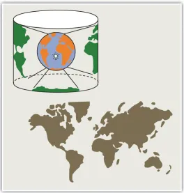
To illustrate the concept of a map projection, imagine that we place a light bulb in the center of a translucent globe (Figure 2.3). On the globe are outlines of the continents and the lines of longitude and latitude called the graticule. When we turn the light bulb on, the outline of the continents and the graticule will be “projected” as shadows on the wall, ceiling, or any other nearby surface. This is what is meant by map “projection.” The term “projection” implies that the ball-shaped net of parallels and meridians is transformed by casting its shadow upon some flat, or flatten-able, surface. In fact, almost all map projection methods are mathematical equations.
Figure 2.3. The concept of Map Projection as illustrated using a spherical globe and a flat map. http://
2012books.lardbucket.org/books/geographic-information-system-basics/s06-02-map-scale-coordinate-sys-tems-a.html
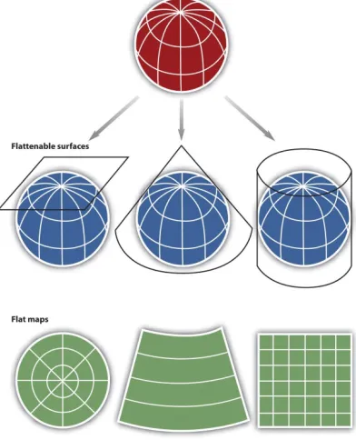
Within the realm of maps and mapping, there are three surfaces used for map projections (i.e., surfaces on which we project the shadows of the graticule). These surfaces are the plane, the cylinder, and the cone (Figure 2.4).
Figure 2.4. Three types of “flattenable” surfaces to which the graticule can be projected: a plane, a cone, and a cylinder. https://www.e-education.psu.edu/geog482fall2/c2_p30.html
As you might imagine, the appearance of the projected grid will change quite a lot depending on the type of sur-face it is projected onto, and how that sursur-face is aligned with the globe. The three surfaces shown above in Figure 2.4 -- the disk-shaped plane, the cone, and the cylinder--represent categories that account for the majority of projection equations that are encoded in GIS software. The plane often is centered upon a pole. The cone is typi-cally aligned with the globe such that its line of contact (tangency) coincides with a parallel in the mid-latitudes. And the cylinder is frequently positioned tangent to the equator (Figure 2.5).
[image:19.612.174.438.41.318.2]Figure 2.5. The projected graticules produced by projection equations in each category – plane, cone, and cylinder.
http://2012books.lardbucket.org/books/geographic-information-system-basics/s06-02-map-scale-co-ordinate-systems-a.html
Referring again to the previous example of a light bulb in the center of a globe, note that during the projection process, we can situate each surface in any number of ways. For example, surfaces can be tangential to the globe along the equator or poles, they can pass through or intersect the surface, and they can be oriented at any num-ber of angles. The following figures shows how these projections can vary.
PROJECTION AND DISTORTION
Flattening the globe cannot be done without introducing some error, and some distortion is unavoidable. Any projection has its area of least distortion. Projections can be shifted around in order to put this area of least dis-tortion over the topographer’s area of interest. Thus any projection can have an unlimited number of variations or cases that determined by standard parallels or meridians that adjust the location of the high-accuracy part of the projection.
If the geographic extent of your project area was small, like a neighborhood or a portion of a city, you could assume that the Earth is flat and use no projection. This is referred to as a planar surface or even a planar “projec-tion,” but with the understanding that it does not use a projection. Planar representation does not significantly affect a map’s accuracy when scales are larger than 1:10,000. In other words, small areas do not need a projection because the statistical differences between locations on a flat plane and a 3-dimensional surface are not signifi -cant.
For small-scale maps one must consider the Earth’s shape. Our assumption that the Earth is round or spheri-cal does not accurately represent it. The Earth’s constant spinning causes it to bulge slightly along the equator, ruining its perfect spherical shape. The slightly oval nature of the Earth’s geometric surface makes the terms ellip-soid and spheroid more accurate in describing its shape, but they are not perfect terms either since differences in material weights (for instance iron is denser than sedimentary deposits) and the movement of tectonic plates
has helped with measurement and geoid projections are now more common.
Projections are abstractions, and they introduce distortions to either the Earth’s shape, area, distance, or direc-tion (and sometimes to all of these properties). Different map projections cause different map distortions.
One way to classify map projections is to describe them by the characteristic they do not distort. Usually only one property is preserved in a projection. Map projections classified based on the preserved properties include:
Conformal - Preserves: Shape, Distorts: Area
Equal Area - Preserves: Area; Distorts: Shape, Scale or Angle (bearing)
Equidistant - Preserves: Distances between certain points (but not all points); Distorts: Other distances
Azimuthal (True Direction) - Preserves: Angles (bearings); Distorts: Area and shape
Map projections that accurately represent distances are referred to as equidistant projections. Note that distances are only correct in one direction, usually running north–south, and are not correct everywhere across the map. Equidistant maps are frequently used for small-scale maps that cover large areas because they do a good job of preserving the shape of geographic features such as continent.
Maps that represent angles between locations, also referred to as bearings, are called conformal. Conformal map projections are used for navigational purposes due to the importance of maintaining a bearing or heading when traveling great distances. The cost of preserving bearings is that areas tend to be quite distorted in conformal map projections. Though shapes are more or less preserved over small areas, at small scales areas become wildly distorted. The Mercator projection is an example of a conformal projection and is famous for distorting Green-land.
As the name indicates, equal area or equivalent projections preserve the quality of area. Such projections are of particular use when accurate measures or comparisons of geographical distributions are necessary (e.g., defor-estation, wetlands). In an effort to maintain true proportions in the surface of the earth, features sometimes be-come compressed or stretched depending on the orientation of the projection. Moreover, such projections distort distances as well as angular relationships.
As noted earlier, there are theoretically an infinite number of map projections to choose from. One of the key considerations behind the choice of map projection is to reduce the amount of distortion. The geographical object being mapped and the respective scale at which the map will be constructed are also important factors to think about. For instance, maps of the North and South Poles usually use planar or azimuthal projections, and conical projections are best suited for the middle latitude areas of the earth. Features that stretch east–west, such as the country of Russia, are represented well with the standard cylindrical projection, while countries oriented north–south (e.g., Chile, Norway) are better represented using a transverse projection.
If a map projection is unknown, sometimes it can be identified by working backward and examining closely the nature and orientation of the graticule (i.e., grid of latitude and longitude), as well as the varying degrees of distortion. Clearly, there are trade-offs made with regard to distortion on every map. There are no hard-and-fast rules as to which distortions are more preferred over others. Therefore, the selection of map projection largely depends on the purpose of the map.
Within the scope of GISs, knowing and understanding map projections are critical. For instance, in order to per-form an overlay analysis, all map layers need to be in the same projection. If they are not, geographical features will not be aligned properly, and any analyses performed will be inaccurate and incorrect. If you want to
duct a measurement of land parcel size, you need to use a projection that does not distort area space. Most GISs include functions to assist in the identification of map projections, as well as to transform between projections in order to synchronize spatial data. Despite the capabilities of technology, an awareness of the potential and pitfalls that surround map projections is essential.
ON-THE-FLY PROJECTION
Creating map projections was extremely challenging, even just 30 years ago. And now we can project and un-project massive quantities of coordinates, transforming them backward and forward from Latitude and Longi-tude (assuming this or that earth model) to overlay precisely with data that are stored in some other coordinate space. It is truly amazing that humans have perfected a rich library of open-source software that can Forward Project geographic coordinates (latitude and longitude, + earth model) to any projected system; and also back-ward project) from any well described projected coordinates back to geographic coordinates -- all in the wink of an eye. We can be thankful for that. But there are still some details that we have to understand.
Automatic transformation of coordinate systems requires that datasets include machine-readable metadata. In about 2002, the makers of ArcMap added one more file to the schema of a shape file. The .prj file contains the description of the projection of a shape file, and if it exists, it is always copied with the shape file or dlements that are exported from it. This is the machine-readable metadata that allows ArcMap to know how to handle the dataset if any transformation (reprojection) is required. There are plenty of datasets that do not include such machine readable metadata. This includes data that are not created with ArcMap since 2002 and even some that are. So we should get used to understanding map projections and their properties. If you need to learn to set the coordinate system for a dataset, use ArcCatalog - as explained in the The ArcMap Projections Tutorial.
UNIVERSAL TRANSVERSE MERCATOR
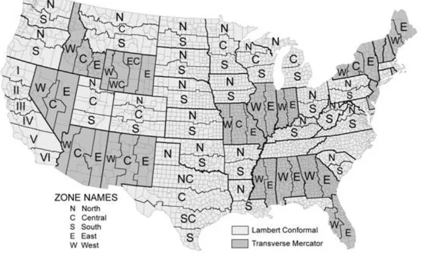
The first coordinate system we want to introduce here is the Universal Transverse Mercator grid, commonly referred to as UTM and based on the Transverse Mercator projection. Universal Transverse Mercator (UTM) is a coordinate system that largely covers the globe. The system reaches from 84 degrees north to 84 degrees south latitude, and it divides the Earth into 60 north-south oriented zones that are 6 degrees of longitude wide (Figure 2.6). Each individual zone uses a defined transverse Mercator projection (See Figure). The UTM system is not a single map projection. The system instead has 60 projections, and each uses a secant transverse Mercator projec-tion in each zone.
The contiguous U.S. consists of 10 zones (Figure 2.7). In the Northern hemisphere, the equator is the zero base-line for Northings (Southern hemisphere uses a 10,000 km false Northing). Each zone has an arbitrary central meridian of 500 km west of each zone’s central meridian (called a false Easting) to insure positive Easting values and a central bisecting meridian. In UTM, the CSUS Geography Department is located at 4,269,000 meters north; 637,200 meters east; zone 10, northern hemisphere. UTM zones are numbered consecutively beginning with Zone 1. Zone 1 covers 180 degrees west longitude to 174 degrees west longitude (6 degrees of longitude), and includes the westernmost point of Alaska. Maine falls within Zone 16 because it lies between 84 degrees west and 90 degrees west. In each zone, coordinates are measured as northings and eastings in meters. The northing values are measured from zero at the equator in a northerly direction (in the southern hemisphere, the equator is assigned a false northing value of 10,000,000 meters). The central meridian in each zone is assigned an east-ing value of 500,000 meters. In Zone 16, the central meridian is 87 degrees west. One meter east of that central meridian is 500,001 meters easting.
Figure 2.6. Visual depiction of the Universal Transverse Mercator project system. http://en.wikipedia.org/wiki/ Universal_Transverse_Mercator_coordinate_system
Figure 2.7. The zones of the Universal Transverse Mercator system as displayed over the United States. http:// en.wikipedia.org/wiki/Universal_Transverse_Mercator_coordinate_system
STATE PLANE COORDINATE SYSTEM
A second coordinate system is the State Plane Coordinate System. This system is actually a series of separate sys-tems, each covering a state, or a part of a state, and is only used in the United States. It is popular with some state and local governments due to its high accuracy, achieved through the use of relatively small zones. State Plane began in 1933 with the North Carolina Coordinate System and in less than a year it had been copied in all of the other states. The system is designed to have a maximum linear error of 1 in 10,000 and is four times as accurate as the UTM system.
Like the UTM system, the State Plane system is based on zones. However, the 120 State Plane zones generally follow county boundaries (except in Alaska). Given the State Plane system’s desired level of accuracy, larger states are divided into multiple zones, such as the “Colorado North Zone.” States with a long north-south axis (such as Idaho and Illinois) are mapped using a Transverse Mercator projection, while states with a long east-west axis (such as Washington and Pennsylvania) are mapped using a Lambert Conformal projection. In either case, the projection’s central meridian is generally run down the approximate center of the zone.
A Cartesian coordinate system is created for each zone by establishing an origin some distance (usually 2,000,000 feet) to the west of the zone’s central meridian and some distance to the south of the zone’s southernmost point.
[image:24.612.102.514.136.383.2]This ensures that all coordinates within the zone will be positive. The X-axis running through this origin runs east-west, and the Y-axis runs north-south. Distances from the origin are generally measured in feet, but some-times are in meters. X distances are typically called eastings (because they measure distances east of the origin) and Y distances are typically called northings (because they measure distances north of the origin).
Figure 2.8. Visual depiction of the State Plane project system as displayed over the United States. http://gis. depaul.edu/shwang/teaching/geog258/Grid_files/image002.jpg
DATUMS
All coordinate systems are tied to a datum. A datum defines the starting point from which coordinates are mea-sured. Latitude and longitude coordinates, for example, are determined by their distance from the equator and the prime meridian that runs through Greenwich, England. But where exactly is the equator? And where exactly is the Prime Meridian? And how does the irregular shape of the Earth figure into our measurements? All of these issues are defined by the datum.
Many different datums exist, but in the United States only three datums are commonly used. The North Ameri-can Datum of 1927 (NAD27) uses a starting point at a base station in Meades Ranch, Kansas and the Clarke El-lipsoid to calculate the shape of the Earth. Thanks to the advent of satellites, a better model later became available and resulted in the development of the North American Datum of 1983 (NAD83). Depending on one’s location, coordinates obtained using NAD83 could be hundreds of meters away from coordinates obtained using NAD27. A third datum, the World Geodetic System of 1984 (WGS84) is identical to NAD83 for most practical purposes within the United States. The differences are only important when an extremely high degree of precision is need-ed. WGS84 is the default datum setting for almost all GPS devices. But most USGS topographic maps published up to 2009 use NAD27.
This chapter material has been collected from the following web links that holds information with CC copy-rights: use and share alike.
http://2012books.lardbucket.org/books/geographic-information-system-basics/s06-02-map-scale-coordinate-systems-a.html
https://www.e-education.psu.edu/geog482fall2/c2_p30.html
http://www.gsd.harvard.edu/gis/manual/projection_fundamentals/
http://gis.depaul.edu/shwang/teaching/geog258/Grid.htm
http://en.wikipedia.org/wiki/Universal_Transverse_Mercator_coordinate_system
http://resources.arcgis.com/en/help/main/10.1/index.html#//003r0000000r000000
Discussion Questions
1. Describe the general properties of the following projections: Universe Transverse Mercator (UTM), State plane system.
2. Discuss the following concepts: Geographic Coordinate System, Projected coordinate system, Datums.
Contextual Applications of Chapter 2
An Anti-Poverty Policy that Works for Working Families (Brookings)
U.S. Women Are Dying Younger Than Their Mothers, and No One Knows Why
CHAPTER 3: TOPOLOGY AND CREATING DATA
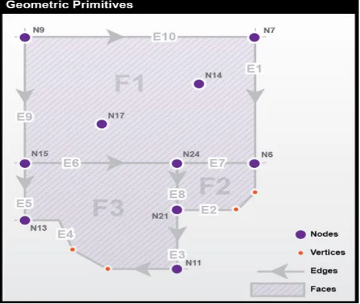
GEOMETRIC PRIMITIVES
Topology is the subfield of mathematics that deals with the relationship between geometric entities, specifically with properties of objects that are preserved under continuous deformation. A GIS topology is a set of rules and behaviors that model how points, lines, and polygons share coincident geometry. The concepts of topology are very useful for geographers, surveyors, transportation specialists, and others interested in how places and loca-tions relate to one another. We have learned that a location is a zero-dimensional entity (it has no length, width, height, or volume), locations alone are not sufficient for representing the complexity of the real world. Locations are frequently composed into one or more geometric primitives, which include the set of entities more common-ly referred to as:
1. Points;
2. Lines; and
3. Polygons (or Areas).
In the field of Topology, we can expand them to:
1. Nodes: zero-dimensional entities represented by coordinate pairs. Coordinates for nodes may be x,y values like those in Euclidean geometry or longitude and latitude coordinates that represent places on Earth’s sur-face. In both cases, a third z value is sometimes added to specify a location in three dimensions;
2. Edges: one-dimensional entities created by connecting two nodes. The nodes at either end of an edge are called connecting nodes and can be referred to more specifically as a start node or end node, depending on the direction of the edge, which is indicated by arrowheads. Edges in TIGER have direction so that the left
and right side of the street can be determined for use in address matching. Nodes that are not associated with an edge and exist by themselves are called isolated nodes. Edges can also contain vertices, which are optional intermediate points along an edge that can define the shape of an edge with more specificity than start and end nodes alone. Examples of edges encoded in TIGER are streets, railroads, pipelines, and rivers; and
3. Faces: two-dimensional (length and width) entities that are bounded by edges. Blocks, counties, and vot-ing districts are examples of faces. Since faces are bounded by edges and edges have direction, faces can be designated as right faces or left faces.
Figure below shows an example of these geometric primitives in a realistic arrangement. In this example, note that:
1. Nodes N14 and N17 are isolated nodes;
2. N7 and N6 are the start and end nodes of edge E1; and
Figure 3.1. The geographic primitives include nodes, edges, and faces. Source: Department of Geography, The Pennsylvania State University. Adapted from DiBiase (1997).
The following illustration shows how a layer of polygons can be described and used:
As collections of geographic features (points, lines, and polygons)
[image:27.612.177.437.40.260.2]As a graph of topological elements (nodes, edges, faces, and their relationships)
Figure 3.2. Relationship between geographic feature and the topological elements. Source: ESRI Help: http:// webhelp.esri.com/arcgisserver/9.3/java/index.htm#geodatabases/topology_basics.htm
TOPOLOGICAL RELATIONSHIPS
We have learned how coordinates, both geometric and geographic, can define points and nodes, how nodes can build edges, and how edges create faces. We will now consider how nodes, edges, and faces can relate to one another through the concepts of containment, connectedness, and adjacency. A fundamental property of all topological relations is that they are constant under continuous deformation: re-projecting a map will not alter
[image:27.612.57.538.362.638.2]topology, nor will any amount of rubber-sheeting or other data transformations change relations from one form to another.
Containment is the property that defines one entity as being within another. For example, if an isolated node (representing a household) is located inside a face (representing a congressional district) in the database, you can count on it remaining inside that face no matter how you transform the data. Topology is vitally important to the Census Bureau, whose constitutional mandate is to accurately associate population counts and characteristics with political districts and other geographic areas.
Connectedness refers to the property of two or more entities being connected. In Figure 2.1, Topologically, node N14 is not connected to any other nodes. Nodes N9 and N21 are connected because they are joined by edges E10, E1, and E10. In other words, nodes can be considered connected if and only if they are reachable through a set of nodes that are also connected; if a node is a destination, we must have a path to reach it.
Connectedness is not immediately as intuitive as it may seem. A famous problem related to topology is the Königsberg bridge puzzle (Figure 3.3).
Figure 3.3. The seven bridges of Königsberg bridge puzzle. Source: Euler, L. “Solutio problematis ad geome-triam situs pertinentis.” Comment. Acad. Sci. U. Petrop. 8, 128-140, 1736. Reprinted in Opera Omnia Series
Prima, Vol. 7. pp. 1-10, 1766.
The challenge of the puzzle is to find a route that crosses all seven bridges, while respecting the following criteria: 1. Each bridge must be crossed;
2. A bridge is a directional edge and can only be crossed once (no backtracking);
3. Bridges must be fully crossed in one attempt (you cannot turn around halfway, and then do the same on the other side to consider it “crossed”).
4. Optional: You must start and end at the same location. (It has been said that this was a traditional
requiment of the problem, though it turns out that it doesn’t actually matter – try it with and without this re-quirement to see if you can discover why.)
The right answer is, there is no such route. Euler proved, in 1736, that there was no solution to this problem.
WAYS THAT FEATURES SHARE GEOMETRY IN A TOPOLOGY
Features can share geometry within a topology. Here are some examples among adjacent features. Source: ESRI Help http://webhelp.esri.com/arcgisserver/9.3/java/index.htm#geodatabases/topology_basics.htm
Area features can share boundaries (polygon topology).
Line features can share endpoints (edge–node topology).
In addition, shared geometry can be managed between feature classes using a geodatabase topology. For example: Line features can share segments with other line features. For example, parcels can nest within blocks:
Area features can be coincident with other area features.
Line features can share endpoint vertices with other point features (node topology).
Point features can be coincident with line features (point events).
Source: ESRI Help: http://webhelp.esri.com/arcgisserver/9.3/java/index.htm#geodatabases/topology_basics. htm
Source: ESRI Help: http://webhelp.esri.com/arcgisserver/9.3/java/index.htm#geodatabases/topology_basics. htm
Galdi (2005) describes the very specific rules that define the relations of entities in the vector database: 1. Every edge must be bounded by two nodes (start and end nodes).
2. Every edge has a left and right face.
3. Every face has a closed boundary consisting of an alternating sequence of nodes and edges.
4. There is an alternating closed sequence of edges and faces around every node.
5. Edges do not intersect each other, except at nodes.
Compliance with these topological rules is an aspect of data quality called logical consistency. In addition, the boundaries of geographic areas that are related hierarchically — such as blocks, block groups, tracts, and coun-ties - are represented with common, non-redundant edges. Features that do not conform to the topological rules can be identified automatically, and corrected.
Topology is fundamentally used to ensure data quality of the spatial relationships and to aid in data compilation. Topology is also used for analyzing spatial relationships in many situations such as dissolving the boundaries between adjacent polygons with the same attribute values or traversing along a network of the elements in a topology graph. Topology can also be used to model how the geometry from a number of feature classes can be integrated. Some refer to this as vertical integration of feature classes. Generally, topology is employed to do the following:
Manage coincident geometry (constrain how features share geometry). For example, adjacent polygons, such as parcels, have shared edges; street centerlines and the boundaries of census blocks have coincident
Support topological relationship queries and navigation (for example, to provide the ability to identify adjacent and connected features, find the shared edges, and navigate along a series of connected edges).
Support sophisticated editing tools that enforce the topological constraints of the data model (such as the ability to edit a shared edge and update all the features that share the common edge).
Construct features from unstructured geometry (e.g., the ability to construct polygons from lines some-times referred to as “spaghetti”).
This chapter material has been collected from the following web links that holds information with CC copy-rights: use and share alike.
https://www.e-education.psu.edu/geog160/node/1948
http://webhelp.esri.com/arcgisserver/9.3/java/index.htm#geodatabases/topology_basics.htm
Discussion Questions
1. How does the topology change as you change the features of a map – for example, when you introduce a road into a landscape?
2. Consider the role of the planner in understanding topology. In what ways does the concept of topology apply to the practice of planning?
3. What are examples of topological errors that may be present in a dataset, perhaps one that you received second-hand?
Contextual Applications of Chapter 3
Metropolitan Jobs Recovery? Not Yet (Brookings)
Job growth
CHAPTER 4: MAPPING PEOPLE WITH CENSUS DATA
WHY CENSUS?
Some of the richest sources of attribute data for thematic mapping, particularly for choropleth maps, are national censuses. In the United States, a periodic count of the entire population is required by the U.S. Constitution. Ar-ticle 1, Section 2, ratified in 1787, states (in the last paragraph of the section shown below) that “Representatives and direct taxes shall be apportioned among the several states which may be included within this union, accord-ing to their respective numbers ... The actual Enumeration shall be made [every] ten years, in such manner as [the Congress] shall by law direct.” The U.S. Census Bureau is the government agency charged with carrying out the decennial census.
Figure 4.1: A portion of the Constitution of the United States of America (preamble and first three paragraphs of Article 1). Credit: Obtained from: http://www.archives.gov/exhibits/charters/charters_downloads.html
Figure 4.2: Reapportionment of the U.S. House of Representatives as a result of the 2000 census. Source: Smith, JM., 2012. Department of Geography, The Pennsylvania State University; After figure in Chapter 3, DiBiase.
Congressional voting district boundaries must be redrawn within the states that gained and lost seats, a process called redistricting. Constitutional rules and legal precedents require that voting districts contain equal popula-tions (within about 1 percent). In addition, districts must be drawn so as to provide equal opportunities for rep-resentation of racial and ethnic groups that have been discriminated against in the past. Further, each state is al-lowed to create its own parameters for meeting the equal opportunities constraint. Whether districts determined each decade actually meet these guidelines is typically a contentious issue and often results in legal challenges.
Beyond the role of the census of population in determining the number of representatives per state (thus in providing the data input to reapportionment and redistricting), the Census Bureau’s mandate is to provide the population data needed to support governmental operations, more broadly including decisions on allocation of federal expenditures. Its broader mission includes being “the preeminent collector and provider of timely, rel-evant, and quality data about the people and economy of the United States”. To fulfill this mission, the Census Bureau needs to count more than just numbers of people, and it does.
THEMATIC MAPPING
Unlike reference maps, thematic maps are usually made with a single purpose in mind. Typically, that purpose has to do with revealing the spatial distribution of one or two attribute data sets. In this section, we will consider distinctions among three types of ratio level data, counts, rates, and densities. We will also explore several dif-ferent types of thematic maps, and consider which type of map is conventionally used to represent the different types of data. We will focus on what is perhaps the most prevalent type of thematic map, the choropleth map. Choropleth maps tend to display ratio level data which have been transformed into ordinal level classes. Finally, you will learn two common data classification procedures, quantiles and equal intervals.
MAPPING COUNTS
The simplest thematic mapping technique for count data is to show one symbol for every individual counted. If
the location of every individual is known, this method often works fine. If not, the solution is not as simple as it seems. Unfortunately, individual locations are often unknown, or they may be confidential. Software like ESRI’s ArcMap, for example, is happy to overlook this shortcoming. Its “Dot Density” option causes point symbols to be positioned randomly within the geographic areas in which the counts were conducted (Figure 4.3). The size of dots, and number of individuals represented by each dot, are also optional. Random dot placement may be acceptable if the scale of the map is small, so that the areas in which the dots are placed are small. Often, howev-er, this is not the case.
Figure 4.3. A “dot density” map that depicts count data. Source: G. Hatchard. https://www.e-education.psu.edu/ geog482fall2/c3_p17.html
An alternative for mapping counts that lack individual locations is to use a single symbol, a circle, square, or some other shape, to represent the total count for each area. ArcMap calls the result of this approach a Proportional Symbol map. When the size of each symbol varies in direct proportion to the data value it represents we have a proportional symbol map (Figure 4.4). In other words, the area of a symbol used to represent the value “1,000,000” is exactly twice as great as a symbol that represents “500,000.” To compensate for the fact that map readers typi-cally underestimate symbol size, some cartographers recommend that symbol sizes be adjusted. ArcMap calls this option “Flannery Compensation” after James Flannery, a research cartographer who conducted psychophysical studies of map symbol perception in the 1950s, 60s, and 70s. A variant on the Proportional Symbol approach is the Graduated Symbol map type, in which different symbol sizes represent categories of data values rather than unique values. In both of these map types, symbols are usually placed at the mean locations, or centroids, of the areas they represent.
`
Figure 4.4. A “proportional circle” map that depicts count data. Source: G. Hatchard. https://www.e-education. psu.edu/geog482fall2/c3_p17.html
MAPPING RATES AND DENSITIES
A rate is a proportion between two counts, such as Hispanic population as a percentage of total population. One way to display the proportional relationship between two counts is with what ArcMap calls its Pie Chart option. Like the Proportional Symbol map, the Pie Chart map plots a single symbol at the centroid of each geographic area by default, though users can opt to place pie symbols such that they won’t overlap each other (This option can result in symbols being placed far away from the centroid of a geographic area.) Each pie symbol varies in size in proportion to the data value it represents. In addition, however, the Pie Chart symbol is divided into piec-es that reprpiec-esent proportions of a whole (Figure 4.5).
Figure 4.5. A “pie chart” map that depicts rate data. Source: G. Hatchard. https://www.e-education.psu.edu/ geog482fall2/c3_p16.html
[image:35.612.151.459.490.722.2]Some perceptual experiments have suggested that human beings are more adept at judging the relative lengths of bars than they are at estimating the relative sizes of pie pieces (although it helps to have the bars aligned along a common horizontal base line). You can judge for yourself by comparing the effect of ArcMap’s Bar/Column Chart option (Figure 4.6).
Figure 4.6. A “bar/column chart” map that depicts rate data. Source: G. Hatchard. https://www.e-education. psu.edu/geog482fall2/c3_p16.html
Like rates, densities are produced by dividing one count by another, but the divisor of a density is the magnitude of a geographic area. Both rates and densities hold true for entire areas, but not for any particular point location. For this reason, it is conventional not to use point symbols to symbolize rate and density data on thematic maps. Instead, cartography textbooks recommend a technique that ArcMap calls “Graduated Colors.” Maps produced by this method, properly called choropleth maps, fill geographic areas with colors that represent attribute data values (Figure 4.7).
[image:36.612.144.464.466.701.2]