1
Continuum: A Task-Based Evaluation
of Temporal Visualisations
Paul André, Max L. Wilson and m.c. schraefel
Electronics and Computer Science
University of Southampton, SO17 1BJ, UK
{pa2,mlw05r,mc}@ecs.soton.ac.uk
ABSTRACT
Time is a powerful and common attribute for exploring information, and timelines can be an excellent way to help represent and explore temporal data. Most timelines hit problems when the dataset has a large number of values or attributes, or when the data to be conveyed is multidimensional. We previously introduced Continuum, a tool to support rich temporal visualisations by allowing nested hierarchies, cross-concept relationships and meaningful levels of detail at all levels of zoom. Here we present a qualitative and quantitative study of Continuum in comparison with the current state-of-the-art Simile Timeline. The quantitative study investigates performance via three exemplar kinds of temporally oriented tasks: event finding, counting, and comparison tasks. The qualitative components of the study investigate user satisfaction and affect with the tool. Overall, Continuum demonstrated a significant improvement for user experience and accuracy. We consider the attributes of the tool that account for this success towards a generalized approach for temporal visualizations.
Author Keywords
Temporal visualisation, timelines, user interfaces, evaluation
ACM Classification Keywords
H5.2. [Information interfaces and presentation] User Interfaces: Evaluation/methodology, Graphical user interfaces.
INTRODUCTION
Time is a powerful and common attribute for grounding information. When an event occurs, time between events, and the frequency of an event are each attributes of frequent interest in data collections. Visualizations of time can be an
excellent way to both represent and explore temporal data: a timeline can readily show proximity of one event to another, and enable analysis of possible coincidence or influence of similar events happening at similar times but in seeming isolation from each other. Most temporal visualizations hit problems however when the data scales up either in terms of number of values, number of attributes, or both. This problem is often manifested as the blob or spaghetti view of data: when trying to view a large number of events at a particular scale, the event markers become so small as to become illegible or they are so tightly packed that they blend into blobs, both of little value. Likewise it becomes difficult in most timelines to convey the multidimensionality of a data set's temporal values. For example, in a film domain, various directors have careers which span a certain period of time; within those spans they have developed particular films. Traditional timelines do not easily support such visual nesting of temporality. There may also be relationships among periods. Various directors' works may go in and out of vogue. Theatrical re-release of films over time may therefore be of interest, especially relative to other historical events. Again, traditional linear timelines are not particularly effective at reflecting such cross-time relationships.
In previous work we presented Continuum [1], a tool to support such rich temporal visualisations by allowing a) dynamic nested hierarchies, b) cross-concept relationships, and c) meaningful levels of detail available at all levels of zoom. At that time we did a small comparative evaluation of Continuum against the state-of-the-art Simile Timeline [21]. Results from that trial were positive, but some questions about the interaction design remained open: do Continuum's representations (nested hierarchies and semantic zoom) allow faster retrieval of information? More accurate retrieval? Is performance and accuracy task-type dependent? Are participants more satisfied, and if so, with what features and in what task conditions?
types, in order to derive a better understanding of design considerations for visualizations of multidimensional temporal data. In this paper we review the related work in temporal visualizations, describe the evaluation we carried out to assess our approach, and discuss the generalisable design implications from the results. We conclude with our directions for future work.
MOTIVATING EXAMPLE
[image:2.612.58.294.224.331.2]Whilst our initial motivation for this work comes from our experience in high-dimensional datasets, complex temporal data has been represented on timelines for centuries. Tufte [22] highlights a graphic from the New York Times displaying New York City’s weather in the 1980s (Fig. X).
Figure X. New York City’s weather in the 1980s. The figure shows the daily high and low temperatures in relation to the average, and at a glance we can see, say, there is a steady increase in temperature from July – February, and we could even use it to forecast for next year. It also displays actual and normal precipitation as well as relative humidity as of noon; and does all of this in an intuitive and well thought out display. This is a great example of why we want timeline visualizations at all, it organises a large collection of numbers, enables us to see patterns and make comparisons between different parts of the data, and “successfully tells a story” [22]. Clearly carefully-studied, manually-drawn timelines can be very sophisticated, but our question is: can we translate some of these affordances to address the limitations of current automatic visualization research? (as mentioned in the Introduction and seen in Related Work). For example: the utilisation of the y-axis to convey useful data is key; different representations on the same graph; varying degrees of overview and focus detail (highs and lows as well as average) should be thought of, and have been somewhat explored in concepts such as semantic zooming [4] (for meaningful representations throughout a zoom), and focus+context [10] (for overview plus detail). Part of our work here has been to ask how can we integrate these (and other techniques such as spatial grouping, user controlled focus) previously separate techniques to address problems in high-dimensional temporal visualisation.
RELATED WORK
There has been considerable research in different aspects of timeline design. A full summary is presented in our
previous work [1], and here we present a brief summary, specifically highlighting previous studies of temporal visualisations.
Formal mathematical definitions and models have been developed [8,16] for representing complex temporal data on a timeline. Though the purpose of our work is not to develop such a model, we are interested in their approach to visualising and controlling the representation. Kumar et al. [16] promote the display of relationships, though in a fairly obfuscated way due to the requirement to zoom, and thus lose context, or having to choose which relationships to view through a menu, or define derived attributes on the fly. Focus+context [10] is key in the Perspective Wall [17], where a central panel gives a detail view, and two perspective panels on either side relate content. Here the user 'zooms' into information by moving the timeline so the entity is on the centre panel. The Multi-Scale timeline slider [20] addresses the need for focus+context in a different manner: by spawning new timelines focusing on a region of the previous timeline, they simultaneously display information as part of a uniform overview. However, the different levels of zoom do not convey more or less temporal information, but more or less metadata. Subsequently, it still has limitations of scale.
A slightly different approach to displaying time was taken by the TimeSlider [14], in which the ends of the time scale are exponential, allowing an extensive time range to be displayed in a small area. While this approach also allows for zooming and context, Richter et al. suggest that the non-linear representation of time has negative effects on the interpretation of data [20]. Key to our work is the concept of semantic zooming [4], allowing a meaningful overview at each scale.
3 The most recent and widely available work in this area (it has been successfully open sourced) is David Huynh’s Simile Timeline [21]. A uniform overview timeline presents context while a more detailed view focuses on a specified area within the time space. Hierarchy and relationships are not dealt with explicitly, but permitted to certain extents through controls such as colour, but only at one level at a time. For example, classical composers and compositions could be colour coded with the eras, but then compositions cannot also be colour coded to composers at the same time. Correspondence with the lead developer indicates the Simile Timeline has not been engineered to deal with significant scale; visualising a dataset would be an issue above approximately 700 items.
There is a lack of evaluation of temporal visualisations. Chittaro and Combi [7] evaluated three possible representations of relations, precise end-points, and possible on-going periods, though this focus was on different visual vocabularies rather than the design of a complete visualisation tool. The LifeLines system is the first to bring together the full gamut of problems facing timelines: overview, hierarchy, rescaling, inter-relationships and layout issues. LifeLines [18,19] is able to display hierarchies and relationships, but with only colour coding to help, the user must make the links between related entities on separate rows themselves. The LifeLines system was
demonstrated to 60 representative users who commented on perceived advantages and problems, though this was more of a design review than an evaluation of the tool.
We previously discussed Gantt charts in detail [1]. In summary, in various commercial solutions1,2,3 Gantt charts have advanced timeline visualisation and manipulation capabilities, but are considerably different to Continuum - this is discussed in detail in the Study Design section.
CONTINUUM DESIGN
In order to represent faceted temporal data, we needed to be able to visualize temporal information (a) within dynamic hierarchies (such as created in a faceted browser [12]), (b) across-concept relationships/associations, and (c) in large scale overviews with meaningful detail. We iterated on numerous paper and Flash prototypes via cognitive walkthroughs of designs with participants. Drawing from these investigations, the following key design attributes were identified: 1) at any level of zoom, something immediately useful must be conveyed; 2) where
1 Microsoft Project: http://office.microsoft.com/project
2 Artemis Views, AISC Corp, http://aisc.com/Product/2
[image:3.612.56.562.48.387.2]information is minimised to reduce clutter, either by the system or by the user, it must be clear that more information is available; 3) the choice of visible and minimised information must be based on a metric that is clear to the person using the system; 4) the system must always allow the user to foreground what attribute is important to them in their exploration [15]. Full details of design and implementation can be found in previous work [1], here we present a brief overview of the features of Continuum.
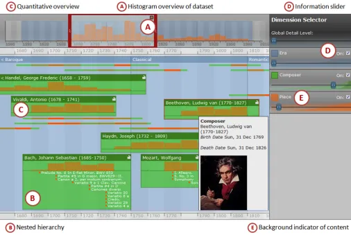
Continuum, as detailed in Fig. 1, has three main panels: 1) the timeline overview in the top left, 2) the timeline detail view (main panel), and 3) the dimension filter (right hand side).
The Overview Panel
Typically, timelines that include an overview, such as the Simile Timeline, simply show the same information as the detail view, but on a much smaller scale. However, for such tools, as the detail view overflows, so does the overview. At such points of overload, an overview fails to provide a complete representation of all the information that cannot be seen in the detail view. In Continuum, the overview panel, top left, presents a scalable histogram overview (callout A), quantifying the focal data of the domain (in this case, composition). This view scales to continually provide a complete representation of the whole dataset.
The Detail View Panel (and Hierarchies)
The detail panel (main panel) shows the information bounded by the viewfinder of the overview panel. In this example, era/composer/piece are categories, in Hearst’s sense of categories as facets [12], and as such are flexibly associated as hierarchies in Continuum. For example, we can display era -> composer -> piece, or era -> piece. The data is not a rigid hierarchy, but a hierarchy by association. This distinction and our display of embedded entities is in contrast to say Lifelines [18], which displays categories on different rows, and even with linking and colour, leaves the user to make some spatial association about relationships between Gantt-like lines. Other timeline visualisations are able to display different types of data [18,21], for example using colour [21], linking arrows [13], or size [18], but these approaches have limitations in terms of scale, and the hierarchical relationships between data are often left to the user’s perception of concurrency in the timeline.
Continuum represents child nodes within parent nodes (callout B), allowing the visualisation to drill down through many hierarchical levels to find information. Like the overview panel, histograms are used to quantify larger volumes of information that cannot be viewed in detail, such as viewing a Composer's Pieces. As showing a full hierarchy would introduce scale problems very quickly, the dimension filter panel on the right allows the user to specify the facets and detail that they wish to view. As both the size and dimensionality of the information can lead to information overload, Continuum has been designed
carefully to deal with scale. When the amount of entities would be prohibitive or uninformative to show completely (such as Piece within Composer), we show the information as a histogram (callout C). Thus, where existing tools will fail at showing complete information, Continuum conveys alternative information: relative quantity.
The Dimension Filter Panel
This unique aspect of Continuum gives control of the abundance of content to the user. As displaying all the information from each dimension would overload the detail panel, the dimension filter panel allows users to control the level and type of detail displayed. Put simply, this allows the user to specify that they want to see lots of information about composers, minimal information about their compositions and absolutely no detail about later recordings. To allow the user to express such requests, each dimension has a slider and a checkbox (callout D). The checkbox allows the user to define which dimensions are visualised at any one time. If the slider is at its leftmost point, the majority of Composers are represented by flat horizontal lines. As the slider is moved towards the right, the most prominent Composers begin to grow in height to display more detail. (The ‘prominence’ metric can be changed as required – for our prototype it is simply the number of compositions). The background of the sliders are subtly coloured into two cumulative histograms. The lighter histogram displays when new information (such as a composer) will appear in the view, in a 'closed' form. The darker histogram indicates when those 'closed' objects will 'open' and display information (see callout E). These give users an indication of when and what content will appear. As the slider approaches the right, all of the composers become expanded. By doing so, more vertical screen space may be needed, and so by expressly requesting more detail, the user is implicitly creating the need to scroll the detail panel vertically.
STUDY DESIGN
In our initial presentation of Continuum [1] we carried out task-oriented design reviews and walkthroughs of the interface. Our goal was to ensure that the artefact was perceived to be at least as usable as the state-of-the-art Simile Timeline, re-testing after design refinement to ensure we had achieved at least that level of compatibility. In this study we conduct a more comprehensive quantitative and qualitative evaluation that focuses on the accuracy and effectiveness of the tool in assisting users in carrying out a range of temporal-oriented queries.
On Comparison Tools
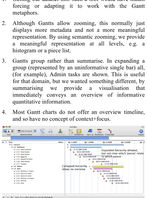
5 the features that Continuum does, and we address why this was still a fair comparison. All other timeline visualisations in the literature are not available, or if so, are outdated (LifeLines for example, has a 1998 version available), and unable to handle the scale of current datasets. We considered using a Gantt tool as a third comparison, since they can have advanced features in handling collapsing hierarchies, filtering, histogram displays, and outline views. We did not for a number of reasons:
1. Getting our dataset into such a tool would have meant forcing or adapting it to work with the Gantt metaphors.
2. Although Gantts allow zooming, this normally just displays more metadata and not a more meaningful representation. By using semantic zooming, we provide a meaningful representation at all levels, e.g. a histogram or a piece list.
3. Gantts group rather than summarise. In expanding a group (represented by an uninformative single bar) all, (for example), Admin tasks are shown. This is useful for that domain, but we wanted something different, by summarising we provide a visualisation that immediately conveys an overview of informative quantitative information.
[image:5.612.51.299.171.505.2]4. Most Gantt charts do not offer an overview timeline, and so have no concept of context+focus.
Figure X. Gantt chart displaying era, composer and pieces. Expanded hierarchies are allowed, but it is not clear which pieces relate to which parent, and collapsed hierarchies show
no overview, just a blank bar.
To emphasise these points, we created a snapshot of a subset of our dataset in two Gantt tools. In Figures X and Y, we see that although providing colour-coded composers and pieces, expandable and collapsible hierarchies of era/composer/piece, and limited histogram views (of just one composer at a time, Fig. X), Gantt charts still run into problems with providing informative overviews of collapsed hierarchies (displaying a meaningless bar), in nesting child items within parent items in an easily accessible way, and in providing integrated informative summative overviews.
Various digital media management tools exist (iBase for photography, Final Cut Pro for movie editing) and provide
great visual timelines, but again lack the ability for more advanced nested hierarchies or informative overviews at different scale representation.
Since our focus is specifically on visual representations of temporal data, we are not considering Google or Wikipedia (where many of the tasks could be answered). However, an interesting possibility for future work is to look at text versus visual representation for temporal data.
[image:5.612.317.559.199.314.2]In summary, Simile is the only widely available tool that is used to provide similar data to the complex datasets that have motivated this work.
Figure Y. Gantt chart displaying problems in histogram overviews: separating the histogram view from the main timeline removes any context, and either only one composer’s pieces can be viewed at any one time, or all composers at once,
not enabling any comparison of data.
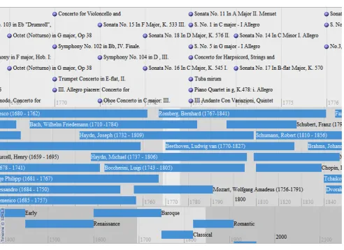
Evaluation, Tasks and Hypotheses
We again use Simile as a control condition (see Fig. 2 and 3 for a zoomed out and zoomed in version of the dataset on Simile). Both conditions visualised the same classical music dataset consisting of Era, Composers and Composition facets. A within-participant experiment was used: participants were asked to answer ten specific questions with each interface, with exposure to the interfaces counterbalanced. We used three different types of query in the sets of tasks: event finding, counting, and comparison. These are generic queries that are common and important in temporal visualisation and can be abstracted to any
[image:5.612.317.565.372.546.2]temporal dataset. These three types of task are representative of the types of questions users may want to ask of their data as highlighted by Tufte [22], for example in terms of organising large collections of numbers, or supporting comparisons between different parts of the data. Further justification for these types of task came from a project we are involved in on musicology4 and the types of questions people are interested in. Each pair of corresponding questions were designed to be of equal difficulty but, in case of any unperceived differences, the order of presentation was also counter-balanced. All tasks are achievable in both interfaces. The two task sets are listed in Fig. X.
Our study was designed to test several hypotheses.
H1. Performance: Users will be able to complete all tasks quicker in Continuum.
Continuum's hierarchical display of data will not only make it quicker to find information, but the quantified overview of data in histograms will support our second hypothesis: H2. Accuracy: Users will be able to complete all tasks to a higher degree of accuracy in Continuum.
We believe these affects are directly due to the extra features in Continuum. While we can partially explore this in user comments, the affect is especially apparent when
4http://www.mspace.fm/projects/musicspace/
comparing data, since this takes direct advantage of the quantitative overview in histograms, and so:
H3. Task Type: Continuum users will achieve a significantly higher score in the comparison questions in particular.
Due to the extra features Continuum affords in exploring this temporal data, we believe it allows users to get at the answers easier, as well as quicker and more accurately, and so:
H4. Experience: Users will report a higher satisfaction level in all user experience measures detailed below (apart from effort).
In a similar way to Capra et al. [6], a total of 9 recordings were taken: time, accuracy, satisfaction, confidence, effort, usefulness, usability, engagement and enjoyment. For each task, completion times were individually recorded using logged timestamps. Task accuracy was measured on a scale of 0-2, where 0 is incorrect, 1 is partially correct, and 2 is exactly correct. For each interface, the participant recorded their satisfaction, confidence in their answers, and self-assessed mental effort for carrying out the tasks on a 7-point Likert scale. Usefulness and usability of the tool, also on a 7-point scale, were measured from a series of adapted questions (5 questions on usefulness and 5 questions on usability were reworded to be appropriate to temporal tasks) from Davis [9]. Similarly, engagement and enjoyment were measured according to the 7-point scales produced by Ghani et al. [11]. Participants were asked to fill out an agreement and demographic survey before beginning, and were debriefed with a semi-structured interview following the study. No participants had extensive knowledge of either interface, and prior to the tasks, participants were given a walkthrough of each interface and a small amount of time to use and become comfortable with each interface. 16 participants took part in the study, 11 male. This is a reasonable multiple of the number of counter-balancing orders, and each interface was used by 16 people and each order was conducted by 8 people. Their age ranged between 18 and 65 and they varied in levels of education. Participants were given a music voucher as an appreciation of their time spent in the study. The study was conducted on an iMac 1.25GHz PowerPC G4 processor, using Firefox 2.0 on a 20 inch screen.
[image:6.612.55.301.175.354.2]Figure 3. Zoomed in Simile Timeline with our dataset.
7 RESULTS
Six of the sixteen participants reported greater than six years (and less than ten) of classical music education. This experience had no significant effect on their accuracy with either Continuum test, t=1,3257, p=0.2) or with Simile (t-test, t=0.4487, p=0.6).
Hypotheses 1 and 2: Speed and Accuracy
At an overall level Continuum participants spent marginally longer (see Table 1), though this is not statistically significant, 2-way ANOVA, F(1,15)=0.376, p=0.549, also seen in the general similarity between average times in Fig. 4. However, this does not support H1, that Continuum participants would be faster than Simile participants.
Ave. time Continuum 22m 34s
Ave. time Simile 20m 42s
Ave. score Continuum (/20) 12.9
[image:7.612.315.557.87.237.2]Ave. score Simile (/20) 7.0
Table 1. Overall average time and accuracy for Continuum and Simile.
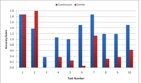
H2, that Continuum participants would be more accurate, is strongly supported - Continuum participants were 20% more accurate in their answers, a significant effect, 2-way ANOVA, F(1,15)=41.69, p<0.001. The scores for each task are presented in Fig. 5. T-tests are described below.
Hypothesis 3: Grouped by Task Type
Breaking the results down into individual tasks, we see there was no significant time difference in any of the individual tasks. Continuum was statistically significantly more accurate in 7 of the 10 tasks, Simile was significantly more accurate in 1 of the 10. In 2 of the 10 tasks, there was no significant difference. To determine if this was an affect of task type, we group and calculate significance for event finding tasks (3 of the 10 tasks), counting tasks (3 of the 10 tasks), and comparison tasks (4 of the 10 tasks).
Event finding. The difference in accuracy for event finding tasks, such as birth, death and composition dates, was not
significant (t-test, t=1.5433, p=0.1295).
Counting tasks. Counting tasks, such as number of composers active in an era (in our dataset), or number of compositions in a year or lifetime, were significantly more accurate (t-test, t=3.7209, p=0.0005) in Continuum.
Comparison tasks. Comparison tasks, such as dry or productive periods in composer lifetimes, or most prolific composer in an era, were significantly more accurate (t-test, t=6.4190, p<0.0001) in Continuum than in Simile. These results support H3, that Continuum participants will achieve a significantly higher score in the comparison tasks in particular.
Hypothesis 4: User Experience Measures
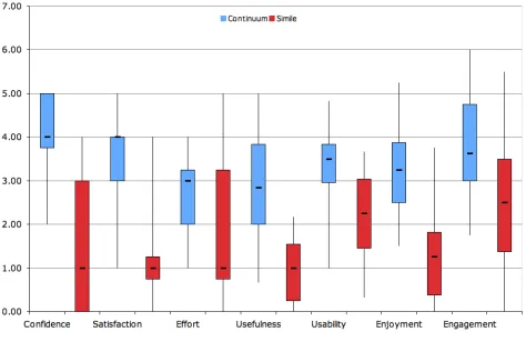
Continuum was rated significantly higher in 6 of the 7 user experience measures (individual t-tests in Table 2). The one measure that was not statistically significant was perceived effort. This supports H4, that participants will report a higher user experience score for all measures apart from effort. The scores for each measure are presented in Fig. 6.
Measure T-test (p, t, value)
Confidence p<0.0001 t=8.6603
Satisfaction p<0.0001 t=6.4820
Effort p=0.0686 t=1.9617
Usefulness p<0.0001 t=5.9851
Usability p=0.0064 t=3.1659
Enjoyment p=0.0003 t=4.7616
[image:7.612.65.280.219.291.2]Engagement p=0.0031 t=3.5235
Table 2. T-tests for each user experience measure.
OBSERVATIONS
[image:7.612.339.538.515.661.2]We mention two relevant observations before analysing these and the results in the Discussion section. In the
Figure 4. Amount of time taken to complete each task, for Continuum and Simile.
[image:7.612.54.297.532.675.2]comparison tasks, we observed Simile participants giving up more often, and either guessing or not submitting answers. When using Continuum, even after an introduction to the tool and stating they were happy, participants still seemed to be hesitant as they figured out the best approach to begin.
Figure X. Boxplot showing minimum, maximum, Q1, Q3 and median for each of the 7 measures of user experience.
DISCUSSION
Overall participants seemed to prefer Continuum to Simile (also evident in Fig. 6). The reasons often given for this preference were the usefulness of the summary information in the histograms of a composer, especially with regards to assessing productivity. Oft-reported complaints were that Simile was frustrating when trying to find out facts which involved the number of pieces composed. 3 people even responded that in the event finding tasks they would prefer neither interface and look up the information (such as Beethoven's birth date) with Google or Wikipedia instead, due to the speed and responsiveness of both interfaces, and that a simple keyword query would garner the information immediately. Note that a search box would have made some of the tasks trivial, though because Simile lacks this ability, it was specifically not implemented in Continuum to ensure a fair comparison. This feature is clearly desirable though and is being implemented. That said, it is clear from both qualitative and quantitative measures that features in Continuum were particularly effective for interacting with temporal datasets.
Overall Time and Accuracy
Our hypotheses that Continuum would be overall quicker and more accurate were only half realised. Based on the data and observations, this seems to be for two reasons. First, as mentioned, we observed participants in Simile giving up on some of the more complex tasks (such as comparison) accounting for the shorter time spent. While the tasks were achievable in both interfaces, in Continuum the task may have been perceived as more achievable by participants due to the display of a histogram communicating relative quantity, and so the participants went through the extra time and effort to complete the task.
Secondly, this could also be due to Continuum being harder to initially understand and start to use than Simile, both because of the default view of 'closed' composers (just showing lines) and the more advanced features it affords. This was represented in comments too, some participants mentioned it seemed a little intimidating at first because there is nothing to give them "a handle" on what data they are seeing, since all composers are minimised. This is borne out by our previous observation, even after participants stated they were happy with using Continuum, there were moments of hesitation as they figured out the best approach to begin. This did not occur with Simile, perhaps because it is simpler, but also because the data is immediately obvious. This seemed to only last a short while though, once the detail level started to be turned up, participants seemed comfortable, and at the end reported that they could become quite proficient with the tool. This is also backed up by the user experience measures in Fig. 6. However, this is clearly an area for future improvement. We plan to change the default view to display a representative set of the data, and conduct a design review to more clearly communicate the function of the sliders in the dimension filter.
By Task Type
Event finding. The non-significant difference in accuracy for event finding tasks is understandable given that both interfaces do not have a keyword search facility, and so participants had to go through the same process in both interfaces, involving manually scanning for the composer and reading off a date against the global time scale, or looking at the metadata for the composer. This is further evidence for including a keyword search.
Counting. While finding the, for example, composer, may be of similar difficulty in both tools, we reason Continuum's hierarchical display of summarised information (in a histogram) enabled participants to both locate and quantify this deeper information more accurately. As reported previously, Continuum participants commented on the usefulness of the histogram in assessing productivity, and frustration was experienced with Simile when trying to find out facts which involved the number of pieces composed.
Comparison. Similar to the counting tasks, based on observations and participant comments, we reason the histogram display within the nested hierarchy in Continuum allowed participants to quickly and accurately gain an overview of a composer’s productivity.
Participant Comments
9 previously considered, the ability to 'focus' on particular composers in Continuum, meaning removing the others from view, or allowing the sliders to work only on the 'focused' composer. Previously we had imagined this working similar to the Multi-Scale Timeline Slider [20], in which new timelines are spawned from a subset of the previous one.
A less frequent but interesting comment was confusion over what precisely (i.e. absolutely, a specific number) the bars in a histogram for a composer in Continuum represented. This is because they are relative to the one composer, not to all composers in that era, making it more difficult to use them for comparison. A possible solution is to have both representations on the histogram, relative to the one composer and relative to all composers. The former would be overlaid (perhaps in a different colour or opacity) on the latter, enabling the user to see how prolific that composer was overall. However, for less productive composers this would still cause a problem, and potentially be even more confusing, and is an area for future work. Around two-thirds of the participants said that while tasks such as "who were the top 5 composers in the Romantic era" were frustrating in Simile, they had to account for this relative summary in Continuum which made it slightly more than a trivial task.
Evaluated Design Affordances
We started this paper by looking at a temporal visualization pointed to by Tufte as an example of a sophisticated graphic excellent for representing and exploring data, and how current automatic temporal visualizations have limitations in achieving such an informative view. We identified where techniques such as spatial grouping, adding individual controllers over degree of detail, histograms as overviews, semantic zooming, and focus+context would address these problems. In summary, we are not proposing a new visualisation technique per se, but have found the collective application of these techniques addresses problems in hierarchical temporal visualization, and leads to greater accuracy and satisfaction. In order to generalise to design recommendations for temporal data viewers of high dimensional data, we consider the evaluated attributes of Continuum that enable improved accuracy and better user experience.
User Determined Focus
The sliders in the dimension filter allow users control over: a) what data is presented - in terms of turning facets on and off, and b) how much data is presented. This enables the user to choose the focus, rather than the tool.
Nested Hierarchical Display
Nested hierarchies group relevant information spatially and in a manner consistent with a user's cognitive model of the domain, i.e. an era contains many composers, and composers each composed many pieces. For other domains,
we encourage designers to consider the taxonomic or associative hierarchy that could be exploited to this effect.
Grouping Information
Complementary to, or in cases where a nested hierarchy is not suitable, grouping information in a meaningful way allows users to quickly ascertain the relevance or importance of an area with respect to their task (as seen in user comments regarding the usefulness of histogram overviews). If the data is quantitative, absolute and relative quantity (if possible) should be communicated in the overview. Continuum achieves this by utilising histograms of compositions, and in the previous section we discussed our future work in ensuring this representation is both intuitive yet advanced enough to 1) communicate information specific to an individual entity, and 2) that data’s place in the entire temporal continuum. In essence, such grouping is semantic zooming, affording a meaningful overview at all levels of zoom. As the user focuses in on an area, a relevant representation should be displayed. This is achieved in Continuum through use of the dimension filter, as the user moves a slider to the right, the request to view more information on pieces, for example, expands the histogram view to display individual pieces relating to eras within the histogram. We are involved in a continuous effort to make this as seamless and usable as possible.
Focus+context
As the user zooms in on the data, it is necessary to strip away the information at the edges, but maintain a way for them to reflect on their current position to the overall view, essentially allowing focus+context. This point brings us back to the start of the paper, and Tufte's arguments for an effective temporal visualisation: one which not only successfully organises a large amount of numbers, but allows us to make comparisons within the data, to investigate and observe patterns not previously obvious. While Continuum is one embodiment integrating these features, others may clearly be possible. Our study has shown that having this integrated multiplicity of controllers on these affordances results in an effective tool for improved temporal data exploration.
CONCLUSIONS AND FUTURE WORK
In terms of our immediate future plans, our goal in designing this tool has been to make it easy for people to apply such rich affordances to any structured data set of temporal values. To that end, we are working on open sourcing the tool for fall 2007 release. Although there are many tools used for timeline visualisation, such as Gantt tools, these are often complex or expensive to quickly setup. We have modelled our approach here to the Simile Timeline where ease of direct application to simple data files has seen it applied to many diverse datasets (http://simile.mit.edu/timeline/examples/ for some).
Longer term, while the results of our current study have been positive for short term use of the tool in a formal lab environment, we wish to conduct a longitudinal study exploring how and what refinements professionals who deal with temporal information (for example, historians and archaeologists) may need. We are not aware of other studies that have investigated use of temporal representations on data over time.
Our overall goal is that through these software deployments and studies we can begin to contribute rich tools, beyond keyword search, for new and interesting ways to exploring the growing data sphere.
ACKNOWLEDGMENTS
Thanks to Alistair Russell, Alisdair Owens, and Steven Day for their work in development of the tool and with the studies, to Ed Cutrell for his statistical help, and to our participants for taking part in the studies. Also to David Huynh for previous discussions on temporal visualisations and Simile Timeline in particular.
REFERENCES
1. André, P., Wilson, M. L., Russell, A., Smith, D. A., Owens, A. and schraefel, m. c. Continuum: designing timelines for hierarchies, relationships and scale.
Proceedings of UIST, 2007.
2. Apperley, MD and Tzavaras, I. and Spence, R. A Bifocal Display Technique for Data Presentation.
Proceedings of Eurographics, 1982, pp. 27-43.
3. Bade, R. and Schlechtweg, S. and Miksch, S. Connecting Time-Oriented Data and Information to a Coherent Interactive Visualization. Proc. of CHI, 2004. 4. Bederson, B. B. and Hollan, J. D. 1994. Pad++: a
zooming graphical interface for exploring alternate interface physics. Proceedings of UIST, 1994, pp. 17-26. 5. Brodbeck, D. and Girardin, L. Trend analysis in large timeseries of high-throughput screening data using a distortion-oriented lens with semantic zooming.
Proceedings of InfoViz, 2003.
6. Capra, R., Marchionini, G., Oh, J.S., Stutzman, F. and Zhang, Y. Effects of structure and interaction style on distinct search tasks. Proceedings of DL, 2007.
7. Chittaro, L., Combi, C., Representing of Temporal Intervals and Relations: Information Visualization Aspects and Their Evaluation, Proc. of TIME, 2001. 8. Cousins, S., Kahn, M., The visual display of temporal
information, Artificial Intelligence in Medicine 3(6), 1991, pp. 341-357.
9. Davis, F.D. Perceived Usefulness, Perceived Ease of Use, and User Acceptance of Information Technology.
MIS Quarterly, 13(3), 1989, pp. 319–340.
10.Furnas, G.W. Generalized fisheye views, Proceedings of CHI, 1986. pp.16-23.
11.Ghani, J.A., Supnick, R., and Rooney, P. The experience of flow in computer-mediated and in face-to-face groups. Proceedings Information Systems, 1991. 12.Hearst, M. Next Generation Web Search: Setting Our
Sites. IEEE Data Engineering Bulletin, Special issue on Next Generation Web Search, 23(3):38-48, 2000. 13.Jensen, M. Visualizing Complex Semantic Time-lines.
NewsBlip Technical Report NBTR2003-001, http://newsblip.com. 2003.
14.Koike, Y., Sugiura, A., & Koseki, Y. TimeSlider: An Interface to Time Point. Proc. of UIST, 1997, pp. 43-44. 15.Kules, B., Kustanowitz, J., and Shneiderman, B.
Categorizing web search results into meaningful and stable categories using fast-feature techniques. Proc. of JCDL, 2006.
16.Kumar, V., Furuta, R., and Allen, R. B. Metadata visualisation for digital libraries: interactive timeline editing and review. Proceedings of DL. 1998.
17.Mackinlay, J. D., Robertson, G. G., and Card, S. K. The perspective wall: detail and context smoothly integrated.
Proceedings of CHI. 1991. pp.173-176.
18.Plaisant, C. and Mushlin, R. and Snyder, A. and Li, J. and Heller, D. and Shneiderman, B. LifeLines: Using Visualization to Enhance Navigation and Analysis of Patient Records. Proceedings of AMAI, 1998, pp.76-80. 19.Plaisant, C., Milash, B., Rose, A., Widoff, S., and
Shneiderman, B. LifeLines: visualising personal histories. Proceedings of CHI, 1996, p. 221-227
20.Richter, H., Brotherton, J., Abowd, G.D., Truong, K. A Multi-Scale Timeline Slider for Stream Visualization and Control, GVU Center, Georgia Institute of Technology, Technical Report GIT-GVU-99-30. 1999. http://hdl.handle.net/1853/3397
21.Simile Timeline: http://simile.mit.edu/timeline/
22.Tufte, E. R. The Visual Display of Quantitative