International Journal of Innovative Technology and Exploring Engineering (IJITEE) ISSN: 2278-3075, Volume-8 Issue-8S2, June 2019
Abstract: Infographic, which expresses the meaning and the value of information easily and clearly, has become a very important part of life in the big data era. This paper focuses on finding the design directions of efficient big data infographic by analyzing the expression characteristics according to the type of visualized infographic Big Data. The types of Big data are classified into three types: map type, topic type, and flow type based on the concept of information message it conveys, and the proposed analysis is based on 12 factors in contraposition representing six different axes of the key elements that need to be balanced when designing infographic through the Visualization wheel Model. As the result of the analysis, it was confirmed that Map type should be centered on a ration information-oriented expression emphasizing functionality and figuration. The topic type should be designed to express originality and novelty. On the other hand, the flow type was confirmed that a natural expression that shows the variation of continuous data change to avoid redundant expression. Big data infographics should be represented according to the type of information by using expressions to inform functional and accurate information, and to express meaningful information with easy to understand and attractive information.
Index Terms: Big Data, Information Visualization, Infographic Types, Infographic Expression Characteristics, Visualization Wheel Model.
I. INTRODUCTION
Currently, we are living in a big data environment. Huge amounts of information that can not be quantified are generated exponentially. Utilization and understanding of data are very important in the age of big data since the amount of information grow incredibly every year. Therefore, it is very important to organize and analyze worthy data to find meaning, to express it easily so that the valuable meaning can be found accurately, and to utilize various infographics to transfer the meanings effectively.
Infographics should provide the content to be conveyed in detail and systematically according to the type and characteristics of the information it provides. Therefore, this paper focuses on classifying the type of infographic that visualizes big data in terms of message delivery and analyze the characteristics of infographic expressions of each type. It also aims to visualize big data efficiently and make it easy and interesting for people to understand the meaning of information being conveyed.
Revised Manuscript Received on May 23, 2019.
Kyung-il Doo, Dept. of Digital Contents Creation, Semyung University, Jechon-si, Korea.
II. BIG DATA AND INFOGRAPHIC A. Big Data Visualization
Big data refers to data generated in a digital environment. The scale of Big Data is huge in its size including text and image data as well as numerical data. Furthermore, the generation cycle is relatively short. The amount of data generated in the big data environment has increased tremendously compared to that of the past. The kinds of data are also diversified, so that not only people's behavior but also thoughts and opinions can be analyzed and predicted through their location and SNS[1].
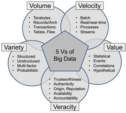
[image:1.595.311.533.447.645.2]In the smart era where advanced smart devices are used in everyday life, big data is utilized in various fields leading to the change of concept in Big Data. Now the term Big Data refers to data that inherits unique meaning and value. In keeping with these trends, recent definition of Big Data is defined as 5V, as illustrated in Figure 1, adding Velocity and Value to the existing 3V(High-Volume, High-Velocity, High-Variety) defined as the core concept of Big Data by IT research institute, Gartner[2].
Figure 1. 5 V’s of Big Data
As the size of the data grows larger, there is a growing interest in the visualization process that makes the analyzed results easier to see, which can be termed as Big Data Infographic.
The Big Data infographic process is based on data reconstruction and semantic
interpretation. In the process
of visualizing the
information structure
Infographic Expression Characteristics for
Effective Visualization of Big Data
Infographic Expression Characteristics for Effective Visualization of Big Data
through various factors, it is very important to balance the visualization function of the data with the aesthetic expression[3]. It is also important to classify, organize and analyze big data, to apply appropriate metaphors, pictograms, diagrams, and convert the design into infographic for effective information delivery.
B. Concepts and Types of Infographic
Infographics is a compound noun that combines information and graphic, which is an abbreviated term for information graphics. Infographics, a sub-concept of information design, provides information that visually expresses complex information, data, and knowledge to make it identifiable at a glance. Information recipient does not read information through infographic but intuitively recognizes the meaning and acquires desired information. This infographic serves as an intuitive communication instrument that allows information recipients to receive unprocessed raw data as converted meaningful information[4].
Infographics helps people to understand a vast amount of information. Therefore, if the visual characteristics and methods of visualization of big data are presented to infographic designers or information providers according to the big data types, it will be useful for implementing infographic that everyone can satisfy. However, distorted or overly visualized infographics regardless of the type or content of the information could be interpreted differently or become inefficient. Therefore, this kind of issues must be give careful consideration.
[image:2.595.304.550.165.485.2]Infographics can be understood as having two main directionality according to the nature of information and the main purpose of graphic as shown in Figure 2. The basic purpose of communicating and converting information visually is the same but it also has a role as a content that creates attractive information by combining the objective as an interface smoothly transferring information with the meaning and metaphors[5].
Figure 1. Two directions of infographic
Previous studies have defined various infographic types according to the way in which infographics are expressed and their perspectives.
Among the infographic types, information message types are classified into 'information type' and 'persuasion type' according to purpose of conveying meaning, and the types as a means of delivering messages is classified as static-motion-interactive infographic. In addition, the types classified according to the contents of expressing the
infographic can be divided into the characteristics of position-time-numerical-connection-function-step.
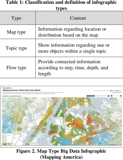
Based on the concept of information as a message that Infographic possesses, this paper classified the types of big data infographic into three types as map type, topic type and flow type according to the information type classification as shown in Table 1[6].
Table 1: Classification and definition of infographic types
Type Content
Map type Information regarding location or distribution based on the map
Topic type Show information regarding one or more objects within a single topic
Flow type
Provide connected information according to step, time, depth, and length
Figure 2. Map Type Big Data Infographic (Mapping America)
[image:2.595.54.282.546.643.2]The Map type big data infographic in Figure 3[7] is an example that illustrates the enormous census data of US all over the country produced by the United States Census Bureau. Infographics in proportional map form is an appropriate format when looking at the overall distribution, and it should be designed so that it can easily grasp the general aspects and tendencies of the contents.
[image:2.595.308.554.600.700.2]International Journal of Innovative Technology and Exploring Engineering (IJITEE) ISSN: 2278-3075, Volume-8 Issue-8S2, June 2019
Figure 4. Topic Type Big Data Infographic (OECD Better Life Index)
Topic type big data infographic drives behavior change beyond information delivery and user understanding. This type consists of interesting elements such as tangibility, exaggeration, unexpectedness, story and entertainment to attract attention[8]. Figure 4 and Figure 5 are Moritz Stefaner's Topic type big data infographic. 'Revisit' in Figure 4 is an infographic showing how certain topics are spread through Twitter in real time. If a search term/keyword is specified, all tweet messages containing the word are arranged in chronological order. The 'OECD Better Life Index' in Figure 5 is an infographic that can visualize and compare factors such as education, housing, and environment in OECD countries. For each of 11 themes for better life, each theme is represented by one flower, one petal represents the score for each topic, and the number of flowers increases if the summed score gets higher[9].
[image:3.595.304.542.370.835.2]Figure 5. Flow Type Big Data Infographic (Growth of newspapers across the United States)
Figure 6. Flow Type Big Data Infographic (A Day in the Life: Women and Men)
Flow type Big Data infographic expresses connected information according to the flow of progress and variation process, time, length and depth. 'Growth of newspapers across the United States'[10] in Figure 6 illustrates the development of newspapers throughout the United States from 1690 to 2011. Each circle represents a newspaper in the city, and the more circles, the more newspapers they represent. Figure 7, 'A Day in the Life: Women and Men'[11], shows the infographic of American Time Use Survey that simulates how the schedules of men and women differ utilizing data from the past two years. Each point represents a person and color code is applied to distinguish gender. Cyan represents female, orange represents male.
III. BIG DATA INFOGRAPHIC EXPRESSION ANALYSIS A. Visualization Wheel Model
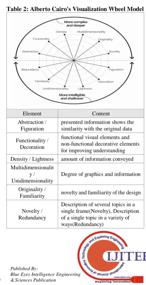
The 'Visualization Wheel Model' presented by Alberto Cairo, an infographic researcher, is based on 12 factors in contraposition representing six different axes of the key elements that need to be balanced when designing infographic. The contents are shown as the 'Alberto Cairo's Visualization Wheel Model'[12] in Table 2. below.
Table 2: Alberto Cairo's Visualization Wheel Model
Element Content
Abstraction / Figuration
presented information shows the similarity with the original data
Functionality / Decoration
functional visual elements and non-functional decorative elements for improving understanding
Density / Lightness amount of information conveyed Multidimensionalit
y / Unidimensionality
Degree of graphics and information
Originality /
Familiarity novelty and familiarity of the design
Novelty / Redundancy
[image:3.595.64.274.457.603.2] [image:3.595.64.274.647.783.2]Infographic Expression Characteristics for Effective Visualization of Big Data
In this paper, we analyze the characteristics of infographic expression by big data type based on the 'Visualization Wheel Model' presented in Table 2 above, and search for effective infographic design direction
B. Big Data Infographic type analysis
[image:4.595.317.538.99.305.2] [image:4.595.64.274.287.485.2]This paper seeks how the degree of consumer perception and preference of big data infographic types changes when they are exposed to each type infographic according to Alberto Cairo's Visualization Wheel Model. 12 example cases were selected consisting four of each infographic type, May, Topic, Flow type, respectively. The subjects of the analysis add up to 30 individuals, including and designers and university students majoring in design. Fig. 8, 9, 10 and Table 3 below summarize the analysis results of three types of analysis cases and 12 cases of big data infographic cases analyzed through 'Visualization Wheel Model'
Figure 8. Map Type Big Data Infographic Analysis result
Figure 9. Topic Type Big Data Infographic Analysis result
Figure 10. Flow Type Big Data Infographic Analysis result
Table 3: Visualization Wheel Model Analysis result
Type Content
Map type
Priority: Functionlity > Figuration > Density > Familiarity > Unidimensionality > Density
Topic type
Priority: Originality > Novelty >
Multidimensionality > Density > Figuration > Functionlity
Flow type Evenly reflect each element with the exception of Redundancy
According to the results of analysis, users who are exposed to the Map type big data infographics think highly of the Functionality and the Figuration of infographic as shown in Figure 8. The map type is composed of information that conveys direct facts or reflects objective statistical values. In order to adequately express such information, it shows rational information-oriented expressions using simple visual elements for improving understanding of information. In the Topic type, Originality and Novelty appear to be important factors for searching information as shown in Figure 9. This result indicates that this type of infographics should be able to describe various topics in a single frame and express the correlation between the information in various ways. Therefore, it is assumed that it is necessary to design a memorable infographic through creative and ingenious expressions that can stimulate the eyes and minds of individuals rather than simply showing statistical data.
Figure 10 shows that the Flow type big data infographic should be composed of each
[image:4.595.63.275.536.733.2]International Journal of Innovative Technology and Exploring Engineering (IJITEE) ISSN: 2278-3075, Volume-8 Issue-8S2, June 2019
type infographic, it is necessary that the elements appropriate to each topic be appropriately applied so that the connection of information is well expressed by abolishing the redundancy. In this type, the data change over time is one of the key factors to be fairly well expressed since it should be able to show the flow of continuous data change
IV. CONCLUSION
What infographics mean is clear. First, infographic should provide functional and accurate information, and second, it should be produced in an attractive and understandable way for information recipients.
In conclusion, this paper suggests the direction and directions for the successful design of big data infographics and the elements of expression, but this is the basis for the strategy of producing infographics. In conclusion, this paper provides analysis results and directions and suggests the important points to be considered when designing successful big data infographic but this can only be a mere fundamentals for producing infographics. Good Big Data Infographics should be designed to effectively deliver the meanings of information and to make it useful, and the basic format and aesthetic design should be expressed in accordance with the to express basic format and aesthetic design according to the intended purpose.
The important thing to understand in infographics is that there is a difference in the perspective of the person making the information and the person receiving it. The things that are taken for granted in the designer's view can be conveyed to people who see infographics in a completely different meaning due to the difference of the recipient's perception and cultural background. In this regard, as Hiroyuki Kimura said, Big Data Infographics can be considered as a design to care someone.
The result of the Big Data infographic expression characteristics, which is derived through case analysis based on the Big Data Type classification conducted in this paper, is expected to be utilized effectively as a basic data that can be used in various industrial fields. In addition, this paper has significance in that it seeks into the visualization method of big data infographic that can be effectively applied considering both the information provider and the recipient facing digital information.
Through future research, we intend to present a direction of big data infographic design that aims to make it more easily and clearly understandable to all users who are exposed to infographics expanding the research field to utilize the results in information design.
REFERENCES
1. Jeong YC, “BigData”, CommunicationBooks, 2013.
2. IBM. Big Data & Analytics Hub [Internet], 2015 [updated 2015 March 19; cited 2019 April 1], Available from: https://www.ibmbigdatahub.com/blog/why-only-one-5-vs-big-data-reall y-matters (website)
3. Julie Steele, Noah Illinsky, “Beautiful Visualization”, Insight, 2012, p.16. 4. Park HJ, “A Study on the Characteristics of Information Visualization System and Expression for Efficient Infographics Design”, A Journal of Brand Design Association of Korea, 2017.
5. Information Forum, “Information Design”, mijinsa, 2012, p.187.
6. Heo JJ. “A Study on Web-based Infographic Layout accordihg to information Type [master's thesis]”, Seoul (MA): Seoul Women’s University, 2018.
7. Mapping America: Every City, Every Block. [Internet], 2010 [updated 2010 December 16; cited 2019 March 21], Available from: https://learning.blogs.nytimes.com/2010/12/16/mapping-our-neighborho ods-mapping-america/ (website)
8. Oh BG, Kang SJ, “TEXTBOOK OF INFORMATION DESIGN”, Angraphics, 2008.
9. TRUTH & BEAUTY [Internet], Available from: https://truth-and-beauty.net/ (website)
10. Growth of newspapers across the United States [Internet], [updated 2011 August 24; cited 2019 March 21], Available from: https://flowingdata.com/2011/08/24/growth-of-newspapers-across-the-u nited-states/ (website)
11. Growth of newspapers across the United States [Internet], [updated 2019 March 6; cited 2019 March 25], Available from: https://flowingdata.com/2019/03/06/women-men-timeuse/ (website) 12. Alberto Cairo, “The Functional Art”, Wikibook, 2013, p.51.
AUTHORS PROFILE
Kyung-il Doo received the Ph.D. degree from Han Yang University, Seoul, in 2008.