Rochester Institute of Technology
RIT Scholar Works
Theses
Thesis/Dissertation Collections
2007
Displacement
Lila Mandzyk
Follow this and additional works at:
http://scholarworks.rit.edu/theses
This Thesis is brought to you for free and open access by the Thesis/Dissertation Collections at RIT Scholar Works. It has been accepted for inclusion
in Theses by an authorized administrator of RIT Scholar Works. For more information, please contact
Recommended Citation
ROCHESTER
INSTITUTE
OF
TECHNOLOGY
A Thesissubmittedto the
Faculty
ofThe
CollegeofImaging
ArtsandSciencesIn
Candidacy
fortheDegreeof MASTEROF
FINE ARTSDISPLACEMENT
by
Lila Mandzyk
Chief Advisor
Tom Lightfoot
Tom R. Lightfoot
Associate Advisor
Alan Singer
Alan Singer
Associate Advisor
Keith Howard
Keith Howard
Date:
Department Chairperson
Don Arday
Don Arday
Date:
5jzf7
I,
L
//a
fJ?a.lJdzr):.
,
hereby grant permission to the Rochester
Institute of Technology to reproduce my print thesis or dissertation in whole or in part
.
Any reproduction will not be for commercial use or profit.
CONTENTS
LIST OF
ILLUSTRATIONS
ACKNOWLEDMENTS
Chapter
1. INTRODUCTION 1
2. ARTIST'S BACKGROUND 3
3.
THE
THEME OF DISPLACEMENT5
4. A PERSONAL JOURNEY 7
5. THE PROCESS 9
6. A PERSONAL SYMBOLISM 18
7. CONCLUSION 40
8. WORKS CITED 43
ILLUSTRATIONS
Figure Page
1. Distant
Motherland
122. Displaced
Water 133. Eureka , 14
4. Portholes 17
5. Pool Focus 18
6. World Upside Down 22
7.
Time
Delay
258. American
Flag
269.
Identity
Crisis28
10. Displaced 30
11. Water Levels 31
12. Displacement 31
13.
Holy
Communion 3414. Black Soil 36
15. Grass
is
Greener 38ACKNOWLEDGMENTS
My
thesisadvisors,TomLightfoot,
Alan
SingerandKeithHoward
My
colleagues,treasuredfriends:
Tatiana, Seung, Tran, Bill, Shan, Erin,
LynnetteandAnne
Nina foralltheencouragement.
Aaronforall
his love.
My
family,
especiallyRoma,
fortheirendlesslove
and support.INTRODUCTION
The
aimofmy
thesis
wasto
create paintingsthat
were meaningfulto
mein
a personal way.What
about meis
unique anddifferent?
Well,
I
amUkrainian
and
it is
abig
part ofmy life.
My family
is really important
to
me soI
decided
to
paint
something
relatedto
my
sense ofgrowing
up
Ukrainian. This
thesis
is
about
the
journey
to
find
myself as aUkrainian-American
artist.I
struggledto
find my
vision and grewup
withaninsatiable
needto
draw
and use color.As
the
present
body
of workdeveloped,
atheme
ofdisplacement
evolved.Displacement is
abroad
term that
I
usein the
sense of a personbeing
displaced from
their
culture andland
of origin asin
my father's
case.Displacement is
also used as aterm
to
describe my feelings
ofgrowing up
displaced
from my
family
language
andculturebecause I
wasgrowing up
in
America
wherebeing
different
is
normalbut
assimilationinto
being
anAmerican
is key.
While
a number of artists whoinfluenced how I
paint,
my
paintingsbegan
using
a personal symbolism asI
created poeticpicturesthat
werefull
of meaning.At
the
sametime
they
were abstract and sometimespuzzling
to the
viewerwithout
any
explanationfrom
me.I'm interested in
how my
paintings,
asabody
ofwork,
look
abstract andseem,
atfirst,
to
be
aboutonly
color and shapebut
become
so much morein depth
and personalandhave
storiesbehind
them
asthey
are explained.I
experimented with pictorial representationsthat
explainmy
childhood.
In
the
future
I
will continueto
enhancemy
vision andthe
relation ofARTIST'S BACKGROUND
My
painting is
aprocessofevolution.As
achild,
I
alwaysloved
to draw.
When I
wasin
aUkrainian nursery
school and wedrew
pictures ofthe
sun onblank
pieces of paper.My
hand
seemedto
flow
withthe
way
ofthe
circle andit
was so natural and
easy for
me andI
couldtell
it
was not soeasy
for
others.I
knew
then,
atthree
orfour,
that
I
had
atalent
for drawing.
I
wascontinually
praised
for my
artworkthroughout
gradeschool.I
learned
to
love
art class andmy
artteachers.
My
parents encouraged meto
pursue art and gave methe
support
to
realizemy
talent.
They
enrolled mein
anArts
Academy
eventhough
my
sisterswereattending Catholic
school.I
started still-lifepainting
whileahigh
school student atthe
Buffalo
Academy
for
Visual
andPerforming
Arts,
a public magnet school whichtrains
students
to
specializein
Art,
Communication
Arts,
Dance,
Theater Arts
orMusic.
As
ahigh
school studentstudying
art,
I
learned
how to
paint with oil and acrylicpaints,
andthen
began to
engagein
printmaking.My
first
printsweredry
point;
gradually
I
learned
moreintaglio
methods.My
paintings evolvedfrom
stilllife to
imaginary
representations.Throughout
my
undergraduate years atthe
University
at
Buffalo,
I
explored collage andpainting
representations offruit,
vases,
pottery,
figures,
portraits,
landscapes
and other academic subjectmatter,
in
a ratherexpressionist manner.
My
use of colorin painting
wasinitially
inspired
through
the
study
ofthe
purposefully
simplecompositions,
reworking
each compositionmany
times,
untilhe
achieveda sense ofbalance.
His
worksare masterpieces ofcolor,
combinedwith shapes and patterns
that
harmonize. "Matisse
refrainedfrom
modulation, to
express
simple,
luminous
areasin
subjectiveequilibrium...He
belonged to
the
Paris group Les
Fauves."(Itten
1970)
I believe
that
because I
studiedMatisse
sointently
I
learned how
to
usecolor.I
usually
get complements onthe
colorchoices
in
my
paintings.In
graduate schoolmy
aim wasto
paintabstractly,
soI
workedfor
afull
yearon
experimenting
with paint.For
the
paint experimentsI
usedrepresentational
themes
I
was comfortable with sothat
contentissues
would notget
in
the
way
ofthe
experimentalfocus
on paint.At
first,
I
paintedfloral
themes
using
a colorful palettewith an ethnicflair. Palettes
can sometimesbe drab
orneutral yet
my
palette was aboutbright
colorsthat
looked like
the
embroidery
ofthe
shirts and skirtsofthe
costumes ofmy Eastern European heritage.
I
splashed paint
around,
purposefully
painting
naiveand simple memories ofthe
landscapes
ofPalestine,
whereI
had just
gone on a pilgrimagethe
yearbefore. I
had
also visitedmy father's
country
that
summerto
visitmy
extendedfamily.
All
the
whileI
was on ajourney
to
find my
voicein
the
abstract realm.Finally
towards the
summermonths,
I discovered
away
ofpainting
in
anabstract
manner,
utilizing
the theme
ofdisplacement.
This
styleandtheme
madeTHE
THEME
OF DISPLACEMENT
In this
abstractbody
of workfor
my
thesis,
I
created a personalsymbolism where
the
canvasis primarily divided into
equalsections;
spaceis
divided
into
partsthat
harmonize
through
symmetry
and color.These
visualimages
of separation andharmonization
represent a symbolicdivision
from
the
mainstream.
My
intention in
this
series of paintingsis to symbolically
representthe
separation of"in
place"people
from "out
ofplace"
people.
"Out
ofplace" or
"displaced"
refers
to those
peoplewho areforcefully
migratedfrom
their
homeland,
and challengedto
live in
placeswherethey
feel
they
don't belong.
The
reasonsfor
their
forced
migration are numerous: politicalpersecution,
political
partition, violence, war,
natural or man-madedisasters,
or economichardship.
I
choseto
explorethe
concept ofdisplaced
people,
because
ofmy
personal experiences
growing
up
withmy
father,
who was animmigrant to the
United States
from Ukraine. After
the
conflicts ofWorld War
II,
he
became
adisplaced
person,
forced
to
leave
his
nativecountry
to
escape communism andthe
Soviet
system.Even
though
he lived in America for
morethen
half
ofhis
life,
my father
immersed himself in
his
homeland's
culturein many
ways.As
I
grewup,
my
father,
azealousUkrainian
patriot, taught
me abouthis
nativeland
andits
rich cultural
traditions.
I
wastaught to
speakmy
parent'slanguage before
evenspeaking
English.
American
traditions
wereconstantly
comparedto
Ukrainian
were
different,
American
children acteddifferently
than
Ukrainian
children would.What
I unequivocally
understood, through
childhoodandinto
adulthood,
wasmy
father's
deep
yearning
to
live in his
motherland,
andthe desire
he
had
for his
children
to
considerthemselves
part ofhis homeland.
Even
though
he
lived
in
aland
that
welcomedhim,
his
profoundfeelings
ofunsettlement,
anddisplacement
from
the
land
that
he
wasforced
from,
deeply
coloredhis
perceptions oflife. I
wonder
how
much ofhis feelings
coloredmy
own perceptions.This
discomfort
is
a
theme
that
I
explorein
my
seriesof paintings.The
conceptof notbelonging
is,
in
asense,
part ofbelonging,
because
weare all
unique,
yet weareallintegrally
relatedto
one another.This
paradoxis
the
reasonI
createdthis
visual symbolism-itis
atruth that
I have
cometo
A
PERSONAL
JOURNEY
Through
introspection,
I
realizedthat
my
chosentheme displacement
wassomething
that
I had been contemplating for
along
time,
starting
asachildgrowing up Ukrainian-American.
Looking
back
onmemories,
I
realizedthat
eventhat
in
the
home I lived
in,
one seemedtransported from
the
oldcity
ofLviv in
Western Ukraine.
In
the
kitchen,
decorated
withicons
and printsdepicting
traditional
villagelife,
my
mother andfather
spokeonly Ukrainian
and cookedethnic
foods:
pyrogies,
borscht,
sauerkrautand sausage and schnitzels.The
entire
home
wasdecorated
withtraditional
embroideredlinens
andbookshelves
filled
withbooks in
the
Ukrainian language.
My
favorite
book
was ahuge
editionof
'The
Kobzar"by
Taras
Shevchenko
whois
the
Ukrainian
hero,
a poet andartist who
lived
in the 1
9thcentury.I drew in the book
withmy
crayons andcovered
the
poetry
andShevchenko
prints withmy four-year-old
scrawl andscribble.
Photographs
of relativesback in
my family's country
were presentin
the
house
as wellbut
only
from
my
mother's side.My
father
saidthat
allhis
photographs
burned
whenthe
German
city
ofDresden
wasbombed
during
World
War II
andmy father's
apartment wasburned
down.
He lived
there
during
the
war
to
escapethe
worse situationin
the
country
ofhis
birthplace.
There
he
studied medicine and
eventually became
adoctor in
America
after notknowing
where
to
go afterthe
war.He
did
not wantto
marry
aGerman
woman andbecome
aGerman
citizenbecause he
wantedto
marry
a womanfrom his
8
Ukrainian AM
radiobroadcasts
from
Buffalo
andToronto,
andmy
motherwouldsometimes
dance
afast
polkain
the
kitchen,
if
the
mood struckher.
I
wasenveloped with a warm
blanket
ofUkrainian
culture andfamily
throughout
childhood.
The backyard
of ourhome
resembled afamily
farm,
ratherthan
anormal,
American city backyard: it
wasfilled
with anenormousvegetable andfruit
garden,
featuring
a widerangeofofferingsfrom
the
standardcucumbers,
tomatoes
andbeets
offerings,
to the
moreexotic,
such ashorseradish,
plums,
red currants and gooseberries.
Every
morning in
the
summertime I
wouldgoto
the
gardento
play
onthe
swing
set andtalk to
my
father
as we wateredthe
plants and
fruit
trees.
My
father
missedUkraine.
This
was apparentto
me,
even as a child.Back
then,
I
wouldtell
him
that
the
spring
weatherin Buffalo
wasbeautiful,
andmy father's
response wouldbe
that
it
did
not even compareto the
beautiful early
spring
ofhis beloved
motherland.Nothing
comparedto the
Ukrainian
culture, the
language,
the
weather-everything
there
wasbetter.
I
longed
to
gothere
andmake
this
comparisonmyself,
and sodid my
father.
We had
this
opportunity
to
visit
together
in
1997.
Seeing
the
village wherehe
grewup,
unchangedin many
aspects,
led
meto
understandhim
muchbetter.
In
fact,
my father's
dying
wishwas
to
returnto
his land
of originfor
onelast
time. I
have
visitedmy family's
homeland
atotal
offour
times in
my
lifetime,
andthough
it is
notmy
birthplace,
it
THE
PROCESS
By
experimenting
withshape,
composition and color combinationsin my
series
"Displacement,"
I abstractly illustrate
the
boundaries
and sense ofdiscomfort
faced
by
displaced
people.I
create visual representations ofdisplacement
andboundary
layers
of waterby
using
simplehalf
circles,
frames
and
borders in my
paintings.Contained
enclosuresare representedby
negativesections of
color,
placed underneath and surroundedby
frames
andborders.
My
work
has
content,
yetthe
subjectis
abstractedinto painterly
relationships withshape,
space and color.I
choseto
depart from
representation,
andin its
place,
distort
the
subject mattertoward
my
own notion ofreality,
ratherthan
to that
perceived
through
regular vision.The Color Field
painters,
whomade abstract workby
using
formal
devices,
are of greatinterest
andinspiration to
me.In
some waysColor Field
painting inspires my
artwork."Most
obviousamong
the
sharedformal
characteristicsof
this
painting is its
emphasis on color-on relationships ofhue
and saturation rather
than
valuedifferences- asthe
chiefdeterminant
of pictorialorganization.
As
acorollary,
it has
evolved atypical
pictorialstructure,
whichexhibits a
tenuous, pulsating flatness
and astrong
bent toward
aunitary
effectasopposed
to
ahierarchical
or relational arrangement ofdiscreet
parts.It has
arrived at abstractness more radical
than
that
ofany
artbefore
it,
imageless
and10
formalism
andturns
outto
be
much moredecorative.
Form-especially
color-is
conceivedof as
the
vehicle offeeling:
feeling
andform
are one".(Colt
1970)
In
my
paintingsthree-dimensional
spaceis
flattened
out andthere
is
a shallowpicture
frame.
Mark
Rothko,
the
abstract artistknown
as aColor-Field
painter,
interests
me
because
space,
luminosity
and colorarethe
primary
considerationsin his
work.
My
workexplores similar compositionformat
considerations and abstractedquality
that
Rothko
pioneered.In 1949
Rothko developed
a simple and effectiveformat that
he
woulduseto
paint picturesfor
the
rest ofhis life
-afull
twenty
years.
Rothko's
signatureimage,
soto
speak,
consisted ofbroad
rectangularshapes placed one above
the
otherin
atall
and massive stack.This
starkandsimple
format
supported anoutstanding
andmonumentalbody
ofwork,
paintingswhich elicit rapt
attention,
deep
emotion,
even awe".(Chave
1983)
I
amenthralledwith
how his
canvases aredivided into
two
halves,
withan upper andlower
portion and colorsframed
withresonating,
accentuating
colors.His
colorsare
harmonious
andleave
a spiritualimpression. I
wouldhope
that
my
workreflects
his,
sinceI
admireit
so much.His
canvases are muchlarger
than
minebut the
idea
ofdividing
the
canvasis
the same,
andsois
the
overallabstractlook
of
the
pieces.Rothko's blocks
of color seemto
float
onthe
background
colorlike
cloudsor auras.
In his
paintingsthe
coloris
applied withbrushstrokes
that
cannot
be
seen andthere
arenovisible edges.In contrast,
my
paintings11
Rothko has
saidthat
his
paintingscanbe described
as"facades"
because
they
tell
little. His
paintings are aboutsubjectsbut he did
not"tell
all".My
subjectcouldbe
anarchetypalimage
that
I
achievedthrough
automatism.
Carl
Jung,
agreat psychologist coinedthe
term
archetype as anidea
that
is
presentin the
unconsciousof anindividual
andis
derived
from
the
experience of
the
race.Automatism is
aterm
coinedby
Andre
Breton,
one ofthe
first
Surrealists,
whodescribes
a method ofworking from
the
unconsciousto
arrive at
imagery.
Many
Abstract
Expressionists,
like
Rothko
usedthis working
method.
In
doing
a series of work relatedto
symbols,
repetition might makethe
image
archetypal or atleast
symbolic.Jung
wrote"The
living
symbol shapesand
formulates
an essential unconsciousfactor,
andthe
moregenerally
this
factor
prevails,
the
more generalis
operation ofthe
symbol;
for in every
soulit
touches
a chord".(Arnason
1982)
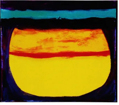
My
thesis
seriesbegan in
the
studio with a smallpainting
that
wasreminiscent of a sunset
(figure
1
).
I
paintedthe
background
yellowthen
contained
the
yellowin
aframe
ofmurky
purple.Above
the
yellowI
placed redand
then
bands
ofturquoise
and other colors abovethe
vessel shape.It
waslike
a porthole
to
a sunset onthe water,
and as soon asI
paintedit
I knew this
wasthe direction
my
thesis
wasgoing
in.
It
seemedthat
the
water wasin
a vesseland
that it
wasin
the
process of movement eitherdown
or up.When something
is
placedin
water,
the
water aroundit
is naturally displaced. This is Archimedes
12
noticing
that the bath
water wasdisplaced
in the
publicbaths. Archimedes
wasthinking
along
the
samelines
asNewton. He
wasthinking
aboutthe
physicalworld we
live
in. Instead
ofgravity he
wasthinking
about waterdisplacement.
The
porthole or cavelike
entranceis
a view ontothe
water.This
is
a perfectmetaphor
for my father's displacement. After
this
painting I
paintedthree
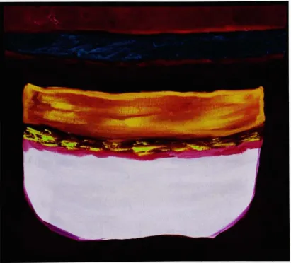
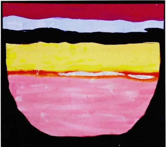
moreFigure
1:
Distant
Motherland
the
same size(figures
2
and3)
withdifferent
colorharmonies
andmy idea
wason
its
way.The
color valuesin
the
painting
achieved atactile
quality.There is
a [image:19.537.53.440.202.543.2]13
bright
and warmthat
it
seemsto
advancewhilethe darker
and cooler color ofmurky
purple recedes.I
exploitedthe
propertiesof colorsin
allthe
workswherethere
is
a sense ofcoming forward
andgoing back
to
express a sense of space.The
proportions ofthe
shapeslend
to
the
composition a sense of space as well.The
yellow,
or colorin
the
centeris
prominent,
whilethe
purpleis
onthe
edgeFigure
2:
Displaced
Water
and
only
frames
the
vessel.The fluid
in
the
vesselis
being
displaced
by
the
[image:20.537.45.457.195.567.2]14
top
horizontal
portion ofthe container,
or sothat
is
the illusion. Like the
displaced
waterin
the painting,
people aredisplaced
by
circumstancesbeyond
their
control.People
aredisplaced like
the
yellowfluid
atthe
bottom
ofthe
vessel.
They
arebrought
to
ahigher level
asthe
water aroundthem
risesdue
to
the
painting
being
placedlike
a portholein
the
water.The
organically
shapedpurple
frame is like
awindow of a cave entranceto
a view ofahorizon.
The
water
is moving
suggestedby
the
wavy lines
atthe
top
yet atthe
sametime
pressurized
by
the
weightofthe
heavy
bands
ofcolorsaboveit. The
apparentsimplicity
ofdesign
repeatsitself in
all ofmy
workin
this
series.I
studiedJosef
Albers
during
my first
year of graduate school andreally
enjoyed
reading
abouthis
colortheory.
He
ascertainedthat
color changesdepending
onthe
colorplaced nextto
it. He demonstrated
how
many
platesofcolor change when another color
is
placed adjacentto
it. For
example a yellowsquare ofcolor would change
its hue if it
were placed adjacentto
the
colorwhite,
Figure
3:
[image:21.537.117.396.453.700.2]15
compared
to
its
placement nextto the color,
black. He
was aware ofthe
interdependence
of color withform
and placement.He
demonstrated
through
many
examples of various patches of colorin
many
combinationsthat
basically
"no
normaleye,
not eventhe
mosttrained one,
is foolproof
against colordeception. He
who claimsto
see colorsindependent
oftheir
illusionary
changesfools only
himself,
and no oneelse."(Albers
1963)
He
demonstrated
the
reasonwhy
we are allfooled
by
our eyesin
regardto
colorby
showing
examples ofthe
effectsof after-images of colors.
He
alsoshowsexamples ofhow two different
colors can
look
the
samedepending
on what colors are placed aroundthem.
Albers'
color
theory
changedmy
thoughts
aboutcolor,
andinfluenced
my
juxtaposition
of colorsin
my painting
series.I
alsodeeply
appreciatedhow
Albers'
paintings are simplified squaresand use rich colors
in
layers.
I
startedusing flat
sections of color with compartments andborders,
resembling
Albers
color
theory
compositions(figure
4).
Using
bands
andspheresof colorjuxtaposed
withalternating
colors withhard
edgesin
my
paintingsI
comparedcolors not
based
ontheories
and examples ofinteractions
of colorbut
according
to
my
own sense ofharmony.
Harmony
in
painting is very
subjectivehowever
there
are objective considerationsthat
canbe learned like combining
complementary
colors orcreating
compositions withsecondary
colors."Color
effects are
in
the
eye ofthe
beholder.
Yet the
deepest
andtruest
secretsof coloreffect
are,
I
know,
invisible
evento
the eye,
and arebeheld
by
the
heart
alone.The
essential eludes conceptualformation."
16
quarters
full
circles withdifferent
colorharmonies
andlayers
to
expressJosef
Alber's belief
in
his
colortheory,
atheory
he
expressedin
some ofhis
poetry:When
I
paint and constructI
try
to
develop
visual articulationI
do
notthink then
-about abstraction
And just
aslittle
-about expression
I
do
notlook for
isms
And
not atmomentary
fashion
I
seeThat
artessentially
is
purposeAnd seeing
(schauen)
That form demands
Multiple
presentationManifold
performanceI
do
notseeThat
forced
individualism
Or
forced
exaltationare
the
sourceOf
convincing formulation
Of
lasting
meaning
In
my
own work17
With
myselfAnd
to
search with simple paletteAnd
with simple colorFor
manifoldinstrumentation
So
I
dare
further
variants [image:24.537.73.368.207.643.2]A PERSONAL
SYMBOLISM
Using
squares andhorizontal bands
ofcolor,
my painting "Pool
Focus"(figure
5)
couldbe
anhomage
to
Josef
Albers'painting "Homage
to the
Square."
Pi^HHHIHHBBnHIHHBi^^MM
1
:;!
tr^ssijc
-y&n. i
I
[image:25.537.101.414.165.623.2]j
1
Figure 5:
Pool
Focus
19
The
most prevalent colorin
the
painting
is
the
mint-green squaresymbolizing
apool of water.
Above it lays
ahorizontal,
thick
band
oforange, then thinner pink,
and
dark
greenbands. The
top
partofmy painting is
reminiscentofAlbers
because
he
usesbands
of colorthat
surround otherlarger
shapes.They
arelike
boundaries
that
separateyet still connectdifferent
colors.A
comparisonis
madebetween
the
top
half
andbottom half.
In
"Pool
Focus"the
sereneCalifornia
poolsignifies
the
potentialhuman
genepool,
acrossboundaries
of countries.This
tranquil,
pleasantpainting
uses colorharmonies,
aswell as compositionalelements
to
convey
ahalcyon
setting.In
my painting
the
vieweris
invited
into
the
scene as
the
viewbecomes
morein focus. The
top
half
ofthe
painting
aregeometric shapes
that
suggest a scene whilethe
vieweris led
to
recognize arepresentation ofapool on
the
bottom half
ofthe
canvas whichis
madefrom
the
samegeometric shapes.
On
the
bottom
ofthe
canvasthe
shapes arein
focus
and
the details form
a pool with orange glasstiles,
and a greenhedge
lining
apinkwall.
The
poolinvites
all of usin
as we mergetogether
as a united peoplewhoeventually may
notbe
ofany
ethnicity
or color.They
say
that
languages
aredisappearing
eachyear; perhaps,
different
ethnicities aredisappearing
each yearas well.
Someday
wemay
allbe
the
same mixed race andethnicity
and speakthe
samelanguage.
The
poolis
beautiful
andtropically
coloredlike
awonderful20
depending
onthe
parent's characteristics.It may someday be
athing
ofthe
pastto
have
a certainethnicity
ordifferent
heritage
from
everyone else.I have
oliveskin with
dark
hair
andbrown
eyes.I have
a roundEastern
European
face
withEastern European features like
asmall pointed nose andthin
lips. Each
country
in
Europe has its
ownlook. In Scandinavian
countriesthe
gene pool makes oneblonde,
blue
eyed andtall
generally.It
was aterrible
mistaketo
try
to
create anideal
racethat
wasArian in
the
days
ofWWII. Differences
existin
peoplefrom
allcountries and no people are superior
to
any
other.However if someday
differences in
peoplearelessened occurring naturally
overmany
ages, then
stereo-types and prejudices
may disappear
as well.In
my painting
the
poolis
paintedin
colorsthat
look
like
warm weathercolors
for
walls around pools.For
this
painting I
used alot
offantasy
anddreaming
to
comeup
with a paradise pool picture.I feel
that
it is
astrong
piecein
that
the
abstractionofthe
shapesandthe
color are wellbalanced. To
create"Pool
Focus," aswellasfor
most ofmy
compositions,
I
referredto
abook
oncolor
harmony.
It
showeddifferent
colorharmonies
which,
whencombined,
conveyed
moods, ethnicity,
orintense
expressions.I
utilizedColor-aid (Color Aid
Corp
1
989)
cards,
to
createjust
the
rightshade,
tint,
ormixtureof certaincolorsthat
were not available straight out ofthe tube,
i
usedmy book
on colorharmony
and
my Color-aid
cardsfor
almost allmy
paintings.Sometimes just
finding
the
right color
harmony
wouldbe
the
beginning
ofapainting.In
the
book
that
was21
pleasant,
others would representcertain ethnicitiesand others still wouldbe
moody.
The book
on colorharmony
is
entitled'Designer's
Guide
To Color
5" andin it
strength canbe depicted
by
incorporating
afew
colorsthat
arebold
andgraphic and
using
colorschemes ofcontrasting
hues. In my painting
"Pool
Focus"
I
usethe
colorbright
pink."Pink is
essentialbecause
it is
the
symbol ofhappiness.
It is
the
main colorfor
the
expression of pleasantness.With
respectto
the
image
associatedwith eachcolor,
orangeis merry
androbust."
(Ikuyoshi
and
Takahashi
1991)
I
pickedthe
colorsthat
suited me.Having
readWassily
Kandinsky's
book
entitled"Concerning
The Spiritual
In
Art",
I
picked colorsthat
were representative of certain realities.
"Kandinsky
began
painting
non-objectivepictures about
1
908.
He
contendedthat
every
colorhas its
proper expressionalvalue,
andthat
it is
therefore
possibleto
create meaningful realities withoutrepresenting
objects."
(Itten
1970)
I
usedthis
approachin
all ofmy
paintingsaswell.
There is
aconstructive effortin
painting,
andaccording
to
Kandinsky,
my
compositionsare melodic.
He
statesthat
there
is
whathe
refersto
as a"simple
composition,
whichis
regulatedaccording
to
an obvious and simpleform."(Kandinsky
1977)
In my
paintingsthe
simpleform
ofthe
vessels withthe
bands
all created with certain
harmonizing
colors causeit
to
be
melodicbecause it is
asimple composition.
In
general,
I
avoidedusing
the
colorblack
directly
from
atube,
asin
the
tradition
ofthe
Impressionists,
whowould recreatethe
colorusing
dark
blue,
brown
and purple.Kandinsky
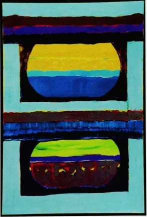
saidthat
black has its
own properties of22
I
usedblack
tube-paint
ononly
onepainting
(figure
6)
to
create a senseofouterspace.
This painting
reflected a mathematical approachto
the
containmentseries as
it looks like
achalkboardfrom
childhood math class.I
decided
that the
circleswere
very
geometricbut I had
not representedthis
facet
ofthe
sphere yet.Circles
were partofthe
math welearn in high
schoolin geometry
class.They
are universal and
every
student mustlearn
that there
are360 degrees
andthat
half
is
180
degrees.
In Ukraine
the
mathematical subjects aretaught
and [image:29.537.37.485.292.530.2]encouraged more
than the
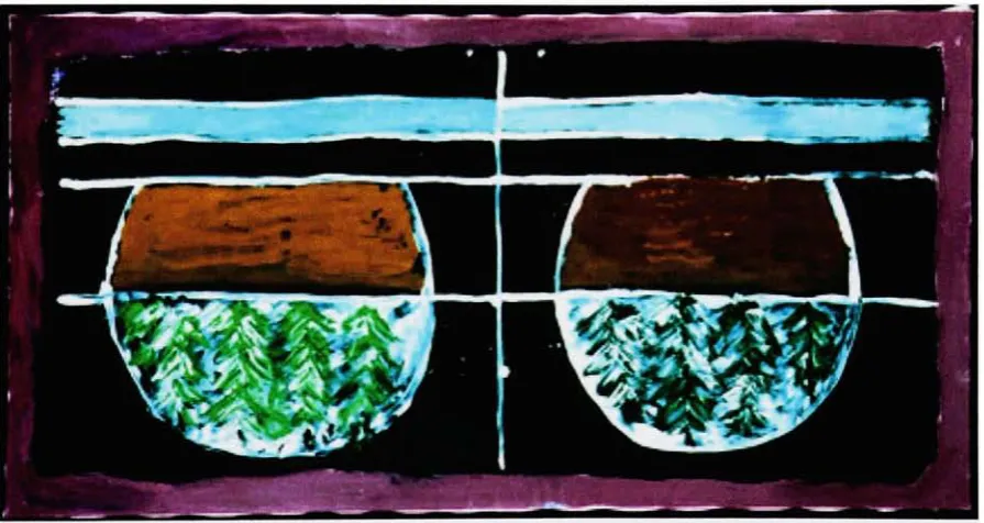
arts.Figure 6: World Upside Down
Everyday
onthe
way
to
class,
I
passed evergreentrees
and appreciatedthe
way
the
sunlight would sit ontheir
branches.
As
a resultI decided
to
add23
express aview of
the
world upside-down.They
symbolizedthe
never-dying love
for
adistant
motherlandthat
I
live
with,
inherited from my
father.
In
Ukraine
there
are
many
forests
andmany
evergreentrees.
When
I
was ayoung
girlgoing
to
Plast camp
that
is like Girl Scout camp for
Ukrainians,
I
would seelarge
evergreens
in
the
forests
aroundthe
camp.There
was oneforest
that
smelledgreatand
had
a carpet of pineneedlesonthe
groundthat
I loved
to
play in.
In my painting
the
brown
abovethe trees
buries
them
andit
seemsthat
the
worldis
upsidedown
but
it is simply
a personal symbol.When
oneis
displaced it
seemslike
the
worldis
upsidedown because nothing
is familiar.
Things
aredifferent in
Ukraine from America. The
cars aredifferent because
they
are small and compact andhave
old-timestyling.The
streets arecobblestone and
twist
all aroundthe
oldcity
where streetcar railstwist
in
alldirections along
side.On
Sundays
there
areonly
people andstreetcars,
no carsare allowed.
Coffee
shops serveTurkish
coffeethat
is strong
anddark
withthe
grounds on
the bottom.
The
shops arefar from
modern.The buildings
are allolder,
some evenfrom
the
1
5thcentury.
The
architectureis very beautiful
andthe
colors ofthe
buildings
arevery
natural.How different
Buffalo
andRochester
are
to
Lviv,
Ukraine. When
he
wasin his
birthplace,
my father
told
peoplethat
the
streetsin
the
U.S.
were so smooththey
seem made of glass.How different
from the
potholefilled
one-lanehighways
they
have
in
my father's homeland.
The bathrooms in
the
reststopshad
just
ahole
in
the
floor. How different from
24
here in America. Ukraine is
called"the
oldcountry"and
it
truly
is
behind in
somany
ways.Things
that
wetake
for
grantedin
western countries aretaken
asluxuries like indoor bathrooms. Life is different in
the
villages.People
maketheir
own
food from
milktaken
from
the
cowsin
the
morning
and growtheir
own wheatto
makebread.
Life
wasreally
upsidedown for my father
whenhe
cameto
live
in
this
country
as animmigrant from
afaraway,
in
time
and place country."Time
Delay"compares
the
same scene overtime.
The
top
ofthe
composition
is
the
"before"section,
andthe
bottom
section,
separatedby
horizontal
bands,
representsthe
"after"withtime
elapsed.In
the
top
image,
"the
before",
I
visually
represent animage
of adesolate,
stilllake.
On
the bottom
ofthe
canvas,
"the
after"
a settlement ofcamps
is
symbolizedby
triangular
refugetents
onthe
bank
ofthe
lake.
On
the
lake,
there
is
commotion with movementsymbolized
by
squiggles ofthrown
paintacrossthe
nowun-calmlake.
This
painting demonstrates
how
people whohave
movedandbeen displaced into
aregion make new settlements albeit
temporary.
This painting
relatesto
allforced
migrants, but
is influenced
by
those
displaced
because
of warandviolence.In "Time
Delay"(figure
7)
my
colorchoices areinspired
by
the
landscapes
ofthe
southwestern
United
States,
withthe intense
turquoise,
country
blues,
coral andwhite colors.
The
use ofthis
southwestern palette wasintentional,
paying
homage
to the
settlement of pioneersinto
the
Great Frontier
ofthe
This
migrationof
foreigners
to
the
southwestis
notmerely
afact
ofhistory:
today,
new25
like
Phoenix,
Arizona
andLas
Vegas, Nevada,
wherethey
settlein
search ofthe
[image:32.537.124.390.101.548.2]American dream.
Figure 7: Time
Delay
In
my
series,
I
alsoincluded
auniquely American
type
offlag
painting
(figure
8)
that
I
felt
compelledto
paint afterthe
tragedy
of9/1 1
during
2001
.This
26
the
quarter.Professor Alan Singer
wasconducting
aclassin
the basement
ofRIT;
he left
the
classroomto
goto the
library
to
get another projectorfor
slides.When he
cameback,
he
told
the
classthat the
World Trade Center had just
been
struck
by
an airplane.It
was soshocking
to
all of usthat
no onesaidanything;
there
was complete silenceas welooked
at each otherin
amazementandhorror.
I
don't
remember much aboutthe
slidesthat
wewere shownthat morning,
[image:33.537.42.455.247.612.2]27
because
I
washorrified. After
the
classI
went upstairs and walked around andtalked to
people aboutwhathappened.
I
skippedpainting for
that
day,
and wenthome
to
sitmesmerizedbefore
the surreal,
live
television
coverage.I
prayedfor
people
that
werekilled
andinjured,
andhoped
that
the
catastrophe would notdamage many lives.
Afterward,
in
my
studio, in the
days
that
followed,
putting
aside
the
politicalissues
ofAmerican involvement
with oil andthe Middle
East,
I
thought
abouthow
proud,
andlucky
I
wasto
be
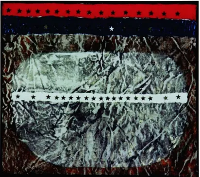
anAmerican. The
9/1
1 tragedies
brought
my
identity
questionsto
the
forefront.
The painting
I
wasinspired to
createwas
overtly
patriotic,
and relatesto
my
generaltheme,
andthe
conflictofidentity
that
I
feel
as aUkrainian-American.
In
the painting,
the
vessel underthe horizontal
bands
of red with silverstars was
dyed using
atechnique
similarto
stonewashing denim. I
usedUkrainian
pysanky
(Easter egg)
dye
to
colorthe canvas,
whichis
atechnique
similar
to batik.
[I
also usedpysanky dye
for
staining
the
waterin
'Time
Delay."]
Staining
is
atechnique that
is
notnewto
artists:many Color-Field
artistsemployed
this
technique to
achievetheir
desired
results.The
colorsI
used werered,
whiteandblue
andthe
stars ofthe American
flag
werestuckinto
woodblock
oil,
as an adhesive.My
finished
canvaslooked
andfelt
asAmerican
to
me as anold,
broken-in
pair ofLevi
blue
jeans.
The painting
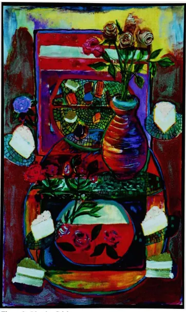
"Identity
Crisis"(figure
9)
in the
series continuesonthe
theme
ofidentity
anddisplacement
by
exploring
the
conceptofquestioning
28
29
some sort.
The broken
vessels and vasesthat
are gluedback
together
signifying
the
fragility
of notknowing
whoyou are.For
me, the
vase andmyself,
arepiecedand glued
together:
I
amAmerican just like every
otherAmerican. After
the
World Trade
Center
tragedy,
I
noticed a commercialplaying
ontelevision,
depicting
adiverse group
ofpeopleproudly declaring: "I'm
American."I
wondered
if I
belonged
in
that
group: wouldI
be
compelledto
proudly
say:"I'm
American?"
The flowers depicted
in this
piece arethree-dimensional
and were createdby
twisting
canvas,
affixing
glue onto cotton rolls andpainting
them
with acrylicpaint.
The
cakes onthe
plates are pieces ofthe
American
piebeing
divided
andready
to
serveondishes
madeup
of shatteredidentities.
The candy
floating
around signifies
the
abundancefound
in America.
The background
ofthe
painting is
a vessel shaped outline.Everything
in
the
painting
is
floating
aroundin
a state of confusion.
I
tried to
recreatethe
feeling
ofbeing
achild,
feeling
confused about
identity.
Printmaking
is
animportant
componentto this
series.The
printsbecame
reflections of
the
paintingsin
my
series.At
first many
ofmy
printsinvolved
tree
themes.
But
soon,
I
startedusing
wash withtoner
to
achievelarge
splashesthat
looked like
paintbut
wasactually
toner
mixed with chemicalsto
create vessel-likeshapes
that
werespontaneous.I
placedthem
one ontop
ofanother,
andI
wasexcited
to
seethat
they
relatedto
my
paintings.While my
paintings relateto
30
Figure 10:
Displaced
(figures
10,
1 1
and13).
As
awholeI
can seehow the
Abstract
Expressionist
movement and
the
professorsI have
had
overthe
yearswho grewfrom
outofthat
tradition
influence my
work.I
really
enjoyedthe
process ofprintmaking
and31
32
prints
in black
and white.I
alsotinted the
black
withblue
and addedtouches
of colorfor
some.When I
putup my
thesis
showI
purposefully
created a vessellike
shapewiththe
wallsofthe
gallery
aroundmy
work.I
putup
the
printsonthe
outside of
the
space andthen
filled
the
inside
withmy
paintingsreflecting
the
symbol ofthe
vessel.The
vesselsin the
printsare organicshapes,
similarto
cauldrons orcontainers,
perhaps evenbowls. Vases
arefeminine
symbols,
used sinceantiquity
to
hold food
or mixtures of wine and water.These
practical,
utilitarianforms
were madeofclay,
ceramic, metal,
bronze,
orother materials.These
sphereshold
spaces which areempty
wereit
notfor
the
color or washes of paintthat
givethem
stability
and reassurance.The
vaseis
a symbolI
usedto
hold
the
fluid
that
is
displaced.
My
half
circles arelike
vesselsfrom antiquity
that
hold
waterexceptthat
they
are seethrough.
The
cauldronsthat
areactually
half
circles show
the
containmentpossibleonly
withthe
ancientsymbol ofthe
vase or vessel.The
containmentofliquid
that
is
being
displaced
possibleonly
with avessel
type
of utilitarian objectis my
centraltheme.
"Vessels
are nottransparent
windowsinto
the
past,
but
membranesthat
expresstheir
own properties and qualities.For
the
artist,
historical
pots are acontemporary
reservoirofinspiration.
They
enlargethe vocabulary
of a common ceramiclanguage
and enable new methods of combination andcommunication."
(Frederick
and33
Displacement is
adifficult
thing
to
showin
painting,
like
trying
to
showtime,
because it
is
an action and most paintingsare aboutasubject not anaction.
The only way it
waspossibleto
showdisplacement
wasthrough
anabstract,
painterly language
where water can standup
onits
ownbetween
aframe
andenclosure,
bands
ofcolors canlayer
upon each otherto
create asense of movement.
Since
the
vesselsaresee-throughthey
are notdecorated.
Decorated
vaseshave
along
tradition that
each culturethroughout the
agesused
to
signify
their
own story.Perhaps in
the
future my
vessels will alsobe
decorated. If
they
weredecorated
they
wouldprobably be
decorated like
the
ancientpots of
the
Cucuteni
culture ofWestern
Ukraine
from
antiquity.In
the
Cucuteni
culturethe
vases weredecorated
withthe
rain/watertheme that
is
associated with
the beak
and eyes ofthe
Cucuteni Goddess
withbroad bands
ofparallel
lines
painted overthe
neck and shoulders.(Gimbutas
1989)
I believe
that
the
spaces wherethe
bands
of color arein
my
paintings are perfectplacesfor the
symbolsofthe
spirals and crescents reminiscent ofthe
Cucuteni
culture.The bands
arealready
atype
ofdecoration in
the
scheme ofthe
abstract,
painterly,
symboliclanguage.
They
are usefulto
indicate
separation anddivide
the
space as a symbol of weightthat
is
usedto displace liquid.
I
canseehow in
future
paintingsthe
spirals and circles and crescents and eventhe
animals usedin
the
oldUkrainian
culture ofCucuteni
canbe
used asdecoration.
Other
symbols
I
might usefrom
the
Cucuteni include zigzag
patternsthat
areprobably
34
Figure 13:
Holy
Communion
Spiritual
renewalis
yet anotherimportant
theme
in my
images:
Ukrainians
are
very
religiouspeople,
withCatholicism
being heavily
relatedto
patriotism.For
the
painting,
"Communion"(figure
13),
I
studiedthe
bowl-like
fountains
at35
about
the
Catholic
andUkrainian-Catholic
practiceoftaking
Holy
Communion.
In
the
painting
there
is
a magentabowl
atthe
top,
suspendedin
anaura of mist.Magenta
asa coloris
utilizedto
symbolizethe
"blood
ofChrist."
On
the
bottom
half
ofthe painting,
there
is
amisty
areadepicting
abowl
that
is
ashellof acontainer,
representing
the
"body
ofChrist."The painting is
aboutthe
spiritualrenewal,
or rebirththat
happens
whenhuman
sins are cleansedaway
by
the
riteof
Holy
Communion. The
vessel ontop
ofthe
painting holds
wine,
andthe
light
above
the
container representsthe
holy
light
of renewal.The
soulis
representedunder
the
vessel asa cleansed soul with somestains,
but
washed anew withforgiveness,
whichCatholics
believe
is bestowed
onthem
afterthe
rites ofHoly
Communion.
For
my
thesis
show,
I
createdalarge painting (figure
14),
taking
two
partsof
the
vessels andmaking
them
into
anhourglass.
The painting
exploresthe
concept of
time
andhow
it
runslike
water.Time
was,
andis,
a continual concernof mine.
A
spiritual renewal or rebirthis
evidentin
this
painting
through the
growth of
flowers in
the
colorbands
and withinthe
purple color area.The
purplecolor refers
to the
spring-thetime
of renewal.For
myself,
personally,
a rebirth orreawakening inside
the
mind andbody
leads
meto
care about peopleandplaces.
Sedimentary
layers
ofsand, clay, grit,
dirt,
and"black
soil"
rich with
nutrients are
the
same asthe
bands
acrossthe
vesselslike
in the
earlierpaintings.
The
"black
soil"
36
Figure
14: Black
Soil
the
soilin
Ukraine
where"black
soil"is actually
the term
usedto
describe
the
richearth
there.
Ukraine is
known
asthe
breadbasket
ofEurope because
ofthe
[image:43.537.93.419.45.535.2]37
splendor of
the harvest
andits
economic profitfrom
wheatin naturally
richcountry is
neverfully
realizedbecause
the
people are so poorthere that
the
machinery
usedto
harvest
the
crops areold andbarely
work.No
matterhow
much wheat
is
plantedthere
is
notenoughtechnology
to
harvest the
plentifulcrop
properly.In 1932-33
there
was a"terror-famine"whichthe
Stalinist State
inflicted
onthe
collectivizedUkrainian
peasantsby
taking
away
allthe
food
andhelp,
starving
millions.It
was aforced
starvationthat
would notnaturally
occurin
such a
fertile land
asUkraine. The
painting'simage is
asymbolfor
a sense ofdisplacement
of growth and renewalin
aplace wherethat
may
notbe
possible.In
this
workI
referto
alandscape
withlayers
of earthshowing
growthandpotential
but
perhapsstifled,
showing
asenseofdisplacement from
ordinary
growth.
The
black
soilis
rich withflowers
andthe
sky is blue
andeverything
seems
ideal
for
growthbut the
sceneis
encapsulatedin
a container withtwo
parts where
it
seemsto
be
analyzed andsectioned.The Spring-like
colorstell
ofthe
rebirthof earth andits
readinessfor
growth.However the
colorgreen,
usually symbolizing
growth,
is
absent.The painting
entitled"The
Grass is
Greener
onthe
Other
Side"(figure
15)
is
abouthow
adisplaced
kid
(me)
feels growing up
in
anAmerican
world whereit
seems
that the typical
American
family
is
the
ideal.
As
a child ofimmigrants,
I
always
felt
that
my
family
wasthe
exception notthe
norm.Most
childrenjust
want
to
be
normalandfit
in.
As
ayouthI
alwaysfelt different
andcompared38
Figure
15:
Grass
is Greener
families
atetypical
American
food
and watchedcartoons onSaturday
mornings [image:45.537.97.397.47.564.2]39
always
thought
how the
grass mustbe
greeneronthe American
side.American
kids
seemto
have
it
so muchbetter.
Now in my
later
ageI
cherishmy
background it's
memories andthe
fact
that
I have
aheritage
and can speakthe
language.
These
things
give mea senseofbelonging
to
agreaterwholeknown
asthe
Ukrainian
Diaspora,
agroup
of peoplewhoI
see atchurch, picnics,
andother events
I
try
to
attend.As
agrown-up,
a person realizesthese things
not asa child.
As
a grownup,
I
can seehow
this
identity
has
an advantageespecially
as an artist who can show
in Ukrainian
galleries.This painting
wasdone in
acrylic yet
it
seemslike
a watercolorpainting because
ofthe
thin
washes of paint.The
colors are also spring-like.Here
there
is
asense of comparison ofcourse,
between the
two
halves
ofthe
picture composition.Among
the
variousCONCLUSION
Much
has happened in Ukraine
sincethe
beginning
ofmy
thesis.
Yuschenko
was elected presidentafter anOrange
Revolution
andthere
have
been
protests aboutthe
election.Much
has happened
but unfortunately
muchhas
stayedthe
same.Ukraine is
still avery
poorcountry,
athird
worldeconomy
in
fact.
It
is
still not part ofthe
European Union
eventhough talks
are underway.I
visitedmy family's homeland
againandit
wasavery
lovely
visit.I
wentto
Eastern Ukraine for
the
blessing
of a cathedralin
Donetsk.
I
stayed withthe
Bishop
there
and metCardinal Hussar.
I
alsoflew to the
westernregion andvisited
my family.
I
hope
to
returnthere
someday
soonto
getmoreinspiration
for
my
art andhave
anotherlovely
visit withmy family.
I hope
to take
many
photographs of people and places and paint
landscapes
andfaces. I
can notonly
showpresent-day Ukraine but
also referto the
ancient pastby incorporating
the
Cucuteni
culturedecoration
motifslike
spirals,
zigzags,
crescents,
and netsin
my
work asI
described
before.
I
wishto
study
Ukrainian
art asI
have
studiedand
been influenced
by
American
artand artists andfind
away
to
synthesize allmy
experimentation.I
hope
to
keep
my
artthemed
onmy father's homeland
andbased
onmy
experienceasaUkrainian
American
and part ofthe
Diaspora. The
creation of
the
art willbe
enoughfor
me,
evenif I
don't
everhave
a show."The
artist
has
acceptedhis
(/her)
fate
with openeyes,
andI
do
notbelieve
that
he
(/she)
wishesany
charity in
relationto
his
(/her)
self-assumedsacrifice.He
(/She)
wantsnothing but
the
understanding
andlove
of whathe
(/she)
does.
41
There
canbe
no other rewards.The
forgoing
therefore
is
notin
the
spirit ofasking
for
acharitablecontribution,
but
ratherthe
clearing
ofthe
way
for
whatis
really
motivating
factor
for
this
strange phenomenon:the
creation ofart."
(Rothko
2004)
My
art,
asI
statedbefore,
is
in
a process of evolution.I
amconstantly
working
onimproving
it
andevolving
it,
making it
better
ordifferent.
I
amwilling
to
recreate myself andtry
newideas
that
someday may
mesh withmy
oldideas.
[image:48.537.168.371.281.649.2]I
gave myself permissionto
be
abad
artist asI
try
to
workthings
outin
my
Figure 16:
42
paintings and create
something
better.
"By
willing
to
be
abad
artist,
youhave
achance
to
be
anartist,
and perhaps overtime,
avery
goodone."
(Cameron
1992)
When
the
artistElizabeth
Murray
cameto
visit our studios sheheld
individual
critiques of all our work.
Listening
to
afamous
artistcritique some aspectsofmy
thesis
worknegatively
wasdifficult.
She
saidthat
my
work used agimmick.I
do
not
believe my
symboliclanguage is
agimmickbut
areal strivetoward
archetypal
imagery.
The frustration
I
felt
was paintedinto my
work.A
torn
apartrose with scribbles of vibrant paint around
it
and ahanging
painted mesh piecereveals
that
I learned
that
not all criticism shouldbe
taken
seriously (figure
16).
Criticism
aboutone'sartis inevitable
andhelps
one create more artthat
is
fresh
and modified.
In the
endI
think
my
series was successfulin
that
it
addressedsome
Ukrainian
issues
that
are closeto
my
heart.
I
have
addressed a collectiveconcern of
displacement
and created a metaphor aboutit in
painterly language.
The
workI
have
createdis
thoughtful,
colorful and poetic.I
used symbolsthat
arevery
wideranging
and appealto
the
general audience notjust
to
Ukrainian-Americans.
I
have
experimentedwith,
and created a personal symbolism:inspired
by
my
childhood;
by
my
personal and uniqueidentity;
by
my
father
andWORKS CITED
Albers,
Joseph.
Interaction
ofColor. New Haven &
London:
Yale
University
Press,
1963.
Arnason,
H. H. Robert Motherwell.
New
York:
Harry
N.
Abrams, Inc.,
Publishers,
1982.
Cameron,
Julia. The Artist's Way.
New York:
JeremyP. Tarcher/Putnam
amember of
Penguin Putnam
Inc.,
1992.
Chave,
Anna. Mark Rothko
Subjects. Georgia: High
Museum
ofArt,
1 983
Color Aid Corp. New
York,