City, University of London Institutional Repository
Citation
:
Koh, L. C., Slingsby, A., Dykes, J. and Kam, T. S. (2011). Developing and
applying a user-centered model for the design and implementation of information
visualization tools. Proceedings of the International Conference on Information Visualisation,
pp. 90-95. ISSN 1093-9547
This is the unspecified version of the paper.
This version of the publication may differ from the final published
version.
Permanent repository link:
http://openaccess.city.ac.uk/555/
Link to published version
:
Copyright and reuse:
City Research Online aims to make research
outputs of City, University of London available to a wider audience.
Copyright and Moral Rights remain with the author(s) and/or copyright
holders. URLs from City Research Online may be freely distributed and
linked to.
Developing and Applying a User-Centered Model for the Design
and Implementation of Information Visualization Tools
Lian Chee KOH, Aidan SLINGSBY, Jason DYKES, Tin Seong KAM
Abstract – The objective of this paper is to show how approaches for user-centered information visualization design and development are being applied in the context of healthcare where users are not familiar with information visualization techniques. We base our design methods on user-centered frameworks in which ‘prototyping’ plays an important role in the process. We modify existing approaches to involve prototyping at an early stage of the process as the problem domain is assessed. We believe this to be essential, as it increases users’ awareness of what information visualization techniques can offer them and that it enables users to participate more effectively in later stages of the design and development process. This also acts as a stimulus for engagement.
The problem domain analysis stage of a pilot study using this approach is presented, in which techniques are being collaboratively developed with domain users from a healthcare institution. Our results suggest that this approach has engaged users, who are subsequently able to apply generic information visualization concepts to their domains and as a result are better equipped to take part in the subsequent collaborative design and development process.
Keywords- Information visualization, User-Centered approach, prototyping, problem domain characterization, requirements, design, Healthcare Patient Satisfaction Index
1 INT RO DUCT IO N
The notion of user-centered design was described by [9] and [8] as the early and continuous inclusion of targeted end-users in the design and development process. Many researchers in the design and development of geographical information visualization tools have recognized the benefits of being consistent with this concept in the involvement of targeted users from the start to the finish of the design and development cycle of information visualization tools [15], [12], [13].
In visualization projects, domain users and visualization experts come together with a mutual objective. Frequently, their shared knowledge is limited. Whilst processes for capturing requirements are well established, means of sharing knowledge of visualization methods that may support and influence this process are less so. We have found that participatory visualization exercises can be effective in sharing knowledge about domain, visualization and their interaction through a process of ‘co-discovery’ [7], [3]. We propose a modification of [12]’s framework that incorporates [13]’s idea of early prototyping. We also propose some additional activities at the beginning of the iterative user-centered process to inform and ensure engagement in our problem domain analysis. These additions:
(a) inform domain users about the concepts and techniques of information visualization, early in the process; (b) help visualization experts understand the work domain; and (c) act to build trust between both parties. At this stage ‘patchwork prototypes’ [4] – ad hoc combinations of existing tools, scripts and mocked-up examples – are used, some of which may contribute to eventual implementation. This early iteration involving data and interaction broadens the Work Domain Analysis of [13] and [12] to a wider consideration of the problem domain. It is intended to better inform all participants about techniques, concepts and objectives, enabling them to participate more actively in the design and development process of information visualization applications to meet user needs.
We applied this approach to the design and development of an information visualization application for a government healthcare institution in Singapore. The study aimed to establish whether and how the introduction of prototypes to the healthcare domain users at the beginning of an iterative user-centered process benefits both domain users and visualization experts. We also used the study to reflect on how each stage of the process should be implemented. The study involved an analyst and a manager from the Quality department. It applied this adapted iterative user-centered design approach to visualize responses to patient satisfaction surveys conducted on a sample population of patients discharged from the healthcare institution.
2 BACKG RO UND
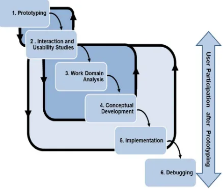
[12] recommended an iterative user-centered design process (Figure 1) that drew on the work of [15]. The targeted end-users are actively involved in each of the six stages of this design framework, which involves significant feedback loops between stages:
Work Domain Analysis – the task of gathering ideas and requirements from the end-users;
Conceptual Analysis – developing the functionality and designs to be featured in the tool;
Prototyping – the creation of working models of the tool’s capabilities;
Interaction and Usability Studies – the evaluation of the model’s partial capabilities;
Implementation – the creation of the tool with full features;
Debugging – the validation of the tool’s features before final deployment.
[13] found several practical issues with this process. Strict compliance to the previous process meant that the Work Domain Analysis stage had to be completed before the creation of the working interfaces in the Prototyping stage. They report that this is
Lian Chee KOH is a PhD student at the giCentre, City University London, but is based in the School of Information Systems, Singapore Management University, e-mail:[email protected]
Aidan SLINGSBY is with the giCentre, City University London; email: sbbb717@soi.city.ac.uk ; Jason DYKES is with the giCentre, City University London; email: [email protected] ;
not practical where (a) initial scaled-down proof-of-concept projects do not have the resources to include user participation; (b) a new development team joins an existing project; (c) users are unavailable or non-existent during the development of the project; (d) an existing application is required to be extended to a broader group of users [13].
[image:3.595.53.272.367.554.2]Figure 1: Robinson et al.’s (2005) six-stage user-centered design process
Figure 2: Roth et al.’s (2010) modified user-centered design process
Figure 2: Roth et al.’s (2010) modified user-centered design process
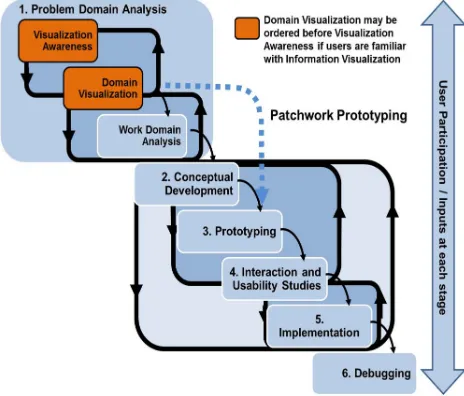
Figure 2 illustrates the modified iterative process proposed by [13]. The adapted approach is also focused on active domain user participation, with the added flexibility of making use of existing versions of the software or working interfaces prior to performing or revisiting Work Domain Analysis. This has the advantage that prototypes or existing versions of the software can be used to extract user ideas and viewpoints that may otherwise not have occurred to them [13], [4].
In our experience, potential users of visualization are often unlikely to know the true potential or scope of visual approaches or their possible impact on workflow at the early stages of design. Indeed [10] reports that those new to or unfamiliar with information visualization concepts may struggle to participate effectively in human-centred design. We therefore suggest another context in which this model, or variants of it, may be relevant, having found that many potential users of visualization have little experience of interactive graphics, the possibilities available or the kinds of
analytical approaches that they encourage. This is particularly important as emerging methods of software development, APIs and toolkits are making interactive prototypes that can overcome these difficulties less expensive to generate [4], [11], [2].
As such, just like [13], we use prototypes prior to the work domain characterisation stage. We do so to engage interest, establish common understanding and engender creative thinking. However, we also use this process to characterize the problem domain and build confidence between experts in visualization and the problem domain. We find that this helps with knowledge sharing, trust building and ‘orientation’. It can be rewarding [7], [3]. This additional need for early prototyping, whereby users and visualizers engage in some initial learning before work domain analysis, differs from the other scenarios identified by [13] in that it is, in itself, user focused – the objective being to inform at a number of levels. We have found that a combination of broad and general learning about visualization possibilities and specific experience using data that are familiar to our users is successful in terms of being informative, engaging and likely to stimulate ideas [7], [3].
Our ‘prototypes’, range in terms of their functionality. We use both specific and focused data prototypes for domain visualization, with broader, more generic, visualization examples for visualization awareness. To use a visualization metaphor, these provide ‘details on demand’ and ‘overview’ in terms of visualization knowledge respectively and act as a stimulus for information exchange between visualizers and domain users. The data prototypes are interactive and use existing, modified, or rapidly coded applications with different levels of functionality that support the visual analysis of data provided by, and of interest to users. They are used in a Domain Visualization Workshop. The visualization examples may be interactive prototypes, but canned, animated or perhaps even static examples of visualization possibilities tend to provide coverage effectively. We use these in a Visualization Awareness Workshop. Thus, rather than using prototypes for 'formative studies' we use them much as they are employed by [13] in their work domain analysis "to prompt useful ideas and reactions that users might not otherwise think to offer" through structured activities at workshops in which we characterise the problem domain by sharing knowledge and establishing interest and needs.
Appropriate ordering of these stages is context dependent. Where participants have knowledge of some visualization possibilities and experience of exploratory analytical work, their existing applications may be used for initial Domain Visualization where strengths, weaknesses and needs are discussed [3], followed by Visualization Awareness in which additional opportunities are determined. Where participants have little experience of graphical approaches, Visualization Awareness may be an important first step, required to ensure that Domain Visualization is effective and successful.
3 PROBL EM DO MAIN AN ALY SIS
The Problem Domain Analysis stage is a process of characterizing the domain in which visualization is being applied and building understanding and confidence between experts in visualization and the domain users. Prototypes are key in this stage, for engaging interest and stimulating broad and creative thinking.
The Visualization Awareness Workshop is designed to introduce
[image:4.595.59.291.290.488.2]general information visualization concepts to the users, illustrating the range of information visualization techniques from standard statistical graphics to more specialized and innovative graphics designed for different types of research questions. The workshop seeks to engage users and allow them to gain a broad appreciation of the scope and characteristics of the information visualization approach and its tools and techniques. Structuring a workshop to help participants relate ideas and consider the application of visualization techniques to their own data analysis and communication scenarios is essential here – through discussion, imagination exercises and the like.
Figure 3: Modified version of Robinson et al.’s (2005) user-centered design process with early prototyping as advocated by Roth et al. (2010)
The Domain Visualization Workshop is another interactive session with a different emphasis. Here domain users can see and use
specific examples of visualization techniques as applied to their own data. The visualization experts prepare data prototypes that showcase visualization techniques that are appropriate to the data supplied by the domain users. This may require several days’ preparation on the part of the visualization experts, depending on how many prototypes are prepared and the nature of the prototypes, but patchwork prototypes [4] or existing software or components may be appropriate. The workshop demonstrates possibilities to the domain users of using visualization techniques with their own data. It also gives the visualization team the opportunity to gain initial user feedback and broad user requirements. The exchange of data, in itself, is a useful process that involves trust and learning on all sides. Ideally, domain users will achieve some insights from their data using these prototypes during this workshop [7].
These workshops may be re-ordered according to local needs. Engaging users in Domain Visualization before holding a Visualization Awareness Workshop may be appropriate in some circumstances, depending upon local knowledge of and experience with analytical and visual methods. In our vizLegends work [3], the domain users had significant prior exposure to visualization
approaches and techniques within their domain, unlike user groups in our subsequent study in Singapore. Our sequence of conducting the Awareness Workshop before the Domain Visualization is deliberate in this case, as our experience in working with various industry groups in the region in the field of software implementations had made us mindful to the fact that domain users in this case had little or no exposure to the concepts of information visualization. Without the initial workshop and prior knowledge about the way information visualization has been applied in various business domains, they would have been unable to participate effectively in the Domain Visualization.
As such, we recommend engaging users through workshops that inform, stimulate and are of interest to domain users. These workshops should inform Work Domain Analysis prior to Conceptual Development and more formal prototyping, and are designed and sequenced to introduce users to visualization applications that are relevant to their domain and knowledge and that ultimately use their data.
These workshops are followed by Work Domain Analysis sessions in which the requirements for a visualization application are collated.
4 API L OT ST UDY
We conducted a pilot study at a government healthcare institution in Singapore, to try this approach on domain users with little experience and knowledge about information visualization techniques. Senior management staff of the healthcare institution are contemplating the use of information visualization tools in the organization and had identified a group of departmental heads with analytical problems and questions, from the Business Development, Corporate Communications, Financial Control, Medical Affairs, and Quality departments to participate in this pilot study, with the aim of identifying potentially viable information visualization projects from these departments. The pilot study is still in progress and this paper only reports on the Problem Domain Analysis stage. We assess the impact of this process on the domain users though observational note-taking and by running informal feedback sessions during and after each stage in the process. As the domain users involved in the pilot study had had little exposure to information visualization concepts, we ran the Visualization Awareness workshop prior to the Domain Visualization session.
4.1 Visualization Awareness Workshop
We invited these domain experts, to a Visualization Awareness Workshop, which was facilitated by an information visualization subject expert. The domain experts had very little knowledge about information visualization techniques and concepts, but were keen to learn more about these and see how they might apply to their work domains.
• The Hive Group Gallery1, a collection of sample information visualization applications by industry, was used to illustrate an interactive tree map representation of a sales team’s performance. This prototype was used to depict how high volume, hierarchical data could be visualized;
• Oakland Crimespotting2, an interactive map of crimes in Oakland for understanding crime in cities, which focused on visualization of spatial and temporal data;
• News Dots3, a social network visualization of the most recent topics in the news, to show how to visualize complex social relationships;
[image:5.595.55.285.298.466.2]• Parallel Sets 2.1 (Parsets; Kosara, 2009) was used to illustrate the relationships between where purchasers were currently housed (either in public or private properties); property types that the purchasers had bought and regions where properties are located. (Figure 4). The highlighted region in Figure 4 shows that the most significant section of property transactions (23%) came from purchasers who were currently living in private housing, who bought condominiums located in the central region of Singapore.
Figure 4: Parsets (Kosara, 2009) visualization of property sales in Singapore.
In addition, generic interaction techniques such as selection, filtering, brushing, hovering for details, and highlighting, were demonstrated.
Feedback elicited from participants during the course of the workshop revealed that they had found the workshop informative and engaging, and were receptive to the interactive way data could be investigated using means that were previously unknown to them. Participants also thought that information visualization tools would add value to the way they analysed their domain data, but reflected their concerns that they might have to commit additional resources (and cost) in the form of expertise and special skillset upgrade in order to use the visualization tools.
Participants shared how information visualization tools could be applied in their respective work domains:
• exploring how doctors from various specialties collaborated;
• tracking trend of inpatient readmissions, falls or medication errors;
• analysing patient satisfaction survey data; • trending financial results.
Domain users from Business Development arranged for a separate meeting shortly after the initial Visualization Awareness Workshop to discuss ideas that had occurred to them as a result of the workshop. This included ideas of tracking elderly patients using
1
http://www.hivegroup.com/solutions/demos/salesforce.html
2
http://oakland.crimespotting.org/map/
3http://labs.slate.com/articles/slate-news-dots/
social network visualization techniques to enable more of the elderly to remain in their homes. Users from the Quality department also came forward indicating keen interest in applying information visualization techniques to the analysis of their patient satisfaction survey data. This kind of creative thinking is a typical response to Visualization Awareness, which stimulates ideas by broadening knowledge and encouraging its application and synthesis. Establishing focus in the problem domain and managing expectation is an important next stage.
Feedback obtained through this workshop and the subsequent meetings requested by the domain users, provided us with some evidence that participants were able to relate information visualization concepts to specific areas of work within their respective domains. The authors also gained some preliminary understanding of the kind of information analysis challenges faced by the various domain users, demonstrating the close relationships between these participatory learning events and work domain analysis as a problem domain is characterized. Further to this, the Visualization Awareness Workshop enabled the visualization team and domain users to identify domain problems or questions that were unsuitable for information visualization - due to the lack of data that available for analysis; or problems requiring solutions that were transactional or operational in nature; or users realising that they lacked the resources to commit to the implementation process.
Discussions with the healthcare institution’s Management, Business Development and Quality Management departments led to a decision to focus on the patient satisfaction survey rather than the ‘tracking elderly patients’ alternative as data collection activities for this domain were ongoing.
4.2 Domain Visualization Workshop
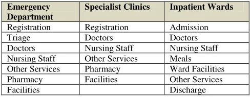
Our domain experts wanted to analyse patient satisfaction surveys that were conducted by patients. The Quality department commissioned appropriately sampled telephone surveys of patients about how satisfied they were about the level of healthcare services they experienced, several weeks after they had been discharged from one of three departments: Emergency Department, Specialist Clinics and Inpatient Wards. Each of these departments contains various patient touch-points, where the department’s staff has service delivery contact with patients (Figure 5).
Selected patients answered a series of questions about their overall satisfaction with the department that provided the treatment and the touch-points within that department. Surveys differed between departments, but all questions were measured on a 5-point Likert scale (1=”very poor”; 5= “excellent”). Patients could also choose not to answer questions that were not relevant to their treatment. Respondents could also provide free-text comments for each question.
The patient satisfaction indices for overall patient experience and the various touch points were calculated as the percentage of total patients who responded with 4 (“good”) or 5 (“excellent”) for the relevant survey questions. Each month, the tele-survey company summarizes the survey responses into a set of static graphical reports that chart key patient satisfaction indices by departments and touch-points within the healthcare institution. The Quality department is provided with these results on a quarterly basis.
Emergency Department
Specialist Clinics Inpatient Wards
[image:6.595.51.295.83.178.2]Registration Registration Admission Triage Doctors Doctors Doctors Nursing Staff Nursing Staff Nursing Staff Other Services Meals Other Services Pharmacy Ward Facilities Pharmacy Facilities Other Services Facilities Discharge
Figure 5: Patient touch points in the segments of a healthcare facility
The patient satisfaction data in its raw form was obtained from the Quality department for the Domain Visualization Workshop. The workshop, which was held several weeks after the Visualization Awareness Workshop, presented a number of prototypes of visualization techniques using the patient satisfaction survey.
The workshop enabled the domain users to see the possibilities these techniques offered for visually analysing their own data. It also allowed the visualization team to learn more about existing means of analysing the data, to get feedback from the domain users on the prototypes presented, and the kinds of questions that the domain users wanted to be able to answer of their data.
The patient satisfaction survey data represented patients’ responses to a telephone survey for each of the patient touch points and the patient’s overall satisfaction with their episode of care. The patient survey data consisted almost exclusively of categorical variables. Parallel Sets [1], [6] and Mosaic Plots [5], [16], [17] are suited for this type of data [14] and these were the techniques chosen for presentation at this workshop.
The Domain Visualization Workshop was facilitated by an information visualization expert and attended by domain users from Quality department. Parallel Sets 2.1 (Parsets; Kosara, 2009) and JMP 8 (a SAS proprietary tool used to visualise mosaic plots) were used to visualize the patient satisfaction survey data.
The visualization team elicited feedback from the users about how they perceived the way they interacted with the prototypes, and the way their domain data was visualized. This was done through initiating discussions at appropriate points during the presentation and observational note-taking. The users liked the fact that these techniques allowed them to interactively explore their own data in new ways. They were able to see relationships between variables in their data that were not provided by the static reports they had been using. Users also suggested additional features that they would find helpful, that were partly informed by the Visualization Awareness Workshop. One such request was the ability to be able to drill-down to obtain details on demand, a capability not available in the applications that we were using.
After interacting with both the parallel sets and mosaic plots prototypes, domain experts expressed a preference for parallel sets prototype as compared to mosaic plots. The indication was that the parallel sets was deemed simpler and hence faster for users to understand. We might hypothesize that the parallel layout of this approach simplifies reading and comparison of the data dimensions, compared to the nested structure of mosaic plots. Participants in the workshop seemed to find it easier to conceptualize questions about their data, and to co-relate 3 or more data dimensions using parallel sets than mosaic plots through our prototypes.
At the end of the workshop, users indicated that they were enthusiastic about the prospect of now interactively exploring their domain data in ways previously not available to them. They were keen to continue working with the visualization team to design an information visualization solution based on the parallel sets
prototype for use in their work domain. They had also begun to suggest broad ideas about the kinds of questions information visualization tools could help them answer as we began to capture requirements.
4.3 Work Domain Analysis
The visualization team held Work Domain Analysis sessions with domain experts to formally gather their requirements for an interactive visualization system. This was done through structured discussion to elicit the questions they would like answered using interactive visualizations. The following questions were prioritised:
• What impact does ‘very poor’ (or alternatively ‘excellent’) satisfaction index at specific patient touch-points (Figure 5) have on the overall satisfaction index for each of the hospital department (Emergency Department, Specialist Clinics and Inpatient Wards)? Users would like to verify whether particular touch-points perceived as main draws for patient complaints (or alternatively bouquets) are key contributors to the impact on overall satisfaction index for the healthcare institution;
• Which days of the week, and peak hours for patient visits/admissions have greater impact on satisfaction index for specific patient touch-points? To provide a feedback loop back to resource planning staff to improve patient’s experience at service delivery touch-points even during busy periods;
• How do the various touch-points within each of the hospital departments relate in terms of the department’s overall satisfaction index? To show how patients perceive service delivery by each touch-point within the department;
• How can patients’ free-text comments be used to back-up the
results derived for patient satisfaction at the touch-points of each department? Patient surveys may include (optional) patients’ comments about each touch-point. Users would like to analyse comments for keywords that may lend support or clarify aspects of patients’ satisfaction with service delivery.
5 DISC USSIO N
We observed a number of benefits associated with early prototyping and the use of Visualization Awareness and Domain Visualization Workshops. In terms of successes:
• domain users were able to relate the information visualization
concepts and techniques to their current work and immediate needs within their work domain as a result of participating in a Visualization Awareness Workshop;
• leading on from the previous point, domain users coming forward with their ideas on how information visualization concepts could be applied to their domain areas, in turn could lead to the identification of potential information visualization projects for an organization that is considering the incorporation of the use of information visualization tools into the organization;
• the Domain Visualization Workshop enabled domain users to better understand information visualization concepts that could be used to visualize the data as well as to enabling the developers to gain a better understanding of the problem domain – these findings are in line with those of [3];
• Our data owners became more demanding of their data and used ideas developed through the workshops to look for more sophisticated relationships in the data that they currently own – importantly demonstrating that our approach has an ongoing effect on analytical process.
• whilst ideas about visualization were forthcoming at our workshops, participants were somewhat limited in their visualization aspirations and there was a tendency to select functionality that existed in data prototypes used during our Domain Visualization Workshop;
• using existing (polished) software as data prototypes for
domain visualization does not emphasize the preliminary nature of the designs and the prototypical (in terms of the visualization development project) nature of the methods being considered. Consequently participants were focused on tool rather than data at the initial interactions with visualization tools.
We consider the benefits reported here to be encouraging. Both concerns could be addressed either in the Domain Visualization Workshop or through feedback loops within the Problem Domain stages of our approach, to allow users to augment their knowledge as they experience and gain familiarity with visualization prototypes.
6 CONC L USI ON
We modify [12]’s user-centered approach to the design, development and implementation of information visualization applications in the context of work with potential users with little knowledge of visualization techniques. Our modification introduces Domain Visualization and Visualization Awareness Workshops early in the processand incorporates some of [13]’s ideas about using prototypes at this stage of user-centred design in visualization. These modifications are designed to enable those lacking experience in visualization to participate as informed users in UCD. They are also applicable to those with more experience and can help domain experts participate more effectively and to help build understanding and knowledge between those with domain knowledge and needs and those with visualization knowledge and capabilities.
We are applying this process to users in a government healthcare institution in Singapore. This pilot study is still in progress, but we are able to report on the Problem Domain Analysis stage.
Our reflections on the implementation suggest that the model has impact because:
• it informed domain users about a range of possibilities for
visual analysis and equipped them to take an active part the process. They were able to suggest ways that these concepts could apply to their data and their problems that drew upon visualization to consider their data more comprehensively;
• it educated the visualization experts about domain-specific data,
the questions of those data that the domain users find interesting and how receptive they are unfamiliar techniques;
• it engaged the domain users to take an active part in the process, evidenced by the further meetings that they called after the Visualization Awareness Workshop;
• it promoted trust between the domain users and visualization experts, enabling free and frank discussion at the workshops.
We observed that users new to information visualization, focused on tools rather than on questions about their data; and brought up ideas and questions about their data that were limited to what they had experienced in the prototypes used in the Domain Visualization Workshop. We believed that these issues could be addressed with iterations within the stages of the Problem Domain Analysis of our approach, where users could further expand the coverage of and experience interaction with various prototypes and by structuring activities and presenting software in ways that emphasize this.
Future work will include development and deployment of a customized information visualization application using experiences
and requirements derived from the Problem Domain Analysis stage of the pilot study to inform subsequent stages of the model.
REF ERE NC ES
[1] F. Bendix, R. Kosara, and H. Hauser, “Parallel Sets: Visual Analysis of
Categorical Data,” in In INFOVIS '05: Proceedings of the Proceedings of the 2005 IEEE Symposium on Information Visualization (2005), 2005.
[2] M. Bostock and J. Heer, “ProtoVis: A Graphical Toolkit for
Visualization”, IEEE Transactions on Visualization and Computer Graphics, 2009 Nov-Dec, vol. 15, no. 6, pp 1121-1128, Dec 2009.
[3] J. Dykes, J. Wood, and A. Slingsby, “Rethinking Map Legends with
Visualization,” IEEE Transactions on Visualization and Computer
Graphics, 2010 Nov-Dec, vol. 16, no. 6, pp. 890-899, Dec. 2010.
[4] I. R. Floyd, M. C. Jones, D. Rathi, M. B. Twidale, "Web Mash-ups and
Patchwork Prototyping: User-driven technological innovation with Web 2.0 and Open Source Software," hicss, pp.86c, 40th Annual Hawaii International Conference on System Sciences (HICSS'07), 2007
[5] M. Friendly, “Visualizing categorical data: Data, stories, and pictures,”
in SAS User Group International Conference Proceedings, pp. 190–200, 1992.
[6] R. Kosara, F. Bendix, and H. Hauser, “Parallel Sets: Interactive
Exploration and Visual Analysis of Categorical Data,” IEEE Transactions on Visualization and Computer Graphics, vol. 12, no. 4, pp. 558-568, 2006.
[7] D. Lloyd, “Evaluating human-centered approaches to geovisualization,”
City University London, 2010.
[8] J. Nielsen, “Usability engineering”. Boston, Massachusetts: Academic
Press, Inc., 1993.
[9] D. Norman, “The design of everyday things.” New York: Basic Books,
2002.
[10] C. Plaisant, “The challenge of information visualization evaluation,” Proceedings of the working conference on Advanced visual interfaces, Gallipoli, Italy: ACM New York, NY, USA, pp. 109 – 116, 2004. [11] C. Reas and B. Fry, “Processing: a learning environment for creating
interactive Web graphics”, ACM SIGGRAPH 2003 Web Graphics, San Diego, CA; ACM New York, NY, USA, 2003.
[12] A. C. Robinson, J. Chen, E. J. Lengerich, H. G. Meyer, and A. M.
MacEachren, “Combining Usability Techniques to Design
Geovisualization Tools for Epidemiology,” Cartography and
Geographic Information Science, vol. 32, no. 4, pp. 243–255, 2005.
[13] R. E. Roth, K. S. Ross, B. G. Finch, W. Luo, and A. M. MacEachren,
“A user-centered approach for designing and developing spatiotemporal crime analysis tools,” in Sixth international conference on Geographic Information Science, 2010.
[14] R. Scheaffer and N. Yes, “Categorical Data Analysis,” NCSSM
Statistics Leadership Institute, 1999.
[15] T.A. Slocum, D.C. Cliburn, J.J. Feddema, and J.R. Miller, “Evaluating
the usability of a tool for visualizing the uncertainty of the future global water balance,” Cartography and Geographic Information Science, vol. 30, pp. 299-314, 2003.
[16] M. Theus, “Interactive data visualization using mondrian,” Journal of Statistical Software, vol. 7, no. 11, pp. 1–9, 2003.